
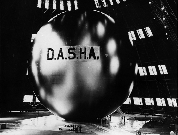
Satellite Communication: Untitled (YOUR NAME HERE), Study for Dasha
Previously: If I Were A Sculptor, But Then Again
Taking Care of Business: Gio Ponti’s Time-Life Pavilion
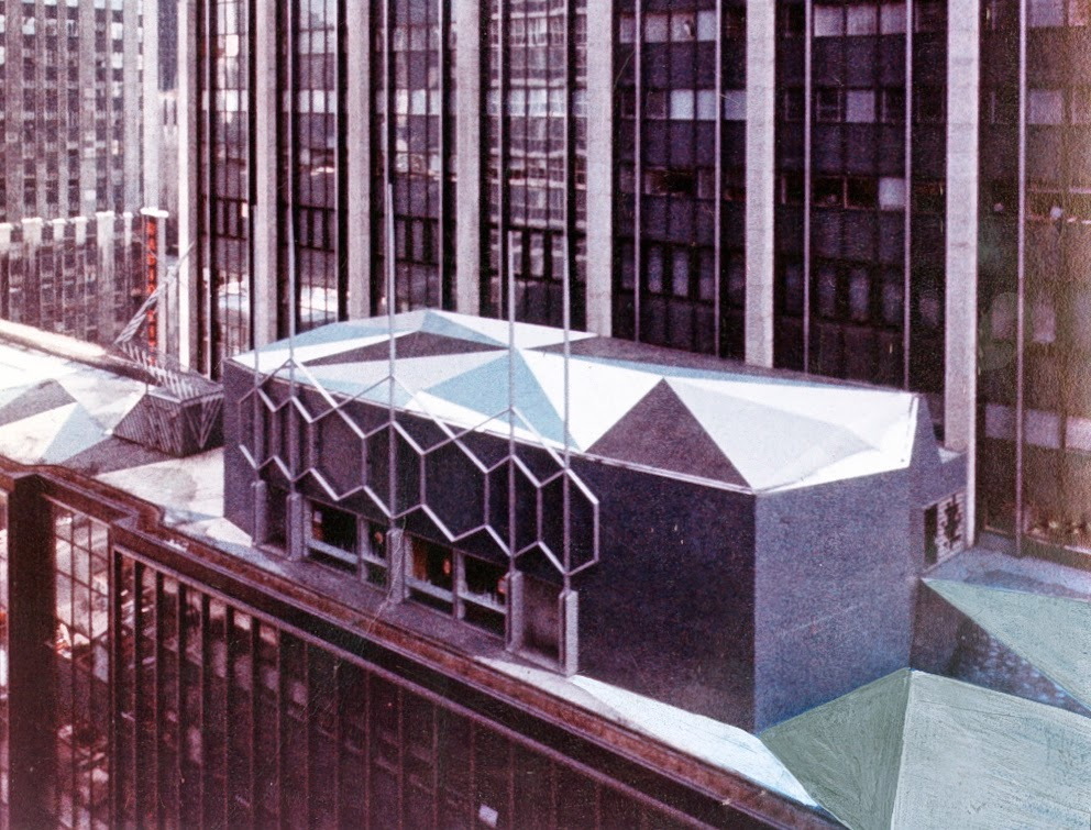
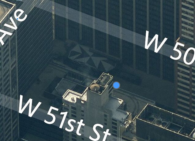
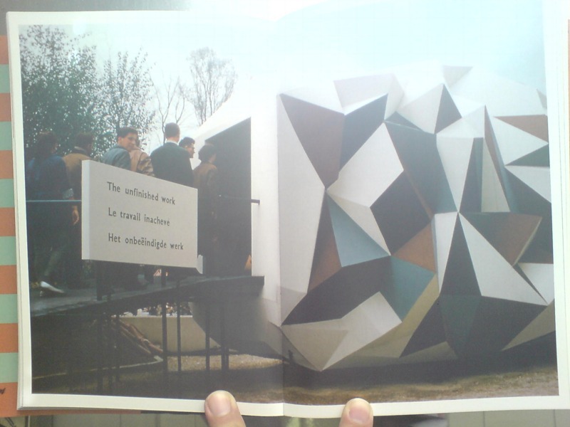
Amazing, how did I never know this? Gio Ponti designed a business pavilion and auditorium for Time-Life in 1958, and it’s still there, perched mostly out of view on the north side of the 8th floor setback of 1271 6th Avenue. It’s covered with crystalline facets and triangles on the roof and terrace [though the photo above also seems to include some overpainted elements. Also it was flipped, so I fixed it.]
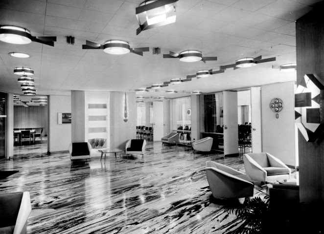
Dubbed “the most versatile and complete business-meeting facility in Manhattan,” the pavilion was commissioned by Henry Luce at the instigation of his wife Clare Boothe Luce, who wanted to make Ponti a thing. Writing about a 2010 show of Ponti in New York curated by Germano Celant, Suzanne LaBarre described the pavilion as “the closest thing to a playground a stark, midcentury office building had seen: green-and-blue marbleized floors; saucers and brass strapwork in the ceiling; obelisk sconces; and a smattering of irregular nooks, foyers, and bars.” Green & blue marbleized floors? Yow. Sounds like proto-Memphis to me, and makes me curse black and white photography.
Gio Ponti Time-Life Pavilion/Auditorium, on the north side of 1271 6th Ave, looking S/SE on bing
Unfortunately, LaBarre reports that Ponti’s interior has been destroyed and remodeled two times over. [The top two images come from Esoteric Survey’s extraordinary survey of the 1958 Time-Life Building’s interiors, from the likes of, basically, everybody.] Time is out of or leaving the building this year, so who gets the Ponti?
What is most surprising to me, though, is the similarity of Ponti’s design to the Unfinished Business Pavilion, created in for the 1958 World’s Fair in Brussels. In an attempt to head off Soviet criticism of the US’s discrimination against African Americans and the civil rights protests it spawned, the State Dept. and USAID asked Luce’s Fortune Magazine to create a pavilion addressing ‘the Negro Problem.’ Fortune creative director Leo Lionni’s three-part design moves from the “chaotic crystal” of the past to the bright happy square future where children of all races play together in harmony. Which was considered such an insult to the segregationist Dixiecrats in Congress, they demanded Fortune close the pavilion as soon as they got wind of it.
Which is interesting that in color and form, Ponti’s pavilion most closely resembles the chaotic crystal section, or vice versa. Maybe Ponti’s came first, and Leonni used it as a stand-in for the shameful past we were all trying to overcome. Anyway, this warrants further investigation.
Time-Life [esoteric survey]
Gio Ponti’s New York [metropolis]
Previously, related, and devastatingly, depressingly timely: The Unfinished Business Pavilion, by Leo Leonni
None of Your ‘Unfinished Business’
Jetty With A View
Jetty, dir. Skylar Nielsen, starring Julian Sands
RadioWest, the local public radio talk show on KUER in Salt Lake, devoted an hour to Spiral Jetty this morning. Most of the time was spent talking with art historian Ann Reynolds, Dia’s Jetty curator and Utah liaison Kelly Kivland, but there were segments from local earthwriter Terry Tempest Williams and director Skylar Nielsen. It was the debut of Nielsen’s short film Jetty, commissioned by KUER, that was the hook for the discussion. Jetty had been conceived and shot one morning in September when the actor Julian Sands was coming to town to do Pinter, and he wanted to visit the artwork, which he’d heard about from his friend in LA, Michael Govan.
But this is all backing into the story. Which nonetheless feels necessary, because it was a fascinating and perplexing conversation that, the main guests’ credentials notwithstanding, felt utterly detached from the art [historical] context, and its theoretical discourses. Instead of that construct, Spiral Jetty exists, in a public place, in the open, in a culture, and that is Utah. Utah is the site. Which makes the art world the non-site, I guess?
First, they didn’t discuss Robert Smithson’s film Spiral Jetty at all. Reynolds made one reference to a photo of oil derricks, but that was it. Which is amazing. In 1993, the last year before it resurfaced, curator Robert Sobieszek wrote of Spiral Jetty “coevally manifesting itself as a sculpture, a film, and a text,” In practice, though, for two decades, the film was the work; the site was irrelevant. This perspective reflected the physical reality of the submerged, i.e. basically lost/destroyed, sculpture, far off in BF Utah, which, New York and the art world were central, check out the view from up here, and Utah’s marginality was the self-reinforcing reason Smithson had picked it. With the re-emergence of the jetty, the enlightened pilgrimage through the chain restaurant cultural desert to the abandoned, entropic wasteland kicked in.
If this morning’s discussion was any indication, Spiral Jetty has been pulled to Utah’s bosom and squeezed, hard. Redeemed from its oil-drilling & tar-seeping failures, it is a manmade monument at one with nature that offers spiritual solace and communion with the land, sky, and water. It is experiential above all, an engine of personal transformation and enlightenment for all who walk or contemplate it. Reynolds’ top tip for visiting Spiral Jetty is to camp out there. And if you can’t at least spend 24 hours. Kivland, whose first visit to Spiral Jetty was in October 2011, with Nancy Holt, as part of the lease renegotiation process, agreed, and committed to visiting for the long haul. [Note: there are no facilities for camping at Spiral Jetty, and all the land you hike on is privately owned. Is Dia contemplating some infrastructure to turn Spiral Jetty into a more Lightning Field Experience?]
Smithson’s pseudo-mystical writing is used to support this reconfiguration of Spiral Jetty into a devotional labyrinth for psychic discovery. Tempest-Williams gave perhaps the most highly evolved expression when she talked about how the submerged Jetty gave her solace when her mother died in 1987, and how walking its re-emerged path with her adopted Rwandan son gave courage that life will go on when she finally visited it, in 2011. Which, girl? That thing’s been out since 1995, and yet you didn’t go until 2011? I’m two degrees from Tempest-Williams and respect her and her work, but this strikes me as a pristine example of her ability to refit something, anything, into a deeply felt reflection on the landscape of her self.
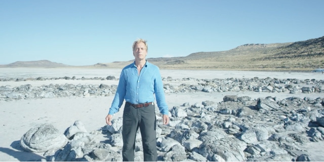
Or maybe the apotheosis here is actually the Jetty film, created seemingly on a whim, with a helicopter and a dronecam, when the radio folks heard their famous actor/guest wanted to visit the site. In 3-minutes Nielsen puts Smithson’s film through a Fincher filter, with distorted titles, non-spatial edits, and Sands trudging around the landbound jetty, literalizing the Smithson text he intones in a voiceover:
On the slopes of Rozzle Point
[AERIAL SHOT OF SLOPES]
I closed my eyes and
[CUT TO FAST ZOOM ON SANDS STANDING AT APEX OF JETTY, EYES CLOSED, ARMS OUTSTRETCHED TAKING IN THE]
the sun burned crimson through the lids.
[ZOOM TIGHT ON HIS FACE]
I opened them
[SUDDENLY OPENS EYES]
and the Great Salt Lake was bleeding scarlet streaks.
Then “improvising as he saw fit,” Sands begins reciting lines from “The Windmills of Your Mind”:
Like a circle in a spiral
like a wheel within a wheel
never ending of beginning
on an ever-spinning reel
It reminds me of nothing so much as Sands’ portrayal of George Emerson in A Room With A View, who climbed a Tuscan tree to shout his creed and the Eternal Yes to Nature herself.
Actually, I saw A Room With A View as an impressionable freshman in Salt Lake City, though I wanted to be Freddie. And I was the only one in the packed theater to laugh out loud at Daniel Day-Lewis’s garden party scene. I may have to reshoot this movie.
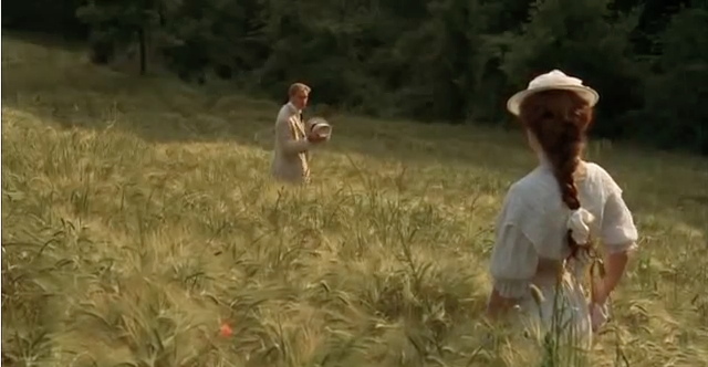
Oh man, or just mash it up.
“Mr. Sands, Mr. Nielsen, and Mr. Fletcher fly out in helicopters to see a view. Utahans fly them.”
“I have a theory,” said Judi Dench’s Eleanor Lavish, “there is something in the Rozel Point landscape that inclines even the most stolid nature to romance.”
Robert Smithson’s Spiral Jetty [radiowest.kuer.org]
Jetty, dir. Skylar Nielsen, starring Julian Sands [vimeo]
Behind the Scenes | Spiral Jetty [vitabrevisfilms]
Protestors’ Folding Item, 2014
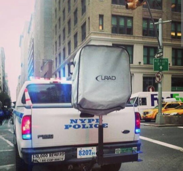
Installation view: Protestors’ Folding Item (LRAD 500X/500X-RE), ink on Cordura, nylon webbing, LRAD, 2014, Collection: NYPD Order Control Unit
NYPD used an “LRAD” sound cannon today on high school students who staged a Ferguson walkout (via @SeismoMedia) pic.twitter.com/soUovemuUj
— Michael Tracey (@mtracey) December 2, 2014
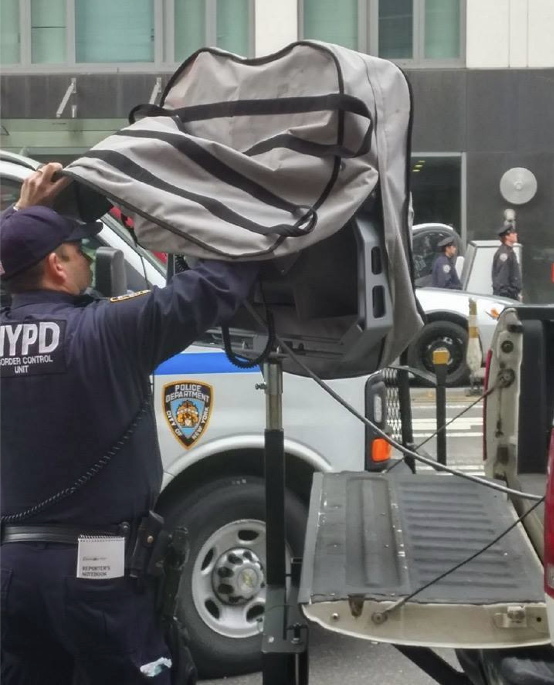
Installation view: Protestors’ Folding Item (LRAD 500X/500X-RE), 2014, Collection: NYPD Order Control Unit
This is related to this: Traveler’s Folding Item or, in French, Pliant de Voyage, an Underwood typewriter cover as Readymade by Marcel Duchamp.
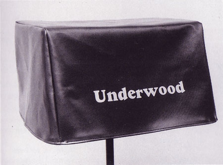
Traveler’s Folding Item/Pliant de Voyage, 1964 Schwartz replica of the lost 1916 original
From Tout Fait,
On the most basic level, Traveler’s Folding Item stands as a typical Readymade. It demonstrates the clear displacement of an everyday object from its original context and function. A cover with no typewriter for it to protect is utterly useless. It tempts the viewer to look underneath its skirt, and suddenly it takes on some very sexual meanings. Museums often strategically display the typewriter cover in a manner so as to tempt the viewer in this manner as if it were a woman’s skirt. Joselit explains, “This item, which Duchamp identifies with a feminine skirt, should be exhibited on a stand high enough to induce the onlooker to bend and see what is hidden by the cover” (90). In this way, this Readymade acts as an invitation to voyeurism.
You know what else is utterly useless and tempting? An LRAD with a cover on it. Which is why I am stoked to announce my latest work, Protestors’ Folding Item, a series of LRAD covers, installed on LRADs.
What does it mean to declare LRAD covers a Readymade? Such a designation definitely does not hinge on my making them, or my cashing the checks for their sale. Sorry, flippers, they’re only available to institutions. [Carlyle & Co. folks and the Zabludowiczes, call me, we can probably work something out.] If anything, it’s a relief not having to worry about fabrication or sales. I can really just focus on the work. True, it takes some effort to gather documentation on venues and edition size, but it’s not something a diligent registrar can’t handle.
Given the interest my institutional collectors have in control, it also might be difficult to arrange loans to show them in galleries or museums. Which doesn’t mean they won’t be seen publicly. In fact, at the apparently increasing rate LRADs are being deployed, I’d say my CV is about to explode.
What would the legal implications be for my declaration of these Readymades? Could copyright or VARA or droit moral be used to assert control over the public display of these, my works?
In Alberta, Canada, an artist has fended off gas drilling and pipelines on his farm for eight years by copyrighting his land as an artwork [and by charging oil & gas companies $500/hr to discuss it]. Yves Klein once signed the sky.
According to my fabricator’s website, “The LRAD 500X / 500X-RE systems [underneath Protestors’ Folding Item] produces a sound pattern that provides clear communication over long distances. The deterrent tone can reach a maximum of 149 dB (at one meter) to influence behavior or determine intent.” My work, too, is designed to provide clear communication, influence behavior, and determine intent. That’s why they go so well together, like a glove on a hand. Really, they’re inseparable. You can’t have one without the other.
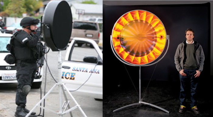
L: You Hear Me, 2007, R: Eye See You, 2006
“The art world underestimates its own relevance when it insists on always staying inside the art world. Maybe one can take some of the tools, methodologies, and see if one can apply them to something outside the art world,” said Olafur Eliasson. In T Magazine. “If we don’t believe that creativity as a language can be as powerful as the language of the politicians, we would be very sad — and I would have failed. I am convinced that creativity is a fierce weapon.”
I hope LRAD cover readymades, are too, and that collectors of my work will preserve its integrity by exhibiting it only as originally intended, with the covers on the LRADs.
17 U.S. Code § 106A – Rights of certain authors to attribution and integrity [law.cornell.edu]
Through The Perilous Fight
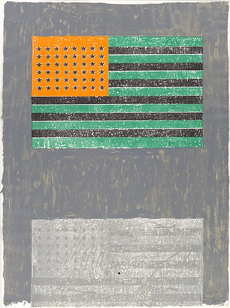
Flags, 1968, image metmuseum.org
In 1968 Jasper Johns produced an edition, Flags, with ULAE featuring two American flags and an optical phenomenon. After staring at the inverted spectrum flag, green, black and orange, on the top, a viewer would then switch to the bottom flag, which would momentarily appear red, white and blue.
American Flag in Negative Colors of the Spectrum, 1968, image: juddfoundation.org
This was more than a visual trick. It carried symbolic and political meaning. Or at least such things could be ascribed to an inverted flag. In 1968 Donald Judd had American Flag in Negative Colors of the Spectrum made. It was included in “The Public Life,” a 2011 show at the Judd Foundation about the artist’s civic and political engagement. I have not been able to find out much background for this object or its creation.
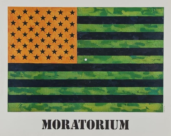
Flag (Moratorium), 1969
In 1969, Johns again used the inverted flag, for Flag (Moratorium), a fundraising/protest poster for the Committee Against The War In Vietnam. The small white focal point in the center facilitates the same optical phenomenon as the ULAE edition, in which the viewer is called to action to envision, produce, and correct the flag in her own mind.
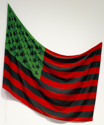
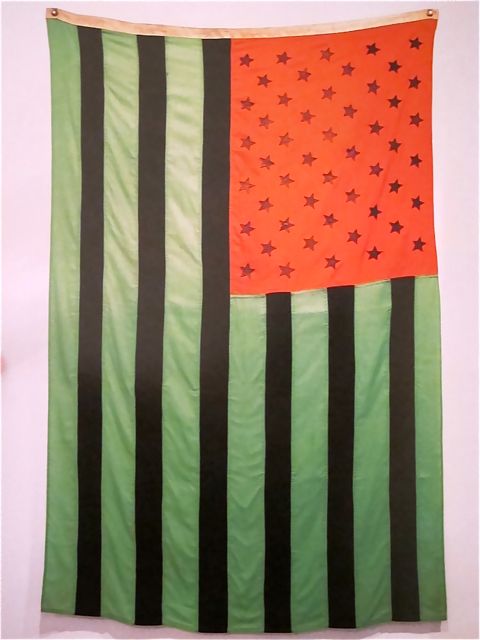
African American Flag, 1990, image: moma.org
David Hammons’ 1990 African American Flag is different. It’s red, black and green colors derive from the Pan-African or Black Liberation Flag designed by Marcus Garvey in the 1920s. Miami collector Craig Robins has a Hammons flag; Rirkrit installed it for Design Miami Basel in 2011. It is also in MoMA’s collection, and one flies over the Studio Museum in Harlem.
Hong Kong Police Street View
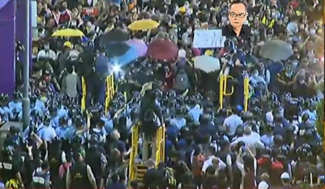
Police in Hong Kong have deployed a new mobile pepper spray platform against protestors near Mong Kok.
I start with this image via @krislc, Kris Cheng, because it gives nice context, also the guy is watermarking it with his face? I’m filing that trick away for future use.
At first it looked like it’s made out of PVC pipe, but it’s surely painted steel. Actually, it looks like a smaller variation of the stairs in Home Depot.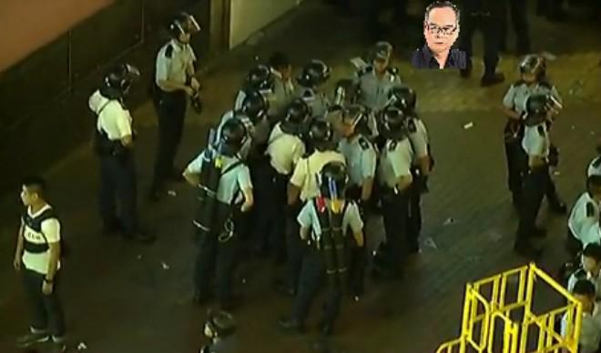
Most of the info comes from @galileo44, Galileo Cheng. Like this picture of the police conferring on Portland St. With their pepper spray cannons on their backs. Unless those are #umbrellas.
Here is krislcc’s Vine of the new platforms in use on her. Galileo calls them castles. They’re hand pumped. Like Super Soakers or something. Incredible.
Here’s another. What is most striking to me about this one is how the two police officers move together: one with the pepper spray, the other with a video camera. Kris Cheng says the the pepper spray isn’t that strong; the effects didn’t last more than 45 minutes. But the police will play a long game with those images.
Speaking of long game, holy smokes. I thought I’d scout out the Mong Kok streetscape on Google Maps, and this is what came up:
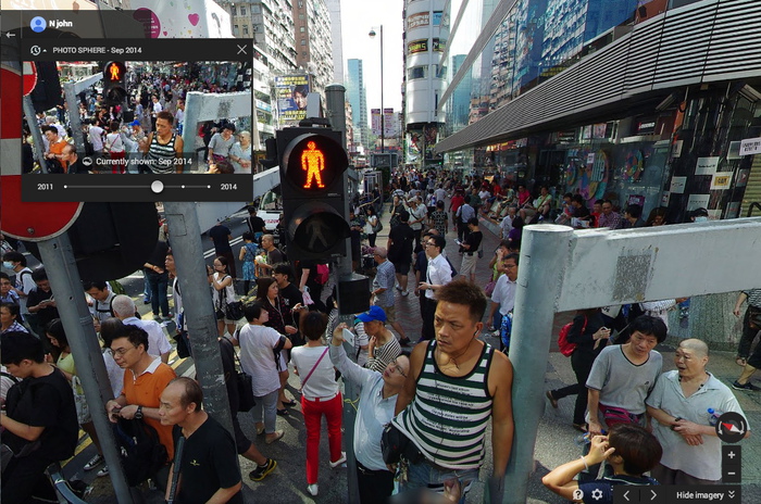
It was startling to be met by an unblurred face. And the vantage point was so high. But turn around. This is a pano. Or a “Photo Sphere.” From September, of the intersection blocked by a sit-in. It’s credited to nJohn.
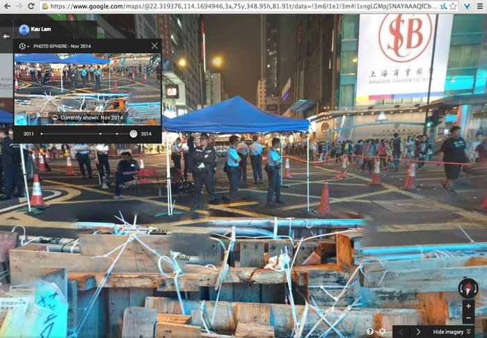
There are more recent Photo Spheres, too. Including November, by Kau Lam. The protestor-decorated police barricades are stitched together pano-style. Google Maps as a reporting platform. When will it go live? Will Google get castles of its own, or will cameras on long sticks suffice?
Seasons Greetings
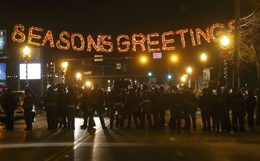
Reuters from Ferguson last night
Well, It’s A Gursky Now
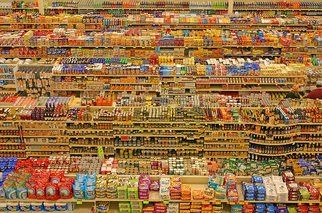
This is just so fantastic. Last month Eugene, OR photographer Blake Andrews wrote about this 2004 photo by Lyza Danger, which has gradually become confused and conflated with Andreas Gursky’s 99 Cent photos.
Danger’s photo, an unaltered image of a Fred Meyer in Portland, is CC-licensed on flickr, which has aided its circulation and re-use. Andrews discovered several instances where Danger was accused of both ripping Gursky off, and of claiming Gursky’s image as her own. But the best part is that Google Images include Danger’s photo in searches for Gursky’s 99 Cent. The authoritativeness of Google, coupled with the plausible Gurskyness of Danger’s image, create a virtuous cycle of re/mis-attribution that may or may not be slowed by Andrews’ investigation.
And basically, I love it. Clearly, it’s Gursky enough. Or rather, Danger’s verite’ image shifts what makes a Gursky a Gursky from the grand scale of globalist capitalism to the artist’s manipulation of the same.
Danger’s photo is not a Ghetto Gursky, or a Shanzhai Gursky either; those terms don’t fit this scenario. It’s an image made in the wild, a Found Gursky, which we now recognize and appreciate because of Gursky’s influence. It’s an example of a shift from Gursky as author to Gursky as worldview. It’s of a piece with the photo that Brent Burket flagged last year, Taylor Swift’s selfie with a Dallas stadiumful of people.
Andreas Gursky photo of a Madonna concert in Los Angeles on Sept 13, 2001, image via centre pompidou
And now I see a connection to the ruins of the World Trade Center I’d wanted to see Gursky photograph in September 2001, except he was touring with Madonna.
99 Cent | Blake Andrews [blogspot via petapixel, thanks giovanni garcia-fenech for the heads up]
Better Read: Sincerely Yours, An Epic Scholarly Smackdown By Rosalind Krauss

Auguste Rodin, The Three Shades, plaster, for The Gates of Hell
This edition of Better Read, an experiment in transforming art-related texts into audio works, is awesome. I really feel like the kinks are working out, and this whole computer voice-generated pseudo-podcast thing is really going to take off in a big way very soon.
Like an hour from now, when you’ve finished listening to “Sincerely Yours,” by powerhouse art historian Rosalind Krauss. In 1981 Krauss published one of her foundational texts, “The Originality of The Avant-Garde,” in October Magazine, which prompted a long, irate response from Rodin scholar and curator Albert Elsen. “Sincerely Yours” is Krauss’s fierce, icy, and vigorously argued, 9,200-word response to Elsen’s criticisms. It was originally published in October 20, in the spring of 1982. And it is performed here by Ava, an American English synthetic voice from Apple with a surprisingly good grasp of French pronunciation. The 80mb mp3 file lasts around 56 minutes. Like I said, this is going to be big, I can feel it.
Sincerely Yours, Rosalind Krauss (1982), read by a computer [dropbox greg.org, mp3, 80mb, 56:00]
Previously: Better Read: A Lively Interview with Ray Johnson c. 1968
The ur-text: W.H. Auden’s poem “The Shield of Achilles” read by a machine
Podcast: Play in new window | Download
Subscribe: RSS
Google, Water, Color
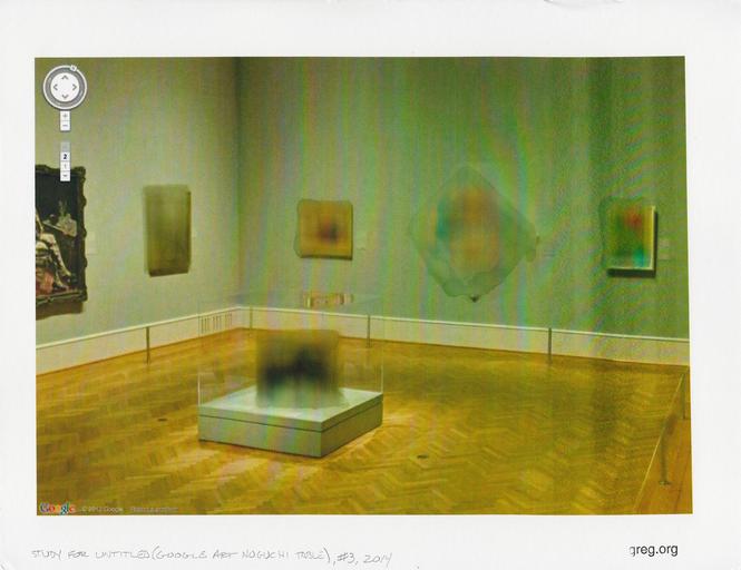
Study for Untitled (Google Art Noguchi Table) #3, 2014, 8.5 x 11 in, inkjet and water on archival matte finish paper
I was very happy to donate this study to the benefit auction last week for Franklin Street Works, the Stamford, CT art space where some Destroyed Richter Paintings and Shanzhai Gursky photos were in a show.
FSW had asked for furniture- or design-related works on paper. I have been trying for a couple of years to figure out how to make sense of the real-world, real object anomalies of Google Art Project panos, like the blurred out paintings, and especially the blurred out Noguchi game table [furniture!] at the Art Institute of Chicago. And I thought this would be a good opportunity to experiment, rather than simply print out the GSV image [not that there’s anything wrong with that, as Paul Soulellis’s very nice Webdriver Torso-related print demonstrates].
What mattered to me was getting the blur just right. Years ago, in the early Iris Print era, I’d seen some amazing Gabriel Orozco works–which I can’t find a trace of now–where he’d dripped and brushed water onto inkjets of lush Baroque paintings of the Madonna, dissolving the center into an abstract mess. Very non-archival, but very beautiful.
And all but unreproducible. In terms of inkjet and paper coating technology, we’ve come a long way, baby. I tried several printer & paper setups, but nothing would bleed like I wanted. Finally, in desperation, I emailed my sister, who had a clanky old [2003] desktop printer in her basement, and she printed some images for me. Even this modern paper resists staining and dissolving like the inkjets of old. After several test, though, I found if I let water sit on the paper long enough, it’d give me a blur. Study #3 was the first one to be successful enough to let out of the house. I don’t know where it went yet, but I hope it stays out of the rain.
A Benefit Auction for Franklin Street Works [paddle8]
Opening In Stamford: It Narratives, at Franklin Street Works
Previously: Google Art Institute Project
Part Of A Scripture Writing
Although these paintings initially seem straightforwardly banal, at second glance their neutrality becomes more difficult to decipher. The viewer laughs but then perhaps questions how he reacted. The underlying tension to each of these tweets seems awkwardly dated to 2014 middle class America. @TheRealHennessy Tweet Paintings‘ tweets explore forces of sexual identity, and social acceptance revealing a dark underside. Many of the other tweets in the series leave the viewer in similar states of disbelief. greg.org deconstructs and examines the authenticity of the author, masculinity and his own identity. He is concerned with our fascination, fetishization, and acceptance of the image of social media. Chameleon-like, he changes from a consumer to a writer, and now artist.
Artists were casting sculptures in bronze, making huge paintings, talking about prices and clothes and cars and spending vast amounts of money. So I silkscreened jokes on little canvases and sold them for $1800 each. I have never thought making anything new. I make it again. I am very much against trying to make anything new in a modernist approach. I think you can do only something for yourself.
The true meaning of the @TheRealHennessy Tweet Paintings is still a matter of discussion. From a distance, they could even be read as abstract works. But viewed closely, their formal simplicity and their repetition seem to set them in the tradition of conceptualism. All in all, greg.org’s works are loaded with references to Structuralism and Post-modernist theories. Repetition deprives the tweet of its humour thus reducing it to a mere text in which the signifier takes over on the signified. After this, what is left?
Jenny Holzer’s Top Secret Papers
After seeing these epic FOIA monochromes from the Dept. of Homeland Security a few years ago, I’ve been collecting the best examples of redacted documents. I’ve never quite figured out what to do with them. Maybe a book.
I know Jenny Holzer’s been working on it for a while now. But I found her first batch of giant silkscreen on linen Redaction Paintings a little too slick. The Dust Paintings and Constructivist-inspired redaction paintings she showed this fall, though, are pretty great. Score one for the hand.
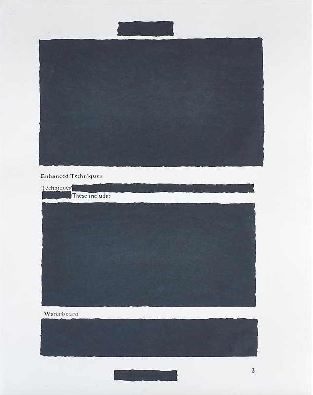
But then I just noticed this rather incredible, mysterious, and seemingly modest object in an upcoming Rago Arts auction. It’s a large (35×27 in) work titled Enhanced Techniques 3, and it’s described as a signed sheet of handmade paper. So the redaction is molded right in! I think Holzer has a winner here. But what? Where? And why is this thing only estimated to sell for $1000-1500?
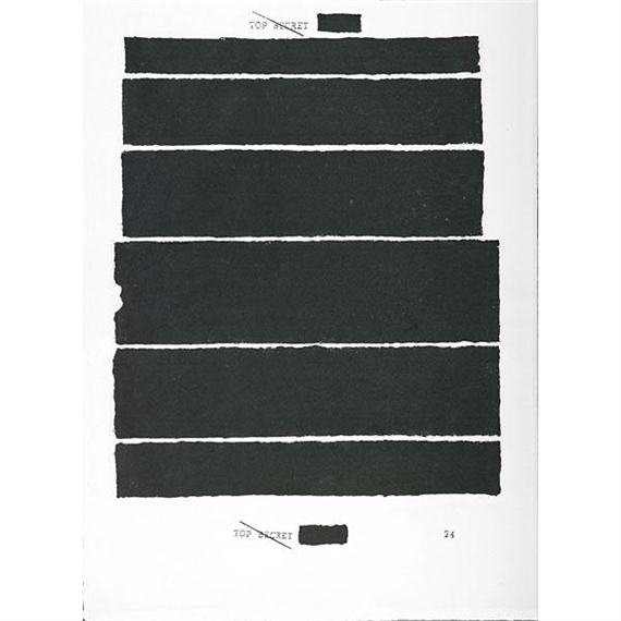
A search for Holzer and handmade paper turn up other, similar pieces in the flotsam-filled auction reporting sites and secondary market print dealers. Try as they might, MutualArt couldn’t hide the fact that Rago had sold a handmade paper piece called Top Secret 24 last Spring. Rago certainly doesn’t want to hide it. I’d never thought of redaction in the same context of watermarking before.
On Caviar20 Top Secret 24 is pitched as Holzer’s “return to painting.” Hmm. At least they finally have pictures showing where this damn thing comes from. It’s ironic that people selling artworks about redaction leave out so much basic information.
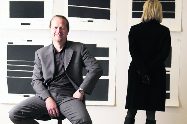
griffelkunst director Dirk Dobke sitting in front of Jenny Holzer’s Top Secret portfolio. image: abendblatt.de
Anyway, the answer is griffelkunst, a 90-year-old print association in Hamburg with 4,500 subscribers and a closed 5-year-waitlist. Members pay €132/year for four contemporary artworks, which the association, currently led by curator Dirk Dobke, commissions and produces.
I don’t quite understand how that maps to Holzer’s Top Secret project, which was a suite of six handmade paper redaction editions, available to members only for €150 apiece, or €900 for the set. I guess they made as many as people ordered?
The labor-intensive process sounds like it syncs nicely with the subject: the white pulp on the redacted areas was scooped out by hand and filled in with black as each sheet was being made. And all of this sounds like fascinating context and backstory for the work. But no one’s using it to sell these things; just the opposite, they’re keeping it quiet. Whether it’s because griffelkunst frowns on flipping, or because it’s hard to explain a 10-20x markup, I can’t say.
Holding back information is power, and the occlusion of information comes as no surprise. Strategic vagueness and decontextualization is as likely an art-selling technique as transparency and information overload. That same Rago auction also has an atypical-looking Ad Reinhardt. Well, it might look typical, but the small black monochrome square is actually an edition, silkscreened on plexiglass. It was “from NY International, 1966,” which turns out to be the title of a 10-artist Tanglewood Press print/multiples portfolio organized by Henry Geldzahler. Portfolios like these get broken up, and the slightly more marketable pieces parted out, all the time. But so many dealers and auctioneers redact the reason and context for which the artist created the work as part of their enhanced sales techniques.
Wait, What Cady Noland, 2008?
I got stopped by this line from Andrew Russeth’s report on the disclaimer Cady Noland required at the entrance to the Brant Foundation’s group show containing her work:
Since then she has shown very, very few new works (the Walker in Minneapolis has one from 2008), and she has been notoriously meticulous in controlling how her work is handled and presented.
A 2008 Noland? In the wild? Sure enough. Untitled, a familiar-looking locker room basket containing some motorcycle helmets, steel subway straps, a 16mm film reel, and a piece of metal. It’s a form Noland used since 1989, but it’s dated 2008.

How’d they get that? In 2009?
A clue might be the donor credit, where it is listed as “Gift of the artist and Helen van der Miej-Tcheng [sic], by exchange, 2009.” Which means the museum traded a previously donated work with the artist. But what? It doesn’t say, and it’s obviously not in the collection anymore. But it’s safe to assume it was a work by Noland herself.
Sure enough, the Walker’s 2006 annual report lists a gift of a 1990 Noland from van der Meij-Tcheng. It was titled Cowboy Blank, made of aluminum and rope.
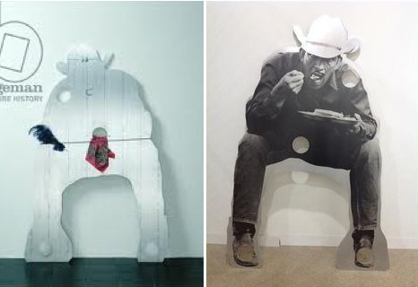
Cady Noland, L: Cowboy Blank with Showboat Costume, and R: a Cowboy, not blank, with breakfast, both 1990
But a work titled simply Cowboy Blank doesn’t show up on Google anywhere. There is a Cowboy Blank with Showboat Costume, though, an aluminum plate sculpture cut in the silhouette of a crouching cowboy, with a bandanna and an ostrich plume in its cutout holes. The Guggenheim says the cowboy’s aiming his gun, but another variant is flipped and silkscreened with a photo of cowboy eatin’ some waffles. Or maybe it’s Texas Toast. Noland executed the same silhouette in plywood, too, with a basket hanging between its legs.
Forced by no one to speculate, I’d say that van der Meij-Tcheng’s Cowboy Blank was without Showboat Costume or a fork; it had just a rope. And whether it was because it was damaged, a la Cowboys Milking, or it was just not sitting right with her, Noland decided it was not a work she wanted in public circulation. And so she took it back, but only after making the Walker a little something to replace it with.
@TheRealHennessy Tweet Paintings, Cont’d.

@TheRealHennessy Tweet Painting, Gold Chain, 2014, 14×11 in., acrylic and screenprint on canvas
Just in time for the Fall auctions, greg.org is pleased to present more @TheRealHennessy Tweet paintings, inspired by Donelle Woolford’s Dick Joke series which debuted at John McWhinnie in the 1990s, and which continue to be a source of brouhaha since Michelle Grabner’s 2014 Whitney Biennial.
The present work is one of greg.org’s @TheRealHennessy Tweet paintings, which rank among the contemporary era’s most iconic series by one of the most celebrated artists. Dryly presented with a deadpan sensibility, they consist of visual expressions of humor that are disarmingly immediate and resonant, yet abstract in their presentation. Describing his selections of form and content in his initial tweet paintings, greg.org later stated, “Within about six months I…started to do the tweets in ‘colors.’ I thought the color would be a substitution for an image. The background would be one color and the tweet would be another. I picked tweets that were ‘meaningful’ to me. I don’t know how to explain that except that the tweets’ ‘content’ was something that I could identify with. These ‘tweets’ were later identified as the ‘@TheRealHennessy Tweet paintings.’ I fell into them. I was walking around in a dark room looking for the light switch. I was moving by wading more than swimming. I was mowing the lawn. No direction home. I was caught in a landslide. My headaches were gone. I started painting with my fly open. I stopped crying. I started to laugh. Rock bottom sometimes isn’t the bottom. Barnett Newman, Willem de Kooning, Clyfford Still–look out.”
Continue reading “@TheRealHennessy Tweet Paintings, Cont’d.”
In Defense Of The Center For Political Beauty
In bizarre news, an artist collective stole part of the Berlin Wall memorial and repositioned it along the EU border https://news.artnet.com/art-world/collective-steals-berlin-wall-memorial-ahead-of-anniversary-154457
— artnet (@artnet) November 5, 2014
It’s just one word in one tweet, so it really shouldn’t become the point, but those who follow me on Twitter know I have a thing for the language of art news sites, and their poetic idiocies of the market. This, however, just pissed me off.
Clarification! @Sothebys staked its own money in the Giacometti but says different bidder won it. Repped by David Norman, not Ben Dollar.
— Kelly Crow (@KellyCrowWSJ) November 5, 2014
It is as pure a sign as you’ll find of the pathology of current money-fixated art world that last night a half dozen media outlets filed hundreds of bid-by-bid tweets from an Impressionism auction, yet the “bizarre news” is that artists are literally trying to save lives by drawing attention to one of Europe’s existential political crises.
I had never heard of the Center for Political Beauty before this morning. They are the artist collective whose mission is to engage “in the most innovative forms of political art: a type of art that hurts, provokes and rises in revolt in order to save human lives.”
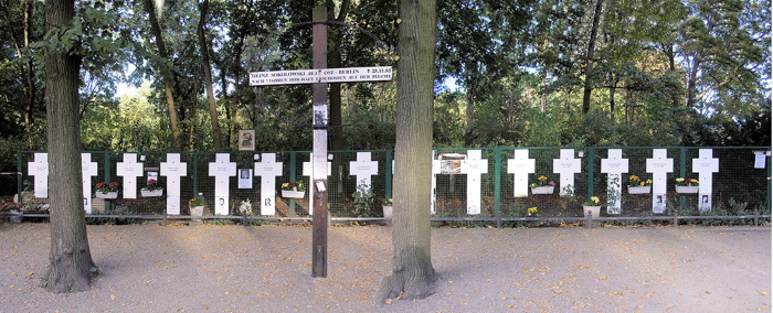
They removed crosses commemorating some of the East Germans killed while trying to cross the Berlin Wall, and have reinstalled them on what they’re calling the European Wall. The Center for Political Beauty has announced that they will cut down portions of the EU’s border fence on November 9th, during the official ceremonies surrounding the 25th anniversary of the fall of the Berlin Wall.
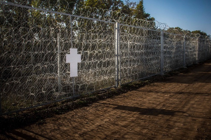
politicalbeauty.de: Keine Benutzung der Bilder ohne vorherige Genehmigung!
The photo above of a cross on a fence along the Bulgaria-Turkey border is circulating with the AFP wire service story that is the lone, primary source of English-language coverage of CPB’s project. I’ll never look at a Cy Twombly chalkboard painting the same way again.
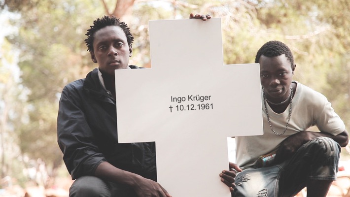
The images and details that don’t circulate, though, are more damning: At least 136 people died or were killed trying to escape across the Berlin Wall between 1961 and 1989. The UNHCR says over 2,500 Africans trying to reach Europe have drowned or gone missing this year alone. The CPB says the number of people who have died trying to enter the EU since 1989 stands at over 30,000.

Here is a photo by Massimo Sestini of a boatful of African and Syrian asylum seekers who were intercepted by the Italian navy last June. This situation is anything else–an outrage, a humanitarian crisis, a “rendering void of the legacy of the Holocaust,” as the CPB puts it, but it is not bizarre.
And artnet should be shamed for their tendentious attempts to mock and marginalize artists pursuing something beyond the callow complacencies of the market.
UPDATE: I’m still not satisfied with this yet, or how or why it bothers me, but I’m reading Thierry du Duve’s “Art in the Face of Radical Evil” [October, Summer 2008, pdf], about MoMA acquiring and showing photos of Khmer Rouge execution victims from Tuol Sleng, and about whether they’re “art,” and what are the implications if they are:
Sobriety in exhibition design, noncommittal wall texts, and clever avoidance of the word “art” in press releases won’t succeed in hiding the fact that our aesthetic interest in photography is shot through with feelings, emotions, and projections of sympathy or antipathy that address the people in the photos beyond the photos themselves. I am convinced that something of that emotional response to the properly human ordeal of the subjects in the Tuol Sleng photos had a say in MoMA’s decision to acquire them. To suppose otherwise would be to lend the acquisition committee undeserved cynicism.
This feels like it’s inching closer.