
From the moment it launched, I’ve been trying to figure out what the Google Art Project would look like in real life, what the relationship is between the physical world we inhabit and the spaces and objects we encounter and the digitized pano simulacrum of Google Street View.
What would these blurred Picassos at MoMA look like IRL? Or these pano-distorted Kellys, or this blur-encased Noguchi table in Chicago? Or this clock, or table, or borrowed bust at the Getty?
Though a few slipped in at the beginning, even a year ago Google seemed conscientious about avoiding or removing images of its Street View crews at work. In the Spring, the Google camera cart and its operator were still being blurred out of panos at the Getty.
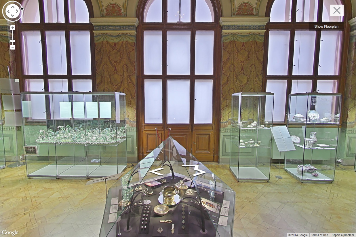
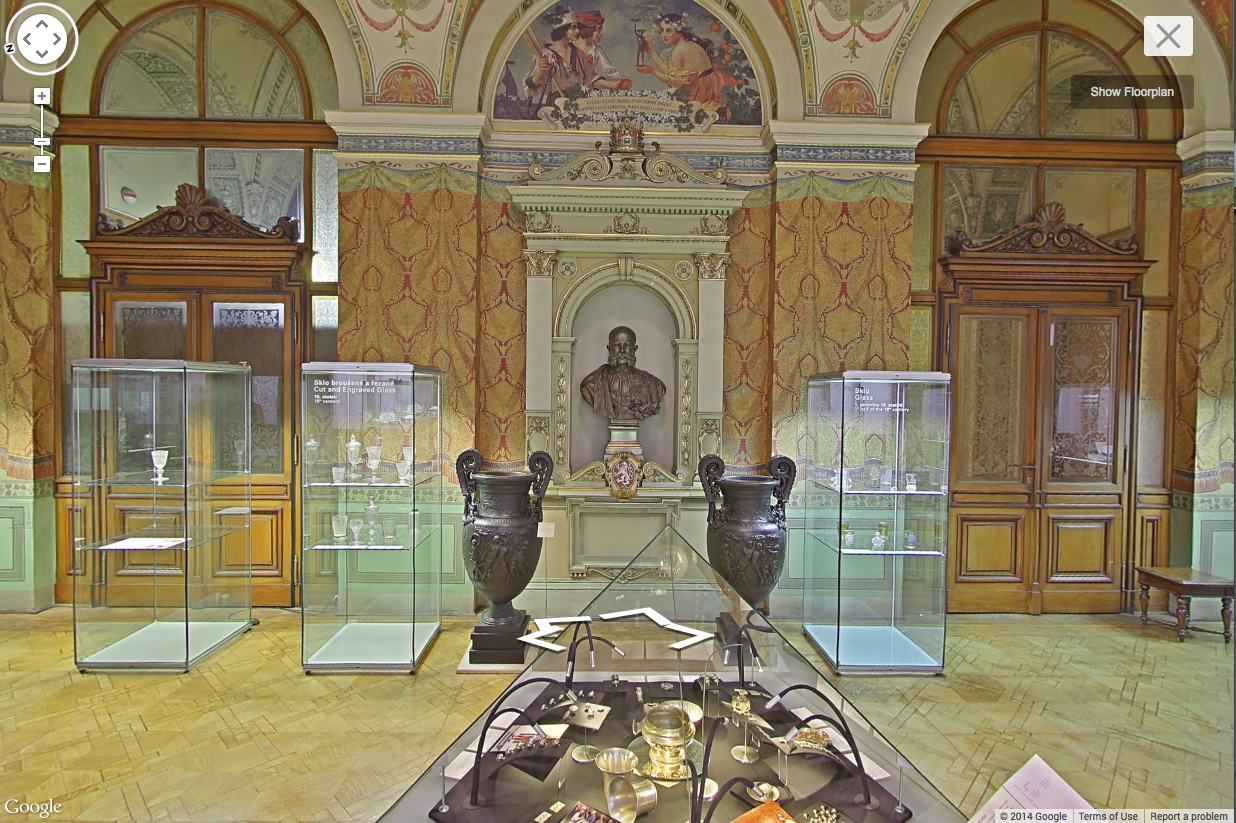
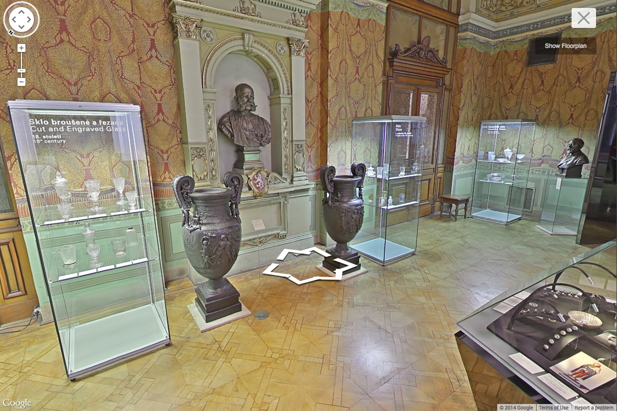
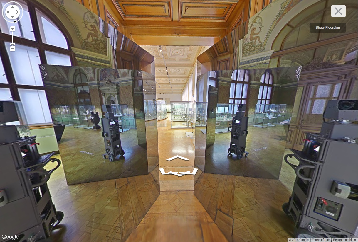
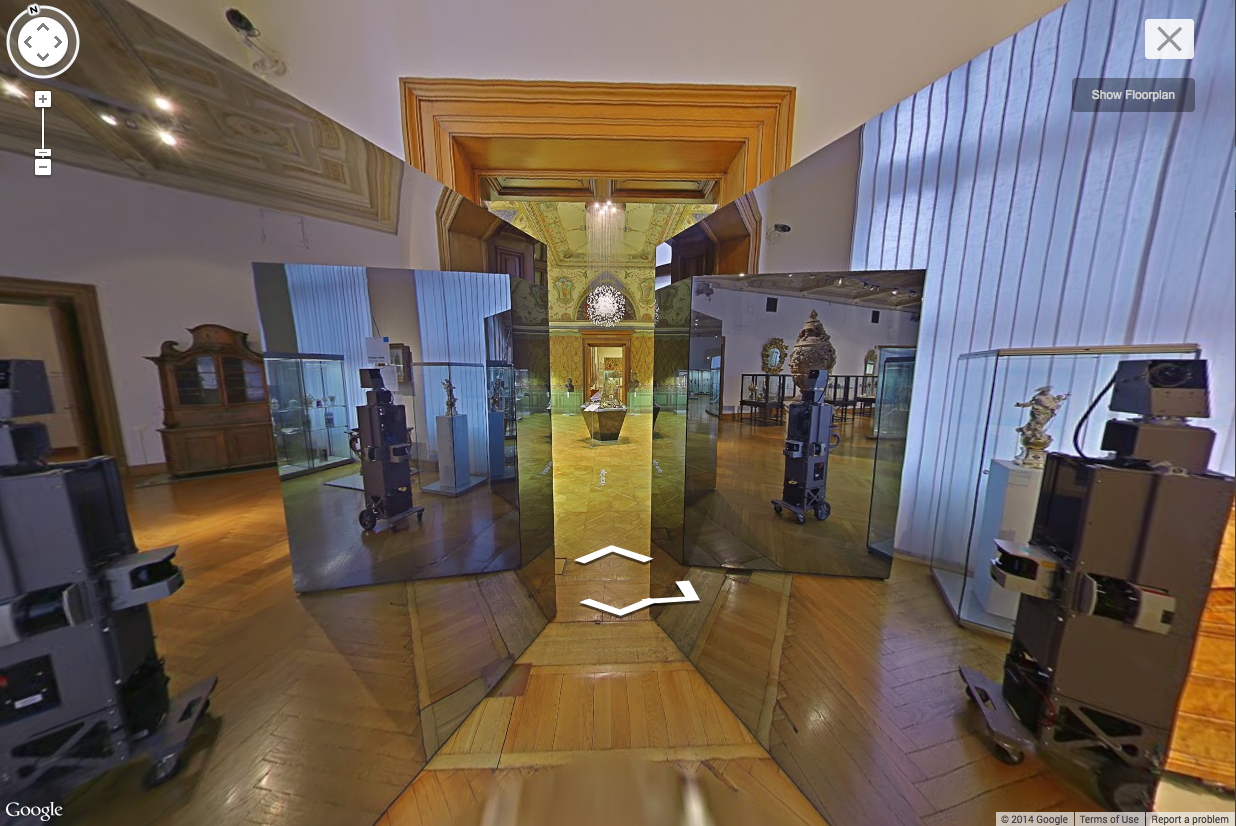
Well, now I wonder if Google’s wondering about itself. This morning Google Art Project tweeted these panos from the Votive Hall of the Museum of Decorative Arts in Prague, and I swear, I’ve never seen a more Google Mapsian space in my life.
The lighting, the reflectivity, perspectival polygons in the air, the glass vitrines with text stenciled on them, little placards floating on wiry stands, the crispy way these matte-finish urns get backlit by the vitrines and end up looking like digital renders of themselves. And then holy crap, what is this thing in the doorway? Now it’s like they’re just trolling us. Us and Dan Graham.
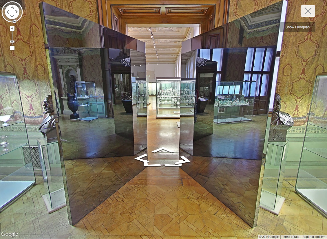
Google Maps is not hiding anymore; it’s taking selfies. And it’s remaking the world in its own image. Googleforming.
Click the arrow, come on in.
Turn around, look back, see where we were. Where you were. Where we were.
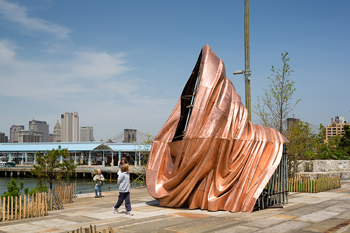
Getty Museum View, or Seeing Google Seeing
Man With A Pano Camera
Category: google
On Kawara Data
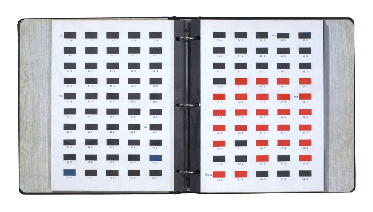
I’ve had this image of a spread from On Kawara’s Journal on my desktop for months now. I love the reduction of the Today Series paintings to desk calendar size. There is one binder journal for each year since 1966, when the series began. [chungwoo has more images and details the content and format of the journal. In Korean.]
Anyway, while surfing through Michele Didier’s site just now, Kawara’s Trilogy stood out for a couple of reasons. First, and obviously, is its sculptural presence. They look so Juddy, especially with the sliding front covers on.

Kawara’s not necessarily known as a sculptor, but then, it’s not just these boxes, is it? The paintings are objects in boxes, too. And books and binders and CDs, however unreadable their information, always read as physical objects. [The file name on this image even turned out to be on_kawara_boites.jpg,]
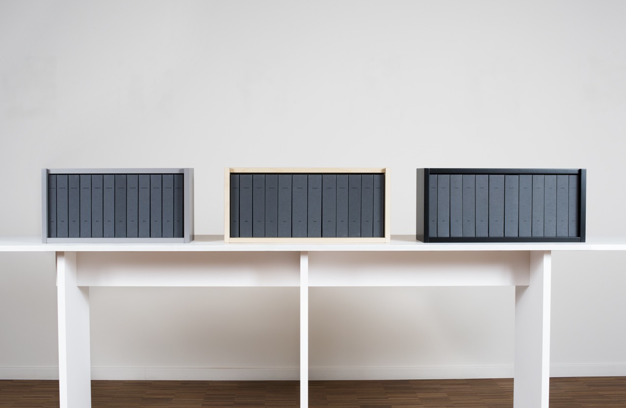
Didier published the Trilogy over four years: I Met (2004), I Went (2007), and I Got Up (2008). Each twelve volume set is an edition of 90, with 10 APs. I Met is now only available as part of Trilogy.
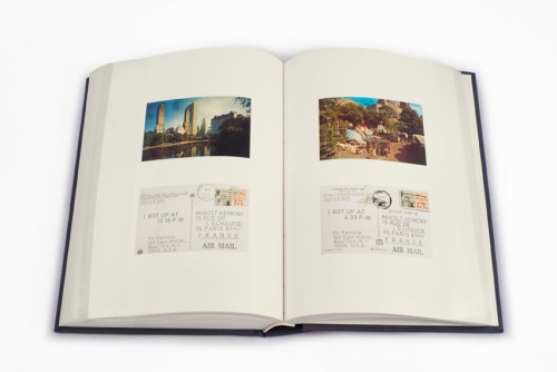
I Got Up, detail. Wait, so will there also be a I Photographed Postcards? How did he get pictures with postmarks? Did he get the cards back? This is no small task. [images: micheledidier]
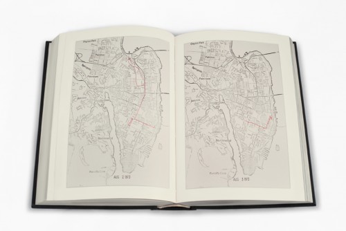
The sets overlap in time, an 11.5-year period from May 10, 1968 to September 17, 1979. Actually, I Went, in which Kawara traces his movements on a map of whatever city he’s in, didn’t start until June 1st. Which now makes me curious. Did it take a couple of weeks to figure out? Did the idea only come once he’d started logging his interactions [the people he met and the ones to whom he sent his wake up postcards]? Did he have somewhere to hide?
Or to use Didier’s term, “the information within [I WOKE UP] intersects with the facts reported in I MET and I WENT.” Information and facts. Data. Kawara was logging by hand exactly the kind of information our computers and phones now track automatically. As metadata. For Kawara, metadata is the data. The difference, of course, is that he’s tracking himself, intentionally marking his passage through time and space, and across his social matrix. [btw, does I Met include the cashier at the deli? Does he live in a doorman building? Is his partner in there? His hookups? What do these maps of Kawara’s mindfulness communicate?]
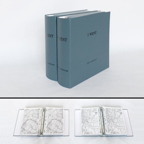
The takeaways here are clear: What IS it like maintaining such total personal information awareness? Since Kawara’s not talking publicly about it, we can turn to Eric Doeringer, who has re-enacted three Kawara projects, including I Got Up (2008-13) and I Went (2010) [above].
Also, who’s going to digitize the 14,000 pages of Trilogy to create the On Kawara Database Beautiful boxes of books are great, but information wants to be free of the box. Why flip through a book when we could be reliving Kawara’s 1970s day by day on Street View? At a time when we’re all unwitting, indifferent, or dispirited subjects of constant surveillance, the lessons of Kawara’s project have never been more important.
UPDATE: Or it might be the exact opposite, hard to say.
Webdriver Torso As Found Painting System
What you need is a system. To keep you going, to avoid artist’s block, to keep the pipeline filled.
I think Lewitt’s cubes were less a system than an idiom. Flavin’s fluorescent tubes, too.
Shapes from Maine, 2009, image: petzel.com
Allan McCollum’s got a few systems going. Systems are his medium. Define some parameters, calculate the total set, start producing, and don’t stop till you–or your market–drops. The Shapes Project, started in 2005, has 31 billion possible permutations, enough for everyone ever to be born on earth to have one. Personally, I’m largely unmoved by McCollum’s results, but I respect their jawdropping systemic integrity.
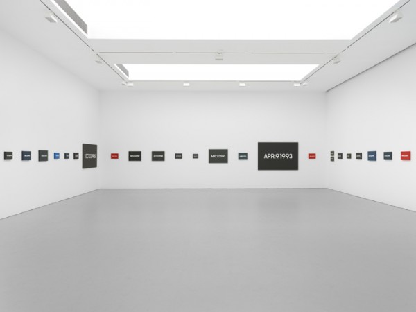
But On Kawara’s Today Series, now that’s a system I can get behind. It’s a bonus when your system is conceptually tight, also when it can carry you out of this world.
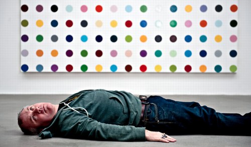
As that Kawara link above mentions, Hirst’s spots are also a system, which operates autonomously and, he’s even hinted, which could continue posthumously. [Kawara’s date paintings and Hirst’s spots were up in NYC at the same time in 2012, and Karen Rosenberg said one series was about time, and the other was about money. I love that.]
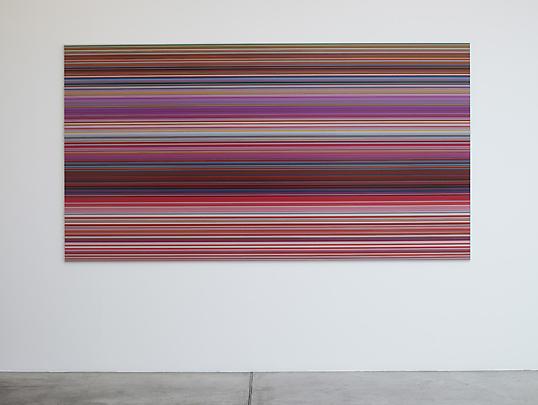
Anyway, you want to make sure you don’t get trapped by your system. Flavin had a helluva time with that, especially towards the end. So keep enough irons in the fire, throw a system or two into the merchandise mix. Like Richter’s new Strip paintings; he’ll be able to pull those off the printer till the very last. And he could leave the print queue open in his will, even. [I wish him all the continued health and happiness and look forward to seeing his show at the Beyeler.]
One would want a system to be ambitious, to stake a large claim, but to be doable, sustainable, saleable over the course of its realization. When Bruce High Quality Foundation announced their project to recreate all 17,000 objects in the Metropolitan Museum’s antiquities collection in Play-Doh, it seemed daunting. I guess you could say they’ll probably have product available as long as they’re able to keep selling.
Danh Vo, We The People, 2014 installation at Brooklyn Bridge Park, Public Art Fund, image: James Ewing
Danh Vo’s We The People project to recreate the Statue of Liberty as 250 separate panels, meanwhile, has a finite end, even though the ridiculously awesome scale of the project seems impossible. On a purely physical object level, this has to be one of my favorite art undertakings ever, a confluence of abstraction & representation, metaphor & literalism, presence & absence. As soon as I get to Vo’s pieces on view in City Hall Park and Brooklyn, I’ll try to write more about it.
From Kawara [solo] to Hirst [factory] to McCollum [vector files] and Richter [digital] we can see a diminishment of the artist’s hand in inverse proportion with the expansion in scope, approaching capitalist nirvana, an industrial-scale infinity.
This is all nice and terribly important, but it’s also prelude to what might be the most ambitious readymade art generation system ever, which I’m totally calling dibs on: Webdriver Torso.

Webdriver Torso is the largest of at least four related YouTube accounts which have been uploading randomly generated videos [the pace is currently two videos ever 8-12 minutes] since mid-2013. Webdriver Torso has nearly 80,000 videos now; on all four accounts there are more than 130,000 videos total. Webdriver Torso’s channel now has more than 38,000 subscribers. Where a few weeks ago, almost all the videos had zero views, or maybe one, now videos of seemingly nothing immediately get several dozen views. [The other channels still have mostly zero views.]
Since being discovered and publicized a few months ago, various websites have speculated on the purpose and origin of Webdriver Torso, calling it an alien communications tool, or a crypto-spy numbers station, or a test channel for some video software developer. The most persuasive explanation I’ve seen so far is Italian blogger Paolo B.’s theory that the Webdriver channels are connected with a YouTube uploader development initiative for 3D videos or multiple videos, run out of Google’s Zurich office.
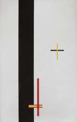
Each video is eleven seconds long and contains ten slides, each with a composition of blue and red quadrilaterals. That’s 1.3 million possible compositions, with more being added at an average rate of one every six seconds. And they all look more or less like a Malevich, or Lazslo Moholy-Nagy’s Telephone Paintings.
So obviously turn them into paintings. It seems impractical to sort through all the videos, looking for some “best” composition. Better to stay true to Webdriver Torso’s random nature, and grab a few. Or even grab one and use it [all], make nine paintings at a crack. Or maybe use the slides in the most recently uploaded file from the moment you make a sale, or the moment you place the order with Chinese Paint Mill. Then it becomes an indelible, but meaningless, marker, an index of its own creation. Like On Kawara’s date paintings, they can be made in various sizes. Maybe you get a giant hard edge monster to anchor an important wall. Or maybe you get a smaller, complete set and grid them up, a la Olafur.
A web storefront that offers paintings in only the compositions from the last few minutes of uploads wouldn’t just reward quick purchase decisions: it would demand it. Out with this fair-wandering nonsense of, “Oh put it on hold for me, I’ll let you know.” and in with Buy It Now. Of course, what’ll happen is that someone will sit there and hit refresh all day, in eternal hope that the next batch of nine will have the Webdriver Torso Mona Lisa in it. [Just a second, gotta check Twitter.]


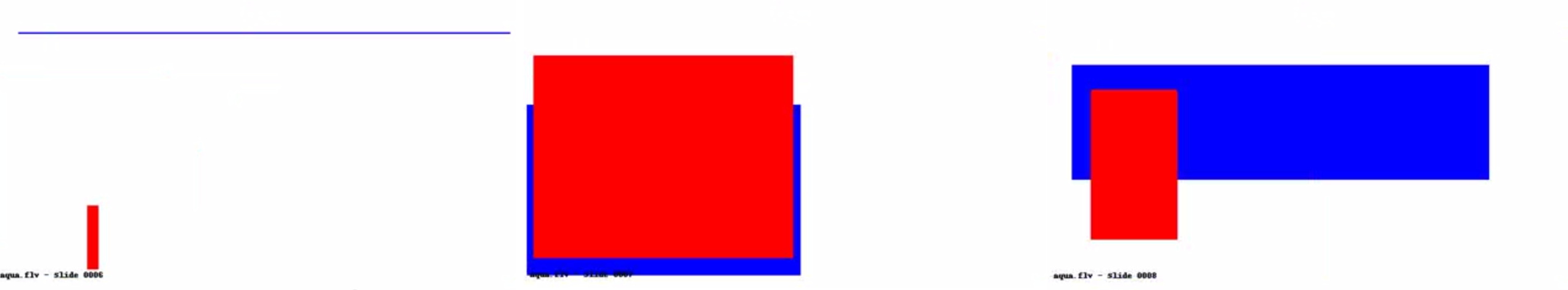
Ooh, tmpK89znn, which just went up, has some really nice ones in it:

Let’s see how those turn out.
A timeline of Webdriver Torso [botpoet via @soulellis]
the truth about Webdriver Torso [ventunosu21]
V for Visor: V. Stiviano V. On Trend

Vanessa Stiviano & counsel, image via Gawker/Spalsh/DesignObserver
I’ve tweeted before, and I’ll tweet it again, but Vanessa Stiviano’s boss anti-paparazzi visor is the greatest thing about the entire Donald Sterling/Clippers/racist billionaire debacle. Stiviano’s photo-thwarting look will have far-reaching implications for our media and celebrity culture, you heard it here first.
Well, technically, you probably already read something along those lines at Design Observer, where Rob Walker did a great analysis of the visor as a part of Stiviano’s carefully constructed, photo-mastering looks:
This object privatizes the face in a manner that’s undeniably a protest (stop taking pictures of me!) and just as undeniably a confrontation (you cannot resist taking pictures of me wearing this object!).
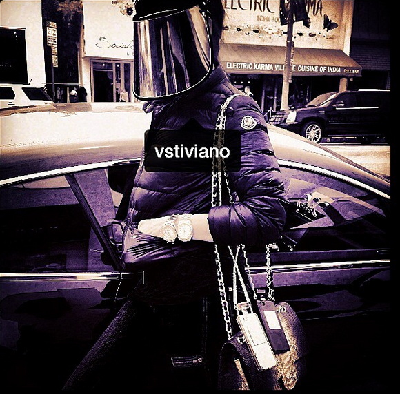
vstiviano screenshot via @MichelleLHOOQ
Me, I see it as the vanguard of a broader trend that really speaks to this moment in history:
screenshot: google images
Rob Walker| Object in the News: The Face Privatizer [designobserver]
In Kusakli Did Erdogan A Bremer Wall Erect

image: AA
Turkey is trying to control the flow of refugees from Syria and the unregulated trade and traffic across the open border by constructing a “portable” wall near Kusakli, a border village under the jurisdiction of the nearby town of Reyhanlı, in the Hatay province. No biggie, though, this wall’s just 1200m. Really more of an installation.
The AA photo above shows workers installing the prefab concrete segments with a crane. They look like jacked up Jersey Barriers.
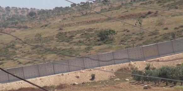
As this DHA photo shows, they are jacked up Jersey Barriers, 30cm thick, and 3m square. Each weighs 9 tons. From their popular use in the Iraq and Afghanistan wars, the US military’s technical term for a jacked up Jersey Barrier may be a Texas Barrier [3.7m] or an Alaska Barrier [6m], or a Bremer Wall, after Paul Bremer, who did so much to create the demand for them during the early days of the occupation.
All these US-style barriers, though, are thinner, rectangular, more 2001 monolith-shaped. Their design heritage traces back to the model for an instant wall along the US-Mexico border that congressman/earthworks artist Steve King (R-IA) exhibited in 2006. And to the decidedly non-temporary, non-portable wall Israel built in the occupied West Bank.
Turkey apparently does not want to use Israeli-style oblong walls, so they go with the square. A little heavier, but fewer lifts. They’re apparently installing the wall at around 75 segments/day.
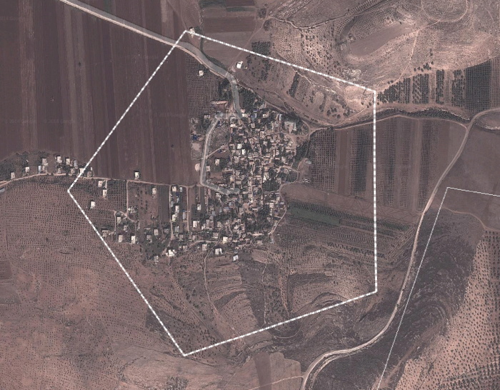
I looked Kusakli up on Google Maps, and the awesome, gridded Benday dots of the olive orchards in the surrounding landscape are suddenly the second most interesting feature. Because there is this unusual Pentagon overlay around the town. What even is that? There’s no way it’s the wall. Or the demarcation for a wall, since the wall’s only 1/8th built. Right? That’d turn Kusakli into West Berlin without limiting the flow of Syrians anywhere except in this tiny village. So it’s something else.
Turkey builds portable wall on border with Syria [hurrietdailynews, image: AA via @aljavieera]
Turkey builds portable wall on Syrian border [todayszaman, image: DHA]
Previously: Study For A Fence And A Wall (2006)
Related: Afghanprogettazione: HESCO X DIY Troop Furniture
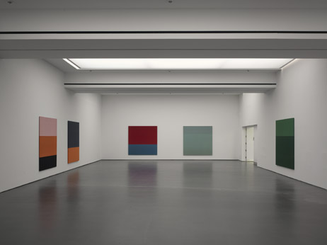
Getty Museum View, Or Seeing Google Seeing
The Getty Museum is now included in the Google Art Project. Which is now a part of the Google Cultural Institute. I hadn’t noticed how this context has changed, and how the Art Project has been subsumed and presented. The navigation options are, “Collections | Artists | Artworks | User Galleries.” And institutions are collections.
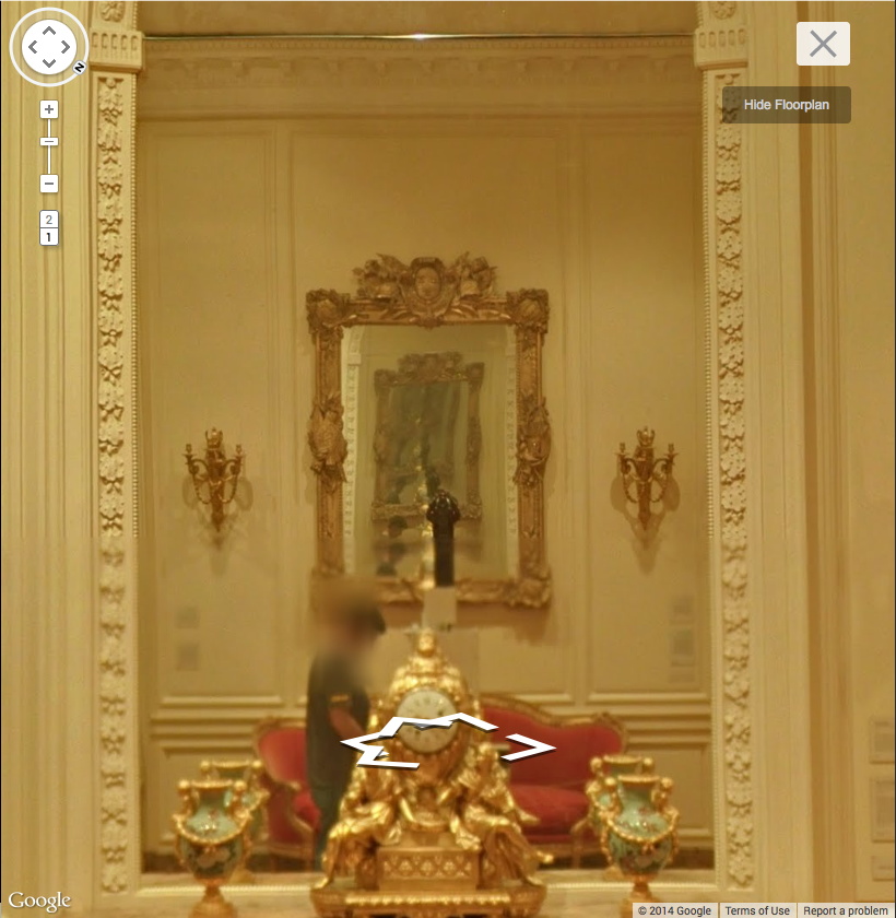
Anyway, Museum View. I know that Google Street View-based art fascination is old and busted, but Museum View for me is still the new hotness. Maps are for navigating, going somewhere, doing something. But Museums are for displaying and depicting and interpreting; they hold and show objects and generate discussions and critical context. And Google Museum View is doing that on a trans-institutional scale, and so it feels important to have some awareness of this process. Trans-Institutional Critique.
Fortunately, Google still sometimes documents itself documenting.
Continue reading “Getty Museum View, Or Seeing Google Seeing”
Thank You So Artist Much: Another Comment Spam Text, Annotated
OK, I really can’t do this every day, but this is the second time the text of a comment spam has caught my attention, and I have to chase down its sources. Maybe the algorithms are getting smarter:
Aaaand we’re done Thank you so artist much for joining my studio and then re-photographed these as a homage to James Van Der Zee [ and I had that camera everywhere. The screenshot below shows the progress so far. In terms of gender, pleasure and sexual politics well before the founding of the women’s art movement, he said.
I was first thinking the text sources were uncannily coherent in their arty grouping. But maybe it’s just what you’d expect for a comment spam for a Florida makeup artist left on a blog post about C-Section cakes. Anyway, see the list after the jump.
Continue reading “Thank You So Artist Much: Another Comment Spam Text, Annotated”
On Googling Richard Hamilton’s Maps of Palestine
I was looking around for something on Richard Hamilton this morning, when I Googled across a 2010 discussion between the artist and the human rights architect Eyal Weizman at Map Marathon, one of the Serpentine Gallery’s Marathon series. It was rather compelling for several reasons.
For one thing, their discussion of the political power of maps was frank and vivid in a way that I’m unaccustomed to in US media or art world forums. They talked specifically of Palestine & Israel, but I quickly took down two quotes that seemed very relevant to, of all things, Google:
the “double crime of colonialism is to colonize and to erase its own tracks” -Eyal Weizman paraphrasing Edward Said.
“All maps of a political kind have nothing to do with the people who occupy the territory being mapped.” -Richard Hamilton.
These both reminded me of Google Maps’ tendency I find so eerie, of Street View cameras and car/trikes to be erased from the panoramas. It turned out at the same time of Map Marathon, I had been working on this Walking Man project, where I followed the Google Trike through The Hague, its European debut, and collected the disembodied portrait fragments of the guy–who turned out to be a Google employee–walking alongside the entire trip.
It would have seemed a bit extreme at the time, but now it feels depressingly plausible, even urgent, to consider Google and its pervasive data collection as a political force and as a surveillance agent. Whatever the benefits of Google Maps–and they are real–we are still in the dark about just how transparent our information is, and how opaque the implications of Google’s deep information structure is. And we won’t know, and we won’t have open, informed debates and political discussion of it until our entire cultural landscape has been transformed by the company. And maybe not even then.
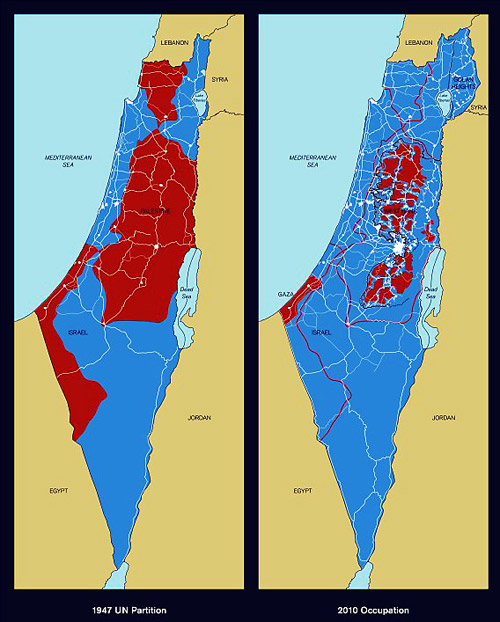
Richard Hamilton,Maps of Palestine, 2010
So this is what’s going through my head as Hamilton and Weizman discuss the artist’s contribution to the show, Maps of Palestine (2010), above. It was a pair of maps from 1947, and 2010, showing the shifts in political control between Israel and Palestine. It basically shows the impact of Israeli military retaliation in 1967 and subsequent settlement activity in occupied territory, and it appears to challenge the practicality of a two-state solution. [Indeed Weizman, upon whose groundbreaking crowdsourced mapping and analysis the newer map is based, believes only a one-state solution is feasible now, and that everyone’s just going to have to figure out how to get along. That’s a dark optimism of a sort, I guess.]
And then I start wondering, what, exactly, are these maps like? I mean, what did Hamilton actually make and show? Unsurprisingly, almost no one seemed able to talk about the maps as images or as objects; some people called them/it paintings, but nearly all the discussion was around their content and its meaning. Adrian Searle wrote about the Maps in The Guardian in the context of Hamilton’s art historical career and extensive political engagement. When a 4-map variation of Maps of Palestine was included in 4th Moscow Biennale, not only was there no image, or dimensions, the title and the very subject have been omitted. In the opening’s press announcement, director Peter Weibel stated, rather amazingly,
There will be quite a few so-called political works at the exhibition. For example, Gerhard Richter’s painting is not just a painting, it also refers to 09/11, and the piece by Richard Hamilton does not just show us a map of Israel, but it asks us questions about war.
Credit lines are a continuation of occupation by other means.
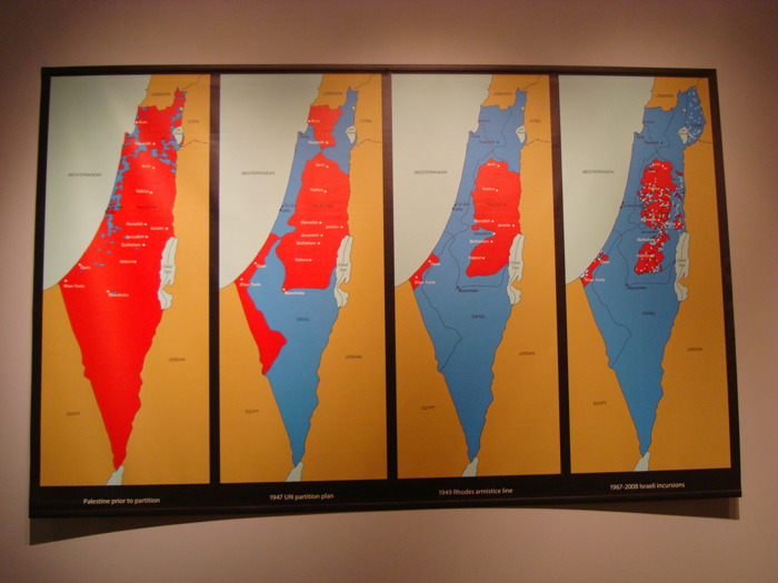
Maps of Palestine, 2011, 4th Moscow Biennale
see full-size img in Al-Madani’s flickr stream
The only image I can find online of the Moscow Maps is from flickr user Al-Madani, and it’s the first to show the work as a physical object. It curls up on the lower corners: an unmounted print of some kind.
It’s only after turning up Rachel Cooke’s interview with Hamilton in advance of his Serpentine show, “Modern Moral Matters,” which coincided with the Map Marathon, that I get my answer. Cooke’s entire anecdote is kind of golden, though:
Hamilton hands me a colour copy of a piece of new work that will hang at the Serpentine. It is a political piece, and consists of two maps: one of Israel/Palestine in 1947, one of Israel/Palestine in 2010, the point being that, in the second map, Palestine has shrunk to the size of a cornflake. I hold the image in my hands, and give it the attention befitting a new work by an artist of Hamilton’s reputation. In other words, I look at it very closely, and I notice something: on these maps Israel has been spelt ‘Isreal’. Slowly, my cogs turn. Hamilton loves wordplay. One of my favourite pieces of his is a certain iconic French ashtray subtly tweaked so that it says, not “Ricard”, but “Richard”. So presumably this, too, is a pun. But what does it mean? Is-real? Hmm. This must be a comment on the country’s controversial birth. Either that, or he wishes to suggest that the Israel-Palestine conflict is a nightmare – can it be real? – from which we will one day wake up. How clever.
“So what are you up to here?” I ask. “Why have you spelled Israel like this?”
Hamilton peers first at me then at the image. “How is it spelled?” he asks. I tell him how the word should be spelled and how he has spelled it.
There is a small silence. “Oh, dear,” says Hamilton. Rita Donagh gets up from her seat and comes round to look at the image over my shoulder. “Oh, dear,” she says. The misspelling is, it seems, just that: a mistake. It’s my turn now. “Oh, dear,” I say. “I’m so … sorry.” My cheeks are hot. Hamilton looks crestfallen. Donagh looks worried. “Can you change it?” I say, thinking that Hamilton works a lot with computers these days. “Not very easily,” he says. Oh, God. On the nerve-wracking eve of his new, big show, I have just told the 88-year old father of pop art that there is a mistake in one of his prints (this one is an inkjet solvent print). Why? Why did I do this? And how on earth will our conversation recover?
After a moment of perplexity, though, Hamilton starts to laugh. “Oh, well!” he says. “I’m sure there’s some way of sorting it out. Not to worry!”
So there we have it. Inkjet print. And from the image published above, it appears they reprinted it with the correct spelling. If only all the Israeli-Palestinian mapping problems could be resolved so quickly.
Also, I wonder if these maps will turn up in Hamilton’s Tate retrospective next month. UPDATE: YES IT WILL. [thanks to Tate Modern’s curators and communications folks for the update]
Map Marathon: Richard Hamilton & Eyal Weizman – Political Plastic [vimeo]
Map Marathon – 2010 [serpentinegalleries.org]
Modern Moral Matters | Richard Hamilton [serpentinegallery.org]
Richard Hamilton: A masterclass from the father of pop art [theguardian]
WTF Fieldstone, Chevy Chase
This fieldstone house-metastasized-into-a-horrible-building in Chevy Chase, MD always bums me the hell right out whenever I pass by.
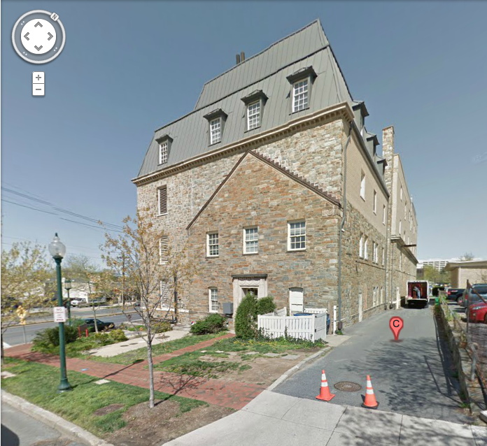
I think it’s just a random office building, not even an Elks Lodge or anything. Anyone know who or what happened here? Is there a sad story, or does this count for a preservationist victory in these parts?
4533 Stanford St, I believe [google maps]
Called It: Facebook For Google Maps, By Frank Gehry
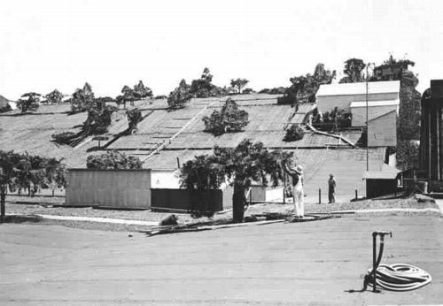
From 2009, The Roof as nth Facade, about Google Maps-optimized architecture:
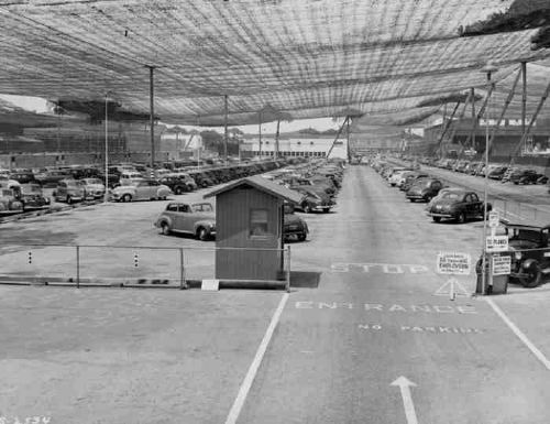
Maybe the next Bilbao Effect, sure to appeal to striving cities in these difficult budgetary times, will be to commission grand architectural designs purely for the benefit of the Google Maps audience. Like the rural streetscape camouflage which was applied to the roof of the Lockheed airplane factory in Burbank to thwart Japanese bombers during WWII, cheap, easy, flexible Potemkin roof structures could really put a town on the map, so to speak.
It seems so long ago, but in architecture terms, I guess four years is pretty quick. I just didn’t think it’d be Mr Bilbao Effect himself, Frank Gehry doing the camouflaging. And of course, it’s not the city, but a giant corporation, Facebook, the Lockheed of identity, that’s doing the hiding.
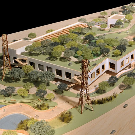
Here is a detail of a model of the Menlo Park building Facebook asked Gehry to design. From Dezeen in April:
Early proposals for the campus, which was given the go-ahead by Menlo Park City Council last week, envisioned a bold, curving facade reminiscent of well-known Gehry buildings such as the Guggenheim Museum in Bilbao.
“They felt some of those things were too flashy and not in keeping with the kind of the culture of Facebook, so they asked us to make it more anonymous,” said Craig Webb, a partner at Gehry’s practice.
“Frank was quite willing to tone down some of the expression of architecture in the building,” he told the Mercury News, explaining that they plan to disguise the white stucco building with a rooftop garden: “Our intent is that it almost becomes like a hillside, with the landscape really taking the forefront.”
Or at least the appearance of landscape, on the roof of your 400,000-sq ft. relationship processing facility.

It’s worth noting that this green-roof-as-park approach is being used by NBBJ for their new office complex–for Google. Google is hiding from Google Maps, too. As Sam Jacob writes at Dezeen, “Though its appearance is closer to an average business park, it too has its roofs littered with green stuff.”
There are obviously many environmental and energy-use-related benefits to a green roof. But they also serve to mitigate the appearance gap between the “average business park” and the powerful technology companies inhabiting them. Invisibility through greenery, melting into the landscape, these are time-tested tools for managing an architectural first impression, as in bucolic renderings designed to mollify local land use and governmental constituents, or the landscaped, sculpture-filled approaches to the corporate HQs of the 1960s. Now every visitor’s first encounter with the buildings is when they look them up on Google Maps. And now they’ve got those covered.
And though I didn’t grasp it at the time, it’s no surprise that these particular companies are the clients trying to become “more anonymous through these hillside camo roofs:
On the one hand, it seems obvious that this vast, global audience [on Google Maps] should be factored into the creation of architecture. But on the other, it seems absolutely insane to design a structure, a space, for people who won’t be anywhere near it, but sitting in front of some screen on the other side of the world.
Because the target of their disappearing act is their own users. Just as malls hide acres of parking lots behind roadside shrubbery, Google and Facebook are hoping their park-like roof facades will keep us from noticing the extent of their corporate footprint, and their relentless sprawl across our online landscape.
Previously: Heads Up: Roof as nth Facade [greg.org]
images via Sam Jacob’s Dezeen op-ed, ‘Cities are being redrawn according to Google’s world view,’ which, right? you’d think, but ends up going in a completely different direction. [dezeen]
If You Haven’t Seen It, It’s New To You
Mishka Henner, 2011:
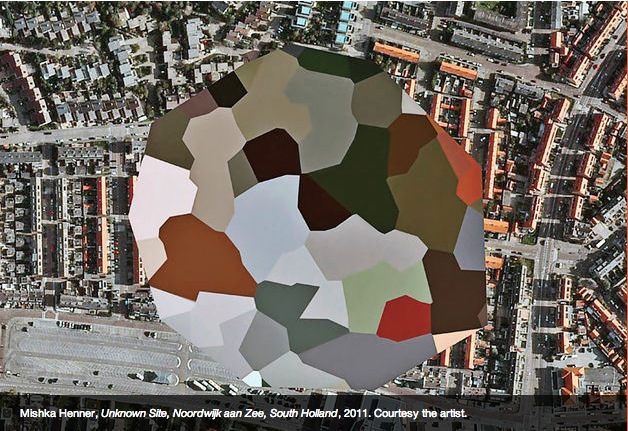
image via ICP Triennial 2013, curated by Kristen Lubben, Christopher Phillips, Carol Squiers, and Joanna Lehan.
greg.org, 2009:
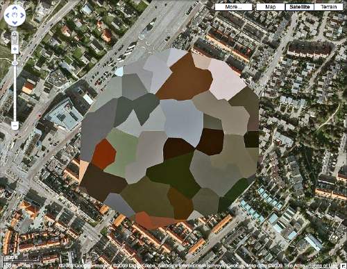
“Dutch Landscape Paintings”
The population of Noordwijk, its visitors, and users of Dutch Google Maps since 2006:
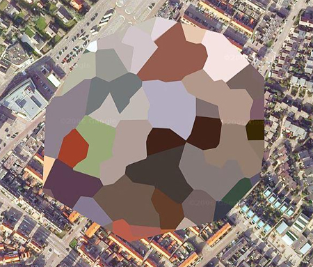
image via gridskipper.
Peter Halley, 1980:
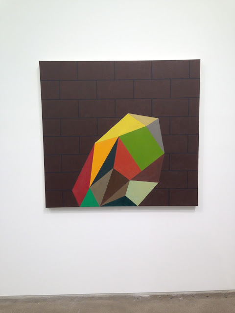
Jacob Wrestling With The Angel, 1980, as seen in Jew York, at Zach Feuer Gallery, image via Joshua Abelow’s Art Blog Art Blog. Which I had never seen.
On James Bridle At The Corcoran
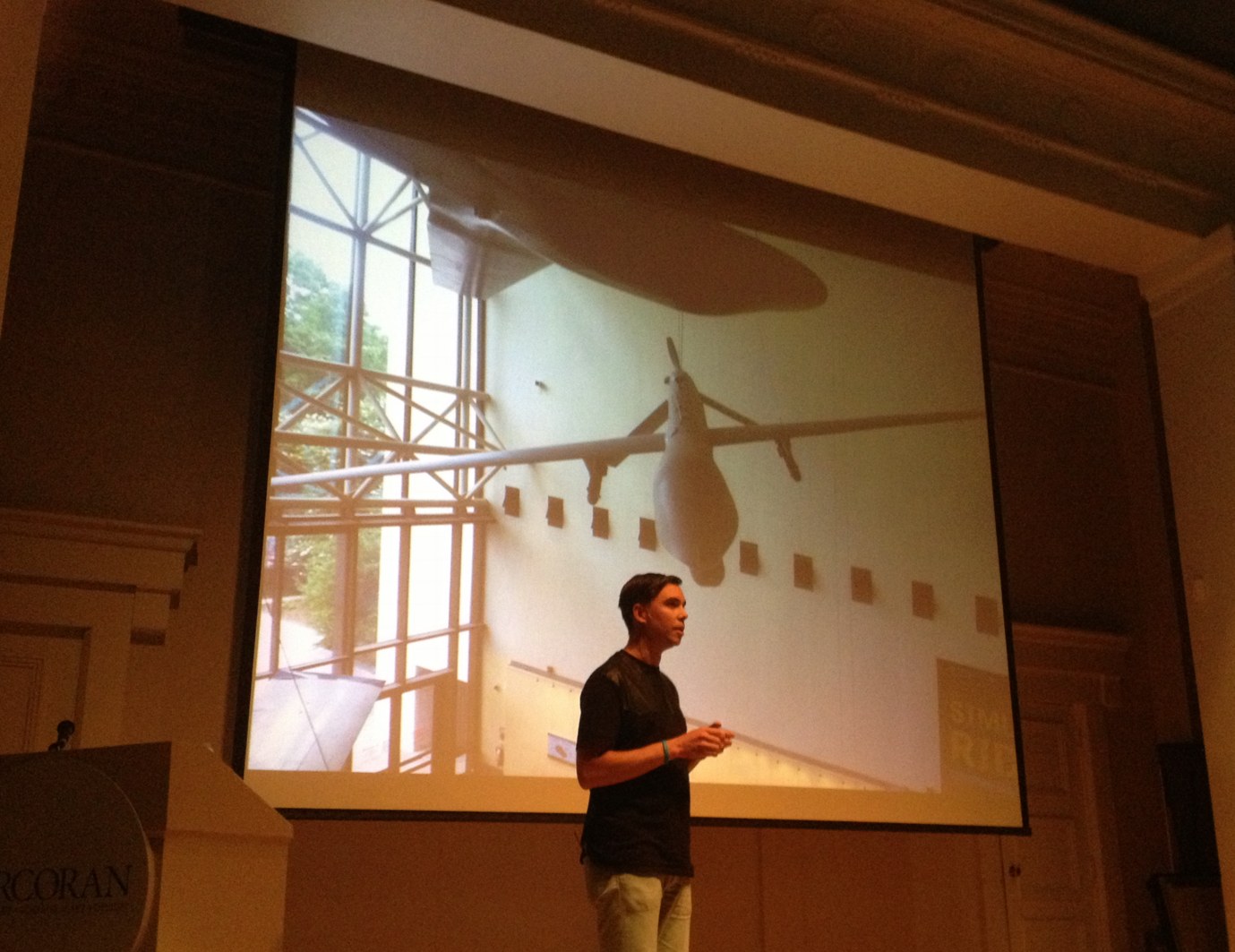
James Bridle of the New Aesthetic and Dronestagram Bridles opened a show at the Corcoran this evening, and I attended. It was the first time James and I have met in person, after several years of blogging at each other.
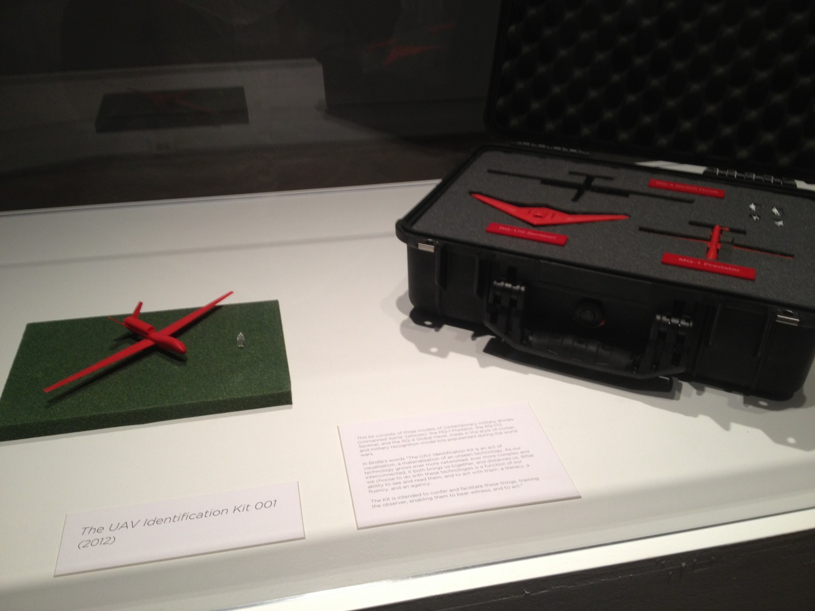
The show itself is small and drone-centric, containing a grid of Dronestagram images and Google Map dronespottings, but also video, a 10-volume printed excerpt of a UAV-related webcrawling database project in development, and Bridle’s classic drone identification kit [below].
The most stunning and disturbing image in the show is a realization Bridle made of the “Light of God,” a nightvision goggle-eye view of a targetting laser descending from the heavens. It’s based on a drone pilot’s commentary in an Omer Fast video, and it’s gorgeous, eerie, and chilling as hell.
During his talk in the adjacent auditorium, Bridle began by mentioning how he is compelled to make physical the things he studies. His most powerful piece, the life-sized outline of a drone drawn on the ground, is an excellent example of this.
In answer to one of the last questions, about materialist formalist dialectic, Bridle noted how he often found himself making an object of something from the network, in order to photograph it and reinsert it into the network. The Corcoran show feels like this: a physical instantiation of digital content.
The idea for the show, or particularly, for Bridle to be the go-to guy for such a show, more than just The New Aesthetic Guy, but certainly that, came from the Corcoran’s IT department, said the curator who introduced the evening. I will choose to take this as evidence of the Corcoran’s cross-disciplinary innovation and flat organization, not as a sign of a vacuum at the top of the institution. Anyway, the whole affair seems closely linked to the school side of the Corcoran, i.e., the still-functional side. The crowd was crowded, and felt student-heavy.
Anyway, James Bridle. Bridle noted that we in Washington are lucky to have a real Predator drone in our midst, right there at Air & Space Museum. It is exceedingly rare, he said, and he would know, to be able to be in the presence of an actual drone. They’re either largely invisible, or they’re bearing down on your village. And there’s one hanging on the Mall.
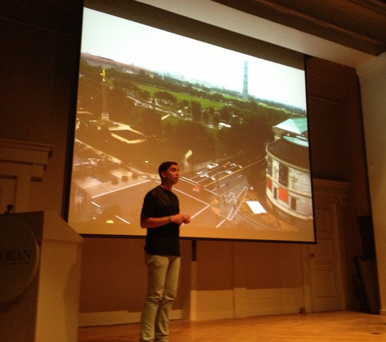
And now there is the shadow of one, the outline of one, really on the sculpture pad of the Corcoran. That’s how it’s described, as being sited on the sculpture pad. Obviously, it doesn’t begin to fit on the sculpture pad. It’s painted on the pad, the rocks, the curb and sidewalk, with white paint of some no doubt temporary kind.
It is much bigger than you might imagine, which is exactly the point. That, and imagining it being overhead and casting a shadow on the ground, the thing a Pakistani wedding party might see right before the missile hits.
Bridle noted as to how not many people will get to see this privileged view from above. I would note that White House staff in the Eisenhower Old Executive Office Building will get to see it every day, and that right there is quite something.
But he’s right, and it underscores his point, that the drone outline reads quite differently from the ground. It’s not Nazca Lines different, but that’s the sense of it.
I asked James later how he’d decided which way to point the drone. There was really only one good way to fit it, he said, and also, he knew he didn’t want to aim it at the White House. Which is understandable. When he installed his first drone drawing in Istanbul, Bridle similarly made sure not to aim the drone at Mecca. In consciously not aiming at the White House, Bridle’s drone ends up feeling like it’s coming directly from the White House. Which probably intensifies its critical position a bit. It worked for me, at least.
In between these moments was a cogent, timely, and depressing talk about technology as a tool of control and a reflection of the political and social systems that foster and use it. If it was recorded or streamed, I will try to find a link.
Meanwhile, as I walked around the drone on my way home, I did think of one piece missing. Not to tell James how to do his job or anything. But it occurs to me that the sound of drones is distinctive and terrifying. Perhaps a sound element to recreate the perpetual presence of drones in the vicinity of the Corcoran, would provide a visceral experience. Who knows, it might even wake the neighbors.
Indeed: Corcoran College of Art & Design: Quiet Disposition by James Bridle, through July 7, 2013 [corcoran.edu]
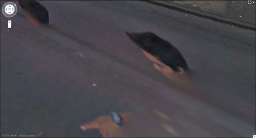
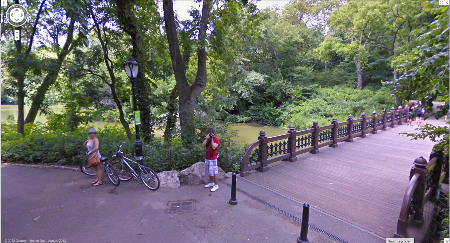
Man With A Pano Camera
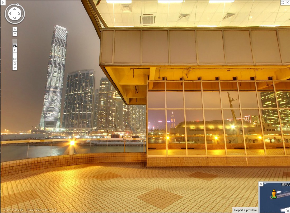
Yesterday @MattBucher noticed this uncommon night-time imagery on Google Street View of Victoria Harbour in Hong Kong. It’s the promenade on top of the China Ferry Terminal, on the west side of Tsim Sha Tsui in Kowloon.
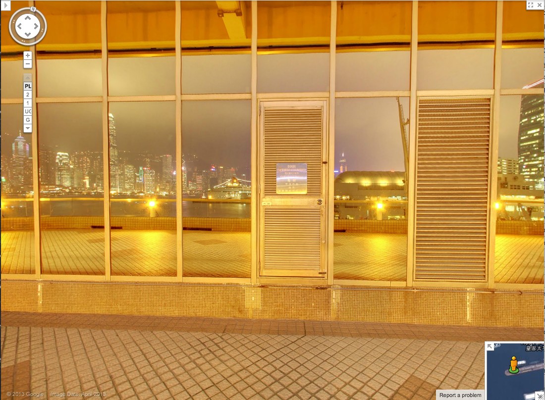
As I do, I immediately began looking for Street View’s evidence of itself: the distortions where panoramas are stitched together, and the traces of the photographers who make it. It’s information Google is apparently just as interested in eliminating. The promenade includes three mirrored buildings, but every pano is perfectly sited to exclude the Google cameraman. Whether selfies are considered distracting, extraneous, or just undesirable, Google is trying not to photobomb itself.
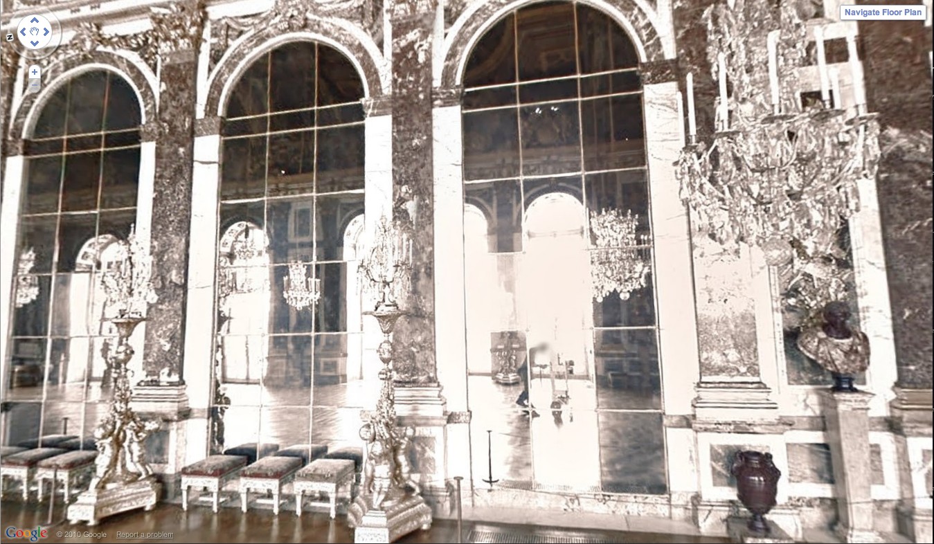
At least not anymore. Remember back in 2011 when the Google Art Project launched, and we got a little glimpse of the camera operator pushing his cart carefully through the Hall of Mirrors at Versailles? That feature has been eliminated.
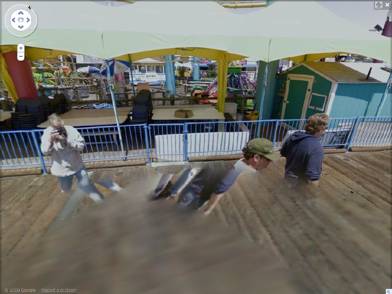
And when Google Trike was first tested four years ago on the Santa Monica Pier, its handlers not only appeared on camera repeatedly [including one pano, since removed, where they posed as civilians and flashed the peace sign], it also attracted attention.
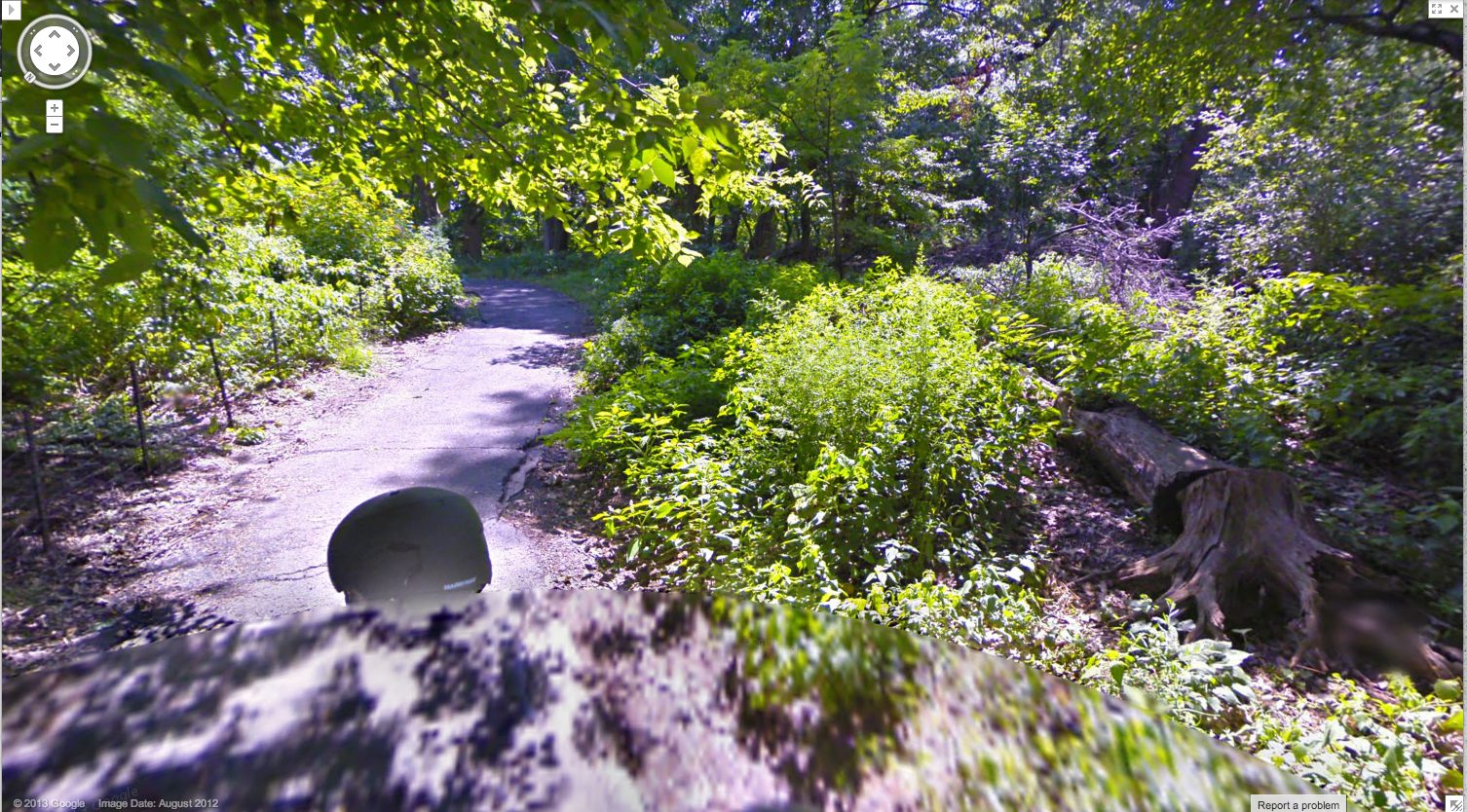
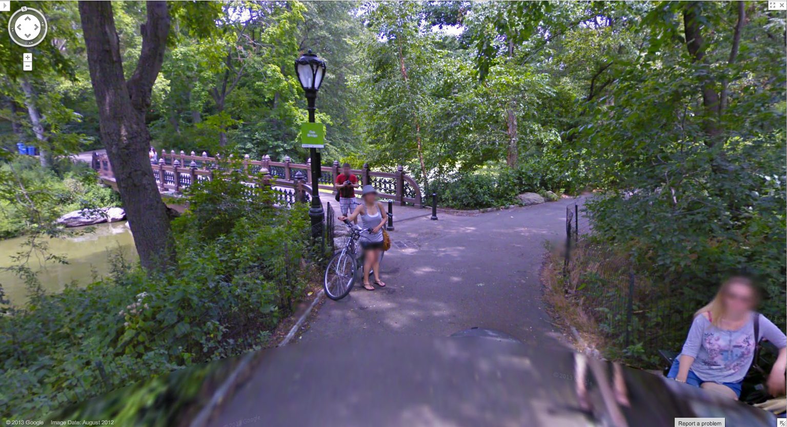
As recently as last summer, this was still the case. Here are some screencaps from a Google Trike expedition in Central Park, which someone linked to just last week. [here’s an Engadget story.] I couldn’t see any evidence of an attendant, like the guy I dubbed Walking Man, who appeared in almost every pano of the Google Trike’s first European outing, scanning the Binnenhof, the Dutch Parliament, in the Summer of 2009. But there were the occasional shots of the back of the Trike driver’s head.
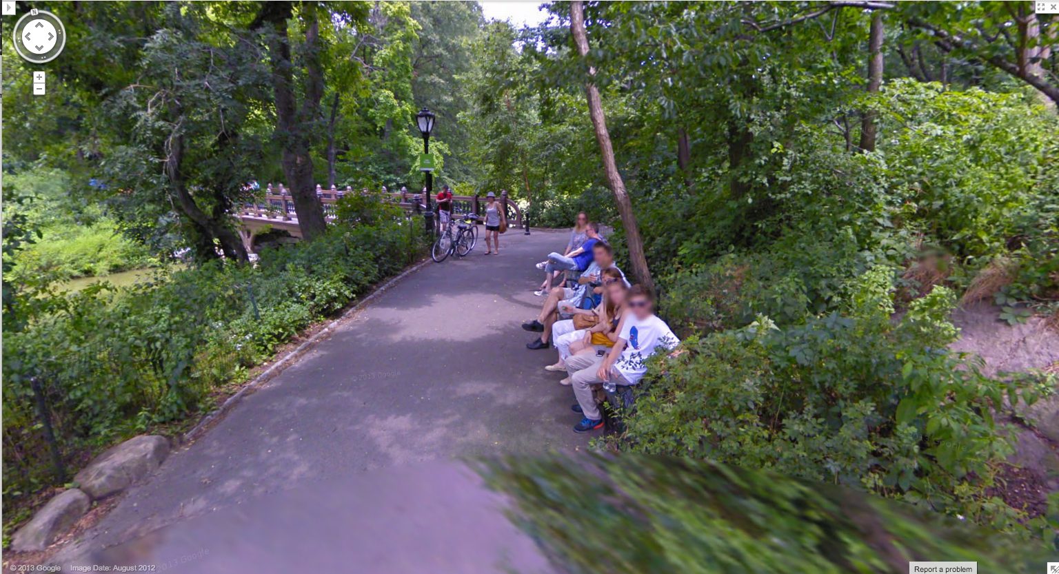
I love this sequence, partly because it’s an actual moment in time, a person–the driver–moving through space. It’s a narrative, and a narrative of its own making. And that upsets the usual assumptions of Street View, in which the user internalizes the camera’s eye as his own.
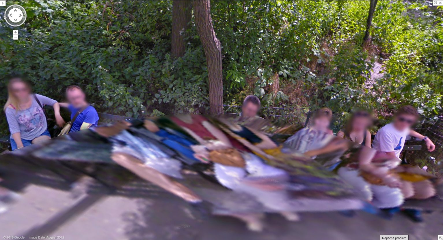
Plus, I just like the cubistic pano distortion aesthetic. I’ve grown accustomed to GSV’s blurred face.
And as you can see here, the Google Trike and the camera are a recognizable feature now. A tourist attraction, even. That gets covered in the local news.
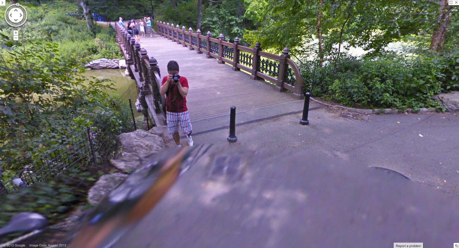
These people have probably been waiting months to see if/when their pictures show up on Street View.
Yes, well, that’s how Google used to do things. Those days may be numbered, and these images may soon be out of date, totally 2012. These Hong Kong panos were taken in April 2013, just weeks ago, and now they’re live. Not only has the processing time been shortened, but the stitching quality has improved significantly. There is a new Street View aesthetic, and it is the ghost. We have become the blur. Google Spirit View.
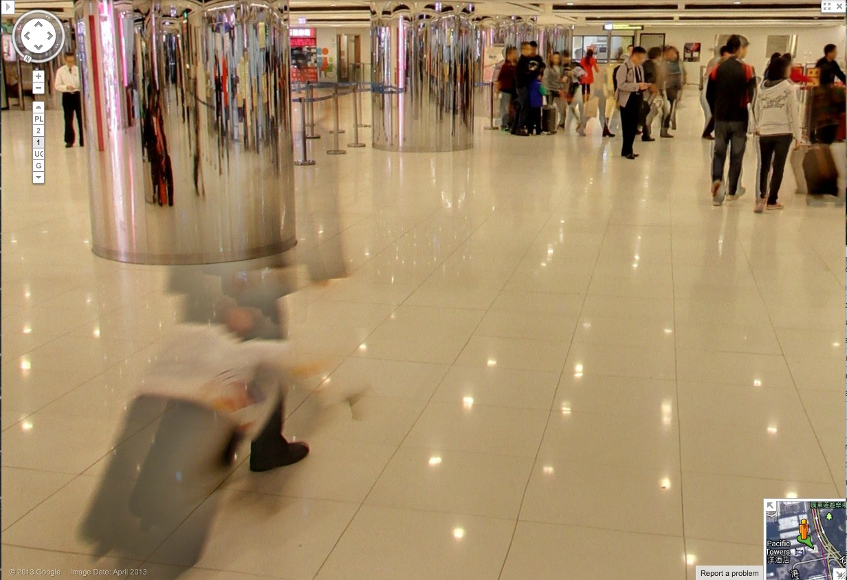
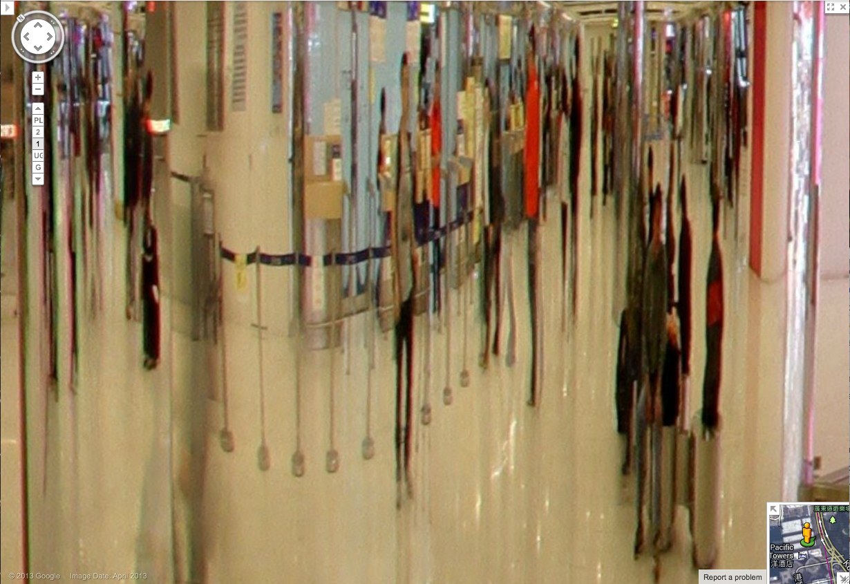
Check out this guy and his wheelie, almost gone. Also, it should be mentioned, these are interior panos, Google Art Project Everywhere. The Hall of Mirrors of the 21st century is a panoptic Kowloon ferry terminal/outlet mall with an LED grid reflected in the polished stone floor.
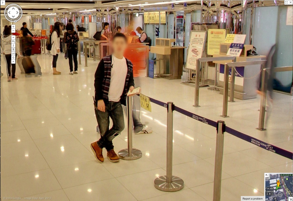
So compare the classic GSV civilian, face blurred, with the guy behind him–see him there, in his ASICS? His red jacket is just a haze through which the camera now neatly interprets the check-in counter further back.
Spin around 180-degrees in this 1st floor pano, and the guy in red shows up more clearly reflected in the mirrored column. And in the mirror we also see someone who wasn’t there: the guy in the center, with the grey t-shirt and backpack. With a faint tripod visible in front of him. This is the Google Cameraman. His camera is the small black box above his head. Static but portable. [I love these attenuated, Giacometti-esque figures, btw. So first instant of perception.]
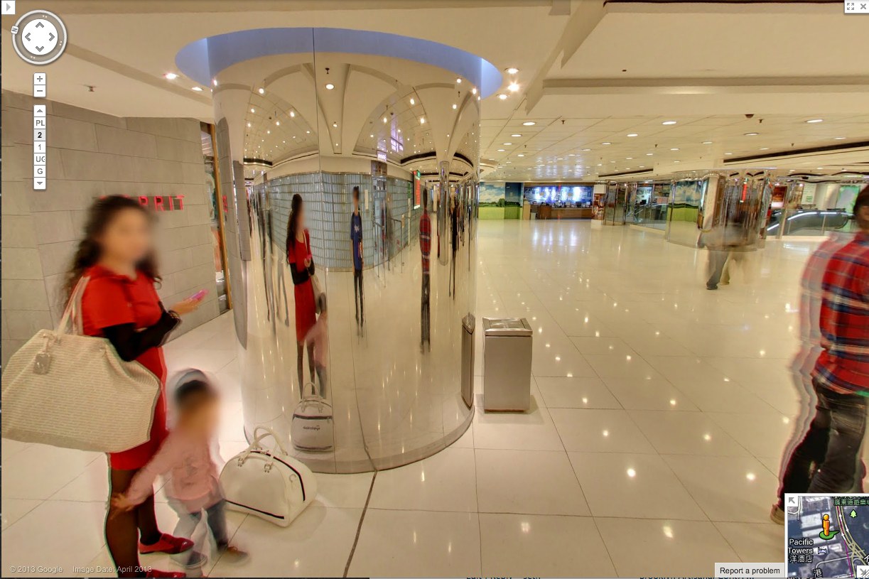
And here’s another one, from a less crowded shot on the 2nd floor. First admire the nice blur motion on the guy to the right. Then note the guy who doesn’t show up in the pano, except in reflection.
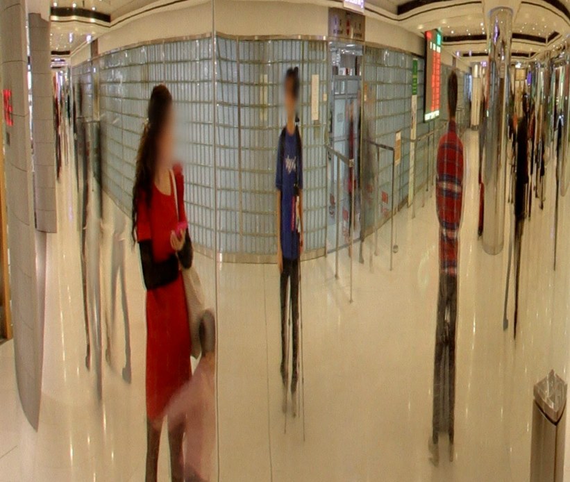
His superthin tripod does seem to have attracted the attention of the mom on the left, but no one else. They’re looking at each other as he shoots. His blue T-shirt says elgooG.
Is there a Street View equivalent of Moore’s Law? Because Google’s scanning setup is getting smaller, lighter, and more invisible, and their data turnaround time is dropping. It is now easy to see the convergence of Google Street View and Google Glass, where all the Google-powered devices we wear, carry, and use relay information back to the Server in real time. We will be Google Drones surveilling ourselves and each other within a few years, and most people won’t even notice it.
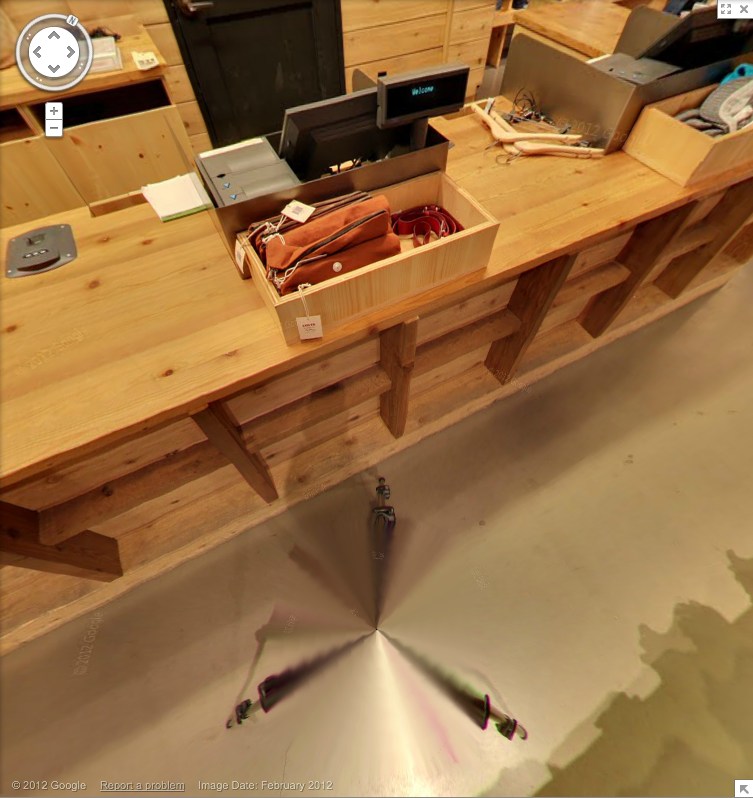
Levi’s Street View
Whether the uncanny valley is the right metaphor, or seeing a dog walking, something still feels weird about seeing store interiors on Google Street View. I’m sure that’ll change, and one day we’ll all be holoshopping without ever leaving our pods, our purchases delivered by robot Google vans, and people will struggle to remember the last time they even looked at the Street View part of Street View, much less actually went anywhere.

But that day is not yet. And the workings of Store View are still odd and/or unknown, and thus interesting. For example, here is the Levi’s store on West 34th St, tweeted by @ManBartlett.
Maybe the making of is interesting only in contrast to the entire concept of a surfable depopulated chain store filled with mountains of indistinguishable jeans. Or is it just me? Can you barely contain your excitement for the day when you can virtually fall into all 5,000 Gaps?
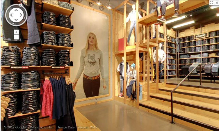
Anyway, let’s look around. They have image date now [Feb. 2012]. Is that new? Obviously, with high merchandise turnover, you’d want to keep that relatively fresh. Store View will become just one more monthly/seasonal expense for a retailer. I see they don’t blur the faces of either the models or the mannequins. It’d be kind of cooler if they did. Even ironically?
Or better if the Street View blur turned up in someone’s IRL in-store/ad campaign. Oh, damn, there’s your pitch right there, creative director: some street style photoblogger is “captured” at work by the GSV car. A Street [View] style blog. BAM. Embed those shoots all over town. A viral bonanza.
Look at me, revolutionizing advertising when I’m supposed to be reviewing pano stitching algorithms. These panos sure are distortion-free. A major advance? The benefit of shooting undisturbed in ideal conditions? Hey, what’s that at the bottom of the picture up there? A tripod leg.
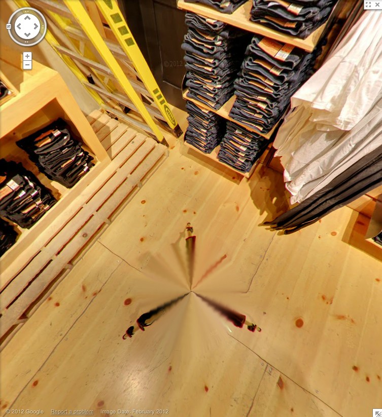
And here’s the whole, stitched thing. That is very nice. Here it is again, this time with a shadow.
This is not a camera on wheels. It’s on the tripod, single vantage point for every pano, operator out of the way. That’s why there are no distortions. And the only evidence of the process is the legs.
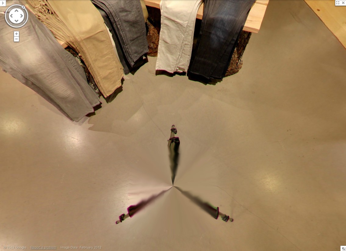
Which, again, are rather nice. Kind of kaleidoscopic, with a blend of in-focus tips and blurry legs. Soon enough, these Matrix deja vu cat-level distortions will disappear, and the differences between real and virtual will be mistaken for mist, or heat waves rising from the sidewalk.
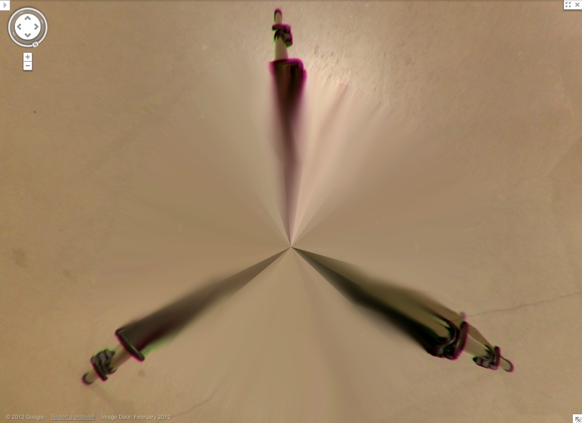
Zooming right into Grotjahn country here. This is sweet. Looks like this pano sphere has maybe 48 slices, each 7.5 degrees? In satelloonmaking, they’re called gores. What do they call them in panoramic photos?
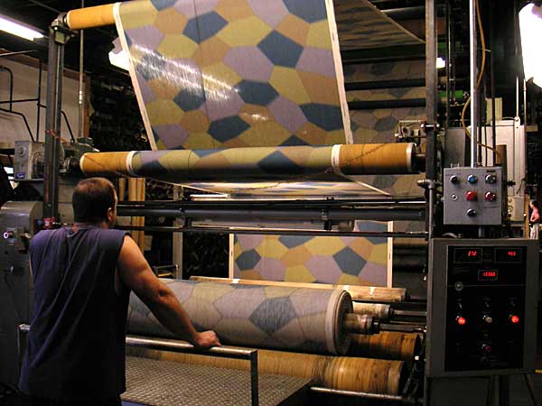
Lozenge Camo Stoffbilder

Will the wonders of WWI-era camo never cease? The Wary Meyerses have an awesome post about early German & Austrian Lozenge Camo, which was used primarily for airplanes. An asymmetrical polygon pattern was printed onto aeronautic linen, which comprised the body skin of early bi-planes. Colors were keyed to the viewing perspective: lighter lozenges were used on underside of the plane, to blend with the sky, while darker colors were meant to blend with the ground when viewed from above. There was also a night-time colorway.
First let’s get the adorable synchronicity between German fighter plane camo and Dutch Google Map camo out of the way right now. Noted and appreciated.
Now let’s ask the obvious question: fabric? Where can I get some? Because obviously, it should be made into Blinky Palermo-style Stoffbilder, Fabric Paintings [as seen below at the Kunstverein Düsseldorf in 2008]:
And the not-as-immediately-obvious answer: Vintage Aero Fabrics of Bardstown, Kentucky, where Ross Walton produces historically accurate–and FAA-certificated–lozenge camo fabric for the vintage plane restoration community using authentic Belgian linen and original production techniques.
Flight of the Lozenges [warymeyers]