‘Photography Is A Form Of Art.’

One of my main points in putting out books of documents from the Cariou v. Prince case is to pull the extraordinary language and logic and concepts of the judicial world into the discussion of art. These are worlds that don’t intersect very much, or very publicly, and that have their own highly distinct modes of discussion and analysis. So there are moments of real discovery and wonder when they are forced together.
Like this definition of photography as art, presented in a footnote [p.15] for the amicus brief filed in support of Cariou by a group of eight professional photography and licensing associations, including American Photographic Artists, and for some reason, Brooklyn freelance photographer Jeremy Sparig:

10 Photography is a form of art. Declaration of Jeremy Sparig, dated Dec. 16, 2013 (“Sparig Decl.”), at 9. As an art, it has two expressive components: 1) the empirical fact of the moment; and 2) the contextual decisions made by the photographer. Id. at 10. Together these comprise the artistic creation of a photographer. When a photograph is appropriated, the entire aesthetic creation of the original artist is taken. Minimal alteration of an appropriated photograph, does not transform the original work. Painting and photography are substantial similar aesthetic presentations. Id. at 11. (“Both photos and paintings use shape, form, color (or its absence), lines, light and dark, objects and symbols and subjects, to create a space for the production of meaning. ‘The signifying system of photography, like that of classical painting, at once depicts a scene and a gaze of the spectator, an object and a viewing subject… Through the agency of the frame the world is organized into a coherence which it actually lacks, into a parade of tableaux, a succession of decisive moments.'” Id. at Ex. 2. A photograph, minimally altered, presented as a painting must be subject to visual comparison as the basis for a “reasonable purpose” test. Otherwise, photographers have no effective remedy at law, if the appropriator can simply rationalize his presentation.

Yes, well. When you put it that way. When you put it that way, you can see how narrow this characterization of photography is within the realm of photography itself, but also have vast the gap is between the sorts of issues and concerns of this niche of photographers and those of contemporary artists who use or engage photography.

Programming The Tiananmen Big Screens

diaping_sunrise_chinafotopress_getty.jpg
image from this week, via chinafotopress/getty
The eerie photo of the sunrise on a Beijing flatscreen cutting through the smog has been making the rounds lately, but it turns out it’s nothing new. The giant screen is one of a double-sided pair installed in the very center of TIananmen Square in 2009, for the 60th anniversary of the PRC.
daping_tiananmen_bluesky_jan2013.jpg
image from the last time the Beijing smog was this bad, Jan. 2013
They flank the Monument of the People’s Heroes in the center of the Square, in line with the Great Hall of the People. From what I can tell, they’re around 42 meters long, and maybe 4-5 meters tall. They typically show tourist info from Beijing and the provinces of China–places not as smoggy as the capital–as well as party and military propaganda: Glorious provinces, beautiful Nature, happy ethnic minorities, thriving Industry They’re the updated, officialized equivalent of Kodak’s Colorama billboard in Grand Central Station, [which were 18×60 feet, and changed weekly.]
daping_beijing_therealjimbot.jpg
image via therealjimbot’s flickr stream
One amazing aspect of them is their sheer, permanent presence, in the heart of the most symbolically important space in China. Each screen is comparable in scale [except in thickness, obv] and street-level experience to Richard Serra’s Tilted Arc. Doubled.
glamorous_beijing_worcep_69189273.jpg
“The Glamorous Beijing,” image via worcep on panoramio
Of course, Serra’s work doesn’t have content or subject beyond itself, its mass, shape, and volumes, and the spatial conditions it creates. The Tiananmen Big Screens, 天安门大屏, [Tiananmen Da Ping, I think] have all this, plus the content as determined by the Party. Which can be beautiful or banal or informative or, as someone on Twitter put it, “eerie and sadistic.” They give the provinces a prominent presence in the symbolic heart of Chinese political power. Which, for all their size, or maybe because of it, the screens can’t escape their context. Or the weather.
Anyway, the screens are so prominent, I wonder if anyone’s tried to hack them as a protest. Or to turn them into a photoshop meme on weibo or wherever. I don’t have the search ability to find out just now.

looks like Marlboro Men at 1:05
What would be more interesting, though, is getting some kind of public art on there. Sort of the Beijing equivalent of the 59th Minute in Times Square. Which, am I reading this right? Does this site say that the Shun Civic Media Company Ltd books commercial space on the screens for Y240mm/year? Yes, there are 525,600 minutes in a year, but let’s imagine that just a third of them are viable. That’s still only around $225/minute. That cannot be right. On the other hand, wouldn’t be more awesome to program them at off hours? Maybe no one sees it but the security guards and phonecammers.
What would you put there? What could you put there? Would the hoops of Party approval be too hard for worthwhile content to make it through? Maybe the way to enter them is by working with a particularly sophisticated province? Maybe we should do some dry runs by projecting onto some Richard Serra sculptures in the mean time.

On Tobias Rehberger On Bridget Riley

rehberger_jfmueller_uhrenobjekt.jpg
I hadn’t heard of this before. The Art Newspaper and several German sources report that a Bridget Riley and Tobias Rehberger have come to an agreement in a plagiarism lawsuit Riley brought last year in a Berlin court.
Riley had demanded that Rehberger’s work, Uhrenobjekt/Watch Object installed in the new National Library Unter den Linden, be removed because it copied her foundational 1961 painting, Movement in Squares. Last Spring, the court denied Riley’s removal request, but ordered the Uhrenobjekt covered until the plagiarism issue was resolved.
It was, and now the work will go back on view, with a new title, Uhrenobjekt nach Movement in Squares von Bridget Riley (Watch Object after Movement in Squares by Bridget Riley). This seems pretty reasonable. I hope Riley’s cool with it. I know she’s had to deal with knockoff/transformations of her paintings by the fashion industry since the beginning. The story of MoMA’s Bill Weitz and Larry Aldrich deciding on their own it’d be awesome to make Riley-inspired dresses timed for the 1965 show, “The Responsive Eye” is a must-read. Story of her life.
So I was kind of fascinated as to what Rehberger’s original idea for his piece was. Was it actually “from” Riley’s work, or did it just happen to look like it? Wouldn’t it be weird to namecheck her if her work hadn’t been part of the process somehow? News reports don’t give any details about arguments made by either side. Most German reports from the initial phase of the suit are sympathetic to the hometown boy, like this Tage Spiegel article, and include a list of the specific differences between Riley’s and Rehberger’s Op Art grids, and lay out a random list of examples of painters borrowing and copying motifs through history. I’d say that the German interpretation of the case is that Rehberger “won.”
riley_movements_square_nmliverpool.jpg
Bridget Riley in front of Movement in Squares, 1961, image: nml
Again, though, what was his point in making this object? It can’t be that he didn’t know of Riley’s painting; he’s been soaking in Op for a long time, and Movement in Squares is Riley’s foundational Op Art work, the one she credits with setting her on her geometric, optically invigorating, abstract path. It went into the Arts Council’s collection almost immediately, and has been in tons of Riley shows and catalogues. [Amusingly enough, it takes a bit of effort to find actual pictures of the painting itself, something that doesn’t look like a pattern. This may be a feature/weakness of Op Art, it’s ready transformation into pattern and image. But never mind, here’s a 2009 photo from the National Museums, Liverpool of the artist standing in front of her painting. It’s 4×4 feet square, tempera on hardboard, a very human scale and presence.]
rehberger_staatsbiblio_side_jfmueller.jpg
Both images of the Rare Book Room of the National Library by JF Mueller, via detail.de
So turning back the clock, I found this preview of the Staatsbibliothek project from the German architecture site Detail. The optical pattern is flipped, obviously, but more than that, the physical aspect of Rehberger’s Uhrenobjekt is quite different: it’s rectangular, fit to the doorway. And it’s thick. Architectural. And it’s way up the wall, and super-shiny. The text describes it as “an interpretation of” Movement in Squares with “partly illuminated areas that show time in an unconventional way.” So yes, it’s an acknowledged interpretation whose main feature is apparently to be a reflective surface for the play of light over the day. Which is not irrelevant, because determining plagiarism vs interpretation/transformation/whatever the German equivalent of fair use is, brings the whole host of differences between the works and their context into play. And then there’s the fundamental distinction between Objekt and Bild, object and picture, and all that entails.
Agreement reached in plagiarism row between artists [TAN via @artnet]
Huh? What’s that? Die große Karo-Frage [berliner-zeitung.de]
Previously, super-related: The Trendmaking Eye

On Googling Richard Hamilton’s Maps of Palestine


I was looking around for something on Richard Hamilton this morning, when I Googled across a 2010 discussion between the artist and the human rights architect Eyal Weizman at Map Marathon, one of the Serpentine Gallery’s Marathon series. It was rather compelling for several reasons.
For one thing, their discussion of the political power of maps was frank and vivid in a way that I’m unaccustomed to in US media or art world forums. They talked specifically of Palestine & Israel, but I quickly took down two quotes that seemed very relevant to, of all things, Google:

the “double crime of colonialism is to colonize and to erase its own tracks” -Eyal Weizman paraphrasing Edward Said.
“All maps of a political kind have nothing to do with the people who occupy the territory being mapped.” -Richard Hamilton.

walking_man_pointing.jpg
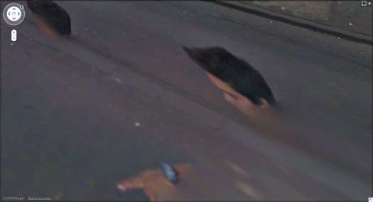
These both reminded me of Google Maps’ tendency I find so eerie, of Street View cameras and car/trikes to be erased from the panoramas. It turned out at the same time of Map Marathon, I had been working on this Walking Man project, where I followed the Google Trike through The Hague, its European debut, and collected the disembodied portrait fragments of the guy–who turned out to be a Google employee–walking alongside the entire trip.
It would have seemed a bit extreme at the time, but now it feels depressingly plausible, even urgent, to consider Google and its pervasive data collection as a political force and as a surveillance agent. Whatever the benefits of Google Maps–and they are real–we are still in the dark about just how transparent our information is, and how opaque the implications of Google’s deep information structure is. And we won’t know, and we won’t have open, informed debates and political discussion of it until our entire cultural landscape has been transformed by the company. And maybe not even then.
hamilton_palestine_2.jpg
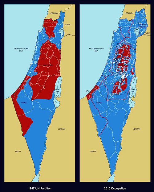
Richard Hamilton,Maps of Palestine, 2010
So this is what’s going through my head as Hamilton and Weizman discuss the artist’s contribution to the show, Maps of Palestine (2010), above. It was a pair of maps from 1947, and 2010, showing the shifts in political control between Israel and Palestine. It basically shows the impact of Israeli military retaliation in 1967 and subsequent settlement activity in occupied territory, and it appears to challenge the practicality of a two-state solution. [Indeed Weizman, upon whose groundbreaking crowdsourced mapping and analysis the newer map is based, believes only a one-state solution is feasible now, and that everyone’s just going to have to figure out how to get along. That’s a dark optimism of a sort, I guess.]
And then I start wondering, what, exactly, are these maps like? I mean, what did Hamilton actually make and show? Unsurprisingly, almost no one seemed able to talk about the maps as images or as objects; some people called them/it paintings, but nearly all the discussion was around their content and its meaning. Adrian Searle wrote about the Maps in The Guardian in the context of Hamilton’s art historical career and extensive political engagement. When a 4-map variation of Maps of Palestine was included in 4th Moscow Biennale, not only was there no image, or dimensions, the title and the very subject have been omitted. In the opening’s press announcement, director Peter Weibel stated, rather amazingly,

There will be quite a few so-called political works at the exhibition. For example, Gerhard Richter’s painting is not just a painting, it also refers to 09/11, and the piece by Richard Hamilton does not just show us a map of Israel, but it asks us questions about war.

Credit lines are a continuation of occupation by other means.
hamilton_palestine_4maps_moscow_700.jpg
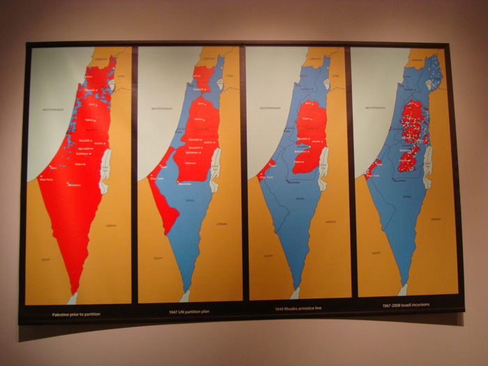
Maps of Palestine, 2011, 4th Moscow Biennale
see full-size img in Al-Madani’s flickr stream

The only image I can find online of the Moscow Maps is from flickr user Al-Madani, and it’s the first to show the work as a physical object. It curls up on the lower corners: an unmounted print of some kind.
It’s only after turning up Rachel Cooke’s interview with Hamilton in advance of his Serpentine show, “Modern Moral Matters,” which coincided with the Map Marathon, that I get my answer. Cooke’s entire anecdote is kind of golden, though:

Hamilton hands me a colour copy of a piece of new work that will hang at the Serpentine. It is a political piece, and consists of two maps: one of Israel/Palestine in 1947, one of Israel/Palestine in 2010, the point being that, in the second map, Palestine has shrunk to the size of a cornflake. I hold the image in my hands, and give it the attention befitting a new work by an artist of Hamilton’s reputation. In other words, I look at it very closely, and I notice something: on these maps Israel has been spelt ‘Isreal’. Slowly, my cogs turn. Hamilton loves wordplay. One of my favourite pieces of his is a certain iconic French ashtray subtly tweaked so that it says, not “Ricard”, but “Richard”. So presumably this, too, is a pun. But what does it mean? Is-real? Hmm. This must be a comment on the country’s controversial birth. Either that, or he wishes to suggest that the Israel-Palestine conflict is a nightmare – can it be real? – from which we will one day wake up. How clever.
“So what are you up to here?” I ask. “Why have you spelled Israel like this?”
Hamilton peers first at me then at the image. “How is it spelled?” he asks. I tell him how the word should be spelled and how he has spelled it.
There is a small silence. “Oh, dear,” says Hamilton. Rita Donagh gets up from her seat and comes round to look at the image over my shoulder. “Oh, dear,” she says. The misspelling is, it seems, just that: a mistake. It’s my turn now. “Oh, dear,” I say. “I’m so … sorry.” My cheeks are hot. Hamilton looks crestfallen. Donagh looks worried. “Can you change it?” I say, thinking that Hamilton works a lot with computers these days. “Not very easily,” he says. Oh, God. On the nerve-wracking eve of his new, big show, I have just told the 88-year old father of pop art that there is a mistake in one of his prints (this one is an inkjet solvent print). Why? Why did I do this? And how on earth will our conversation recover?
After a moment of perplexity, though, Hamilton starts to laugh. “Oh, well!” he says. “I’m sure there’s some way of sorting it out. Not to worry!”

So there we have it. Inkjet print. And from the image published above, it appears they reprinted it with the correct spelling. If only all the Israeli-Palestinian mapping problems could be resolved so quickly.
Also, I wonder if these maps will turn up in Hamilton’s Tate retrospective next month. UPDATE: YES IT WILL. [thanks to Tate Modern’s curators and communications folks for the update]
Map Marathon: Richard Hamilton & Eyal Weizman – Political Plastic [vimeo]
Map Marathon – 2010 [serpentinegalleries.org]
Modern Moral Matters | Richard Hamilton [serpentinegallery.org]
Richard Hamilton: A masterclass from the father of pop art [theguardian]

On Schwendener On Richard Serra & Public Art

I’m pleased to see some actual critical response to Richard Serra’s sculptures, and Martha Schwendener is more right than wrong in her review of Serra’s latest shows at Gagosian. But this retelling of the Tilted Arc controversy is based on several faulty premises that are amply documented and refuted in the written record of the case.

It’s hard to approach Mr. Serra’s sculptures without some kind of baggage. There is, of course, the unfortunate 1989 “Tilted Arc” episode, in which that commissioned sculpture by Mr. Serra was removed from Federal Plaza in Lower Manhattan after complaints from neighbors and workers that it impinged on their use of Foley Square. In the aftermath of that fiasco, rather than fighting for the rights of artists creating public sculpture, Mr. Serra’s response was to make abstract drawings with puerile titles like “The United States Government Destroys Art” and “No Mandatory Patriotism,” both from 1989.
When exhibited at the Metropolitan Museum of Art in 2011, these drawings seemed only to iterate Mr. Serra’s myopic misunderstanding of art in the public realm. As the art historian Leo Steinberg put it, the space of Federal Plaza was Serra’s “raw material, but there are a thousand people working there, so this is not raw material but the space of their existence.”

The campaign against Tilted Arc was started by a judge in the building, and it became an ascendant conservative rally that pulled in the likes of Rudy Giuliani. Public opinion, even the opinion of the workers in the Federal Building was not opposed to the sculpture. The commission assembled to judge the work’s fate was stacked, and its recommendations went against the evidence it assembled.
What I bristle against most, I suppose, is Schwendener’s idea that Serra did not “fight for the rights of artists creating public sculpture.” That is exactly what he did when he sued the GSA to stop the removal of the work, and to declare it destroyed when it was removed. In the legal context of the time, this was, unfortunately, the most that could be done.

Of all artists, Serra has pushed the hardest for the primacy and autonomy of the artist’s vision. His take-it-or-leave-it stand is certainly annoying and abrasive to some people, but it is principled, and it is at the core of his practice, and apparently, his personality. He’s not a collaborative guy. He’s not a compromiser. He compared Robert Venturi’s plan for Pennsylvania Avenue to the Nazis. He walked out on Helmut Kohl and removed his name from the Berlin Holocaust Memorial rather than take the chancellor’s suggestions. [Schwendener mentions the memorial in her review, but ignores Serra’s involvement.] He apparently walked out on Steve Ratner when asked to pitch for a Hudson Yards public art project.

It may very well be the case that Serra is unsuited for public art and the political rigamarole that it requires. But he wasn’t poisoning the well so much as pissing on a reactionary fire that had already been lit during the Reagan Era. If such non-accommodationism is damaging to artists’ prospects for making public art, then maybe we should consider the processes by which public art comes to be. Maybe the gargantuan spatial spectacles Serra produces now really are optimized for private consumption, the single decisionmaker, the big checkwriter. But whatever Serra’s faults, the public art ecosystem in the US has rarely produced works that command such a spirited defense as Tilted Arc received back in the day.

Previously:
On those “Revenge Drawings”: Richard Serra was not pleased with the US Government
Serra interview from 1982: And I AM. An American Sculptor.
You really should have The Destruction of Tilted Arc: Documents, the 1990 compendium of material from the case [amazon]

‘A House For Art’: On Saving The Folk Art Museum

moma_dsr_art_bay_rendering.jpg
Big news, negative reactions, but very few surprises. MoMA announced today that the American Folk Art Museum building would be demolished after all, as part of an expansion & reconfiguration project connecting the current Taniguchi building to galleries in the base of the Jean Nouvel tower set to rise to the west. No one could honestly have believed that Diller Scofidio + Renfro had been brought into the controversial situation to do anything other than provide expert architectural cover for a decision that had been made long, long before.
DS+R also brought some necessary conversation changers, architectural features that would allow The Modern to proceed in a constructive, rather than a purely destructive context. Everyone and their dog has weighed in tonight on the few renderings of MoMA’s plans, so I’ll skip most of that. Except to say that Diller’s proposal for the AFAM site, an entry/gallery open to the street, and a performance space on top, neatly renders the volume of the demolished building in the negative. It’s like a ghost space of the structure that was once there. That design solution has a certain morbid integrity.
And I will note what others haven’t, that one of the changes DS+R have proposed is not just “an architecturally significant staircase,” as Jerry Saltz dismissively called it, but an extension to an architecturally significant staircase: the Museum is planning to continue the iconic Bauhaus Staircase, which connects the 2nd and 3rd floor galleries, all the way down to the Titus 1 and 2 movie theaters. As a longtime member of the Film Department’s Trustees Committee, I suppose I should know more about how this will impact the presence and experience of film at the Museum. I’ll look into it.
[Probably a disclosure, or at least a heads up: I was co-chair of the Modern’s Junior Associates for many years, and helped raise money for the 2004 capital campaign. My own association with the Museum has been long and deep and deeply rewarding, even though I’ve never had the resources to donate trajectory-changing amounts of money. I’m glad for the relationships and engagement with folks all through the Museum, and I won’t pretend that I have any juice, or inside knowledge of the Museum’s capital and construction plans.
bunshaft_travertinse_house_esto.jpg
Travertine House, 1963, Gordon Bunshaft, image: Ezra Stoller/ESTO via archnewsnow
I have purposely steered clear of the Folk Art Museum issue over the last couple of years, in part because I remember some impassioned discussions over the Museum’s sale of Gordon Bunshaft’s modernist house in East Hampton around the time Martha Stewart gutted it and flipped it to Donald Maharam. The Museum makes a clear distinction about what enters the collection, and the curatorial process by which it happens. In this regard, Bunshaft’s house, which was willed to the Museum by the architect, had the same status as the Folk Art Museum: it was an asset, not a part of the collection. And it was dealt with as an asset. Maybe someone should ask Barry Bergdoll if there was ever any discussion in the Architecture&Design Department of accessioning the Williams+Tsien building. I’m going to guess that there wasn’t. It’s an exceptional case that throws the collection out of scale. Anyway, this reality is exactly at the root of much of the disagreement with MoMA’s decision, but I believe it was internally consistent. Whatever that means for the state of the city and the urban experience of the Museum, of course, remains wide open to criticism. And now this parenthetical has veered back on topic.]
ARCH_Mauss_ESTO_FolkArtMuseum_01.jpg
AFAM images: Paul Mauss/ESTO, 2001, via architectmagazine
MoMA’s gonna do what MoMA’s gonna do, but what can be done about Williams & Tsien’s Folk Art Museum Building? It’s worthy architecture, and I think it can be saved, and it should be saved. The Folk Art Museum Building could be moved. And given MoMA’s centrality in this carefully crafted building’s destruction, I think MoMA should open itself to the possibility of facilitating the rescue.
When I say it should be moved, I obviously don’t mean entirely intact, as-is. But it could and should be dismantled, and Williams & Tsien could be enlisted to rebuild it somewhere else in town. And it should be reborn as a townhouse. Why shouldn’t it be the most spectacular new townhouse in town? I just read a ridiculous article in the American Express magazine about the race for the $100 million penthouse. What roving billionaire shopping Jean Nouvel’s MoMA Tower penthouses wouldn’t want an award-winning “bespoke” house museum instead?
williams_tsien_towhouse_e72.jpg
GSV, obv
Not coincidentally, the model for such a project would be the extra wide townhouse [above] Williams & Tsien built in 1996 on the Upper East Side for none other than Jerry Speyer, the collector/developer who is currently MoMA’s Chairman.
pj_east_64th_st.jpg
GSV, obv
Speyer’s house is 33 feet wide; the Folk Art Museum building is 40 feet wide, 85 feet tall, and 100 feet deep. Those dimensions may not work in most traditional side street townhouse environment, but it’s not impossible. There was a foundation building designed by Philip Johnson [above] on my block of East 64th Street that’s almost the same volume. And there have to be sites across the city that could accommodate it. It might even fit in better than it did in the cramped shadows of West 53rd Street.
ARCH_Mauss_ESTO_FolkArtMuseum_int_02.jpg
again, Peter Mauss/ESTO via architectmagazine
So given that the building will come down soon, the thing to do is to salvage and stockpile as much of the structure as feasible. This would begin with the cast bronze alloy facade, whose 63 panels could be saved as easily as the could be sold for scrap. Then there are key handcrafted elements and materials in the building that gave it its character: cherry railings, custom fixtures, the molded glass curtain, flooring, etc., that should not simply be scrapped in any event. I mean, there’s a Georgian bank facade in the American Wing of the Met, and in 1992 Stefan Knapp [who?]’s op arty sculptures were peeled off the facade of Alexander’s department store and sent into the design market without blinking.
alexanders_cityofdave.jpg
Stefan Knapp facade for Alexander’s, via cityofdave’s flickr stream
The other essential elements of the building–cast concrete walls, stairs, balconies, skylights, the space itself–aren’t portable, but they are recreateable. Or adaptable. The AFAM was actually a helluva piece of craftsmanship and a cramped museum. People called it a “jewelbox.” Billie Tsien called it “a house for art, not a museum.” Which, well, we see how that turned out.
Now maybe the architects get a second chance to configure a successful spatial experience inside their stylish envelope. I imagine that whoever wanted to build or buy such a place would probably collect. So with some reprogramming and rebalancing, it could once again become a house for art. MoMA would only need to let the deconstruction happen.

The People’s Guide To Paul Chan’s The People’s Guide To The Republican National Convention

paul_chan_peoples_guide_RNC_det.jpg
detail of The People’s Guide To The Republican National Convention, by Paul Chan, for Friends of William Blake
Since the NY Times has seen fit to examine the Bloomberg Administration’s rights-defying actions against protestors during the 2004 RNC Convention in New York City, I thought it’d be a good time to look at a remarkable artifact of those protests, Paul Chan & co’s The People’s Guide To The Republican National Convention. Here’s how Paul described it to the CAA Journal last Spring:

The first map I made was in 2004. It was done with a group calling itself Friends of William Blake. I drew Manhattan south of Central Park and we detailed all the events and activities in New York affiliated with the 2004 Republican National Convention. The idea was to make a free map that helped people “get in or out of the way” of the RNC. It worked–to the extent that we showed both protesters and clueless conventioneers the strip-club where the Utah Republican delegation was hosting a fundraiser, and the midtown location of the Dick Cheney gala. The map did not show directions as much as sow havoc.

There are still print copies of The People’s Map to be found, but it looks like Activist Magazine is the only place online that hosts the original PDF [pdf, 1.1mb]. I’m going to host it here in hopes that it’ll get picked up and archived around a bit.
Meanwhile, the rest of Chan’s CAA thing is about the maps in his Waiting For Godot project. Keep reading.
X jxm vlr rpb pelria ilpb vlr Paul Chan [artjournal.collegeart.org]
Mass Arrests During ’04 Convention Leave Big Bill and Lingering Mystery [nyt]
The People’s Guide To The Republican National Convention, original single sheet version, 2004, rncguide_map.pdf [greg.org]

Variations On A Charlotte Perriand Beach House

perriand_maison_vuitton_raleigh.jpg
I’m as stoked as I am nonplussed at Louis Vuitton’s over-luxed realization of Charlotte Perriand’s une petite maison au bord de l’eau (1934), which was unveiled at the Raleigh Hotel during Design Miami last month. It’s a small U-shaped shed with glass opening around a canvas-shaded deck.
As LV’s publicists explain it in designboom [small caps sic]:

the pavilion was originally conceived by perriand for an architecture competition sponsored by l’architecture d’aujourd’hui magazine – for which it won second place. she brilliantly prefigures the ease of construction and assembly, and affordability. the pavilion was built (and furnished) by louis vuitton’s inhouse architectural team in collaboration with perriand’s estate to adapt her loose sketches. the design probably would have slipped unnoticed into 20th-century architectural history where it not for julie de libran, the woman’s creative director at louis vuitton.

Mhmm. Except that Perriand’s project is mentioned and reproduced in numerous catalogues and exhibitions of the architect/designer’s work both before her death in 1999, and especially after.
And as for rescuing and realizing Perriand’s history and design, the Perriand archive hasn’t released more than a sketch, and no information about the competition, which was specifically for a weekend beach house, and no information about the variations of the design Perriand made over the years.
borddeleau_perriand_original_sketch_designboom.jpg
And in realizing the house, Vuitton doesn’t say that they changed it significantly: Perriand’s original concept was for a living space raised on stone columns and walls, with open space underneath for storage and parking. So in structure, material, and affordability, Vuitton’s sleek, hardwood construction is beautiful, but it is not an accurate representation of Perriand’s concept. When a luxury giant like LVMH comes calling, though, the estate [run by Perriand’s daughter] can be flexible. And when design shoppers hit Miami Beach, the right logo can obviate any concern about notions of history, accuracy, or context. The Perriand pavilion [sic] was for sale; it’s not clear if it sold.
kocher_frey_canvas_hse.jpg
But the entire project demands an open reinterpretation that tries to be true to Perriand’s original design–or at least to the aspects of it that don’t appeal to a fashion marketing priorities of a luxury purse manufacturer. Imagine an ultralight version built on pilotis, and realized in, say, sealed canvas, like the beach cottage Albert Frey & Lawrence Kocher built in Northport, LI in 1933-4?
openside_purple_20_abccontainers.jpg
image: abc containers (au)
Or bring it all forward. Who can look at the Vuitton Perriand House and not think of shipping containers? Two 40’s open on the side, and a 20′ in the middle, BAM.
charlotte perriand’s la maison au bord de l’eau is a louis vuitton tribute [designboom]
Louis Vuitton realises unbuilt Charlotte Perriand beach house in Miami [dezeen]

International Jarman Blue

jarman_blue_moma_CRI_137123.jpg

I am so stoked to see Derek Jarman’s Blue in the 2nd floor galleries at MoMA. It is truly one of the most formative film experiences I’ve ever had, and it changed the way I thought of both movies and monochromes. And it captured and collapsed art and film and a moment of outrageous, despairing history, when the personal and cultural toll from HIV/AIDS seemed almost beyond hope. Which is a lot for any film to carry, much less one as unusual as Blue.
The last year and a half or so, whenever the radio gets too cloying or annoying, I’ve taken to listening to the soundtrack for Blue sometimes in the car. It’s weird that an angry elegy against indifference, AIDS, and death would be so pleasant. Maybe emotionally satisfying is a better term. But I can easily recall the first times I saw Blue, at the NYFF in October 1993, and then at the New Yorker Cinema during its release.
But enough about me, because there are important things that I still didn’t realize about Blue precisely because my own intense personal encounter with the film blinded me [sic] to them.
Like I knew that Jarman had chosen Blue‘s blue for its reference to Yves Klein, but I did not realize that Jarman had been contemplating a monochrome IKB film for Klein as early as 1974, as sort of a cinematic answer to the painter’s Symphonie Monotone. Blue went through many titles and Klein-centered iterations before becoming what it finally was: a poetic documentary of Jarman’s own life and illness. [A lot of this stuff comes from Rowland Wymer’s 2006 Derek Jarman biography, which is a good read, even if “colour field” doesn’t mean what Wymer thinks it means.]
It very much became a film about Jarman’s losing his sight, and the effective end of his career, even though that’s not at all what it had been before. Because before also meant before all that went down. Blue‘s unchanging monochrome field was able to accommodate whatever content changes Jarman brought to it.
jarman_bliss_book_chelsea_space.jpg
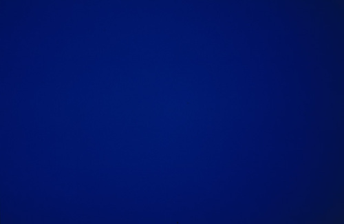
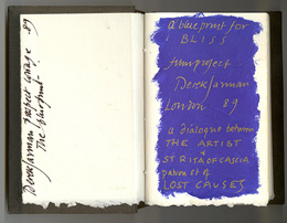
When Blue was still called Bliss, back in 1987, and was a Klein-related companion film to The Last of England, Jarman filled a notebook with dialogue, poems, and IKB monochrome paintings. The Bliss Book and other Blue-related preparatory and archival material will be in “Almost Bliss,” an exhibition next month at Chelsea Space, London, England.
Blue really took its finished form beginning in 1991, not as a film, but as a performance/event. Jarman and Tilda Swinton first performed Bliss at a charity fundraiser for his hospital, sandwiched between a performance of Klein’s Symphonie Monotone and a screening of The Garden. [Which must’ve been quite a night: the Klein’s supposed to be 40 minutes, and The Garden‘s an hour and a half.]
Yves_Klein_California_1961.jpg
A still of Klein’s IKB 71 (Californie), 1961, which, I have no idea what his film loop looked like, but this one seemed appropriately cinematic. It’s in a private collection, but was at the Met a few years ago.
At first Jarman used a film loop of a Klein monochrome. When the film jammed, Jarman switched to a blue gel. I don’t quite know why, but I find this easy passing between media and image to be fascinating. Bliss‘s blue began as a film of an object, but then the object disappeared, replaced by a light effect. Later, when Blue was complete, and aired simultaneously on Channel 4 and BBC radio, listeners were invited to send for a monochrome blue card they could stare at during the broadcast. A broadcast image replaced by an object.
The project evolved and funding came through in 1992, and Jarman’s own stories became the central theme. All along I figured that Jarman maybe didn’t film anything, that the blue was a chemical aspect of the film print itself. But Wymer’s book says the blue was “electronically produced.” I confess, I find this something of a letdown, even if it means MoMA’s probably OK to show Blue on digital projection rather than film. And it makes me want to do something around or to Blue and its visuals. I don’t know what yet.
#53 Almost Bliss: Notes on Derek Jarman’s Blue, curated by Donald Smith, 29.01.14 – 15.03.14, Chelsea Space [chelseaspace.org]
buy Derek Jarman (2006) by Rowland Wymer [amazon]
JUNE 2014 UPDATE In Issue 165 of Frieze (May 2014), Paul Schütze talked with Simon Fisher Turner about his longtime musical collaborations with Jarman, including the making of Blue.
Turner says they probably did six or seven live concerts of Bliss/Blue before the film. I wonder if any of them were recorded? Also this bombshell:

Derek and I had really big arguments about Blue, because at one stage people wanted to put images into it and I said, ‘You’re mad!’ By then my relationship with Derek was really good. I’d say, ‘Listen, this is really what I think.’ Then he suggested that it would be great to have some gold drifting down amidst the blueness, because he loved gold, or the occasional shadow of movement. I objected and said, ‘Please NO! It has to be pure.’

Yikes.

Pete Souza, White House Photographer

souza_stfu.jpg
“Oh, just the press getting access to the Oval Office, NBD,” Pete Souza trolled.
It’s almost embarrassing that I did not make the Sforza/Souza connection until this outrage crested. But maybe now is the right moment.
Last month the White House News Photographers Association and 37 other groups and media organizations complained to the White House that they were being frequently blocked or excluded from covering Pres. Obama’s activities. And that the White House was instead releasing its own video and photographs, usually taken by WH official photographer Pete Souza.
Team Obama responded, it seems, by releasing the above Souza picture as the White House Photo of The Day. And as USNews reports [really? They’re even still around?] the “media” were “enraged”:

Julie Mason, SiriusXM POTUS press pool host and former White House Correspondents’ Association board member, saw Friday’s photo and suggested it was an equivalent to a middle finger, a snub and an eye roll. “All of that, plus a drop of anxiety,” Mason wrote in an email. “Behold how sensitive the White House is to claims they shut the press out.”
BagNewsNotes, a website that analyzes images, was the first to notice Friday’s Oval Office picture and called the White House “incredibly petty” for putting it out, arguing that photojournalists should have been offered the opportunity to capture President Obama doing something personal, instead of another staged photo-op.

Personal? Staged photo-op? Are these somehow mutually exclusive? Here’s what BagNews actually wrote:

People in high places should always be mindful how much they are saying, or not saying, with a picture. If the White House intended even a half-respectful gesture, they would have provided access to the president yesterday in a spot that was personal, doing something personal — graciously offering to the visual media (if just to lower the heat and at least suggest you get it) just one of the hundreds, maybe even thousands of scenes only Pete Souza has been privy to for six years now.

Half-respectful gesture? Graciously offering? I guess now I’m at a loss as to what the actual problem is here.
The actual letter sent to press spokesman Jay Carney argues that the WH is wrongly excluding journalists by declaring public, newsworthy White House activities “private,” and then releasing only official photos. But BagNews is complaining about Souza’s insider exclusive on actual “personal” activities. These are completely different types of events.
wh_gwb_katrina_flyover.jpg
real or real staged? I can’t tell or remember now.
At first I’d just meant to post a quick plus ça change, because literally the exact same complaint had been lodged by the same photographers against the George W. Bush administration, in 2006. Then the issue came to a head when the White House released a photo of Bush looking out the window of Air Force One on a brief Katrina flyover. Except when I went to look for the image, it turns out that photojournalists had been permitted to take essentially the same shot, including the AP’s Susan Walsh, who filed the 2006 handout complaint.
The issue has not died down, just the opposite. A couple of weeks ago the AP’s Santiago Lyon wrote an op-ed in the NY Times titled, chillingly, “Obama’s Orwellian Image Control.” Lyon cites iconic photos or news-worthy moments that photojournalists captured which “show–surprise–the president is human.” Except all but one of Lyons’ examples were outside the White House [Nixon leaving], straight news [Reagan’s hospital window], or at totally staged press events [GWB’s Sept. 11 bookreading, and his rousing rubble mounting at the WTC.]
The other example, JFK Jr. peeking out from under his father’s Oval Office desk, does not serve Lyon’s argument well. Kennedy had calculated the political value of his children’s images from early in his campaign, and photojournalist Stanley Tretick had become the president’s go-to guy for sympathetic, “human” images. He was the Pete Souza of his day, whose nominal employer happened to be, not the White House, but LOOK Magazine. In October 1963, two months after the death of their third child, and when the overprotective Jackie was vacationing on Aristotle Onassis’ yacht, JFK brought in Tretick for some exclusive hangin-out picture time with the kids. Is this the kind of independent journalistic access the media is clamoring for?
wh_pool_spray_nyt.jpg
img: still from Stephen Crowley’s epic 32-sec. pool spray video, 2009
I think the journos are totally right to give the administration crap about limits to access; they should push for whatever they can, and raise the political price for the WH’s own communications/image policy. But let’s look at what they’re really arguing over: ‘pool sprays,’ 30-second drive-by photo ops of people doing nothing. Let’s see what we’ve already lost: ‘Sforzian Replays,’ where the president re-performs some act or re-gives a speech for video and still photographers. The White House image machine is weird and complex and conflicted, and everyone wants to control it to their own ends.
If Special Moments or human interest photos are being brought in-White House, then old/corporate/non-government media should come up with a new visual product. And maybe they start by looking around at their own freakshow presence. BagNewsNotes said some photographers read Souza’s image up top as an act of visual aggression, “a subliminal ‘screw you.'” Why don’t they give right back?
Boehner_shutdown_Watson-AFP_BNN.jpg
img: Jim Watson/AFP
In October, BagNewsNotes posted a notable collection of pictures of House Speaker John Boehner caught in the media scrum during the government shutdown: Shooting Boehner: Shutdown Visuals Meet GOP Aggression:

What’s going on, symbolically of course, are the press members — as the proxies of the people — not just dropping their typical submissiveness but actually challenging Boehner’s destructiveness and irresponsibility.

BNN also calls it “breaking the contract,” [their scare quotes] the contract which apparently precludes media from “panning out,” thereby acknowledging its own circus existence. BNN’s editorial take is that Boehner and the GOP basically brought this chaotic imagery on themselves.
Is there a White House “contract” too, and if so, hasn’t the White House broken it, and mightn’t White House beat photographers protest by taking nothing but complicated and aggressive pictures? If the Obama administration’s only giving them shit images, why don’t they put it in a bag on the White House porch and light it on fire?
White House Pic of the Day of Media Enrages Media [usnews.com]
Shooting Boehner: Shutdown Visuals Meet GOP Aggression [bagnewsnotes]
Limit on Access Stirs Tensions Between White House Photographer and Press Corps [nyt]
Obama’s Orwellian Image Control [nyt]
Previously: It’s all done with mirrors
And previously in the Bush era: WH Beat Photogs Upset At Staged Photographs They Don’t Take

Olga (2007/2009-)


Recently 20th Century Fox asked me to make a short film to promote the upcoming release of The Secret Life of Walter Mitty. It would be about following your dreams or something, I don’t remember the details too well; there had just been a hurricane in the Philippines that was really bumming me out. So I said sure, dug up a short film no one’s seen yet anyway, and pocketed the entire budget myself.
And so, Olga of 67th Street. I made this short film several years ago, but it’s never really been seen by anyone except the subject, Ms. Olga Bogach. I happened to meet Olga in 2007, and I rough cut the footage together in 2009. I just pulled it off the old hard drive where it had been stuck, and decided to put it online.
Olga was for many years a muse, model, and secretary to artists living in her building on the Upper West Side of Manhattan. I really don’t want to say too much about the video at this point. Partly because it might get reworked a bit, but also because I’m really kind of swamped with other stuff. But mainly because I think the piece is a little complicated, and it hangs together [assuming it does, of course] by the slightest of threads, and to presplain it all would ruin its chances. Olga’s story and especially her telling of it, is so refined, so precise, I still find myself fascinated with listening to her every detail. The Calendar Artist.
Anyway, I do want to thank Olga, and my father-in-law, who invited me on very short notice to accompany him on his visit.
Olga of 67th Street (21:37), 2009-

Than Friend Brad

than_friend_brad.jpg
Than Friend Brad, 2013
via @willak comes this collaboratively written essay by Brad Troemel, Artie Vierkant, and Ben Vickers, Club Kids: The Social Life of Artists on Facebook. It is so perfectly and myopically descriptive of their situation as social network artists and curators without recognizing the situation as deeply problematic, that it’s exasperating to read. Until the very end, when they seem to conclude that yes, Facebook is not the world, or even the internet, but a “bad infinity” [pace Hegel], where the seeming endlessness of choice is a controlled, corporate deception.
And so, too, would be the very idea of an artistic practice or an artistic dialogue that centers/exists/originates on Facebook, and that is comprised of posts documenting “the artist’s online brand” and her “lifestyle,” activity driven by and judged by likes and friendings and other technosocial cues.

Why go to such great lengths to make and photograph a painting that will net 5 Likes when a photo of you and your friends eating 50 McChickens could net hundreds?

First off, don’t get me started on the “make and photograph a painting” thing; I’ve curated Contemporary Art Daily-only shows in my head the same as anyone else. So please don’t pretend that actually painting a painting–especially one that requires going to “great lengths,” whatever that may mean–doesn’t change your very being just as surely as eating 50 McChickens does.
And anyway, it seems like this essay was written well over a year ago, before Facebook’s IPO, and Troemel and friends are still ordering exclusively off Art’s Value Meal, tumblin’ rebloggable insta-art, curating themselves into IRL group shows without a critical care in the world.
In this new age of Smarm we suddenly find ourselves living in, Brad and Artie’s mapping of their platform’s spectrum of critical discourse seems very apt:

Feedback, if any, is always on a scale ranging from positive to non-existent–the Like function itself being explicitly designed as a binary function between total consensus and total lack of response. Instead of moving the artistic conversation forward, most people are literally just happy to be part of the online conversation, to be part of the club or whatever other indistinct social group they silently pledge allegiance to.

This seems like a very shitty environment in which to make art, and frankly, I’d be surprised if people who spend six figures for two years of MFA crits would put up with it. Or maybe that’s exactly what they crave after they’re out of school: affirmation, reassurance, participation, belonging, naked acknowledgement of one’s existence and activity.
But what’s the alternative?

Posting work to the internet with no social network readily in place is synonymous with the riddle ‘If a tree falls in a forest and no one is around to hear it, does it make a sound?’ For young artists on the internet the answer to the forest question is ‘no’- their work will easily go unnoticed, making their participation as a social actor an a priori necessity to contextualizing what they do as art.

Except it turns out that just because you can’t hear it, doesn’t mean it doesn’t make a sound. Elephants can hear sounds below the range of human detection. 7-Eleven owners blast music at loitering teenagers at frequencies Olds cannot perceive. Don’t make art only for your friends’ affirmation, or for Hans Ulrich’s attention. There are people in the world you don’t know.
It would behoove the Facebook Artist to get off Facebook once in a while, at least, where you can find critical responses beyond “total lack of response,” and people making and engaging art that is not interchangeable with lifestyle, and who don’t give much of a damn about fave parties.
Club Kids: The Social Life of Artists on Facebook [dismagazine]
UPDATE Wow, so much quietly delivered support for this post. Intriguing! And thanks!

On Untitled (Beauty Love)

There is beauty in this painting. But the beauty is not what makes you love it.
It’s the emotion of what it says, in very simple means about life. And where we all go.
I don’t know why I get chills from Tobias Meyer’s little promo video for Silver Car Crash (Double Disaster), but here we are.
I matched the audio to Michelle V. Agin’s photo from the Times this morning.

And then after reading Ian Bogost’s McRib essay again, I realized it was the most persuasive explanation I’ve seen of Auction Week. So

untitled (where we all go)

Balling Art In Harlem USA


Oh hi, no, NBD, just a video of David Hammons making a basketball drawing in a skylit stairwell. Shot probably in 2000-01 by EV photographer Alex Harsley.
If you’re one of the three other people in the world who’s seen it on YouTube, let me know. 3 VIEWS, PEOPLE.
And here’s the gang hanging out on the stoop at 4th Street Photo Gallery in, what, 1994? just talking art. There’s the timestamp, Sep.24.1994. Hammons, Herb Gentry, a couple of folks I don’t recognize. From just before Phat Free/Kick The Bucket. “11 views”!
[Sept 2014 Update:Thanks to Mary Anne Rose for correcting me. That’s not Herb Gentry in the fedora after all. Listening to the video again, it turns out he’s named Junior. Also, Rose identified the painter Gerald Jackson in the light blue cap.]

Herb Gentry: “Listen, if you’re an older guy, you should be ahead of that by now.
Hammons: “Not necessarily.
HG: Well, where’re you gonna be?
DH: You can be anywhere. You can be wherever you want to be. This is one of the last places that anything still should go. And it still goes, but nobody’s going with the anything. Everyone has slipped into some category-some formula. And they’re waiting for their formula to show up on the chart. And it ain’t gonna show up.”
Balling Art in Harlem U.S.A. [photodirect’s youtube channel]
Bucket Party [same deal]