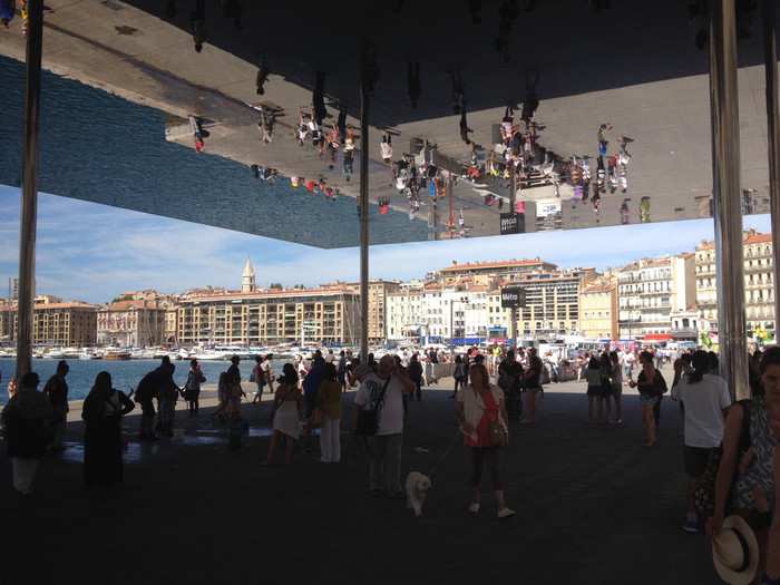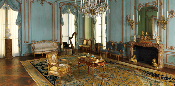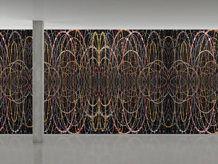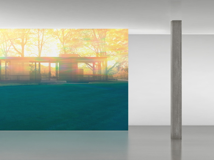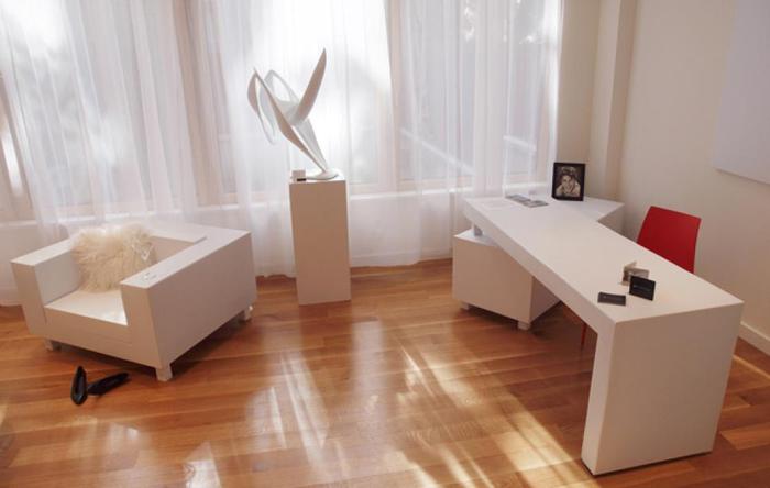
Getty Museum View, Or Seeing Google Seeing

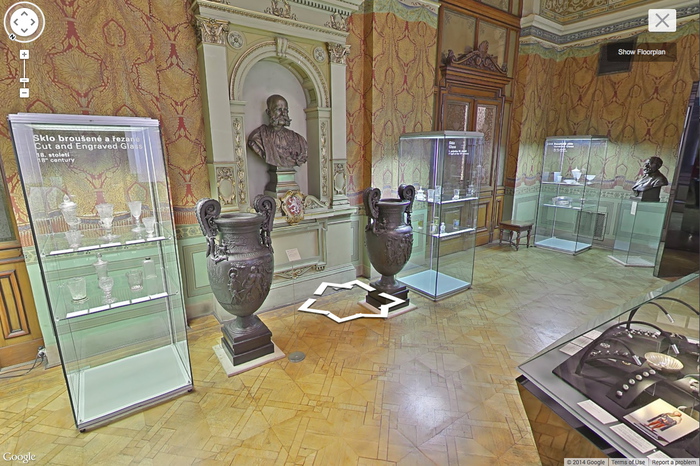
The Getty Museum is now included in the Google Art Project. Which is now a part of the Google Cultural Institute. I hadn’t noticed how this context has changed, and how the Art Project has been subsumed and presented. The navigation options are, “Collections | Artists | Artworks | User Galleries.” And institutions are collections.
getty_google_art_mirror_03.jpg
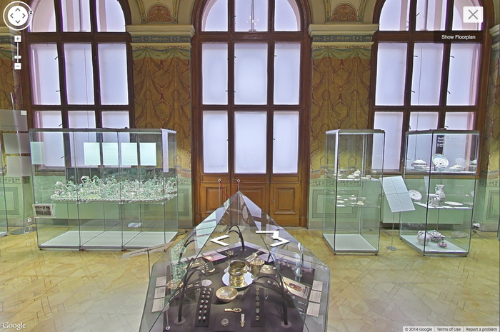
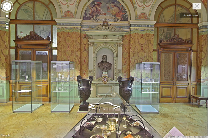
Anyway, Museum View. I know that Google Street View-based art fascination is old and busted, but Museum View for me is still the new hotness. Maps are for navigating, going somewhere, doing something. But Museums are for displaying and depicting and interpreting; they hold and show objects and generate discussions and critical context. And Google Museum View is doing that on a trans-institutional scale, and so it feels important to have some awareness of this process. Trans-Institutional Critique.
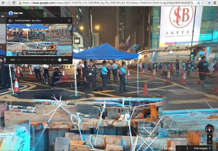
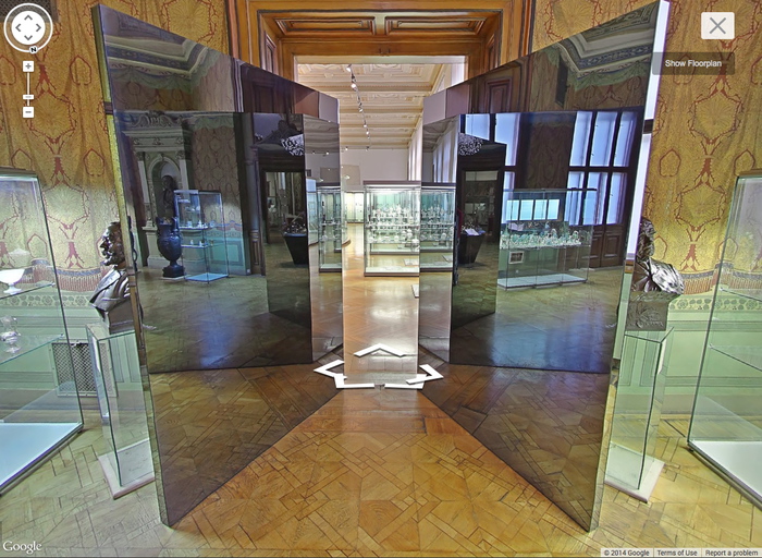
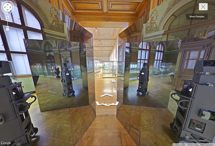
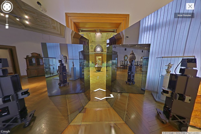
Fortunately, Google still sometimes documents itself documenting.

Continue reading “Getty Museum View, Or Seeing Google Seeing”

Images And Ideas I’ve Been Thinking Of

So many projects, so many browser tabs, open for so many months, I’ve gotta clear some of these things out:
warhol_worlds_fair_overpainted.jpg
I’ve wanted to remake the lost/overpainted panels from Andy Warhol’s Thirteen Most-Wanted Men mural for the NY World’s Fair since the Destroyed Richter Paintings days, but now with the comprehensive-sounding show at the Queens Museum opening, I’ve probably got a week to do it. And process it. And put it behind me. Ah well. The show does sound good, though.
folk_art_tables_vf.jpg
Not sure why it didn’t occur to me sooner, but the news this week that MoMA’s started the dismantling of the Folk Art Museum gave me a flash of inspiration: The Williams+Tsien Folk Table Collection. Turn each bronze alloy panel into a unique memento/tabletop. Maybe there’s enough material inside to use for legs, &c., too. I see a couple dozen dining tables, as many coffee/side tables, and a handful of console/sofa tables. An edition of up to 63. They’d be a stunning addition to the finest home, and quite the conversation piece.
williams_tsien_chester_higgins_nyt.jpg
Actually, the inspiration came from Chester Higgins Jr’s photo of Billie & Tod holding architectural fragments. The domestication of architecture.
Primary_struc_photomurals_20140411nyt_conrad.jpg
Also from the Times: Fred Conrad’s great photo showing the use of photomurals to evoke/approximate historical spatial experience at the Jewish Museum’s “Other Primary Structures” show. It’s interesting that they’re angled and mounted on wall-sized panels, not stuck to the moulding-encumbered wall. Makes them a bit more exhibition design and a bit less exhibition, I suppose.
Richter tweeted this the other day, and it’s been nagging at me ever since:

the exhibition of reproductions of paintings, that is, not just paintings based on photographs. Also, of course, the show is at the world’s most intensely named museum, the Topography of Terror.
I’ve reached out to the Topographers, hoping to find out more about how paintings function in an exhibit like this, and how the decision was made to include them as reproductions. But so far I have received absolutely no response. But I did get some screencaps from a YouTube video of the opening, which I can’t find right now:
richter_topography_terror_1.jpg
richter_topography_terror_2.jpg
Hmm, actually the panels look like reproductions of pages of books, not of paintings. Simultaneously more and less interesting.
sf1978.565.jpg
While rummaging around the Met’s collection database, looking for Arthur Vincent Tack info, I Google Imaged up this hard edge painting. Which apparently hadn’t been documented in the color photo era, but I couldn’t find it on the Met’s site.
As I was posting this I realized the filename is the accession number, 1978.565, Larry Zox. 1978’s obviously too old for Hard Edge; the painting’s from 1966, an at once unusual and logical size of 50×100 inches. Untitled (from the Double Gemini Series).
Turns out the Guggenheim has a very similar painting, Alto Velto, from 1969. Color really matters in these jpgs.
Larry-Zox-Alto-Velto-1969-580x388.jpg
Martin Bromirski posted images from a 2008 Larry Zox show at Stephen Haller.

Rem Casafresca

rem_koolhaas_venice_pressconf_scr.jpg
The Venice Architecture Biennale, which opens in June, held a press conference today with curator Rem Koolhaas and Paolo Baratta. The event was streamed live online. As @kieranlong pointed out on Twitter:

Intrigued, I quickly tuned in to the event, already in progress. The average age of the large crowd of press/reporters looked to be well over 60 yo, and their questions were often longer than Koolhaas’s answers, which were simultaneously translated by a rotating cast of female voices. It really was a mess.
The first words I heard set the tone:

So I decided to livetweet it.
With a couple of brief exceptions the text comes only from Koolhaas. I don’t type very fast, and I can’t figure out the keyboard shortcuts for accents, but otherwise I think this transcript captures the experience of watching quite well:

Continue reading “Rem Casafresca”

A Fluxhouse™ Limited Edition Can Now Be Yours

Yesterday at MoMA, I took extra time this time in David Platzker’s 4’33” exhibit so I could dig into the Fluxus material a bit more. George Maciunas’ extraordinary chart of the entire history of art as seen through the other end of the Fluxus telescope was especially awesome. [The site for last year’s Fluxus exhibit has a huge image of Maciunas’ chart for close-up study.]
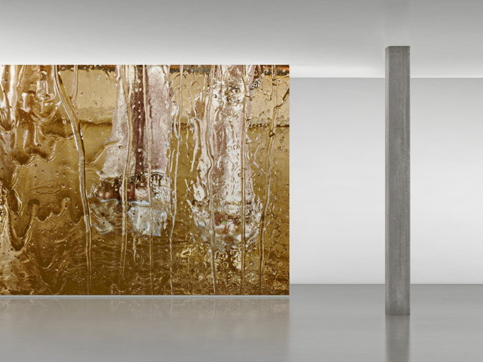
maciunas_house_bklnmodelworks.jpg
Fluxhouse™ model via Brooklyn Model Works
Trying to find a copy for myself, I headed to the Stendhal Gallery, the post-Fluxus home of the Maciunas/Fluxus legacy, as managed by Henry Stendhal. And that’s where I found out you can now buy a license for a Fluxhouse™.

The Fluxhouse™ [always with the ™] was George Maciunas’ concept for affordable, adaptable, lightweight, prefabricated housing to change the world The 1,900sf single-family house is raised on concrete piers, with structural flooring and cabinetry around the perimeter, a central kitchen/bath core, and with adaptable, non-loadbearing panels defining the spaces around a glassed-in courtyard garden. Originally, it was supposed to be made out of a cheap, environmentally friendly material like plastic.
When Stendhal’s George Maciunas Foundation showed a model of the Fluxhouse™ last year [above, built by Brooklyn Model Works], the story was a bit more complex. From The Architects’ Newspaper [via Fluxus Fndn]:

The Prefab Building System first appeared in plans that Maciunas and a sometime colleague, the pugnacious philosopher/musician/all-purpose gadfly Henry Flynt, devised in 1965 for a housing system in the Soviet Union, hoping to improve on the heavy concrete residences that Soviet builders had favored since 1960. Maciunas designed, and may have helped draft, Flynt’s pamphlet, which urged a return to the revolutionary aesthetics of the 1920s and an adoption of certain technologies that could democratize cultural power, including electric guitars, Buckminster Fuller domes, and Citroen 2CV cars. The Prefab System was part of this document. The Stendhal Gallery’s public presentation nearly erases this origin (thought a press-kit essay by Julia Robinson does mention it), perhaps to jettison what today appears as off-putting ideological baggage. It’s easy to accuse Flynt and Maciunas of naivete in attaching egalitarian hopes to the post Stallinist Soviet regime, but abstracting the design idea from any utopian context seems naïve in a different way.

Henry Flynt’s involvement, whatever it may have been, doesn’t come up in the Fluxhouse™ pitch.
But when the Foundation still writes that “George Maciunas is best known as the ‘Father of Soho’ for colonizing and gentrifying this neighborhood from a post-industrial dystopia into a mecca for the arts,” it’s safe to say that building a Fluxhouse™ still involves a certain utopian naivete.
Which may or may not be described in the FluxCty™ Assessment Report, the product of a five-year effort to finally take the Fluxhouse™ beyond the concept sketch stage, and to turn it into a commercially viable prefab building system. And now, the next logical step in a universal housing solution: selling up to five licenses to build your own Fluxhouse™ Limited Edition [pdf]. With a 2012 estimate of construction costs at $7.50/sf,, or $14,250, the limited edition license may end being the most expensive part.
there are a lot of Fluxhouse-related links in the sidebar here [georgemaciunas.com]
Previously, and definitely related: Modernism’s embrace of systems, including George Nelson’s strikingly similar modular house system from 1958
Jan Kaplicky was a fan of Fritz Haller’s steel framing system
Kocher & Frey’s Aluminaire House, which, obv
From sketch to Vuitton marketing scheme: realizing Perriand’s beach house
Muji Houses

The Maze Collection

tony_smith_maze_la_install_1.jpg
Tony Smith conceived of The Maze in 1967 for a very early show of installation art at Finch College’s townhouse gallery on the Upper East Side. The four units, two 10×7′ and two 5×7, were originally made from plywood, painted black. Grace Gleuck said the light was low, and that “a walk among these gloomy, primeval presences evokes the feeling of an endless forest.”
When I wrote about the little cardboard model of Maze in Aspen 5+6, in 2012, I did not know whether it had been shown since. That was because I just wasn’t looking hard enough. It turns out that another plywood incarnation of The Maze was shown at Paula Cooper Gallery in 1988. And last Fall, Matthew Marks installed a black steel version of Maze [no The] in his Los Angeles gallery. I’m bummed I didn’t get to visit it in person, but the photos look stunning [top].
smith_ubu_mazeGrid2.gif
The plan of the piece seems to show that the dimensions, including the inner and outer passages, and even the units themselves, were all 30 inches wide, and derived in some degree by the Finch space itself. Not sure about Paula’s incarnation, but that site-specific aspect didn’t make it into the 2013 version, which looks suitably monumental, but also clearly sculptural. And not a hint of primeval gloom.
In his statement for Aspen, curated by Brian O’Doherty, Smith actually gave permission to anyone to “reproduce the work in its original dimensions (in metal or wood).” And so I will. As The Maze Collection of functional household built-ins. It just seems like a lot of space to lose to sculpture. It’s more Zittel than Zittel, and less Jade Jagger than Jade Jagger.
tony_smith_maze_kit_desk.jpg
I see The Maze Collection as having a really sick, velvety, matte black surface. No gloss, no lacquer. As long as you make that the panels close properly, and give you that clean, solid, not-at-all-hinged-or-doored look, I think it’ll work.

‘A House For Art’: On Saving The Folk Art Museum

moma_dsr_art_bay_rendering.jpg
Big news, negative reactions, but very few surprises. MoMA announced today that the American Folk Art Museum building would be demolished after all, as part of an expansion & reconfiguration project connecting the current Taniguchi building to galleries in the base of the Jean Nouvel tower set to rise to the west. No one could honestly have believed that Diller Scofidio + Renfro had been brought into the controversial situation to do anything other than provide expert architectural cover for a decision that had been made long, long before.
DS+R also brought some necessary conversation changers, architectural features that would allow The Modern to proceed in a constructive, rather than a purely destructive context. Everyone and their dog has weighed in tonight on the few renderings of MoMA’s plans, so I’ll skip most of that. Except to say that Diller’s proposal for the AFAM site, an entry/gallery open to the street, and a performance space on top, neatly renders the volume of the demolished building in the negative. It’s like a ghost space of the structure that was once there. That design solution has a certain morbid integrity.
And I will note what others haven’t, that one of the changes DS+R have proposed is not just “an architecturally significant staircase,” as Jerry Saltz dismissively called it, but an extension to an architecturally significant staircase: the Museum is planning to continue the iconic Bauhaus Staircase, which connects the 2nd and 3rd floor galleries, all the way down to the Titus 1 and 2 movie theaters. As a longtime member of the Film Department’s Trustees Committee, I suppose I should know more about how this will impact the presence and experience of film at the Museum. I’ll look into it.
[Probably a disclosure, or at least a heads up: I was co-chair of the Modern’s Junior Associates for many years, and helped raise money for the 2004 capital campaign. My own association with the Museum has been long and deep and deeply rewarding, even though I’ve never had the resources to donate trajectory-changing amounts of money. I’m glad for the relationships and engagement with folks all through the Museum, and I won’t pretend that I have any juice, or inside knowledge of the Museum’s capital and construction plans.
bunshaft_travertinse_house_esto.jpg
Travertine House, 1963, Gordon Bunshaft, image: Ezra Stoller/ESTO via archnewsnow
I have purposely steered clear of the Folk Art Museum issue over the last couple of years, in part because I remember some impassioned discussions over the Museum’s sale of Gordon Bunshaft’s modernist house in East Hampton around the time Martha Stewart gutted it and flipped it to Donald Maharam. The Museum makes a clear distinction about what enters the collection, and the curatorial process by which it happens. In this regard, Bunshaft’s house, which was willed to the Museum by the architect, had the same status as the Folk Art Museum: it was an asset, not a part of the collection. And it was dealt with as an asset. Maybe someone should ask Barry Bergdoll if there was ever any discussion in the Architecture&Design Department of accessioning the Williams+Tsien building. I’m going to guess that there wasn’t. It’s an exceptional case that throws the collection out of scale. Anyway, this reality is exactly at the root of much of the disagreement with MoMA’s decision, but I believe it was internally consistent. Whatever that means for the state of the city and the urban experience of the Museum, of course, remains wide open to criticism. And now this parenthetical has veered back on topic.]
ARCH_Mauss_ESTO_FolkArtMuseum_01.jpg
AFAM images: Paul Mauss/ESTO, 2001, via architectmagazine
MoMA’s gonna do what MoMA’s gonna do, but what can be done about Williams & Tsien’s Folk Art Museum Building? It’s worthy architecture, and I think it can be saved, and it should be saved. The Folk Art Museum Building could be moved. And given MoMA’s centrality in this carefully crafted building’s destruction, I think MoMA should open itself to the possibility of facilitating the rescue.
When I say it should be moved, I obviously don’t mean entirely intact, as-is. But it could and should be dismantled, and Williams & Tsien could be enlisted to rebuild it somewhere else in town. And it should be reborn as a townhouse. Why shouldn’t it be the most spectacular new townhouse in town? I just read a ridiculous article in the American Express magazine about the race for the $100 million penthouse. What roving billionaire shopping Jean Nouvel’s MoMA Tower penthouses wouldn’t want an award-winning “bespoke” house museum instead?
williams_tsien_towhouse_e72.jpg
GSV, obv
Not coincidentally, the model for such a project would be the extra wide townhouse [above] Williams & Tsien built in 1996 on the Upper East Side for none other than Jerry Speyer, the collector/developer who is currently MoMA’s Chairman.
pj_east_64th_st.jpg
GSV, obv
Speyer’s house is 33 feet wide; the Folk Art Museum building is 40 feet wide, 85 feet tall, and 100 feet deep. Those dimensions may not work in most traditional side street townhouse environment, but it’s not impossible. There was a foundation building designed by Philip Johnson [above] on my block of East 64th Street that’s almost the same volume. And there have to be sites across the city that could accommodate it. It might even fit in better than it did in the cramped shadows of West 53rd Street.
ARCH_Mauss_ESTO_FolkArtMuseum_int_02.jpg
again, Peter Mauss/ESTO via architectmagazine
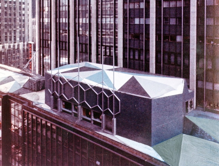
So given that the building will come down soon, the thing to do is to salvage and stockpile as much of the structure as feasible. This would begin with the cast bronze alloy facade, whose 63 panels could be saved as easily as the could be sold for scrap. Then there are key handcrafted elements and materials in the building that gave it its character: cherry railings, custom fixtures, the molded glass curtain, flooring, etc., that should not simply be scrapped in any event. I mean, there’s a Georgian bank facade in the American Wing of the Met, and in 1992 Stefan Knapp [who?]’s op arty sculptures were peeled off the facade of Alexander’s department store and sent into the design market without blinking.
alexanders_cityofdave.jpg
Stefan Knapp facade for Alexander’s, via cityofdave’s flickr stream
The other essential elements of the building–cast concrete walls, stairs, balconies, skylights, the space itself–aren’t portable, but they are recreateable. Or adaptable. The AFAM was actually a helluva piece of craftsmanship and a cramped museum. People called it a “jewelbox.” Billie Tsien called it “a house for art, not a museum.” Which, well, we see how that turned out.
Now maybe the architects get a second chance to configure a successful spatial experience inside their stylish envelope. I imagine that whoever wanted to build or buy such a place would probably collect. So with some reprogramming and rebalancing, it could once again become a house for art. MoMA would only need to let the deconstruction happen.

Variations On A Charlotte Perriand Beach House

perriand_maison_vuitton_raleigh.jpg
I’m as stoked as I am nonplussed at Louis Vuitton’s over-luxed realization of Charlotte Perriand’s une petite maison au bord de l’eau (1934), which was unveiled at the Raleigh Hotel during Design Miami last month. It’s a small U-shaped shed with glass opening around a canvas-shaded deck.
As LV’s publicists explain it in designboom [small caps sic]:

the pavilion was originally conceived by perriand for an architecture competition sponsored by l’architecture d’aujourd’hui magazine – for which it won second place. she brilliantly prefigures the ease of construction and assembly, and affordability. the pavilion was built (and furnished) by louis vuitton’s inhouse architectural team in collaboration with perriand’s estate to adapt her loose sketches. the design probably would have slipped unnoticed into 20th-century architectural history where it not for julie de libran, the woman’s creative director at louis vuitton.

Mhmm. Except that Perriand’s project is mentioned and reproduced in numerous catalogues and exhibitions of the architect/designer’s work both before her death in 1999, and especially after.
And as for rescuing and realizing Perriand’s history and design, the Perriand archive hasn’t released more than a sketch, and no information about the competition, which was specifically for a weekend beach house, and no information about the variations of the design Perriand made over the years.
borddeleau_perriand_original_sketch_designboom.jpg
And in realizing the house, Vuitton doesn’t say that they changed it significantly: Perriand’s original concept was for a living space raised on stone columns and walls, with open space underneath for storage and parking. So in structure, material, and affordability, Vuitton’s sleek, hardwood construction is beautiful, but it is not an accurate representation of Perriand’s concept. When a luxury giant like LVMH comes calling, though, the estate [run by Perriand’s daughter] can be flexible. And when design shoppers hit Miami Beach, the right logo can obviate any concern about notions of history, accuracy, or context. The Perriand pavilion [sic] was for sale; it’s not clear if it sold.
kocher_frey_canvas_hse.jpg
But the entire project demands an open reinterpretation that tries to be true to Perriand’s original design–or at least to the aspects of it that don’t appeal to a fashion marketing priorities of a luxury purse manufacturer. Imagine an ultralight version built on pilotis, and realized in, say, sealed canvas, like the beach cottage Albert Frey & Lawrence Kocher built in Northport, LI in 1933-4?
openside_purple_20_abccontainers.jpg
image: abc containers (au)
Or bring it all forward. Who can look at the Vuitton Perriand House and not think of shipping containers? Two 40’s open on the side, and a 20′ in the middle, BAM.
charlotte perriand’s la maison au bord de l’eau is a louis vuitton tribute [designboom]
Louis Vuitton realises unbuilt Charlotte Perriand beach house in Miami [dezeen]

Olga (2007/2009-)


Recently 20th Century Fox asked me to make a short film to promote the upcoming release of The Secret Life of Walter Mitty. It would be about following your dreams or something, I don’t remember the details too well; there had just been a hurricane in the Philippines that was really bumming me out. So I said sure, dug up a short film no one’s seen yet anyway, and pocketed the entire budget myself.
And so, Olga of 67th Street. I made this short film several years ago, but it’s never really been seen by anyone except the subject, Ms. Olga Bogach. I happened to meet Olga in 2007, and I rough cut the footage together in 2009. I just pulled it off the old hard drive where it had been stuck, and decided to put it online.
Olga was for many years a muse, model, and secretary to artists living in her building on the Upper West Side of Manhattan. I really don’t want to say too much about the video at this point. Partly because it might get reworked a bit, but also because I’m really kind of swamped with other stuff. But mainly because I think the piece is a little complicated, and it hangs together [assuming it does, of course] by the slightest of threads, and to presplain it all would ruin its chances. Olga’s story and especially her telling of it, is so refined, so precise, I still find myself fascinated with listening to her every detail. The Calendar Artist.
Anyway, I do want to thank Olga, and my father-in-law, who invited me on very short notice to accompany him on his visit.
Olga of 67th Street (21:37), 2009-

WTF Fieldstone, Chevy Chase

sad_stone_chevy_chase_bldg.jpg
This fieldstone house-metastasized-into-a-horrible-building in Chevy Chase, MD always bums me the hell right out whenever I pass by.
sad_stone_chevy_chase_bldg2.jpg
I think it’s just a random office building, not even an Elks Lodge or anything. Anyone know who or what happened here? Is there a sad story, or does this count for a preservationist victory in these parts?
4533 Stanford St, I believe [google maps]

The Enterprise School

idc_dbia_1.jpg
In an extensive profile of the NSA Director, Foreign Policy reports that when Lt. Gen. Keith Alexander was head of Army Intelligence, he built out his “Information Dominance Center” to look like the bridge of the Starship Enterprise:

It had been designed by a Hollywood set designer…complete with chrome panels, computer stations, a huge TV monitor on the forward wall, and doors that made a ‘whoosh’ sound when they slid open and closed. Lawmakers and other important officials took turns sitting in a leather ‘captain’s chair’ in the center of the room and watched as Alexander, a lover of science-fiction movies, showed off his data tools on the big screen.
“Everybody wanted to sit in the chair at least once to pretend he was Jean-Luc Picard,” says a retired officer in charge of VIP visits.

Indeed. And here, I believe, it is.
idc_dbia_2.jpg
The Information Dominance Center at Fort Belvoir, VA is featured in the portfolio of DBI Architects, a leading DC commercial architecture firm. The firm has done buildouts for absolutely everyone, but in the 1980s, they created a “Stealth Design” practice, focusing on computer rooms and “technology-oriented spaces, including network operation centers, switch sites, data centers, advanced concept laboratories, and video teleconferencing centers.”
idc_dbia_3.jpg
With several top-level command centers under their belt, DBI turns out to be one of the go-to architects for the post-9/11 Intelligence Industrial Complex. Their regional clients include Geo-Eye, the satellite imaging company which powers Google Maps; Lockheed Martin, for whom they build a 50,000-sf control center; various Army intelligence divisions; and even the White House itself. DBI remodeled the WH Situation Room in 2007. They also built the grand, cinematic nerve center of the Department of Homeland Security’s National Counter-Terrorism Center, which was in an undisclosed suburban office park location until George Bush used it as a press corps backdrop in 2006.
gwb_terrorism_set.jpg
The DBI look is part NASA, part Dr. Strangelove, to NORAD to War Games and on and on, back and forth. The big screened control center is part of the security theatrical tradition now. And in an era of Federation-inspired flip phones and iPads, where the fictional CIA of 24 enabled and rationalized torture at the actual CIA’s hands, we probably shouldn’t be surprised that politicians–of all people–are susceptible to intelligence industry set pieces that look and feel just like a movie.
Previously: But He’ll– He’ll See The Big Board!

Calvin Klein’s House For A Single Man

klein_meadow_ln_plywood_archpaper.jpg
image of CK 0.9, the plywood mockup, c.2009, via sara hart archpaper
Where to start?

Mr. Haverland and Mr. Klein began meeting two to three times a week and bonded over a love of architects like Mies van der Rohe, Richard Neutra and Joe D’Urso.

Danish modern chairs by Poul Kjaerholm are in one of the sitting rooms downstairs. Other vintage pieces by Jean Prouvé and Le Corbusier have arrived.

After that, a life-size mock-up of the two-story house was built of plywood on the property. That project was so substantial that it required a building permit from the Village of Southampton and wound up costing approximately $350,000, according to two sources close to Mr. Klein. So that Mr. Klein could get an even better idea of what it was to be like, the furniture he had in mind was created out of foamcore.

“I think it’s going to change the way we think about houses in the Hamptons,” said Sam Shahid, an old friend of Mr. Klein’s who has worked on many of his most famous ad campaigns. “Like when Charles Gwathmey built his house, and it changed everybody’s idea of what the future was. I can’t wait to see it.”

First, Mies, Neutra and d’Urso?
And also, Kjaerholm, Prouvé, and Corbusier? Just no. No, no, and WTFLOL no.
if Calvin really wanted to change the way we think about houses in the Hamptons, he’d have stopped with the plywood mockup. Can you imagine how awesome that would’ve been? He could build a new one every spring. A new architect every year. He could spend a million dollars a year for life, on career-making commissions and still come out ahead. It would have been marvelous.
Instead we end up with just another $75 million OCD dream house.


The House That Calvin Built [nyt]
Image: Sara Hart/Archpaper

[2020 update: after all that Calvin sold out for $100m to Ken Griffin, who now has his eleventh nine-figure pandemic safe house or whatever.]

On Metal And The Passage Of Time

dimore_brass_kitchen.jpg
Is it just me who can’t stop thinking about that oxidized brass kitchen in Dimore Studio designers Britt Moran and Emiliano Salci’s Milan apartment? The one in T Magazine this weekend, even though it seems like the Women’s Fashion issue, not Design?
dimore_brass_kitchen_2011.jpg
BECAUSE HOLY SMOKES.
A couple of things: they also do have that brass slab cabinet/headboard, which kind of dilutes it a bit, or maybe not. It makes me think they ended up with half a truckload of brass from a client project, and were like, well, we could just make everything out of brass?
Also, I guess two years is the appropriate time to wait to shoot an apartment that has already been featured in other magazines and blogs and debuted at international design fairs? Because these pictures by Emanuele Zamponi are all for Yatzer from 2011. Though they do look pretty much exactly like the Times’s photos.
Dimorestudio_palazzo_kit_blox.jpg
This embedded light strip seems extraneous and unfortunate, though. It will have no place in my oxidized brass kitchen. It looks like a remnant of a planterbox from a corporate lobby, which is always a risk one faces when working with lavishly thick brass, I suppose.
It’s also a fairly stiff repudiation of the elite brass ideology, which, when it is seen on the doors, awnings, siamese firehose connectors, and other brass elements on New York’s finer co-ops, shine brightly as proof of extraordinary, hand-labor-intensive, maintenance. For Dimore, thought, the patina is the point. Splash marks, drag marks buff marks, heat marks, air, it is a new kind of extravagance-through-negligence.
beshty_copper_surrogate_basel.jpg
Which, of course, immediately calls to mind the copper pieces of Walead Beshty, both the tabletop-shaped Copper Surrogate wall pieces which appeared at his 2011 Regen Projects show and in last year’s Art Unlimited at Basel [above], which accrete a fine patina through handling and installation; and the smaller, more interesting FEDEX pieces, which really earn their knocks on the street, the handtruck, and the plane. [Now I wonder what the insurance is on shipping these things?]
Beshty_20-in_copper_jc.jpg
image via phillips
I remember a discussion I once had with someone from Donald Judd’s operation. They told me how Judd was outraged to find out collectors, and even some museums, would put a clearcoat on their copper or brass stacks in order to preserve the pristine look. But Judd’s preference, I was told, was that you damn well better leave his unfinished finish alone. And if you want it to shine, you polish it. And if you don’t polish it, you let it oxidize.
I actually think of this conversation often, because of the shiny brass Judd floor sculpture at MoMA, a 1968 work given to the museum in 1980 by Philip Johnson. It’s probably the single Judd work I’ve seen the most over my adult life. And I’ll be damned if I’ve ever seen it without some visitor’s grubby handprint on it. Conservation does not remove them immediately, though; it’d just be too much. So when I’ve visited the galleries several times in a week, I’ve noticed the same handprint still there. A calculated balance, I’m sure the museum is aware of how many microns of material they lose with each buffing, and plan accordingly.
moma_judd_1968_212250.jpg
Donald Judd, Untitled, 1968, image:moma.org
Anyway, even after all these years, I’ve never been able to look at that Judd and not think of a coffee table. Not once.

All The World’s A Stage Set By Piet Mondrian

mondrian_ephemeral_werner.jpg
Model for set design, “L’Ephemere est eternel,” 1926, recreated in 1964, photographed in 2008 at Vanabbemuseum by Jeff Werner
After reading Michel Seuphor’s Dada play “L’Ephemere est eternel” in 1926, Piet Mondrian surprised his friend by designing sets for each of the three acts. The little models were photographed amidst Mondrian’s paintings in his studio, a nice parallel to the play’s denouement, in which a model of a theater is destroyed by an executioner. It also resonates with a play Mondrian himself wrote in 1919, which ends in his studio. For someone trying to change all the world, the stage was a nice place for a dry run.
mondrian_studio_model.jpg
Susanne Deicher noted that Mondrian refused to be photographed painting in his studio.

Mondrian often said that “new life” could be found in the free space opened up by reason and thought. The empty plane at the centre of the small painting on the easel reflects the absence of the artist.
During this period Mondrian frequently spoke of the end of the subject in the new age to come. He designed his studio as an imaginary setting for a theory without an author, where the “new” appears to evolve in the non-space of the empty center of his abstract paintings.

This absence to Mondrian’s ideas for the staging of “L’Ephemere” as well. He really wanted sets that concealed the actors as they delivered their lines. To what extent Seuphor was on board with Mondrian’s creative involvement, I don’t know.
I also don’t know in what form it circulated at the time, or how widely it was read or known, but Seuphor’s play was not actually ever performed until 1968. By then Mondrian’s original models had been lost; someone–perhaps Seuphor himself–had refabricated one in 1964. It’s in the collection of the Vanabbemuseum in Eindhoven. [That’s where Vancouver designer/blogger Jeff Werner photographed it in 2008.. I first saw it a few months ago in “Inventing Abstraction” at MoMA.]
Remarkably, the US premiere of “L’Ephemere est eternel” took place in 1982, at the Hirshhorn Museum. It was one of several ambitious elements of Judith Zilczer’s exhibition, “de Stijl: Visions of Utopia: 1917-1931.” The show also included a large-scale recreation of Theo van Doesburg’s lost interior of the cinema/cafe in the Aubette in Strasbourg. The opening was attended by Queen Beatrix, who, on a state visit, discussed nuclear proliferation and anti-NATO protests with Ronald Reagan.
Georgetown University theater professor Donn B. Murphy directed his and Zilczer’s 60-minute adaptation of Seuphor’s absurdist, plotless, and wordplay-filled script, which ran for at least seven public performances during the weekend of June 25-27. The show was in the museum’s auditorium, which barely has a stage, more of a podium, but which was apparently able to accommodate a full-scale version of Mondrian’s spare, shallow set.
The Washington Post hated it. In his review David Richards summed up the play’s Dadaist, traumatized historical context as “the intellectual’s version of ‘Hellzapoppin,’ music-hall for the nihilists born of World War I.” Which, well, I guess it could be worse. Whatever could Dada tell the world of Washington during the throes of the Culture and Cold Wars and at the onset of the AIDS pandemic? [On the same page, the Post hated on John Carpenter’s remake of The Thing, starring Kurt Russell, even more.]
In the Dada spirit of non sequitur, and to add one more datapoint to calibrate the Post’s critical settings, I can’t not quote from the their review of a local stand-up performance by one Jay Leno:

Leno’s nasal delivery, which resembled Andy Rooney’s, expanded to a colorful palette of characters as he worked through subject matter including the Phil Donahue show, photo stores (“How come they can transmit pictures 80,000 miles through space, and you walk across the street to Fotomat and they can’t find yours?”), male strip shows, Steven Spielberg movies, video games, and even local deejay Howard Stern.

Anyway, the Hirshhorn has a [VHS!] videotape of the performance in their archive. I will be making my appointment pronto.

Dome Half Full

You know what? It’s the little differences.
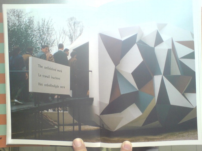
When Americans think of Buckminster Fuller’s Geodesic dome, they probably remember the eternal, benevolent optimism of the US Pavilion at the 1967 World’s Fair in Montreal. Oh yes, good times.
If only Europe could look back to these days, and past the array of geodesic domes dotting the continent, the ones in which NATO radar dishes and surveillance equipment have been cloaked, then everything would be awesome once again.
der_spiegel_bundesdome.jpg
Looks like Der Spiegel didn’t get the memo.

Tokyo Midtown And Out-Of-Town

tokyo_midtown_porcelain.jpg
This was the first untouched old house in the middle of Tokyo I came across on this trip, so it got photographed. I love stumbling across these things; they’re the barn finds of architecture.
This one is especially good because you can go in it. It’s a little vintage porcelain shop. It’s really awesome, mostly untouched inside, too. I’d move in tomorrow. Even though it’s in a kind of disgusting corner of Roppongi, sandwiched between the elevated freeway and Tokyo Midtown.
tokyo_midtown_stanchions.jpg
Speaking of Tokyo Midtown, I love that these little portable stanchions don’t realize the chain’s down and they’re free to wander. [What, you think Japan doesn’t have robot stanchions for responsive crowd control in development somewhere?]
fujimoto_sou_na_curtains.jpg
And speaking of slightly out of town, and tiny, kawaii places I’d move into tomorrow, we went to check out Sou Fujimoto’s NA House. The house’s location is unpublished, but it took all of five minutes to figure it out online. So don’t ask me to tell you.
What’s the point, one might ask, of going to visit a building that has been so widely published, and why take a picture when it’s been so skillfully documented by Iwan Baan?
fujimoto_sou_na_wires.jpg
Because you get to see how someone actually lives in that thing [answer: with lots of curtains], and you get to see it in context. Which, especially in Japan, means surrounded by 1) random architectural noise, and 2) electric power lines, transformers, and poles. I’d go so far as to say that this dense infrastructural web is one of urban Japan’s defining spatial conditions. I wonder if rather than cursing or ignoring it, an architect has ever addressed it in some way? What if you considered it a feature, not a bug?
IRL, NA House’s white steel grid and varied floor planes feel like a barely solidified extension of the criss-crossing mesh thicket in which it’s embedded.