
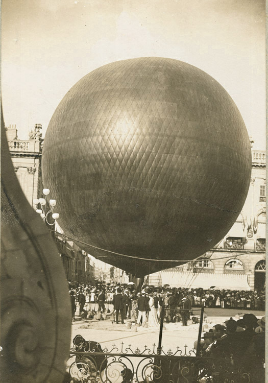
Rather than post this beautifully composed 1895 photo of Henri LaChambre’s rather awesome gas balloon inflated at Nancy, I should’ve freakin’ bought it by now.
Of course, my problem is that, now that I’ve seen it, I’ve filed it away for future flea market reference, where I’m sure I’ll just stumble upon a photomural-sized print of it for a euro.
Anonymous – Henri Lachambre and His Balloon at Nancy, France, $450 [vintageworks.net, thanks to whoever sent this to me, I forget, sorry]
Previously: Les Ballons du Grand Palais
Category: art
Drawing About Architecture About Music
I’ve got a lot of browser tabs to clear before I head to Miami.
Am I not listening or looking in the right place, or is there really not enough discussion about MoCA’s exhibition of drawings by the composer/architect/polymath Iannis Xenakis?
Xenakis was a longtime collaborator with Le Corbusier. Philipp Oswalt credits him with the introduction of light and projection as tools and “subject[s] of architecture” in the dramatic chapel of the convent at La Tourette.
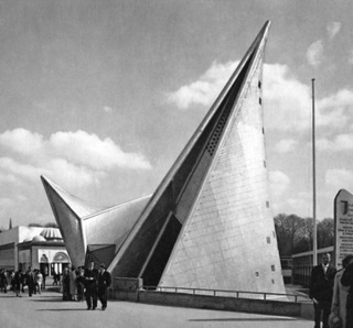
Tools which would come in handy in the multimedia Poeme Electronique, whose film projection cones and soundscapes drove the form of the 1958 Philips Pavilion [top].
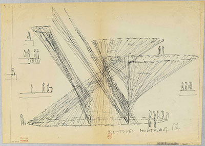
Anyway, the drawings include musical scores, which sometimes appear interchangeable with Xenakis’ schematics and sketches for his later independent installations, including the Polytope for Montreal, above, an abstract light and sound environment, which he created around the time of Expo 67. The Xenakis archive is at the National Library in France. Not sure how accessible it is, but LA might be the best/easiest shot.
Related: Philips Pavilion models spotted in Amsterdam
‘Relational Aesthetics For The Rich’ – Friday 12/3, 1PM In Miami
It’s less than a week away, and I can’t believe I haven’t hyped it yet:
I’m giving a presentation this Friday in Miami during Art Basel Miami Beach titled, “Relational Aesthetics For The Rich, Or A Brief History Of The Gala As Art.”
It’s based on this similarly titled blog post, which pulls together a lot of things I’ve been fascinated by over the years, but which was inspired by MoCA’s Annual Gala, which the museum relabeled “a Happening,” and which they turned over to Doug Aitken to design as an artwork.
At least that was Jeffrey Deitch’s original pitch; the results–and the history and context of museum gala art–turn out to be a little more complex.
Anyway, the talk is part of #rank, a program put together by Bill Powhida and Jen Dalton, which will be held at SEVEN, the shared exhibition and program space in Wynwood organized by a group of awesome New York dealers.
There are so many people to thank, starting with Magda Sawon from Postmasters and artist Michelle Vaughan, who are the honorary co-chairs of the presentation. And there are the gift bag sponsors, of course, who will be announced soon. I hope.
The gig goes down at 1pm, and it should be available for live streaming online, in case you are too busy making acquisitions at ABMB or something. But then you won’t get a gift bag…
Jean Nouvel Should Build A Better Bedouin Tent
At least now we know what NY Times museum building critic Nicolai Ourossoff has been up to lately.
Just as I am thinking I need to add Saadiyat Island and the names of the grand new patrons of the arts from Qatar and Abu Dhabi to the greg.org art world pronunciation guide, I find a few things blocking my view of Our Glorious Cosmopolitan Future.
Since at least as far back as Rem Koolhaas bold, neo-Nixonian embrace of CCTV, a policy of architectural engagement has liberated our Western starchitects from the tyranny of conscience, of having to think or worry about the political or ethical unpleasantness of their state clients. I guess that exemption extends to our Western, liberal institutions, too–our Louvres, our Guggenheims, our NYUs, our Georgetowns.
But seeing as how I am not in one of these cultural oases and thus am not at risk of getting fired, deported, or arrested, I’ll just put some of the problematic parts in bold:
The consultant who works in fear of losing his/her job:
“There are religious extremists everywhere in the Middle East — even here,” said an Arab consultant who has worked on several developments and spoke on the condition of anonymity for fear of being fired. The sheik, this person said, believes the cosmopolitan influences of the projects may help “open up the minds of these younger Emiratis before they go down that road.”
The international museum franchises walled off in hermetic playgrounds for the ruling class:
The new museums will be embedded in a kind of suburban opulence that can be found all over the Middle East, but rarely in such isolation and on such an expansive scale as in Abu Dhabi. The concrete frames of a new St. Regis hotel and resort and a Park Hyatt are rising just down the coast from the museum district, along Saadiyat Beach. Nearby, a 2,000-home walled community is going up along an 18-hole golf course designed by Gary Player, to be joined eventually by several more luxury residential developments and two marinas for hundreds of yachts. A tram will loop around Saadiyat, connecting these developments to the museums.
But wait, didn’t Jean Nouvel just say he’d “always wanted” to “make the museum part of the city, not just a building?”
The temporary workers’ paradise that doesn’t actually exist yet, except as a tourist stop for foreign reporters:
In some sense this village embodies a version of the cosmopolitanism Abu Dhabi says it is trying to create. But even if it is completed as planned, it will house only a small fraction of the city’s hundreds of thousands of migrant laborers; the rest will presumably live in cramped quarters in the city’s industrial sector or in faraway desert encampments. And once the museums are completed, a spokesman for the government development agency told me, it will be bulldozed to make room for more hotels and luxury housing.
And the kicker:
Even many educated Arabs in and outside Qatar — among the museums’ target audience — see a disturbing inconsistency in these grand plans.
“Some have lived here 50 years,” said Fares Braizat, a Jordanian professor at Qatar University who has been working on a census of foreign nationals. “They speak Arabic with a Qatari dialect, but they are still not allowed Qatari citizenship” or any of the enviable perks that go with it: free education and health care, interest-free government loans, preference in hiring, a sense of equality.
Here I would have to take issue with Mr. Ouroussoff’s characterization. Whatever feeling a Qatari citizen derives from his large, exclusive bundle of “enviable perks,” a “sense of equality” is clearly not among them.
But it’s not all bad. There’s something about Qatar’s National Museum that gives me hope:
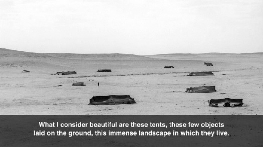
Inside, displays of tents, fabrics, saddles and other objects, as well as enormous video screens that will immerse the visitor in the experience of the desert, are meant to convey both the humble origins of Qatar’s royal family and the nobility of Bedouin life.
If we can get work through our tribalistic present, beyond both Qatar’s exploitative foreign worker practices and American jingoist sneers at the mere mention of Al Jazeera, maybe there will be a shared, globalized, nomadic future where the humble nobility of Bedouin life is celebrated as an aspirational ideal, not just an exotic throwback. Maybe a culture rooted in hospitality and mutual responsibility that subsumes, or at least reconciles the twin forces of rootless disconnection and nationalism which shape each individual’s worldview.
I’m not sure where billion-dollar museums shaped like falconry hoods or hyper-magnified sand crystals will fit in such a culture, but maybe that’s the point.
Building Museums, and a Fresh Arab Identity [nyt]
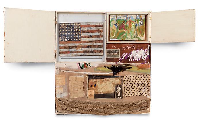
This Flag Is My Flag. This Flag Is Your Flag.
Something Holland Cotter wrote today made me really think: “Short Circuit is a sweet reminder of Rauschenberg’s collegial generosity; he believed in art making as a communal endeavor, and acted on that belief.”
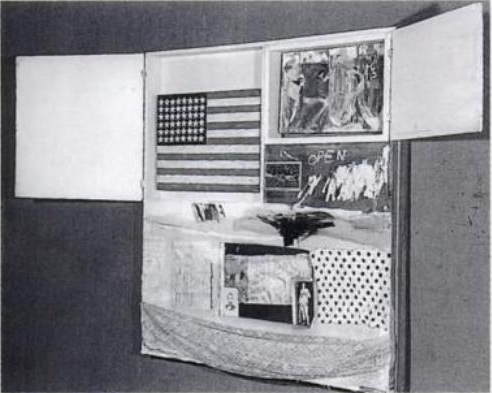
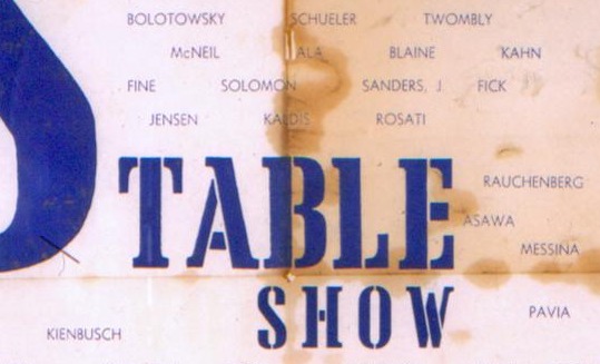
Collegial generosity is certainly one way to look at it. Because Rauschenberg had exhibited in the Stable Gallery’s Second and Third Annuals, he was supposed to be able to select artists to show in the Fourth Annual. For whatever reason, though, in 1955 Eleanor Ward decided only Stable alumni would be allowed in that year, and so Rauschenberg’s picks–Short CircuitJasper Johns, Ray Johnson, Stan VanDerBeek, and Susan Weil–were rejected.
And so the story goes that Rauschenberg smuggled them into the show anyway, as elements in his own combine painting. [It’s not clear why VanDerBeek’s work wasn’t included; Cotter says he didn’t get a piece finished in time, but I’ve also read that VanDerBeek declined the combine invite.]
Rauschenberg invited the artists to, as Walter Hopps put it, “collaborate in his piece.” A generous gesture, to be sure, but also a complicated one.
Short Circuit triggers a whole host of questions that I find the quite interesting: What is the status and relationship of the artworks Rauschenberg incorporated into his combine-painting? Do they still function as autonomous works? If so, why? Are they substantively different from the other cultural detritus he used–newspapers, postcards, fabric, objects? If not, why not?
In the bluntest sense, these questions are answered by the invitation for the show, which mentions none of Rauschenberg’s three collaborators:
Rauschenberg’s generous inclusion of his ex-wife’s painting, his friend’s collage, and his partner’s iconic flag painting–oh, wait, that’s right, this was the first flag painting of Johns ever to be exhibited, and it was as an element of another artist’s work–and behind a door to boot. Did anyone in 1955 even know that Jasper Johns’ Flag wasn’t Robert Rauschenberg’s flag?
The story of Johns’ promethean debut at Castelli Gallery in 1958 is well known. In this 1969 telling of it to Paul Cumming, Castelli visits Rauschenberg’s studio in 1957, and then they pop down to Johns’ studio, which is full of targets and flags, and Castelli offers him a show on the spot. Which makes the cover of Art News and changes the New York art world overnight. But check this out:
Jasper Johns was a real discovery in a certain sense because, although he existed, not many people knew about him. I saw him for the first time in a show at the Jewish Museum. That was in March of 1957, and that was the Green Target that the Modern has now. I saw that green painting. It didn’t, of course, appear as a target to me at all. It was a green painting. I didn’t know that he was doing targets. Well, going around and seeing the familiar painters of that time…. It was a show that had been organized by Meyer Schapiro and other people. There was Rauschenberg and Joan Mitchell, and, oh, all that younger generation. Well, I came across that green painting, and it made a tremendous impression on me right away. I looked at the name. The name didn’t mean anything to me. It seemed almost like an invented name–Jasper Johns.
[Emphasis added on the parts where, holy crap, two years after exhibiting Short Circuit, there’s still a question whether “Jasper Johns” exists.]
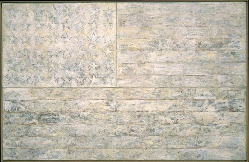
Johns had shown flags at Bonwit Teller [including White Flag, which he eventually gave to the Met], where he and Rauschenberg dressed windows under the commercial pseudonym Matson Jones. Except for a drawing in a group show, Johns only exhibited a flag painting under his own name in 1957, in a group show at Castelli a few weeks after their fateful studio visit.
Rauschenberg’s Short Circuit–and Johns’ first and most immediately important paintings of flags and targets–were created when the two artists were closest, and when Johns was essentially unknown. When the flag was stolen from Short Circuit, both artists were famous, and their split was so acrimonious, they were not speaking to each other.
These relationships and collaborations, these formative histories of the New York art world, and these contestations of autonomy, authorship, sourcing and appropriation all seem to converge on Short Circuit. And it makes me wonder, again in the bluntest terms, whose flag was it, and who was it stolen from?
Wait, What? I Thought Johns’ Flag Was Stolen From Short Circuit In 1967.
In his review of the Robert Rauschenberg show at Gagosian, where the work is somehow different because it is for sale, Holland Cotter explains Short Circuit‘s origin as an attempt to get his recommended artists’ work into the Stable Gallery’s group show, but then whoa:
Only Mr. Johns and Ms. Weil, Rauschenberg’s ex-wife, came through with work on time, so into the cabinet went a little painting by each And, with one significant change, those two paintings are still there: Mr. Johns’s picture, a mini-version of one of his soon-to-be famous flag images, was stolen in 1965 and replaced by an Elaine Sturtevant copy.
Really? 1965? But didn’t I just get finished explaining how it was actually stolen in 1967? Yes, yes I did.
Or so I thought.
I won’t dwell on the fact that, though they were extremely responsive and helpful, Gagosian had already told me neither they nor the Rauschenberg Foundation had any record or idea of when Johns’s Flag painting was stolen.
But as I was about to send in my correction to the Times, I re-read Walter Hopps’ 1976 account:
The original flag painted by Jasper Johns was subsequently stolen and was replaced by a replica painted by Elaine Sturdevant [sic] at the time of the exhibition “Art in Process: The Visual Development of a Collage,” held at the Finch College Museum of Art in March 1967.
And you know what, it might be possible that the “subsequently stolen” does not, in fact, refer to the March 1967 show, and that the Sturtevant replacement took place “at the time of exhibition.” That is a possible reading.
But it doesn’t change the fact that texts and critical coverage of the Finch show so far makes no mention of the theft, or the replacement. And that a year into the traveling exhibition, Short Circuit‘s cabinet doors, which visitors had been able to open, were now nailed shut.
I’d also add that while the 1976 catalogue text mentions the theft, the reproduction of Short Circuit seems to include the original Johns flag. It certainly does not depict the Sturtevant Johns Flag that’s in there now. It’s almost as if the Sturtevant replacement decision was made in time for the 1976 show/catalogue, but not in time to have it photographed. [Or maybe Rauschenberg and/or Hopps didn’t see a need to rephotograph it? Which would be a separate set of interesting issues.]
So either Cotter knows something, or he’s wrong, and is just latching onto 1965 as the theft & replacement date because that’s when Sturtevant first showed her Johns Flags. Either way, I’ve added him to the interview list.
Short Circuit 2: Wheeere’s Johnny?
Alright, the search is on; I’m working to trace the history of Robert Rauschenberg’s 1955 combine Short Circuit and especially to figure out what happened to Jasper Johns’ flag painting, and when and how Sturtevant’s flag painting got in there, and what all that means.
When I first wrote about Short Circuit last week, there was no date or story or anything about how the flag disappeared, only that it had been described as “stolen.”
In his 1997 Rauschenberg catalogue, Paul Schimmel had mentioned the Johns Flag–which, like a painting by Rauschenberg’s ex-wife Susan Weil, was incorporated into the combine behind two cupboard-style doors–had been stolen while the work was on exhibit. Now I’ve found out where and when that was, I think.
In 1976, Walter Hopps curated a Rauschenberg retrospective at the National Collection of Fine Arts, which is now the Smithsonian’s Museum of American Art. From the catalogue:
The original flag painted by Jasper Johns was subsequently stolen and was replaced by a replica painted by Elaine Sturdevant [sic] at the time of the exhibition “Art in Process: The Visual Development of a Collage,” held at the Finch College Museum of Art in March 1967. In his statement for the exhibition catalogue, Rauschenberg commented, “This collage is a documentation of a particular event at a particular time and is still being affected. It is a double document.”
For Rauschenberg the work remains “a double document” of the past and the ongoing present. Recently, in commenting on the stolen encaustic, he has stated, “Some day I will paint the flag myself to try to rid the piece of the bad memories surrounding the theft. Even though Elaine Sturdevant did a beautiful job, I need the therapy.”
Much to unpack there, especially in that second quote. Wow.
But at least now we have a date and a place: Finch College Museum, March 1967. Finch was a women’s college on the Upper East Side. From the archival photos, the Museum looks like the basement floor in one of the school’s townhouses on East 78th Street [between Madison and Park]. In the 60’s, under the direction of Elayne Varian, the Finch Museum had a pretty advanced contemporary exhibition program.
[One of the top Google hits for Finch College turns out to be from Calvin Tomkins’ Rauschenberg bio. Legendary dealer Ivan Karp tells the story of how he was showing some girls from Finch around Castelli Gallery when Roy Lichtenstein walked in with his first comic panel paintings under his arm.]
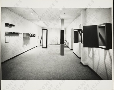
“Art in Process” was an innovative series of exhibitions that placed sketches and models alongside finished works to examine the working practices of contemporary artists. An “Art in Process” show on Structure, for example, which went up in 1966 within months of the Jewish Museum’s seminal “Primary Structures” show, contained works by Lewitt, Judd, and Smithson, including the latter’s Enantiomorphic Chambers [on the right in the image above, via aaa.si.edu], which, ironically, was also lost.
Anyway, after its Spring 1967 debut at Finch, the Collage show traveled under the auspices of the American Federation of Arts. Though I can’t find the complete list of venues, in February 1968, it came to the Phillips in Washington, DC, where the Post’s sportswriter-turned-art-critic Paul Richard panned it by repeatedly dismissing collage as mindless random gluing and comparing it to the tacky “Snoopy’s valentines” everyone had just exchanged.
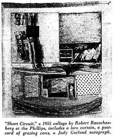
Except for Short Circuit, that is, which Richard called, “the best in the show.” Take note of his description, though, and that he specifically mentions reviewing all the extra documentation of the show in the Phillips back offices:
(When first exhibited, viewers could open the collage’s two hinged doors to discover two paintings, one a flag picture by Jasper Johns. They’re no longer visible. The doors have been nailed shut.)
No mention of the theft, the missing Johns, or any replacement. And the doors are shut on the paintings by the artist’s ex-wife and ex-partner. No musing, please!
Despite the mind-boggling variety of its components, the piece somehow holds together. The composition is bright and strong. It’s nice to think about (the viewer can muse on the various associations generated by relics of Miss [Judy] Garland, Lincoln and [John] Cage), but tracing the development of this work would be a hopeless task.
We shall see, Mr. Richard, we shall see.
The Photographic Book Series By Ofer Wolberger
Brooklyn-based photographer Ofer Wolberger is right in the middle of an interesting project: The Photographic Book Series, twelve limited edition artist books, each with a specific subject or theme. Sometimes he uses source photos, sometimes they’re [presumably] his own.
The newest volume, #7 – Covers, is actually a handmade book of photocopied hardcover books, and it’s definitely more interesting than it might sound. Part Nina Katchadourian, part Sigmar Polke, it’s really quite poetic and beautiful.
Another standout from the Series is #3 – Town, and I’m not just saying that in a “Look, shiny object!” way. But Town is a series of photos of a large silvered canvas/painting propped up on the edge of a gel-lit stage. Its nice combination of abstract and documentary makes it more Moholy-Nagy than Walead Beshty. And it makes me think it could have been shot after a Silver Clouds party at Warhol’s Factory. I.e., awesome.
Publications | Ofer Wolberger [oferwolberger.com]
Book trailer for Covers from Ofer Wolberger [vimeo]
Please Sir, I’d Like Some Meer
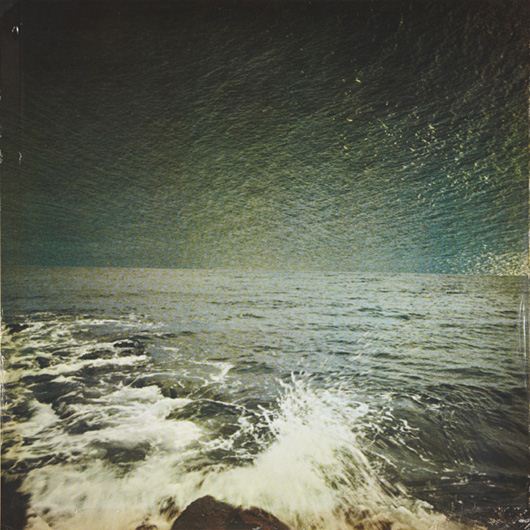
Also up at Phillips today was this nice little [25x25cm] seascape, Meer (Sea), a 1973 offset print by Gerhard Richter.
Richter replaced the sky in one snapshot with the sea from another. This particular example sounds like it had some condition problems, but with an edition size of 250, plus a dozen or more proofs, I’m sure a better one is never too far away.
Meer (Sea), 1973 [gerhard-richter.com]
Related? Lichtenstein’s Electric Seascapes
Hiroshi Sugimoto
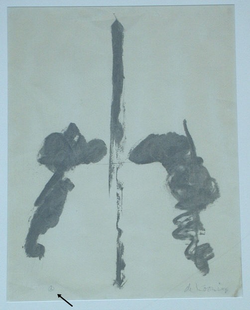
Washington Monument Peace Sign
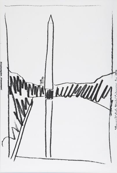
An interesting curatorial pairing where you’d least expect it: deep in the middle a random, Sunday afternoon print sale at Phillips de Pury.
Lot 327: Washington Monument, is an unnumbered edition sliced up from a wallpaper Andy Warhol made in 1974 for an unknown commission, but apparently never installed. Dia had 322 rolls of the stuff, which it gave to found the Warhol Museum.
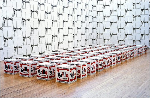
With a few takebacks, I guess, because the Warhol let Dia Beacon install a whole roomful of the stuff in 2005. It looks kind of nice and abstract, a nice background for those Pasadena Brillo Boxes. [image via nyt]
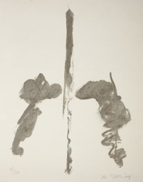
Meanwhile, Lot 328 [above], was Washington Monument, a properly signed and numbered lithograph by Willem de Kooning, published in 1970. The composition’s almost identical to Warhol’s, as if both artists used the same photo or postcard for a source. Or as if Warhol used de Kooning’s print, which would be pretty unusual. Several of these have come up at random auctions this year: #13/50 at Bloomsbury; #14/50 at Swann.
An abstract representation of an abstract original, de Kooning’s Washington Monument is uncontroversial enough to be displayed in a wide range of otherwise complicated settings.
The Phillips version is #26/50, and it was sold by the defunct law firm Dreier, LLP, which was implicated in a massive securities trading fraud sideshow to the Bernard Madoff scandal.
And two related, slightly larger charcoal drawings, dated 1969-70, are on loan from the Estate to the US Ambassador’s residence in London [pdf].
The drawings are untitled, but every numbered lithograph I’ve found is titled simply, Washington Monument. But a Connecticut antique dealer once had a signed, proof, which apparently came from a close friend of the artist. The title of the work, the friend said, is actually Washington Monument Peace Sign, and in the bottom corner, in place of an edition number, de Kooning put a little peace sign.
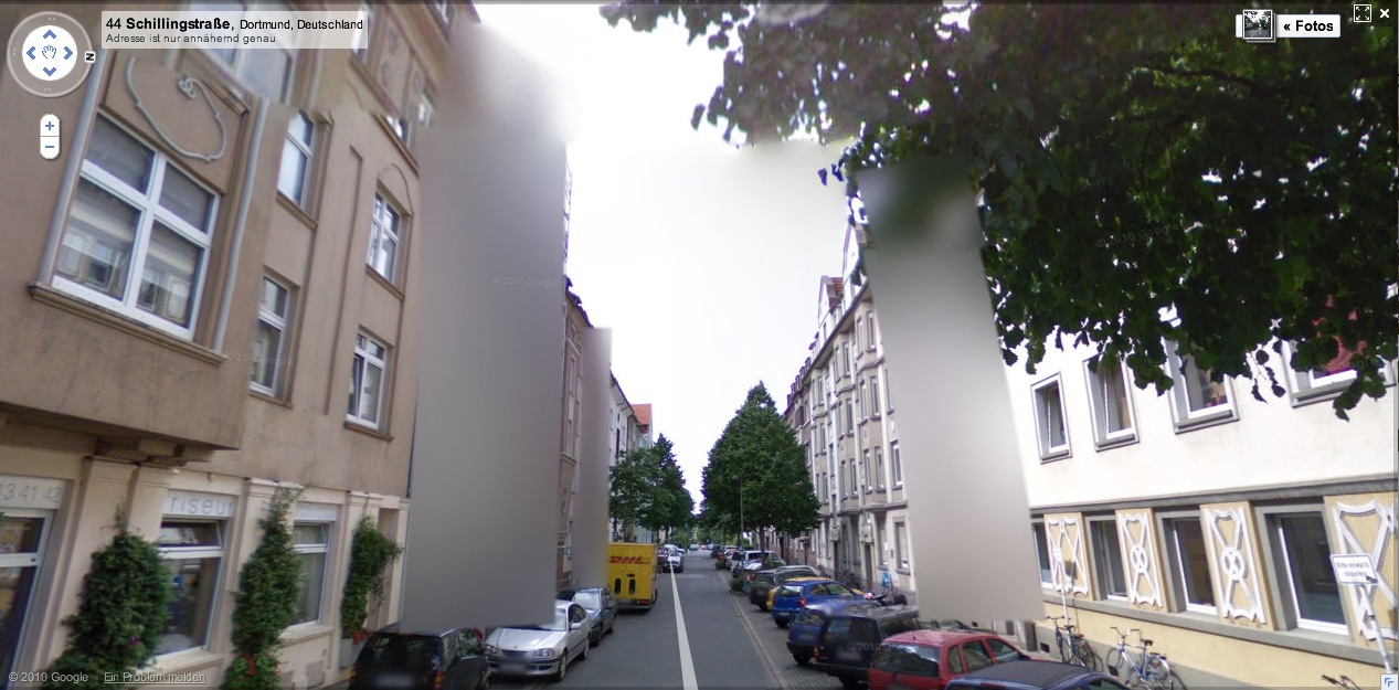
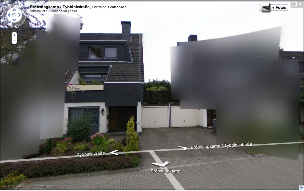
Blurmany: The Dortmund School
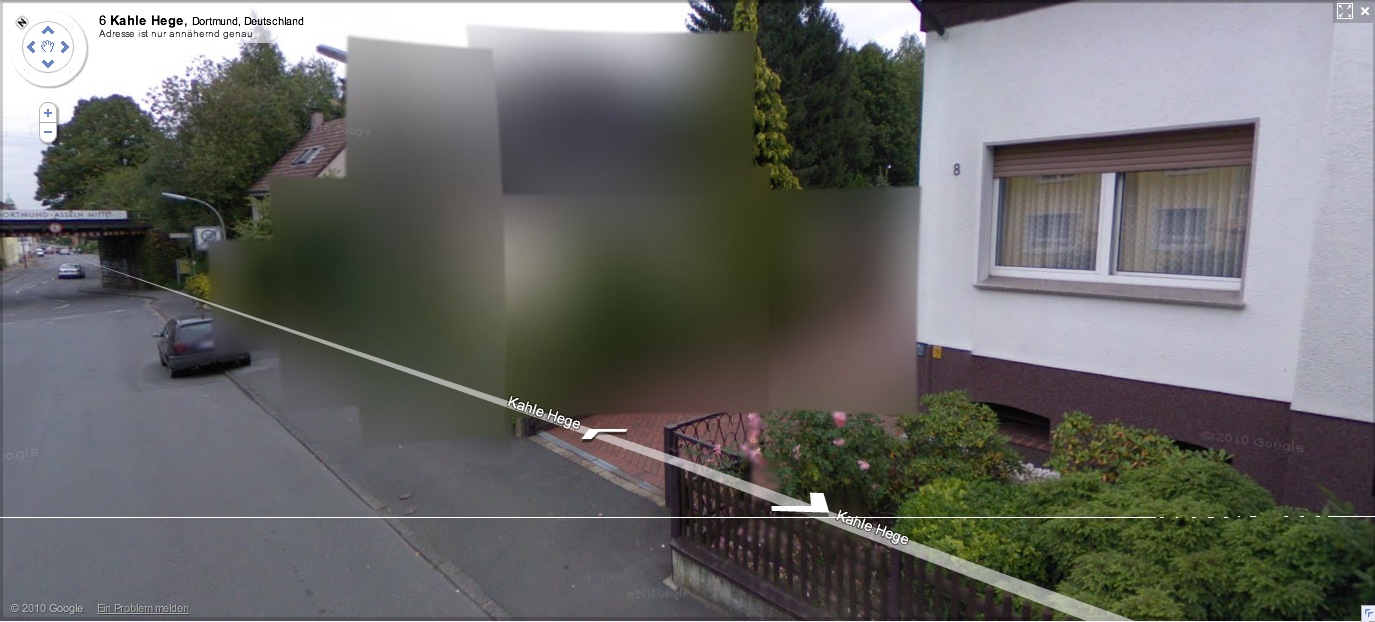
More of Germany is appearing on Google Street View, and we can start to see what 240,000 blurred out residences looks like in a country of 8 million-plus: a lot. Far from being a marginalized fraction, the blurred structures pop right out; they’ll be the prominent, even the defining feature of Google’s virtual German landscape.
[How ridiculously cursory is this opt-out scheme, by the way? Does the blur go with the house, or the owner? Can an owner take his Street View privacy with him when he moves? Will blurred residences have an easier or harder time selling? Who gets to decide to blur a multi-family apartment? The landlord? A majority of the tenants? Whatever else they think of it, Germans should recognize that this blurring is unsustainable as it stands, and that Google is certainly treating it as a transient fix for getting through the immediate political situation.]
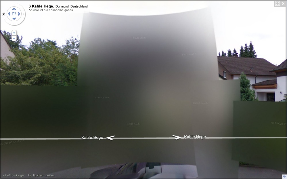
And in just a matter of days, it seems that the algorithm Google is using to blur out the houses has changed. The result, as seen in this completely random collection of houses I just surfed up in Dortmund, is all blur and no pixel.
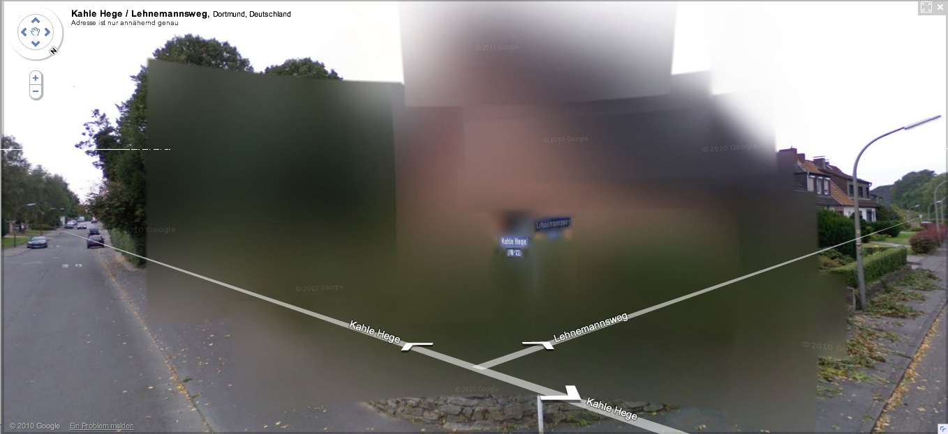
It’s also distinctively planar, with large, overlapping, color-averaging tiles, like looking through scrims or through a construct of semi-opaque glass. If they’re still Richters, they’re the glass paintings,
![]()
as assembled in space by Helio Oiticica.
At least that’s what I’d probably use to reconstruct the blur structures in real life. Probably set up a very slight scaffolding of polycarbonate sheets, experiment with the films and filters to get the right optical effect. And then rephotograph the whole site.
Without searching through the German web, I’ll naturally assume that I’m the first to think of this brilliant artistic idea. But I’m just as sure someone on the ground will beat me to the execution. And as Germans acclimate to this Street View, I’m sure that the Blurman landscape will begin to creep into the aesthetic consciousness in a whole host of ways.
Previously: Blurmany and the Pixelated Sublime
Fun In Paint
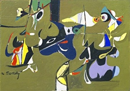
I don’t know why I do it either, but here is Washington Post arts blogger Blake Gopnik ruminating on just what it is that makes Arshile Gorky’s paintings so upbeat, so appealing:
The most striking thing about this AbEx show is how cheery and bright many of its paintings seem – as cheery as Gorky’s “Garden [in Sochi]” – given that the movement is so often associated with gloomy existentialism, post-war angst and the dark Freudian unconscious. Could it be that its true roots are in the post-war boom and a country, and a city, coming into their own as cultural and economic hot spots? (But if so, why is Gorky having fun in paint in 1941 already? Or could it be that painting is an inherently affirmative, cheery act, and that painters can only ever mimic gloom, with the risk that silver linings may show through at any moment, in any work.)
Fun in paint? I’d have gone with, “tortured nostalgia for the garden his family had to flee during the Armenian genocide, during an attempt to blot out the horrors of the forced refugee march where his mother died of starvation, but not before instilling in her young son a desperate ambition which became the altar upon which a perennially destitute, lying, insecure Gorky sacrificed his own family and which, after abandonment, cancer and a debilitating car wreck, led him to hang himself from a tree.” But if you see “fun in paint,” I guess that’s…
Anyway, the Garden in Sochi paintings are more properly considered surrealist, transitional, or proto-AbEx, similar to early the figurative/narrative/symbolic work by the other two members of the Fun In Paint School, Pollock and Rothko.
An interview with Gorky’s wife Agnes Magruder, conducted on the occasion of Tate Modern’s Gorky retrospective. She seems far more interesting than the subject matter lets on. [tate.org.uk]
Related: Gorky was an expert camofleur
Have You Seen Me? Jasper Johns’ Little Short Circuit Flag
The Rauschenberg show at Gagosian is pretty incredible, but then again, I’ve had Walter Hopps’ incredible show of Rauschenberg’s 50s work imprinted on my brain from day one.
Anyway, here’s a little art history mystery about one of the great 50s pieces in the show, Short Circuit, 1955, which, in addition to a Ray Johnson collage and a Susan Weil painting, originally included a small flag by Jasper Johns, the first one he ever exhibited publicly.
The flag that’s in there now is by Sturtevant [above], because, as Calvin Tomkins put it,
Some years later, after Johns had become famous, the little flag painting mysteriously disappeared from the mother-work. Later still, a dealer brought a small Johns flag into Leo Castelli’s gallery and asked if Leo could identify it–he said it had been offered to him by a third party. Castelli recognized it immediately as the missing element from Short Circuit. He told the dealer it had been stolen, and said he did not want it to leave the gallery. The dealer refused to part with it. He took the little painting away, and nobody has seen it since.
Nice, but not true. At least two people have seen it since: the dealer, and the perp. If they fenced it elsewhere, you can add a third or more. You stay classy, art world!
So what’s it like, when did it get lifted, and more importantly, where is it?
Thomas Crow’s history makes it sound like the Short Circuit flag was straight [sic] oil on canvas, and that Johns only later switched to the more laborious, anti-painterly medium of encaustic, which he showed in 1958. [uh, or maybe it was encaustic after all. see below.] Either way, Sturtevant’s flag certainly looks more Johnsian than Johns’s flag.
Short Circuit stayed in Rauschenberg’s own collection, which would necessarily limit who had access to the work. Sturtevant’s first show, in 1965, included Johns Flag, which only puts a starting date for when Rauschenberg might have had the work replaced, but provides no help in figuring out when Johns’ own flag went missing.
Let’s try and nail down some of these dates, though, and then see who might have been around Bob’s place at the time, shall we?
update:
- OK, it sounds like Johns’ flag was still there when Leo Steinberg was talking to Bob and Jasper in 1961.
- Wait, in a footnote in his 1994 book Figuring Jasper Johns, Fred Orton says the Short Circuit flag is, in fact encaustic, and that the combine is discussed in the Smithsonian’s catalogue for Rauschenberg’s 1976 retrospective. No mention of a missing flag, or Sturtevant.
- Am I looking way too early? Well, at least by
1997[whoops, 2005], the catalogue for Paul Schimmel’s MoCA Combines show is calling the flag an “Elaine Sturtevant replica.” - It also says the flag was stolen “by an unknown viewer,” so it was taken while on exhibit? Bonus Short Circuit trivia: Rauschenberg also invited Stan VanDerBeek to stick a work in, but he declined.
Huh, a good question from a British reader, who sent along an amusingly embarrassing story from the Daily Mail about some poor chump reporter’s attempt to authenticate a glaringly obvious Johns forgery he bought for a hundred pounds on Portobello Road: has this Short Circuit flag ever been registered as stolen? Because it sounds like Scotland Yard hasn’t heard of any missing Johns.
Off The Wall: A portrait of Robert Rauschenberg [excerpt via google books, thanks art unwashed]
Sea Force One
Christoph Brech is the master of the meaningful tight shot. In Sea Force One, he focuses in on a pair of workers in a small boat who are scrubbing the hull of Francois Pinault’s black yacht in front of Punta della Dogana during the 2009 Venice Biennale.
The work is included in “Portraits and Power: People, Politics & Structures,” at Strozzina in Firenze. It is interesting to compare their writeup of the piece–
We do not know who was on board the yacht – possibly François Pinault himself, the famous French luxury goods entrepreneur and primary investor in the new Venetian exhibition area. Brech has turned his camera on a moment that would otherwise have gone unnoticed, deliberately choosing not to record the sumptuous affirmation of wealth of the yacht. It is the contrast between the size of the latter and that of the small boat, or between the black hull of the yacht and the evanescent white of the soap and of the reflections upon the water, that brings out the greatness of the vessel, the actual size of which we do not grasp. The artist succeeds in moving beyond the façade of power and wealth by stopping at its surface. He seems to be suggesting that the strategy for the construction of an image of power may lie in its antirepresentation: i.e., the “myth” of power is created by veiling or concealing the identity of those who hold it.
–with the artist’s own:
The yacht Sea Force One is anchored in front of a museum at the Punta della Dogna in Venice. The waves of the lagoon are reflected in the black varnish on the ship´s hull.
From a small boat nearby, workers are cleaning the yacht.
A painting emerges from the broad, white trails of foam on the ship´s dark surface, visible only for a short while until erased by cleansing streams of water.
Once again the reflected waves dapple the yacht.
At first read, I thought Brech’s focus on the formalist, painterly abstraction was notably less political than the Florentine curators’ interpretation. And damned if it doesn’t, in fact, look like a negative inversion of a making of film shot in Franz Kline’s studio.
Which immediately reminded me of the interview Felix Gonzalez-Torres did with Rob Storr, which I’ve reprinted and referenced here several times over the years.
I’m glad that this question came up. I realize again how successful ideology is and how easy it was for me to fall into that trap, calling this socio-political art. All art and all cultural production is political.
I’ll just give you an example. When you raise the question of political or art, people immediately jump and say, Barbara Kruger, Louise Lawler, Leon Golub, Nancy Spero, those are political artists. Then who are the non-political artists, as if that was possible at this point in history? Let’s look at abstraction, and let’s consider the most successful of those political artists, Helen Frankenthaler.
Why are they the most successful political artists, even more than Kosuth, much more than Hans Haacke, much more than Nancy and Leon or Barbara Kruger? Because they don’t look political! And as we know it’s all about looking natural, it’s all about being the normative aspect of whatever segment of culture we’re dealing with, of life. That’s where someone like Frankenthaler is the most politically successful artist when it comes to the political agenda that those works entail, because she serves a very clear agenda of the Right.
For example, here is something the State Department sent to me in 1989, asking me to submit work to the Art and Embassy Program. It has this wonderful quote from George Bernard Shaw, which says, “Besides torture, art is the most persuasive weapon.” And I said I didn’t know that the State Department had given up on torture – they’re probably not giving up on torture – but they’re using both. Anyway, look at this letter, because in case you missed the point they reproduce a Franz Kline which explains very well what they want in this program. It’s a very interesting letter, because it’s so transparent.
I guess it’s the curator’s job to overexplain things [?] but Brech’s title and his discussion of the work in terms of abstraction is plenty political in itself.
The Ultimate Collector’s Book Of The Millennium
We go to History with the culture we have, not the culture you want, or might wish to have at a later time.

316 pages. 136 Mb PDF download. Not including the copyright notices, well under 1,000 words.
I can’t quite put my finger on why, but I feel that, at least when The Future looks back on us, here, in this moment, in this culture, in the–as the flight attendant unexpectedly put it when he announced our arrival at Schiphol–in this, the 2,010th Year of Our Lord,
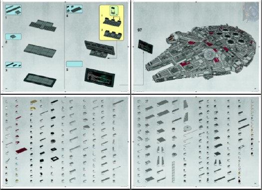
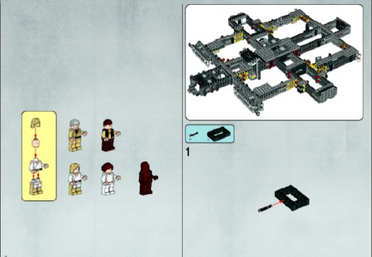
the instruction manual for the 5,000+piece Lego Set 10179-1: The Ultimate Collector’s Millennium Falcon may just end up as the touchstone, the most meaningful book, the best we managed to do. It is certainly the pinnacle of something.
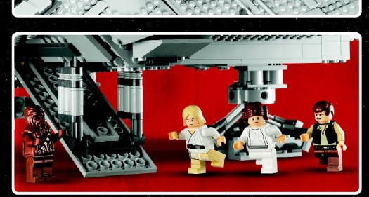
During the unboxing, a giddy Amazon customer notes: “The bound instruction book weighs almost as much as the completed model! Almost. It’s huge!!!”
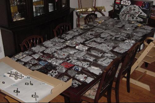
Seriously, I’m thinking it should be sold as a stand-alone. On the shelf next to The 9/11 Commission Report. And published in a limited edition art book version, on archival paper. Or at least given a fighting chance by being uploaded onto blurb.com.
I mean, it’s allowed, right?
If you plan to print the building instruction, please be sure to download the correct version:
# Building instructions labeled “NA” or “V39” may be printed on US standard letter size paper (8½ in × 11 in, 215.9 mm × 279.4 mm).
# Building instructions labeled “IN” or “V29” may be printed on EU standard A4 paper (210 mm × 297mm, 8.3 in × 11.7 in.)
http://cache.lego.com/bigdownloads/buildinginstructions/4525430.pdf [via things magazine, so this might be the A4 formatted file, fyi]
UPDATE: Lego does have the Instruction Manual available for sale separately. It is $53, plus shipping. [lego.com]