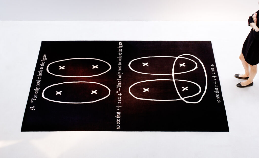
Joseph Kosuth, Remarks on the Foundation of Mathematics, 2015, 2x3m carpet, photo: Francesco Lagnese via Equator Production
For years now, I’d assumed that it was vaporware. Research inquiries had always turned up nothing. But where the Felix Gonzalez-Torres Foundation closes a file, Joseph Kosuth…unrolls…a carpet.
Critic Deborah Solomon mention this morning of a carpet in Kosuth’s house led me to Equator Production, an artist carpet venture by Petra and Ranbir Singh with Reiner Opuku, that ran from 1985 until 2003. Petra seems to have rebooted it [Kosuth’s carpet, Remarks on the Foundation of Mathematics, has the earliest date of the new bunch: 2015.]
And in 1991 Equator Production made “Untitled” (Free Tibet), a handwoven carpet with a text saying “FREE TIBET” on it, by Felix Gonzalez-Torres, which was listed as no. XXVI in the “Registered Non-Works” appendix of the 1997 catalogue raisonné.
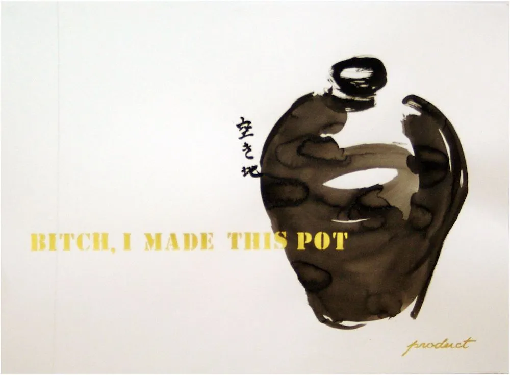
Theaster Gates, Untitled (Bitch, I Made This Pot), 2010, this is not the later print; I think it is ink, not from To Speculate Darkly, Milwaukee Art Museum, image: theastergates.com via thedrip
Despite mingei‘s origins as nationalist propaganda, and its “double Orientalist” emphasis of primitivism while appropriating Korean ceramic traditions, and its gender-biased gatekeeping that continues a century later, Gates et al still manage to make aesthetic and cultural meaning from engaging with it. And that problematic faving paradigm comes in handy.
Last Thursday [18 Apr 2024], in the music humanities class I teach at Columbia University, two students were giving an in-class presentation on the composer John Cage. His most famous piece is “4’33”,” which directs us to listen in silence to the surrounding noise for exactly that period of time. I had to tell the students we could not listen to that piece that afternoon, because the surrounding noise would have been not birds or people walking by in the hallway, but infuriated chanting from protestors outside the building…
The protestors are from the Gaza Solidarity Encampment, and they are calling for Columbia to divest and disassociate from Israel and to stop the genocidal attacks on Palestinians in Gaza. The protest began alongside university president Minouche Shafik’s testimony at the US House of Representatives last week. It has intensified and spread to other colleges after Shafik called NYPD into campus to arrest student protestors for the first time since 1968.
The idea that Cage meant 4’33” to be an ersatz reflection on bird calls and room tone is misguided at best. In 1999 art historian Jonathan D. Katz wrote of 4’33” that it, “inaugurated a process of reading that moved the listener, potentially, from unselfconscious complicity with dominant forms of expression…toward a degree of self-consciousness about one’s role as a listener or a maker of meaning.”
Which would be a helluva thing for these kids to learn in their humanities class anyway, including right now. If experiencing performances of 4’33” in the midst of protest, or resistance, or military attack could make a difference of even a day in this horror, then I’d say everyone download the John Cage Trust’s 4’33” app, and start recording.
But McWhorter’s entire newsletter turns out to be a sonic justification of police violence against the protestors. He repeatedly cites the sounds of the student encampment and of sympathizers on the street with destroying the peace, the kind of peace that requires no response. No ruckus, no police.
The performance lecture form has been of interest to me and a topic on this site for an extended period of time.
It has its origins in my own professionally driven interest in Powerpoint as a Creative Medium [oof so many dead links, from when I also believed hotlinking images would be the best practice/fair use realization of a Project Xanadu-like networked utopia. I’ll fix them in a minute.]
But I also ended the lecture by declaring it a work of art, in an edition, and I sent around a stack of signed and numbered certificates of authenticity for anyone who wanted one. I think I made 100, and got 40 or so back? [Shoutout to my OG collectors, that turned out to be CR-1.]
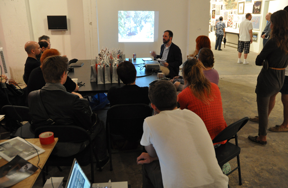
Relational Aesthetics for the Rich performance, 2010, image via hyperallergic
While an audience question that is more of a comment is a curse, a lecture that’s more of a performance is a blessing. Mindy Seu writes in Outland about artists who work in the medium of the lecture.
Lecture-as-performance calls assumptions of authority and credibility into question, Seu argues. It also opens the process and tools of lecture—such as podiums, Powerpoint, and Zoom grids—for critical examination or reworking.
One intriguing example Seu cites is Gordon Hall’s 2014 work, Read me that part a-gain, where I disin-herit everybody. Through the course of talking, Hall registers the implications of power, precarity, tension, and chill as he engages an array of prop-, screen- and podium-like objects.
Seu’s article was a reminder to look again for one of the most spectacular artist lecture/performance works, Suzanne Bocanegra’s Honor, which took place at The Met in February 2022. And wow, finally, it is on YouTube. Honor, as The Met describes it, was “a stage work that masqueraded as an artist lecture about one of The Met’s most important 16th-century tapestries.” If the theatrical link wasn’t strong enough, Bocanegra had actress Lili Taylor present the lecture while she, the artist, sat at a table on the edge of the stage, apparently feeding Taylor her text.
Which, in turn, makes me think way back to an artist talk I attended at the New School, by Maurizio Cattelan. Except, at the end of the lecture, the speaker revealed that he was not actually Cattelan, but a friend of the artist named Massimiliano Gioni, who was then an editor for Flash Art. Carol Vogel wrote about it months later, but I have not yet found this recording online.
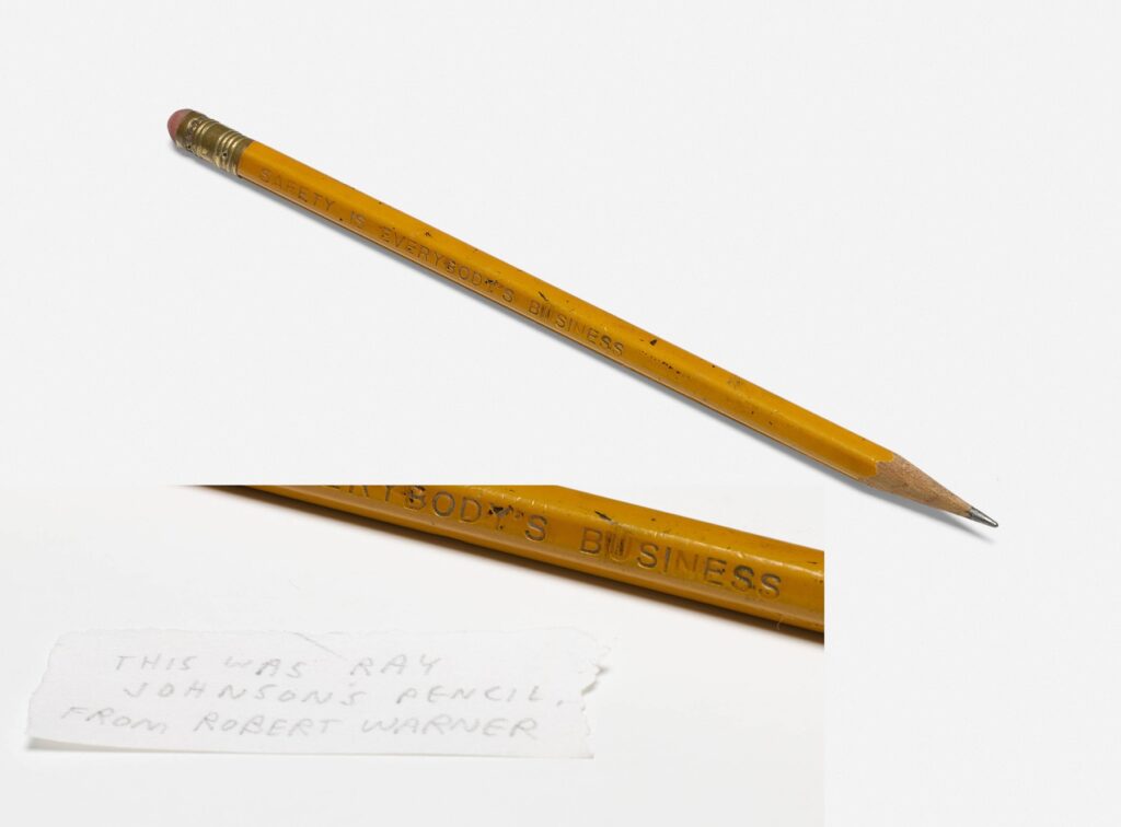
Jason Polan had a pencil that belonged to Ray Johnson. He got it from Robert Warner, a friend and longtime correspondent of Johnson’s. It will be sold next month with a note from Polan written [in? with the?] pencil.
nice grouping… Lot 121 in the May 3 2024 sale of Jason Polan’s collection
I’ve never been more excited for the Third of May, or more implicated.
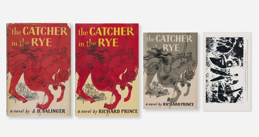
It’s still wild and sad that artist Jason Polan is not here, and not just because he left his project to draw every person in New York unfinished. Polan’s collection is coming up for sale on May 3rd, 2024, and it includes a bunch of his own work, plus artworks and artist books by others.
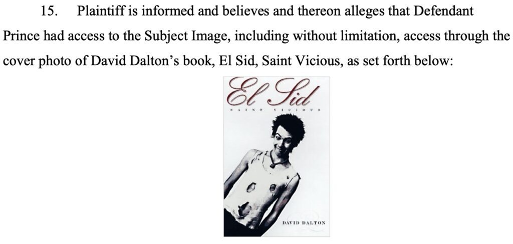
Among those works is this surprising quartet being sold as the The Catcher In The Rye Collection, which includes: JD Salinger’s original 1951 novel; an unopened copy of Richard Prince’s The Catcher In The Rye, which he sold from a blanket along Fifth Avenue in 2012; Eric Doeringer’s 2018 bootleg version of Prince’s Catcher, with an original drawing for and by Jason; and
[mic drop]
[picks mic back up] The Deposition of Richard Prince, which I published with Bookhorse in Zurich in 2013, and which feels like the hardest of the four to find sometimes.
Obviously everyone is encouraged to bid. If you can’t wait, four of you can at least get your own copy of Doeringer’s book directly from him.
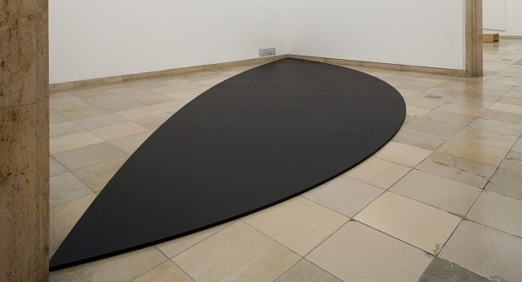
OK, I guess it’s clear I was not paying close enough attention when I posted about Ellsworth Kelly’s Red Floor Panel (1992) in 2022. I recognized that Kelly made five floor works. They began in 1990, Matthew Marks wrote, with Yellow Curve, for Portikus and were followed by “two in black, one in blue, and this one in red.” I’d assumed that Glenstone purchased Yellow Curve (1990), but of course, it was later made clear that Kelly did not recreate Portikus’ Yellow Curve, but made it anew as an autonomous work, Yellow Curve (EK 808), 2015, for an identically dimensioned—and purpose-built—space. Which means technically, Kelly made six.
Ellsworth Kelly, Black Curves, 2011, installed at Haus der Kunst, photo: Wilfried Petzi
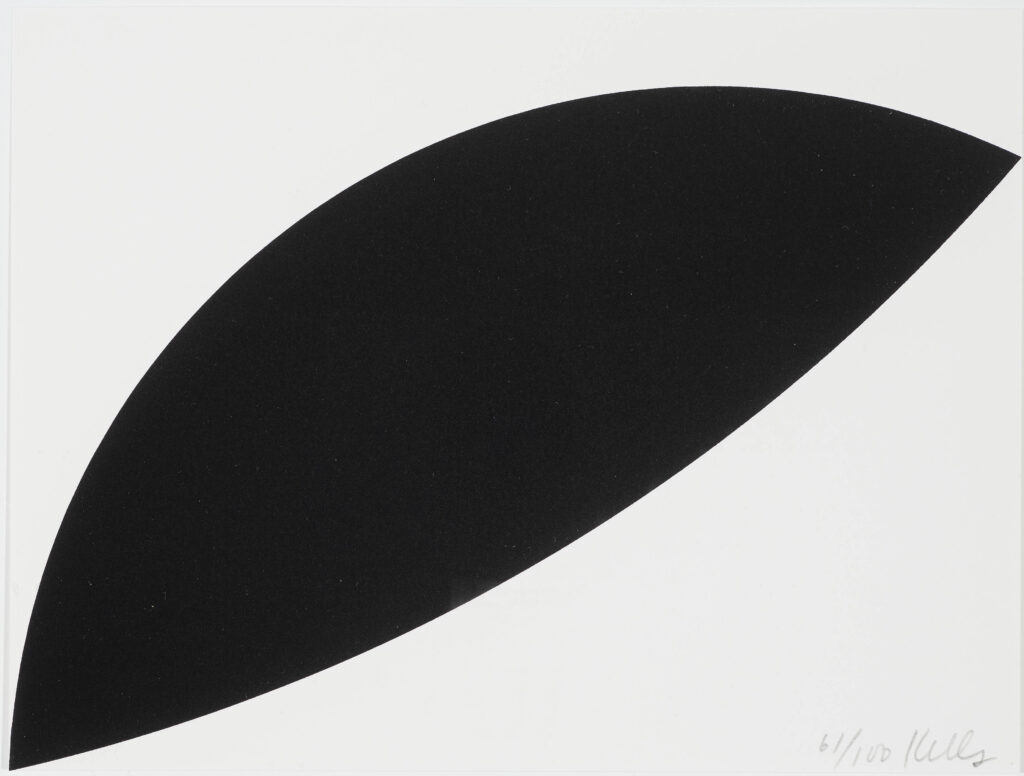
Red Floor Panel was reconstitutable and not site-specific, and Yellow Curve was not. Which are two potential conditions a floor piece can have. And now while researching Kelly’s 1955 painting Bar, I surfed across the 2011 exhibition, Ellsworth Kelly: Black & White at Haus der Kunst in Münich. For this venue Kelly was commissioned to create a floor panel the Haus called Black Curves [though Artforum called it Two Curves For Floor]. This panel extended 11 meters across a bay of the museum, and was destroyed when the show moved to Wiesbaden.
Ellsworth Kelly, Black Curves, 2011, lithograph, 197 x 261 mm, ed. 100, this ex. 61/100, sold at Neumister, was flipped upside down for schematic effect
It lives now only in proportion, memorialized in the diminutive fundraising edition created for the exhibition. Though with the dimensions and the plan, it feels ripe for recreating; all you need is a space with an 11m hypotenuse.
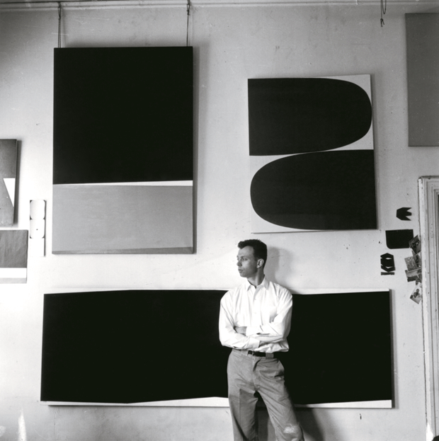
Ellsworth Kelly wore khakis: 1956 photo in his Broad Street studio, by Onni Saari via IG
Last April during the centennial year of the artist’s birth, photographer Onni Saari posted a 1956 image to Instagram of Ellsworth Kelly in his studio on Broad Street in lower Manhattan. In addition to some tantalizing little works on paper and images stuck into the door frame, three paintings are visible behind him. Counter-clockwise from the bottom they are, Bar (EK87), Red Curves (EK81), and Marblehead (EK IDK?)
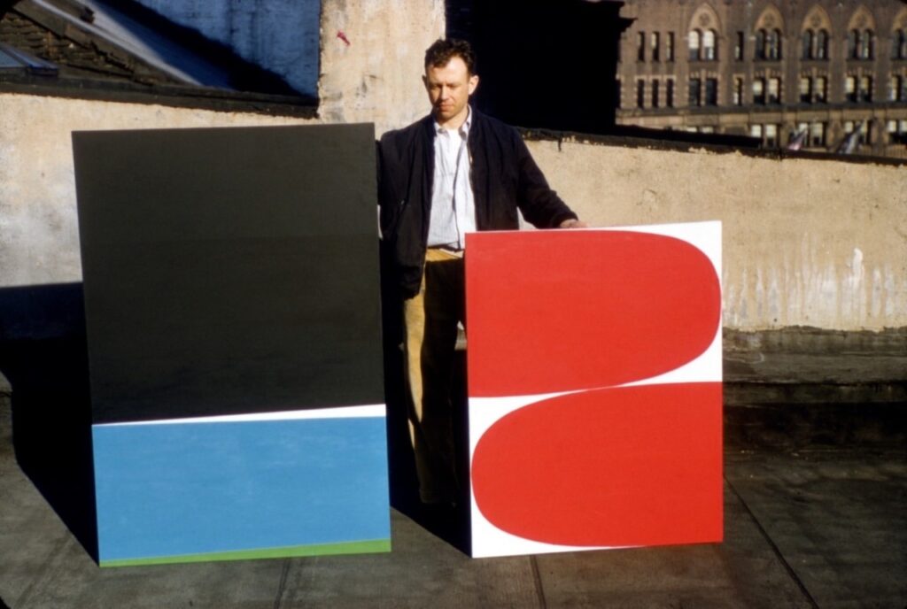
Ellsworth Kelly posing in 1955 with Marblehead (left, est 60×40 in. destroyed 1995) and Red Curves (right, 45×35 in.), photo: IG/ellsworthkellystudio via kundst and voorwerk
In November 2023, the Ellsworth Kelly Foundation posted this 1955 photo of the artist posing with Marblehead and Red Curves on his Broad St rooftop. The caption read, “Ellsworth considered Red Curves to be an epiphany of sorts, leading to many more curves, though the same cannot be said for Marblehead. The black, pulsing blue, and irregular bands made it a favorite with a Betty Parsons dealer [sic], but Ellsworth’s dislike of the composition was so strong that he destroyed it in 1995. ‘One I never cared for,’ a scrupulous Ellsworth wrote in his notes.”
The circumstances around Kelly’s decision to destroy Marblehead after 40 years intrigue me, but in writing this post, I have run out of time to get to the catalogue raisonné to find out what happened.
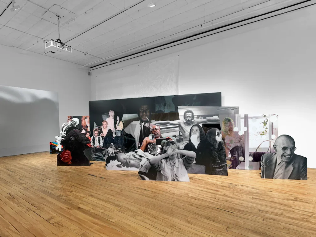
Arthur Jafa’s Large Array II, 2024, as installed at 52 Walker, who provided the image to ARTnews
Alex Greenberger was not getting the Arthur Jafa love message, on account of all the death. In his ARTnews review of Jafa’s shows, he doesn’t see a point to the en-Blackening and looping of violent scenes from Taxi Driver at Gladstone; nor to Jafa’s concatenation at 52 Walker of Cady Noland-esque image/sculptures “seemingly at random,” fronted by an image of Noland herself:
Those borrowed shots continue outside Picture Unit in the form of an assembly of cutouts, some of which have holes bore through them. These sculptures allude to similar ones by Cady Noland of Patty Hearst (from her Symbionese Liberation Army days). Noland’s portrait, featuring her hands in front of her face, is here appropriated by Jafa. He places her beside an image from 1970 of artist Adrian Piper, performing with a sock stuffed into her mouth. What do Piper and Noland have to do with, say, a black lamb with a red ribbon around its neck or a group of rock musicians? Nothing, except that the images all ended up in Jafa’s archive, as have many others that he has arranged, seemingly at random, in the form of binders.
Greenberger’s experience feels a little wild, ngl, because it does seem closed to what have been central tenets of Jafa’s visual art practice from the jump: his decades-long accumulation into binders of photos, images, clippings, and ephemera that resonate in some way with the lived Black experience and as documentation of a generative Black aesthetic language; the centrality of music to Black—and American and world—culture; and the fundamental decentering of white validation and judgment. Everyone gets to listen in, Jafa has repeatedly said, but he is addressing Black people.
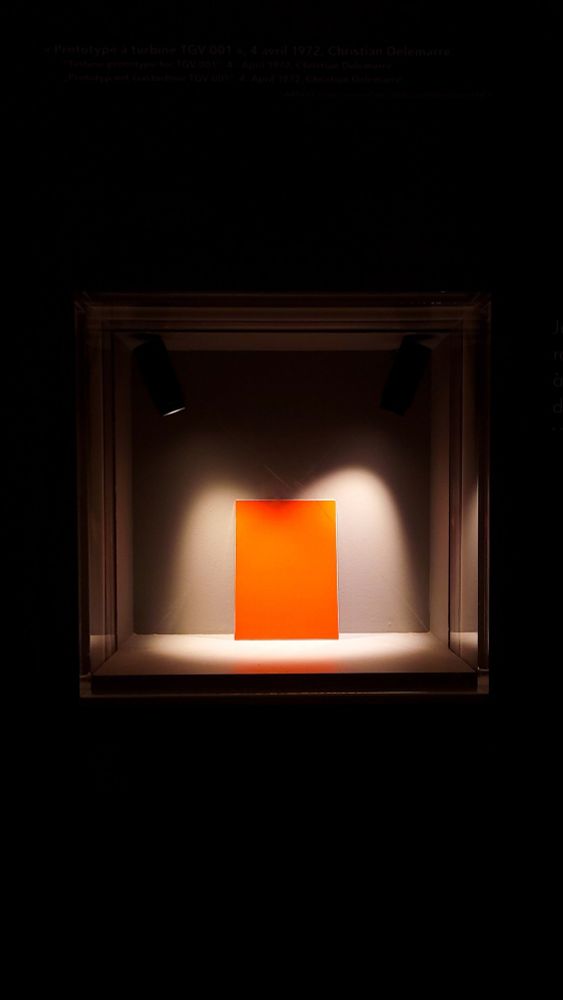
The designer and colorist of the TGV, Jacques Cooper, passed away at the age of 93. An industrial and auto designer, Cooper created the distinctive wedge-shaped face of Alstom’s prototype high speed train for SNCF, the TGV-001, in 1972. Cooper picked the orange color. In 1977 a brighter orange, known as SNCF 435, was approved for the livery of the TGV Sud-Est.
TGV Orange col0r sample, Cité du Train, Mulhouse, photo: Aurélien Vret
The TGV Orange SCNF 435 livery was retired in the 1990s, but was brought back for a nationwide tour in 2020 for the 40th anniversary of the TGV. Otherwise it lives on in the model train painting community.
In 2001, textilemakers to the King, AB Märta Måås-Fjetterström inaugurated an Art Council to select an artist who would be invited to make the Textile Artwork of The Year. Between 2002 and 2014 (sorry, 2011 and 2013!) MMF managed to make eleven Textile Artworks of The Year . Though some years, as we will soon see, also have an artist’s proof, most of the Textile Artworks of The Year seem to be unique.
The inaugural TAwOTY in 2002, above, was made by provocative Swedish painter, filmmaker, and theater artist Marie Louise Ekman. Her textile depicts a female-coded figure breastfeeding a hovering infant through a full-body costume not unlike those Ekman designed for a 1987 ballet. As it happens, this TAwOTY is being sold at Bukowski’s, which is now the Swedish node in the Bonham’s network. The listing for Ekman’s textile includes all of the artists invited to create a TAwOTY, and notes that most of them are in prestigious public, institutional, and private collections.
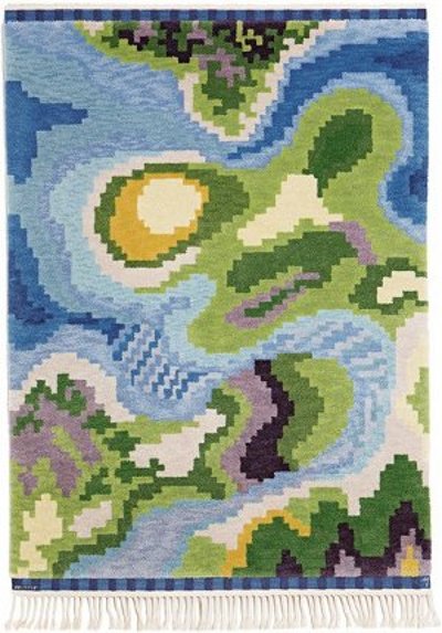
In 2009, the 90th anniversary of the MMF studio, the TAwOTY was created by HM Artist/Queen Margrethe II of Denmark, whose artistic practice has been discussed here previously. Titled Kustlandskap [Coastal Landscape], it appears to be an aerial view, perhaps invented, or perhaps of a beloved fjord. 2009 was around the time Margrethe was also working on her film adaptation of De Wilde Svaner, so perhaps this is a prince-turned-swan’s-eye view. This textile’s dimensions and present whereabouts are unknown, but tbh it looks about as big as a doormat.
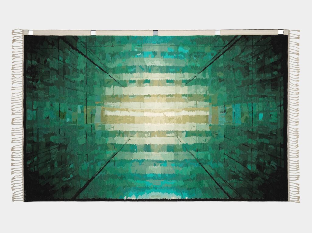
The next artist after Her Majesty was Olafur Eliasson. The Green Glass Carpet was produced as Ed. 1 + 1 AP. This is the Ed. 1/1, and it hung in the London outpost of Aquavit until that restaurant closed last fall. The New York connection goes deeper, though. The Green Glass Carpet is based on a photo of The Inner Kaleidoscope (2000) as it was installed in 2000 at Bonakdar Jancou (now Tanya Bonakdar Gallery) in Chelsea.
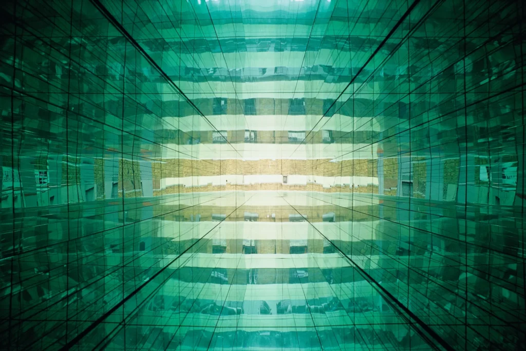
Olafur Eliasson, The Inner Kaleidoscope, 2000, installed at Bonakdar Jancou in 2000, photo: Oren Slor via olafureliasson.net
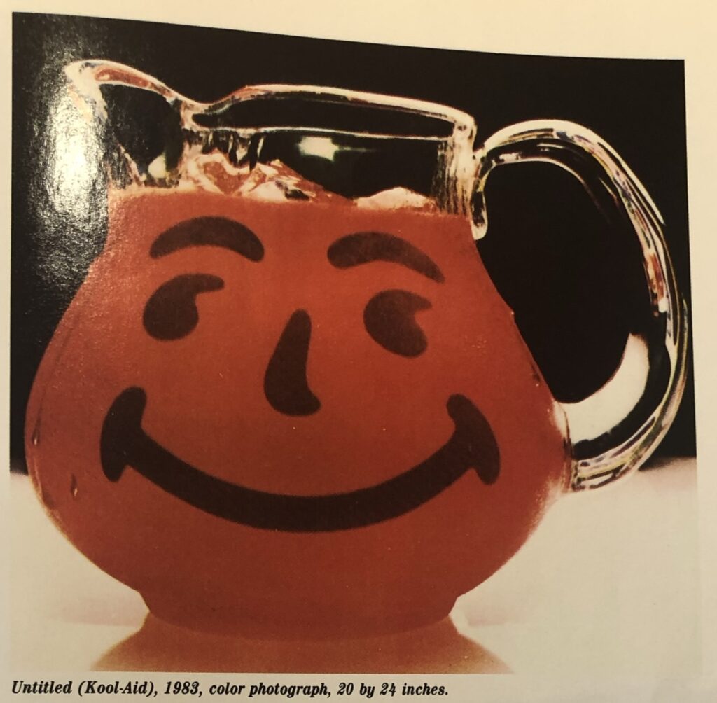
Richard Prince, Untitled (Kool-Aid), 1983, 20 x 24 in., as published in AiA Mar 1987
A few weeks ago, I got a correction from Jeffrey Rian about which Richard Prince interview of his I was quoting, and I wanted to see what the one I’d missed actually said. It was from the March 1987 issue of Art in America magazine, and Prince’s work was on the cover. There was an interview, an intro article, and copious full-page images of Prince’s work. The print copy I looked at in the National Gallery’s library looked fresh as the day it was bound.
The interview was indeed interesting in unexpected ways, and I’ll get to it in a bit. What jumped out at me, though, was Untitled (Kool-Aid), 1983. It felt unusual, and had I realized why at the time, I would have tried to take a better snapshot of it. #rerephotography