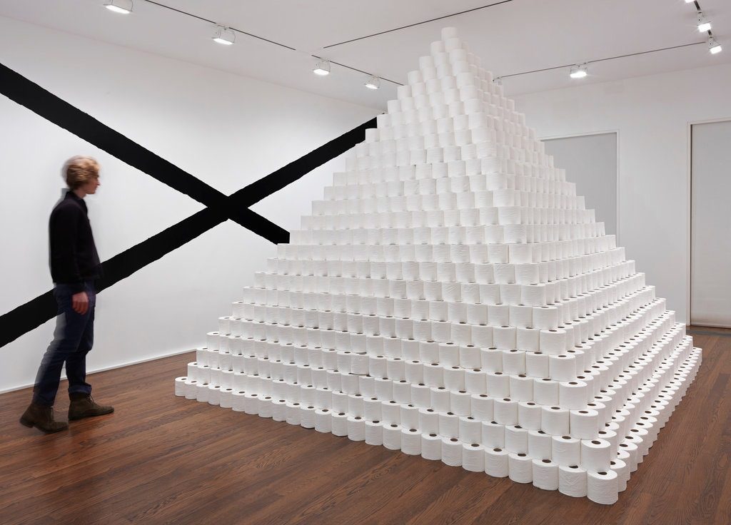
Simpler times, when toilet paper was only $20/roll for a unique work.
the making of, by greg allen

Simpler times, when toilet paper was only $20/roll for a unique work.
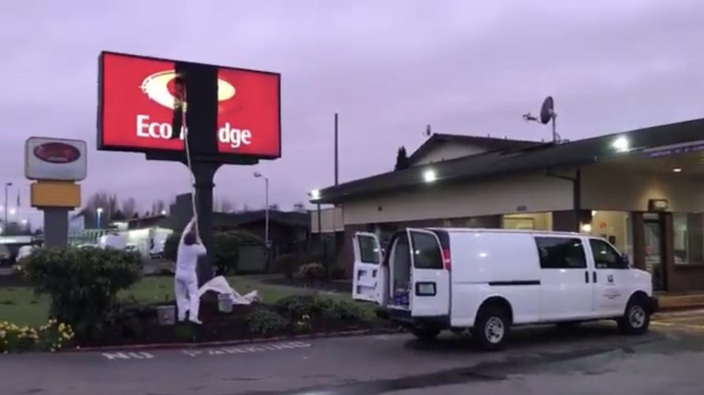

The Washington town of Kent does not want King County Public Health Department to buy the EconoLodge and use it for coronavirus quarantine housing, but it is the only property on the market at the moment with separate entrances and separate HVAC for each room. Yay capitalism.
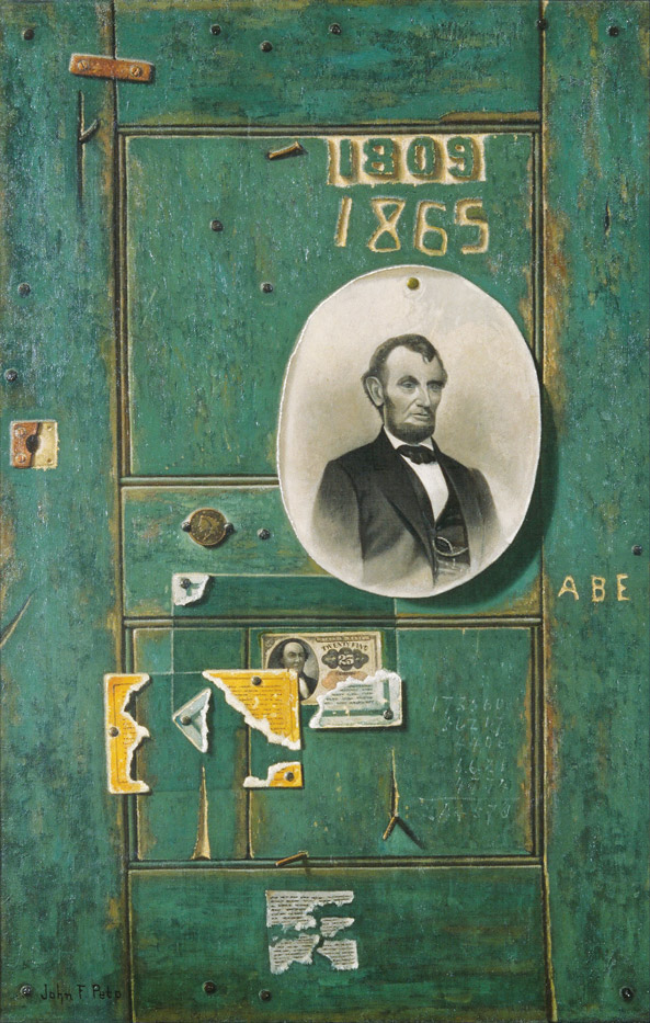
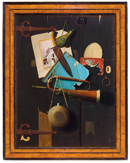
In the late 1800s, artists like William Harnett and John Frederick Peto manifest the nostalgia for the Civil War and its dying veterans through trompe l’oeil paintings of war artifacts or pinup photos of Abraham Lincoln.
This is not that.
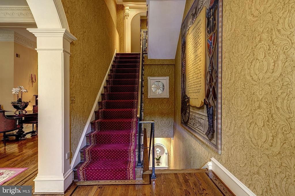
An eight-foot square painting of the Gettysburg Address is installed in the stairwell of an 18th century townhouse in Georgetown. The manuscript appears gigantic, filling a trompe l’oeil wall above carved wainscotting, flanked by stylized heraldic shields of the Union and the Confederacy. A well worn pair of riding boots on the Southern side seems almost as big as the cannon on the Northern side. A flying eagle sits atop the whole thing. It is surrounded by a frame (or painted band?) of alternating light and dark grey squares, which lends the whole thing a 1990s vibe. I have not asked if the painting conveys when the house is sold, but maybe it’s there to up the appeal to someone from the administration.
You know the saying, don’t refute my scholarship and tell me it’s raining.
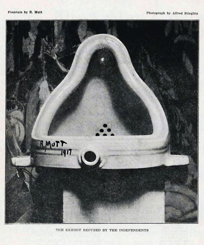
Much has happened in the academic pissing match over the idea, floating around for almost 20 years now, that Fountain was not the creation of Marcel Duchamp, but of Baroness Elsa von Freytag-Loringhoven. The theory was first [AFAIK] put forward in Irene Gammell’s groundbreaking 2002 biography of the Baroness, based on circumstantial evidence: she and Duchamp knew each other; a 1917 newspaper report of the Society rejection said R. Mutt, the urinal’s purported author, was from Philadelphia, where Elsa was living at the time; a then-recently uncovered letter* of Marcel to his sister Suzanne Duchamp said Fountain was the work of a female friend; and an inverted urinal that looked like a Buddha does seem to resonate with an inverted drainpipe titled God, a sculpture which had been belatedly reattributed to Freytag-Loringhoven, and which Duchamp helped into the Philadelphia Museum of Art.
Then five years ago a couple of trolls came at Duchamp, calling him a thief in The Art Newspaper, as part of an attempt to take down the century of contemporary art that flowed from Fountain. How Dawn Ades and Alastair Brotchie got involved is not quite clear to me, but they have unleashed a stream of criticism against the Baroness Elsa theory, and it is a glorious sight to behold. It all seems to be triggered by an article by Bradley Bailey in The Burlington Magazine, and it’s playing out via letters to the editor of The Art Newspaper.
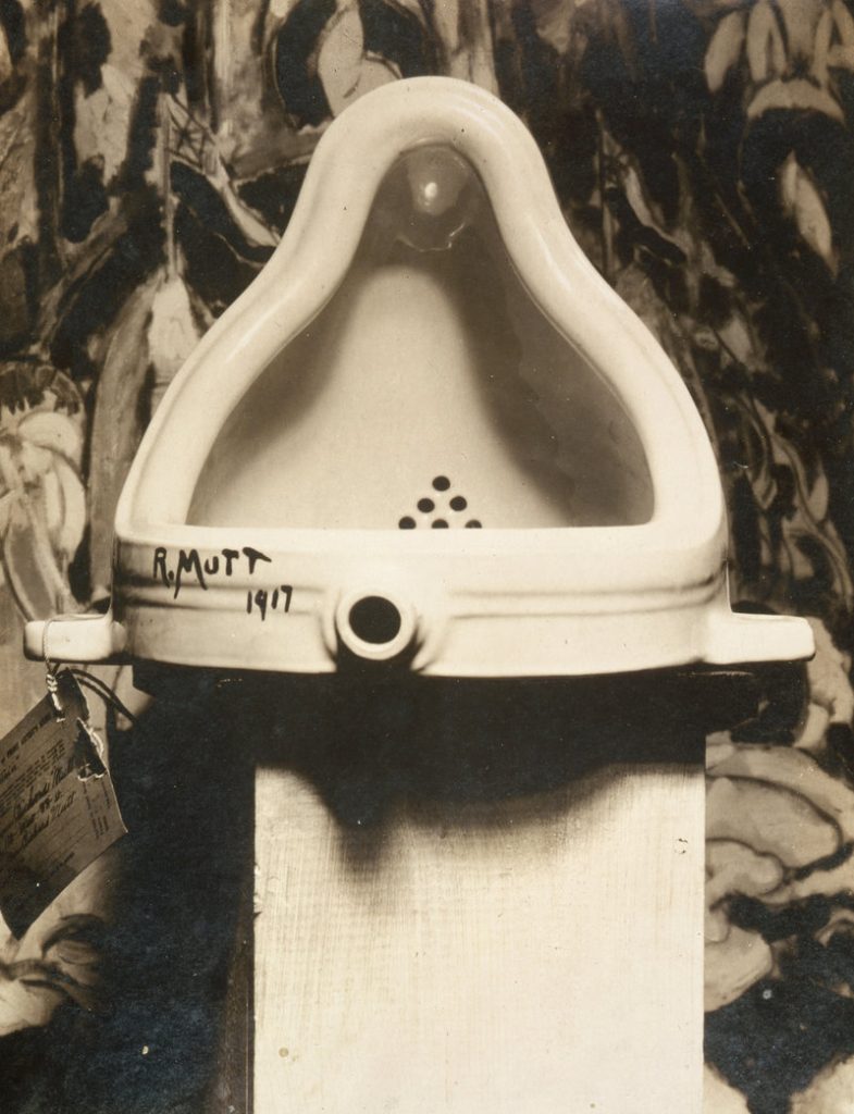
It’s worth reading every pissed off, pissed on word, but it seems to boil down to the emergence of previously unpublished–or at least unconsidered–evidence supporting Duchamp’s hand: an alternate Stieglitz photo of Fountain shows its submission label, with Duchamp’s female friend Louise Norton’s address. [I think this is just the same Stieglitz photo from The Blind Man, only less cropped, and developed or printed more brightly than it appears in the grainy offset. For whatever reason, even the image below, from the Wikipedia entry for Fountain shows a legible tag.]
And Norton discussed Duchamp and the Society show and the Fountain incident in an unpublished interview. Other pieces of supposed evidence put forth by the trolls are likewise refuted by historical facts that should be easily known–if your goal is actually knowing things, not just tearing them down.
Letters to the editor | Did Duchamp really steal Elsa’s (sic) urinal? [The Art Newspaper]
Marcel Duchamp Was Not A Thief [atlaspress.co.uk]
previously, related: In the Beginning
* Tempus really fugit. Francis Naumann himself just emailed to point out that he discovered the letter to Suzanne all the way back in 1980, and published it, along with other correspondence, in 1983. [Naumann, “Affectueusement, Marcel: Ten Letters from Marcel Duchamp to Suzanne Duchamp and Jean Crotti,” Archives of American Art Journal 22, no. 4 (Spring 1983): 2‑19.)] He also added that he refuted the trolls’ distortion of the letter’s contents back in 2015, and I am confident he would agree with me that this is getting tired.
I left the world of internet startups to begin making films in 2000, just as Creative Capital was launched, and I immediately aspired to work with them; their startup-like model that provided a network of professional community and in-kind support in addition to project funding seemed like an immediately obvious, logical win. As it happened, I never pursued funding from Creative Capital for any film projects, but they kept my interest and respect. [They had it even before I was awarded an Art Writers Grant for the blog, which Creative Capital administers alongside the Warhol Foundation.]
So I was psyched to be asked to look back and write about a year of operation for their 20th anniversary–and not just because it was a chance to write for the LA Review of Books, which I also admire. But it was, and I did. And now it’s out, and you can read it.
I think my penchant for archive diving and deep reads was one of the reasons they asked me, and it was enticing to study the 38 wildly varied projects Creative Capital funded in 2005. I came to see the exceptional impact of Creative Capital in supporting a specific grouping of proposals: ambitious, genre-defying projects by somewhat unproven artists, which ended up having an outsize influence on the trajectory of those artists’ careers. The artists I focused on–filmmaker Natalie Almada and artists Liz Cohen and Pablo Helguera–all made work that I cannot imagine getting funding from any other source, and it made a difference. Kickstarter later changed the funding environment, but Creative Capital still stands out for its deep in-kind support system. But that is all a different story, and I look forward to seeing who else is going to say what else next.
ART MATTERS NOW—12 Writers on 20 Years of Art: Greg Allen Reviews Artists in the Americas in 2005 [lareviewofbooks.org]
Amazing people are always sneaking into town and talking at the Smithsonian American Art Museum without my knowing. Last October it was Arthur Jafa and Ja’Tovia Gary, who spoke about their work, Black music, and the conception of a Black Cinema.
At least I’m not the only one out of the loop; until the audience questions, neither Jafa nor Gary seemed to know Kanye West had rolled up that morning on Howard University with his Sunday Service tour. [Gary was not. Having. Immmmmmt, either, and criticized West’s appropriation of gospel church practice as self-promoting spectacle, as well as his alignment with fascism and the forces of state violence. Jafa was taught.]
Anyway, point is, video of the event turns out to include Jafa’s epic Love is the message, the message is death and Gary’s 2015 short film The Ecstatic Experience, neither of which I’d seen in the wild. [Gary has an excerpt on her own Vimeo.]
Jafa’s piece was acquired jointly by SAAM and the Hirshhorn.
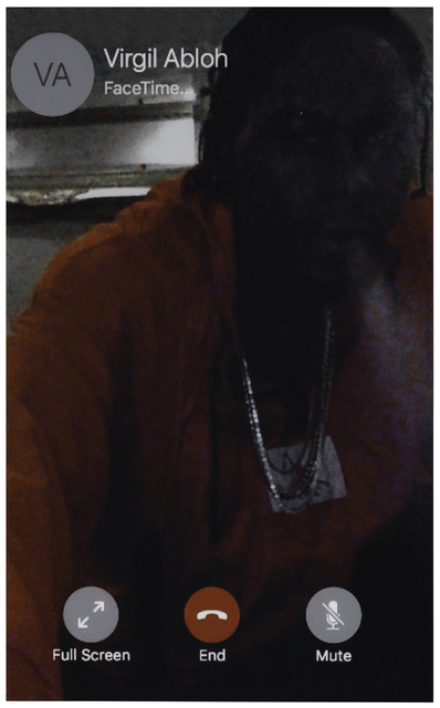
The first work of Arthur Jafa’s is to appear at public auction*. Screen Shot (2017) will be sold next month by Chicago auction house Wright. The estimate is $10-15,000. Printed in 2019 and mounted between plexi and aluminum, it is no. 2 in an edition of 5, plus two artist proofs.
Visible in the image is the contact for Virgil Abloh, a party to a Facetime conversation. Wright helpfully includes a link to a phone conversation between Jafa and Abloh, which took place in August for i-D, after Jafa won the Golden Lion at the Venice Biennale.
They did not discuss Abloh’s exhibition at the Museum of Contemporary Art Chicago, which was on at the time, and which included Screen Shot in the final gallery.
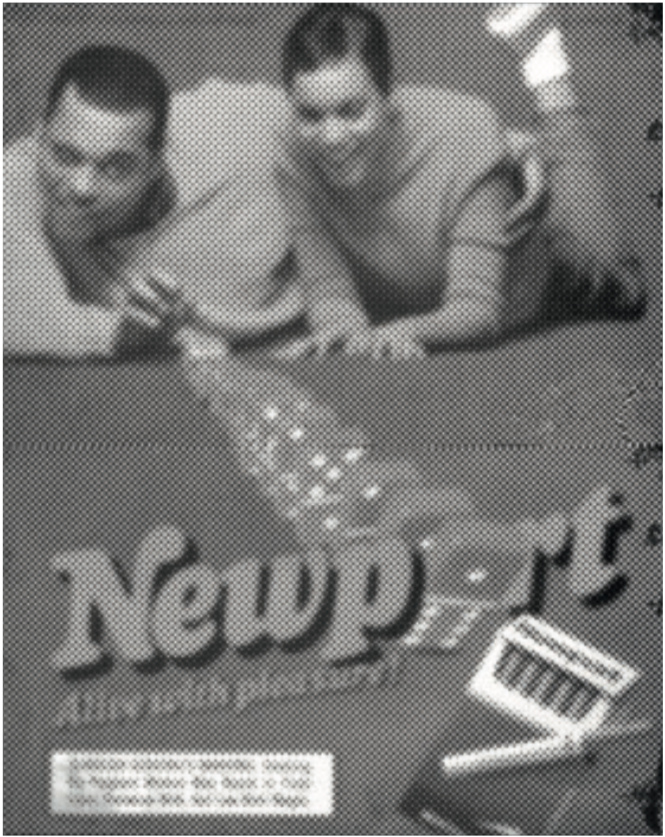
Wright does not give any provenance or exhibition information, so we do not know if this example of Screen Shot was the one shown, but we do know it was included included in a silent auction on artsy, to be sold to benefit the MCA Chicago. The MCA’s page for the benefit auction on November 16th, 2019 shows the donor of the work was Jafa’s gallery, Gavin Brown Enterprises. With a $55,000 estimated value, Jafa’s work was the most expensive in the silent auction portion of the event. (With an estimate of $50,000, a unique “print on chrome” of a blown out Newport ad by Abloh himself was second.** )
If there’s an ed. 2/5, there is presumably at least an ed. 1/5, which perhaps belongs to Abloh. Or maybe it belongs to the person actually depicted in Screen Shot, rapper and Abloh collaborator Theophilus London. Did Jafa call Abloh and London got on, in which case, this was a screenshot of Jafa’s phone? Or is this a London selfie? It’s easier to imagine the former; the latter would have a different credit–or even mention London at all.
In any case, the estimate at Wright is $10-15,000. What the price might be for ed. 3-5 is unknown. [update: it sold for $7,500, which could mean it got two bids, $5k and $6k.]
March 12, 2020 Lot 190: Arthur Jafa, Screen Shot, 2017/2019, est. $10-15k [wright20]
in auction: MCA Chicago Benefit Auction 2019 [artsy]
*It is also the second to appear at benefit auction. The first one has so far managed to stay put.
** “If I hadn’t sat on Illustrator and gone to the screen printers to make it a reality, then it wouldn’t have happened – everything else is a domino effect,” Abloh said to i-D in 2015, in an article that called him “Yeezus’s most trusted disciple and a prophet to the talent of today and tomorrow.”
Late last October I saw an exhibition of George W. Bush’s paintings of veterans at the Reach, the new Kennedy Center annex designed by Stephen Holl. With all due respect to Verrocchio, it was the most significant painting exhibition in town last fall.
Continue reading “If I Did It: George Bush Paintings At The Kennedy Center”
I have not yet heard from anyone who declined to participate in Desert X Al Ula, but I’ve started seeing reports from people who did. I would have said that the exhibition and all the spectacular work in spectacular scenery was taking place right where it had been planned all along: in the #desertxalula hashtag. But then I saw a slideshow of the artworks from a new instagram account, saudiarabianholiday, which promotes the same as a hashtag, but their link-in-bio is to an unfinished website registered two weeks ago to an anonymous tour packager run out of an Irish coworking space. The point of Desert X Al Ula is to turn Saudi Arabia into an international tourist destination.
While scrolling and marveling at the budget for the Desert X installations, I idly considered what project I would execute [sic] in the stark sandstone cliffs. I decided I would recreate the Buddhas of Bamiyan. Tinted shotcrete over foam block, how hard could it be?
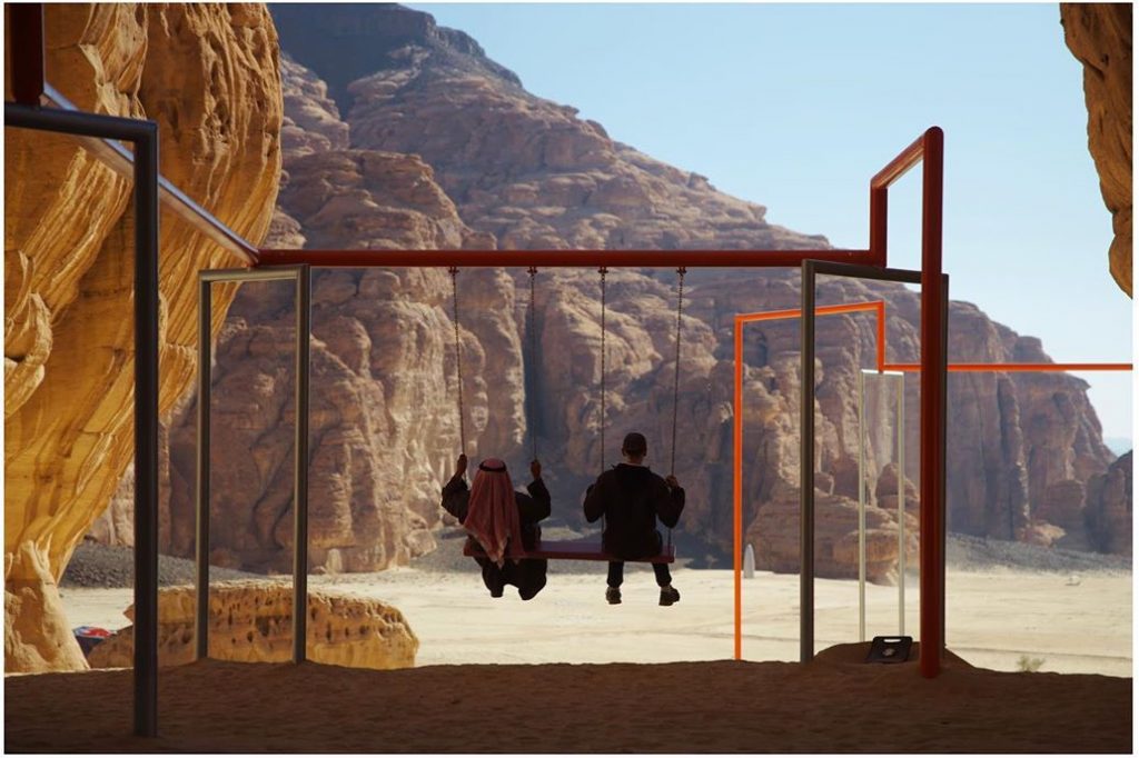
Then I saw the post from @colinjr, a California real estate photographer who was attending the Desert X press/influencer junket. He captured fellow Desert X photographer Lance Gerber and their Saudi driver sharing a moment swinging on a tandem swing. It was Superflex’s contribution to the show, a multilevel swingset sculpture titled, One, Two, Three, Swing!, one of several elements from the group’s 2017 project that began in the Tate Turbine Hall and have since expanded to sites around the world.
I imagined MBS and Neville Wakefield sharing a similar moment, sitting next to each other, working together, in sync, on a common goal of an experience, toward a common spectacular end. And I marveled at the simplicity of the gesture, and the symbolic power with which Superflex captured the spirit of the entire exhibition enterprise. Superflex told people that by using the three-seat swings, they would set the orange line over their heads in motion and potentially change the trajectory of the planet. And it must be working; I do feel like a shift is happening. I apologize for ever doubting them.
I am struggling to understand the Desert X Al Ula collaboration with the Kingdom of Saudi Arabia, and am interested to hear from people who have direct contact or experience with the organizers.
Did you visit Al Ula on that 2018 junket that was organized before Jamal Khashoggi was murdered, but which took place after it? Did you originally agree to visit, but then did not?
Did Neville Wakefield discuss or invite you to propose a project for Desert X Al Ula? Did he or someone else sound you out? Did you consider it? Did you take the meeting, then decline? Do you know of people who had this experience?
I’m not gonna lie, I am profoundly troubled and disappointed that Desert X, Wakefield, and the artists of Superflex, who I have long admired, are all involved in this exhibition.
I’m not sure whether I will write anything about what I learn. I’m happy to talk to anyone in confidence, off the record, or whatever you need to reach out. Text me at 1-34-SOUVENIR or reach me via email or twitter DM. Thanks in advance.
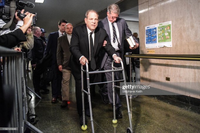
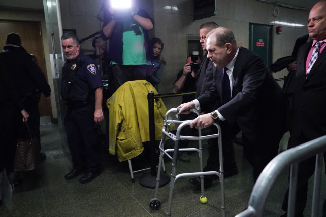
The psychopath is rarely suicidal. Although he would pretend to play the game to the last, and he would viciously press a peer to take on genuinely life-threatening risks, the psychopath always saves his own skin. The psychopath may court death, but it is someone else’s. The psychopath leaves a trail littered with the broken, discarded bodies and lives of others, he trashes them, leaving them as rotten matter as he proceeds to his next site. Where he gave the impression of being deeply involved in the life and death struggles he creates around the last victim, he was always vacuous and remote.
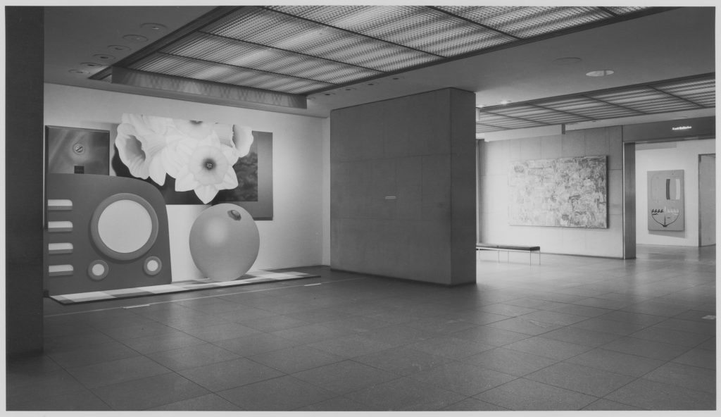
Barriers, gates, and fences are physical and symbolic manifestations that generate publicity and rule out participation. For those unable to comply with the pressure to perform, prostheses such as walkers, picker arms, or canes for the blind are the only means of participating in public life. Celebrities, on the other hand, simply have no choice but to participate.
Everything we encounter in public space can and must be regarded as public sculpture; for every object is the product of a process of material composition and formal design. All objects influence our perceptions, our movements, our feelings, and our thoughts. Public space is not designed by human beings alone, but is instead shaped by the boundaries between public and private, institutional and commercial.
X may fashion an artifact called ‘the mirror device’ with which to manipulate Y. Using this device, X cynically fashions his tastes and judgments to accord with those of Y, thus winning Y’s trust and approbation. An alignment is formed under false pretenses, but Y, hopefully is none the wiser. Even while X is saying in effect, ‘me too, brother…’ X’s actual feelings are secreted from the interaction. X may not always mirror Y, but may instead mirror a role which is acceptable to Y. For example, X goes to Y’s door in the guise of an electrician come to fix some faulty wiring, when X is not, in fact an electrician. A fictive example of this occurs in LITTLE RED RIDING HOOD. Conning devices are tools. The degree of harm that they do, if any, depends upon the purpose for which they are instrumented. Where ‘the mirror device’ might be used by a parent to encourage a child, or by a psychiatrist as a therapeutic device, it is also used by ambitious students, known otherwise as ‘brown-nosers’ or ‘ass kissers’, who cynically reword the opinions of their teachers in their written and oral work. People also use the ‘mirror device’ to ‘pass’, as Erving Goffman points out. A high school girl may try to hide her intelligence and approximate a bubbly persona instead of going dateless. Goffman details many other versions of ‘passing’ in his book, STIGMA. ‘The mirror device’ is a tool with which to modify Y, and render him more pliable to X’s manipulations. Malignant use of ‘the mirror device’ abounded in Nazi Germany. According to Hannah Arendt, one of the sights that struck Adolph Eichmann as being the most horrific was a perfect imitation of the Treblinka railway station. This imitation had been constructed for the express purpose of lulling prisoners into the mistaken impression that they had arrived at a safe and benign destination. The station had been built with patient attention to detail, with contrivances like signs and installations.
2/24 update: the psychopath was convicted on two counts of rape and sexual assault.
3/11 update: the psychopath was sentenced to 23 years in prison.
Anyway, it quickly became apparent that there was a lot more to the story they found, and Andrew and Sarah at ARTnews were amazingly supportive of my suggestion to dive deeper into the archives of the Castelli Gallery, and to turn to the larger story of Leo Castelli’s relationships with his biggest collectors, and how Jasper Johns’s protean work became the object of such intense discussion and competitive collecting. (If Andrew and Sarah were around, they would have suggested cutting that into several sentences, I’m sure.) From that beginning emerged the possibility of using Johns’s early works as they passed from the most adventurous collectors to the richest and, occasionally, into museums.
The resulting article came out in print in the (newly redesigned) Fall issue of ARTnews, and is now available on the (newly redesigned) website as well. There was so much amazing material, and so many intriguing threads, so many incomplete stories that could be added and expanded upon, so much that was locked in MoMA’s archives, which were inaccessible for the entire time I was working on this. But 4000 words feels like plenty to start with.
How Leo Castelli and MoMA Charted Today’s Rocket-Fuelled Art Market [artnews]
The Gallerist’s Gambit: Financial Innovation, Tax Law, and the Making of The Contemporary Art Market [The Columbia Journal of Law and the Arts]
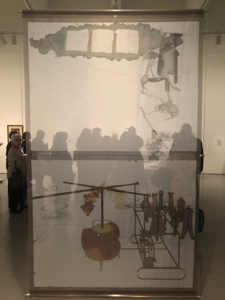
When Pontus Hulten , and then Richard Hamilton wanted to show Marcel Duchamp’s Large Glass but couldn’t, they made full-size replicas (actually Ulf Linde and Per Olof Ulfvedt made Hulten’s, based on photographs), which the artist eventually showed up and signed, “Certifié pour copie / conforme / Marcel Duchamp.”
And now those copies don’t travel, either. And there are other copies, but they’re non-conforme, I guess. So when the Hirshhorn Museum wanted to show the Large Glass in the context of related works from a large promised gift from Barbara and Aaron Levine, they faced a challenge.
Which was solved by an exhibition designer, who suggested printing a photo of the work at scale, and suspending it in the gallery. Acetate didn’t work. A free-floating polyester scrim didn’t work. But a scrim held taut with discrete cables and clamps worked just great. Evelyn Hankins, who curated the show, as well as the Hirshhorn’s recent Bob Irwin retrospective, which sent a giant, site-specific, taut scrim wall through the gallery, could only laugh.
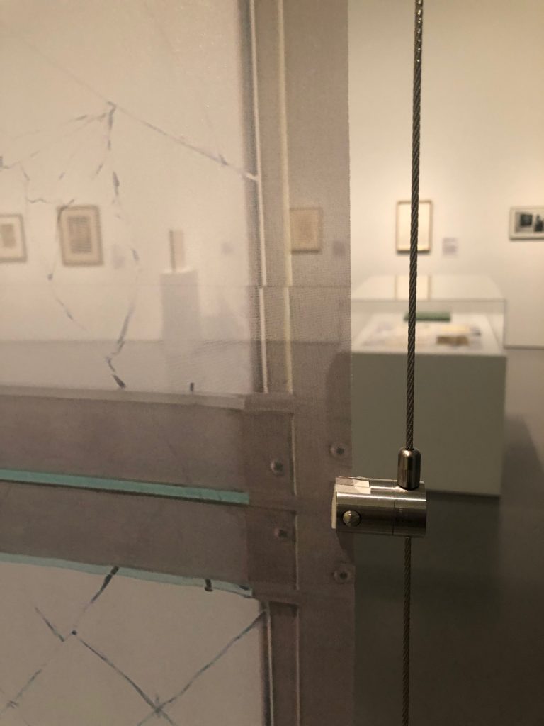
I love it, so much that I want it. Unfortunately, the Association Marcel Duchamp does not want me to have it. Or anyone, for that matter. The Association, run by Duchamp’s (step-)grandchildren approved the Hirshhorn’s production of a banner (not a replica, and not, it turns out, full-size, but a couple of inches smaller) from the Philadelphia Museum’s (two-part, not entirely aligned) photodocumentation of the work, if they get it when the show’s over. The Hirshhorn, which will soon house one of the world’s major collections of minor Duchamps, prefers to be on good terms with the Duchamp estate rather than let me run out of the museum with the banner under my coat. Go figure.
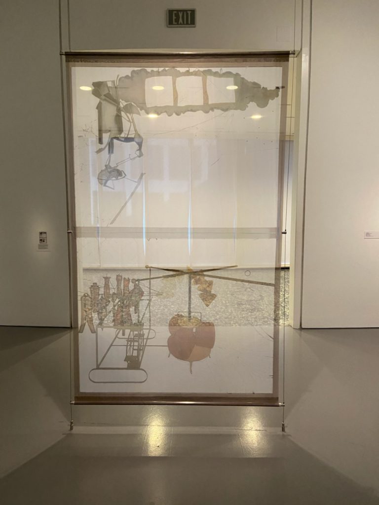
Previously, related: After he interviewed Duchamp for the BBC Hamilton took home the full-scale transparency of the Large Glass they’d made. Later he not only made a replica of the Large Glass; he made a full-scale diagram edition of it, which is my favorite Large Glass replica of all. The Philadelphia Museum published a poster edition of it, and also, I just learned, a shower curtain, which is somehow a gift shop item but also in the collection. Putting the appropriate in appropriation since [checks notes to see when, exactly, the more uptight grandchildren took over the Association].
Through The Large Glass: Richard Hamilton’s Reframing of Marcel Duchamp, by Bryony Bery [tate.org.uk]
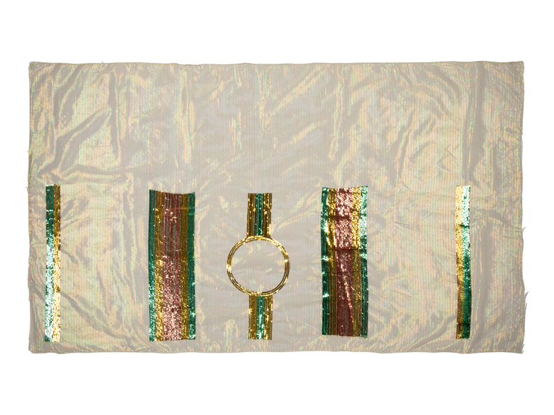
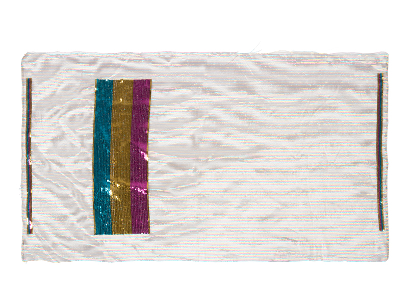
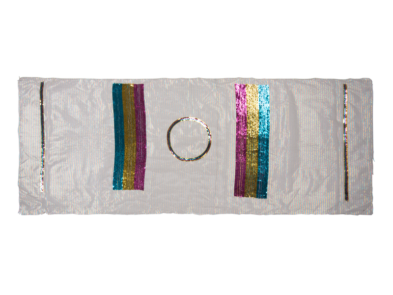
One, then another, then a whole bunch more. Realizing a group of unfinished textiles happens like that bankruptcy quote: slowly, then suddenly.
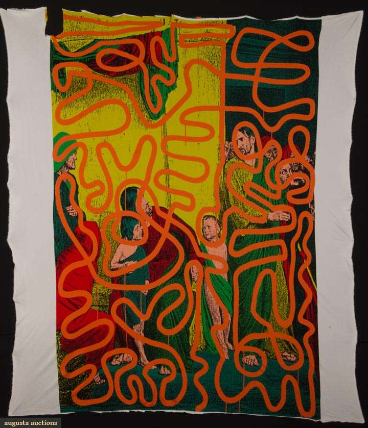
Lot 260 Keith Haring for Stephen Sprouse Textile, est. $1,500-2,000 update: this object sold for $12,000. [augusta-auction]
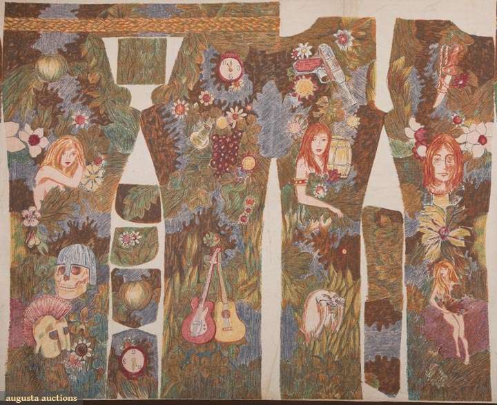
Lot 379 John Lennon Uncut Wrangler Jeans, 1967-8, est. $500-800
update: this object did not sell in this auction
Deadstock is one thing, but these uncut tops from the Geoffrey Beene Archive are something else. And they feel like something else again (something that gets stretched and hung on a wall).
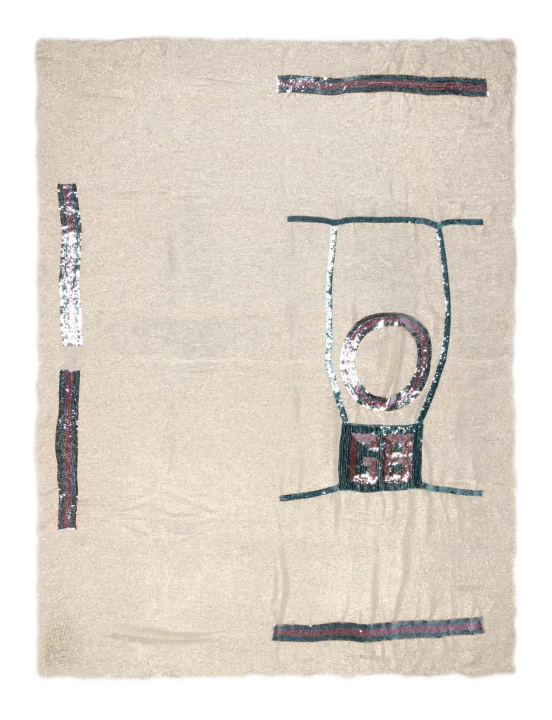
It all reminds me of that time Marc Jacobs said Elizabeth Peyton was all, “Don’t be intimidated; fashion is art, too,” and he was like, “so I got a little bit of confidence from that conversation.” And I guess it’s contagious, because here we are!
Lot 38 Unfinished Geoffrey Beene Sequin Tops, c. 1975, est. $1,000-2,000 [hindman via invaluable]

In 2013-16, Camille and Bill Cosby paid $700,000 to have their art collection, including Alma Thomas’s superlative 1970 painting A Fantastic Sunset, exhibited at the Smithsonian. The museum and its Cosby-funded director bravely left the show up amidst a swirling storm of criticism as reports of decades of sexual assault and lawsuits piled up and criminal charges loomed. Cosby went to jail last year, and he and Camille put up two Thomas Hart Benton paintings for sale, and as collateral for a loan.
Around the same time, or at least at some point between the close of the Smithsonian show and this week, title for A Fantastic Sunset was transferred to “A Distinguished Collector of American Art” in St. Louis. A collection that will soon be distinguished by the large, Alma Thomas-shaped hole in the middle of it. And, hopefully, by a large, fresh, untainted pile of money.
13 Nov. 2019, Lot 26B: Alma Thomas, A Fantastic Sunset, 1970, est. $2.2–2.8 million [christies]