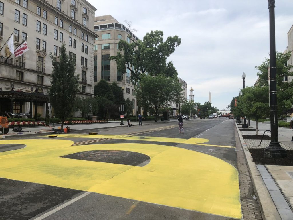
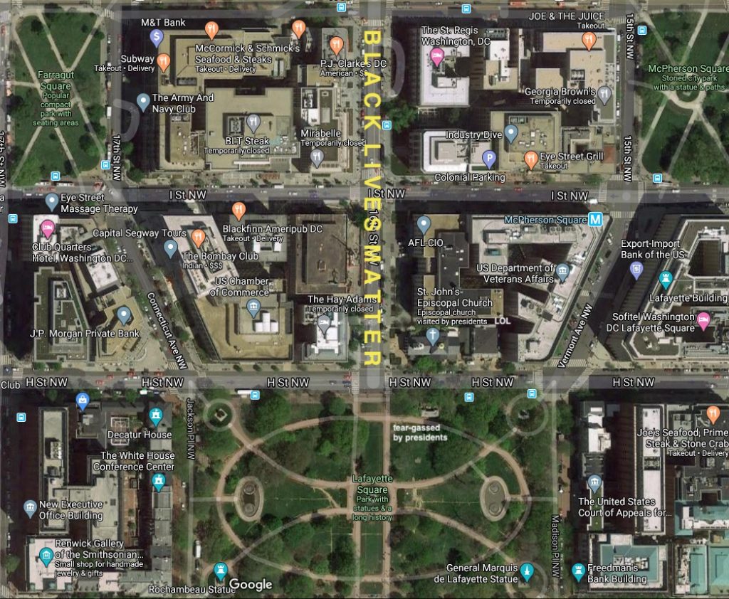
After the Washington Monument and two occupying troops were struck by lightning last night, Washington DC woke up to the biggest painting project in the country: BLACK LIVES MATTER being painted, from curb to curb, on 16th Street leading up to the White House. It starts at K Street, in front of the St. Regis Hotel, and I expect it will go right up to the fence around Lafayette Square. Prince of Petworth has photos and updates.
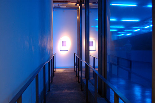
artist’s rendering
It will be big enough to view from military surveillance planes circling the District, and from Google Maps, but it is not visible from the bunker of the White House.
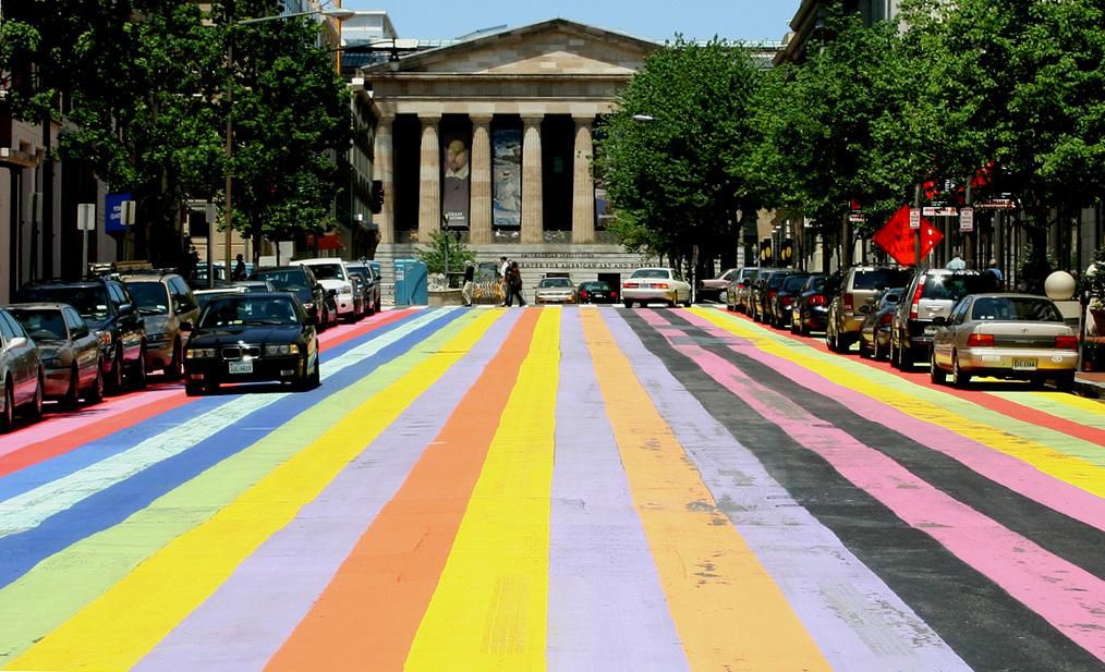
Davis-esque: 2007 street painting on 8th St NW south of the SAAM. Image: wikipedia via smithsonianmag.com
The last massive street painting the District government realized was a fake Gene Davis painting to celebrate the anniversary of the Washington Color Field movement in 2007. That painting, concocted by a former studio assistant, was a block long, and in front of the Smithsonian American Art Museum, which holds Davis’s estate, and really should have known better.
So yes, this is a vast improvement.
See the completed painting this afternoon at 5:45 when you join a peace vigil organized by the houses of worship along 16th Street NW.
#BlackLivesMatter
— Muriel Bowser #StayHomeDC (@MurielBowser) June 5, 2020
UPDATE: The Artist is present, and tweeting her pano from the roof of the closed Hay Adams Hotel. When I made my rendering I did not anticipate it would include the DC flag. greg.org deeply regrets the error. Also she has officially named 16th street in front of the White House Black Lives Matter Plaza.
[2022 update: the video above is from @murielbowser’s tweet, archived here and at the internet archive]
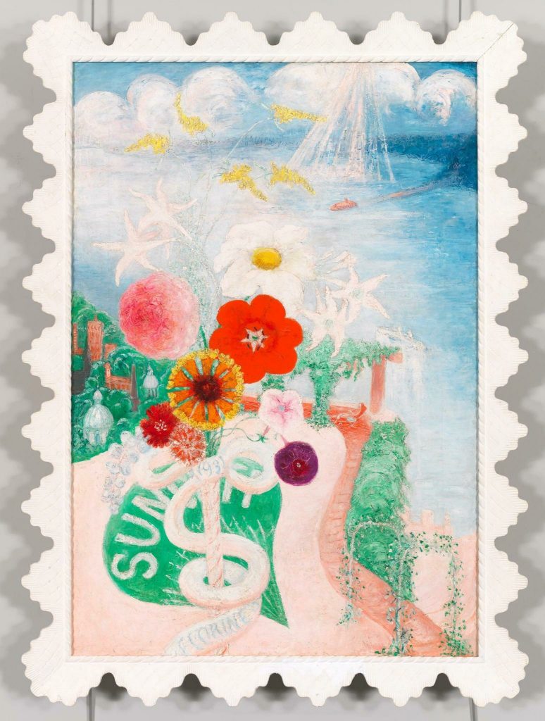
Max Mara created the Whitney Bag in collaboration with the Whitney Museum’s architect Renzo Piano to echo the facade of the new downtown building.
The Stettheimer Collection of Whitney Bags, image: maxmara.com
To celebrate its 5th anniversary, the cult bag has been revived in a special edition version dedicated to the American painter Florine Stettheimer who boasts an important presence at the Whitney. A feminist and activist ante-litteram (1871-1944), Stettheimer’s work “Sun”, created in 1931, inspired the bag’s five new color variants and the design of the floral printed lining. [via]
Nevertheless when she needed a Whitney Bag to carry a bible across a tear-gassed public park for her father’s photo opp, Ivanka chose white.
Ivanka chose white. image detail: doug mills/nyt
Because of course it is, the tear gas police fired to clear peaceful protestors out of the park was manufactured by Defense Technologies, which is owned by ex-Whitney trustee Warren Kanders.
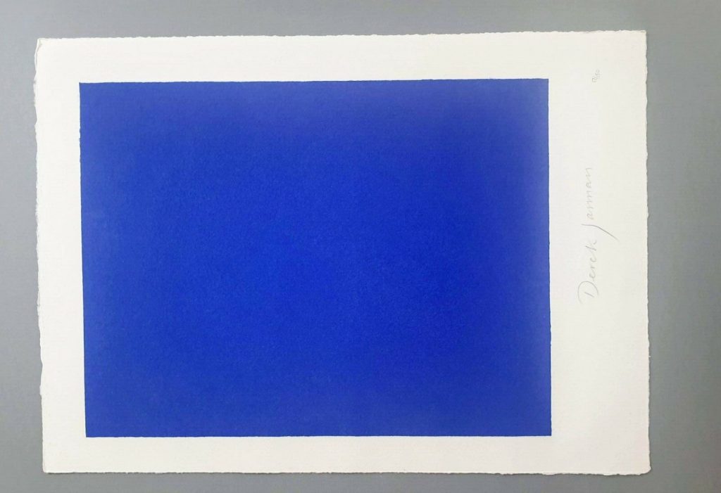
Derek Jarman, Blue, 1994,17×12 1/2 in., screen print originally made for the deluxe letterpress edition of the script by The Blue Press, now floating loose on ebay
This is a silk screen print by Derek Jarman. It was originally intended to accompany a letterpress edition of the text for Blue, his final film. That project was either produced in an edition of 150, plus some proofs, or was not realized before Jarman’s death. The numbers on the two I’ve seen hint at a bunch–this one is labeled 17/150, and the print shown at Chelsea Space in 2014 as part of the book was 37/150.
you may approach: Blue print installed at Chelsea Space, 2014, image: chelseaspace
But the only other copies I’ve ever seen of the whole book were described as printer’s proofs. Jarman was supposed to have painted IKB on the clamshell boxes of 25 of the 150 editions. One proof on ebay back in the day said only four proofs were made before Jarman died, and its lid was painted, but didn’t have a print, and said the prints were never realized either. Another, proof listed for sale privately, had a print (#43/150), but its lid looked more like the paper under the paintings than a painting itself.
Derek Jarman, Blue special edition, proof, The Blue Press, via paperbooks.ca
But that seller [pdf] said the whole letterpress edition “was centered on a loose Klein Blue screenprint signed by Jarman,” which makes it sound like the prints made it across the finish line after all. Why a signed print in a painted box doesn’t essentially become a certificate for a painting, I don’t know, but if the paintings never happened, it’s moot.
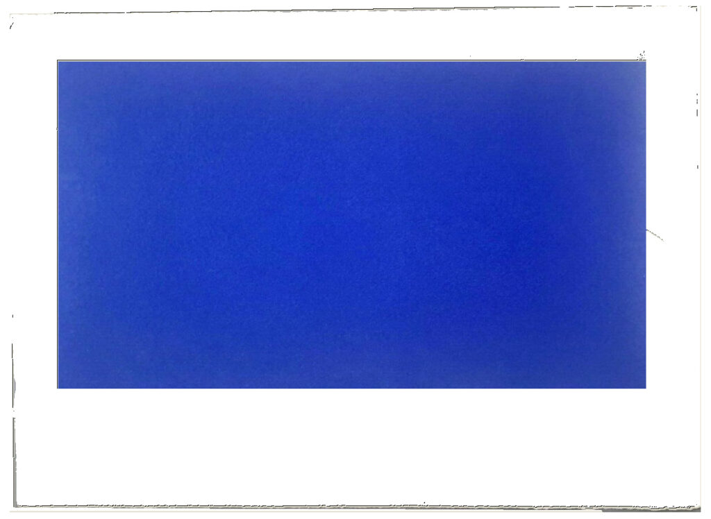
Study for Derek Jarman Blue Screen Print, 2020, gahhh, the aspect ratio…
I absolutely love this print, and may try to buy it, but I cannot for the life of me figure out why it’s portrait and not landscape. Maybe I’ll just make some and fix it myself.
LMAO This always happens to me. I think, oh, just flip it, DONE. But as I am typing in the dimensions of my new cinematic masterpiece, I am frozen. Because what should it be? Jarman made Blue on 35mm film. So 16:9 (1.77 in the US, where I first saw it, except if I look it up, some definitive-seeming sources have a widescreen aspect ratio of 1.85:1.) But Jarman’s own print is basically 4:3, so television. (Which is OK because Blue was aired on Channel4? Or nah?) But when it was still a live performance called Bliss, Jarman projected an image of an actual Yves Klein painting, and then switched to a blue gel, so no image at all, just a frame or aperture mask on the light? I think 16:9 is the clear choice here, but still.
so something like this, at 16:9, using the sheet size and smaller margins as the parameters yields a 8.125 x 14.5 inch print on a 12.5 x 17 inch sheet. study-derek-jarman-blue-screen-print-2020.jpg
Next day update: after spending part of a day determining the size and placement of the blue printed field in relation to the (unconfirmed) paper size and type of the original, I repeatedly caught myself trying not to think about how the film, then the print, then the book, then the box, then the– were all approached as the last project Jarman might complete. Make just one more thing, he and those around him might have thought? Woke up again, so there is still some time.
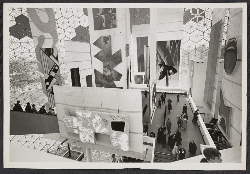
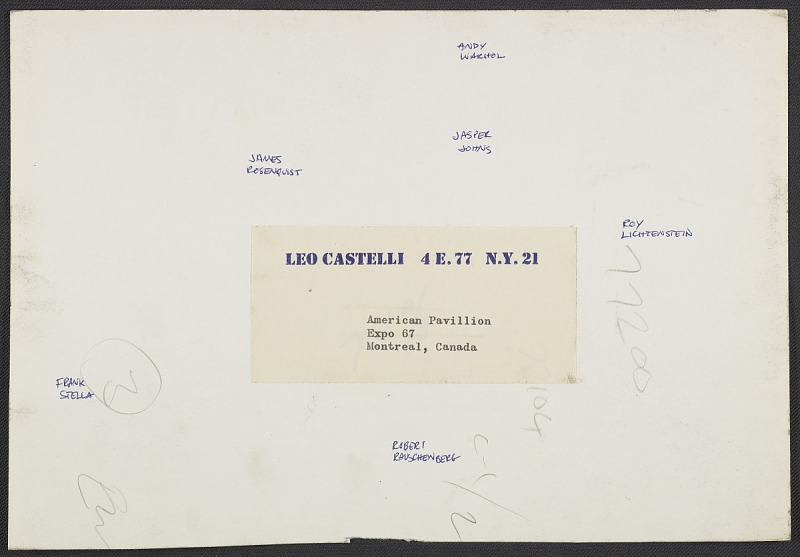
Photo of the American Paintings installation at the Expo 67 US Pavilion, curated by Alan Solomon in the back room of Castelli Gallery, apparently, image: Leo Castelli Archive/AAA
Verso of the Expo 67 photo with Castelli artists’ names written in: [R to L]: Lichtenstein, Warhol, Johns, Rauschenberg, Rosenquist, Stella image: Leo Castelli Archive/AAAThough I haven’t looked at the US Pavilion at the Expo67 World’s Fair in a while, it still lives in my heart. But I just stumbled across this photo of the American Painting Now show from the Leo Castelli Gallery. I should clarify, the show American Painting Now was at the US Pavilion; the photo is from the gallery’s records at the Archives of American Art. But it’s hard to tell, when six of the 22 artists Alan Solomon curated into the show came from Castelli.
More than ten years after I first got fascinated with world’s fairs as exhibitions, I was surprised to find it’s still not easy to see who or what was in the show. So I’ve mirrored the American Paintings Now press release and checklist from worldsfairphotos.com’s US Pavilion press kit. The installation of the sailcloth panels and innovative uplighting gets two paragraphs and top billing over the paintings themselves. Solomon is not mentioned at all.
But at least the artists in the show were listed in what I think is rough exhibition order, perhaps following the pavilion’s prescribed escalator&walkway path: Edward Adevisian, Allan d’Arcangelo, Jim Dine, Friedel Dzubas, Helen Frankenthaler, Robert Indiana, Ellsworth Kelly, Roy Lichtenstein, Robert Motherwell, Kenneth Noland, Tom Wesselman, Nicholas Krushenick, James Rosenquist, Richard Anuszkiewicz, Jasper Johns, Andy Warhol, Frank Stella, Larry Poons, Larry Zox, Robert Raucenberg [sp], Claes Oldenberg, and Barnett Newman.
Except though Larry Poons’ painting was credited as coming from the Sculls, he showed with Castelli then. So really, it’s seven of the 22, and six in one installation shot. [Interestingly, six of these artists also made work for the New York Pavilion at the 1964 World’s Fair: Indiana, Kelly, Lichtenstein, Rauschenberg, Rosenquist and Warhol.] I think I need to finally chase down this entire show.
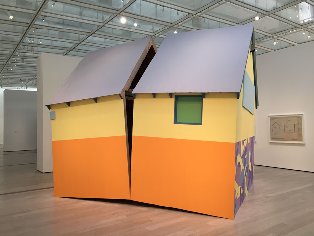
Daniel J. Martinez, The House America Built, (2004-2017), plywood and 2017 Martha Stewart Collection Paint, 2017 installation via LACMA
It was a long time and a world ago that the editors of Art in America asked if I’d write something about the art world of the 2000s. I choose not to think that means I’ve reached some “back in my day,” bracket, but I did end up writing about things I’d seen with my own eyes. In the 20+ years since first visiting The Project, and in the decade+ since it closed, I’ve thought very regularly about the shows and artists I saw there, and not just because so many of them continue to make great work. There are many who don’t make–or at least don’t show–art as much now, and I think about them, too.
One artist whose work I think a lot about is Daniel J. Martinez’s, which I saw (and wore) first at the 1993 Whitney Biennial. We tried for ages, so far unsuccessfully, to find images of his sculpture The House America Built, a Matta-Clarked replica of the Unabomber/Thoreau cabin, with its original c.2004-05 colors from that year’s Martha Stewart Paint Collection.
If you’re sleeping on that, or other archival material, ephemera, or images from The Project and its successors and relateds, HMU. Inquiring bloggers want to know the palettes.
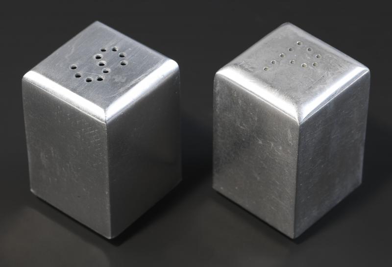
In a sense it should not be surprising. Sheeler’s salt and pepper shakers have been around. They show up most recently last year, in Rebecca Shaykin’s show at the Jewish Museum on Halpert and her Downtown Gallery, along with a silver brooch and ring he designed for Halpert when he was trying to woo her.
In 1934, to help drum up interest for artists during the Depression, Halpert had curated a groundbreaking show of her own, “Practical Manifestations in American Art,” that paired a fine artist’s work alongside an item of industrial design: Yasuo Kuniyoshi wallpaper, Edward Steichen textiles–and Sheeler salt & pepper shakers.
And then she says this:
We got the biggest silver company [International Silver Co., or ISC], and they stole the design. Sheeler conceived the idea of the S and the P, but he didn’t patent it, so they stole that.
Really? I will look into it. Halpert gave her Sheeler salt shakers to the Smithsonian in 1968.
[a little while later update: lol while researching these salt shakers, I come to wonder if I have them. There was a show from the Musée des Arts Décoratifs de Montréal called What Modern Was that came to New York, at the IBM Gallery, which was actually a thing, in the IBM Building, which was also a thing, and my favorite indoor garden space when I moved to the city. Anyway, I think these were in there, and between that, the 1939 World’s Fair, and Shmoo, I went on kind of a salt & pepper shaker binge. [I know, but also, I managed to block out the memory of it until at least this afternoon. Anyway, they’re somewhere. Doesn’t answer the question of the headline, though.]
Walker Evans, “Beauties of the Common Tool,” Fortune Magazine, July 1955, scan via fulltable
While a staff photographer at Fortune magazine, Walker Evans produced a photoessay titled, “Beauties of the Common Tool,” which ran in the July 1955 issue. Dr. Chris Mullen has scans of the five-page spread as published, on his Visual Telling of Stories website. [There is also a great deal more of Evans’ work at Fortune.]
Walker Evans, Bricklayer’s Pointing Trowel, by Marshaltown Trowel Co., $1.25, 1955, silver gelatin print, object number 84.XM.1056, image:getty.edu
It turns out to be tricky to find what passes for a complete set of Evans’ photos from this series. As the successor to Evans’ estate and holder of his archive, the Metropolitan Museum probably has all of them in its nearly 8,000-item collection. Just sort by date or era: 1900–present, and, uh…
Walker Evans, [Two-Blade Knife Seen At Forty-Five Degree Angle], silver gelatin print, 1955, Object number, 84.XM.956.1062, image: getty.eduThe Getty loaned eight prints from this Common Tool project to the Cooper Hewitt for an exhibition in 2015. It turns out their giant Walker Evans collecction has at least 22, though, images of a reamer, an awl, a bill hook, an auger, various pliers, and a couple of variations on a T-square and some wrenches. Posted here are two favorites (three, including the Swedish pliers): a trowel, which made the cut for the magazine, and a double-edged knife, which did not. What I love about the trowel is how, by shooting straight on, Evans completely flattens the depth of the trowel’s handle, which is, of course, _/ -shaped.
Where the Met’s search capability is nonexistent, the Getty’s is non-persistent, but at least esoteric. I searched the collection by object number: 84.XM.956 is the code for their 1,082-piece Walker Evans trove. The Common Tool images are near the bottom of the accession stack, at numbers 84.XM.956.1052 to 84.XM.956.1073. [thanks to @_installator_ on instagram for the ispo]
[After dinner which I should have been making, but ended up ordering in because of tool glamour shot obsession update: I still can’t find Walker Evans’ photo of an awl on the Met’s site, but even if I did, it’d only be like the 15th sweetest crisply shot photo of an awl in their collection. They have like 45 awls, and they’re almost all elegantly documented. Oh ok, wow they have six photos of the trowel. Make that six 8×10 negatives of the trowel. If you search for the accession number 1994.258, it brings up a more manageable stash of 846 Evans photos. 18 tool photos are among the newest. Just imagine the contact prints…]
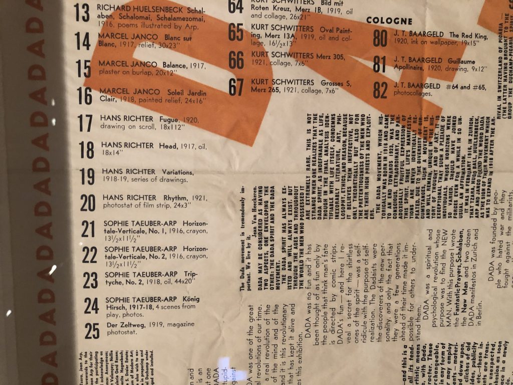
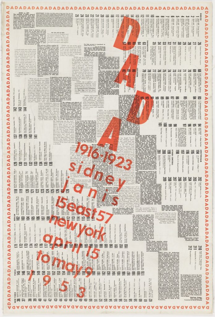
Reading this entire checklist in one take in ASMR voice this morning, I considered that the description of exhibition announcements and brochures as “throwaways” may be related to Duchamp’s recommendation that visitors should throw away his posters.
As considered in the recording, Number 22, Sophie Taeuber-Arp, was indeed incorrectly listed as Horizontale-Verticale, No. 1, when it was actually Horizonale-Verticale, No. 2. This correction will appear in all future performances.
The times I was interested in the content of Marcel Duchamp’s exhibition poster/catalogue/checklist for the Dada exhibition he organized at Sidney Janis’s gallery in 1953 never managed to coincide with the times I had one readily at hand to study it, or to the times when one turned up on the market that I wanted to drop a few thousand dollars for. [Duchamp encouraged visitors to crumple this 38×24-inch poster into a ball and throw it in the trash when they entered the exhibit, so even fewer survive than you’d hope.]
And every time I tried to research it online—the show was a landmark, and influenced people like Jasper Johns and Robert Rauschenberg tremendously, so that happened a lot around here–I was surprised that A) no giant images of it existed online, and B) none of the text in this all-text document for this historic show seems to have ever been published. [After transcribing the entire thing, I now see that is not the case; at least one of these essays was published in the collected writings of its author, but I can’t remember which. And it won’t matter now.]
So right as the pandemic closures loomed, I jammed down to the Hirshhorn Museum, where a Dada exhibition poster hung peacefully among the Duchampiana promised by the Levines, and I photographed the whole thing. When I was stuck or exhausted by other writing–or by lockdown life in general–I’d take a few minutes and just type the stuff in.
Now I am pleased to release this historic text for the first time. It is available both as an edition of Better Read, where a computer-generated voice reads texts by Sidney Janis, Tristan Tzara, Richard Huelsenbeck, Jean Arp, and Jacques Levesque, plus Duchamp’s own text contribution. The essays are also available as a pdf.
The 212-item checklist is currently available as a spreadsheet on my Google Drive. If this lockdown situation continues I may end up reading it myself. But having it read by a computer was such a mess, Zombie Tzara himself would have risen to smack the Dada right out my mouth.
One day later update: So I’m reading Kenneth Goldsmith’s new book, Duchamp Is My Lawyer, and suddenly I’m like, d’oh I bet Monoskop has this damn poster. And of course he does, but just as a giant (finally) legible jpg. So anyway. Dada.
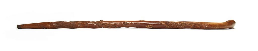
This walking stick carved with three alligators is being sold at Swann’s upcoming African Americana auction, along with a note stating that the cane was a gift from Frederick Douglass to John Brown, and tracing the provenance of the cane from Brown’s widow to the purchaser. After noting the well-documented history of Brown and Douglass’s interactions, Swann continues:
We have found no contemporary documentation that Frederick Douglass ever gave John Brown a cane or walking stick. Nor does the cane itself bear any inscriptions.
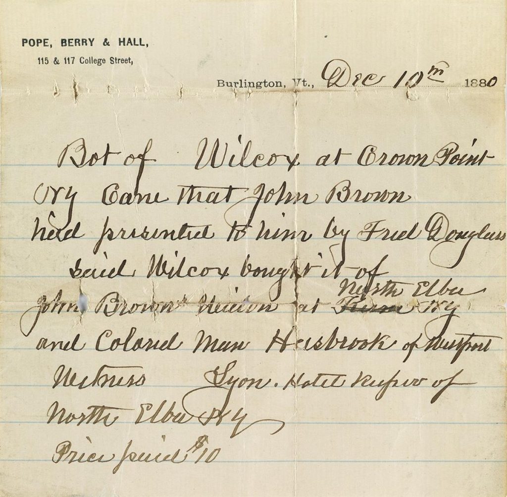
The entire burden of proof rests on a slip of notebook paper passed along with the cane for the past 140 years, on the letterhead of Pope, Berry & Hall of Burlington, VT, 10 December 1880: “Bot of Wilcox at Crown Point, NY, cane that John Brown had presented to him by Fred Douglass. Said Wilcox bought it of John Brown’s widow at North Elba, NY and colored man Hasbrook of Westport. Witness, Lyon, hotel keeper of North Elba, NY. Price paid $10.”
This story seems plausible. The gift from Frederick Douglass to John Brown would have likely been in the late 1850s. After Brown’s execution in 1859, the cane would have been left to his widow Mary Ann Day Brown (1817-1884) at her home in North Elba, NY. Probably shortly before she sold the North Elba property in 1863, it would have been given to Josiah Hasbrouck (circa 1818-1915), an African-American farmer who was a close friend and neighbor of the Brown family. Hasbrouck resided in Westport, NY from 1871 until before 1880 when he moved to Vermont. During this period he would have sold it to a man named Wilcox from Crown Point, NY; the only Wilcox there in the 1880 census was a 27-year-old laborer named John Wilcox. On 10 December 1880, it was sold by Wilcox to George F. Pope. It has been consigned by a Pope descendant.
It only gets better from here:
Any link in this chain could have been invented or exaggerated by any actor up through 1880. John Brown might have told his wife the cane was from Douglass, but it really wasn’t. Mary Brown might have told her friend Hasbrouck that it was John Brown’s cane, but it really wasn’t. Hasbrouck might have invented a Brown family provenance to effect a sale to Wilcox. Wilcox might have invented the whole story to effect a sale to Pope, although it seems unlikely he would have gotten so many details right. Less likely, George Pope could have invented the whole story and drew up this note to support it; or the original cane could have been swapped out at some point in the intervening century to pair with the note.
On the other hand, we have found no way to disprove the story, either. We are confident that the note is dated 1880, and we have found no reason to doubt the credibility of any of the parties. If this really was a gift from Frederick Douglass to John Brown, well, that would be quite a find.
Myself, I am glad to have found this auction, the contemplation of which, along with the contingencies and uncertainties of history, provides great pleasure. I haven’t had this much fun thinking about the way objects accrue an aura of significance since the slivers of Washington’s coffin and the random, stranded andiron with the attribution to Paul Revere.
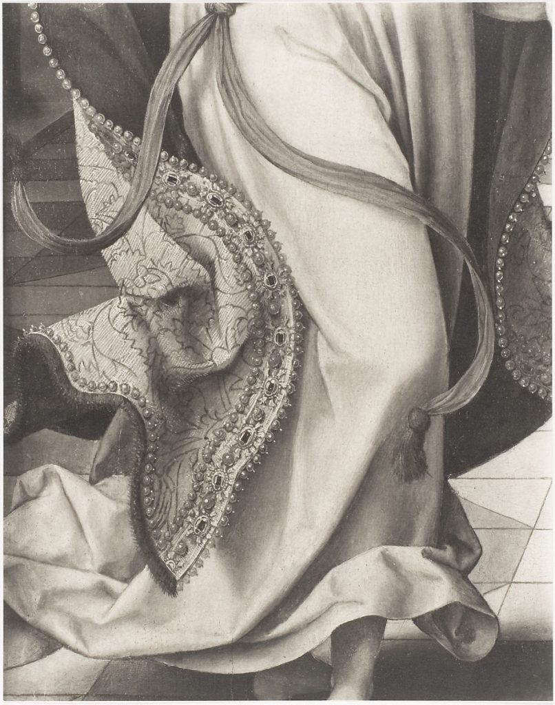
Charles Sheeler, Annunciation by Joos van Cleve, 1943 image:metmuseum.org
Yesterday while searching for lion embroidered Qing rank badges at the Metropolitan Museum, I saw many of them photographed in black & white, which made me wonder if any had been photographed by Charles Sheeler.
It appears not, but Sheeler’s Met photos are always interesting to me. While I ‘ve never imagined buying a Sheeler, I have fantasized about running across a stray print of an African mask or an Egyptian torso in some photodealer’s bin some day. [That has not happened.]
What I did not expect, though, was jamming so hard on this 1943 detail of Antwerp painter Joos van Cleve’s c.1525 Annunciation. Sheeler shows just a dynamic section of the archangel Gabriel’s flowing drapery, embroidered cope, and swirling sash–and just a hint of ankle.
The Annunciation, Joos van Cleve, c. 1525, oil on panel, image: metmuseum.org
Sheeler certainly made stylized, even dramatically composed images for his day job [he worked as a photographer at the Met in 1942-43.] He even took detail shots of other artworks, particularly the museum’s extraordinary Assyrian wall sculptures. [I have an old photobook of them somewhere, published by the museum in 1946.] But this sort of tightly cropped image with such elaborate internal composition feels like he was shooting for himself.
Another thing that comes to mind is Sheeler’s work as a fashion and socialite photographer for Condé Nast between 1926 and 1931. [Though he was quoted in the 2017 show of that work as hating the gig, comparing it to going to jail every day.]
Only a couple of Sheeler’s Assyrian prints are in their collection database, so those might be catalogued as something else. But this was one of a group of Sheeler photos printed and acquired as works in 1982.
It is also my second sixth favorite artwork based on someone else’s Annunciation, after Richter’s first five, but before his next 53.
Olafur Eliasson, Earth Perspectives, 2020, a series of nine images of earth designed to produce afterimages, via serpentine gallery and olafureliasson.net
As part of Hans Ulrich Obrist’s Back to Earth project drawing attention to Earth Day, Olafur Eliasson has created Earth Perspectives, a set of nine images of climate-critical sites on Earth designed to elicit afterimages.
Above is Greenland, whose millions-of-years-old ice sheet is melting like crazy rn. At one point I might have printed these bad boys and gridded them up like the rest of the Olafurs, but not right now, mkay?
“. . . in a matter which so closely concerns the wellbeing of the human race, no decision shall be made without all the knowledge which a little analysis and calculation can provide.”
—Daniel Bernoulli, 1760
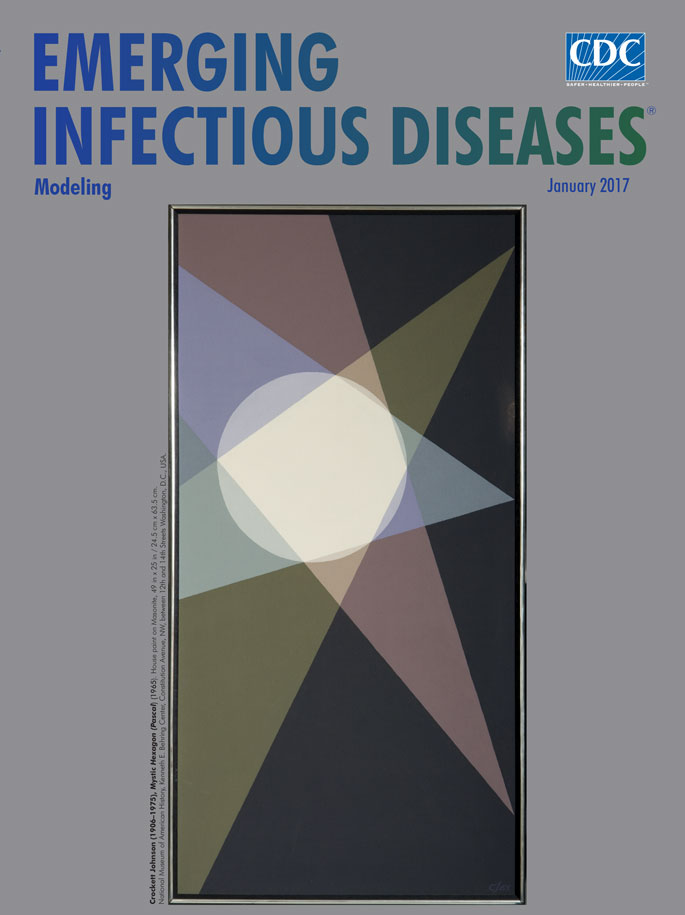
According to the National Museum of American History, “Inspired by the allure of the space age, many Americans of the 1960s took great interest in mathematics and science.” Included among these was Crockett Johnson, a well-known cartoonist, book illustrator, and children’s author best remembered for his Harold and the Purple Crayon series.
From 1965 until his death in 1975, Johnson painted what he described as “a series of romantic tributes to the great geometric mathematicians from Pythagoras on up.” Initially, Johnson drew inspiration from figures he found in James R. Newman’s book The World of Mathematics (1956) and other mathematics books but later began to develop his own geometric constructions. He completed more than 100 of these distinctive paintings of layered, precise geometrical shapes during the last decade of his life.
Critics and art historians have noted that Johnson showed little interest in the technical details of painting. Eschewing convention, Johnson instead preferred to use house paints from a local hardware store and to paint on the rough side of small pieces of Masonite instead of canvas—though he did on occasion both use the smoother side and complete some larger works. Although other contemporary painters such as such as Piet Mondrian, Josef Albers, Alexander Calder, Richard Anuszkiewicz, and Ad Reinhardt (who was a close friend) also used mathematical ideas and geometric shapes, Johnson differed from them in that he linked his geometric paintings with specific mathematicians and he delved into researching and understanding the mathematical ideas that he found inspiring.
Among the earliest of these paintings is this month’s cover art, Mystic Hexagon (Pascal), which Johnson based on a theorem devised by 16-year-old Blaise Pascal in 1640. In essence, Pascal had postulated that if the opposite sides of an irregular hexagon inscribed in a circle are extended, they meet in 3 points that lie on a straight line. In his depiction of Pascal’s work, Johnson positioned the circle and cream-colored hexagon near the center of the painting. Overlapping wedges of green, blue, and gray form the different pairs of lines. He did not paint the line that would serve to join the 3 intersections (now dubbed the Pascal Line), but the right edge of the painting fulfills that function.
Pascal, like Johnson, was intrigued by numbers, and he made notable contributions to mathematics and science. He is credited with laying the foundation for probability theory through a series of letters he exchanged with Pierre de Fermat. The pair pondered a problem related to expected outcomes in a dice game that vexed an acquaintance who gambled professionally. That correspondence is credited with developing a fundamental theory of probability—the branch of mathematics concerned with analyzing random, or seemingly random, phenomena—with its roots in Pascal’s “Treatise on the Arithmetical Triangle.”
Similar to Pascal’s geometrical extrapolations as depicted in Johnson’s painting, mathematical extrapolations of data have long provided essential information to aid public health officials with decision making. An early example is that of Daniel Bernoulli, who in 1766 used the then relatively new method of calculus to estimate that smallpox elimination via routine vaccination would reduce the risk of death by age 25 years from ≈57% to 50%. Ronald Ross’s model on malaria transmission, first introduced in 2 reports published in 1908 and 1911, is a particularly important example of such modeling for public health decision making. Versions of that model are still used today to inform critical public health decision making regarding malaria control.
Today, mathematical models have become essential tools for public health officials, providing estimates of disease burden, potential impact of interventions, and duration of disease outbreaks. They are particularly useful in situations for which little or no data exist, such as estimates of number of cases of disease in the future, or potential impact (benefit) of a yet-to-be-licensed vaccine. In such situations, mathematical modelers typically use data from different sources, along with assumptions about the underlying transmission, to build (or extrapolate) models to provide estimates for the current problem. Such mathematical models have, with the advent of more powerful and cheap computing capabilities, become ever more diverse in methods and degrees of complexity. Mathematical models of infectious disease can now range from the simple, such as the two-dimensional representation found in Johnson’s painting, to large multidimensional models that simulate the daily contacts between individuals within a community and the resultant risk for onward transmission of infectious disease.
He’s been a fellow blogger, an editor, and a hero to me for more than a decade, but I’m always glad when Andrew Russeth writes. And that goes double for this moment when it feels like we as a people are on a precipice.
Andrew looks around, backwards, and forwards, and sees the importance of maintenance, unsung labor, the often invisible work that is so necessary for making everything go:
In language that startles today, [Mierle Laderman] Ukeles argues that “avant-garde art, which claims utter development, is infected by strains of maintenance ideas, maintenance activities, and maintenance materials.” (Emphasis mine.) She chides Process art in particular for obscuring that fact, but maintenance is in operation everywhere in contemporary art, once you start looking. It is the hidden force that makes so much—in art, and in the world—possible.
And it’s the kind of work–art and labor–we’ll need to get through this.
The current pandemic also makes me think of the AIDS epidemic, and the lessons it holds for us now. There are people who did not survive the malice and indifference and inaction of governments–and there are people who did, and who made a difference in peoples’ lives and in the entire world. We should seek them out and learn from them.
The title alone makes me think of David France’s 2012 documentary about the AIDS activist movement, How To Survive A Plague. A good place to start
Can’t touch this: Rudolf Stingel, Untitled, 2012, electroformed copper, plated nickel and gold, stainless steel frame, in 6 parts, 120cm sq each, sold at Sotheby’s in 2017
Before the extent of his crimes bubbled to the surface, Philbrick himself related to me the occasion on which he tried to negotiate the sale of a badly damaged Stingel painting from Hiscox insurance company that had been written off owing to catastrophic water damage. An employee of the company confirmed to me that Philbrick indeed had tried unsuccessfully to purchase the damaged painting. Simultaneously, he engaged his assistants to buy the super-rare German paint Stingel uses, which was available only seasonally, so they could replicate over the course of months the precise method of the pricey artist and create an exact replica. Though Philbrick never managed to buy the destroyed work from the insurer — such companies often facilitate or contribute to the restoration of a work that has a claim against it to repatriate it into the marketplace, or they sell it discounted with damage — the fate of Philbrick’s meticulously crafted copy is at present a mystery. Chances are it will be on offer at an auction house near you, if it hasn’t been sold already.
Though I have even more questions about an “exact replica” of a specific painting than I do about a specific paint, or the idea that damaged=destroyed, the “conceptual pose” of Stingel’s challenge to authorship is now a reality, and I am very much here for it. Let a thousand fanmade Stingels bloom–and let them all turn up at Christie’s.