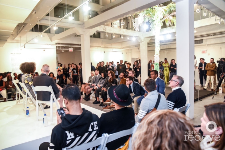
A month before Art Basel, Thom Browne engaged Cultural Counsel to develop his profile as an artist and unveil his first ever public artwork in Miami’s Design District. Tol bolster our traditional PR strategy, we secured a high profile curator Deana Hagag, CEO Of United States Artists, for the installation, an programmed a panel with Thom Browne, Artforum Editor-in-Chief David Velasco, and Haggag, creating a strong foundation for the designer to build his art world credibility. Our VIP guests for the opening included Diplo, Jamian Juliano-Villani, and Kimberly Drew.
Thom Browne, the designer, is an established visionary in the fashion world, acclaimed for his cropped suits and unorthodox approach to tailored separates. But Thom Browne the artist has, until now, maintained relative obscurity.
Browne has been making art on the down-low for the better part of a decade. He paints minimalist compositions inspired by Pointillist techniques, and counts giants of 20th-century American painting—from Milton Avery to Andrew Wyeth to Edward Hopper—as influences. Browne has also dabbled in sculpture, integrating those works over the years into fashion runway shows that are more like full-blown thespian extravaganzas than industry events.
In his view, clothing was only a piece of a larger creative project for a designer with no formal training, but a strong taste for iconography and pageantry. So he dotted his runway shows with his installations, continued to privately paint, and waited. He had a one-off portrait in a 2014 group show at the Metropolitan Opera, but he continued to be known as a designer.
“It’s not that much of a secret,” Browne said in his office recently, referring to his longtime art practice. “I think the secret would be more opening it up to show to people.” For the most part, he thought, it was simply unclear that the installation for his 2013 Amish-inspired collection or the 2009 performance he staged for his show in Florence were meant to stand on their own.
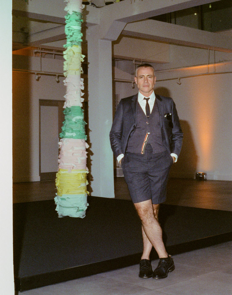
After keeping his fine-art practice more or less under wraps for years, Browne is finally stepping out with his first-ever public artwork: a 21-foot-tall likeness of a palm tree that will go on view in Miami’s Moore Building come December 5, when Art Basel Miami Beach opens to the public.
“All this time, Thom has been…upending rigid gender assumptions, exploring uniformity and individuality, and investigating the monotony of everyday life,’” says the project’s curator, Deana Haggag, who is also the president and CEO of the nonprofit United States Artists. “We’ve become accustomed to reckoning with some of these tensions, but Thom has been consistently and meticulously considering them for years. I think it’s tremendous that we finally get to see him expand fully into this artistic dimension of his making practice.”
Painting, Browne says, is the medium that currently interests him the most, but performance remains his bread and butter. While Palm Tree I doesn’t move, Browne considers the sculpture to be a performative artwork, “in the way that it invites the viewer to interact with the piece and the environment made for it through the sandpit and mirror,” he explains.
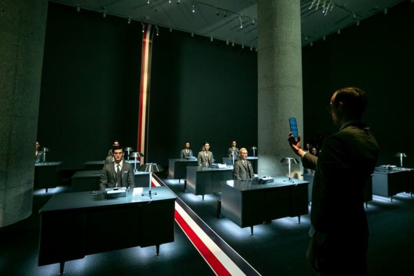
In the Spring of 2020, Cultural Counsel worked with Thom Browne to launch an international campaign around their Samsung cellphone, staging an event to unveil the collaboration at Sotheby’s in New York. Cultural Counsel handled guest list management, on-site support, and targeted media outreach that resulted in top-tier coverage in The New York Times, Wall Street Journal, Vogue, GQ, and Vanity Fair.
Though Browne said fashion remains his primary outlet, he debuted his first stand-alone sculptural installation at Art Basel Miami in December. The Sotheby’s performance continued in that vein. “This performance was more art performance than fashion,” Browne said, “that’s what I told the models that were actually in the performance.”
At the beginning of the performance, rows of models sat at desks with typewriters in front of them, frozen in an eerie quiet. One model by one, a standing ringleader activated them to begin their task: an athletic bout of typing. By the time he made it to all the desks, the room was clattering with keys, until the latter of a pair of phone calls eventually ended the din, one typewriter by one, and the models processed out of the room with their workdays complete.
Ermenegildo Zegna acquired an 85% stake in Thom Browne at a $500 million valuation in 2018, which appeared to leave the future of the brand secure. “In the past I did collaborations of course that I was proud of,” Browne said on Wednesday, “but more to keep the business going. Now I don’t really need to do collaborations, so I only do collaborations with companies who make a product that I really, really believe in.”
The main problem with Browne’s commitment to his silhouette, then, might have been that it worked. He described himself as permanently restless, and after the Zegna acquisition and the Cleveland Cavaliers’ and FC Barcelona’s public embraces, where to go next if not Miami in December? “After a while, people—I don’t think they get bored—but they expect more,” Browne said. “And I think now is the perfect time to show them different sides.”
Until I got to the last paragraph, I could not figure out why Browne needed to be identified as an artist to launch a Fashion Week phone collabo, but this is all inspo for all artists looking for innovative ways to support their practice, whether painting, sculpture, or performance. If I ever find footage or a transcript of the panel discussion, I will add it here. [h/t]