Cy Twombly Rip

untitled (200 x 157) is an appropriated 200px jpg of a 10x12 foot cy twombly painting published by the philadelphia museum in 2019 and earlier, which is reproduced here at 800px, but which has been turned into an artwork that could be reproduced at any scale, up to and including the size of twombly's original painting, or bigger, why not. the original image was hotlinked from the philamuseum site, and has been updated with an archived copy in 2024
Untitled (200 x 157, after Achaeans in Battle, 1978, by Cy Twombly), 2019, an appropriated 20opx jpg displayed 800px, via Philadelphia Museum of Art

Two weeks ago on the 378th episode of Modern Art Notes Podcast, Tyler Green discussed Cy Twombly: 50 Days at Iliam, a monograph published by Yale University Press and the Philadelphia Museum, which has the 10-painting series permanently installed in its own gallery. Green’s guest was Richard Fletcher, a classics professor and one of six contributors to the book, alongside PMA curator Carlos Basualdo and Nicola Del Roscio, who heads the Cy Twombly Foundation.

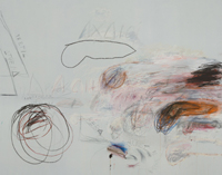
I’d anticipated an episode on Twombly, because Green had recently tweeted about the extremely small and useless images of Twombly’s paintings on the Philadelphia Museum’s website, which, word. I promptly tweeted back an unhelpful joke, by upsizing the jpeg of one of the paintings, Achaeans in Battle, into a uselessly pixelated mess [above].

This is something that has occupied my mind and work for more than ten years, when I first turned a tiny jpeg of a Richard Prince Cowboy photo into my own work as a critique of MoMA/Gagosian/Prince’s refusal to provide images for an exhibition review at Slate. A related concept was articulated a little later by Hito Steyerl as the “poor image,” a low-res image optimized for networked circulation by being stripped of information. A crappy, digital simulacrum of an original [sic], complete [sic], physical and visual experience with an artwork.

Not knowing about the Iliam book, I assumed Tyler was going to be talking to Joshua Rivkin, who has a new biography of Twombly called Chalk: The Art and Erasure of Cy Twombly, which I’d recently finished. Rivkin’s book is a labor of love and pilgrimage; inspired by his regular presence in front of Twomblys at the Menil as a teacher and guide, the book documents his attempts to gain insights into Twombly’s life and work from the places he lived and worked: Rome, Gaeta, and Lexington. What Rivkin finds is the thwarting presence of Del Roscio, who disapproves of the biography project, silences sources, and denies Rivkin access to Twombly’s archive, as well as use of his images.

But no, it was Iliam. Green talked with Fletcher about details of Twombly’s marks and texts; his use of a Greek delta instead of an A to write Achilles and the Achaeans; the symbological vocabulary of the series’ colors; what’s going on with all those phalluses; and Twombly’s relationship to his literary source, Alexander Pope’s translation of the Iliad. [Fletcher also discussed a discovery he’d made, of a different source for some of Twombly’s texts. It’s hot, academic stuff.]

I mention all this scholarly and critical detail because of the sheer bafflement at learning, a few days after the episode was released, that the Twombly Foundation had sent Green a cease & desist letter demanding that images of the Iliam paintings be removed from the MAN Podcast webpage. Those would be the images of the 50 Days at Iliam works whose details were being studied and discussed. By an author of the book. Published by the museum and Yale. It’s an extremely impoverished attempt to exert control over consideration and discussion of Twombly’s work by an extremely interested party, using an extremely wealthy foundation. That it is being done in the name of one of the most important and formative artists in my own life is extremely disappointing.

As soon as I saw Green’s tweet about the C&D, and his removal of the Iliam images, I looked for it on Internet Archive. No luck. But I ripped a screenshot of the page from Google’s cache. In a couple of days, it had been replaced by the stripped down version. So except for anything Green might have archived himself, I think this screenshot is the only record of the original page. I printed it as Untitled (Foundation), an artist book in an edition of 10. The widest printer I could find was 36 inches, so it came out 3 inches wide and barely legible. The images are smaller than even the Philadelphia Museum’s website.

I am sending this artwork to people who appreciate the importance of fair use to progress of Science and the useful Arts; to the freedom of the press and expression; to the transformational creation of new art; and to the accountability to the public good that is expected of tax-exempt foundations and those who control and benefit from them.

Continue reading “Cy Twombly Rip”

On Sam Gilliam For Art In America

I’m slow to realize I’ve only been hyping this on Twitter, but I’m psyched that my essay on Sam Gilliam and his decades-long investigations of abstraction is out now in Art in America magazine.

When the editors asked me all the way back in June, the assignment was to interview the artist in his studio, a regular feature of the magazine. Gilliam had just opened a retrospective in Basel, and was working on a show in LA in the fall. When that show got pushed back, the interview request process got drawn out, and finally, I ended up going to Gilliam’s studio to talk about interviewing him, but very purposefully not interviewing.

He was a gracious and fascinating guy in the middle of a great deal of activity, and we figured it would be best to talk more at length after the show got pinned down. And then the show preparations intensified, and my deadline loomed, and I ended up writing a full-on essay rather than interviewing Gilliam. Which was the culmination of a months-long journey through his work, his career, and his life, digging through archives and clippings files and hours of earlier interview recordings.

My takeaway is utter respect for Gilliam’s work and his practice, which evinces the kind of fierce independence required to sustain six-plus decades of experimentation, only some of which happened in the spotlight of the mainstream art world. I find myself rewriting the essay right now, so just go ahead and read it; I left it all on the page.

Color in Landscape [artinamericamagazine]

Hommage à Caïssa

Marcel Duchamp, Hommage à Caïssa, 48 x 48cm, wood and printed vinyl, or what the Israel Museum calls “artificial leather,” image:sothebys

For a guy who’d supposedly gave up making art to play chess, Marcel Duchamp made an awful lot of art. Maybe making a readymade edition of a chessboard for a chess-themed fundaiser group show somehow didn’t count. It definitely sounds like it didn’t sell.

Asked in 1965 to help raise money for the American Chess Foundation, Duchamp organized “Hommage à Caïssa,” after the fictional patron wood nymph of chess, which opened at the Cordier & Eckstrom Gallery in New York in February 1966. [A year earlier, Cordier & Eckstrom had staged the largest Duchamp exhibition to date, a 90-object show, most from a single collection, that toured 16 cities in four countries over four years.]

“More than any other artist of his generation,” Francis Naumann wrote, “Duchamp was aware that his signature carried the magical power to transform an object of relatively little value into a work of art.” He was constantly dodging or finessing people at openings who approached him with things to sign–including the non-deluxe editions of his exhibition catalogues. For the chess show, Duchamp created a readymade chessboard in an edition of 30. I’ve seen it called just Chessboard, but mostly it’s titled Hommage à Caïssa, which is what Duchamp wrote on the frame.

On the frame of at least one. Though an edition of 30 was designated, Arturo Schwarz says “fewer than 10” were actually issued. Only two turn up online: one, 3/30, was Schwarz’s, and it went to the Israel Museum. The other is 2/30, which has a dedication to Maria. Could that be Maria Martins, Duchamp’s mistress, and the body model for Étant donnés? Who else would get a lower edition number than the artist’s most important dealer?

Anyway, it’s coming to auction for the second time in a decade. Presumably there was a 1/30, too, and 3 is less than 10, so Schwarz isn’t wrong. But either way, it doesn’t sound like Duchamp’s magical powers to transform  chessboards into art transformed any into money. For Chess. But if two dealer flips in seven years can take this piece from EUR 42,000 to EUR 200,000, I guess we’ll know where the real magic lies.

26 Feb 2019, Lot 47, Marcel Duchamp, Hommage à Caïssa, est. 180-250,000 GBP [sothebys]

Previously, kind of related:
Chip of Fools, or How Many Fountains Are There? And Another One. And Another One. And

‘Party Hat’

Charline von Heyl, Dub, 2018, image via petzel

I went back to the Charline von Heyl show at the Hirshhorn yesterday, mostly because I could. Also because it’s good. I never tire of looking and thinking about her paintings.

What stood out to me this time is so obvious I can’t believe I missed it, but also apparently so obvious, no one else has mentioned it either? [update after confirming my suspicions: No one except the artist and the curator Evelyn Hankins, at von Heyl’s talk at the museum, starting at 28:00].

Dub (2018) is in the second gallery, and P. (2008) is in the second to last gallery. It took me a couple of back&forths to figure out that the structure of these two paintings, separated by space and time, are not exact matches.

Dub wasn’t in the Deichtorhallen Hamburg’s iteration of the Hirshhorn’s show, but it was in von Heyl’s overlapping show at Petzel in New York. So this (non-)pairing is unique to DC.

Charline von Heyl, P., 2008, Collection: Guggenheim

They make me think of two things. Several of von Heyl’s paintings reminded me of big-brushy, 1970s and 80s de Koonings, and now with the likelihood of her painting over a projection of an earlier work, we can add de Kooning’s last phase to the mix. Also, a pair of new paintings with a bowling pin motif are described as von Heyl’s first diptych, but that now seems only technically true.

UPDATE: no, she made it freehand, because it wasn’t clear whether the Guggenheim would loan P. for the show. Dub, von Heyl said, is what P. would be if she made it now, toxic, with a little “party hat.”

Charline von Heyl: Snake Eyes at the Hirshhorn has been extended through April 21, 2019.

Untitled (monocrome du pont), 2019

Untitled (monocrome du pont), 2019, enamel on stone, est. 150 x 150 cm, installation view from Lauzun’s Legion Bridge, Washington, DC

Again with the buffing, I am not a fan. But I’m also not going to pretend it doesn’t exist.

The 2e Légion des Volontaires Étrangers de Lauzun, comprised of foreign mercenaries led by the duc du Lauzun, was part of the Compte du Rochambeau’s expeditionary force to aid the colonists in the American Revolution. They marched from New England to Yorktown, Virginia, where they played a pivotal role in the American victory.

On their way, the Légion du Lauzun crossed the Potomac just east of Georgetown. Washington, DC did not,  obviously, exist yet. In 2004, following its renovation, the P Street Bridge connecting Georgetown to Dupont Circle was renamed Lauzun’s Legion Bridge.

Untitled (monocrome du pont), 2019, installation view

This nearly perfect square monochrome painting is installed on the east pier of the bridge, at traffic level for the Rock Creek Parkway. Except for fleeting views from passing cars, where its deep grey surface and uncommonly crisp geometric form positively pop off the stone support, it is best seen from the bike and jogging path on the west side.

I’m guessing. It was butt cold on top of this bridge today, and that is as far as I was gonna go.

SPRING-LIKE RESPITE UPDATE:

installation shot, parkway level

imagine you’re standing in the middle of the road…

It’s very matte.

Previously, related:
Untitled (Palermo South Park)
UntitledICE

The Great Salt

The Great Salt, c.1629–1638, Collection: Harvard Art Museums/Fogg Art Museum

Jace Clayton (H ’97), who performs as DJ Rupture, was an artist in residence at Harvard Art Museums, where he currently has an exhibition, sound installation, and performance, Jace Clayon, The Great Salt. The show is up through February 4th.

The Great Salt is an historic colonial silver salt receptacle, the oldest piece of silver Harvard owns, came to Boston with Elizabeth Harris Glover, whose husband died while crossing the Atlantic in 1639 [which was also the year the first enslaved Africans arrived in North America]. She would go on to marry the first president of Harvard, and her brother left it to the school, where it was used in the inauguration ceremonies of Harvard’s presidents through the 20th century. [After some point I guess they stopped it? Is this one more thing Larry Summers screwed up?]

40 synthesizer modules in the gallery are programmed to respond to visitors playing three marimbulas, Caribbean/African thumb pianos. On December 6, 2018, Clayton performed his three-part composition, “Salt Wood Salt Wire Salt Salt” with the new music group Bent Duo.

Listening With Jace Clayton [harvardartmuseums.org via bomb]
Performance–Jace Clayton, “Salt Wood Salt Wire Salt Salt” [vimeo]

Dana Chandler’s Fred Hampton’s Doors

Fred Hampton’s Door 2 (1975), installed in Soul of A Nation at The Brooklyn Museum, image:gregcookland

Getting the colors of that Melvin Edwards X Blinky Palermo joint in my head was like learning a new word: you start hearing it everywhere. Like in Dana Chandler’s 1975 painting, Fred Hampton’s Door 2, which is in Soul of the Nation at the Brooklyn Museum. Greg Cook has a great post on Wonderland about Chandler, a prominent Black Power activist and artist from Boston, who painted at least two versions of Fred Hampton’s Door, complete with [bullet] holes, to memorialize the young Black Panther leader and to protest his murder at the hands of Chicago police.

Chandler’s painting in Soul of a Nation was made in 1975, after his original 1970 painting was stolen from Expo ’74 in Spokane, Washington. The original was a framed painting of a section of Hampton’s door; the second version was actually a door. Both had holes that are meant to be read as bullet holes. The original had one big white star that read (to me, anyway) as an armed forces service star; the second one has a cluster of four stars, arranged like an admiral’s insignia. But the dominant colors are Pan-African red and green.

Dana C. Chandler, Jr. posing for Time Magazine (6 Apr 1970) with a 1970 painting then titled, Freddie Hampton’s Door.

This is the only photo I’ve seen of the original painting; it ran as a full page in Time Magazine in April 1970, illustrating an article on Angry Black Artists [sic].

Dana Chandler’s Memorial To Murdered Black Panter Fred Hampton [wonderland]
Dana Chandler’s website [getalivinglegend.com]

Untitled Palermo (South Park), 2019

Untitled Palermo (South Park), 2019, enamel and latex on wood and steel, enamel and steel on cast iron and brick, installation image by Bryan Finoki, aka @subtopes

When he first tweeted this photo from San Francisco, Bryan Finoki saw #fortressurbanism. I saw metal af Blinky with a Melvin Edwards twist.

Untitled, Palermo, 1970 image ganked from wherever (it is not so easy to tell in this jpg, there are actually three bands of green. hashtag metadata, but I can’t tell if this is a different work from the Untitled, 1968, belonging to Grand Duc Jean)

My principled stand against buffing is not softening, and I don’t condone it, but I can’t not appreciate the occasional aesthetic results. Until I’m able to source the exact anti-climbing spike strips in this installation, to see this work you’ll have to go–or google your way–to 2nd & Brannan streets.

Which is fine. Palermo was very into site specifics, which I can appreciate. The painted wall and pipes here feel especially significant.

I’ve recently been taking a long look at the work of Sam Gilliam. There was one drape installation he made in the 1970s at a gallery, and when he reinstalled the piece in a museum, he added a vertical beam to stand in for the gallery’s steam riser. I think this painting, though standalone, would benefit from a similar treatment [chef’s finger kiss emoji].

Previously, related:
Untitled (Turbinengradientin), 2017
Untitled (Gerda Taro Leipzig Monochromes), 2016
Barnett Newman’s Lace Curtain for Mayor Daley

Untitled (Plaque d’Orléans), 2019

Untitled (Plaque d’Orléans), 2019, 17.7 x 23.4 cm, enamel and hammered, engraved, and silver-plated bronze, now ed. 12, but only 1/12  has this sweet patina and provenance. image: sothebys.com

In 2015 Sotheby’s auctioned a medium-sized trove of stuff from the former royal family of France, the House of Orléans. Included was this silver-plated and enameled bronze plaque, which featured the crowned coat of arms of the Princes d’Orléans, a bunch of repoussée auricular swags, and fourteen engraved signatures.

The plaque is believed to have been created for the cover of a photo album to commemorate the 1931 marriage in Palermo of Henri, comte de Paris (22yo) to his cousin, princesse Isabelle d’Orléans-Bragance (19):

Les signatures sont très probablement celles de Henri (comte de Paris) et Isabelle (princesse d’Orléans-Bragance, comtesse de Paris), Valdemar (prince de Danemark), Aage, Axel et Eric (princes de Danemark, comtes de Rosenborg), Amélie (princesse d’Orléans, reine du Portugal), Jean (futur grand-duc de Luxembourg), Margrethe (fille de Charles, duc de Vestrogothie et épouse du prince Axel de Danemark), auxquelles il faut ajouter quatre signatures non attribuées, Marguerite, Patrice et deux fois Marie.

It seems pretty wild to me. There was no foolin’ around with the coat of arms, obviously, but everything else seems to have been improvised in the extreme. The signatures–all first names–are distinct in their style, and wild in their placement. Those swags look like doodles come to life. It’s like the young wedding party drew up a souvenir themselves on the spot, and handed it off to the silversmith, a melange of extravagance, intimacy, and whimsy.

I knew a woman who was a bridesmaid for Grace Kelly, and received a customized photo album of the event. I later saw a similar album from another wedding party member turn up at Glenn Horowitz in East Hampton. Which makes me wonder if there are indeed multiple albums from Henri & Isabelle’s wedding, sitting in the bibliotheques of the descendants of various cousins royal. And if so, do they have these plaques, or something related? Was this a proof, a spare, a prototype?

Part of me wants this to be a unique object, and thus, a unique work, declared from afar, and sitting in the collection of some unsuspecting aristophile or decorator. But I’m also happy to declare it a multiple. Assuming this one’s from the happy couple, eleven in the edition remain to be fabricated. RSVP.

2020 update: OK, I thought of this plaque last night, and wanted to see it, and the more I dig into the names, I think some of the information in the Sotheby’s lot is incorrect. And that affects the date, and thus the very nature of this plaque.

Continue reading “Untitled (Plaque d’Orléans), 2019”

Realized

This weird practice I’ve been exploring leaves me very aware of how I discuss it, and of how works are explained. I try to be accurate about what I actually do, or what a work has to do with me. A lot of times, the work exists, and I announce it. Or I’m stoked to announce it. It’s on view. It is available. Sometimes it is conceptualized. Rarely is it conceived; that doesn’t feel like how it works. It’s not really found, though that is obviously part of the process. Same with declaring it, though I bridle at the ostensible ease, which can make me doubt myself as a Duchampian poseur, or an armchair usurper of someone else’s creative exertions.

But sometimes, rarely, exquisitely, there is a right word to describe the flow from which a perfect product emerges. In this case the word is realized. I realized this work in a hot-tweeted instant about an hour ago. This work was realized at the Hirshhorn Museum.

Untitled (Trudeau Trump Brushstroke), 2019, painted and fabricated aluminum, installation shot at Hirshhorn Museum, Washington, DC

tweet by @yridea, h/t @robinsloan

It is also interesting to me how immediately and completely realizing a work transforms the context and history around it. Something I hated with disgust I now love-hate. This huge, overbearing, aggressively dumb sculpture once seemed to me a monument to its own pomposity and that of the institution(al leadership) that brought it to town, then set it smack in the unavoidable center of things, then promptly discovered it was too big and unwieldy and expensive to get rid of, and that it wasn’t even clear the site’s hollow foundation could support the apparatus needed to remove it, or survive the attempt unscathed.

So yeah, amazing how that’s all changed now. And you can see it during the shutdown. What you can’t do, though, is ever unsee it.

New World Order

In Bruce Hainley’s new essay on Cady Noland [Artforum Jan ’19, too short at 12 pages] I learned that the artist’s mom, Cornelia Langer Noland Reis, was the co-owner with Maria O’Leary of a world-focused jewelry and fashion boutique in Old Town, Alexandria known as Nuevo Mundo.

Cady Noland, Stand-In for a Stand-In, 1999, cardboard, wood, spray paint, rubber mat, installation image from Robert Gober’s 2014 MoMA retrospective, collection Eileen & Michael Cohen

The image, with caption, at top, is from a 2015 remembrance of O’Leary, who was a life/style icon to the moms and daughters of Old Town. The image above was screencapped from a checklist of Robert Gober’s 2014 MoMA retrospective. It included a re-staging of his 1999 group show for which Cady Noland made Stand-In for a Stand-In, a cardboard version of a stock.

the time of her life: remembering alexandria’s own  [alexandriastylebook]
The Picture of C.N. In A Prospect Of Horrors [artforum]

School of Rock Fan

David Hammons’ Rock Fan, rock, fans, shrubbery [?], little rocks with paper fans on them [?], Oct-Nov 1993, image: idiotbooks
[ONE THING WENT RIGHT IN 2020 UPDATE] When David Hammons’ How Ya Like Me Now?, a billboard-size portrait of a blonde & blue-eyed Jesse Jackson was  being installed on a vacant lot in downtown Washington, DC in 1989, Black passersby who first encountered it without the soothing benefit of a museum guide or explanatory text took offense–and then a sledgehammer–to it. That incident and that work are now a major part of Hammons’ story.

Four years later,  Hammons again encountered local resistance while installing another outdoor sculpture, which was then vandalized, and later destroyed. It all went down on the bucolic campus of Williams College, in Williamstown, Massachusetts.

In October 1993 Hammons opened a show, curated by Deborah Rothschild, at the Williams College Museum of Art. Yardbird Suite, the indoor installation of boomboxes in trees playing Jazz was chill. The six-ton boulder placed in front Chapin Hall at the center of campus, with antique fans bolted to the top, was not.

“Hammons defends Rock Fan,” The Williams Record, 10/23/1993

Students began questioning and criticizing the piece as Hammons was installing it. He called it Rock Fan, which only seemed to incense those demanding deeper meaning or significance from this work of art temporarily in their midst. [He also told some agitated students that it was called The Agitator.] In Williams’ hyper-privileged and hyper-collegial culture, every gifted scholar was expected to be able to weigh in on everything. In practice, this meant students commented on Post-It notes on literally whatever poster, building, vending machine, or public sculpture they encountered.

From The Williams Record, Oct. or Nov 1993

They criticized the site, the title, the fabrication, the aesthetics, the imagined expense, and the disruption. Some complaints were reported in the weekly student paper, The Williams Record. Additional back and forth took place a daily student bulletin, plus the Post-Its. While he was on site, Hammons gave as good as he got.

“You don’t have to make it into some big mystery. Damn, relax. Use your energy on something else besides intellectual masturbation,” he said.

Hammons added that he was primarily interested in confronting and challenging people with images that they aren’t used to seeing or which seem out of place. “I’m in the business of making the invisible visible…Most of your eyes are very weak, so you need to see things you’re not accustomed to seeing so that your eyes get much stronger.” [WR 10/26/93]

In the first couple of weeks, a student or students [I haven’t been able to find yet] surrounded Rock Fan with their own sculptural responses: accordion-folded paper fans glued to small rocks [top]. Then came the painters, dousing Rock Fan with purple paint for Homecoming.

David Hammons’ Rock Fan, painted purple by unknown Ephs, 1993, image: a book illustration shot off a screen, apparently, by @art2sex

On March 3rd, 1994, David Hammons gave a slide lecture at SFMOMA, introduced by curator Gary Garrels, which ends with Rock Fan[s]:

And this is a piece at Williams College called Rock Fans.

This was protested. For about the last five months, they’ve been protesting this piece on their campus. And so some students made fans out of paper and put these little rock fans around the piece. It’s been vandalized and written about.

When the wind blows, the fans actually move. Someone said, “I don’t care how many fans you put on it, it’s not going to fly.”

And this is after Williams students painted the rock. Someone called me and told me that now they feel like it’s theirs, because they painted it their school colors.

The transcript of the lecture–but not the slides–was published this year by the CCA Wattis Institute as part of their year-long program devoted to Hammons and his work. The book, David Hammons Is On Our Mind, was created in collaboration with the artist. There are photos he selected, a poem by Tongo Eisen-Martin, and a text by Fred Moten. Reading Hammons’ narration of invisible slides creates an exquisitely baffling disjuncture that has to be intentional. It definitely sent me looking for things I was not accustomed to seeing.

Rock Fan was originally meant to travel to SFMOMA, too, but at some point Hammons decided it would not. He left it at Williams; it was removed in April, during Spring Break. The fans went back to the artist. I haven’t found the rock.

David Hammons, Rock Fan, 1997, textile on rock, Collection: WCMA, finally

In 1997 Hammons appropriated the Williams students’ response to his sculpture to make a new Rock Fan out of a stone and pleated fabric. In 2004 the director of the Williams Museum found out about it at Jeanne Greenberg Rohatyn’s place, and acquired it for the collection. In 2012 Robbi Behr (’97) designed a Rock Fan-themed coffee mug for their 15th reunion.

Destroyed David Hammons: the Rock Fan Rock abides. [photo: Jordan Stein’s insta]
[UPDATE] Before 2020 destroys us all, we can at least know that Rock Fan Rock has not been lost, but abides still, and will continue–apparently past the extinction of humanity. Curator Jordan Stein found and visited it during a teaching gig at Williams, and posted photos on Instagram. It was apparently removed to a small hill near the Westlawn Cemetery. A fitting resting spot. Also it is still purple.

Previously, related:
How ya like How ya like me now?
Public Enemies Nos. 2–?
Stop and Piss
‘Art objects are tailored for physical spaces owned or controlled by the social elite.’ Will I never be able to stop returning to this 1995 Frieze essay on signifyin’? That is fine with me.
Jordan Stein found some amazing stuff on attempts to restore/repair/remake Philip Johnson’s little Giacometti

Better Read #026: Douglas Blau For Elizabeth Peyton For Gavin Brown

Phaidon lists the title for this 1993 drawing as, “Princess Elizabeth’s first radio address”.

This installment of Better Read is the first to derive from an Instagram post. A few days ago Gavin Brown posted a picture of a text from what looks like a brochure or handout for his first show of Elizabeth Peyton’s work. The text was by Douglas Blau, and the show was mostly drawings, and in a room at the Chelsea Hotel, because that’s how people rolled in in November 1993.

In 2018, meanwhile, we apparently number our computerized readings of art-related texts slightly out of order. But there is an episode 25 in my drafts, and maybe two episode 22s, so this could be right or wrong or wrong in the other direction. Fortunately, it probably doesn’t matter, since if anyone does anything, it’ll just be to click through to Gavin’s Insta and read the damn thing yourself.

Play or download Better Read #026: Douglas Blau For Elizabeth Peyton For Gavin Brown [mp3, 1.3mb, 2:41, via @passerbystop]

This Is My Problem…Should Love Come First?

True Confessions, March 1951, the Slave Wife Issue?

The big score in my search for the collage elements of Robert Rauschenberg’s lost painting, Should Love Come First? was the magazine clipping that said just that.

It turns out to be from True Confessions, a women’s sex and relationship advice magazine. The article was written, apparently, by a reader named June soliciting advice for handling her man. I gave a brief recap of the article in Panorama, and there’s a picture which shows the pullquote, which does

My Problem: Should Love Come First? image: a freakin’ multiyear search

seem to resonate with the situation of Rauschenberg, his new, pregnant, wife Susan Weil, and Rauschenberg’s new squeeze Cy Twombly, at the moment the painting was made:

Will I be able to find happiness married to the man who once jilted me? Or will I always remember that I was second choice?

But I have transcribed the whole thing here. And I now feel sort of compelled to look for the responses that True Confessions readers gave “June” about taking her man–and his new baby–back. What do YOU think she should do? Leave your answers in the comments! Continue reading “This Is My Problem…Should Love Come First?”

Day Without Art, 1989

Nancy Spector posted this to Instagram today. For the second World AIDS Day, December 1st, 1989, and the first Day Without Art, she and her then-boyfriend/husband-to-be Michael Gabellini unfurled a massive, black shroud from the Guggenheim. The original call for Day Without Art was to close museums, or to cover works of art as a reminder of the art that would not be made because of AIDS-related deaths.

“At the time, we didn’t know the depth of loss we would be facing in the art community,” Spector wrote.