A few weeks ago I spoke with Michael Shaw for his long-running art podcast, The Conversation. And when I say long-running, I mean both he’s been doing the podcast for a long time, and holy smokes, not only did we talk a long time, he got two whole episodes out of that content. (Granted the first part *does* have “meandering” right in the description.)
I’m kind of on a writing crunch at the moment, but I’ll circle back to add some links to posts/topics we discussed. (Or there’s a search bar?) Thanks, Michael, and enjoy, everyone!
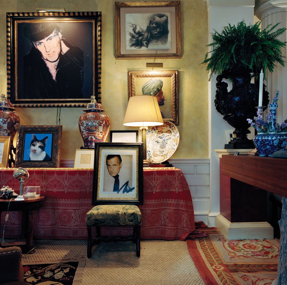
Richardson Warhol Richardsons flanking a portrait of Richardson’s cat Lulu, image: The Art Newspaper
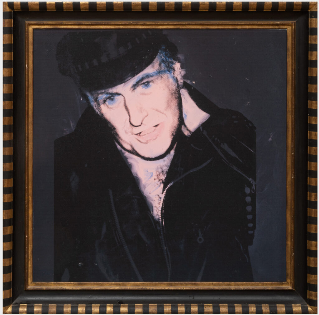
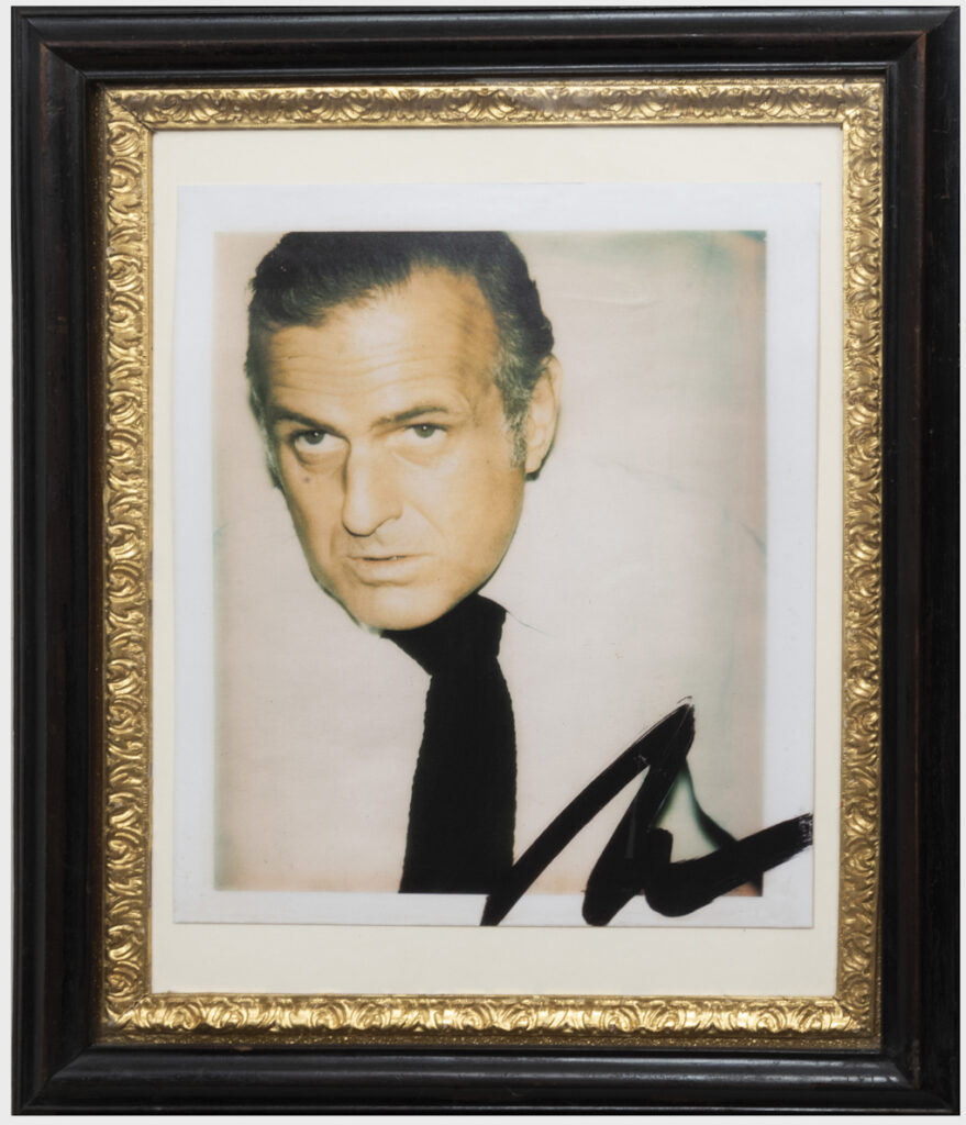
In 1973 John Richardson had his portrait as a middle-aged leather daddy painted by Andy Warhol. Warhol also photographed Richardson as a middle-aged Upper East Side art daddy. Both portraits were displayed prominently in Richardson’s loft on lower Fifth Avenue. Except the photo is an enlargement Richardson made from a Warhol Polaroid. And the painting, at least when Rizzoli and The Art Newspaper came to visit, was a giclée print Richardson had made, because he’d donated the painting to Tate Modern.
Richardson Warhol Richardson, 2017? 40×40 like Andy used to do, but giclée on canvas, in artist’s (sic) frame, lot 257, est. $2-4,000?? lmao [update: sold for $2,000!]
These, along with homemade collages of the Miros and surmoulages of the Giacometti furniture you cashed out, are my favorite categories of reproductions of art. Not only do they have to look like the artwork they look like, they have to stand in for them and actually do their work, like Hercules holding up the heavens for Atlas. Or like the Tethereds in Jordan Peele’s Us, which were created amidst power and privilege, share the aura of their originals, and occasionally take their place without anyone noticing–until they dramatically do.
That signature really is choice, tho: Richardson Warhol Richardson facsimile objet, before 2014? 17×14 in. photo in 24×20 in. artist’s frame, lot 258, est. $200-400 [update: sold for $1,200!]
Richardson welcomed these and many more doppelgängers into his well-appointed homes, the contents of which are now for sale, while their true natures are free for contemplation.
I have three deadlines at the moment, so of course I needed to take a couple of hours to tackle a project that has been on my to-do list for seven+ years: figuring out how to print the world’s greatest webpage at full-scale.
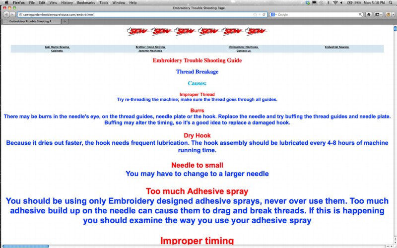
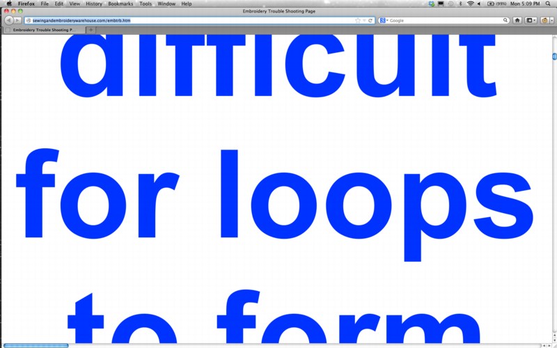
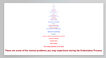
I hadn’t figured out how to print the Embroidery Trouble Shooting Guide in the time between it first going viral and when its wonky html code finally got fixed a few years later. I bought myself some more time by publishing the original page on my site as a work, Untitled (embroidery trouble shooting guide), one of my collection of zombie art websites.
But I have always wanted to see it printed out. A book never turned out right, and the exponentially growing font size made a joke of any remotely normal printing process, even to look at it.
Today though, I decided to just print the webpage as a pdf, and see how big one sheet needed to be to hold it all. And it worked. From that, I figured out how big the font on the last line of text actually is. [I mentioned this triumph at dinner, and my wife just said, “Can’t you just calculate it from the code?” Reader, I married her.]
Study for Untitled (etsg), 2020, inkjet on paper? uv on vinyl? 175 x 330 feet, though, that I know [pdf]
Anyway, the answer is a single page 175 feet tall and 330 feet wide, slightly larger than a football field. Rendered in 6,093 point font, the last, largest line of text is almost 85 inches tall.
Study for Untitled (These are some of the normal problems you may experience during the Embroidery Process.), 2020, inkjet on paper, 85×3927 in.
Surely, there is a 96-inch wide, 500-foot long roll of paper waiting to take this work. I do know a guy with an Epson printer; maybe I should just print it on primed Belgian linen folded in half instead.
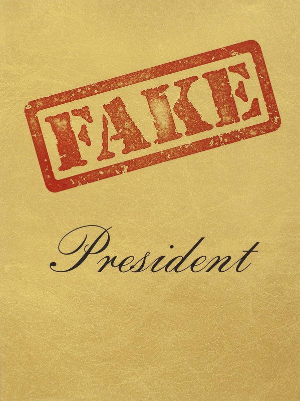
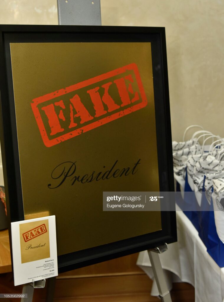
Fake President, 2017, stamp and silkscreen on paper, 24×18″, $2000, ed. 250, published by Gemini GEL, at one point to benefit People for the American Way, though the Gemini site doesn’t mention that. PFAW’s website has them available, along with a Ruscha.
Richard Serra makes a lot of prints, and a lot of them are published as polit..ical fundraisers. They are collected here, mostly from Serra’s Gemini GEL page, where a lot of them are still available, even long after their specific election has passed.
[Caption ganked along with photo] NEW YORK, NY – OCTOBER 25: “Fake President” art work by Richard Serra the People For The American Way Event For Election 2018 on October 25, 2018 in New York City. (Photo by Eugene Gologursky/Getty Images for People for the American Way)
The most recent, published in October 2018, is the most atypical. Fake President commemorates Norman Lear’s 95th birthday, and was one of several works created to raise money for the People For the American Way, which Lear founded. The reflection in the Getty Images pic from the drop party–just two weeks before the election, so riding the wave, not making it, I guess–looks like a bronze plaque, or at least metallic foil, which would be weird and awesome. The force behind these prints, often part of portfolios, is Gemini G.E.L., which I assume means Sidney Felsen.
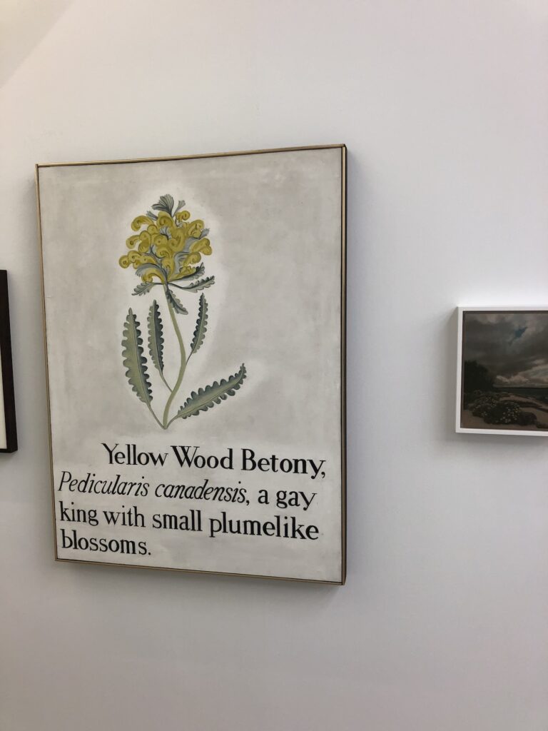
Vern Blosum’s Betony, 1962, installed at “(Nothing but) Flowers” at Karma through Sept. 13, 2020
I had to go into Manhattan for a meeting, and so I slipped into a show I’d been aching to see: “(Nothing But) Flowers” is a sprawling delight of a group show filling both Karma galleries for the summer. It is a rich and fascinating respite, and a quiet, disarming way to approach what painters do with the simplest of subjects. Plus there was that Manet Moment the other day.
Anyway, one of the things I most wanted to see in person was this 1962 painting, Betony, from Vern Blosum. When I went up to the Berkshires almost ten years ago to meet the artist who’d painted under the name Vern Blosum, I was obviously interested to see his paintings in real life, but I was also nervous, concerned that this pseudonymous project had been a joke, a hoax, which he would disown, relegating his works to orphaned oddball status.
“But what does it MEAN?” A painting given by the Agalarovs to Trump as a birthday present, right in the middle of the Trump Tower collusion meeting and DNC hack leak in 2016 [via SSCI Report Vol. 5]
I’ve been tracking the trouble #painting has been getting itself into for a while now. I’ve always imagined sitting down and sorting them out some day, when there weren’t pandemics or multinational criminal enterprises masquerading as governments running amok. Of course, #painting didn’t want to wait.
In Volume 5 of the Senate Select Committee on Intelligence’s bipartisan report released today [pp. 373-78], paintings turn up at the center of the secret meetings between the Trump family and campaign and Russian intelligence agents during the 2016 presidential election. In June 2016, the day after Emin and Aras Agaralov, a pop singer and his real estate oligarch father, respectively, arranged a meeting at Trump Tower, they gave a giant painting to Trump as a birthday present, with a handwritten note attached. Four days later, on Trump’s birthday, the Washington Post reported that the DNC servers had been hacked; Guccifer 2.0, the Russian operative working with Roger Stone to release the stolen DNC files, dropped Hillary Clinton’s opposition research on Trump the next day. Two days after that, Trump sent the Agalarovs a note thanking them for the gift, and the best birthday ever.
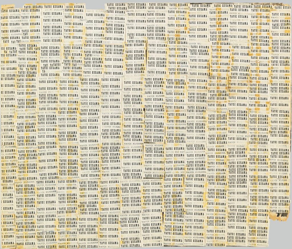
Yayoi Kusama, Accumulation of Letters, 1961, gift of the artist to Stella Waitzkin, sold at Sotheby’s in 2013
There were so many avenues to pursue in writing about Yayoi Kusama and her work; one that I found among the most compelling and the least considered is her practice of photographing herself among her work. I mean, it gets mentioned by various historians or curators, but I didn’t find anyone doing a deep, critical look at Kusama’s always deliberate, constructed, and embedded imagemaking of her body and her [sic] artworks.
Midori Yamamura’s research found examples of Kusama doing this at the very beginning of her artistic practice, organizing shows of her own watercolors at the Matsumoto civic center as a teenager. But it’s there with the Infinity Net paintings, and it’s there with the Accumulation Objects, too. And in between these two bodies of work, it is here in this 1961 work on paper that is related to the Air Mail stamp works she made and showed beginning in 1962.
Even though it interests me, I take auction catalogue essays with a raised eyebrow, but Sotheby’s nailed this one:
Accumulation of Letters is arguably one of the most art historically important works by Kusama. In many ways it can be read as a self-portrait, the artist’s name, or signature, standing in as a metaphor for the self. Known for her promotional talent and flair – Kusama regularly arranged for professional photographs to be taken of her with her work often wearing outfits that matched the paintings or sculptures – Accumulation of Letters acts as an artwork-cum-advertisement. In the exhibition catalogue for Kusama’s 2012 traveling retrospective, Rachel Taylor writes that Kusama “situated herself at the centre of her artistic universe, the key protagonist in a world populated by proliferating forms, endless nets and infinite polka dots”
This Accumulation of Letters is made by cutting up hundreds of left over gallery announcements from two shows at Gres Gallery in Washington, DC: one was a solo, and the other a group show of Japanese artists. Beyond the obviously laborious process, and the artist’s totalization of herself and the work, I am struck by the wrenching pathos of this piece, of those stacks of invites sitting in her studio. All these cards left over from shows out of town that no one in New York would see, or had seen. What was she supposed to do with them?
As it turns out, she gave this piece to a friend, an artist named Stella Waitzkin, who’d fled to downtown from the stifling patriarchy of suburban Long Island. Since surfacing at Sotheby’s in 2013, Accumulation of Letters has been shown at Kusama’s museum in Tokyo.
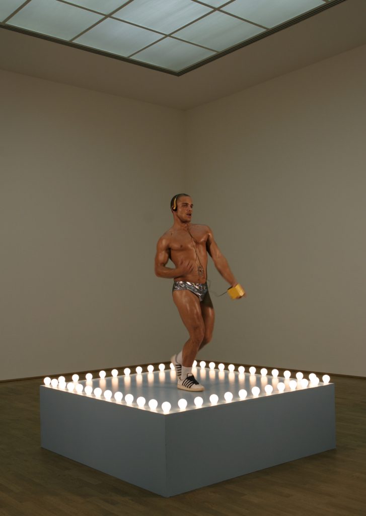
Tyrus with Mack Untitled (Gaga Dancing Platform), enamel on MDF, actor from Andi Mack, installation shot, 2019
Last year this time, I surprised myself by making a work related to* Sturtevant’s repetition of Felix Gonzalez Torres’ “Untitled” (Go-Go Dancing Platform) that appropriated props (and would enlist actors) from the series finale of the Disney Channel middle school soap opera Andi Mack, and was deep-looking and cross-referencing Leo Steinberg, Bruce Hainley, and tumblr superfans. This year we’re protesting outside the condo of the postmaster general to prevent the throwing of the election via the dismantling of the post office. What a world.
Sturtevant, Gonzalez-Torres Untitled (Go-GO Dancing Platform), 2004, MMK Museum für Moderne Kunst Frankfurt am Main, Photo: Axel Schneider, Frankfurt am Main via larb
* One thread of thought I ended up on was about a Leo Steinberg reference to what kind of act is involved in the creation of one artwork that is connected to another artwork. Tbh, I had to re-read these posts twice and can barely follow what was apparently so epiphanically clear then.
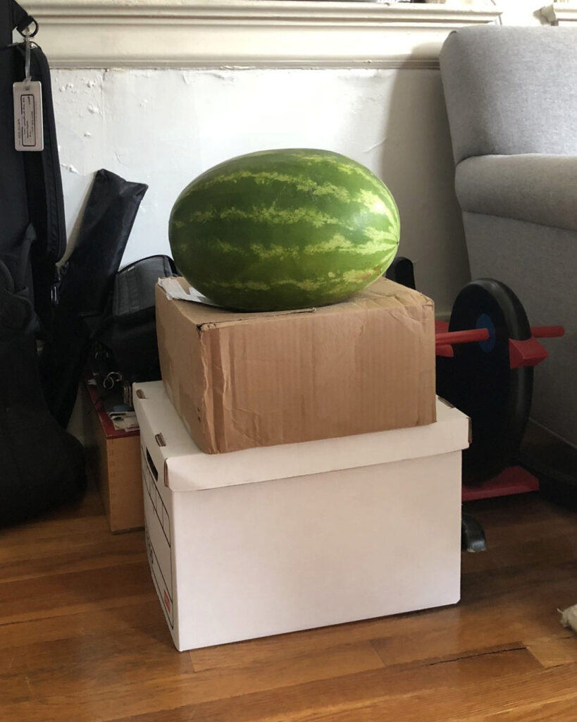
Untitled (#WatermelonDay), 2020, box of books needing to go to the storage unit for four months, box of grandparent mementos needing to go to the storage unit for six weeks, watermelon with seeds too big to fit in the fridge and moved in a rush to make room for a hot pan, 26 x 16 x 13 in., via IG/gregdotorg
I was updating my documentation, and when I realized it would be my 200th work, I said why yes, I absolutely am making this in painted bronze. 200. what a world.
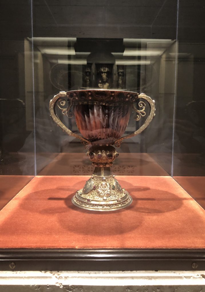
The Chalice of Abbot Suger of Saint Denis, 2nd/1st century BCE carved sardonyx cup in a 12th century gilded silver & jewel-encrusted mount, in the National Gallery of Art‘s West Building medieval galleries
When I went back to the National Gallery the other week, I didn’t just see some little paintings. I visited the empty medieval galleries to see the one thing that has been considered a literal treasure for longer than anything else in the museum: the chalice of Abbot Suger of Saint Denis.
During Power and Pathos, the epic 2016 exhibition of Hellenic bronzes, Getty curator Kenneth Lapatin talked about these rarest of all antiquities in their contemporary context. Turns out, even when bronze sculptures were made of heroes by the most celebrated sculptors of the day, they were not considered valuable, or even necessarily important; such bronze sculptures literally lined the streets and crowded the grounds of every temple in town. And of course, when their metal was needed for spears, or helmets, or the next big wrestling star, they were readily melted down. They’re rare today precisely because they weren’t valued as more than scrap.
Lapatin looked at what the rarest, most precious objects of the Hellenic Age were. What did they spend their biggest money on? What conveyed the greatest social status? What were the most completely extraneous and frivolous and conspicuous luxury purchases that influenced the political and social forces of the day? What, in other words, was their Art?
It was blingy dishware, but not just gold, which was also quickly reduced to its metallurgical value. The pinnacle was carved hardstone in exotic patterns from far away or unknown sources. Records show cups of porphyry that sold for more than a villa. The delicately fluted and translucent sardonyx cup in the chalice is one such cup, made 2100 years ago in Alexandria, and then transformed 900 years ago for the sacramental use of the kings of France.
In whose private chapel it remained until the revolution, when it was nationalized, then–lol wow ok–stolen in 1804 and smuggled to England via Holland inside a plaster cast of the Laocoön, whence it circulated in the market until it was bought in 1922 by Joseph Widener, who ended up donating it to the National Gallery. Sounds like its roughest time was the last 200 years. But then, Abbot Suger never said where it came from or how he got it, so who knows.
The Emily Tremaine Papers are digitized at the Archives of American Art, and for an art history nerd on lockdown, it is a welcome diversion.
There’s so much in there, but here is one forgotten disaster–which I actually found last year, in the Leo Castelli archive, while researching Castelli’s first Johns show. It was the Summer of ’69. June. Stonewall Rebellion. Ted Cruz’s father on a murderspree. The Apollo 11 moon landing. Charles Manson & co. on a murderspree.
Meanwhile, in early August, at the Tremaine’s house in Connecticut:
Dear Leo,
We’re glad you are back–we are having problems!
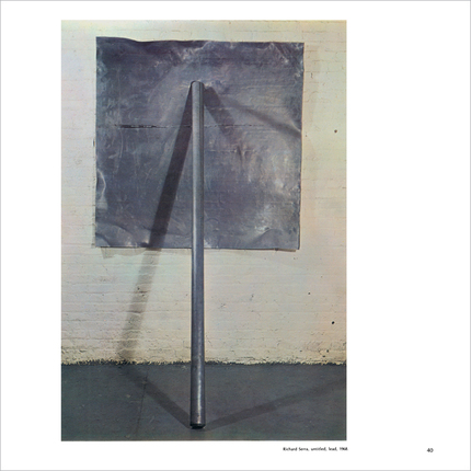
Problem No. 1. The Serra does not seem to be the right proportion for the wall. I am enclosing some snapshots, compare these with the picture on page 40 of the February 1969 ART FORUM. Ours seems to start too high and come down too low. Something seems wrong; but worse that the proportion, it keeps flopping over (see on one of the enclosed photos). It won’t stay straight for more than a few hours. Unless this can be corrected, it is impossible.
[Problem No. 2 left out here, but it was the encaustic on Jasper Johns’ Tango constantly lifting off the canvas.]
Maybe you and Toni could drive up one day for lunch and a swim and we can get your advice on the Serra.
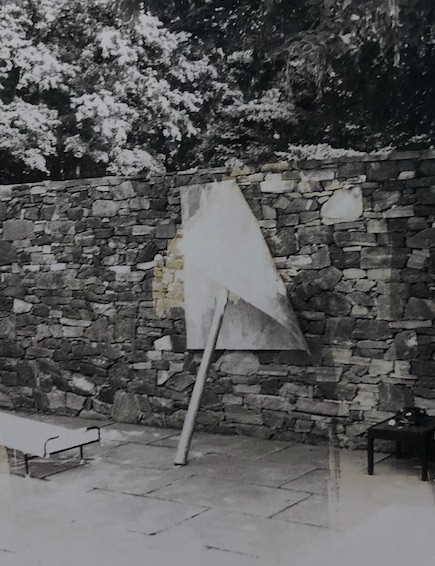
The Tremaines had barely taken delivery on their Serra, Prop, 1968, which was an edition of 6, $1,200, less 10% discount, paid on June 20th. It was installed, not indoors as in the Robert Morris-curated “9 in a Warehouse” show Max Kozloff reviewed in that Artforum, but outdoors. Against a dry-stone retaining wall, and on the slate terrace of the pool. The Castelli archive has the snapshots, and it sure did flop over. The reference image I snapped last year, though, has a huge reflection from the overhead light, so it’s useless here. [update: I am not alone in admiring the Tremaine’s flopped Serra; thanks to an intrepid reader who dug this out.]
To Flop, To Be Impossible, photo: Mr. or Mrs. Burton Tremaine
It may be a little different from the prototype Serra made in Germany, but it is also clearly the same proportions as the edition from the Warehouse show [above]: a 60×60-inch lead antimony sheet held up by an 8′ lead roll. But the precarity is definitely part of the piece. Here’s Serra talking about it at MoMA:
At one point In the 60s, I had written down a series of verbs, and was just enacting these verbs. And one of the verbs was “to roll.” And I found myself rolling either a single roll or a double roll or a triple roll. And then we had pieces of lead that were remnants we had cut off a sheet.
And I thought, ‘what if I took a flat sheet of lead, and tried to hold it against the wall by the force of a rolled pole. Would it hold? I wasn’t sure if I could do it.
So we hoisted the flat plate up, and then we lowered the pole against the plate, and low and behold, it held. And that piece enabled me to think about the possibility of doing other pieces against the wall.
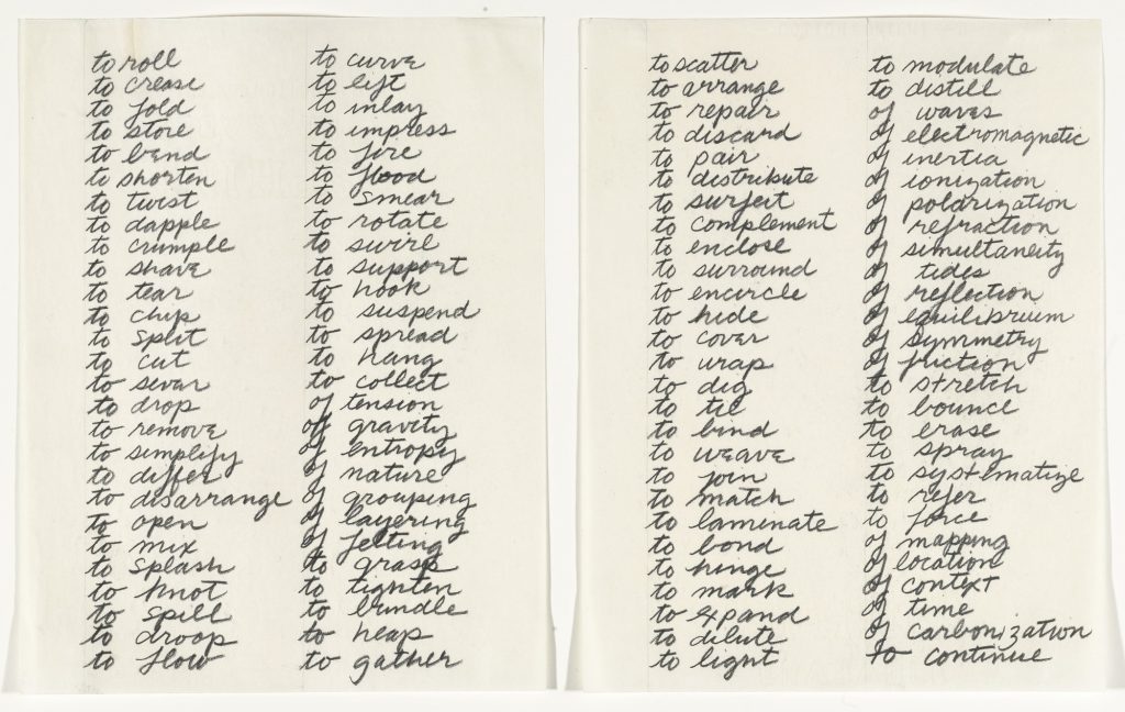
Richard Serra, Verblist, 1967-68, gift of the artist to MoMA in honor of Wynn Kramarsky (who made the ask)
I just checked, and not only is to flop not on Verblist, 1967-68, 24 things on the list aren’t even verbs. Also, I never noticed that though they’re not technically all transitive verbs, they really are actions for the sculptor, not the sculpture. Which seems very on brand. [few minutes later update: duh, in 1980 Serra told Bernard Lamarche-Vadel that his list was all transitive verbs.]
And who even knew? If I hadn’t taken a wonky bootleg picture, I would have just posted, “LOL Floppy Serra,” and called it a day.
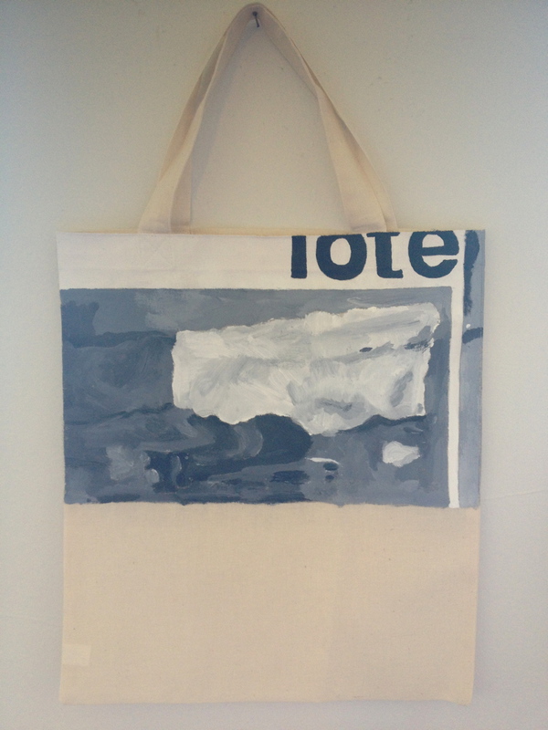
Untitled (Muji Tote), 2014, acrylic on muslin, 19.5 x 12 x 1 in.
idk why, but I just remembered that when this was in a show, one of Gerhard Richter’s art dealers wanted to buy it, but was like, “$1200? I can make my own,” and I felt both annoyed and understood.
And now that I’m writing this, I’m also relieved I didn’t sell it to Ye.
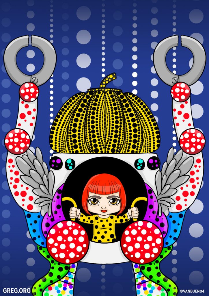
an interpretation of Kusama driving a mecha, by vanbueno for greg.org
[tl;dr I commissioned two anime artists to depict Yayoi Kusama in a mech-suit to hype the article I just wrote about her. Shout out to vanbueno {above] and onki [below] for their amazing work!]
One of the big questions we set out to answer when writing about Yayoi Kusama for ARTnews was how does the artist keep making so much work, of increasing scale and complexity, well into her 90s? Kusama has always worked at a relentless, obsessive pace; it’s as much a part of her story as of her practice. But her most high-profile work of the last decade especially–Infinity Mirror Rooms, installations, and giant pumpkins–and her many large-scale museum exhibitions, obviously requires an extensive organizational and fabrication infrastructure. How does that work, and who’s really in control of it?
Edouard Manet, Tama the Japanese Dog, 1875, gift of the Mellons to the NGA
I visited the National Gallery as soon as it reopened because I could. On the last day before everything shut down in March, I debated rushing down to see this kind of minor-seeming show of European plein air painting, but I passed. Except for Degas, it was the only show open, so I saw it, and was buoyed by these small paintings, most of them basically sketches in oil, with a freedom and looseness that would come to be associated with the Impressionists only decades later. These were minor, low stakes paintings, mostly by minor, and sometimes even unknown artists, and they communicated the simplicity and directness of their making.
Which is all fine, but on the way to the exhibition, in a gallery most everyone was just passing through, there were small French paintings from the collection, including four Manets. After unexpectedly weeping in front of a late arrangement of flowers in a crystal vase, I turned to see the National Gallery has two Manet portraits of dogs. Two!
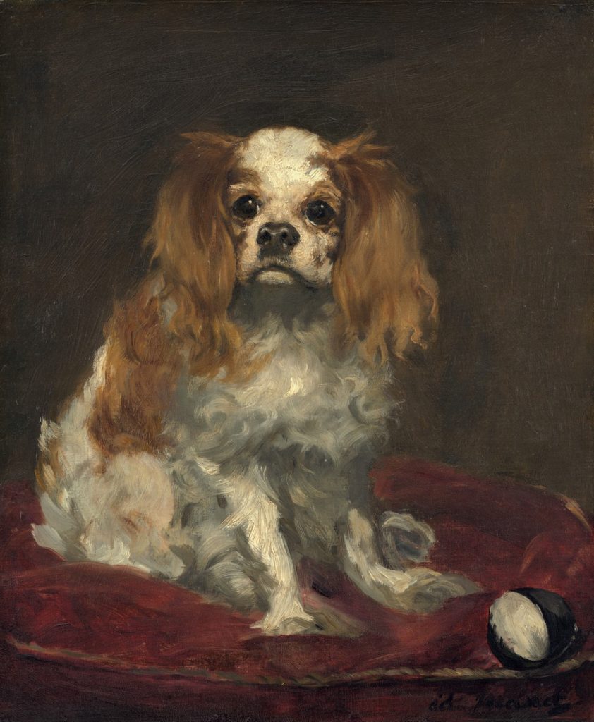
Edouard Manet, A King Charles Spaniel, 1866, gift of Ailsa Mellon Bruce to the NGA
The National Gallery has seventeen Manet paintings, and two are of dogs. What’s more remarkable, statistically, anyway, is that Manet only painted eight dog portraits, and the NGA has a full quarter of them. In the fifty years since Manet’s catalogue raisonée was updated, only two others have been reproduced in color. Others don’t appear to have been seen since at least 1932; some have no history at all beyond their original owner 140 years ago. Manet’s dog portraits are not considered important; in fact, they’re barely considered at all. But I am now fascinated with them.
Absolutely love this double exposure photo by Yayoi Kusama of her and an Infinity Net painting, c. 1960, via the MoMA catalogue.
If 4000+ words on Yayoi Kusama leaves you wanting more, here are some of the many sources I found useful in trying to understand and write about the artist and her work: