
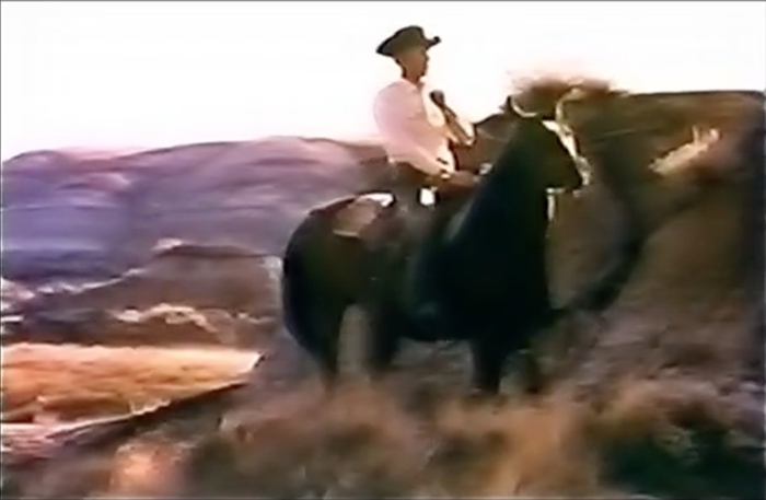
I saw this picture by Rey Baniquet in a “best photos of the day” roundup at The Guardian yesterday. The caption read, “MANILA, PHILIPPINES/ President Rodrigo Duterte shows a list of police and government officials allegedly involved in the illegal drug trade during a forum with local and foreign businessmen”. The original photo’s actually wider.
Two things that struck me about the photo. One is the framing, which turned out to be taken from amid a tableful of glasses, and which reminded me of the video of Mitt Romney dissing the 47%, which was made surreptitiously from atop a catering bar. The other, more important thing is the list itself.
Googling around for more information, I kept coming across what the Philippine press called a “thick list” that Duterte had been circulating to the army, the legislature, the judiciary, implicating an untold number of people in the drug industry.
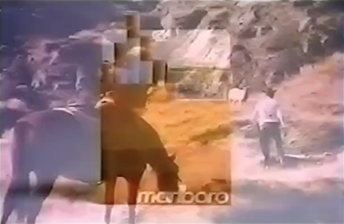
This event involved the Wallace Business Forum, a private business consulting group that advises international companies on doing business in the Philippines. Duterte spoke for two-plus hours at a dinner at the Malacañan Palace on December 12. The transcript and video of his speech are available online.
Duterte discussed the illegal drug industry, including three or four, let’s go with four million, “drug addicts,” as a national security threat. Then he mentioned the reported killings by his government:
You know, this is the drug industry. Sabi ko nga eh [I said, eh] you worry about the 3,000? Dead? A third of them during police encounters, I don’t know about the rest. And you do not worry the drug industry?
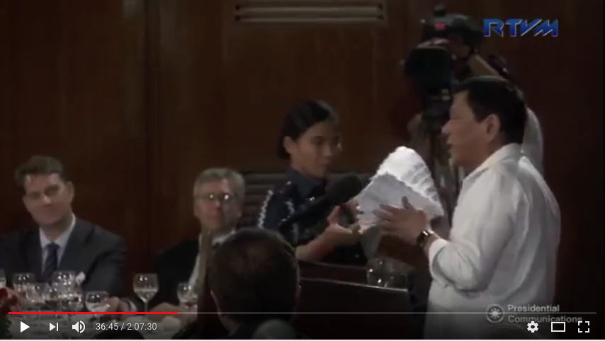
“You want a visual thing? Okay. This is the drug industry of the Philippines,” he said, as he had the list brought to him. This occurs at around 36:30.
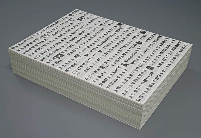
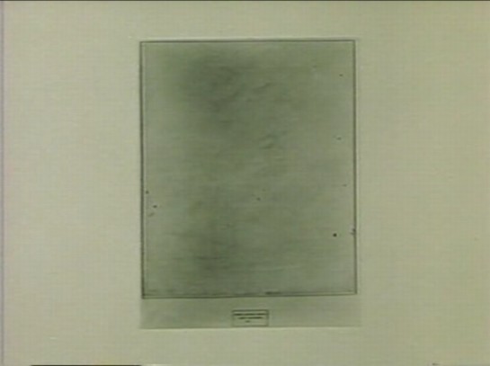
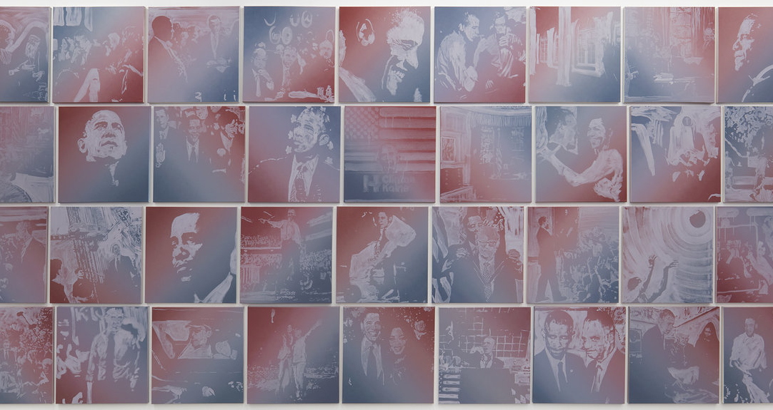
The top of the stack is filled with a grid of headshots, like a yearbook. And like the Time magazine issue listing a week of US gun fatalities which Felix Gonzalez-Torres used to create his 1990 stack work, “Untitled” (Death By Gun) [below]. That list included 460 people.
Duterte says the list in his hand contains 6,000 people. While flipping through the list, he tosses of names and titles, mayors, judges, generals, in a way that makes it sound like he and everyone in the room knows them.
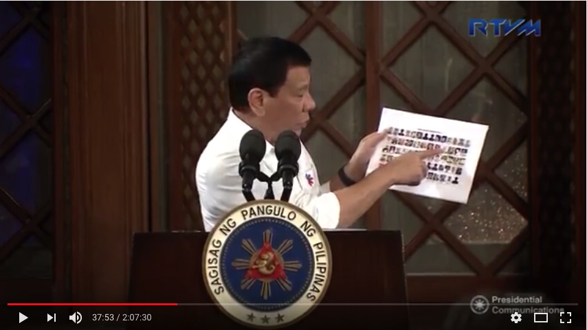
Duterte’s stack turns out not to be all photos, though. That is only the first deck. Several binder clips appear to break out the drug industry roster by region. The stack looks to be about 1000+ pages, more than two reams, for sure, maybe the clips throw it off a bit. Let’s say the ideal height [sic] is 15 cm.
I am wrestling with how, and whether, to make a work out of what is apparently an active kill list being circulated by a government. The visual, formal, even content reference is immediately clear, but the parameters are not. And neither are the possible implications.
On just a formal level, is the stack a single work, with no takeaways, or is the deck the data, which gets laid out into a larger grid, then turned into a stack? I feel like Duterte’s grasp on the entire stack gives me that answer [one work], even though it contradicts the typical Felix stack format. But of course, so did Felix, who created one stack, “Untitled” (Implosion), 1991, as a single unit comprised of 200 screenprinted sheets. So it’d be a single work. Maybe it’d be a publication. Maybe you print it out and save me the hassle.
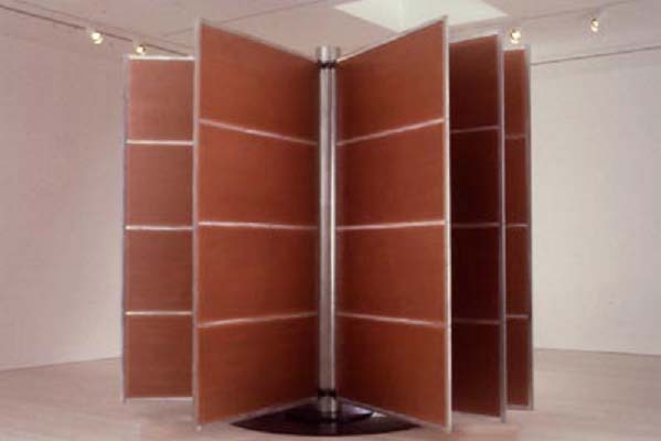
And maybe it’s not the kind of thing that you do casually, or at least while the killings are ongoing. Or maybe not the kind of thing I should do as a white guy. Duterte’s mention of 3-4 million more reminds me of Chris Burden’s The Other Vietnam Memorial, 1991 [above], which mashed up names from a Vietnamese phone book into 3 million anonymized stand-ins for the real, unheralded dead. The people in the Philippines are real, and they have their own names.
It also reminds me of the million-who-knows people on the US’ no-fly list, about whom we know almost nothing except some part of the government deemed them a national security risk. And there are lists of known communists in the State Department, suspected homosexuals in the US Government, climate change scientists in the Energy Department, Muslim Registries, the list of lists goes on.
I tweeted yesterday that I don’t really know why I do these works; that ambivalence and uncertainty was brought to the fore by this photo. So until I think it through a bit more, I am really not comfortable right now with enshrining or recontextualizing Duterte’s “thick list” as an artwork. Even though it is, as the president himself said, a very important “visual thing.”
previously, somewhat related: Better Read #008: Death By Gun

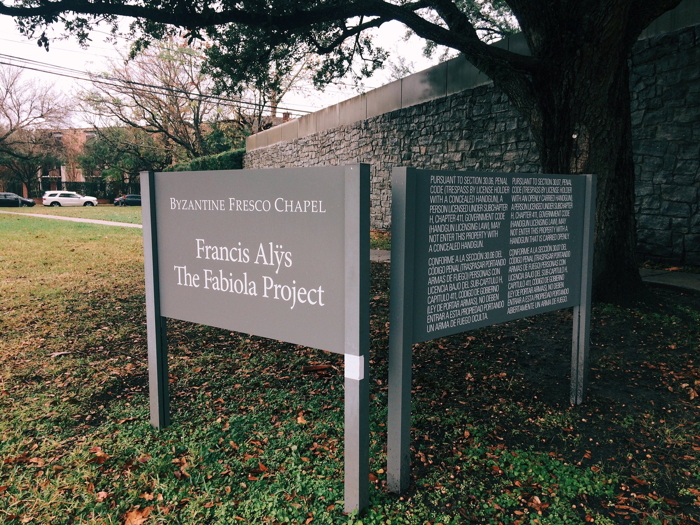
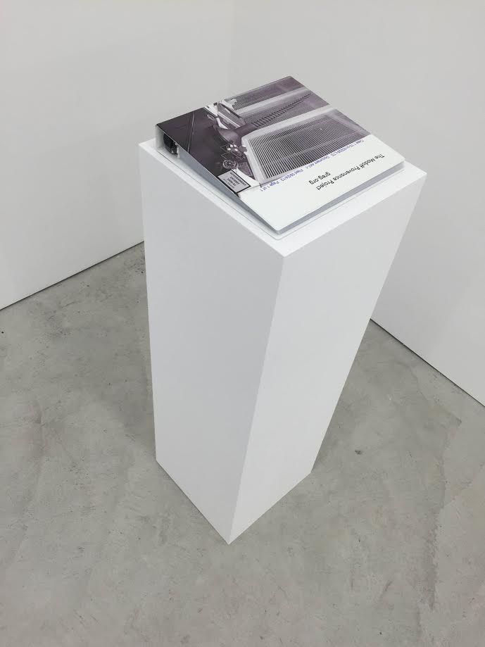
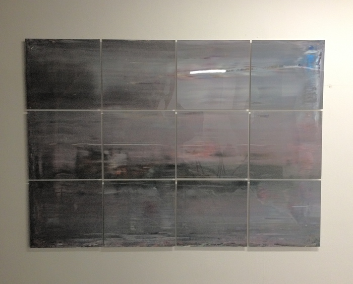
 Untitled (30.06 & 30.07), 2017, screen printed text on enamel on wood, est. 48 x 36 in., installation image via @soulellis
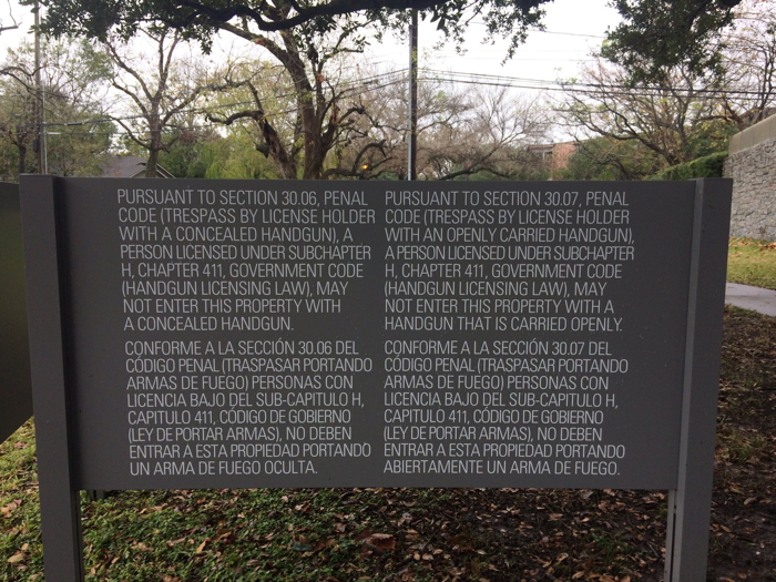


