The giant, reflective aluminized mylar satelloons of Project Echo were designed to be seen by the naked eye from anywhere on earth. As I trace down depictions and accounts of seeing them, I wonder how watched they actually were outside the scientific community.
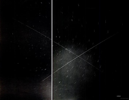
Echo II was launched January 25, 1964. Shortly afterward, scientists at Sandia Corporation calculated the crossing of the two satelloons and snapped this photo, a 6-minute exposure. Echo I [100-ft diameter, 870-mi. orbit] is traveling from the upper left. Echo II [135-ft dia., 670-mi. orbit] is traveling from the lower left. The photo was a double page spread in LIFE Magazine on Feb. 28.
Sandia was a division of Western Electric, a subsidiary of AT&T, which ran the Sandia National Labs in New Mexico. It was a different division from Bell Labs, the division of AT&T which ran the Echo communications system on the ground. Sandia is now owned by Lockheed Martin, which manages it for the Department of Energy.
I think I’d now like to track down some vintage prints of this photograph, and not just the copies of LIFE, which I already hoovered up from eBay.
“Heavy Traffic In Outer Space,” Feb. 28, 1964 [LIFE via Google Books]
Related, but the exact opposite: Trevor Paglen’s The Other Night Sky
Category: satelloons
As Seen On TV: Echo II Satelloon Inflation Video
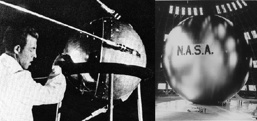
I’ve been searching for historical and primary source material for Project Echo, one of NASA’s earliest missions, which kicked into high gear in 1958. The giant, inflatable satelloons were functional–passive reflection communication satellites. That they were shaped just like Sputnik, only a hundred thousand times bigger, and were visible to the entire world with the naked eye, were, I’m sure, just a happy Space Race coincidence.
Echo I [above, right] was 100 feet in diameter and launched in 1960. Echo II was 135 feet, and launched in 1964. By then engineers at NASA’s Langley Research Center figured out that over-stressing the aluminized Mylar would help the giant sphere keep its shape, even if it deflated a little bit. [Echo I was found to have partially caved in a few months after launch.]
Film and TV cameras were included in the Echo II rocket–the film canisters were recovered in the ocean, but I haven’t found images from the footage. Video of the Echo II Inflation, however, is right here. Retired Goddard engineer Ron Muller screened it as part of a history of The Echo Project at a 2004 NASA conference on solar sails. It’s pretty awesome, right down to the end. [The avi is available for download at the conference page.]
I put a little film strip together after the jump, too:
Continue reading “As Seen On TV: Echo II Satelloon Inflation Video”
Hey Look, Forrest Myers Has More Of The Moon Museum Etchings
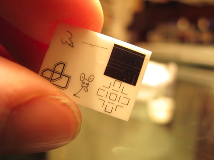
Regular readers of greg.org will recall the Moon Museum. Initiated by the artist Frosty Myers–who know prefers to be called Forrest Myers, I take it–the Moon Museum was the first art on the moon, a tiny ceramic chip containing etchings by six artists, which was secretly attached to the lunar landing module for the Apollo 12 mission in 1969.
When I posted about the Moon Museum in 2008, I was happy to even find a grainy picture of the entire thing. Andy Warhol’s contribution, a graffiti-style doodle of a penis, was deemed unfit to print by the NY Times when the art project’s existence was first revealed.
Now Reg at We Make Money Not Art has posted a much nicer, color photo of the chip from Myers himself. It was featured in an exhibition of “art of extreme environments” in Paris last fall. She actually notes that “a few were made,” which is awesome. That means they might be–or become–available some day. At least one other example of the Moon Museum was, in fact, given to MoMA in 1993 by Ruth Waldhauer. It’s described as a “tantalum nitride film on ceramic wafer.” This warrants further inquiry.
The AMNH’s Digital Universe Atlas
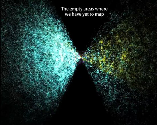
The American Museum of Natural History maintains a Digital Universe Atlas, which maps all the objects in the universe using the most current data available.
They just released The Known Universe, an animated version of the data, in conjunction with the Rubin Museum of Art [which presumably paid to have the Powers of Ten-style roundtrip through all time and space begin and end in Tibet.]
While it’s encouraging to see so much empty-looking orbital space for me to put my satelloon, this is my favorite shot: “the empty areas we have yet to map.”
Watch The Known Universe by AMNH in HD [youtube via kottke]
Download or visit the Digital Universe Atlas [haydenplanetarium.org/universe]
Previous posts on the charming concept of trying to depict everything in the universe: On The Sky Atlas And The NGS-Palomar Observatory Sky Survey
Delirious DC
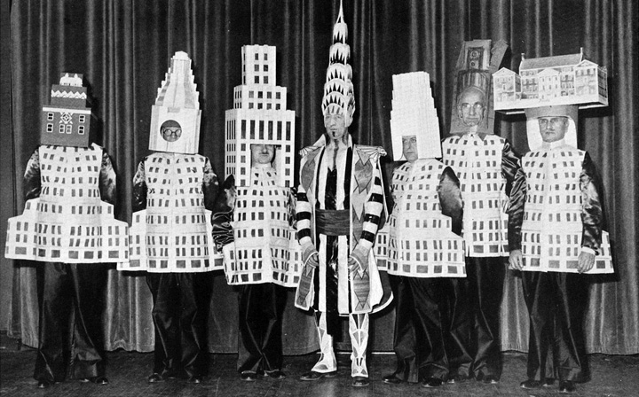
At the 1931 Beaux Arts Ball, more than a dozen New York architects came dressed as their buildings: [l to r] A. Stewart Walker [Fuller Building], Leonard Schultze [Waldorf-Astoria], Ely Jaques Kahn [Squibb Building], William Van Alen [Chrysler Building, who clearly booked his own stylist], Ralph Walker [Irving Trust Company], and Joseph Freedlander [Museum of the City of New York].
Rem Koolhaas included the Ball in his 1978 history/”retroactive manifesto,” Delirious New York.
Which was hook enough for Lali Chetwynd, whose 2006 performance piece, “Delirious!” reimagined the Beaux Arts Ball as a skyscraper cocktail party. It was ably documented by Showstudio:
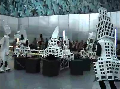
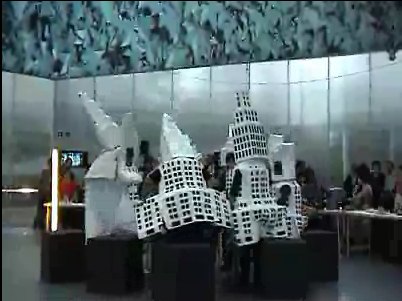
“Delirious!” was staged in the Serpentine Gallery Pavilion designed by Koolhaas and Cecil Balmond, which comprised a giant, inflatable ovoid canopy atop a cylindrical amphitheater/event space.
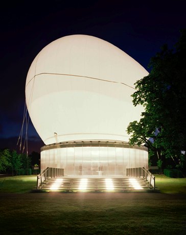
Which, of course, bears a striking resemblance to the much-discussed, little-funded inflatable balloon space Diller Scofidio + Renfro have designed for the Hirshhorn Museum in Washington DC.
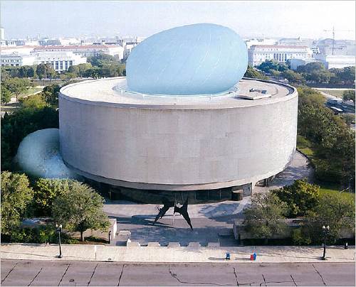
So now we have some idea what will go down in the Hirshhorn Balloon if and when it is realized: Liz Diller will appear at a $5,000-a-table benefit, dressed as her creation, and probably looking not a little like this:
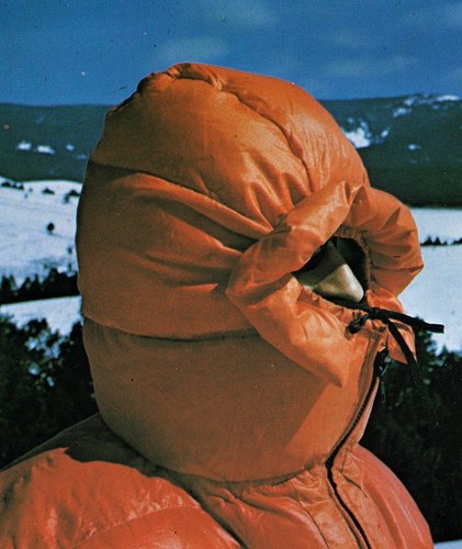
but in light blue.
Or perhaps.
Soon after “Delirious!,” Chetwynd changed her first name to Spartacus. Tom Morton discussed the implications of this move in Frieze:
Chetwynd’s adopted moniker seems designed to make us stage a mock-heroic mini-drama in our minds, in which she persuades a band of artists to stop pitting themselves against each other and instead revolt against their masters. Push this fantasy a little further (and Chetwynd’s art is nothing if not about pushing idle thoughts as far they’ll go), and we might imagine the defeated rebels refusing, pace Stanley Kubrick’s 1960 film Spartacus, to identify their chief, instead claiming one after the other ‘I’m Spartacus’, only to be symbolically crucified by a poor auction result or a less than complimentary review.
If this flight of fancy resembles the absurd, unexpectedly telling narratives and motifs that characterize Chetwynd’s work, then this is no mistake. In her practice the epic and the everyday speak through each other in accents of giggled hope.
Giggled hope seems to be an apt operating principle for the Hirshhorn’s Balloon of Cultural Democracy. Is it not now time for us balloon lovers, each of us, to put on our puffy down coats, cinch our hoods around our noses, and raise the defiant cry to all who dare challenge or pooh-pooh us, “I’m Liz Diller!” “I’m Liz Diller!” To the Mall!
[hoodie image via old chum’s flickr, thanks to the purely coincidentally titled blog, an ambitious project collapsing]
Mercury’s Tethered Balloon Experiment
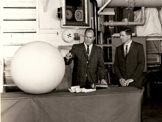
A periodic check on eBay for Project Echo-related material turned up this photo from April 29, 1963: “NASA-MERCURY, HANGAR 5, CCMTA – Left to Right – William Carmines and William Armstrong of NASA describe the balloon experiment for the MA-9 mission.”
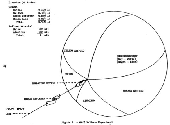
MA-9 was Mercury-Atlas 9, the last of the first series of manned US space flights. L. Gordon Cooper was the first American to spend more than a day in space. “The balloon experiment” was designed to measure atmospheric drag at various altitudes by inflating a 30-inch balloon behind the orbiter, which would trail at the end of a 100-ft nylon cable. Cooper was also supposed to take photos of the tethered balloon to test visibility in space.
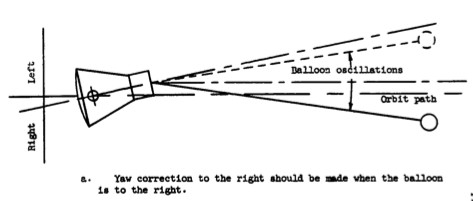
The balloon experiment was a carryover from MA-7, 1962, in which astronaut M. Scott Carpenter became the second American [after John Glenn] to orbit the earth. As the MA-7 flight plan describes it, the balloon experiment was a color test:
Objective: The objective of the visual portion of the experiment is to evaluate the relative merit of various colors for optimum visibility in space at short and long ranges.
…
The test device consists of a 30-inch diameter balloon constructed of 30 gores of 1/2 mil Mylar – 1/2 mil aluminum foil material. It will be divided into five equal size lunes composed of uncolored aluminum foil, yellow and orange Day-Glo, flat white paint, and phosphorescent paint (figure 1, below).
…
The balloon, [inflating] bottle, and shock absorber will be packaged between two balsa half cylinder shells in a metal cylinder which si three inches in diameter and seven and one-half inches long. It will be mounted in the Mercury spacecraft antenna fairing. [The assembly would be ejected out of a spring-loaded door by the firing of an electric squib.]
…
A small quantity of 0.250-inch diameter Mylar disks will be placed in the folds of the balloon. The Mylar is backed by aluminum foil on one side and is coated with Claray (diffuse-reflecting) compound on the other. These will disperse as the balloon inflates.
So, small explosion, burst of mylar confetti, and deployment of beach ball-like balloon on the end of a 100-ft cord. Then photos of the whole thing. Sounds awesome.
Unfortunately, the MA-7 balloon tore on inflation, and only the aluminum and orange Day-Glo lunes were visible. The orange was so much brighter, that the MA-9 balloon, above, was painted entirely in orange. Unfortunately again, the MA-9 balloon failed to deploy at all.
Those balloons would look nicer in color.
Project Echo & Satelloon Conservation
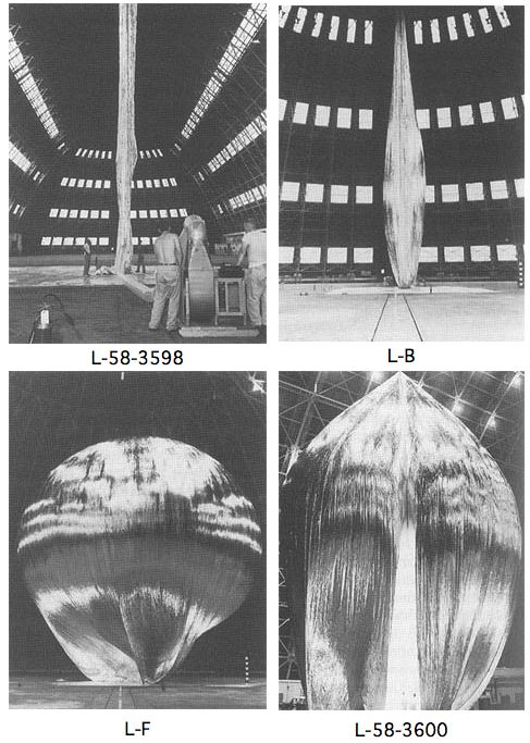
The first Project Echo satelloon may have started out as a 100-meter sphere, but it didn’t stay that way. Echo IA launched on August 12, 1960, and it stayed in orbit and visible to the naked eye until May 24, 1968. It inflated successfully, but as a paper in Bell Labs Report, Sept. 1961 explains, by May of that year, its shape had already been somewhat deformed in orbit:
On several early passes the average “scatering cross section” was equal to that corresponding to a perfectly conducting 100-foot sphere. From this it is assumed that the balloon inflated as planned.
There apparently has been a long-term decrease, of a few db, in the average “scattering cross section.” As of last May, Echo I [technically IA, since Echo I burned up soon after launch in March 1960] was probably an approximately spherical object with a diameter of no less than 70 feet, and a somewhat wrinkled skin. There may have been a few flattened areas, as indicated by occasional deep fades in the radar signal, but voice communication was then still possible as shown by successful tests with NRL on May 25.
One factor may have been the solar sail effect, the slight pressure generated by photons from the sun bombarding the satelloon’s skin.
image: The Odyssey of Project Echo [history.nasa.gov]
Before There Were Satelloons: Prof. Thaddeus SC Lowe And The Union Army Balloon Corps
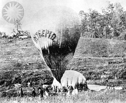
Thaddeus S. C. Lowe was once one of the country’s most famous aeronauts. His grand plan to fly a balloon across the Atlantic was shelved by the outbreak of the Civil War. He preferred to be called Professor. On July 11, 1861, with the help of Prof. Joseph Henry of the Smithsonian Institution, Lowe demonstrated the aerial reconnaissance capabilities of his varnished silk, gas-filled balloon Enterprise by ascending 500 feet above the Columbia Armory [on the site of the National Mall where the National Air & Space Museum now stands] and transmitting the first aerial telegram to President Abraham Lincoln.
Like many first messages, Lowe’s telegram is mostly about itself:
This point of observation commands an area near fifty miles in diameter. The city with its girdle of encampments presents a superb scene. I have pleasure in sending you this first dispatch ever telegraphed from an aerial station and in acknowledging indebtedness to your encouragement for the opportunity of demonstrating the availability of the science of aeronautics in the military service of the country.
Lowe persuaded Lincoln to appoint him Chief Aeronaut and to establish the Union Army Balloon Corps.
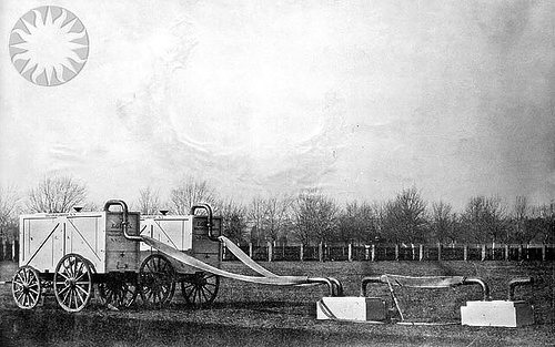
Lowe ordered seven balloons be fabricated in Philadelphia, while portable gas generators were built in Washington:
The generators were built at the Washington Navy Yard by master joiners who fashioned a contraption of copper plumbing and tanks which, when filled with sulfuric acid and iron filings, would yield hydrogen gas. The generators were Lowe’s own design and were considered a marvel of engineering. They were designed to be loaded into box crates that could easily fit on a standard buckboard. The generators took more time to build than the balloons and were not as readily available as the first balloon.
They sound fantastic, and I love the standardized buckboard-scale design. It’s at once obvious and totally subjective. Do any of these things survive?
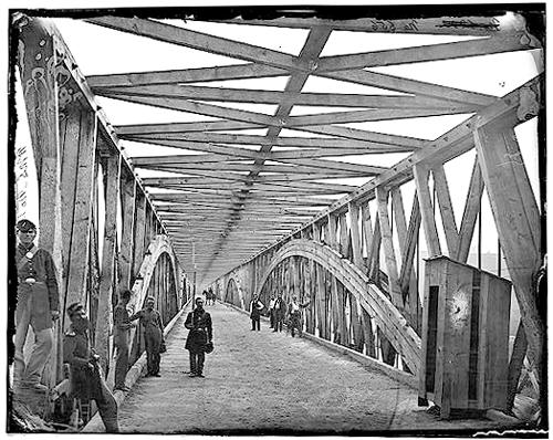
Anyway, even more than the establishment of Balloon Camp, this is my favorite part of the Balloon Corps story, partly because I cross the Chain Bridge at least once a weekday when I’m in DC:
By October 1, 1861, the first balloon, the Union, was ready for action. Though it lacked a portable gas generator, it was called into immediate service. It was gassed up in Washington and towed overnight to Lewinsville via Chain Bridge. The fully covered and trellised bridge required that the towing handlers crawl over the bridge beams and stringers to cross the upper Potomac River into Fairfax County. The balloon and crew arrived by daylight, exhausted from the nine-hour overnight ordeal, when a gale-force wind took the balloon away. It was later recovered, but not before Lowe, who was humiliated by the incident, went on a tirade about the delays in providing proper equipment.
The Balloon Corps continued with somewhat more success until Lowe resigned in 1863. The top photos are credited to Matthew Brady and date to 1862. They are from the Smithsonian’s collection of awesome, unnecessarily watermarked public domain photos of military and scientific balloons. The bridge one is from wikipedia.
On This Spot [blog.nasm.si.edu]
Union Army Balloon Corps [wikipedia]
100-ft Spheres In The Center? On Buckminster Fuller’s Original Expo 67 Pavilion
From the Other Things I Didn’t Know About What Goes Inside Geodesic Dome Pavilions Department:
Christine Macy and Sarah Bonnemaison devote a chapter in their 2003 book, Architecture and nature: creating the American landscape to geodesic domes, including this description of Buckminster Fuller’s original vision for the US Pavilion at Montreal’s World Expo 67:
His [Fuller’s] design of 1964 featured a dome nearly twice the size [of the 250-ft diameter, 3/4 dome by Fuller and Shoji Sadao that was realized] with a massive interior gallery. From this elevated vantage point, the viewer would focuse their attention inward to a hundred foot diameter Earth tranforming slowly into an icosahedron, before it opens up, unfolding like a flower as it descends to the floor. [what a sentence. -ed.] In this way, Fuller’s “geodesic” globe transforms into his “Dymaxion” map of the Earth before the visitors’ eyes, displaying the “one world island in one world ocean.” And then it would come to life. Wired with tens of thousands of miniature light bulbs, this great map would begin to pulsate with patterns–showing world resources, electricity generation, the flow of transportation and communication systems across the Earth. This interactive display, this giant bio-feedback device, would be the playing surface of the “World Game.” Assembling in teams or playing by themselves, visitors were intended to chart out optimal paths to link resources with industries and population centers, to streamline transportation flows and maximize satellite coverage The aim, according to Fuller, was to “make the world work successfully for all of humanity…without anyone gaining advantage at the expense of another.”
Since he had not actually been asked to design the exhibit, just the pavilion, this idea was rejected and replaced by a selection of quilts, duck decoys, and Cary Grand billboards.
American Painting Now Then
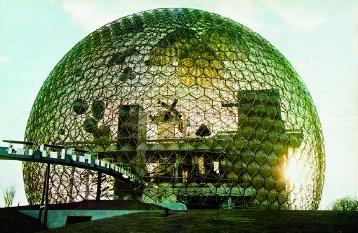
How to account for my dogged fascination with the temporary/permanent, futuristic/historic paradoxes of Expo art and architecture?
Buckminster Fuller’s 20-story Biosphere was far and away his greatest single success and the hit of the most successful modernist world’s fair, the Expo 67 in Montreal. And yet how little did I consider what was in it: a giant exhibit of the movies; The American Spirit, an exhibit of NASA satellites and space capsules; some crafts or whatever, and American Painting Now, 23 huge paintings commissioned by Alan Solomon from a “Who’s Who of modern art,” including :
James Rosenquist, Claes Oldenburg, Andy Warhol, Jasper Johns, Jim Dine, Ellsworth Kelly, Barnett Newman, Robert Rauschenberg and Roy Lichtenstein. Their works illustrated trends such as abstract expressionism, op, pop, hardedge and geometric art. Like the space component, this part of the American exhibition was truly spectacular. The works, gigantic, simple and colourful, paid a vibrant tribute to the creative vitality of artists who now count among the great masters of 20th century painting.
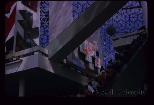
Uh, and from Fuller, too, from the looks of that giant Dymaxion Map right there.
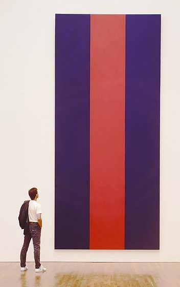
From a 1996 book on Voice of Fire, Barnett Newman’s own 17-foot tall contribution, we learn Solomon requested that the artists [all male?] “contribute paintings that are (a) large in scale and (b) vertical in format.”
 I want to quote “Exorcism in Montreal,” the April 30, 1967 review by NY Times critic and famous Newman nemesis John Canaday, in its entirety, but I won’t:
Here we have the same old clique of names that have been handed the favors regularly in Venice and everywhere else on the circuit. A natural response to the list is “Oh, no, not again!” There is that tiresome Barnett Newman, who this time turns out three vertical stripes in two colors–but they are 17 feet high. There’s Jim Dine, with nothing but two big slabs of enameled canvas, in two flat colors, bearing in one corner a notation as to the brand of paint used–and the panels are 35 feet high. There is Roy Lichtenstein being Roy Lichtenstein again, but now 29 feet high.
There are all the rest of the club, not including some whose work was not fully installed on press day, and some whose work seems to me to have more substance than the ones listed, for instance James Rosenquist’s colossal “Firepole.” I have chosen the most vacuous because in this setting even they are part of a genuinely spectacular show fulfilling demands that could not have been met by any other kind of painting.
The dimensions given above tell that the paintings, most of them done for this spot (what other spot could hold them?), are gargantuan…they are played against strips of sail cloth in heights up to that of a 10-story building. It is as if the whole water-treading esthetic that they represent had been originated and sustained by some genii who knew that one day a form of painting bold enough and shallow enough to supply enormous bright banners for this pavilion would be necessary.
And then there’s Canaday’s assessment of the NASA artifacts, which basically hits it home for me with the art/science beauty paradox:
…since technology is creating the most beautiful objects today, and the most imaginative ones, Apollo might also be thought to have added one more muse to the group that he has always chaperoned.
Of course, there is no separating the fascination of the Apollo Command Module as a scientific object from its quality as an esthetic one, with its self-generated form and its patina burnt into it during the minutes of its descent rather than by centuries of weather, but it is a beautiful object all the same–inherently beautiful, and no other word than beautiful will do–as well as an historical monument with emotive associations And that is what great works of art used to be.
Ah, so it’s just the domes and the satelloons.
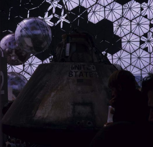
Update: From Architecture & Nature (2003), more details/corrections on who showed what: Kelly had a 30′ canvas, no title given. Robert Indiana, Cardinal Numbers. At just 13’x15′, Robert Motherwell’s Big Painting #2 was anything but. Lichtenstein: Big Modern Painting [sensing a theme here?] Helen Frankenthaler was The Woman Painter. And the Dymaxion Map was by Johns, “a small [sic] token to his friend Fuller’s desire to have the map be the centerpiece of the pavilion.”
Interior images of Biosphere, the US Pavilion at Expo 67 from The Dixon Slide Collection at McGill University. [mcgill.ca]
Q: was this the Ellsworth Kelly? [no, see update above]
Previously: Hmm. That satelloon & command module show was so good, they used it again at Expo 70 in Osaka.
Echo I
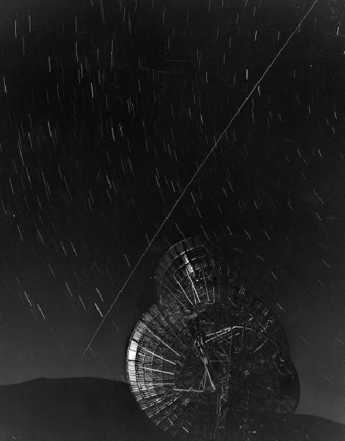
This 1960 LIFE Magazine photo by Grey Villet of Antenna bouncing first message off Echo I satellite is a great, uh, echo of Trevor Paglen’s The Other Night Sky series.
On The Public-Sculpture Gravy Train
It’s got shiny spheres, and science re-creations, and DC artists and quotes from curator and museum director friends. But it’s been a few weeks now, and the only thing I can say about Blake Gopnik’s mind-numbing/blowing article on Jim Sanborn is that this passage on public art is pretty damn funny:
The fame of the CIA commission “funded me for all the years since,” Sanborn says. It put him on the public-sculpture gravy train. He stopped living in his scruffy studio building in Northeast Washington (it’s where he met his wife, Jae Ko, a well-known local sculptor), bought a house in Georgetown, designed a home in the Shenandoahs and continued to fund his more “serious” art, such as “Atomic Time.”
But lately, the commissions have dried up. Today’s selection panels, he complains, go for “decorative embellishments.”
Damn those panels. If only noted art historian/author Dan Brown would write a book about Washington, he could include another mention of Sanborn’s work.
??!!??: Sparking Interest Within the Sphere of Art | ‘Physics’ May Be Most Substantive D.C. Piece in Half-Century [washingtonpost via man]
Floating Cloud Structures, Or We All Live In A Fuller Satelloon
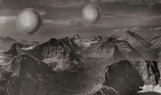
Just like how, once you’ve learned it, you start hearing a word all the time, now I see satelloons everywhere. Including at the Buckminster Fuller retrospective last year at the Whitney [which went on to Chicago this summer.]
Buckminster Fuller and his architecture partner Shoji Sadao mocked up this photo of a photocollage, Project for Floating Cloud Structures (Cloud Nine) , around 1960. Cloud Nines are self-contained communities of several thousand people living inside enclosed geodesic spheres a mile wide, which float over the earth’s surface.
Because the geodesic structure increases in strength as it gets bigger, and its surface increases at a power of two, while its volume increases at a power of three, Fuller hypothesized that heating the interior air even one degree will set the Cloud Nines aloft.
Obviously, as a sexy, futuristic utopian image, Cloud Nine is hard to pass up, but holy crap, Bucky, did you think for two seconds about the urban fabric and the social experience of living trapped in a floating dome? I’d love to see someone write an SF story about it. Because I think it might be a fantastically totalitarian disaster.
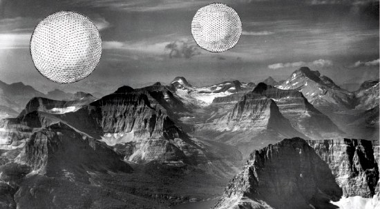
There are two versions of the Cloud Nine image: [the earlier?] one has smooth, silvery, featureless spheres. I’d call them satelloons, even. The other [above] has line drawings of the geodesic structure collaged onto it.
It was only now, as I get around to finally posting about them, that the relationship between Cloud Nines and satelloons might be more than formalistic. The original satelloon, Project Echo launched in 1960, the same year Fuller and Sadao designed their giant floating spheres. Could there have been a connection?
The easiest, most obvious thing to do might be to ring up Shoji Sadao. What is he up to these days, anyway? You’d think that given the recent interest in Fuller’s work, a guy who worked so closely with Fuller on so many major projects–he’s credited with the dome at the 1967 World Expo in Montreal, arguably the most spectacular Fuller structure ever realized–would be all over the place. I mean, it was only a few years ago that he gave up his position as executive director of the Noguchi Foundation in Long Island City. And then he curated that great Fuller-Noguchi show in 2006. [Sadao was also a longtime collaborator with Noguchi and the chief overseer of his legacy.] Anyone spoken with him lately?
A Small Compendium Of Shiny Orbiting Balls
In a 1970 paper, two Harvard/Smithsonian scientists proposed A Passive Stable Satellite for Accurate Laser Ranging. Dubbed project Cannonball, the 38-cm spherical satellite would be covered with triangular reflectors and would weigh–did someone drop a decimal?–a prodigious 8000 pounds. Cannonball would be a stable laser target which would allow surface mapping of the earth with 10cm accuracy by reflecting laser light between earth base stations. It was designed to be launched using an extra Saturn rocket left over from the Apollo program, but it didn’t happen.
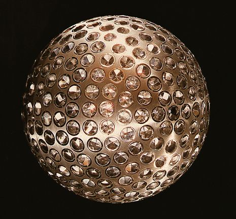
The passive laser reflector disco ball-lookin’ satellite trend didn’t really kick in until 1976, when NASA launched LAGEOS I [LAser GEO-something Satellite, above], which was built by ASI, the Italian Space Agency, from a NASA design. The 60cm-diameter aluminum-coated brass sphere is set with 426 cube-cornered retro-reflectors–4 are germanium, the rest are glass.
ASI built another, identical satellite, LAGEOS II [below], which was launched in 1992.
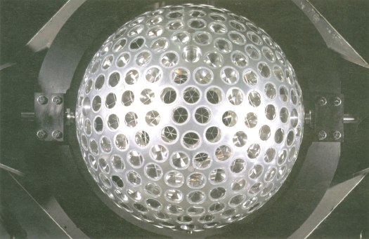
A third passive retro-reflector satellite, called LARES, was designed as an all-Italy project, and is set to launch in 2009 on an ESA rocket. LARES is smaller [36cm], made of solid tungsten, and contains 92 retroreflectors.
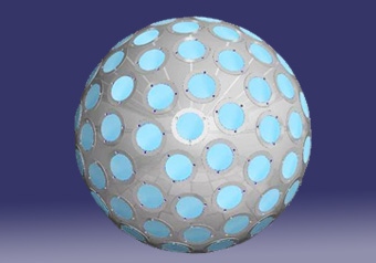
In 1989, Russia launched two Etalon satellites [below], which are each 1.3m in diameter and contain 2,145 retro-reflectors.
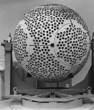
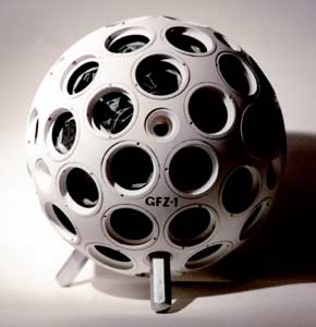
NASA launched Larets, a tiny 21cm sphere with 60 prismatic reflectors into low-earth orbit in 2003. It is very similar in design to the German GFZ-1 [below], which was launched in 1995 and burned up in 1999. They also look llike Buckminster Fuller Fly’s-Eye Domes.
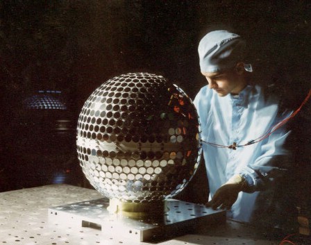
The most disco ball-looking of all, though is Project Starshine, a series of three student project satellites [??] which launched between 1999 and 2003. Built from spare hardware, each Starshine sphere was covered with almost 900-1500 mirrors polished by students around the world. The satellites reflected sunlight, enabling a network of schools to track their movement. They all burned up as they re-entered the atmosphere, and Starshines 4 & 5 have been waiting for a ride into space since 2004.
LAGEOS I also contains a plaque [below] designed by Carl Sagan and drawn by Jon Lomberg. It consists of three maps showing the position of the continents in the distant past, the present, and 10 million years from now, when the satellite is expected to re-enter earth’s atmosphere. The idea being, I assume, to let whoever retrieves the beautiful, shiny artifact from space some time before that happens know that we totally knew they were going to do that.

Space Flight Dolphin, By Richard Clar

San Francisco Ocean Film Festival – “Space Flight Dolphin – the art of SETI”, originally uploaded by oceanfilmfest.
Space Flight Dolphin is a life-sized “inflatable dolphin sculpture/satellite by the space artist Richard Clar. The sculpture/satellite will be made from a memory alloy that springs into shape when heated by the sun.
It will transmit a magnetic signal “modulated by dolphin ‘voices'” [Clar’s quotes] in an attempt to communicate with extra-terrestrial intelligence. Also, “as the sculpture/satellite orbits the Earth, the dolphin voices will be monitored in various museums around the world, providing a link between different people and cultures on our own planet.”
Near as I can tell, Space Flight Dolphin was conceived in 1982, and was approved by NASA for inclusion in its special payload program in 1986. Which is the same year Star Trek IV came out. So if anyone copied anyone, it was Star Trek.
This still is from an animated short which was screened last year at the San Francisco Ocean Film Festival.
Space Flight Dolphin: An Art-and-Technology Payload for the Space Shuttle | Richard Clar’s Art Technologies [arttechnologies.com]

