
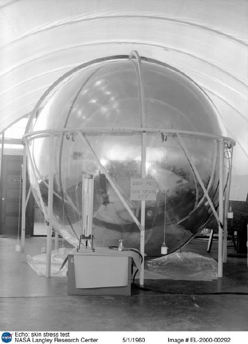
A digitized collection of vintage NASA Goddard Space Flight Center newsletters led me to the June 23, 1963 issue of LIFE Magazine. If it were possible for any photo of a Project Echo satelloon to be slightly less than awesome, this photo would move forward to be the awesomest:
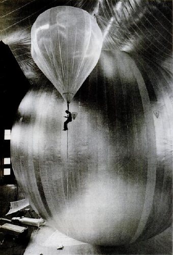
It’s a technician inspecting for leaks during a test inflation of the Echo II at Lakehurst, New Jersey, which was long the Navy’s site for giant inflatable vehicles. From the 1930s construction photos of the massive dirigible hangars to the parades of Navy blimps during WWII, the “Lakehurst” is a stealth candidate for awesomest single search term Google’s LIFE Magazine image archive. Unfortunately, this photo is not included. I’d love to find it, though; someone deserves a credit.
Here’s one of the same test, only there’s no location, and it’s misdated. credit: NASA. And it’s public domain. Here’s one of the first ever photos of an Echo satelloon; famous LIFE photojournalist Grey Villet took it while standing next to the antenna used to bounce the first radio signal off Echo I in 1960.
All of this is related to my master plan to show a satelloon as an art object, sure, but it’s also precipitated by NASA’s latest, the Bullet 580, dubbed, depressingly, “the world’s largest inflatable airship,” which was test inflated last weekend. At 235 feet long and 65 feet across, it practically fills the Garrett Coliseum in Montgomery, Alabama [below]
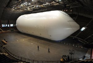
If there were a clearer sign that Our Nation has lost its way in the field of Giant Balloons And The Buildings That Hold Them, I can’t think of it. A sad, sad day. [images: George Strock/LIFE; AP]
Category: satelloons
Otto Piene’s More Sky
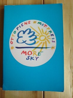 Alright, all y’all who didn’t tell me about Otto Piene’s classic of the books-written-in-longhand era, More Sky: what else have you been hiding?
Otto Piene literally opens up new horizons here in both art and art education. His book is a plea for more scope, more space for art–for making public property artful and making art public property–for freeing the arts from the tight economic bonds that give the curators and the collectors a near monopoly. He writes, “The artist-planner is needed. He can make a playground out of a heap of bent cans, he can make a park out of a desert, he can make a paradise out of a wasteland, if he accepts the challenge…. In order to enable artists of the future to take on planning and shaping tasks on a large scale, art education has to change completely. At this point art schools are still training object-makers who are expecting museums and collectors to buy their stuff….”
The first part of More Sky covers “things to do” arranged alphabetically, A-M (Piene will take up N-Z some other time.) Like city planning, clothing, collaboration, electronic music, elements, engineering or government, graffiti, graphics, green toad jelly.
All these notes cohere into a larger statement in support of an environmental art for social use, the interaction of art and architecture and the city and the open landscape, a total ecological and elemental aesthetics.
The last part of the book, “Wind Manual,” gives a practical demonstration of things to do in just one area. But it’s a big one–the whole sky–and a lot can be done in it, making use of the wind; making human clouds, rain, rainbows; and making things that fly and float. This section is made up almost entirely of full-color illustrations of some of the things that man the artist can do to purify the skies polluted by man the money-maker and rendered fearsome by man the war-maker. The illustrations show different kinds of flags, banners, ribbons, wind socks, wind sculptures, riggings, kids and other things.
The first part was written plain, in the Spring of 1970, with no trace of artspeak jargon. And the second is plainly drawn and colored. (Piene is more versatile than most contemporary artists: he can do his abstract light-ballet things, and he can span rivers with man-made rainbows, and he can draw a recognizable picture of a bull.) The “Wind Manual” was originally drawn for instant use in schools and colleges in Pittsburgh–it was created as part of a Piene-guided public art project called Citything Sky Ballet.
The MIT Press
Massachusetts Institute of Technology
Cambridge, MA 02142
Otto Piene’s More Sky is available the 1973 edition with the fun, blue cover, and a print-on-demand version with a boring black cover. So heads up when you buy. [amazon]
Art Fleet: Domes & Trucks & Art Things That Go
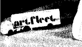 While researching the National Gallery of Art’s Barkley L. Hendricks paintings, which were purchased by J. Carter Brown with money from Michael Whitney Straight, I came across one of the crazier space-meets-art moments in the history of exhibition design: Art Fleet.
In an amusingly transparent move to manage his own complicated story, Straight wrote a biography of Nancy Hanks, the founding chairwoman of the National Endowment for the Arts, who had been appointed by Richard Nixon. [Straight himself had been approached to found the NEA by the Kennedy administration, at which point, he disclosed his history as a KGB spy. He became the deputy chairman, instead, a post which did not require Senate confirmation.]
Anyway, Art Fleet. We begin in San Clemente, 1970:
In the same spirit of loyalty to the president who had appointed her, Nancy committed the Endowment to supporting a project entitled Art Fleet. She had asked the president, when she met with him in San Clemente, what he would like the Arts Endowment to do. He had replied that “it was extremely important to get the arts out into the country.” Nancy had agreed. She was reminded of the technical problems involved in moving art masterpieces around the nation. She dismissed them. As Bill Lacy, our program for Architecture and Environmental Arts, recalls, “Nancy contended that if we could put a man on the moon, we could surely send the Mona Lisa around the country.” [p.149]
Surely, why not, but seriously, why?
And what do you want to do with the Mona Lisa again?
Continue reading “Art Fleet: Domes & Trucks & Art Things That Go”
Otto Piene’s Light Ballets & Exhibiting In The Sky
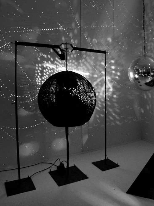
Following on to their 2008 retrospective of ZERO, Sperone Westwater is exhibiting work by the group’s co-founder, Otto Piene. ” Otto Piene: Light Ballet and Fire Paintings, 1957-1967″ runs through May 22nd. [16 Miles has very nice installation shots.]
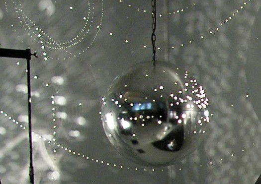
While I am stoked to see Lichtballet, 1961, above, the piece I’d most like to see, the silver sphere hanging on the right, is not in this show. This photo, by Günter Thorn, turns out to be of Lichtraum [obviously] from “Bilder, Objekte, Grafiken und Lichtraum,” an exhibition last winter at the Kunstverein Langenfeld.
Last year, the Pompidou had a cheeky, brilliant exhibition, Voids: A Retrospective, which consisted of nine empty galleries, each a different re-creation of an artist’s showing of a void. [John Perrault discussed the show at length in March 2009.] I feel I am now tiptoeing backwards into a similar project, a retrospective of artists’ shiny silver balls.
Piene was creating these Light Ballet pieces while the Echo I satelloon was orbiting the earth, its reflection visible to the naked eye. He exhibited them in New York in November 1965, at the Howard Wise Gallery. Sperone has reprinted Piene’s essay from the small catalogue to that show. Here is an excerpt:
In 1959 I played the light ballet with hand lamps, in 1960 I built the first machines, in 1961 they appeared in large darkened rooms at exhibits and in museums: one object, two objects in a large hall, a waste of space, an elimination of conventional attitudes about quantity. The farther the distance between the projecting device and the light-catching confines of a room, the larger are the light forms. And when they are large, the claustrophobia caused by the ordinary cubicity of our interior spaces recedes.
…
My endeavor is twofold: to demonstrate that light is a source of life which has to be constantly rediscovered, and to show expansion as a phenomenal event. Everything is striving for larger space. We want to reach the sky. We want to exhibit in the sky, not in order to establish there a new art world, but rather to enter new space peacefully–that is, freely, playfully and actively, not as slaves of war technology.
A rubber skin, helium and the wind, light, electricity and fireworks seem to me excellent media. The revolving beam of a lighthouse and a balloon in the air are more convincing sculptures than the big chunks that are so hard to move. Calder’s mobiles can be taken apart. Our objects ought to be inflated or ignited or projected. And environments? As far as a laser beam reaches. Are the jet pilots who write vapor trails in the sky the artists of our time, as Gothic stone-masons were the artists of theirs?
Despite their similar shapes, there is one essential difference between Gothic cathedrals and rockets: a cathedral seems to soar, expressing the yearning of its builders to ascend to heaven; a rocket does soar. The same technical difference exists between traditional sculpture and my objects. Previously paintings and sculptures seemed to glow, today they do glow, they are active, they give, they do not merely attract the eyes, they do not merely express something, they are something. A filament glows and warms, a painted halo only reflects light. Energy in a contemporary form produces the living media. Is the filament in itself a piece of art?
Transformation still has two meanings, one technical, one spiritual. He who leaves his house leaves the light on to make it appear inhabited.
Previously: Otto Piene et al’s Centerbeam & Icarus on The National Mall
Alcoa Forecast: Spheres Of Tomorrow
They’re both under-known, and so they probably deserve their own posts, but the uncanny similarity of these two Alcoa Forecast program designs requires me to put them together.
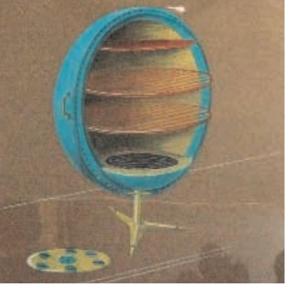
Greta Magnusson Grossman was a Los Angeles-based Swedish industrial designer. According to the notes at the 2008 Drawing Center exhibition of her never-before-seen technical drawings, she was highly influential on her fellow Southern California colleagues in the 1950s-60s, including the Eameses.
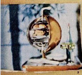
That show included a sketch [above] for the personal aluminum oven she designed for Forecast. A small photo of the wacky, ball-shaped oven appeared in a collaged Forecast ad in the Dec. 28, 1959 issue of LIFE Magazine.
[update: whaddyaknow, the new blog The Modernlist reports that the Arkiteturmuseet in Stockholm has the first-ever Magnusson Grossman retrospective right now, through May 16. Definitely check out that crazy Grossman House.]
Graphic designer Lester Beall, meanwhile, is better known, at least by my criteria: I recognize his awesome, constructivist-style photocollage posters for the Rural Electrification Administration from MoMA’s design collection. His portfolio site says he designed the Music Sphere for Alcoa in 1956, which seems remarkably early.
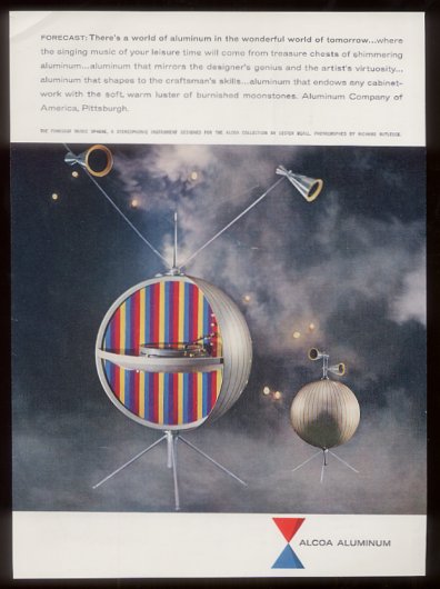
An unsourced tear sheet for a Forecast Collection ad on eBay says it’s from 1969, which is remarkably late. I’m going to guess it’s really 1959. But the real question is why the future doesn’t have even a tiny fraction of the giant, shiny aluminum ball-shaped appliances we were promised?
“Aluminum that mirrors the designer’s genius and the artist’s virtuosity”? “Aluminum that endows any cabinetwork with the soft, warm luster of burnished moonstones”?? I think we have found Project Echo’s official stereo!
Echo I: The Making Of – Giant Clothespins
While I remember where it came from, here’s another image found in that Jan. 1961 Popular Science story starring William O’Sullivan Jr, who headed Project Echo and the whole satelloon paradigm at the fledgling NASA.
When you see a couple of guys at a 50′ table, assembling, folding, and gluing Echo I’s Mylar gores using not much more than a pile of footlong clothespins, you can understand why I still hold out hope of replicating one for exhibition as an art object. [On earth first, of course. Baby steps.]
‘If Echo were as fleet…’
Paul Brodeur in Talk of the Town, The New Yorker, September 3, 1960. The abstract pretty much captures the whole, short piece:
Comment on attending Shakespeare’s “The Taming of the Shrew” at Central Park’s outdoor Belvedere Lake Theatre.
We noticed that many of our fellow-theatre-goers were gazing upward at the stars & summer haze of the night sky…& we followed suit. With the opening lines, we realized that they were still lost in the galaxies overhead. We again directed our attention to the stage. The lord was saying, “Thou art a fool. If Echo were as fleet, I would esteem him worth a dozen such…” & suddenly, brought rigid by the unwitting bard, we turned our gaze aloft, where, shining majestically in sunlight beyond the pale of our night, Echo 1 floated in the west. For many minutes, as the satellite traveled toward its northeast solstice, we sat with tilted head, our spirit swiveling between past myth & future myth. Then, unraveling ourself from our involvement with Echo’s awesome journey, we returned to the bleachers at the Belvedere, and thence to Shakespeare’s Padua, filled with reborn wonder at the mastery of man.
And it turns out Calvin Tomkins himself did a long profile in 1963 of Dr John Pierce, who oversaw Project Echo at Bell Labs. Tomkins seems to focus on what I find most mind-blowing about the Echo satelloons: the whole thing was undertaken by a tiny, informal group, without a giant industrial-scale infrastructure. It was almost ad hoc and bricolage, something akin to making, not manufacturing.
Not sure when I’m going to have the time to read that…
image: a 40-second time lapse from Autumn 1960 of the Echo I satelloon in orbit, published in an extensive “making of/launching of” article in the January 1961 issue of Popular Science magazine.
How Your Street View Panoramas Are Made
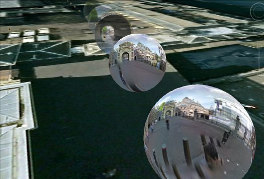
I’ve been looking into how Google Street View panoramas are made, and it’s been kind of awesome. Each equirectangular panorama is stitched together on the fly out of 21 photos.
Equirectangular projection, or plate carrée (flat square), is a technique that maps coordinates onto an evenly spaced grid of latitude and longitude, which produces significant distortions, especially along the perimeter. Like how Antarctica ends up looking bigger than the rest of the continents put together. Flickr user swilsonmc’s images of flattened out Street View panoramas show the axis of distortion quite nicely.
I think there are other distorting elements in Street View, though; it appears that each panorama is anchored to a specific set of lat/long coordinates. [The Street View data layer on Google Earth shows this beautifully by plopping these 3D pano bubbles down on its own 3D landscape. (top) It’s like simulation-within-simulation. Also, they look like inverted satelloons, only they’re projecting back their surroundings from the center, rather than reflecting from the surface. I mean, just check out the highly reflective surface of the PAGEOS global mapping satellite for a minute. Am I right? Wait, did someone say mapping?]
Anyway, the panoramas pull together the best images of that spot, which are not necessarily taken at that spot. Google’s roving cameras are shooting constantly, so there images approaching and leaving a particular panorama site. This introduces multiple POV and perspectival distortions into a single panorama. Which can result in awesome, zig-zagging thickets of tree trunks, fence posts, stanchions, and disembodied pedestrians. And which all remind us that these panoramas are not photos, but photomontages.
But wait, that’s not all! swilsonmc also created a php script that turns every flattened Street View panorama into a frame of video. The flickr video above shows the trip up the Long Beach Freeway in LA, from Seal Beach to Glendale. It reads as a continuous trip, of course, but if you watch the traffic and the clouds, the other Street View distortion–time–so obvious it’s invisible, becomes clear: there are photos taken on different days.
Roland Barthes described photography as “the presence of a thing (at a certain past moment).” The always didactic John Berger said,
Photographs bear witness to a human choice being exercised in a given situation. A photograph is a result of the photographer’s decision that it is worth recording that this particular event or this particular object has been seen
and on the intrinsic temporal content of photography, he said, “This choice is not between photographing x and y: but between photographing at x moment and not at y moment.” I think it becomes clear that in the traditional, theoretical sense, whatever Google Street View images are, they are not photography.
Roel Wouters’ Shiny Silver Balls
Suddenly silver mirrored balls are everywhere.
Music video and filmmaker Roel Wouters created the trailer for last year’s International Film Festival Breda:
A silver sphere on an endless checkerboard floor is the default for many 3D modeling applications. It can be seen as an icon for a sterile, makeable world. Reality though, is dirty and unpredictable. By recreating this icon in reality the beauty and imperfection of real life gets emphasized.
The recording was the result of 3 people controlling different parts of the installation, Roel controlled the speed of the balls, Benoit (Eurogrip) controlled the speed of the dolly and Sal focussed and zoomed the camera. It turned out to be a play were the 3 of us playing harmoniously together.
It’s awesome. Coincidentally–actually, several coincidentallies–a selection of Wouters’ work was screened just today in Den Haag, organized by a cinema club called Cinetoko. Cinetoko is a collaborative effort between Motoko, a motion and video design studio, and <>TAG, an art/tech/culture catalyst of some kind. It happens at the Zeebelt Theater, which is safely to the west of any Google Map camo or StreetView complications. [via manystuff thanks andy]
Shiny Space Balls? Yes, Please, I’ll Take Two. No, Four.
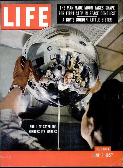
I could feel Mondo-Blogo was baiting me as I scrolled through the photos from MoonFire, Taschen’s luscious 2009 commemorative book for the anniversary of the Apollo 11 landing. He was amped about the text by Norman Mailer, and the multiple insane limited edition versions of the book–with or without embedded lunar asteroid fragments and lander-style display cases–designed by Marc Newsom. I, meanwhile, was sensing some ur-satelloon spheres coming on, and–BOOM. This photo above.
But what was it? I couldn’t tell the mission, and I couldn’t find the same or similar images of such Sputnik-like satellites in progress, no matter how hard I Googled. And from the preview, neither Mondo nor I could read the captions. The trade edition of the book wasn’t out yet, at least in the stores–and space bookshops, and the National Air and Space Museums–I visited last week. What to do? I asked Taschen’s publicist for help, and voila. Project Vanguard.
This is a previously unpublished 1957 image from LIFE Magazine photographer Hank Walker of the Project Vanguard team at the Naval Research Laboratory, hard at work on the world’s first “earth satellite.” [Well, not quite the first, as it turned out.] But almost no one in the US knew about Sputnik on June 3rd, 1957 when LIFE ran an excited cover story about Vanguard’s development [“Man-Made Moon Takes Shape,” “Shell of Satellite Mirrors its Makers”] That’s Vanguard scientist Alexander Simkovich, by the way.
Walker’s other LIFE photos of Project Vanguard from the Spring of 1957 are just as awesome. Some of the most artistic highlights:
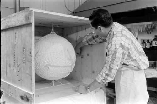
The crating: Apparently, at least 35 Vanguard and Vanguard II satellite shells were manufactured in Detroit by Brooks & Perkins, then shipped to Washington for assembly. I have to wonder what Eva Hesse was doing while these things were being packed:
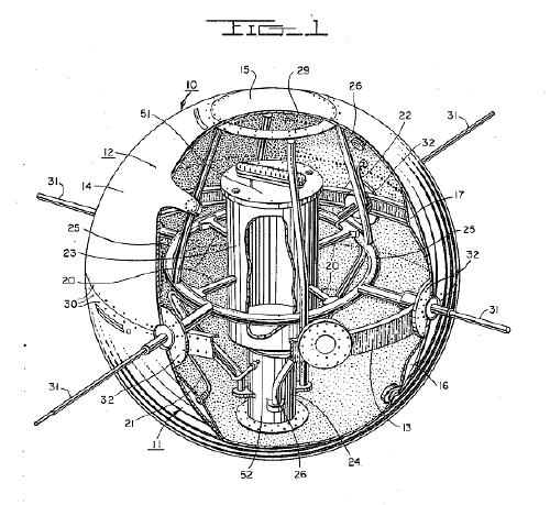
The see-through model: Instead of an internal sphere full of scientific instruments, the 20-inch Vanguard II satellites were designed with a suspended, miniaturized, stacked core, as this plexiglass model showed:
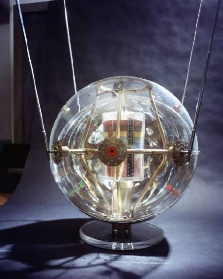
This looks remarkably like the cutaway drawing for the first patent ever issued for a satellite structure. Satellite team leader Robert C. Baumann filed the patent in August 1957, and it was granted in 1958. In the mean time, of course, the Soviet Union had launched two Sputniks and the rocket carrying the first, grapefruit-sized Vanguard satellite, had exploded on the launch pad on live television [that satellite was recovered intact and is on view at the Air & Space Museum, btw]:
The making of: Brooks & Perkins manufactured the vanguard shells from sheets of magnesium [below], then plated them with gold. A remarkably detailed Time Magazine article from April 15, 1957 explains the rest of the manufacturing process:
When the satellites came from their manufacturer, Brooks & Perkins, Inc. of Detroit, they were thin-skinned magnesium spheres plated with gold. Aluminum is better for reflecting sunlight, but since aluminum will not stick to gold, the gold had to be covered with a thin film of chromium. Aluminum will stick to chromium, but it also mixes with it and loses part of its reflecting power. So the chromium film in turn had to be coated with glassy silicon monoxide, and then with aluminum.
The delicate work of depositing the coatings was done by the Army Engineers at Fort Belvoir, Va. Each satellite was put in a vacuum chamber and turned, like a chicken on a spit while the materials in the coatings were evaporated electrically and deposited on its surface. The final coat was a second layer of silicon monoxide.
In terms of the Space Race, Project Vanguard was only a fair success, and it was quickly superseded. A Vanguard II satellite launched in 1958 is currently still in orbit and is the oldest man-made object in space. So that should mean that at least a couple dozen of these iridescent masterpieces still roam the earth–or are stuck in crates in NASA scientists’ grandchildren’s garages waiting to be liberated and exhibited. The search is joined.
Oh, look, here’s one that’s off the list: a 1958 Vanguard Lyman Alpha replica or flight spare on display at the National Air & Space Museum’s Udvar-Hazy site at Dulles.
On The Soviets On The Moon
It doesn’t feel like a tangent to go from satelloons and museums on the moon to other aesthetic aspects of space and the space race. Plus there’s the fascination at discovering, as a grown man, how much I hadn’t been taught as a kid. As an American kid.
No one tried to ignore Sputnik or Yuri Gagarin, of couse, but it never registered with me that the Soviet Union reached the moon first. And landed the first spacecraft on it. And took the first pictures of the dark side of the moon. And from the surface.
The Soviets’ Luna Program began way back in 1959, when Luna 2 hit the moon [after shedding a bunch of small Soviet emblems, apparently.] This, beefore America even got a balloon into orbit around the earth.
Also in 1959: Luna 3 returned photos of the far side of the moon.
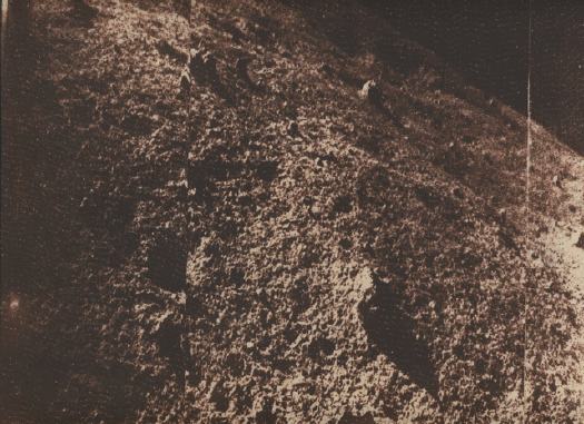
And in 1966, Luna 9 made the first soft-landing on the moon and transmitted back the first five photos from the surface.
To avoid embarrassment in the case of failure, Russian missions were typically only announced after they succeeded. This meant that each achievement was met worldwide with a sense of surprise and skepticism/resentment.
The first image sent back from Luna 9, however, was intercepted by the University of Manchester’s Jodrell Bank Centre for Astrophysics, which scooped the Russians’ own announcement.
As an image, there’s something familiar about it, at least in retrospect; it looks like what we [now] know the surface of the moon to look like. But in 1966, it had to have packed a punch. Add to that the level of political intrigue, the rivalry of the Space Race, and the ever-present military/nuclear threat of the Cold War, and this image becomes an incredibly powerful, important artifact.
One which I’d never heard of, or seen before last week. It’s as if Apollo and 1969 wiped away the contentious, anxious experience and history of the earlier years. And along with it, the memory, recognition, and appreciation of the achievements that came first.
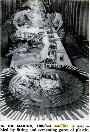
Selections From The NASA Library: How-To Build A 100-Foot Satelloon
Part of re-creating the Project Echo satelloons as art objects is tracking down the documentation and history of it all, identifying archives and primary source materials, and finding out how, exactly NASA built these early, early satellites.
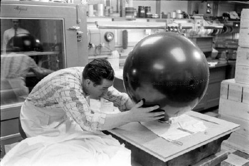
Because it’s more than technically possible to replicate their efforts. America’s first forays into space were literally ad hoc: the prototype Echo satelloon was twelve feet in diameter because that’s how big the ceiling was in the workshop. They figured out how to fold the balloon after one engineer saw his wife’s rain bonnet. They pressure-tested the Mylar skin on an armature made of 1-by lumber, pulleys and weights. [image above: nasaimages.org]
I thought I’d have to track down a NASA archive facility in some Maryland backwoods, and make an appointment, and I may still. But it turns out NASA has converted a lot of the technical and fabrication documents for Project ECHO–ECHO I and ECHO II–to PDF format. The compilation of links at Astronautix.com is pretty high in the Google results.
Here’s what I especially like:
- NASA Report, Development of the Fabrication and Packaging Techniques for the Echo II Satellite, Web Address when accessed: http://ntrs.nasa.gov/archive/nasa/casi.ntrs.nasa.gov/19670014586_1967014586.pdf.
- NASA Report, Postlaunch Structural Analysis of Echo II Satellite, Web Address when accessed: http://ntrs.nasa.gov/archive/nasa/casi.ntrs.nasa.gov/19660007648_1966007648.pdf
- NASA Report, Mechanical Properties of Echo II Laminate, Web Address when accessed: http://ntrs.nasa.gov/archive/nasa/casi.ntrs.nasa.gov/19640016629_1964016629.pdf
- NASA Report, Mechanical and Physical Properties of the Echo II Metal-Polymer Laminate, Web Address when accessed: http://ntrs.nasa.gov/archive/nasa/casi.ntrs.nasa.gov/19660025569_1966025569.pdf
- NASA Report, Buckling of the Echo-A-12 Passive Communications Satellite, Web Address when accessed: http://ntrs.nasa.gov/archive/nasa/casi.ntrs.nasa.gov/19640015999_1964015999.pdf.
- NASA Report, Strain measurements conducted on a full scale Echo II passive communications satellite balloon, Web Address when accessed: http://ntrs.nasa.gov/archive/nasa/casi.ntrs.nasa.gov/19660010463_1966010463.pdf.
- NASA Report, The Echo I Inflation System, Web Address when accessed: http://ntrs.nasa.gov/archive/nasa/casi.ntrs.nasa.gov/19640012106_1964012106.pdf.
On Ken Knowlton, Bell Labs, Art & Technology
Ken Knowlton’s artistic collaborations have been less well-known that his Bell Labs colleague, Billy Kluver, who created E.A.T. Experiements with Art & Technology, with Robert Rauschenberg and who introduced Andy Warhol to Mylar. But we’ll get to that.
 In collaboration with Leon Harmon, Knowlton made some pioneering, ASCII-style artworks, including a reclining nude transformed from photograph to a printout of dot-matrix symbols, which was featured in a NY Times article in 1967 [“Art and Science Proclaim Alliance in Avant-Garde Loft,” Oct. 11, 1967].
The report was about an art/technology “news conference ‘happening'” held in Rauschenberg’s loft, and attended by corporate and union leaders, and politicians, including Sen. Jacob Javits, who is shown with large, pillow-shaped Mylar balloons floating behind him in “the Chapel,” the two-story space at the back of Rauschenberg’s Lafayette St. building. [The occasion was a reorganization of E.A.T.]
They’re the same balloons Andy Warhol had used in his April 1966 installation, Silver Floations, which he’d learned about from Kluver. [Bell Labs, of course, was also the ground operator of the Mylar communications satelloons of Project Echo, which launched in 1960 and 1965.]
Anyway, 18 months later, it’s Kluver whose seen batting these balloons around, with nary a mention of Warhol to be found. Odd.
Willard Maas made an awesome short film about the show in 1966. It’s at YouTube or UbuWeb:
‘Preparing An Exhibit For The House Space Committee’
I’m still looking for the c. 1958-9 images of the 12-foot satelloon prototype being inflated in the US Capitol Building as part of NASA’s push to fund the 100-foot version.
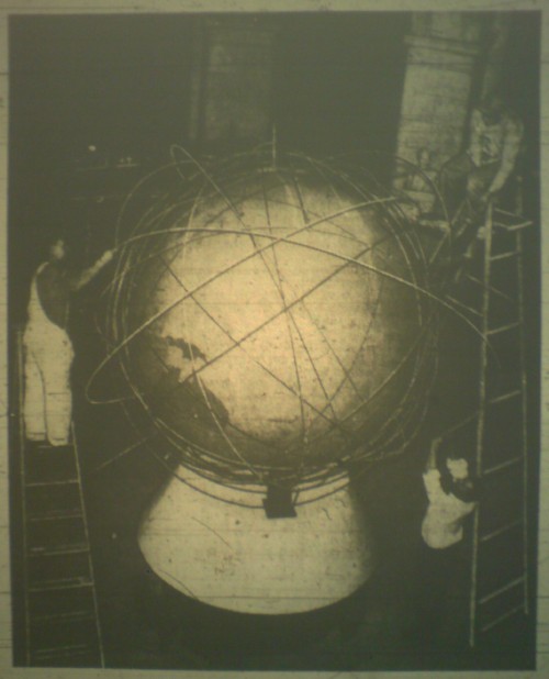
But look what I found in the March 14, 1961 edition of the Washington Evening Star, right above the story about the Mclean bridge club’s Ab Ex artist hoax:
Workmen preparing an exhibit for the House Space Committee put another ring around a huge globe in the rotunda of the old House Office Building. Each ring represents the path of a satellite…
that’s where my photo of the microfilm got cut off, but they’re both Russian and US satellite paths. No idea yet what the hearing discussion was [see update], but this was just a couple of weeks before Yuri Gagarin became the first person to orbit the earth, so I’d imagine this exhibit, whatever its purpose, was soon forgotten.
I’m sure it’s too much to hope for, that the metal bands of satellite orbits hand-assembled 50 years ago for a congressional hearing exhibit [?] have survived in a government warehouse somewhere. But the photo’s credited to the AP, so at least there’s a chance of finding a vintage print of it, right?
UPDATE: Eh, from the Washington Post coverage a few days later, the Space Committee, which by 1961 was called the House Committee on Science and Astronautics, was contesting Defense Secretary Robert McNamara’s rushed order for the Air Force to take over all military space development and to prepare to subsume NASA. So there you go.
Your Imploded View (2001) By Olafur Eliasson
For all my talk lately about satelloons, Olafur’s stayed very politely quiet about his own giant, swinging aluminum balls. Maybe because he only has one? Seriously, though, I hope it’s an edition.
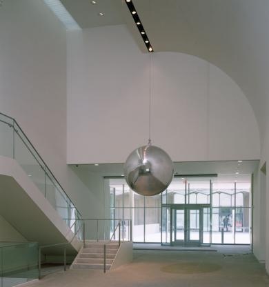
Your Imploded View is a 51-inch diameter, 660-lb polished aluminum sphere that swings like a pendulum. It dates from way back to 2001 [!], though it’s not clear when it was first realized. At that weight and dimension, it has to be solid, which is rather spectacular. Such precision-manufactured geometry reminds me of the fantastically produced objets de science like Le Grand K, the International Kilogram Prototype stored outside Paris.
Anyway, the Kemper Art Museum at Washington University in St Louis purchased Your Imploded View in 2005, and it’s on permanent view in the atrium there. Kemper curator Meredith Malone’s YouTube video is nice and informative, but HD would be better for capturing the sculpture’s experience. Don’t miss they guy using the special, custom-made Your Carpet-Wrapped Pushing Trident to get the ball swinging.
Your Imploded View (2001) by Olafur Eliasson on permanent view at the Kemper Museum, St Louis [kemperartmuseum.wustl.edu]