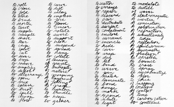
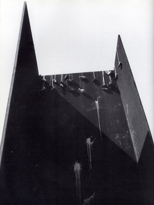
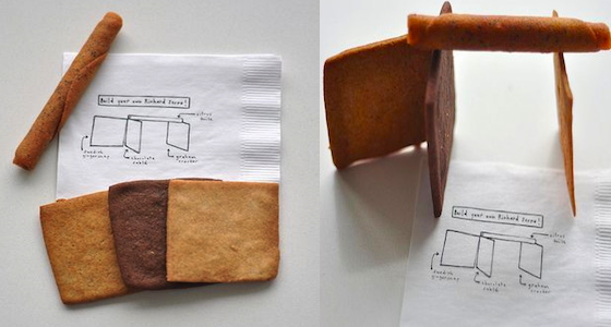
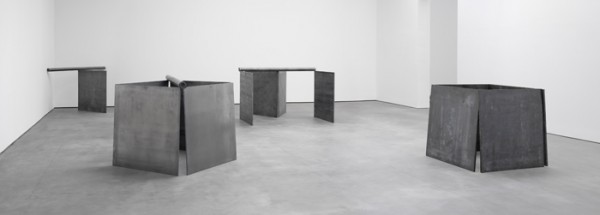
Richard Serra, Verb List, 1967-68, image: moma.org
When the US’s demand to destroy all of Syria’s chemical weapons was first being discussed in September, I heard a report on NPR about the Office for Prohibition of Chemical Weapons, and how they went about their mission. It struck me as an almost sculptural process, a cross between Paul Shabroom, a Matthew Barney gallery installation, and Richard Serra’s Verb List.
5 March 2007
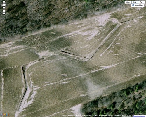
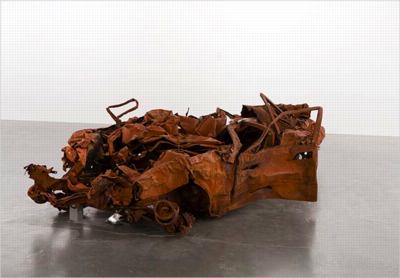
Now that the OPCW is on the ground, has won the Nobel Peace Prize, and is completing their inspections and such, I thought I’d pull together some news accounts of these CW destruction techniques for reference. When I get a bit more time, I’ll try digging through the OPCW’s site for official protocols and such. At some point, like Jeremy Deller’s bombed out car from Iraq, I guess this stuff should be exhibited.
A slightly facile FAQ-style AP article, Chemical Arms Inspectors Gird For Risky, Dirty Job” [npr.org]:
THE SIMPLEST WAY TO DISABLE EQUIPMENT? SMASH IT!
Inspectors can use any means they deem necessary to render equipment inoperable, including techniques that are crude but effective. Options include: taking sledgehammers to control panels; driving tanks over empty vats or filling them with concrete; or running mixing machines without lubricant so they seize up and become inoperable.
From the Washington Post, same day Chemical weapons officials say coordination with Syrian government has been ‘efficient'”:
He said OPCW officials charged with destroying Syria’s chemical weapons production capabilities by Nov. 1 will use “expedient methods” to fulfill their task.
“It might be a case of smashing something up with a sledgehammer. It might be a case of smashing something up with some explosive. It might be a case of driving a tank over something,” he said, or filling vessels with concrete, ruining valves and running bearings without oil so that they get stuck.
That won’t take long or cost much money, he said, but disposing of the chemicals themselves “is going to cost a lot.”
From a McClatchy report on Sept. 30, “Experts optimistic Nov. 1 deadline can be met for ending Syria’s chemical threat” [miamiherald.com]:
Once combined, the chemicals result in a mixture that is unstable and dangerous to handle. But before they are mixed, the chemicals generally are far less dangerous.
The equipment needed to mix those chemicals is easily destroyed, said Ralf Trapp, a chemical threat consultant who was among the original staffers who set up the Organization for the Prohibition of Chemical Weapons. “You can drills holes, cut pipes and flanges, remove wiring, crush computer boards, fill tanks with concrete,” he noted.
Disposal of the separated chemicals also is relatively easy, he said. One, an alcohol, “can simply be poured out onto the desert to evaporate without any risk,” he said.
A quick search has not yet turned up any photos or documentation of these practices, b


 First museum shows for