‘A Bunch Of Kids Offering Tours’

I often wonder what it’ll do to my kids to grow up immersed in contemporary art the way they are: reading Jacob Lawrence’s Migration Series at bedtime; seeing every vertical line in a painting as a “zip”; choosing to watch “The Way Things Go” over Yo Gabba Gabba; asking 20x day to hear the story of “daddy’s friend Jamie” who hides in the sculpture.
So I am stoked to get to see a little further down the road, thanks to Jovi Juan’s awesome account of his sons’ participation in Tino Seghal’s “This Progress” at the Guggenheim.

People walked into the performance with no context. When a lady on the second day started screaming, “How can you charge 17 dollars for an empty museum and a bunch of kids offering tours? I want my money back! I want my money back!”, the two boys were surprisingly affected. The whole episode made them sad, seeing the staff having to deal with the hysteria. In the end, she didn’t get her money back, and she left in anger.

Well, except for that part, which was a little sad. But the point is, they get it, and it can be serious and meaningful to them.
Tino Sehgal’s “This Progress”: The Missing Children’s Guide [wsj via afc]

Bidwell And The Lost Virginia Abstract Expressionists

bidwell_abex_star61.jpg
In 1961, Hazleton Laboratories, a pioneering biological sciences testing company based in Falls Church, Virginia, was growing rapidly. For one of their expansions, executives and scientists were given allocations to buy cutting edge abstract art for their offices.
Which was fortuitous because, as a group of forward-thinking Hazleton wives in McLean told their husbands, their bridge club was actually sponsoring a very promising young abstract painter named Bidwell. Perhaps after a bit of vetting by some galleries in the District who know this kind of art, the company might consider collecting Bidwell’s work?
So the wives took Bidwell’s paintings to three galleries in DC for evaluation. One canvas, “Snow in July,” which was executed with housepaint and a stick in an action painting style reminiscent of Pollock, was said to exhibit a “tremendous sense of design and color,” and might sell, the dealer said, for as much as $150. I believe that is “Snow In July” on the left in the photo above, being held by Mrs. Jiro Kodama. The painting Mrs. Lewis Van Hoose is holding is unidentified.
The bridge club arranged a private showing of Bidwell’s work–and then revealed to their husbands that the whole thing was a scam. For six months, the women had taken turns painting the works themselves during their bridge games. Their original plan was not just to sell the work to Hazleton, though; according to the front page story in the Washington Evening Star, it was really to “show how modern art can be phony.”
I first learned of the McLean bridge club’s “artistic slam” from Nina Burleigh’s 1998 book, A Very Private Woman: The Life and Unsolved Murder of Presidential Mistress Mary Meyer. She cited the Star article as an example of postwar Washington culture’s derisive, even philistine view of modern art. The suburban wives’ parodic production is almost a perfect mirror of the amateur-yet-serious pursuit of abstract painting by the Georgetown wives Burleigh cast as Meyer’s peers.
Of course, there are many problems with this story, at least as it comes down. Conflating McLean and Georgetown makes as much sense as Greenwich and Greenwich Village. And the Bidwell exercise only came to light after the fact, and was only ever depicted as a generalized condemnation of modern art’s scammy bankruptcy: the wives declined to name the actual galleries they claimed to have visited, and the reporter, Gilbert Gimble, didn’t bother to check, or to question the wives’ misrepresentations of the work. And no actual art experts were asked about the project; it was all just a sensible, amusing, suburban pin in the “high-brow” art world’s balloon.
baffling_us_art_life59.jpg
But as contemporary critique, the Bidwell incident was hardly novel, or even up to date. By 1961, Abstract Expressionism had been presented as America’s official Dominant Art Form–or at least LIFE Magazine’s–for over a decade. LIFE kicked off the “debate” over whether Pollock was “America’s greatest living artist,” way back in 1949. But even in 1959, they were still publishing multipart, pseudo-analytical service pieces for understanding “Baffling U.S. Art”.
What if, instead, Bidwell were taken at face value–or at least at the face value afforded by decades of art critical hindsight? Are there feminist implications to the reality that parody was apparently the only means available for these women to engage the prevailing cultural discourse? [Their next collaboration, they said, would be “to write a sexy novel.”] Or that the only way for women’s art to make the front page of the paper is as farce?
Reading about the bridge club’s actual process and project, I’m struck by how it resonates with the works of later artists and collectives, from Paul McCarthy to Matthew Barney to Karen Finley to Gelitin and Reena Spaulings and Bruce High Quality Foundation.
I’ve included the entire text from Gimble’s article after the jump. It ran on page A1 of the March 14, 1961 edition of the now-defunct Washington Evening Star, and is available via microfilm at the DC Public Library. Make of it what you will.

Continue reading “Bidwell And The Lost Virginia Abstract Expressionists”

‘Hier ist die Future’ By Matthew Thompson

thompson_resurrection_city.jpg
I just bought this incredible poster at the Martin Luther King Jr. Memorial Library, designed by Mies van der Rohe, in DC. It’s for “Hier ist die Future,” an exhibition held last year at the library by British artist Matthew Thompson.
Thompson explored the intersections of King and Mies, civil rights and modernism, by re-creating a minimalist, triangular plywood shelter designed by UMD architecture professor John Wiebenson and his students for Resurrection City, the 2,800 person encampment on the National Mall organized as part of King’s and the SCLC’s Poor Peoples’ Campaign in the summer of 1968.
matthew_thompson_res2.jpg
The PPC was intended to expand the Civil Rights Movement’s mission to include the needs and rights of the poor; Resurrection City, originally conceived as City of Hope, was to be an in-government’s-face reminder of the invisible poor while King and others lobbied for new jobs, welfare, housing, and education-related legislation.
Unfortunately, King’s assassination that April, followed by poor organization, horrible weather, and then Robert Kennedy’s assassination in June, left Resurrection City an ineffective mess.
wiebenson_res_city.jpg
Thompson obtained the original drawings and plans for the Resurrection City shelters from Wiebenson’s widow, along with archival photos and materials of the encampment. He furnished his version with a Barcelona chair, his poster, and a 1971 coffee table book on urbanism.
The Social Sciences division of the library did a video podcast with Thompson that offers the best discussion and documentation of the project I’ve found so far. [dcpl-socialsciences.blogspot.com]
The Library also posted installation shots for “Hier ist die Future” on flickr [flickr]
“Hier ist die Future,” by Matthew Thompson, 8 January – 28 February 2009

Henri Matisse, Photographer

Jeffrey Weiss’s Artforum article on the implications of forensic analysis of paintings has me stoked to see “Radical Invention,” Stephanie d’Alessandro and John Elderfield’s incredible-sounding exhibition of experimental Matisse in the 1910s.
Weiss calls out the potential trap of uncritically trusting or reading too much into previously unavailable x-ray analysis: seeing every technical detail of a painting’s construction and material “compels us to take process for truth,” and to “conclude that the temporality of change itself represents the very content of the work.” It’s not what it is, or even what we see, that matters, but the making of.
“Radical Invention” carefully argues for the importance of Matisse’s modernist use of series, which complements Weiss’s own study of how Matisse used photography:

Much later, beginning in 1935…Matisse–or his studio assistant and model Lydia Delectorskaya–photographed works in progress with a handheld Kodak, producing a proliferation of images, sometimes as many as twenty or more so-called etats (states) of a single painting or drawing. The small photos, which were often pasted together onto sheets of gridded notepaper, are startling, especially to the degree that they conjure a sense of system. In any case, they radically formalize Matisse’s methodology, and we might go so far as to speculate that, by this time, Matisse was painting states for the camera. The fact that he permitted these photographs to be published and that he even showed some of them–enlarged and framed–together with the final painting in a gallery setting surely also suggests such a thing. This is to argue…that the photographs came not just ot record the artist’s working method but to motivate it–or, better, that they served to stage process as both developmental and iterative.

This just blows my mind a little bit. I’ve always thought of Matisse as somehow an age and an artist apart from the development of photographic modernism; but in fact, he was living right in the middle of it. Why wouldn’t he use it? Now where are these photos?
STATE OF THE ART: MATISSE UNDER EXAMINATION, Jeffrey Weiss, Artforum, March 2010

The Allure Of Permanence

eldorado_box.jpg
A lot of people are excited about the takedown of Nicolai Ouroussoff in Design Observer this week. And I can see their quaint, anti-starchitect point. But for me, Ouroussoff’s biggest crime only became clear this afternoon. That’s when I had to learn about Eldorado Stone,
“THE MOST BELIEVABLE ARCHITECTURAL STONE VENEER IN THE WORLD™”
not from the architecture critic the NY Times imported from Southern California–Eldorado’s biggest market!–but from the bed of a contractor’s truck on the way to kindergarten pickup.
eldorado_profiles.jpg
Is there a more exquisite tagline in the entire design world? Oh wait:

BELIEVABILITY
To us, it’s more than a corporate tagline.
It’s at the very core of our company philosophy.

My sincere apologies. I didn’t mean– It’s just– What else could you call the intersection of honesty in design and fake rocks, but “most believable”? I’m blown away. Please go on:

We constantly ask ourselves, does our Mountain Blend Stacked Stone evoke the precision of a hand-laid, dry-stack set? Is our Bucktown Rubble an accurate representation of the stonework of rural Pennsylvania? Does our Veneto Fieldledge really look like it was just gathered from a pristine meadow?

Relentless self-reflection. Precision. Accuracy. Representation.

Three Critical Steps There are three critical steps in the creation of TMBASVITW. The first is the careful selection of stones from nature that will form the basis of our molds. Our craftsman [sic] sort through tons of stone, piece-by-piece, selecting only rocks that complement each other and have just the right shape, texture, size, and detail.
After the optimal stones are selected, special molds are fabricated…
Deep moss green. Russet brown. Golden umber. Nature’s palette is limitless. And the palette of Eldorado Stone isn’t much smaller. Drawing on more than 30 years of research and development, Eldorado utilizes a vast array of pigments in the stone-coloration process–the third and final step in achieving unmatched depth and variation.

Holy smokes, this is not some injection-molded, hide-a-transformer boulder from SkyMall. These folks are mass-producing believably artfully random rocks in more than two dozen completely different, national and regional styles!
This is our world, people! Every river rock fireplace, every gated community gate, every tanning salon and Starbucks in every upscale strip mall built in the country the last ten years was made with fake rocks of–it turns out–varying degrees of believability.
Who among purported fine artists is collaborating with the proven craftsmen of Eldorado Stone to bring more believability to your contemporary artworks? Who? Because while you dither about video installations, the Eldorado Stone Crew artist collective already has an installation video in the can:
eldorado_cube.jpg
eldorado_admire_work.jpg
eldorado_stone_crew.jpg
As the video demonstrates, the quantity of Stone needed to fabricate this cube-shaped sculpture is around 320 sq ft [8 x 8 x 5], plus 64 lineal feet [8 x 8] of corner pieces.
And their hardcover inspiration catalogue? The title alone is worth $24.95: The Allure of Permanence. It’s like the most believable Tuscan farmhouse subdivision in the world, built out of pure language.
Eldorado Stone [eldoradostone.com]

In The Hopper

hopper_sun_empty_room.jpg
I’m afraid there’s part of me that sees Edward Hopper as a little too loved-it-in-high-school, the Salinger of painting. But I still like Empty Room in the Sun, 1963, and I really like the way Brian O’Doherty talks about Hopper and his work. And the possibility that there may be something worth going back and studying:

Rail: Would you say there’s a subtle similarity between Rothko and Hopper?
O’Doherty: Sam Hunter made a wonderful comment. He said “Hopper does realist Rothkos.” Hopper is far deeper than the sentimental interpretations of him, the easily available loneliness and isolation. The void at the center of Hopper is very much the inner void. His second to last picture, “Sun in an Empty Room” is the closest he got to that exploration of who he was. There’s not enough done on this, because it becomes difficult to articulate. I do believe the void of his deepest nature, which was mysterious to him, is similarly re-enacted in much of Rothko’s art, his opposite in so many ways. Rothko’s daily self was exquisitely sensitive. Underneath he was exploring this void, he was on his quest. It’s not often said that Hopper was on a quest. Rothko was on a quest. Both sounded the void. That’s a little facile, but it’ll do for the moment. It’s that void that returns to us those fictions of self.

June 2007: Brian O’ Doherty with Phong Bui [brooklynrail.org]

The Not So Spiral Jetty

spiral_jetty_v09.jpg
For a generation of art watchers, Robert Smithson’s Spiral Jetty existed primarily as an image, via the making-of film and Gianfranco Gorgoni’s iconic aerial photographs, which were exhibited at MoMA’s seminal Information show and were published in Smithson’s Artforum essay on the work. This mediated encounter with the work inevitably affected its interpretation. But similarly, the 16 years of visibility and visitability since the Jetty’s re-emergence from the Great Salt Lake can lull you into a sense of complacency that you now know the work. And by you, of course, I mean me.
The latest issue of the Smithsonian’s Archives of American Art Journal includes an excellent essay, “Spiral Jetty through the Camera’s Eye,” by doctoral candidate Kathleen Merrill Campagnolo, which looks at how Smithson used photography and film to shape not only the reception of the Jetty, but its conception and evolution as well.
For example, at first, and even until a week after it was supposedly completed, it wasn’t actually a spiral. The image above is from a contact sheet Gorgoni took in April 1970. It shows the Jetty:

…with a single, simple curve to the left, creating a hook shape with a large circle of rocks at the end…In a recently published account of the construction of the sculpture, the contractor Bob Phillips reveals that Smithson considered this first curved jetty, as seen in Gorgoni’s photographs, to be complete, but about a week after the construction crew had been sent away, he called them back to alter the configuration…
…Not surprisingly, the early version of the sculpture was not included in any of Smithson’s Spiral Jetty works. In fact, by the time he had finished his essay in 1970-71, the text reads as if the form the jetty took was a foregone conclusion from his first arrival at Rozel Point.

Campagnolo’s article has another Gorgoni photo, of Smithson and Richard Serra looking at a lost/destroyed sketch of Jetty v1.0 with v2.0 superimposed on it.
To see the sketch, you should really read the article. But I am reproducing the top half of the image here because I am in awe of Serra’s impressive Jewfro.
serra_jewfro_gorgoni.jpg
PDF: Vol 47: 1-2, The Archives of American Art Journal [aaa.si.edu via the Archives of American Art Blog Really? Yes. It’s awesome. [blog.aaa.si.edu, probably via tyler green, since it mentions hockey]

Wait, ‘Highly Developed Dutch Cartographic Traditions’?

dutch_adam_map.jpg
From Ken Johnson’s thrilled NYT review of “Pride of Place: Dutch Cityscapes of the Golden Age,” which was at the National Gallery last winter:

The painters of the golden age in Holland brought the city onto center stage and made the cityscape a genre unto itself.
This urban motif evolved out of highly developed Dutch cartographic traditions. Large, intensively detailed maps included in the show suggest an almost obsessive preoccupation with geographical facts.
One of the strangest pieces is a painting of Amsterdam, seen as if from a hot-air balloon. Seemingly every building, street, canal and boat in town is carefully rendered, and shadows of clouds pass over the city and surrounding fields, creating an almost surrealistic mix of the real and the schematic. (Aerial views from Google Maps come to mind.) Made in 1652 or later by Jan Micker, it is a copy of a similar work from 1538 by Cornelis Anthonisz.

I confess, I liked the exhibit, but at the time I was not sufficiently attuned to the highly developed cartographic traditions of the Dutch. And anyway, the oblique angle on that bird’s eye-view map look more like Bing to me.
At the Height of Power for the Netherlands, the City in Glorious Detail [nyt]

Molly Dilworth’s Painting For Satellites

Last fall as the Dutch Landscape paintings idea was kicking into gear, artist Molly Dilworth emailed me a link to her rather awesome project, Paintings for Satellites.

For the last couple of years, since the dawn of the Google Earth Era, Dilworth has been exploring different techniques for creating giant paintings for the once-invisible, now-primary facade known as the roof.

As you can see above, she used a piece of Google/Aerodata’s distinctive polygonal Dutch camo in the study for her most recent piece, which was executed in November on the roof of 547 West 27th street in Chelsea.

The finished painting is more free-form and organic, and is executed, as are all her rooftop works, out of found, discarded paint, so the color’s always a surprise. Very nice work, I hope it’s still visible when the snow thaws.

Paintings for Satelites photo set [flickr via c-monster]

On Celestographs And Photograms

strindberg_celestograph.jpg
Apparently, in the 1890s, the Swedish modernist playwright August Strindberg went through a period of intense imagemaking. He created paintings and photographs [hold that thought] that sound and look decades ahead of their time using chance and natural/chemical processes such as burning and oxidation. Technically, his photographs are better called photograms, but Strindberg called them “celestographs”:

Strindberg distrusted camera lenses, since he considered them to give a distorted representation of reality. Over the years he built several simple lens-less cameras made from cigar boxes or similar containers with a cardboard front in which he had used a needle to prick a minute hole. But the celestographs were produced by an even more direct method using neither lens nor camera. The experiments involved quite simply placing his photographic plates on a window sill or perhaps directly on the ground (sometimes, he tells us, already lying in the developing bath) and letting them be exposed to the starry sky.
The black or darkly earth-colored pictures that eventually appeared are strewn with a myriad small, lighter dots that Strindberg thought were stars. That they might have been drops of dew, some kind of atmospheric particles, or just some dirt in the developer cannot be ruled out.

It’s remarkable that Strindberg was so acutely aware of the subjectivities of photography’s mechanics while remaining apparently oblivious, or at least sanguine, about the unavoidable influences of his chemical process.
deschenes_tilt_swing.jpg
The celestrographs remind me of similarly produced photograms by Liz Deschenes, which she showed at Miguel Abreu last summer. From the press release for Tilt/Swing:

Deschenes fills Bayer’s empty panels with empty photographs – photograms evacuated of all representational content. By exposing photosensitive paper to the darkness of night and bringing the sheets back indoors before sunrise to fix them with silver toner, she produces a range of slightly reflective sheens. The photogram circumvents the responsibility of figurative depiction in favor of temporal record. The photographic moment has passed, but the possibility for another image begins, or continues. The passersby may scan the slippery surface, detecting their own cloudy features. Although out-of-focus and incomplete, we are pictured. The resulting image, more absorptive than reflective, is fleeting. As the exhibition proceeds, the atmospheric circumstances will tend to slightly oxidize the photograms’ surfaces, manifesting a third, time based material operation.

The Celestographs of August Strindberg, by Douglas Feuk, Summer 2001 [cabinetmagazine.org via vvork, thanks andy]
Strindberg’s celestographs were in Massimiliano Gioni’s 2008 exhibit, After Nature [newmuseum.org]

On Thomas Ruff At Aperture

thomas_ruff_17h16m-45.jpg
Joerg has an interesting recap of Thomas Ruff speaking with Philip Gefter a couple of weeks ago at Aperture.
I’m a fan of several of Ruff’s series of work–and distinctly not a fan of others, but hey. Here’s a bit about the Sterne/Stars photos, one of several of Ruff’s appropriation series:

Ruff has worked a lot with images that are not his own, be it the stars, the newspaper clippings, or the images of machines he found on a set of glass plates he bought. Each of those series centers on investigating the essence of authorship or reality in photography: The stars he picked as the most objective photographs one could possibly produce (as an astronomer I’m not sure I agree with this)…Here’s a photographer who not just decided to play with images to have them fit his artistic vision – instead, it’s a photographer who has looked at what photographs can do from a very large number of angles…

I love that Joerg’s an astrophysicist/photographer.
Though Ruff uses contemporary plates from an entirely different survey form a different observatory in an entirely different way, his Sterne are definitely an inspiration for my plan to show and reprint the NGS-Palomar Observatory Sky Survey.
Also an antecedent, if not a direct influence: Ruff’s Jpegs series, which blows up low-res web-scavenged images to grand, pixelated scale. Even though the discussion was scheduled to promote Gefter’s new book and the limited edition of Ruff’s Jpegs catalogue [published by Aperture, with an essay by my buddy Bennett Simpson], the jpeg images didn’t make it into Joerg’s notes.
Neither, alas, did much input from Gefter. He’s a very attuned guy, and it was great to work with him on some of my pieces for the Times. So basically, I’m a 360-degree fanboy over this event, and am hoping Aperture will indeed post video of it soon. Or ever.
update: aha, they did. right here. Thanks again, Joerg.
Ein Abend mit Thomas Ruff [jmcolberg.com]
Thomas Ruff: Jpegs

#Class-y! Collector Panel Saturday 2/27, 6-7pm

Hey Snow People,
I’ll be participating in a “non-hierarchical panel discussion” about collecting art tomorrow, Saturday, 2/27 at #class, that’s hashtagclass, Bill Powhida and Jen Dalton’s show/performance/talk-in at Edward Winkleman Gallery.
The gig is organized by Barry Hoggard and James Wagner, there’s an interesting-looking roster, and it kicks off at 6pm. I’d love to see a bunch of greg.org readers in the crowd, though if you can’t make it, you can always watch the proceedings on the hashtagclass blog’s livestream.
Collecting with your Eye, not your Ear [hashtagclass.blogspot.com]
UPDATE/REPORT Well, that was fun. “non-hierarchical” turned out to mean any/all of the following: sitting around a table in the center of the gallery, surrounded by the audience, which, incidentally, is also how a discussion/interview I did a few years ago at Witte de With was set up; all the images on Barry & James’s collection website are the same size and most everything cost under $1000; or no artists in the discussion have sold much work for more than mid-six figures, if at all. Non-hierarchical, but not by choice.
But it was all good. The one instant I was worried–which John Powers noted, too–was when the one artist pointed in my direction and said, “I would never sell a work to him!” At which point, I looked around–are you talking to me?–and realized he was actually pointing to the screen behind me, which contained a juicily obnoxious quote from Tobias Meyer about bidding and sex, or something. So I dodged that bullet.

On Etienne-Jules Marey And The Photographic Depiction Of Time

mauritshuis_portrait1.jpg
I’ve been thinking about this image from Google Street View, the one of the Mauritshuis which contains two distorted images of the guy’s head. As that elongated lower head shows, Google’s image knitting algorithm apparently combined two photos of the guy, two photos separated by a couple of seconds and/or feet.
It’s like an automated cubism, or futurism, I thought, the photography of multiple simultaneous perspectives, or of motion. Which led me to the work of Etienne-Jules Marey, the pioneering 19th century French physiologist and chronophotographer.
Marey used photography and early cinematography to study motion, and he developed a chronophotography gun which printed multiple exposures on a single surface. Like this pelican landing:
marey_pelican.jpg
I found a couple of eerily relevant Marey quotes from the excellent compilation by GregP [no relation] on Interfacial Effects, a research-lookin’ blog about art and temporality:

“Marey made it possible for the avant-garde to become receptive to new values: instead of escape into the past, the unreal or the dream, there was the double cult of machines and their propulsion […]” (148) inspiring Giacomo Balla & Luigi Russolo, Marinetti, and ultimately Duchamp (1912 Nude Decending a Staircase)
Etienne-Jules Marey : a passion for the trace, François Dagognet
“artists who wished to give form to the new experience of time Bergson so articulately voiced were drawn to Marey’s pictures. They were an irresistible and particularly fecund visual source. For artists the attraction of the photographs lay in one important particular: they were the first images to effectively rupture the perspectival code that had dominated painting since the Renaissance. Marey’s pictures depicted chronological succession within a single frame. Chronophotography provided a language for representing simultaneity – what was popularly understood to be Bergson’s idea of time.”
Picturing time: the work of Etienne-Jules Marey, Marta Braun [google books]

Many of Marey’s studies have been digitized by the BIUM at the University of Paris and are available online.

Your Imploded View (2001) By Olafur Eliasson

For all my talk lately about satelloons, Olafur’s stayed very politely quiet about his own giant, swinging aluminum balls. Maybe because he only has one? Seriously, though, I hope it’s an edition.
imploded_view_olafur_kemper.jpg
Your Imploded View is a 51-inch diameter, 660-lb polished aluminum sphere that swings like a pendulum. It dates from way back to 2001 [!], though it’s not clear when it was first realized. At that weight and dimension, it has to be solid, which is rather spectacular. Such precision-manufactured geometry reminds me of the fantastically produced objets de science like Le Grand K, the International Kilogram Prototype stored outside Paris.
Anyway, the Kemper Art Museum at Washington University in St Louis purchased Your Imploded View in 2005, and it’s on permanent view in the atrium there. Kemper curator Meredith Malone’s YouTube video is nice and informative, but HD would be better for capturing the sculpture’s experience. Don’t miss they guy using the special, custom-made Your Carpet-Wrapped Pushing Trident to get the ball swinging.

Your Imploded View (2001) by Olafur Eliasson on permanent view at the Kemper Museum, St Louis [kemperartmuseum.wustl.edu]

Some Writings On Giacometti & Looking

giacometti_moma.jpg
These are mostly for me, just kind of gathered here without order or comment for the moment. I’ve been thinking about Alberto Giacometti lately, and his sculptural, spatial pursuit of that moment when a figure comes into view.
Arthur C Danto in The Nation 2001 about Sartre in 1948 on Giacometti:

Sartre says something even more striking about Giacometti’s figures. “The moment I see them, they appear in my field of vision the way an idea appears in my mind.” This is a way of explaining the somewhat ghostly feeling of his figures, as if they were persons whose bodies had been all but erased. Giacometti was legendary for destroying his work–his studio floor would be found littered with broken plaster in the morning, after undoing a night’s work. I think this was the result of an impossible effort to eliminate whatever gave them the solidity that belonged to their material condition as sculpture.

Rosalind Krauss in Artforum 2001 quoting Sartre in 1948 on Giacometti:

“Giacometti,” Sartre wrote, “has restored an imaginary and indivisible space to statues. He was the first to take it into his head to sculpt man as he appears, that is to say, from a distance.” And because this is man as he is perceived, it is fitting that these sculptures should all be vertical, since Sartre equates perception with walking, traversing space, doing things, just as he links imagining with the body’s repose. If one dreams lying down–as in the sculptor’s earlier, Surrealist, s leeping women–one perceives standing up.

Michael Kimmelman in NYT 2001 on Giacometti’s MoMA retrospective:

In the 1940’s and 50’s, when he made extremely thin heads, flattened on both sides like pancakes, Giacometti talked about the effect of looking at somebody straight on, then from the side. He was rejecting the Cubist idea that it was possible to keep different views of the same person in sight at the same time. ”If I look at you from the front, I forget the profile,” he said. ”If I look at you in profile, I forget the front view.” Which is precisely what happens: if we move 30 degrees left or right off-center of these heads, the face becomes a profile. Back six inches, the profile disappears. If we move: the work is about our distance from the figures, our position vis-a-vis the heads or striding men or standing women.

Kimmelman in the NYT 1996 reviewing David Sylvester’s incredible book, Looking at Giacometti:

The issue for Giacometti became the pursuit of what he called likeness. Roughly, it had to do with trying to represent the real experience of seeing, apart from artistic conventions: on the simplest level, conveying the actual swimmy sense of distance and engulfing space when viewing figures across, say, a broad street, or conversely, the vertiginous foreshortening you get when standing face to face with someone. Likeness also had to do with something less tangible but still real: the intense sensation of the shared gaze between living artist and living model. Mr. Sylvester contrasts Giacometti with Matisse in this respect. “The Matisse sculptures present a figure seen whole and entire now, in an instant of time, in any instant of time, meaning outside time,” he writes. “The Giacometti sculptures seem to present figures as they are perceived while time passes.”

I’ve GOT to get Sylvester’s book out of storage this weekend. That, and Herbert Matter’s photobook of Giacometti’s sculptures. I have my Bonnefoy, of course, which is beautiful to look at, but nearly impossible to read. Just, wow, what is going on there?
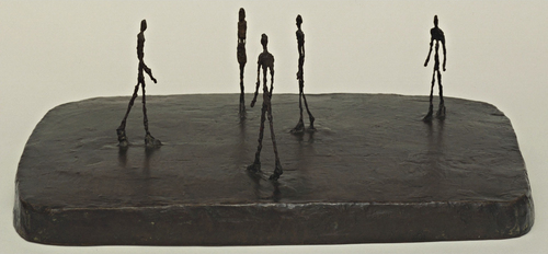
image: City Square, 1948, via moma.org