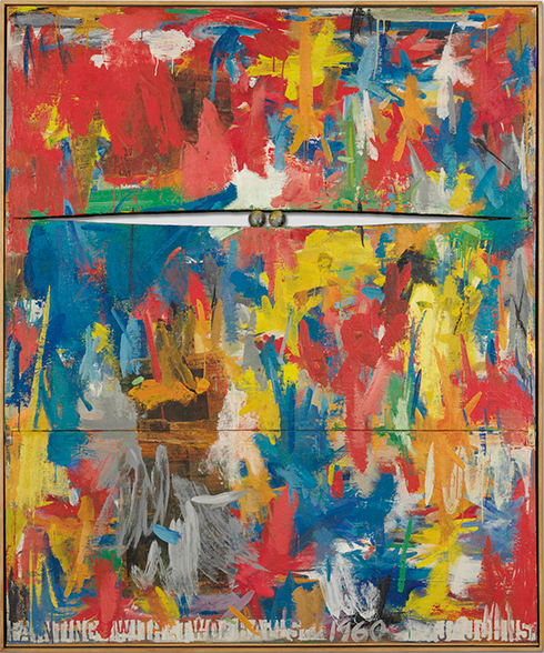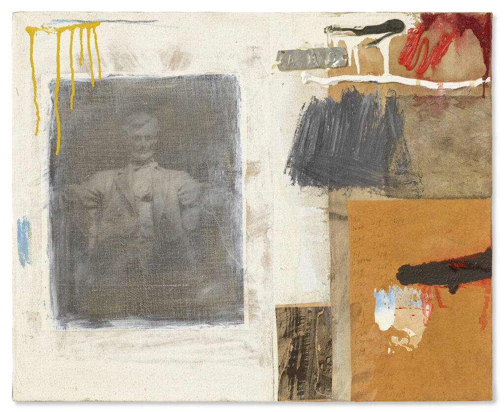
Trying to trace the whereabouts of Jasper Johns’ 1960 Painting With Two Balls around 1987, when Sturtevant made her Johns Painting With Two Balls, I note that it was reproduced in color in Michael Crichton’s catalogue for Johns’ 1977 Whitney Museum retrospective.
From the notes in the Jasper Johns Catalogue Raisonée, I see that the painting has been on loan to the Philadelphia Museum of Art, beginning March 1979.
Also, that some of the collage pieces date from December 1959.
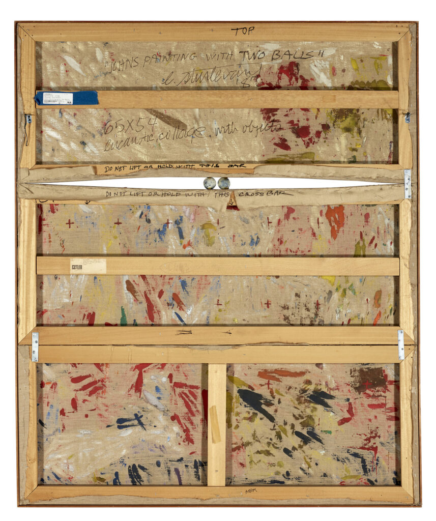
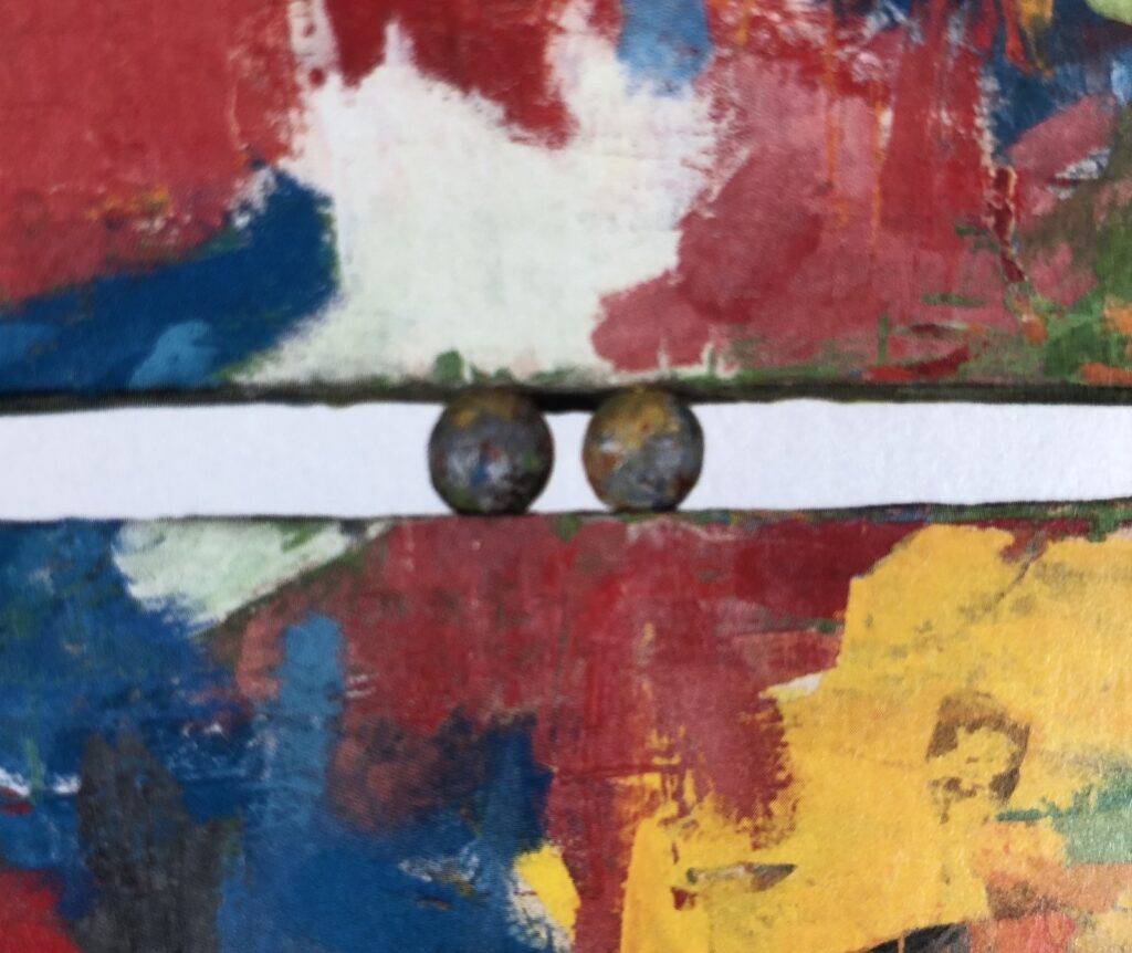
Also, the construction is as follows: “four mending braces are attached to the canvas with screws, and a strip of wood runs under the bottom edge of the painting.” [Sturtevant’s version has no such strip.]
Also, THOSE ARE NOT JASPER JOHNS’ BALLS. THE BALLS WERE STOLEN. TWICE. AND REPLACED. TWICE.
When the painting returned from a traveling exhibition in November 1962, the original balls were missing and had to be replaced.
That exhibition, 4 Americans: Jasper Johns, Alfred Leslie, Robert Rauschenberg, Richard Stankiewicz, traveled from the Moderna Museet to the Stedelijk to the Kunsthalle Bern, presumably went off without incident until the end. Presumably, the artist made the replacement balls.
The second set was later stolen while the painting was on view at the Venice Biennale in 1964. According to the artist, the balls were replaced again and paint was applied to them with his approval.
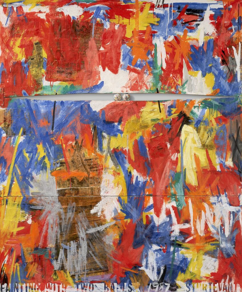
So these balls were handled by Italians. They are, in fact, Italian balls. Palle di Venezia. Meanwhile, four of Jasper Johns’ balls are on the loose, last known location: someone’s pockets in Europe. Keep an eye out, I guess.