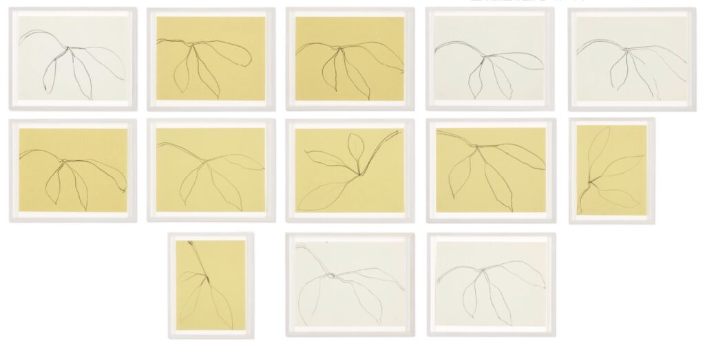
Ellsworth Kelly, 13 Drawings, 1979 8.5 x 11 in each, graphite on paper, marked “EK 1-13 JAN 25 79” on the verso, to be sold at Christie’s NYC on March 10, 2023, with an estimate of USD 300-500,000.
It’s late January. It’s cold and gross back home, but you’ve gotten away. You’re at the beach. Let’s say St. Maarten. The house fits a few friends. It’s quiet, peaceful, relaxing, private. Or maybe it’s joyous, raucous, uninhibited, and freeing. Honestly, I don’t know, I wasn’t there. One morning before breakfast, or maybe it was a late afternoon after a hot day at the beach, you notice your friend Ellsworth sitting on the edge of his lounge chair, facing away from the pool and toward the rhododendrons. You don’t disturb him. As you’re about to drive him to the airport, he presents you with a sheaf of drawings, a token of thanks for a wonderful visit. You cherish those drawings and the memories they evoke for 44 years, then you sell them at Christie’s for half a million dollars.
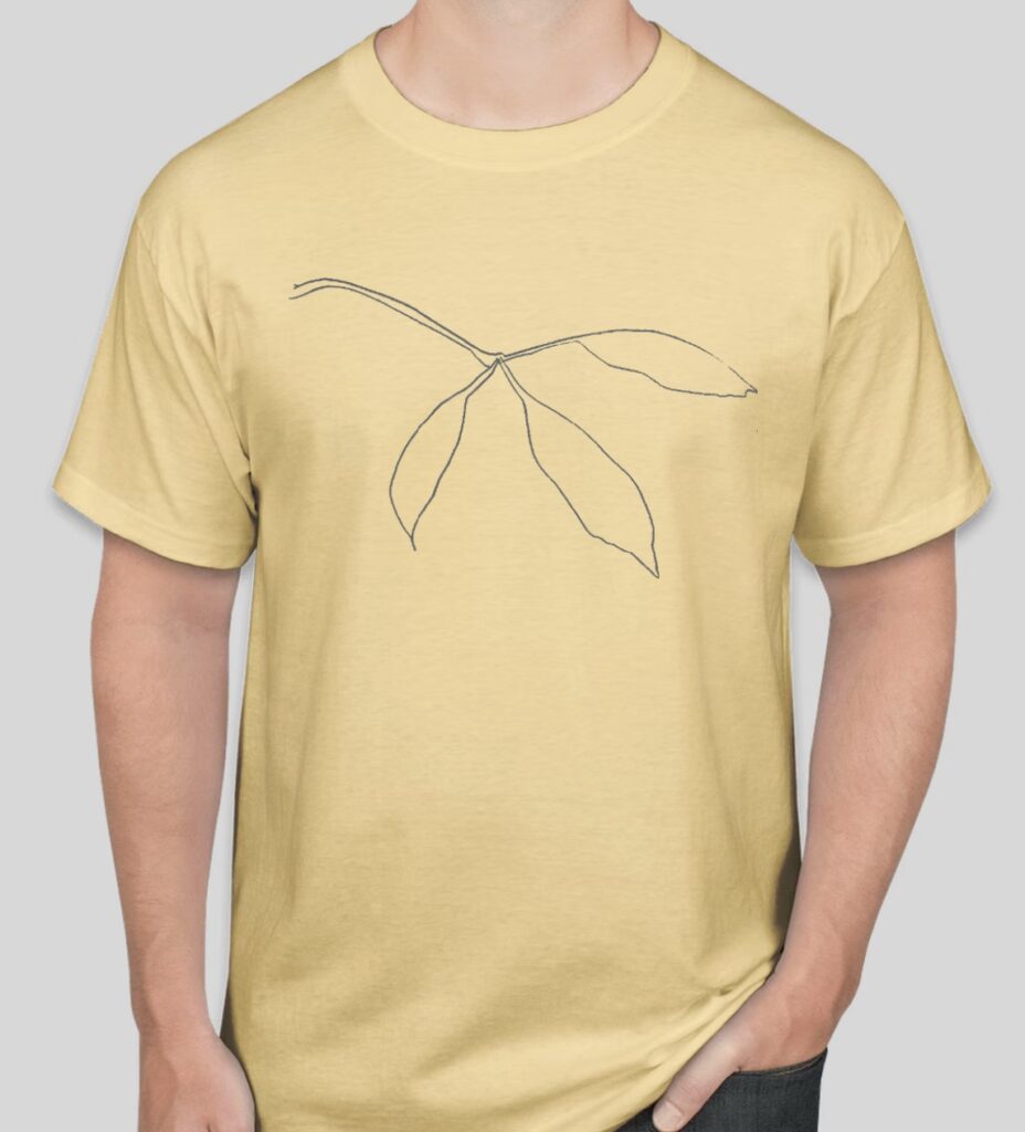
EK 10 MAR 23 T, 2023, silkscreen on Hanes Authentic T-shirt, $30 or $40, shipped.
Everyone marks the 100th anniversary of Ellsworth Kelly’s birth differently. Some people organize a massive, traveling exhibition. Some sell the stack of plant drawings Kelly gave them from January 25, 1979. And some people celebrate the sale of those drawings with a T-shirt.
The EK 10 MAR 23 T is silkscreened on daffodil yellow Hanes Authentic T, and is accompanied by a hand-signed and numbered certificate of authenticity. The shirt will be available only until the completion of the sale of Lot 139, Ellsworth Kelly, 13 Drawings, at Christie’s New York, this Friday, March 10. The sale starts at 10AM Eastern, with Lot 101. After the sale ends, two shirts will be available, upon proof of ownership, as a prize for a successful bidder—or, worst case, as a consolation for an unsuccessful seller. Otherwise, get your orders in before like 10:30 Eastern?
[Note: If the project reaches a breakeven number of 10 t-shirts, it’s a go, otherwise I’ll refund everyone and cancel it. This is the first shirt project I’ve done since Elmugeddon, and I frankly have no idea what my social media reach is these days. Or what t-shirt fatigue may be setting in, for you or for me.]
The shirt is $30 shipped in the US, and $40 shipped worldwide. Order an EK 10 MAR 23 T via PayPal until the morning of Friday, March 10, 2023:
[morning of Friday, March 10, 2023 update: the drawings failed to sell at a top bid of $220,000. Please accept two t-shirts as your consolation prize, dear seller, and thank everyone else for engaging!]
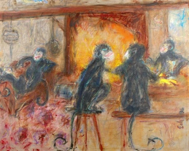
It is by fashion illustrator and creative director Joe Eula, and it’s huge, maybe the biggest work of his I’ve ever seen—because I’ve never been able to find images of the giant Eiffel Tower scrim he painted on the fly for the Battle of Versailles in 1973 after discovering the backdrops he’d made used inches instead of centimeters, and so they didn’t fit.
But the size only underscores the wtf-ness of the subject: these are life-sized monkeys at the bar, and lounging in the club chair under a disco ball [?] in the country house next to what looks like a roaring fire? And those monkeys, according to Doyle, the auction house that sold this painting in 2006, those “abstract monkey figures represent Bobby Short, Elsa Peretti, Mrs. Glenn Bernbaum and Joe Eula.”
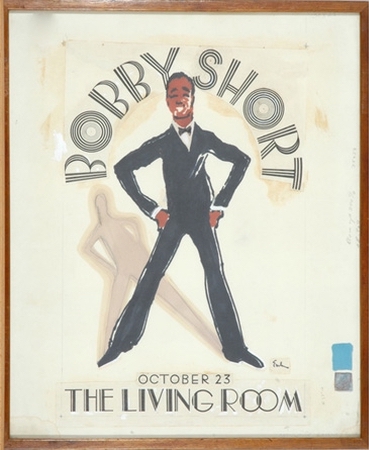
Joe Eula, Bobby Short at The Living Room, 17.5 x 14.5 in., ink and watercolor on paper, sold with a sketch of Lou Rawls at Doyle in 2006 for just $780
Bobby Short, we know, of course. In fact, his friendship with my family, and the presences of Eula’s poster of him in my mom’s basement, was the first Google search that led me to this monkey business. [Turns out the original sketch for that poster sold at Doyle, too, for not much at all. I really wish I’d known. You out there? HMU!]
Of course, Short was friends with everybody, including Eula—who, like Elsa Peretti, was extremely close with Halston—and [Mr.] Glenn Bernbaum. Short might have been the only Black person who could regularly get a table at Bernbaum’s restaurant, Mortimer’s. But though I did a spit take and a doublecheck after seeing this painting, there very much was no Mrs. Glenn Bernbaum.
Bernbaum’s meanness, snobbishness, racism, alcoholism, and anti-Semitism, along with Short’s relentless, performative, anti-sensual charm, all stem from the same thing: the ingrained personal discomfort at the precarity of being gay and Jewish or Black among the ruling class of a systemically racist and homophobic society.
The Doyle auction included 42 lots of Eula material, which makes me think they were from his collection. Nothing else sheds any light on this painting, though. Was it a weekend visit of friends to Eula’s house in Hurley, NY? The late date, 1996, was not long before Bernbaum died. Eula died in 2004, and Short in 2005. Short’s own estate auction at Christie’s included large amounts of African art and furniture, as well as racist artifacts from the US Jim Crow era of his youth; I think he had a not-unsophisticated view of the implications of his closest friends depicting him—and them!—as monkeys, even if today it fees like All Monkeys Matter.
But where did this painting live? Who saw it? How did it come about? Did Glenn Bernbaum actually have quiet, goofy weekends with friends where he could just be? Elsa Peretti, the last monkey standing, died in 2021, so the chance for a firsthand account is gone. [few minutes later update: Perhaps Cathy Horyn, who wrote the book on Eula in 2014, and hung out at his Hurley house, knows something about this monkey painting business.]
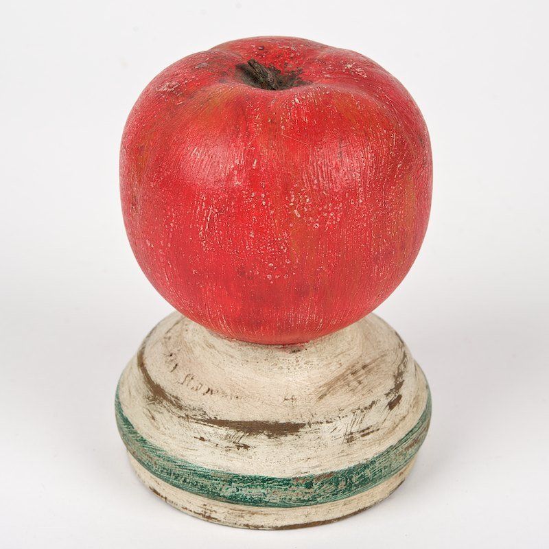
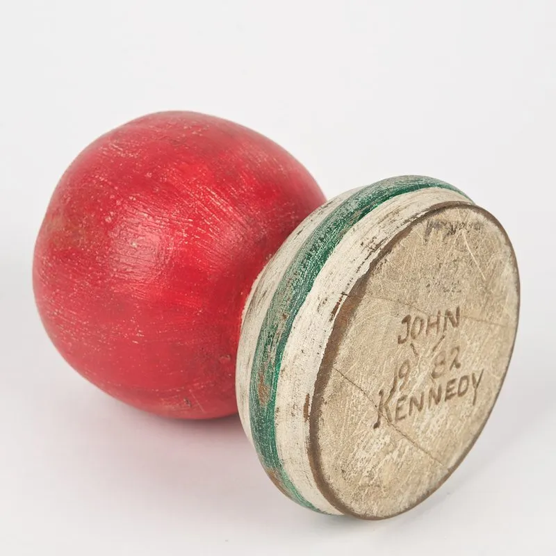
In 1982 John F. Kennedy, Jr. was a senior in American Studies at Brown, living off campus in a house with, among others, Christiane Amanpour. Under what circumstances would he make…this? It looks like the top of a newel post on a stairway, except it has to be carved, not just turned. And while newel posts are topped with balls, acorns, and even pineapples, I have never seen one topped with apple apples. Also it is painted and distressed. And signed on the bottom which, if it were meant for a newel post, would be invisible forever, a secret revealed only to future carpenters.
But imagine you can conjure a scenario where JFK Jr. made this. Now think of the situation in which John-John gave this little painted apple objet to legendary cabaret star Bobby Short [RIP 2005].
I mean, I don’t doubt they knew each other, such as these things go. Short was certainly friendly with Kennedy’s mother and aunt. But how? When? Why? Did he take a woodworking class at Brown, and made all his Christmas presents that year? In which case, how is this the only one? Or the only one to come to light?
This painting, Mathis, from 1983, strikes me as a very good transitional painting, and was recognized as such by a serious collector who kept it for decades. That did not, apparently, drive interest to the level Phillips had estimated, and so all the work of contextualizing this painting was at risk of being lost, or at least under-appreciated. Not now though.
After his $69 million sale of a work and an nft at Christie’s in 2021, no one in the self-policing art world went harder after Beeple’s attention than Carolyn Christov-Bakargiev. CCB curated one of the most off-the-charts Documentas, and now runs the Castello di Rivoli in Torino.
When CCB released a Zoom video of her first conversation with Beeple, whose actual name is Mike Winkelmann, I watched it and concluded that his pose of ignorance and indifference toward the art world of galleries and museums—as totally distinct in his view from the online/digital communities and platforms where he’d been releasing his art for years, or the 3D projection wrapping and CG graphics world of his profession—was in fact a pose. He toggled between claims of not knowing an artist or anything about art, and of standing in front of paintings in galleries for hours. In any case, he decided his best response to the sudden interest of dealers, curators, and artists was to neg the art world that only started paying attention because of his record-setting auction result. CCB was one of the most persistent and credible counterparts, but I didn’t realize the extent. When CCB tweeted yesterday that her latest conversazione [sic all the way through] with Beeple was out, I misinterpreted it as the second.
Against all manner of better judgment, and only because I guess I like pulling blocks out of the jenga tower of my admiration for CCB, I went back to listen to the actual Episode 2. OF SEASON 1. Of her conversazioni with Beeple. About an hour into the 2-hour ep, I started taking tweet-sized notes, since there seems to be no other record of this glitch-looping trainwreck even happening. I gathered the tweets below, and will probably keep listening, and documenting, if only because CCB’s Curating for Dummies tutorials are probably worth noting.
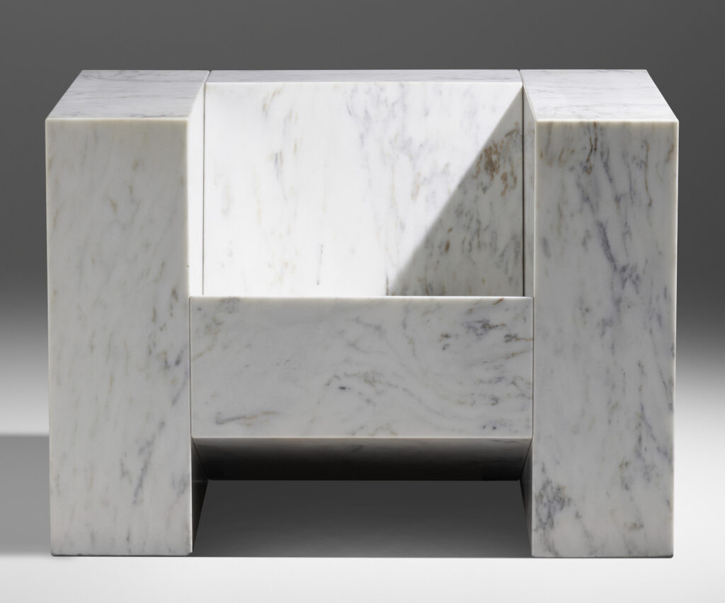
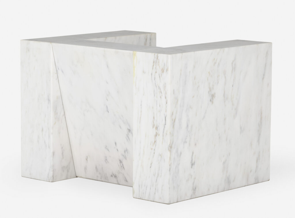
Scott Burton, Marble Armchair, 1987-88/89, Vermont Danby Marble, for sale
The Danby Quarry in Vermont provided the marble for the Jefferson Memorial; the US Supreme Court Building; the Beinecke Rare Book & Manuscript Library at Yale; and the seating on the third redesign of the Jacob Javitz Plaza in lower Manhattan after the destruction in 1989 of Richard Serra’s Tilted Arc. Also in 1989, four 9-inch thick blocks of Danby were used to make this, the second Marble Armchair in an edition of three, by Scott Burton.
Last September at RogerEbert.com, Soren Hough interviewed Swiss director Cyril Schäublin about his new film, Unrest, which was then in the New York Film Festival. Unrest is about a mountain community of anarchist watchmakers in the 19th century. It sounds fascinating, both for its content, but also for how it was developed and produced, in an exceptionally decentralized, collaborative, mutual aid-inspired mode inspired by its cast of predominately non-actors, but also by the ideas of one of its characters, the Russian anarcho-communist Peter Kropotkin.
SH: It sounds like your natural aesthetic instinct tied well into this particular story where you, as you say, have this big name in “Unrest”—Peter Kropotkin. He’s not in a huge amount of the movie, he doesn’t have that many lines, he’s not a central character, and it’s certainly not a biopic.
CS: The guy who acts as Kropotkin (Alexei Evstratov) is a very avid Kropotkin guy. I mean, he’s really into him. And he said to me at the end, “I didn’t say that much!” But he told me the way we were doing the film, and how the film was organized, and how we talked to each other, he felt [it took a] mutual aid approach. That was really interesting for me.
Schäublin talks, too, about the desire to understand and depict the experiences of the women in his family, his ancestors, who worked in watch factories, but also the difficulties in doing so, especially for 19th century people:
it’s much easier to reconstruct male biographies [from the 19th century] than female biographies. I thought, “What can I show of women, like the women in my family who did that work?” The only thing we can reconstruct is their work. People today that go to watchmaking schools still learn how to build a watch from the 19th century—that’s the start of the school. So you can reconstruct the manual labor, but not the biographies—what we call biographies.
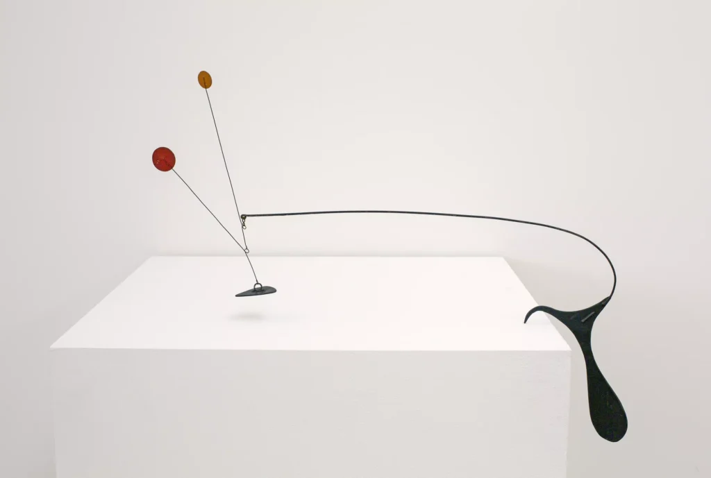
Alexander Calder, Little Mobile for Table’s Edge, c. 1939, sheet metal, wire, and paint, 19″ × 24″ × 1-3/8″ (48.3 cm × 61 cm × 3.5 cm), image: Pace
A two-artist show, “Calder/Tuttle: Tentative,” just closed at Pace LA today. Richard Tuttle made sculptural and spatial responses, or recontextualizations, to a series of works by Alexander Calder. I’d first seen someone criticizing it, but to look at the installation shots, I’d say it’s a fresh and interesting way to see both artists’ work.
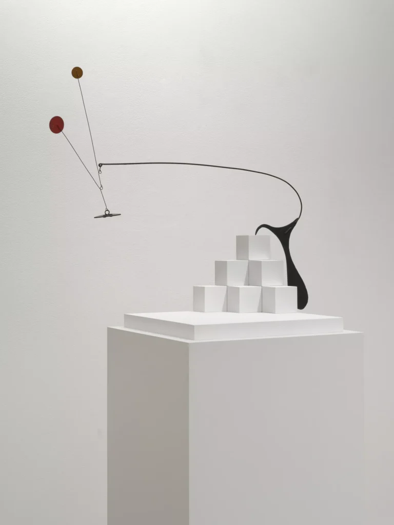
The Calders are nice enough, but the one above, Little Mobile for Table’s Edge, is exceptional, a mobile that sits like a stabile. Tuttle’s response?—Solution? Proposition? Alteration? Companion? I am undecided what the word should be. In this too-brief video, Alexander Rower calls them vessels, while Tuttle calls them pavilions or frames, none of which apply here.
Tuttle took the mobile off the table’s edge and put it on a sculptural plinth, with a Q*bert-friendly corner of square blocks. As the show’s press release explains, “On a formal level, Tuttle explores enactments of verticality and horizontality—as well as plays of light and shadow—in Calder’s work,” as he focuses “on the space discovered in the mobiles.”
Richard Tuttle enactment [?] with Calder mobile, as installed at Pace LA.
I assume whoever is buying one is buying both, if they can. If you, too, missed it, no sweat; there will be a book.
A companion presentation of Tuttle objects—works of and on paper—made in response to Calder and his work’s context ran concurrently at David Kordansky.
[next day update]: roaming through the Calder Foundation’s archive, it appears that this was the first of only two or three mobiles Calder made with this type of hanging-off-the-table dynamic. Orange Under Table is a much larger mobile from 1949, now in the collection of the MCA Chicago. Meanwhile, the tiny 1948 work, Toadstool With Feather, hangs a counterbalanced feather off the edge of a toadstool disc balanced at its center, putting the “table” element itself in motion. Scrolling through Calder’s oeuvre, it becomes clear that he used or revisited some mobile dynamics often. This is not one of them. I wonder why.
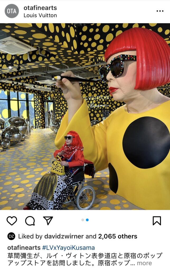
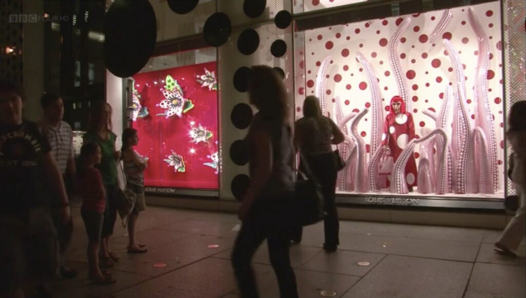
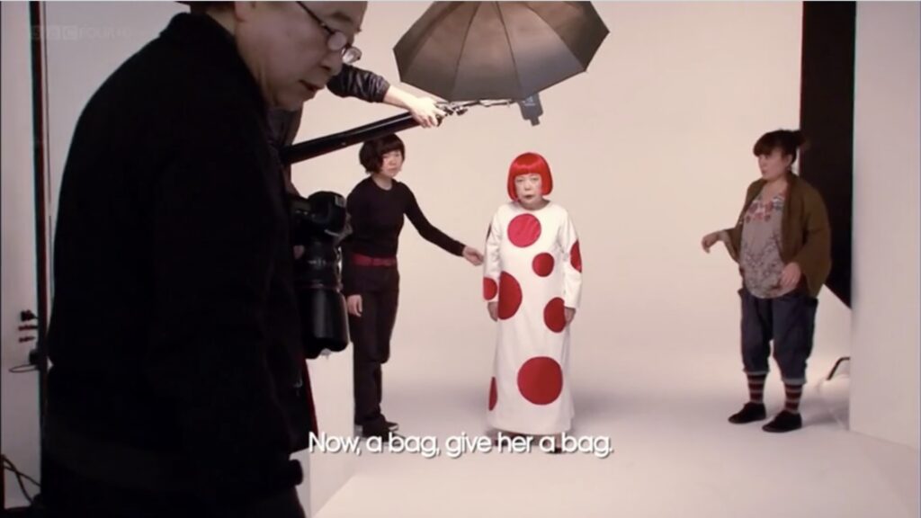
Kusama, an LV X Kusama scarf and bag on her lap, personally oversees every dot on the second floor of her immersive LV X Kusamaverse pop-up store in Harakuku. Image: Ota Fine Arts IG
Let’s stipulate that the artist either approves or at least knows about it. She’d certainly recognize it. But what exactly is going on with the Kusama X Louis Vuitton collaboration? To find out, I turned to an expert [whoever rewrote this December 2022 press release for Hypebae]:
The collaboration comprises ready-to-wear, bags, shoes, luggage, trunks and fragrances, set to launch in two distinct parts. The first drop is set to feature Kusama’s “Painted Dots,” “Metal Dots,” “Infinity Dots” and “Psychedelic Flower” collections, with a second drop due to launch a few months later. The application of every dot on each piece has been personally overseen by Kusama, alongside many of the objects that make up the partnership, with a distinct focus on precision and detail.
Ota Fine Arts Instagram post of Kusama visiting the Louis Vuitton Omotesando store and Harajuku pop-up, 20 January 2023, confirming that the artist is indeed aware of the collab.Kusama mannequin installed at the NYC 5th Avenue Vuitton store in 2012, still from NHK/BBC
This will be one of two posts about the current collaboration between Yayoi Kusama and Louis Vuitton. The reaction to the current campaign feels different from the original 2012 campaign. There is concern over how much the 93-year-old artist was involved in the collab, given its vast scale and its hundreds of related products, or even if she is aware of it. This concern was exacerbated by photos on Instagram of a collector posing with a seemingly disoriented Kusama in her hospital, which were particularly at odds with the elaborately styled and carefully managed character she presents at her public appearances.
Kusama being photographed holding various Louis Vuitton products in 2012, image: NHK/BBC
This worry of exploitation of an artist by, in this case, a cabal of dealers and a the world’s biggest luxury goods company owned by the world’s richest man, is valid, but not easily addressable. I don’t know how this deal went down, or who gets what from it, except that it is clearly massive, and involves the concerted, sustained efforts and investments of some of the most powerful people in the art, fashion, and retail industries. It seems significant that the content of this collab is based, not on new work or effort by Kusama, but by an existing product—literally one object, a painted trunk—from the 2012 campaign. [The second post will be a closer look at what is actually happening on the ground, which goes far beyond animatronics.]
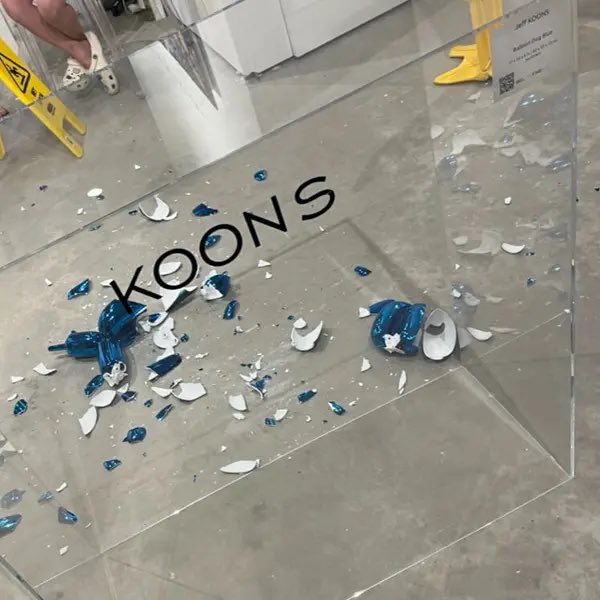
a photo from the gallery that shows loose porcelain tchotchkes on concrete floors, via damon k
A woman knocked a chihuahua-sized Jeff Koons porcelain balloon dog off its unsecured plexi pedestal, and it shattered against the concrete floor.
The dog was made in 2021 in an edition of 799 plus 50 AP by Bernardaud, Limoges. One was flipped last April at Christie’s. I don’t really care right now where this happened, or why, or who was involved. I’m just glad for an occasion to hear Meryl Streep say, “My Limoges!”
[update: I’ve read a couple of stories and seen more headlines, and the eagerness to make cynical, uninformed, and clichéd takes is actually pretty impressive. The woman said she was a “collector” attending a “VIP preview” of an “art fair” ON A THURSDAY. The chain of galleries in whose Wynwood pop-up this happened has more locations than Gagosian, which they probably think about a lot. Meanwhile, despite having all the same Bernardaud in his shop, Larry’s never heard of them.]
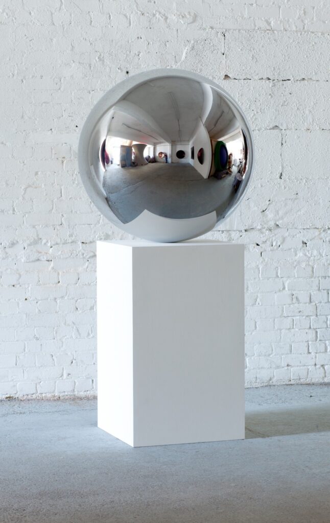
Anish Kapoor, Untitled, 2009, 100 x 100 x 100 cm stainless steel sphere on 100 x 60 x 60 cm base, ed. 1 of 9, for sale at Sotheby’s London on 2 March 2023, Lot 387, est. GBP 60-80,000
So you’re telling me that in 2009, two years after I started spinning about satelloons, but two years before he filled the Grand Palais with Leviathan, Anish Kapoor made not just one 1-meter stainless steel sphere, but nine? And I’ve never seen one until now, and that’s the one he donated to Trudie Styler’s charity dinner in 2011?
What’s that? The provenance lists The Aspinall Foundation & The Ecology Trust Charity Auction on 24 March 2011, but tactfully omits the more common name of the event, the Ormeley Dinner? And the sphere, ed. 1 of 9, sold for £420,000 [nice], reported Trudie as she and Sting sailed on a schooner “from the French Riviera to our [their] Tuscan villa, Il Palagio“? And now the sphere has an estimate of 1/8th of that? How did I miss all this?
Anish Kapoor, Tall Tree and The Eye, 2009, 13 x 5 x 5 m, 73 stainless steel spheres, including some that look like they could be a meter across, installed at Leeum in 2012-13, image: anishkapoor.com
Was it perhaps just left over from Tall Tree and The Eye, also from 2009? Did it fall off the Tree after it was installed in Bilbao in 2010, but before it moved to Leeum in Korea in 2012? Suddenly ed. 9 feels small.
[update: sold for GBP 266,700. amazing. do they get to write off the loss as a donation to Sting’s wife now?]
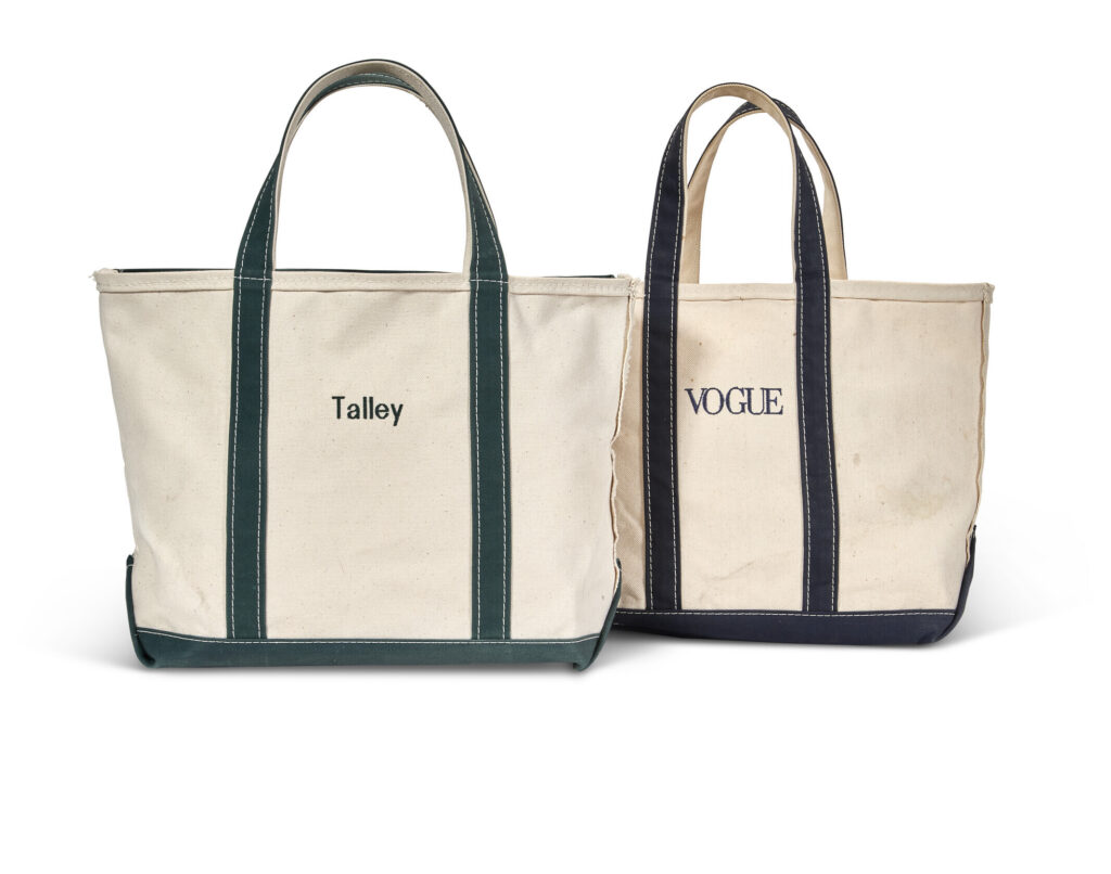
Lot 387, LL Bean canvas tote bags, c.2010, H28cm, from the Estate of Andre Leon Talley, sold for $2,520
This is the one bag I actually kind of wanted from the sale of Andre Leon Talley’s estate. And yet it felt like it was so not his style. OTOH, “includes a Christie’s dustbag,” so they made it hard to resist. But it also included a VOGUE tote bag, which made it easier. RIP.
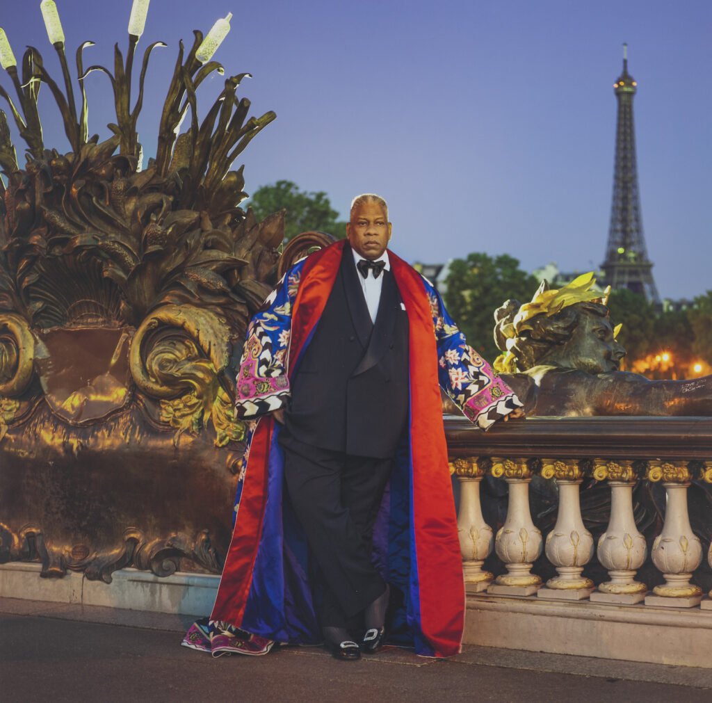
Does this look like a Chevalier de l’ordre des arts et des lettres who’d use a 12-inch LL Bean canvas tote? photo by Jonathan Becker sold, but Tom Ford kimono didn’t, innnteresting.
“It’s like living art history while trying to study it,” I wrote in 2021. Today I’d say clocks keep ticking, in sync or gradually not, but understanding comes in quick bursts, sometimes in the comments on Instagram.
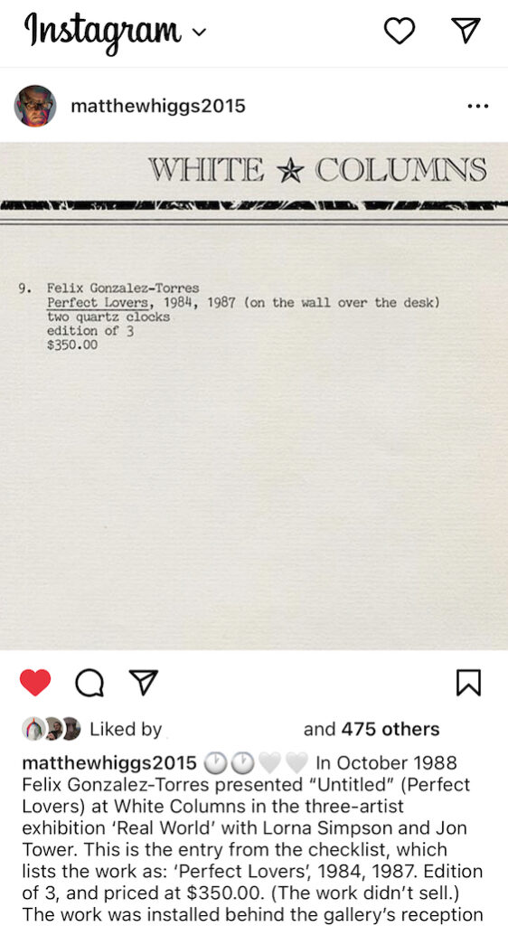
White Columns director Matthew Higgs’ Valentine’s Day post was of the original 1988 checklist entry for Félix Gonzalez-Torres’ work, “Perfect Lovers,” which consisted of two 9.75-inch diameter quartz clocks installed next to each other over the desk:
🕙 🕙🤍🤍 In October 1988 Félix Gonzalez-Torres presented “Untitled” (Perfect Lovers) at White Columns in the three-artist exhibition ‘Real World’ with Lorna Simpson and Jon Tower. This is the entry from the checklist, which lists the work as “Perfect Lovers”, 1984, 1987. Edition of 3, and priced at $350.00 (The work didn’t sell.) The work was installed behind the gallery’s reception desk. This was, I believe, the first public presentation of the work, and the checklist is the only time I have seen it dated this way, ie. “1984/ 1987.” (The Wikipedia entry for the work lists its dates as 1987-1990, and suggests it was first shown at Jay Gorney’s gallery in 1990.) 🕙 🕙🤍🤍 #perfectlovers @felixgonzaleztorres.foundation @white_columns @davidzwirner @andrearosengal @jaygorney1 #valentinesday
I responded that the catalogue raisonné did list White Columns’ 1988 show as the first exhibition of “Untitled” Perfect Lovers [cat. 108], with a date of 1987-1990. But that an in-process page of the Foundation’s website says that work was a separate work—now not classified as work—titled “Perfect Lovers,” with the dates 1984/1987. [The CR lists “Perfect Lovers” as A25, with a date of 1987.]
Then who weighs in on Higgs’ post but Bill Arning, who was the director of White Columns at the time, who curated the show—and who typed the checklist:
The work was not planned to be in the show at all during our studio visits but right before we were done installing Félix walked in with a bag, and he had bought the two clocks on his way that morning. They were not fancy clocks at all, little plastic things, and FGT asked if he could hang them over my desk and he did, and then explained the concept of the piece to me so I added them to the checklist. it is always shocking how casual grand moments in art history actually are when you[‘re] living through them.
“Any recollection of how the date 1984 came about? Was this an idea he’d had at the time or for a while?” I asked.
“I know he specified it but I don’t remember the argument—working with him require a belief that he knew what he was doing,” Bill replied.
Indeed it does. Indeed it does. So while we don’t know why the date 1984 is attached, we know Félix knew. Which is something. Knowing that he lived and loved with an awareness of time, of sharing it, of conquering it, of marking it.
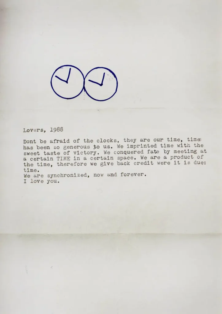
Lovers, 1988, a note written to Ross Laycock, who Félix met in 1983.
The CR listed “Perfect Lovers,” as “signed, titled, dated, and numbered 1/3” on the back of each clock, and in the collection of Jorge Collazo. Perhaps this is the source of the 1984 date. These don’t sound like the same clocks Félix pulled out of a bag on the way to White Columns, and which are still there somewhere, at least through 2009. So now we can assume there is another (pair).
“Untitled” (Jorge), 1992, c-print, 75×100 cm, Collection Goetz via FG-T Foundation
Collazo is mentioned several times in Félix’s oeuvre, as the owner of images used in billboards, and presumably as the Jorge in letters turned into puzzles and photographs. And the the artist’s published bio, “1991 Jorge stopped talking to me, I’m lost—Claudio and Miami Beach saved me.” and on the back of a puzzle given to another friend, “Sunlight over the water in between Key West & Miami – trip with Jorge,” which the artist also used for a photo work, “Untitled” (Jorge), 1992. Who another friend Jim Hodges described, in his 2009 artist statement at the FLAG Foundation, as “a missing friend who was often mentioned.”
Maybe an answer is there. With Jorge, or on the backs of his clocks. It all really makes me want to sit people down and ask them questions, and record their memories, and their experiences, while there’s still time.
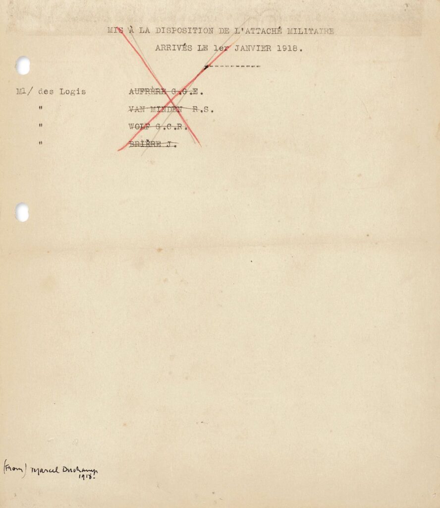
French Military Paper, (from) Marcel Duchamp, 1918, offered for sale at Christie’s 0n 28 Feb
Marcel Duchamp’s French Military Paper, a readymade of sorts, unpublished until after the artist’s death, and shown only once, as Untitled Ready-Made, in Zurich and Paris [I guess that’s twice, but the same Dada show], is for sale at Christie’s in a couple of weeks. It is a checklist Duchamp made—do we know he made it, or did he just bring it home?—while working as a secretary to a captain in the French Purchasing Commission in New York:
The sheet records the names of four military attachés in the French Purchasing Commission who arrived on 1 January 1918, and required suitable lodging during their stay in New York. The subsequent inked crossing out of the names, and the final X in red over the height of the typescript, suggest that all such considerations had been attended to, and there was nothing further to be done. Possibly contravening whatever security precautions may have then been in force, Duchamp took the document home. No other work of this kind appears in the artist’s oeuvre.
This was a period when Duchamp was exploring the nature of the Readymade, classifying things by signing them. Things like the Woolworth Building, a mural painted by someone else in the residents’ restaurant at the Hotel des Artistes, and, apparently, some expired paperwork from his temp job. And whether it mattered that something was classified as “from” or “by” him. By the time he got to the Boite en Valise, of course, he said, “de ou par,” why choose?
Which is interesting—or at least significant, because this work seems intentionally and almost radically boring, about as non-retinal as you can get—and maybe the reason Christie’s had to add the torn-from-today’s-headlines speculation that maybe Duchamp took classified documents home with him? The ghost of Marcel Duchamp appearing at Mar-a-Lago and saying, “Don’t drag me into this!”
[update: sold for a bid of 110,000, GBP138,600 with premium.]