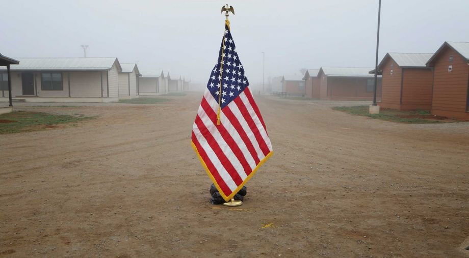
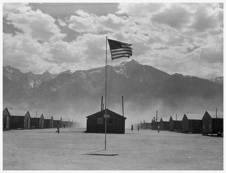
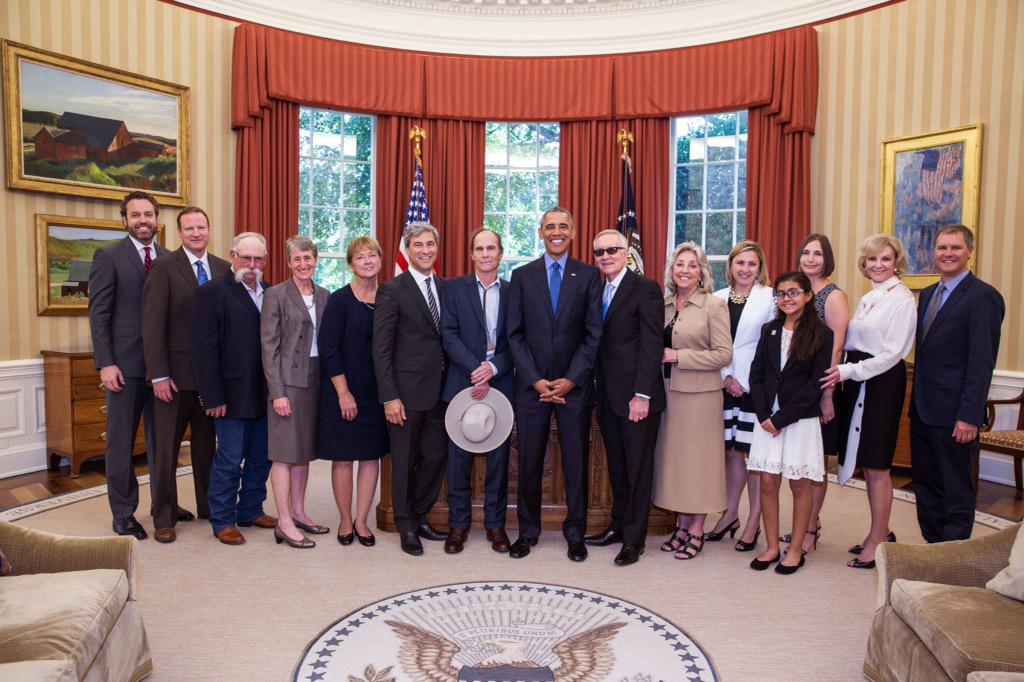
Based on this photo at the opening of the world’s largest family detention center in Dilley, Texas last January, I’d say San Antonio Express News photographer Bob Owen is very familiar with Dorothea Lange’s photos from the Japanese American detention camp at Manzanar, CA. It’s almost like the only thing that’s changed in this country since WWII is now the government outsources its illegal, immoral detention of non-white children to a giant, for-profit prison company.
And what do kids do in Dilley, besides get dangerously incorrect vaccinations and medical treatment?:
While children wait for their mothers to talk to lawyers and legal aids, they are usually watching kids’ movies dubbed in Spanish, namely Rio or Frozen. The children of Dilley, like children everywhere, have taken to singing Frozen’s iconic song “Let It Go.”
The Spanish-language refrain to the song “Libre soy! Libre soy!” translates to “I am free! I am free!” It’s an irony that makes the adults of Dilley uneasy. Mehta recalls one mother responding to her singing child under her breath: “Pero no lo somos” (But we aren’t).
Do you know the chorus of “Let it Go” in Spanish? I did not, but it is one helluva song for kids to be singing in a corporate prison in 2015:
Libre soy, libre soy
No puedo ocultarlo más
Libre soy, libre soy
Libertad sin vuelta atrás
Y firme así me quedo aquí
Libre soy, libre soy
El frío es parte también de mí
I am free, I am free
I can’t hide it anymore
I am free, I am free
Freedom without turning back
And I’m staying here, firm like this
I am free, I am free
The cold is also a part of me
Oh no, I was too slow. I was in the middle of a deadline-intensive project when I suggested that. While I understood the reluctance, even the revulsion, an artist might feel, but being compelled by a judge to make a “large and impressive” artwork–and a $350,000 one, no less–sounded like a fascinating situation. What would you do?
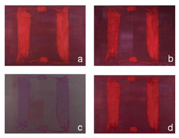
…, 2015, oak and polychrome Madonna and child, French Early Gothic 1280- 1320; marble torso of Apollo, Roman workshop, 1st-2nd century ad; steel 154.2 × 50 × 50 cm
Courtesy of the artist and Marian Goodman Gallery [works list (pdf) via palazzograssi.it]
Well, today, just as I was mapping out the parameters of my own proposal, Danh Vo apparently answered that question himself. His proposal to Dutch-in-Switzerland collector Bert Kreuk was a little unclear in the details, but it involves a quote from the demon possessing Regan in The Exorcist, which Vo had also used for a piece in his show at Marian Goodman in London last January, and which he included in “Slip of the Tongue,” his fantastic group show at Punta della Dogana in Venice. [I guess it’s still available. Ask for it by name!]
Maybe Vo already had this whole Kreuk/Gemeentemuseum/lawsuit situation on his mind when he chose The Exorcist for his source material. Who knows? But the artwork parameters cited in the court’s new ruling in Kreuk’s lawsuit are intriguing enough to lay out, and at least give some though to the question: What Would Danh Vo Do?
John Cliett’s photo of Walter de Maria’s The Lightning Field, 1977, on the cover of Artforum (Apr. 1980)
From the beginning, access to The Lightning Field has been tightly monitored by the administrative machine surrounding the project. Visitors to the site are required to spend the night and are not allowed to take photographs during their stay. Indeed the entire project is predicated on the viewer’s personal physical experience of the work in its location. Yet, at the same time, the artist and his patrons have also sought to stake out a particular presence in the wider discourse of contemporary art for The Lightning Field, a goal they have accomplished in part through a carefully orchestrated approach to photographic documentation.
[John] Cliett worked from the beginning with De Maria on formulating the scheme for photographing The Lightning Field; many of the most often-reproduced images of the Field, including those which famously introduced it to the art world in the pages of the April 1980 issue of Artforum magazine, come from his two summer sessions. Indeed, that so many viewers have come to know The Lightning Field through these images–a fraction of the total he took, strategically promulgated over the years by the artist and Dia–emphasizes their essential role in the artist’s plan for shaping the image and promoting the “idea” of the work.
Well beyond the artist’s own writing, Jeffrey Kastner’s interview with The Lightning Field photographer John Cliett has been central to my understanding of the work since 2001.
Cliett told of taking the extraordinary, iconic, and extremely difficult pictures of The Lightning Field, but also of how images are antithetical to de Maria’s concept for the work. This contradiction between the artwork and the art system surrounding it generated tension similar to other Land Art. During the 1970s and 80s when Robert Smithson’s Spiral Jetty was considered “lost” or invisible under the Great Salt Lake, the artist’s film became the focus of critical attention.
De Maria felt that even this iconic imagery, which Cliett later jokingly compared to “a Pink Floyd album cover,” could only ever fail to communicate the experience of the work. “Walter’s work is designed to create an environment where a viewer can have a highly personal relationship with a work of art that is completely unique to each individual,” Cliett said.
But the images had another purpose, controlling the discussion of the work, as I was reminded when I re-read Kastner’s interview this summer:
With respect to the copyright, if you control the picture of a work of art, you will control everything that’s said about it, because nobody will publish an article without pictures. So you get the right to pick, and that’s a very powerful thing.
Yes, well.
After many discussions, dreams, and failed attempts over 22 years, we managed to get a trip to The Lightning Field together for this summer. We built the rest of our cross-country road trip around it and got home a couple of weeks ago. A visit takes basically 21 hours, starting at 2pm, no stragglers. Dia’s folks on the ground drive you to and from the remote site. There is room for six people in the cabin; in addition to our family of four, there was a young couple from Brooklyn.
I’m not sure when I decided to livetweet our visit to The Lightning Field, maybe after I started seeing people I knew from Twitter in the registry. Or when I read one excited, tweet-sized comment left by a dealer about soaking in the sublime, which seemed like a lot to feel before you even get there. And so as I was about to learn the difference between an image and an artwork, I started thinking about real and virtual, individual and network, living and publishing, an account and an experience, a livetweet and IRL.
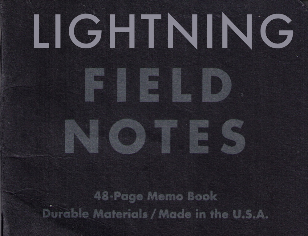
Without wanting to blow my actual encounter with The Lightning Field, I was interested to isolate what happens when you approach an experience with a livetweeting mindset: do livetweeters dream of 140-character sheep? Since there was cameraphones, and no hope of connectivity anyway, I decided to write my tweets down. My black Field Notes book looks very iPhone-ish, and I was quickly aware of being glued to it like any other screen, so I did not write every tweet in real time; I’d put some in my mental drafts folder and batch them.
There’s still a lot that didn’t make it in. Stuff I left out. But from there, also what de Maria left out. After several ventures into and around the Field, the artist’s almost total silence on the land itself is stunning. “The land is not the setting for the work but part of the work,” wrote de Maria, in bold, at the beginning of his Artforum essay. He wrote that the site was “searched by truck over a five-year period,” and that’s about it. The entire rest of his statement is about the hyper-precise calculations, surveying, and technical challenges of manufacturing and installing the poles. There are two pages of credits for the companies and construction workers involved.
Like Cliett’s photos, de Maria’s industrial fetish text was intended to manage the discourse around the work. No one could dismiss it as nonsensical, non-serious or unintentional. And it’s not some basement project, either; this is not your grandpappy’s mile of fence. Yet the only way to get around The Lightning Field is on foot, and the landscape makes you literally watch every step. And then there were the coyotes howling at sunrise, hoo boy, that was freaky.
I ended the livetweeting right before our ride came, but one of the most interesting parts for me was the drive back to town, and the conversation with Kim, the longtime Dia staffer who runs the guest program on the ground. I decided not to tweet that, though, just as I didn’t really mention our cabinmates too much. Besides basic respect for their privacy, I figure that’s also truer to the work: tweets aren’t reporting, but a reflection of a single, individual experience.
Once I had this notebook of tweets, I had to figure out what to do with it. I scanned them and figured I’d play them back, tweet them in real time. That idea quickly ran afoul of my schedule. I guess I could have set a script to automatically post them at the prescribed times, but instead I tweeted each by hand, beginning yesterday at around 2 o’clock New Mexico time. I didn’t anticipate the friction of overlaying this recap of The Lightning Field with my back-to-normal life. Where visiting The Lightning Field was an intensely physical experience, livetweeting The Lightning Field became all about time. I could not anticipate the next tweet accurately; I was always way too early. I got in trouble for tweeting at the dinner table. I realized only after I started that twitter-as-usual would kind of blow the whole thing, so I stopped retweeting and responding to people until it was done. [Sorry!]
I may work the tweets up into an edition, a facsimile notebook or something. Dan Perjovschi made a little sketchbook facsimile for Kunsthalle Basel a few years ago that I like, and Field Notes are the perfect on-brand readymade. Or maybe I’ll do some other project, involving barnwood, Hudson’s Bay blankets and yoga mats. I don’t know yet, but something’s sure to come of it.
If I had to make a list of photo ops I could never imagine, Michael Heizer standing alongside Pres. Obama and Sen. Harry Reid would be right up there. And yet here we are.
Heizer, along with LACMA director Michael Govan and others, gathered to celebrate the designation of the Basin & Range National Monument, which protects 704,000 acres of Nevada wilderness, ranchland, and Heizer’s decades-long project, City, from oil extraction or encroaching development. Spiral Jetty‘s on 10 acres. Lightning Field‘s on a few thousand, plus DIA’s bought up 9,000+ surrounding acres to protect the view. With 700K plus a high-powered entourage at the White House, it’s as if Heizer has out-Earthworked all the Earthwork artists with the biggest Earthwork on Earth.
[via @RepDinaTitus]
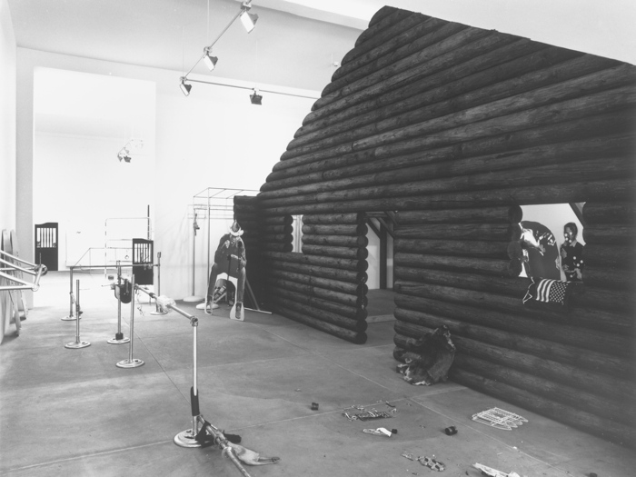
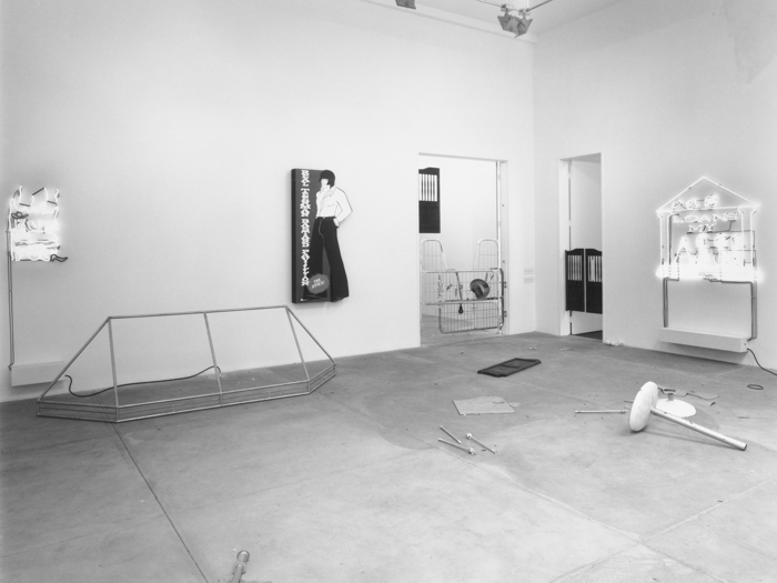
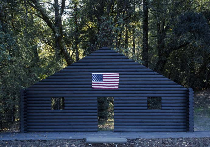
On July 7, 1990 Cady Noland opened a solo show at Luhring Augustine Hetzler, the NY- and Cologne-based galleries’ short-lived colabo space in Santa Monica.
Look at it, just look at it. Is there a better place than the end of the America for all this treasure to wash up? There is so much going on here.
Log Cabin Façades*, Cowboys, Oswald, and the SLA were all there, but there is so much we don’t see or hear about now: Neons. Naked Awnings. Broken down floor lamps. Saloon doors, What is that manly ad?
[2018 update: title has been changed. Though referred to and reported as Log Cabin, in a court affidavit filed 4/2/2018, the artist indicates the official title of the work being disputed with Michael Janssen is Log Cabin Façade. I believe this log cabin facade is actually the Stones’, Log Cabin Blank with Screw Eyes and Café Door (Memorial to John Caldwell).]
I basically never do this, but now I had to.
I dreamt it was a new Cady Noland piece. It involved a boat ride and possibly a flume or course of some kind. There was some line of people trying to figure out how to get into these pedalboats with six seats, seatbacks cut and folded into place, like kirigami, from a single sheet.
Someone who knew the deal motioned to me to come over onto a two-person kayak/kneeboard which was easier to maneuver because you paddled. she looked like a younger Mary Boone, though it was definitely not her, in a straight sleeveless dress and flats she didn’t want to get wet, so I went to get a couple more towels. She already had one under her knees and folded up onto her lap.
The towels were yellow and black Versace Home, but not so gigantic. I walked back up from the shore to where the towel attendants were, wondering if they’d even have more towels [because Versace], and they had stacks and stacks of them, it was an insane volume of towels.
A blackboard sign was perched on top of the leftmost towel tower, too creatively handwritten like a coffeeshop greeting:
BE DIVAS AND RIP OFF OUR TOWELS AND WE WILL COME AT YOU FOR $500 EACH
Maybe it was the vivid memory of this sign that prompted me to write this down.
I got a couple more towels and took them back down to the beach/shore, and not-Mary was already gone. The befuddled line of people trying to get on the pedalboats was not making much progress.
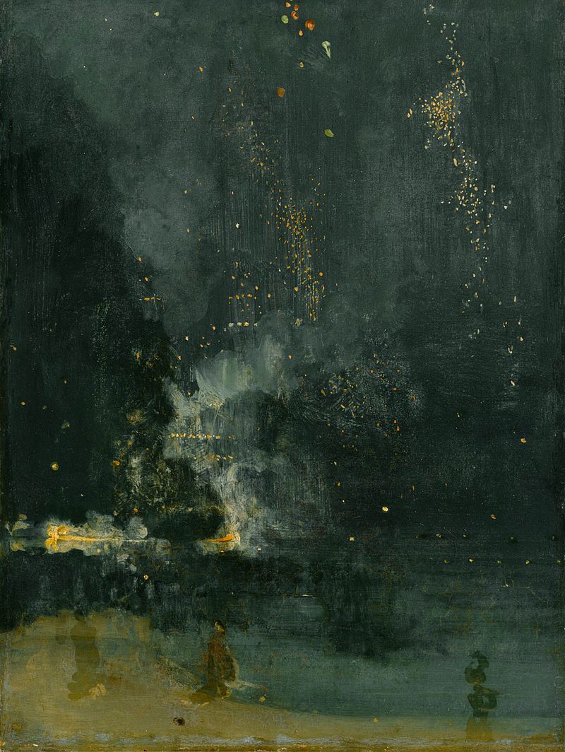
The setting was very clear, light, sand-colored shore, and darkened water and sky, but it didn’t feel like night. I tried to recall a painting that might correspond to the setting, and the closest I can get right now is Whistler’s Nocturne in Black and Gold: The Falling Rocket from the Detroit Institute of Art [above]. Maybe the title somehow informed the towels, is that how it works? I don’t know. I might need to feed this into Google DeepDreams when I get home.
It shouldn’t need to be pointed out, but I will anyway, that Ms. Noland was not involved in the conceiving of this piece and did not approve it.
[This is not the Cady Noland log cabin you’re suing for] Log Cabin Blank with Screw Eyes and Café Door (Memorial to John Caldwell) (1993), collection Norman & Norah Stone, image: stonescape.us
What is the deal with Cady Noland and her sculptures, especially this Log Cabin (sic) situation?
Which is not to say this Log Cabin. Let’s be clear, the Cady Noland sculpture above is not the one in dispute in Scott Mueller’s lawsuit against Michael Janssen Gallery. It is owned by the Stones, and is installed happily in Stonescape, their art vineyard in Napa. As of Saturday evening, Courthouse News, Artnet, Artforum, Art Market, and everyone who followed their initial report still has this basic fact wrong.
The facts about the sculpture’s history and provenance don’t line up to this work and this image, but you can’t expect a court reporter to pick up on that. The reason the Stones’ Log Cabin is mentioned or pictured at all is because it’s on Google, whereas Wilhelm Schuermann’s is not. [Courthouse News and everyone also got the basics of the refabrication wrong, and that matters, and it is because people don’t read the primary material, they just go with whatever.] But Mueller has attached the sales agreement as an exhibit to his suit, and it includes a 2-page information sheet on the artwork itself [“Artwork Description And Provenance”] that leaves no doubt what it is, where it’s been, who owns it–and some of what happened to it. I assume it was prepared by Janssen in cooperation with Schuermann. [Download it and read along: schuermann_noland_log_cabin_appendix.pdf]
OH IT GETS BETTER 25 June 2015 UPDATE ALSO UPDATED OCTOBER 2015 WITH AN ENTIRELY NEW DISCLAIMER THIS WILL EVENTUALLY BE A BOOK I CAN FEEL IT [LAST UPDATED 22 FEB 2017 29 MAR 2018 06 NOV 201816 DEC 202128 FEB 2024 MAY 2024] [This image needs a disclaimer all its own] Cady Noland, Log Cabin Blank with Screw Eyes and Café Door (Memorial to John Caldwell) (1993), collection Norman & Norah Stone, image: stonescape.us In a lawsuit about the unauthorized log replacement in and failed sale of Log Cabin, filed by buyer Scott Mueller against Michael Janssen Gallery, seller Wilhelm Schürmann, and adviser Marisa Newman comes this glorious gem:
15. Noland called [Mueller’s dealer/agent] Shaheen. Noland angrily denounced the restoration of the artwork without her knowledge and approval. She further stated that any effort to display or sell the sculpture must include notice that the piece was remade without the artist’s consent, that it now consists of unoriginal materials, and that she does not approve of the work. 16. Noland also sent by facsimile a handwritten note to Mueller on or about July 18, 2014, stating, “This is not an artwork” and objecting to the fact that the sculpture was ‘repaired by a consevator (sic) BUT THE ARTIST WASN’T CONSULTED.” (Emphasis in the original.)
Hmm, technically, this is more a reflection of a disclaimer than a disclaimer itself. But it is awesome. Frankly, Noland’s demands as characterized in P15 don’t seem that egregious, or like a dealbreaker. “This is not an artwork” is pretty solid, though. Maybe people could try to engage Noland before altering her work. Is that so high maintenance?
The only way this could get better is if the “Plaintiff Mueller,” who is seeking the return of his remaining $800,000 were “an individual residing in Chagrin Falls, Ohio.” Hey guess what! [via a rather snide artnet rewrite of courthousenews‘s report. Read Mueller’s original court complaint here.] Also, speaking of “chain of provenance”: Mueller’s suit says Log Cabin is owned by Schürmann, but it is installed at Norman & Norah Stone’s art vineyard in Napa, who call it “an integral part of Stonescape,” and “a singular work in the Stones’ contemporary art collection”? And who, like the artist, were very close to the late SFMOMA curator namechecked in its title. How was this work owned by Schurmann or for sale in the first place? And how much rotting does wood do in Napa anyway? The Stones’ picture dates from at least 2009, but still, it looks totally fine. Oh hey, here’s a 2008 photo by Michael Sippey. It looks like 15yo wood, which would be totally appropriate. Who would up and decide restore this thing? Or sell it for the price of a San Francisco 2-bedroom condo? Honestly, Noland sounds like the sanest one in this whole story.
I am going to bet anyone a dollar that there are two outdoor Noland sculptures titled Log Cabin, and that in the Google frenzy to report the story, every outlet has confused the visible Stone/Caldwell work for the cabin Schürmann left in front of a German museum to rot. I propose the next disclaimer read “THIS IS NOT THE ARTWORK BEING SUED OVER.”
Indeed. The sales agreement filed as part of the lawsuit makes it clear Log Cabin is not the Stones’. It was on loan from 1995-2005 to the Suermondt-Ludwig-Museum in Aachen, and the conservation report & log replacement took place in 2010-11. It was exhibited at KOW Berlin in 2011 and, according to the agreement, “An image of the artwork was initially posted on KOW, Berlin’s website and was subsequently taken down, as Cady Noland did not approve of the context of the exhibition; and did not want to be shown along side with Santiago Sierra.” A glimmer of a disclaimer, though the exhibition website still shows four other Noland works.
BEGIN ORIGINAL POST Benjamin Sutton tweeted the Cady Noland Disclaimer for “Rawhide,” a cowboy-themed exhibition at Venus Over Manhattan:
VENUS MANHATTAN DISCLAIMER Because Ms. Noland has not been involved with the chain of provenance with many of her pieces, there are more situations like this show which place demands on her time and attention to ensure proper presentation of her artwork–including its representation in photographs–, than she has time or capacity to be involved with. She reserves her attention for projects of her own choosing and declined to be involved in this exhibition. The artist has not given her approval or blessing to this show.
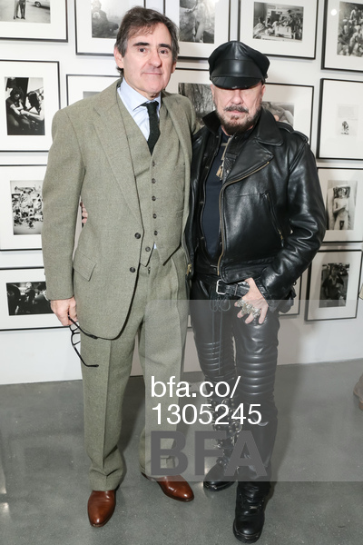
Peter Brant posing with a real piece of work, photo: bfa.co
The differences between it and the disclaimer posted at “Deliverance,” at the Brant Foundation last fall are few, and give the air of repurposing, if not appropriation. Since the VOM show is curated by Dylan Brant and Vivian Brodie, maybe it just came down from Greenwich with the art:
Cady Noland has requested the Brant Foundation Art Study Center post the following disclaimer: “Because Ms. Noland have [has] not been involved with the chain of provenance with many of my [her] pieces there are more situations like this show which place demands on her time and the artist’s attention to ensure proper presentation of her artwork (including its representation in photographs), than she has time or capacity to be involved with. She reserves her attention for projects of her own choosing and declined to be involved in this exhibition. The artist, or C.N., hasn’t given her approval or blessing to this show.”
I believe the bracketed grammatical corrections were made by Andrew Russeth, who reported the text for ARTnews. Which may mean that Ms. Noland simultaneously refers to herself in the third person as Ms. Noland, the artist, and C.N. To which I say, brava; the art world can only be improved by a multiplicity of Cady Nolands.
In 2012 Chris D’Amelio, who worked with, or at least showed, Noland in the 1990s, had a very special, personalized disclaimer in his booth at Art Basel, and in the fair catalogue:
At the request of the artist, D’Amelio Gallery has agreed to display the following text: “This exhibition is not authorized or approved by the artist Cady Noland, nor was she consulted about it. Neither Christopher D’Amelio nor the D’Amelio Gallery represents Cady Noland or her interest. Ms. Noland does not consider Christopher D’Amelio to be an expert or authority on her artwork, did not select the artwork being displayed in this exhibition, and in no way endorses Mr. D’Amelio’s arrangement of her work.”
Sarah Thornton included the following disclaimer when she wrote about her interview with the artist for her 2015 book, 33 Artists in 3 Acts: “Ms. Noland would like it to be known that she has not approved this chapter.” [Thanks to Grant for the reminder.]
Please note the stand with which the lot is being displayed is not the stand that Cady Noland designed for this work and this stand is not included in the sale of this lot. As a result, subsequent to the sale, the buyer will be provided with a new stand, which will be in accordance with Ms. Noland’s copyrighted stand design for this lot, and which will be an integral part of the complete work.
Internal documents produced during the court case Jancou v. Sothebys & Noland indicate the artist would approve the disclaimer text before publication. Since it was published, we can assume she did.
It just does not get any better, though I am sure it will. OH IT DOES UPDATED 6/25UPDATE: Triple Candie ended the announcement for their controversial 2006 show, “Cady Noland, Approximately, Sculptures & Editions 1984-1999,” with the following disclaimer: “None of the objects in the exhibition are individually authored. Cady Noland was not consulted, or notified, about this exhibition.” It follows, then, that Ms. Noland was not consulted or notified about this disclaimer, either. So we should consider it with an asterisk *.
OCT 2015 UPDATE
Neither Ms. Noland nor Sotheby’s has been asked for nor given the rights to any small jpgs of her works made from photos presumably made by the auction house as part of their sales preparations, nor is any claim to rights being made. But those corners do look better preserved than some.
Statement from the Artist: In an atmosphere of rapidly trading artwork, it is not possible for Cady Noland to agree or dispute the various claims behind works attributed to her. Her silence about published assertions regarding the provenance of any work or the publication of a photograph of a work does not signify agreement about claims that are being made. Ms. Noland has not been asked for nor has she given the rights to any photographs of her works or verified their accuracy or authenticity.
Silence is not agreement.
APRIL 2016 UPDATE Christie’s includes this same Statement from the Artist on Lot 470 in their May Contemporary Day Sale. That work, the 1989 assemblage CHICKEN IN A BASKET is signed and date twice [“(on the Michelob 6 pack)”!], and also includes a signed certificate of authenticity. Are we perhaps seeing the emergence of a Platonic ideal of a Cady Noland disclaimer, and if so, is the market able to accommodate it in considerations of authenticity? Enquiring minds!
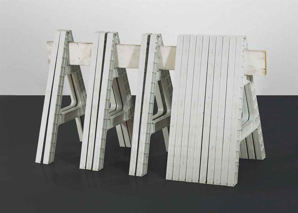
FEB 2017 UPDATE Apparently, yes, so far. Christie’s has included this same disclaimer as a “Statement from the Artist” on Lot 65 in next week’s Contemporary Day Sale, Four in One Sculpture. Examples of this work, a [typically] numbered edition of 20, have appeared pretty regularly since it debuted in 1998 at D’Amelio Terras, the gallery co-operated by [now certified not-expert] Chris D’Amelio from 1996 until 2011. It comprises 17 plastic sawhorses and a 6-foot, painted 2-by-8. This one also includes six extra sawhorses. The last example to sell via Christie’s, #8/20, in 2013, included 13 extra sawhorses. What a perfect situation for a blanket disclaimer.
29 MARCH 2018 UPDATE:
The anthology comes full circle. The full text of the disclaimer Ms. Noland faxed to Scott Mueller, the disappointed buyer of Log Cabin, has emerged from a lawsuit the artist filed against Michael Janssen and others last year. It is handwritten in all caps, but I will transcribe it in lower case for easier reading:
THIS IS NOT AN ARTWORK
From Cady Noland To: “Mystery Client,” [fax number omitted]
If the ‘previous owner did work with a so-called conservator’ I certainly was not consulted, nor did I approve whatever was done. From now on, the provenance must include the fact that the piece was ‘repaired’ by a conservator but the artist wasn’t consulted. The conservator’s name should be on the provenance accompanying that important fact.
As any reputable valuation expert will tell you, the work needs to be depreciated in value because of the ‘repair’ that hadn’t been overseen or agreed to by the artist. So, for example if you were to gift the work to a museum the tax deduction should reflect this depreciated amt. You may not produce/reproduce photos to go online or to be printed. I own the photo copyright.
Executed in 1993-1994, this work is accompanied by a certificate of authenticity signed by the artist.
We thank Cady Noland for reviewing the cataloging for this work.
!!!
NOV 2018 UPDATE: There is a Cady Noland retrospective at the MMK, organized with the cooperation of the artist, and then this, again, at Phillips.
Truly we are in a new era:
We thank Cady Noland for reviewing the cataloging for this work.
Lot 53: Beltway Terror, 1993-94, sold at Sotheby’s for $746,000 from the Brants’ collection
DEC 2021 UPDATE: Obviously so much has changed in the Cady Noland Disclaimerverse, which I will not get into here. EXCEPT. The Peter Brants have sold their stockade piece, Beltway Terror (1993-94) [above], and in addition to the now-standard disclaimer text, the Sotheby’s listing included this quiet shocker:
The present work is accompanied by a certificate of authenticity.
In an atmosphere of rapidly trading artwork, it is not possible for Cady Noland to agree or dispute the various claims behind works attributed to her. Her silence about published assertions regarding the provenance of any work or the publication of a photograph of a work does not signify agreement about claims that are being made. Ms. Noland has not been asked for nor has she given the rights to any photographs of her works or verified their accuracy or authenticity.
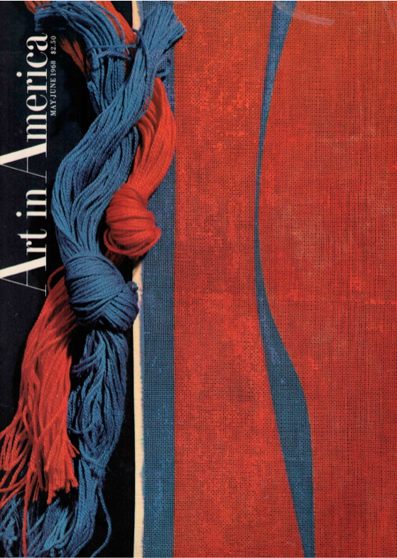
AiA May-June 1968 cover featuring Lorser Feitelson’s Hi-Fi Speaker Cover
In 1968 Art in America commissioned thirteen artists to create needlework designs, which is really weird, and kind of great. I stumbled across the project a few months ago while studying up on Lorser Feitelson; the Los-Angeles-based surrealist-turned-hard-edge painter had talked about how, ironically, the needlework project turned him on to screenprinting, which gave him the smooth lines and flat surfaces painting never could.
Feitelson’s contribution was a hi-fi speaker cover, which ended up on the cover of the magazine. It was the only image I could find online, and it made me want to see the rest. Because honestly, what could possibly be greater than abstract needlepoint hi-fi speaker covers? Oh, maybe Frank Stella throw pillows?
This is a great photo, btw. I love the edge, the space, the painting’s objectness. I assume it’s old, pre-frame, but I don’t really know; and the site I ganked it from didn’t seem to have any awareness, much less answers. Anyway, it’s here on purpose.
I’m not sure when I knew that the blur in the center of Gerhard Richter’s Tisch/Table (1962, CR:1) isn’t a brushstroke, but a smear, but I didn’t give it any thought until I started looking hard at Rauschenberg’s work on Erased deKooning Drawing. Then it completely changed for me.
The first time I saw it in person was 2002. Richter told Rob Storr that he had “canceled the painting by blurring.” I read Table‘s blob alongside the brushy blur of the early photopaintings. And those soupy loopy Vermalung paintings whose AbEx-style gestures preceded but didn’t exactly prefigure the squeegees.
But that’s not what’s happening.
In trying to understand what Jasper Johns did to Erased deKooning Drawing, I also had to figure out what Rauschenberg had done:
He was trying to make a mark with an eraser. It’s the difference between erasing a drawing, and drawing with an eraser. And when he was done, the result was both an erased de Kooning and a drawing.
At just that moment I read John J. Curley’s essay, “Richter’s Cold War Vision,” in Gerhard Richter: Early Work, which tied them together:
Richter’s Informel-esque brushstroke was not painted over the image of the table (as some have suggested), but was the product of erasure. The artist attacked the canvas with a solvent (perhaps turpentine) after the initial image was already painted. The new mark has diminished the original painted surface, leaving traces of bare canvas showing through.
But as with Rauschenberg, this is not negation; cancelation is not rejection. [Richter would later designate Table as the first work in his Catalogue Raisonné, even though it is not.] As Curley wrote, the erasure “naturalizes a false realism” in Tisch; its abstract disruption provides cover and credibility for the table’s “off-kilter” representation and “structural impossibility.” Erasure becomes “the crux of both the table and the painted gesture.”
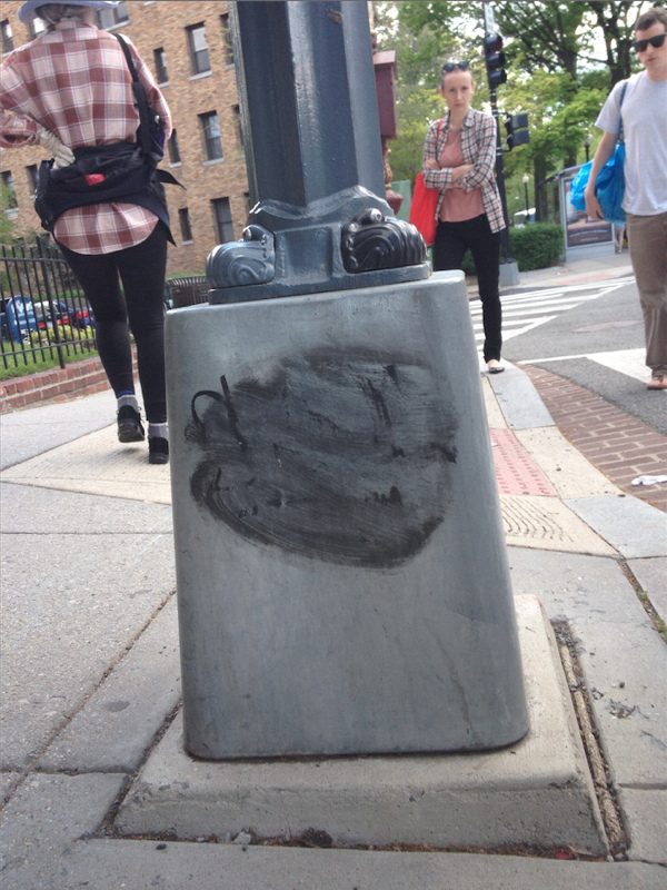
Well that blew my mind. I’ve ended up thinking about Tisch all the time, at first because of the blogging, and then the Destroyed Richter Paintings project. But then mostly because there’s a lamp post near our place in DC that I pass almost every day on my way to the train or the store. It has a basic graffiti tag that someone tried to erase–I was about to say unsuccessfully, but I think it looks a hundred times better like this.
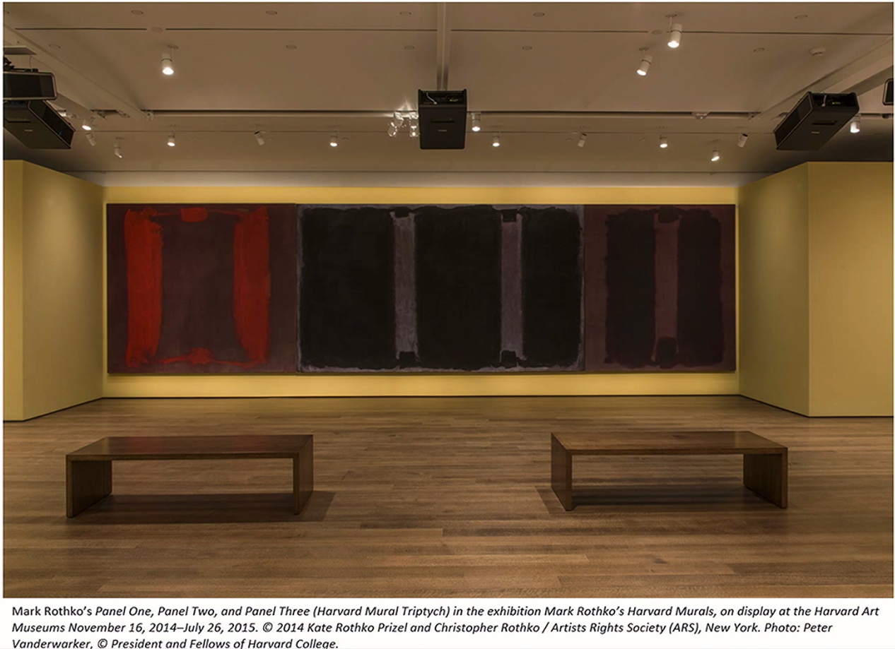
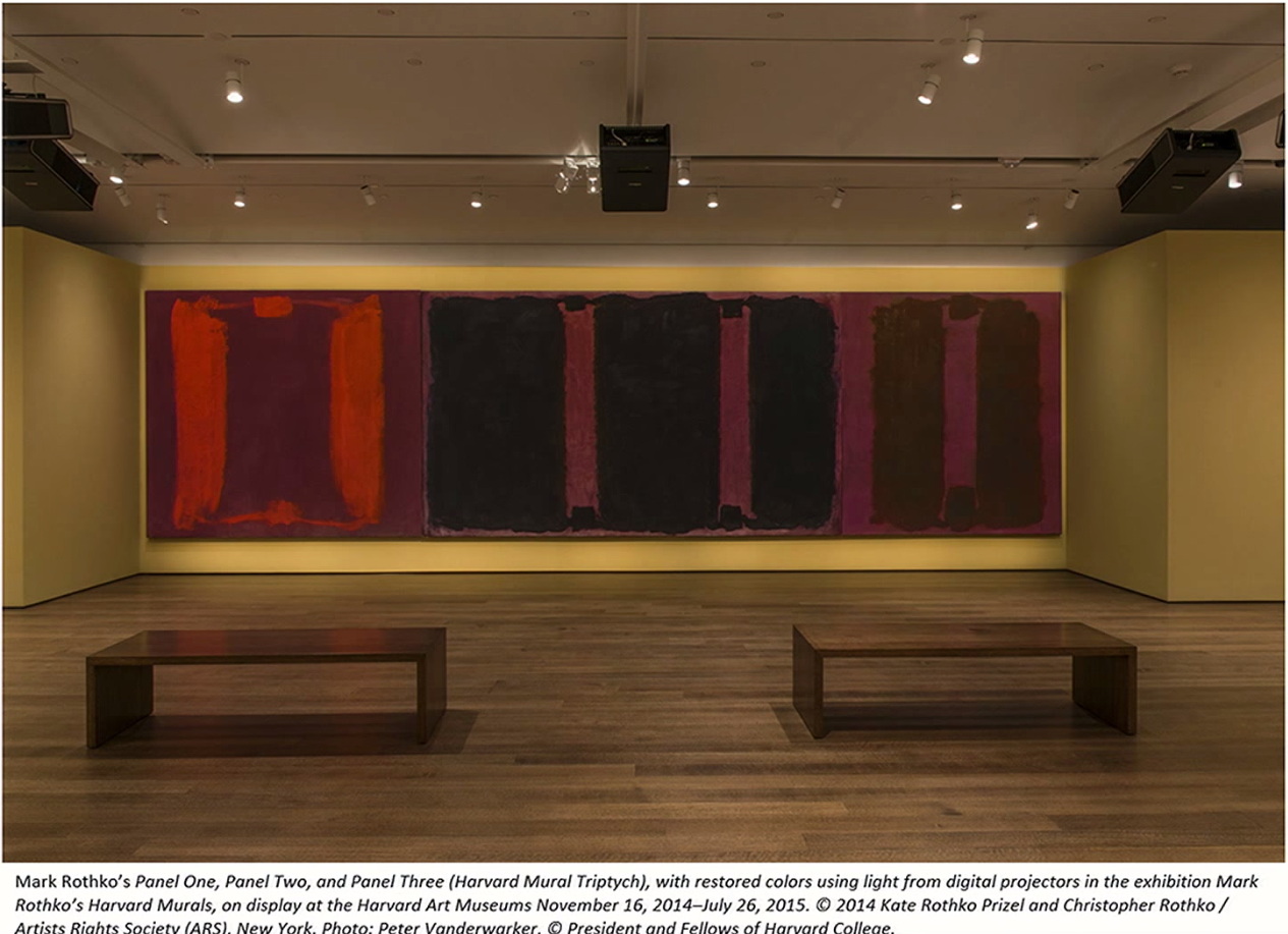
I’m slow to take a closer look at the conservation project to restore the coloration to Mark Rothko’s badly faded Harvard Murals (1963) using computer-calibrated light projections. The project has been going for several years, but the last winter the lit paintings went on view for the first time in decades, and remain up until July 24th. Which was the trigger for the roundtable discussion in Artforum that piqued my interest. It’s fascinating all around, but I really liked that it included artists Rebecca Quaytman, David Reed, and Ken Okiishi, who ended discussing the fate of paintings and the use of projection on painting as a creative medium in itself.
Even before the conservator Carol Mancusi-Ungaro explained that the projection was tuned pixel by pixel to approximate Rothko’s intended colors, I found myself jonesing to get my hands on the image, and turn it into a work of its own. Called a compensation image, it’s made by calculating the chromatic differences between the paintings’ current state and the target state. It’s a map of everything the painting has lost, an accounting of how far it’s fallen from its (hypothetical) historical potential.
It’s the color that might have been. In the case of Rothko’s Harvard Murals, Mancusi-Ungaro explained that they weren’t seeking to return the paintings’ appearance to a new, “original” state, but simply to erase the damage caused by Harvard leaving the works to bake in the sun for 15 years. The target state was determined using color-corrected Ektachrome slides from 1964 and a sixth painting, excluded from the set, which has been in dark storage in the Rothko estate.
The images above showing three of the paintings with and without the corrective projection come from a TEDx talk given by Harvard conservator Narayan Khandekar. The dramatic reveal, when the museum turns off the projection, happens every day at 4 o’clock, and is by all accounts dramatic.
What is not shown is the compensation image itself. Here is a photo of part of it, when Khandekar holds some foamcore in front of the painting. I would like to see and use the entire thing. There may be a way.
In 2011 other Harvard conservator Jens Stenger published a report on the project at the International Committee of Museums triennial in Lisbon, which is circulating as an ICOM-CC newsletter pdf. In it, Stenger discloses that the team confected a small scale test of the light correction process by using identical materials (egg and pigment) to paint another Rothko and superfade and correct it.1, 2
A is the Conservators’ Rothko. B is the painting after a few weeks under some tungsten lamps. C is the interpolated compensation image (A – B). D is the lit painting (A + C). In an incisive essay last April, John Pyper likened the compensation image’s duplicative relationship to the painting as a similar to a print and a plate. Seeing it now makes me think of a color photo negative.
Which makes me think of Alma Thomas, who painted Watusi (Hard Edge) in 1963 [!] using the form from Matisse’s giant cutout, L’Escargot, but in the inverse colors. For Thomas the colors signaled a reversal of direction for cultural appropriation. What does the color of a compensation image represent? Here it is loss, a loss caused, let’s face it, by Harvard’s years of neglect, mishandling, and occasional abuse. [Actually, the projector project does not address the physical damage, dents, scratches and graffiti the paintings received in what was, after all, a campus dining room.] At least in this case, compensation feels too diplomatic; maybe we should call it a restitution image, or a reparations image.
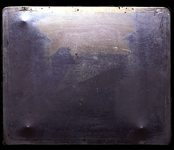
Now that I look at it a bit, the particular colors of the Rothko compensation image remind me of not just any photo negative, but the first photo/negative, made by Joseph-Nicéphore Niépce in 1826. And just because a projection is used to index and compensate for loss or aging now doesn’t mean that’s all it’s capable of. It turns out photography could do more than capture a view out a window. 1 I don’t think it’s a spoiler to say this outcome is literally the kicker from the Artforum discussion. 2 This is the second instance I’ve heard of conservators making post-war painting simulacra, and now I want some. Stenger, J. et al., “Non-invasive Color Restoration of Faded Paintings Using Light from a Digital Projector” [icom-cc.org, pdf] After Mark Rothko, American [printeresting.org]
Previously, and very much related: On Peter Coffin at the Hirshhorn, also Donald Moffett other early Donald Moffett projections on paintings
On Kawara’s One Million Years readings have always had a profound effect on me. From the first time I saw it at the Dia, to the resonance of One Million Years in Okwui Enwezor’s Documenta 11 in 2002; to an installation at David Zwirner, to the reopening Stedelijk. It was Brian Sholis’s moving account of reading with his then-fiancee Julia Ault at Zwirner that cemented my determination to read one day, too.
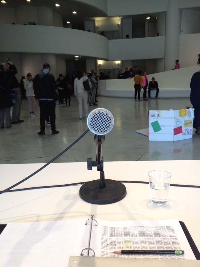
That day was April 5th, Easter Sunday. I had booked my wife and myself to read in the first shift, just as the Guggenheim opened. I’d already seen the museum’s On Kawara retrospective, but on a day when there was no reading. These are some recollections and thoughts of the experience with the piece. One Million Years and an unannounced roaming exhibition of one week’s worth of date paintings in kindergarten classes are the two projects Kawara authorized to continue after his death last summer at age 29,771 days. Mary, who was coordinating production of One Million Years and prepping volunteers, took our picture when we sat down on the dais. She said the artist used to listen to recordings of One Million Years as he worked in his studio, and that the liked to have photos of the readers.
I had not anticipated such a thing, but now the entire project felt extremely personal. It was not just a performance, but a communication, a communion, with the artist himself. But not anymore, not for us. It turns out the Guggenheim was recording the reading, but only for exhibition documentation. Posthumous recordings like ours would not end up contributing to a “complete” recording. That aspect of the work, too, ended with the artist’s death.
Still, as I’d expected, reading itself was a wonderful experience. I found it somehow meditative and exciting at the same time. I found myself thinking of the dates we were reading, long before modern humans, and their history, existed. Yet narrative was there; the numbers became their own narrative. There was suspense as we counted down to an even hundred. Symmetrical numbers, or pairs or trios of digits, or chains of multi-syllabics, felt momentous, like a winning poker hand. These numbers, these years, with literally no significance of their own had significance thrust upon them, at least for a few seconds, by being read aloud. It turns out long numbers are not usually read aloud.
The greatest thrill was the echo of the Guggenheim’s rotunda. We sat on the ground floor, backs to the window, with loudspeakers flanking us, and our numbers seemed to ring out through the show. We took it slow and serious. We intoned, and I imagined how we must affect the reception of the rest of Kawara’s works up the ramp. We contributed our small part to everyone else’s enlightenment.
After we ended, we went through the show. We stopped on the way out to watch our replacements. Mary had said it’s easy to tell when the readers are a couple. Inversely, it was immediately obvious that the two jokers after us were either breaking up, or didn’t know each other and could not be bothered. Even on the rare numbers they didn’t mumble away into nothing, you could barely hear them standing right in front of the dais.
But how was this really any different from our experience? In fact the sound from One Million Years never left the ground floor, and sometimes it hardly left the little stage. In the hard-surfaced cacophony of the rotunda, One Million Years was essentially lost. I felt very acutely the gap between our rewarding personal experience of performing and the empty opacity the being in the audience. Or of not even noticing the piece existed.
In glass half-full mode I considered this divergence alongside the rest of Kawara’s practice, where dates and times and lists barely hint at the complexities of the artist’s daily experience.
Did I say half-full? This comparison, along with some of Kawara’s lesser known series [60s word diagrams, the coded letters, and of course, all the newspaper clippings in all the Today series boxes] made me wonder what there actually is to know? Frankly, I’ve begun to fear that under it all lurks an actual Message, hidden by Kawara, just waiting to be cracked. And that the profundity, the interpretation, the significance, will turn out to be all in our heads.
While I knew the basics of its origins, I did not know that qur’an means “recitation.” From Oxford Islamic Studies:
Most members of the early Islamic community, including Muhammad, were illiterate. The new scripture was known as the qur’an (recitation) because believers learned it by listening to public readings and recitations. Many of Muhammad’s followers committed the passages to memory. But the Prophet also commissioned many scribes to preserve the messages in writing. They recorded the words on a variety of available materials, including paper, stones, palm leaves, and pieces of leather.
…
By the time of Muhammad’s death, several of his followers had memorized the entire Qur’an. Many of them, however, were killed in battle. Fearing that knowledge of the Qur’an might be lost, the leaders of the Islamic community decided to collect all the revelations, from both written and oral sources, and to compile an official version of the sacred text.
I was looking this up because several religious traditions include the public reading of sacred texts. When Okwui Enwezor introduced the concept behind the public reading of Karl Marx’s Das Kapital at the Venice Biennale, he chose Sikhism:
Taking the concept of the Sikh event, the Akhand Path (a recitation of the Sikh holy book read continuously over several days by a relay of readers), Das Kapital will be read as a dramatic text by trained actors, directed by artist and filmmaker Isaac Julien, during the entire duration of this year Art Biennale.
This reading, Okwui explained, was the center of the center of the Biennale, and was inspired by the 1974 Biennale’s condemnation of the [US-backed] coup in Chile on Sept 11, 1973 and its oppressive aftermath:
The dedication of the program of events to Chile and against fascism remains one of the most explicit attempts, in recent memory, by which an exhibition of the stature of the Art Biennale not only responds to, but courageously steps forward to share the historical stage with the political and social contexts of its time. It goes without saying that, in view of the current turmoil around the world, that the Biennale’s Eventi del 1974 has been a curatorial inspiration.”
“In response to this remarkable episode and the rich documentation it generated, the 56th International Art Exhibition: All the World’s Futures, will introduce the ARENA, an active space dedicated to continuous live programming across disciplines and located within the Central Pavilion in the Giardini. The linchpin of this program will be the epic live reading of all three volumes of Karl Marx’s Das Kapital (Capital). Here, Das Kapital will serve as a kind of Oratorio that will be continuously read live, throughout the exhibition’s seven months’ duration.”
“Designed by award-winning Ghanaian/British architect David Adjaye, the ARENA will serve as a gathering-place of the spoken word, the art of the song, recitals, film projections, and a forum for public discussions.
And so the linchpin of the Biennale’s central programming space dedicated to the Biennale that courageously stepped forward to explicitly attempt to share the stage with the political and social context of the time is a religiously inspired recitation of a venerated text.
I had barely finished watching Enwezor say these words at the Biennale Press Preview when it was reported that Venetian government officials had ordered the Icelandic Pavilion to close immediately, because they disapproved of Christoph Büchel’s artwork, The Mosque. The full title is The Mosque: The First Mosque in the Historic City of Venice, but the website for The Mosque, which was created in collaboration with the Islamic Communities of Venice and Iceland, calls it Misericordia Mosque & Islamic Cultural Centre Venice, after the deconsecrated Catholic church Iceland rented for their pavilion.
The Mosque was contested before it opened, for the two weeks it was open, and for the several days it has been closed. Icelandic Art Center officials say the city kept changing the terms and throwing up successive obstacles beforehand, and were determined to shut it down. In the face of this resolve, it seems almost irrelevant to debate whatever pretexts were finally used. Büchel saw this coming when others did not. A sympathetic local law professor told the NYT:
Venice is without a doubt the most tolerant city in Italy and proud of it, and so I think it’s the wrong place to make this kind of statement.”
Mr. Büchel said he had seen little evidence of such tolerance in his dealings with the city over the mosque.
Büchel’s art didn’t float an argument or evoke a narrative; he made a real situation. The Mosque posed a non-hypothetical moral test, which politicians and pundits alike are lining up to spectacularly fail.
The worst failure of all, though, would be the Biennale itself. Would be, or already is. Eiríkur Thorláksson, the Chairman of the Icelandic Art Center, said:
Most disappointingly, the administration of La Biennale di Venezia, an institution within the City of Venice, has not supported this artistic endeavor in the way that would have been expected for an organization of its stature and proclaimed advocacy of contemporary art.
The Times reported that neither Enwezor nor Biennale president Paolo Barrata had made any public statements of support for Büchel or The Mosque, even though the Icelandic Pavilion is part of the official Biennale program.
If Biennale officials are indifferent, they are complicit in The Mosque‘s unjust and unwise censorship. If they are actively maneuvering to thwart The Mosque and keep it closed, they are betraying the very mission Enwezor announced for himself and his exhibition, and hollowing out its lofty pretensions. If they are constrained by some unseen political situations, they should call it out.
But what Enwezor could really do is embrace The Mosque, and make its successful realization the center of his Biennale. I don’t presume to know how to achieve this. My first impulse was to move The Mosque to the ARENA somehow. But the actual Venetian Muslims attending and operating The Mosque are not actors or props performing their prayers for an art world audience. They have autonomy. So ask them. Have Büchel ask. Maybe it’d work somehow. Or maybe the pavilion could reopen without the spectators. Why does The Mosque have to be a spectacle? The important thing now is that it’s there. And it is the political and social context of our time.
UPDATE: After I posted this, Cristina Ruiz from The Art Newspaper tweeted about another Venice Biennale work I’ve been thinking of, and which didn’t quite fit here: Gregor Schneider’s Venice Cube, a large, draped sculpture inspired by the Kaba’a, which was to be installed in the Piazza San Marco in 2005.
Gareth Harris’s July 2005 TAN article on its fate is very relevant [pdf via gregor-schneider.de], in that it details the political process by which Venice Cube was rejected. Harris reports that Rosa Martinez, the co-curator who commissioned Venice Cube, “was not permitted to argue her case directly with the city authorities and later with the Ministry of Culture”; these discussions were held by the Biennale president, then Davide Croff. Today the president is Paolo Baratta, whose decision, actions, inactions, and present silence shame the principles and the institution of the Biennale.