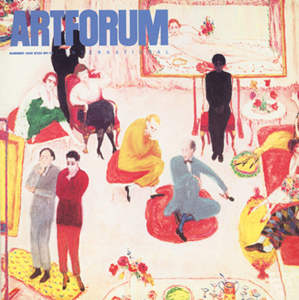
Which turns out to be just one example of how time moved back then. The cover—for which there was no hook except art world vibes—was none other than Florine Stettheimer’s Studio Party (or Soirée). Don’t expect ME to demand an excuse to love Florine Stettheimer!
And then there were dueling reviews of a big Yves Klein retrospective, from Nan Rosenthal and Benjamin Buchloh, who—spoiler alert—may have disagreed on Klein, but they both disliked the show. And while neither of them answered the highly specific Yves Klein-related question that led me to this issue in the first place, I can’t complain.
Last September at RogerEbert.com, Soren Hough interviewed Swiss director Cyril Schäublin about his new film, Unrest, which was then in the New York Film Festival. Unrest is about a mountain community of anarchist watchmakers in the 19th century. It sounds fascinating, both for its content, but also for how it was developed and produced, in an exceptionally decentralized, collaborative, mutual aid-inspired mode inspired by its cast of predominately non-actors, but also by the ideas of one of its characters, the Russian anarcho-communist Peter Kropotkin.
SH: It sounds like your natural aesthetic instinct tied well into this particular story where you, as you say, have this big name in “Unrest”—Peter Kropotkin. He’s not in a huge amount of the movie, he doesn’t have that many lines, he’s not a central character, and it’s certainly not a biopic.
CS: The guy who acts as Kropotkin (Alexei Evstratov) is a very avid Kropotkin guy. I mean, he’s really into him. And he said to me at the end, “I didn’t say that much!” But he told me the way we were doing the film, and how the film was organized, and how we talked to each other, he felt [it took a] mutual aid approach. That was really interesting for me.
Schäublin talks, too, about the desire to understand and depict the experiences of the women in his family, his ancestors, who worked in watch factories, but also the difficulties in doing so, especially for 19th century people:
it’s much easier to reconstruct male biographies [from the 19th century] than female biographies. I thought, “What can I show of women, like the women in my family who did that work?” The only thing we can reconstruct is their work. People today that go to watchmaking schools still learn how to build a watch from the 19th century—that’s the start of the school. So you can reconstruct the manual labor, but not the biographies—what we call biographies.
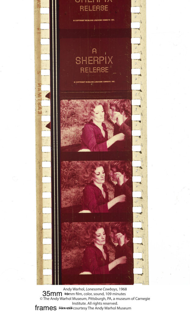
frames from the first of six 35mm reels of a vintage print of Andy Warhol’s 1968-69 film, Lonesome Cowboys, being sold at Christie’s Jan. 27, 2023, est. $20-30,000
The lot description for this Lonesome Cowboys print is extraordinary. Maybe like the texts about the Arizona Spike, and for this sale as a whole, the exceptional is the norm. Lonesome Cowboys was not just an anti-narrative, queer, softcore, experimental anti-Western filmed over a cold week in a Tuscon cowboy theme park; investigated by the FBI; and slowly edited while Warhol recovered from being shot. It was the first brick thrown in the “Stonewall of the South,” a powerful document in the fight for equality.
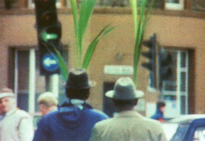
I was driving the kid to a babysitting gig, and as we pulled into the street, I saw a Black man carrying a large-leafed houseplant in front of him. I immediately had to explain who Steve McQueen was, and how the first show of his work in New York in 1997 had in one room this amazing, silent, one-minute film he’d made on the street, in 1992, when he was a student, and saw two African men in trilbys, each carrying a potted palm plant, weaving their way through London traffic, and he just found the scene and instantly decided to film it, and it was transfixing and beautiful.
I started this blog in 2001 as a side project for my filmmaking. It was the place to share my inspiration, development, behind-the-scenes, making-of, marketing, reception, and commentary.
screenshot of @zootycoon’s tumblr post with the bootleg platform sneakers with a label based on a movie poster that unlocked the Goncharovissance
Now Tumblr has, in one day, generated an entire metacontent universe around a film that doesn’t exist: Goncharov (1973), produced and/or, disputedly, directed by Martin Scorsese. It is spectacular, and exactly the kind of thing I got into blogging about movies for.
[update: I am told that Goncharov (1973) is, in fact, an absolutely real film. If it wasn’t, would it have an elaborate and exhaustive Google Doc mapping its history, production, plot, music, versions, and analysis? And there’s a poster? And then there’s all the fanfic. My apologies to Messrs JWHJ0715 and Scorsese.]
I am kind of deep in an assignment, and so cannot really give the space right now to process the news of Jean-Luc Godard’s death and the impact of his work.
But as an absolute fan of Agnes Varda who has not seen Faces Places because I detest JR’s work, Manohla Dargis’s interpretation here of Godard’s refusal to even come to the door makes sense to me.
Aspect Ratio Blanket, jacquard cotton, $120 from A24 Films
In late 2020 A24 Films dropped this aspect ratio blanket. It is part of the film studio’s unusually extensive swag collection, and was designed by Actual Work, of Provo, Utah. It is great, and not only to the extent it makes me think of Liz Deschenes’ photos and Derek Jarman prints.
In 2003 Deschenes made a series of monochrome photographs in the dimensions of various screens, analog and (emergent) digital, which helped to forefront the usually unseen technological systems used to produce the images we consume. They don’t get as much attention as the saturated awesomeness of her green screen photos of the same era. I saw them first at Andrew Kreps, and she showed them again in London at Campoli Presti.
Just turn it sideways, he says: Study for Derek Jarman Blue Screen Print, 2020, gahhh, the aspect ratio
Derek Jarman is my own damn fault, a rabbit hole I jumped into and kept on digging as I tried to figure out the correct [sic] aspect ratio of a monochrome silkscreen of Jarman’s Blue, rather than just buy an example from the unfinished deluxe letterpress edition of the screenplay when it appeared on eBay.
But maybe it’s exactly those too-close encounters with aspect ratios that made me wonder what’s going on in A24’s blanket? Why does it have the seven aspect ratios it does? 1.33:1 and 2.39:1 are pretty standard (standard TV and anamorphic/widescreen theater, respectively), but 1.66:1? That’s a European theatrical format. 2:1 was originally launched in the ’50s as SuperScope, but it’s more likely that its promotion by Red, the digital camera company, as an optimal format for phone & flatscreen display is a more likely explanation. 2.76:1 is Panavision, and an auteur-y choice only a Tarantino would make (or, apparently Gareth Edwards, who used it for Rogue One. Neither film was an A24 joint.) 1:1 is…Instagram? Josef Albers? I have no idea.
1.19:1, though, is an ancient ratio that does have a direct A24 connection. Originally used in the 1920s during the transition to sound, Robert Eggers used it on his 2019 film, The Lighthouse, which was an A24 joint. The ratio was a deliberately, constricted, archaic choice that evoked imagery of the 19th century of Edgar Allan Poe’s unfinished story that inspired the film. So in a way, it makes the most sense of all.
But I think the blanket is not meant for overthinking, and these ratios were chosen to look good when stacked. Which, I guess it’s good that they do look good. If they also connected to something about the self-consciously quirky studio that made them, that’d be even better.
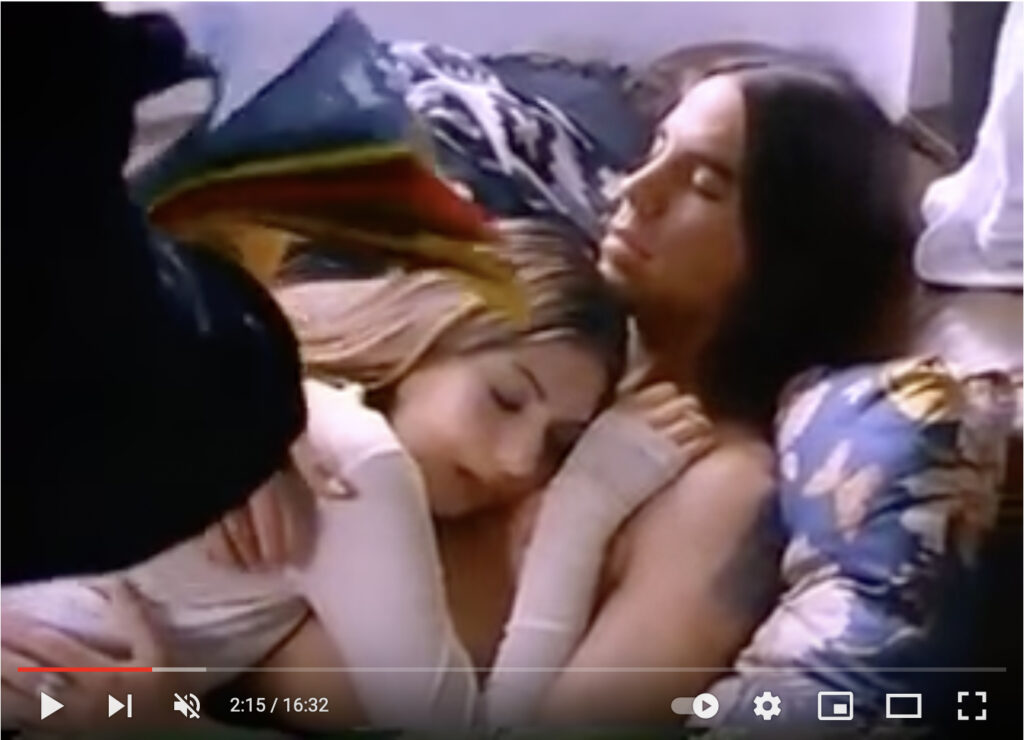
Debbie Harry trying to wake Anthony Kiedis and Sofia Coppola up in their loft crash pad across the street from CBGB, in a 1993 short film Paul Morrissey made for Details Magazine
When @MattHaber first tweeted this short film directed by Paul Morrissey for Details Magazine, it blew my mind right back to 1993. I was ready to hype it as an underground gem, a time capsule of a truer, rawer, cooler, lost New York. But honestly, maybe the reason it only has 840 views on YouTube after almost ten years, is because it’s pretty dumb.
The 16-minute, silent-style film was created in early April 1993 as/for/alongside a fashion photoshoot for Details’ Music Issue, which dropped in July. Debbie Harry is a downtown promoter chasing Anthony Kiedis and his mopey girlfriend Sofia Coppola around the East Village, trying to wrangle him for a gig at the fictitious Wig & Pizza Boutique. Sonic Youth and a dozen drag queens, including Joey Arias and Lady Bunny fill out the cast of extras who stand around CBGB while Kiedis changes outfits and runs away. The only explanation for the acting and directing is, it’s for a photoshoot. Literally everyone involved seems dumber by the end, including me, for watching it twice. It really should be added to everyone’s IMDb, if only for karmic reasons.
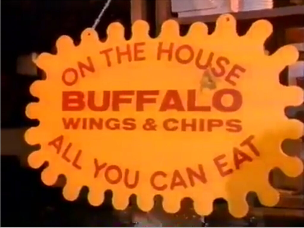
study for Untitled (CBGB Buffalo Wings), 2021, enamel on wood, est. 18 x 30 in., image: youtube
By the time I decided not to rummage around and unearth the lost history of this short, I realized the only good thing is the sign at CBGB offering free, all you can eat Buffalo wings & chips, which I could totally see as a painting. Unless John Varvatos already did it.
I just started watching Barry Jenkins’ adaptation of Colson Whitehead’s The Underground Railroad, and it is gorgeous and terrible and intense. One extraordinary thing about it is that in the midst of making this 10-hour series, Jenkins also made an hour-long, non-narrative work titled, The Gaze, and it is almost supernaturally moving. He wrote at length about it on Vimeo:
Early in production, there was a moment where I looked across the set and what I saw settled me: our background actors, in working with folks like Ms. Wendy and Mr. and Mrs. King – styled and dressed and made up by Caroline, by Lawrence and Donnie – I looked across the set and realized I was looking at my ancestors, a group of people whose images have been largely lost to the historical record. Without thinking, we paused production on the The Underground Railroad and instead harnessed our tools to capture portraits of… them.
What flows here is non-narrative. There is no story told. Throughout production, we halted our filming many times for moments like these. Moments where… standing in the spaces our ancestors stood, we had the feeling of seeing them, truly seeing them and thus, we sought to capture and share that seeing with you…
None of these shots are planned. Occasionally, when the spirit moved us, we stopped making the planned thing and focused on making THIS thing.
…we have sought to give embodiment to the souls of our ancestors frozen in the tactful but inadequate descriptor “enslaved,” a phrase that speaks only to what was done to them, not to who they were nor what they did. My ancestors – midwives and blacksmiths, agrarians and healers; builders and spiritualists, yearn’ers and doers – seen here as embodied by this wonderful cast of principal and background actors, did so very much.
Standing in for ancestors to see and remember them, and to experience being seen by them is as extraordinary as the insight to make this in the first place.
Annie Lennox’s cover of “Every Time We Say Goodbye” appeared in Derek Jarman’s Edward II. He was supposed to direct this music video for Red, Hot +Blue, but couldn’t. Cinematographer Ed Lachman took over. It features home movies of Jarman as a child which he used in The Last of England.
Join me and 13 other museums and museum-like private collections in embedding Arthur Jafa’s incredible “Love is the Message; the Message is Death” [2016, ed. 13+2 AP] on my front page for the next day or so.
“I am thrilled for the opportunity, finally, to have as many people as possible see ‘Love is the Message, The Message is Death,’” Jafa said.
Close t0 100K views so far, 300 simultaneous viewers at a time. Masks off and huddle up, let’s get this data to spike. Not that we can watch, collect, or curate our way out of this mess we’re in.
#DeathIsLoveIs
[Previously linked to: https://www.ustream.tv/embed/4222323]
The conversation in the second roundtable organized by sunhaus.us has barely started, and already the fact that most everyone saw the work first on a bootleg, and then marking the change between the first viewing and this moment, and the fear that exists now, is very important.
now 35min in, they’re talking about how this video was originally going to end up on the internet before it was pulled into the art world, and now here it is.
Everyone’s good, but Simone White is amazing, flat out.
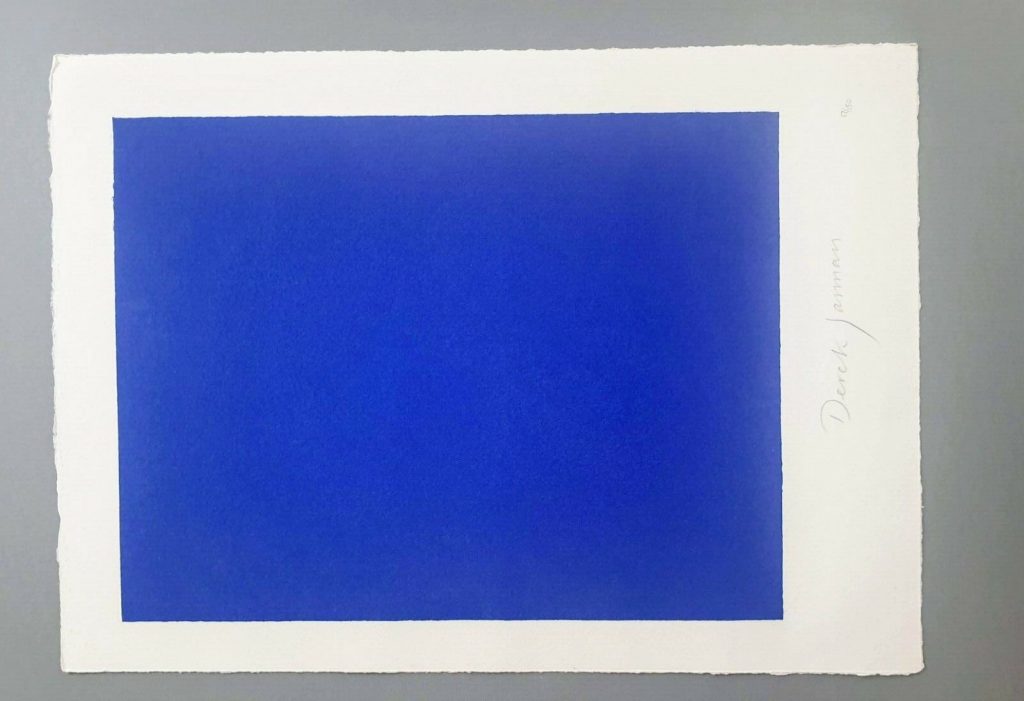
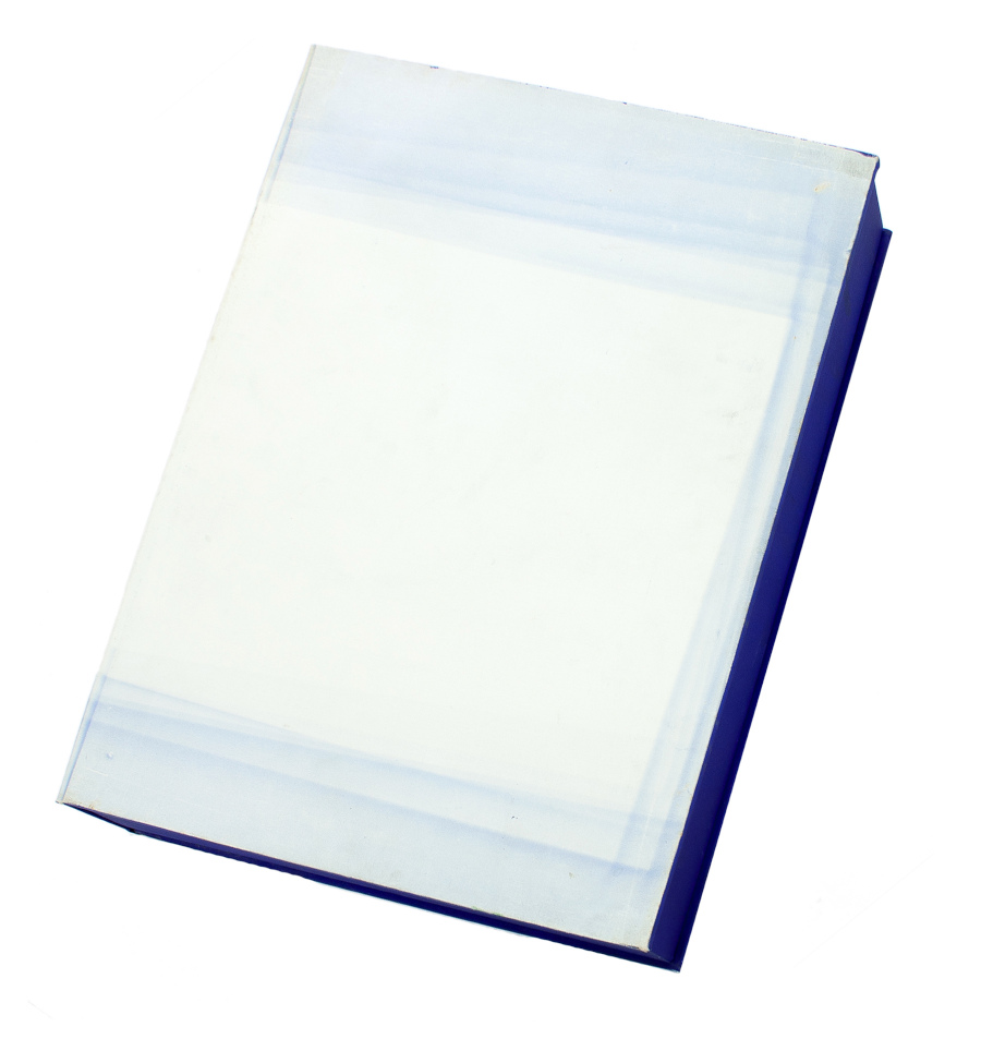
Derek Jarman, Blue, 1994,17×12 1/2 in., screen print originally made for the deluxe letterpress edition of the script by The Blue Press, now floating loose on ebay
This is a silk screen print by Derek Jarman. It was originally intended to accompany a letterpress edition of the text for Blue, his final film. That project was either produced in an edition of 150, plus some proofs, or was not realized before Jarman’s death. The numbers on the two I’ve seen hint at a bunch–this one is labeled 17/150, and the print shown at Chelsea Space in 2014 as part of the book was 37/150.
you may approach: Blue print installed at Chelsea Space, 2014, image: chelseaspace
But the only other copies I’ve ever seen of the whole book were described as printer’s proofs. Jarman was supposed to have painted IKB on the clamshell boxes of 25 of the 150 editions. One proof on ebay back in the day said only four proofs were made before Jarman died, and its lid was painted, but didn’t have a print, and said the prints were never realized either. Another, proof listed for sale privately, had a print (#43/150), but its lid looked more like the paper under the paintings than a painting itself.
Derek Jarman, Blue special edition, proof, The Blue Press, via paperbooks.ca
But that seller [pdf] said the whole letterpress edition “was centered on a loose Klein Blue screenprint signed by Jarman,” which makes it sound like the prints made it across the finish line after all. Why a signed print in a painted box doesn’t essentially become a certificate for a painting, I don’t know, but if the paintings never happened, it’s moot.
Study for Derek Jarman Blue Screen Print, 2020, gahhh, the aspect ratio…
I absolutely love this print, and may try to buy it, but I cannot for the life of me figure out why it’s portrait and not landscape. Maybe I’ll just make some and fix it myself.
LMAO This always happens to me. I think, oh, just flip it, DONE. But as I am typing in the dimensions of my new cinematic masterpiece, I am frozen. Because what should it be? Jarman made Blue on 35mm film. So 16:9 (1.77 in the US, where I first saw it, except if I look it up, some definitive-seeming sources have a widescreen aspect ratio of 1.85:1.) But Jarman’s own print is basically 4:3, so television. (Which is OK because Blue was aired on Channel4? Or nah?) But when it was still a live performance called Bliss, Jarman projected an image of an actual Yves Klein painting, and then switched to a blue gel, so no image at all, just a frame or aperture mask on the light? I think 16:9 is the clear choice here, but still.
so something like this, at 16:9, using the sheet size and smaller margins as the parameters yields a 8.125 x 14.5 inch print on a 12.5 x 17 inch sheet. study-derek-jarman-blue-screen-print-2020.jpg
Next day update: after spending part of a day determining the size and placement of the blue printed field in relation to the (unconfirmed) paper size and type of the original, I repeatedly caught myself trying not to think about how the film, then the print, then the book, then the box, then the– were all approached as the last project Jarman might complete. Make just one more thing, he and those around him might have thought? Woke up again, so there is still some time.
Amazing people are always sneaking into town and talking at the Smithsonian American Art Museum without my knowing. Last October it was Arthur Jafa and Ja’Tovia Gary, who spoke about their work, Black music, and the conception of a Black Cinema.
At least I’m not the only one out of the loop; until the audience questions, neither Jafa nor Gary seemed to know Kanye West had rolled up that morning on Howard University with his Sunday Service tour. [Gary was not. Having. Immmmmmt, either, and criticized West’s appropriation of gospel church practice as self-promoting spectacle, as well as his alignment with fascism and the forces of state violence. Jafa was taught.]
Anyway, point is, video of the event turns out to include Jafa’s epic Love is the message, the message is death and Gary’s 2015 short film The Ecstatic Experience, neither of which I’d seen in the wild. [Gary has an excerpt on her own Vimeo.]
Jafa’s piece was acquired jointly by SAAM and the Hirshhorn.
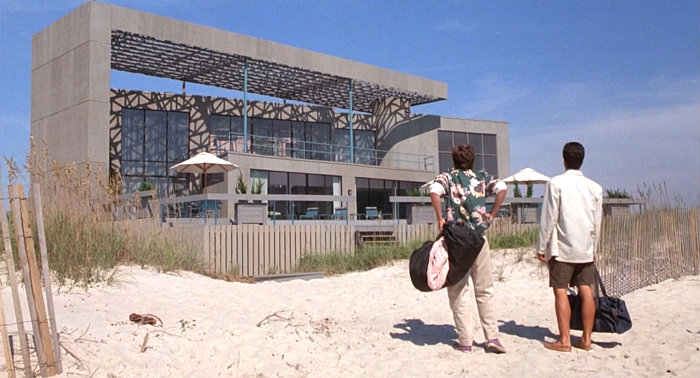
Gwathmey? Or just Gwathmey-esque? Weekend at Bernie’s (1989, dir. Ted Kotcheff), all screencaps via Mirror80
I confess I have never seen Weekend at Bernie’s 1 OR 2, but I knew the general concept from the trailer. What I did not know was that it was supposed to be based in a fictional Hampton called Hamptons Island.
And that the beach house of Bernie Lomax, the corrupt insurance CEO of the title, was actually built for the shoot in North Carolina, near a state park on Bald Head Island, a golf cart-based village south of Wilmington, and that it was torn down after production ended.
And if the commenter at retro styleblog Mirror80 is to be believed, Bernie Lomax’s house was DESIGNED FOR THE FILM BY GWATHMEY SIEGEL.
Which would make it the greatest Hamptons-related pop-up architecture since Calvin Klein’s full-scale plywood beach house maquettes. [Yes, technically, Bernie’s came before Calvin’s. But NOT before Calvin’s Gwathmey. (Didn’t Gwathmey do Calvin’s old barn house?]
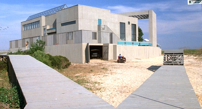
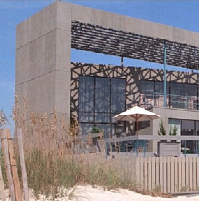
Now that I mention it, the freestanding wall holding up that giant brise-soleil (does this have a name?) on Bernie’s house does look like it’s made of 4×8 plywood sheets. I’d be surprised if the house was much more complete than an actual set. How did this making of story not get told before now?
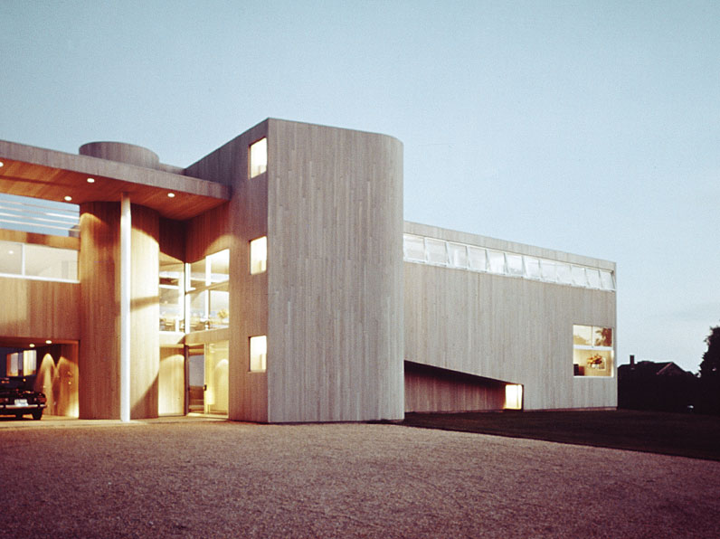
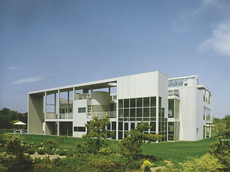
Commenter Evan says Bernie’s house was based on the 1970-2 Cogan House (above), but there are similarities as well to the François de Menil House (1979) (below), both in East Hampton. The de Menil house is now owned, of course, by Larry Gagosian.
I’ve scanned the production credits and cannot find any obvious explanation for Gwathmey-Siegel’s involvement. [There are other puzzles in the movie’s production design, which were the impetus for discovering the architecture, that will be addressed later.] One seemingly clear inspo, though, is Oliver Stone’s Wall Street, which came out two years before. The crooked villain in that film, Gordon Gekko, also famously lived in an oceanfront Gwathmey-Siegel house in the Hamptons. The location for that was the Steel House II (1968) in Bridgehampton, which by then had been significantly remodeled.
At first I thought Wall Street might have put a chill on the Gwathmey villain’s lair location scouting business, but it’s more likely that building a temporary Gwathmey set in North Carolina was still cheaper than shooting an entire film in the Hamptons.
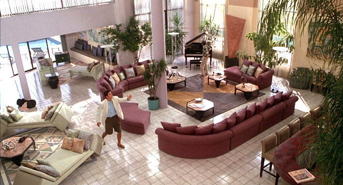
[MORNING AFTER UPDATE: OK, I have seen scrubbed through the movie which is–and I cannot emphasize this enough–wacked out garbage from beginning to end. The house has basically the one finished interior space. There is a two-second shot of a Roy Lichtenstein painting which has nothing to do with anything else, artistically or spatially. And Lichtenstein is thanked in the credits. (This was the original hook for even thinking about this movie, btw.) If Gwathmey Siegel were actually involved in this, it has to be because someone on the production’s cousin worked there one summer. Nevertheless, I’ve put out some queries.]