El Arbol de Barbero

D245: Sketch for The Barber’s Tree, 1975, watercolor on paper, 22 1/4 x 30 1/4 in., collection of the artist, never been shown [at least through 2014], via JJCR-D

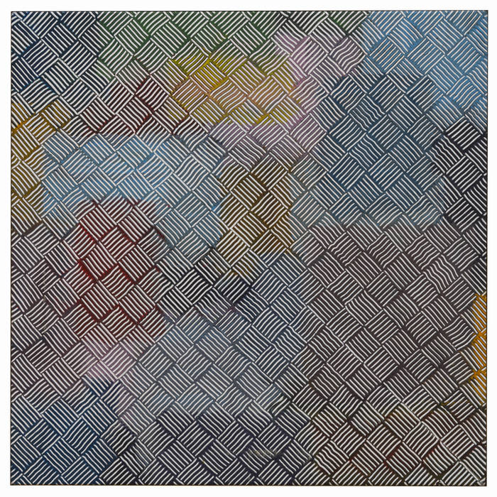
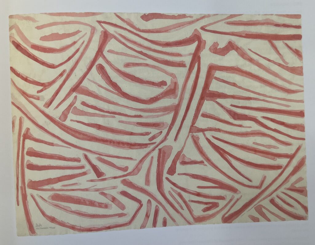
Maybe not being able to find the flagstones motif source, a Harlem wall glimpsed once through a taxi window and then lost, changed Jasper Johns’ approach a bit. Because by 1973, he did take note of the inspiration The Barber’s Tree. At least for the sketch [above], if not the painting, which turned out to be a mostly typical crosshatch motif executed in red and white.

And now we know what Johns knew.

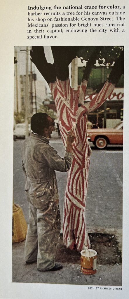
Here is photographer Charles O’Rear’s image from “Mexico: The City That Founded A Nation,” a dispatch by Louis de la Haba and Albert Moldvay from the May 1973 issue of National Geographic.

It is small, and slight, but indeed eye-catching. It’s not clear who is responsible for this cringe caption, though, about “Indulging the national craze for color” and “The Mexicans’ passion for bright hues,” when every barber pole north of the border has the same color scheme.

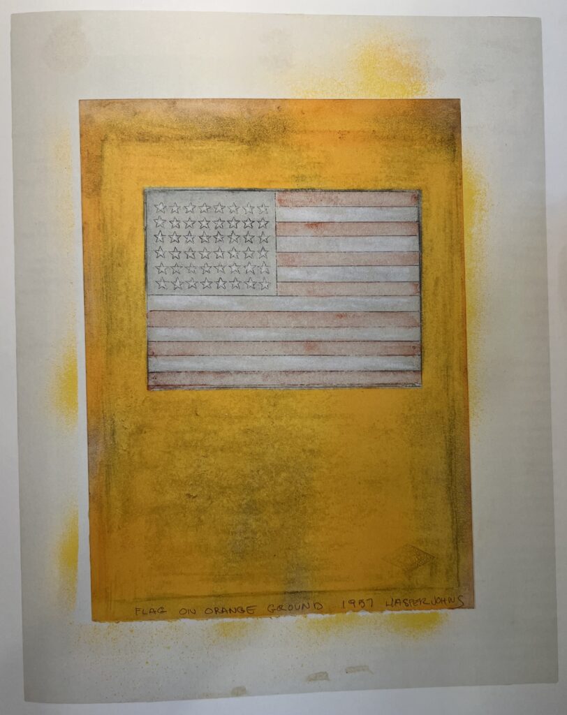
What is notable, perhaps, is that Johns chose this painting—found, vernacular, and anonymous—only after seeing this on the preceding page:

Albert Moldvay’s spread of David Alfaro Siqueiros’ March of Humanity, one page before the anonymous barber painting a tree in Nat Geo May 1973.

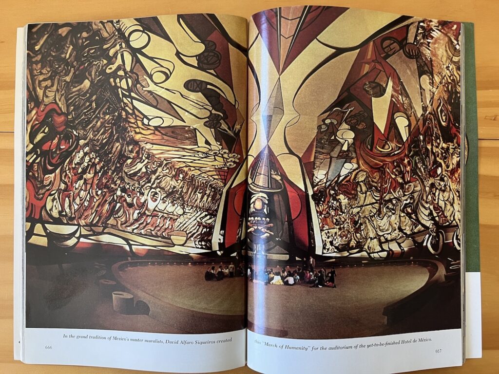
Looking on the web for contemporary images of David Alfaro Siqueiros’ absolutely gargantuan mural, la Marcha de Humanidad, in what was supposed to be the auditorium for the Hotel de Mexico, I can’t see that anyone managed to capture it more fully than Albert Moldvay did in 1973. The Mexicans sure have a national craze for murals. Jasper Johns, not so much.

[Next morning update: Joke’s on me, it’s been on my shelf the whole time. While looking for an image of the 1975 painting The Barber’s Tree, I stumbled on it and O’Rear’s photo in Michael Crichton’s 1977 Whitney catalogue:

it was worth $6 to see it in color, I guess, and to discover the Siqueiros. But let’s be honest, without the intervening watercolor, this tree motif feels kind of far from Johns’ cross-hatches.

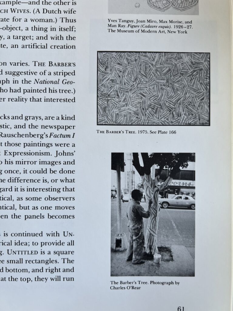
I’ve been saying it is barber pole-colored, but Crichton describes The Barber Tree (1975) as “flesh-and-blood colors.” Which, you’ll have to trust him, because the catalogue only had black & white images, and it was in the Ludwig’s collection until they donated it to the National Art Museum of China in 1996.

The Barber’s Tree, encaustic and collage on canvas, 34 x 54 in. (87 x 137.8 cm), snapped from the Jasper Johns Catalogue Raisonné, vol. 3 (P196)

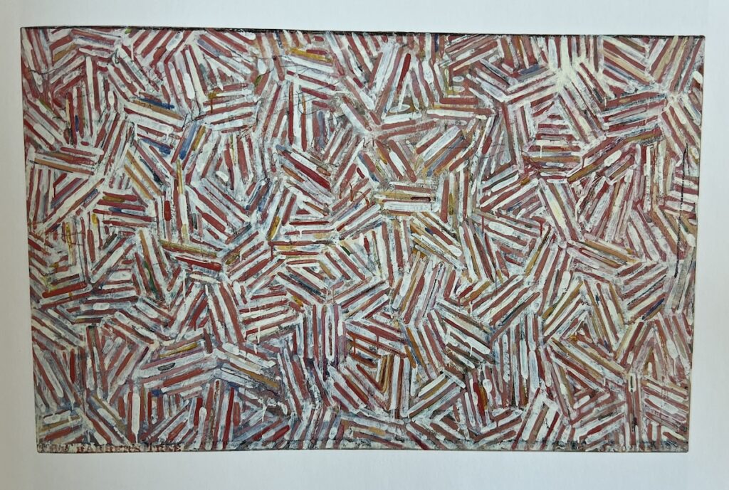
Now that they’re all together, maybe the overlapping structure of the cross-hatches is what carries through from the tree. Crichton noted Johns deployed different structures in the cross-hatch paintings of this period, 1973-76, including various degrees of mirroring or duplication. That is not what’s going on here.

Previously: Jasper Johns Drawings CR Driveby

Donald Baechler’s Blinky Palermo

Lot 44, Blinky Palermo, Untitled, n.d., graphite on paper, 8 1/2 x 11 in., sold from the collection of Donald Baechler at Stair in Feb. 2024 for $4,750

The February 2024 installment of Donald Baechler’s collection sale really feels sorted by style, like it was Baechler’s collection of works that looked like his.

What caught my eye, though, is this little unsigned, undated sketch which we nevertheless somehow know is by Blinky Palermo.

Maybe it was a diagram for Baechler to make his own Palermos? Maybe it’s a diagram for anyone to make their own Palermos?

Hellrot/Hellblau, Hellgrun/Orange, Dunkelgrun/Ocker [?/?], Dunkelrotviolett/Schwarz [s/o Claudio for taking a run at the third one]

Light red/Light blue, Light green/Orange, Dark green/Ochre [?/?], Dark red-violett/Black

Has anyone seen these combos realized?

Rebuilding The Queue

I updated Firefox the other day, and when it restarted, it did not give me the option to restore my previous session. So I lost the like 100+ tabs in five thematically grouped windows that I’d been holding onto, some for years. Others were fresh, things I was going to blog about. Now they’re gone, I’m sure they were going to be the best blog posts I’ve ever written.

Lot 422 on 5 June 2024, a signed Cy Twombly poster, 1975, not in the CR, but numbered 56/80, once owned by Donald Baechler, selling at Stair Galleries

Oh, actually, here’s one I’ve already written around: In 2021 I wrote about the signed exhibition poster from Cy Twombly’s 1974-75 show at Lucio Amelio’s gallery in Naples, which featured the swagged out artist striking a pose next to Castor and Pollux’s backsides. Amelio and his shows were instrumental in both the development of Twombly’s boat motifs, and the subsequent completion of Untitled (Say Goodbye, Catullus, to the Shores of Asia Minor) after two decades in the artist’s studio—and Amelio’s AIDS-related death in 1994.

This copy, ed. 56/80, belonged to Twombly’s friend Donald Baechler, who died in 2022. Much of Baechler’s collection was sold at Stair Galleries last fall, but for whatever reason, this one piece hung back. It’s a slightly weird thing, and it’s weird to see it twice.

Richard Prince, Self-Portrait, 1970s, oil on board, 23 1/2 x 16 in., lot 493 on 5 June 2024 at Stair

And that reminds me, in that same auction are several highly unexpected 1970s, student-era paintings by Richard Prince, which are being sold by a former friend and Nasson College classmate. Among them: this self-portrait with a toilet flush valve coming out of his head, so either an oblique Duchamp Fountain reference, or a stoned unicorn Jesus, who am I to say? The longer it stares at me on my screen, though, the more i want it.

How Do You Do, Fellow Outsider Punk Kids In Their Own Minds?

Choire Sicha wrote about his friend Eric McNatt, who sued Richard Prince for copyright infringement after Prince used McNatt’s photo of Kim Gordon—which he shot for Paper Magazine, which paid him $100—for Prince’s own Instagram portrait of Gordon.

As Choire put it so well, “Everyone involved here is still an outsider punk kid in their own mind.” Well, as it turns out, when the settlement was announced, I realized a friend of mine from way back in the day was McNatt’s litigator from Cravath, and I don’t think he has ever thought of himself as an outsider punk kid, then or now.

But Choire’s point observation is still useful, because some outsider punk kids in their own minds still hustle to survive, making $100 for licensing their now-famous photo a second time, and other outsider punk kids in their own mind testify in their depositions to making $45 million a year. So it really is the little differences

The Portrait of Kim Gordon | Why Eric McNatt Sued Richard Prince [vulture]

Harry Bertoia Silver Bowl Flip

image of Bertoia’s monogram and a 1941 date on the bottom of a bowl attributed to one of his students c. 1942 at a Jan. 2024 estate auction near Santa Cruz, CA

In January—and not even the beginning of January, either, it was the 28th, so barely three months ago—a “Cranbrook Academy Modernist” silver bowl and saucer, listed as “produced by a student under Harry Bertoia,” in 1942 sold at an estate auction for $370, only barely more than the scrap value of its 410 grams of silver. Never mind that they had a date of 1941 and Bertoia’s monogram engraved on the bottom.

They just turned up at Wright, where it’s instantly $1,600. I thought it was just a quick and easy flip after checking its listing in the Harry Bertoia catalogue raisonné. But the bowl’s entry there has up-to-the-minute provenance and a patina that’s cleaner than January’s, but duller than Wright’s. So maybe it was the monogram that led to the attribution, which led to spotting the pieces in a 1942 Cranbrook installation photo, which led to the creation of the newest CR entry for hollowware, updated Feb. 29. Nice hustle all around, I guess, now if we can just figure out who the FDB monogram belonged to, we’re set.

[update: sold for $4,788]

Previously, artist silver-related: Thank you for your silver service, Donald Judd X Puiforcat

Bumped Richter Unique Now

“Upper right corner bumped”: Gerhard Richter, Spiegel, 1986, 21 [or 20.5] x 29.8 cm, ed. 89/100 [or unique] Lot 97 at Lempertz

Sometimes after all the relentless perfection what you really want is a Gerhard Richter Spiegel that has really seen some stuff. You just know this one has never spent a minute of its life in a box in a freeport, and shouldn’t that be a premium instead of an 80% discount?

Lot 97 ending online 7 Jun 2024: Gerhard Richter, Spiegel, 1986, est. €2,000 – €2,500 [update: sold for €2,900] [lempertz]

Hear That? An Internal Soundtrack by James Hoff

Jack Whitten, Mother’s Day 1979 (for Mom), 1979, the cover art for Shadows Lifted from Invisible Hands, James Hoff’s new EP

Somewhere amidst all his publishing and other art world activities, Primary Information’s James Hoff created an album, and now he’s released it.

Hoff calls Shadows Lifted from Invisible Hands an autobiographical record: “Each track is composed from sources drawn from his own involuntary aural landscape, specifically musical earworms and tinnitus frequencies.”

It is not only ambient media remixed from catchy pop songs—though it is partly that. The aural elements that make up the album’s four tracks are “non-cochlear”; both earworms and tinnitus appear or are experienced inside the head without external stimulus. They’re sounds we get stuck with and accustomed to, the kind of “internal soundtrack” that, by definition, no one else hears. So it’s exceptional that Hoff transforms them into something intentional, and something that can be shared.

[TWO WEEKS LATER UPDATE: Just read about artist/musician Lola De La Mata’s project where she actually recorded her tinnitus [??] or whatever sound phenomenon was being generated autonomically in her ear, using an anechoic chamber. Absolutely fascinating and wild.]

James Hoff | Shadows Lifted from Invisible Hands is on digital and vinyl [bandcamp]
Uneasy on the Ear: An Interview with Lola De La Mata [thequietus]

Jasper Johns Drawings CR Driveby

Sure, curating is great, but have you ever just gone through an artist’s six-volume catalogue raisonné of drawings in chronological order, seeing every wild, weird, and eye-popping thing they worked on for 60 years?

I’ve dipped into Jasper Johns’ drawings CR before, but have not spent any sustained time with it until this week, when I went looking for the diagram he made to explain a print to a pushy university president. [It wasn’t included.] And it is fascinating. It feels more revealing than the paintings CR—which I have and enjoy, don’t get me wrong—like it tracks the artist’s process more closely. Here are just a few snapshots of things that caught my eye:

D19: Flag on Orange Ground, 1957, 10 1/2 x 7 3/4 in., fluorescent paint, watercolor, graphite on paper mounted on board, image via JJCR-D

This watercolor and pencil version of one of Johns’ early Flag paintings is one of two works made on pages from an old college yearbook; the logo of a sorority, Alpha Delta Pi, is visible in the lower right corner. Also it looks like it was spraypainted. ALSO, it was a gift from Johns to Susan Weil, Robert Rauschenberg’s ex-wife.

Continue reading “Jasper Johns Drawings CR Driveby”

Map Of The Pencil On The Paper On The Subway

William Anastasi, Subway Drawing (Way to John Cage), 1988, graphite on paper, 11 1/8 x 11 1/2 in., sold from a Danish collection in 2011 at Christie’s London

Beginning in the 1960s William Anastasi would make “blind drawings” that incorporated chance and the environment. One way he did this was by placing a piece of paper on his lap, and holding pencils in his hands while he rode the subway.

The 2011 Christie’s auction where this drawing sold included a short essay, apparently written by watching a 2007 interview with Anastasi on a website that no longer exists: “The reoccurrence of layers due to repetitive cycles in Anastasi’s work is fundamental to his being in regard to his admiration for Soren Kierkegaard who in Anastasi’s words created a “Recipe for life” (ibid.) in saying, “the love of repetition is the only happy love, like that of recollection.”

The subway drawings were titled with the trip or the destination. Many, like this one, from 1988, were made on the way to meet his friend and longtime collaborator John Cage. Cage died in 1992. Anastasi died in 2023.

Map Of The Boat Under The Pen

“Wave drawing from north of Iceland”, 1998, ink on paper, 64 x 45 cm, via bruun-rasmussen.dk

Oh hey it’s one of those drawings Olafur Eliasson made on a boat with his dad.

photo of the pendulum drawing apparatus Olafur Eliasson and his father Elias Hjörleifsson created on his father’s boat, 1999, image via olafureliasson.net

The map is not of the wave on the sea, but of the boat on the wave.

11 June 2024, 921/441: Olafur Eliasson & Elias Hjörleifsson, “Wave drawing from north of Iceland” 40-50,000 DKK [bruun-rasumussen.dk]

[update: the listing is gone, after the artist’s studio said it was a work of Hjörleifsson only. Such things are always complicated, I suppose, but perhaps more scholarly interest in Hjörleifsson’s oeuvre will clear things up.]
Previously, related: Mapping Olafur Mapping [in which, now that I mention it, this boat/pen project was described as Elias’s, not Eliasson’s.]

[november 2024 update: it is back, as a work by Hjörleifsson. Glad this is sorted out.]

Frank Lloyd Wright Temporary Pavilion(s)

Two oak veneer clerestory window panels from Frank Lloyd Wright’s Usonian Exhibition House, 1953, built on the site of the Guggenheim, dismantled, stored, parted out, now selling at Toomey

Seeing these Frank Lloyd Wright clerestory window screens from the New York Exhibition House, and being like, New York Exhibition House?? And I guess I somehow never clocked that the Usonian project kicked off with a fully furnished, 1,700-sq ft house built on the site of the Guggenheim Museum in 1953. The Usonian Exhibition House was supposed to be sold off and rebuilt somewhere, which didn’t work out [see above], and the plans were executed twice—for the Feimans in Ohio, and the Triers in Iowa—but that’s not important now.

Frank Lloyd Wright Office sketch of the Exhibition Pavilion, called a “Temporary Structure,” built on the corner of Fifth Avenue & 89th St, at the Guggenheim Museum, in Oct-Dec 1953

Because also—or rather, first—FLW built a pop-up, 10,000-sq ft exhibition pavilion, on Fifth Avenue.

Continue reading “Frank Lloyd Wright Temporary Pavilion(s)”

Be Kind, Rewind: Mark Leckey Throwback Fiorucci VHS Edition

The image for the edition being a screenshot-timestamped.png makes it feel like we’re right there in the studio, dubbing via gladstonegallery

This is the 25th anniversary of Mark Leckey’s epic video work, Fiorucci Made Me Hardcore (1999), and to celebrate, he released a throwback “final version” as a VHS edition of 100. I am always too slow to get his limited edition album drops, and I figured I’d already missed this, too. But I just saw an edition in the White Columns Benefit Auction, and I wondered…

Sure enough, Gladstone still has some, and practically at 1999 prices. Now I just have to pull a VCR out of storage, and figure out how to connect it to my digital TV, to relive the hollowed out cultural promise of that haunted ghost-space.

[Until then, though, I’ll just keep watching it on Ubu.]

Buy Mark Leckey: Fiorucci Made Me Hardcore: Ghosted on VHS, 25 Years Later, 2024 [gladstonegallery]

Specific Funerary Objects

If I had a nickel for every artist documentary made from well within the circle of subjectivity that caught me off guard with the nuances of the artist’s funerary arrangements, I’d have two nickels. Which isn’t a lot, but it’s wild that it’s happened twice.

In 2007 Rainer Judd and Karen Bernstein co-directed Marfa Voices, a documentary about Donald Judd’s life and work in west Texas that emerged from the Judd Foundation’s Oral History Project. Among those who shared their stories were friends and colleagues who attended Judd’s funeral up Pinto Canyon in 1994, including the bagpiper, Joe Brady, Jr.

It probably could go without saying that Judd was buried in the most pristine of pine boxes, but it is remarkable to actually see it nonetheless.

Jasper Johns Chosen Family

Jasper Johns, Untitled (American Center in Paris), 1994, lithograph, 29 1/2 x 23 1/2 in., AP 12/22 of an ed. 75, being sold on 23 May 2024 at Bonham’s

1994 feels like a weird time for Jasper Johns to make a print edition namechecking the American Center in Paris. It’s true that was the year they famously opened their new, limestone Frank Gehry building, for which Untitled (American Center in Paris) could logically have been a fundraising edition. They definitely needed the money. But it was also two year after the Center’s French executives infamously fired the American curatorial and programming staff they’d just hired—including Adam Weinberg, who returned to the Whitney and who feels, along with major donor Frederick Weisman, like the conduit for Johns to get involved in the first place. And it was two years before they infamously ran out of credibility, ideas, and money, and the century-old American Center in Paris imploded in hubristic ignominy.

But perhaps Johns had been working on it for a while, and 1994 was just when it shipped. Some c. 1992 Gemini prints with very similar elements—the Barnett Newman, the George Ohr pot, the Elizabeth & Phillip profile goblet, the Isenheim altarpiece tracing—were first proofed by Bill Goldston at ULAE, where American Center was published.

c. 1904 or so? portrait of Jasper Johns’ father William Jasper Johns [on lap], his uncle Wilson [left] and aunts Eunice & Gladys [standing], with his grandparents William & Evelina Johns [center], cropped from Untitled (American Center in Paris), 1994

Anyway, the point is, this print was, I think, the first, but not the last, to include a photo of Johns’ family. That’s the artist’s dad, William Jasper Johns, Sr. [b. 1901] on his grandfather William Isaac Johns’ lap, next to his grandmother Evelina, so the photo maybe dates to 1904-05? Johns lived with these grandparents as a child, after his dad ghosted, and his mom kind of flaked. He also lived with his aunts, the two girls standing in the photo: Eunice [b. 1893] and Gladys [b. 1895]

And this is the point, because at some point after 1985, when he became president of Brenau University, John S. Burd decided that the way to build the small northern Georgia school’s art collection was to cold call the famous nephew of two of his schools alumnae, Eunice & Gladys Johns, and ask for some work. Burd was shunted to Johns’ “agent,” Leo Castelli, who was surprised at the ask. Burd eventually got up to speed, took the CEO of Coca-Cola to a meeting, and, in 1991, asked Castelli to join Brenau’s board of trustees.

The result was a slew of shows of Castelli-connected artists, of Castelli’s collection of prints, and Castelli’s introductions. One of Castelli’s donations was an AP of Untitled (American Center in Paris). Burd kept after Johns, asking him to explain the work, which prompted the artist to create a full-scale overlay diagram on tracing paper for Hurd, which somehow gets mentioned all the time, but never published. [Next day update: It is not in the catalogue raisonné of works on paper.]

Indeed, the Johns aunts connection, along with the Castelli era, are part of the story Brenau tells itself. For my part, I can’t help but wonder if the spike of outside interest in his aunts may have given Johns the excuse, if not the inspiration, to use this exceptional family photo.

And for all that, my favorite thing about this print is the trompe l’oeil spraypainted zip running down from the bottom edge of the trompe l’oeil picture. It feels almost anti-climatic to note that another AP of Untitled (American Center in Paris) is selling this week at Bonham’s. [bonhams]

Pole Flags

I really did just think I could post two pics of sweet-looking flags and be done, but nooo.

Because as a not country, Antarctica doesn’t have an official flag. There are eight territorial claims made by seven sovereign states, and some of those have their own flags. There’s a flag-shaped “emblem of the Antarctic Treaty System,” negotiated beginning in 1958 and enacted in 1961, which supersedes those sovereign claims, which is a map of the continent divided up into twelve longitudinal slices. A similar continent-shaped flag, minus the slicing, on a lighter blue, was inspired by the UN flag. It was designed by Graham Bartram in 1996 for a CD-ROM atlas, using new satellite imagery.

In 2002, Edward Kaye took two dozen of Bartram’s flags on an expedition cruise to Antarctica, where he flew and distributed them at five nations’ bases [Brazil, Chile, Argentina, UK, and Ukraine]. His account of the trip was published in the proceedings of the 20th International Congress of Vexillology, held in Stockholm in 2003. Since 2015 Bartram’s design has been used for the Antarctica Flag emoji: 🇦🇶.

Kaye’s brief history of Antarctic flags included a mockup [above, left] of a possible Antarctic flag flown by Ernest Shackleton on his 1907-09 Nimrod expedition. He was citing Flags of The World [fotw.net, now defunct], where flag nerds of the world posted their latest information about the world’s flags. An archived version of the Antarctic Flags page reveals that in 1999 someone saw a hand-colored edition of Shackleton’s account of the Nimrod expedition on Antiques Roadshow which included a five-band blue & white flag. Kaye’s diagram was based on the gif [above, right] António Martins made in 2000 for fatw.net using a different blue.

But this flag did not exist, or at least, it was not published in Shackleton’s book. The Google Books scan of p. 52 [above] shows three black flags of the type Shackleton mentions throughout the account, which were used to mark supply depots.

In 2018, Antarctic contractor Evan Townsend proposed the flag I thought I’d write my quick & easy blog post about, the True South Flag. Townsend’s proposal focused on drawing attention to Antarctic conservation and the people who work toward it: “The future of this continent depends on humans, which is why we need a flag not just for a landmass, but for a people and a community.” Compared to Bartram’s design, which has been propagated via technological flanking maneuvers, the True South flag seeks to build credibility through use and support on the ice.

It draws attention to both the historical territorial claims on Antarctica by other sovereign states, and the treaty that precludes such claims and guarantees the continent’s exceptional status as a peaceful, collaborative, non-state. But it does that, ironically, by rallying what had long been missing from the equation: a permanent, not to say indigenous, population.

Which is partly why True South’s resemblance to the flag of Greenland, the other polar flag I’d thought to post about, stuck in my mind. With the advent of home rule in 1978, Greenlanders sought a distinct identity apart from the legacy of Danish colonialism. The design [above] that was eventually ratified in 1985 was by Thue Christiansen. [It was immediately discovered to be identical to the logo of a Danish rowing club, but they said they didn’t mind.]