
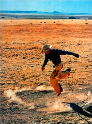
 When I offhandedly declared a jpg of Richard Prince’s 2003 rephoto, Untitled, (Cowboy) to be my own work a year ago, I had no idea it would ever leave my blog post.
As an idea, appropriating an appropriation might be funny/interesting for about 30 seconds. Or it might be a useful provocation for a discussion about fair use, and the unacknowledged constraints it places on our cultural dialogue and production.
Untitled (300 x 404) may look like a jpeg of Richard Prince’s Untitled (Cowboy), but it turns out to look nothing like Prince’s actual, 30×40 inch work. [Which, itself is actually an enlarged photo of Sam Abell’s Marlboro Man ad from a magazine.]
And that’s something I only began to realize when I started looking around for the best way to print this jpg file in real life. Obviously, it can be reproduced infinitely online–here, have one! But printing it without dramatically altering the original data turned out to be a challenge.
So when Jen Bekman and I started talking about publishing an edition with 20×200, my first question was for their printer. Since they knew their printer was awesome and could pull it off, their first question was for their lawyer.
But as soon as we saw the proofs come in in various sizes, with the pixels rendered in velvety, matte inkjet pigments on that heavy paper, it was obvious that this piece really needed to be published, and it needed to be done by 20×200.
I have no claim on the image, or the idea, or the technical skill of making them, and yet I feel incredibly proud of these prints, which are these beautiful, physical things.
As I figure out how best to photograph them, I’ll post some image of the prints themselves over the next little while. But it might be tough. They’re really the kind of thing you want to see in real life.
Check out prints and details about Untitled (300 x 404) at 20×200 [20×200.com]
Read Jen’s email announcement of the edition [20×200.com]
Previous greg.org posts:
May 18: West Trademark F(*#$Up
May 20: 300 x 404 [sic]: The Making Of
June 10!: Richard Prints: Untitled (300 x 404)
Author: greg
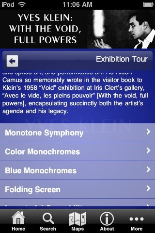
Whoa, Cowboys. The Hirshhorn Yves Klein App Is So-So At Best
I’m as excited as the next guy that there’s an app for the Yves Klein retrospective at the Hirshhorn. I bought it the first day to try it out. I did not expect it to be as cool as the Yves Klein app in my head, which is a Brushes-like painting program where the choice of brushes consists of a flamethrower or a tiny, naked 20-year-old Frenchwoman. I would pay $5 for that right now, and send $5 App Store gift codes to a hundred friends.
As it turns out, the app is so mediocre, I started planning my sobering review almost immediately. Alas, I wasn’t quick enough to get ahead of the wave of hype which has crashed on top of the app, including, most prominently, a fluff piece in the Washington Post. The most eyerolling nontroversy so far is from @museumnerd, who tweetwhined about an Android version: “isn’t @hirshhorn promoting Apple products?” [Yes, just like they promote Weyerhauser products when they print their brochures on paper.]
Now it’s important to get some real, constructive feedback out there early, try and nip the horrible practices in the bud before the museum app world is flooded with poorly designed brochureware.
To be fair to the HIrshhorn and the Smithsonian–and even a little bit to @museumnerd–the cross-platform app development imperative lies at the heart of the Klein app’s problem. But I’ll get to that in a minute, after taking a quick look at what the Klein app is, and where its greatest failings lie:
The app contains early iPod-like nested directory/menus of the exhibition and Klein’s various bodies of work; a timeline, and basic map/visitor info for the Museum. At the end of each branch is an image of a work. There are a couple of film clips, but I could not get them to play. Throughout, most of the text consists of quotes from Klein himself.
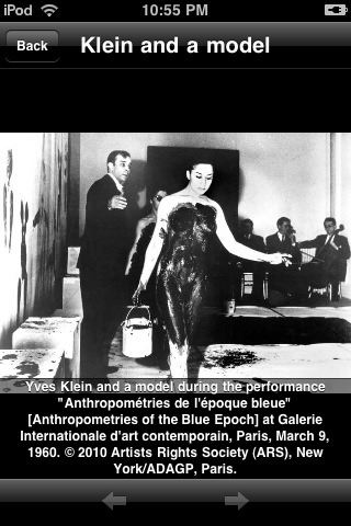
[Thanks to a single image of Klein and a bodypainted model at the Monotone Symphony performance [above], the app carries a warning that nudity makes it suitable for 12yo+. And just like that, the Hirshhorn app corners the 13-yo boy iPhone user demographic.]
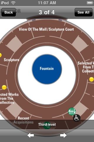
The text is incredibly small; the size cannot be changed. The volume of text, combined with the number of menu items and–most of all–the amount of screen space given over to a static header and a navigation footer, require scrolling to do or find anything. Images are zoomable, but they turn out to be merely web-resolution, so they immediately dissolve into pixels rather than allow any meaningful exploration. For Klein’s large paintings and close-up surfaces, this is a dealbreaker. Ditto for maps of the Museum, which don’t fit the screen.
I understand that most of the content is taken from a documentary playing in the gallery. This content, which would barely fill a three-fold gallery handout, turns out to be way too much. But the real problem isn’t the Hirshhorn’s 10 pounds of content; it’s with the 5 lb bag.
The Museum built their app using Toura, a multi-platform mobile tour guide content management system from a New York-based startup. Museums just insert their content into Toura’s cloud-based template system, hit publish, and voila! Apps for Everybody! Toura’s model is to give away their easy-to-use development tools for free, and then split the app revenue with the museums and other tourist and travel site operators later.
To museums with no budgets and thinly staffed IT and design departments, a free, insta-app is as compelling as a 10-week, 5-figure app dev project is unworkable. I can’t see that changing soon, and until someone proves otherwise by making a fortune with my nude-avatar-paintbrush Anthropometries app idea, I suspect $0.99 repackaged brochures will be the only game in town for a while.
Which is too bad. Because Toura’s standardized design is so suboptimal and user-unfriendly, that it’s almost better to do without. Especially if it’s as poorly executed on an Android as it is on an iPhone. I checked out the only other Toura-based app available, too, for Pace Gallery’s Conrad Shawcross installation in the IBM Atrium on 57th Street. It’s marginally better, with less text, more iPhone-style slideshows, and working video, but it’s still poorly designed, with tons of wasted screenspace, and no content that can’t be found or done online.
For the biggest multiplatform bang for the buck, then, is seems like museums should focus on making their websites more accommodating to mobile browsing. And for the app-happy museum directors trying to get some PR, put out a free app that is basically a portal to your mobile-optimized site. You can then program it right alongside your web content management.
But this seems like the hurdle, both from a development and a user standpoint: if an app can effectively be replaced by an exhibition webpage or a gallery handout, then it probably should not exist. And it certainly should not exist as a paid product.
Of course, this calculation might be different for the Hirshhorn, a museum whose small bookstore maintains a large section devoted to the selling of its own mail–including old catalogues and exhibition brochures from other institutions.
Prints: I Did An Edition With 20×200.com. It Comes Out Tomorrow.
![]() Look, no one is more surprised than I am about this. But when Jen Bekman and I started talking about it a while back, it started sounding like the awesomest thing in the world.
Look, no one is more surprised than I am about this. But when Jen Bekman and I started talking about it a while back, it started sounding like the awesomest thing in the world.
So I’ve done an edition with 20×200.com. It looks fantastic. And it will be released tomorrow.
You can get the first look at it–and the first chance to buy one–by joining the 20×200 mailing list.
Actually, it looks even better in various sizes, so I recommend buying several.
After it’s released, I’ll post a bit about the piece and the ideas and work that went into it.
Meanwhile, a huge shoutout to Jen, Eric, Sara, John and the other folks at 20×200.com, who have been great to work with. Thanks, and stay tuned!
20×200.com/mailinglist [20×200.com]
A Sharp Sticker Car In The Eye
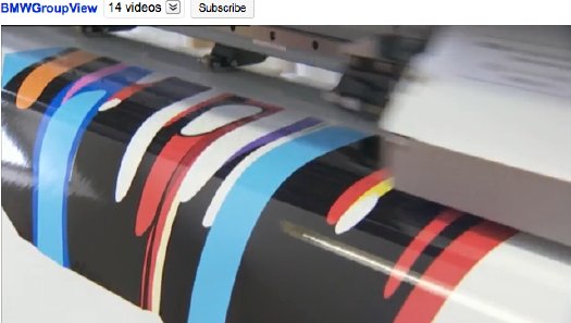
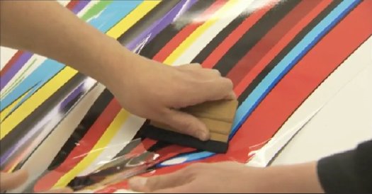
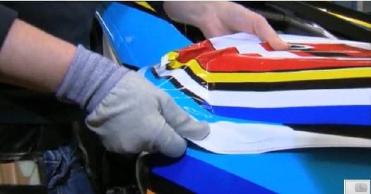
The day I watched the video of Jeff Koons’ crew wrapping the vinyl decals on his BMW Art Car was also the day I surfed across Little Lamb, Richmond artist/musician Sara Gossett’s awesome blogspot compendium of psychedelia [which has lately been supplanted by a tumblr.]
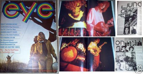
Home for Christmas, Sara was presented with her dad’s collection of Eye Magazines, from which she culled just a few of the most incredible countercultural images. Eye was Hearst magazine’s demographic play for the youth market of 1968-9, the MTV Generation’s parents. It was the Domino and Vitals of its day, with all that entailed. Which means it lasted for just 15 issues.
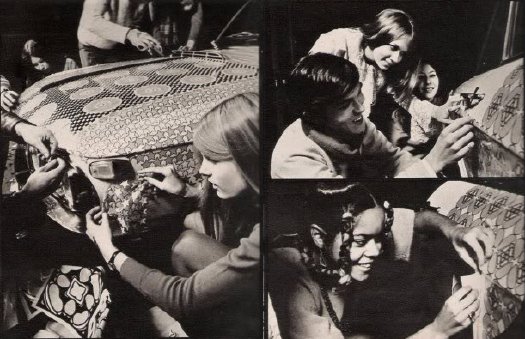
Among Sara’s finds: this incredible car-decorating photoshoot. Look familiar? No, seriously. Look familiar? Let me help read you read the caption: “Finished! Time: four hours and seven minutes (the seven minutes to blow up the balloons).” [emphasis added on the most Koonstastic part]
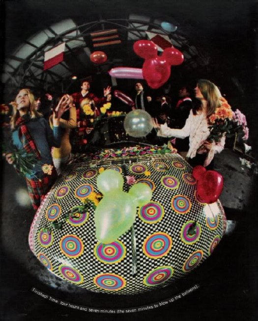
Alas, as a visually inspired type, Sara had no text, or info about the shoot, or even what issue it was in. With some digging, though, I think I found it: Eye, Vol. 1, Issue #1 from, wow, March 1968, the September 10th of the Sixties:
“The Almost-Instant-Flamboyant-Fluorescent-Decal-Decorated Car”
Like I said, sound familiar? I asked a friend who is well-versed in such things, and he identified the car as, not a BMW, but a Lancia Fulvia. If any was involved, the artist’s name is currently unknown. But I bought the cheaper of the two copies of the magazine from the web, so we should know in 5-8 business days.
UPDATE: Uh-oh, could this be true? From a completed ebay.ch auction: “Why is this Man Smiling? Peter Max – 3 pages of Peter’s artwork on cars“!
Eye Magazine, 1968 [hello little lamb, thanks sara]
How To Make A Jeff Koons BMW
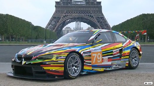
It’s a testament to the PR-fed, context-free media machine, I guess, that Olafur Eliasson, the last artist to make a BMW Art Car, goes entirely unmentioned in the promotions of Jeff Koons’ iteration. [One exception: Richard Chang at the Times.] Or maybe it’s a testament to Olafur’s machine: he gets to have his over-the-top, ice matrix experiment, but he never has to be trotted out and lined up on the lawn at a car show as another corporate trophy.
True, Koons’ hyper-graphic BMW is also more in the tradition of earlier, painted Art Cars by the likes of Calder and Warhol. His design, while dazzling and generally awesome, also feels deeply insignificant. It makes clear the difference between art made of cars and cars decorated by artists.
Which I don’t mean in a bad way, understand. Far from it. Significance is not always a virtue.
The breakthrough of the Koons BMW [which I have to laugh at when I say it, because it’s a car dealer in Virginia. There’s Koons Ford and Koons Nissan, too, and all these cars around DC have the Koons signature on the back, which makes me smile in traffic sometimes, imagining they’re all a big, banal, found object edition.] Anyway, the breakthrough of the Koons BMW is technological. It’s the opposite of Olafur’s impossibility; you can almost literally replicate it anywhere.
As this making of video shows, the design is a vinyl wrap, designed and printed in Koons’ studio, and with a double layer of clearcoat. Everyone should have a giant vinyl wrap printer in his house.
The design templates for standard vinyl wraps are widely available. Judging by the mom&poppiness of the businesses wrapping their ads on Scions these days, it can’t be that expensive. All that’s lacking, obviously, is an artist’s touch.
There are now no barriers to an artist making his own vinyl wrap design, and selling it in edition. Be sure the design is flexible enough to look good on whatever car models collectors might have. [Or you could make them work a little bit by limiting it to, say, Range Rovers.] You’d probably let it be reprinted as needed, but also limit the certificate to one car at a time. And consider offering some zipcode exclusivity for sales; you wouldn’t want any awkward moments in the parking lot at the Atlantic Golf Club in Bridgehampton. Or maybe it’d be interesting, who knows?
If Editions Schellmann can do a series of editions of artists’ doors, and if Art Production Fund can do shower curtains, why can’t some enterprising foundry publish a whole set of artists’ vinyl car wraps? It would not be significant, but it could be awesome.
HowTo: Make A Vija Celmins Night Sky Painting
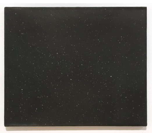
The Brooklyn Rail’s Phong Bui interviewed Vija Celmins about her show at David McKee Gallery
Brooklyn Rail: About the night sky paintings, I always wanted to ask you, with all of the subtleties of gray tones embedded in the white stars and the black sky, how do you build up the surface while controlling the balance of tones?
Vija Celmins: Well, the rather boring technique is this: what I do is I first draw in a pattern that breaks the surface, and then I draw the different sizes of circles for the stars. Next, with a small sable brush, I apply a tiny drop of liquid rubber; it hardens and I build up to a desirable thickness. I then paint different layers of ivory blacks that have been mixed with burnt umber, ultramarine blue, and sometimes with a bit of white. And I use alkyd, which takes about two days to dry, and once it’s dry, I then take off the little rubber bumps, which create those little holes with various kinds of white, which is mixed with a little bit of cerulean blue, and sometimes with raw umber or yellow ochre.
Rail: What kind of white?
Celmins: A combination of titanium and zinc white. And I keep filling those holes until they come up to the same level as the black surface.
Rail: That’s intense.
Celmins: And I often sand it a little, so that the whole surface is totally uniform, flat, and has very tight skin.
It’s the perfect balance between boring and intense that makes her paintings such marvels.
Vija Celmins with Phong Bui [brooklynrail.org via two coats of paint]
image: Dark Galaxy, at David McKee Gallery through June 25 [mckeegallery.com]
The Race To The Moon Museum
Whoa, check that out! The Moon Museum’s on the Tee Vee! Or it will be, June 21st.
The PBS show History Detectives is trying to figure out whether the Moon Museum, a SIM card-sized ceramic wafer created in 1969 by Forrest Myer, with help from an engineer at Bell Labs, which contains drawings by Myer and five other contemporary artists, actually made it to the moon.
The show uses Tampa-based curator/writer Jade Dellinger’s copy of the chip as the hook. They’re making an open plea to viewers with any info on the identity of “John F,” the Grumman engineer supposedly responsible for secretly attaching a chip to the leg of the Apollo 12 lunar landing module.
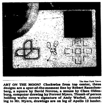
After I posted the NYTimes’ picture of the chip in 2008, it got picked up by Melissa Terras’ Blog, where several people involved in the Moon Museum came forward. The comments now hold a discussion between family members of the Bell Labs engineers who worked on the chips, including Fred Waldhauer, Burt Unger, and Robert Merkle.
Though Myers told PBS that 16 or 20 chips were made, Amy Waldhauer [whose mother Ruth Waldhauer donated the chip to MoMA which was exhibited last year at PS1’s 1969 show], said there were 40.
Also chiming in: curator Annick Berraud, who exhibited a chip in Paris last year, and who is apparently also working on an extended article on the Moon Museum for Leonardo, MIT’s arts journal.
It’s all awesome, but it also sounds like I gotta step up my game if I want to get me a Moon Museum chip. Or at least reopen the comments around here.
More Is More: Warhol’s Silver Clouds In Mies’ Crown Hall
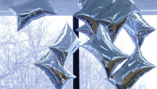
Bell Labs’ Billy Kluver guided Andy Warhol to the Mylar balloons the artist used for Silver Clouds, his 1966 installation at Leo Castelli Gallery. And at Ferus Gallery. And at the Cincinnati Arts Center.
At the time, Bell Labs was operating both Project Echo satelloons; after Echo II’s launch in 1964 until Echo I’s disintegration on re-entry into the atmosphere in 1968, these two giant Mylar balloons were visible with the naked eye around the world.
Flash forward to this week, when the Mies van der Rohe Society opened the largest Silver Clouds installation ever, somewhere between “hundreds” of balloons and “1,000” at the Illinois Institute of Technology’s Crown Hall.
At current Armory Show prices, that’s up to $5 million worth of balloons!
ANDY WARHOL’S SILVER CLOUDS FILL S. R. CROWN HALL, through Aug. 1, 2010 [iit.edu via c-monster]
video: Warhol and Mies: Floating Silver Clouds [edwardlifson]
Art In The Age Of Digital Reproduction
So beautiful. Or is it elegant?
Either way, the degraded, abstracted pixelation of user canzona‘s 1000th ripped & uploaded YouTube video is a great digital tribute to experimental composer Alvin Lucier and the ‘photocopy effect,’ “where upon repeated copies the object begin to accumulate the idiosyncrasies of the medium doing the copying.”
As MeFite DU puts it, “I like how it’s called ‘the photocopy effect,’ but was inspired by a sound recording.”
I Am Sitting In A Video Room 1000 [youtube via @joygarnett]
Pour Copie Conforme
After bagging on Blake Gopnik’s comments on Marcel Duchamp playing the buyers of his readymades for fools, I started looking more closely at Duchamp’s actual statements and working process. It’s so easy to consider him as just a source of ideas, and to forget that in fact, he expended a great deal of effort and time on the creation of objects.
On the other hand, that dude would sign just about anything that wasn’t nailed down. Including readymades that were really made, or found, or bought, by others. All over the place. The only thing that stopped him, it seems, was Arturo Schwartz, who insisted Duchamp stop signing stuff to protect the value of the 1964 readymade editions.
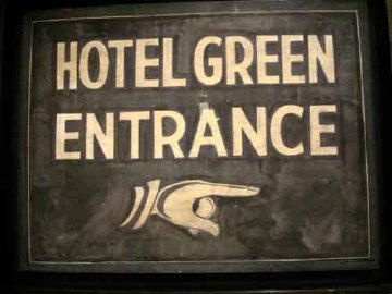
One example: when the late photographer, painter, and avant garde filmmaker Dennis Hopper met Duchamp on the day of the opening of his 1963 retrospective in Pasadena, he grabbed a sign from the Hotel Green, where Duchamp was staying, and asked him to sign it. And he totally did.
Another, from Francis Naumann’s incredible practice history, Marcel Duchamp: The Art of Making Art In The Age Of Mechanical Reproduction, which I picked up at the suggestion of John Powers [Naumann’s gallery was the site of that fantastic Duchamp chess show last year.]:
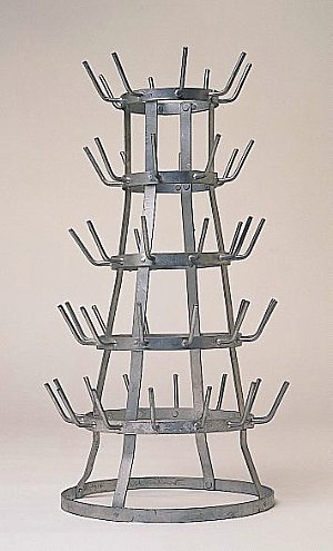
During the time of the Pasadena exhibition, Duchamp was invited to attend a breakfast in his honor at the home of Betty Asher, an important collector of contemporary art who lived in West Los Angeles. Among the thirty or more guests she invited, one of them, Irving Blum, then owner of the Ferus Gallery in Los Angeles, asked Duchamp if he would consider signing a bottle rack he had found and purchased from a local thrift shop. Just in case the artist agreed, Blum brought the item along with him to the breakfast. When Blum asked, Duchamp responded: “Gladly,” whereupon Blum retrieved the work from the trunk of his car and Duchamp signed it on the bottom rung, adding the usual inscription, “pour copie conforme,” and the date: “1963-14”. When Blum was in the process of returning this treasured artifact to the trunk of his car, Richard Hamilton reportedly rushed out of the Asher house and quipped: “You are, of course, aware of the fact, Mr. Blum, that in order to devalue his work, Duchamp signs everything.” [p.235, emphasis added for the awesome parts]
Indeed, and one of the last things he signed was the replica of Bicycle Wheel which Hamilton had made, and had asked Duchamp to sign the next time he passed through London. [Blum donated his Bottle Rack, below, to the Norton Simon Museum in 1968 after Duchamp’s death.]
And Pontus Hulten told how Duchamp said the Modernamuseet could save money by making a bunch of readymade replicas for a show instead of shipping them: “Duchamp later signed everything. He loved the idea that an artwork could be repeated. He hated ‘original’ artworks with prices to match.” [p.213]
Which is making me nod and laugh out loud right now as I sit here, with a pile of pens, signing my name over and over and over on the stack of certificates for the edition I’m doing with 20×200.com, which is going to be announced very soon. Stay tuned.
Cue The Dolphin Embassy
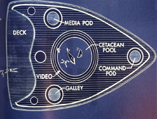
The architecture and art collective Ant Farm first proposed The Dolphin Embassy in Esquire magazine in 1974. When they ended up meeting the owner of the Dolphinarium in Australia a couple of years later, they worked it up into a full-fledged proposal, which got funding from the Rockefeller Foundation and a show at SFMOMA.
Basically, the idea morphed from an underwater building into an open, mobile laboratory craft [above] to facilitate human-dolphin interaction in the wild. [spatial agency has images of both early designs.] First, they would deploy the awesome power of video technology to create a common language with the dolphins. Then…
Here’s Ant Farmer Doug Michels talking about the project with Connie Lewallen in the catalogue for the 2004 retrospective at Berkeley Art Museum:
The next year and a half for me [from 1977-8] was filled with trying to make the Dolphin Embassy real. There was a lot of time spent with both captive and wild dolphins and researching dolphins, a lot of design time on the boat, and a lot of public relations time communicating the dolphin idea to Australia. Putting it in historical context, we were feeling pretty confident about accomplishing things. The House of the Century had been built, Media Burn had been done, The Eternal Frame–these large-scale productions. Cracking the dolphin communication code, well, how hard could that be?! (Laughs.)
CONNIE: Why didn’t the Dolphin Embassy get built?
DOUG: Eventually, it became clear that it was a gigantic project beyond the scale we could accomplish with the funds we had raised. While we didn’t solve cetacean communication during our mission in Australia, the Dolphin Embassy experience provided a deeper view into the mysteries of Delphic civilization.
A few months ago Andrea Grover posted this great 1976 photo of a TV-toting Michels having a diplomatic summit of some kind with his dolphin counterpart. Not sure what they discussed.
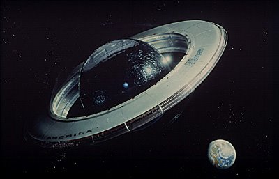
From the disbanding of Ant Farm in 1977 up until his unexpected death in 2003, Michels kept developing the Dolphin Embassy concept. By 1987, it was retitled Bluestar, a joint dolphin-human-compatible space colony with a 250-ft diameter sphere of water “ultrasonically stabilized” within a wall of space-made glass. My merely 100-ft satelloon bows in awe at the thought.
Anyway, I’m reminded of all this now because, with the iPad and all, it may be time to dust off those Dolphin Embassy blueprints.
Speak Dolphin press release at Orange Crate Art [mleddy via boingboing]
Doug Michels, Dolphin Lover [andreagrover.com]
Orbit: Final Conflict
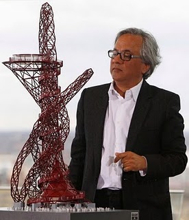
Took me a couple of months, but I finally figured out which, out-of-place alien Washington embassy in the short-lived, suspiciously-generous-aliens-move-into-Earth TV series Anish Kapoor’s wacked out Orbit Tower reminded me of: the one in Gene Roddenberry’s Earth: Final Conflict.
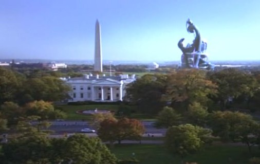
Glad to have that off my plate.
Into Orbit [kosmograd via things]
[images via willwiles and rivenwolf]
The Greatest Camo Story Ever Told
 Sure, there’s Dutch Camo Landscapes, and Razzle Dazzle, and the Civilian Camouflage Council, but it all pales in comparison to the truly epic WWII camo accomplishments of Jasper Maskelyne and The Magic Gang.
Maskelyne was a British magician-turned-Army camo mastermind who, in 1941, led a ragtag band of desert artists and illusionists who created a series of incredible camo techniques that protected Allied forces in North Africa from aerial reconnaissance and bombardment.
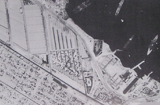
Using burlap and sticks, they disguised trucks as tanks, and tanks as trucks, and they created devices to enable tanks to cover their own tracks across the desert sands. But the most amazing achievements are in his 1949 memoirs, Magic – Top Secret where Maskelyne–whose grandfather, also a magician, invented the pay toilet–tells how he saved the port of Alexandria, Egypt from night bombing by building an elaborately lit decoy port, several miles away in the desert. Using incendiary devices and real anti-aircraft artillery, he and his Magic Gang fooled the German bombers with realistic-looking “hits” and return fire; and by morning, his crews would strew papier-mache rubble around the real port, giving simulated damage for the reconn pilots to report back. [below: a German spy photo of part of the port]
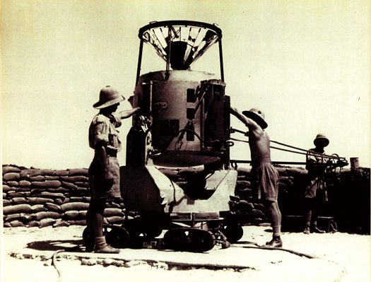
The success of the Alexandria decoy was only surpassed by Maskelyne’s brilliant [literally] strategy for protecting a vital supply route for the Allies, the Suez Canal. He designed “Dazzle Lights,” a rotating structure of made up of mirrors and 24 powerful anti-aircraft searchlights that, when set into motion, gave off a “Whirling Spray,”:
[Maskelyne] managed to create beams nine miles long, twenty-four of them from each searchlights [sic] … the magic mirrors were a success, and the next job was to get the device into mass production. With them, we made twenty-one searchlights serve for the entire one-hundred-mile length of the Suez Canal.
That’s right, the Suez Canal was saved from being bombed by the biggest lightshow in history: the 100-mile-long, Whirling Spray of almost two dozen Dazzle Lights.
How is it possible that I did not know this before now? Why is this miracle of modern warfare not taught in our military academies? Our elementary schools, even? How are these mindblowing aesthetic achievements not celebrated as a landmark in the history of art? Why is there no Bruckheimer movie, starring Josh Hartnett as the daring soldier magician? Maybe because the entire thing is bullshit.
In 2004, military historian and magician [seriously] Richard Stokes published the findings of his multi-year investigation into Maskelyne’s claims. They are gathered in the exhaustively paged website, MaskelyneMagic.com. Working with the magician’s son, he had access to Maskelyne’s archives and scrapbooks from the war. Stokes also cross-referenced official records, declassified intelligence reports, and consulted experts and historians in the North African war. And there is nothing in the historical record to support Maskelyne’s fantastical claims.
On Alexandria, the place where he said he built a decoy port doesn’t even exist; neither does the geography he describe match to any in the vicinity of the city. There are no pictures or corroborating eyewitness accounts, and no documentation.
On the Suez front, Stokes demolishes Maskelyne’s claim to have invented Dazzle Lights by pointing to similar, tank-based tactics under development since WWI. Again, no record of Dazzle Lights can be found in the historical source material, and extensive accounts of the actual defense of the Canal provide well-documented alternative explanations to Maskelyne’s. According to Stokes, Maskelyne didn’t actually come up with the Whirling Spray idea until 1942, after the aerial threat had subsided. And he quotes the illusionist’s son: “The ‘Dazzle Lights’ were an idea which was, I believe, constructed only in one prototype and tested on one occasion.”
Which appears to be the scene depicted in the photo gallery on Stokes’ site, where a searchlight is being outfitted with a faceted, mirrored cone extension:
Which means the photo below, showing an awesomely Duchampian folly, 18 flashlights on a turntable, is somewhat confusing to me:
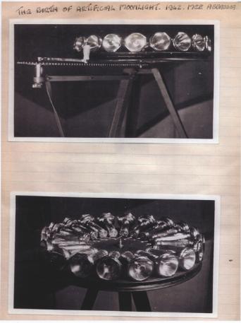
But with a caption like, “The birth of artificial moonlight, 1942,” I’d think that Maskelyne’s imagined heroics are long overdue for [re-]creation.
The War Magician| “”Myth is invulnerable to mere facts” – Barthes [all images via MaskelyneMagic.com]
Previously: Bombardment Periphery, Rotterdam, and Los Angeles’s ‘wigwam’ of searchlights; Forrest Myers’ light pyramid
Tomasons And Akasegawa Genpei, Translated
I’ve got browser tabs full of sweet, sweet updates and extensions to some earlier posts. I’ll start with Tomasons.
Tomasons [also Thomassons], but really, トマソン, are the inadvertent, useless architectural leftovers, vestiges of a city’s churned and rebuilt history. They were invented/ discovered and documented beginning in the 1980s by the Japanese art/architecture collective Rojo Kansatsu [Roadside Observations] and its co-founder Akasegawa Genpei.
At the time, Japan was in the middle of a crazy, real estate-fueled economic bubble, and the built environment was in constant flux. Akasegawa made Tomasons the humorous, overlooked fodder for a magazine column, the compilation of which became a hit in the 80s.
Now, thanks to Kaya Press, Akasegawa’s Thomasson writings have been published in English. Should be great stuff. [via metafilter]
Previously, 02/08: On Tomason, or the flipside of Dame Architecture
Related: Roadside Observation [neojaponisme.com]
Related from last week: Berthier’s (and Boudvin’s) Door, a fake Tomason in Paris [bldgblog, who else]
The Togs Must Be Crazy
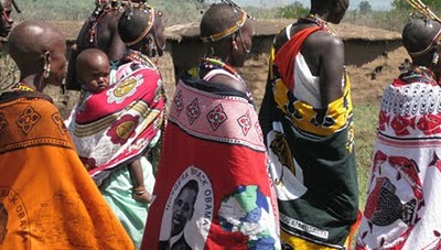
Colorful, cheap African textiles: they’re not just for Yinka Shonibare anymore!
Called Pagne in West Africa and Kanga [also khanga] in Tanzania, 1×1.5m screenprinted cotton wraps are produced all across Africa. There is a tradition to make commemorative kanga for major events, such as the official visit or inauguration of a US president.

Or more typically, the inauguration of a local political leader. Politicians in newly independent nations quickly adapted a traditional practice, and distributed the government-produced fabric for free or at a subsidized cost to their supporters.
As Linda reports in full-color glory on All My Eyes, the Tropen Museum in Amsterdam has a show, “Long Live The President | Portrait Cloths from Africa,” which includes over 100 examples of these textiles. Many come from the extensive private collection of Bernard Collet and can be seen online. The Tropen show runs through August 29th. Obviously, everyone should go.
Even more obviously, though, everyone should be commissioning Pagne and Kanga designers to make commemorative patterns for whatever event or non-event they want to propagandize, too. The mind reels at the awesome possibilities.
African Portrait Cloth [all my eyes]
Long Live The President | Portrait Cloths from Africa [tropenmuseum.nl via all my eyes]
Adire African Textiles [adireafricantextiles.com via a.m.e., like basically everything in this post]