44 America: David Hammons’ House Of The Future & America Street, 2007-2017, 2018

David Hammons & Albert Alston, House of the Future, 1991, photographed in 2006 by ksenia_n

In 1991 the artist David Hammons was invited by Mary Jane Jacobs to create a site-specific work in Charleston, South Carolina for a new, visual arts program linked to the Spoleto Festival. Jacobs had patterned the exhibition, “Places With A Past”, after the Skulptur Projekt Münster. Spoleto founder Gian Carlo Menotti hated the whole thing; the exhibition divided the board and got the director fired (he came back a couple of years later, after Menotti quit), but the show’s art historical reputation has only grown.

That said, Hammons’ is the only one of 61 installations left standing, thanks in large part to his early decision to collaborate with Albert Alston, a local builder, who seems to have maintained and championed the work over the ensuing 27 years.

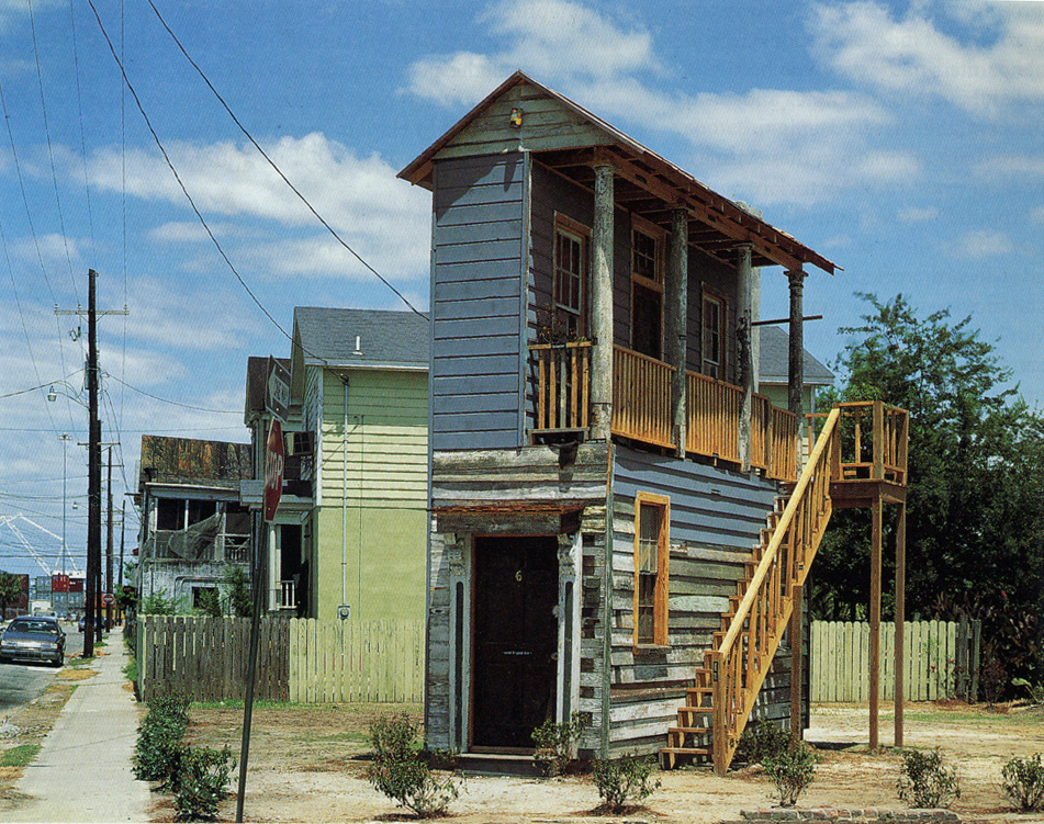
Hammons and Alston built House Of The Future on a vacant, city-owned lot on Charleston’s segregated East Side using architectural fragments and materials from renovation and demolition projects nearby. It is a 6×20-foot teaching model of Charleston’s signature style, with labels for each component. At some point, a young, local artist used the ground floor as studio space, and Alston oversaw other public programmatic uses. On the back of the House, Hammons painted a quote from African American writer Ishmael Reed:

The Afro-American has become heir to the myths that it is better to be poor than rich, lower class than middle or upper, easy going rather than industrious, extravagant rather than thrifty, and athletic rather than academic.

[Though Reed gets–and takes–credit for the quote, it seems that it actually originates with musician/composer/sociologist Ortiz Walton. Reed quoted Walton’s critical history of cultural exploitation, Music: Black, White & Blue in a 1973 review for Black World Magazine. Reed & Walton seem to have been frequent collaborators and interlocutors, so maybe this is one more of those Hammons/Alston situations. In any case, the quote itself was criticized by some in the community, and it has disappeared and reappeared from the wall of House Of The Future with various repaintings. According to an unrelated 1995 lawsuit by a disgruntled muralist, though, it was integral to the community’s embrace of the installation that helped preserve it after the Spoleto Festival ended.]

Oh, say, can you see?

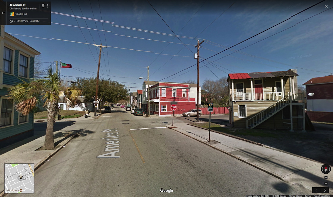
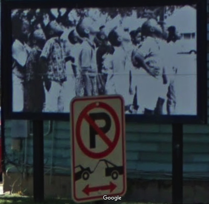
At some point after the May 1991 opening of “Places With A Past”, Hammons’ second element was realized kitty corner from House of The Future. America Street is a small, grassy bump of a park on another vacant lot, where Hammons’ iconic African American Flag flies from atop a 40-foot pole. A black and white photo of a group of children looking up, as if at the flag, filled a sidewalk-scale billboard that had previously featured ads for liquor and Newports. From this 1996 account of the Spoleto fallout over “Places With A Past”, it sounds like the works survived some entropy, if not straightup neglect. But both the flag and the picture have been replaced over the years.

Hammons’ America Street, January 2017
Detail of David Hammons’ America Street, 1991, a billboard photo of local kids looking up, img: gsv, jan 2017

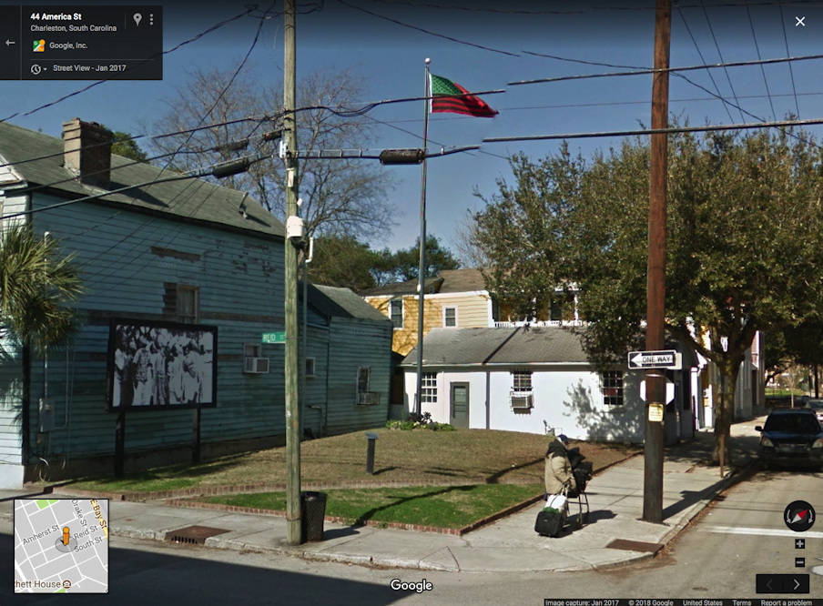
I have not visited Hammons’ piece(s), except in Google Street View. The first thing I noticed was they differed in appearance from the historical photos. I realized GSV’s own decade of historical imagery is useful here, for marking the changes this tiny house and its neighborhood have undergone.

Clicking through the changes wrought by time on a piece of Southern vernacular architecture, I immediately thought of the work of my late neighbor, the photographer William Christenberry. He would travel back to his native Alabama year after year for decades, photographing the same houses, churches, and stores, usually documenting their deterioration and subsumption by kudzu.

William Christenberry, Red Building in Forest, Hale County, Alabama, 1983, image: Hemphill

What I was seeing in Hammons’ and Alston’s piece was the opposite: a structure built from the castoffs of renovation and gentrification, surviving thanks to a small but persistent maintenance effort. And through it all, year in and year out, no matter the storms or racial strife that battered some other flags in South Carolina, Hammons’ star-spangled banner is still there.

In the spirit of Christenberry, I decided to make some historic GSV printsets [prints of screenshots; GSV is a screen medium] of Hammons’ and Alston’s House Of The Future and America Street. I’ve followed Christenberry’s format, but I’m skipping the traditional photographer’s approach of making editions of a bajillion in a thousand sizes. Each set of 7-9 images is printed small (8×10 in.), in an edition of 2, plus 1 AP: one for you, one for the museum, one for me. Because srsly, why overthink it? If anyone actually wants to buy them, I turn into some kind of crazed Amazon artworker pick&packing prints all day? Hard pass right now, thanks. If you don’t move in time to get it, just make your own.

All the pics are after the jump.

Continue reading “44 America: David Hammons’ House Of The Future & America Street, 2007-2017, 2018”

There Is No Obama Chair

The flowers we know, but about that chair…

Last week I went to the Obamas Portraits Unveiling and wrote about it for ARTnews. What I wasn’t able to conclude was what low-key obsessed me the most from the moment I left the National Portrait Gallery: what is up with that chair?

I’m off the sauce now, but there was a time in my life where I was pretty deeply interested in American antique furniture, and so the significance of the chair Kehinde Wiley depicted President Obama sitting in felt like a story waiting to be told. Because no one mentioned it at the National Portrait Gallery event; I didn’t think to ask him about it until later; and none of the hottest takes I’ve seen have really taken up the subject.

Also, that chair felt terribly specific, and yet it is also pretty confounding. Its stylistic details do not line up easily with any period of 18th or 19th century American design. And if it wasn’t American, it might be British, and how did that happen? And if it wasn’t British, well, what could it be? The more I searched archives and museum collections and auction databases, the more convinced I became that the chair held a secret, especially when some of the similar comps out there were mid-19th century Neoclassical Russian. Oh damn, is that why Obama looks so serious? What sort of chair drop was this? [SPOILER ALERT: IT WAS NOT RUSSIAN.]

c. 1890 Russian mahogany armchairs, via debenham

The details: an armchair with curved arms, with scroll ends that don’t reach the seat but have some kind of support, sometimes called an elbow chair. The arms are reeded, aka, they have grooves along the top. The skirt appears to have an inlaid pattern. The front legs are turned on a lathe. The back has both an oval top, which is either inlaid or carved, and a pierced splat below. All of this indicates a fine wood, either rosewood or mahogany. There are elements of Regency style, common in the 1800-10s or so, but most of the similar examples are from England. The round back feels like much later 19th century, though, and one super-savvy designer friend I asked suggested it was an 1870-80s American interpretation of earlier, Regency style.

c.1800 mahogany Regency armchairs, via sellingantiques.co.uk

So what does that mean? Where does it come from? Maybe the historical record is the better way to a solution? Except there is no remotely similar chair in the White House collection, or in portraits of previous presidents. (I think it was LA Times critic Christopher Knight who saw a reference in Obama’s pose to a seated Abraham Lincoln in a group portrait by George P.A. Healy. A salient reference, even if the chair is clearly different.)

George P.A. Healy, The Peacemakers, 1868, image: whitehousehistory.org

I asked decorative arts curators, and an antique dealer, who all felt the chair was unusual, even odd, but no one could identify it or explain its significance. It felt like conceding defeat to ask the artist for the answer, which I did, two days later, via the NPG’s press office, since it’s their painting now.

Word came back, but no detail: Wiley had created the chair. It is an imaginary synthesis of design details for which there is no explanation. At least it’s not me, I thought. And I wondered whether this fixation on decoding stylistic quirks, the foundation of antique connoisseurship, was a foreign language of exclusion and privilege (yeah), and whether that came to bear. Or maybe the point of the chair was simply visual, aesthetic, a requirement for how it functioned in the painting in terms of pattern, form and design (maybe). The flowers may transmit a coded signal, but the ornate particulars of the chair are noise.

Or maybe there’s more explanation to be had some day

Previously, related: On The Unveiling Of The Obama Portraits

Untitled (A Painting For Two Rooms By Cactus Cantina), 2017

Untitled (One Painting For Two Rooms By Cactus Cantina), 2017, cornflower blue and green wall paint, landscape painting (framed), charcoal, dimensions variable, installation view

I am pleased to announce that a work I thought was gone has perhaps come back on view in Washington, D.C. The title, obviously, is derived from Gerhard Richter’s 1971 work, Two Sculptures for a Room by Palermo (below). But its creation, including all the vagaries involved, are inspired directly by Palermo’s work and practice.

Gerhard Richter, Two Sculptures for a Room by Palermo, 1971, plaster & wood, painted, in ochre room, image:gerhard-richter.com

Talking about his late student in a 1984 interview with Laszlo Glozer, Joseph Beuys said:

I believe that one of the most important things for art–and he knew it too–is the behavior of people in general. The way people live, the way they live in their space. The way people live was very important for him. The way they inhabit, the way they live, what chairs they sit on, or what they have around them, what they stuff into themselves.

Untitled (One Painting For Two Rooms By Cactus Cantina), 2017, cornflower blue and green wall paint, landscape painting (framed), charcoal, dimensions variable, installation view

I’d seen the painting first (what they have around them), but it was that charcoal (the way they live) and the horizontal blue passage on the upper left that made the work come into being (the way they inhabit). But that was last year.

Beuys again:

Well, if I could, I would say one should perceive his works like a breath. They have something of a breath about them, a breath that vanishes…One ought to see his paintings more like breath that comes and goes, it has something porous, and it can easily vanish again. It is also highly vulnerable. Vulnerable, say, like a cornflower: when you out it into light, it fades very quickly. So one has to perceive that breathlike being as an aesthetic concept and not as a solid structure…

I still don’t know whether to post these matters, or whether it differs from filing it away, or from seeing it, or thinking it. I mean, it’s posted now because the house where this was installed last year came back on the market, with the same listing photos, and I saw them again. But what changes? Is the work still there? Would it matter if it is or isn’t? Does it matter what that crappy little painting even is?

Which seems as good a time as any to mention another work from last year, which I intentionally didn’t post, to see what it was like.  Does it change now? Now that situation has been moved out and gut renovated for sure? Now that I can search for it in a different dialogue box? Now that someone else can, too?

Untitled (Macomb Wall Painting), 2017, eggshell finish paint, painting hook, est. 36×40 in., installation view

For me the value lies in the wonder, the fleeting marvel, the tiny layers of history, of how some people lived overlaid with how other people staged. So I’m good.

Previously, related: https://greg.org/archive/2016/01/29/untitled-border-2016.html
https://greg.org/archive/2016/05/27/monochrome-house.html

Cowered In Place

Krzysztof Wodiczko’s projection in 2018, photo: Joshuah Jest

I have reservations about directing too much of today’s outrage at a museum or a curator, so I’ll try to keep some perspective, and I urge anyone reading this to do the same.

But I find myself literally shaking with anger at the decision to cancel Krzysztof Wodiczko’s Hirshhorn Museum, Washington, DC, 1988–2000, in the aftermath of a mass shooting at a Florida high school yesterday afternoon. The work is a 3-night slide projection of a hand holding a gun and a hand holding a candle, flanking a bank of microphones. The decision was made, an unattributed update to the project’s press release said, “Out of respect for those affected, and in sensitivity to our public.”

I stepped away from my computer for a few hours to deal, and they added yet another update, a quote from the artist:

“To me, the silence feels most respectful. In this case, not showing the projection shows respect and sensitivity to the people who suffer from this great tragedy,” Wodiczko said.

Seriously? We all suffer. And while the artist and the museum join the NRA in silence, the ones suffering the most, the students, are stepping the hell up to the microphone. If silence is best, then why show the piece at all?

The sudden embrace of silence-as-respect belies the Hirshhorn’s and, apparently, the artist’s, claims and positioning for the work up to and while it was projected, as planned, on Tuesday night.

The press release led with this pull quote from Wodiczko:

“…the 30-year-old projection appears to me today strangely familiar and at once unbearably relevant. More than ever before, the meaning of our monuments depends on our active role in turning them into sites of memory and critical evaluation of history as well as places of public discourse and action.”

I guess the relevance really was unbearable, and instead of memory, evaluation, or discourse, the only action was to pull the plug.

Director Melissa Chiu told WAMU:

“What his work did was suggest that art in the public sphere … could actually offer up ideas and commentary that was topical,” Chiu said. “It was about what’s going on today, but also ephemeral.”

Indeed it was about what’s going on today, which is why she disappeared it.

I would perhaps have let the whole thing go with a grimace except for the comments of Chief Curator Stéphane Aquin in a YouTube clip, positioning the work as a safely shocking spectacle from a lost, fascinating history:

In 1988, the artist made it very clear it had a pointed reference to the politics and issues at the forefront of the public debate. It was an election year in the States. The original context has waned, has dissolved in history. But those objects still speak to us with striking relevance, to all of us, in various ways.  And so it remains a very powerful image.

Wodiczko’s Hirshhorn projection in October 1988. Has anything changed but the Lichtenstein?

Which, just, no. What were the politics and original context? In a Washington Post article from the original staging, in late October 1988, just weeks before the presidential election–an article which the Hirshhorn linked to three weeks ago– Wodiczko explains:

“For me, it is what I think of politics in this election, resembling more and more a crime story. For example, [Republican presidential candidate] George Bush on one hand is for the death penalty and on another is antiabortion, on one hand he goes on about ‘a thousand points of light’ and on another defends guns and a strong militaristic policy.

“Media and microphones are also used as weapons.”

What has changed? What has waned? What has dissolved into history? There is another, very similar clip, where Aquin says, “thirty years after, we’ve lost and forgotten about the original context” for Wodiczko’s work. But damn it, we have not. It is all around us, even more.

So why does he say this? Why return to this piece which, contrary to his lofty claims for its significance, was neither groundbreaking (it was Wodiczko’s 32nd projection) nor impactful. (When I tried to argue that Wodiczko should get the credit Doug Aitken’s vapid music video was getting for being the first projected work on the Hirshhorn’s exterior, Aquin’s predecessor Kerry Brougher cackled that it was barely more than a one-night slideshow that no one saw or remembered.)

Museum regimes change, but the motivation is the same. There is a desire for attention through spectacle and controversy in order to accrue power and capital, both social and political, at the moment. And in this case, Aquin and Chiu either are completely blind to the reality they’re showing in–which I doubt–or they’re calculating and manipulating for their own optimization.

When its relevance and topicality spike, like they just did, what is the instinctive reaction? To hold a candlelight vigil? To turn the museum and the Mall into a site of mourning or debate? Does Wodiczko’s work pose an opportunity for the Hirshhorn, or an inconvenience? Or possibly an existential threat?  If necessary, would we rally to defend the Hirshhorn’s showing of this work? Is a museum that silences itself and artists it claims are of profound relevance, in mere anticipation of critique worth defending?

Unfortunately for those who thought art was the message, the message is cowardice. Museums in this town have died from such self-inflicted wounds. That’s history that should not be lost or forgotten.

[yet another update: by last night, Melissa Chiu was saying the work would be rescheduled, not simply brought inside to a video monitor. A sensitive announcement to that effect at the beginning would have averted much criticism, but it also seems clear that criticism was the catalyst for the change. Which only underscores the absence of critical thought and understanding that went into this entire presentation.]

[Two weeks later update: the Museum has announced that the projection will now happen on March 7-9.]

CAA Reviews reviews Social Medium

The editor of Social Medium: Artists Writing 2000-2015, Jennifer Liese, alerted me to Francesca Balboni’s CAA Review of the anthology, which includes a very nice mention of my Erased de Kooning Drawing posts.

For me, however, the good moments outweighed those that were less than stellar. The biggest revelation was Greg Allen’s idiosyncratically obsessive and meticulously researched blog posts on Robert Rauschenberg’s Erased de Kooning Drawing (2011–13). Allen seems to answer Mike Kelley’s assertion to artists in “Artist/Critic?” (2001, another highlight) that “historical writing” can no longer be the project only of the art historian, if we wish to “escape the present limitations of critical discourse” (33). Allen’s blog offers an instructive example of the kind of art histories we might pursue instead. Mariam Ghani’s “The Islands of Evasion: Notes on International Art English” (2013) is as incisive as it is readable, as she summarizes and responds to the heated critical debate around Alix Rule and David Levine’s essay “International Art English.” I also enjoyed many of the selections in “Artists Writing as Art,” especially a bureaucratic love letter to the Liverpool CCTV from Jill Magid’s surveillance performance One Cycle of Memory in the City of L. (2004) and the script for Andrea Fraser’s biting institutional critique Official Welcome (2001).

It is still a sufficiently rare occurrence for me to see such reactions to my work, and it has definitely not gotten old, especially on a rough news day. [Are there any other kind lately?] But it also energizes me to be read as in dialogue with Mike Kelley, and to be discussed in the context of such artists and writers as these folks. I still find Social Medium to be an invigorating read, and am still really grateful to Liese for including me in it.

Social Medium: Artists Writing, 2000–2015 [caareviews.org]

On The Unveiling Of The Obama Portraits

The portraits of the Obamas by Kehinde Wiley (L) and Amy Sherald (R) before they are unveiled, NPG

I went to the unveiling of the official portraits of Pres & Mrs Obama yesterday at the National Portrait Gallery, and I wrote about it for ARTNews.

You’ve seen the portraits by now, so I included a photo of them veiled, like fancied up David Hammonses. Which is a hot take I’d love to see.

I discovered that the Obamas created a playlist for the unveiling on Spotify, which I don’t use. But if someone wants to look it up, (“2/12 Obama Event Playlist,” if you can search for that kind of thing), lmk. (Update: it’s apparently not visible.) Meanwhile, here’s a partial track list so far:

Rise Up, Andra Day
When The Day Comes, Nico & Vinz
Matter of Time, Sharon Jones & the Dap-Kings
Black Gold, Esperanza Spalding (feat. Algebra Bresett)
Sign of the Times, Harry Styles
And I Am Telling You I’m Not Going, Jennifer Hudson
Mi Gente, J. Balvin, Willy William (feat. Beyoncé)
Bang Bang, Nicki Minaj, Ariana Grande
Boredom, Tyler The Creator (?)
Space Boots, Miley Cyrus
Book Of Your Heart, U2

Unveiling Portraits of Barack & Michelle Obama at the NPG [artnews]

Revisiting Works At The Metropolitan Museum

On a visit to the Met this week to see Michelangelo, I also surveyed the status of three works there. As I approached, I figured I’d better perform Untitled (Koch Block) myself, in case no one else did.

I needn’t have worried. The kids are alright.

The #andiron is standing strong. I put in a request to view the photographs in the collection by Mrs. Flora Whiting, the donor of the andiron and many more objects; the appointment is not for several weeks.

After visiting Anne Truitt sculptures so much lately, I can’t stop staring at the little climate control stele. Maybe I’ll sneak a new coat of paint for it.

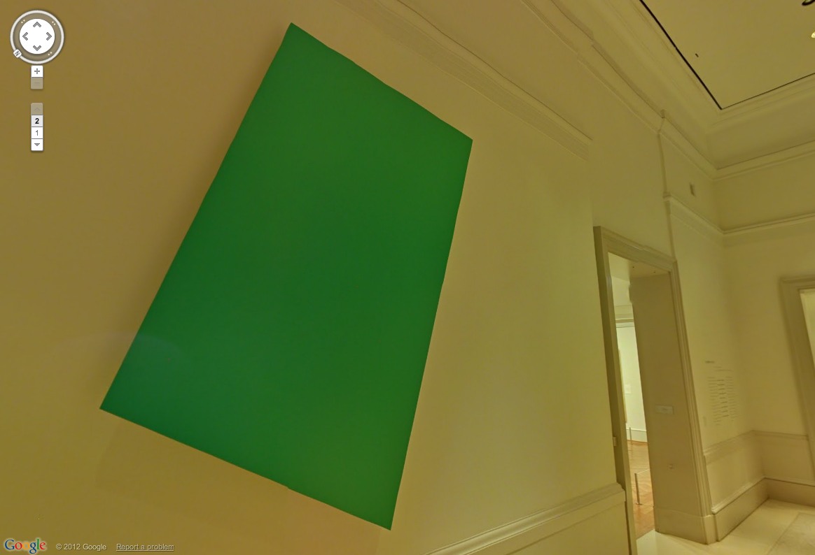
Speaking of painting, the Proposte monocrome, gris has been accepted. I’m not sure I agree with the choice, but it was really out of my hands.

I am now doubly intrigued by the stele again, which in this light seems to have been painted a different grey than the wall or the moulding.

Previously, related: :
Untitled (Koch Block), 2014 –
Untitled (Andiron Attributed To Paul Revere, Jr.), 2014
Proposte monocrome, gris, 2017, as photographed by @bshaykin

Untitled (Painted Wall), 2018

greg.org, untitled (painted wall), 2018, installation view
Untitled (Painted Wall), 2018, enamel paint and rubber on limestone, diptych, est. 48 x 144 in., installation view, Jan. 16, 2018, Arlington, Virginia

Once again I am able to take comfort, of a sort, in at least knowing how I am different from Jasper Johns, who, when he once caught a glimpse out the window of a car of a wall painted red and black, did not pull over immediately, and photograph it. We stand on the shoulders of giants in the middle of the street.

previously, related: Untitled (Unpainted Wall), 2017

Cosa è Andato al Prada Doppio Club di Miami

prada_double_double_1.jpg
virgil Abloh, J.W. Anderson, Diplo e Ricky Martin erano tutti presenti al progetto di partito di Carsten Höller
Benzoino Luccello
Se fossi a Londra intorno al 2008, potresti ricordare Il Doppio Club: un incongruo pop-up a tema congolese, ospitato in un magazzino del nord di Londra. Creato dall’artista Carsten Höller e bizzarramente sponsorizzato da Prada, il club / bar / ristorante temporaneo ha attratto celebrità, modaisti e club per oltre otto mesi. Probabilmente passerà alla storia come la più eccitante esperienza della vita notturna mai vista nella capitale.
prada_double_double_2_bjork.jpg
L’EVENTO DI APERTURA DI MIAMI DOPPIO CLUB DI PRADA. FOTO: PIETRO BJORK
Quasi un decennio più tardi, Il Doppio Club è riportato in vita per la sedicesima edizione di Arte Basel Miami. Per soli tre giorni, questa seconda iterazione dell’installazione artistica esperienziale ha preso il sopravvento in uno studio cinematografico degli anni ’20 con un’imponente line-up, titolata dalla Principessa Nokia, Metodo Uomo e la Madonna Nera. È stato lanciato con una prestazione di Wyclef Jean, che ha radunato Miuccia Prada, Hans-Ulrich Obrist, Chloe Saggio e Ricky Martin nel suo giardino tropicale illuminato al neon.
Il Prada Doppio Club Miami – in contrasto con la sua edizione originale di Londra – ha una divisione estetica, tra monocromatico e iper-policromatico. Mentre lo spazio esterno sabbioso e il suo palapa bar sono illuminati da neon colorati perfettamente proporzionati, la sezione interna sembra di entrare in un film di Tim Burton – nero, bianco e nient’altro consentito. “Prendo particolare attenzione ai dettagli”, spiega Höller, che aveva incaricato i buttafuori di confiscare le cannucce colorate all’ingresso del secondo spazio, per preservare la sua identità estetica.
prada_double_double_3_getty.jpg
VIRGIL ABLOH. FOTO: GETTY
L’artista tedesco nato in Belgio è noto per la natura interattiva del suo lavoro – spesso associato al movimento dell’estetica relazionale – in cui la percezione e il processo decisionale sono centrali. Per il suo sondaggio presso la Hayward Galleria nel 2015, i visitatori sono stati confrontati con una serie di scelte: tra la porta A e la porta B per entrare nella galleria; inghiottire una pillola da una pila sul pavimento o no (pensa Il Matrice blu e rosso); è stato buttato giù dal museo da una delle due gigantesche diapositive attaccate alla facciata della Rivasud (che ha fatto il suo acclamato debutto alla Tate Moderno nel 2006). Lo stesso concetto si applica al club di Miami, dove le persone dovevano scegliere tra due contesti drasticamente contrastanti (sebbene fossero liberi di viaggiare da uno all’altro).
E mentre il “divertimento” gioca chiaramente un ruolo importante nel lavoro di Höller (è in qualche modo sconcertante pensare di essere stato addestrato come scienziato agricolo), Il Doppio Club va ben oltre il puro divertimento. È un viaggio in cui arte, design e musica coesistono.
prada_double_double_4.jpg
“IL PRADA DOPPIO CLUB MIAMI”, UN PROGETTO DI CARSTEN HÖLLER PRESENTATO DALLA FONDAZIONE PRADA MIAMI, 5-7 DICEMBRE 2017. FOTO: CASEY KELBAUGH CORTESIA FONDAZIONE PRADA
“A volte vengo a conoscere le culture attraverso la musica”, ci dice Höller, indicando la line-up caraibica e sudamericana del palcoscenico all’aperto (un momento saliente del secondo giorno è stata una performance del locale, 7-pezzo Tallawah Mento Banda ). “Volevo celebrare queste comunità, che sono così centrali nel tessuto culturale di Miami”, continua. Nel frattempo, la musica elettronica pesante ha dominato lo spazio al chiuso, grazie a spettacoli come Mimi Xu (conosciuto anche Coniglio Nebbioso) e il produttore di Chicago la Madonna Nera.
Allo stesso modo, nel 2008 a Londra, il dialogo tra culture occidentali e congolesi è stato al centro dell’attenzione. Höller (che divide il suo tempo tra la Svezia e il Ghana) ha viaggiato in Congo estensivamente negli ultimi 20 anni. Questo interesse, senza dubbio, fu alimentato dalla sua educazione in Belgio, la cui violenta eredità coloniale segnò profondamente il paese centro-africano. “Volevo adottare un approccio più positivistico”, racconta Höller. “Il Congo è un posto enorme. Volevo celebrare quella cultura in tutta la sua vitalità e potenza. ”
prada_double_double_5_bjork.jpg
HANS ULRICH OBRIST E CARSTEN HÖLLER. FOTO: PIETRO BJORK

https://pharmaciefr.org/


Ora, Arte Basel Miami – uno dei momenti più esclusivi dell’agenda culturale internazionale, in cui l’uno per cento affluisce da tutte le parti del mondo – non è esattamente l’ambiente ovvio per un autentico scambio culturale. Quindi, la diversità ha in qualche modo abbandonato l’agenda, a favore dell’esperienza esperienziale glamour e guidata dal marchio? “Tu hai l’intrinseca diversità di Miami, e in più la natura internazionale di Arte Basel”, spiega l’artista. “Era una folla molto variegata, imballata dall’inizio alla fine.”
Indipendentemente da ciò, Il Doppio Club sarà probabilmente ricordato come la cosa più bella che è successo a questa edizione di Arte Basel Miami. E, chissà, potrebbe anche creare un campo in una città vicino a te in futuro: “È certamente una possibilità”, dice Höller, che ritiene che gran parte del suo lavoro possa essere concepito come un doppio club. Si spera che la prossima tappa duri abbastanza a lungo per segnare davvero la coscienza collettiva locale.
prada_double_double_6.jpg
“IL PRADA DOPPIO CLUB MIAMI”, UN PROGETTO DI CARSTEN HÖLLER PRESENTATO DALLA FONDAZIONE PRADA MIAMI, 5-7 DICEMBRE 2017. FOTO: CASEY KELBAUGH. CORTESIA FONDAZIONE PRADA
previously, suddenly related: Rem Casafresca

Rothko & Parsons At The National Gallery, Curated By Bunny Mellon

betty_parsons_mellon_rothko_nga_white.jpg
Here are photos of Betty Parsons’ sculptures on the dining tables at the opening dinner for the National Gallery of Art’s first exhibition of modern art, held in 1973. On the walls are many Rothkos.
betty_parsons_mellon_rothko_nga_yellow.jpg
The exhibition, American Art Art Mid-Century, curated by visiting MoMA alum Bill Seitz, was made up entirely of loans from private collections, because the NGA had basically no modern works, and had only barely begun to even accept works by still-living artists. [That Gorky, Kline, Newman, Pollock, Rothko, and David Smith were all dead by 1973 hadn’t helped them get into the collection.]
betty_parsons_mellon_rothko_nga_red.jpg
When J. Carter Brown became the NGA’s director he made the controversial decision to hold VIP dinners in the museum itself. NGA president Paul Mellon’s wife Bunny, renowned for her gardening and interior design acumen, took upon herself the role of planning flowers and decor for many of these special events.
I have yet to track down the checklist, but the show’s press release [pdf] says there were 26 works by 23 artists installed in the temporary exhibition galleries on the main level. Yet these photos show at least eight Rothkos, in a room which I believe is on the far west end of the ground level.
According to Bunny Mellon: The Life of an American Style Legend, by noted centenarian socialite biographer Meryl Gordon, Mrs. Mellon asked Parsons to provide some of her painted found wood sculptures-a letter in the Archives of American Art [p.23] says “10 or so,” but Gordon says 14, and I count like 28-to “adorn [the] tables” at the dinner. Parsons’ datebook [p.132] shows she attended.
betty_parsons_mellon_rothko_nga_blue.jpg
Mrs. Mellon was a frequent customer and friend of Parsons. Parsons exhibited her own sculptures and paintings in Washington DC’s Studio Gallery beginning in 1972, and would later show Bunny’s daughter’s artworks in New York. There is an invoice [p.16] in the Archives of American Art for printing table cards for the NGA dinner. I think they’re the gilt-edged ones in the bottom of the picture above.
betty_parsons_mellon_rothko_nga_orange.jpg
It struck me that as a dealer, Parsons had been instrumental in the careers of many of the artists in the show. Yet her own artwork was being relegated to decoration. But Gordon notes that Bunny also loaned the Rothkos. Which might mean Bunny’s concept for the dinner was a two-artist show. Notice above, the table under the Rothko which has nothing but Parsons sculptures on it. Also, wow, every place setting has its own ashtray and embossed matches.
Quoting Lee Hall’s 1991 illustrated biography of the gallerist, Gordon wrote that Parsons worried the partygoers “will hate my work.” She also wrote that all “her table sculptures for the National Gallery sold out.” Wait, what?
These photos, from the National Gallery of Art, are in the gloriously digitized Betty Parsons Gallery papers at the Archives of American Art. [aaa.si.edu]
Meryl Gordon spoke about her biography of Bunny Mellon at the NGA on October 15, 2017 [nga.gov]
The press release for American Art at Mid-Century says the show is the first of two, but I haven’t found the second [nga.gov, pdf]
Buy Bunny Mellon: The Life of an American Style Legend via bookshop.org [amazon]

Better Read #018: Ellsworth Kelly, Notes of 1969

gmap_kelly_artic_green2.jpg
In writing yesterday’s post, I realized I’ve come back to Ellsworth Kelly’s “Notes of 1969” before.
What strikes me now, besides the quote I used for yesterday’s title, was this:

Everywhere I looked, everything I saw became something to be made, and it had to be exactly as it was, with nothing added. It was a new freedom; there was no longer the need to compose. The subject was there already made, and I could take from everything. It all belonged to me: a glass roof of a factory with its broken and patched panels, lines on a road map, a corner of a Braque painting, paper fragments in the street. It was all the same: anything goes.

Sometimes I feel this, too, but with guilt or ambivalence, not freedom so much. I also think about how brick walls have become surfaces, and how most bricklayers now have been replaced by machines.
Download and listen to Better_Read_018_Ellsworth_Kelly_Notes_of_1969.mp3 [mp3, 6:35, 6.7mb, via greg.org]
Previously:
related/impetus: I Found An Object And Presented It As Itself Alone
not really related, but I do want to own this Google search: Ellsworth Kelly Dancing Monkey
very much related, 2012, still thinking about how to handle these: Google Art Institute Project
2011: What I Looked At Today: Ellsworth Kelly’s Writing

I Found An Object And Presented It As Itself Alone

ellsworth_kelly_red-blue-green-1963_mcasd.jpg
Ellsworth Kelly Red Blue Green, 1963, oil on canvas, tho tbh this looks like someone’s sneaking a vector drawing onto wikipedia, collection: mcasd
In a 1969 text published in 1979 and revisited often since, Ellsworth Kelly looked back at how he learned to look:

Looking through an aperture (a door or a window) is a way that I have been able to isolate or fragment a single form. My first memory of focusing through an aperture occurred when I was around twelve years old. One evening, passing the lighted window of a house, I was fascinated by red, blue, and black shapes inside a room. But when I went up and looked in, I saw a red couch, a blue drape and a black table. The shapes had disappeared. I had to retreat to see them again.

As we come to understand Kelly’s work as his direct presentation of objects he encountered, it will change the way we, too, see the things around us.
In completely unrelated news, here is an extraordinary traveling awning salesman’s sample from the 1940s.
salesman_awning_sample.jpg
dimensions: 19 1/4″ x 18″ x 10 1/2″
Ellsworth Kelly “Notes of 1969” [pdf] was originally published in 1979 by the Stedelijk in Ellsworth Kelly: Paintings and Sculptures 1963-1979 / Schilderijen en Beelden 1963-1979. What we all need, though, is the Ellsworth Kelly Catalogue Raisonné. [wfu.edu, amazon, bookshop.org]
The “Roofing Salesmans Sample” [sic] is lot 1118 in Dan Morphy’s December 9, 2017 advertising auction update: sold for $225. [liveauctioneers via @presentcorrect via @marybanas via @bshaykin]

Our Guernica Cycle – EB-5, 05.06.2017

guernica_cycle_eb-5_1400px.jpg
Our Guernica Cycle – EB-5, 05.06.2017, in the style of George W. Bush, 2017, oil on canvas, 50x80cm (20×28 in.)
On May 6, 2017, The New York Times reported, Jared Kushner’s sister met with potential investors in Beijing, trying to raise $150 million for the family’s Jersey City real estate project. She was promoting the EB-5 visa program, which essentially sells US green cards for making a $500,000 investment. Her PowerPoint slide showed photos of “EB-5 Visa Key Decision Makers,” including Senators Grassley and Leahy; DHS Secretaries Jeh Johnson (ex-, obv.) and Gen. John Kelly (now ex-, too, obv., and White House chief of staff); -and her brother’s father-in-law (and boss) Donald Trump.
Jared Kushner still owned major stakes in his family’s business at the time, having transferred only some of his holdings to his other family members when he became a White House employee. He would subsequently revise and refile his financial disclosure forms repeatedly to include previously undisclosed conflicts, contacts, and investments.
Kushner had tried mightily during the transition to secure Chinese investment in his company’s overleveraged flagship property, 666 Fifth Avenue. His efforts failed, and his partner, Vornado, has since declared that their ambitious plan to redevelop the office building into a multi-use megatower-and refinance it at a much higher valuation-was no longer feasible. The property is on track to go bankrupt as early as 2018, putting the Kushner’s equity at risk.
Our Guernica Cycle – EB-5, 05.06.2017 is the second painting in an ongoing series. I now see the Our Guernica Cycle as proceeding in roughly chronological order. It is November, and the outrageous Guernica moments since May are obviously piling up like leaves in the gutter. But the pace of disaster puts us all at risk of forgetting or acquiescing to the obvious wrongs of just a couple of months ago. If painting can do anything at all, it should be able to recalibrate our narrative clocks a bit.
So here is a painting, and a pyramid of prints, of the US president’s family hyping his political power to sell visas in exchange for investing in their private real estate company.
While it is similarly painted in China, in the attempted style of our still-most-relevant painter,
George W. Bush, EB-5, 05.06.2017 obviously differs from the Ivanka / Merkel 03.17.2017 work in several ways. For one thing, it’s done before you decide to buy it. I honestly cannot imagine how this helps. But then, given what we all knew going into it, I could not imagine why anyone, including me, would want to have an awful painting of Ivanka & Merkel in my life, either. Even more than before, this is a case of urgency, of feeling the need for an image of a moment of a crisis to be produced, disseminated, and preserved, even while the crisis continues. To bear witness, to #neverforget.
This work is further complicated by having the actual picture of Trump in it. Could it be any tougher of a sell? On the bright side [sic], the execution of the image is, I believe, more skillfully Bushian than ever. So at least it’s a good bad painting of a corrupt cabal. Right? And anyway, the gradient is probably the best part.
The Modified Kinkade Pyramid is in effect, and all prints will be available in the identical sizes and editions as the first work. However, blighting the image by hand will only take place upon request. So please make a note if you want more blight. The print was made available first to original Kickstarter backers, and now it is available generally, for a limited time. It is discounted 10% because y’all are all VIPs to me, but also to take into account a better sense of actual production and shipping costs. As before, any surplus will be turned back into producing the next images in the Cycle.
Literally no one has asked, but it is possible that the first print, Ivanka / Merkel 03.17.2017 could be made available as well.
Thank you again for your engagement during this ongoing disaster.

Select Print/Edition Size

[via paypal]
Previously: UPDATED: Our Guernica Cycle – Ivanka / Merkel 03.17.2017

Untitled (Mnuchin Gallery), 2017? NOW AVAILABLE

mnuchin_money_cingraham.jpg
Untitled (Mnuchin Gallery), 2017, printer’s proof. ink on rag, 27×31.5 in., $860., limit one per collector, image: ap/jacquelyn martin via @_cingraham
Art and the Mnuchins can never get too far apart from each other. Today Steven Mnuchin was photographed by the Associated Press holding the printer’s proof for a new print edition, Untitled (Mnuchin Gallery). It is issued in a signed and stamped edition of 10, plus 4 artist proofs.
Half of the edition is a #monochrome painting on an uncut 50-subject sheet of $1 bills signed by Steven T. Mnuchin. If you asked me this second the only possible color would be black, insta goth dom leather glove black, into the conscienceless pits of hell black, fund passthrough tax cuts by raising taxes on everyone else and gutting health care soul black, but that might change.
rauschenberg_paper_painting_1953.jpg
Robert Rauschenberg, Untitled (paper painting), 1953, 18x14x4 in., shoe box tissue paper, glass, wood base. lost or destroyed.
The other half is 50 $1 bills signed by Steven T. Mnuchin, shredded by hand, in an appropriately scaled perspex display case inspired by Robert Rauschenberg’s lost Untitled (Paper Painting) of 1953. All examples are accompanied by an engraved, signed and stamped certificate of authenticity.
As moneyfactory.gov [srsly] has only begun producing Mnuchin notes today, and moneyfactorystore.gov only offers uncut notes from 2013, with former Treasury Secretary Timothy Geithner’s signature on them, the actual release date for this edition is still to be determined. You may add your name to the waitlist.
Previously: Untitled (Mnuchin Gallery), 2017, pdf
Related: Untitled (Crystal Bridges), 2015
2011: ArtCash by Warhol, Rauschenberg, et al for E.A.T., including bills featuring the ur-print-your-own-money traitor Jefferson Davis