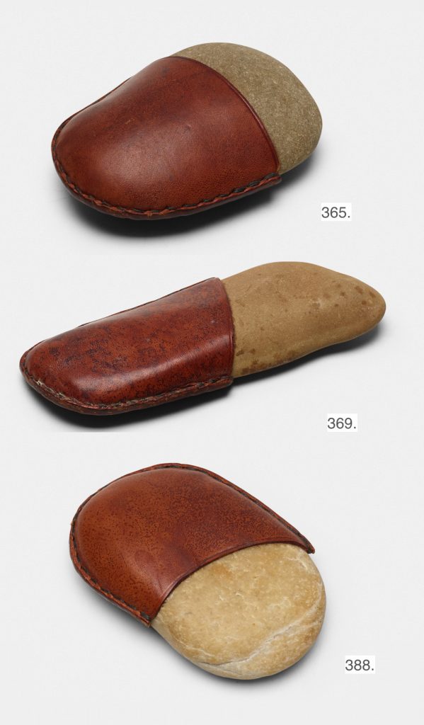
Lots 365, 369, and 388 in Wright20’s art & design sale, 19 Apr 2018
A pre-emptive note: I have seen Carl Auböck’s 1950s-era stone and leather paperweights coming up for auction at Wright20 in a few weeks.
Though they bear a superficial formal resemblance, they do not quality as editions of Untitled (Sold Out). If you submit them for authentication, please be assured that I have logged their dimensions, patina, and images, and I will know immediately that you did not buy them at a Nordstrom’s Christmas 2016 pop-up shop, so please save me the hassle and you the certain public embarrassment.
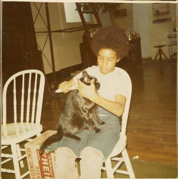
Hicri brushing Jasper Johns’ cat, next to a Warhol Heinz box, with a monkey in a cage in the background, October 1971 image:Suzi Gablik papers, AAA/SI
Hi, are you or do you know Hicri, the 10 year-old or so kid in the picture brushing Jasper Johns’ cat? With the grape-eating monkey in a cage behind you? If so, I’d love to hear your story.
This was October 1971, Johns had his studio at The Bank, as it was called, a sprawling 1912 building at 225 East Houston St, on the corner of Essex. Artist/writer Suzi Gablik took these photos and captioned them in her scrapbook as Hicri & Jap. Gablik’s scrapbooks are now in the Archives of American Art.
It’s possible Hicri’d hang out there while his mother or some other family members worked for Johns; there’s a snapshot of Hicri in Johns’ kitchen corner, surrounded by the preparations for a meal or a party. There’s a photo of Hicri helping Jap carry stuff to a cab, and it’s labeled “Off to St. Maartens.”
Some folks at the AAA had wondered what Johns’ cat’s name was, and I thought Hicri might know. He’d probably be 57-58 by now. (Hicri, that is, not the cat.) Me, I just wonder what it was like hanging around the studio back then; it seems unimaginable, but probably memorable. So Hicri, HMU.
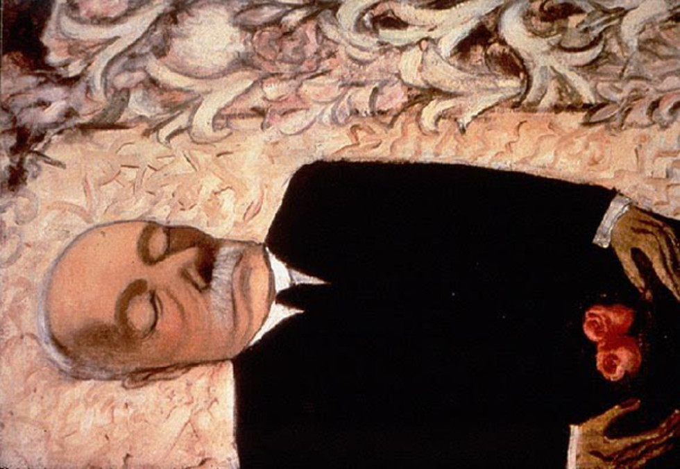
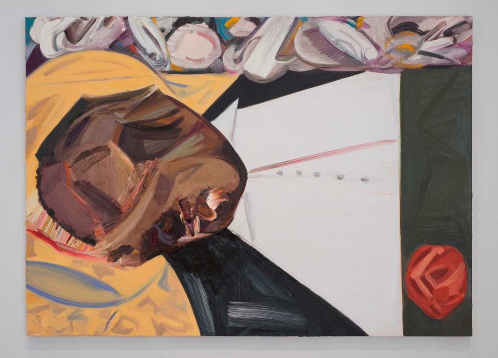
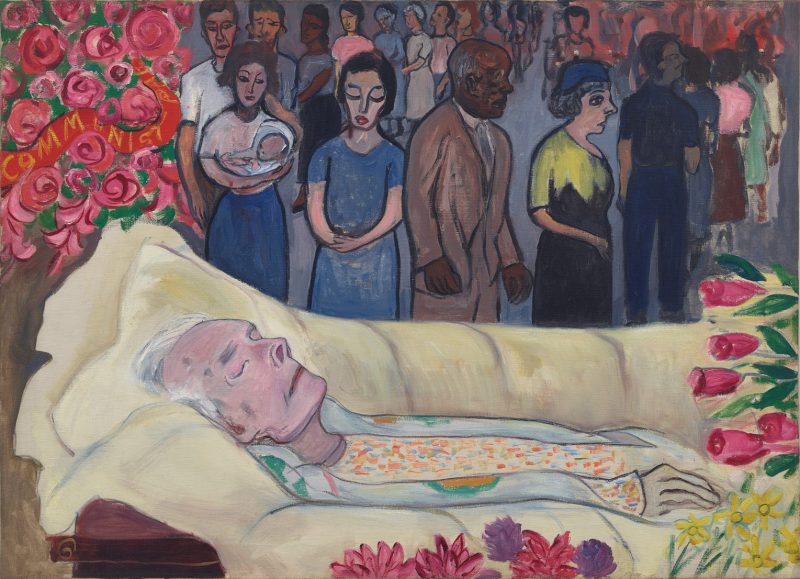
Alice Neel, Dead Father, 1946Dana Schutz, Emmett Till, 2016, image of painting installed at the 2017 Whitney Biennial via Washington Post
A reader, Jon Auman, who is amused by my sense of art mystery, recently sent along a pairing of paintings. He saw Alice Neel’s 1946 Dead Father (above) in the catalogue of a Thomas Amman show in Zurich, and it reminded him of Dana Schutz’s Emmett Till.
For all but a few days after the Whitney Biennial opened, it has been beside The Point, if not impossible, to consider Schutz’s painting as a painting, not as a cultural flashpoint. But Auman’s noticed what I think is a real reference for Schutz, and it’s one that has not been raised or discussed publicly, afaik.
The immediately received and problematic genesis of Schutz’s painting of Emmett Till is the photograph of Till’s murdered body in an open casket that his mother Mamie Till caused to be published to protest his unjust killing. The most widely circulated of those photos was just young Emmett’s face, and it’s reasonable to accept that Schutz’s gashed painted surface was inspired by that picture. But other photos of the funeral reveal that Till’s body, his casket, and his surroundings, do not resemble Schutz’s depiction at all. Her painting is not a documentation; it is her construction. Which, of course it is.
And Neel’s painting of her own father’s funeral is pretty clearly a reference. Unlike her more famous portraits, Neel painted Dead Father from memory, a deliberate remove from experience and observation. Looking for a clean image of it brought up another Neel painting I’d forgotten, which feels even more relevant.
Alice Neel, Death of Mother Bloor, 1951
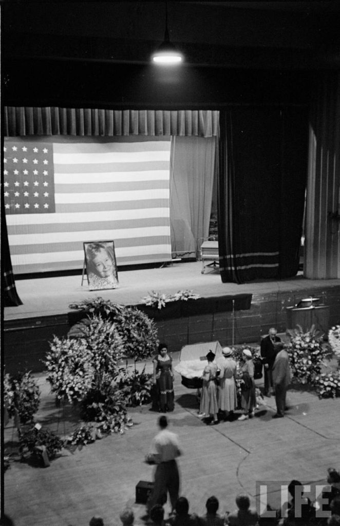
In 1951 Alice Neel painted Death of Mother Bloor, which shows the public funeral in Harlem of Ella Reeve “Mother” Bloor, the revered American Communist organizer and suffragist, who died in the midst of McCarthy’s witch hunts. Like Schutz, Neel cast a sympathetic eye on the historic funeral of a politically controversial figure, and constructed a painting unconstrained by photography’s documentary assertions.
In 2012, Dana Schutz talked with Jarrett Earnest at length about her painterly influences, or artists she admires. A lot of what she sees is construction. She doesn’t mention Neel, but I think it’s worth asking.
My new work, “One Square Kilometer (for Walter de Maria)” is a black square on the web that literally measures one square kilometer in real space: https://www.aarea.co
Kenneth Goldsmith announced aarea.co this morning, “One Square Kilometer (for Walter de Maria)”.
Kenneth Goldsmith’s 1×1.jpg at original scale. It’s there! I promise!
It is a 1×1 pixel jpg scaled to 3,779,527 pixels wide–which by common calculations is 1 kilometer of pixels–and 4,320,000 pixels long–which is, by the same calculations, 1.14km of pixels. Ceci n’est pas un square.
Screenshot of Kenneth Goldsmith’s aarea.co, One Square Kilometer (for Walter de Maria), 2018
The result is a massive, black monochrome, scrollable in a browser window. I don’t know what it is to Kenny, but the gap between the image’s single-pixel essence and its 7-figure pixel scaling is interesting to me.
Also interesting: the original source of the pixel dimensions used for this calculation. Because screen resolution and pixel density will affect how 1km it actually is. Goldsmith’s code for aarea.co currently contains only a Google Analytics script, but perhaps it will some day have responsive scaling, that yields a 1-Km Square on whatever screen or device it is viewed with.
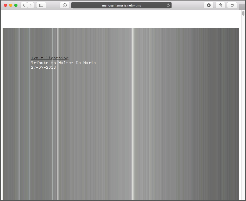
Screenshot of Mario Santa Maria’s 1km Z Lightning: A Tribute to Walter de Maria 27-07-2013
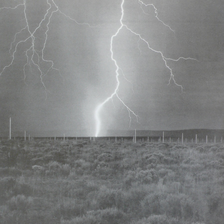
A few minutes after Kenny’s tweeting about it, Mario Santa Maria responded with a link to his project, 1 km Z Lightning: A Tribute to Walter de Maria, 27-07-2013, the day we learned of the artist’s death. Mario takes a square photo of de Maria’s Lightning Field [below] as wide as the browser window and, apparently using the same pixel calculator as Kenny, scales it to 3.78whatever million pixels tall.
Mario Santa Maria’s source image for 1 km Z Lightning, probably originally taken by John Cliett
Which got me thinking. I mean, repeating the project didn’t require thinking; that came instantly, and it was all I could to do wait a few hours so I didn’t step too hard on Goldsmith’s tweet traffic. And changing my dimensions to an actual square 3.78m x 3.78m pixels was easy, too, and surely such a massive proportional change, of 140 meters, would count as transformational, should Goldsmith ever decide to sue. [Can you imagine how awesome that’d be?]
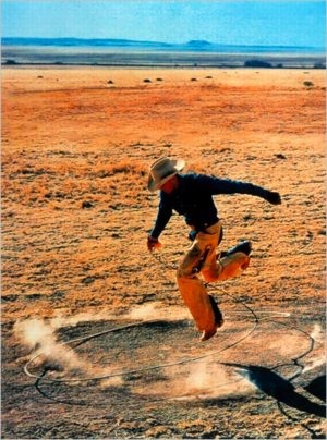
Untitled (300×404), 2008, after Richard Prince’s Untitled (Cowboy), 2003
But what image to use? The immediate answer also feels like the most natural, but it might not turn out to be the best: the 300×404 pixel jpg of Richard Prince’s Untitled (Cowboy), 2003 which I’ve been resizing and printing since 2008. Pixel-level distortion of poor image is my bag, baby. And so I made 1km, an adapted appropriation of Goldsmith’s code (sans Google’s), with my square dimensions and my image. At 1km-sq, one of my pixels appears to be 12,600 pixels wide. Scrolling across the image is like swimming through a gradient colorwheel [What are pixels to a digital fish?]
I’ve toyed around with random image grabbers, which I may use at some point. Or a 1km button, to blow up any image on the site to 1x1km scale. Or I’ve thought of opening it up with an image uploader, but srsly, I don’t want to see your giant Trump and/or porn. [Or, probably inevitably, as Stormy forecasts, both]. But I will change it from time to time to see what other images look like on this deMarian, Goldsmithian scale. For now, I’ll leave it to Kenny to print them all out.
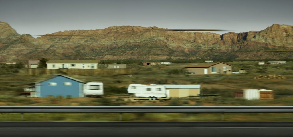
Andreas Gursky, Utah, 2017, at the Hayward Gallery, London, thru Apr 2018
Whether it heals all wounds, time does cool all hot takes. When the Gursky show opened at the Hayward Gallery in January, I was immediately set off by this kicker from Laura Cumming’s review in The Guardian:
But the show’s masterpiece is unlike almost anything Gursky has made before. It is a new work, a single shot of some prefab houses skimmed on a mobile phone while driving through Utah. The photograph registers the speed of the car racing through the landscape – and modern life – in all its random glitches and blurs. At the same time, the houses look perilously ephemeral against the ancient mountains behind them. This fragile little thing, a spontaneous and disposable shot, is enlarged to the size of a cinema screen – a monumental homage to the mobile phone and the outsize role it plays in depicting our times.
Not just Gursky using a phonecam, but Gursky doing something new? Now that is news.
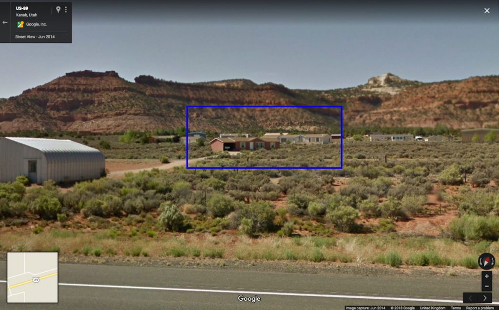
In addition to the phone and all its quotidian implications, what caught my attention was the subject: Utah. I had, just a couple of weeks before, driven along the very road in southern Utah as Gursky. I was also in the middle of a two-month mess on my server, which necessitated rebuilding my blog and its underlying software and databases. But that could wait until I identified the precise stretch of highway Gursky had captured. So I set out again, on Google Street View.
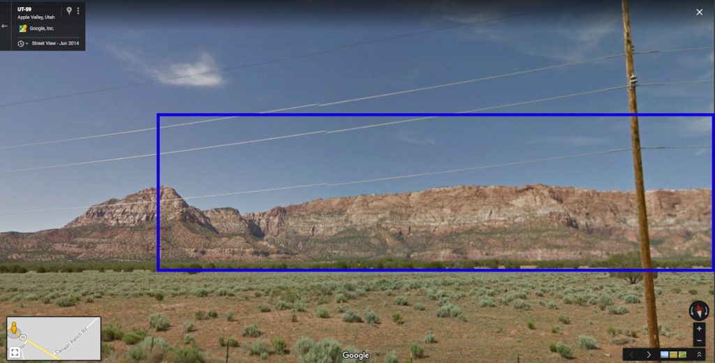
From the geology and the development, it was possible to narrow down the site of Gursky’s photos to the roads around Zion National Park, and east from Zion and Kanab, toward Grand Escalante and Staircase National Monuments. The sections of this rural, two-lane highway with guard rails and fresh blacktop were even fewer. And none of it matched.
This section of Utah is very sparsely populated, and very few roads cross it at all. So the options dwindled very quickly. But on the road between St George and the border-straddling polygamist towns of Hildale, UT and Colorado City, AZ, I recognized the striated mountain range immediately. But there were no houses at all.
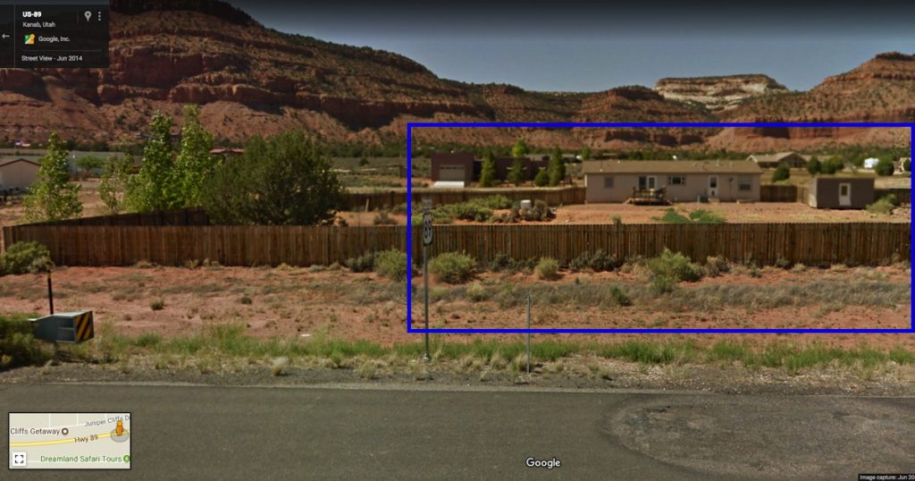
outside Hildale, UT, image: gsv
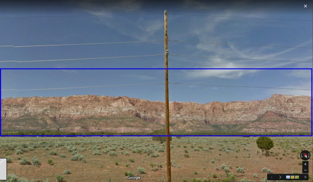
Which, two things: it’s now obviously a composite. But before that, those poles. Gursky’s original image is full of blurs and artifacts, including what are apparently some disembodied pole fragments. These artifacts, coupled with the disparate blur on houses, patios, guard rail, etc., led me to assume Gursky had experimented with an iPhone’s panorama feature from a moving car. That he was exploiting the stitching algorithm of the phone, a source of found digital manipulation.
Google Street View saw what Gursky saw, or vice versa
But of course, this turned out not to be the case. What hit me during these first few days was that this Gursky was being presented as a single image when it was now obviously a composite.
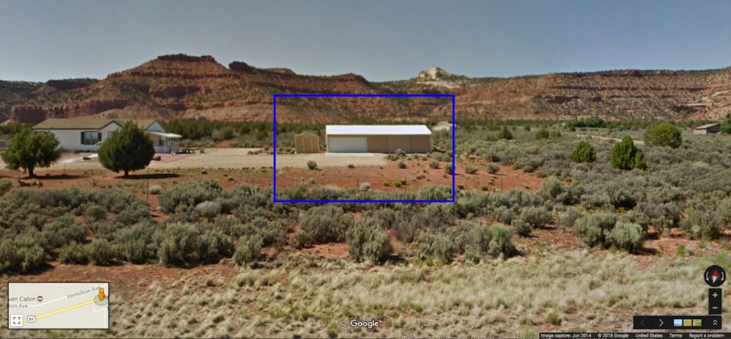
And so I set out to find the site of the other, lower half. Which, with every Streetviewed mile, was turning out to be an entirely fictional, constructed composition. While trying to rebuild my webserver I wandered the highways again, finding this or that house; meanwhile the more accurate version of Gursky’s process emerged: that he’d taken photos with a phone, and then returned to reshoot sites with his regular camera, and–like always–he just fixed the whole thing in post.
So my Gursky bust turned into a Guardian factcheck. And I was left dissatisfied, again, by Gursky’s view, even as I grew intrigued by Google’s. I found myself indexing the differences: vantage point, height, date, blur, glitch, and stitching. I imagined Streetview’s rooftop, panoramic compositor, and Gursky’s passenger driveby–which turned out to be a tripod on the shoulder. And I tried to imagine what it’s like for a maker of ambitiously scaled images to work in a world where giant companies are constantly taking a picture of the entire earth. Maybe the better digital analog for Gursky’s practice isn’t Google at all, but etsy.
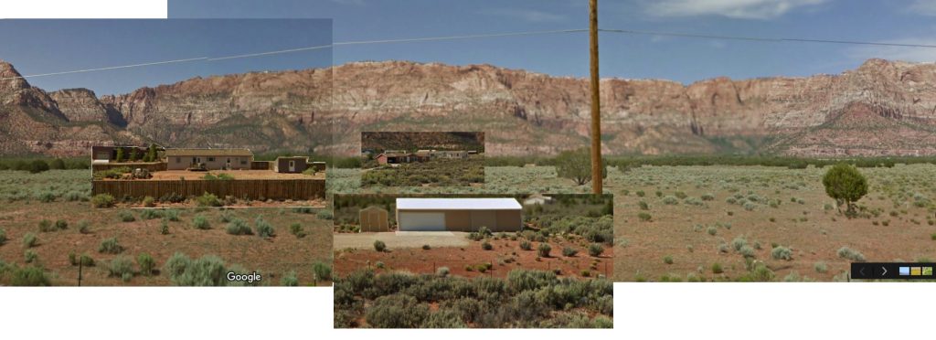
Gursky Street View, v.1, 2018 –
In good etsy form, I have knocked off Gursky’s image by collaging the elements I’ve found. If/as I find more, I’ll add them until…until what? I don’t know, I guess until it’s done, or I get bored. If you see something say something.
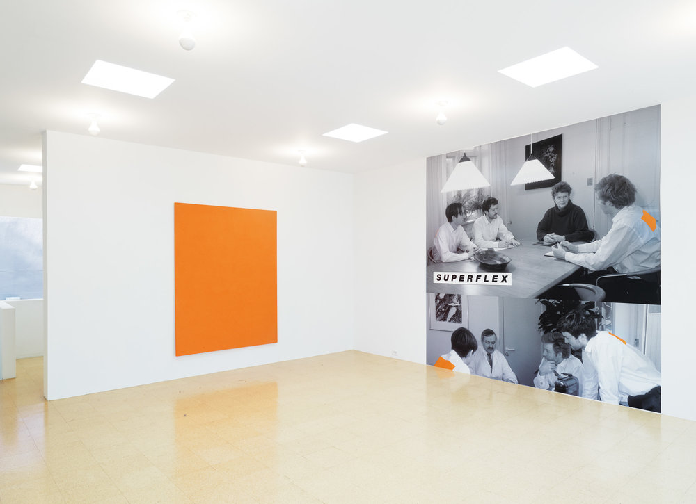
In 1995 SUPERFLEX, they write, “was invited to participate in a painting exhibition (Painting after Painting), although they had never shown any interest in this medium. Fascinated with the International Klein Blue (IKB) they worked with several specialists in painting methods. No one knew how to copy Klein’s method of fixing the pigment to the surface of the painting, so SUPERFLEX went ahead with their own attempt, resulting in an orange painting entitled SUPERFLEX on Canvas.”
Which is relevant because the vaunted patent Klein was awarded for IKB related not to the color, or the pigment itself, but to the binding of the medium to the pigment. [Also it was not really a patent, so much as a registration, and it never had any applicability outside France. What matters now is trademark, and the Klein estate’ll getcha.]
The polyvinyl acetate that paint store chemist Edouard Adam paired with Ultramarine Blue pigment to create IKB is called Rhodopas M60A, and is sold by Adam Montmartre, the family’s fourth-generation paint shop, as Médium Adam 25.
All of which SUPERFLEX probably figured out by 2013, because that’s the date on the SUPERFLEX on Canvas, now happily available in an edition of 3, in “Whatever Works,” their career-spanning show at 1301PE, their longtime Los Angeles gallery.
SUPERFLEX on Canvas 1995/2013, Dry orange pigment, polymer medium on cotton over plywood, 78.35 x 60.24 inches, Edition of 3 (now) and The Campaign (which used to be called Meetings, apparently), 1994, installed in “Whatever Works” at 1301PE through last week.
I heartily support their sustained or renewed interest in the medium.
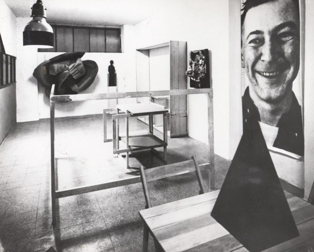
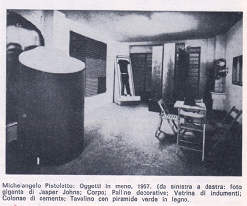
Michelangelo Pistoletto’s Minus Objects installation in his live-in studio, 1965-66; photo: Brassa via Flashart
Thanks to grupaok, I’d been looking at Michelangelo Pistoletto’s Minus Objects a lot when my server ran into trouble last December.
Partly because I’ve been long contemplating tables as a platform for paintings, and Pistoletto made a table out of paintings.
Partly because Minus Objects was Pistoletto’s attempt at breaking [or “dismounting”] the capitalist system that rewarded/demanded artists produce in a recognizable style, and all he did was jump off his own market, and confuse his dealers. [Though curator Germano Celant caught on quickly, and made Minus Objects a critical foundation for his proposition of Arte Povera.] Partly because that whole concept is LMAO now that his selfie-friendly mirror paintings have roared back into vogue, anchoring art fair booths around the globe.
But let’s face facts, it’s really because of that awesome, giant, unmounted photo of a slightly demonic Jasper Johns.
It looks very different from our post-Struffsky vantage point, but I’d imagine this object was especially problematic for the art context of its day. Just as tables & chairs and cardboard teetered on the functional and material boundaries around art, respectively, this headshot was thwarting the idea that it was just information.
I decided to be directly transforming a feeling or an idea into an object. Being in that condition, the dream of the night became part of the daily life. Because I was living in the studio, in that place, and the work became part of my life. It was like a living activity.
And I had a dream that I was looking around for cardboard, and was cutting cardboard, it was like a recipe to make a rose, that I had in my dream. And getting up in the morning I decided to realize this recipe that I was dreaming in the night. I find the cardboard in my studio, and I did exactly what was the dream, and the work was done.
At the end of the dream I was giving the fire to the center of the rose, and I did it.
Very Johns & Rauschenberg both. Anyway, as he later explained [46:00], the photo of Johns came about in a similar way:
Because I was living the occasion of the moment, and getting up in the morning, the mail arrived. There was an envelope, and inside a catalogue of Jasper Johns, a square catalogue with Jasper Johns, he was smiling. In the morning, I see this face smiling to me, and I say, “OK, I will blow up it.”…I thought this the morning The Smile arrived.
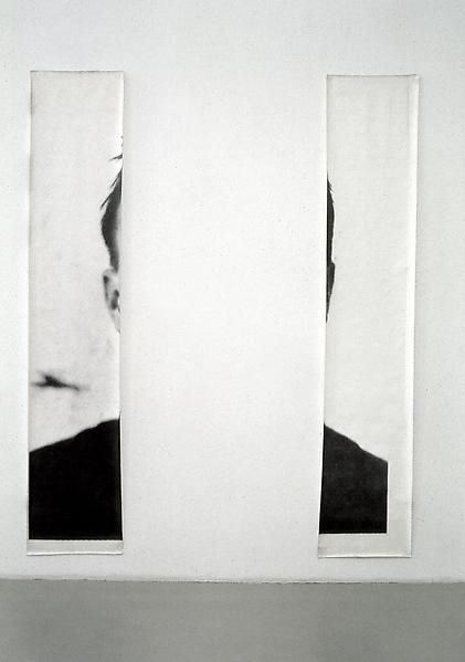
The Ears of Jasper Johns, 1966? 250 x 250? cm, 80 cm each
The installation photos show the single, giant photo. And I always thought the cutout version, with The Ears of Jasper Johns came later. But Pistoletto says his idea was to make a 2×2 meter photo of The Smile, and that his printer only had meter-wide paper. The two sections are listed as each 80 cm wide. Everything’s 250cm tall. So there are some rounding issues, maybe, and the single pic is listed as 125 cm wide. Whether there was cropping or reprinting or both, I don’t know.
Minus Objects, 2014 installation view at Luhring Augustine Bushwick
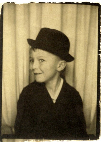
In any case, I was taken with the idea of tracking down the original photo–I assume it’s in the square catalogue for the 1964 Whitehall Gallery show–and making a giant Smiling Johns myself. But I guess sometimes it’s good to wait? Because in the mean time, the press around the show at The Broad helped surface this photo of Johns:
4yo Jasper Johns in a South Carolina photobooth, image probably the artist’s, via nyt , now also Study for Foto di Jasper Johns, 2018, 200x280cm, digital inkjet print
And oh my gosh, now I want to make 2-meter wide versions of this in an edition of a million and hang them everywhere on earth.
This edition of Better Read comprises a found text, the documentation of a fungi specimen submitted to the New York Botanical Society. That documentation in turn comprises several elements: an archivist’s gnomon, a page removed from a mycology guidebook; item labels, notes, and a submission form with NYBG letterhead. They are read from the top of the digitized scan of the specimen record to the bottom.
One thing I noticed, besides the rather remarkable combination of words, and their genesis: after 20 recordings, I only just noticed that Alex, the computer-generated voice, inhales before he starts speaking. Now it kind of freaks me out.
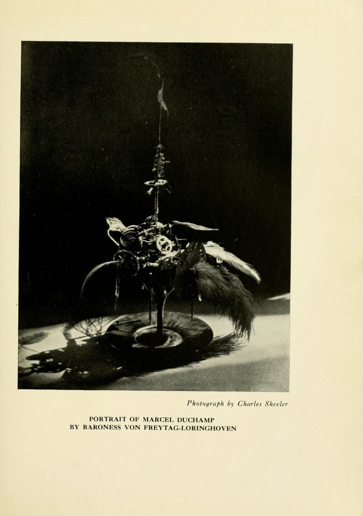
Baroness Elsa von Freytag-Loringhoven, Portrait of Marcel Duchamp, 1920, photo: Charles Sheeler, published in the Little Reiew, 1922. image: brown.edu
After 6 years and 72 issues, I am sure glad Margaret C. Anderson hung in there to publish one more issue of her avant-garde poetry magazine The Little Review in the Winter of 1922. Because it includes a different Charles Sheeler photo of Baroness Elsa’s Portrait of Marcel Duchamp.
The one that’s been floating around, via Duchamp dealer Frances Naumann, mostly, is a more clinical, perhaps Sheeler-esque photo [below].
Charles Sheeler The Baroness’s Portrait of Marcel Duchamp, ca. 1920 Gelatin silver print 9 5/8 x 7 5/8 inches, via francesnaumann
But besides the dramatic lighting, the Little Review version actually reveals more of the cocktail of feathers, gears, and flywheels that filled Baroness Elsa’s glass. Also it’s sitting on a plate.
All of this matters to me because this, my second favorite portrait of Duchamp after Florine Stettheimer’s, is lost, destroyed. And so this kind of documentation will help make a reconstitution of it truer to the original, and less of an inspired-by approximation.
Brown University and the University of Tulsa have digitized The Little Review as part of their Modernist Journals Project [brown.edu]
Untitled (No Evil Befall Thee), 2018, latex paint and crayon on door (if I ever refabricate this it’ll probably be written by my dad? idk) , trash bags, installation shot by @JacobGarchik
Vintage wood chopped in half, Biblical evocations written on architecture by anxious parents, folks on Twitter wondering aloud about “exorcism gone wrong?” Sounds to me like New York City’s caught a case of Danh Vo Fever!
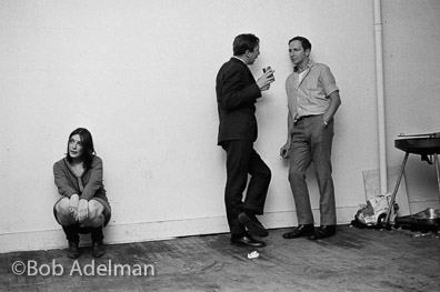
Bob Adelman photo of Jasper Johns & Robert Rauschenberg talking during a 1966 loft party. No offense, but that sad woman holds the composition together like a Degas watering can. image: bobadelman.net
In 1966 photographer Bob Adelman covered the scene around the Leo Castelli Gallery for New York Magazine, but the greatest photos in his deep dive archive are from parties at Robert Rauschenberg’s loft. By 1966 Bob and Jasper Johns were apparently talking to each other again. [Oh hi, Andy!]
Bob Adelman photo of Elaine Sturtevant, Robert Rauschenberg, IDK, IDK2, and James Rosenquist, at Bob’s loft party, c. 1966. image: bobadelman.net
Adelman’s captions have some gaps, so though it’s easy to ID Elaine Sturtevant there, huggin’ and grinnin’, with Bob and Jim Rosenquist, the man and woman in the center are still unknown to me. Part of me wants to say Yvonne Rainer, but the hair doesn’t seem right. One not-helpful clue: neither of them made a Warhol screen test.
If you’re ever wondering how hard it is to see something that’s been right in front of your face all along–even if you knew the details and the discrepancies–this entry is from the chronology Joan Young prepared with Susan Davidson for Walter Hopps’ 1997 Robert Rauschenberg retrospective:
With Johns as partner, forms Matson Jones–Custom Display; “Matson” is Rauschenberg’s mother’s maiden name and “Jones” stands for Johns.
10 MINUTES LATER UPDATE: SFMOMA has a new recap of the Matson Jones era from none other than Richard Meyer [Outlaw Representation ftw] . In a 2018 essay about scholarly dismissal of or disdain for their relationship, this sentence makes an unusual effort to say yes, Bob & Jap were “family,” but only distantly related: “’Matson’ was the maiden name of Rauschenberg’s maternal grandmother, and ‘Jones’ is a phonic near cousin to ‘Johns.’” How about homophonic kissing cousins, at least?
Also, I guess after tracking decades of academic and critical avoidance and differentiation, from Alan Solomon onward, I also completely disagree with Meyer’s first sentence: “The intensity of the creative dialogue between Robert Rauschenberg and Jasper Johns in the 1950s has long been recognized by scholars, critics, and curators.”
But I do look forward to that first two-man show. And don’t get me started with Cy.
The Hirshhorn Museum offers non-hearing or non-sighted visitors transcripts of audio or video artworks they exhibit. In some cases those transcripts come from the artist or their dealers. For the video art show in the lower level, you can read along for the entire performance of a Polish opera in Jasper & Malinowska’s Halka/Haiti, or [no thanks] all of Frances Stark’s sex chats. [The transcript for Arthur Jafa’s Love Is The Message, The Message Is Death, though, only includes the lyrics to the Kanye West song he laid down, not the dialogue in his video montage.] When they don’t exist, though, the Hirshhorn produces their own descriptive, transcriptive text.
Anyway, I noticed the existence of these transcripts while watching Gretchen Bender’s Dumping Core (1984), a rapid-fire, multi-channel video installation that plays out over 13 monitors arrayed throughout a black box gallery.
The improbability of the existence of one of Bender’s major works was already next-level. MoMA apparently helped restore or recover the work, which had only been exhibited as an abbreviated documentation video like my pic above, as recently as 2013. But the idea of a translating a frenetic video wall into a narrative text seemed too intriguing to ignore. And translating that back into an audio experience? If Bender wouldn’t have approved, I think she’d disapprove in the right way.
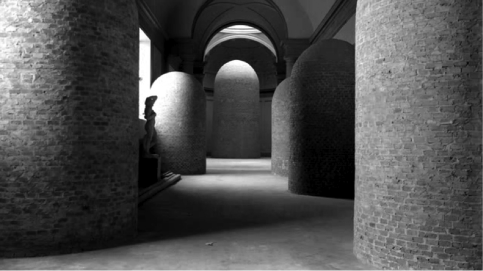
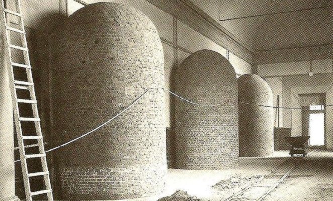
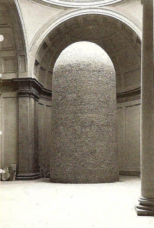
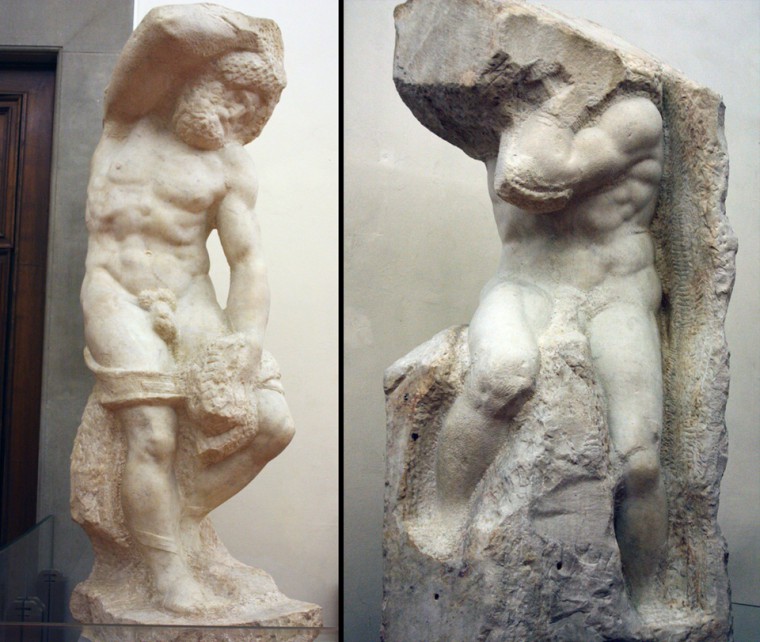
Michelangelo slaves and David encased in brick during WWII, image: reddit
There is a Michelangelo inside every brick cairn, and it was the curator’s job to bury it.
Museum historian Anna Tulliach tweeted these amazing photos from Italian archives. They show Michelangelo’s sculptures in the Accademia in Florence–David and the unfinished Slaves–encased in brick during World War II, an effort to protect them from possible damage during Allied attacks.
I don’t want to steal any of Tulliach’s thunder; only one of the images is in ready circulation online, and they may come from the 1942 report on protecting the patrimony she referenced later. The encasement only gets passing mentions, though, in histories of art preservation in the midst and aftermath of WWII, and I, for one, am psyched to know more.
The director of the Accademia at the time was Ugo Procacci, and he undertook the massive effort to evacuate what artworks he could from the city, and store them for safekeeping in remote villas around Tuscany.
Michelangelo’s David encased in brick at the Accademia during WWII, via AT
What’s so great is these forms themselves. They’ve been called silos, but I’d think they have to be solid, more like a cairn. In another context, their form is obviously a lingam; and we all know Michelangelo loved the lingam. But anyway, there they are, in a museum.
Michelangelo, The Bearded Slave & The Atlas, via Accademia
It turns out to be very difficult to find out exactly what Michelangelo said, or what Vasari said he said, even, about a statue existing in every block of stone, and it’s the sculptor’s job to free it.
But it could be a sculptor’s job again to remake these forms, with a Michelangelo-shaped void at the center of each one. We can bring these back. And we should.
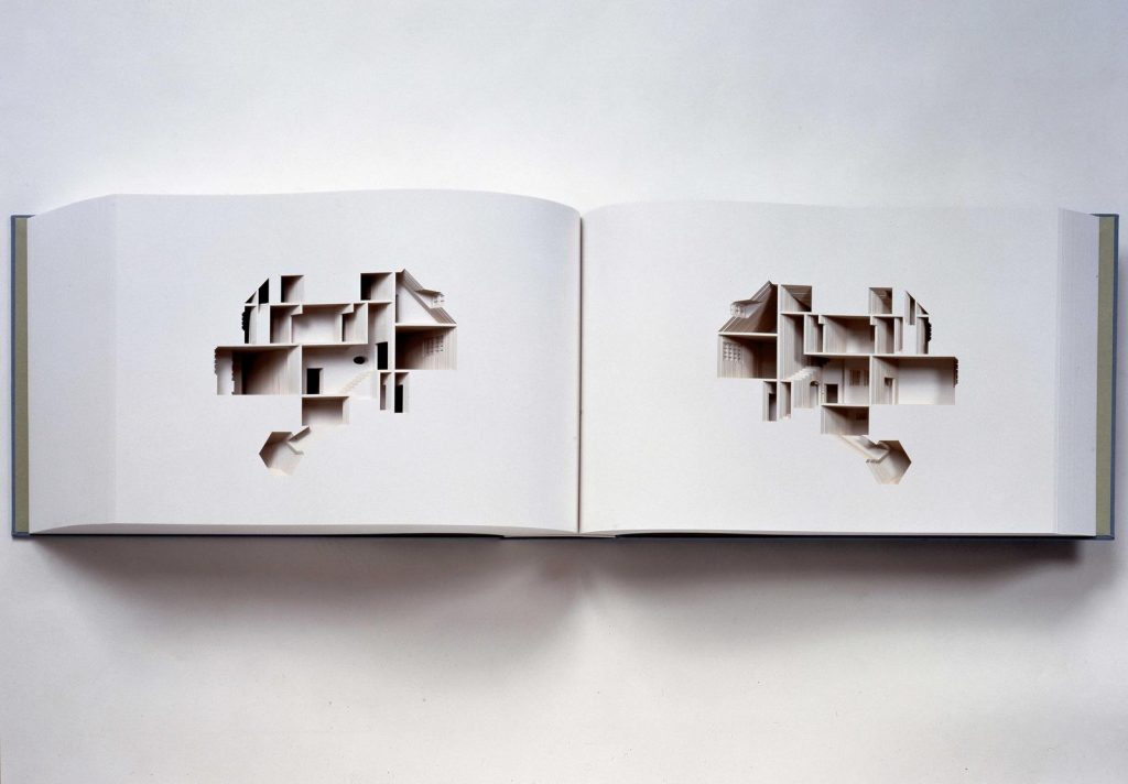
Olafur Eliasson, Your House, 2006, published with Friends of MoMA Library. image via
It could be like Your House, that intricately die-cut book Olafur Eliasson made with MoMA’s library, but out of bricks.
detail from AP photographer Carolyn Kaster’s image of the world’s most basic yet still inadequate script for performing empathy, and a monogrammed cuff.
What the hell is going on with this country? And who wears cuffs this long? I can answer only one of these questions. Two, if you count, “why is he holding these prop notes facing out?”