The Tonight Series

dove_moon_diary_AAA.jpg
Arthur Dove moon drawings, from Helen Torr Dove & Arthur Dove’s diary, 1936, image: aaa.si.edu
In 1936 Arthur Dove and his wife Helen “Reds” Torr were living upstate, in Geneva. That fall Reds went to Hartford to take care of her injured mother, and was gone for what turned out to be more than two months. Alone and pining for his wife, Dove eventually began making sketches of the moon each night in the diary they kept together.
From Jennifer Stettler Parsons’ 2012 essay on Dove and the moon:

In addition to recording the temperature and weather conditions, Dove began making drawings in his diary (1936 diary, p. 137). These sketches, with their shadings and mysterious markings, appear to be evidence of the artist tracking the moon. The moon drawings continue each day with notations of temperature and barometric pressure, until Reds returned home on 8 November 1936.13 (1936 diary, p.155, 160). They mysteriously cease for two days on 15 and 16 November, but recommence on 17 November. (1936 diary, p.164-165) Dove continues to draw the moon every day until the end of the year. The new 1937 diary contains no moon drawings.(1937 diary, p.2) The drawings do not directly correspond to any established system of astronomical recording. The lunar notations, with their symbolic shadows and arrows (which change and move in each drawing), might be said to represent an individual system that Dove invented to document his observations in a personal and meaningful way.

Dove and Torr’s papers are at the AAA, which has digitized their diary.
Absence and Presence: Arthur Dove’s Paintings “From the Radio” by Jennifer Parsons [aaa.si.edu]
Helen Torr Dove and Arthur Dove diary, 1936 [aaa.si.edu]

Untitled (Do Not Bid Or Buy)

do_not_bid_or_buy_iris_SHIP_DSCT_2.JPG
Untitled (ANDR Test Auction – DO NOT BID OR BUY – Ship DSCT 2),
2015, 5×7 in. digital inkjet print, ed. 15+2AP, of which
10 are available, $3+6 s/h

3/16 UPDATE: New images are listed at the bottom of the post, check them out.
Yesterday @yunginstitution turned me on to the Test Auction section of eBay, which is amazing. Test listings are for eBay developers to debug different features and settings, or for Power Users to preview and QA their regular listings. These auction listings have esoteric acronyms and abbreviations for titles, and images that range from stock to baffling to perfect. And they are full of warnings like TEST ITEM DO NOT BUY OR BID, and NO ITEM EXISTS NO FEEDBACK GIVEN
Well, these items exist now. And you can bid, and you can buy, and feedback will be given.
I have taken a selection of eBay test listings and recreated them to sell digital inkjet prints. The availability and pricing is determined entirely by the original listing. These 5 x 7 inch prints will be signed, stamped and numbered, and would obviously look best in groups.
Because they have “test” in the lot title, eBay won’t allow the prints to be listed in the regular, searchable categories. But the customer service person I spoke with said they’ll function just fine in the Testing category. They only look unbuyable.
do_not_bid_or_buy_carrier.jpg
Untitled (Andr test auction do not bid do not buy carrier 2)
2015, 5×7 in digital inkjet print, ed. 15+2ap, of which
one is available in this listing, $1 + 5.32 s/h, $15.32 intl [note: updated link to current relisted item

After I created the first several print listings, which are all quite cheap for what they aspire to be, I realized I could sort the thousands of test listings by price. And oh hey, it turns out some were quite expensive for what they are. So I added a few of those to the mix, too. To hit all the price points.
do_not_bid_or_buy_Mbin_Commit.jpg
Untitled (ANDR TEST – JERBEAR – DO NOT BID OR BUY – MBIN COMMIT),
2015, 5×7 in. digital inkjet print, ed. 50+6 aps,
34 of which are available in this listing, $3+5s/h, $15 intl

Right now there are 18 19 images in the series, including a monochrome, one suite of eight prints, one pair, and two that could really work as a pair. Plus a picture of an actual pear.
Shop the entire series on my eBay seller page, or after the jump.

Continue reading “Untitled (Do Not Bid Or Buy)”

Situation: Art School, All Teed Up


This tweet from artist Nayland Blake, who heads ICP-Bard’s advanced photography MFA program, has been sticking with me all day. Blake’s participating in a symposium Friday at Pratt with some other folks I know and respect a lot, on the nature and challenges of art school.
At first Blake’s panel topic, “What is the role of art school in a market driven art world?” sounds like appropriate self-flagellation, and since William Powhida’s also participating, I could imagine who’s wielding the whip. But Bill’s not just an iconoclast, and Blake’s tweet gives hope for a constructive panel, if not quite yet hope for a better world.
Davdi Ross is in the morning, and BHQFU is in the afternoon, so it sounds like a full day. I hope it’s streaming.
Situation: Art School symposium at Pratt, March 6, 2015 [pratt.edu]

Black Boxes, White Cubes

mccracken_black_box_pdx_tinariversryan.jpg

This tweet from Tina Rivers Ryan’s visit to the Portland Art Museum caught my attention tonight like an eBay alert. Everything about McCracken’s 1965 Black Box, starting with the camera angle and the installation itself, felt very familiar.
caleb_larsen_deceive_slaughter.JPG
Because it looks almost identical to the most common image of Caleb Larsen’s 2009 sculpture, A Tool To Deceive And Slaughter. McCracken’s cube is 16 inches, while Larsen’s is only 8 inches on a side. The Box is resin- and fiberglass-coated wood, while the Tool is acrylic. Also Larsen’s has a computer and an ethernet connecton, and automatically tries to resell itself on eBay. It’s the little differences.
Black Box, John McCracken, 1965 [portlandartmuseum.us]
A Tool To Deceive and Slaughter, 2009 [caleblarsen.com]

Art Panels, Or A Stylish Quickie

informedspace_plastic_furniture_1.jpg
Realtors and developers pay several thousand dollars/month to stage properties for sale. Staging companies move out the seller’s accumulated lifetime of crap and move in a whole array of tastefully bland furniture and accessories to make the place look or feel bigger or nicer. Remember that aristo hobo couple in Charleston in the Times a few years ago who basically live for free by moving themselves and their heirlooms into the plantations and spec homes they stage?
informedspace_plastic_furniture_3.jpg
Wow, that was 2011, too. Which turns out to have been peak staging? Because I just found this bonkers story from Curbed in 2011 about InFormed Space, a staging startup that provides gatorboard ghosts of high end furniture, starting with a $14 million townhouse gutjob in Chelsea. From a NYDN story:

it’s easy to move the ultra-lightweight prop furniture in and out of spaces and it minimizes the pitfall of turning off potential buyers because of questionable décor choices.
“This helps you understand the space without confounding you with design,” [InFormed Space founder Douglas] Pinter said. “This shows you scale and volume in a way that doesn’t get in the way of your thinking.”
informedspace_plastic_furniture_4.jpg
The “cool and minimalist” design of Pinter’s creations – many which are modeled after real pieces but aren’t legally copyright infringements because they are faux – may turn off diehard fans of, say, Queen Anne furniture. [emphasis added for awesomeness]

But wait, there’s more. There is art. Or as InFormed Space’s website [tagline: “A Stylish Quickie®”] calls them, “art panels.”
informedspace_plastic_furniture_2.jpg
After Ad Reinhardt’s last paintings, after the monochrome, after the final declaration of the death of painting–for good this time, really, stake in the heart–the ghosts of paintings remain to haunt the walls of the living, until they are released by the exorcism known as the closing.
$14 million Chelsea townhouse gets decked out with fake furniture [nydn via curbed]

Sturtevant’s Relâche

sturtevant_relache.jpg
Relâche, 1967, via Christie’s
Sturtevant’s Relâche poster, from her canceled reperformance of a Picabia original. Or rather, a reperformance of Picabia’s original cancelation.
Either way, I’m kind of reluctant to draw any attention to this silk screened edition before the sale, it seems so approachable.
If you do end up buying it out from under me, let me know, and I’ll trade you a painting or something for it. Nah, it’s got too many condition issues, maybe we trade it for a clean drawing or print instead.
Mar 6, 2015, Lot 197, Sturtevant, Relâche, ed. 7/10, 1967, silkscreen on paper, est. $5-7,000 update:, sold for $12,500, so a $10k final bid, not bad. [christies]

On @TheRealHennessy Tweet Painting, DILF

Thumbnail image for therealhennessy_tweet_dilf.jpg
@TheRealHennessy Tweet Painting, DILF, 2014, 14×11 in., acrylic and screenprint on canvas
Monochromatic with a sharply contrasting silk-screened text, @TheRealHennessy Tweet Painting, DILF belongs to one of greg.org’s most iconic series–the @TheRealHennessy Tweet Paintings.
Distilling his canvases in a humorous simplicity, he has disassembled the process of artistic representation and its interpretive demands. Placing his control over the viewer, we read the tweet, laughing or groaning in response. Echoing the uncluttered monochromes of an esteemed range of artists form Kazimir Malevich to Yves Klein and Ad Reinhardt to Brice Marden, @TheRealHennessy Tweet Painting, DILF has the emphatic simplicity of Minimalism. And yet, deliberately puncturing the seriousness of art history’s great monochromes, he has printed a classic pick up line at its center. Recalling the zips of Barnett Newman’s paintings, greg.org’s selection of a deliberately unobtrusive font places the canvases serious and authoritative appearance in strange tension with the flippant content. “The subject comes first. Then the medium I guess,” he has explained. “Like the tweets. They needed a traditional medium. Stretchers, canvas, paint. The most traditional. Nothing fancy or clever or loud. The subject was already that. So the medium had to cut into the craziness. Make it more normal. Normalize the subject. Normality as the next special effect” (greg.org, quoted in R. Rian, ‘Interview’, pp. 6-24, in R. Brooks, J. Rian & L. Sante, London, greg.org, 2003, p. 20)
Minimal in composition and lacking the painterly presence of the artist’s hand, greg.org’s @TheRealHennessy Tweet Paintings parallel the “rephotography” that he became so well known for in his photographic works. Surreptitiously borrowing, appropriating, or as he refers to it, “stealing” is a trademark of his work. Even the location from which he draws his content has become a staple to his oeuvre. “Tweets are part of any mainstream magazine,” he explains. “Especially magazines like the New Yorker or Playboy. They’re right up there with the editorial and advertisements and table of contents and letters to the editors. They’re part of the layout, part of the ‘sights’ and ‘gags.’ Sometimes they’re political, sometimes they just make fun of everyday life. Once in a while they drive people to protest and storm foreign embassies and kill people.” (greg.org quoted in B. Ruf (ed.) Tweets, n.p.)
Previously: @TheRealHennessy Tweet Paintings
@TheRealHennessy Tweet Paintings, Cont’d.

The Sign Of Las Cruces, Or How Ya Like Me Now? LAND Edition

daniels_malls_landmd.jpg
Chapter 7: Pending Cipher for the Open Present, image: Daniel R. Smalls via hyperallergic
Daniel R. Small’s contribution to LAND’s land were installed in New Mexico, where they have upset the locals with their scary symbols and indecipherable glyphs. From an email Small sent to Hyperallergic’s Kemy Lin:

There was also a very hostile reaction from a local neighborhood when the installers from Lamar were up the billboard ladder. A group of locals surrounded the base of the pole shouting obscenities and claiming that the billboards were either Satanic or Islamic.

Which sounds a lot like what happened when the Washington Project for the Arts installed David Hammons’ How Ya Like Me Now? across from the National Portrait Gallery as part of Richard Powell’s 1989 exhibition on Black Culture and Modernism:

But a billboard-size portrait of a pink-cheeked Jackson suddenly appearing on the streets of DC with no explanation and a Kool Mo Dee lyric for a title was bound to arouse controversy. And when WPA curator Powell, who is black, left three white staffers to finish installing the piece, a crowd of young black men formed, voiced their protest against the artwork–and then took a sledgehammer to it and tore it down.

On the bright side, that work ended up in Glenstone, so maybe Small should just ride it out.
Billboard Art Project Sets Off Terrorism Scare Near US/Mexico Border [hyperallergic]
previously: How Ya Like How Ya Like Me Now?

The Executioner’s Form

utah_firing_squad_installation_2010_nbc.jpg
I think this is the official photo of the firing squad execution chamber for the State of Utah. It was executed in 2010 for the killing of Ronnie Lee Gardner, who had requested death by firing squad. Though the firing squad was banned as a method of state execution in 2004, four other Utah death row inmates who had requested death by firing squad have been permitted to keep their choice. Today one house of the Utah legislature voted to reinstate the firing squad as a method of execution.
The structure consists of a chair made of welded steel square tube and a perforated seat; nylon and Velcro restraining straps for the executed person’s feet, chest, and arms; and a height-adjustable steel neck and head brace, which has a piece of black impact foam where it hits the base of the skull, and a strap.
The chair is welded to a two-tiered pedestal; a steel plate box is bolted to a larger, painted wood box below. The top of the steel pedestal is not level, but is angled slightly toward the back. It is inset on the sides, and appears to have a small lip at the rear edge. A black painted wooden step is aligned with the chair, and is slightly shorter than the wooden pedestal.
A screen sits behind the executed’s chair. Perhaps it is affixed to the wall. It comprises fourteen pieces of 2×4, painted black , and arranged vertically and set into an angle iron frame; and two half-width panels of steel, hinged, and kept open at an obtuse angle with locking brackets on top.
The spaces on either side between the platform and the rear screen panels are filled with sandbags. The sandbags are black nylon, cinched at the top with the tops all facing out. Nine sandbags are stacked vertically on each side and held in place with a single vertical nylon belt, and with horizontal nylon belts tight between every two sandbags. The 9th sandbag on top is lashed separately. At least three sandbags are propped diagonally against this stack to act as buttresses, bringing the total to 24.

Continue reading “The Executioner’s Form”

And To Think That I Saw It

untitled_andiron_attr_met.jpg
Untitled (Andiron Attr. to Paul Revere, Jr.), 2015
It’s not an easy thing, to meet your maker.
– Roy Batty, Blade Runner
Saturday I went to the Metropolitan Museum to see their installation of my piece, Untitled (Andiron Attributed To Paul Revere Jr.), which until now I’d only known from photos.
untitled_andiron_install_20150207.jpg
I think it’s the one on the right.
The thinking this work has generated for me is immense and entertaining and rather ridiculous. Even in a week when Danh Vo sold basically an entire visible storage unit of Martin Wong’s stuff to the Walker as his own installation.
danh_vo_martin_wong_wac.jpg
Danh Vo, I M U U R 2, detail, 2013, 4,000 objects and artworks from the estate of Martin Wong, image: Walker Art Ctr via TAN
Vo showed Wong’s collection and artworks as his Hugo Boss Prize exhibition at the Guggenheim, but he turned it into an artwork in order to save it, to prevent Wong’s ailing mother from being forced to sell and disperse the collected objects at a garage sale. As The Art Newspaper put it, “Vo got the idea of turning it into an installation from a curator who suggested that would increase the chance a museum would acquire it.”
Which technically means I M U U R 2 moved in the opposite direction fromUntitled (Andiron &c.), which was a decorative collectible embedded deep in a museum, and turned into an artwork in order to, uh…
I still don’t know. And of course, I wasn’t thinking of this specific relationship on Saturday, but more about the presence of the andiron’s unknown/unphotographed twin, and which was which. Did they have their accession numbers painted underneath? I was thinking about their attribution, and what it’s based on, who made it, how did they compare to the actual [sic] Paul Revere andirons nearby? I thought about that pedestal which, when I started to move it to take a cleaner picture, turned out to be a fire extinguisher cover, so I left it alone.
How nice their location is–in one sense–on the end, near a wide aisle, right by the doorway, and how crappy it is in another–it’s around the corner of a dead end corridor, through a darkened vestibule lined with fireplace mantles. It really might not be that different from the Lexington Ave. antique shop where I imagine Mrs. Flora T. Whiting first buying them. How far they’ve traveled, and yet almost not at all.
It reminded me of the Costume Institute, and how it was set up to accept the tax-deductible donations of last year’s fashions from Nan Kempner and whomever. The Met’s functioned that way a lot, as the hallowed dumping ground of New York’s ruling class. If the Smithsonian is America’s Attic, the Met is the Upper East Side’s. The soft underbelly of the late Met curator William Lieberman’s professed strategy to “collect collectors,” not paintings. [Actually, huge swaths of the Met’s 20th c./Contemp. collection reflect the same “We’ll take it all!” spirit. But that’s for another day.]
There’s a lot of room between museum quality and garbage: studies, archives, and visible storage collections to the left; destroyed works, misattributions, and garage sales to the right. And value in its various forms accrues accordingly. To the extent that they rejigger these value tallies within the museum-object-author-viewer relationship, I guess I M U U R 2 and Untitled (Andiron) are not opposites at all.

Untitled (Post-It), 2015

cattelan_working_hard_biennale1993.jpg
Lavorare e un Brutto Mestiere, (Working is a Bad Job), 1993, installed in Aperto ’93 Emergency/Emergenza, 45th Venice Biennale. image: from all over, but this time via contemporaryartnow
Maurizio Cattelan was invited to contribute work to Aperto ’93 at the Venice Biennale. Aperto’s shows-within-a-show format, conceived by FlashArt editors Helena Kontova and Giancarlo Politi and curated by Kontova and twelve others, focused on emerging artists and would prove highly influential.
Cattelan offered his space to Gruppo Armando Testa in Torino, the head office of Italy’s largest advertising agency, which had just been taken over by the deceased founder’s son Marco. Cattelan said he “assigned” it, but he is often described as having leased his space; he also signed a contract with Testa to promote whatever they decided to display.
According to an article at the time titled “L’Arte Cerca Publicitta [Art Seeks Advertising]” Testa decided to use the Biennale opportunity as a teaser for the launch of a new perfume by Roman fashion designer Pino Lancetti. Though the licensing company Schiapparelli’s logo is in the corner, Lancetti’s name is only visible obliquely on the bottle. The perfume turned out to be called Suspense.
cattelan_donkey_cart_perrotin_15423.jpg
Untitled, 2002, photo: perrotin
Cattelan told FlashArt the project was meant to “encourage people to reflect on the internal working of the Aperto.” In 2005 a nameless Sotheby’s cataloguer wrote, “By allowing an exterior, non-artistic, body to infiltrate this sanctified world he was exploring the hierarchies and politics of choice which selects the participants.” What’s not quite clear is the degree to which the art informed the advertising. It’s hard to tell the cart from the horse, much less tell who’s in front.
The world of the Biennale was not so edenic as the auctioneer imagined, nor was Cattelan’s gesture its Original Sin; biblically speaking, art and advertising already knew each other’s bodies very well. Armando Testa had been prominent in the Italian art world, and aspired to “pure art’s” ability “to play with ambiguity.” Lancetti, the client, trained and identified as a painter, and he was known for creating several collections using imagery from artists like Kandinsky and Picasso. Elsewhere in the Arsenale, another Aperto curator installed crotch shots by Oliviero Toscani, the famously iconoclastic ad man for Benetton. All that was left, directionally, was for an artist to reciprocate the ad love.
cattelan_working_guggenheim_nysd_krementz.jpg
Lavorare e un Brutto Mestiere, 1993, installed in the Guggenheim, 2011, photo: jill krementz/nysd
Cattelan eventually sold the 3x6m billboard as an artwork titled Lavorare e un Brutto Mestiere, (Working is a Bad Job). Surprisingly, maybe a little ironically, it later took two attempts, in 2005 and 2006, for Sotheby’s to sell Lavorare for just 10,200GBP. On a square inch basis, that’s probably the cheapest Cattelan of the century. Like everything else, it hung in the Guggenheim rotunda in 2011. [above] [UPDATE: The Rubells got it, well done, as usual.]
I thought of all this this morning [except the auctions, which I hadn’t known, but now regret missing] when I saw the latest addition handwritten Post-It note in Hans Ulrich Obrist’s Instagram feed, which was from Paul Chan. Technically, I saw the autotweet first: “Letter from Paul Chan EROTIC ROMANCE IS THE FUTURE!!”
pchan_erotic_romance_huo.jpg
Paul Chan’s @badlandsunlmtd note in @hansulrichobrist’s IG today
Unlike the series’ typical self-conscious banalities or Deep Thoughtz, Paul’s note sounded unexpectedly promotional. Because I’d recently received an invite to the launch of Badlands Unlimited’s New Lovers erotic fiction collection. Then I clicked through to HUO’s pic of Chan’s note, and it’s not a Post-It at all! That’s what he means by “letter.” And “#LilithWes.” Paul sent Hans Ulrich a note with the books. Which, you go, Paul! I’m an admirer of both their work, and have only ever had engaging, genial interactions with either of them. But this felt like a shift, a disruption in the making.
I’m thinking HUO’s leaving a lot of mindshare on the table. Most of HUO’s notes respond to his request for a thought, and most all those thoughts at that moment are non-promotional. [An inevitable exception: Alex Israel, who can never not promote himself.] But HUO’s got like 90,000 followers. Once you move beyond the initial “it’s a personal brand boost to be asked for a Post-It note,” why wouldn’t you artfully pitch your book? Or obliquely reference the work in your upcoming show? There’s a lot of promotional room to travel between HUO’s status quo and Alex Israel.
Which is how and why I came up this project:

Like a director who always has his thank you speech in his pocket if he needs it, I will make sure that whenever Hans Ulrich gets around to asking me, I’ll have something on point and monetizable to scribble down. And that’s the witty brand message or hashtag that I’ve been supplied with, exclusively, by a thinkfluential social media professional. Email for rates and terms.
Your message can’t be too terribly time sensitive, of course, since there’s no telling when HUO’s tap is gonna come. With kids and shows and all, we don’t hang out as much as we used to. But with an/your important message in place, I would definitely make it a subtle priority to make it happen. If it doesn’t, of course, well, that’s HUO. I’ll gladly write your content on a Post-It note and help get the word out in my own channels as a make-good. The important thing is the concept, and that we tried.

Richard Nixon’s Last Look

ellsworth_kelly_kissinger_1966.107.19_1a.jpg
Ellsworth Kelly, Yellow over Dark Blue, 1964-5, from a suite of 27 color lithographs, ed. 29/75, loaned to Henry Kissinger for display in his White House office. Collection: SAAM
Who was Henry Kissinger’s favorite artist? Ellsworth Kelly. But that’s not important now.
While searching through the White House art loan records for the Nixon administration yesterday, I noticed that over the years, Kissinger borrowed several Kelly prints for his office, including the one above. It was a gift of the artist in 1966 to the National Collection of Fine Arts, which became the Smithsonian American Art Museum.
Oldenburg_Scissors_Obelisk.jpg
Claes Oldenburg, Scissors Obelisk, aka Scissors as Monument (Scissors Obelisk, Washington, D.C.), 1967 or 1968, ed. 144. Collection: SAAM
I first started wondering about art in the Nixon White House a couple of months ago, after I stumbled across a NY Times article describing a 1978 NCFA White House Loan inventory that showed hundreds of artworks missing, mostly from the Nixon era:

More than 100 prints, including a Claes Oldenburg poster, “Scissors Obelisk,” and an Andy Warhol “Flowers” poster, borrowed and displayed in the White House, at Camp David, and in the Presidential helicopter during the Nixon Administration, have not been found where they were supposed to be.

The reason I’m writing this should now be clear: Richard Nixon had art on his helicopter.

Continue reading “Richard Nixon’s Last Look”

The National Collection of Fine Arts Logo Was Awesome

ncfa_letterhead_goodman_1966_sm.jpg
I was doing some research in the Smithsonian Archives this afternoon, and I stumbled across this letterhead from the National Collection of Fine Arts, the precursor to the American Art Museum. That kaleidoscopic star is fantastic, and it still looked like it had been engraved yesterday.
I tried to find the designer, so far to no avail. But I did find this rather slapdash 1965 NCFA flag, where the design of the star outshines the star-eats-earth logo of the Smithsonian itself.
ncfa_flag_1965_smithsonian_archive.jpg
National Collection of Fine Arts Flag, 1965, image: siarchives
That star-within-a-star reminds me of the US Bicentennial logo, which was created by Bruce Blackburn, the same guy at Chermayeff & Geismar who designed NASA’s mod “worm” logotype.
bicentennial_star_logo.jpg
It also kind of reminds me of Gabriel Orozco’s geometric drawings and paintings. Orozco, of course, shows with Marian Goodman.

Overpainting Photographs

It was the first thing I thought of when I saw them, and so I noticed when Roberta Smith’s otherwise incisive review didn’t mention it, and thought maybe it was just me. Then my very sharp friend Sam emailed, shocked at the omission, and the more general lack of discussion of the connection. Which was a relief, then a puzzle.
Urs_Fischer_overpainted_studio_gbe.jpg
Urs Fischer, 2014, huge, image via gavinbrown.biz
Because Urs Fischer’s giant, printed overpainted photos at Gavin’s last month felt like such clear shoutouts to Gerhard Richter’s overpainted photos it was ridiculous.
Richter_Overpainted _Photo_Cantz.jpg
Gerhard Richter, Overpainted Photograph, image via hatje cantz
The differences actually feel like similarities. Richter has been smearing, wiping, knifing, and dripping paint on 10x15cm snapshots for more than twenty years now. Combining his paint-covered squeegees and family photos, Richter captures a single, quick gesture that works, and the photo lives, or doesn’t, and the mess goes in the trash. The survival rate’s around 50%. The first survivors ended up in Atlas; they proved themselves and became their own thing. A couple of deliberately made series became artist books. He’s given them away to friends and studio visitors; he’s used them as party favors; and he has quietly sold overpainted photos through Fred Jahn, a dealer in Munich. They had their first dedicated show and catalogue in 2009.
Richter’s overpainted photos exist as documents of chance, while Fischer’s show definite marks. Fischer paints on photographs. I would say that this, not the size, or the printing, is the main difference.
man_with_palm_tree_and_urs_fischer_gbe_s.jpg
Man with palm tree outfit next to Urs Fischer, 2014, image: gbe
On the size: Fischer’s works are gigantic, like 9×11 feet. I imagined the contortions I might undergo to get one in our apartment; which window would I cut out to load them in? Since our ceilings are only barely 9 ft, could we live with it, under it, like a lean to? We’re gonna need a bigger house.
Conversely, in discussing Richter’s works, Markus Heinzelmann writes of the artist’s central interest in monumentality:

The overpainted photographs, despite their extremely small format, make an extremely monumental pictorial impact because the intricate photograph entices viewers into studying microscopic details. Encouraging viewers to increase their visual acuity in this away automatically transfers to photograph-related painting.

Only the Fischers are disoriented by their enlargedness, but both artists clearly like what the disparity between the paint mark and the photographic space underneath it does to a viewer’s sense of scale. [Fischer’s painting-related photographs feel like they began as 8×10-in prints, or maybe even bigger. That’d make them the size of a small but real canvas.]
Richter_Overpainted _Photo_ndlr_portr.jpg
Gerhard Richter, Overpainted Photograph, image via ndlr
Both artists are also equally interested in their pictures as objects. Heinzelmann entire essay is about Richter’s overpainted photos as “objects of contemplation.” Fischer, meanwhile, forefronts his works’ physicality through description. They’re not merely “prints on aluminum,” but, “Aluminum panel, aluminum honeycomb, two-component epoxy adhesive, two-component epoxy primer, galvanized steel rivet nuts, acrylic primer, gesso, acrylic ink, spray enamel, acrylic silkscreen medium, acrylic paint.”
Which is ironic, given how they converge so completely and float so freely online. I would really like to see the two artists’ work side by side.
richter_overpainted_photo_brushed_92.jpg
Richter, 14.2.96, from the book
update: I’ve been looking through the Hatje Cantz catalogue again, Richter’s are so fantastic. Several clear typologies emerge, including some that have been scraped after schmearing, but the actively worked over structure of this one, from Valentine’s Day 1996, may be unique. Maybe the thing to do is blow a few of them up, Fischer-size. Or half-Fischer-size, to start. First, though, I’ll wait and see if he sends me one for my birthday. He meaning Richter OR Fischer, I’m open.
Urs Fischer, 2014 exhibition [gavinbrown.biz]
Five years on, Gerhard Richter: Overpainted Photographs is getting expensive and staying awesome [amazon]

In The Beginning

els_von_freytag_god_schamberg_met.jpg
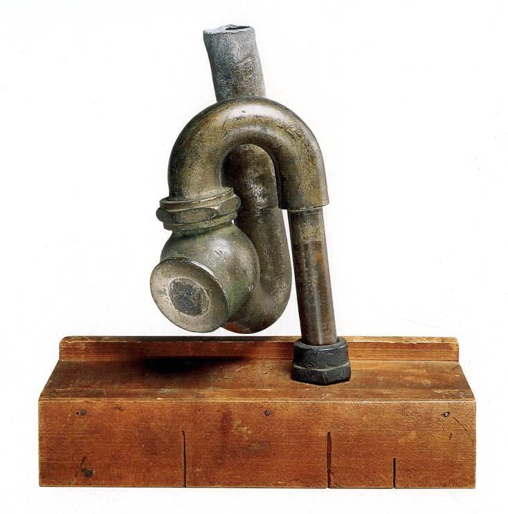
God, Elsa Baroness von Freytag-Loringhoven, photo: Morton Schamberg, 1917, collection: metmuseum.org

The claim that Duchamp “stole” Fountain from Elsa Baroness von Freytag-Loringhoven was brought to the fore recently. The ostensible hook was a criticism of the reissue of Calvin Tomkins’ Duchamp bio, which doesn’t credit Freytag-Loringhoven. But authors Julian Spalding and Glyn Thompson’s real goal is the delegitimization of Duchamp, and with him, the entire post-war art and theory that flowed out of Fountain. It’s the reactionary art historian’s equivalent of traveling back in time to kill teen Hitler. Here is Dr. Thompson trolling his commenters at The Art Newspaper:

Any of the global curatorial elite contemplating changing a label also have the problem of what to attach labels to, because the problem for a work art that draws its legitimacy from the acceptance by Duchamp of the attribution of Mutt’s urinal is that it is now required to obtain it’s legitimacy from somewhere else. Had Duchamp merely exhibited a urinal at the Janis Gallery in 1950 and explained it as homage to Elsa, whose urinal had been rejected by the Independents in 1917, there would be no problem, but there is, because the replica of 1950, attributed to Duchamp, and signed R Mutt, drew its authenticity from the attribution of Mutt’s original to Duchamp, a process which had begun with no complaints from Duchamp in 1935.The implications of this conundrum for the future of avant-garde art must now be addressed…

“Duchamp’s mean and meaningless urinal has acted as a canker in the heart of visual creativity,” they kicked, “Elsa’s puts visual insight back on to the throne of art,” as if they would for a minute support the artistic reign of Queen Elsa, whose outrages and transgressions troubled even the Dada-est of her contemporaries.

stieglitz_mutt_fountain_blindman_2.jpg
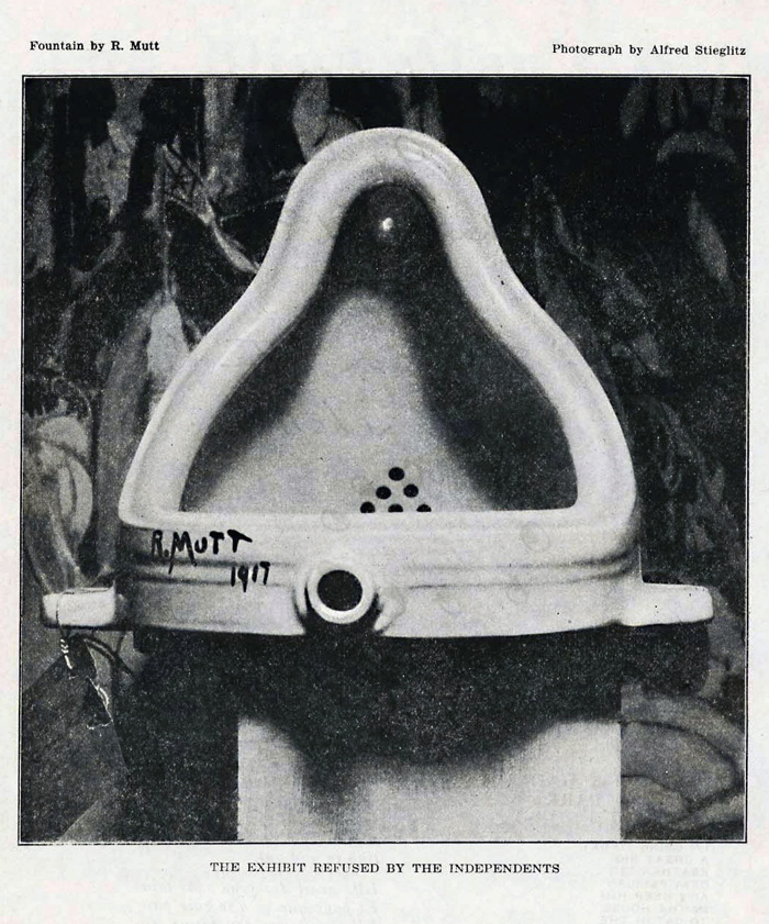
Fountain, 1917 assisted readymade by R. Mutt, apparently photographed by Alfred Stieglitz, as it was first seen and known via its publication in The Blind Man 2, May 1917

Which doesn’t mean they’re wrong. Their claims are not based on their own work, but on many years of carefully researched and argued publications of scholars like William Camfield, Irene Gammel, Amelia Jones, and Francis Naumann. Among the evidence: a letter Duchamp wrote to his sister in April 1917, just days after Fountain was rejected, attributing it to “one of my female friends,” which was only discovered and published in 1983. Also bolstering the case: the similarity of Fountain to God, top, Freytag-Loringhoven’s plumbing fixture-based sculpture of the same period. No brainer, right?
elsa_von_freytag_duchamp_portr_sheeler.jpg
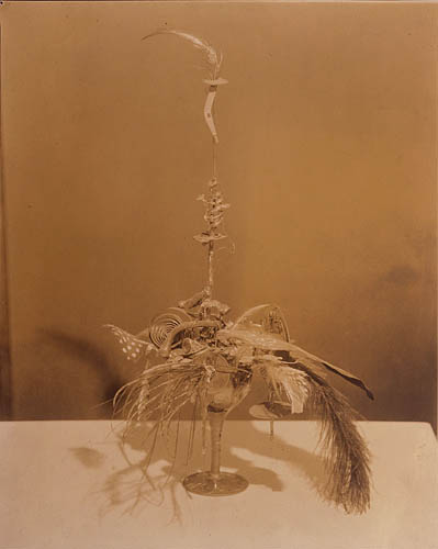
Portrait of Marcel Duchamp, c. 1920, Elsa von Freytag-Loringhoven, photo: Charles Sheeler, via francisnaumann

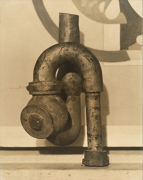
Except that for decades God was considered to be the work of Dada/precisionist painter Morton Schamberg. Schamberg was a close friend of decidedly un-Dada Charles Sheeler. Both Schamberg and Sheeler photographed artworks for money. Freytag-Loringhoven’s found object assemblage Portrait of Marcel Duchamp exists only in Sheeler’s photo of it, above, which was only discovered in the 1990s. They have separate billing. Naumann, who has written several of The Books On Duchamp, re-attributed God to Elsa in the mid-00’s, but so far she gets, at best, shared credit. One of the photos Schamberg took of God includes his own machine-inspired painting in the background, but two do not. This is the only sculpture associated with Schamberg, who died in the 1918 flu pandemic.

god_schamberg_christies_baroness.jpg
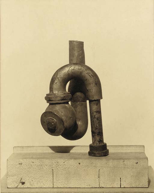
Morton Schamberg photo of God, image via christies

This Schamberg-less Schamberg photo of God sold at Christie’s in 2011. The estimate of $5-7,000 was in line with his market history; the result, $390,000, makes me think that the Baroness’s history was a factor and that someone out there believes in her God.

This God talk was weighing on my mind for a couple of months when I stumbled across a 200+ page oral history from UCLA of the pioneering West Coast abstractionist Lorser Feitelson, whose career began in New York in the 1910s and 20s:

[Freytag-Loringhoven] would come up to visit us, …and she’d bring up all kinds of –I think I told you this–a cluster of pipes that she picked up right around the corner (they had razed one of those buildings), dragging this thing up the stairs. [It sounded like] somebody was busting the building. And she said, “Isn’t this a grand sculpture?” And she wasn’t kidding. Accident made this thing. What the hell difference does it make if the guy intended it or not? It wasn’t difficult to convince us.

The awesomely gossipy Feitelson tells the Baroness’s endless demands for sexual services from men and women alike, and of her many arrests for indecent exposure for “the way she dressed, in batik, with an opening there and dyed pubic hair, walking down Fifth Avenue.” And of how taking his young nieces to Elsa’s studio turned out to be “the worst mistake I ever made in my life,” when she identified the glittery pink nebula painting they were looking at as a belfie.

For all this, though, Feitelson’s most interesting story is of his first, daunting encounter with Freytag-Loringhoven, who picked up the young student at a live modeling session in Gertrude Whitney’s Studio Club and took him home.

Geez, I mean, what the hell kind of a gal is this? And here on the walls were shovels and all kinds of things. I said, “Marcel Duchamp.”* She said, “Yes, I know him very well.” I don’t mean to say that she took it from him–and I’m not sure. She was playing around with “found discoveries.” She would take the shovel and put it up against a background of some kind of a colored paper or materials. She had many such things, and they were wonderful.

morton-schamberg-god-sculpture_1.jpg
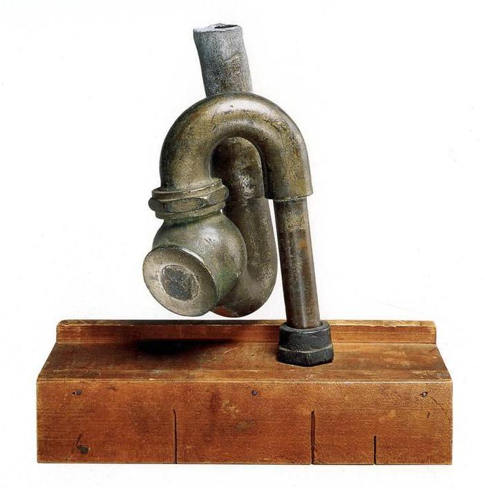
God, cast iron plumbing trap on miter box, 1917, attr. to Schamberg & von Freytag-Loringhoven, collection: philamuseum

In a deal engineered by Duchamp, God was acquired in 1950, along with many major Duchamp works, by the Philadelphia Museum.. The Large Glass joined the museum two years later. God is currently credited to both Schamberg and Freytag-Loringhoven.

What if Elsa took the original In Advance of A Broken Arm? What if she helped make it? What if she and Duchamp conspired to create R. Mutt’s Fountain–which, remember, was identified almost immediately as a Buddha–and submit it to the Independents? Feitelson wrapped up his discussion of the Baroness with a segue to Duchamp: “[s]he had to have this terrific conceit and faith in her convictions. And I still say you cannot talk about Marcel Duchamp detached from other people.” In its own fitful way, the art world’s conversation is starting to shift.

* OK, I’ve wondered about this for a while, and now it’s a year later, and I am still wondering. I have a hard time figuring out how Feitelson would see a shovel hanging in a stranger’s studio and immediately associate it with Duchamp.

Feitelson actually said this drawing studio was before Whitney started her Studio Club, but that was 1914. And Duchamp only hung In Advance Of A Broken Arm in the studio he shared with Jean Crotti in November 1915. So no.
Feitelson said he was in NYC “during the war,” which would be 1918-19 from the US view of things. Whitney Studio Club was on W 4th St, and moved to W 8th in 1923. So that’s a possibility. But again, Duchamp had his shovel in his studio, and Feitelson never seems to have gone there. He never mentioned Crotti. He never mentioned the Arensbergs, the center of Duchamp’s circle, and exactly the kind of folks a namedropper like Feitelson would go on about. Did people talk about Duchamp’s studio objects? Because I don’t think he showed them publicly. Instead, I suspect this Elsa memory is a retrofit, Feitelson trying to make it sound like he knew what was going on in Elsa’s studio. There may have been a shovel, which would be interesting, very interesting! But I highly doubt if he saw it, Lorser Feitelson connected it at the time to Duchamp.