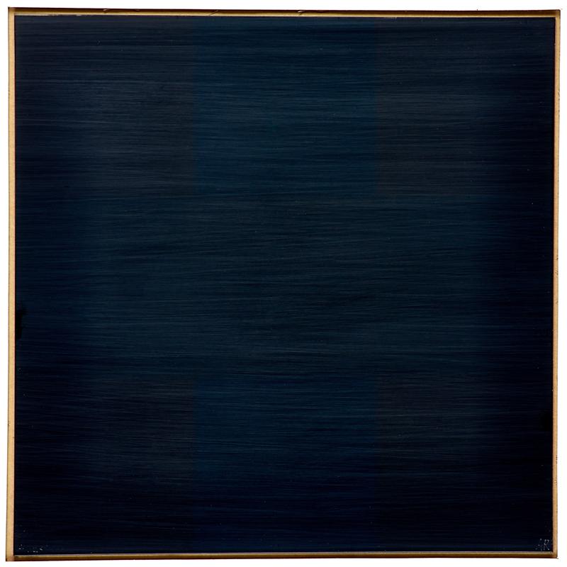
Untitled (Andiron Attributed To Paul Revere Jr.), 2014

untitled_andiron_attr_met.jpg
Untitled (Andiron Attributed To Paul Revere Jr.), 2014, whoops, 2015, obv
[UPDATED, see below; UPDATED AGAIN, see below that]
I am stoked (pun recognized and allowed to stand) to have a new work in the Metropolitan Museum. Despite its minty freshness, Untitled (Andiron Attributed To Paul Revere Jr.), 2014, is currently on view in The American Wing, Gallery 774, the Luce Visible Storage Gallery, officially known as the Henry R. Luce Center for the Study of American Art.
I have not seen it installed yet–I just made it a few minutes ago, cut me some slack–if you’re at the Met, maybe swing by and send me a pic? Ideally, the piece should be installed just as it’s depicted in this beautiful photo.

Continue reading “Untitled (Andiron Attributed To Paul Revere Jr.), 2014”

Paul Revere (Attr.), Time Capsule Plaque, Silver, Engraved Text, c.1795

paul_revere_time_capsule_mfa_6.jpg
image: via usnews
I may have tweeted smack about it when I thought it was just old newspapers and coins, but that’s only because initial headlines of Samuel Adams’ and Paul Revere’s time capsule in the cornerstone of the Massachusetts State House criminally underplayed the presence of this amazing, engraved silver plaque.
THIS is EXACTLY the kind of thing people should put in time capsules: slightly-precious-but-not-too items handmade to commemorate the occasion. These artifacts capture the moment, but more importantly, they retain an historical significance, and who knows, in time they may accrue an aesthetic aura as well.
paul_revere_time_capsule_mfa_2.jpg
image via reuters
The Boston time capsule plaque also benefits from the connection to the still-relevant Revere brand; whether he actually made it or not, it feels plausible, authentic. There is also the handmade aspect: I have an engraved ring, and a stationery die, but a whole engraved plaque? That’s something.
[It’s not the intern who wrote this USNews piece’s fault for describing every item in the time capsule in terms of its market value, and the impact a Revere attribution & provenance might have on it. Every report has that. It’s just another sign of who we’ve become as a culture. Like Antique Roadshow.]
A more interesting cultural change is the invisibility/illegibility of whatever the plaque actually says, and what it might mean. The Masonic context goes unremarked or glossed over in the mainstream coverage of the plaque. He that still hath ears, two hundred years on, let him hear, I guess.
walter_de-maria_melville_chr.jpg
Invisibility was one of the qualities of engraved text that appealed to Walter De Maria early in his career; he made a series of polished steel or aluminum works with engravings on them: Garbo Column (1968) had a list of the reclusive actress’s 27 films; Melville (1968, above, which I have swooned over before) features the opening of the author’s first hit novel, The Confidence Man.
demaria_color_men_choose_menil.jpg
The Barnett Newman-scale monochrome painting De Maria asked Michael Heizer to make for him for Dwan Gallery’s 1968 Earthworks show has its title engraved on a polished steel plaque in the center: The Color Men Choose When They Attack the Earth. Can you read it in this picture?
demaria_dorian_gray_prada_2011_fabyab.jpg
Walter De Maria, Silver Portrait of Dorian Gray, 1965, at the Prada Fndn’s exhibit in Venice in 2011, image: @fabyab
De Maria created at least one work in silver. It was for his patron at the time, Robert Scull, who fronted the dough for the fabrication of a series of polished metal sculptures. Silver Portrait of Dorian Gray (1965) is just that: a mirrored silver plaque behind a velvet curtain that darkens and oxidizes over time. The artist’s instructions on the back offer the owner the chance to wipe away the stains of aging, though: “When the owner judges that enough time has passed, this plaque may be removed to free and clean the silver plate.” The promise of immortality, the opposite of a time capsule, at least for the mirror. Your call, Miuccia!
demaria_dorian_gray_verso_scull_aaa.jpg
image:
UPDATE A brief dive into the history of time capsules tells us we need to pay more attention to the Masons, and to the Egyptians. The birth of the modern/20th century time capsule is linked to the discoveries of relic-filled Egyptian tombs and pyramids. And in a list of the International Time Capsule Society’s 1991 list of the Top Ten Most Wanted Time Capsules is this:

5. George Washington’s Cornerstone
Today’s custom of burying time capsules is in part an outgrowth of Masonic cornerstone-laying ceremonies. Through the centuries, Masons have officiated at rituals which often include placing memorabilia inside building cornerstones for later recovery.In 1793, George Washington, a Mason, performed the Masonic ritual upon the laying of the original cornerstone of the U.S. Capitol. Over the years, the Capitol has undergone extensive expansion, remodeling and reconstruction, but the original George Washington cornerstone has never been found. It is unknown whether there is anything inside of it.

Here is a Mason’s explanation of the cornerstone laying ceremony, one of the only public Masonic rituals. [“When the brethren are sharply dressed, and well-rehearsed, it’s an awesome thing to behold.” mhmm.] And Wikipedia’s article on cornerstones has a brief account of a 19th century cornerstone laying ceremony in Cork, which involved “a trowel specially made for the occasion by John Hawkesworth, a silversmith and a jeweller.” So maybe these engraved plaques are also a thing?
Coins, Newspapers Found in Time Capsule Buried by Paul Revere [usnews]
Previously, very much related: While We’re On The Subject Of Polished Metal Objects: Walter De Maria

Uber, But For Artists

Monochromes. Why’s it always gotta be monochromes?
In his recent NYT Magazine profile of Stefan Simchowitz Christopher Glazek writes about the emerging artist Kour Pour that “several artists I spoke with had initially assumed that Pour did not in fact exist — that he was a computer-generated figment of Simchowitz’s prodigious imagination.” One reason Glazek gives is that Simcho’s email was the contact link on Pour’s website. Another, he infers, is because Pour’s digital image tapestry paintings seem so perfectly suited to Simcho’s Instagram- and minor tech billionaire collector-centric art dealing operation.
But Glazek saves the biggest reveal for his annotation of his own article on genius.com: he’d heard that Simcho had already fabricated an artist, and had put his work up for show and sale in 2011. That artist’s market-optimized multi-culti name was Chen Obogado.

An artist told me Simchowitz had approached him to make paintings under a false name, though it seems possible that Simchowitz actually painted them himself. I’m not sure if money ever exchanged hands for the paintings. It may have been more of a prank than a scheme, and the art world is forgiving of pranks.

chen_obogado_china_art_obj_inst.jpg
China Art Objects, Mind Games, installation view with Chen Obogado [L] and actual artist Evi Vingerling [R], Jul/Aug 2011
Let’s review Obogado’s known body of work and brief exhibition history. It won’t take long. As far as I can tell, Chen Obogado made his debut in a summer group show at China Art Objects called, appropriately enough, “Mind Games.”
Chen_Obogado_MS6_01_chinaartobj.jpg
Chen Obogado, MS6 01, 2011, resin, pigment, aluminum, image: caog.la
Like many actual artists at the time, simulated artist Chen Obogado [SimChO?]’s practice interrogated chemical process-based abstraction; two works are pigmented resin slabs, possibly on aluminum panels, but definitely in tray-like aluminum frames. They retain the traces of their skll-less pour [!]: bubbles, pour lines, and pigment mixed unevenly within each batch. I guess this is supposed to be works’ content. If I were trying to sell them, I’d reference the foam scenes from Fischli & Weiss’sThe Way Things Go and let the zombie abstraction momentum do the rest.
Chen_Obogado_MS001PB001_chinaartobj.jpg
Chen Obogado, MS001PB001, 2011, polyurethane, aluminum, image: caog.la
The third, smaller work is made of polyurethane in aluminum. It is glacial, sculptural and reductive, and appears to be a piece of Stingel-ian insulation board that’s been scraped with a solvent-dipped spackling knife. They have inconsistently formulated serial numbers for titles. Their irrelevance is a standout, even among the forgettable flotsam that seems to have washed up in Culver City that summer. [Like car crash videos in drivers ed, anyone starting a new painting series should be forced to surf 3-yr-old group show installation shots.]
Chen_Obogado_CO_MSM_001_S1_laxart.jpeg
Chen Obogado, CO MSM 001 S1, 2011, resin, platinum powder, aluminum, est. $3,000, opening bid: $1,500. image: laxart
Which wasn’t enough to actually forget them. The fourth and last Obogado to make a documented public appearance was in November, at the LAXART benefit auction. This work was made of resin and platinum powder on/in aluminum. Which sounds like it might be kind of metallic and shiny, a poor, stupid, unconnected man’s Jacob Kassay.
It was listed as a “donation of the artist and an anonymous donor,” which makes little sense in the benefit auction context, and even less if he actually didn’t exist. But it does seem like the credit line of an artist who didn’t exist who wasn’t buying his own materials. Last summer Simcho told Artspace, “I help dealers decide which artists to represent, how to represent them.” Was SimChO presented to CAO and LAXART as a Simcho joint? Was he pitching the glorious future where artists-as-brands soared free of the foibles and frailties of actual artists? The next step in the end of authorship? That would be more than a scheme OR a prank.
The Kassay mention above is interesting because Summer 2011 was when Kassay had his first show in LA, and L&M. And Henry Codax had his first show in New York. Is it too late to organize an east coast/west coast monochrome show of these two non-existent artists? Please say no. #Sumer2015
Though rumors of Kassay and Olivier Mosset’s involvement in Codax’s work were reported at the time, I’ve come to think that Codax must be a gallerist’s dream: all that margin without all those hassles. Assuming it sold, of course, and you could keep it moving. And maybe that’s what doomed SimChO’s work: Simcho couldn’t keep up the act well enough to sell it, or maybe it sucked so bad even his buy-it-now yesmen network didn’t click, and so Simcho decided to eat the cost of two buckets of resin and call it a day?
It’s worth considering Chen Obogado in the Simcho’s own preferred, network/platform/disruptor context [My favorite quote, from another of Glazek’s annotations: “All he demanded was a minimum level of respect. ‘You can’t say I’m bad–I created the post-internet movement!'”] Stories of artists feeling exploited by Simcho remind me of reports last year of the drivers who were the pawns in Uber’s anti-competitive attacks against Lyft. Which LOLjobsWTF when Uber’s CEO talked about how psyched he was to replace all the drivers with robot cars. If Chen Obogado’s any indication, Simchowitz may feel the same way about artists.
Christopher Glazek annotates himself [genius.com]
When he has a fawning audience Simchowitz really lets the vision flow. Must read. [artspace]

Wait, What? Jasper Johns Blue Ceiling By Matson Jones??

2020 UPDATE BELOW:matson_jones_blue_ceiling.jpg
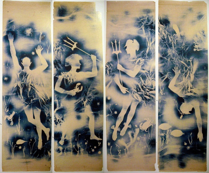
Jasper Johns Blue Ceiling, 1955, 12×10 feet [!], image: postermuseumblog

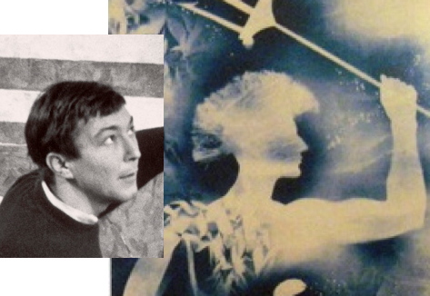
How did I miss this? Just a week after I posted about Matson Jones’ hand-painted plaster melons and pomegranates, poster dealer Philip Williams revealed an incredible Matson Jones find: a set of cyanotype/photograms titled Jasper Johns Blue Ceiling.
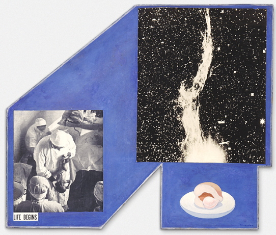
Each of the four panels depicts an underwater scene featuring a male figure holding a trident, or with a Trojan-style helmet; the only figure not in profile has pointy, Sub-Mariner-style ears. They’re all signed “Matson Jones” in the image, and apparently, the title, which is apparently a reference to Johns’s bedroom, is written on the back in what Andy Warhol said was Robert Rauschenberg’s handwriting. They surfaced in the 1980s from the office of Gene Moore, the guy who commissioned Matson Jones [the commercial pseudonym of Rauschenberg & Johns] to create window displays for Bonwit Teller. The prints were apparently a backdrop for [Bergdorf Goodman] windows made in 1955.

rauschenberg_weil_photogram_life_mag.jpg
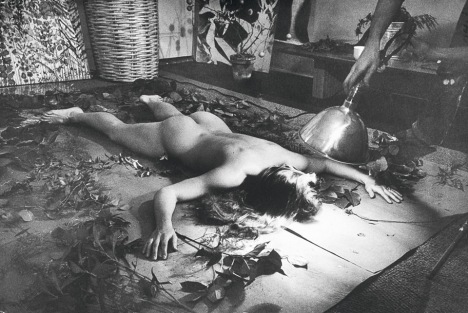
Rauschenberg & Weil making a blueprint photogram, 1951, LIFE Mag via tate

Rauschenberg, of course, had made and shown similar photograms with his wife Susan Weil. She [or a model] would lie on the photosensitive paper in a composition, and he’d swing a lamp around her, Pollock-style, to make the image. [MoMA has one.] Weil kept making photograms after their divorce, but I never realized they shared joint custody of the technique. Or that Rauschenberg would use it with his next model–and that’s the question here, I guess: is that Johns?
matson_johns_profile.jpg

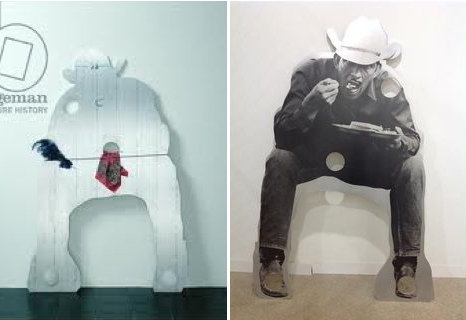
Who else could it be, right?* And if it wasn’t Johns in 1955, it certainly was in 1962. These 1-to-1 scale photograms make me think of Johns’s Study for Skin drawings, which he made by pressing his oiled up face and hands against a sheet of drafting paper, then rubbing it out with charcoal. Richard Serra owns a full-body Johns Skin job from 1975, too, so it’s not like he gave it up.

johns_study_for_skin_i.jpg
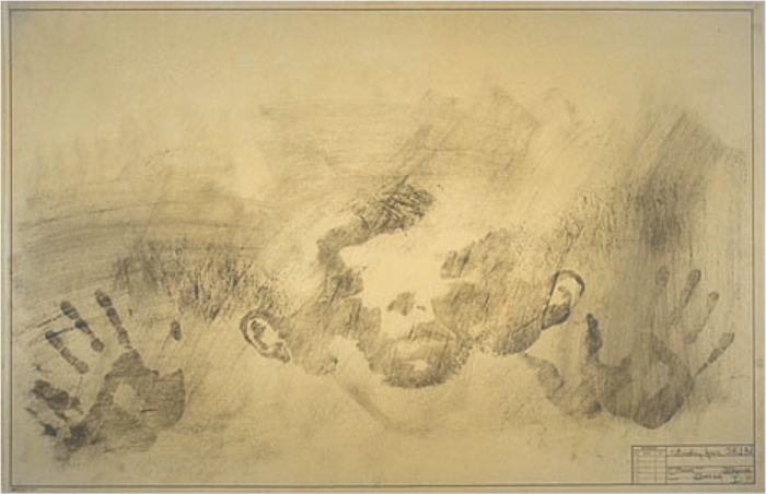
Jasper Johns, Study for Skin I, 1962, image via nga

There’s also Rauschenberg’s large-scale, 1968 print triptych Autobiography, and though it’s a stretch across time, the shadows remind me of Johns’s landmark Seasons paintings and prints of 1986-7, which all feature the artists’ shadow.

jasper_johns_seasons_ulae.jpg
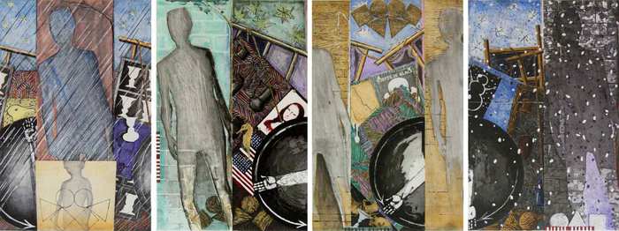
Jasper Johns The Seasons print series from ULAE

Connecting Johns’s imprint of the body to Rauschenberg’s–and Weil’s–photogram process would be interesting enough; but these photograms also connect Matson Jones’ production more directly to the art practices of Johns and Rauschenberg.

It does not feel great to not be the first to make this connection. In a Feb. 1959 column in Arts Magazine that is a master class of insiderish gay-bashing, Hilton Kramer denigrated Johns and Rauschenberg as “visual publicists” working in the commercial art “gutter”:

Rauschenberg, for example, is a very deft designer with a sensitive eye for the chic detail, but the range of his sensibility is very small — namely, from good taste to “bad”…Frankly, I see no difference between his work and the decorative displays which often grace the windows of Bonwit Teller and Bloomingdale’s. The latter aim to delight the eye with a bright smartness, and Rauschenberg’s work differs from them only in ‘risking’ some nasty touches. Fundamentally, he shares the window dresser’s aesthetic to tickle the eye, to arrest attention for a momentary dazzle…Jasper Johns too is a designer…Johns, like Rauschenberg, aims to please and confirm the decadent periphery of bourgeois taste.

There are a couple of other examples of gender-coded criticism early on in Johns and Rauschenberg’s careers, but Kramer’s knowing sneers link gayness with non-seriousness, taking a double swipe at the artists’ rapidly growing reputations. Johns wrote an angry letter in response, saying “a kind of rottenness runs through the entire article.”

Which is why Williams’ post of what “may very well be the only known surviving Matson Jones work,” is unsettling. It ends with this shoutout, “Today, Friday May 15th, is Jasper Johns’ 84th birthday. From everyone here at Philip Williams Posters Happy Birthday Mr. Johns!” Almost as if they were inviting the artist–who has a penchant for destroying early work that doesn’t necessarily fit his preferred narrative–to buy it back. Frankly, they belong in a museum. If there is a museum bold enough to take them.

Jasper Johns Blue Ceiling by Matson Jones [postermuseumblog]

Continue reading “Wait, What? Jasper Johns Blue Ceiling By Matson Jones??”

On Lorser Feitelson’s Life Begins

feitelson_life_begins_lacma.jpg
I don’t see or think about it nearly enough, but I’ve been fascinated by Lorser Feitelson’s 1936 collaged photo/painting Life Begins for years. 1936! LACMA acquired it in 1996.
Feitelson’s later, post-war, hard-edge abstraction gets much more attention than the 1930s “Post-surrealist” works, which generally makes sense. Something like Life Begins is just so unusual is almost doesn’t fit into that bucket, either. But seeing images of it again recently made me wonder just what is going on here. I can’t find almost anything written about it, except Steve Roden’s discussion of it in the LA Times a few years ago: “On some days it feels as hermetic as ‘outsider art,’ and on others it seems the most experimental painting he ever made. I’ve been visiting this work for 25 years, and I still don’t understand it. I really love that.”
Which, it’s nice to know it’s not just me who loves it, and who’s baffled by it.
The basics:Life Begins is oil and collage on a shaped masonite panel around two feet square. The painted elements are the blue space, which often gets called a sky, and a half peach and pit on a small plate. The collage elements are two black&white photographs, or close to it, of a doctor holding a newborn baby, cropped to preserve the caption, which gives the work its title; and an astronomical feature.
The “Life Begins” photo in Life Begins is easy enough to source: it’s the first photo printed in the first issue of LIFE Magazine, which began publication on November 23, 1936. [That means Life Begins was not in the Post-Surrealism show Feitelson organized for himself, his wife Helen Lundeberg, and other California-based artists at the Brooklyn Museum in May 1936. And it wasn’t among the Feitelsons included in Alfred Barr’s Fantastic Art, Dada & Surrealism show at The Museum of Modern Art in November 1936.]
The other element has taken more time to track down. When they describe it at all, most sources have called it a photo of a solar flare. But it’s not. While solar flares were being observed along with sunspots, on the face of the sun, there was no technology capable of photographing a solar flare like that in the 1930s. The only online source to identify the image correctly was a letter from an MD/amateur astrophotographer of the Journal of the American Medical Association, which had used Feitelson’s painting on their cover in 2004. It is a detail of the Western Veil Nebula (NGC 6960) in the constellation Cygnus.
We are very used to such images now, but in 1936, there were very few observatories capable of producing such a photo. The scientific understanding of nebulae, and of the universe itself, was in flux. It was only in 1924 that Edwin Hubble announced, first in the New York Times, that many of the objects called nebulae were actually galaxies, which existed far beyond our own Milky Way. As late as 1933, it was still a matter of speculation whether the Veil Nebula surrounded a star, and was actually the remnant of a supernova.
duncan_veil_nebula_1921.jpg
Let’s just say, thanks to Hubble the telescope, it’s difficult to search for historical astronomical images, which have been supplanted by higher resolution, full spectrum glitz. After a couple of evenings, though, I think I found Feitelson’s source. Wellesley astronomer John Charles Duncan, who published several articles on photographing nebulae, made a 7-hour exposure of NGC 6960 in 1921 using the largest telescope in the world, the Hooker Telescope at Mount Wilson Observatory. Duncan used the image as the frontispiece for Astronomy A Textbook, published in 1927. [above]
The image doesn’t match Feitelson’s in size, exposure, or cropping, obviously, but I suspect the artist either rephotographed the detail from the plate, or got access to the negative at Mount Wilson. Duncan later published a fainter, underexposed version of the image, which extrapolates to what an overexposed version like Feitelson’s would look like.
lundeberg_red_planet.jpg
Helen Lundeberg, Red Planet (1934)
This image in Life Begins is not a one-off. Both Feitelson and his wife Helen Lundeberg included astrophotography in their Post-Surrealist paintings in the early 30’s. [Maybe Post-Surrealism feels a bit like Post-Internet: a way for artists to signal to lagging institutions they’ve incorporated something and are moving ahead.] Lundeberg’s Red Planet is a paradoxically lit interior featuring a red planet-looking orange hovering over a telescope mirror-looking tabletop, and a photograph of a comet leaning against a book titled, “Mars.”
feitelson_genesis_2_saam.jpg
Lorser Feitelson, Genesis #2, 1934, collection Smithsonian American Art Museum
Feitelson’s Genesis #2, also 1934, has a telescope pointing through the eyes of several aging masks and a skull, propped on books, toward a painting of what looks to me like a photograph of the Crab Nebula. There’s also a trompe l’oeil drawing of an Annunciation, a Picabian outline of a woman and her developing breast, a baby bottle, a conch, an eggshell, and a sliced melon and light bulb that immediately make me think of Matson Jones-era Johns. Which, any connection is impossible, I know, but still.
Genesis #2 combines scientific, religious, and metaphorical accounts of birth, which makes it feel closely related to Life Begins. Now the unusual shape of Life Begins feels related to the perspectival lines and sharp, flat planes Feitelson used to define his spaces. Which makes Life Begins a variation on a Genesis II theme; when Life Magazine launched with that photo, of all photos, Feitelson must have really felt like he was onto something big.
Life Begins [lacma.org]
Genesis #2 [americanart.si.edu]

Taking Care of Business: Gio Ponti’s Time-Life Pavilion

gio_ponti_time_auditorium_ext_esotericsurvey.jpeg
Amazing, how did I never know this? Gio Ponti designed a business pavilion and auditorium for Time-Life in 1958, and it’s still there, perched mostly out of view on the north side of the 8th floor setback of 1271 6th Avenue. It’s covered with crystalline facets and triangles on the roof and terrace [though the photo above also seems to include some overpainted elements. Also it was flipped, so I fixed it.]
gio_ponti_time_auditorium_int_esotericsurvey.jpeg
Dubbed “the most versatile and complete business-meeting facility in Manhattan,” the pavilion was commissioned by Henry Luce at the instigation of his wife Clare Boothe Luce, who wanted to make Ponti a thing. Writing about a 2010 show of Ponti in New York curated by Germano Celant, Suzanne LaBarre described the pavilion as “the closest thing to a playground a stark, midcentury office building had seen: green-and-blue marbleized floors; saucers and brass strapwork in the ceiling; obelisk sconces; and a smattering of irregular nooks, foyers, and bars.” Green & blue marbleized floors? Yow. Sounds like proto-Memphis to me, and makes me curse black and white photography.
ponti_time-life_pavilion_bing.jpg
Gio Ponti Time-Life Pavilion/Auditorium, on the north side of 1271 6th Ave, looking S/SE on bing
Unfortunately, LaBarre reports that Ponti’s interior has been destroyed and remodeled two times over. [The top two images come from Esoteric Survey’s extraordinary survey of the 1958 Time-Life Building’s interiors, from the likes of, basically, everybody.] Time is out of or leaving the building this year, so who gets the Ponti?
leonni_brussels_masey_ext4.jpg
What is most surprising to me, though, is the similarity of Ponti’s design to the Unfinished Business Pavilion, created in for the 1958 World’s Fair in Brussels. In an attempt to head off Soviet criticism of the US’s discrimination against African Americans and the civil rights protests it spawned, the State Dept. and USAID asked Luce’s Fortune Magazine to create a pavilion addressing ‘the Negro Problem.’ Fortune creative director Leo Lionni’s three-part design moves from the “chaotic crystal” of the past to the bright happy square future where children of all races play together in harmony. Which was considered such an insult to the segregationist Dixiecrats in Congress, they demanded Fortune close the pavilion as soon as they got wind of it.
Which is interesting that in color and form, Ponti’s pavilion most closely resembles the chaotic crystal section, or vice versa. Maybe Ponti’s came first, and Leonni used it as a stand-in for the shameful past we were all trying to overcome. Anyway, this warrants further investigation.
Time-Life [esoteric survey]
Gio Ponti’s New York [metropolis]
Previously, related, and devastatingly, depressingly timely: The Unfinished Business Pavilion, by Leo Leonni
None of Your ‘Unfinished Business’

Protestors’ Folding Item, 2014

nypd_lrad_seismomedia_1.jpg
Installation view: Protestors’ Folding Item (LRAD 500X/500X-RE), ink on Cordura, nylon webbing, LRAD, 2014, Collection: NYPD Order Control Unit


nypd_lrad_seismomedia_2.jpg
Installation view: Protestors’ Folding Item (LRAD 500X/500X-RE), 2014, Collection: NYPD Order Control Unit
This is related to this: Traveler’s Folding Item or, in French, Pliant de Voyage, an Underwood typewriter cover as Readymade by Marcel Duchamp.
duchamp_travelers_folding_1964.jpg
Traveler’s Folding Item/Pliant de Voyage, 1964 Schwartz replica of the lost 1916 original
From Tout Fait,

On the most basic level, Traveler’s Folding Item stands as a typical Readymade. It demonstrates the clear displacement of an everyday object from its original context and function. A cover with no typewriter for it to protect is utterly useless. It tempts the viewer to look underneath its skirt, and suddenly it takes on some very sexual meanings. Museums often strategically display the typewriter cover in a manner so as to tempt the viewer in this manner as if it were a woman’s skirt. Joselit explains, “This item, which Duchamp identifies with a feminine skirt, should be exhibited on a stand high enough to induce the onlooker to bend and see what is hidden by the cover” (90). In this way, this Readymade acts as an invitation to voyeurism.

You know what else is utterly useless and tempting? An LRAD with a cover on it. Which is why I am stoked to announce my latest work, Protestors’ Folding Item, a series of LRAD covers, installed on LRADs.
What does it mean to declare LRAD covers a Readymade? Such a designation definitely does not hinge on my making them, or my cashing the checks for their sale. Sorry, flippers, they’re only available to institutions. [Carlyle & Co. folks and the Zabludowiczes, call me, we can probably work something out.] If anything, it’s a relief not having to worry about fabrication or sales. I can really just focus on the work. True, it takes some effort to gather documentation on venues and edition size, but it’s not something a diligent registrar can’t handle.
Given the interest my institutional collectors have in control, it also might be difficult to arrange loans to show them in galleries or museums. Which doesn’t mean they won’t be seen publicly. In fact, at the apparently increasing rate LRADs are being deployed, I’d say my CV is about to explode.
What would the legal implications be for my declaration of these Readymades? Could copyright or VARA or droit moral be used to assert control over the public display of these, my works?
In Alberta, Canada, an artist has fended off gas drilling and pipelines on his farm for eight years by copyrighting his land as an artwork [and by charging oil & gas companies $500/hr to discuss it]. Yves Klein once signed the sky.
According to my fabricator’s website, “The LRAD 500X / 500X-RE systems [underneath Protestors’ Folding Item] produces a sound pattern that provides clear communication over long distances. The deterrent tone can reach a maximum of 149 dB (at one meter) to influence behavior or determine intent.” My work, too, is designed to provide clear communication, influence behavior, and determine intent. That’s why they go so well together, like a glove on a hand. Really, they’re inseparable. You can’t have one without the other.
lrad_olafur.jpg
L: You Hear Me, 2007, R: Eye See You, 2006
“The art world underestimates its own relevance when it insists on always staying inside the art world. Maybe one can take some of the tools, methodologies, and see if one can apply them to something outside the art world,” said Olafur Eliasson. In T Magazine. “If we don’t believe that creativity as a language can be as powerful as the language of the politicians, we would be very sad — and I would have failed. I am convinced that creativity is a fierce weapon.”
I hope LRAD cover readymades, are too, and that collectors of my work will preserve its integrity by exhibiting it only as originally intended, with the covers on the LRADs.
17 U.S. Code § 106A – Rights of certain authors to attribution and integrity [law.cornell.edu]

Through The Perilous Fight

johns_inverted_flags_ulae.jpg
Flags, 1968, image metmuseum.org
In 1968 Jasper Johns produced an edition, Flags, with ULAE featuring two American flags and an optical phenomenon. After staring at the inverted spectrum flag, green, black and orange, on the top, a viewer would then switch to the bottom flag, which would momentarily appear red, white and blue.
donald_judd_negative_spectrum_flag.jpg
American Flag in Negative Colors of the Spectrum, 1968, image: juddfoundation.org
This was more than a visual trick. It carried symbolic and political meaning. Or at least such things could be ascribed to an inverted flag. In 1968 Donald Judd had American Flag in Negative Colors of the Spectrum made. It was included in “The Public Life,” a 2011 show at the Judd Foundation about the artist’s civic and political engagement. I have not been able to find out much background for this object or its creation.
jj_moratorium.jpg
Flag (Moratorium), 1969
In 1969, Johns again used the inverted flag, for Flag (Moratorium), a fundraising/protest poster for the Committee Against The War In Vietnam. The small white focal point in the center facilitates the same optical phenomenon as the ULAE edition, in which the viewer is called to action to envision, produce, and correct the flag in her own mind.
hammons_african_american_flag_moma.jpg
African American Flag, 1990, image: moma.org
David Hammons’ 1990 African American Flag is different. It’s red, black and green colors derive from the Pan-African or Black Liberation Flag designed by Marcus Garvey in the 1920s. Miami collector Craig Robins has a Hammons flag; Rirkrit installed it for Design Miami Basel in 2011. It is also in MoMA’s collection, and one flies over the Studio Museum in Harlem.

Well, It’s A Gursky Now

lyza_danger_fred_meyer_640.jpg
This is just so fantastic. Last month Eugene, OR photographer Blake Andrews wrote about this 2004 photo by Lyza Danger, which has gradually become confused and conflated with Andreas Gursky’s 99 Cent photos.
Danger’s photo, an unaltered image of a Fred Meyer in Portland, is CC-licensed on flickr, which has aided its circulation and re-use. Andrews discovered several instances where Danger was accused of both ripping Gursky off, and of claiming Gursky’s image as her own. But the best part is that Google Images include Danger’s photo in searches for Gursky’s 99 Cent. The authoritativeness of Google, coupled with the plausible Gurskyness of Danger’s image, create a virtuous cycle of re/mis-attribution that may or may not be slowed by Andrews’ investigation.
And basically, I love it. Clearly, it’s Gursky enough. Or rather, Danger’s verite’ image shifts what makes a Gursky a Gursky from the grand scale of globalist capitalism to the artist’s manipulation of the same.
Danger’s photo is not a Ghetto Gursky, or a Shanzhai Gursky either; those terms don’t fit this scenario. It’s an image made in the wild, a Found Gursky, which we now recognize and appreciate because of Gursky’s influence. It’s an example of a shift from Gursky as author to Gursky as worldview. It’s of a piece with the photo that Brent Burket flagged last year, Taylor Swift’s selfie with a Dallas stadiumful of people.
gursky-madonna-0913.jpg
Andreas Gursky photo of a Madonna concert in Los Angeles on Sept 13, 2001, image via centre pompidou
And now I see a connection to the ruins of the World Trade Center I’d wanted to see Gursky photograph in September 2001, except he was touring with Madonna.
99 Cent | Blake Andrews [blogspot via petapixel, thanks giovanni garcia-fenech for the heads up]

Google, Water, Color

FSW_Paddle8_Google_Art__det.jpg
Study for Untitled (Google Art Noguchi Table) #3, 2014, 8.5 x 11 in, inkjet and water on archival matte finish paper
I was very happy to donate
this study to the benefit auction last week for Franklin Street Works, the Stamford, CT art space where some Destroyed Richter Paintings and Shanzhai Gursky photos were in a show.
FSW had asked for furniture- or design-related works on paper. I have been trying for a couple of years to figure out how to make sense of the real-world, real object anomalies of Google Art Project panos, like the blurred out paintings, and especially the blurred out Noguchi game table [furniture!] at the Art Institute of Chicago. And I thought this would be a good opportunity to experiment, rather than simply print out the GSV image [not that there’s anything wrong with that, as Paul Soulellis’s very nice Webdriver Torso-related print demonstrates].
What mattered to me was getting the blur just right. Years ago, in the early Iris Print era, I’d seen some amazing Gabriel Orozco works–which I can’t find a trace of now–where he’d dripped and brushed water onto inkjets of lush Baroque paintings of the Madonna, dissolving the center into an abstract mess. Very non-archival, but very beautiful.
And all but unreproducible. In terms of inkjet and paper coating technology, we’ve come a long way, baby. I tried several printer & paper setups, but nothing would bleed like I wanted. Finally, in desperation, I emailed my sister, who had a clanky old [2003] desktop printer in her basement, and she printed some images for me. Even this modern paper resists staining and dissolving like the inkjets of old. After several test, though, I found if I let water sit on the paper long enough, it’d give me a blur. Study #3 was the first one to be successful enough to let out of the house. I don’t know where it went yet, but I hope it stays out of the rain.
A Benefit Auction for Franklin Street Works [paddle8]
Opening In Stamford: It Narratives, at Franklin Street Works
Previously: Google Art Institute Project

Jenny Holzer’s Top Secret Papers

holzer_enhanced_technique_paper.jpg
After seeing these epic FOIA monochromes from the Dept. of Homeland Security a few years ago, I’ve been collecting the best examples of redacted documents. I’ve never quite figured out what to do with them. Maybe a book.
I know Jenny Holzer’s been working on it for a while now. But I found her first batch of giant silkscreen on linen Redaction Paintings a little too slick. The Dust Paintings and Constructivist-inspired redaction paintings she showed this fall, though, are pretty great. Score one for the hand.
But then I just noticed this rather incredible, mysterious, and seemingly modest object in an upcoming Rago Arts auction. It’s a large (35×27 in) work titled Enhanced Techniques 3, and it’s described as a signed sheet of handmade paper. So the redaction is molded right in! I think Holzer has a winner here. But what? Where? And why is this thing only estimated to sell for $1000-1500?
jenny_holzer_topsecret24_rago.jpg
A search for Holzer and handmade paper turn up other, similar pieces in the flotsam-filled auction reporting sites and secondary market print dealers. Try as they might, MutualArt couldn’t hide the fact that Rago had sold a handmade paper piece called Top Secret 24 last Spring. Rago certainly doesn’t want to hide it. I’d never thought of redaction in the same context of watermarking before.
On Caviar20 Top Secret 24 is pitched as Holzer’s “return to painting.” Hmm. At least they finally have pictures showing where this damn thing comes from. It’s ironic that people selling artworks about redaction leave out so much basic information.
griffelkunst_dobke_holzer_abendblatt.jpg
griffelkunst director Dirk Dobke sitting in front of Jenny Holzer’s Top Secret portfolio. image: abendblatt.de
Anyway, the answer is griffelkunst, a 90-year-old print association in Hamburg with 4,500 subscribers and a closed 5-year-waitlist. Members pay €132/year for four contemporary artworks, which the association, currently led by curator Dirk Dobke, commissions and produces.
I don’t quite understand how that maps to Holzer’s Top Secret project, which was a suite of six handmade paper redaction editions, available to members only for €150 apiece, or €900 for the set. I guess they made as many as people ordered?
The labor-intensive process sounds like it syncs nicely with the subject: the white pulp on the redacted areas was scooped out by hand and filled in with black as each sheet was being made. And all of this sounds like fascinating context and backstory for the work. But no one’s using it to sell these things; just the opposite, they’re keeping it quiet. Whether it’s because griffelkunst frowns on flipping, or because it’s hard to explain a 10-20x markup, I can’t say.
ad_reinhardt_ny_international_plexiglass.jpg
Holding back information is power, and the occlusion of information comes as no surprise. Strategic vagueness and decontextualization is as likely an art-selling technique as transparency and information overload. That same Rago auction also has an atypical-looking Ad Reinhardt. Well, it might look typical, but the small black monochrome square is actually an edition, silkscreened on plexiglass. It was “from NY International, 1966,” which turns out to be the title of a 10-artist Tanglewood Press print/multiples portfolio organized by Henry Geldzahler. Portfolios like these get broken up, and the slightly more marketable pieces parted out, all the time. But so many dealers and auctioneers redact the reason and context for which the artist created the work as part of their enhanced sales techniques.

Wait, What Cady Noland, 2008?

I got stopped by this line from Andrew Russeth’s report on the disclaimer Cady Noland required at the entrance to the Brant Foundation’s group show containing her work:

Since then she has shown very, very few new works (the Walker in Minneapolis has one from 2008), and she has been notoriously meticulous in controlling how her work is handled and presented.

A 2008 Noland? In the wild? Sure enough. Untitled, a familiar-looking locker room basket containing some motorcycle helmets, steel subway straps, a 16mm film reel, and a piece of metal. It’s a form Noland used since 1989, but it’s dated 2008.
cady_noland_2008_walkerart.jpg
How’d they get that? In 2009?
A clue might be the donor credit, where it is listed as “Gift of the artist and Helen van der Miej-Tcheng [sic], by exchange, 2009.” Which means the museum traded a previously donated work with the artist. But what? It doesn’t say, and it’s obviously not in the collection anymore. But it’s safe to assume it was a work by Noland herself.
Sure enough, the Walker’s 2006 annual report lists a gift of a 1990 Noland from van der Meij-Tcheng. It was titled Cowboy Blank, made of aluminum and rope.
noland_cowboy_showboat_eating.jpg
Cady Noland, L: Cowboy Blank with Showboat Costume, and R: a Cowboy, not blank, with breakfast, both 1990
But a work titled simply Cowboy Blank doesn’t show up on Google anywhere. There is a Cowboy Blank with Showboat Costume, though, an aluminum plate sculpture cut in the silhouette of a crouching cowboy, with a bandanna and an ostrich plume in its cutout holes. The Guggenheim says the cowboy’s aiming his gun, but another variant is flipped and silkscreened with a photo of cowboy eatin’ some waffles. Or maybe it’s Texas Toast. Noland executed the same silhouette in plywood, too, with a basket hanging between its legs.
Forced by no one to speculate, I’d say that van der Meij-Tcheng’s Cowboy Blank was without Showboat Costume or a fork; it had just a rope. And whether it was because it was damaged, a la Cowboys Milking, or it was just not sitting right with her, Noland decided it was not a work she wanted in public circulation. And so she took it back, but only after making the Walker a little something to replace it with.

@TheRealHennessy Tweet Paintings, Cont’d.

therealhennessy_tweets_chain.jpg
@TheRealHennessy Tweet Painting, Gold Chain, 2014, 14×11 in., acrylic and screenprint on canvas
Just in time for the Fall auctions, greg.org is pleased to present more @TheRealHennessy Tweet paintings, inspired by Donelle Woolford’s Dick Joke series which debuted at John McWhinnie in the 1990s, and which continue to be a source of brouhaha since Michelle Grabner’s 2014 Whitney Biennial.
The present work is one of greg.org’s @TheRealHennessy Tweet paintings, which rank among the contemporary era’s most iconic series by one of the most celebrated artists. Dryly presented with a deadpan sensibility, they consist of visual expressions of humor that are disarmingly immediate and resonant, yet abstract in their presentation. Describing his selections of form and content in his initial tweet paintings, greg.org later stated, “Within about six months I…started to do the tweets in ‘colors.’ I thought the color would be a substitution for an image. The background would be one color and the tweet would be another. I picked tweets that were ‘meaningful’ to me. I don’t know how to explain that except that the tweets’ ‘content’ was something that I could identify with. These ‘tweets’ were later identified as the ‘@TheRealHennessy Tweet paintings.’ I fell into them. I was walking around in a dark room looking for the light switch. I was moving by wading more than swimming. I was mowing the lawn. No direction home. I was caught in a landslide. My headaches were gone. I started painting with my fly open. I stopped crying. I started to laugh. Rock bottom sometimes isn’t the bottom. Barnett Newman, Willem de Kooning, Clyfford Still–look out.”

Continue reading “@TheRealHennessy Tweet Paintings, Cont’d.”

In Defense Of The Center For Political Beauty

It’s just one word in one tweet, so it really shouldn’t become the point, but those who follow me on Twitter know I have a thing for the language of art news sites, and their poetic idiocies of the market. This, however, just pissed me off.

It is as pure a sign as you’ll find of the pathology of current money-fixated art world that last night a half dozen media outlets filed hundreds of bid-by-bid tweets from an Impressionism auction, yet the “bizarre news” is that artists are literally trying to save lives by drawing attention to one of Europe’s existential political crises.
berlin_wall_Gedenktafel_Ebertstr.JPG
I had never heard of the Center for Political Beauty before this morning. They are the artist collective whose mission is to engage “in the most innovative forms of political art: a type of art that hurts, provokes and rises in revolt in order to save human lives.”
They removed crosses commemorating some of the East Germans killed while trying to cross the Berlin Wall, and have reinstalled them on what they’re calling the European Wall. The Center for Political Beauty has announced that they will cut down portions of the EU’s border fence on November 9th, during the official ceremonies surrounding the 25th anniversary of the fall of the Berlin Wall.
Berlin_Border_Political_Beauty.jpg
politicalbeauty.de: Keine Benutzung der Bilder ohne vorherige Genehmigung!
The photo above of a cross on a fence along the Bulgaria-Turkey border is circulating with the AFP wire service story that is the lone, primary source of English-language coverage of CPB’s project. I’ll never look at a Cy Twombly chalkboard painting the same way again.
Berlin_Wall_Cross_Ingo_PoliticalBeauty.jpg
The images and details that don’t circulate, though, are more damning: At least 136 people died or were killed trying to escape across the Berlin Wall between 1961 and 1989. The UNHCR says over 2,500 Africans trying to reach Europe have drowned or gone missing this year alone. The CPB says the number of people who have died trying to enter the EU since 1989 stands at over 30,000.
african_asylum_boat_massimo_sestini_sm.jpg
Here is a photo by Massimo Sestini of a boatful of African and Syrian asylum seekers who were intercepted by the Italian navy last June. This situation is anything else–an outrage, a humanitarian crisis, a “rendering void of the legacy of the Holocaust,” as the CPB puts it, but it is not bizarre.
And artnet should be shamed for their tendentious attempts to mock and marginalize artists pursuing something beyond the callow complacencies of the market.
UPDATE: I’m still not satisfied with this yet, or how or why it bothers me, but I’m reading Thierry du Duve’s “Art in the Face of Radical Evil” [October, Summer 2008, pdf], about MoMA acquiring and showing photos of Khmer Rouge execution victims from Tuol Sleng, and about whether they’re “art,” and what are the implications if they are:

Sobriety in exhibition design, noncommittal wall texts, and clever avoidance of the word “art” in press releases won’t succeed in hiding the fact that our aesthetic interest in photography is shot through with feelings, emotions, and projections of sympathy or antipathy that address the people in the photos beyond the photos themselves. I am convinced that something of that emotional response to the properly human ordeal of the subjects in the Tuol Sleng photos had a say in MoMA’s decision to acquire them. To suppose otherwise would be to lend the acquisition committee undeserved cynicism.

This feels like it’s inching closer.