
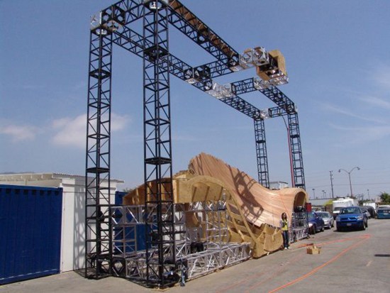
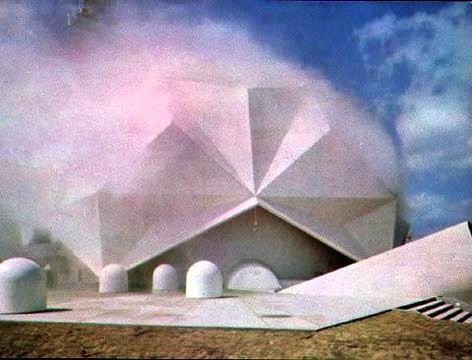
John Powers has been on me for months to read “>Nicholas de Monchaux’s Fashioning Apollo, the incredible and unlikely history of the development of the Apollo spacesuits.
And I have been meaning to, I swear, but this insane photo may be just the thing to push me over the edge. Because in his otherwise heady interview with de Monchaux, Geoff Manaugh only captions the images as being from the book.
Which I will have to buy, to find out what this three-story dolly was doing in this massive, origami-ended space lined with sound-deadening foam pyramids. Because seriously, holy smokes.
Spacesuit Interview with Nicholas de Monchaux [bldgblog]
Category: satelloons
Ladies Love The Mylar
This is fantastic, a 1955 industrial film by E.I. duPont deNemours, Inc. about their miraculous new plastic film, Mylar.
I mean, first off, it’s Mylar, so satelloons and Warhol balloons and everything else about the future.
But then there’s the film itself. The Mylar trampoline and trapeze–with acrobats. The circus-y knifethrower’s assistant in satin hotpants and beret, doing her ur-Vanna Whitest by turning the painted bullet point signs around.
The Grid-Sphere Satellite And The Doomsday Stone
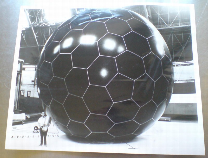
Last year I picked up this extraordinary photograph, and then didn’t have immediate results researching it, so I put it away until now. Then, wow.
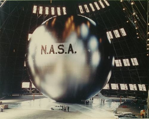
NASA launched the first Project Echo communications satelloon in 1960 to much fanfare, but the 100-foot diameter inflated Mylar sphere’s actual performance as a reflective signal relay fell short of predictions. Echo IA launched in 1960 and stayed aloft and visible from earth until 1966, but it partially deflated within a few weeks, which weakened its reflectivity. And the drag of such a large object decayed its orbital speed in ways that made it an unreliable relay.
Soon after Echo II’s launch in 1964 by NASA and Bell Labs, the US Air Force began pursuing a next-generation technology with one of its leading military contractors, Goodyear Aerospace: the grid sphere.
The grid sphere satellite was designed, near as I can tell, by Goodyear Aerospace engineer Howard Barrett. The 30-food diameter sphere of rigidized, laminated aluminum wire was embedded in a UV-sensitive plastic, which would photolyze, or disintegrate, after inflating in space, leaving the open grid sphere intact. The sphere was calculated to produce a backscatter reflection signal more than 5x as powerful as the Mylar solid sphere three times its diameter, and would be immune to its puncture, deflation, and solar radiation drag effects.
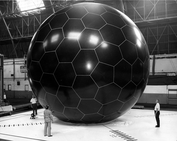
image via National Museum of the US Air Force
I’ve found mention of both 2-foot and 14-foot diameter grid sphere models, and another image of this 30-foot test inflation. Good gravy, did they really just inflate it using that tiny, leaf blower thing? I think it goes without saying, but I’ll say it anyway, that when it launched in 1966 from Vandenburg AFB on an Atlas rocket, the grid sphere satellite became the second-most beautiful object ever put into space. Between July 13, 1966 and May 24, 1968, when Echo IA burned up in the atmosphere, there were two satelloons and this open grid sphere, all orbiting the earth together, in Minimalism’s awesomest group show.
Which would be cool enough on its own. And then Andy Beach sends me this.
It’s Nicholas Mangan’s 2008 photo of Ed Grothus’s Doomsday Stone. Grothus was the atomic technician-turned-anti-nuclear peace activist-and-retail-icon who ran The Black Hole, the legendary military/scientific surplus store in Los Alamos, New Mexico. Grothus died in 2009 without being able to realize his decades-in-the-making Doomsday Stones memorial, a set of massive black granite obelisks carved with warnings in 15 languages about the destructive power of nuclear weapons.
The obelisks I’d heard about, but not this insanely awesome 1-meter, 1.5-ton, black granite sphere, which rests alongside them in a shipping container in Grothus’s backyard. Mangan:
In late 2007 Ed went to the Art in Public Places board in Los Alamos to offer them his monuments for public display. They rejected them stating that ‘they couldn’t think of anywhere in Los Alamos where they would fit in’. They backed up their rejection by claiming that Ed was not an ‘Artist’ according to their set of definitions and requirements.
There is something about a prophet in his own country here. Grothus’s Doomsday Stones are art in every sense of the word, and his work is an artistic practice of the highest kind, and should be recognized as such.
Large Red Sphere, Walter de Maria, 2010, permanent installation at Kunstareal, Munich, image: e-flux
The self-proclaimed art world ignores Grothus at the peril of its own credibility and relevance. If it’s just a matter of the research not being done, let’s get on it. If we need to inflate the critical balloon to give Grothus’s reputation the structure it is obviously meant to have, let’s start blowing. From his quixotic minimalist megalomania in the desert [Heizer, Turrell, De Maria] to his performative taunts in high Catholic regalia [Klein], to his fantastical historical dumpsterdiving [Dion], Grothus is Los Alamos’ own Simon Rodia. It’s just a question of how long it’ll take everyone to realize it.
Where Is Enzo Mari’s ‘Where Is The Craftsman?’
In what is probably the most ideologically analytical essay ever written about paperweights, curator Barbara Casavecchia notes that many of the 60 paperweights she selected from Enzo Mari’s collection “are the product of a manual labor–serving as fragmented evidence of the persistence of non-alienating forms of work, specifically within the craftsman-like dimension inherent to production that Mari has investigated for years.”
One incarnation of Mari’s investigation was an exhibition and discussion forum he organized in 1981 titled, “Dov’e l’artigiano”/”Where is the crafstman”. It was presented first at Fortezza da Basso in Florence, and then at the Triennale in Milan. There was a catalogue published–which I can’t find anywhere–and at least one review–which I can only find a few quotes from, but otherwise, the Italians have not yet processed or digitized their contemporary design history yet.
In his latest book, Venticinque modi per piantare un chiodo/25 ways to drive a nail, Mari says the objective was to “illustrate the unresolved ambiguity of the relationship between industrial design and ‘handmade.'”
Excerpts from an Ottagono review of “Dov’e l’artigiano” place the show and Mari’s critical view of the alienating labor conditions of mass production at the center of the debate over Italian design, culture, business, even a national identity of sorts. On the one hand, some Italian producers, still modernizing, hid the fact that their consumer products were partially made by hand because they “did not want to lose the noble title” of industrial design. And others hid the fact that they’d begun using industrial manufacturing processes because they didn’t want “to lose the prestigious title of an object ‘made by hand.'”
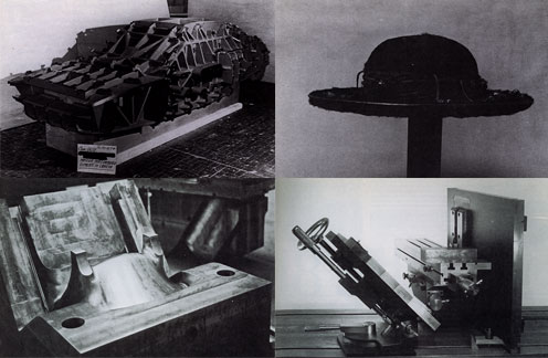
As he had done in 1973 with his autoprogettazione plans, exhibition, and product line, Mari eschewed theoretical arguments in favor of a “didactic exhibition” of objects and the close analysis of their creation. For the show he uncovered hundreds of examples of artisanal and craftsman-like processes being used to make mass-produced industrial design. Here are the objects and categories I’ve been able to find so far:
- Industrial prototypes and models made by craftsmen, such as hand-formed auto body parts by Italdesign’s Giorgetto Giugiaro and Aldo Mantovani for Alfa Romeo [top left, I think]
- Scale models and testing prototypes of turbines.
- A hand-made mold for high-quality plastic chairs [bottom left].
- The schematic drawing for an integrated circuit, which apparently took over 1800 man-hours to create. [I believe it]
- “Technological masterpieces” such as US nuclear submarines, one-off industrial objects.
- An 18th-century-style table with legs “built in series with industrial machinery, but finished with a stroke of the chisel to make it ‘unique.'”
- A Borsalino custom-made for the Pope [top right].
- A machine-like sculpture by Mari collaborator Paolo Gallerani [bottom right].
Oh yeah, and the whole show took place inside a geodesic dome.
I’ll add more objects and pictures if/as I find them. It’s hard to process a 30-year-old exhibit you’ve only just found out about. But it makes me think of things like, well, obviously, pen plotters and that insane William Shatner integrated circuit drawing movie. And NASA workers using giant clothespins to glue the mylar strips toghether for Project Echo satelloons. And Richard Serra sculptures made in defunct shipyards and Richard Prince car hoods. And hand-embroidered Gap kids’ dresses that turn out to have been made by children in India. And etsy and custom Nikes and pre-stressed jeans. And Ikea furniture that offloads all the non-alienating labor processes onto the customer.
Which is all by way of saying I have no grand theories on the current state of the relationship between craft and industrial production; but I think they’ve turned out to be not quite as incompatible as they seemed in 1981.
LINKS/RELATED
This all started with the catalogue essay for Enzo Mari: Sixty Paperweights, An Intellectual Work, which just closed in Berlin. [kaleidoscope-press.com, tanyaleighton.com]
Maddamura’s discovery of the Ottagono review is one of the few online sources of info on the “Dove’e l’Artigiano” show [image, too: maddamura.eu]
Mari’s new book, 25 Ways to Drive A Nail, is not available in English yet. [google books tho]
Close Encounters Jam Session
I’m sure the original’s long gone, but I want the Moog synthesizer-equipped lightboard from Close Encounters of the Third Kind.
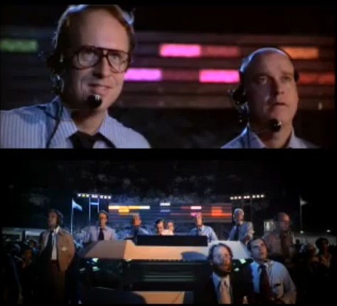
The idea of communicating with extraterrestrials via “a basic tonal vocabulary” synched to a gridded light show is like the lovechild of Carl Sagan and Ellsworth Kelly, conceived at an outdoor Pink Floyd concert. In a good way.
Sculpture for a Large Wall, 1957, image: moma.org
[Just an aside, the story of Kelly’s Sculpture for a Large Wall is utterly fantastic. I’m glad that it’s safe and at MoMA, but the utter failure of Philadelphia to keep it should be discussed every time the Eakins or Barnes stories are told.]
Spencer Finch, The River That Flows Both Ways, image by iwan bann via thehighline
I would have expected Spencer Finch or Leo Villareal to have made one of these already. Or any one of a number of early Silicon Valley IPO nerds. But I can’t find any record of replicas anywhere. So I will step in where I must.
My first guess was that Douglas Trumbull gets the credit for the board; and maybe he designed and executed it. But according to Ray Morton’s definitive-sounding 2007 book on the making of Close Encounters, it was Spielberg’s idea to have a colored lights that correspond to each Moog tone. John Williams composed and recorded the music in advance, so it could be played back on set for filming what was called “the jam session.” I’ll gladly overlook this somewhat Milli Vanillistic approach to jamming in exchange for the score and the rig’s schematics.
Rirkrit Tiravanija, Untitled (Rehearsal Studio No. 6, Silent Version), 1996, installed at MCA Chicago, image via artforum
Because obviously, when you exhibit this, you’ll expect the first thing everyone will play is that iconic five-note greeting. Then they’ll get into a jam session of their own. You’d probably want to make it possible, via the web or USB stick or something, for people to execute their own compositions, to let the computer “take over the conversation” once in a while. And you’d probably stream the piece over the web, too, give it its own channel. Maybe schedule some performers to come in and use it.
Then for good measure, put the whole thing on a golden CD and launch it into space, and wait for a response.
Off the Golden Record
Blowing Up Tanks: Ellsworth Kelly And The Camouflage Secret Army
ce ci n’est pas un Razzle Dazzle? Ellsworth Kelly, Study for Meschers, 1951, moma
When tiny scans of Gwyneth Paltrow’s Interview interview with Ellsworth Kelly first appeared on tumblr, the only thing you could read was his pullquote about his tour of duty in World War II:
I was in what they called the camouflage secret army. The people at Fort Meade got the idea to make rubber dummies of tanks, which we inflated on the spot and waited for Germans to see.
Which, nuts, right? I guess I’d heard of Kelly’s camouflage involvement before, and I remembered somewhere that Bill Blass had also been in a camouflage division, but I’d never put it all together that these guys were in the Ghost Army, whose operations remained largely classified and unknown until the mid-1990s.
Here is Kelly’s fuller quote, and his photo of himself standing next to a burlap jeep:
PALTROW: Did you design camouflage while in the army?
KELLY: I did posters. I was in what they called the camouflage secret army. This was in 1943. The people at Fort Meade got the idea to make rubber dummies of tanks, which we inflated on the spot and waited for Germans to see through their night photography or spies. We were in Normandy, for example, pretending to be a big, strong armored division which, in fact, was still in England. That way, even though the tanks were only inflated, the Germans would think there were a lot of them there, a lot of guns, a whole big infantry. We just blew them up and put them in a field. Then all of the German forces would move toward us, and we’d get the call to get out quick. So we had to whsssh [sound of deflating] package them up and get out of there in 20 minutes. Then our real forces, which were waiting, would attack from the rear.
PALTROW: So in a way, it was just like an art installation! That’s amazing.
KELLY: One time, we didn’t get the call and our troops went right by us and met the Germans head on. Then they retreated, and they saw our blow-up tanks and thought they were real and said, “Why didn’t you join us?” So, you see, we really did make-believe.
PALTROW: It’s the perfect job for an artist in combat.
KELLY: We even had the tank sounds magnified because tanks would go all night long.
It sounds like Kelly was actually in the 603rd Engineer Camouflage Battalion, one of four units in the 23rd HQ Special Troops, which entered France just after D-Day and ended up seeing quite a bit of action, all with balloons and loudspeakers instead of actual weapons.

As Edwards Park explains in a fairly detailed history, the 23rd’s main objective was to impersonate various active divisions in order to cover or obscure troop movements. The inflatable weaponry was designed to fool aerial reconnaissance, but the 23rd also acted out the operations of the units they were impersonating/replacing, visiting fake garbage dumps, and laying fake tank tracks at night under the cover of pre-recorded troop sounds and fake radio broadcasts. And they created fake badges and mingled with local civilian populations, passing along disinformation. As Park puts it, “It wasn’t long, in fact, before the 23rd had a voluminous file on visual identifications and the men suffered many a bloody finger sewing bogus shoulder patches on their uniforms before going into action.”
It’s one of many not-too-thinly veiled references to the 23rd’s apparently fruity reputation. I’m sure there’s at least one queer studies dissertation out there on masculinity, war, and the confluence of camouflage, artsiness, and passing for “real” soldiers.
As NPR reported in 2007, most camo/deception soldiers were apparently ordered never to discuss their wartime efforts. But Jack Masey was never told to keep quiet–waitaminnit, Jack Masey? The USIA design director and serial Expo geodesic dome commissioner? Holy smokes! It all makes filmmaker Rick Beyer’s documentary Ghost Army feel like a race against time. I hope he got some good stuff.
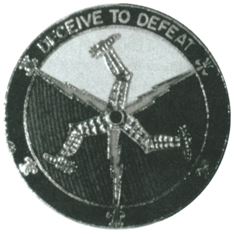
Meanwhile, I guess I’m on the hunt for some 23rd material myself. In 2004, Sasha Archibald wrote in Cabinet about the Ghost Army’s unauthorized insignia for itself, which featured the three-legged triskelion and the motto, DECEIVE TO DEFEAT. [Christoph Cox’s excellent history of sonic deception in the military leads me to believe that everything I knew about the 23rd I learned in Cabinet Magazine.]
And I guess it’s too optimistic to imagine any rubber tanks or vintage camo have survived all these years; I can’t imagine if the top secret thing preserved such artifacts or doomed them. But at the least I could start tracking down some of those Ellsworth Kelly posters.
OK, Meyers’ site points to this 1992 video by/about the WWII paintings of Harold Laynor, who describes himself as part of the “famous Ghost Army,” and says its activities were “unknown to the general public until well after 1980.” Hmm. Laynor also says there was an initial plan in 1942-3 for the 603rd to focus on domestic camouflage. But that the British successes with battlefield camo in North Africa inspired the US to deploy the deception unit in combat.
Related: British WWII bullshit camo stories
The Civilian Camouflage Council, included a lot of folks at Kelly’s school, Pratt
Sounds so-so, but full of facts/details: military historian Jonathan Gawne’s 2002 book, GHOSTS OF THE ETO: American Tactical Deception Units in the European Theater, 1944 – 1945
Israeli Air Force Has Huge Belgian Balls
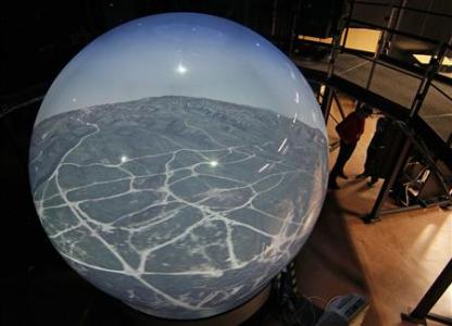
Speaking of huge, impressive balls, Reuters reports that a Belgian firm called Barco is delivering its first order of eight, brand new, 360-degree flight simulators, each of which is a 3.4 meter-diameter cast acrylic sphere. The sphere is ringed by thirteen hi-res projectors, whose images are all laser-stitched together or something in some suitably seamless way.
Alls I know is, 10-foot-wide acrylic sphere screen. Also, Top Gun? Really?
Belgian firm unveils new Top Gun flight simulator [reuters via boingboing]
Welcome To The Talus Dome! Ball -Nogue Shiny Balls
Hoo man, David has an interview with Ball and Nogue about their High Desert Test Site project which is called Yucca Crater, and which appears to be an earthwork, but is man-made. It’s a tricked out plywood recreational structure half-embedded in the desert which looks a bit like a half-pipe, an abandoned pool, and one of those deadly carnivorous pitcher plants. Because it’ll have a climbing wall and a pool in it, in which some random tripping art student will, I’m afraid, drown one day.

But that’s not important now. Yucca Crater is made from the leftover formwork from another Ball-Nogues project, Talus Dome, a public art commission for the Edmonton Arts Council. [Quesnell Bridge. Holy smokes, people, a mountain dome of giant mirrored spheres.
But why, you may ask, is the form available to bury in the desert if the Telus Dome is not actually complete yet? This is not some CAD/CAM hit ENTER and 3-D print operation. They actually pack those balls into that thing to make it.
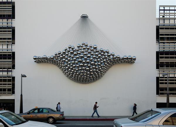
image: Timothy Hursley via arch mag
Like how they made Cradle, Ball-Nogues’ shiny ball 2010 commission for the “updated” facade of what [used to be] Frank Gehry’s Santa Monica Place parking garage. [It’s called Cradle I guess because calling it a bulging “men’s Speedo” or “a big banana hammock” before they finished it might have raised some eyebrows.]
Anyway, who else but Design Boom has a big photo set of the making of Cradle. These balls are just hanging there, each held in place by a steel cable, the specific length of which was determined by rigging the whole thing up in a giant, wooden banana hammock mold. Designboom also shows how the balls themselves were made: they were welded together and blown in China. See how I avoided any innuendo there?
Whatever, I can’t stop staring.
Hirayama Masanao Mylar Ghost Master
If I’ve accomplished little else with my grandiose ambitions for my satelloon fetish, it has at least turned me into several people’s go-to guy for odd projects involving shiny balls and/or large amounts of Mylar.
So thanks Michael Dumontier of Stopping Off Place for passing along this video short, Masanao Hirayama Memory Master, which is thoroughly awesome.
Hirayama is a Tokyo-based zine artist, and from the timing and the decor, I would guess this was made as part of Hon to Sakuhin (Books and Works), his just-closed exhibition at Pantaloon, a design/event firm in Osaka. The show traveled the Japanese art book circuit, starting out at Edition Nord and Utrecht in Tokyo.
The un-Google Translate-able single jpg website for the Pantaloon show mentions a transformed cafe, video, and “movie-like sequences,” but has no mention of silent Mylar spirits.
Hirayama Masanao’s website, HIMAA [himaa.cc]
Hirayama Masanao show at Pantaloon, 8.20 – 9.25.2011 [pantaloon.org]
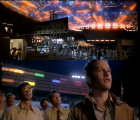
Creative America
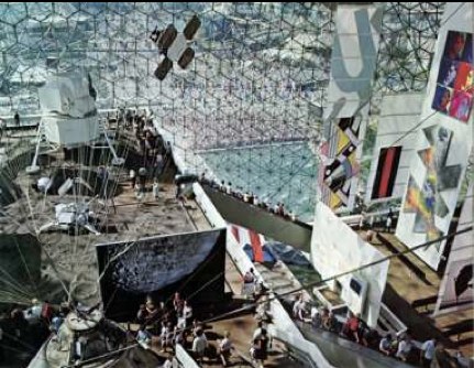
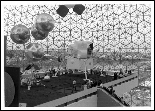
This interior shot of Fuller/Sadao’s US Pavilion at Expo67 almost has it all: installation view of the giant paintings Lichtenstein, Newman, Warhol and Johns made for Alan Solomon’s American Painting Now; plus a giant photomural of the moon, perfect for posing in front of.
There’s another photomural, earthrise from the moon, on the other side, which was a backdrop for the lunar landscape diorama. You can see it in Carl Harstad’s photo:
w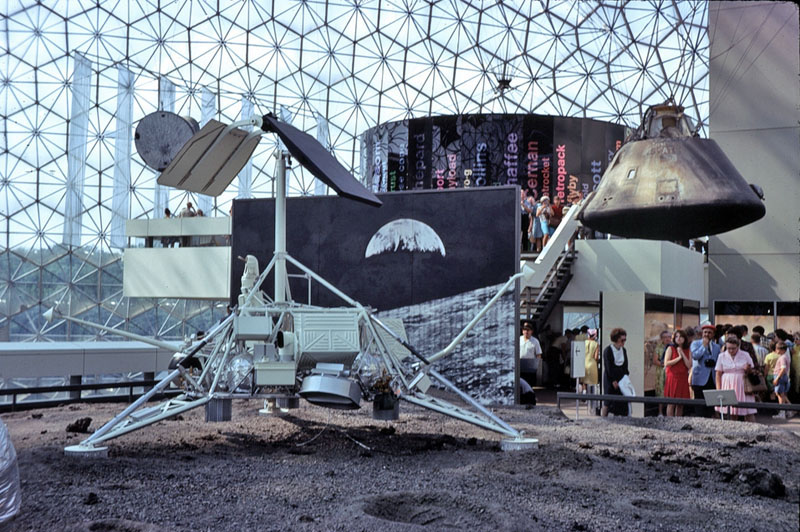
And the satelloon-like weather balloons were just out of both pictures’ edge. Fortunately, Bob Charlton’s mother captured them below:
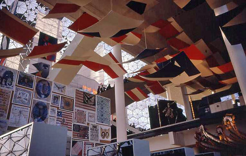
The underside approach for the lunar platform has this awesome installation [image from fan train’s flickr], a series of panels or canvases with abstracted elements of the American flag. It’s a little Ellsworth Kelly, a little Helio Oiticica, and a little Richard Lippold at Lincoln Center, all rolled into one piece of exhibition filler created, I assume, by Cambridge Seven.
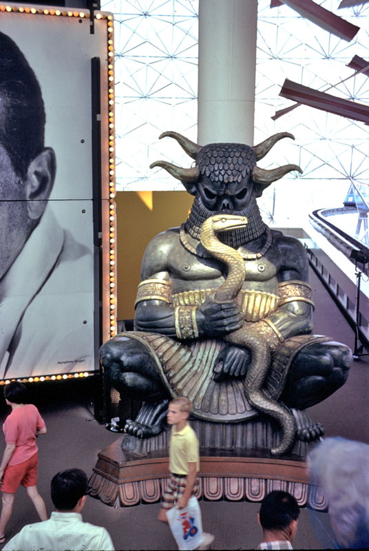
This other photo from Carl Harstad of the Hollywood section of Cambridge Seven’s exhibit features, what? I don’t know. I’d guess it’s left over from Joseph Manciewicz’s disastrous Cleopatra shoot, in front of a giant, multipanel headshot of Humphrey Bogart.
Cambridge’s exhibition carried the overall title, Creative America, and I think it very successfully steamrolled everything–paintings, photomurals, dioramas, film props, spaceships, cultural effluvia–into a single, unified, spectacularized drive-by aesthetic experience. And it was all done by and for the US Government. As I go on about reconsidering ‘non-art’ things like photomurals and satelloons in an art context, I keep coming back to the Expo67 pavilion. At one point, it was all art, or something like it. And vice versa.
[note: I’ve seen it elsewhere, but I took that top photo from former USIA design director Jack Masey’s powerpoint deck on the history of postwar World’s Fairs, which he presented last October at the National Building Museum. I’m about to listen to his archived talk now.]
Off The Golden Record
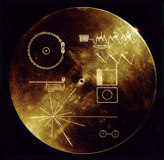
I was stoked to see [thanks to Paul’s link from the Walker’s Off Center] that Trevor Paglen included Murmurs of Earth on the reading list he shared with art21. The book is the authoritative account of the making of the Golden Record, the galactic greeting devised by a committee led by Carl Sagan and attached to the Voyager 1 and 2 space probes launched in 1977.
Designed to last a billion years in the vacuum of space, the gold-plated copper records each contain messages and information about life on Earth for whomever might come across the spaceships, which left the solar system in 2008. The disc includes messages from President Jimmy Carter and UN Secretary General Kurt Waldheim; greetings recorded in 55 languages; nature sounds; and 90 minutes of music [plus one unauthorized, scrawled greeting from the recording tech]. It also includes 116 images, in both black and white and color. The cover includes a map to Earth and instructions for playing the disc. It also includes a stylus.
Which is all great. But what I love most, beside the disc itself, which is gorgeous, is the fact that the images are all recorded in analogue. The upper right quadrant of the cover explains how to decode the rasterized data, one line at a time, into a 512-line image. Color images are encoded three times, in RGB, for reassembly.

The images themselves are mostly information, science, nature, not art, except in the largest sense, that the entire, inspiring folly, a golden object made in a bid for connecting across time, is an artistic project. Or as Carter put it:
This is a present from a small, distant world, a token of our sounds, our science, our images, our music, our thoughts and our feelings. We are attempting to survive our time so we may live into yours.
And there are a few images which aspire for aesthetic distinction, like Wayne Miller’s photo of his own child being born [above], which was included in Family of Man, the landmark photo exhibition Miller curated with Edward Steichen at MoMA.
For my money, though, you can’t beat the idea itself; I wonder how these objects, and how this content would be received. As objects, machines, sounds, images. I want to output the images from the disk and see what they turn out like. Maybe make some prints, even. Truth be told, I want a Golden Record of my own.
So far, I haven’t found one. You have to imagine that NASA didn’t take delivery of all the copies, did they? Aren’t there a few hanging around in the libraries or attics of Sagan’s committee members? Has there ever been a facsimile edition? [I think not.] Don’t you think there should be? [Yes.]
Copyright holders for recordings and images on the disc had originally only given permission for playback outside the solar system [seriously]. But after many years of negotiation, Sagan also managed to clear all the music and all but one image for a CD-ROM, which accompanied a 1992 reissue of Murmurs of Earth.
And so it goes that the US intellectual property industry somehow managed to outcrazy the idea of communicating with extraterrestrials by sending records into outer space. Nice hustle, fellas.
Inspired Reading | Trevor Paglen [art21.org]
Voyager Golden Record [wikipedia]
“Please note that these images are copyright protected. Reproduction without permission of the copyright holder is prohibited.” [nasa.gov]
Buy Murmurs of Earth in some format [amazon]
goldenrecord.org shows all 116 images [goldenrecord.org]
Small World Keeps On Turning
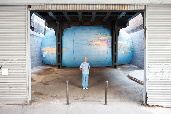
image: nymag
The awesomeness of David Byrne’s giant, inflatable globe shoved under the High Line gives us a good chance to look back.
To remember David Byrne’s pioneering show of PowerPoint Art at Pace in 2003.
And also to hope that Joshua Foer’s got someone updating his “A Minor History of Giant Spheres,” which is, of course, my too-infrequently cited source of inspiration for my satelloon fixation.
Not Steinberg, Wallace, Nabakov Or Qaddafi
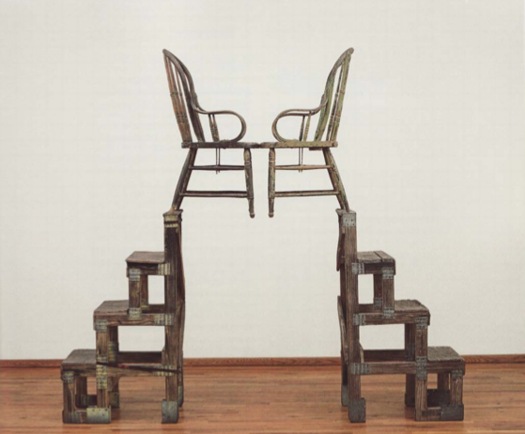
Oh brother, I have this giant post mostly written about how Leo Steinberg’s awesome 1997 lecture Encounters With Rauschenberg includes all these references that show that, not only did he recognize the intimate interrelationships between Johns’ and Rauschenberg’s early works, he also identified hints of dialogue, reference, in works made decades later.
And of course, I’m referring to Steinberg’s discussion of The Ancient Incident, the 1981 Combine/sculpture of a pair of lover/chairs pyramided atop some old steps, which is going to be in Gagosian’s Rauschenberg show in Paris next month. [Hold on, unless that’s the bronze replica Rauschenberg made of the sculpture in 2005. I think it may be. Except I just read the title of the image file, so no. 9/14 update: Except I just read the caption on the email announcement of the same show, and sure enough, this is patinated bronze, and, confusingly, is also titled The Ancient Incident (Kabal American Zephyr), but it has a date, 1981-2006, like it’s the same work, except it’s a different one, or. Anyway.]
I was really going to publish it, but it feels a little, I don’t know, sappy, hokey, romantic, even. But not crazy, AFAIK. As I write out these 2.25 paragraphs, I’m starting to wonder if the best way to put the info out there isn’t as an annotated, footnoted, republished version of Encounters With Rauschenberg, which reveals the lecture to actually be a secret, epic poem of the founding of Bob & Jap’s hometown of Zembla. I so totally called it.
But while busily not writing that, then, and worrying my over-conversational voice, over-excited art historical imagination, and my over-reliance on semicolons and footnotes is a sign of my over-doing it on the David Foster Wallace homage front–but see, Maud, my footnotes are from Pale Fire, not Infinite Jest! I don’t think I’m not copying Wallace; I think I’m not copying Nabokov! Nice work in the NYT Mag, btw!–John Powers matter-of-factly produced the greatest greg.org post ever. On his own blog, Star Wars Modern.
It’s all about the connections between previously overlooked satelloon mentions by Arthur C. Clarke and J.G. Ballard and Robert Smithson and Spiral Jetty. And with some steampunk Contact thrown in for free. I bow my head in awe and gratitude, and I look forward to seeing you back here after you’ve finished reading it.
And then I didn’t post it last night because, well, Libya, of course. Did anyone else notice this crazy, masking tape rebel flag behind these doctors treating a pro-Qadaffi soldier? [nyt/ap]

And then I didn’t fix the post because I was interested in Art In America’s report [via rkjd] that several months ago, John Chamberlain and Gerard Malanga quietly settled their lawsuit over the sale of 315 Johns, which Malanga and like a million other people insisted was his work, made of tons of silkscreened Chamberlain portraits as “an homage” to Warhol, but which Chamberlain claimed he had traded for with Warhol, and that Andy, he, and Henry Geldzahler had cooked it up in the first place, which is how Chamberlain managed to get it authenticated–and which he sold for $3 million at Art Basel “to an unidentified collector.” Mhmm.
My favorite part is how the case got resolved “a few weeks before the May 5 opening of Chamberlain’s first show at Gagosian.” Actually, that’s my second favorite part. My favorite part is the awesome quote Malanga’s lawyer Peter Stern gave AiA:
“[T]here has been no retraction of allegations in the complaint and no one has acknowledged that they are in possession of or know the whereabouts of the painting.
Well now. Glad that’s all cleared up.
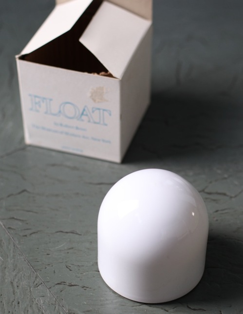
On Robert Breer, Floats, Rugs & Flags
I’ve had Michelle Kuo’s interview with Robert Breer [artforum, nov 2010] open in my browser tabs for months now, ever since Steve Roden posted about his incredible little toy Float, which was sold at MoMA’s gift shop in 1970, at the same time one of Breer’s original Pepsi Pavilion Floats had been liberated from Expo’70 in Osaka and set loose in the Abby Aldrich Sculpture Garden. [A PDF of The Modern’s Aug. 25 press release for the piece, titled Osaka I, said the toy Floats would be sold for $7.95, or two for $15,” in the Museum’s Christmas Shop.]
Kuo’s is one of the best interviews I’ve seen with Breer; most never got past the basic, “how did you get into animation?” “So you lived in Paris on the GI Bill?” chestnuts. With what is now a terrible lack of urgency, I’d made a few attempts to track down Breer this year, in hopes of following up with him about what he’d probably consider the least important aspects of his creative practice: the commercial work and product design and TV animation [including still unidentified segments on The Electric Company] he would bring up–and then insist be kept separate.
Because Breer’s consistently innovative filmmaking and playfully minimalistic/animalistic sculptures–and the fact that he did his most monumentally awesome art work for Pepsi–hinted at the potential relevance of the work he kept in his commercial closet.
Which, amusingly, is not really the point, except to say I want to find a Float of my own, please.
No, the immediate point is, wow, how awesome is Breer’s 1966 sculpture, Rug? This was the work that introduced Breer’s sculpture to me, at a show that also opened my eyes to the revelatory breadth of his filmmaking. It was recreated for the first time in decades in 1999 at AC Projects. Their small second floor space in off-Chelsea was creeping and crawling with little Breer sculptures, while the Mylar Rug slowly shifted around in place. The other works felt alive, droid-like. Rug‘s movements were creepier, more ominous, like something was alive underneath it.
Good for the Walker, it looks like they acquired the mylar Rug [there are others, in other colors/materials] just this year.
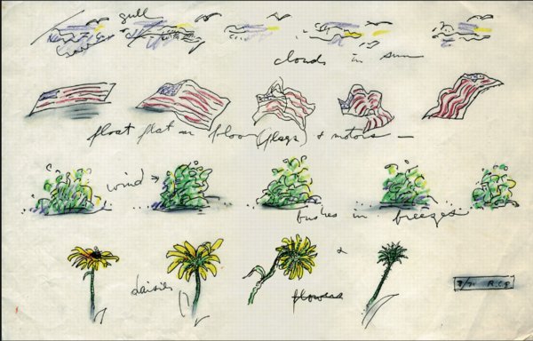
Anyway, while poking around GB Agency, Breer’s Paris gallery, I came across this sketch, dated 8/71, which includes an incredible proposal for a Rug piece made from an American flag. [The text underneath reads, “float flat on floor (flags) + motors”.] The storyboard-like drawing not only ties Breer’s sculptural and animation projects together nicely; the other three sequences–“cloud in sun,” “bushes in breeze,” and “daisies”–help site Breer’s work in observation, duration, and the natural world. Which may have mitigated the political implications in 1971 of something lurking under a crumpled US flag.
In any case, I expect, if not exactly look forward to the day when, this work will be realized for a future Breer retrospective.
Up Newtown Creek, Or This, Anish, It Don’t Stink
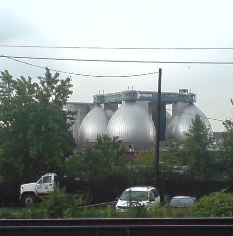
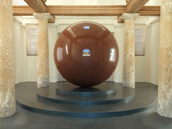
I’ve been moving art and life at our storage unit in Long Island City several times the last couple of weeks, and it’s given me time to really look. Look across the water to the most spectacular structures built in New York City in the last five years: the massive, stainless steel egg-shaped digesters at the Newtown Creek Waste Water Treatment Plant.
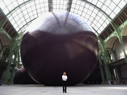
I mean, really. I refuse to be swayed or disheartened [too much] by it–it’s totally different, I say. I really want to put mine in the Pantheon anyway, I say–but several thoughtful folks have expressed their sympathies upon seeing Anish Kapoor’s Leviathan at the Grand Palais photographed from its more satelloonish angles.
But you know what they say in the sewage treatment business, what goes around comes around. If Kapoor has the intestinal fortitude to keep working after the opening of these unsurpassable 145-foot tanks, I can certainly forge ahead with replicating a satelloon.
If anything, it’s even more relevant and imperative than before. Because Newtown Creek is actually designed by Polshek Partners [now Ennead], who also designed the Rose Center at the American Museum of Natural History, an early inspiration for my Project Echo project.
In a way, then, the idea for putting a satelloon in a museum space was hatched from the eggs of Newtown Creek. In another way, though, no, gross.

Newtown Creek Waste Water Treatment Plant digesters up close and symmetrical on Google Maps [google]