
In Japan, I woke up a couple of nights angry from dreams about having dinner at the White House, and sitting across from Pres. Obama, and arguing with him about hunger striking prisoners at Guantanamo.
We talked–I talked at him, because, I guess my mind was incapable of imagining a viable retort, really, what could he say?–about Yasiin Bey’s video demonstrating the standard procedure the military uses to force feed hunger strikers through their noses. And I asked if the Constitution was now as quaint as the Geneva Conventions, a reference to Bush era torture theorist John Yoo’s position on following the rule of law and international treaties the US had nominally upheld for decades.
It was the kind of dream where I felt that surge of adrenaline, that this moment, this conversation, was going to be what opened the President’s eyes to the awful urgency of this situation our country is in. These people are in.
I had seen the reports by investigative journalist Jason Leopold which revealed JTF-GTMO’s recent, extraordinary revisions to the prison hospital’s forced feeding procedures. But it wasn’t until a couple of days ago that, with Jason’s assistance, I found the actual military manuals and memos themselves. They are in an archive of documents produced in response to Freedom of Information Act requests maintained byThe Department of Defense’s FOIA Service Center.
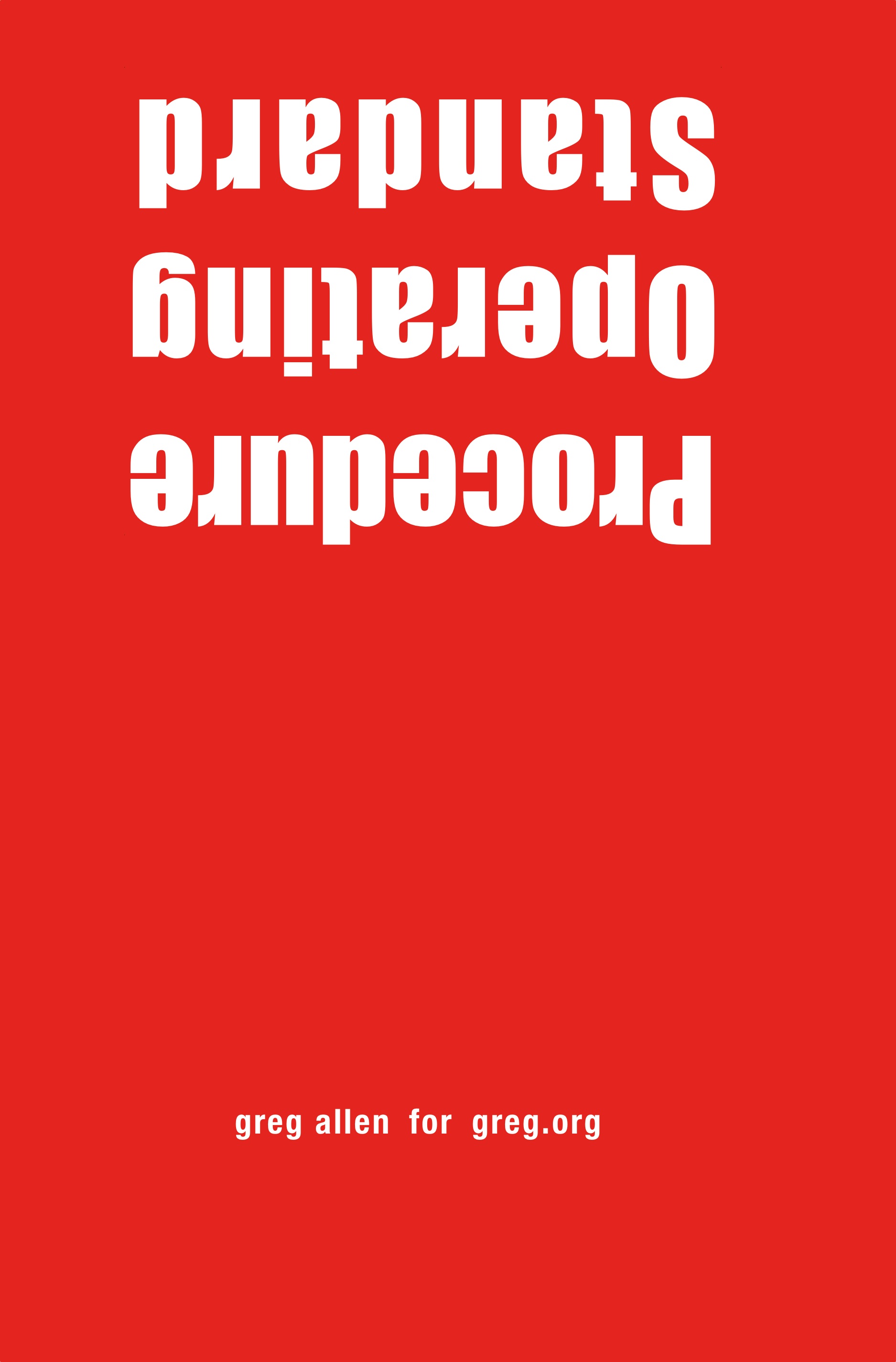
I can’t not do something, so I have published the three sets of detainee treatment regulations, known as Standard Operating Procedures, as a book. Which, believe me, I know. I feel a bit like an outraged @Powhida jamming @BarackObama into all his tweets, until the non-effect wore him out.
It’s weird feeling compelled to do something that you recognize is irrational and irrelevant. But again, I can’t not do something, and this is one thing I do. And with all due respect to Richard Prince, this text, as it is, and as it drives the world, is the kind of thing I feel must be propagated and put examined and contextualized if appropriation, or art, or attention, really, is going to mean anything at all.
Standard Operating Procedure includes the SOP Manual for Camp Delta, the prison side of GTMO, which was implemented in 2003. It’s 240-some pages, not including the various classified appendices for detainee transport and adjudication, which have not, apparently, been released. It also contains the 2003 version of SOP for the detention hospital for “Voluntary and Non-Voluntary Total Fasting and Re-Feeding,” which has several p.ages completely redacted. And then there’s the May 2013 revision to those procedures, which are contained in an SOP for the Joint Medical Group for the “Medical Management of Detainees on Hunger Strike.” That’s the regime the detainees are currently under.
Of course, as Leopold and others continue to report, the situation of detainees is even worse than what these SOP prescribe. There are indications that regulations are extensively, if not routinely ignored by guards and prison commanders. These primary documents embody the best case scenario for people who have been cleared for release for years, but who remain in harsh, indefinite, imprisonment.
So whether you buy the book [which should be is finally available to order this weekend, I think; I’ve been experiencing some friction from the printer/publisher, which is kind of annoying, and it’s been going on all week.] or read the regulations in electronic format, read them, and know that they exist.
Buy Standard Operating Procedure, 284pp, unsigned edition, $15.99 +s/h [createspace]
UPDATE: Proof copy – Standard Operating Procedure is here
Category: writing
Mari X IKEA: autoprogettazione by greg.org (2010)
Three years ago, I was thinking about what to do with the posts I’d written about the project I’d begun six years ago. Which I guess means it’s time to release the results.
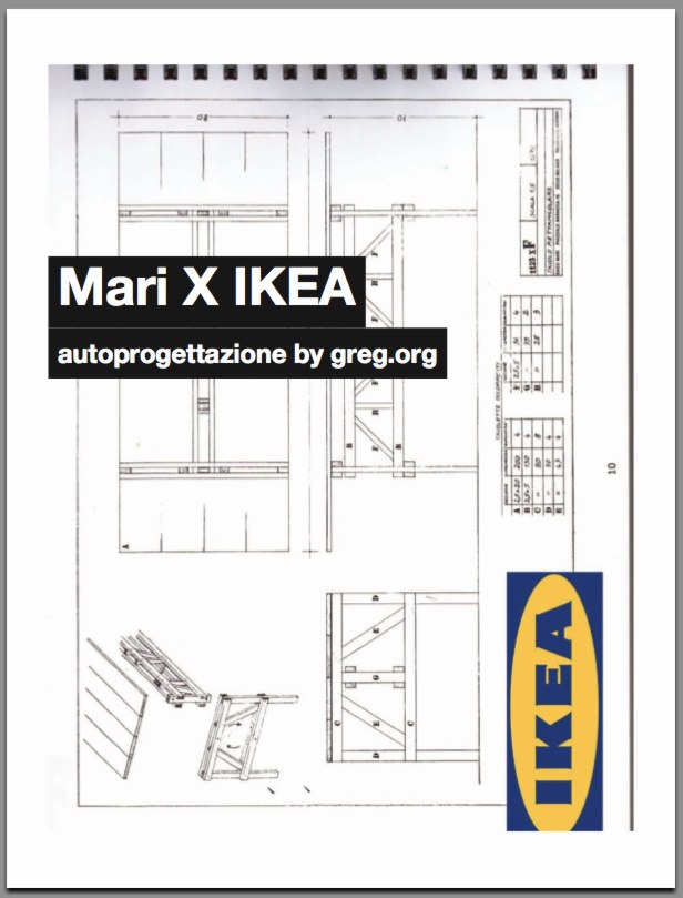
So here’s Mari X IKEA, a PDF compilation I made in 2010 aboutfmy 2007-09 project to construct an Enzo Mari autoprogettazione table out of Ikea furniture components.
I was not entirely pleased with the way it read all together, and so I didn’t publish it back in the day. But I realize now that my inner archivist and inner editor will never agree on things, and I/we are becoming OK with it. So the tabloid-style publication contains all the original blog posts and images documenting the project, and that includes a fair amount of recapping and repetition. Meanwhile, my inner publicist wants to emphasize that this is not a bug, but a feature, like the catchy chorus of a song.
I’m still quite stoked about the project–and the table, for that matter, which I am using at this very moment–and it continues to influence and inform my thinking about stuff: art, design, originality, authorship, authority, appropriation, systems, craft, utility. So I’m very happy to get information on the project out there in a more easily consumable format.
I should also give a shoutout to The Newspaper Club, the amazing publishing company, then just starting out, where I had originally contemplated printing Mari X IKEA in 2010. This PDF was made using their easy publishing/layout tool. And though I ended up not pulling the trigger on this particular project, they regularly make me want to turn this blog, and many other things, into a newspaper.
Mari X IKEA: autoprogettazione by greg.org, 2010 [PDF, 2.8mb]
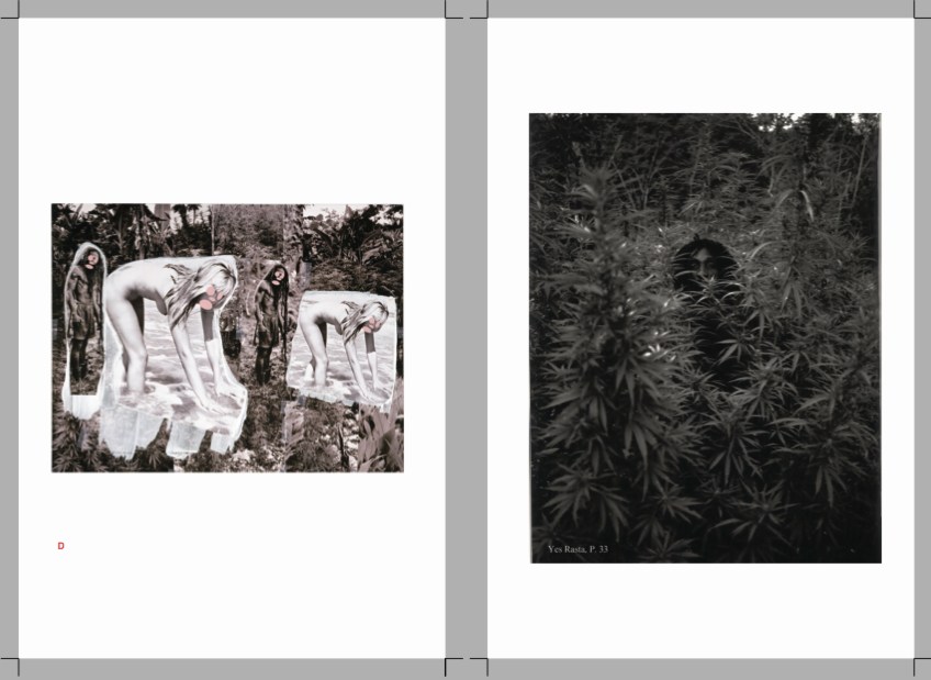
CZRPYR2 Is A Thing
Wow, the first shipment of Canal Zone Richard Prince YES RASTA 2: The Appeals Decision & The Appendix arrived, and they actually look very nice.

Which is good.
Because people are writing about it. And buying it. And it would be kind of awkward if it sucked.
Your Thievin’ Art: At play in the field of fair use [artnews]
Not yet in stores: Buy Canal Zone Richard Prince YES RASTA 2: The Appeals Decision & The Appendix direct, $12.99 [createspace]
A Guerrilla Reading, A Gallery Talk
On Friday March 22, I went to see Kenneth Goldsmith reading Richard Prince’s The Catcher In The Rye in front of a Prince rephotography piece in MoMA’s 2nd Floor galleries. I’d been bummed to have missed Goldsmith’s talk on Wednesday night [granted, I had an opening of my own, but still] so I wanted to make sure I didn’t miss this most appropriate event. When he saw my tweets about it, KG graciously offered to reserve a ticket for me, a gesture which set a certain expectation in my mind of guest lists, seats, or crowd control.
Even as I asked at the desk for the ticket, though, my sense began to change. I suspected, and was right, that this was not a ticketed gig, or even a gallery talk-style crowd with a limited number of slots which, if you didn’t get one, you could shadow and eavesdrop on anyway. The ticket was for getting into the Museum. Which, of all things and all places, I did not need a comp for MoMA.
Introducing CZRPYR2: The Appeal + The Appendix

So I did this.
I am very pleased to announce the latest title from greg.org, Canal Zone Richard Prince YES RASTA 2: The Appeals Court Decision in Cariou v. Prince, et al., Also The Court’s Complete Illustrated Appendix. It is available now.
It would have been available sooner. It really should have been available sooner. I got it all together by the end of the day the Appeals Court decision came down, but there was seemingly endless futzing and back & forth with the digital publisher about proofing and formatting, etc. So sorry for the delay.
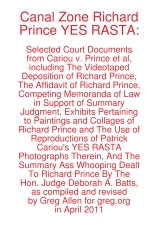
CZRPYR2 is a follow-on and indispensable primary source companion to Canal Zone Richard Prince YES RASTA, [above, available here], which contains the full transcript of Richard Prince’s incredible 7-hour deposition, as well as many key filings and exhibits from the first phase of Cariou v. Prince.
I wondered what you wondered: why not just add the Appeals Court decision to the original book? And if CZRPYR2 was only the decision itself, I might have done just that. Or not bothered with it at all. But then I found the beautiful Appendix the Court created for the decision, and I realized it deserved a permanent place in the history of the case, a book of its own.
Following on Patrick Cariou & friend’s own slapdash effort, the Appeals court produced a high-quality, carefully cross-referenced catalogue of each use of Cariou’s YES RASTA images in Prince’s Canal Zone paintings. This indexing was the basis of the judges’ Solomonic decision to divide the Canal Zone series into 25 non-infringing works, and 5 infringing?-who-knows-let’s-look-again works. Where applicable, the Court added highlights to Cariou’s images, arguably creating yet another transformative work. And submitting it into the public record.
For this 142-page volume, I integrated the Court’s collections of Prince & Cariou images, to facilitate painting-by-painting review of Prince’s appropriations. And I annotated them for easier referencing. But otherwise the Court’s primary documents are preserved, with an eye to posterity, as they were prepared,
CZRPYR2 is in this way a salute to the Court’s own transformative, creative spirit.
Buy Canal Zone Richard Prince YES RASTA 2: The Appeals Court Decision in Cariou v. Prince, et al., Also The Court’s Complete Illustrated Appendix (142 pages, b&w, 6×9-in.) for $12.99 [createspace]
Buy Canal Zone Richard Prince YES RASTA: Selected Court Documents from Cariou v. Prince, et al for $17.99 [they can ship together, but I’ll probably only sell 2-vol. sets in person. Maybe on a blanket next to Central Park.]
On The Restoration Of 101 Spring Street
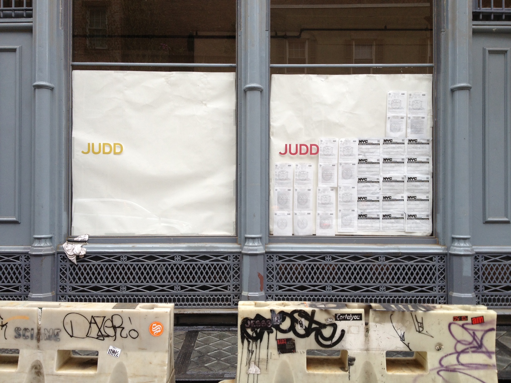
I don’t know how they knew, but I was asked to write about ARO’s restoration of 101 Spring Street for Architect Magazine. I’ve been a huge fan of Donald Judd’s architecture since I first visited his spaces almost 20 years ago, so I was somewhere between concerned, wary, and freaking out over what was going to happen to the artist’s works.
So I attended the Judd Foundation‘s preview last week [EXCLUSIVE GREG.ORG IMAGES ABOVE, BELOW]. Basically what happened was, after 19 years of life-consuming effort and stress, a shit-ton of money, and a near-fanatical approach to conservation, 101 Spring Street is done and saved. [Well, technically, it’s almost done. Like 99% done.]

The second biggest surprise was ARO’s absolutely amazing transformation of the subterranean levels at 101 Spring into the beautiful, light-filled offices of the Judd Foundation. I’d been in the basement once before, way back when, and it was a dingy, dark, leaky mess. Now the original 19th century sidewalk vaults and floorlights [below] work and look fantastic. Even as they go to extraordinary lengths to preserve their dad’s spaces, Judd’s kids also managed to create something for themselves as well.

Meanwhile, I tried to write about Judd in the empiricist style of Judd. It turned out to be very difficult. And if no one noticed or said anything about it, Ima guess that I was only partly successful at it. Still, a very nice thing to write about.
101 Spring Street by Donald Judd (and ARO) [architectmagazine]
The Judd Foundation will start guided visits of 101 Spring Street in June 2013. [juddfoundation.org]
Organizer-Artist vs Artist-Organizer
The new Frieze begins its series of artists talking about curating and being curated [sub req] with Daniel Buren’s classic 1972/1992 statement in Harald Szeeman’s Documenta 5, “Exhibitions of an Exhibition.”
I never registered it before, but Buren uses the term “organizer” for curator. Which is ironic, because at apexart several years ago, at the thin wedge of the emerging trend/abuse, they moved away from using the term “curator”–in favor of “organizer.” And the sense I’ve gotten while working on Exhibition Space is that they were seeking to get away from exactly the curator-as-artist/exhibition-as-art pretensions or associations that Buren was kvetching about in 1972.
In any case, now that I’m an organizer, and apparently the worst of Buren’s fears realized, here are some excerpts from his 1992 English translation of “Exhibitions of an Exhibition”:
Exhibitions of an exhibition
More and more, the subject of an exhibition tends not be the display of artworks, but the exhibition of the exhibition as a work of art….
The works presented are carefully chosen touches of color in the tableau that composes each section (room) as a whole.
There is even an order to these colors, these being defined and arranged according to the drawn design of the section (selection) in which they are spread out/presented.
These sections (castrations), themselves carefully chosen “touches of color” in the tableau that makes up the exhibition as a whole and in its very principle, only appear by placing themselves under the wing of the organizer, who reunifies art by rendering it equivalent everywhere in the case/screen that he prepares for it.
The organizer assumes the contradictions; it is he who safeguards them.
It is true, then, that the exhibition establishes itself as its own subject, and its own subject as a work of art. The exhibition is the “valorizing receptacle” in which art is played out and founders, because even if the artwork was formerly revealed thanks to the museum, it now serves as nothing more than a decorative gimmick for the survival of the museum as tableau, a tableau whose author is none other than the exhibition organizer.
Which, in 2003, prefaced his response to the idea, proposed by e-flux and Jens Hoffman, that “The Next Documenta Should Be Curated By an Artist.”:
Could a large-scale exhibition like Documenta be entrusted to an artist? If the tendency remarked upon here continues to hold, my response would undoubtedly be “yes.” For the artist-organizer would erase the faults inherent in the organizer-artist. For example, it would be worth betting that the announcement of an artist-organizer, whoever he or she might be, would cause an immense outcry of lamentations from the choir of the majority of all the other panic-stricken and destabilized artists.
This will be a varied and serious song. Its reasons for being will be intelligent, stupid, and revealing at the same time. They will be founded on jealousy, on the one hand, and fear of the artist-organizer’s positions, on the other. Artists, exacerbated individualists if ever they existed, would show that their corporatist spirit is not as remote as it may seem. One would notice, then, that the critiques suddenly raised by the announcement of the name of an artist-organizer had never been raised by the announcement of any organizer-artist. This a priori predictable reaction already bears within itself the fruits of extremely positive debates, for they reveal a state of fact that has been occulted for over thirty years.
Mirror, Mirror
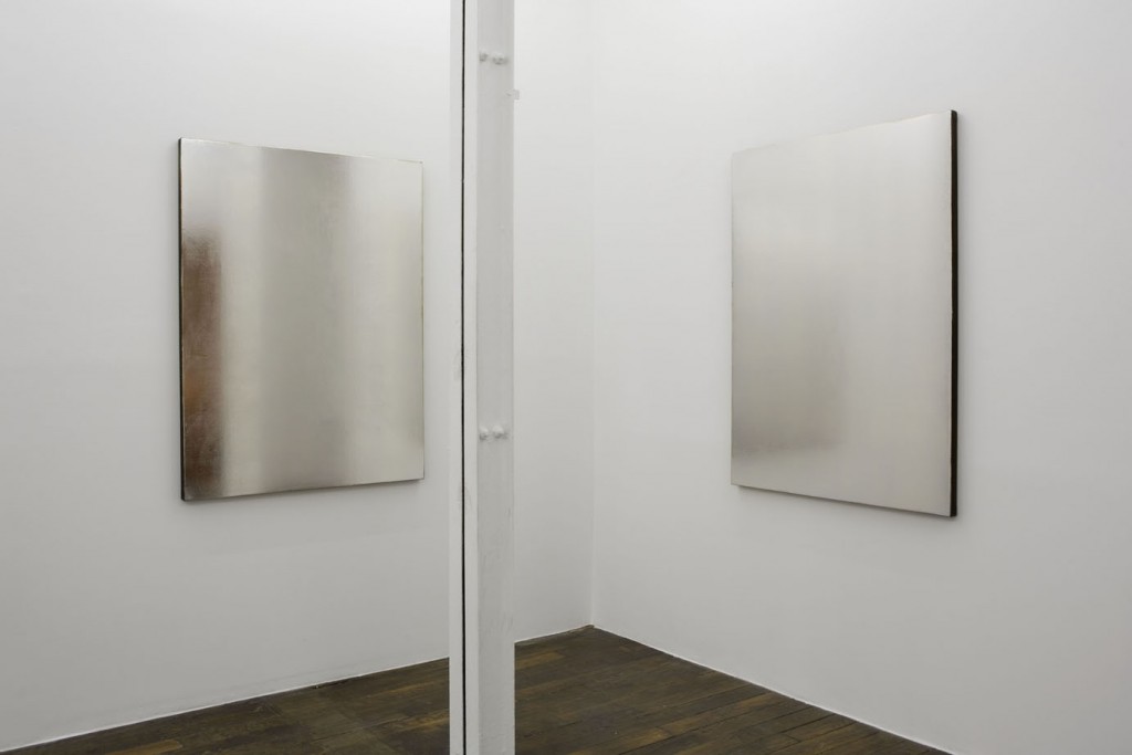
OK, I am a bit in love with Jacob Kassay right now, in my head.
In Art F City Eva Heisler reviews Kassay’s current show at Art:Concept in Paris [above], his second, and it looks remarkably like the first, in 2010 [below].
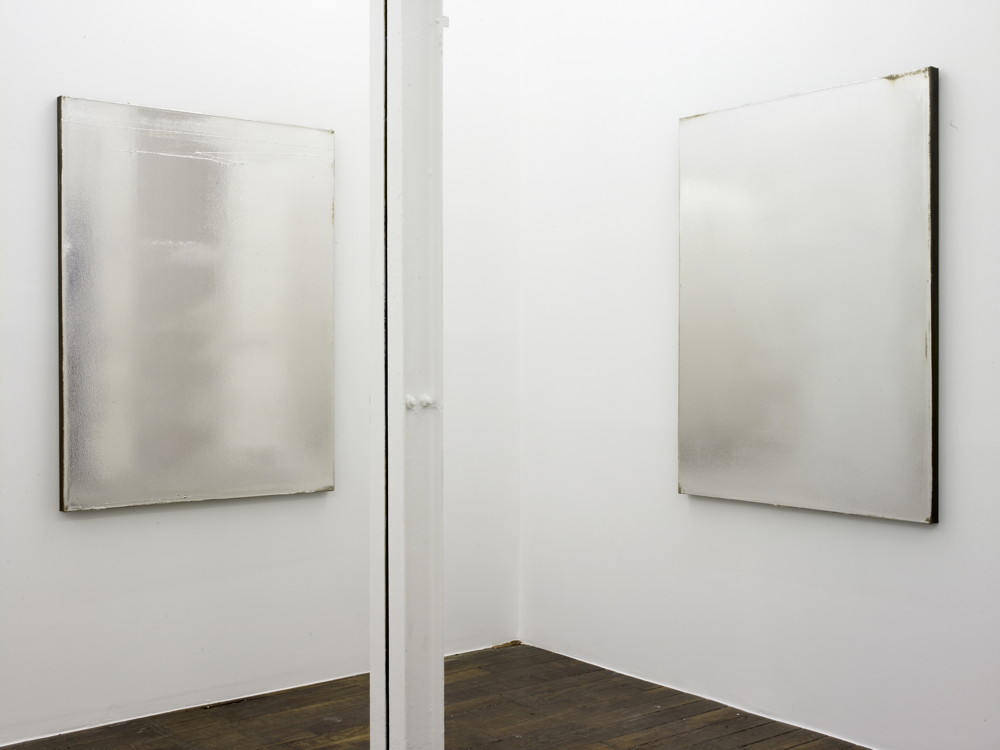
Do you see what he did there? Did he really just answer the perennial art journo question about how he’ll top with the extraordinary popularity of his electroplate paintings by just cold restaging an entire show of them? Apparently, no.
Heisler explains that these are not Kassay paintings, but “canvases,” “props in lieu of paintings.” In fact, they’re in exactly the same lieux and same dimensions as Kassay’s first show. And the installation shots of 2013 are almost all identical to those of 2010. And despite what it looks like, this situation Kassay has set up is one in which, as Heisler astutely puts it, “his paintings are present only through their staged absence.”
But these present absences, these “not paintings,” are–are you sitting down?–not for sale. They will be destroyed after the show. At least the canvases will be. The “stretcher bars (will be) recycled.” Which seems like an odd detail, but hey.
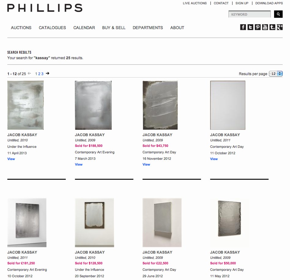
There were actually not 25 paintings at Phillips, only 17, with one sold twice. Which, holy smokes, nice placement. Does anyone hold onto these, ever?
And not only do these new canvases have a uniform, non-gestural, more mirror-like facture, Heisler reports, again, kind of oddly, that “this time the artist did not touch the surfaces at all.” Which would seem like the least determinative factor possible for a non-painting these days, until this one:
The fact that Kassay’s mirror objects are emphatically “not paintings” and earmarked for destruction implies that the definition of what counts as a “Kassay painting” has to do with its entry into the art market. If so, then it is an irony that the artist’s attempt to evade the market in fact reaffirms its powers even to name what counts as “a painting by Jacob Kassay.”
Which, what? Why? No way, not even. Kassay can outsource or not sell or destroy what he wants. But the only reason Kassay’s “not paintings” are not paintings is because Kassay says they’re not paintings.
What Heisler calls “deflection” I would see as negation. Looking back, and following the artist’s chosen mediations, the Art:Concept show reflects [sic] a sustained strategy of negation and “staged absence” as a constructive part of Kassay’s practice.
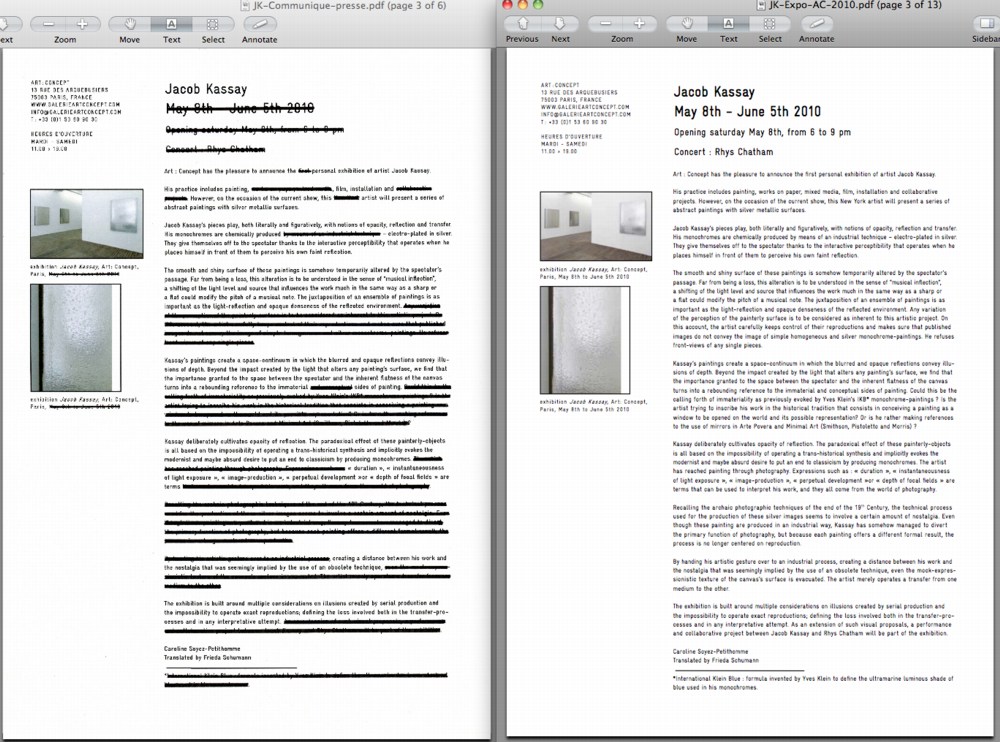
Art:Concept’s press release for the current show is, so to speak, Exhibit A. Just as the 2013 canvases bear striking resemblance to the 2010 paintings, The new press release, too, [left, pdf] turns out to be an excised, barely augmented, near-replica of the old [right, pdf] And you know what the funniest thing about Kassay in Europe is, it’s the little differences.
To make it easier to see what’s changed, or specifically, what’s been deleted, negated, from Kassay’s presentation, I converted his strikethroughs to highlights. You can download the complete, highlighted pdf here. What’s erased crossed out? Well, data [Dates, “New York,” “collaboration,” and “works on paper,”] but also things like “industrial,” “chemical,” “conceptual,” and every reference to photography and his monochrome and mirror forebears such as Yves Klein and Robert Smithson. Also blacked out: any privileging of “the perception of the painterly surface,” and particulars of how “the artist carefully keeps control of their reproductions.” Which, he may not want to talk about it, but since the 2013 installation shots match perfectly to the 2010 photos, I think it’s safe to say he still cares.
It’s a stretch, perhaps, but there seems to be a non-trivial overlap between what was blacked out and the terms, references and concepts initially used to hype Kassay’s paintings in auction catalogues and the media. [“Whilst Kassay uses industrial techniques, they retain an engaging, painterly quality.”]
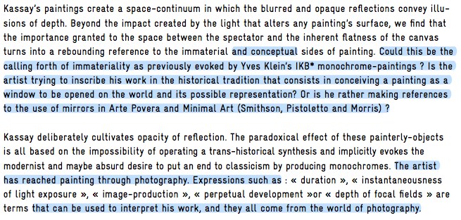
What’s less speculative but feels quite instructive is to see what stays:
“the modernist and maybe absurd desire to put an end to classicism by producing monochromes.”
“…creating a distance between his work and the nostalgia that was seemingly implied by the use of an obsolete technique.”
“…multiple considerations on illusions created by serial production and the impossibility to operate exact reproductions; defining the loss involved both in the transfer-processes and in any interpretive attempt.”
The Art:Concept show also invites a reconsideration of Kassay’s just-ended exhibition in New York, Untitled (disambiguation) [or as I liked to call it, “leftovers at The Kitchen”], which consisted, remember, of stretched scraps of canvas from which his earlier paintings had been cut. The staged absence of paintings.
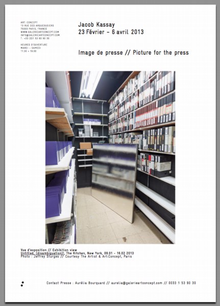
It also included several silvered paintings, installed/photographed in conspicuously offhand, even marginalized spaces: propped in the foyer, behind a column, or in a storeroom. These images are, in fact, included in Art:Concept’s press release.
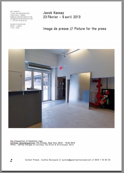
And now that you mention it, their surface looks as uniform and non-painterly as the “not paintings” of Paris. Did anyone look into The Kitchen’s mirrors, to see what their status was? Were they, too, “props in lieu of paintings”? Were they dismantled or destroyed? Were they for sale? Is there any place better than the gallery of a performance space to stage absence?
I looked back at reviews and such, and found that, again, the press release had been altered, this time without leaving a trace. The early text preserved–along with Ben Davis’s mug–in this photo contains facts about the making of which are omitted from the archived version. [pdf] What had been explained and presented as the artist’s intent was eliminated, transformed through negation into historical hearsay.
Which makes me think again of the Henry Codax Incident last year. That’s when Christie’s, citing Gallerist NY’s report, described a dark grey monochrome by the fictional artist Codax as the product of a collaboration between Kassay and Olivier Mosset. Kassay protested, and insisted that Christie’s read a statement before the auction “disassociating his name” from the painting.
So in addition to Codax paintings which are “not Kassay paintings,” we can add canvases in a Kassay show which are “not paintings.” To paraphrase John Cage, Kassay has nothing to paint, and he’s not painting it.
But just as Rauschenberg demonstrated erasure as a generative act, Kassay gives hints that negation for him is constructive and not repudiation or “deflection.” Art:Concept’s current Kassay slideshow also includes two non-not-painting objects: used French library books with prismatic acrylic wedges inserted into them. One is a collection of work by the late Greek poet Constantin Cavafy.
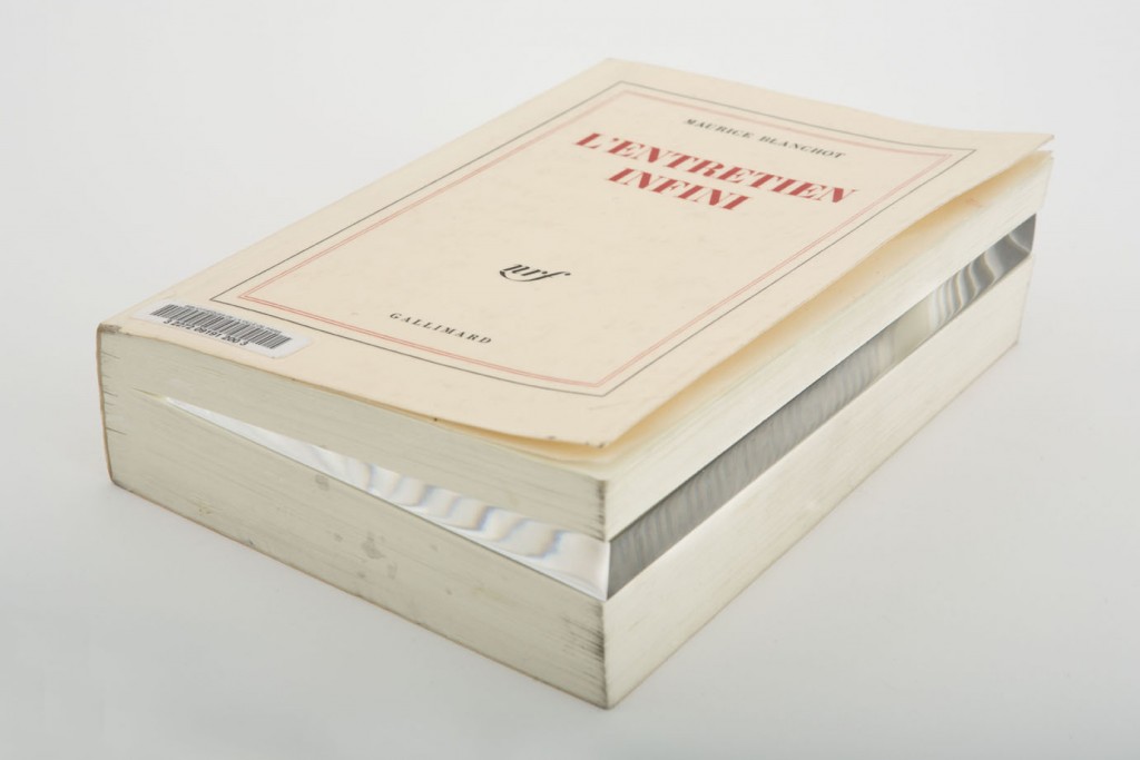
The other: l’Entretien Infini, The Infinite Conversation, by philosopher/theorist Maurice Blanchot. Blanchot and Mallarmé argued that the power of language derived from its ability to negate a thing and replace it with an idea. And that both thing, the disappeared/negated thing and the idea that replaced it were equally valid, constant, and stable. And that the idea was even moreso, because the thing was subject to change. So really, instead of looking at the not paintings as destined for destruction; we should see them as ideas which will never be tarnished by time, atmosphere, or white-gloved flippers.
Jacob Kassay at Art : Concept, Reflection or Deflection? [artfcity]
Jacob Kassay, 23 février – 6 avril 2013 [galerieartconcept.com]
Jacob Kassay, 8 mai – 5 juin 2010 [galerieartconcept.com]
Previously: Henry Codax at Auction; also, Speculation
Also, Jacob Kassay, Johns & Rauschenberg, and collaboration
Frank O’Hara And Alfred Leslie’s Lamp
UPDATE: Make that Alfred Leslie and Frank O’Hara’s Lamp [see below]
UPDATE UPDATE Just to be clear, let’s make that Alfred Leslie and Frank O’Hara’s Lamp by Larry Rivers
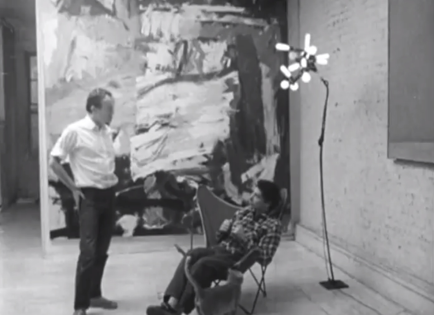
Obviously the best part of Richard O. Moore’s 1966 WNET profile of Frank O’Hara is the poet reading “Having A Coke With You.” But 2nd and 3rd best are a tossup between footage of New York back in the day, and this totally bonkers, homemade floor lamp in Alfred Leslie’s studio. That’s how awesome that lamp is.
UPDATE
Thanks to Maureen O’Hara for pointing out that this scene was actually shot in Frank’s loft, and that the lamp was his, made by Larry Rivers.
Though I did wonder how Alfred Leslie’s range included figurative portraits and the large abstract painting behind them, I didn’t wonder hard enough to realize it wasn’t by Leslie at all. [It’s by Mike Goldberg, the subject of O’Hara’s 1957 poem, “Why I Am Not A Painter.”]
Anyway, clips from Moore’s film, as well as other Frank O’Hara interviews and readings are at frankohara.org.
And now that I know a bit better what to look for, here are a couple of additional photos of the lamp in O’Hara’s loft, taken, I believe, by Mario Schifano in 1964:
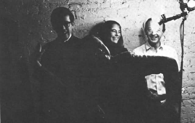
l-r: Kenneth Koch, John Ashberry photobomb, Patsy Southgate, Frank O’Hara, lamp
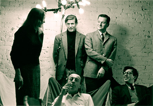
l=r: Southgate, lamp, Bill Berkson, O’Hara (seated), Ashberry, Koch (seated)
This bottom one is almost clear enough to reconstruct the lamp, if need be. Oh, wait, yes, Schifano, as seen in Homage to Frank O’Hara, Berkson and LaSueur’s 1988 Pinterest board-avant la lettre, and tumbld by poets.org. So basically, I could take Lamp with Poets here to Canal Hardware and walk out with a complete lamp kit:

And for additional context, here’s at least one other lamp/sculpture Rivers made, this one from 1966.
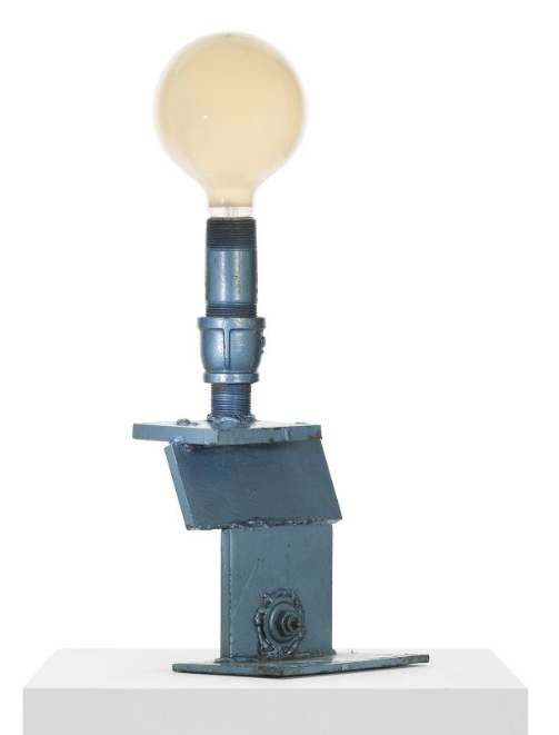
Blue Lamp looks like a spray painted construction of welded metal scraps and industrial hardware, with a “studio label” and a stock number on the bottom. Acquired directly from the artist, it didn’t sell at Wright20 in 2011, because est. $5-7,000.
USA: Poetry: Frank O’Hara (1966) [youtube via VNY via @jameswagner]
Frank O’Hara – Video [frankohara.org]
Untitled (Embroidery Trouble Shooting Guide)
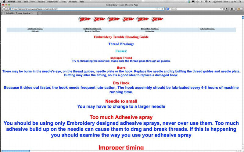
When I first met Richard Serra in 1994 or so, we talked a lot about the Internet. Soon after, I began trying to imagine what a Richard Serra web project would look like. Given the way his sculptures rather definitively reconfigured the space they inhabited, I envisioned a Serra site as a single, massive, interlaced GIF, that rendered in your browser with excruciating, megalithic slowness, controlling time and processing power as well as screenspace.
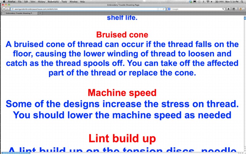
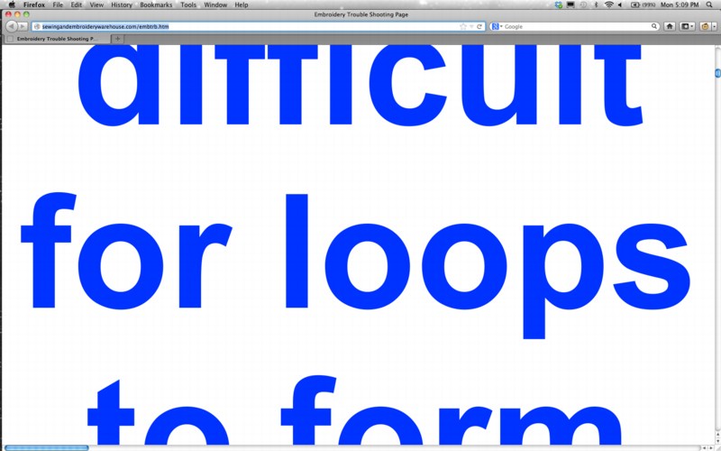
I mention this now because I think that, after my nearly 20 years online, the Embroidery Trouble Shooting Guide page at sewingandembroiderywarehouse.com comes closest to Serra’s work in terms of its spare, dauntless power.
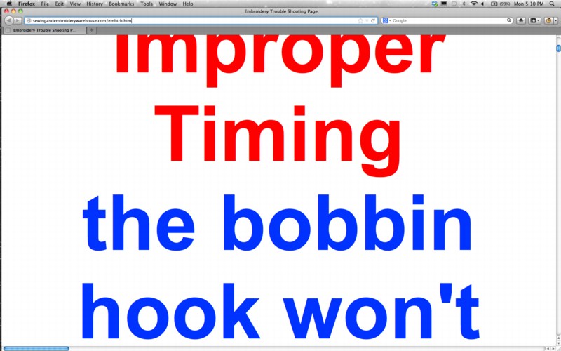
ETSG is created in Microsoft FrontPage. None of the HTML headings tags are closed, so the text, as Rob at boingboing puts it, grows “inexorably in size until the greatest website in the world is achieved.”
This kind of webby, self-referential recursiveness is similar to, though the inverse of, Moonwalk, Martin Kohout’s standout YouTube video which was a conceptual standout at the Guggenheim’s YouTube Play competition/exhibition a couple of years ago.
ETSG‘s scrolling text is also reminiscent of Serra and Carlotta Fay Schoolman’s 1973 video piece, Television Delivers People.
But of course, it’s all unintentional, even unnoticed. Apparently, the SEW folks say the page renders just fine in Internet Explorer.
The Golden Age Of Arts Writing
“In the future, everyone will be a foundation.” –@bhqf in an art-nerdy new post by @phillipsauction: ow.ly/hrgnW
— Artsy (@artsy) February 5, 2013
From said “art-nerdy post,” “Mining the Past with Bruce High Quality Foundation,” published last week by Phillips on Artsy:
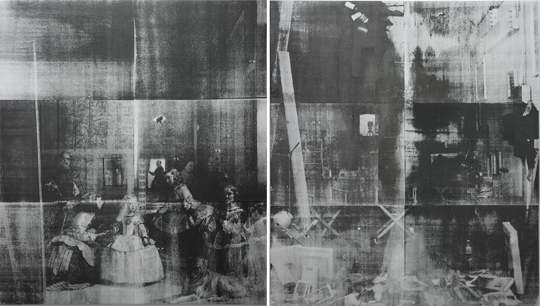
The overt appropriation in this work, unabashedly titled Las Meninas, is multifarious in terms of the iconographic and the aesthetic. First, with analogous titles, the left panel of the diptych is a reproduction of the 17th-century painting by Diego Velázquez. The group portrait of the Spanish royal family (and the inclusion of a self-portrait of the artist at the easel) is iconic and stands as the Velázquez’s most famous work. As Velázquez presents himself in Las Meninas (circa 1656) as an unrivalled painter welcomed into the royal sphere, the appropriation of the work refers back to BHQF’s rejection of the “celebrity artist.” Las Meninas (2011) is juxtaposed with a silkscreened photograph of the BHQF studio, notably absent of any artist, however, scattered with materials of art production. Both versions of Las Meninas are paintings regarding notions of the artist and ultimately reveal the processes of art-making.
Formally, the black on silver silkscreening application of BHFQ’s Las Meninas serves as a visual allusion to Andy Warhol’s seminal silkscreens of the sixties. By using visual codes, BHQF’s specific reference to Warhol is used to further articulate the role of the artist. Warhol serves as the clear precursor to the contemporary status of superstar artists with fame, celebrity and notoriety delineating key themes in Warhol’s work. Thus, through appropriation of iconography and style from icons of the past, BHQF formulates a cohesive dialogue about contemporary art practice today.
“It’s been important for us to think of art history as a material, as more stuff to work with, whether it’s to honor or to disparage it. It’s as much a material as anything else, wood or plaster.” (BHQF in an interview with Cameron Shaw, ‘Enter the Afterlife: A Conversation with the Bruce High Quality Foundation’, Art in America, March 2009).
Las Meninas will be offered in our Contemporary Art auction, 14 February 2013, in London.
Which, yes, here is Lot 28, Bruce High Quality Foundation, Las Meninas, 2011, ESTIMATE £150,000 – 250,000:
The overt appropriation in the present lot, unabashedly titled Las Meninas, is multifarious in terms of the iconographic and the aesthetic.
First, with anal…&c. &c.
How can anyone say there’s a crisis in arts writing, when art marketing companies are tweeting about blog posts by auction houses republushing the lot descriptions excerpting artist q&a’s from art magazines owned by collectors, in their massive, coffee table-sized catalogues literally every quarter?
Given the nature of the work itself, I say we should celebrate this vivid example of the Bruces’ influence on Phillips’ et al’s appropriationist literary practice as a synergistic triumph, and wish them well as they seek to clear the ambitious reserve price this week.
May 2013 Update: So I guess the 181,250 GBP this diptych brought in London inspired a collector in New York, or maybe they just realized their Bruce was just one of [several? many? a few? two?], because there is another BHQF Las Meninas coming up at auction at Sotheby’s on May 15. It’s the same screens, but with different pulls. Also, a lower estimate ($80-120k), presumably to target the underbidder from Phillips.
The Selling Of American Art
Have you read me?
Art today is in a precarious position. In order to survive artists must participate in an elaborate system that is increasingly becoming a point at which Wall Street, Madison Avenue and government converge. The embarrassment and the corrosive effects of such a system may well prove to be dangerous to creative life in our culture.
…
Evidence of the interlocking elements that make up the art world today is obvious in reports of increased corporate investment in painting and sculpture as a hedge against inflation, and a new interest on the part of individual buyers in the business value of art. For a long time there have been wry comment in the artists’ milieu about a kind of elegant decorative painting that can be called art-for-banks. Now those banks are advising individual clients to follow their example.
Those are a couple of the opening paragraphs of “The Selling of American Art,” an unsigned, undated, unmarked, 9-page essay I came across the other day in a miscellaneous clippings section of Dore Ashton’s collection at the Archives of American Art. I can find absolutely no mention or reference to it online, and I don’t just mean Google.
Obviously, it sounds like it could have been written yesterday, but the paper’s references to Harold Rosenberg’s last published interview [In Portfolio, vol. 1, 1979] and the December 1980 edition of Artworkers News [!] probably hint at its actual date.
It’s a pretty incisive and prescient indictment of the emerging art system, right up until the somewhat incongruous suggestion that then-underappreciated [or under-collected?] painters like Richard Diebenkorn and “the late Philip Guston” represented an alternative path out of the corporate art trap.
Ashton was a rare critical defender of Guston throughout the artist’s lifetime, and his inclusion makes me think she is also the author of “The Selling of American Art.” I really should have asked her about it when I had her on the phone.
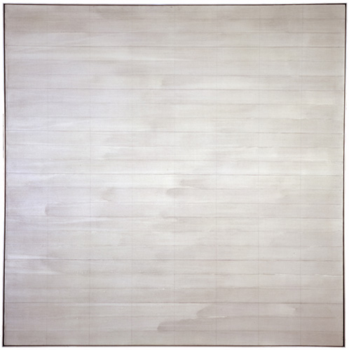
Destroyed Agnes Martin Paintings
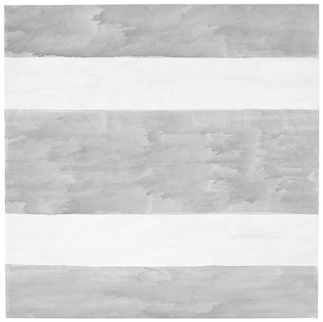
Untitled, 2004, Agnes Martin’s last painting. Image via Phaidon
The visits that maybe stick in the mind are the ones where she would show me four versions of a single painting and she’d say to me. ‘I think this is the best one, what do you think?’ Invariably there was so little difference between them, it was so hard to say, they were all really beautiful. And then she’d say OK we’re gonna keep that one and we’re going to cut up the others. And I would help with a knife slice up the paintings. Those are the studio visits that I think are the sharpest, helping her destroy the work.
What goes through your mind the first time you hear something like that?
It’s her work, and I’m a co-worker in the art field. . . but yeah. It is brutal. I was there at the end of her life and she said ‘go down to the studio, there are three paintings. Hanging on the wall is the one I want to keep, I want you to destroy the other two.’ So I went down to the studio. The two paintings she wanted me to destroy were magnificent – absolutely perfect. The one on the wall was a very stormy painting, unlike anything that she had made since the 60s. I certainly didn’t want to destroy those two spectacular paintings but I did. I sliced them to ribbons and put them in the trash. When I came back. She said, ‘did you do it?’ I said, ‘I did it.’ And that was that. Our last conversation.
Arne Glimcher, in a Q&A published last month by Phaidon.
The Q&A is timed to the publication of Agnes Martin: Paintings, Writings, Remembrances by Arne Glimcher, an extraordinary collection of Martin’s writings and correspondence, many works, and Glimcher’s own snapshots and notes. He would take extensive notes during his studio visits with Martin in New Mexico, and then transcribe them on the plane home.
He expands on Martin’s last request to destroy some of her work in March 2004:
A mystique exists that Agnes painted very few works but in actuality, she painted almost daily when inspired and that was with some frequency. However, only a relatively small amount of works exist from such a long and productive life because she destroyed most of the works she produced. Probably no artist has ever been a better editor than Agnes Martin. The rejected paintings were shredded with a mat knife. As she grew older, during the last few years, she enlisted the help of friends (myself included) to destroy the unacceptable works, as it was very hard to cut through the thick primed linen fabric. When I once asked her why she was destroying a particularly delicate and beautiful work, she said, ‘It’s too aggressive, and there’s a mistake.’ Most often that referred to a pooling of colour in one of the works that made the brushstrokes discontinuous. The mistake became an unwanted ‘focus’ in a non-compositional painting, which disturbed its serenity.
Trumpet, 1967, an earlier last painting by Agnes Martin, image via zwirnerandwirth
I drove to the studio where I found three grey paintings, all of which were beautiful. Using her mat knife, I reluctantly shredded two and spared the one that hung on the wall. It was unique, expressionistically painted with stormy grey asymmetrical brushstrokes covering the surface. Five thin pencil lines visually grounded the passionate wash to the canvas. There is only one other painting with such an expressionistic asymmetrical handling of brush work. It is called Trumpet and was painted in 1967, just before she took her long hiatus and first departure from painting. On first glance, in this last painting, Agnes appears to have taken a new direction. Comparing Untitled (2004) with Trumpet, it is clear that it was not so much a change in style as it was coming full circle home.
[2016 UPDATE: In 2013 Glimcher spoke with Tate Modern curator Frances Morris about his memoir, and the last audience question was about what the last two destroyed paintings looked like:
The two that I had to destroy were very dissimilar from the one that was left, which you saw the picture of. They were much more rigorous; they were less emotional paintings. They looked more like the 70s than they did the 90s, or the late work. They seemed to be a little bit out of context, but perfect paintings, really exquisite paintings. So I took the box cutter and sliced them to ribbons.
]
In reviewing “Five Decades,” a 10-painting Zwirner & Wirth survey in 2003, Holland Cotter called the artist’s practice, “a kind of yoga of painting.” I’m still trying to think it through, and understand why she destroyed so much of her work–or her paintings, really, and maybe that’s the difference–but perhaps it involves a kind of yoga of looking as well.
Buy Agnes Martin: Paintings, Writings, Remembrances by Arne Glimcher via Amazon [amazon]
Ten questions for Pace Gallery’s Arne Glimcher [phaidon via yhbhs]
Creation Is Joined With The Playing
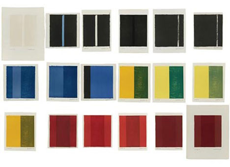
Barnett Newman, 18 Cantos, image via portlandart.net
Barnett Newman, from the statement included in 18 Cantos, a set of lithographs produced in 1963-4 with ULAE:
I must explain that I had no plan to make a portfolio of “prints.” I am not a printmaker. Nor did I intend to make a “set” by introducing superficial variety. These cantos arose from a compelling necessity–the result of grappling with the instrument.
To me that is what lithography is. It is an instrument. It is not a “medium”; it is not a poor man’s substitute for painting or for drawing. Nor do I consider it to be a kind of translation of something from one medium to another. For me, it is an instrument that one plays. It is like a piano or an orchestra; and as with an instrument, it interprets. And as in all the interpretive arts, so in lithography, creation is joined with the “playing”–in this case not of bow and string but of stone and press. The definition of lithograph is that it is writing on stone. But unlike Gertrude Stein’s rose, the stone is not a stone. The stone is a piece of paper.
I have been captivated by the things that happen in playing this litho instrument, the choices that develop when changing a color of the paper size. I have “played” hoping to evoke every possible instrumental lick. The prints really started as three, grew to seven, then eleven, then fourteen, and finished as eighteen. Here are the cantos, eighteen of them, each one different in form, mood, color, beat, scale, and key. There are no cadenzas. Each is separate. Each can stand by itself. But its fullest meaning, ti seems to me, is when it is seen together with the others.
I joked about 18 Cantos this morning; it’s one of my absolute favorite print works ever. [And no, I don’t have a copy, so no, I will not be breaking it up and giving it away to random Twitter followers.]
But it just occurred to me that Newman’s perception of the lithograph stone as an instrument to be played, not a medium to be translated, is very similar to Richard Prince’s early approach to photography.
Here’s just one example from Prince’s Canal Zone deposition, when questioned about a 2003 Artforum Q&A where he said he “played the camera”:
I was extremely–to tell you the truth, I was extremely conservative, on the other hand, in terms of my artistic attitude.
And I knew that in order to maybe discover something new I had to change a bit and take on another persona. And I felt that by playing, quote, as I said in the interview, the camera, just like a punk rock guitarist who picks up a guitar, seven days later he’s playing on stage. He doesn’t know how to play the guitar, but it’s his inability which shines through, which is really exciting. And the fact that he’s not a virtuoso–it’s the very limitations I think that make–can actually make great art.
Newman’s statement is published as “Preface to 18 Cantos” in Barnett Newman: Selected Writings and Interviews [amazon]
Arcy Douglass’s 2008 post about 18 Cantos, then on exhibit at the Portland Art Museum [portlandart.net]
Blank And Blank And Blank
One of the things I found so fascinating about the Cariou v. Prince case is the language. The juxtaposition of the ambiguities and subjectivities of art, the calculated omissions of the art market, and the adversarial formalism and ritual of the legal context.
That comes to a head in Prince’s deposition transcript, which is this kind of amazing text and performance in one. People objecting to things, people repeating or parsing questions, spelling out names with the consciousness that the purpose is to put something on a record–the record–for later use.
And out of it all, art history inevitably or inadvertently emerges, and a window opens onto something–I was going to type reality, but that’s probably naive. It’s information, information pulled and distorted by the constraints and confrontations of the deposition process. Which fits the form of the genre, the medium.
The deposition transcript Gallerist posted yesterday from Larry Gagosian, in the suit over the Cowles Lichtenstsein is another example, just a great read. Unlike Prince, and unlike Gagosian’s Cariou deposition, it’s a real pageturner, combative, tense, a bit suspenseful, maybe with some setups that you think are corny, but yet, in the deposition setting, they still end up working. And even some twists at the end. [My only real complaint: I hate scribd. Just hate it. It’s as much a reason for doing a book in the first place, because I hate using scribd so much.]
Anyway, point is, while reading through the hilarious transcript of a preliminary scheduling hearing in the contract/infringement/revenge/divorce case of Burch v. Burch, the chatty judge, Chancellor Leo Strine, wrapped up with an insight on depositions that is a piece of poetry itself:
THE COURT: Okay. Then don’t — then don’t worry. What I’m saying is it could be — if you can all get the depositions done in 62.3 hours on each side, you should.
But a hundred hours is just an artificial thing.
I also don’t know — for example, depositions are often longer than they should be, not
because the person is taking a long time asking questions, because somebody says “Objection.”
Mr. Abrams knows that the real reasons why the board did this were blank and blank and blank. And it’s distracting the witness from the fact that they’re blank and blank and blank, and the witness’ inability to answer for himself blank and blank and blank and blank has now been corrected by me, indicating that the real reasons he did what he did is blank and blank. I mean, I’ve seen plenty — everybody in Chancery has seen plenty of transcripts — and you’ve been at those depositions — where, frankly, it’s much more from the obstreperous defense side than there is from the asking side.
In fact, during his deposition, Gagosian actually stops his lawyer, the estimable Hollis Gonerka Bart, a couple of times to ask, “What does that mean, by the way? Can I ask you what that means when you say ‘Objection to form’?”
I can tell you that by the end of the live staging of Canal Zone Richard Prince Yes Rasta this summer, “Objection to form” meant everyone took a drink. To the obstreperous defense.