

Photojournalist Feng Li has some truly epic images of Tienanmen Square in the recent post on Beijing pollution at In Focus. Like the giant video wall above, which feels like a cross between Blade Runner and Happy Together.

And this extraordinary image of a flag-raising ceremony just out of frame, which sure? Whatever you need to say in order to get that amazing gradient.
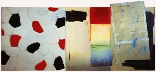
If Frederic Edwin Church were alive today, he’d be wearing a panda mask and painting in Beijing.
China’s Toxic Sky [see fullsize images by Feng Li/Getty at The Atlantic]
Previously, related: Kodak Colorama
Flaming Creatures Not ‘Sanpete Appropriate’
I swear I did not know about this when I put up the last Jack Smith/Flaming Creatures post.
The Central Utah Arts Center has filed a federal civil rights lawsuit against the City of Ephraim in Sanpete County and its mayor, alleging official censorship and discrimination. CUAC was evicted last summer from the city-owned building it had restored and occupied for nearly two decades, and its city funding and school-based programs were canceled after various public officials complained about offensive content in at least two art exhibitions.
The one that started the censor ball rolling, it seems, was a 2011 traveling exhibition which included Jack Smith’s Flaming Creatures. In CUAC’s court complaint, they quote an email where the mayor of Ephraim calls the showing not “Sanpete appropriate.” The City Manager and Economic Development Director of the City then emailed “to share my disgust with the ‘art’ on view.” “I know there are places in the world where smut like this is tolerated but the last place I expected to see it was in Ephraim.” And there it was!
The city had filed suit against CUAC after evicting them, and approved turning the building over to a newly formed arts group, one which promised not to show “abstract ‘contemporary art’ that many residents found esoteric and difficult to understand.”
CUAC is seeking damages, restitution, and attorneys fees, as well as to be reinstated in its former premises. This, even though the organization and its director Adam Bateman have fled to that notorious den of permissiveness, Salt Lake City.
Ephraim art center founder says censorship behind eviction [sltrib via artforum]
On Jack Smith, And Also Agnes Martin
While huh, wtf? investigating the backstory of this tweet this morning, I was reminded of the time Strom Thurmond screened Jack Smith’s Flaming Creatures at the US Senate in 1968:
Some mailboxes that were confiscated by police when Jack Smith mailed his Beautiful Book. Collection, Fulton Ryder. [pic missing]
— Richard Prince (@RichardPrince4) February 2, 2013
Which, wow, has it really been two years since “Hide/Seek”? I found videos of the symposium presentations I was stunned by in 2011:
Jonathan D. Katz on Agnes Martin, abstraction & sexuality, and Zen [“and though she was not a practicing Buddhist, she did her best to both look and sound like one,” strikes me now as a heckuva hook, but keep watching.]
Dominic Johnson on disgust and Jack Smith’s Flaming Creatures, and the context for the Senate hearings and screening, which had been “confirmed” by the courts as obscene.
I assume Johnson’s book Glorious Catastrophe: Jack Smith, performance and visual culture, includes more information on the Thurmond screening. No reviews or discussion of the book yet? Really?
UPDATE With this recollection of that paragon of traditional virtue that was the late segregationist senator from South Carolina, we note the passing of Ms. Essie May Washington, 87, Strom Thurmond’s secret daughter, who was born to his family’s 16-year-old African American maid when Thurmond was 22.
‘One Mask Shy Of A Nurse Painting’
So, Gerhard Richter and Richard Prince. They’ve both had their way with photography, and painting, and even squeegeeing, but do we ever consider them together? I mean, I’ve tweaked on each of them for several years now, and even I have to admit, I haven’t thought of their work in relation to each other, until this instant:
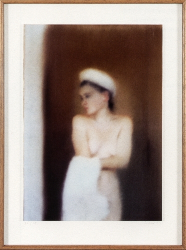
Gerhard Richter’s 1996 photo edition, Small Bather, is based on an identically titled painting from a couple of years earlier.
And yes it’s the blur, but it’s also maybe the towel on Mrs. Richter’s head, but when I saw it in the Christie’s catalogue for next month’s London sale, the first thing I thought was “Whoa, Nurse Painting.”
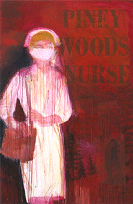
Richard Prince, Piney Woods Nurse, 2002, image: oh, it’s around
Seriously, how awesome would that be? I mean, the Chapmans worked over those Goya prints; and Kippenberger turned that Richter into a coffee table. I mean, sure you could paint over an inkjet of the thing, and flag your est. £40,000 – £60,000 for other things. But why?
On his site, Richter shows Small Bather, above, as it was published: “Cibachrome photograph, fixed on stiff, white cardboard, framed, behind glass.”
This example at Christie’s, though, is only shown cropped to the c-print, and is only listed as on the “artist’s mount,” which, that’s where it’s signed and numbered, so. So? So if some chucklehead compromised this particular piece by taking it out of the artist’s frame, why not use it as an ingredient in a new work? There are presumably still at least 53 others out there to carry on.
Contemporary Day Sale, Feb. 14, 2013 Lot 183: Gerhard Richter, Kl Badende, Small Bather, est. £40,000 – £60,000 [christies.com]
Kl. Badende | Small Bather, 1996 [gerhard-richter.com]
You Can Have A Secret Or A Publicist.

That Richard Prince, he’s got more secrets than a busload of priests heading for the border.
I just heard from a tipster [publicist] that under the busy photocollaged label of each can of the limited edition AriZona Beverage Richard Prince Lemon Fizz, the artist has hidden his signature, and one of his dumb jokes.
So when the samples the tipster so kindly FedExed me arrived, I peeled one off, and sure enough:
Two cannibals were eating
a clown. When one turned to
the other and said, “Does he
taste funny to you?”
RP~~~~
My Lemon.
Richard Prince
Which, holy smokes, these look approximately one million percent better. Why do we not have beverages in plain aluminum cans, with whatever text mumbo jumbo is required printed on the bottom? Or at least let us strip our beverages of their branded skins like this more often.
There are apparently five different jokes hidden under Richard Prince Lemon Fizz, which means Prince/AriZona collectors will need to keep buying and peeling them until they’re sure they’ve got the complete set. And only then can they stockpile the still-wrapped versions.
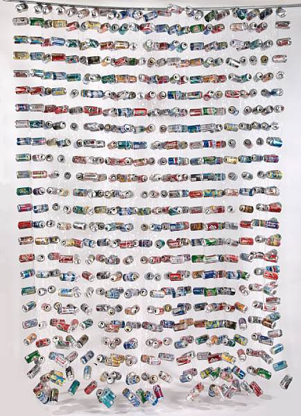
It also poses a problem for the artist John Dogg, who’ll have to decide which version of the can to use in his signature doorway curtains.
As for me, I’ll take my cue from Willem de Kooning’s assessment of Leo Castelli, as told by Jasper Johns: you give this son of a bitch two Lemon Fizz cans, and I’ll sell’em.
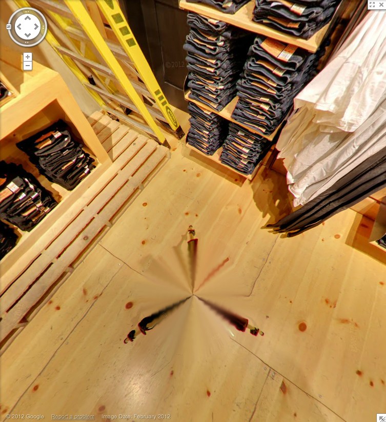
Levi’s Street View
Whether the uncanny valley is the right metaphor, or seeing a dog walking, something still feels weird about seeing store interiors on Google Street View. I’m sure that’ll change, and one day we’ll all be holoshopping without ever leaving our pods, our purchases delivered by robot Google vans, and people will struggle to remember the last time they even looked at the Street View part of Street View, much less actually went anywhere.

But that day is not yet. And the workings of Store View are still odd and/or unknown, and thus interesting. For example, here is the Levi’s store on West 34th St, tweeted by @ManBartlett.
Maybe the making of is interesting only in contrast to the entire concept of a surfable depopulated chain store filled with mountains of indistinguishable jeans. Or is it just me? Can you barely contain your excitement for the day when you can virtually fall into all 5,000 Gaps?
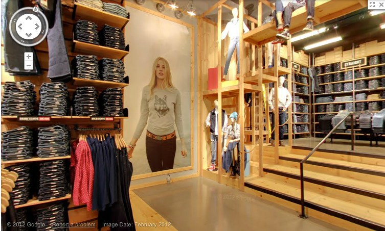
Anyway, let’s look around. They have image date now [Feb. 2012]. Is that new? Obviously, with high merchandise turnover, you’d want to keep that relatively fresh. Store View will become just one more monthly/seasonal expense for a retailer. I see they don’t blur the faces of either the models or the mannequins. It’d be kind of cooler if they did. Even ironically?
Or better if the Street View blur turned up in someone’s IRL in-store/ad campaign. Oh, damn, there’s your pitch right there, creative director: some street style photoblogger is “captured” at work by the GSV car. A Street [View] style blog. BAM. Embed those shoots all over town. A viral bonanza.
Look at me, revolutionizing advertising when I’m supposed to be reviewing pano stitching algorithms. These panos sure are distortion-free. A major advance? The benefit of shooting undisturbed in ideal conditions? Hey, what’s that at the bottom of the picture up there? A tripod leg.
And here’s the whole, stitched thing. That is very nice. Here it is again, this time with a shadow.
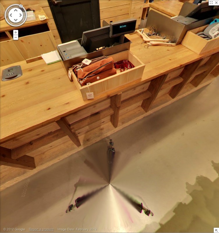
This is not a camera on wheels. It’s on the tripod, single vantage point for every pano, operator out of the way. That’s why there are no distortions. And the only evidence of the process is the legs.
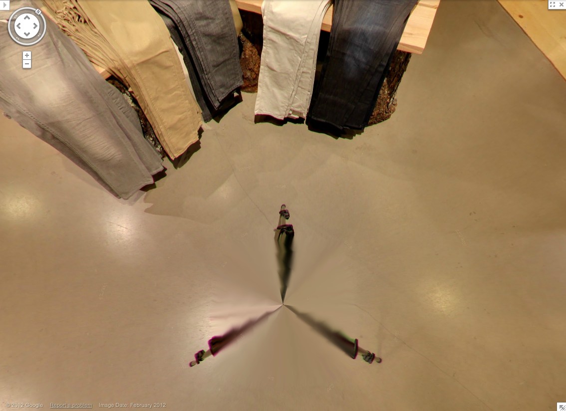
Which, again, are rather nice. Kind of kaleidoscopic, with a blend of in-focus tips and blurry legs. Soon enough, these Matrix deja vu cat-level distortions will disappear, and the differences between real and virtual will be mistaken for mist, or heat waves rising from the sidewalk.
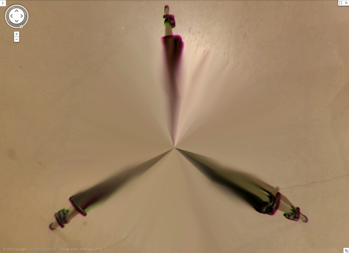
Zooming right into Grotjahn country here. This is sweet. Looks like this pano sphere has maybe 48 slices, each 7.5 degrees? In satelloonmaking, they’re called gores. What do they call them in panoramic photos?

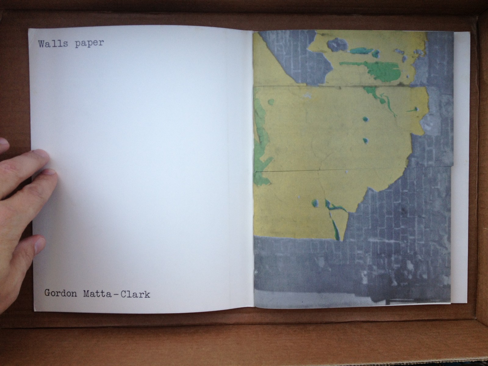
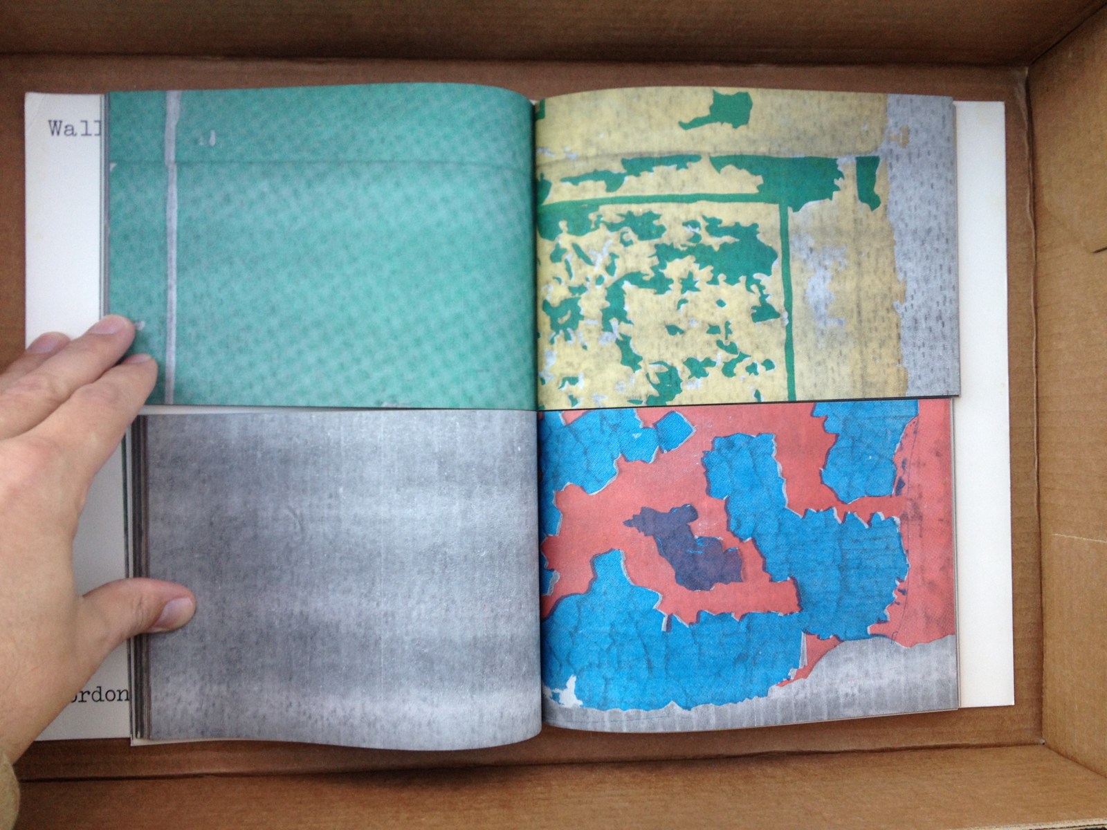
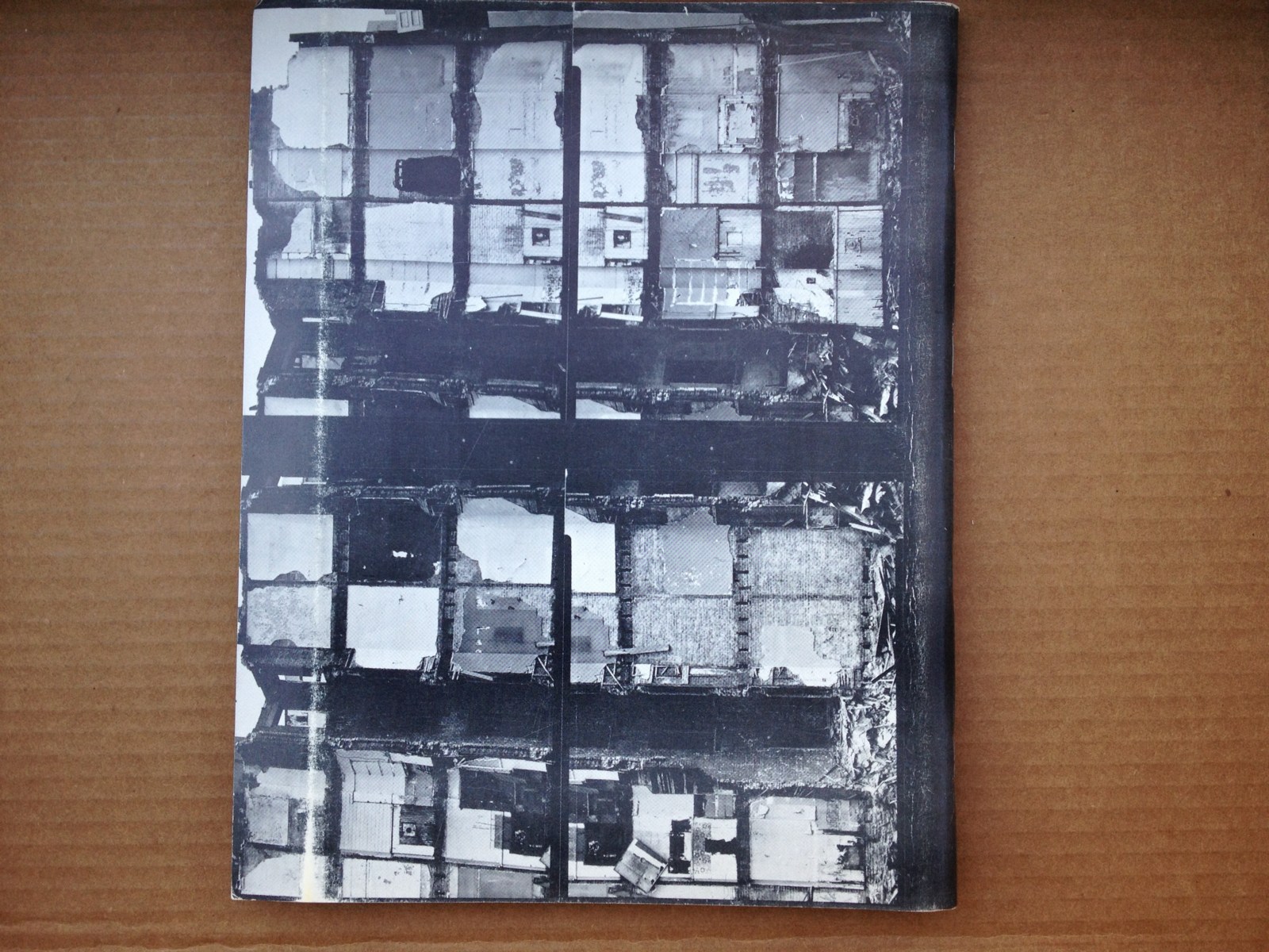
You Can Buy Gordon Matta-Clark’s Walls Paper
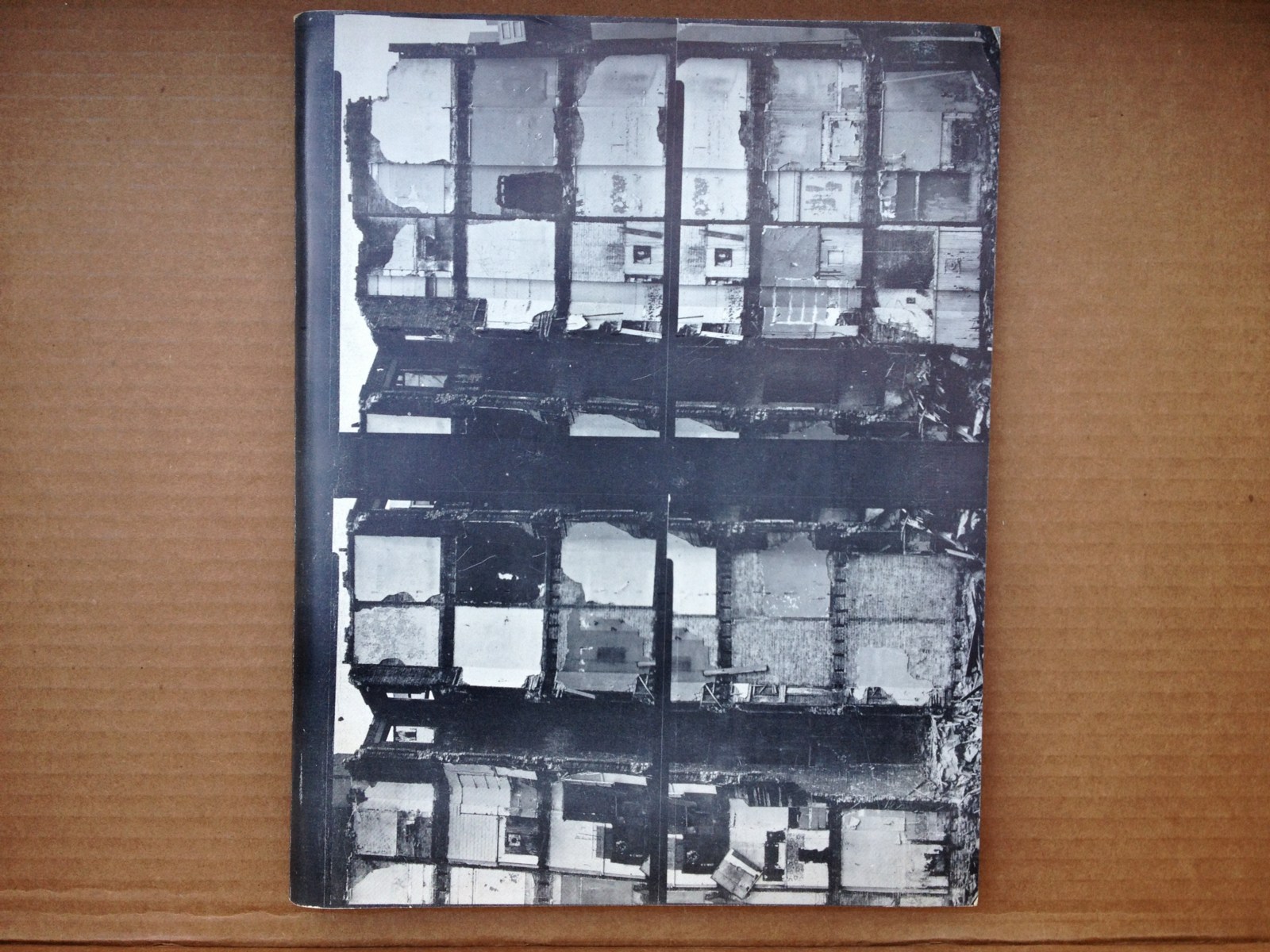
Gordon Matta-Clark only created one artist book, and this is it. Walls Paper was self-published by Buffallo Press in 1973 in an edition of 1,000. Matta-Clark’s photos of abandoned tenements in the Bronx wrap the cover, and colored offset prints of his photos of the ruined wallpaper in these apartments fill the horizontally cut, mix-and-match pages inside.
There was a show of Wallspaper at 112 Greene St. in 1972, and a privately published newsprint edition of the photos that fall.
Last fall, I found that I had two copies. It was much less expensive back in the day. They’re both beautiful, but the other one’s signed.
So I put this one on eBay the other day at a price that seems enticingly lower than the two copies already out there, but probably dealbreakingly high for a flipper. Story of my life, though, always stuck in the gap between retail and wholesale.
Anyway, you can buy it on eBay right now, or before Jan. 19th. Or if you have a better idea, email me.
Brought A Trailer

I hate malls in general, Tyson’s in particular, and Tyson’s at Christmas most of all. So I was beyond annoyed that it was the nearest/soonest Genius Bar appointment when the foot came off my laptop.
All was forgiven, though, when I saw this slightly amazing portable building. An office module on a trailer.

I do not know what it was for–I didn’t notice that now-obvious sign by the steps. And I don’t know whether to put it in the tiny home, prefab, shipping container, or cabin porn category.

It’s really one space on the inside. With a window unit A/C, a little bit of a hack. It looked a little shabby, i.e., used, broken in, so it presumably wasn’t [just?] a materials/color mockup for reskinning a nearby office building.

If it’s a temporary building, though, such as one might find on a giant construction site like the one enveloping the entire Tyson’s Corner area, we should definitely give credit where it’s due; this thing is far sweeter than the standard issue site office.
The sad part is, now that I’ve insulted their mall, I feel bad about calling and asking what it’s for. Maybe someone else can be the citizen journalist here and cold call the mall with a, “What’s this awesome thing I saw on the internet?? You guys are so awesome!”
Pussy Riot Matyroshka Dolls By Manfred Stumpf
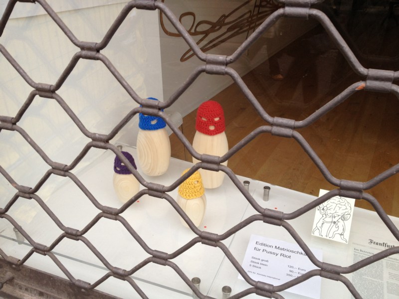
We spent a day in Frankfurt a couple of weeks ago, where I spotted these Pussy Riot matryoshka dolls with real, little knit hats, in the window of Galerie La Brique on Braubachstraße.
They’re by Manfred Stumpf, it seems, an edition for which 20% of the 350 EUR sale price goes to Amnesty International. I don’t have much sense of Stumpf’s work, except to note that these seem atypical.
Manfred Stumpf [galerie-la-brique.de]
Supreme Sforza

image: protestor in front of the US Supreme Court on Jan. 8, 2013, the 11th anniversary of the opening of the Guantanamo prison. by Saul Loeb for AFP/Getty
I’ve been meaning for a couple of weeks now to post a photo of the extraordinary construction scrim on the front of the US Supreme Court, which has a full-scale photo reproduction of the actual building. Here we go, since this tweet:
This is art RT @wayneandwax: whoa RT @matthewstoller: The Supreme Court is covered with a Supreme Court themed tarp.
— John Pyper (@johnpyper) December 19, 2012
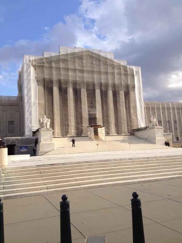
I had no idea. So I looked it up. And was troubled by the fact that I had no idea it had been in place since last May. During the 21-month west facade stone restoration project, “The scaffolding and ongoing conservation work will be concealed by a scrim that will mimic the Court’s architecture.”
The Supreme Court building was designed by Cass Gilbert with John Rockart, and completed only in 1935. From its overall classical Greek temple design to the sculptures on the facades to the smallest ornamentations of the bronze flagpoles and handrails, is highly symbolic. As Chief Justice Charles Evans Hughes said at the laying of the cornerstone in 1932, its very creation and existence are symbolic:
The Republic endures and this is the symbol of its faith…the national ideal of justice in the highest sphere of activity.
So it is entirely appropriate, then, to take a symbolic view of the scrim as well, and its illusionistic simulation of Equal Justice Under Law. As symbolic curtains go, it’s the most inadvertently damning drapery since Colin Powell covered up the UN Security Council’s Guernica tapestry in 2003.
The anniversary of Guantanamo coincided with the unreleased ruling in the hearing on Pvt. Bradley Manning’s illegal and abusive detention without charge. The cancer of vengeance and torture that the US government first directed only toward foreign others has spread to its treatment of our country’s citizens.
And so the thing that gets me about Saul Loeb’s photo above is not the hooded Abu Ghraib/GTMO/Fort Meade protestor, or the Court’s photogenic tarp, but the police officers spread long the steps between them.
Interesting, related, and surprisingly full of scare quotes for a 2009 show: Ben Street’s review of Goshka Macuga’s Whitechapel installation about Guernica, which included the UN tapestry.
If He Did It: Johns Edition
Alright, let’s get all these together in one place:
After claiming for more than 40 years that he had drawn it himself, Robert Rauschenberg acknowledged in 1999 that, in fact, Jasper Johns, who “lived upstairs,” created the graphite text label collaged onto Erased de Kooning Drawing. Or as one person who knew the work when it was made told me last year, “Bob made it, but Jasper made it art.”
Minutiae
Jasper Johns in 1999, as published on the site of the artist’s Foundation for Contemporary Arts [and first quoted here in 2011, in discussing collaboration and Jacob Kassay, actually]:
In 1954 I had helped Bob Rauschenberg a bit with his Minutiae set, his first for Merce Cunningham, and I continued to assist him with most of his stage work through 1960.
Rauschenberg is credited with costumes and/or set design for at least 10 works for the Merce Cunningham Dance Company between 1954 and 1960, including the iconic painted backdrop/leotards of “Summerspace” (1958). Johns’s first actual credit doesn’t appear until 1968.
Oh, but look, on this walkeradmin tumblr [? ;)], a detail from the “Johns/Rauschenberg backdrop for “Summerspace.” I’m glad it’s not just me.
Of the 18 works Rauschenberg is credited with between 1954-58 for the Paul Taylor Dance Company, 17 were for costumes, and one, “The Tower,” (1957) was for set design. Jasper Johns is credited with making the costumes for “The Tower.”
The Tower, by Rauschenberg & neighbor
The Tower, a 1957 Rauschenberg combine created for the dance set, which depicts a couple, was described by the Christie’s representative trying to sell it in 2011 as both “autobiographical” and “cryptic,” which, for these two, is redundant. For composer John Cooper’s part, the Feb 10, 1957 program said he had been considering the “pastoral themes of the Adonis-Persephone myth.” [Persephone and Aphrodite both fell in love with Adonis while babysitting him. So, yeah. Not sure what to do with that.]
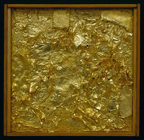
Untitled (Gold Painting), 1956, Menil Collection
I recently met someone who owned a Rauschenberg Gold Painting. The collector said that once Jasper saw it, and said, “Oh, yes, this is one I did.” 10 existing gold paintings predate 1954, the year of Johns’s and Rauschenberg’s meeting, but according to Walter Hopps’ 1991 catalogue, “two or three” were made afterward, at the “special request” of friends. Alison Gingeras included Untitled (Gold Painting), 1955, in “Unpainted Paintings,” her 2011 show at Luxembourg & Dayan. The Menil’s gold painting [above] dates from 1956.
In 1977, in the SoHo Weekly, art historian Roberta J.M. Olson had posed to Johns this kind of remarkable question:
During his early days in New York City Johns and Robert Rauschenberg shared a closely knit friendship of cross-fertilization…It has been said [it has?? -ed.] that during this period the two artists also painted works in each other’s styles.
I asked whether any so-called “Johns paintings by Rauschenberg existed in collections today?
JJ: No, but there is one “Rauschenberg” by Johns. Really, though, it is a Rauschenberg because after I finished it, Bob fooled around with it and I do believe that he eventually signed it. It was a small painting and I don’t know its whereabouts today…The only time I remember Bob actually working on a painting of mine was when he picked up the red paintbrush and went to work on one of the white stripes in a flag painting” […]
One? Just one? Does no one ever ask follow-up questions? No, no one ever does.
Johns told Calvin Tomkins in 2005 that in 1960 Rauschenberg, who had been using maps as an element in his combines as early as Small Rebus (1956), “simply gave” him mimeographed maps of the US, which he painted on directly, and later enlarged into paintings like Map (1960).
UPDATE: In fact, Rauschenberg painted on maps as early as 1950, when he created Mother of God, which was part of SFMOMA’s massive 1998 acquisition.
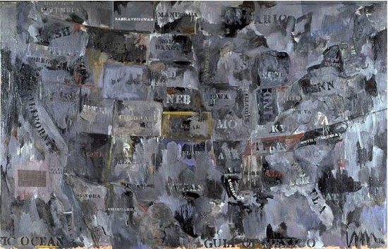
Map, 1962, image via moca.org
In 1988, Deborah Solomon told a version of Johns’s Flag dream story that somehow includes direct quotes from–and a co-starring role by–Rauschenberg:
One day in 1954, Johns casually mentioned to Rauschenberg that he’d had a crazy dream the previous night. ”How crazy was it?” Rauschenberg asked. ”Well,” Johns replied, ”in this dream I was painting the American flag.” The American flag? Rauschenberg didn’t think it was crazy at all. ”That’s a really great idea,” he said.
And this all is aside from the Short Circuit saga; and the fact that Flag looks like it’s constructed like a combine; and his paintings from the earliest canvas & fabric, drawer, canvas, fork, spoon, flashlight, plate, and letter set are essentially combines, too, only we don’t call them that–even though Johns says he came up with the term.
There is so much we don’t know about how these two artists worked and collaborated. So much that doesn’t get asked, or is known and doesn’t get written. So much about the similarities and cross-references and resonances in their work that has been overlooked, dismissed or deflected for so long.
From the earliest days, curators like Alan Solomon and critics were assiduous about keeping these two oeuvres separate and distinct. Whenever asked about influence, Johns would say he always tried to stay aware and move away from it. Rauschenberg would emphasize how diametrically opposite their personalities were, and that was that. Whatever the forces at work, whether the closet, the AbEx legacy of the lone genius artist, or the market’s willful self-delusion, the work they made and discussed side by side, alone with each other, for six foundational years, is almost only ever considered in isolation.
1954: more than a decade before BMPT, and two decades before Prince & Levine [And multiple generations before Codax, BHQF, and Dylan]. What would it mean for the concept of authorship to find out Johns and Rauschenberg were making each others’ work?
update: And while the PMA’s amazing collaboration-related show has absolutely gotten me off my duff to post about this subject, I swear, I had no idea that Alistair Macaulay would publish his email q&a with Johns about his work with Merce Cunningham this morning. Great minds.
Scoring John Cage’s Table
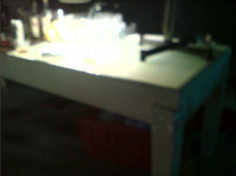
So this is John Cage’s table.
Nothing fuels one’s quixotic pursuit of Cage’s visual and aesthetic artifacts quite like being served a drink from what turns out to be John Cage’s table.
I cannot say where or when I saw it. I cannot say who has it. I can only say I was told that it was Cage’s table–really, John’s and Merce’s table–from their loft on 18th St, and that it came with instructions [conditions?] not to fetishize it. I believe that was the word used. Maybe it was valorize. Not to valorize it. At which point I joked that I did not fetishize it or whatever, I only coveted it. And I promised that, if asked, I would attest that it was not fetishized, and that if it was given to me, I would not fetishize it, either.
Upon reflection, it felt like a useful insight into Cage’s perception of objects, the things around him which he knew, if he wanted or allowed them to, could garner attention or importance by virtue of being his. It’s Buddhism 101, eschewing attachment to objects, but it’s also an artistic position. No branding. At the very least, art was not a practice for generating objects, either for sale or veneration. Oh, maybe that’s what it was not supposed be: venerated.

Yes, that’s it. Veneration. Like saints and gurus. I could see why Cage would be sensitive to that. No problem. Since it was being used as a sloppy drinks table, I was going to happily attest that it was not being venerated in the slightest. No venerating here, nosiree.
But let’s just take a look at it instead, hmm? Because it does have some aspects which we might consider Cageian. It’s rough, simple, not fancy, not precious, not worked, just made. It’s painted white, like the original Mazza loft. It’s utilitarian, or functional. Multi-functional. IT HAS A LIGHT BOX BUILT RIGHT INTO THE END, PEOPLE. So it was for working, meeting, and eating.
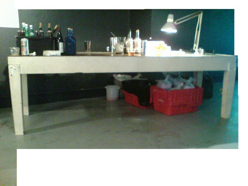
And it was made, not bought, found, or adapted. With some trace of intention. No chance operation produced the slight taper in those square wooden legs. And there’s the nice little setback edge between the upper and lower halves.
Since the table was not immediately offered to me, and given its principled/conceptual encumbrances, the obvious thing was to make one myself. Which is why these photos exist, as documentation for this project, my second table. Table-shaped object. By-product of my performance of a score for a table. I really just want the table, mkay? I’m imperfect and unenlightened, and the Dalai Lama has his watch, I just want the table.
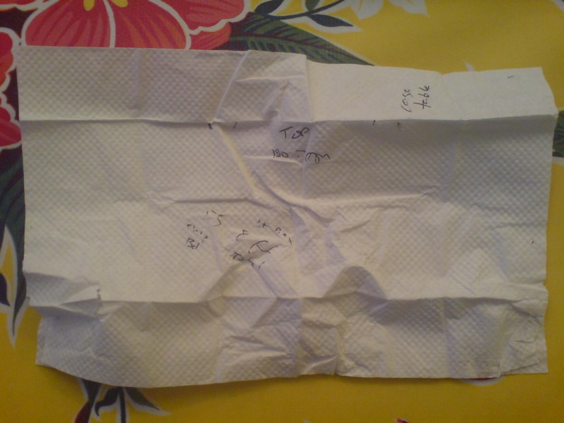
So as best I could, I took some measurements. I just found the napkin I used to scribble down some ad hoc data. What a dork I was right then and there. I hope I was at least amusing.
“Cage table”
those are the widths of the top and bottom of the legs, looks like about a 4/3, 1″ taper.
“55 [?] chip Bd?
lt Box 8 ft Total”
That can’t be right. Well, it’s close. If the napkin’s 10″, the light box looks to be around 3′, at least. [That was my unit of measure: napkinlengths.] I guess I figured I’d be able to feasibly extrapolate the other dimensions? Was that what I was thinking?
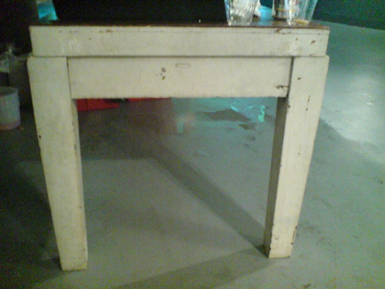
Hmm, maybe this was found, and hacked. Given a new top and a paint job. An old lab table or something. Because seriously, those legs are non-trivial. But then, those legs also look hammered. I won’t fetishize or historicize the construction. Any deskilling will be my own.
Meanwhile, seriously, current non-venerator[s] of this table, if it’s ever in the way, or under threat, or if you redecorate, or whatever, any reason, let me know, and I’ll gladly clear it out in the least venerating way possible.
Koonsian Backdrop
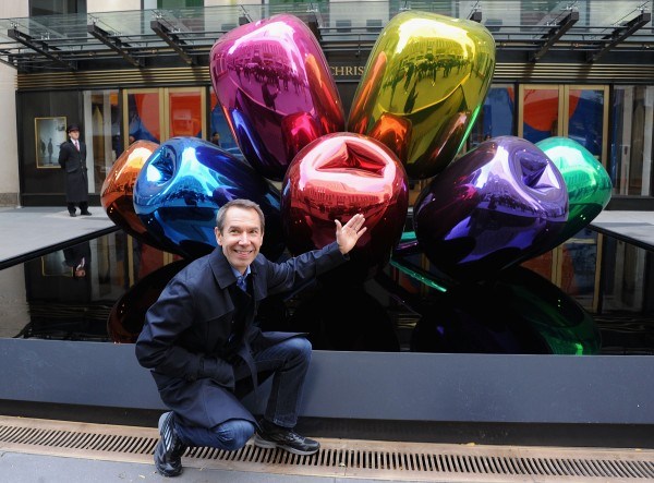
Why, he can promote this stuff one-handed. image: getty via gallerist ny
Though I was excited as could be by the invitation to what was billed as “an exceptional photo call,” I did not attend Jeff Koons’ appearance in front of his tulips, which were for sale last month in front of Christie’s.
Fortunately, Gallerist NY’s Rozalia Jovanovic was there, reporting live from the scene [“At Christie’s, Jeff Koons Poses With ‘Tulips'”]:
While the creation of the sculpture might be over, Mr. Koons is nonetheless still hard at work on crafting and maintaining his image. Despite having a broken wrist, which was in a cast (the result of a horseback-riding incident), he was charming and upbeat, much like a professional model, seeking the best angle, variously standing or sitting, feigning at turns surprise and conviviality, and even giving us some pointers: “Come around from here,” and, “I can stand over there.” Mr. Koons once again proved that he is his own greatest creation.
Koons may be the most manipulatively congenial about it, but he is by no means the only artist to ham it up for the cameras.

Here he is, goofin’ with both hands, alongside his fellow “master of the art” of branding,, Takashi Murakami, in The Art Newspaper’s Canal Street knockoff version of post-Basel critical reflection that starts with, “Have there ever been better bedfellows than art and luxury?”
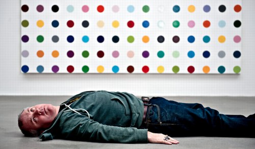
And move over, here’s Damien Hirst at a photo opp for the Spot Challenge:
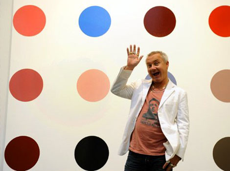
This is obviously a particular and not-unbiased sample. But there are a few inter-related things I’m seeing here. The least interesting is how these three all adopt roughly the same persona: the artist-as-minstrel-clown. Whether court jester is a step up, down, or a lateral move, it’s just a LULZ-ier example of Jasper Johns’ characterization of artists as the elite of the servant class.
No, no, don’t get up. image: Andrew Testa for nyt
Koons’ work–and his workin’ it–are revealing, though, and I mean literally. You can see the photo scrum right there, the wire service joes with their daily list of photo calls to make, reflected in the mirrored surface of his balloon tulips. Like GWB White House stagecraft manager Scott Sforza, Koons knows that all these guys want is their shot, and he is all too happy to help them get it. Koons’ mugging and poses are the visual equivalents of his banal soundbites about his work; he’s very much embodying, reflecting, transmuting into the sycophantic, celebrity- and money-driven mediated culture around him.
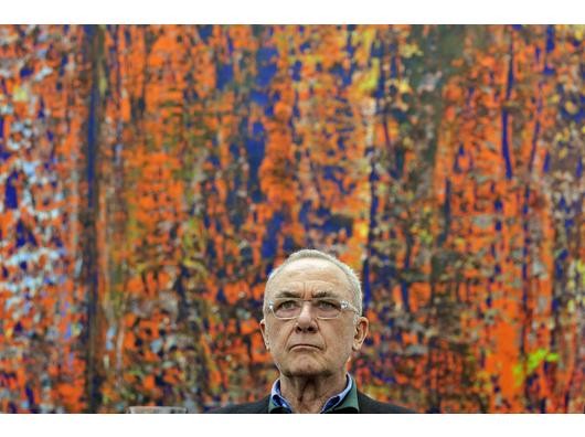
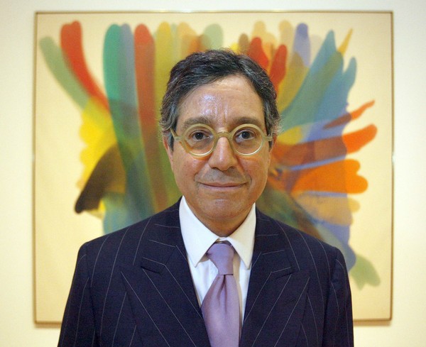
Gerhard Richter photo opp at the Ludwig in Köln, 2008, image: ddp via derwesten.de
The prevalence of this image genre and the media & publicity system that produces it inevitably colors our view of the art and the artists. I think most artists are very aware of that, and thus harbor anxiety or at least ambivalence toward the photo opp and feature experience. Managing the unpleasantness, wanting to support their own work, wanting not to be difficult, but really wanting to do almost anything else at that moment, they often acquiesce to these photographers’ weird, stilted, or just clichéed compositions of The Artist Next To Her Work.
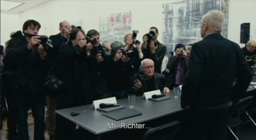
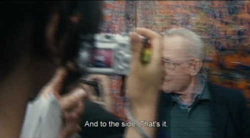
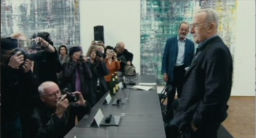
For some, it’s an apparently unavoidable, barely tolerable evil. There’s a stark, kind of ridiculous scene that interrupts Corinna Belz’ Gerhard Richter Painting, a press preview of the artist’s 2008-9 show of late/recent Abstrakte Bilder at the Museum Ludwig in Köln, where it’s clear how much Richter hates the experience and the context. And the process [“I just want to get out of here.”], and the pictures that result from it. [“Oh, just throw them all away.”] I’m guessing that low shot above was taken by the bald guy in this screencap:
We’re used to consuming such images without much concern, but hearing the artist’s empty answers to the journalists’ simultaneously preening and undermining questions, you really start to wonder. And by you, I mean, of course, me.
Deitch coming to MOCA, image: Lawrence K Ho for latimes
Anyway, if I were a tumblrin’ sort of guy, WTF Poses With Art would easily be the second or third tumblr I’d make. It’d depend on whether to treat photos of museum directors & curators with Meaningful Art in soft focus behind them as a category, or as its own thing.
Driving Taxis Through Heavy Neighborhoods To Look At The Paintings
Via the Hirshhorn via Art21 comes a nice two-way interview between Barbara Kruger and Richard Prince, originally published in BOMB Magazine in 1982, that ends:
RP I’m misinformed about style. I always thought it had to do with being able to wear the same kind of a jacket for ten years. I don’t know. What I wonder is . . . is it possible to have style and be unreasonable at the same time?
BK I think unreasonableness can mean any number of possible locations nearer or further away from the idea of reason. Because many of these positions are already coded, their shock value is tempered by style. A lot of times the idea of transgression really turns on a romantic conception of otherness; of a rebellion already tolerated. You know, the charming rogue, the picaresque cuteness of the bull in the china shop and in the art world, badness invades the atelier. Driving limos through heavy neighborhoods to look at the graffiti. Unstylish unreasonableness may be limited to the categories of the insane and the unpleasant (the poor, the unbeautiful, the unempowered). The non-romanticism of these kinds of otherness makes them unsightly and “vulgar” considerations for the polite company of international bohemia.
This image of limos driving “through heavy neighborhoods to look at the graffiti” is great in itself, but it also reminded me of an anecdote from, of all people, Jasper Johns.
Jasper Johns, Harlem Light, 1967, image “taken. It’s not mine.”
It’s about the genesis of a motif that first appears in a 1967 painting, Harlem Light [above]. Here’s the version from Michael Crichton’s 1977 catalogue for Johns’ Whitney retrospective, which is still the most engrossing Johns book I’ve seen. And I’ve seen a lot:
Johns was taking a taxi to the airport, traveling through Harlem, when he passed a small store which had a wall painted to resemble flagstones. He decided it would appear in his next painting. Some weeks later when he began the painting, he asked David Whitney to find the flagstone wall, and photograph it. Whitney returned to say he could not find the wall anywhere. Johns himself then looked for the wall, driving back and forth across Harlem, searching for what he had briefly seen. He never found it, and finally had to conclude that it had been painted over or demolished. Thus he was obliged to re-create the flagstone wall from memory. This distressed him. “What I had hoped to do was an exact copy of the wall. It was red, black, and gray, but I’m sure that it didn’t look like what I did. But I did my best.”
Explaining further, he said: “Whatever I do seems artificial and false, to me. They–whoever painted the wall–had an idea; I doubt that whatever they did had to conform to anything except their own pleasure. I wanted to use that design. The trouble is that when you start to work, you can’t eliminate your own sophistication. If I could have traced it, I would have felt secure that I had it right. Because what’s interesting to e is the fact that it isn’t designed, but taken. It’s not mine.”
Crichton goes on to discuss the “small differences” that go unnoticed, and which are lost in creating from scratch. And of flagstones, like flags, an ideal Johnsian image,” which are found and known and abstract and concrete. Seriously, I could just keep quoting from that book all day.
But instead, I’m going to try to make sense of Kruger’s next sentence, “Unstylish unreasonableness may be limited to the categories of the insane and the unpleasant (the poor, the unbeautiful, the unempowered).”
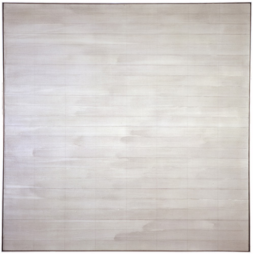
Destroyed Agnes Martin Paintings
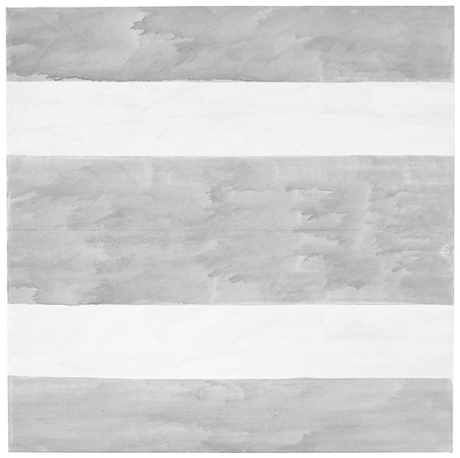
Untitled, 2004, Agnes Martin’s last painting. Image via Phaidon
The visits that maybe stick in the mind are the ones where she would show me four versions of a single painting and she’d say to me. ‘I think this is the best one, what do you think?’ Invariably there was so little difference between them, it was so hard to say, they were all really beautiful. And then she’d say OK we’re gonna keep that one and we’re going to cut up the others. And I would help with a knife slice up the paintings. Those are the studio visits that I think are the sharpest, helping her destroy the work.
What goes through your mind the first time you hear something like that?
It’s her work, and I’m a co-worker in the art field. . . but yeah. It is brutal. I was there at the end of her life and she said ‘go down to the studio, there are three paintings. Hanging on the wall is the one I want to keep, I want you to destroy the other two.’ So I went down to the studio. The two paintings she wanted me to destroy were magnificent – absolutely perfect. The one on the wall was a very stormy painting, unlike anything that she had made since the 60s. I certainly didn’t want to destroy those two spectacular paintings but I did. I sliced them to ribbons and put them in the trash. When I came back. She said, ‘did you do it?’ I said, ‘I did it.’ And that was that. Our last conversation.
Arne Glimcher, in a Q&A published last month by Phaidon.
The Q&A is timed to the publication of Agnes Martin: Paintings, Writings, Remembrances by Arne Glimcher, an extraordinary collection of Martin’s writings and correspondence, many works, and Glimcher’s own snapshots and notes. He would take extensive notes during his studio visits with Martin in New Mexico, and then transcribe them on the plane home.
He expands on Martin’s last request to destroy some of her work in March 2004:
A mystique exists that Agnes painted very few works but in actuality, she painted almost daily when inspired and that was with some frequency. However, only a relatively small amount of works exist from such a long and productive life because she destroyed most of the works she produced. Probably no artist has ever been a better editor than Agnes Martin. The rejected paintings were shredded with a mat knife. As she grew older, during the last few years, she enlisted the help of friends (myself included) to destroy the unacceptable works, as it was very hard to cut through the thick primed linen fabric. When I once asked her why she was destroying a particularly delicate and beautiful work, she said, ‘It’s too aggressive, and there’s a mistake.’ Most often that referred to a pooling of colour in one of the works that made the brushstrokes discontinuous. The mistake became an unwanted ‘focus’ in a non-compositional painting, which disturbed its serenity.
Trumpet, 1967, an earlier last painting by Agnes Martin, image via zwirnerandwirth
I drove to the studio where I found three grey paintings, all of which were beautiful. Using her mat knife, I reluctantly shredded two and spared the one that hung on the wall. It was unique, expressionistically painted with stormy grey asymmetrical brushstrokes covering the surface. Five thin pencil lines visually grounded the passionate wash to the canvas. There is only one other painting with such an expressionistic asymmetrical handling of brush work. It is called Trumpet and was painted in 1967, just before she took her long hiatus and first departure from painting. On first glance, in this last painting, Agnes appears to have taken a new direction. Comparing Untitled (2004) with Trumpet, it is clear that it was not so much a change in style as it was coming full circle home.
[2016 UPDATE: In 2013 Glimcher spoke with Tate Modern curator Frances Morris about his memoir, and the last audience question was about what the last two destroyed paintings looked like:
The two that I had to destroy were very dissimilar from the one that was left, which you saw the picture of. They were much more rigorous; they were less emotional paintings. They looked more like the 70s than they did the 90s, or the late work. They seemed to be a little bit out of context, but perfect paintings, really exquisite paintings. So I took the box cutter and sliced them to ribbons.
]
In reviewing “Five Decades,” a 10-painting Zwirner & Wirth survey in 2003, Holland Cotter called the artist’s practice, “a kind of yoga of painting.” I’m still trying to think it through, and understand why she destroyed so much of her work–or her paintings, really, and maybe that’s the difference–but perhaps it involves a kind of yoga of looking as well.
Buy Agnes Martin: Paintings, Writings, Remembrances by Arne Glimcher via Amazon [amazon]
Ten questions for Pace Gallery’s Arne Glimcher [phaidon via yhbhs]