
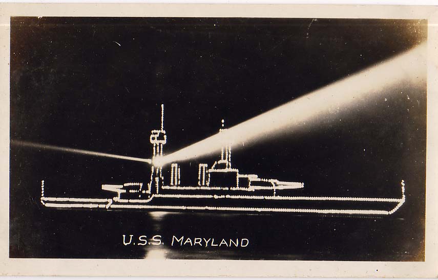
Apparently, as a state-of-the-art battleship in the US Navy during the 1920s, the USS Maryland was “in great demand for special occasions.”
Which might give a hint about why she was tricked out at some point in these dazzling but highly non-camo lights.
USS Maryland [thekingof via reference library]
Rirkrit Passed The Shark On The Autobahn

image via artreview
Oh, man, oh, man. I think this clears up a lot. Finally, here is a quote that gives some insight on Rirkrit Tiravanija’s approach to art objects and object-making. The artist is discussing the making of Untitled 2010 (All the days on the Autobahn), 2010, which was purchased by the Foundation for the Association of Friends of the National Gallery Berlin for Contemporary Art:
untitled 2010 (all the days on the autobahn), is a work extending from a series that I have been working on over the past ten years. It is biographical and also a documentation of the artist and art in action, where the boundaries of life and art merge into one becoming indistinguishable from each other. The artist in his daily life; his movement through time and space becomes his practice. In response to the quotation above which I said many many years ago, the question for me as an artist is how does one continue to make art after Duchamp’s readymade? In some ways I found art to be defined by the action taken upon the object, the use of the object when one lives with it; with action and usage one is asked to form meaning. The Peugeot 205 was a car I drove while living in Berlin, it was an economical and efficient utility vehicle – it took me to many places where I had to travel for work, and a so I formed a deep relationship with it. Over time and with all my other concerns, the car became redundant and I placed it aside, and with this work, I encased it and returned it to its original state — as the readymade. On its heel (rear left wheel) a riddle can be found written on a crushed up coffee cup that states, “is this all there is to life”. [emphasis added]
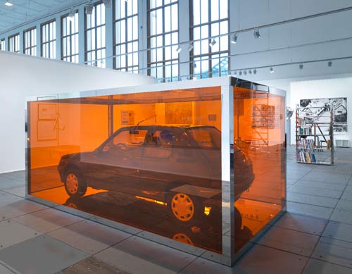
So the functional objects of the artist’s daily life/practice become redundant [in the US or the British sense? I don’t know], and then convert–or revert–to readymade status. It’s the ultimate upcycling. But that doesn’t quite explain the mirrored steel & Perspex vitrine; can a readymade exist within a custommade?
I can’t think; I’m too distracted by the chrome Autoprogettazione bookcase in the back there, part of neugerrimscheider’s vast, shiny booth at last year’s Artforum Berlin. Do want.
#70 Rirkrit Tiravanija | untitled 2010 (all the days on the autobahn), 2010 [vfn-stiftung.org]
Previously: Transactional Aesthetics, or the highly collectable Rirkrit Tiravanija
howtospendit.com +rirkrit
There’s No Such Thing As A Free Lunch
Dos Zapatas
Looking through Social Photography II, Carriage Trade’s second Phone Camera benefit auction, I find this photo by Sarina Basta, Zapata Headquarters, Cuernavaca, and I’m like, Zapata? I swear, I’ve seen this before.
But not quite.
In the Diego Rivera murals exhibit at MoMA, there’s a full-size X-ray image of the artist’s iconic, Agrarian Leader Zapata, which shows the fresco panel’s internal steel bracing structure.
Here’s an image of it from Jill Krementz’s remarkably comprehensive coverage of the preview for New York Social Diary. Krementz, who even managed a photo of anti-Zapata Anna Wintour who was not at the Rivera press preview, but was leaving a meeting for the Film Department’s Pedro Almodovar benefit.
Close Encounters Jam Session
I’m sure the original’s long gone, but I want the Moog synthesizer-equipped lightboard from Close Encounters of the Third Kind.
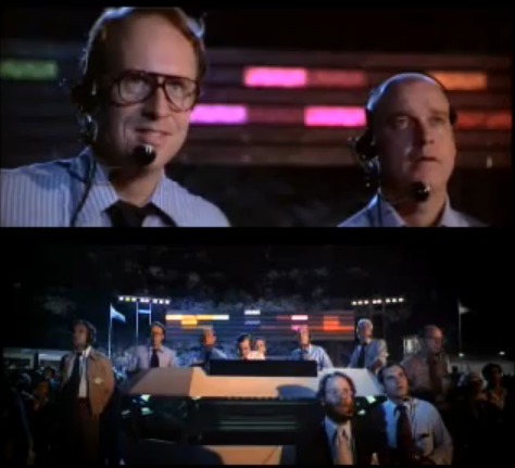
The idea of communicating with extraterrestrials via “a basic tonal vocabulary” synched to a gridded light show is like the lovechild of Carl Sagan and Ellsworth Kelly, conceived at an outdoor Pink Floyd concert. In a good way.
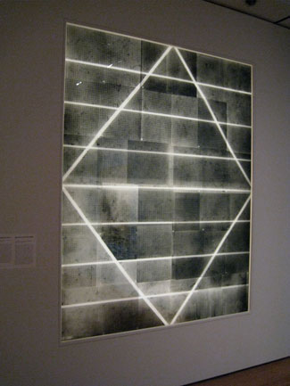
Sculpture for a Large Wall, 1957, image: moma.org
[Just an aside, the story of Kelly’s Sculpture for a Large Wall is utterly fantastic. I’m glad that it’s safe and at MoMA, but the utter failure of Philadelphia to keep it should be discussed every time the Eakins or Barnes stories are told.]
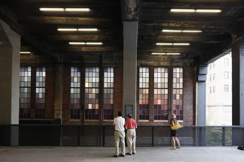
Spencer Finch, The River That Flows Both Ways, image by iwan bann via thehighline
I would have expected Spencer Finch or Leo Villareal to have made one of these already. Or any one of a number of early Silicon Valley IPO nerds. But I can’t find any record of replicas anywhere. So I will step in where I must.
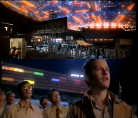
My first guess was that Douglas Trumbull gets the credit for the board; and maybe he designed and executed it. But according to Ray Morton’s definitive-sounding 2007 book on the making of Close Encounters, it was Spielberg’s idea to have a colored lights that correspond to each Moog tone. John Williams composed and recorded the music in advance, so it could be played back on set for filming what was called “the jam session.” I’ll gladly overlook this somewhat Milli Vanillistic approach to jamming in exchange for the score and the rig’s schematics.
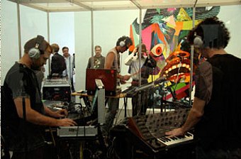
Rirkrit Tiravanija, Untitled (Rehearsal Studio No. 6, Silent Version), 1996, installed at MCA Chicago, image via artforum
Because obviously, when you exhibit this, you’ll expect the first thing everyone will play is that iconic five-note greeting. Then they’ll get into a jam session of their own. You’d probably want to make it possible, via the web or USB stick or something, for people to execute their own compositions, to let the computer “take over the conversation” once in a while. And you’d probably stream the piece over the web, too, give it its own channel. Maybe schedule some performers to come in and use it.
Then for good measure, put the whole thing on a golden CD and launch it into space, and wait for a response.
Off the Golden Record
Jackboot, Bean Boot
The video is absolutely riveting, all the way through. And though it’s outrageous &c &c., the casual pepper spraying of the seated student protestors is only the second or third most important takeaway from this clip.
That said, I have to confess that the, like, third thing I thought when seeing Louise Macabitas’ photo [via motherjones] was, “Hey, Bean Boots!”

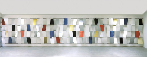
Rijksoverheid Rood 5: Mirror
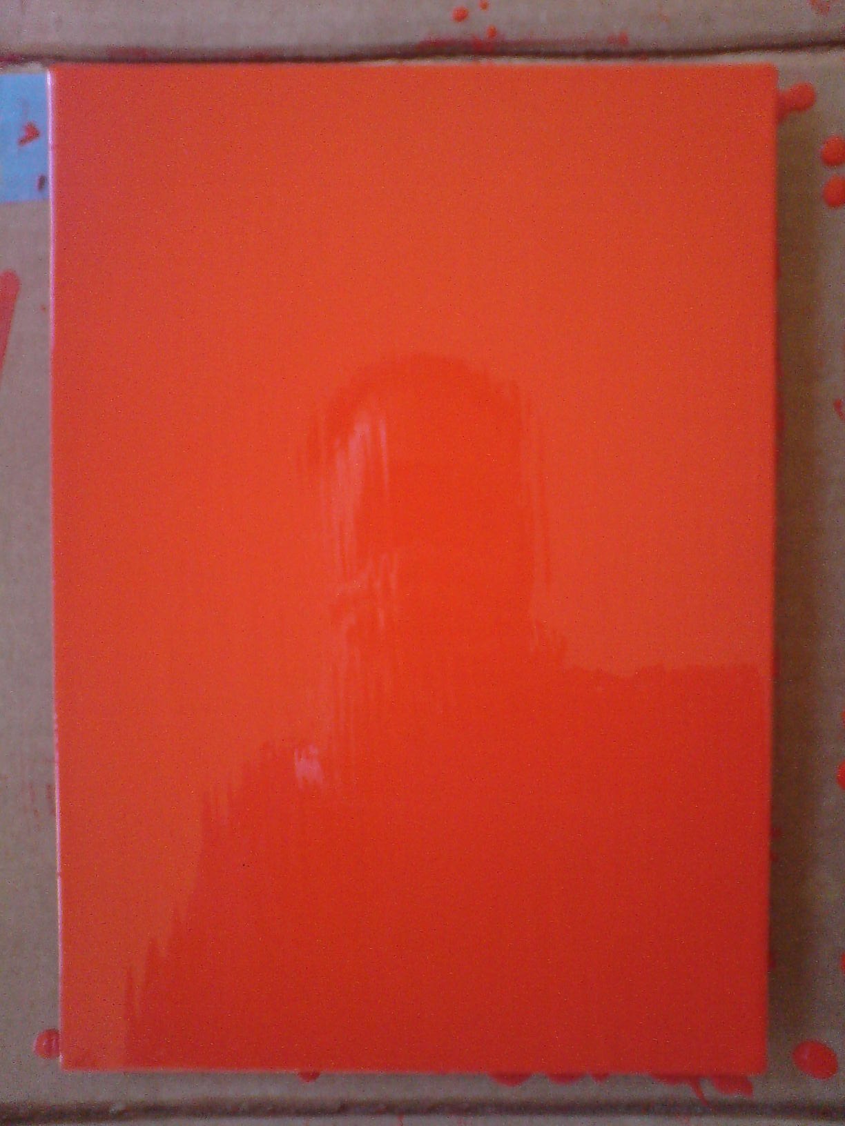
Theoretically, I can get the prep and sanding and tacking and painting of a new coat, and the cleanup, and a bit of documentation, done in a little over an hour now. But I also find it takes a certain kind of hour.
And anyway, I wanted to switch to a roller, and so I went looking at neighborhood hardware stores, to no avail. I explained to one ACE manager what I needed: a roller for laying down smooth oil enamel on steel panel. Yes, it’s primed. No, it’s just a panel. No, can’t spray; it’s custom mixed in a can. Monochr– Just the one color. Not going to paint anything on top of it. He finally said, “It sounds like art.” Well, that remains to be seen. Right now, it’s just a painting.
Well, yes and no. It’s taken me several coats or sessions to realize that I’ve been handling these panels very carefully, like art–but like someone else’s art. Art I’ve bought and need to take care of. I think I’m over that. They need to be made before they need to be conserved.
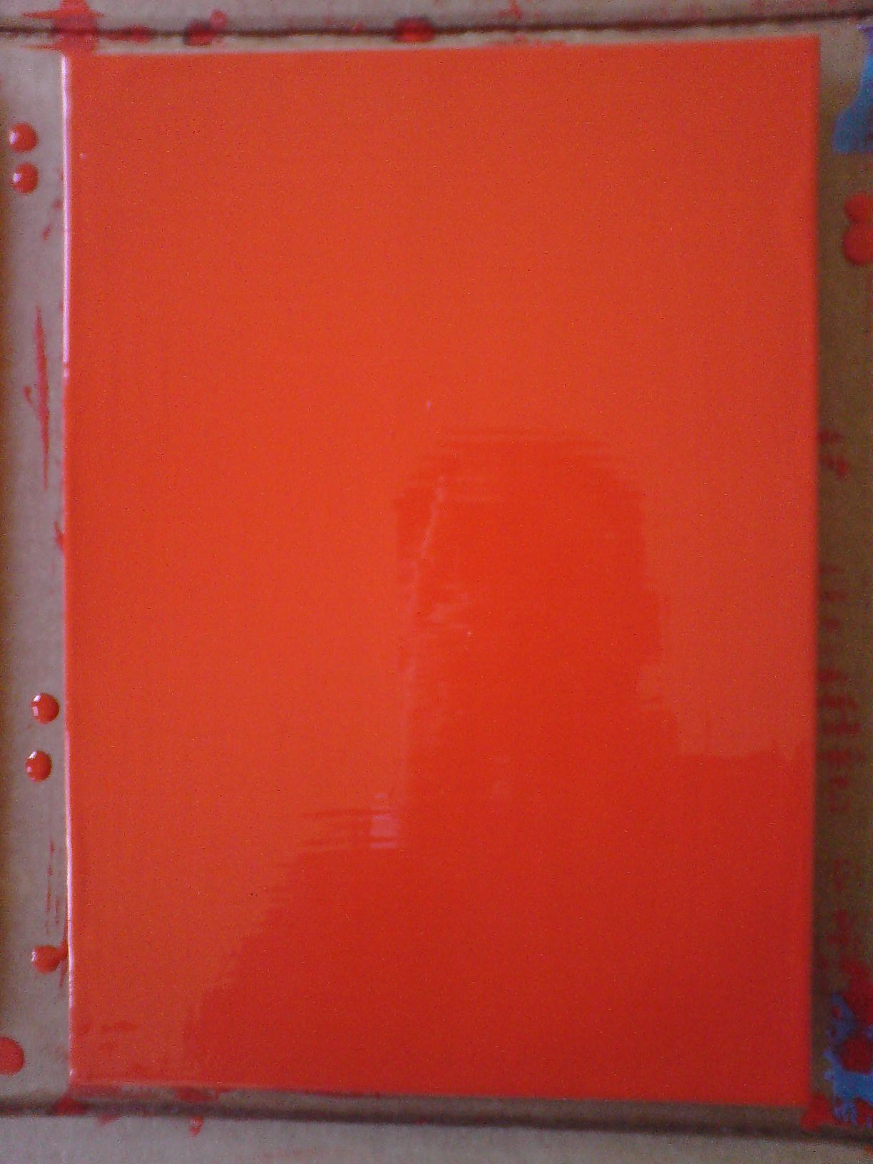
And now that I’m handling them a lot more, and less hesitantly, I’m finding I like the feel of the steel panel [top] better than the aluminum [above]. At least at this gauge, the aluminum is just too light and flimsy. And since I don’t want the metal to have an edge profile of its own, I’m wary of moving up to a thicker gauge.
The sponge brush, well, I’m not sure I’m for it. It does produce a much finer striation than the natural brush I’ve used till now. What I think is that for these layers I know I’m going to sand, it’s not as important. I am interested, though, in how the brush strokes differ, horizontally and vertically, or portrait and landscape [sic or heh, I’m not sure which]. If I can’t get rid of it entirely, I may keep that somehow.
[Note: I missed posting an update #4, but it was sanding, and then cutting the drip/stalactites off, rather than wait any longer for them to dry, which they’d never really do, and then you’d sand across one, and it’d break and shmear like a rood zit.]
You’ll Be My Mirror
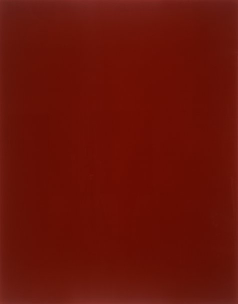
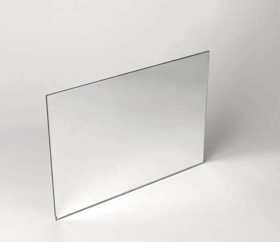
gerhard richter, blood red mirror, cr736-3, 1991, image via gerhard-richter.com via jenettem’s twitter/tumblr to cavetocanvas’s tumblr
You see the problem: this is exactly the effect I’m trying to get with my Rijksoverheid Rood paintings. Only with a brush.
I totally love Gerhard Richter’s mirrors. And his mirror paintings. There was that diptych in Rob Storr’s show. And oh man, that installation at Dia Beacon? I think it was the early gray paintings that helped me into the mirrors. Which is probably why I had never noticed that there were red mirror paintings, too. Of course, the mirrors don’t look like this.
They look like this:
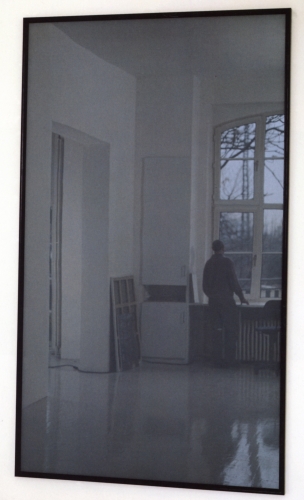
mirror, grau, cr735-1, 1991, image gerhard-richter
There are at least 44 mirror works so far. Including this one I’d never seen, an edition done in 1986 for the Kunstverein in Dusseldorf. I love Richter’s website description of this cork-backed mirror: “This object is not a ready-made but was made to Richter’s specific instructions.”
I think this one sold at Swann last year may have a little chip in the lower corner.
Richter’s specific instructions: make it 210x298mm, a dimension better known as A4. Less well known as the size of the metal panels I’m painting right now.
I think this helps me to sort the things I make into two categories: things I make because other people made them; and things I make and then find out other people made, too.
Chinese Google Earth Art Project
I confess, I haven’t checked out Utah’s Dugway Proving Grounds since the Terraserver era. But I just checked them out again
This crazy, Toyo Ito-ish tangle of 20m-wide white lines in the desert of Gangsu province have been stumping folks on Googlesightseeing for 2+ years. [Scrolling down, they found Google Earth images of the feature under construction in the spring of 2005.]
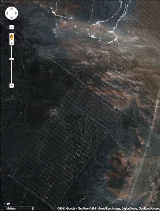
This is my favorite, though, an 18-mile-long grid [!] in Xinjiang. The speculation is that it’s a calibration grid for Chinese spy satellites. I like to think of it as the world’s biggest Agnes Martin painting.
Gizmodo’s been adding more Chinese Google Earth oddities to their original post. I’d still put Dugway into the top 3, or at least the top 5.
[thanks ryan, patrick, dt, and a couple of other people who also consider me their go-to guy for oddball Google earth art links.]
What I Want To Look At Today: Byron Kim’s Night Sky Paintings
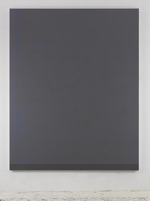
Byron Kim, Untitled (for S.B.), image via jamescohan.com
Byron Kim’s first show at James Cohan consists of large, nearly monochromatic paintings of the night sky in Brooklyn. Or perhaps they’re of memories of the night sky in Brooklyn, or evocations or references to specific phenomena of the night sky in a city. From the press release:
In this new series of work, Kim paints night in the city, evoking the quality of light and hazy cloud formations in the transition from dusk to dark and beyond. He depicts the state of constant suspension that city dwellers experience; the omnipresent lights block their view into the cosmos and deny a resolution to the day that true darkness delivers. The paintings in this ongoing series, measuring 90 x 72 inches, often have hard-edged, painted borders on two or three sides that act as reminders of the architectural elements like windows, cornices and facades of buildings that frame our views of the city sky. Kim paints his crepuscular skies from memory, creating open spaces that act as trigger points for the viewer’s inner dialogue, giving the imagination room to resonate and remember.
Art in America’s Faye Hirsch talks with Kim about the work, which is somewhat related to his ongoing Sunday Painting series, quick renditions of the daytime sky, which are much more representational [or maybe not? Some of those Dark paintings seem very atmospheric, and the borders do feel like architecture.] And they all kind of remind me of the varied blues of Donald Moffett’s monochrome photographs of the sky, which always felt very poetic to me, and which were always framed and matted in strong white so they looked like windows. Which all makes me wonder if the other unmentioned reference here is James Turrell’s PS1 piece.
Byron Kim, Nov 4 – Dec 17, 2011 [jamescohan.com]
Night Rider: Q&A with Byron Kim [artinamerica.com]
previously: what I looked at today: NGA monochromes, [including Byron Kim]
Gene Davis Giveaway, By Douglas Davis & Ed McGowin
There are so many fascinating things about the Gene Davis Giveaway, I almost don’t know where to start. And I’m embarrassed to not have known about it sooner. Gene Davis Giveaway, or Give Away, or as it was called at the time by its creators, The Event, was an amazing art project, part Happening, part Conceptual Art, part ur-Post-Modernist appropriationist market critique, and–yes–part Relational Aesthetics mayhem. And it happened in Washington, DC, in 1969.
The story, as it was fed to Washington Post critic Paul Richards, is that in the spring of 1969, DC sculptor Ed McGowin and art critic/artist Douglas Davis were at a party, trying to figure out how to declare the end of the once-edgy, now “Establishment”-friendly Washington Color School movement. Douglas wanted to “gather [all] the color paintings and destroy them,” and McGowin said no, “let’s give them all away.”
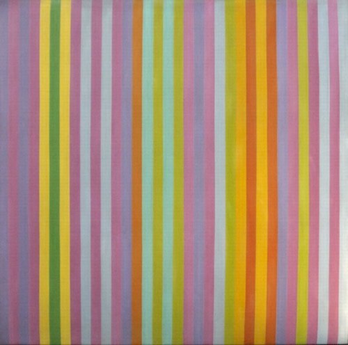
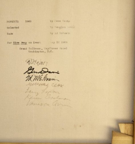
So they approached Gene Davis, who agreed to let McGowin and Davis make 50 replicas of Popsicle, one of his trademark stripe paintings. Davis mixed and supplied the paint, while McGowin and some art students from the Corcoran–including Clark Fox–produced the 6×6-ft paintings. When it was all done, Gene came to silkscreen the three creators’ signatures on the back of each canvas. Sometimes the fabricators signed the works, too.
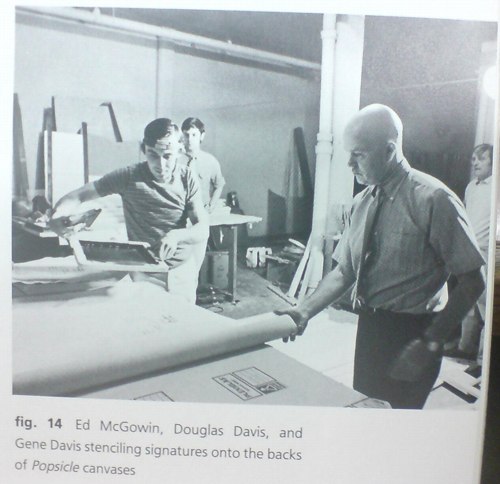
McGowin and Gene Davis screening Giveaway signatures with Douglas Davis looking on, from Douglas Davis’s The Giveaway Box, via Gene Davis: A Memorial Exhibition, 1987
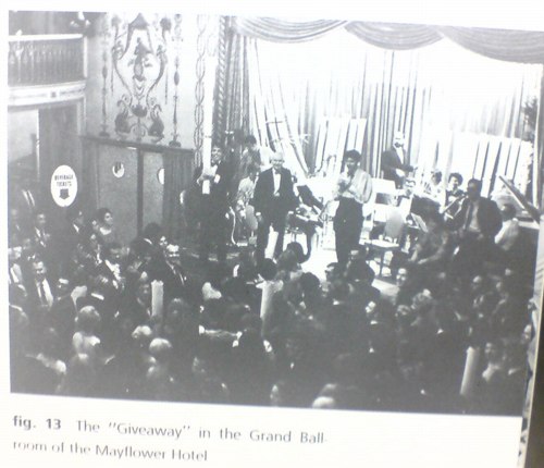
Meanwhile, Douglas invited 500 local swells to a black-tie party in the ballroom of the Mayflower Hotel, where the 50 “Gene Davis Paintings” would be given away, free, to lucky attendees whose names were pulled from a large bowl. [Actually, I think it was 40 paintings, because 10 had been pre-sold to folks who underwrote the production of “The Event.” I’d bet they were exchanged for around $1,000, an attractive discount from the $3,000 price of an “original” Davis painting at the time.]
And that’s how the Gene Davis Giveaway was positioned at the time, and apparently, for long afterward: Gene Davis paintings by any other name that still looked as sweet. At 0% of the price.
In his uncannily prescient and expansive preview of Gene Davis Giveaway in the Post, Richards likens the project’s collaborative “assembly line production” to “a different sort of event that not so long ago celebrated the dominance of another kind of painting.” Which, obviously, I must quote at length:
That earlier event was performed on a Willem de Kooning drawing by Robert Rauschenberg, a painter then unknown [sic]. The drawing had been made freely, almost automatically, in the abstract manner with soft pencil on fine rag paper. Working freely, almost automatically, in the abstract expressionist manner, Rauschenberg erased it.
Traces of pencil marks remained so that the handwritings of both artists were visible when their work was shown as “Erased de Kooning by Robert Rauschenberg.”
Rauschenberg’s gesture marked a point in the history of art. His erasing did not destroy–but underlined–the premise of the artwork it altered. Freehand erasing is to freehand drawing as mass production is to the tedious production of an “original” Gene Davis stripe.
That’s one way of looking at it. There are others. Some see the Giveaway as a publicity gimmick and others see it as a way to get something nice for nothing and still others regard it as a joke. Douglas Davis feels the Giveaway–with its color, its lottery, its glamor, its suspense–is itself a special work of art.
Wow. Exactly! Except that I think Richards’ actual take was one or more of those unnamed “others,” and that Davis & McGowin fed him the rest. When Douglas looked back on Gene Davis Giveaway in 1987 in a catalogue essay for the recently deceased painters’ memorial exhibition at the Smithsonian American Art Museum that re-examined the project in light of postmodernism’s challenge to originality and authorship, Richards poo-poohed it all as “self-congratulatory hyperbole.”
Which you’d expect if Richards thought the Event was a “publicity gimmick” or a “joke,” but not if it were “a special work of art” which just so happened to align with, if not prefigure, the contemporary art world’s next two decades of conceptual and theoretical developments.
By Douglas Davis’s 1987 account, though, there’s no question that he and his collaborators “were in the midst of artmaking,” and that the art was “The Event” itself:
What I remember most about that evening is the roar. The crowd was enormous, virtually filling the gigantic ballroom [above]…The atmosphere approached that of a ritual, yes, but the ritual of Wall Street or striptease. Very early, the chanting began: “Give it away, give it away.” When we finally drew the names of the winners out of a large silver bowl, the yelps and screams of the victors, and the groans of the losers, were earsplitting. I began to feel ashamed of myself. Barbara Gold of the Baltimore Sun was the only critic who sensed the conceptual edge in “Giveaway.” She claimed that the patrons calmed down toward the end, stunned by their own vulgarity, by the shock of recognizing “how totally monetary value could get in the way of the aesthetic pleasure.” “A vague air of sheepishness became pervasive,” she wrote. I hope her reportage is more accurate than my memory. I recall nothing but loud, overbearing greed to the last. Photographs reveal the winners waving their rolled Popsicles in the air as they left the Mayflower, dancing above a sea of black-tied oglers. At least for the moment, free art, having found its owners, returned to the realm of the precious. No, Walter Benjamin, the aura of Popsicle glowed that night in fifty different directions.
Alright, maybe that is a little hyperbolic.
In any case, I think it’s clear that under the Erased de Kooning analogy, Gene Davis Giveaway is really a work by Douglas Davis and Ed McGowin. But that poses the uncomfortable question, what if you erase a de Kooning, but you don’t become Robert Rauschenberg? For all his DC Happenings and on-point conceptualizing, Douglas Davis is less well known for making art than for his 1970s tenure as the art critic at Newsweek, and for organizing the Open Circuits symposium that brought video art to MoMA in 1974.
And while Gene Davis’s market is pretty sleepy, it’s still more established today than either Douglas’s or McGowin’s. And so it is that most of the Popsicles in public are optimistically/delusionally presented and traded as Gene Davis. Because even in 1987, Douglas didn’t realize his project would also prefigure the eventual acceptance of editioned originals and outsourced painting.
So while you can put on a happy conceptual face and say the piece is still working, on another level, it’s gotta hurt when, as recently as 2010, Douglas Davis’s own copy of Popsicle is being sold–along with his Giveaway Box, the trove of ephemera, documentation, and related materials he’d assiduously collected as part of Gene Davis Giveaway–as a Gene Davis. That’s like the A/P right there, the ur-After Popsicle, and it still only makes $11,000.
[2018 update: in 2016 Clark Fox wrote about his experience making all 50 “Gene Davis” paintings in nine days.]
Maintaining Power

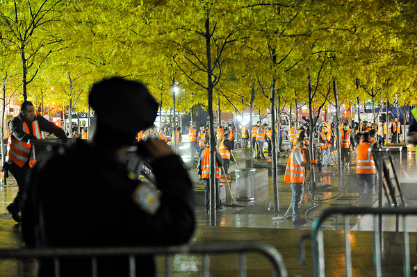
Gotta hand it to the Bloomberg Administration: scheduling the expulsion of the Occupy Wall Street protesters for the middle of the night, and then arresting and beating and harassing journalists covering the raid, thereby minimizing–but apparently not eliminating entirely–the creation of images of white-shirt violence like the one above by Agence France Presse, was slick.
But then scheduling the cleaning performance at Zuccotti Park for sunrise, when the dawn’s early light hits the golden trees just so, and the Times’ photographer can get an NYPD relaxing against a barricade just so? That is pure political poetry.
It reminds me of Mierle Laderman Ukeles, longtime artist-in-residence for the Department of Sanitation, who identified the political and aesthetic power of maintenance when she asked, in her Manifesto for Maintenance Art 1969! [pdf via feldmangallery.com], “After the revolution, who’s going to pick up the garbage on Monday morning?”
Unfortunately, I think this is the opposite answer Ukeles was seeking.
How Ya Like How Ya Like Me Now?
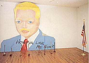
How Ya Like Me Now?, a large painting of a white Jesse Jackson by David Hammons, was one of seven outdoor works in “The Blues Aesthetic: Black Culture and Modernism,” an ambitious exhibition organized in the Fall of 1989 by Richard Powell at the Washington Project for the Arts.
The other six outdoor artworks were installed without a hitch, but approval for Hammons’ painting to be erected on a DC city-owned parking lot dragged on for six months, three months after the show opened. When the OK was suddenly given [with no explanation of either the delay or the decision], WPA staffers hurriedly erected How Ya Like Me Now? on the lot at 7th & G Streets [where the Verizon Center currently sits], across the street from one of the intended target audiences for its questioning title, the National Portrait Gallery.
The NPG had no portraits of blacks on display at the time. And Hammons suggested that a portrait of Jackson, arguably the most prominent African American in the US in 1988, would already be in the museum if he’d been white. Jackson had lost the Democratic Party’s nomination for president to Michael Dukakis after hitting a wall of white voter resistance in Wisconsin, a phenomenon of racist reluctance pundits called “the Bradley Effect.”
But a billboard-size portrait of a pink-cheeked Jackson suddenly appearing on the streets of DC with no explanation and a Kool Mo Dee lyric for a title was bound to arouse controversy. And when WPA curator Powell, who is black, left three white staffers to finish installing the piece, a crowd of young black men formed, voiced their protest against the artwork–and then took a sledgehammer to it and tore it down.
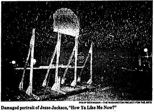
The Washington Post showed a photo of the only piece left standing on 7th Street, Jackson’s blonde afro and part of his blue eyes. After some back and forth in which Hammons kind of complained that the WPA did not install the work as high off the ground as had originally been called for, and the WPA complained about the city’s footdragging delays and said it was going to send the scalped Jackson back to Hammons for repair, the damaged tin painting went back on view, encircled by hammers, for the remainder of the exhibition.
All of which makes me very interested to know when and how How Ya Like Me Know? ended up in its current home in a private DC collection.
The most complete account of this story I can find online is this 1998 Duke Alumni Magazine article on RIchard Powell, who went on to become a very prominent art historian and author [duke.edu]
On Things Other Than David Hammons’ Work
These two quotes from Coco Fusco and Christian Haye’s 1995 Frieze essays on David Hammons reminded me briefly of, say, gala artists and, say, Jacob Kassay, respectively:
‘Visual art may be the obdurately white and upper-middle class field of our culture. I have a notion why. Art objects are tailored for physical spaces owned or controlled by the social elite. To make appropriate objects for or even (or especially) against the spaces takes even more than talent and more than technical know-how. It takes intimate familiarity with those rooms where art enters history.’ Of course, critics also have a role to play as gatekeepers of history, and Schjeldahl is sly to entirely shift this responsibility to the museum.
…
During the 80s the road taken by many artists was to become known for creating a visual style and milking it for a lot more than it was worth. The road less travelled is to develop that autograph and then drop it in order to invent an entire new language.
For what it’s worth, I also want to see if anyone’s discussed Alma Thomas’s Watusi (Hard Edge) in terms of Henry Louis Gates’ theory of Signifyin’. Will look. Also, Christian Haye, where are you these days?
[frieze via hans ulrich obrist’s top 20 list]
Let Them Eat Cake
OOPS! Never mind!
In my dead-serious indignation, I had completely overlooked the potential of Marina Abramovic’s MoCA Gala for pathetic comedy. Fortunately, we have Ryan Trecartin, who speaks diva absurdity fluently. Trecartin’s livetweeted photo report from inside the tent is hilarious.
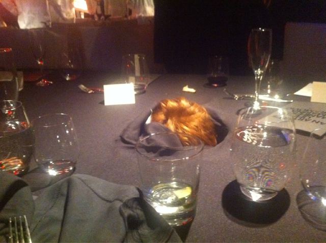
First, of course, the page of “INSTRUCTIONS FOR BEHAVIOR WITH THE CENTERPIECE,” which, yes, but. The second you read the instructions, you know the piece has already failed, or has at least missed an opportunity.
In 1974, Abramovic executed a piece called Rhythm 0, in which she sat completely impassive next to a table full of objects, including a gun and a knife. A sign informed the audience they could use anything they wanted on the artist’s body. It got kind of aggressive, and contested, and Marina says later she “felt really violated.” Surely the norms of gala culture would have tempered any actual violence, but would it not have been more illuminating to not tell the gala crowd to behave with basic human decency toward the human performer–and then see what happens?
But that’s not what was on the menu for this piece. Oh, the menu. “THE SURVIVAL MOCA DINNER” featured “Super Human Cocktails: Purity MoCA Martini, The Minimalist, The Conceptualist” and “John Cage Symphony,” which was a frisee salad with crostini and a fruit-nut loaf. Rauschenberg, de Kooning and Warhol were the other artists with courses named after them. I have no idea.
Holy moley, what is this extraordinary thing where people chant Marina’s artist manifesto at the audience? And Debbie Harry gets carried out by four Hollister doormen? A runway-like stage seems to be a trademark of the MoCA gala medium. Vezzoli had it. Aitken had it. Now Marina had it.
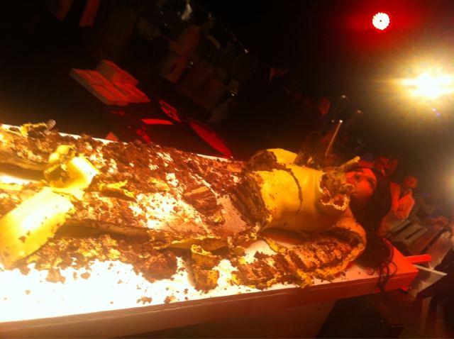
As Marina says, you can’t judge a work unless you’ve experienced it. Fortunately, Trecartin and his intrepid entourage stayed until after the bitter end, after the body part cakes in the form of Miss Thang and Ms. Harry were reduced to roadkill, and they investigated the underside of the table and then popped their own heads up. This is close looking and arts journalism, right here folks.
And in the service of art. For then our man in Los Angeles headed [sic] back to his hotel room with the greatest gift bags imaginable, containing kits to make centerpieces at home. So. Awesome.
Off with their heads!
All images via Ryan Trecartin’s Twitter
Marina Knows What She Is Doing.
At the invitation of Jeffrey Deitch, Yvonne Rainer has seen a rehearsal of Marina Abramovic’s performance art project for this year’s MoCA Los Angeles gala. And in a new letter to Deitch, she has refined and reiterated her condemnation of it as an exploitative and “grotesque spectacle [that] promises to be truly embarrassing.”
Would that it were actually embarrassing to the people involved, and to Marina herself. Rainer goes to great, cordial lengths in her open letter to Deitch [reproduced below] to separate her criticism of the gala from Abramovic’s work. While generous, I believe this is incorrect; the only context in which a revolving human head centerpiece on a $100,000 table could be realized is as an artwork. I mean, Abramovic’s certainly not claiming this is just edgy party decoration, is she?
If that were so, the case for embarrassment would be easily made. No, I think the reason this rankles so much is precisely because the gala does take on the mantle of art–and the stamp and stature of the artist. It’s not possible to say that this gala is not art; it is art you cannot afford to experience. It is art that you find humanly, ethically, and socially objectionable. And it is being produced and shown for money in one of our [sic] most reputable museums, by an artist who shows and is celebrated in similar institutions.
That’s a reality of the art world as it’s currently constructed.
Last year between the blog post where I declared the Gala as Art Movement and my presentation on it at #rank, I found two things: 1) Abramovic was deeply engaged in the luxury/sensual/sensory spectacle that is the gala experience’s stock in trade. And 2) Doug Aitken’s MoCA gala Happening was, on one level, a critique of the real estate and cultural forces which used art and museums to shape Los Angeles to serve their own needs. And that critique was utterly and completely subsumed by those very forces, probably without Aitken realizing it.
The Gala is bigger than any artist’s attempt to subvert it from inside the party tent. Aitken tried and failed, but I think Abramovic is just fine with it.
Yvonne Rainer Blasts Marina Abramović and MOCA LA [theperformanceclub.org]
Previously: An Incomplete History of The Gala-as-Art Movement [greg.org]
“Relational Aesthetics for the Rich, or A Brief History of the Gala as Art” [vimeo]
Yvonne Rainer’s revised letter to Jeffrey Deitch, along with its growing list of signatories, is after the jump.