
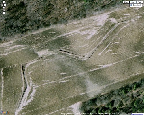
Add Shift, a seminal, early site-specific sculpture from 1970-72, to the list of Richard Serra works you can see on Google Maps.
The series of wedge-shaped, concrete walls is tucked away on remote farmland in King City, Ontario. The Township Council decided this week to place Shift [or “the Shift,” as the local paper calls it] under the protection of the Ontario Heritage Act.
Hickory Hills, an investment company which owns the land, had resisted the designation for nearly two years, proposing instead an agreement not to destroy the work, but also not to maintain it, to protect it, or to be responsible for any damage, vandalism, or destruction caused by third parties. Third parties whose curiosity had already been piqued by the debate over Heritage protection. “There are some crazy people out there,” said Hickory Hills’ attorney Chris Barnett. The proposal also called for preserving just a 1.2-meter buffer zone around the walls.
The obvious outcome of Hickory Hills’ proposal would have been destruction-by-neglect, then when the sculpture was too damaged to argue over, they could just level it, then carve up the 5-hectare [12-acre] field into a residential subdivision like the one abutting it.
But designation of Shift as a Heritage Site will now require Hickory Hills to preserve the sculpture and not alter or destroy it. It also precludes “urban use” or development of the surrounding land.
Still, it is high earthwork comedy to imagine Shift‘s now-averted, alternate future: it manages to evade King City’s roving gangs of art vandals until Toronto’s demand for exurb bedroom communities increases, and then, surrounded by scrawny trees and a zig-zagging bike path 1.3 meters away, it ends up on the cover of the sales brochure for Hickory Hills Estates, [homes starting in the $190’s.]
Township ready to designate the Shift under Heritage Act [kingsentinel.com via man]
Tyler’s extensive background post on Shift from Sept. 09 [modernartnotes]
Previously: Richard Serra sculptures on Google Maps, Feb 09
Related: The Shops at Rozel Point
On Remembering Ross Laycock
I’ve thought about similar situations before, so when I saw the mention in the NY Times article about all the dela Cruz’s Felix Gonzalez-Torreses I realized I was surprised at how infrequently I hear or see Felix’s partner mentioned by his full name. Turns out yesterday was the first time the Times has called him Ross Laycock, not just Ross, in the nearly twenty years since he died of AIDS-related illness.
This, despite Ross’s integral, intimate role in so much of Gonzalez-Torres’s work. Despite? Or because of? It’s partly the nature of Felix’s work, but Ross is most widely encountered [by people who didn’t meet him during his life, obviously] as an abstraction, a figure, a reflection, an absence, even, in the art work itself.
Remembering that there was far more to Ross than Felix’s artistic gestures, no matter how poignant, could convey, I Googled around a bit, and found my way to Nick Dobbing, who had been thinking very similar things for far more personal reasons.
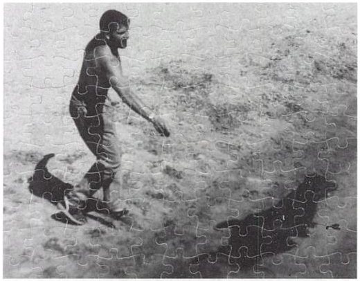
Dobbing knew Laycock before Ross was famous, and posted a Christmas snapshot of him:
One can find pictures of Felix online easily enough, but (to my knowledge) none of Ross. I have often wondered, when people read about Ross, who is remembered mainly for being Felix’s lover, who do they think he was?
So I scanned this from an old snapshot and put it up, as a memorial.
It’s one of my most popular photographs, often revealed to others through Google searches, so I wonder if others are looking for a photograph of Ross.
Felix used several photos of Laycock in his works. Untitled (Ross and Harry) is a 1991 puzzle edition with the same dog:
Recent Photos | Ross Laycock [wovenland.ca via flickr]
What I Looked At Today – Gerhard Richter
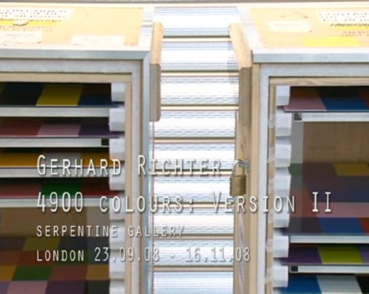
Gerhard Richter used a randomizing computer program to place the 11,500 hand-blown squares of glass in 72 different colors in his 2007 stained glass window for the Cologne Cathedral.
He used the same program at the same time to create 4900 Colours, a work which revisits the color chart and color chip paintings he made in the 1970s. For 4900 Colours, square acrylic paint chips were glued to Aludibond, a European brand of aluminum composite panel.
4900 Colours, Version II, shown at the Serpentine Gallery last fall, consists of 196 panels, each nearly 1m square and containing 25 computer-placed chips. The panels were hung in randomly selected groups of four to make one work comprised of 49 panels. Hans Ulrich Obrist talks about the work and its various versions in this video.
I can’t get over how gorgeous they look, even in the crates. Watching the installation and listening to the several random elements Richter deployed reminds me of John Cage’s rolywholyover exhibit from 1993-4. Using a a list and map created each day by an I Ching-based program, the museum’s art handlers would essentially perform by installing, moving, and removing artworks selected for the show. When not on the walls, paintings and such were stored on rolling walls, still visible, in a roped off section of the gallery. One of my absolute favorite art experiences ever.
So They’re Surrealist Dutch Landscapes?
Been trying to think about where the idea of painting an intentionally obscuring, computer-generated, institutionally applied abstract pattern onto a systematically produced aerial photographic map of the entire world fits into the historical painting/photography, abstract/representational context.
From Andre Bazin’s 1945 essay, “The Ontology of the Photographic Image” [pdf]
…[P]hotography ranks high in the order of surrealist creativity because it produces an image that is a reality of nature, namely, an hallucination that is also a fact. The fact that surrealist painting combnes tricks of visual deception with meticulous attention to detail substantiates this.
No Redwoods Were Harmed In The Making Of That Serra?
In 1969, Allen Ruppersberg created Al’s Cafe, a detailed, functioning facsimile of an archetypal diner, which was to operate/perform one night a week. Allan McCollum, who was making work in Los Angeles at the time, wrote about Ruppersberg and Al’s Cafe in a 2001 catalogue essay:
I would like to explain a little of why this piece was so significant in L.A. in 1969. “Site” works and “performance” pieces were proliferating at the time; in 1970, for instance, Richard Serra would create an outdoors-brought-indoors installation at the Pasadena Art Museum, in which three immense California redwood logs were leant upon a fourth, and their cantilevered ends were sawn off and allowed to crash to the floor. The aftermath of this action created an enormously dramatic display, and the project was much talked about. Elsewhere, a number of artists of these years were crowding into their cars and heading out to the deserts to work with natural processes, the results of which were often brought back from such alternative, poststudio locales to wind up in the same clean white gallery spaces that the artists seemed to have abandoned so pointedly. Robert Smithson had worked to point out the dialectical relations between the “nonsites” of the urban galleries and the peripheral “sites” of marginalized geographic territories: slag heaps, rock piles, dry lakes, landfills. He and others who followed took to the Midwestern plains and the Western deserts, executing projects in the middle of nowhere, and bringing back aerial photographs, sketches, documentation, and truckloads of residues and samples from these relatively exotic, empty regions of the American map to display in the populated cities. A new vocabulary was building, and an exploration of how our culture’s richness and complexity have always been framed and defined by our fantasies of the sophistication of our urban centers, and the purity of their showplaces and shrines, in relation to nature’s marginalized and boundless emptiness.
A dilemma was beautifully revealed by these pioneering artists–and clearly spelled out for the younger artists–and the question (“naturally”) arose: isn’t our idea of nature just another idea? Another concept? Another cultural artifact? Does moving out of our urban habitats to make art really accomplish anything beyond promoting a further alienation, a further fiction, another kind of imperialism, a new imaginary idea of purity? It was within this growing discourse that Al’s Cafe offered to sell a “JOHN MUIR SALAD (BOTANY SPECIAL),” or “GRASS PATCH WITH FIVE ROCK VARIETIES SERVED WITH SEED PACKETS ON THE SIDE.” In Al’s Cafe, Ruppersberg answered the growing mannerisms of Earth art with a slyly symbolic display of nature as always mediated, always already determined by the culture that processes it–both literally and figuratively–for its own use. He presented nature as a commodity for consumption, without the pretense of any pure “natural” vision.
I really planned to just quote the Serra description [emphasis added]. I’d heard references to the work before, but never to the process and content of the piece. Which means, I guess, I’ve never seen the catalogue for Serra’s one-man Pasadena show, which documented the making of the work, which was titled: Sawing: Base Plate Template (Twelve Fir Trees). Also, I don’t think they were redwoods.

Smithson himself had installed a Non-site, Dead Tree, which consisted of just one tree, in the Dusseldorf Kunsthalle in 1969. Joe Amrhein and Brian Conley’s 2000 re-creation of Dead Tree in Pierogi 2000 was a classic. [Here’s a Frieze review by David Greene.] What’s been written–or exhibited–about these two guys’ early history together?
Feigned The Warhols!
You know what we haven’t been hearing much news about lately? That’s right, art crime. No Pebble Beach “Pollocks” bollocks, no Find The Warhols! updates from LA…
So it’s a relief to hear that hilarious Warholian scams haven’t all disappeared. A man and a woman in Utah were recently busted for trafficking in fake Warhol paintings. In February 2008–wow, take your time reporting that one–a California man paid $25,000 toward the $100,000 purchase of six supposed Warhol paintings, made in 1996, of Matthew Baldwin, aka The Lost Baldwin Brother. Never mind that Warhol died in 1987 and Matthew Baldwin is actually the writer of Defective Yeti.
After an appraiser pointed out the fakes, the woman tried to exchange them for a painting “she claimed was worth nearly $70 million.” Hey! I know two guys who just lost a supposed $70 million painting!
This is officially the best Fake Warhol In Utah story since the artist sent an impostor to deliver a lecture at the University of Utah in 1968. [Sorry, aging Salt Flats hippie who’s trying to sell the Warhol garbage bag he took home from the Factory.]
Couple charged with trying to sell fake Warhols [sltrib]
A Little Lamb

The uncovered radiator was starting to seem a little dangerous in the kids’ bath, and since I had a bit of Ikea shelving left over, and a leftover can of primer turned out to match perfectly the color of my newly installed rubber floor, I took a page from Max Lamb’s Reference Library x Apartamento Magazine playbook.
And that’s how I saved $187 [$195 for a custom radiator cover, minus $8 for a pint of pink paint] and learned a nice lesson in the importance of proportion, all in one afternoon.

Enzo Mari X IKEA Mashup, Ch. Last
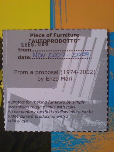
home stretch, from Thanksgiving 2007 to Thanksgiving 2009.
And it is done. [more pictures here]

A quick recap:
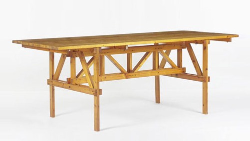
An EFFE table based on a 1974 design by Enzo Mari, but made entirely from unfinished pine components of Ikea’s Ivar shelving system. The vertical and diagonal elements are the square corner posts. [Some revisions were made mid-construction.] Horizontal elements are the pre-assembled shelving side trusses. [The center truss uses two trusses intact, while the end trusses use disassembled pieces.] The top is glued up from four Ivar shelves, which are braced underneath. [compare to Mari’s original design below.]
Though Enzo Mari’s original design calls for the low-grade pine to remain untreated, I decided to finish the entire thing with Sutherland Welles tung oil varnish. Components received five coats of wiping varnish, with sanding in between, before the trusses were constructed [finishing nails and #10 stainless screws]. The trusses and top then received six more coats of medium lustre varnish. The top will get two more, then a final sanding with steel wool.
Not only did the varnish cost more than the wood, all this hand-finishing turns out to be an insane amount of time and effort. Even so, the incredibly uneven quality of the Ikea pine resists a fine finish. This top may be conceptually ideal, but a more practical solution may be required if we decide to use the table daily.
Previously:
Autoprogetazzione: The Making of an Enzo Mari dining room table
Ch. 1: Enzo Mari x Ikea Mashup
Ch. 2: Parts
Ch. 3: Decisions, Decisions, adapting Mari’s design for Ikea lumber
Ch. 4: Finish Fetish
Ch. 5: In Process (Rev.)
Ch. 6: Ikeaness
And All Is Right With The World
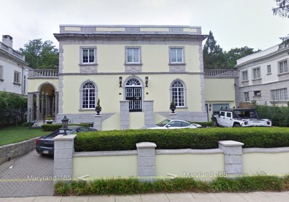
For years, I’ve driven past the revival palazzo–the one with the Hummer and the Ferraris and the Porsche, the one that’s just the exactly wrong color of chiffon yellow–on my way in or out of town, and I’ve wondered who? And then I saw him walking the little dog, the portly man with the toupee the colors of a red ruffed lemur. I am now at peace.
Neuester Himmels-Atlas, By Christian Goldbach
Just another, particularly beautiful, addition to the list of sky atlases throughout history which showed the entire universe. Or the known universe. Or the known universe that they could show:
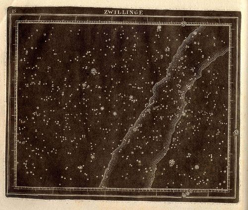
Zwillinge (Twins : Gemini), a 1799 constellation map by Christian Goldbach from his book, Neuester Himmels – Atlas . Here is some discussion of Goldbach’s depiction and technique, from the Linda Hall Library, where a full scan is available:
“The print style and technique was unusual. White stars are shown against a black background. The first pressing was made before the constellation figures and text details were added. These prints looked like a night sky. Then the finished plate was printed once more, providing a comparison with figures. The copper plates were printed in relief rather than the more common intaglio. While not the first to use this technique, his atlas was very influential on those that followed. His maps represent the stars with a Flamsteed projection.”
[image via USNO rare book library by way of bibliodyssey]
Gene Smith And The Jazz Loft Project
I’m diggin’ the crazy cats at WNYC and The Jazz Loft Project. After abandoning his family in Westchester, longtime LIFE photographer W. Eugene Smith wired his 6th Ave loft for sound and recorded the hell out it for several years in the 1950s. Until 1998, no one had ever listened to the 4,000+ hours of tapes in Smith’s archive. Turns out they held the conversations, practice sessions, and jam sessions, and hundreds of jazz musicians, and they captured a remarkable slice of mid-century downtown/underground New York City.
They’re up to Episode 6 right now. Ep. 7 will be about how “urban pioneers in New York’s Flower District find ways to make lofts more livable.”
Catch up with the series and check out the enticing web extras at WNYC’s Jazz Loft Project page [wnyc.org]
Shaquille O’Neal Curates An Art Exhibit
Well known Twitter pioneer Shaquille O’Neal is curating an exhibition next February titled “Size DOES Matter,” which will look at the issue of scale in contemporary art. The show will take place at the Flag Art Foundation, which was founded by the collector/greg.org friend Glenn Fuhrman. In reporting on Bloomberg’s initial report, the LA Times’s David Ng talked a little critic trash:
One has to wonder how much “curating” O’Neal actually did for the exhibition and whether the whole thing is just a savvy publicity stunt for the Flag Art Foundation, whose main backer is collector Glenn Fuhrman, a co-managing partner of MSD Capital LP.
Since no one put scare quotes around “curating” or questioned the Louvre’s motives when they asked non-curator Umberto Eco to curate an exhibition, I will assume that Ng is really referring to the way everyone from bloggers to windowdressers are curating now.
Shaquille O’Neal, art curator? [latimes.com, original hed: “Shaquille O’Neal says curating is no slamdunk” ]
Umberto Eco Curates An Art Exhibit
‘We Like Lists Because We Don’t Want to Die’
The headline was glib enough that I waited several days before actually reading it, but Spiegel’s interview with Umberto Eco does turn out to be worth it.
SPIEGEL: But why does Homer list all of those warriors and their ships if he knows that he can never name them all?
Eco: Homer’s work hits again and again on the topos of the inexpressible. People will always do that. We have always been fascinated by infinite space, by the endless stars and by galaxies upon galaxies. How does a person feel when looking at the sky? He thinks that he doesn’t have enough tongues to describe what he sees. Nevertheless, people have never stopping describing the sky, simply listing what they see. Lovers are in the same position. They experience a deficiency of language, a lack of words to express their feelings. But do lovers ever stop trying to do so? They create lists: Your eyes are so beautiful, and so is your mouth, and your collarbone … One could go into great detail.
SPIEGEL: Why do we waste so much time trying to complete things that can’t be realistically completed?
Eco: We have a limit, a very discouraging, humiliating limit: death. That’s why we like all the things that we assume have no limits and, therefore, no end. It’s a way of escaping thoughts about death. We like lists because we don’t want to die.
Interviews and breathless features about Eco are popping up everywhere because he has been a “Special Guest Curator” at the Louvre. The resulting show, “The Infinity of Lists,” [1] is open through Dec. 13. Previous Special Guest Curators include Robert Badinter, Toni Morrison, Anselm Kiefer and Pierre Boulez. The Special Guest Curator program is absolutely not a publicity stunt. As Jean-Marc Terrasse, Eco’s handler at the Louvre for the last two years explains in The Art Newspaper:
Umberto Eco is an ideal guest for many reasons. He is a man who has worked in all the artistic disciplines and who thinks at great speed and has thousands of very lucid ideas. He is a particularly interesting personality because he has a very clear, erudite vision of the art world, combined with a particular ability to marry high culture and pop culture, the sublime and the profane, the arcane and the new.”
The Louvre’s next Special Guest Curator is film director Patrice Chareau.
[1] Actually, the show turns out to be called “Vertige de la Liste.”
I GET IT. Le Corbusier Was A Totalitarian
Wow, who tore up Theodore Dalrymple’s urban fabric and replaced it with a tower in a garden?
If there were no conservative polemic blogs for cranky, reactionary modernism haters, I’m sure the Manhattan Institute would’ve invented them. Oy.
The Architect as Totalitarian [city-journal.org via @bldgblog]
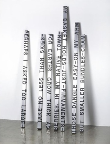
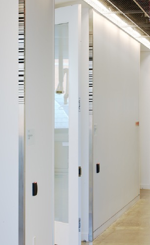
The Roni Horn Memorial Signage System
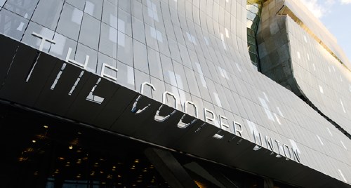
Pentagram has nice coverage of Abbott Miller’s work for the crisp signage and graphics systems at Thom Mayne’s spectacular new building for the Cooper Union.
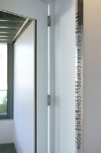
Which looks, in some of its particulars, quite like Roni Horn sculptures.
I look forward to hearing that Cooper Union students and faculty eventually learn to read the backsides/bottoms of the signs, too. And that the barcode-like patterns start to appear on peoples’ business cards. [Do professors have business cards?]
Kind of like how Rem Koolhaas/AMO made that awesome proposal for an EU flag by extruding the colors of all the member states’ flags across the field.
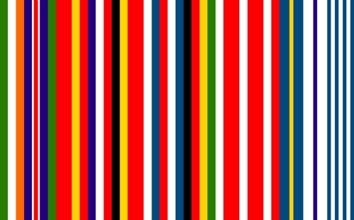
If I were a hostel-type, would definitely sew that on my backpack.
New Work: The Cooper Union [pentagram via greg.org reader br]