
[2022 update: the video was deleted from youtube, but the page remains in the internet archive.]
Angry crowd surrounds a fleeing Sarah Palin bus and shouts, “Sign our books!” and “Quitter!” You go to the bookstore with the mob you have, I guess, not the mob you want.
priceless angry comments on rumproast via @felixsalmon]
Correction: A Serra NOT Named Bellamy
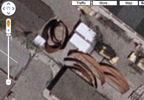
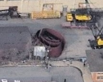
So last winter, after finding Jake Dobkin‘s, and Nathan Kensinger’s photos during my search for Richard Serra sculptures visible on Google Maps, I got a little fascinated with the massive Cor-Ten sculptures Richard Serra stores in a riverfront machine yard in Port Morris, the Bronx. Google Maps showed a Torqued Spiral as well as several long, arced steel pieces [above]. A presumably more recent image from Microsoft Live/Bing [below] only shows the spiral.
After talking to some friends at Gagosian and because there is a giant I-beam with “Bellamy” on it, I’d originally deduced that the Torqued Spiral was Bellamy one of Serra’s first spiral sculptures, which he’d shown in the fall of 2001.
But that turns out to be wrong. Writing about her visit to the stored Serra for the journal Afterall, Mary Walling Blackburn reports that it is not Bellamy after all. Bellamy is currently in England.
The “Bellamy” I-beam on-site [visible in Nathan’s photos], is apparently not a nametag or some such. Instead, they are used for stabilizing the curved pieces during transport and installation. They can be seen in use in Art21’s series of photos of Joe being installed at the Pulitzer Foundation in St. Louis.
So that begs the question: what Torqued Spiral is it, then? Inquiring minds might want to ask the artist next time they see him. I know I will.
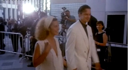
Finally, Sarah Palin’s Stylist Comes Out Of The Closet
Now the truth can be told, says Lisa Kline, the New York corporate stylist who was called in on a moment’s notice over Labor Day weekend by the McCain campaign to provide clothing and hair and makeup for, first, Sarah Palin, and then her entire clan. The result: a politically damaging $150,000 designer clothing shopping spree at Neiman Marcus that clung to the giant, phony Palin ship like a noxious fart cloud until it finally ran aground on election night. Or, uh, something like that.
Now that Sarah Palin has swum to shore and is settling scores with McCain staffers and her “New York stylist” in her book, Kline has finally agreed to tell her side of the story to the NY Times.
It’s good, nostalgic reading. But the most important thing Sforza-wise is to clear up some early reporting on the story that I did here on greg.org, and possibly burnish the good name and credibility of one of my sources.
On October 22, 2008, soon after the $150,000 shopping spree story broke, I was combing through the McCain campaign’s financial filings, when I spotted both the stylist’s name, Lisa Kline, and the name of a Minneapolis baby store, Pacifier, which I recognized from my dadblogging activities. [I’d first tried to identify what kind of stroller the campaign had supposedly purchased for the prop baby Trig.]
The most prominent stylist named Lisa Kline I could find was from Los Angeles, a boutique owner who worked with Paris Hilton. I tracked down a video of her, showed it to Jon, the owner of Pacifier, and asked if he recognized her. He said he was “pretty sure” he did. It took a couple of days before I could track down LA Lisa Kline to deny her involvement.

In her Times story today, Lauren Lipton mentions this East Coast vs West Coast Kline controversy. But now that we have NY Kline’s photo [right], I think Jon’s eyewitness account bears out. Those two stylists named Lisa Kline do look an awful lot alike.
Only Her Stylist Knows for Sure [nyt]
Previously, 10/22/08: NO WAY: Did Sarah Palin Use Paris Hilton’s Stylist??
Sarah Palin’s shopping spree is so Sept. 10th
What I Looked At Today [Until My Eyes Glazed Over] – Goethe
I don’t know who Bruce MacEvoy is, but his is the most exhaustive series of comparative analyses of various theories of color theory I’ve found. [aha. A web guy/artist who sold YHOO better than I did.]
As I debate in my mind whether to order paint colors for my Dutch Landscape paintings or to mix them myself, I find once again that painting, which I thought I knew something about, has deep historical, theoretical, and practical tranches which I’d never seriously considered.
Anyway, here’s a tiny bit of MacEvoy’s discussion of Zur Farberlehre (1810), the monumental, idiosyncratic, combative, and too-obscure treatise/polemic on color that consumed Johann Wolfgang von Goethe for nearly two decades:
This approach is exemplified in the watercolor Color Magnet (right), painted after a long evening discussion about the “polarity” of color with the poet Friedrich Schiller. The short vertical bars (far right) represent primordial yellow and blue refraction fringes (discussed below); the curved bars (at left), which are drawn to resemble the curve of iron filings across the opposing poles of two magnets, show the mixtures that result when “attracting” fringes are overlapped to produce the “union” mixture green (below) and the “deepening” extraspectral mixture purpur (above). These combinations produce Newton’s spectrum (horizontal bar, center bottom) and the extraspectral purples (horizontal bar, center top). Linking all mixtures together end to end, just as bar magnets can be linked at their opposite poles, produces the central vertical bar, the circumference of the hue circle, with the light emitting colors of sun and sky at the center. There is an almost mystical simplemindedness in this pursuit of patterns, resemblances and associations, but it is the essence of the Goethean approach to color.
Unfortunately, Goethe’s ambitious project has been rendered incoherent both by the deleted sections and by the English translation title: Farbenlehre simply means “chromatics,” with no “theory” implied (just as Sprachlehre means “grammar” and not “theory of speech”). Given Goethe’s sensitivity to language, it is not irrelevant to note that the root meaning of lehre is “lesson,” “teaching” or “learning from experience”. In the same way that a grammar of language simply describes the patterns in how we speak, Goethe wanted to develop a holistic “grammar” of color that describes how color behaves. He was looking for patterns in color experience — not for a theory of colors extracted from physical experiments. This makes his book an important precursor to German phenomenology. All these complexities have disappeared from the truncated English version of the book.
And then there’s this bit from further down, which seems to sidle up to the edge, to so speak, of these discrete polygons of algorithmic color I will paint:
Next, in what he motivates as a pedagogical move, Goethe illustrates the “primordial” shadowing or distorting of images with the colors produced by a prism. These illustrate what is probably the central analogy of his book: that color, to the extent it has an external, physical origin, results in the blending of edges or boundaries between dark and light; edges are both the essential element of an image and the primordial cause of color appearance:
“[When viewed through a prism], we have found all unbroken surfaces, large or small, to be colourless, yet at the outlines or boundaries [edges], where the surface is relieved upon a darker or lighter object, we observe a coloured appearance. Outline, as well as surface, is necessary to constitute a figure or circumscribed object. We therefore express the leading fact thus: circumscribed objects must be displaced by refraction in order to exhibit an appearance of colour.” (¶197-198)
Not that Goethe was at all correct, of course. [Or as MacEvoy puts it, “Even when charitably summarized, Goethe’s theory of color is incomplete, inconsistent and incomprehensible.”] But it’s still kind of fascinating.
Fischer Foul?
Is Charlie Finch feeling left out? In his new column on artnet, Finch downplays the New Museum’s Dakis controversy–by throwing out several blind items he thinks are even bigger, yet unacknowledged scandals, including a claim he made in his Urs Fischer smackdown two weeks ago that, apparently, no one noticed, cared about, or believed:
The Fischer show is nothing but market driven, specifically by one collector with a heavy position in Fischer who has contributed mightily to the cost of the show and will handsomely reap the awards at future auctions. This is why Fischer provides the gullible, conformist art crowd with a whole floor of shiny boxes bedecked with consumer images, that is nothing more than a dull rehash of Andy’s Brillo boxes.
Do you see the difference in subversive mojo between a jarring one-off like [Warhol’s] Tunafish Disaster, which continues to project real dread and uncertainty, and a charlatan like Fischer regurgitating the Duchampian template for the cynical purpose of market domination? It’s not that difficult, pass me a spare rib.
I can’t think of anything less eyebrow-raising than a collector who buys a lot of an artist’s work also supporting his museum show. But Finch somehow sees Fischer’s case as atypical. So who’s the manipulator? Looking at the list of sponsors, it could really be anybody [anybody but Dakis, he says]: I see Peter Brant, Adam Lindemann, Eugenio Lopez, Francois Pinault, Steven Cohen, and David Teiger. Pinault’s already given Fischer a show in Venice. Lopez, Cohen, and Teiger aren’t really speculator types, at least on Fischer’s level or the compressed time frame Finch is hinting at. So that leaves Brant and Lindemann. And Finch’s “spare rib” non sequitur could be a reference to Adam.
But then, so what? Adam’s not hiding his Fischers; he puts them on his lawn. And he’s not ducking the market, either. He backed a gallery, then married one of the partners, and he rather famously netted $15 million by flipping a Koons heart sculpture, via Sotheby’s, right back to/through Gagosian. Whoever they turn out to be and however big or small the scandals, Finch’s blind items are really just meant to bolster his own insider status when the larger conversation seems to be passing him by.
Gehry & Calatrava: The Set Designers Meet Sivaji: The Boss
Spectacularious music video for “Style,” a song from Shankar’s Sivaji: The Boss [2007], the most expensive and highest grossing Indian film in history. It was shot on location in Spain, and stars Rajnikanth [b. 1950], the superstar of Tamil cinema, as a–oh, who cares what the plot is? We’ve come a long way from watching bad VHS dubs on “Namaste America” [Saturday night on Manhattan Cable’s leased time channel], let me tell you.
This was my favorite production blurb from Sivaji: The Boss:
5. The team of Shankar saw important footages of most of Rajnikanth’s films since his debut in 1975. They found that Rajnikanth looked best in Padikkadavan (1985) film. Then Shankar summoned the make-up artist to come up with a similar hairdo for Rajnikanth 22 years later.
6. Rajnikanth donned 15 different hair styles for this film. He also tonsured his head and shaven off his mustache for a get-up in this film. A make-up artist from France is flown in for this purpose.
Until I found this. Turns out they used CG to lighten Rajnikanth’s skin in “Style,” to show “how the superstar would look had he been a European.” They cloned the skin tone of a British backup dancer frame by frame. Took over a year.
Which I guess makes Rajnikanth the Tamil Bruce Willis and Sivaji: The Boss the Indian Hudson Hawk.
Here’s a higher-quality version of “Style” than the one at everythingisterrible.com. [via afc]
The Mystery Of What To Eat At The Sphinx
This has to be one of the funniest pullbacks ever.
The Player
I can’t say how I feel about Francesco Vezzoli’s work; that’s not how my mama raised me. I will grant though, that he’s extremely smart and astute and has successfully identified an elemental dynamic of the art world and makes highly successful art that taps into that dynamic. OK, fine. his work embodies almost every superficial, vapid, self-unaware, pseudo-celebrity, luxury consumerist aspect I hate about the VIP Preview art world.
So bully for him that he’s turning the MoCA gala benefit tonight into the set for a performance/piece? This faux-ambivalent account of Vezzoli, his date/star Lady Gaga, and the preparations for the event in the LA Times makes for hilarious reading. I’m sure the event will be the biggest, starchasing cluster$%#& at MoCA since Tom Ford and Naomi Campbell turned the Takashi Murakami dinner into a commemorative plate-stealing riot.
Alas, Vezzoli’s use of art to hustle celebrities into working for free unfortunately reminds me of someone I actually like: Robert Altman. To shoot the benefit scene in The Player, where Tim Robbins’ murderous studio honcho Griffin Mills is honored by several hundred of his best celebrity friends, Altman threw a real fundraiser for LACMA, complete with black & white dress code, then hustled all his celebrity friends to attend–then he filmed them for scale for his movie.
At least now I can finally make sense of Lady Gaga: she is post-op Cher.
Francesco Vezzoli escorts Lady Gaga to MOCA’s gala [lat]
Project Echo & Satelloon Conservation
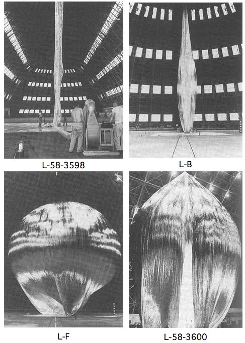
The first Project Echo satelloon may have started out as a 100-meter sphere, but it didn’t stay that way. Echo IA launched on August 12, 1960, and it stayed in orbit and visible to the naked eye until May 24, 1968. It inflated successfully, but as a paper in Bell Labs Report, Sept. 1961 explains, by May of that year, its shape had already been somewhat deformed in orbit:
On several early passes the average “scatering cross section” was equal to that corresponding to a perfectly conducting 100-foot sphere. From this it is assumed that the balloon inflated as planned.
There apparently has been a long-term decrease, of a few db, in the average “scattering cross section.” As of last May, Echo I [technically IA, since Echo I burned up soon after launch in March 1960] was probably an approximately spherical object with a diameter of no less than 70 feet, and a somewhat wrinkled skin. There may have been a few flattened areas, as indicated by occasional deep fades in the radar signal, but voice communication was then still possible as shown by successful tests with NRL on May 25.
One factor may have been the solar sail effect, the slight pressure generated by photons from the sun bombarding the satelloon’s skin.
image: The Odyssey of Project Echo [history.nasa.gov]
What I Looked At Today – Alex Brown

Though they’re pixelated abstractions, and though they’re almost as likely to be landscapes as people, Alex Brown’s paintings feel a bit like the opposite of what fascinates me about the Dutch Landscape paintings I’m working on.
From a q&a with Brown that accompanied his most recent show this February at Feature:
.who or what are some of the things that inspired your interest to have your work delve into the interdependent relationship of representation and abstraction? Lack of skill as a painter in a more traditional sense of the word? Unwillingness to give you a clear picture of what’s really going on in my brain?
That relationship is a direct result of the manner in which I have chosen to paint. I have always been confused by abstraction. Confused because of a lack of orientation. Taking something realized and turning it into something unrecognizable makes sense to me. I try not to think in those terms so much. They’re all just paintings and some look more like something that you’ve seen in your experience than others do. It all trickles down in varying degrees from a clear source image to finished painting. My abstractions are really just less than overly clear realizations.
Brown developed his approach after realizing he can’t paint straight; he deploys a grid and a filter on an undistorted source image, then painstakingly transfers the result to canvas. I imagine it’s a process similar to Chuck Close’s, whereby a photo is reconstituted, pixel-shaped abstract blob by pixel-shaped abstract blob.
But the distorting abstractions that unmoor the image from its specific subject and turn it into a painting are all Brown’s. The abstract polygons in these Dutch Camo Landscape images have all been put there by someone else–who wants to obscure and despecify the underlying representation. In an odd, inverted sense, paintings of them will look abstract, but will be representational.
Anyway, there are many more wonderful images of Brown’s work at Feature’s website. Above: Fairgrounds, 2008 [featureinc.com, thanks 2 coats of paint for the reminder]
Before There Were Satelloons: Prof. Thaddeus SC Lowe And The Union Army Balloon Corps
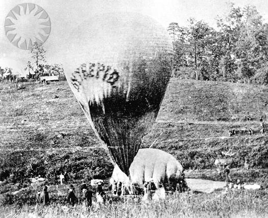
Thaddeus S. C. Lowe was once one of the country’s most famous aeronauts. His grand plan to fly a balloon across the Atlantic was shelved by the outbreak of the Civil War. He preferred to be called Professor. On July 11, 1861, with the help of Prof. Joseph Henry of the Smithsonian Institution, Lowe demonstrated the aerial reconnaissance capabilities of his varnished silk, gas-filled balloon Enterprise by ascending 500 feet above the Columbia Armory [on the site of the National Mall where the National Air & Space Museum now stands] and transmitting the first aerial telegram to President Abraham Lincoln.
Like many first messages, Lowe’s telegram is mostly about itself:
This point of observation commands an area near fifty miles in diameter. The city with its girdle of encampments presents a superb scene. I have pleasure in sending you this first dispatch ever telegraphed from an aerial station and in acknowledging indebtedness to your encouragement for the opportunity of demonstrating the availability of the science of aeronautics in the military service of the country.
Lowe persuaded Lincoln to appoint him Chief Aeronaut and to establish the Union Army Balloon Corps.
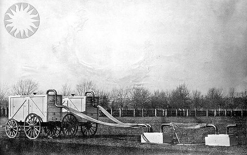
Lowe ordered seven balloons be fabricated in Philadelphia, while portable gas generators were built in Washington:
The generators were built at the Washington Navy Yard by master joiners who fashioned a contraption of copper plumbing and tanks which, when filled with sulfuric acid and iron filings, would yield hydrogen gas. The generators were Lowe’s own design and were considered a marvel of engineering. They were designed to be loaded into box crates that could easily fit on a standard buckboard. The generators took more time to build than the balloons and were not as readily available as the first balloon.
They sound fantastic, and I love the standardized buckboard-scale design. It’s at once obvious and totally subjective. Do any of these things survive?
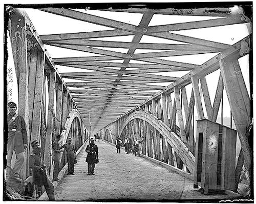
Anyway, even more than the establishment of Balloon Camp, this is my favorite part of the Balloon Corps story, partly because I cross the Chain Bridge at least once a weekday when I’m in DC:
By October 1, 1861, the first balloon, the Union, was ready for action. Though it lacked a portable gas generator, it was called into immediate service. It was gassed up in Washington and towed overnight to Lewinsville via Chain Bridge. The fully covered and trellised bridge required that the towing handlers crawl over the bridge beams and stringers to cross the upper Potomac River into Fairfax County. The balloon and crew arrived by daylight, exhausted from the nine-hour overnight ordeal, when a gale-force wind took the balloon away. It was later recovered, but not before Lowe, who was humiliated by the incident, went on a tirade about the delays in providing proper equipment.
The Balloon Corps continued with somewhat more success until Lowe resigned in 1863. The top photos are credited to Matthew Brady and date to 1862. They are from the Smithsonian’s collection of awesome, unnecessarily watermarked public domain photos of military and scientific balloons. The bridge one is from wikipedia.
On This Spot [blog.nasm.si.edu]
Union Army Balloon Corps [wikipedia]
What I Looked At Today – Hiropon Factory
![]()
I didn’t realize it until I surfed across this half-pixelated Takashi Murakami painting, but I have Murakami’s factory lodged in my brain as a model of digital-to-analog painting and production.
Back before the whole Louis Vuitton thing, even before Kaikai Kiki, I used to go to Hiropon Factory, Murakami’s Brooklyn studio, somewhat regularly. It seems quaint now, compared to the scale of the Murakami machine. But there’d be teams of painters carefully translating computer-generated illustrations to canvas, one mixed-and-matched color at a time. It was a Superflat paint-by-numbers.
For all the hype, there’s something refreshingly cynical about Murakami’s practice, which I think looks quite different in a Japanese/Asian context than it does from within the Western Art World.
The group show this painting was in, “Hi & Lo,” was curated by trendchasing fashion guru Hiroshi Fujiwara at the Kaikai Kiki space last October. It included Murakamis and works from Fujiwara’s collection, as well as works by Fujiwara fabricated by Murakami’s staff. And there was merchandise–jeans, tote bags, t-shirts–“which used the paintings as a foundation.”
Except that the paintings themselves are based on something: Murakami’s underlying IP–his characters, visual language, design elements, etc. It’s the same basis which gets translated into products and media from paintings to plush toys to cell phone charms, all at different price points. In the Japanese context, there is no distinction between craft and object and art. It’s a perspective that makes me weigh my own assumptions and motives for making a painting vs a photo vs a print, an edition vs a unique work.
for this image and many more: “Hi & Lo” Curated by Hiroshi Fujiwara and Presented by Takashi Murakami [slamxhype.com]
Hi & Lo Opening [kaikaikiki.co.jp]
What I Thought Of Looking At Today: Tomma Abts
More from Paper Monument, the print version #1, an interesting critique of Tomma Abts’ Turner Prize-winning exhibition in 2006 by editor Dushko Petrovich:
Understatement is of course a wonderful tactic, provided that you first have something to state. Without content, the muted tends toward the silent. If, on the other hand, a painting’s content is the process of painting, then the general feeling drifts toward something worse–a kind of false modesty. It is hard to fault such carefully made, quiet–you could even say flawless–objects, but there is something about their very correctness, about their self-imposed limits, and the absence–or eradication–of risk, that makes their introversion hard to admire.
These paintings have been praised both for looking like early modernist paintings and for not looking like early modernist paintings. I think the trouble stems from the desire to make paintings with no referent. As the vocabulary for this kind of endeavor is inevitably limited (the surface of the painting can’t refer to the surfaces in the world, the color can’t resemble the color in the world, the shapes can’t, et cetera,) a lot of the attempts are going to look like variations: both repeating and not repeating the previous patterns. This brings us back to the screen savers. The lesson seems to be that if you attempt to make a painting with absolutely no referent, this painting will look (a) like previous paintings with no referent and (b) like recently outmoded developments in technology.
But just because it’s impossible doesn’t mean it shouldn’t be done.
The Painting of Triumph [papermonument.com]
Chromatic Modernism Meets Tweeds Catalogue
Oh, Paper Monumentalists, please keep going. The only thing I don’t like about your almost-too-short-to-tweet reviews is that there are too few of them:
Josiah McElheny
“Proposals for a Chromatic Modernism”
September 12 – October 17
Andrea Rosen Gallery
Ruined by a silver-haired power couple (for whom collecting contemporary art obviously constituted foreplay) crowing lustily over the artist’s colored-glass towers while their horrible J.Crew children checked out the Tetsumi Kudo drawings in the back.
[via afc]
Related: “but Mies van der Rohe’s building was a kind of pink.” Modernism: any color as long as it’s white
What I Looked At Today – Dean Fleming
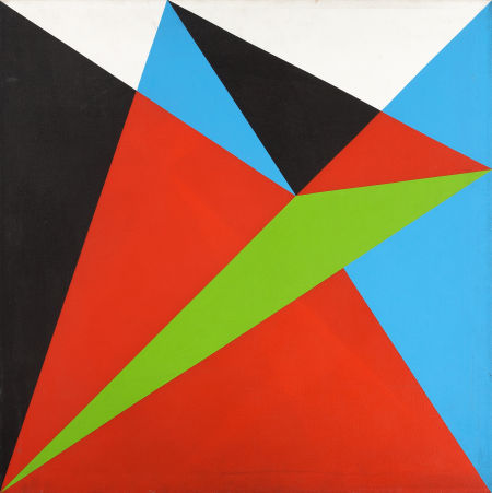
You never know what’ll turn up. In the same sale as that Sheeler study is this 1965 geometric abstract painting by Dean Fleming, one of the pioneers of SoHo. In 1962, Fleming founded the Park Place Gallery, an artist co-op, with a small group of other artists, including Mark diSuvero, Frosty Meyers, and Robert Grosvenor. Their first gallery director was John Gibson, and their second was Paula Cooper. Park Place was the first gallery in SoHo [though technically, it was north of Houston on LaGuardia Place], which made it basically the first center of the New York art world that emerged in the 1960s.
By 1966-7, Fleming was feeling burned out on the art scene/market. As he told Michael Fallon in 2005, “In New York I was the ‘parallelogram’ painter, which I thought sucked beyond belief.” Well, I’m sure no one wants to sit around taping paint edges day in and day out to meet the uptown demand [detail below], but it sure looked great while it lasted.

Fleming’s early 1960s abstraction is proto-minimalist, proto-op-art, a bit of East Coast Hard Edge, if there was such a thing, basically resistant to the canonical categories of 1960s New York as we’ve received them.
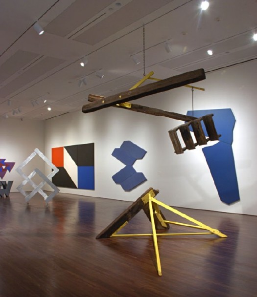
Last year, Linda Dalrymple Henderson curated a show about the Park Place Gallery artists at UT-Austin’s Blanton Museum. Here’s a quote Sharon Butler pulled when she blogged about the show that kind of brings it all home:
“Park Place artists were united by their multifaceted explorations of space. Their abstract paintings and sculptures, with dynamic geometric forms and color palettes, created optical tension, and were partially inspired by the architecture and energy of urban New York. The group regularly discussed the visionary theories of Buckminster Fuller, Space Age technologies, science fiction, and the psychology of expanded perception, and these ideas become essential to their work. Dean Fleming’s paintings of shifting, contradictory spaces were intended to transform viewers, provoking an expanded consciousness. Di Suvero’s allegiance was to Einstein’s Theory of Relativity, and his kinetic sculptures explored gravity and momentum in space.
Buckminster Fuller? No wonder the show looks like The Future. It’s like going simultaneously forward and backward in time. [Here’s a smaller slideshow with bigger images than the truly tiny UT-A site. The parallelogram in the background is the second-best Fleming painting in the show; Lime Line, also from 1965, looks like a perfect companion piece to the square Untitled.]
Fleming’s got a shed full of 50 years of work out back of his 40-foot geodesic dome studio at Libre, Colorado, the artists community/commune he co-founded in 1968. I have no idea what his current stuff looks like, but this sweet example from a fascinating, seminal center of activity that’s long overdue for re-examination looks like a steal.
Lot: 67085: Untitled, 1965, Dean Fleming, acrylic on canvas, 32×32 in. est $1,200-1,600 [ha.com]