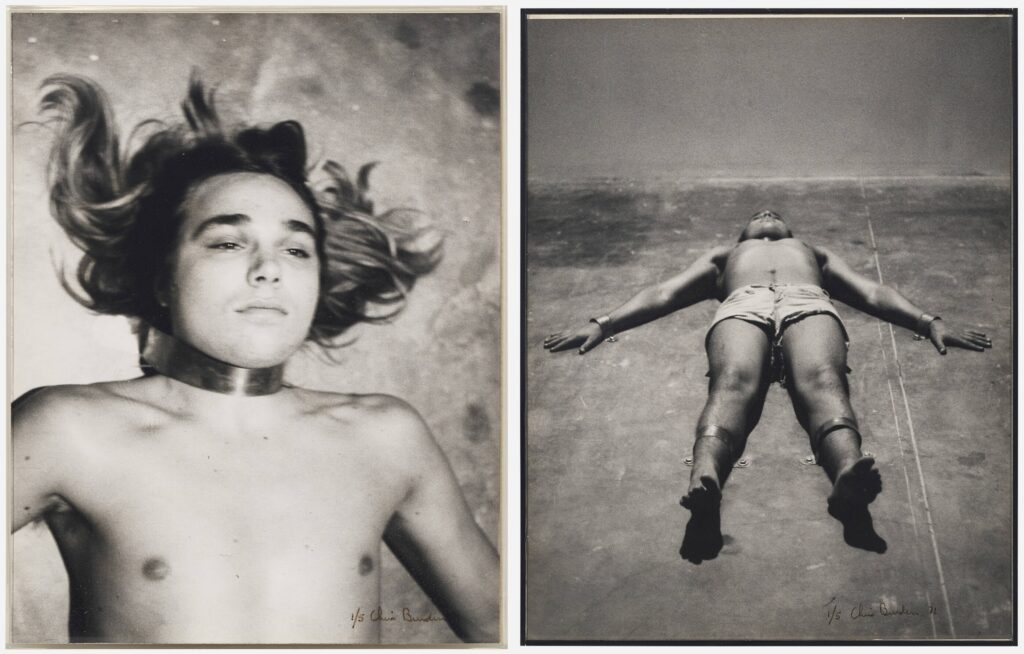
In his peak performance twink era, Chris Burden was not only putting his life on the line for his art, he was selling pictures of him doing it. Or trying to, anyway.
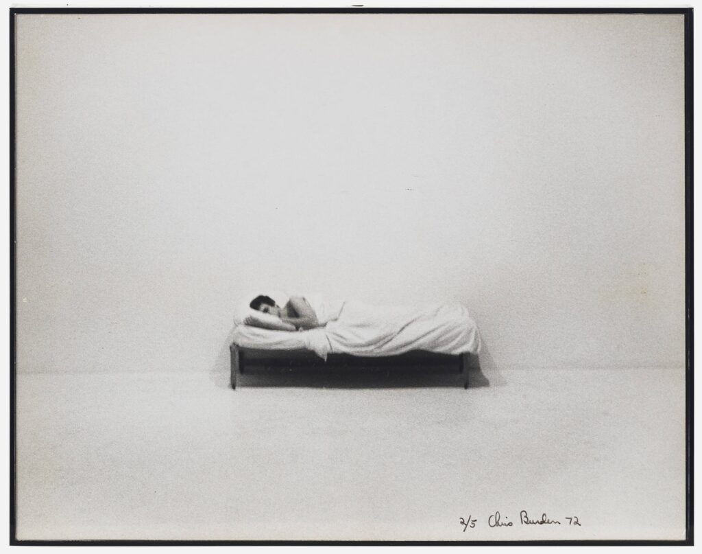
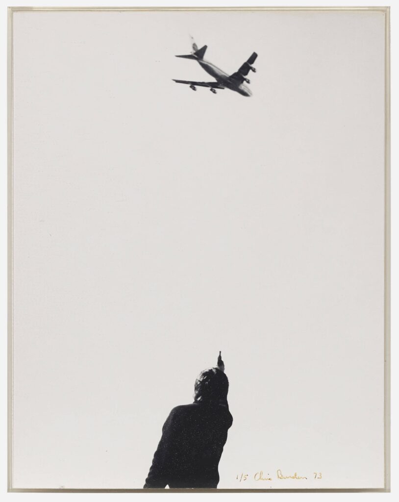
In 1974 Burden released iconic documentary photos of three early performances in an edition of five: Prelude to 220, or 110 (1971), in which he was bolted to the floor next to buckets of water with live electric wires in them; Bed Piece (1972), where he stayed in bed in a gallery for three weeks; and 747 (1973), where he shot at an airplane flying overhead. According to Christie’s in 2000, beside the artist proof they were selling, only one other suite of vintage prints was sold.
Does that mean except for two sets, the other editions of the prints were sold singly? Or that the rest of the edition wasn’t printed or sold until later? I don’t know.
But it does seem like these four prints at LA Modern were there at the beginning. Three are numbered 1/5, and one (Bed Piece) is 2/5. They were acquired by the same person directly from the artist in 1975. They originally turned up for sale together last summer at suite prices, but didn’t sell. Does that make them a suite or nah? Now they’re being sold separately. It’d be wild if they didn’t stay together, though. Burden collector, you know what you must do.
[day later update: hmm, LA Modern sold both ed. 4/5 ($94k in 2017) and ed. 5/5 ($81k in 2022) which were acquired directly from the artist and, if Christie’s is to be believed, were not vintage, but printed later to complete the edition? So maybe Burden collectors are already doing what they needed to keep the sets together. In 1974 Burden also published Chris Burden 1971-73, an artist book consisting of a binder of 53 8×10 photos and text documenting 23 performance works, in an edition of 50. Oddly, the Met’s copy, acquired in 1993, is catalogued with each of the performances separate.]