From Sag Harbor to Monaco to Linz to Cologne to megagallery Los Angeles, the outlook of art world is pretty f’ing dire. Peoples’ critical faculties are failing them. But maybe that just vibes with the rest of the world rn.
five minutes later update: I just read the sentence, “An exceptional team led by Jeff Katzenberg springs into action to produce five weeks of riveting ‘content’ leading up to the Convention…
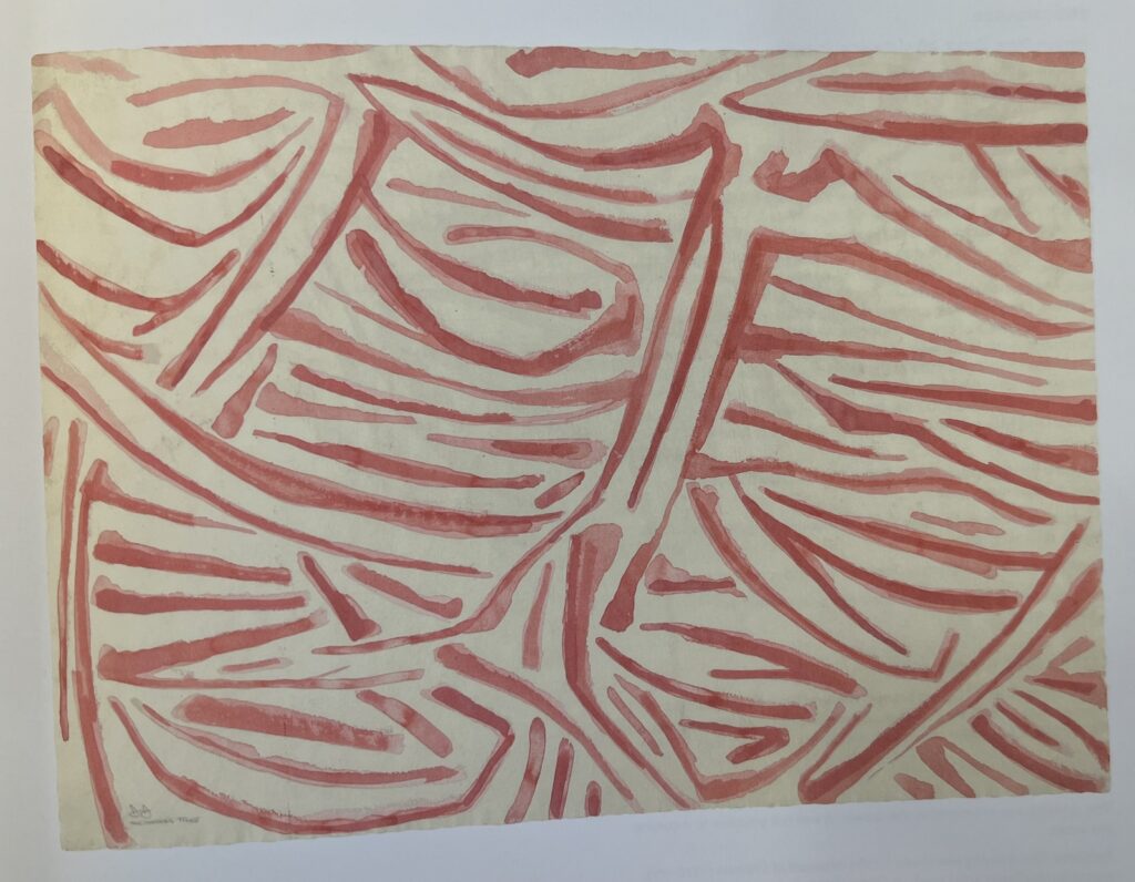
D245: Sketch for The Barber’s Tree, 1975, watercolor on paper, 22 1/4 x 30 1/4 in., collection of the artist, never been shown [at least through 2014], via JJCR-D
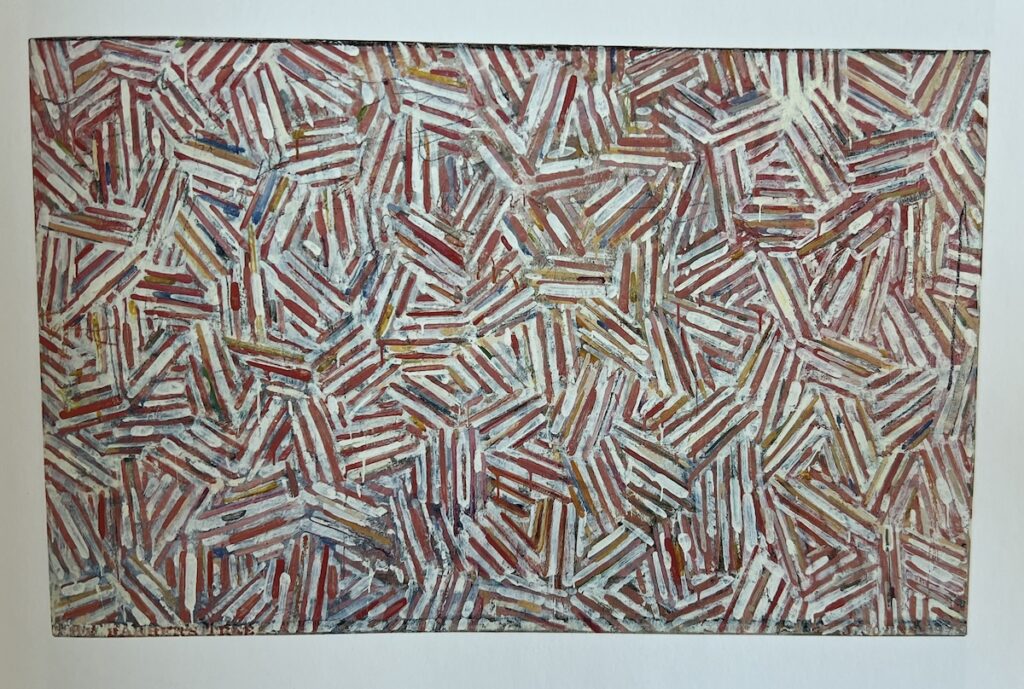
Maybe not being able to find the flagstones motif source, a Harlem wall glimpsed once through a taxi window and then lost, changed Jasper Johns’ approach a bit. Because by 1973, he did take note of the inspiration The Barber’s Tree. At least for the sketch [above], if not the painting, which turned out to be a mostly typical crosshatch motif executed in red and white.
And now we know what Johns knew.
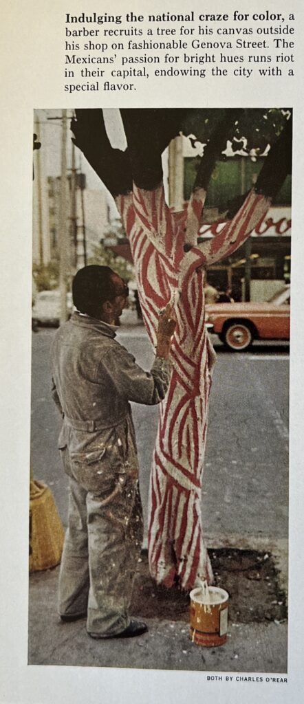
Here is photographer Charles O’Rear’s image from “Mexico: The City That Founded A Nation,” a dispatch by Louis de la Haba and Albert Moldvay from the May 1973 issue of National Geographic.
It is small, and slight, but indeed eye-catching. It’s not clear who is responsible for this cringe caption, though, about “Indulging the national craze for color” and “The Mexicans’ passion for bright hues,” when every barber pole north of the border has the same color scheme.
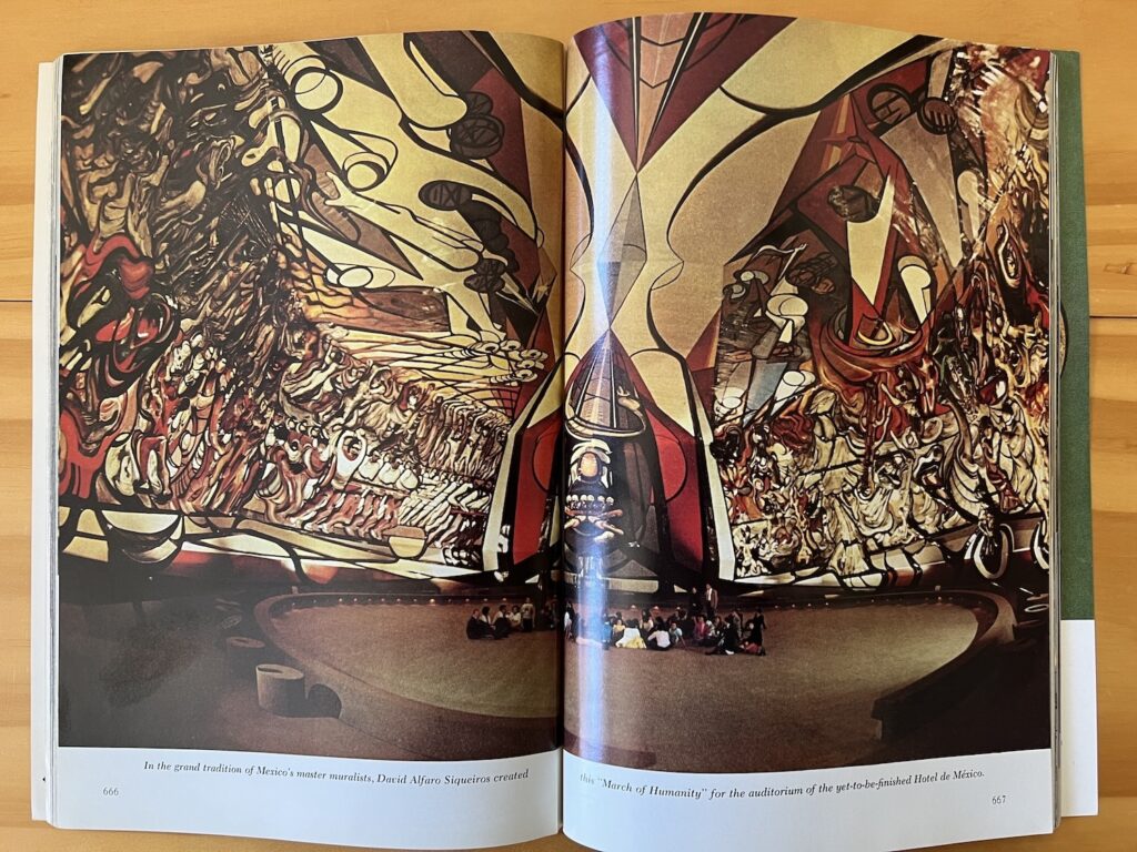
What is notable, perhaps, is that Johns chose this painting—found, vernacular, and anonymous—only after seeing this on the preceding page:
Albert Moldvay’s spread of David Alfaro Siqueiros’ March of Humanity, one page before the anonymous barber painting a tree in Nat Geo May 1973.
Looking on the web for contemporary images of David Alfaro Siqueiros’ absolutely gargantuan mural, la Marcha de Humanidad, in what was supposed to be the auditorium for the Hotel de Mexico, I can’t see that anyone managed to capture it more fully than Albert Moldvay did in 1973. The Mexicans sure have a national craze for murals. Jasper Johns, not so much.
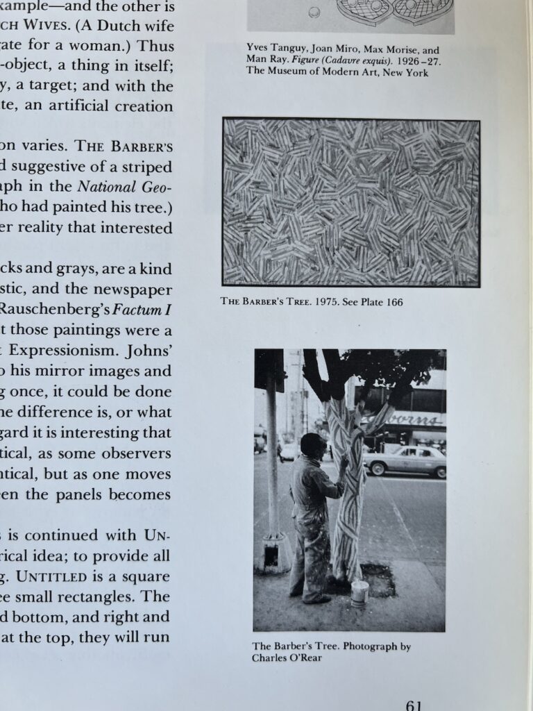
[Next morning update: Joke’s on me, it’s been on my shelf the whole time. While looking for an image of the 1975 painting The Barber’s Tree, I stumbled on it and O’Rear’s photo in Michael Crichton’s 1977 Whitney catalogue:
it was worth $6 to see it in color, I guess, and to discover the Siqueiros. But let’s be honest, without the intervening watercolor, this tree motif feels kind of far from Johns’ cross-hatches.
I’ve been saying it is barber pole-colored, but Crichton describes The Barber Tree (1975) as “flesh-and-blood colors.” Which, you’ll have to trust him, because the catalogue only had black & white images, and it was in the Ludwig’s collection until they donated it to the National Art Museum of China in 1996.
The Barber’s Tree, encaustic and collage on canvas, 34 x 54 in. (87 x 137.8 cm), snapped from the Jasper Johns Catalogue Raisonné, vol. 3 (P196)
Now that they’re all together, maybe the overlapping structure of the cross-hatches is what carries through from the tree. Crichton noted Johns deployed different structures in the cross-hatch paintings of this period, 1973-76, including various degrees of mirroring or duplication. That is not what’s going on here.
She reported on the documentary almost two months ago, and Macdonald told her the same fascinating-to-me thing he told Josh Slater-Williams, that Galliano’s Fall 2022 show was about being the subject of a documentary. Which, if you look at that show, is all kinds of problematic. But.
She also adds so much more context: that it was Anna Wintour who dangled a Galliano documentary on the hook for several years until a director—Macdonald—bit. And crucially, as I read it, that the whole thing pivoted on documentary’s backers at Dior—and LVMH.
The reputation being laundered by the documentary is not Galliano’s—or not just Galliano’s—but Galliano’s collections for Dior. So cooperating effusively was, Macdonald suggested, “a great way for them to say, ‘Okay, we’ve laid that to rest.’ And I think, so, for Dior and for John, I think that was their agenda.”
Galliano near the Met Gala but not at it, fitting Kim Kardashian into a Margiela dress, screenshot via Mikelle Street’s social media
“It is also, of course,” wrote Tashjian-Wise, “an agenda that allows them to make more money off Galliano-designed products.” And so it seems unsurprising that weeks after the documentary dropped, Galliano was declared “the real winner of the Met Gala.” Tashjian-Wise notes that Galliano dressed six celebrities for the Met Gala, including Kim Kardashian, and Zendaya—twice. The actress skipped the co-chairs receiving line at the top of the Met’s stairs to take a second lap outside, wearing a vintage Galliano-era Givenchy.
Both Tashjian-Wise and Chantal Fernandez at The Cut reported rumors that Galliano had been Anna Wintour’s and curator Andrew Bolton’s intended subject this year’s Costume Institute exhibition. After someone at the Met nixed the plan last year, Bolton had to throw together a collection exhibition about spring florals based on a dystopian Philip K. Dick story.
A Wintour-orchestrated, LVMH-sanctioned documentary. A triumphant LVMH-sponsored museum retrospective, and reported “suggestions” that Galliano would return to LVMH. The plan really was going to be, put the antisemitic outrage outrage to rest, and use the Met Gala to launch a rebooted Galliano. The world—and some museum trustees, apparently—have intervened, but it does cast a stark light on the Met Gala as a wholly instrumentalized tool of the luxury industry.
Fernandez’ article on Andrew Bolton gets into the Costume Institute’s weird governance and curatorial shenanigans, but we’ve never gotten a breakdown of the Met Gala’s actual value proposition as the the world’s most extravagant sponcon. It’s a Condé Nast-branded, pay-to-play fashion show, combined with a party giving Vogue advertisers both content opportunities and facetime with celebrities, and the venue gets a cut of the door. And we’re all either too starstruck or too grateful for the fundraising to acknowledge how, beneath the museum’s sheer veil of cultural credibility, the Met Gala is naked.
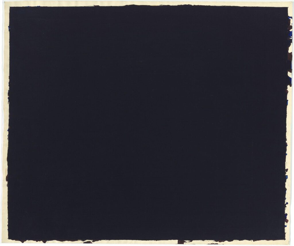
Shoutout to @dailyrothko for bringing this darkest of all Rothkos to light.
Ink on paper, 42 x 50 inches, not titled, dated, or signed, but from 1969, referred to as 1969, and annotated on the back, “no number/ black/ no. 1” in two different corners. In the National Gallery’s collection since the Rothko kids’ gift in 1986, but I’m not sure it’s been shown. I, for one, would love to see it.
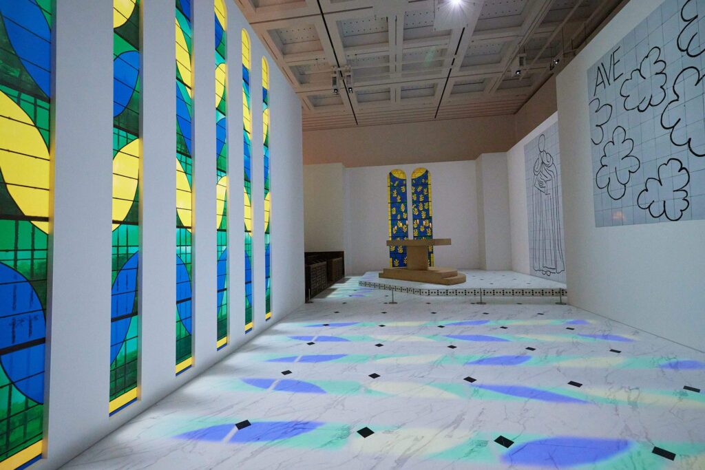
replica of Matisse’s Rosary Chapel in Vence installed at National Art Center Tokyo, via mon oncle
The exhibition, Henri Matisse: Forms in Freedom, at the National Art Center Tokyo includes a full-scale replica of la Chapelle du Rosaire de Vence (1947-51). The experience incorporates simulated daylight on an accelerated loop, as if the replica stained glass windows were the ceiling of the mall at Caesar’s Palace.
photomural of Matisse’s tile Virgin & Child installed at National Art Center Tokyo, via mon oncle
In the caption Chie Sumiyoshi’s Mon Oncle article about the exhibit, it calls the above image a reproduction [再現] of a tile mural. But the only thing tiled here are the sheets of the photomural. The stained glass windows opposite, then, are also photos of the windows, and the wrought iron grates and landscaping behind them. Matisse’s candlesticks are on the replica altar, but Matisse’s crucifix is not.
Matisse’s Stations of the Cross in Vence, from a photo accompanying a 2013 review of a book by the longtime director of the Musée Matisse, in Architectural Review
I can find no images of a Tokyo replica of Matisse’s Stations of The Cross, which occupies the wall that would be directly next to the photographers of the images above. It is a tense and janky tangle that replaces a physical procession with a halting visual search for the next number and the next step. Matisse drew it at scale, with charcoal on the end of a bamboo pole. So the physical experience being replicated would have been not just that of a tourist, but of Matisse himself, standing in front of his work.
If I can find any relevant Brice Marden comments, or if someone gets married in there, I will update this post immediately.
detail of satellite image of Gaza overlaid with destruction data via The Guardian
The commercial satellite data The Guardian used to document the Israeli destruction of neighborhoods, buildings, and fields in Gaza is almost a month old now.
From 1985-87 John Cage worked on one of his most ambitiously scaled projects ever, a full-scale opera created by chance operation. “Europera 1 & 2” debuted at the Frankfurt Oper in late 1987, and they have been an object of longtime interest and fascination on this blog. But because my interest was first in the visual and material aspects of the production—the props, the canvas flats with blown up vintage opera imagery—I missed a key sound element: “Truckera.”
“Truckera” was a 3-minute sound loop made of 101 opera LPs recorded in batches, and mixed down in layers into one “thick” truck-like sound. “Truckera” was to be played by the percussion section of the “Europera” orchestra. Which, fine.
What is wild, though, is that Cage produced “Truckera” live, on air, on the Columbia University radio station, WKCR, with a studioful of turntables and DAT decks and a team of dozens of audio engineers. It took almost three hours.
In between takes and mixes, Cage and host Brooke Wentz chat; Cage reads excerpts of collaged-together synopses from “Europera’s” 12 different programs; and they play recordings of various recent or related works. All the while, the sounds, cues, and logistical banter of audio production continue in the background [or whatever the Cagean equivalent is.]
At times the broadcast feels like, if not quite a Cagean composition, then definitely a Cagean performance, the kind of lecture/musical event Cage did often on college campuses. But it’s actually something rarer: a chance [sic] to eavesdrop on some central moments of Cage’s actual production.
This all comes up now because the Truckera broadcast was recorded, and rebroadcast, and rebroadcast again. WKCR aired it last September 5 to mark Cage’s birthday. And Laura Kuhn, director of the John Cage Trust, just finished airing it—in three one-hour installments—on her weekly show, All Things Cage, on WXGC. I haven’t actually gotten through all three yet, but it’s already the best Cage recording I’ve heard this year.
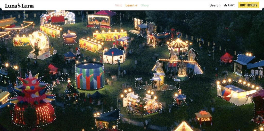
It’s just a couple of minutes walk from 356, south toward the Instagram Influencer Bridge, past the Explore Vatican Immersive Sistine Chapel Experience, to Luna Luna, the Artist Carnival Immersive Experience Drake just installed in a 60,000 square-foot soundstage that’s part of the 18-acre property being assembled by Anderson Real Estate, which owns and manages 4.5 million square feet of commercial properties in California, Hawaii, and the US Virgin Islands.
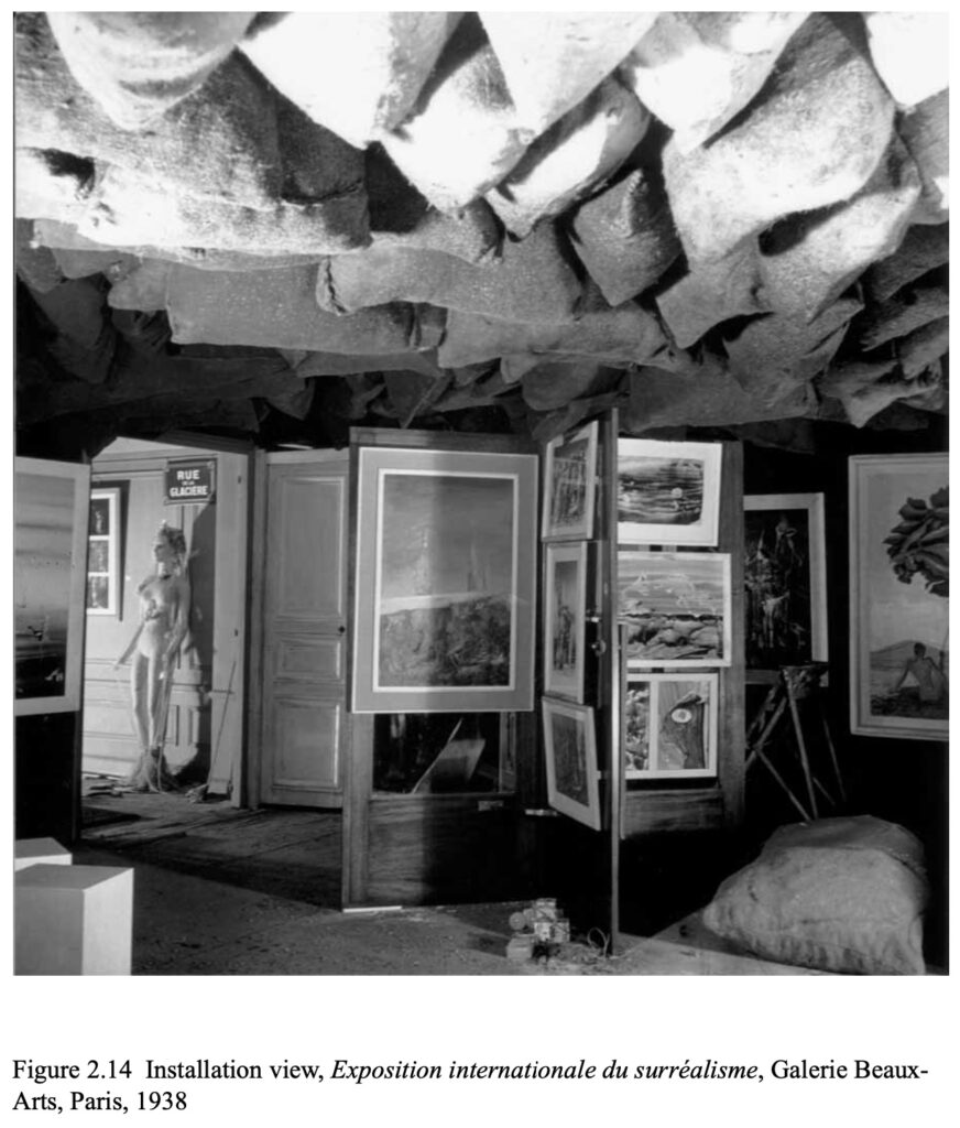
an unidentified photo of Duchamp’s 1938 installation, with paintings hung on one of two revolving doors he put on either side of the perforated iron brazier that provided most of the light. ganked from Elena Filipovic’s dissertation
Specifically, I never really noticed or heard that much about the revolving doors Marcel Duchamp used as exhibition devices in the 1938 Exposition internationale du surréalisme he designed/curated at the Beaux-Arts in Paris. As Murtha pointed out, Duchamp later considered other elements from the show to be artworks—1200 Coal Bags Suspended From The Ceiling Over a Stove, for example—but the doors didn’t get the same treatment. Despite, as I see below, Duchamp’s well-documented interest in doors—and Large Glass works that, you must admit, look rather doorish.
It feels like worlds ago, and world ago all the way down. And also just yesterday.
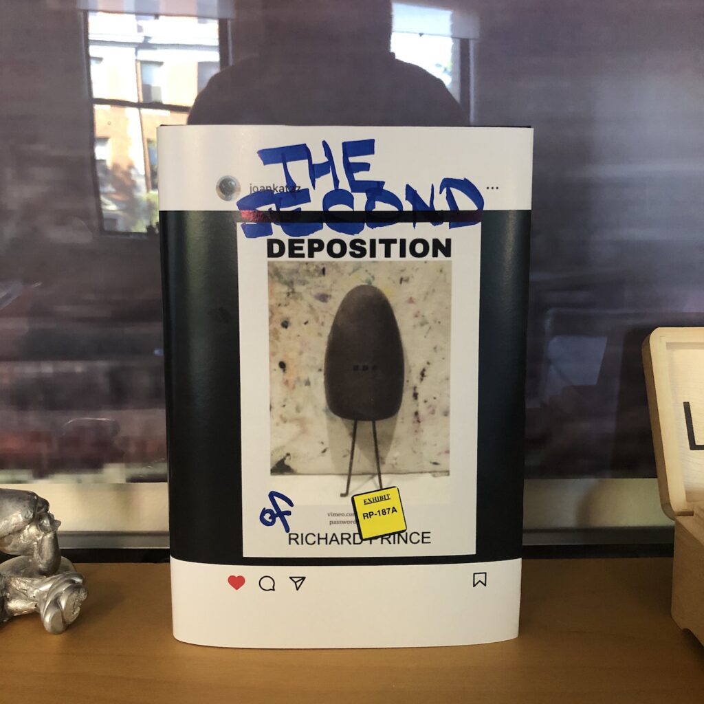
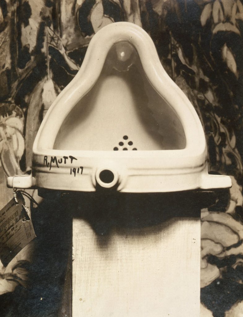
For a few hours in the Summer of 2023, an Instagram account that tracks the work of artist Richard Prince posted a picture of a rusty shoe tree, standing in front of an abstract painting. It echoed the original image of Marcel Duchamp’s Fountain, which Alfred Stieglitz photographed in front of a Marsden Hartley painting in 1917.
Marcel Duchamp’s Fountain, photographed in front of Marsden Hartley’s The Warriors on April 19, 1917 by Alfred Stieglitz
The Instagram image included text elements: DEPOSITION above and RICHARD PRINCE below, with a url and password to an unlisted video file. The video, more than six hours long, appeared to be a recording of Richard Prince’s deposition in a pair of conjoined lawsuits filed by photographers Donald Graham and Eric McNatt, in 2015 and 2016, respectively. Both men objected to photos they took, posted to Instagram by others, which appeared in Prince’s 2014 New Portraits series.
From the jump, the experience of encountering a Sturtevant is different from almost all other artworks. The moment of recognition, of loading up your assumptions and expectations of an artist’s work, of anticipating a certain kind of engagement is the same, until the instant it isn’t. Sturtevant’s work triggers a recognition, and then it thwarts it. When you realize a work is by Sturtevant, you consider how close she has gotten to the artist you thought it was by; then you start marking differences. You may also start to reflect on your upended expectations, and to question the systems that produced them.
July 2023 installation view of Sturtevant’s Gonzalez-Torres Untitled (Blue Placebo), 2004, at the Whitney, via Scott Rothkopf’s IG
And by you, I mean me. And the Sturtevant work that has been confounding me for months is Gonzalez-Torres Untitled (Blue Placebo). The 2004 sculpture is a repetition of “Untitled” (Blue Placebo), a 1991 pour of blue cellophane-wrapped candy. The Sturtevant was acquired by the Whitney Museum in 2016, and it went on view for the first time this summer in “Inheritance,” an expansive collection exhibition about legacy and lineage curated by Rujeko Hockley.
As far as I can tell, Sturtevant only made one candy pour. It was shown at least twice in the artist’s lifetime, and this is the second time since her death. How does it work? What does it do? How does a museum handle it? Is there a certificate?
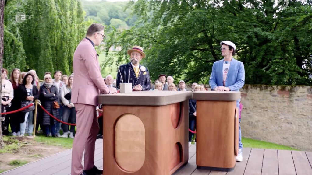
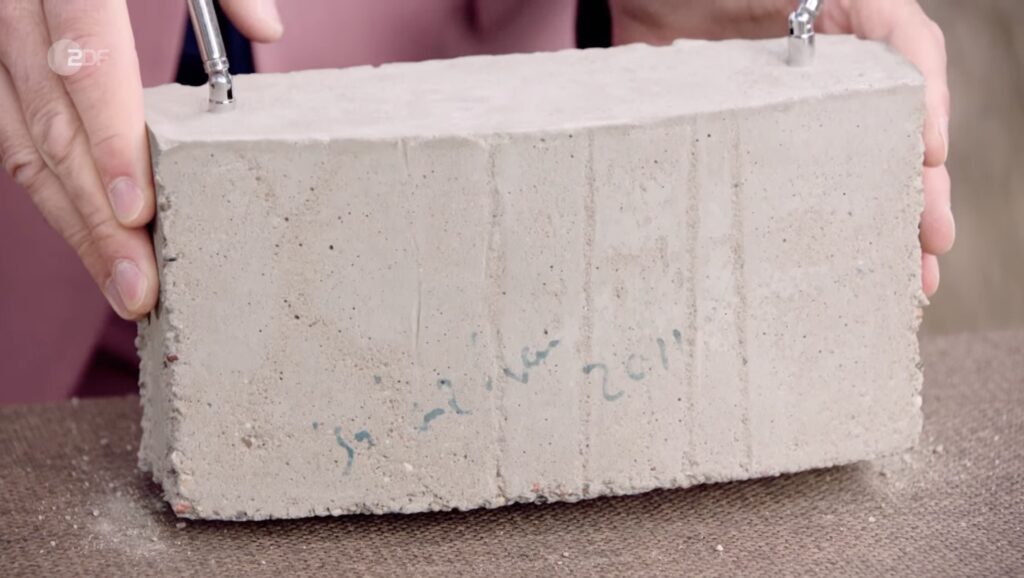
Was ist das at 1h17? an Isa Genzken Weltempfänger on the 6 Sept 2023 episode of Bares für Rares XXL, all screencaps via ZDF
Alex Greenberger has the English report at ARTnews, but there is apparently a German version of Antiques Roadshow called Bares für Rares, or Cash for Rarities, and it is hosted by Jerry Saltz starring in Gilbert & Sullivan’s adaptation of Death in Venice? I don’t really speak German. But that’s not important now. What matters is that an Isa Genzken sculpture was crumbling on prime time German television.
Once I could confirm she included no LL Bean tote bags, I made my peace with not blogging every review and post and image of Cady Noland’s one-room exhibition at Gagosian. But it’s hard to resist, especially in this window before I get to the show in person.
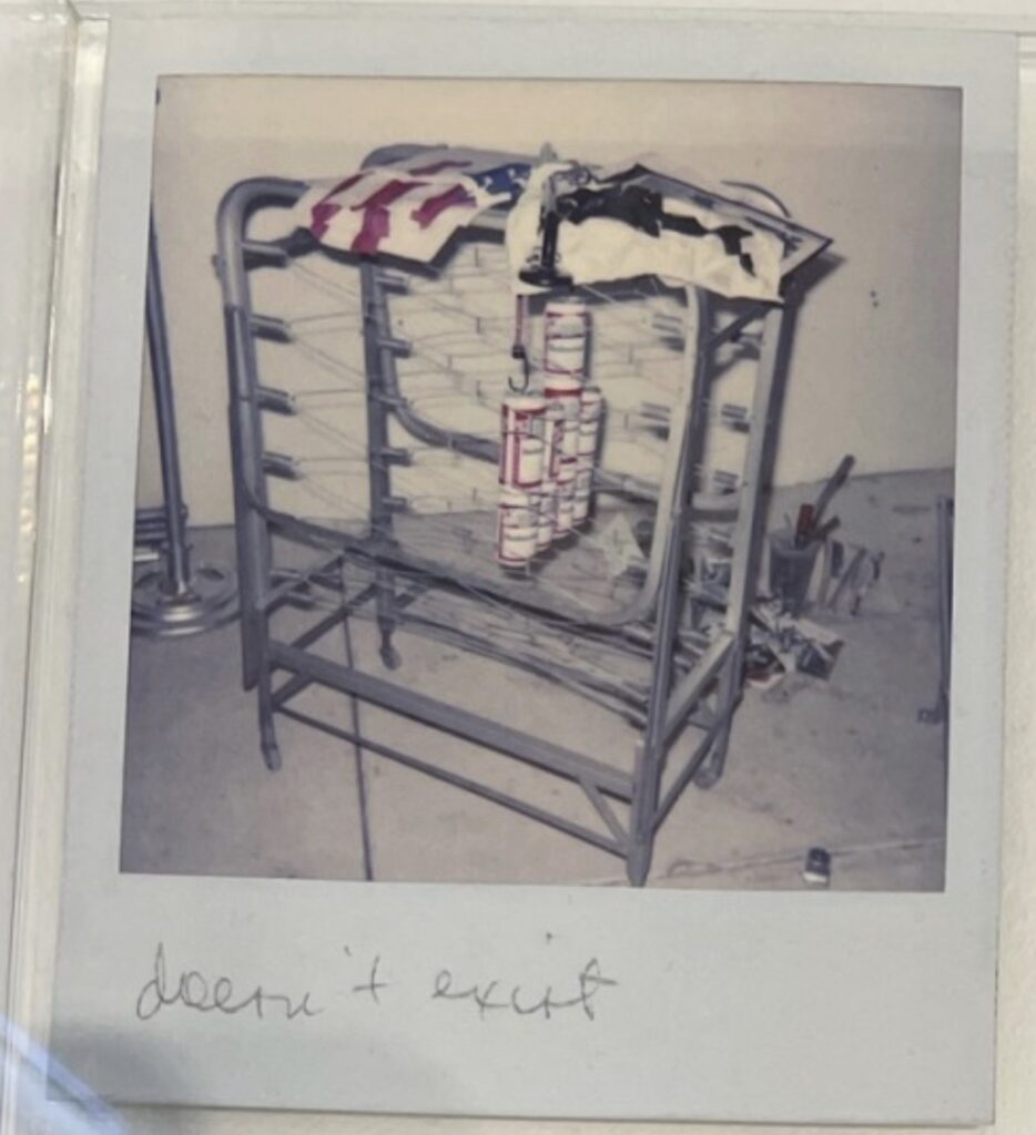
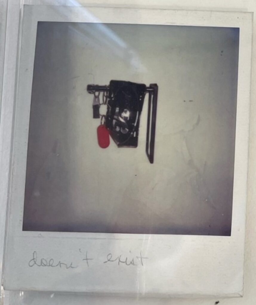
detail of a photo of archival Polaroids from Cady Noland’s exhibition at Park & 75th, showing an undated sculpture with the label, “doesn’t exist,” via octavio-worldAnother detail of the archival Polaroids, with another Cady Noland that “doesn’t exist,” from octavio-world
On tumblr Octavio has posted some intriguing photos that were not in the gallery checklist: a collection of archival Polaroids, some stacks several pictures deep, of earlier installations and details of work. I’m going to wait to go through them more carefully, but I will absolutely rush to post the discovery of a new category of Cady Noland sculpture alongside “destroyed by refabrication” and “disavowed because of damage and conservation shenanigans”:
As the poisoning and destruction of twitter continues apace, I’ve been expending more of my social media energy on Bluesky, which is still in testing mode. The current owner of twitter has apparently taken to disabling accounts that publicize Bluesky or Bluesky invites, but that is fine.
If you are a greg.org reader and would like an invite, please email me. I have a few to share, and would love to see more folks there. First-come, first-served.
[UPDATE: OK, I’m out of invites for the moment, but will share more again when they come.]
[I am also on tumblr, at gregdotorg.tumblr.com, and would love to connect with greg.org readers there, too. Follow and let me find out.]