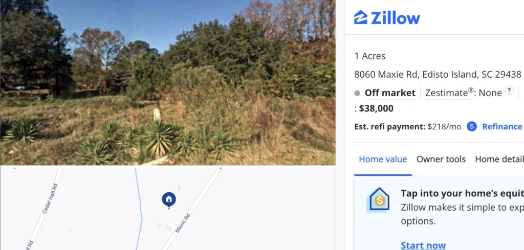
Last Sold: 8/6/2018, Zestimate®: None, Zillow screenshot
Until 2018 Edisto Island meant one thing in the contemporary art world. Then after, it meant another. Or rather, it meant two things. On August 6, 2018, Cameron Rowland bought an acre of land that had once been part of an enslaver’s plantation; then was part of a “forty acres and a mule” Freedmen’s reparations order; and then was almost immediately repossessed by the former enslavers. Rowland bought the land and placed restrictive covenants on its deed that remove any use or monetary value. The land and the deed constitute their work, Depreciation, and Dia just announced stewardship of it.
The work comprises the land and the deed, but that is not all. Depreciation is owned by 8060 Maxie Rd, Inc., a not-for-profit corporation Rowland established to execute the work. The company is named after the land’s address on a road named after the enslavers. Rowland maintains the corporation, and thus ownership of the work, and has put it on extended loan with Dia.
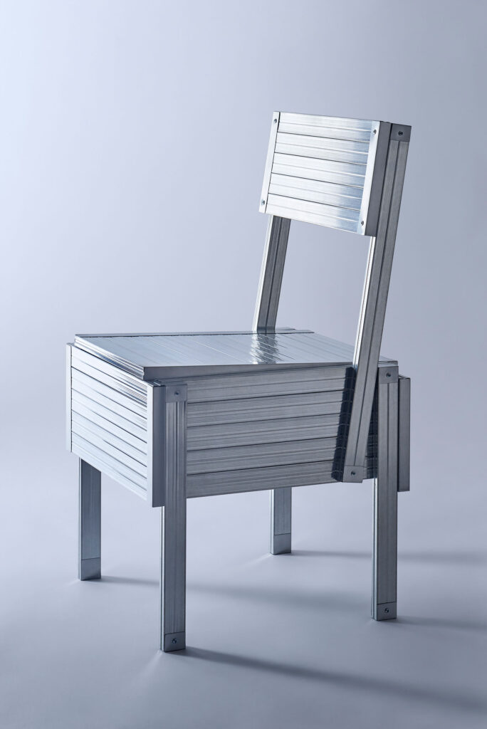
Flow Homage to Enzo Mari, 2022, low gauge steel, for beautifulpeople by Daisuke Yamamoto
Does the algorithm have me? I was unable to resist the suggested instagram post featuring this Enzo Mari autoprogettazione project at the Salone in Milan. But I at least did track down the actual designer and the actual project, rather than credit the insta-clout-chasing design aggregator.
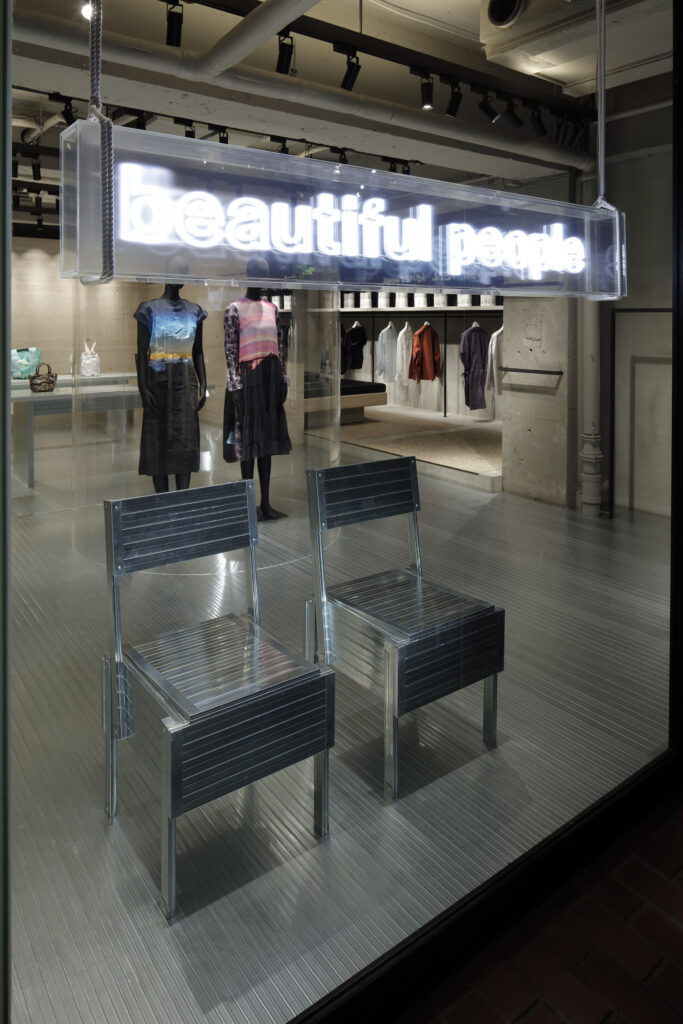
beautiful people unseen archives pop-up made of LGS, including these Enzo Mari chairs, by Daisuke Yamashita, photo Kozo Takayama via IDREIT
Daisuke Yamamoto’s FLOW project is an exploration of material reuse and recycling that proposes to make furniture out of decommissioned light-gauge steel (LGS) beams. In Milano Yamamoto made chairs not only by Enzo Mari, but by Gerrit Rietveld and others. The origins and evolution of the project are documented by the Melbourne-based Japanese design site IDREIT.
ngl, part of the reason I’m running away to the countryside today to see art I’ve just seen is because it’s unexpectedly hard to sit at a computer, at a blog dashboard, and know that Heather Armstrong was around, and now she’s not. Our paths ran in parallel for a long and formative time, and they intersected in many ways, both major and minor, and they diverged. But her voice, her presence, her influence, has been a constant in some form for decades of my life, and it’s painful to know she’s gone. It’s painful, too, to even get glimpses of the suffering and challenges she dealt with, and it is gutting to know that her family and friends will have a hard road ahead. So yeah, I’m going to take a minute.
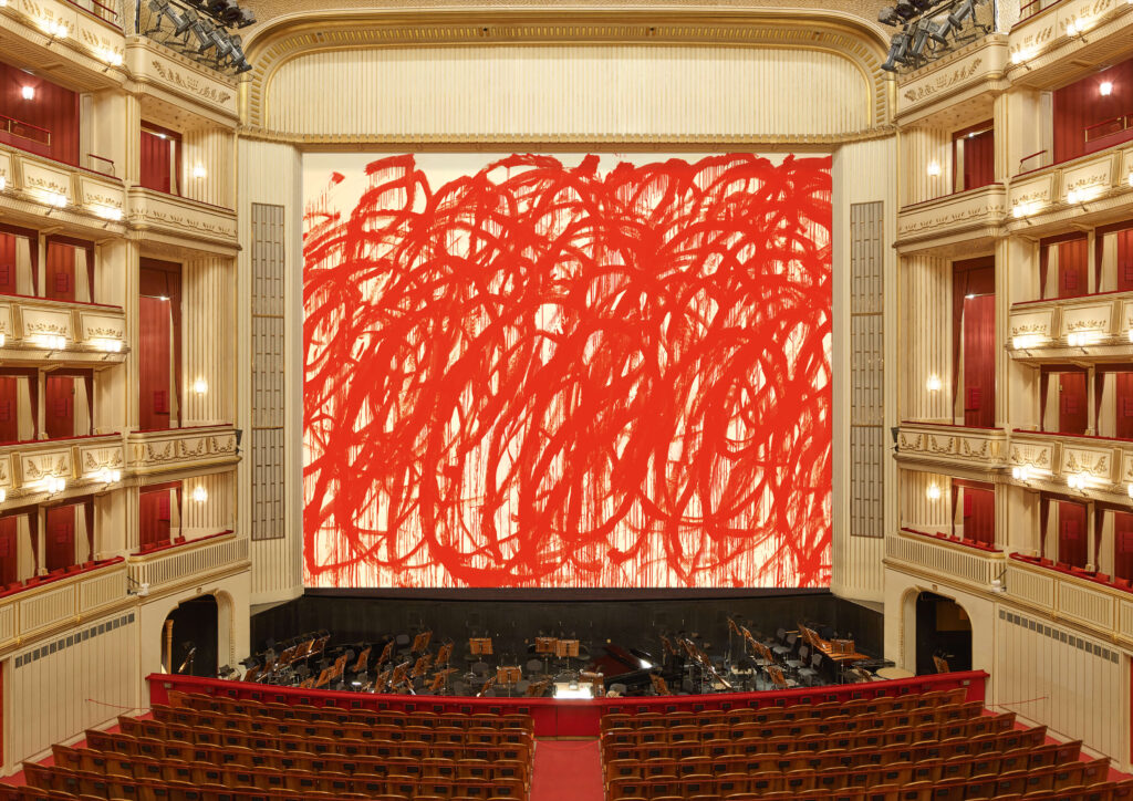
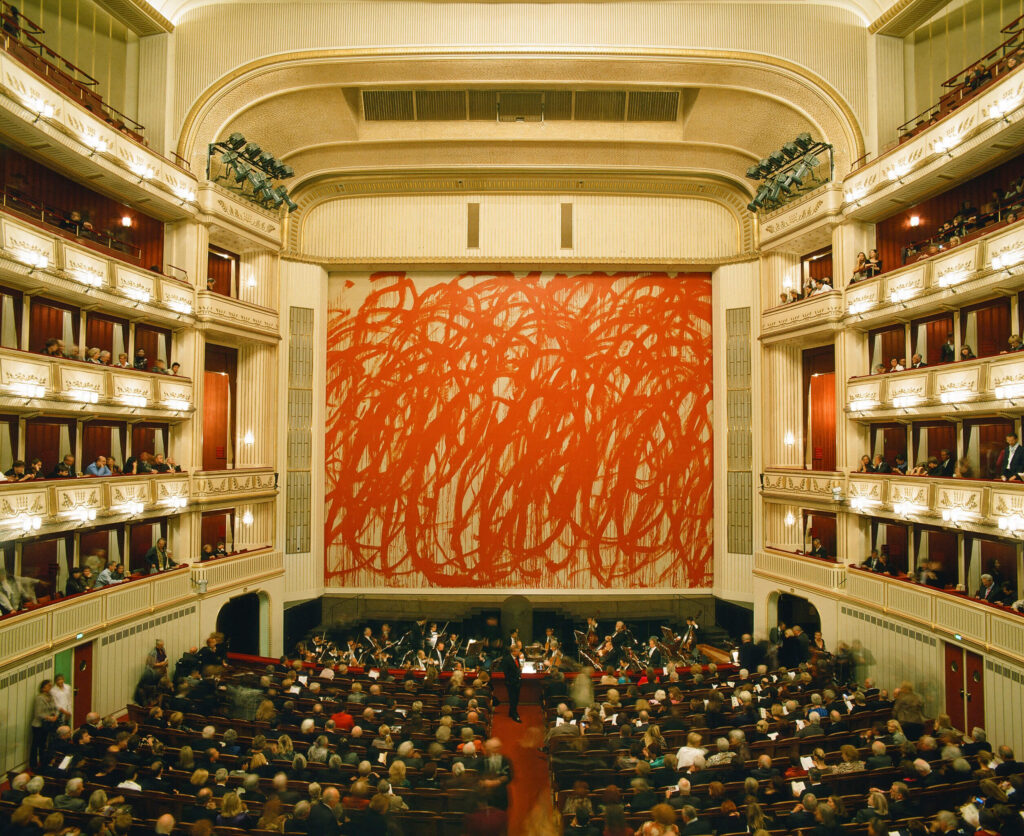
You cannot overestimate my incredulity when I saw this jpg that purported to be a three-storey tall Cy Twombly painting at the Vienna State Opera. image: mip.at
I saw this gigantic Cy Twombly painting on the landmarked firewall of the Vienna State Opera, called the Iron Curtain, and was like, that is totally fake. It is a rendering. And it was.
OK maybe this is real? But still not a painting, though, right? image: mip.at
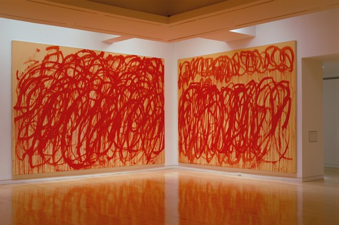
This is what the Twombly fire wall looked like installed in 2010-11. So pretty close, except for the color of the canvas and the paint. Except this 176 square meter image was inkjet printed on PVC mesh, like a billboard. The picture is of an untitled 2005 painting from the Bacchus series. Twombly painted these dripping red loop paintings with giant brushes on sticks, like if Cold Mountain-era Brice Marden just got back from the Iraq War. Everyone wants the Bacchus paintings to be about the Iraq War.
Untitled paintings installed at Cy Twombly’s Bacchus, 2005, uptown Gagosian
The original is 10×16 feet or so. Here it is installed at Gagosian in 2005. They really cropped that right down. In 2008, between this show and the Vienna State Opera commission, Twombly showed a couple of a third batch of Bacchus paintings at Tate Modern. After his death, the Foundation ended up donating three of them, plus some sculptures, enough to fill a permanent room, which feels astute.
The Safety Curtain Project has been selecting contemporary artists for the Vienna State Opera fire wall since 1998. It is run by Daniel Birnbaum and Hans-Ulrich Obrist, the only two curators in Europe. Oh wait, there’s a third now. Bice Curiger has joined the group chat. I love them all like brothers, sisters, and/or non-binary siblings, but seriously, enough.
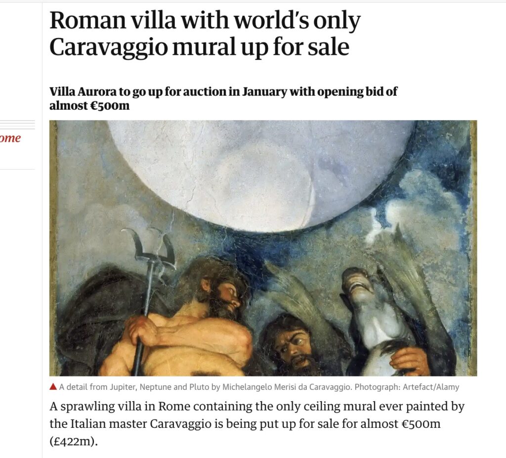
Guardian screenshot of Caravaggio’s nude ceiling selfie, cropped to be sfw, but backwards
The Casino di Villa Boncompagni Ludovisi in Rome is for sale, and the hook for media coverage is not the Guercino painting in the foyer of radiant Dawn riding her chariot across the glowing sky that gives the house its nickname, Villa Aurora. Instead it’s the oddly composed mural on the ceiling of a small upstairs room, the only mural painted by Caravaggio.
It has been appraised somehow at EUR310 million, which helps bring the opening bid for the auction of the former hunting lodge on a half-acre hilltop next to the Borghese to EUR471 million. The Italian state has the right to match any winning bid.
The mural is purportedly on the theme of alchemy; the room it inhabits was initially a laboratory, and housed a distillery. It depicts a celestial sphere flanked by three nude gods, Jupiter, Neptune & Pluto–the model is the artist himself, who was 25 years old in 1597–letting it all hang out in extreme perspectival, toga-less majesty.
Which prompts two questions, one historic, one contemporary: what are the circumstances under which a 25-year-old emerging artist paints himself nude, three times, towering over the viewers below? And why is it so hard to figure out which way the mural is facing? Because it is reproduced in both orientations almost equally.
Danh Vo Facsimile Object (V1), 2021, dye sublimation pigment on aluminum, 297 x 210 mm
Previous mentions of Danh Vo do not begin to account for the extent to which his work has influenced the Facsimile Object project.
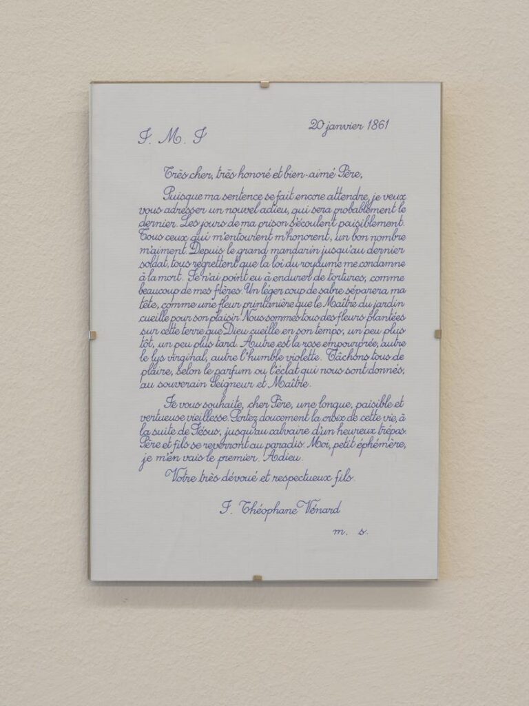
The Frenchness of the original Manet Facsimile Object drove me to decide the certificates of authenticity needed to somehow be French as well. I spent a couple of increasingly frustrated weeks looking for a calligrapher who could execute certificates in official 19th century French letter forms. Researching the history of French script, I kept running up against the realization that the image of French cursive in my mind had become Vietnamese.
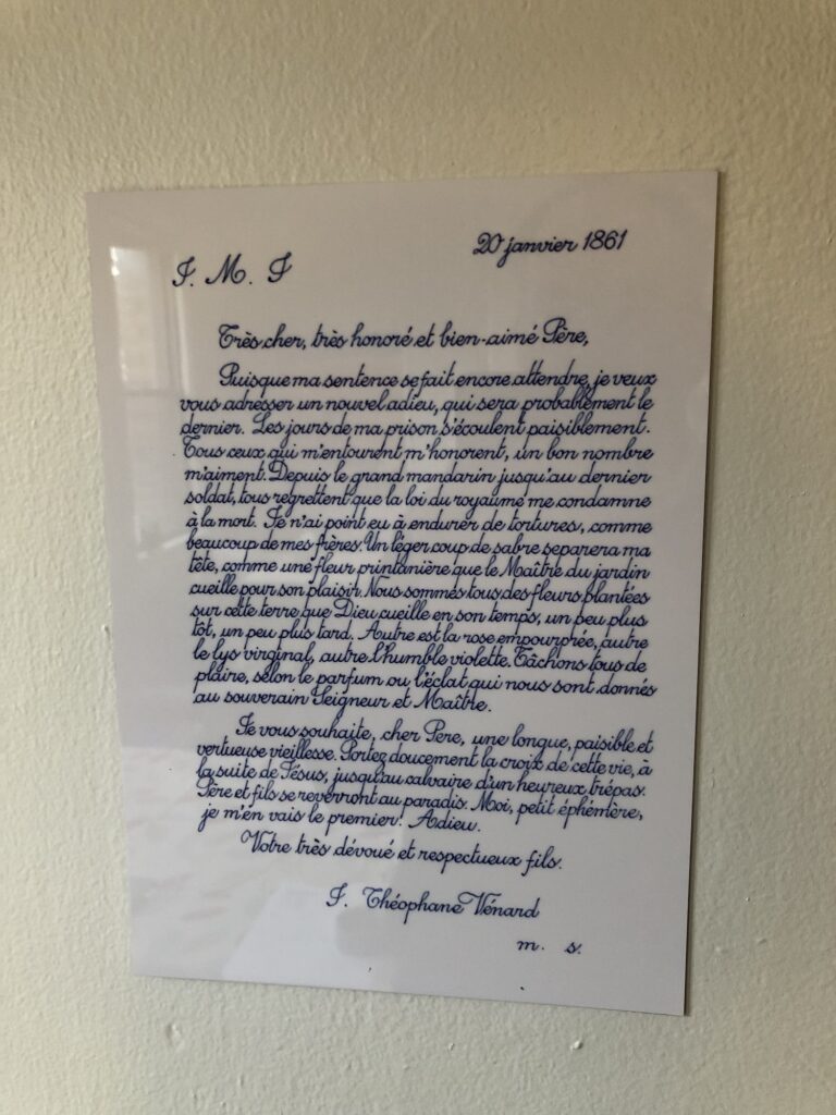
2.2.1861 (2009 – ) is one of Danh Vo’s simplest, most elegant, and most powerful projects. His father, Phung Vo, copies out editions of a farewell letter Jean-Théophane Vénard, a 19th century Catholic missionary wrote to his father on the eve of his beheading for proselytizing. Phung learned exquisite, French-style penmanship in school Vietnam during French colonial rule, and converted to Catholicism as a gesture of political solidarity with the South Vietnamese regime–but he doesn’t speak French. He’s reproduced the letter hundreds, if not thousands, of times, and Danh includes the letter in all his exhibitions. Phung’s letters will continue as long as he’s able. In the mean time, the father’s elaborate calligraphic texts have become an evermore prominent element of the son’s work.
After deciding not to try to get Phung Vo to make them, I ended up copying his letter for practice, and producing the Manet certificates myself. It’s a pattern I’ve kept since, using period German script for the Dürer certificates, and so on.
I think Vo’s creating 2.2.1861 as a time-bracketed edition, available until it’s not, also informed my own approach to the Facsimile Object editions. Though a bigger inspiration was clearly limited-time editions that arose during the pandemic, like Pictures for Elmhurst and Wolfgang Tillmans’ Between Bridges. They’re available as long as they’re needed, or useful, or relevant, or I don’t know what. It’s not like they’re meant to be disposable, but there is a finitude to them.
Anyway, as much as I love 2.2.1861, I’ve never put one up; they feel pretty intimate, but also pretty fragile, the less handling the better. While wishing Vo and his family all the health and safety in the world, the last year-plus had me thinking about mortality more regularly. And I decided to order a letter now, while I knew they were available. When it arrived–the lead time was several months–I immediately felt like I knew what had to be done, and so I made a Facsimile Object of it.
In a way, this Facsimile Object complicates the relationship between itself, the artwork, and a COA. What would a certificate of authenticity even look like here, but a less expert copy of the original work?
Within minutes of my taking the photo at the top of the post, the tape slipped, and the object guillotined to the floor. It was totally fine, and will be hanging again by morning. It is very sturdy. I can’t tell for sure in the dark, but it also seems to have a slight lack of focus, or a pixel-level distortion keyed to the tiny waverings of Vo’s line. It reminds me of the visual tension present in Richter’s stripe series. Those images are created not by stretching, but by replicating an almost imperceptibly narrow vertical strip of a painting. Will producing a facsimile object cause an unanticipated, slight distortion that’s only visible in person, close up? Daylight can’t come fast enough.
[update: it does! actually, it feels a little blurry. perhaps something about the scanning, or the surface of the paper. Anyway, fascinating.
Dürer Facsimile Object (D3.38)? a FO of a 9×14.5 in. section of a Dürer, plus Vermeer Facsimile Object (V0.9)?, both at the newly reopened National Gallery, Washington, DC. Plus a FOOL FO (W1), positively glowing in the morning sun as it rests against its hand-stitched flannel packet
News from the Facsimile Objects front: barring any exceptional developments, the National Gallery in London will reopen on Monday (5/17), and so the Dürer there, the heavenly phenomenon on the back of the St. Jerome, will be visitable again. At that point, of course, the corresponding Facsimile Object (D1), will no longer be needed, and so will become unavailable. Get one while you can, I guess. The Karlsruhe agate-like painting on the back of Dürer’s Sad Jesus will, sadly, still be available, while Germany’s COVID numbers remain so high.
Recently I made a couple of Facsimile Objects related to works in the National Gallery in Washington, DC, which has been closed for several months. They will not be issued in any numbers, partly because the NGA just reopened. In fact, we were there yesterday, the first day back, when the shipment of test FOs arrived in the mail.
As you can see from the installation photo above, though, they look nice. Other than their uselessness, I’m pleased with how they turned out.
AD FO (D1) & (D2), 2021, in their full, experiential glory, indexing the limits of digital image reproduction. Dye sublimation prints on aluminum, dimensions: 23 x 17 cm and 30 x 18.4 cm, available separately or together, for now, each with a full-size, handmade certificate of authenticity
Do paintings, like people, have a fabricated online persona, and a different, “real” character offline? Or do paintings, like people, have one real existence, different aspects of which are manifested online and in the real world?
These Albrecht Dürer Facsimile Objects have been propped, taped, and laid out in front of me for a little more than a week now, and while I expected them to live different than their 500-yo painted counterparts, I am struck by how they also differ from their digital images.
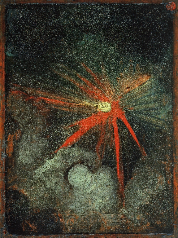
Verso: Heavenly Body, aka Cosmic Phenomenon, attributed to Albrecht Dürer, c. 1494-7, 23 x 17cm, oil on pearwood panel, collection: National Gallery, this low-res image, of the unframed panel, is via casaforte.blogspot.com, but originated on tumblr before 2013. I would really like to know the source, because the National Gallery’s image is cropped, and loses the wax seal in the upper right corner, as well as the general sense of objectness.
There are no more than two paintings by Albrecht Dürer in a public collection in the United Kingdom. One is this swirling, brushy depiction of an explosive, cosmic phenomenon on a small pearwood panel. The other, a meticulous devotional picture of St. Jerome in the wilderness, is on the other side of the same panel. The panel was only attributed to Dürer in 1957, and was acquired by the National Gallery in London in 1996.
Like all England’s museums, the National Gallery has been closed to visitors since December 2020, when a Tier 3 lockdown went into effect to reduce the transmission of the COVID-19 virus. According to current government indicators, museums will remain closed until at least May 17. So assuming it’s really by him, England’s only Dürers will remain inaccessible for at least several more weeks.
While considering whether an Albrecht Dürer Facsimile Object could offer even a partial experiential hedge during this challenging, Dürerless time, another, similar Dürer suddenly became similarly inaccessible.
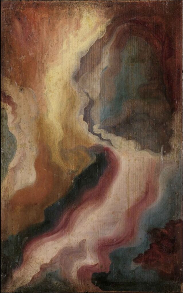
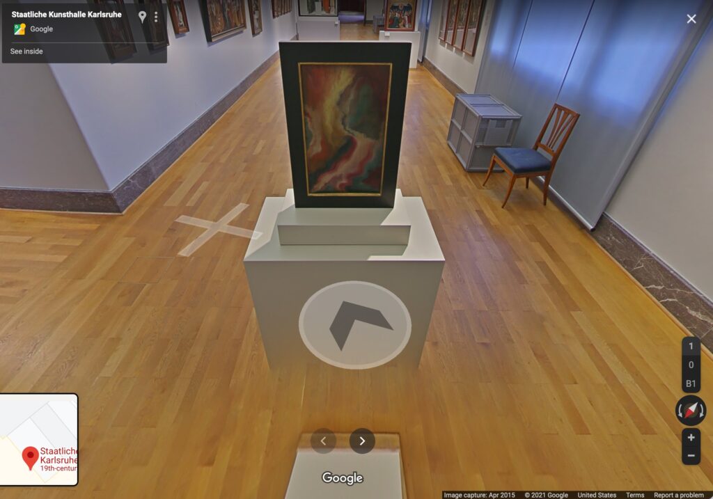
Albrecht Dürer, painting of a slice of agate, c. 1492, oil on panel, 30.1 x 18.4 cm, collection: kunsthalle-karlsruhe.de
Another small oil, c. 1492, depicts a swirling abstraction of sliced agate or other hardstone, painted with a transparency that permits the grain of the fir panel to show through. On the other side of this panel is another small devotional painting, a gold ground picture of Christ, Man of Sorrows, which was attributed to Dürer a few years before 1941, when the Nazis’ favorite art dealer Hildebrand Gurlitt sold it to the Musée des Beaux Arts in occupied Strasbourg. It subsequently crossed the Rhine, and is now at the State Kunsthalle in Karlsruhe, which was closed on March 22 when German health officials abruptly declared lockdowns to thwart a “third wave” of the pandemic. The government then changed some restrictions after a backlash, but I think the Kunsthalle is closed until at least April 18.
Verso: a flaming color spectacle? c.1492-3, oil on panel, 37x26cm, collection State Gallery in Karlsruhe, via Google, obv
“If a work is on Google Street View, does it even need a Facsimile Object?” is a question that came to mind. But then I wondered what would happen if these two works were decoupled from the paintings they are physically twinned with, the works they were fated to be “behind,” always understudied and overshadowed by? Facsimile Objects might hit different with this not-quite-a-pair. So let’s see.
It feels like a good time to be looking for lost Jacob Lawrence paintings. The publicity around the Metropolitan Museum’s show of his 1942-43 series The American Struggle has so far helped surface two of the original 30 works. Three more remain unlocated, and one of those is known only by its title.
See those four Jacob Lawrence paintings on the left that aren’t from The Migration Series? Coast Guard paintings. image: MoMA, 1944
Which is still more information than is known about the works Lawrence made next, in 1944-45, while serving as a combat artist for the US Coast Guard. Tallies differ, but Lawrence painted either 17 or 48 paintings in the Coast Guard, and all but three are lost. Images exist of twelve more, including the eight shown at MoMA in 1944. And except for a few mismatched titles, that’s it. Until now.
A group of 14 publicity photos for Lawrence’s 1944 MoMA show is up for sale at Swann Galleries next week in New York, and it includes pictures of four previously unknown Coast Guard paintings. Along with one photo that was first published in 2015, that makes five paintings which don’t appear in the artist’s 2000 catalogue raisonné. According to Swann, it appears none of the five were included in MoMA’s show.
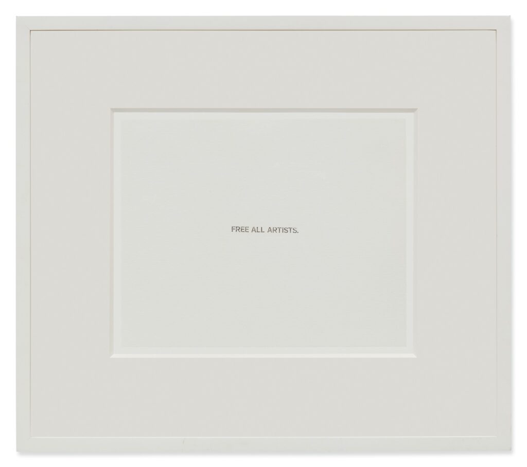
Lot 543, John Baldessari, Untitled (Free All Artists), 2010 (sic), ink stamp on mat board, 8×10 in., image: sothebys
The provenance of this John Baldessari states that it was purchased at the 2010 installment of Incognito, the Santa Monica Museum of Art’s popular annual sale of identically sized, anonymous artworks donated by hundreds of local artists, famous, not, and in between. It is an inkstamp on an 8×10 mat board that reads, “FREE ALL ARTISTS.”
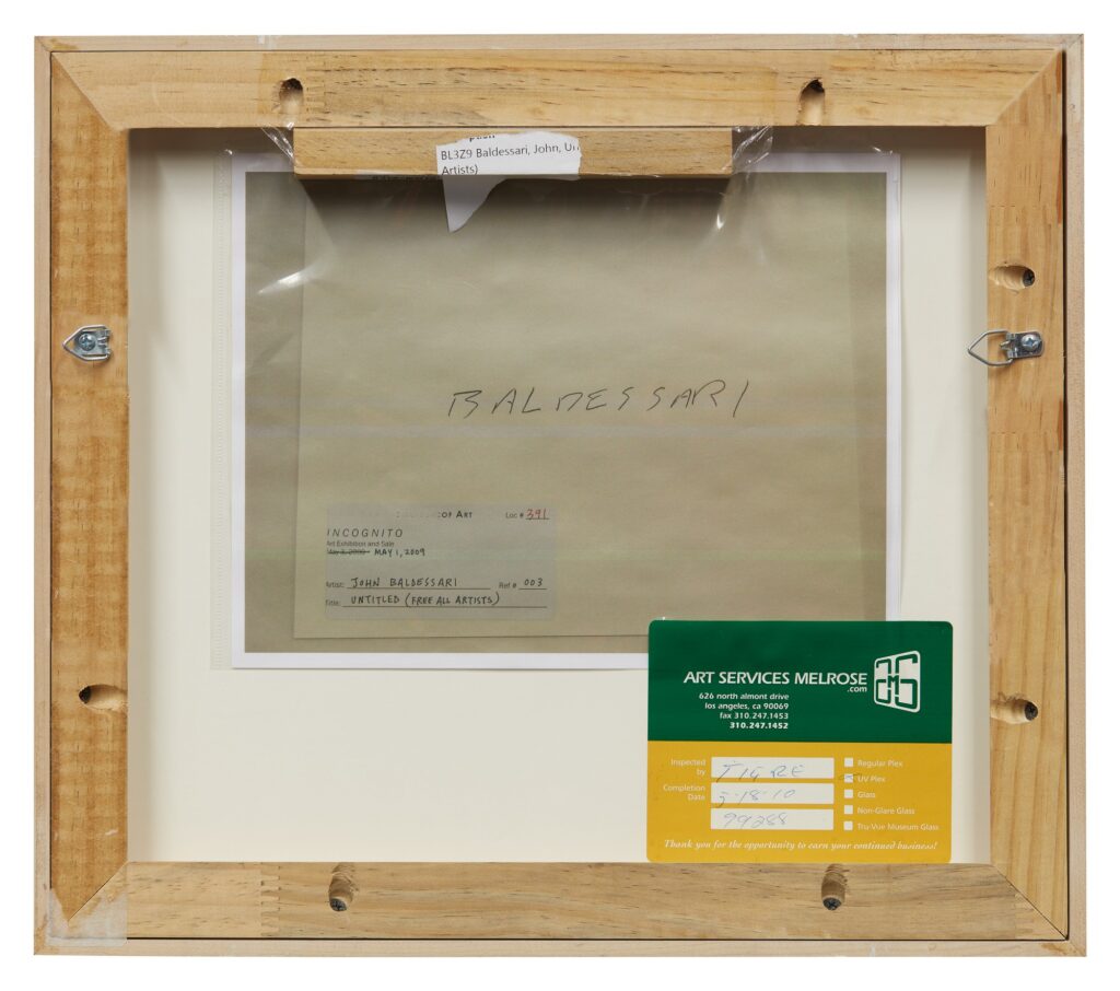
same, but backwards
It is listed as an open edition, executed in 2010. Which is cool, except that there’s an Incognito label on the back of the mat board–again, this is the entire work, an ink-stamped mat board–from 2008. And then that date is crossed out, and replaced with the date of the 2009 sale.
Can you just see how this went down? Hundreds of people buying VIP preview tickets in order to scan the hundreds of anonymous works, and to scope out the big scores, the big names, before anyone else. And for two years in a row, they left the Baldessari, the biggest name in town, sitting on the shelf.
It was only in 2010, that the art advisor Will Kopelman told the LA Times that he’d gotten a Baldessari, a Ruscha AND a Pettibone by getting to the front of the line at the preview. Was this the one? Was this the moment? Did he really have to elbow his way toward it? Was there a tipoff, perhaps, three years in, that a visually slight but conceptually robust Baldessari was lurking in plain view?
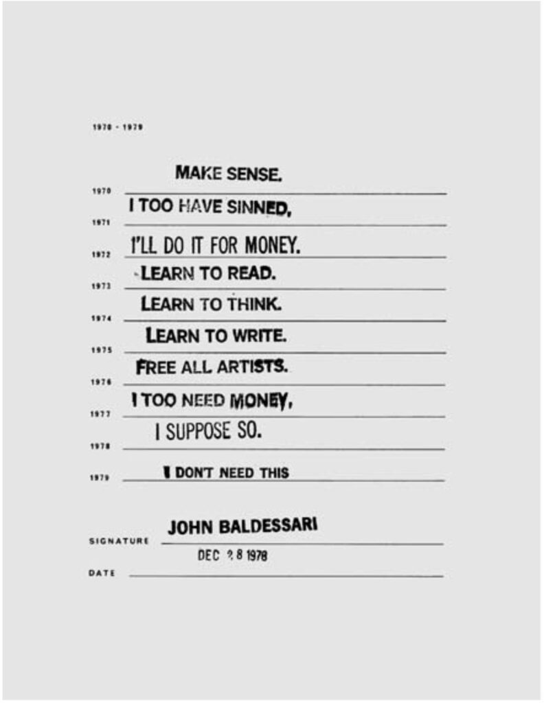
form filled out by John Baldessari in 1978, later published in The Form, 1970-1979, image: burningbooks.org [pdf]
When I googled to see how large this open edition was, I found two things. The source of the text seems to be one of the stamps Baldessari used to fill out the form Melody Sumner Carnahan sent him in 1978, which ended up in The Forms, 1970-1979, the debut title of her independent press, Burning Books.
The second thing is that every other mention of this edition seems to be this same print. Before yesterday’s auction, it has been put up for sale two times–once in 2014, and once last year–and it has failed to sell twice. So it was unloved twice when it was anonymous, and it was unloved twice when it was a Baldessari. It cannot catch a break.
This third time, it had no reserve price, and I so I bid a dollar for it, guaranteeing that it would, at least, find a new, happy home. Then today, someone outbid me. Right now the bid is $200, with fees, it’s close to the $300 the Incognito buyer paid for it. Meanwhile, if this is really an open edition, only one example of it seems to have surfaced; so what was unloved as a Baldessari edition may turn out to be a unique work. And right now it is quite a bargain, if not free.
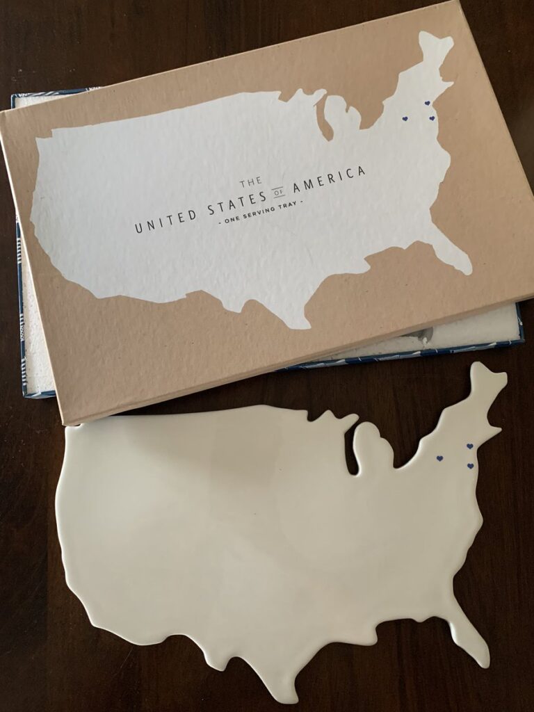
porcelain serving tray at the 9/11 Museum Gift Shop, as photographed in May 2014 by Scott Lynch for Gothamist
It is New Year’s Day, and way past time to recognize the significance of the 9/11 Museum Cheese Board in the development of my practice.
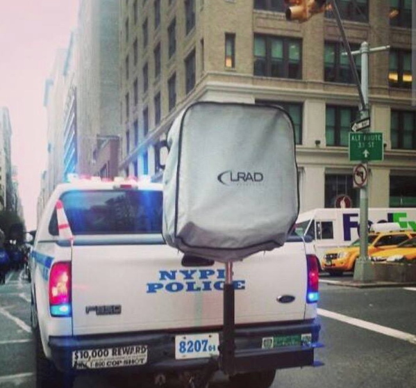
Installation view: Protestors’ Folding Item (LRAD 500X/500X-RE), ink on Cordura, nylon webbing, LRAD, 2014, Collection: NYPD Order Control Unit, image: @SeismoMedia
It is true that in late 2014, recognizing the aesthetic resonance of an LRAD and its cover with the work of Olafur Eliasson and Marcel Duchamp, respectively, combined with Olafur’s call to take the tools and methodologies of art beyond the confines of the art world led directly to my idea to create Protestors’ Folding Item, an artwork in the collection of the NYPD, with the intention of using VARA in court to enforce the piece’s exhibition integrity and require LRAD remain covered in public. From there I stepped up a practice of declaring works that involve objects I do not own or situations I don’t control-including some already in museums, which is convenient, conservationally.
But after spending more than six years now looking for them in the wild, and exploring various techniques and approaches for replicating them, it’s clear to me that the complicated condition of these cheese boards helped map the territory where Protestors’ Folding Item would soon be found: the implications of the art/not-art inflection point, the context of those states, and the related issues of authorship, the object, and the exercise of control.
Almost as soon as Jen Chung reported the existence of the porcelain serving trays in Gothamist, I began researching their creation, and identifying their creators. That the trays were significant was immediately obvious. That their significance came entirely from their terribleness was, too, but the immediate media focus on their terribleness made their significance an awkward subject. I never heard back from the designer or the company after sending what I thought was a very diplomatic and persuasive email request for the middle of a sudden PR maelstrom:
Dear Ms. S––,
Thank you in advance for your consideration, and for your assistance in a story on the porcelain platter Rosanna designed for the 9/11 Museum. I am a writer in Washington DC and New York City, and have published my independent art- and architecture-related research at my blog, greg.org: the making of, since 2001. The site was recently recognized by the Creative Capital | Warhol Foundation Arts Writers Program.
One of the subjects I covered rather extensively and authoritatively was the design competition for the World Trade Center Memorial. I was impressed by the Cartography platter in the recently opened 9/11 Museum Gift Shop, and the debates it has engendered about the museum, the memorialization process, and different experiences and modes of remembrance.
I would hope that as a company and a designer, Rosanna and Ms. Bowles might be able to share insights on the design and the process of creating it, and to site the platter in a constructive and empathetic context.
If it’s germane to this particular commission, it would also be helpful to hear about other museum or philanthropic projects, or perhaps to expand the context to include the history of commemorative plates, figures, and other objects.
Thank you again, and I look forward to your response, and to answering any questions that can facilitate my research.
Sincerely,
As is clear, though, I was still in research mode. It felt like a delicate balance, a fine line, to acknowledge that attention came from controversy, which is not something a manufacturer of porcelain serving pieces and collectibles is anticipating. But it’s also the case that though I was obviously not going to declare their trays works of art in my interview request, I was not yet ready to do it myself, even in my own mind. So for several months in 2014, these trays existed for me as objects in a state of tension.
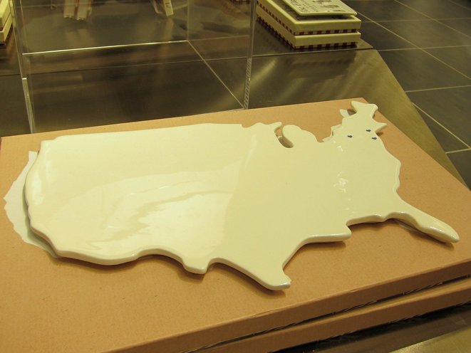
The 9/11 Serving Trays are evidence of the historical and cultural reality of our world right then, when an expensive museum at the site of a terrorist attack slash commercial real estate development contracted with a housewares company to design an exclusive product for sale in their gift shop. The object that resulted was not a commemorative plate, which had already been produced in great volume by 2014; it was a ceramic tray in the shape of the continental United States, in cream glaze finish, and blank except for three navy blue hearts to mark the sites of four crashed planes. The box called it not a cheese board, but a serving tray. What could be more honorable than serving, they might have thought when they approved the copy. And when faced by overwhelming criticism, even from The 9/11 Families, a group used regularly until that point as human shields for all manner of capital- and politics-driven decisions at the WTC site, the museum defended its offering of “keepsakes” to a bigger market, “the 9/11 Community,” which could include not just the 9/11 Industry, but anyone who has the “historic experience” of visiting the museum itself.
I’m rambling, obviously, but after the internal debate over whether to post works like the blurred Frida, I am deciding to err on the side of slightly more info. And also, for the first time, my periodic internet sweep turned up this photo on a 3-month-old reddit post, the first evidence of the 9/11 Cheese Board existing outside the 9/11 Museum.
9/11 Cheese Board (2014), aka One Serving Tray, produced by Rosanna, Inc. exclusively for the gift shop of the 9/11 Museum at the World Trade Center, and available for a few days, at most, image via reddit user 13nobody
So there is something that in many other circumstances would be called hope. And that feels very fitting for today, and for this moment in time.
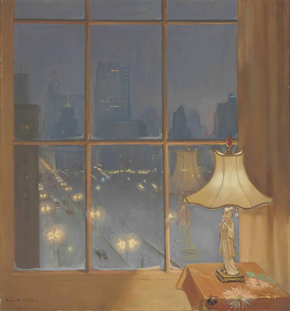
Huguette Clark, Scene from my window – Night, 50×46 in., image via christies
Wow, just when I thought we were having something very special when considering the implications of portraiture and erasure in a found real estate listing photo of a laundry dungeon in an epically gross American University flophouse–and I don’t mean to imply I’m not grateful for The Discourse–but anyway, y’all* were apparently also fine with letting me go yet another year without knowing that forgotten heiress recluse who kept up her sprawling Fifth Avenue co-op and Santa Barbara mansion like she’d be back any minute but actually checked herself and her doll collection into a midtown hospital room and only left decades later when she died in 2011 at 104 Huguette Clark made paintings?
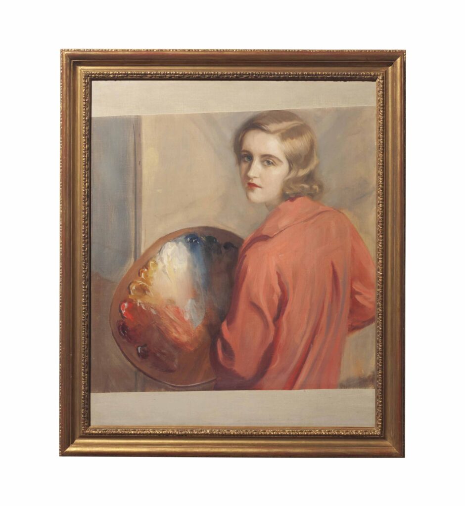
Huguette Clark, self-portrait with palette, image: christies
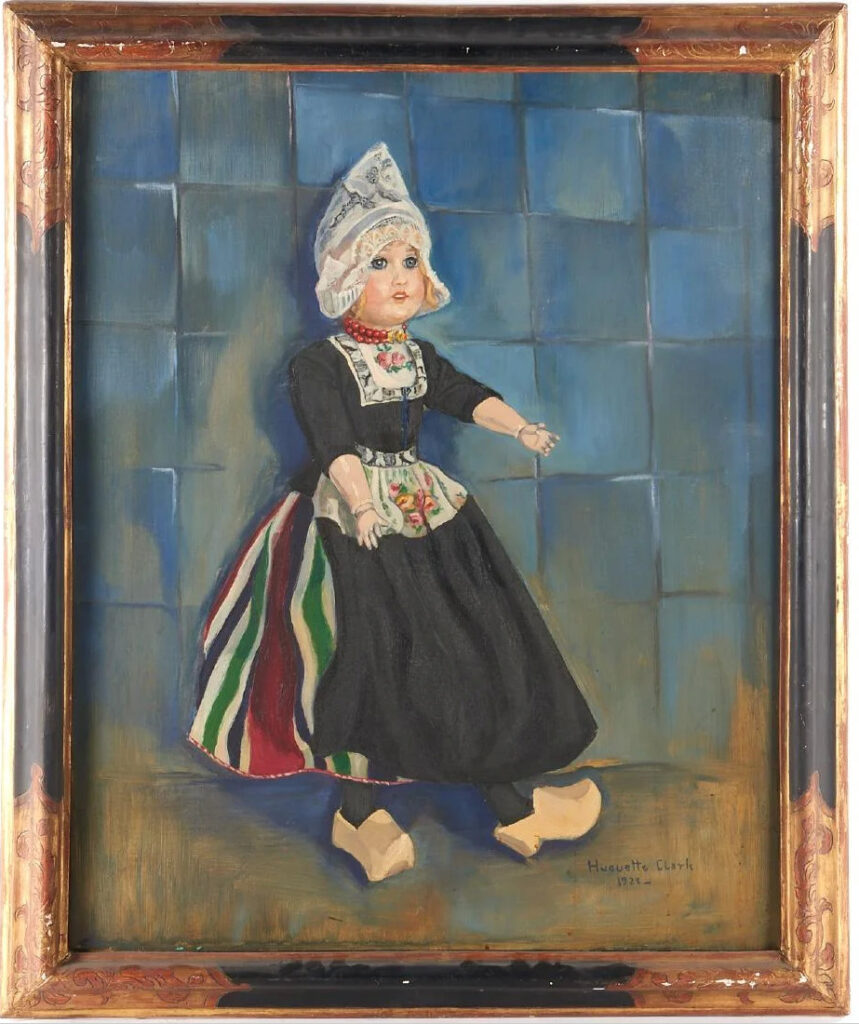
And that except for a few included in a two-week show at the Corcoran Museum in Washington in Spring 1929–four years after her father’s death and the bequeathing to the Museum of 800 artworks and a Clark Wing–they were only first seen publicly in the jumble of an estate sale at Christie’s in 2014, where they sold for not that much money? Anyway, seventeen paintings by Clark were included in that sale, and she had some moments, mostly that window above, with the geisha lamp reflected in it. [Another four signed paintings, plus a couple of attributions, some prints, and an album of reproductions of her paintings, were auctioned in New Jersey in 2017, leftovers from Christie’s cataloguing. A highlight was this painting of a Dutch doll, which checks a lot of Clark boxes.
Also, though her teacher Tadeusz Styka specialized in painting portraits of socialite women, and once painted Clark appearing to paint a nude man, many of Clark’s surviving paintings are of Japanese women.
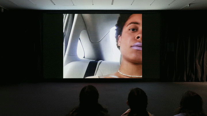
Join me and 13 other museums and museum-like private collections in embedding Arthur Jafa’s incredible “Love is the Message; the Message is Death” [2016, ed. 13+2 AP] on my front page for the next day or so.
“I am thrilled for the opportunity, finally, to have as many people as possible see ‘Love is the Message, The Message is Death,’” Jafa said.
Close t0 100K views so far, 300 simultaneous viewers at a time. Masks off and huddle up, let’s get this data to spike. Not that we can watch, collect, or curate our way out of this mess we’re in.
#DeathIsLoveIs
[Previously linked to: https://www.ustream.tv/embed/4222323]
The conversation in the second roundtable organized by sunhaus.us has barely started, and already the fact that most everyone saw the work first on a bootleg, and then marking the change between the first viewing and this moment, and the fear that exists now, is very important.
now 35min in, they’re talking about how this video was originally going to end up on the internet before it was pulled into the art world, and now here it is.
Everyone’s good, but Simone White is amazing, flat out.