On Scraper Capitalism

Last summer I wrote about discovering Artisoo, a company selling oil paintings of thousands of artists’ images on Amazon. “Chinese Paint Mill has appropriated Google Images and put it up for sale on Amazon,” I wrote.
Which reminded me of LifeSphere, the Spamerican Apparel botcompany Babak Radboy wrote about that systematically turns every public domain image into every possible Zazzle product.
We have all set our sights way too low.
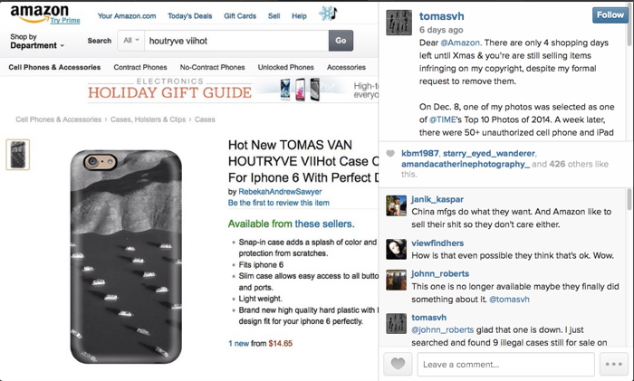
van_houtryve_amzn_iphone_instagram.jpg
image via @tomasvh
This week Dutch National Geographic photographer Tomas van Houtryve began posting pictures of iPhone cases featuring a photo of his, which had recently been selected as a Time Magazine photo of the year.
tyler_hicks_amzn_iphone_wtf_pbs.jpg
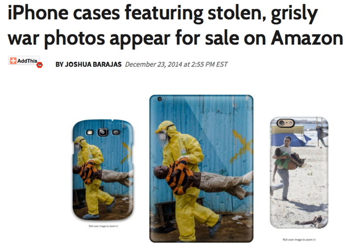
screenshot from pbs.org
PBS reported that NYT photographer Tyler Hicks found iPhone cases for sale featuring several of his images, including dire pics of Ebola patients and Palestinian children being shot by snipers in Gaza:

“Who wants to buy a picture with a dead child on it,” said Tomas van Houtryve…”If any human being in the process had seen that, I don’t see how it could possibly get through”.

Which is exactly the wrong question and the right answer for this situation. They and the outrage associated with them only exist once they’ve been searched for, and the product will only exist after it’s been ordered. Because these images, like tens, hundreds of thousands more, have been scraped from the web and turned into products by bots.
lynn_a_carter_phonecovers.jpg
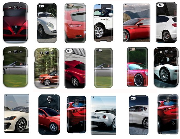
By focusing on the laughably limiting category of public domain images, Spamerican Apparel was too timid and deserves to fail. For these Amazon iPhone case sellers copyright’s no object, and Google Images is just the start. Cropping is strictly default settings, actual image be damned. Among the 6,324 phone cases offered for sale by Lynn A Carter are hundreds printed with the center of PR photos of various cars. They have descriptions like, “Daly R Martinez NVDWiaj2848OHOgq Case Cover Iphone 5c Protective Case Alfa Romeo Giulietta 36.” Daly R Martinez is another Amazon seller. The string is a product ID, different from Amazon’s ASIN. Then there is product + the data that was scraped with the image. SEO enough for Amazon.
kerry_washington_iphone_cover_wtf.jpg
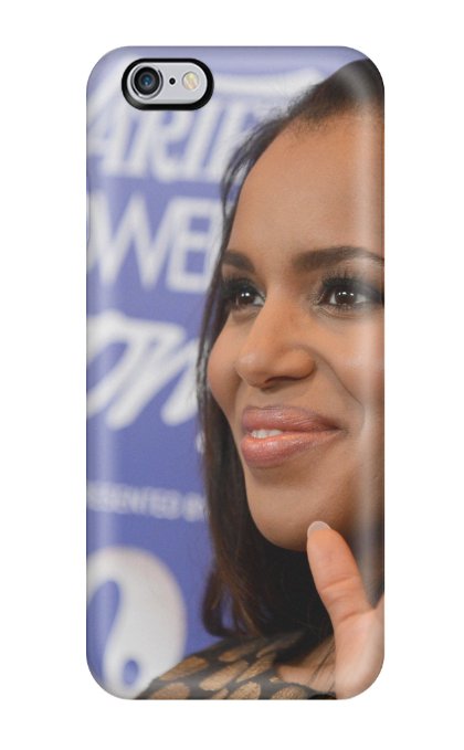
They really do just grab any damn image at all. Like this, LvukQDp7415hnQVt Snap On Case Cover Skin For Iphone 6 Plus(kerry Washington). It’s a red carpet photo from October 2013. There are nearly 300 other Kerry Washington phone covers like this.
pinterest_garbage_kitchen_iphone_covers.jpg
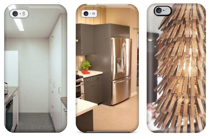
L to R: “Corner Blocked Kitchen With Stainless Countertops Sleek White Cabinets”; “Kitchen Peninsula With Quartz Countertop In Kitchen”; “Eclectic Kitchen With Artistic Pendant Lights” iphone cases
My favorites so far have to be the kitchens. The scrapers have found Pinterest, and have turned it into iPhone covers. Here’s the one on the right, on a Pinterest board called “Junk Ideas.” Scrapers are turning the great image vortex of our digital ocean into an actual island of plastic garbage on demand. Who are these people?
I will wager they are not the people listed on Amazon, but more digital simulacra. Searching for the sellers turns up a Chinese-language website run on a free .tk domain which is used to manage case returns for various Amazon IDs. Poking around the domain also turns up a quick&dirty Amazon upload management dashboard. It looks to me like a Chinese case manufacturer is flooding Amazon with hundreds or thousands of bogus sellers, each with thousands of scraped data-derived products. That award-winning photographers’ images and names got scraped as well should come as no surprise.
What Amazon will do about this vast, digital garbage dump of a retail offering is not clear. Maybe this is just the way it’s going to be from now on, every image always available on every product. Maybe we will adapt to Scraper Capitalism by becoming Sifters, consumers attuned to the surreal moments, the horrific, the sublime, the sea glass and driftwood of the web. We’ll develop tools for surfacing them, and critical faculties for appreciating them. If we do, Amazon will have them, just 1-Click away.

Wait, What? Jasper Johns Blue Ceiling By Matson Jones??

2020 UPDATE BELOW:matson_jones_blue_ceiling.jpg
Jasper Johns Blue Ceiling, 1955, 12×10 feet [!], image: postermuseumblog

How did I miss this? Just a week after I posted about Matson Jones’ hand-painted plaster melons and pomegranates, poster dealer Philip Williams revealed an incredible Matson Jones find: a set of cyanotype/photograms titled Jasper Johns Blue Ceiling.
Each of the four panels depicts an underwater scene featuring a male figure holding a trident, or with a Trojan-style helmet; the only figure not in profile has pointy, Sub-Mariner-style ears. They’re all signed “Matson Jones” in the image, and apparently, the title, which is apparently a reference to Johns’s bedroom, is written on the back in what Andy Warhol said was Robert Rauschenberg’s handwriting. They surfaced in the 1980s from the office of Gene Moore, the guy who commissioned Matson Jones [the commercial pseudonym of Rauschenberg & Johns] to create window displays for Bonwit Teller. The prints were apparently a backdrop for [Bergdorf Goodman] windows made in 1955.

rauschenberg_weil_photogram_life_mag.jpg
Rauschenberg & Weil making a blueprint photogram, 1951, LIFE Mag via tate

Rauschenberg, of course, had made and shown similar photograms with his wife Susan Weil. She [or a model] would lie on the photosensitive paper in a composition, and he’d swing a lamp around her, Pollock-style, to make the image. [MoMA has one.] Weil kept making photograms after their divorce, but I never realized they shared joint custody of the technique. Or that Rauschenberg would use it with his next model–and that’s the question here, I guess: is that Johns?
matson_johns_profile.jpg

Who else could it be, right?* And if it wasn’t Johns in 1955, it certainly was in 1962. These 1-to-1 scale photograms make me think of Johns’s Study for Skin drawings, which he made by pressing his oiled up face and hands against a sheet of drafting paper, then rubbing it out with charcoal. Richard Serra owns a full-body Johns Skin job from 1975, too, so it’s not like he gave it up.

johns_study_for_skin_i.jpg
Jasper Johns, Study for Skin I, 1962, image via nga

There’s also Rauschenberg’s large-scale, 1968 print triptych Autobiography, and though it’s a stretch across time, the shadows remind me of Johns’s landmark Seasons paintings and prints of 1986-7, which all feature the artists’ shadow.

jasper_johns_seasons_ulae.jpg
Jasper Johns The Seasons print series from ULAE

Connecting Johns’s imprint of the body to Rauschenberg’s–and Weil’s–photogram process would be interesting enough; but these photograms also connect Matson Jones’ production more directly to the art practices of Johns and Rauschenberg.

It does not feel great to not be the first to make this connection. In a Feb. 1959 column in Arts Magazine that is a master class of insiderish gay-bashing, Hilton Kramer denigrated Johns and Rauschenberg as “visual publicists” working in the commercial art “gutter”:

Rauschenberg, for example, is a very deft designer with a sensitive eye for the chic detail, but the range of his sensibility is very small — namely, from good taste to “bad”…Frankly, I see no difference between his work and the decorative displays which often grace the windows of Bonwit Teller and Bloomingdale’s. The latter aim to delight the eye with a bright smartness, and Rauschenberg’s work differs from them only in ‘risking’ some nasty touches. Fundamentally, he shares the window dresser’s aesthetic to tickle the eye, to arrest attention for a momentary dazzle…Jasper Johns too is a designer…Johns, like Rauschenberg, aims to please and confirm the decadent periphery of bourgeois taste.

There are a couple of other examples of gender-coded criticism early on in Johns and Rauschenberg’s careers, but Kramer’s knowing sneers link gayness with non-seriousness, taking a double swipe at the artists’ rapidly growing reputations. Johns wrote an angry letter in response, saying “a kind of rottenness runs through the entire article.”

Which is why Williams’ post of what “may very well be the only known surviving Matson Jones work,” is unsettling. It ends with this shoutout, “Today, Friday May 15th, is Jasper Johns’ 84th birthday. From everyone here at Philip Williams Posters Happy Birthday Mr. Johns!” Almost as if they were inviting the artist–who has a penchant for destroying early work that doesn’t necessarily fit his preferred narrative–to buy it back. Frankly, they belong in a museum. If there is a museum bold enough to take them.

Jasper Johns Blue Ceiling by Matson Jones [postermuseumblog]

Continue reading “Wait, What? Jasper Johns Blue Ceiling By Matson Jones??”

On Lorser Feitelson’s Life Begins

feitelson_life_begins_lacma.jpg
I don’t see or think about it nearly enough, but I’ve been fascinated by Lorser Feitelson’s 1936 collaged photo/painting Life Begins for years. 1936! LACMA acquired it in 1996.
Feitelson’s later, post-war, hard-edge abstraction gets much more attention than the 1930s “Post-surrealist” works, which generally makes sense. Something like Life Begins is just so unusual is almost doesn’t fit into that bucket, either. But seeing images of it again recently made me wonder just what is going on here. I can’t find almost anything written about it, except Steve Roden’s discussion of it in the LA Times a few years ago: “On some days it feels as hermetic as ‘outsider art,’ and on others it seems the most experimental painting he ever made. I’ve been visiting this work for 25 years, and I still don’t understand it. I really love that.”
Which, it’s nice to know it’s not just me who loves it, and who’s baffled by it.
The basics:Life Begins is oil and collage on a shaped masonite panel around two feet square. The painted elements are the blue space, which often gets called a sky, and a half peach and pit on a small plate. The collage elements are two black&white photographs, or close to it, of a doctor holding a newborn baby, cropped to preserve the caption, which gives the work its title; and an astronomical feature.
The “Life Begins” photo in Life Begins is easy enough to source: it’s the first photo printed in the first issue of LIFE Magazine, which began publication on November 23, 1936. [That means Life Begins was not in the Post-Surrealism show Feitelson organized for himself, his wife Helen Lundeberg, and other California-based artists at the Brooklyn Museum in May 1936. And it wasn’t among the Feitelsons included in Alfred Barr’s Fantastic Art, Dada & Surrealism show at The Museum of Modern Art in November 1936.]
The other element has taken more time to track down. When they describe it at all, most sources have called it a photo of a solar flare. But it’s not. While solar flares were being observed along with sunspots, on the face of the sun, there was no technology capable of photographing a solar flare like that in the 1930s. The only online source to identify the image correctly was a letter from an MD/amateur astrophotographer of the Journal of the American Medical Association, which had used Feitelson’s painting on their cover in 2004. It is a detail of the Western Veil Nebula (NGC 6960) in the constellation Cygnus.
We are very used to such images now, but in 1936, there were very few observatories capable of producing such a photo. The scientific understanding of nebulae, and of the universe itself, was in flux. It was only in 1924 that Edwin Hubble announced, first in the New York Times, that many of the objects called nebulae were actually galaxies, which existed far beyond our own Milky Way. As late as 1933, it was still a matter of speculation whether the Veil Nebula surrounded a star, and was actually the remnant of a supernova.
duncan_veil_nebula_1921.jpg
Let’s just say, thanks to Hubble the telescope, it’s difficult to search for historical astronomical images, which have been supplanted by higher resolution, full spectrum glitz. After a couple of evenings, though, I think I found Feitelson’s source. Wellesley astronomer John Charles Duncan, who published several articles on photographing nebulae, made a 7-hour exposure of NGC 6960 in 1921 using the largest telescope in the world, the Hooker Telescope at Mount Wilson Observatory. Duncan used the image as the frontispiece for Astronomy A Textbook, published in 1927. [above]
The image doesn’t match Feitelson’s in size, exposure, or cropping, obviously, but I suspect the artist either rephotographed the detail from the plate, or got access to the negative at Mount Wilson. Duncan later published a fainter, underexposed version of the image, which extrapolates to what an overexposed version like Feitelson’s would look like.
lundeberg_red_planet.jpg
Helen Lundeberg, Red Planet (1934)
This image in Life Begins is not a one-off. Both Feitelson and his wife Helen Lundeberg included astrophotography in their Post-Surrealist paintings in the early 30’s. [Maybe Post-Surrealism feels a bit like Post-Internet: a way for artists to signal to lagging institutions they’ve incorporated something and are moving ahead.] Lundeberg’s Red Planet is a paradoxically lit interior featuring a red planet-looking orange hovering over a telescope mirror-looking tabletop, and a photograph of a comet leaning against a book titled, “Mars.”
feitelson_genesis_2_saam.jpg
Lorser Feitelson, Genesis #2, 1934, collection Smithsonian American Art Museum
Feitelson’s Genesis #2, also 1934, has a telescope pointing through the eyes of several aging masks and a skull, propped on books, toward a painting of what looks to me like a photograph of the Crab Nebula. There’s also a trompe l’oeil drawing of an Annunciation, a Picabian outline of a woman and her developing breast, a baby bottle, a conch, an eggshell, and a sliced melon and light bulb that immediately make me think of Matson Jones-era Johns. Which, any connection is impossible, I know, but still.
Genesis #2 combines scientific, religious, and metaphorical accounts of birth, which makes it feel closely related to Life Begins. Now the unusual shape of Life Begins feels related to the perspectival lines and sharp, flat planes Feitelson used to define his spaces. Which makes Life Begins a variation on a Genesis II theme; when Life Magazine launched with that photo, of all photos, Feitelson must have really felt like he was onto something big.
Life Begins [lacma.org]
Genesis #2 [americanart.si.edu]

Taking Care of Business: Gio Ponti’s Time-Life Pavilion

gio_ponti_time_auditorium_ext_esotericsurvey.jpeg
Amazing, how did I never know this? Gio Ponti designed a business pavilion and auditorium for Time-Life in 1958, and it’s still there, perched mostly out of view on the north side of the 8th floor setback of 1271 6th Avenue. It’s covered with crystalline facets and triangles on the roof and terrace [though the photo above also seems to include some overpainted elements. Also it was flipped, so I fixed it.]
gio_ponti_time_auditorium_int_esotericsurvey.jpeg
Dubbed “the most versatile and complete business-meeting facility in Manhattan,” the pavilion was commissioned by Henry Luce at the instigation of his wife Clare Boothe Luce, who wanted to make Ponti a thing. Writing about a 2010 show of Ponti in New York curated by Germano Celant, Suzanne LaBarre described the pavilion as “the closest thing to a playground a stark, midcentury office building had seen: green-and-blue marbleized floors; saucers and brass strapwork in the ceiling; obelisk sconces; and a smattering of irregular nooks, foyers, and bars.” Green & blue marbleized floors? Yow. Sounds like proto-Memphis to me, and makes me curse black and white photography.
ponti_time-life_pavilion_bing.jpg
Gio Ponti Time-Life Pavilion/Auditorium, on the north side of 1271 6th Ave, looking S/SE on bing
Unfortunately, LaBarre reports that Ponti’s interior has been destroyed and remodeled two times over. [The top two images come from Esoteric Survey’s extraordinary survey of the 1958 Time-Life Building’s interiors, from the likes of, basically, everybody.] Time is out of or leaving the building this year, so who gets the Ponti?
leonni_brussels_masey_ext4.jpg
What is most surprising to me, though, is the similarity of Ponti’s design to the Unfinished Business Pavilion, created in for the 1958 World’s Fair in Brussels. In an attempt to head off Soviet criticism of the US’s discrimination against African Americans and the civil rights protests it spawned, the State Dept. and USAID asked Luce’s Fortune Magazine to create a pavilion addressing ‘the Negro Problem.’ Fortune creative director Leo Lionni’s three-part design moves from the “chaotic crystal” of the past to the bright happy square future where children of all races play together in harmony. Which was considered such an insult to the segregationist Dixiecrats in Congress, they demanded Fortune close the pavilion as soon as they got wind of it.
Which is interesting that in color and form, Ponti’s pavilion most closely resembles the chaotic crystal section, or vice versa. Maybe Ponti’s came first, and Leonni used it as a stand-in for the shameful past we were all trying to overcome. Anyway, this warrants further investigation.
Time-Life [esoteric survey]
Gio Ponti’s New York [metropolis]
Previously, related, and devastatingly, depressingly timely: The Unfinished Business Pavilion, by Leo Leonni
None of Your ‘Unfinished Business’

Jetty With A View

Jetty, dir. Skylar Nielsen, starring Julian Sands

RadioWest, the local public radio talk show on KUER in Salt Lake, devoted an hour to Spiral Jetty this morning. Most of the time was spent talking with art historian Ann Reynolds, Dia’s Jetty curator and Utah liaison Kelly Kivland, but there were segments from local earthwriter Terry Tempest Williams and director Skylar Nielsen. It was the debut of Nielsen’s short film Jetty, commissioned by KUER, that was the hook for the discussion. Jetty had been conceived and shot one morning in September when the actor Julian Sands was coming to town to do Pinter, and he wanted to visit the artwork, which he’d heard about from his friend in LA, Michael Govan.
But this is all backing into the story. Which nonetheless feels necessary, because it was a fascinating and perplexing conversation that, the main guests’ credentials notwithstanding, felt utterly detached from the art [historical] context, and its theoretical discourses. Instead of that construct, Spiral Jetty exists, in a public place, in the open, in a culture, and that is Utah. Utah is the site. Which makes the art world the non-site, I guess?
First, they didn’t discuss Robert Smithson’s film Spiral Jetty at all. Reynolds made one reference to a photo of oil derricks, but that was it. Which is amazing. In 1993, the last year before it resurfaced, curator Robert Sobieszek wrote of Spiral Jetty “coevally manifesting itself as a sculpture, a film, and a text,” In practice, though, for two decades, the film was the work; the site was irrelevant. This perspective reflected the physical reality of the submerged, i.e. basically lost/destroyed, sculpture, far off in BF Utah, which, New York and the art world were central, check out the view from up here, and Utah’s marginality was the self-reinforcing reason Smithson had picked it. With the re-emergence of the jetty, the enlightened pilgrimage through the chain restaurant cultural desert to the abandoned, entropic wasteland kicked in.
If this morning’s discussion was any indication, Spiral Jetty has been pulled to Utah’s bosom and squeezed, hard. Redeemed from its oil-drilling & tar-seeping failures, it is a manmade monument at one with nature that offers spiritual solace and communion with the land, sky, and water. It is experiential above all, an engine of personal transformation and enlightenment for all who walk or contemplate it. Reynolds’ top tip for visiting Spiral Jetty is to camp out there. And if you can’t at least spend 24 hours. Kivland, whose first visit to Spiral Jetty was in October 2011, with Nancy Holt, as part of the lease renegotiation process, agreed, and committed to visiting for the long haul. [Note: there are no facilities for camping at Spiral Jetty, and all the land you hike on is privately owned. Is Dia contemplating some infrastructure to turn Spiral Jetty into a more Lightning Field Experience?]
Smithson’s pseudo-mystical writing is used to support this reconfiguration of Spiral Jetty into a devotional labyrinth for psychic discovery. Tempest-Williams gave perhaps the most highly evolved expression when she talked about how the submerged Jetty gave her solace when her mother died in 1987, and how walking its re-emerged path with her adopted Rwandan son gave courage that life will go on when she finally visited it, in 2011. Which, girl? That thing’s been out since 1995, and yet you didn’t go until 2011? I’m two degrees from Tempest-Williams and respect her and her work, but this strikes me as a pristine example of her ability to refit something, anything, into a deeply felt reflection on the landscape of her self.
sands_jetty_through_the_lids.jpg
Or maybe the apotheosis here is actually the Jetty film, created seemingly on a whim, with a helicopter and a dronecam, when the radio folks heard their famous actor/guest wanted to visit the site. In 3-minutes Nielsen puts Smithson’s film through a Fincher filter, with distorted titles, non-spatial edits, and Sands trudging around the landbound jetty, literalizing the Smithson text he intones in a voiceover:

On the slopes of Rozzle Point
[AERIAL SHOT OF SLOPES]
I closed my eyes and
[CUT TO FAST ZOOM ON SANDS STANDING AT APEX OF JETTY, EYES CLOSED, ARMS OUTSTRETCHED TAKING IN THE]
the sun burned crimson through the lids.
[ZOOM TIGHT ON HIS FACE]
I opened them
[SUDDENLY OPENS EYES]
and the Great Salt Lake was bleeding scarlet streaks.

Then “improvising as he saw fit,” Sands begins reciting lines from “The Windmills of Your Mind”:

Like a circle in a spiral
like a wheel within a wheel
never ending of beginning
on an ever-spinning reel

It reminds me of nothing so much as Sands’ portrayal of George Emerson in A Room With A View, who climbed a Tuscan tree to shout his creed and the Eternal Yes to Nature herself.
Actually, I saw A Room With A View as an impressionable freshman in Salt Lake City, though I wanted to be Freddie. And I was the only one in the packed theater to laugh out loud at Daniel Day-Lewis’s garden party scene. I may have to reshoot this movie.
rwav_poppy_field_kiss.jpg
Oh man, or just mash it up.
“Mr. Sands, Mr. Nielsen, and Mr. Fletcher fly out in helicopters to see a view. Utahans fly them.”
“I have a theory,” said Judi Dench’s Eleanor Lavish, “there is something in the Rozel Point landscape that inclines even the most stolid nature to romance.”
Robert Smithson’s Spiral Jetty [radiowest.kuer.org]
Jetty, dir. Skylar Nielsen, starring Julian Sands [vimeo]
Behind the Scenes | Spiral Jetty [vitabrevisfilms]

Protestors’ Folding Item, 2014

nypd_lrad_seismomedia_1.jpg
Installation view: Protestors’ Folding Item (LRAD 500X/500X-RE), ink on Cordura, nylon webbing, LRAD, 2014, Collection: NYPD Order Control Unit


nypd_lrad_seismomedia_2.jpg
Installation view: Protestors’ Folding Item (LRAD 500X/500X-RE), 2014, Collection: NYPD Order Control Unit
This is related to this: Traveler’s Folding Item or, in French, Pliant de Voyage, an Underwood typewriter cover as Readymade by Marcel Duchamp.
duchamp_travelers_folding_1964.jpg
Traveler’s Folding Item/Pliant de Voyage, 1964 Schwartz replica of the lost 1916 original
From Tout Fait,

On the most basic level, Traveler’s Folding Item stands as a typical Readymade. It demonstrates the clear displacement of an everyday object from its original context and function. A cover with no typewriter for it to protect is utterly useless. It tempts the viewer to look underneath its skirt, and suddenly it takes on some very sexual meanings. Museums often strategically display the typewriter cover in a manner so as to tempt the viewer in this manner as if it were a woman’s skirt. Joselit explains, “This item, which Duchamp identifies with a feminine skirt, should be exhibited on a stand high enough to induce the onlooker to bend and see what is hidden by the cover” (90). In this way, this Readymade acts as an invitation to voyeurism.

You know what else is utterly useless and tempting? An LRAD with a cover on it. Which is why I am stoked to announce my latest work, Protestors’ Folding Item, a series of LRAD covers, installed on LRADs.
What does it mean to declare LRAD covers a Readymade? Such a designation definitely does not hinge on my making them, or my cashing the checks for their sale. Sorry, flippers, they’re only available to institutions. [Carlyle & Co. folks and the Zabludowiczes, call me, we can probably work something out.] If anything, it’s a relief not having to worry about fabrication or sales. I can really just focus on the work. True, it takes some effort to gather documentation on venues and edition size, but it’s not something a diligent registrar can’t handle.
Given the interest my institutional collectors have in control, it also might be difficult to arrange loans to show them in galleries or museums. Which doesn’t mean they won’t be seen publicly. In fact, at the apparently increasing rate LRADs are being deployed, I’d say my CV is about to explode.
What would the legal implications be for my declaration of these Readymades? Could copyright or VARA or droit moral be used to assert control over the public display of these, my works?
In Alberta, Canada, an artist has fended off gas drilling and pipelines on his farm for eight years by copyrighting his land as an artwork [and by charging oil & gas companies $500/hr to discuss it]. Yves Klein once signed the sky.
According to my fabricator’s website, “The LRAD 500X / 500X-RE systems [underneath Protestors’ Folding Item] produces a sound pattern that provides clear communication over long distances. The deterrent tone can reach a maximum of 149 dB (at one meter) to influence behavior or determine intent.” My work, too, is designed to provide clear communication, influence behavior, and determine intent. That’s why they go so well together, like a glove on a hand. Really, they’re inseparable. You can’t have one without the other.
lrad_olafur.jpg
L: You Hear Me, 2007, R: Eye See You, 2006
“The art world underestimates its own relevance when it insists on always staying inside the art world. Maybe one can take some of the tools, methodologies, and see if one can apply them to something outside the art world,” said Olafur Eliasson. In T Magazine. “If we don’t believe that creativity as a language can be as powerful as the language of the politicians, we would be very sad — and I would have failed. I am convinced that creativity is a fierce weapon.”
I hope LRAD cover readymades, are too, and that collectors of my work will preserve its integrity by exhibiting it only as originally intended, with the covers on the LRADs.
17 U.S. Code § 106A – Rights of certain authors to attribution and integrity [law.cornell.edu]

Through The Perilous Fight

johns_inverted_flags_ulae.jpg
Flags, 1968, image metmuseum.org
In 1968 Jasper Johns produced an edition, Flags, with ULAE featuring two American flags and an optical phenomenon. After staring at the inverted spectrum flag, green, black and orange, on the top, a viewer would then switch to the bottom flag, which would momentarily appear red, white and blue.
donald_judd_negative_spectrum_flag.jpg
American Flag in Negative Colors of the Spectrum, 1968, image: juddfoundation.org
This was more than a visual trick. It carried symbolic and political meaning. Or at least such things could be ascribed to an inverted flag. In 1968 Donald Judd had American Flag in Negative Colors of the Spectrum made. It was included in “The Public Life,” a 2011 show at the Judd Foundation about the artist’s civic and political engagement. I have not been able to find out much background for this object or its creation.
jj_moratorium.jpg
Flag (Moratorium), 1969
In 1969, Johns again used the inverted flag, for Flag (Moratorium), a fundraising/protest poster for the Committee Against The War In Vietnam. The small white focal point in the center facilitates the same optical phenomenon as the ULAE edition, in which the viewer is called to action to envision, produce, and correct the flag in her own mind.
hammons_african_american_flag_moma.jpg
African American Flag, 1990, image: moma.org
David Hammons’ 1990 African American Flag is different. It’s red, black and green colors derive from the Pan-African or Black Liberation Flag designed by Marcus Garvey in the 1920s. Miami collector Craig Robins has a Hammons flag; Rirkrit installed it for Design Miami Basel in 2011. It is also in MoMA’s collection, and one flies over the Studio Museum in Harlem.

Hong Kong Police Street View

hk_pepper_spray_platform4_krischeng.jpg
Police in Hong Kong have deployed a new mobile pepper spray platform against protestors near Mong Kok.
I start with this image via @krislc, Kris Cheng, because it gives nice context, also the guy is watermarking it with his face? I’m filing that trick away for future use.
At first it looked like it’s made out of PVC pipe, but it’s surely painted steel. Actually, it looks like a smaller variation of the stairs in Home Depot.
hk_pepper_spray_supersoakers_galileocheng.jpg
Most of the info comes from @galileo44, Galileo Cheng. Like this picture of the police conferring on Portland St. With their pepper spray cannons on their backs. Unless those are #umbrellas.

Here is krislcc’s Vine of the new platforms in use on her. Galileo calls them castles. They’re hand pumped. Like Super Soakers or something. Incredible.

Here’s another. What is most striking to me about this one is how the two police officers move together: one with the pepper spray, the other with a video camera. Kris Cheng says the the pepper spray isn’t that strong; the effects didn’t last more than 45 minutes. But the police will play a long game with those images.
Speaking of long game, holy smokes. I thought I’d scout out the Mong Kok streetscape on Google Maps, and this is what came up:


mongkok_gmap_201409_njohn.jpg
It was startling to be met by an unblurred face. And the vantage point was so high. But turn around. This is a pano. Or a “Photo Sphere.” From September, of the intersection blocked by a sit-in. It’s credited to nJohn.


mongkok_gmap_201411_kaulam.jpg

There are more recent Photo Spheres, too. Including November, by Kau Lam. The protestor-decorated police barricades are stitched together pano-style. Google Maps as a reporting platform. When will it go live? Will Google get castles of its own, or will cameras on long sticks suffice?

Well, It’s A Gursky Now

lyza_danger_fred_meyer_640.jpg
This is just so fantastic. Last month Eugene, OR photographer Blake Andrews wrote about this 2004 photo by Lyza Danger, which has gradually become confused and conflated with Andreas Gursky’s 99 Cent photos.
Danger’s photo, an unaltered image of a Fred Meyer in Portland, is CC-licensed on flickr, which has aided its circulation and re-use. Andrews discovered several instances where Danger was accused of both ripping Gursky off, and of claiming Gursky’s image as her own. But the best part is that Google Images include Danger’s photo in searches for Gursky’s 99 Cent. The authoritativeness of Google, coupled with the plausible Gurskyness of Danger’s image, create a virtuous cycle of re/mis-attribution that may or may not be slowed by Andrews’ investigation.
And basically, I love it. Clearly, it’s Gursky enough. Or rather, Danger’s verite’ image shifts what makes a Gursky a Gursky from the grand scale of globalist capitalism to the artist’s manipulation of the same.
Danger’s photo is not a Ghetto Gursky, or a Shanzhai Gursky either; those terms don’t fit this scenario. It’s an image made in the wild, a Found Gursky, which we now recognize and appreciate because of Gursky’s influence. It’s an example of a shift from Gursky as author to Gursky as worldview. It’s of a piece with the photo that Brent Burket flagged last year, Taylor Swift’s selfie with a Dallas stadiumful of people.
gursky-madonna-0913.jpg
Andreas Gursky photo of a Madonna concert in Los Angeles on Sept 13, 2001, image via centre pompidou
And now I see a connection to the ruins of the World Trade Center I’d wanted to see Gursky photograph in September 2001, except he was touring with Madonna.
99 Cent | Blake Andrews [blogspot via petapixel, thanks giovanni garcia-fenech for the heads up]

Better Read: Sincerely Yours, An Epic Scholarly Smackdown By Rosalind Krauss

rodin_shades_pre-1886.jpg
Auguste Rodin, The Three Shades, plaster, for The Gates of Hell
This edition of Better Read, an experiment in transforming art-related texts into audio works, is awesome. I really feel like the kinks are working out, and this whole computer voice-generated pseudo-podcast thing is really going to take off in a big way very soon.
Like an hour from now, when you’ve finished listening to “Sincerely Yours,” by powerhouse art historian Rosalind Krauss. In 1981 Krauss published one of her foundational texts, “The Originality of The Avant-Garde,” in October Magazine, which prompted a long, irate response from Rodin scholar and curator Albert Elsen. “Sincerely Yours” is Krauss’s fierce, icy, and vigorously argued, 9,200-word response to Elsen’s criticisms. It was originally published in October 20, in the spring of 1982. And it is performed here by Ava, an American English synthetic voice from Apple with a surprisingly good grasp of French pronunciation. The 80mb mp3 file lasts around 56 minutes. Like I said, this is going to be big, I can feel it.
Sincerely Yours, Rosalind Krauss (1982), read by a computer [dropbox greg.org, mp3, 80mb, 56:00]
Previously: Better Read: A Lively Interview with Ray Johnson c. 1968
The ur-text: W.H. Auden’s poem “The Shield of Achilles” read by a machine

Google, Water, Color

FSW_Paddle8_Google_Art__det.jpg
Study for Untitled (Google Art Noguchi Table) #3, 2014, 8.5 x 11 in, inkjet and water on archival matte finish paper
I was very happy to donate
this study to the benefit auction last week for Franklin Street Works, the Stamford, CT art space where some Destroyed Richter Paintings and Shanzhai Gursky photos were in a show.
FSW had asked for furniture- or design-related works on paper. I have been trying for a couple of years to figure out how to make sense of the real-world, real object anomalies of Google Art Project panos, like the blurred out paintings, and especially the blurred out Noguchi game table [furniture!] at the Art Institute of Chicago. And I thought this would be a good opportunity to experiment, rather than simply print out the GSV image [not that there’s anything wrong with that, as Paul Soulellis’s very nice Webdriver Torso-related print demonstrates].
What mattered to me was getting the blur just right. Years ago, in the early Iris Print era, I’d seen some amazing Gabriel Orozco works–which I can’t find a trace of now–where he’d dripped and brushed water onto inkjets of lush Baroque paintings of the Madonna, dissolving the center into an abstract mess. Very non-archival, but very beautiful.
And all but unreproducible. In terms of inkjet and paper coating technology, we’ve come a long way, baby. I tried several printer & paper setups, but nothing would bleed like I wanted. Finally, in desperation, I emailed my sister, who had a clanky old [2003] desktop printer in her basement, and she printed some images for me. Even this modern paper resists staining and dissolving like the inkjets of old. After several test, though, I found if I let water sit on the paper long enough, it’d give me a blur. Study #3 was the first one to be successful enough to let out of the house. I don’t know where it went yet, but I hope it stays out of the rain.
A Benefit Auction for Franklin Street Works [paddle8]
Opening In Stamford: It Narratives, at Franklin Street Works
Previously: Google Art Institute Project

Part Of A Scripture Writing

Thumbnail image for therealhennessy_tweets_hbo.jpg
Although these paintings initially seem straightforwardly banal, at second glance their neutrality becomes more difficult to decipher. The viewer laughs but then perhaps questions how he reacted. The underlying tension to each of these tweets seems awkwardly dated to 2014 middle class America. @TheRealHennessy Tweet Paintings‘ tweets explore forces of sexual identity, and social acceptance revealing a dark underside. Many of the other tweets in the series leave the viewer in similar states of disbelief. greg.org deconstructs and examines the authenticity of the author, masculinity and his own identity. He is concerned with our fascination, fetishization, and acceptance of the image of social media. Chameleon-like, he changes from a consumer to a writer, and now artist.
Artists were casting sculptures in bronze, making huge paintings, talking about prices and clothes and cars and spending vast amounts of money. So I silkscreened jokes on little canvases and sold them for $1800 each. I have never thought making anything new. I make it again. I am very much against trying to make anything new in a modernist approach. I think you can do only something for yourself.
The true meaning of the @TheRealHennessy Tweet Paintings is still a matter of discussion. From a distance, they could even be read as abstract works. But viewed closely, their formal simplicity and their repetition seem to set them in the tradition of conceptualism. All in all, greg.org’s works are loaded with references to Structuralism and Post-modernist theories. Repetition deprives the tweet of its humour thus reducing it to a mere text in which the signifier takes over on the signified. After this, what is left?

Jenny Holzer’s Top Secret Papers

holzer_enhanced_technique_paper.jpg
After seeing these epic FOIA monochromes from the Dept. of Homeland Security a few years ago, I’ve been collecting the best examples of redacted documents. I’ve never quite figured out what to do with them. Maybe a book.
I know Jenny Holzer’s been working on it for a while now. But I found her first batch of giant silkscreen on linen Redaction Paintings a little too slick. The Dust Paintings and Constructivist-inspired redaction paintings she showed this fall, though, are pretty great. Score one for the hand.
But then I just noticed this rather incredible, mysterious, and seemingly modest object in an upcoming Rago Arts auction. It’s a large (35×27 in) work titled Enhanced Techniques 3, and it’s described as a signed sheet of handmade paper. So the redaction is molded right in! I think Holzer has a winner here. But what? Where? And why is this thing only estimated to sell for $1000-1500?
jenny_holzer_topsecret24_rago.jpg
A search for Holzer and handmade paper turn up other, similar pieces in the flotsam-filled auction reporting sites and secondary market print dealers. Try as they might, MutualArt couldn’t hide the fact that Rago had sold a handmade paper piece called Top Secret 24 last Spring. Rago certainly doesn’t want to hide it. I’d never thought of redaction in the same context of watermarking before.
On Caviar20 Top Secret 24 is pitched as Holzer’s “return to painting.” Hmm. At least they finally have pictures showing where this damn thing comes from. It’s ironic that people selling artworks about redaction leave out so much basic information.
griffelkunst_dobke_holzer_abendblatt.jpg
griffelkunst director Dirk Dobke sitting in front of Jenny Holzer’s Top Secret portfolio. image: abendblatt.de
Anyway, the answer is griffelkunst, a 90-year-old print association in Hamburg with 4,500 subscribers and a closed 5-year-waitlist. Members pay €132/year for four contemporary artworks, which the association, currently led by curator Dirk Dobke, commissions and produces.
I don’t quite understand how that maps to Holzer’s Top Secret project, which was a suite of six handmade paper redaction editions, available to members only for €150 apiece, or €900 for the set. I guess they made as many as people ordered?
The labor-intensive process sounds like it syncs nicely with the subject: the white pulp on the redacted areas was scooped out by hand and filled in with black as each sheet was being made. And all of this sounds like fascinating context and backstory for the work. But no one’s using it to sell these things; just the opposite, they’re keeping it quiet. Whether it’s because griffelkunst frowns on flipping, or because it’s hard to explain a 10-20x markup, I can’t say.
ad_reinhardt_ny_international_plexiglass.jpg
Holding back information is power, and the occlusion of information comes as no surprise. Strategic vagueness and decontextualization is as likely an art-selling technique as transparency and information overload. That same Rago auction also has an atypical-looking Ad Reinhardt. Well, it might look typical, but the small black monochrome square is actually an edition, silkscreened on plexiglass. It was “from NY International, 1966,” which turns out to be the title of a 10-artist Tanglewood Press print/multiples portfolio organized by Henry Geldzahler. Portfolios like these get broken up, and the slightly more marketable pieces parted out, all the time. But so many dealers and auctioneers redact the reason and context for which the artist created the work as part of their enhanced sales techniques.