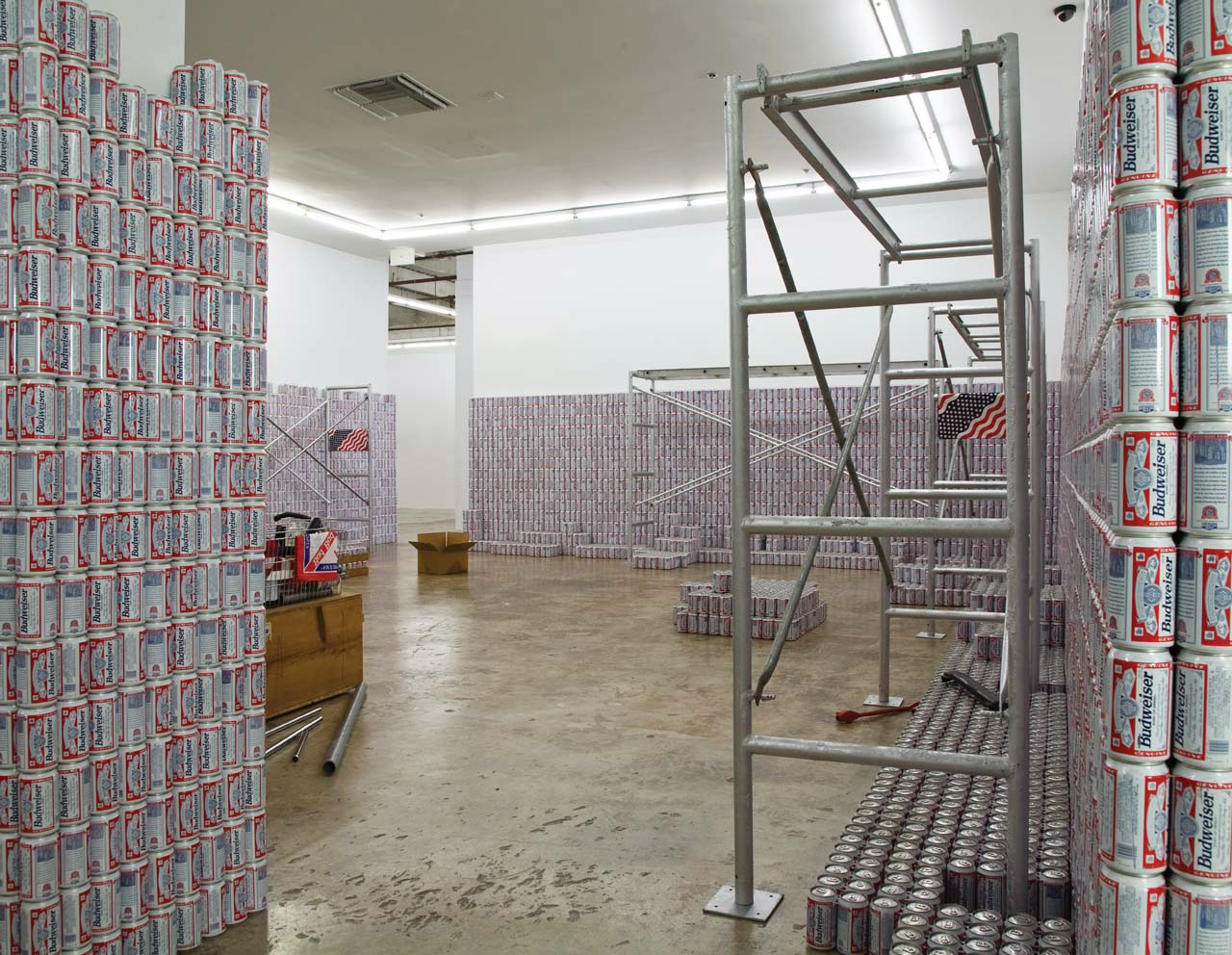
America by Budweiser, available from Memorial Day thru Election Day, 2016.
Beginning the Spring of 2016 and running through the Fall, I put out Untitled (Free As In America), a series of Cady Noland sculptures replicated with the America beer cans that Anheuser-Busch InBev replaced Budweiser with in the run-up to the US presidential election. The concept was to remake any sculpture for only the cost of the raw materials it required.
Exactly none of these sculptures were realized in the window in which Budweiser’s America cans were available.
You see it. I’m not mentioning it or linking to it.
Now the window has reopened. As the right wing is consumed by its own flames of hate and violence, it seeks to transform that hate into consumption. Recognizing the futility of icing out the giant, international beer conglomerate for paying a trans woman to promote one of their products on her own social media channel, some grifter created an alternative: right-wing beer.
Cady Noland, This Piece Has No Title Yet, 1989, Budweiser and scaffolding and stuff, the Rubells
As long as this beer is actually for sale, then, I will make Untitled (Free As In America) sculptures available again. I will replicate any Cady Noland sculpture, replacing the Budweiser cans with perfect replicas of—when I started this post, it was going to be replicas of the grift beer. But no, it will be replicas of the 2016 America cans, made by the finest trans metallurgists and artists in the world. All proceeds beyond the production costs will be used to fund trans legal defense, health care, and emergency support services. Prices run from $100 million for a basket to $1 billion for a room-sized installation.
ONE DAY LATER UNBELIEVABLE UPDATE: In a statement literally titled, Our Responsibility To America, Anheuser-Busch InBev caves to trolls attacking their product and threatening humans with baseball bats. To update Cady Noland, “Violence has always been around. The seeming [systematization] of it now actually indicates the [work] of political organization representing different interests. ‘Inalienable rights’ become something so inane that they break down into men believing that they have the right to be superior to women (there’s someone lower on the ladder than they) so if a woman won’t date them any more they have a right to murder them.”
A FEW DAYS LATER UPDATE: I joked about it, but now other people investigating the grifter’s sourcing are saying it is actually likely the case that the rightwing grifterbeer is made in an Anheuser-Busch plant. It’s America all the way down.
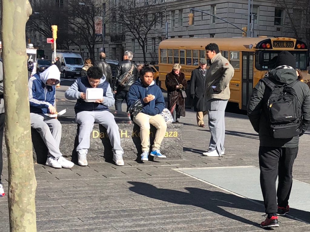
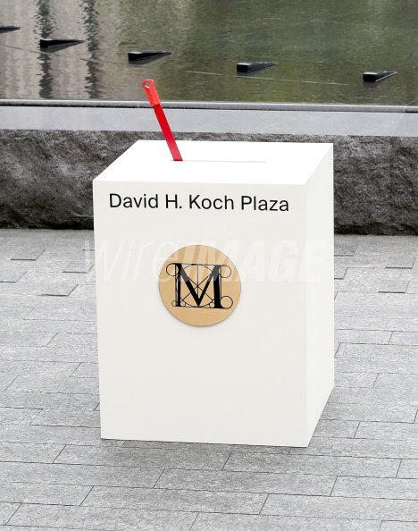
On Tuesday, September 9, 2014, The Metropolitan Museum of Art enacted what historian Daniel J. Boorstin called a pseudo-event. It was intended to draw public attention to David Koch, a right-wing extremist whose inherited fossil fuel fortune funds a vast network of politicians, judges, lobbyists, and ideologues that has pursued power in its own service for decades.
A small fraction of his wealth, $65 million, was used to redo the plaza in front of the Met, where Koch was a trustee. The main feature is a pair of large, square, fountains of black granite, with circles of choreographed water jets. The fountains are ringed by a rough cut black granite seating ledge that bears the inscription, David H. Koch Plaza, in gilt letters.
Untitled (Koch Block), 2014 — ongoing, performance/condition, documented in 2018
In 2017 I made a work of an endless, collaborative performance of negation, where the Met’s millions of visitors and passersby, New Yorkers and outsiders alike, continuously sit in a way that blocks this aggrandizing, carved text from view. That piece is called Untitled (Koch Block), and it is still in process. Please join it whenever you’re nearby.
But there is another work, a predecessor, unearthed only recently, through a search for something else, I already forget what. On the 9th of September, the Metropolitan Museum invited the Kochs—David and his wife, Julia, whose first socialite outing in New York was co-chairing the Met Gala in 1997, a year after their marriage—to flip the switch on the fountain for the media assembled, and in the presence of local politicians and functionaries, museum leaders, neighborhood schoolchildren, and a youth chorus dressed in white and wearing red gloves, who sang a dissonant arrangement of “New York, New York.”
The Washingtonian notes that in addition to Supreme Court justices, Harlan Crow also collects Hitler paraphernalia. And yet Hitler manages to be only the second most shocking painter in this billionaire’s group show:
“I still can’t get over the collection of Nazi memorabilia,” says one person who attended an event at [Clarence Thomas’s billionaire Harlan] Crow’s home a few years ago and asked to remain anonymous. “It would have been helpful to have someone explain the significance of all the items. Without that context, you sort of just gasp when you walk into the room.” One memorable aspect was the paintings: “something done by George W. Bush next to a Norman Rockwell next to one by Hitler.”
Previously: “Our Guernica, After Our Picasso” “As he explained to Jay Leno, the idea of taking up painting comes from Bush’s fantasy of being, or being compared to, Winston Churchill. Churchill painted. Of course, Hitler also painted. If painting makes Bush like Churchill, does it make him like Hitler, too? Is either association, when based on painting, more or less outrageous than the other?”
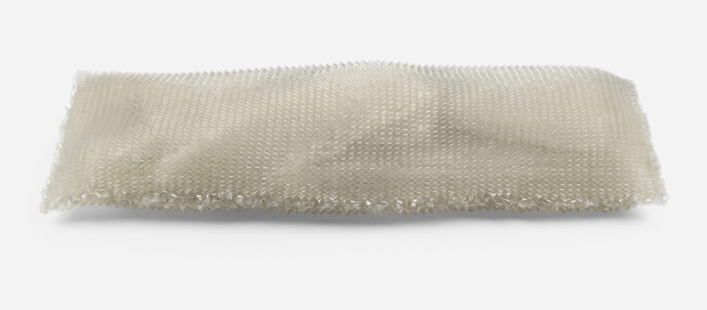
Lot 123: Oliver Herring, Untitled (Body Bag), 1995, knit mylar, 24 x 155 x 55 cm, at Wright20 Apr20
I feel like I lost track of Oliver Herring and his work after The Glitter1. But he’s going strong. And more to the point here, his knit mylar sculptures were a haunting and powerful presence in the 1990s, and they continue to exert an elegiac force.
Or maybe it’s seeing one called Untitled (Body Bag) that just hits a little harder. Herring began knitting mylar while still in grad school at Hunter, as a gender bending tribute to Ethyl Eichelberger, an iconic downtown drag artist and performer. Herring was at Wigstock in 1991 when Lady Bunny announced Eichelberger’s death by suicide after receiving an AIDS diagnosis. In 2014 Herring spoke on Clocktower Radio [mp3 hotlink, because Clocktower] about how knitting embodied time and mindlessness, giving him a chance to think and do simultaneously. He also talked about having to address the isolation that followed, and the inevitable end to the practice.
Herring’s move into video, performance, and community-based work makes for a quiet market for his objects. And part of me thinks I’m an idiot for posting about this before bidding on it, instead of after. But as someone who apparently needs to type to think, I’m not really in a spot to do different.
1 The Glitter: The last show I saw of Herring’s work as at Meulensteen, the guy who bought into and then bought out Max Protetch Gallery, where Herring showed in the ’90s. Herring’s show in October 2010, Areas for Action, was a month-long, free-form performance/making platform for serendipity, but in the societal frame of an eight-hour workday. What that that meant in practice was a performance-art-a-day calendar pad full of random nudity, body painting, and glitter. So much glitter. Protetch-turned-Meulensteen was on the east end of West 22nd street, and so everyone coming to Chelsea would start there, and trek the glitter down the street and into everyone else’s galleries. My strongest memory of that show, and of Meulensteen’s shortlived program, frankly, is hearing other dealers complaining about The Glitter. Kudos to Herring, though, for taking that concept on the road: glitterbomb and run beats glitterbomb and stay.
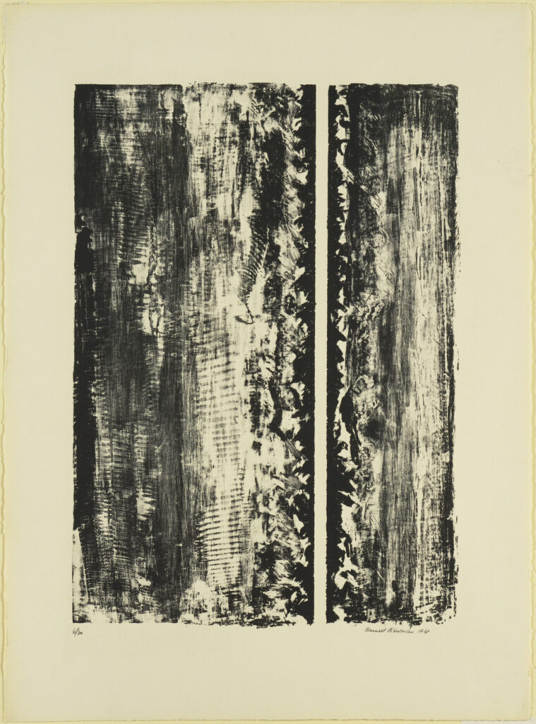
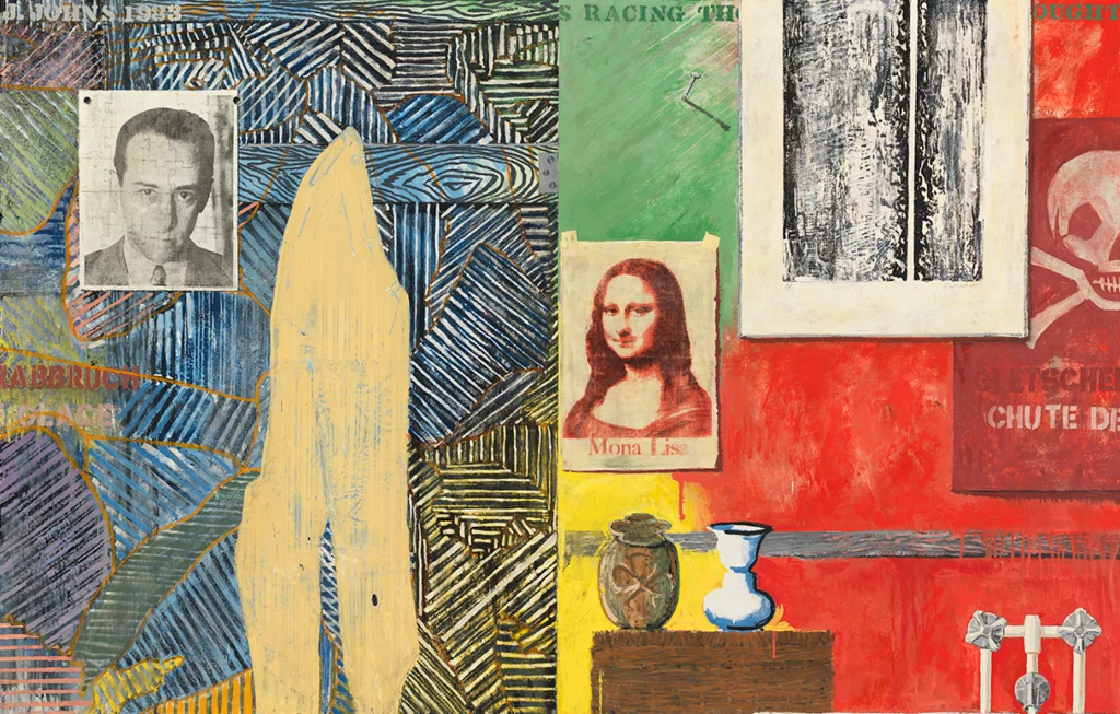
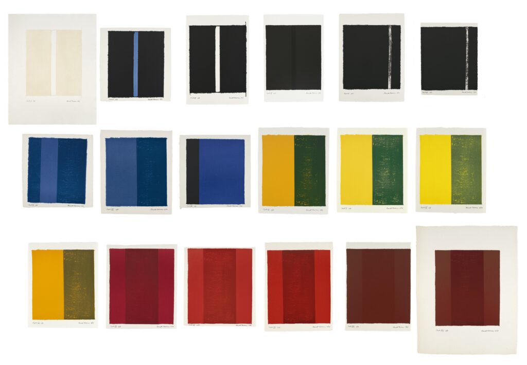
Jasper Johns has one of Barnett Newman’s first lithographs, Untitled, 1961, which Newman made at the urging of Cleve Gray, his artist friend who taught at Pratt.
Jasper Johns, Racing Thoughts, 1983, 121 x 191 cm, collection: Whitney Museum
Johns included the Newman print as an element in several of his trompe l’oeil-style paintings in the 1980s. The first, I think—I will doublecheck the catalogue raisonné later; right now I’m just trying to procrastinate something else—was Racing Thoughts, in 1983. That painting is now at the Whitney.
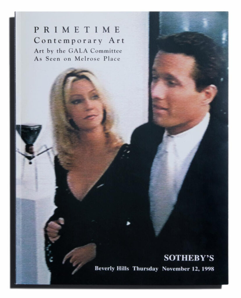
Prime Time Contemporary Art: exhibition/auction catalogue for the GALA Committee’s project, In The Name Of The Place, just published in facsimile edition by Primary Information
An amazing catalogue of an incredible project is now available. Primary Information has just released Prime Time Contemporary Art: Art by the GALA Committee As Seen on Melrose Place. It is a facsimile edition of the original MOCA exhibition catalogue, which was formatted as—and served as—an auction catalogue for a real world benefit auction that, in elegant form, was incorporated into the TV series itself.
GALA Committee was formed by Mel Chin and Helen Nagge, to realize In The Name of The Place, a collaborative project by artists and art students to crate artworks that were surreptitiously used as props during two seasons of Melrose Place, the Beverly Hills 90210 spinoff created by Aaron Spelling.
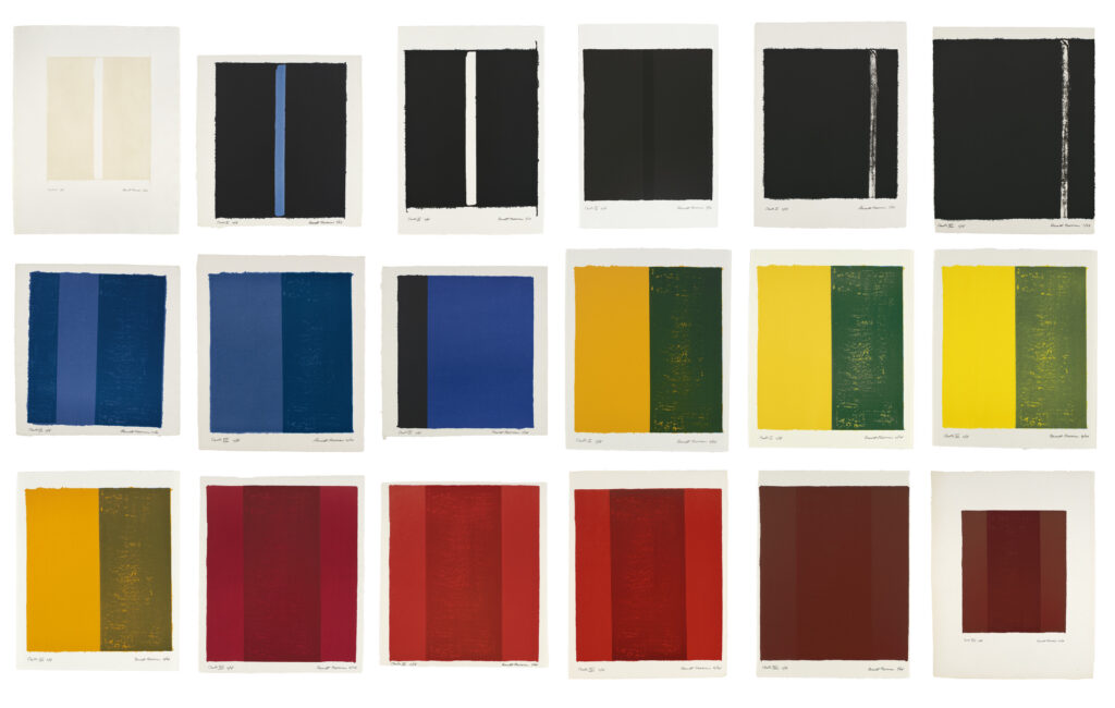
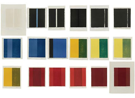
Barnett Newman, 18 Cantos, 1963-4, eighteen lithographs on various papers in various sizes not really reflected in this jpg, published by ULAE, ed. 2/18, being sold at Christie’s in a couple of weeks, probably from Chase
I never wish harder for several million extraneous dollars than when one of the greatest print projects in postwar art, Barnett Newman’s 18 Cantos, comes up for sale. At least it’s not a regular occurrence. This is the second time; the last was about fifteen years ago.
18 Cantos is being sold at Christie’s as part of a very high quality collection, assembled over decades by an unidentified corporation. It was asking myself which corporation, in 1964, would have gotten number two in an edition of eighteen, that made me think this is the collection of the David Rockefeller era of Chase Manhattan Bank. At least twelve of the 18 Cantos editions are in museums. At least a couple of have been broken up and are circulating individually, a print tragedy.
I didn’t know this sale was coming when I posted a couple of weeks ago about Barnett Newman’s comparison of lithography to playing an instrument, which has its own material and aesthetic “licks,” including the lithographic stones themselves, and the borders of the papers receiving the impression. As he explains in the text for 18 Cantos, Tatyana Grosman taught him this, that printing is not just replicating a painting; it’s its own thing.
And Newman took that to heart. The eighteen prints of are made with only a few stones, singly and in pairs, in differing orders; with unmixed French and American inks; on Japanese, English, and French paper in at least twelve sizes. The result is a printed fugue where the identical elements and minute differences between prints are as important to the artist as the specific composition of each print.
[UPDATE: I’m rereading the 2008 Sotheby’s lot text, which says, without sourcing, that Newman referred to the third “sequence,” the yellow-on-blue ink variations in Cantos X-XIII, as “The Four Seasons.” It also notes that two sets have been dispersed–but makes no mention of the as many as five A/Ps signed by Annalee Newman into the 1970s. It’s not clear whether any of those proofs were complete sets or all loosies. I wish there was more discussion of this project than just auction catalogues.]
Size-adjusted 18 Cantos: I-III, V&VI, VIII&X-XIII, and XIV-XVIII are all made from the same sets of stones, I think
Those resonances are clear in person, the reward for long looking and roaming among the prints. But some of these harmonies get flattened out online, like in reproductions of the whole suite, like the one up top, which haplessly resize individual prints to fit a graphic designer’s grid. I’ve made a quick adjustment to correct the major errors, but that feels like a rough mix, still in need of fine tuning. I was already thinking about Cantos a lot before this sale popped up, and I will keep jamming on it for a while, I’m sure. Meanwhile, if you have several unneeded millions of dollars handy in the next couple of weeks, HMU.
[day after update: sold, barely, for $2.107 million. pls let me know the tracking info for when you ship it to me, successful buyer.]
[upon even a minute’s rumination UPDATE] Great work everybody (me), I just made a halfbaked, slightly higher resolution version of the 2008 image I reposted in 2012 from Arcy Douglass’ amazing essay on 18 Cantos during their exhibition at the Portland Museum. So it’s really just a Christie’s problem. And a me problem for not looking in my open tabs.
Apr. 18, Lot 25: Agnes Martin, On A Clear Day, 1973, silkscreen on paper, mounted, each sheet 12×12 in., est. $150-200k at Christie’s
A complete edition of Agnes Martin’s silkscreen portfolio, On A Clear Day, is coming up for auction at Christie’s, from “an important corporate collection” I expect is the merged remnant of the Chase Manhattan Bank.
It’s as good an occasion as any to reflect on two aspects of this important work: As print curator Riva Castleman explained when The Museum of Modern Art announced the exhibition and gift of the prints [pdf], Martin did not make them. She selected “30 drawings from more than 300 that she executed in 1972…[and] had the Domberger silkscreen workshop in Stuttgart cut the stencils to their exact measurements without attempting to duplicate her autographic line.” This was in order “to replace, by means of mechanical application, the illusionary and irregular drawing that detracted from the perfection she sought in her compositions.”
Agnes Martin, Untitled (Study for On A Clear Day), 1972, graphite on paper, 30 9×9 in. drawings, collection SFMOMA
The Fishers bought what seem to be the 30 drawings—which are shockingly loose for Martin—and they are now at SFMOMA as a Untitled (Study for On A Clear Day), which is not quite how it went down? But close.
The other thing is, though the artist conceived On A Clear Day as mechanically supplanting the imperfections of her autographic line, it is credited with pulling her out of self-imposed isolation and re-starting Martin’s art production. Yet she also made 300 drawings for it in 1972. And her correspondence with curator Sam Wagstaff from the time she supposedly wasn’t painting—1971-72—includes references to making paintings. And to loaning, selling, and planning to show work. So she was not isolated, and had not stopped working, but was managing her work’s reception while still seeking its perfection.
Anyway, it’s a good time to have an extra couple of hundred thousand dollars and some taste. For my part, I am trying to figure out the best way back from the silkscreens to the drawings. Which seems like a more easily realizable project than my other Untitled (On A Clear Day), to reuinite one of the broken-up editions as a work.
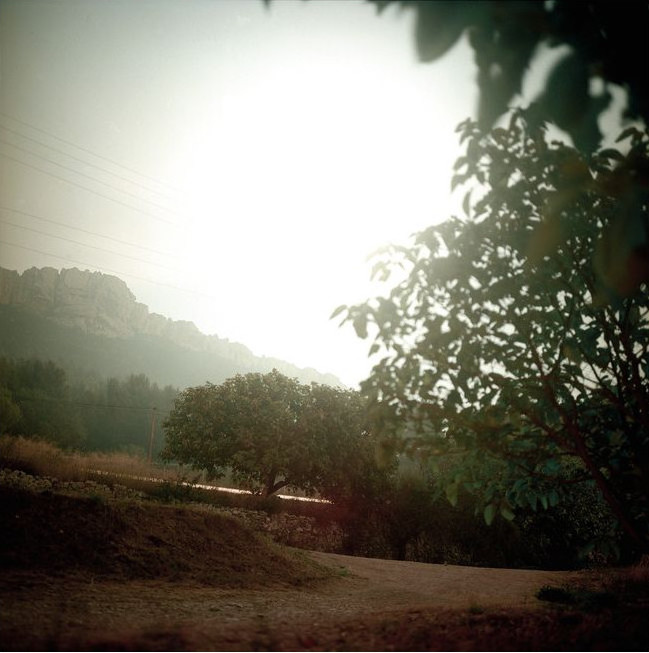
“Obviously, it’s a clock, the whole project is a clock. It’s managed by the moon,” said Darren Almond of his Fullmoon Photos series in this seven-year-old video from the Louisiana Museum.
It’s been a minute [h/t @br_tton] since I remember how thoughtful and interesting I find Almond’s work, then he comes up with this:
It started off as a romantic gesture, an inquisitive point. Then it became a kind of controlled concept. But then I was involved in this meditation by moonlight. I was involved in the act of making the photograph. Then my life was becoming connected and had a strong relationship with the landscape. I was going off into this landscape we are no longer familiar with, which is the landscape of the night, away from all the pollution, the light pollution that we’ve generated, that we surrender ourselves with.
Darren Almond, Fifteen Minute Moon, 2000, c-print on aluminum, the first one is apparently of/near Mont Saint Victoire, with the autoroute running through it, and an exposure that literally lasted as long as a kiss? That is romantic.
Recognizing the change we undergo by the making of the work. It’s something I think about a lot, at various levels. I have unrealized projects that would, I recognize, consume me, were I actually to attempt to realize them. Some of them are maybe even unrealizable by design. There are tabs open for a project I actually consider doing. There are tabs open for posts I have yet to write. These are the impacts of writing and connecting as I do.
In a 2017 interview for MUDAM he talked about the end of the project, and what had been invisible to him before:
In 2013, I was in Patagonia. There, the atmosphere is very clear, there’s far less light pollution and you’re able to literally see the colours of the night sky. This experience marked a cut-off point for me. After twenty years of traversing the globe and looking through the lens of a camera at what I could see in front of me, I suddenly felt that I needed to approach landscapes that I couldn’t see, landscapes beyond visibility, but through the visual somehow, using a tool or a mechanism to see into the shadows, to enlighten the shadows that lie before us.
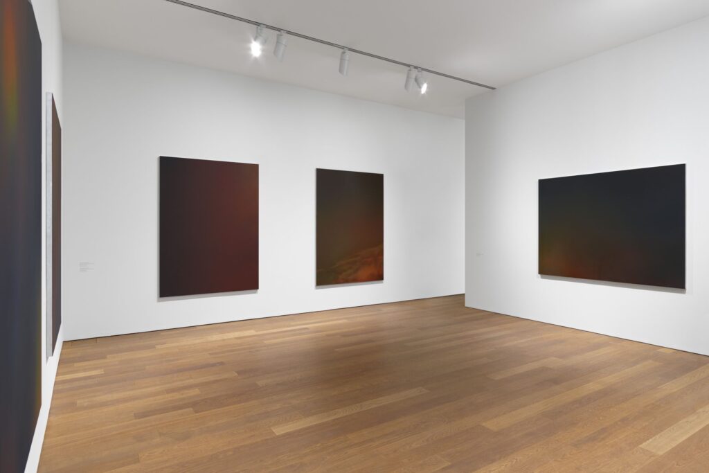
What followed was Timescape paintings, “Inspired by views of the deeper space…[that] materialise the impression felt when faced with this night sky,” and “that evoke the visible confines of the cosmos,” according to MUDAM. “Despite their apparent blackness, these paintings are obtained from numerous layers of different flat colours applied successively on an aluminium support.”
Darren Almond Timescape paintings installed at MUDAM in 2017, image via Max Hetzler
So twenty years of meditating by moonlight and traveling to forgotten landscapes led Almond to become an abstract painter trying to capture the impression of looking up at the night sky. I was worried this romantic project didn’t sound like progress, but then I remembered we exist within cycles of time, some of which are made visible by moonlight, and some which only come into view after many trips around the sun.
Bernice Bing, Self-Portrait with a Mask, 1960, image: Asian Art Museum via Hyperallergic
I’m late to John Yau’s essay on Bernice Bing, the late Bay Area artist who explored the abstractionist movements of the mid-20th century, and then developed a synthesis of her own of west coast abstraction, calligraphy, and Zen. But it’s not too late to see the exhibition built around the 20 pieces of Bing’s work recently acquired by the Asian Art Museum. The show, curated by Abby Chen, runs through June 26, 2023.
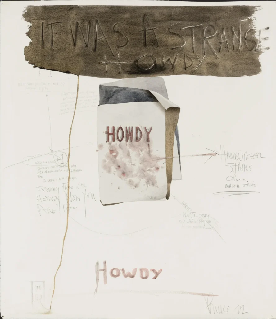
Richard Prince, Howdy Burgers, 1972, Watercolor, pencil and charcoal on paper, matted, 24 1/2 x 21 3/8 in., via Barridoff Auctions/liveauctioneers
Art historian Michael Lobel spotted this unusually early Richard Prince work coming up for auction in Maine. It’s not unusual for Lobel; he curated a whole show of Prince’s early work, which was shown and collected, but which the artist has mostly tried to write out of his own history. Because of that, it’s rarely seen, and almost never discussed. [Bruce Hainley did review the show for Artforum, though; and the catalogue is a work of conceptual art in itself.]
Howdy Burgers is constructed as a watercolor illustration of a stained napkin, annotated in pencil: “Study for HOWDY (#1)/ appeared one strange day/ out of nowhere when reaching/ for a napkin I was/ suddenly faced with/ HOWDY NOW YOU/ ARE TOO” is the most prominent text, surrounding the napkin along with “HAMBURGER STAINS OR Burger stains” and “White No. 1 Study/ (1) White napkin.”
Under the IT WAS A STRANGE HOWDY banner are fainter texts with arrows, “NOTE: This printing is not/ by Andrew Wyth [sp]” and “Early reproduction of early/ pre-colonial sighn [sp] (notice the/ handy electric cord which runs/ down the page) this is also/ early American reproduction of an/ electric cord.” And sure enough, the sinuous trail of brown paint ends in a penciled electric outlet.
So a lot is going on within the work, and with references beyond; it’s certainly more complex than it seemed even a few minutes ago, before I started parsing it. To some extent, it looks a lot like another work Lobel called out, a 1993 melange of text and drawing on a smoky face that appears to be a drawing from 1975, which sold at Phillips in London last December.
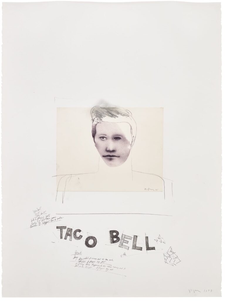
Richard Prince, Untitled (Taco Bell), 1993, ballpoint pen, pencil, collage and charcoal on paper, sold at Phillips in Dec. 2022.
Untitled (Taco Bell)‘s annotations turn out to be less captions and more Prince’s joke works. One example: “A funny thing happened to me while coming out to/ the mike tonight. I forgot my act.” Meanwhile, the moody, pointillist young face on a sheet signed “Prince 75” was augmented after it was affixed, with rudimentary hair, neck and shoulders. It’s as if Prince was seeing his old work, and asking what he could make of it [“A brooch, a pteradactyl,” etc.]
By 1993, he developed several significant bodies of work, this collaging and reworking of existing works feels of a piece with his larger practice. And it resonates with stuff he’d do later, too. But it’s really interesting to see it in the light of this far earlier work, a drawing from the period it originated, the period Prince raided for parts.
Lobel reminded me that in 1993 Prince had just finished working with Lisa Phillips on his first big retrospective, at the Whitney, and so had an occasion himself to revisit his work, early and not. This is a rare chance for others to do the same.
Robert Rauschenberg photographed by Cy Twombly at 61 Fulton Street, where he lived from Spring 1953 until Summer 1954
[CORRECTION: The Twombly sculpture is in Chicago, see below.]
This Cy Twombly photograph of Robert Rauschenberg has been around. He is in his Fulton Street studio, the crumbling walk-up he moved into when he returned to New York from his Italian romp with Twombly in the Spring of 1953. Clearly, he’s settled in a little bit, put some interesting stuff up on the wall.
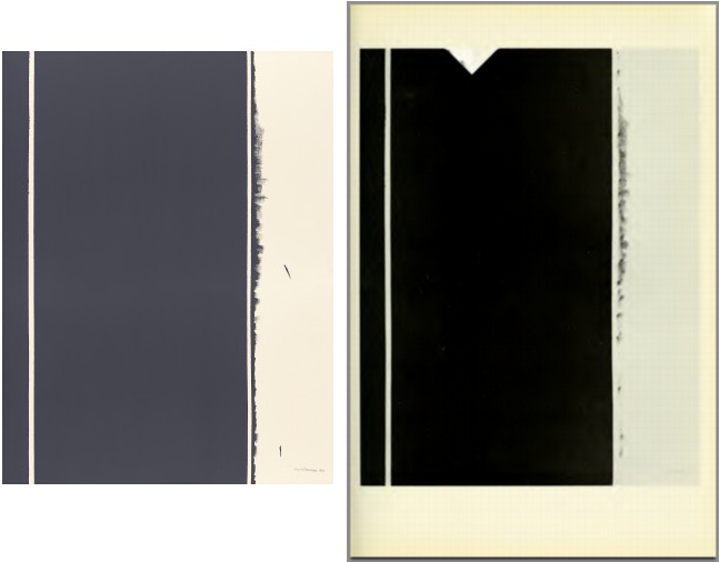
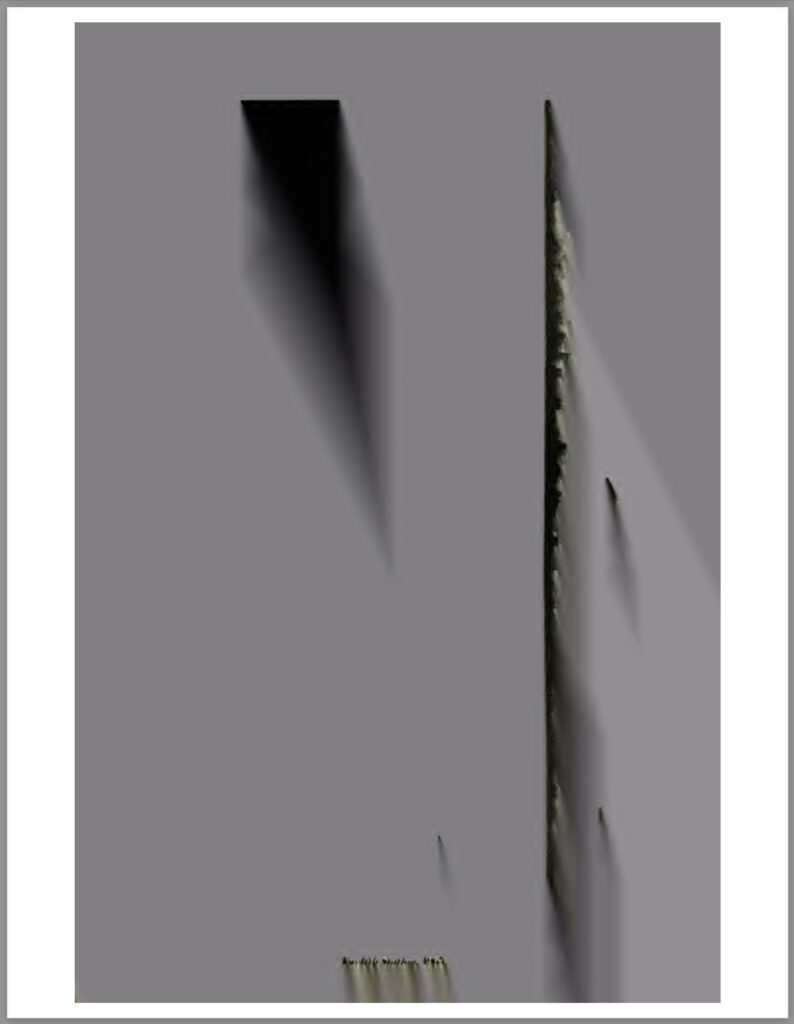
[l to r]: Barnett Newman, Twelfth Station, 1965, acrylic on canvas, 78 x 60 in., collection: NGA; Study for Untitled (Newman Twelfth Station Glitch I), 2013/2023, jpg of pdf
It’s been almost ten years since I found the Internet Archive scan of the Guggenheim’s 1966 catalogue for the debut exhibition of Barnett Newman’s Stations of The Cross had not one, but two alternating glitches in it.
Study for Untitled (Newman Twelfth Station Glitch II), 2013/2023, jpg of pdf
And ten years and five minutes since I decided they should be made into paintings.
And ten years, five minutes and a day since I last thought about me actually painting them myself. I guess these things just take time. I was about to buy an old catalogue of Barnett Newman prints when I realized I already had two. And that memory of Newman’s interest in the borders around prints, intrinsic to the medium, and his treating lithograph stones as an instrument to be played, reminded me of these pages. And though my previous comparison this instrument metaphor to Richard Prince’s description of playing a camera didn’t help me make the connection at the time, I now see that a scanner can be an instrument as well, with what Newman called its repertoire of “instrumental licks.” [Which, now that I type it, reminds me of Sigmar Polke’s hyperexpressive use of a Xerox machine to make his artist’s book, Daphne. But if the artist introduces them himself, are they even glitches?]
Still not sure what form(s) these should take—whether books, or prints, or paintings, or paintings of paintings—but I am glad to be thinking about it again.
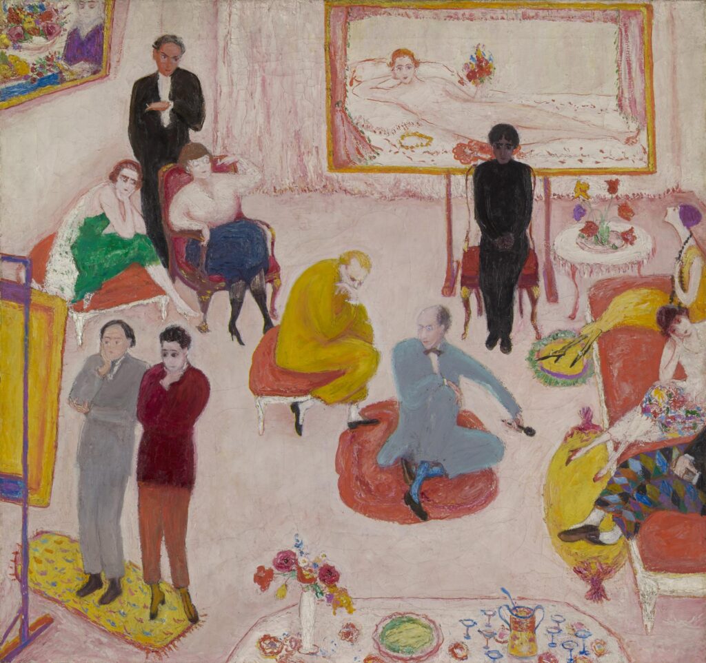
Florine Stettheimer, Studio Party (or Soirée), 1917-1919, 28 x 30 in., collection Yale University Art Gallery
In her 1995 biography of Florine Stettheimer Barbara Bloemink identifies everyone the artist put in this painting of a painting unveiling, based on guests whose presence at such soirées had been recorded somewhere. I don’t have my copy of Bloemink’s book handy, but my guess is the sources were the correspondence and journals of Florine and Ettie Stettheimer at Yale’s Beinecke Library, which transferred the painting to the Art Gallery in 2019.
According to Bloemink, the two guys contemplating the painting in the lower left are sculptor Gaston Lachaise and cubist evangelist painter Albert Gleizes. Ettie Stettheimer is in green in the upper left, sitting next to poet Isabel Lachaise, the sculptor’s wife and muse. Painter/sculptor Maurice Sterne is standing behind them. Sterne’s wife Mabel Dodge, a friend of Gertrude and Leo Stein with a giant villa in Florence and a downtown Manhattan salon, who was part of the founding of artist colonies in Provincetown and Taos, is not pictured. But that’s Leo Stein on the pouf, next to playwright and Carl van Vechten squeeze Avery Hopwood on the ottoman. Florine Stettheimer herself is sitting on the sofa at right between Madame Juliette Gleizes and an unknown figure in harlequin pants.
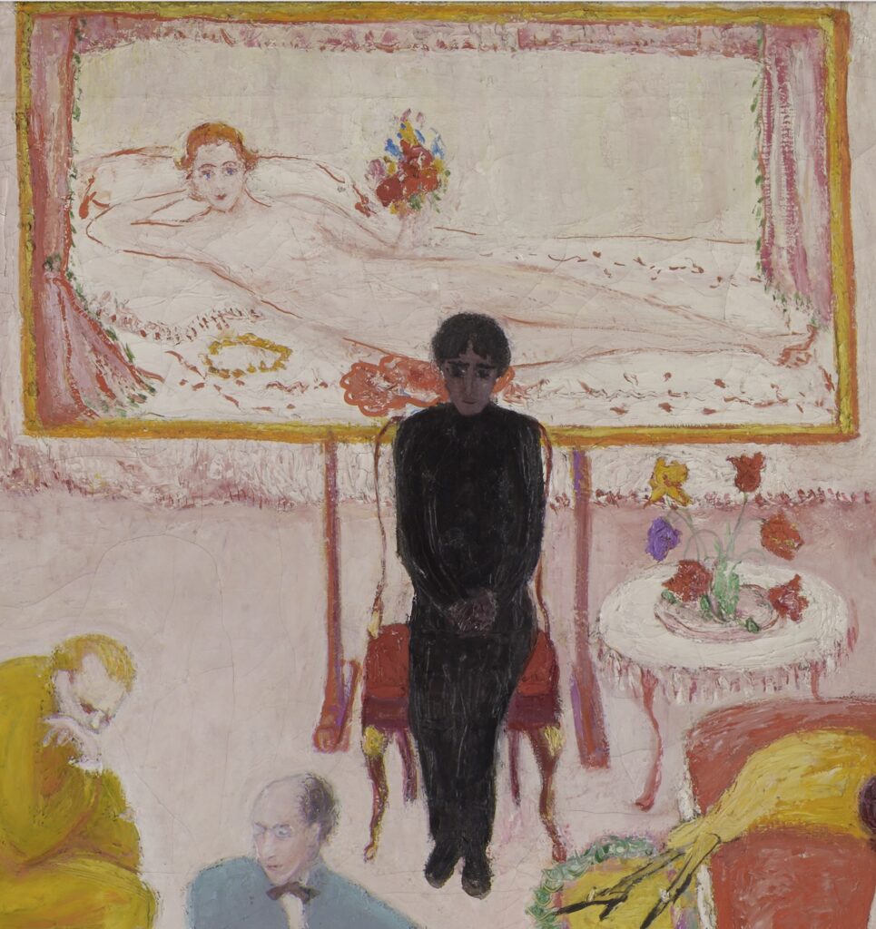
Florine Stettheimer, portrait of “Hindu poet Sankar” in front of the nudest part of the artist’s nude self-portrait, a detail from the 1917-19 painting, Studio Party (or Soirée) at Yale
Everyone’s accounted for so far, but Bloemink identified the dark-skinned figure in a black suit at the top center of the picture, sitting in front of the nude self-portrait Stettheimer never exhibited publicly in her lifetime—nor was it included in the posthumous show Marcel Duchamp organized for her at MoMA in 1946, although this painting was—as “Hindu poet Sankar.” Sankar, whose only mentions I can find are related to this painting, but it seems pretty clear the reason they were invited was to keep the painting from getting censored on Tumblr. So who even is Hindu poet Sankar, and what have they done? Literally every online mention of them tries to sound like of course, they know who Hindu poet Sankar is, but if you don’t know, they’re not going to tell you.
Anyway, Sankar looks a little uncomfortable, not to say out of place—no, stay right there, Sankar, don’t move, I’ll get you a drink. This is a family blog.
[At least it’s not just me update: In a 2017 paper [pdf] on the interrelation between Carrie Stettheimer’s well-known doll house models and, respectively, Ettie’s writing and Florine’s painting, Duke art historian Annabel Wharton notes that, even after enlisting the help of Asian Studies colleagues, she was unable to further identify “Hindu poet Sankar.” According to Wharton, Bloemink learned of the Sankar ID from a 1991 conversation with Yale’s longtime bibliographer and curator Donald Gallup [who died in 2000]. Gallup helped acquire and process Gertrude Stein’s papers, too, so he was familiar with the modernist milieu. Maybe the answer lies somewhere in the library.]
NEXT DAY UPDATE: With no information forthcoming from the Stettheimer side, it seemed useful to try looking around to see what prominent Indian poets or other figures were making the scene in New York City in 1916-1919. A couple of possibilities: In September 1916, a Columbia grad student named Shankar M. Pagar married fellow Columbia student Radhabai Pawar in what the Times called the first Hindu wedding on record in the United States. At least it was the first one in the Times. Their reception was at the Hindustan Association of America, an ex-pat student group where Pagar was an officer. There was no mention of poetry, though, and the Pagars were planning to return to India after completing their degrees in mid 1917.
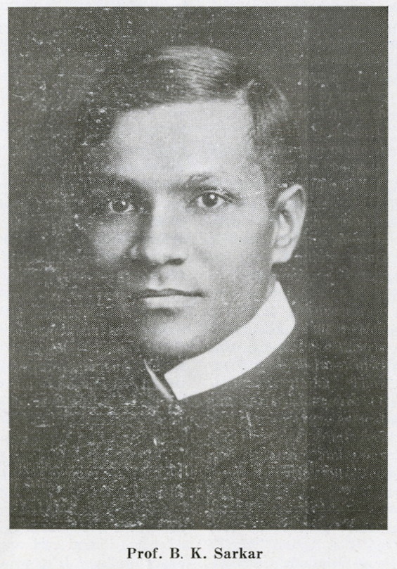
The HAA archives mentioned another, more prominent possibility: Benoy Kumar Sarkar, a prolific Calcutta sociologist and nationalist. I couldn’t find mention of Sarkar as a poet, or that he visited New York before the 1930s—and I gave up looking when his Wikipedia page said he praised Nazism and recommended India establish a fascist dictatorship [presumably a Hindu dictatorship instead of an English one.] But Twitter user @sand_fiddler pushed past that to find the Times ran a full-page feature & interview with Sarkar during a Spring 1917 US tour. Not only was Sarkar credited with publishing three volumes of Bengali poetry, his interview is laced through with references to Homer, Wagner, Chinese poetry, Walt Whitman, and Rabindranath Tagore. Now that we know he was in town, the only question remains the most salient one: is there any indication he visited Stettheimer? And that he might be the Sarkar/Sankar we’re looking for?
FEB 2024 UPDATE: Thanks to a comment from Tumblr scholar @Idroolinmysleep, published identification of Sarkar as Stettheimer’s “Sankar” now extends back 20 years. In 2012, NYU historian Manu Goswami identified Sarkar, and discussed his aesthetic theories and curatorial efforts in an extensive article on Sarkar and interwar internationalism. It’s a dense but fascinating read. Along with flagging a Sankar/Sarkar indexing error, Goswami cites a 2003-4 article on sculptor Gaston Lachaise by artist, art historian, and then-Met researcher Virginia Budny, that also identifies Sankar as “surely Sarkar.” Budny notes the same NYT article above, Bloemink’s date of the painting by a stretcher inscription [“August 25, 1919”], and Sarkar’s friendship with the artist Max Weber to put him in this NY artistic milieu. From here on out, any further mention of “Hindu poet Sankar” in discussion of Stettheimer’s work should be considered like brown M&Ms in Van Halen’s dressing room: a sign that the promoter didn’t read to the end—or dgaf if they got things right.
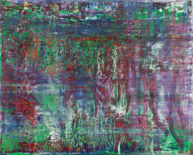
The last something: Gerhard Richter, Abstraktes Bild (CR 952-4), 2017, 200x250cm, image:gerhard-richter.com
I get it, it’s been six years since Gerhard Richter announced he’d “retired from painting,” but after several months of press releases and invites for a show of “new and recent” work, it still came as a shock to read David Zwirner describing the show opening last night as containing “a group of Richter’s last paintings, made in 2016–2017.”
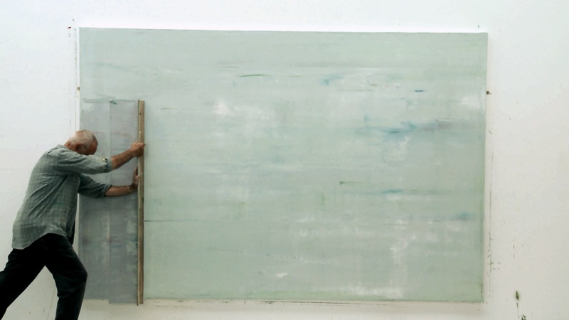
Gerhard Richter painting in Gerhard Richter Painting, 2011, image from Corinna Belz’ film
Of course, what it technically means is, “last paintings on canvas.” Or “last squeegee paintings.” Which still shocks to think about; I, for one, would like him to still be painting. But given the artist’s incredible physical exertion while making the squeegee paintings in Corinna Belz’ 2011 film, Gerhard Richter Painting, it’s understandable. I’m still trying to think through what to make of it, though, and to see what Richter’s making now.