
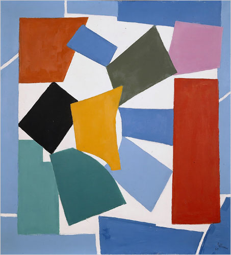
So now that the White House has returned Alma Thomas’s 1968 painting, Watusi (Hard Edge) to the Hirshhorn amid a flurry of interest in its making and in the artist herself, I assume the museum will quickly put it on public view. Probably with a bit of explanatory text about how and why the aged, arthritic Thomas appropriated her composition from The Snail, one of last works Matisse managed to create before he died.
Maybe they’d even put it alongside some Matisse paintings, which demonstrate the early modernists’ bold innovation of appropriating motifs and forms from African art.
Or maybe they could go all out and borrow The Snail from the Tate, so it could hang alongside Thomas’s painting, allowing a careful examination of what she saw, but also of what she changed.
I’ll be waiting by my inbox for that press release.
Author: greg
Oy. White House Sends Alma Thomas Painting Back To The Hirshhorn
I guess I can understand if the White House saw the rightwing faux-controversy over Alma Thomas’s Watusi (Hard Edge) as an unhelpful distraction, and it’s not like the country elected Obama to be curator-in-chief, but that doesn’t mean their people need to make shit up about it.
Randy Kennedy reported tonight on the NY Times’ ArtBeat blog that the painting has been returned to the Hirshhorn Museum. Watusi is well-known [at least as well-known as a painting by Alma Thomas, an African American woman in DC who only began painting abstraction and exhibiting her work after she retired from teaching, can be] as a deliberate appropriation and alteration of a late cutout painting/collage by Henri Matisse. Some critics of the Obamas ignored this history and strategy and decided the work was plagiarized and that Thomas was either a fraud or a hack.
I read the every comment on the original FreeRepublic.com thread about this controversy, and I wrote that the criticisms were grounded in longstanding conservative views on the primacy of craft and originality in the evaluation of art. In contemporary art terms, the critics of Thomas’s work rejected the pared down abstraction of both her and Matisse [without noticing or caring about the differences in technique: painting vs. collage], and they rejected the validity of appropriation as an artistic strategy [without noticing or caring about the significant differences Thomas introduced]. But it’s now obvious that this controversy is not about Alma Thomas or even about art; it’s about politics.
Which is the only explanation I can think of for why the White House misrepresented the painting’s fate:
Semonti Stephens, the deputy press secretary for Mrs. Obama, said that the painting had been intended to go in the first lady’s office and that the the decision not to put it there was made only because its dimensions did not work in the space in which it was to hang.
“This piece just didn’t fit right in the room,” Ms. Stephens said, adding that the first lady continues to admire the work of Alma Thomas and is happy to have one of her works in the White House. “There’s no other reason,” she said of the other painting. “It really has nothing to do with the work itself.”
As long as you equate “decision not to put it there” with “decision to take it down,” that statement is technically true. But the implication that the painting was not hanging in the First Lady’s office is completely false. It was, and it was there for quite some time. The office is small, and the painting is big, but it certainly seemed to fit fine until a bunch of wingnuts pitched a fit over it.
Off The Wall: White House Drops [i.e., Changes Mind] About Painting [nyt]
Previously: On Wingnuts on Alma Thomas
John & Merce’s Bob
Walter Hopps’ 1991 exhibition at The Menil, Robert Rauschenberg: The Early 1950s, changed my art life, basically. Bob and Cy trekking around Italy. Bob and John and Merce collaborating. Bob and Jasper, whoa. Did not hear much about that at BYU’s Art History Department.
Anyway, Merce Cunningham and John Cage’s art collection is now being sold at Christie’s to support the late choreographer’s foundation. Some of the stuff is fantastic, and some is slightly precious.
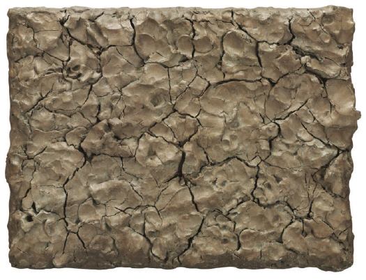
Here’s Clay Painting (For John Cage and Merce Cunningham), Rauschenberg’s 1992 recreation/replacement of the seminal 1953 work, Dirt Painting (For John Cage), which the artist borrowed for a retrospective and never returned. He was working on it when Cage passed away in 1992.
Rauschenberg’s original dirt painting was created after his visit to Alberto Burri’s studio in Rome. But while Rauschenberg has acknowledged Burri and his material aesthetic as a central influence on his later Combines, the original dirt painting, with its notion of growing mould defining the form and composition of the work, probably owes more to the influence of a work like Marcel Duchamp’s Dust Breeding of 1920. Duchamp was an important presence behind the creative thinking of both Cage and Rauschenberg who, in 1953, collaborated on a number of projects, most notably perhaps their Automobile Tire Print — a printed drawing made by Cage driving a truck with a painted tire over a series of paper pages laid down by Rauschenberg. In this later dirt painting, Rauschenberg has chosen to use unfired clay as the material for this newer version of his earlier self-defining painting. In this work which, like many of Cage and Rauschenberg’s works is dependent on the passage of time for its resultant form, the cracks that have appeared in the dried clay this time recall more closely the later Cretti paintings made of earth that Burri was to make in the 1970s.
Can you believe Cage driving the car? Automobile Tire Print is like a Zen scroll painting, action painting, a Newman zip, and Pop Art stunt all in one.
Nov. 10, NYC, Lot 5: Robert Rauschenberg, Untitled, 1953-1992, est. $200,000-300,000 [christies.com]
Also: Lot 6: No. 1, 1951, a 50+yr black painting colabo between Rauschenberg and Cage, est. $800,000-1,200,000
Related: Alberto Burri’s Cretto on greg.org
Digital To Analog Paint Matching?
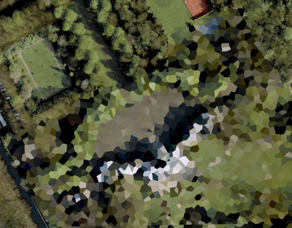
Maybe I’ve just been living in the digital world too long, but I’d like to somehow extract a color list from these polygon-laden Google Map images, and then order paint that matches. Only I’m not finding a vast, well-developed, digital-to-analog paint matching infrastructure in place. Does anyone have any ideas?
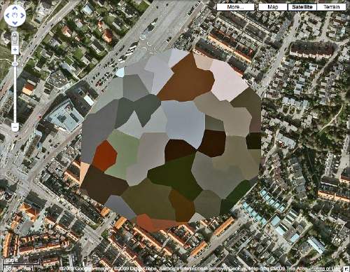
Obviously, I can see why no one would want to match colors to a JPEG or PNG; the range, accuracy, and quality of color in the physical world significantly outstrips the digital approximations. And it’s not like there’s a common, systematized language of color that crosses the digital/analog border. Binhex or RGB for paint? Pantone for Photoshop?
I’ve been talking to several painters about this the last few weeks, and they’re all for mixing my own colors, or at least having an artist mix them for me, by hand/eye. And I can respect and understand that. With mediums and grounds and consistencies and undercoats and transparency and absorption, paint turns out to be a vast, complex, multifactored thing, and I’m fascinated by how quickly these conversations of a topic I nominally thought I knew something about leave me in the dust.
But the digital essence of the original seems germane here. Although I suspect the blob in the Noordwijk image above was just cut and pasted there by the obscurer [like the Dept. of Defense HQ clearly was], the camo polygons are usually generated by software, an algorithm that carves up the underlying [sic] digital image and then reduces each component to a dominant or average [sic] color. The data aspect will have to yield to the object at some point, if only when the paint actually hits the printed photograph’s surface. Since the loss of information–or its censorship, or its transformative destruction–is one of the most interesting elements of these images, I’d like to make sure I’m accounting for the changes at each step along the way as best I can.
Collecting Dutch Landscapes
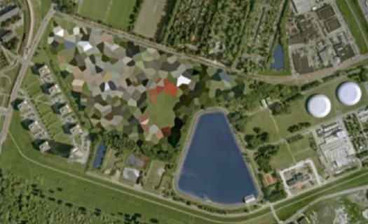
I just got the first prints of Dutch Landscapes to paint. And I’ve captured a few more to prep for printing. Here are a few more of the camo-obscured Dutch sites I also like but haven’t gotten around to capturing and printing yet. Most are military or intelligence installations of some kind, culled from the Onherkbaar/Unrecognized list here:
View Larger Map
The landscape and architecture around this one on the Maas in Rotterdam has a really nice, explicit geometry of its own. The light in some of these is just wonderful, too. So strong and clear. Which is what you’d want, obviously, for aerial photomapping. As Stefan reported on Ogle Earth back in 2006 when this dataset debuted, the fact that these were not satellite images is intrinsic to their camo censorship. Satellite imaging is considered to be beyond Dutch jurisdiction, but permits are required for aerial surveying, and the images are reviewed to censor “vital” military or intelligence buildings and sites.
View Larger Map
More landscape geometry. This one reminds me of Isamu Noguchi’s admiration of hatake, the rice paddy landscape of Japan, a terrain which, like the Netherlands, was the product of centuries of intensive human sculpting and engineering. [That said, I can’t find any mention of the Noguchi quote I’m thinking of.]
View Larger Map
This one’s the Palace Huis ten Bosch, the Queen’s residence. I love that the tennis court and the sculpture garden at the top are not considered “vital” sites. While trying to identify any of the installed works, I learned that H.M. Queen Beatrix is quite a fan and practitioner of sculpture and maintains at studio there at the palace.
‘The Sound of Footsteps’
Tacita Dean on the making of Craneway Event, the rehearsals of the Merce Cunningham Dance Company in a former auto factory on the San Francisco Bay, which she filmed exactly a year ago:
I edited it alone on my film-cutting table using magnetic tape for the sound, which means you have to continually mark everything to keep the film in sync. The sound and image are separate, and the moment you lose sync it’s a nightmare: It’s just the sound of footsteps, which could be from anywhere in the film so it’s nearly impossible to find sync again.
17 hours of film edited down to 1h48, which fits nicely with the “longueur of some of [her] other films.” Looks and sounds fantastic.
Tacita Dean | 500 Words [artforum.com]
Craneway Event premieres Nov. 5-7 at St. Marks Church as part of Performa 09. [performa-arts.org]
The Beautiful Caverns of Luray, Virginia
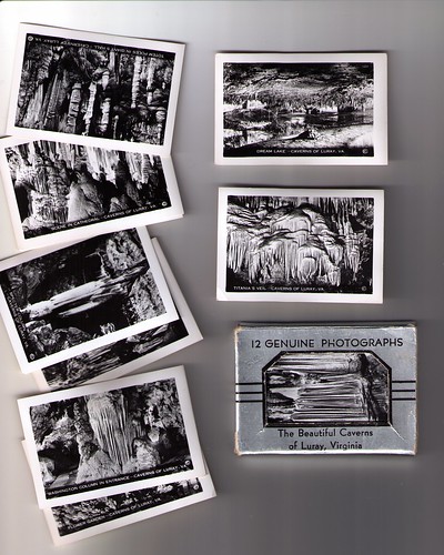
Score one for the bloggers. I found this beautiful little packet of souvenir photographs at a small, otherwise uninteresting flea market a few weekends ago.
They’re tiny, just 2×2.5 inches, but they’re crisp and beautiful in a way that reminds me we’re losing something tangible in this wholesale shift to digital printing.
The photos reminded me a bit of a miniature photogrid from Olafur Eliasson–he’s done caves looking in and looking out, and some later pieces are documentations of his trip through a place, like the river rafting series.
But more than that, they reminded me of a tiny set of Robert Smithson mirror displacement photos I kind of wanted to buy. Smithson had used a Kodak Brownie to take tiny, square snapshots of mirrors stuck in the snow on his Greenwich Avenue roof. The Met had them on hold for a very long time, and ended up taking them in 2001. There are no images online, but they fall in an interesting place in Smithson’s work, between his contact sheets and his rarer, larger photos.
As for these photos, I have to thank Steve Roden, who helped me notice them at all. Roden had posted this summer about the Luray Caverns, specifically a recording of The Great Stalacpipe Organ, which was made of concert-tuned stalactites. Those Luray promoters didn’t miss a single angle.
What I Looked At Today – Mondrian Transatlantic Paintings
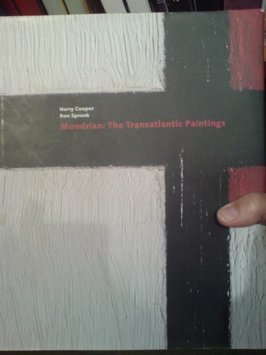
Anyone with an interest in Piet Mondrian’s painting technique probably already has Mondrian: The Transatlantic Paintings, published by the Harvard Art Museums in 2001. It’s a fascinating, in-depth, and not-at-all boring look at a unique body of Mondrian’s work, based on the scholarship of art historian Harry Cooper and forensic painting scientist Ron Spronk.
They examine a group of 17 paintings which Mondrian took with him to New York when he fled Paris just before the outbreak of WWII. Mondrian had already shown some of the paintings, but he reworked them so significantly after his arrival in the US, that he gave them all two dates. [The Phillips Collection’s Painting No. 9, for example is dated 1939-1942.]
Cooper and Spronk get deep into the layers of paint to reveal how Mondrian constructed and executed his paintings, and then how he altered them. It’s great, geeky stuff, and the book is filled with weird, interesting photos of details–like 40x zooms on brushstrokes, and the messy backs and reshaped stretchers–that people who don’t own Mondrians never get to see. And there’s X-ray photos and spectral analysis that you usually only see used on Old Masters, rarely on modern art. These images, these paintings, are objects, after all, and they were made by someone. It’s a basic reality that is somehow easy to forget.
Buy Mondrian: The Transatlantic Paintings for like $40, a third off the $60 cover price [amazon]
What I Looked At Today: Theo van Doesburg Edition
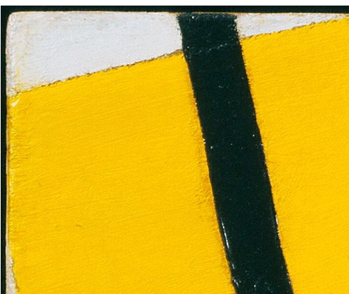
It’s hard to see Theo van Doesburg’s work up close these days, especially paintings. But for this Dutch Landscapes paintings project, the technical and theoretical logic of both Mondrian and van Doesburg is pretty inarguable.
Though the de Stijl folks were pursuing geometric purity and truth, not deploying abstraction as an obscuring, information-smothering blanket, the boundaries of their color planes and lines are interesting reference points.
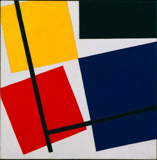
And fortuitously, a new, expansive exhibition of van Doesburg and his network of influence across the avant-garde, just opened at the Stedelijk Museum De Lakenhal in Leiden. It will travel to the Tate Modern in February. Which is as convenient an occasion as any for the release of a beautiful hi-res image of Simultaneous Counter-Composition, 1929-30, which is on loan from MoMA’s collection. Just look how the yellow brushstrokes come up right against the black line. And the free edge on that little white wedge up there,
The Knew Museum
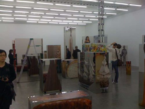
At the press preview of the New Museum’s Urs Fischer show yesterday, curator Massimiliano Gioni said that Fischer “treats reality as if it were software,” an assessment I suspect is designed to be tweeted more than analyzed.
Gioni and Fischer are entitled to use any metaphor they care to, of course, and this artist-as-reality-coder trope may be borne out nicely in the scholarly catalogue essay. But it also the kind of cross-disciplinary conceptual appropriation that leaves itself open to mockery by people who actually know what they’re talking about, like how NYU physicist Alan Sokal submitted a nonsensical paper, “structured around the silliest quotations [he] could find about mathematics and physics” made by postmodernist academics which questioned the hermeneutics of quantum gravity, to the cultural studies journal Social Text–who published it without question or peer review.
But looking at the work, Gioni’s explanation may turn out to be less deep but more valid than it first seems. The “Labyrinth of Mirrors” on the second floor, for example [above, in a photo from @artnetdotcom], is full of four-sided pictures of objects on mirrored boxes, which distort the space of the room as you walk around them. They feel like real-world approximations the XYZ-grid boxes inhabited by irregularly shaped virtual objects in Google Sketchup or the CAD/CAM programs. Which makes Fischer a user, not a coder.
Spatially, they labyrinth also gives off a bit active camo/invisibility vibe, like James Bond’s Aston Martin in Iceland, or–yes, it seems I have to go there–The Matrix.
So the world we see is just a construct, all ones and zeroes, and we’re too asleep to know it. Or the digital worlds where we increasingly spend our time–Google Earth, Halo, Second Life [oh wait, that’s right, no one actually does Second Life]–are rapidly eating away the physical world’s monopoly on reality, confounding our expectations and perceptions along the way. Maybe it’s all making too much of a throwaway soundbite.
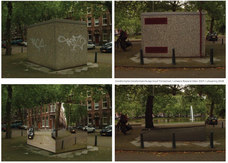
One thing I’m sure of though, is that Rotterdam architect Roeland Otten finished his trompe l’oeil Transformatie project just in time. [via]
Autoprogettazione Updates From All Over
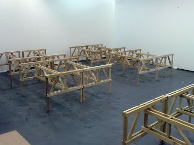
Sheesh, as if I wasn’t painfully aware of the nearly finished Enzo Mari x Ikea Mashup table sitting behind my sofa, I get this, from Peter Nencini, [above] which frankly just hurts:
A couple of weeks ago we reassembled 32 studio tables, originally built last year to Enzo Mari’s Autoprogettazione plans, published in 1974.
I’ll assume that they’re not putting twelve coats of hand-rubbed tung oil on theirs. At least I can hope my next 31 tables will go much more quickly.
Then there’s Wallpaper magazine swooping in with Autoprogettazione Revisted at the Architecture Association in London, where AA students and a few name designers show off their Mari-inspired hacks, and there’s even a lecture by Mari himself, which is alternately animated and tedious, and thanks to the on-the-fly translation, twice as long as it would normally be.
But even as I worry a bit about missing a trend–or worse, finding myself caught up in one–I’m reading the AA’s catalogue and instructions for the show–because yeah, I’d totally make Kueng-Caputo’s awesome lamp, wouldn’t you?–and I find this:
Mari was ultimately disappointed with the original response to Autoprogettazione, believing that ‘only a very few 1 or 2% understood the meaning of the experiment’…Enzo Mari hoped that the idea of Autoprogattazione would last into the future. Autoprogettazione Revisited reveals that it has done just that. Not all of the artist/designer responses in Autoprogettazione Revisited can be duplicated by the enthusiast, but they are inspirational and without a doubt follow the Mari principle that ‘by thinking with your own hands, by [making] our own thoughts you make them clearer.’
I’ve always understood Mari’s project to be a critique of the self-important distinction between the “artist/designer” and the “enthusiast.” In his lecture, Mari actually said that of the many thousands of requests for Autoprogettazione plans, only 1-2% of them were from design professionals. I can totally imagine the head of an architecture school gallery thinking that those two tiny, so-enlightened populations are the same, but I’m not at all sure Mari would agree with her. [thanks andy for the links]
Korean Art Flipper Eats It On Schnabel Dog
It happens all the time in the Old Masters market, but I could never understand how a work of art could sell at auction for one price, only to reappear–and to sell–at a fair a few months later with a vastly inflated price tag. I mean, I can imagine how a dealer would do it; and if there were a cleaning, a restoration, a different presentation, or even new research or a new attribution, it can even make sense. What I don’t get is the mindset of the collector who, either through indifference or ignorance, buys a work that just sold very publicly for 40-80% less than what he paid.
Of course, it would explain a lot if these chumps are all North Korean 80’s art speculators. Let’s pick at some of the confusing details from the New York Law Journal’s error-ridden story of an unsuccessful lawsuit by one such “collector,” Najung Seung, who the NYLJ describes as “a resident of North Korea” and “a woman who worked in art galleries in Beijing.”
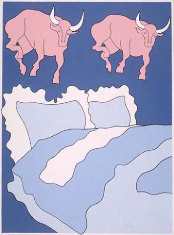
In May 2006, Seung, and who is actually listed in court filings as Korean, not North Korean, bought a 1986 John Wesley painting for $118,000 from Dinaburg Arts, a NY art advisory. Its principal, Mary Dinaburg, had just curated Wesley into the windows of the Hermes store, and Seung was friends with one of Dinaburg’s assistants.
But despite holding a paid invoice for Bulls and Bed, “the following March [i.e., 2007], Seung learned that Dinaburg had sold the Wesley painting to another buyer,” reportedly for $200,000. Way to stay on top of things, Najung. [Bulls and Bed was at Basel this past summer, btw, offered by Wesley’s London representative, Waddington Galleries, for $300,000. It’s still available.]
To make up for it, Dinaburg apparently offered Seung a $200,000 credit toward the purchase of Chinkzee a giant, truly execrable, 1983 velvet painting of a dog by Julian Schnabel. It was a $500,000 painting, Dinaburg said, though she’d let it go at the “gallery net” price of $380,000. In a May 2008 email, Dinaburg wrote, “I believe we have a good opportunity to place your work within the year and resell it a profit.”
Instead of her main firm, though, Dinaburg offered the Schnabel through Fortune Cookie Projects, [not Ventures, NYLJ. Who’s proofing these things?], the Asia-focused art advisory operation she’d launched in 2006 with Howard Rutkowski, who oversaw Asian, modern, and contemporary art for Bonham’s auction house in London.
Seung agreed and paid Fortune Cookie an additional $90,000 in June 2008. Her lawsuit mentions a final invoice [presumably unpaid] for the last $90,000 installment, dated October 30, 2008, aka The End of The Art World As We Knew It.
At some point–even though it kind of matters, it’s not clear when–Seung realized that Chinkzee had sold in May 2007 at Phillips in New York for $156,000, well above its original estimate of $60-80,000, but well below the $500,000 value she’d been told. [How Seung managed to avoid getting those gigantic catalogues Fedexed to her, I have no idea; Phillips was blanketing the globe with those things.]
Anyway, if Seung’s case is meaningful, it’s only as a reminder to collectors to do their own damn homework; the NY Supreme Court determined that art advisors and even dealers are not “experts,” and their opinions are just sales patter which constitutes, at best, “non-actionable ‘puffery’…on which a sophisticated commercial entity could not reasonably rely.”
When I started writing this post, I thought it was just a savvy dealer using the promise of an easy follow-on flip to flip her own auction purchase to a clueless, foreign speculator. But there’s someone else involved. Dinaburg’s emails to Seung, including the one promising “the gallery net,” make it sound like Chinkzee was coming from the artist himself:
(1) We are working with the very well respected [sic] and important [sic] artist Julian Schnabel. I was thinking that I could offer you what I offer the galleries directly…
(3) I have spoken to the Schnabel studio and have gotten the final lowest possible price on both [?] works
(4) I was over there with Julian before I went to Hong Kong and we were pricing work and you will never see a Schnabel form [from] the studio coming out at the prices they are now, but higher.
Did Schnabel buy his own old painting back from Phillips, and then flip them back through Fortune Cookie? Or was Chinkzee just part of Fortune Cookie’s big, 2007 All-Asia Tour of Schnabel’s “best works”? [A: Yes.] There is a punchline here somewhere about sarong-wearing white devils peddling Chinkzees out of the back of a Fortune Cookie van as they drive across China, but I can’t figure it out.
No Money Back for Gallery Worker Who Relied on Estimate of Schnabel Painting’s Value [law.com]
Sept. 2007: Julian Schnabel Presents Best Works in Beijing [china.org.cn]
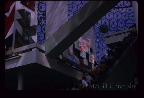
100-ft Spheres In The Center? On Buckminster Fuller’s Original Expo 67 Pavilion
From the Other Things I Didn’t Know About What Goes Inside Geodesic Dome Pavilions Department:
Christine Macy and Sarah Bonnemaison devote a chapter in their 2003 book, Architecture and nature: creating the American landscape to geodesic domes, including this description of Buckminster Fuller’s original vision for the US Pavilion at Montreal’s World Expo 67:
His [Fuller’s] design of 1964 featured a dome nearly twice the size [of the 250-ft diameter, 3/4 dome by Fuller and Shoji Sadao that was realized] with a massive interior gallery. From this elevated vantage point, the viewer would focuse their attention inward to a hundred foot diameter Earth tranforming slowly into an icosahedron, before it opens up, unfolding like a flower as it descends to the floor. [what a sentence. -ed.] In this way, Fuller’s “geodesic” globe transforms into his “Dymaxion” map of the Earth before the visitors’ eyes, displaying the “one world island in one world ocean.” And then it would come to life. Wired with tens of thousands of miniature light bulbs, this great map would begin to pulsate with patterns–showing world resources, electricity generation, the flow of transportation and communication systems across the Earth. This interactive display, this giant bio-feedback device, would be the playing surface of the “World Game.” Assembling in teams or playing by themselves, visitors were intended to chart out optimal paths to link resources with industries and population centers, to streamline transportation flows and maximize satellite coverage The aim, according to Fuller, was to “make the world work successfully for all of humanity…without anyone gaining advantage at the expense of another.”
Since he had not actually been asked to design the exhibit, just the pavilion, this idea was rejected and replaced by a selection of quilts, duck decoys, and Cary Grand billboards.
American Painting Now Then
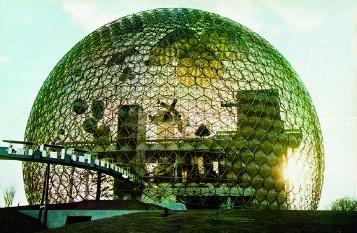
How to account for my dogged fascination with the temporary/permanent, futuristic/historic paradoxes of Expo art and architecture?
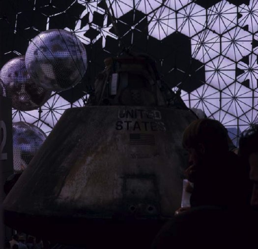
Buckminster Fuller’s 20-story Biosphere was far and away his greatest single success and the hit of the most successful modernist world’s fair, the Expo 67 in Montreal. And yet how little did I consider what was in it: a giant exhibit of the movies; The American Spirit, an exhibit of NASA satellites and space capsules; some crafts or whatever, and American Painting Now, 23 huge paintings commissioned by Alan Solomon from a “Who’s Who of modern art,” including :
James Rosenquist, Claes Oldenburg, Andy Warhol, Jasper Johns, Jim Dine, Ellsworth Kelly, Barnett Newman, Robert Rauschenberg and Roy Lichtenstein. Their works illustrated trends such as abstract expressionism, op, pop, hardedge and geometric art. Like the space component, this part of the American exhibition was truly spectacular. The works, gigantic, simple and colourful, paid a vibrant tribute to the creative vitality of artists who now count among the great masters of 20th century painting.
Uh, and from Fuller, too, from the looks of that giant Dymaxion Map right there.
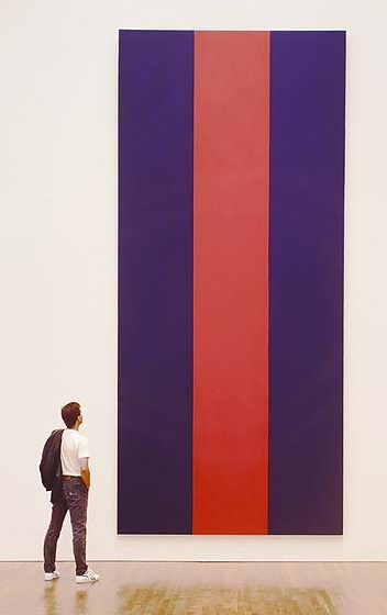
From a 1996 book on Voice of Fire, Barnett Newman’s own 17-foot tall contribution, we learn Solomon requested that the artists [all male?] “contribute paintings that are (a) large in scale and (b) vertical in format.”
 I want to quote “Exorcism in Montreal,” the April 30, 1967 review by NY Times critic and famous Newman nemesis John Canaday, in its entirety, but I won’t:
Here we have the same old clique of names that have been handed the favors regularly in Venice and everywhere else on the circuit. A natural response to the list is “Oh, no, not again!” There is that tiresome Barnett Newman, who this time turns out three vertical stripes in two colors–but they are 17 feet high. There’s Jim Dine, with nothing but two big slabs of enameled canvas, in two flat colors, bearing in one corner a notation as to the brand of paint used–and the panels are 35 feet high. There is Roy Lichtenstein being Roy Lichtenstein again, but now 29 feet high.
There are all the rest of the club, not including some whose work was not fully installed on press day, and some whose work seems to me to have more substance than the ones listed, for instance James Rosenquist’s colossal “Firepole.” I have chosen the most vacuous because in this setting even they are part of a genuinely spectacular show fulfilling demands that could not have been met by any other kind of painting.
The dimensions given above tell that the paintings, most of them done for this spot (what other spot could hold them?), are gargantuan…they are played against strips of sail cloth in heights up to that of a 10-story building. It is as if the whole water-treading esthetic that they represent had been originated and sustained by some genii who knew that one day a form of painting bold enough and shallow enough to supply enormous bright banners for this pavilion would be necessary.
And then there’s Canaday’s assessment of the NASA artifacts, which basically hits it home for me with the art/science beauty paradox:
…since technology is creating the most beautiful objects today, and the most imaginative ones, Apollo might also be thought to have added one more muse to the group that he has always chaperoned.
Of course, there is no separating the fascination of the Apollo Command Module as a scientific object from its quality as an esthetic one, with its self-generated form and its patina burnt into it during the minutes of its descent rather than by centuries of weather, but it is a beautiful object all the same–inherently beautiful, and no other word than beautiful will do–as well as an historical monument with emotive associations And that is what great works of art used to be.
Ah, so it’s just the domes and the satelloons.
Update: From Architecture & Nature (2003), more details/corrections on who showed what: Kelly had a 30′ canvas, no title given. Robert Indiana, Cardinal Numbers. At just 13’x15′, Robert Motherwell’s Big Painting #2 was anything but. Lichtenstein: Big Modern Painting [sensing a theme here?] Helen Frankenthaler was The Woman Painter. And the Dymaxion Map was by Johns, “a small [sic] token to his friend Fuller’s desire to have the map be the centerpiece of the pavilion.”
Interior images of Biosphere, the US Pavilion at Expo 67 from The Dixon Slide Collection at McGill University. [mcgill.ca]
Q: was this the Ellsworth Kelly? [no, see update above]
Previously: Hmm. That satelloon & command module show was so good, they used it again at Expo 70 in Osaka.
Don’t Find The Warhols Yet, Anyway
So it looks like we won’t be finding the Warhols just yet. The Kickstarter project deadline came today, and only $265 of the $1400 or so required to print and ship a batch of giant Wanted posters had been pledged. A huge thanks to all the folks who pledged, though; it was and is very encouraging.
This doesn’t mean there won’t be giant Wanted posters; because frankly, they’d look awesome, and seeing them is at least half the point of the project. The project had to tread a fine, meandering line through that poster awesomeness on the one hand, the unofficial, unsanctioned publishing of the LAPD’s poster on the other, and–wait, how many hands do I get?–the obvious intellectual property issues. And of course, underpinning the entire thing is the obvious challenge it poses to our sympathies and sense of value: is it harder or more problematic to feel altruistic and volunteerish towards someone who’s lost 11 of his 80-plus Warhol paintings? Is the world actually a worse place because one of eight sets of these portraits is now missing? Did the answers to these questions change after the insurance company’s reward was rescinded and Weisman started trashtalking the investigators?
My own interests and motives–to realize and propagate these giant Warhol posters in various back rooms and offices of the art world–still depend on this presumption of a community chipping in and keeping an eye out to help find these missing artworks. It’s acting as if the art world is a small subdivision, where everyone joins the search to find the lost puppy. If there’s a more hilariously inapt metaphor for the art world than that, I guess I don’t know what it is.