
It’s funny how I think I know the history of the Pasadena Art Museum, when all I’m doing is projecting back and assuming a bunch of stuff based on a bunch of great-sounding anecdotes:
 First museum shows for Duchamp, Lichtenstein, Warhol; Walter Hopps and the ur-Pop Art show; great posters [Ruscha, Duchamp, Warhol]; Pasadena Brillo Boxes; Serra’s massive 1970 fir tree installation; the increasingly intrafamily-related theft of Norton Simon’s nephew’s Warhols; Lichtenstein signing his Pasadena billboard.
But then I read through Paul Cummings’ 1975 AAA interview with John Coplans, artist, Artforum co-founder & editor, and former Pasadena curator and director, and it sounds like the place was a total shitshow:
ladies’ auxiliaries overruling curators to keep buying local artists’ crap; architects calling the fire department on curators for hanging shows; firemen ripping lights and cords off of Rauschenbergs; trustees scheduling Warhol shows with Castellis behind their curators’ and directors’ backs; trustees not putting up a dime, or asking their friends to donate; trustees demanding shows that include work they own who then sell that work without notice a few weeks before the opening; and people freaking the hell out when some crazy East Coast guy with a Jewfro drops a dozen fir trees in their precious museum and calls it art.
And on and on. There are definitely some additional sides to the stories I’d love to hear: trustee/collector Robert Rowan, for one. He’s the guy who was apparently running the show during the late 60s, and who plotted the Warhol show with Castelli. And whose Temple of Apollo painting was featured so prominently on Lichtenstein’s billboard.
Also, Norton Simon, who apparently refused to lend all kinds of stuff as a trustee, but who obviously made a deal at some point, otherwise it’d still be called the Pasadena Art Museum.
Hopps, of course. Irving Blum, who drove around LA with a bottle rack in his trunk, waiting to get Duchamp to sign it. Even though a lot of folks have died, there are still plenty who are alive and perhaps willing to talk.
UPDATE: Well this sounds like a start. Tyler points to Susan Muchnic’s 1998 biography Odd Man In: Norton Simon and the Pursuit of Culture, which apparently “comes alive” with accounts of “the bizarrely bitter politics of Los Angeles museums.”
Category: art
I Rumori Dell’Arte
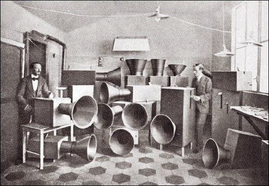
That’s Futurist painter Luigi Russolo on the left being helped by his friend Ugo Piatti, probably around 1913 or 1914. They stand amidst Russolo’s musical instruments, intonarumori, noise-intoners, which were designed in accordance with the principles laid out in Russolo’s Futurist music manifesto, l’Arte dei Rumori, The Art of Noise.
Though the trajectory of his ideas and influence is not quite as clear as The Hydra’s otherwise excellent recounting of his legacy imputes, Russolo was an innovator and visionary in the use of noise, found sound, in musical composition.
In The Art of Noise, Russolo makes a bold, lucid argument for music of the future to adopt the sounds of the world, especially the sounds of the machine, which had irrevocably changed the world’s aural landscape:
Ancient life was all silence. In the nineteenth century, with the invention of the machine, Noise was born. Today, Noise triumphs and reigns supreme over the sensibility of men. For many centuries life went by in silence, or at most in muted tones. The strongest noises which interrupted this silence were not intense or prolonged or varied. If we overlook such exceptional movements as earthquakes, hurricanes, storms, avalanches and waterfalls, nature is silent.
…
In the pounding atmosphere of great cities as well as in the formerly silent countryside, machines create today such a large number of varied noises that pure sound with its littleness and its monotony, now fails to arouse any emotion.
Then there’s this, the source noise for his Intonarumori, the sounds of the modern world:
the gurglings of water, air and gas inside metallic pipes, the rumblings and rattlings of engines breathing with obvious animal spirits, the rising and falling of pistons, the stridency of mechanical saws, teh loud jumping of trolleys on their rails, the snapping of whips, the whipping of flags. We will have fun imagining our orchestration of department stores’ sliding doors, the hubbub of the crowds, the different roars of railroad stations, iron foundries, textile mills, printing houses, power plants and subways. And we must not forget the very new noises of Modern Warfare.
Indeed. Russolo’s first public demonstration of Intonarumori was in Modena in April 1913. An instrument called the scoppiatore variously called the exploder or crackler, it replicated the sound of an internal combustion engine, not, actual explosions. That would be the detonatore, which came soon after.
I realize that it was not mentioned specifically in Russolo’s list of noises, but how can you not think of hail cannon when you see that photo up there? Russolo was born in 1885 in the formerly silent countryside of the Veneto, which was at the heart of the hail cannon boom [sorry] at the turn of the century. Thousands of hail cannon were installed across the region in 1901-02; in 1904, the Veneto was the site of the first official scientific study of hail cannon’s effectiveness. [They failed, and once-enthusiastic farmers turned against them en masse and sold their hail cannon for scrap.]
Did Luigi perhaps recall a pastoral orchestra of hail cannonfire from his youth when he wrote his manifesto? I have no idea, but it’s interesting to think about. None of the intonarumori recordings on Ubu sound like the modern hail cannon these guys try to throw their Barack Obama basketballs into.
On an object note, Russolo’s original Intonarumori were destroyed or scrapped, but his nephew Bruno Boccato has refabricated some following his uncle’s original plans. I think these are they.
Oh, And Hail Cannon. Must. Remake. The Hail Cannon.
Good grief, it was only a couple of hours ago, and I can’t even remember what took me to this three-year-old link roundup on BLDGBLOG that mentions hail cannons. I mean, hail cannon.
Turns out they still make’em, they just don’t make’em like they used to. It’s something that the Wikipedia entry on hail cannon calls them “pseudoscientific” devices. Because whatever scientific data exists for them now–and it’s not at all clear that there is much/any–it’s pretty obvious that hail cannon are technotheoretical holdovers from the turn of the 20th century.
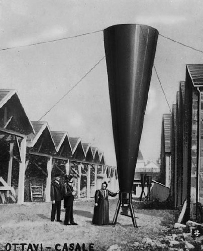
The promise of vintners being able to their crops by creating and channeling explosive shockwaves to pulverize hail in the hyperlocal atmosphere had been shooting around Europe since at least the days of Benvenuto Cellini, the Mannerist goldsmith & sculptor who claimed to have stopped the rain and hail with artillery fire.
Between 1896 and 1899, Austrian inventor Albert Stiger tested his design for a giant, megaphone-shaped mortar cannon that fired a smoke ring 300 meters into the air–and spared his village fields from hail damage. The Italians seized upon the hail shooting technology with incredible fervor, and within a year, there were 10,000 hail cannon protecting the vineyards of Northern Italy.
The first two International Congresses on Hail Shooting were held in Italy [Casale in 1899, and Padua in 1900], by which point at least 60 different models of hail cannon were on the market. So far, though, neither event was as extensively documented as the Troisième Congres international de defense contre la grêle, [the Third International Congress on Hail Shooting,] held in Lyon in 1901 [below, via]
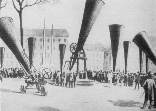
For three days, the streets, parks, and plazas of the cities were filled with hail cannon. Were there live demos scheduled? Did people lay out picnics [well, it was Novembre] and listen to the big finish of the 1812 Overture over and over? Did the vineyards of Europe, laid out with a grid of hail cannon–an anti-Lightning Field–echo with rhythmic explosions during the most vulnerable months of the growing season? [Did I suddenly start speculating as if were auditioning for the guestblogging slot at BLDGBLOG?]
Eh, if they did, it didn’t last. Governments and scientists began questioning the data behind hail shooting, and by the time the Fourth conference rolled around in Graz, Austria, hail cannon salesmen were prohibited from attending. Suddenly sober and facing the facts–that hail shooting couldn’t be demonstrated to actually have any effect–the European hail cannon industry all but disappeared by 1905.
And so it is that refilling our cities’ public spaces with several orchestrasful of hail cannon would be a powerful, performative tribute to man’s indomitable urge to control the weather using military technology.
Q: Why is this Romanian Wikipedia page on Hail Cannon so darn good? [ro.wikipedia.org]
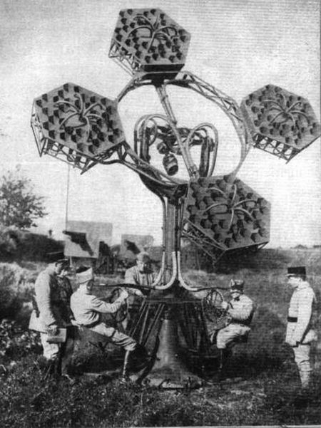
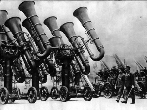
Must. Remake. Acoustic Mirrors & Locators
My list of incredible objects and machines from the past that need to be refabricated as art objects continues to grow.

Actually, I guess the acoustic mirrors, built in the 1920s and early 30s as part of a sound ranging air defense network along the British coast, still exist, most spectacularly at Dungeness, above. So there’s really no need to rebuild them, only to preserve then. And admire them for their undeniable Serrawesomeness and Kapooriosity.

With the acoustic locators, however, the real question is where to start? Because, holy smokes, Dr. Seuss was basically a combat photographer.
Do I go with the first one I saw, a US Signal Corps Exponential Sound Locator T-3 from 1927? Which looks an awful lot like the one Frank House patented in 1929, which was assigned to Sperry Gyroscope, the US’ leading manufacturer of anti-aircraft sound locators? Yet which was developed beginning in 1924 at Fort Monroe, VA? And which, even when its breakthrough “ear” designs appeared in the popular press in 1931, was still compared to “antiquated phonograph horns”?
Or maybe go for decorative superlatives, such as the Hector Guimardian rarity of the télésitemètre designed by French Nobelist Jean-Baptiste Perrin? [via]
Or perhaps begin with a bit of the absurd, thanks to the Czech Mickey Mouse thing going on here? [via]

Frankly, the Japanese War Tuba is a little too Seussian Steampunk for even me to take it seriously, no offense to the emperor there. [via]
Surfing up information on these things, I’m well aware that I’m late to the sound locator game. But I didn’t think I was so far behind the Maker Faire/Burning Man crowd. Hmm. And hmmm.
Oh what the hell, maybe just throw this one on Governors Island and be done with it? The stethoscope to the stars.
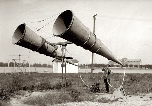
But then there’s this highly portable German model–the awesome wheels and lowslung platform are typical among acoustic locators–which, wow. Stick your head in.

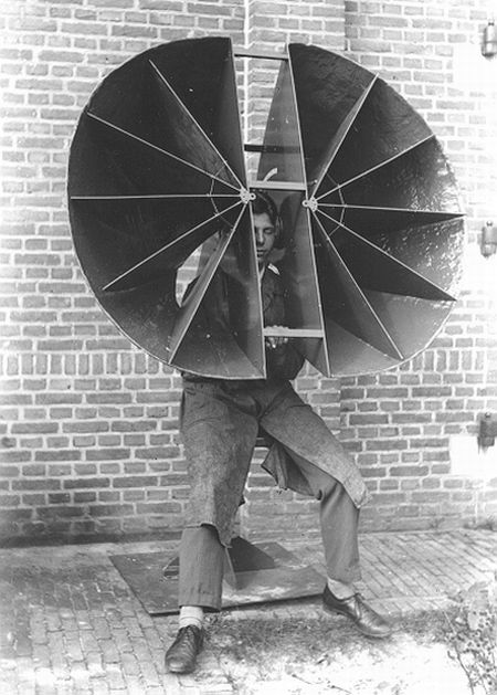
It’s like a real world precursor to other man-media interface devices, such as Walter Pichler’s Portable Living Room and Joep van Lieshout’s various fiberglass helmets, including the Orgone Helmet and the Sensory Deprivation Helmet [below].
Of course, it’s also a pretty short trip to a beer hat, so you gotta be careful.
Also of course, as a friend predicted when I started my giddy sound locator rant, it IS all about the satelloons. Specifically, the 50-foot horn-shaped radio antenna which Bell Labs used in Holmdel, New Jersey to track the epically faint radio signals reflected off of Echo IA’s mylar surface.
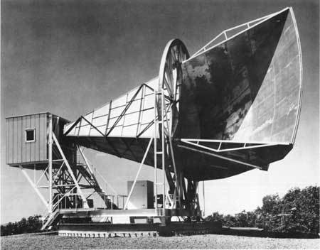
And which was later crucial to the inadvertent discovery of microwave background radiation, the first evidence of the Big Bang.
Earlier this morning, I tweeted half-seriously about the Bechers not working their way into The Original Copy, MoMA’s show about photography of sculpture. For all their conceptual sophistication, and their typological aestheticization to the industrial forms and structures they photographed, I don’t believe the Bechers saw their work in terms of, say, a readymade. Their art is their photos, not their subjects.
With their built-in obsolescence and anachronism, none of these objects could function as they originally did. Or were intended to do. And they don’t, really, remain as artifacts [except, as in the sound mirrors’ case, when they do]. So the only context in which they could plausibly exist–or credibly, since it’s plausible that they could be recreated by an enthusiast, a WWI re-enactor, or a nerded out…who is that guy in that refabricated sound locator, anyway?–is as an art object. And that’s the whole point, because they are these fantastic objects that surpass the presence and sophistication and beauty and…aura of so much intentional art, that it almost feels wrong not to appropriate or recontextualize or readymake them in somehow.
LATER THAT DAY UPDATE: Never mind. Going into my boxes, I see that, in fact, the title of the Bechers’ first book is Anonyme Skulpturen. Should’ve gotten the English edition after all. Stay tuned.
Yeah, well, in this 2000 interview with the Bechers, they talk about the beginnings of their work, which was considered “inartistic” by the art world of the day, the early 1960s. Bernd Becher: “To say, ‘This winding tower is an object, and it is just as interesting on its own terms’–that was not possible.” And then he talked about the urgency of photographing buildings they “didn’t like” which were slated for demolition, and explained not like them in terms of them not having “an aura.” So really, really, never mind.
Cretto Street View
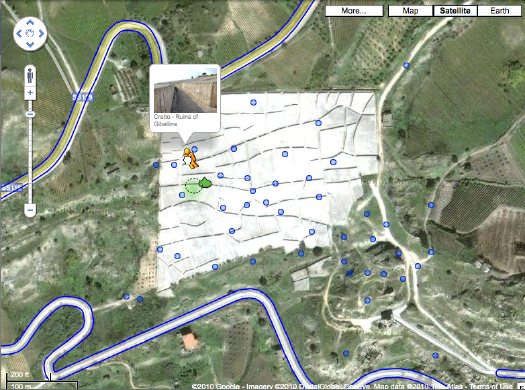
Christopher Knight took the occasion of an Alberto Burri retrospective in Santa Monica to tweet about Cretto, the artist’s absolutely incredible 20-acre memorial/earthwork, in which the earthquake ruins of the Sicilian town of Gibellina were encased in a grid of concrete. I’d mentioned Cretto in 2006, including a basic Google Map image.
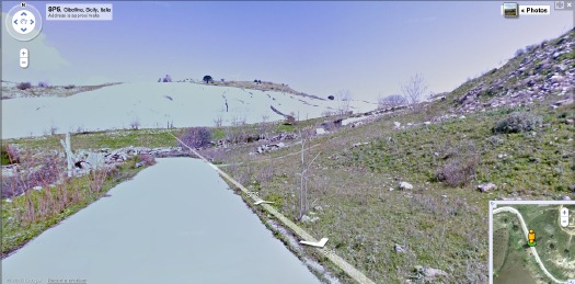
Well, Street View has come to Gibellina. At some point, I suspect no one will marvel at the idea of using your laptop to drive around the backroads of Sicily, or to dive into geotagged photos of remote land artworks. But that point is not yet. The Street View images in particular have a great, desaturated feel that makes me imagine I’m right there for the ribboncutting. The future and the past is now.
Cretto, Alberto Burri/Ruins of Gibellina [google maps]
Related: finding Double Negative has never been easier
Keep Calm, Arts, And Carry On
Here [via COS] is David Shrigley’s animated short for Save The Arts, which is trying to help arts organizations in the UK avoid debilitating budget cuts.
At first, I thought WTF?? The Arts are so screwed! Then I thought, well, maybe they should’ve just gotten Nizlopi to do it. And then I thought for the whole “think of the children!” angle to work, it’d be nice if the kid–who HAS the arts right now, mind you–wasn’t an inert loser with less than three lines to string together. And then I saw, in my related videos selection, and I mellowed the heck right out.
Because Shrigley being Shrigley had previously saved Pringle of Scotland from being shuttered. Not only did he save Pringle, he helped get all the other jumpermakers bombed back to the sockmaking age.
And what did he save Pringle to do, you ask? Why, to commission Ryan McGinley to film Tilda Swinton’s exploration of the moody Highlands in Pringle eveningwear for the Spring/Summer 2010 collection:
And then it all came together when I saw the credit: Creative Director – Neville Wakefield, the great roving-so-as-not-to-have-to-give-up-too-many-side-gigs curator at PS1. I think the Arts will be just fine.
update: And a good thing, too, because Shrigley’s right: Tracy Emin’s not going to come put out your housefire. [via @bhoggard]
Lichtenstein’s Electric Seascapes

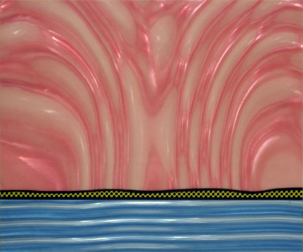
Seascape I, 1964, screenprint on Rowlux, ed. 200, from New York Ten portfolio [via]
You know how you just think you’ll blog about one thing, and then you want to get a little context, so you dig a bit, and then a bit more, and a bit more, and.. anyway, even though I rather obsessively collected out a bunch of his source comic books in the early 1990’s, I haven’t been a close follower of Lichtenstein’s work. Or rather, I think I’ve been lulled into a sense of familiarity by Lichtenstein’s almost immediate recognizability, and I never paid too much attention to when he made what and why or how. It just was.
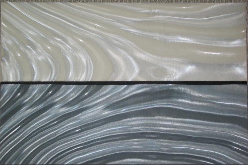
Seascape I, 1964, printer’s proof, Rowlux, different horizon, no Benday [via]
Which is why these early landscapes and seascapes are so fascinating. They’re so odd, so resolutely unfamiliar, almost unrecognizable as Lichtensteins, and yet they’re from 1964-68, a period when Lichtenstein’s career specifically and Pop Art generally were both gaining global recognition. They seem like experiments, avenues of persistent research. They account for some milestones: Lichtenstein’s first use of his own subject matter, inclusion in his first museum show. They have clear–or at least compellingly arguable–influence on later, major work. But they still somehow feel atypical, marginal, minor, dead-ends, even failed. But are they? Could they just be underseen or underappreciated? Undervalued by the market because they don’t “look” like Lichtensteins [yet]?
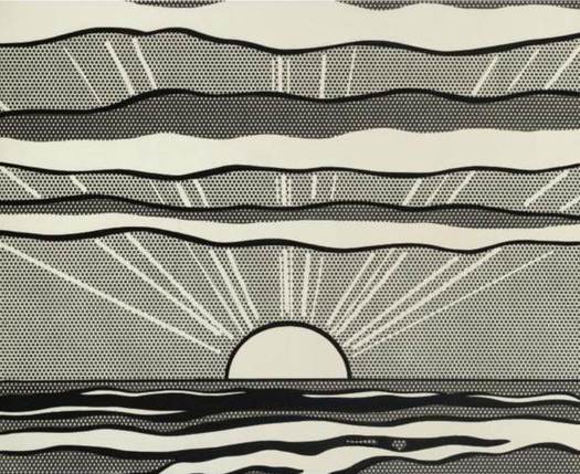
Black and White Sunrise, 1964, oil on magna on canvas [via]
According to the Roy Lichtenstein Foundation’s official chronology, the artist began making landscapes in early 1964. Some were painted rather spectacularly, like the black and white sunrise [above]. And with others:
Begins to incorporate plastic, Plexiglas, and metal into some of his landscapes.
And near the end of ’64, there’s this [images top]:
Rosa Esman begins Tanglewood Press with the portfolio, New York Ten which includes Seascape, 1964, a color screenprint on clear Rowlux by R.L.
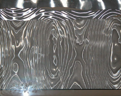
Rowlux is a wavy, prismatic plastic sheeting material which Lichtenstein apparently discovered at a novelty store. Its moire pattern can simulate reflections on water. [Hmm, novelty shop? The Rowland brothers were trying to market Rowlux for use in highway signs, and according to Ron Abbe’s 1976 paper, “Experiment with Rowlux,” Salvador Dali was the first artist to use the material, in 1962. Dali decked some models out in Rowlux collages for a “couture” show in 1965. What a mess.]
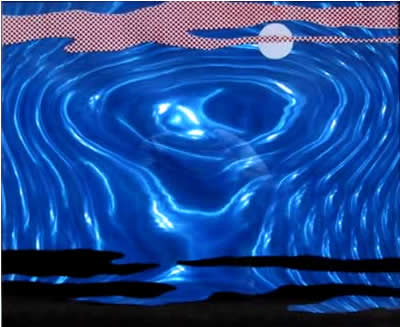
Moonscape, 1965, silkscreen on Rowlux, ed. 200 [image]
In 1965, Lichtenstein made painting collages using Rowlux and other materials. The dealer Mark Borghi, which is selling Littoral [below], lists some more. Littoral was purchased from Castelli by Larry Aldrich and made its way to his museum, which apparently deaccessioned it at some point.
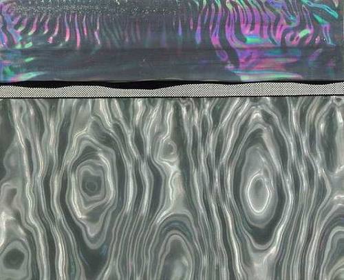
Littoral, 1965, Metalized polyester foil, aluminum and magna on board, [via]
1965 was also when Lichtenstein began experimenting with adding backlights and motors to his Rowlux painting collages, making them a hybrid of kinetic art, light art, and moving picture. Examples of these Electric Seascapes were included in the artist’s one-man show at the Pasadena Art Museum in 1967.
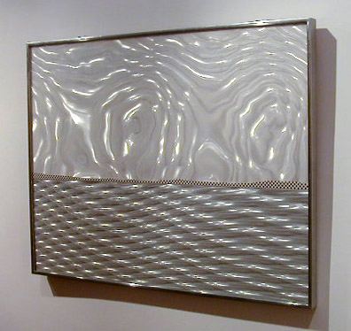
Electric Seascape #1, 1966, Rowlux, paper, light, electric motor, formerly Collection Guggenheim Museum [via]
I think two statements Lichtenstein made about his explosion paintings, which he began around the same time, are also relevant to these landscapes. First, from his interview with John Coplans for the 1967 Pasadena show catalogue, there’s a conscious technical distancing from painting: “I wanted the subject matter to be opposite to the removed and deliberate painting techniques.” And in Aspen No. 3, published in December 1966:
Explosions give me a perfect opportunity to do a completely abstract painting which seems, on the surface to he realistic.
Electric Seascape #2, 1966, Rowlux, wood, light, motor [via]
While Moonscape is pretty strongly representational, many of these landscapes are as abstracted as Rothkos or Sugimoto photographs. Sometimes the only representational element is the hint of a Benday horizon contour–or the light playing on rippling water, which is, of course, an illusion intrinsic to the material itself.
Landscape 2, 1967, silkscreen on Rowlux overlay, ed. 100 [via]
Lichtenstein kept on making these Rowlux collages and editions at least through 1967, when they were reduced to almost nothing but a horizon line. The two 1967 works here were from Ten Landscapes, Lichtenstein’s first solo print portfolio, published by Castelli.
Landscape 5, 1967, silkscreen on Rowlux on board, ed. 100 [via]
When they were made, then, Lichtenstein’s hotness and Castelli’s marketing magic helped these trippy landscapes into major collections like the Guggenheim’s and Larry Aldrich’s. They were what’s available, and they got snapped up. And then at some point, those institutions decided they were expendable, or outside the Lichtenstein narrative, and they ended up back out into the market. Assuming it’s still available, Borghi’s Littoral has been on the market for at least two years.
Besides their intentional distance from the painting process–a major concern of almost all Lichtenstein’s work–these shimmery landscapes and seascapes are almost nakedly direct explorations of the characteristics of light, sight and visual perception. The play of light and reflectivity would become significant subjects for Lichtenstein going forward–his first painting of a mirror [below] was made in 1969. In 2000, an entire show of Lichtenstein’s light-related works, titled “Reflection/Reflessi,” was organized in Rome. The inclusion of Electric Seascape #1 only highlights the extent of Lichtenstein’s investigations.
Mirror #1, 1969, oil on magna on canvas, [via]
But these landscapes also related directly to another series of unusual works, the ones that started me on this whole researching jag: Lichtenstein’s only films. Which are coming soon to a blog near you.
Now That’s A Fire!

This is why greg.org readers earn the big bucks, people. GF-R spotted this hilarious/sublime juxtaposition of ad and content from the LIFE Magazine report on the 1958 fire at the Museum of Modern Art and asks,:
coincidence? Or the work of the advertising and layout guys at LIFE? I’d love to know. The color image of the grilled cheese sandwich even looks like a proto pop art piece. (although I know there is no way of that being intentional and is only the result of my own retrospective anachronism).
Oh, I don’t know, someone check Claes Oldenburg’s resume for suspiciously ad agency internship-sized gaps. Meanwhile, add whoever designed that frying pan to the list of random cranks suing Damien Hirst for plagiarism.
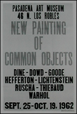
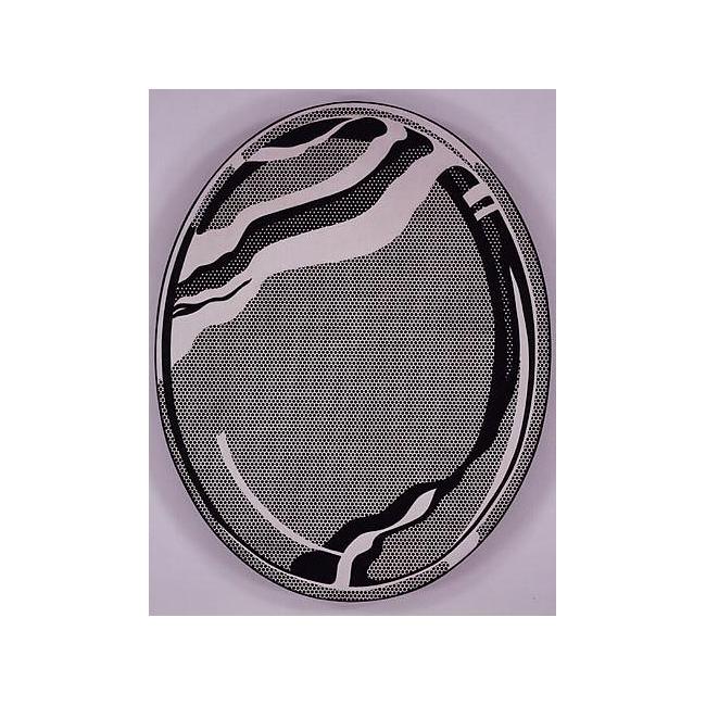
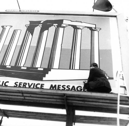
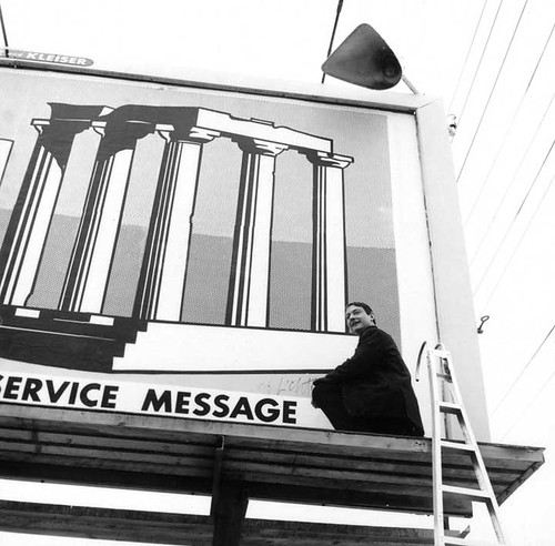
Roy Lichtenstein’s Billboard Excursion, 1967
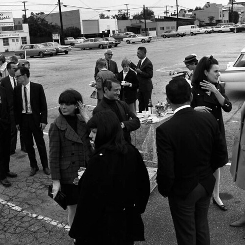
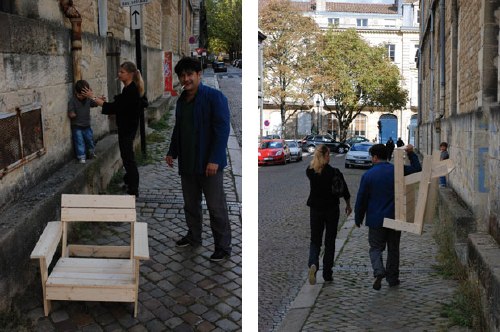
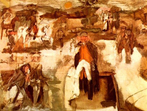
Over the weekend, I hit the road to interview some people I’ve wanted to meet and talk with for months now. I’ll be publishing the results soon here on greg.org. One of the artists whose work I’ve been interested in is Roy Lichtenstein. This wasn’t where I had planned to start my Lichtenstein story, but the beginning just keeps getting pushed back. And the Manitoba Museum of Finds Arts’ archive of Frank J. Thomas’s photos from the Pasadena Art Museum are just too awesome to ignore:

John Coplans gave Lichtenstein his first solo museum show in 1967, and while the artist was in Pasadena, the Museum organized a little excursion, which involved some old-timey outfits, and an old bus. And a ladder.
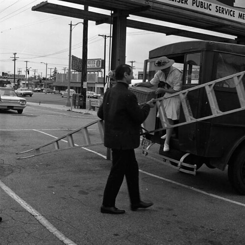
And a casual yet elegant affair in a Sears parking lot. A Sears promoting the–yes, you read that right–the “Vincent Price Art Collection.”
Roy climbed the ladder onto a Foster and Kleiser billboard.
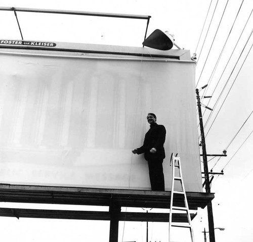
And unveiled a giant billboard for his show, with what looks to be a life-sized reproduction of his 1964 painting, Temple of Apollo.
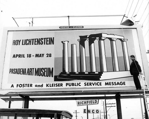
Which he promptly signed.
The Temple of Apollo was [is?] in a local Pasadena collection. The Billboard Temple of Apollo‘s fate and whereabouts are unknown, but I would start looking in either the Foster’s or the Kleiser’s garage.
update: Robert Rowan, a Pasadena trustee, bought the Temple. It’s mistranscribed in Castelli’s AAA interview as “tempo”.
Space Race
And in other Just Cold Stealin’ My Satelloon Idea Before The Fact News:

This has been stuck on my iPad for way too long. At a space flight conference a couple of months ago, the Global Aerospace Corporation announced their GOLD program, the Gossamer Orbit Lowering Device for controlled satellite de-orbiting.
GOLD is a commercial venture designed as a solution for managing the clutter in low-earth orbit [LEO]. It’d be available as an option for future missions, or as its own mission for dealing with space junk that’s already out there.
The idea is to attach a satelloon-style inflatable sphere up to 100 meters [!] in diameter to a satellite, thereby degrading its orbit much more quickly, and letting you steer it to a fiery death in the atmosphere. Though Global only just announced it publicly, they received a patent for the GOLD system it in 2004.
Conceptually, it couldn’t be more different than my satelloon idea; Global Aerospace is pushing hardcore utility and cost-effectiveness, while I’m going for art’s utter uselessness for anything but sheer experiential and aesthetic benefit.
But from the ground, I suspect it’ll be pretty hard to tell the art satelloons from the functional satellite killers. I will need to keep an eye on these people.
Global Aerospace Corporation | GOLD [gaerospace.com]
Balloon device for lowering space object orbits [google patents]
Tools And Tactics Aren’t Art’s Alone
I can’t quite figure out how it ties to the rest of the story, but I still think Sean O’Toole just shortlisted himself for arts lede of the year:
For every Joseph Beuys and Yves Klein there is a fascist doppelgänger who also believes in the transformative potential of paint on the human body.
Alright, I am listening:
In 1999, shortly after trespassing onto a white farmer’s property southeast of Johannesburg, Moses Nkosi, 21, was stripped, his naked body painted silver by the landowner and his black assistant. An anomalous brand of vigilantism, this was repeated again a year later when a 14-year-old girl accused of shoplifting underwear was similarly stripped and painted by a white store manager and her black assistant.
Don’t Show That! [frieze.com]
Sedia Veneziana, Chaise Bordelaise
via la_biennale
So Venice is not a total bust. Raumlaborberlin have installed their 2006 mobile inflatospace sculpture, „Das Küchenmonument,” in the Giardini.
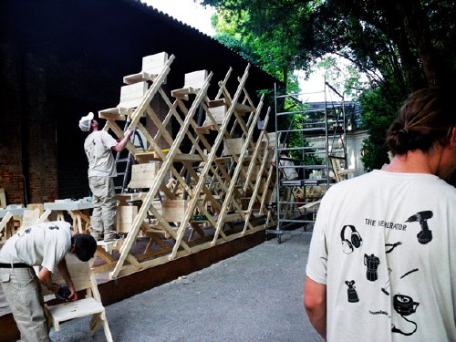
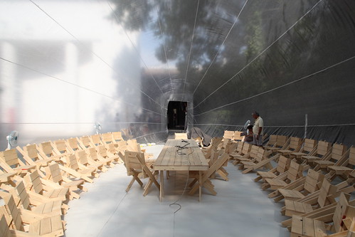
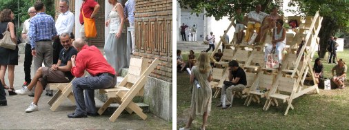
And next to it is The Generator, an on-site workshop for knocking together “sedia veneziana,” which are not just autoprogettazione-style chairs…
via br1dotcom
they’re “future particles of the generator-space-structure,” modular building elements of both social space and structure. autoprogettazione stacking chairs. Awesome.
Which, of course, is related to their exhibition for Arc en Reve in Bordeaux last year, “Chaise Bordelaise.”
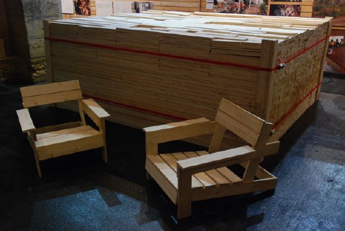
“Chaise Bordelaise” consisted of a 3x3x1m pile of pre-cut, reclaimed lumber, instructions, and some tools. Visitors made some chaises, then took them home.
It’s basically an Enzo Mari x Felix Gonzalez-Torres mashup. If greg.org had tags, this post would be giving me a tagasm right now.
Raumlaborberlin: what’s up? exhibitions [raumlabor.net via archinect]
Chaise Bordelaise [raumlabor.net]
related: proposta per un’ auraprogettazione
Venetian Mirror

via tsaaby
Yeah, so I’d been poking around flickr for a while, looking to see how MOS’s project for the US Pavilion at the Venice Architecture Biennale turned out. Because well, because.

via Erika-Milite
And hmm. What is it about it? The green straps? Should the weather balloons have been upside-down, so gnarly knots and straps take a backseat, and the smoother, more reflective surface is visible instead of pointing to the sky? Maybe instead of straps, string a net across the courtyard, and attach the balloons from above, or maybe let the balloons float up against it to find their own structure?
via
br1dotcom
Do the balloons just not have enough gas, or enough gores?
Because right now, I’m rethinking my entire satelloony look.
It’s Reagan Men! Hallelujah!
This is where Nightcrawler ‘ports in and shouts, “Ausgezeichnet!”
Here is Joseph Beuys, pop singer, performing his greatest anti-US, anti-nuclear hit from 1982, “Sonne statt Reagan, [Sun not Reagan].” Reagan, remember, is a German homonym for rain [Regen], so it makes perfect sense.
As Ubu explains it, “Beuys tried his luck as a pop singer as part of his political commitment.” Sure.
To throw one more tidbit in there, here’s one section of the lyrics that jumped out at me:
Er sagt als Präsident von USA
Atomkrieg ? – Ja bitte dort und da
ob Polen, Mittler Osten, Nicaragua
er will den Endsieg, das ist doch klar.
He says as President of USA
Nuclear war? – Yes please here and there
whether Poland, Middle East, Nicaragua
he wants the final victory, that much is clear.
Endsieg: perhaps Reagan used a loaded term in German, one that turns out to be associated with Jews in Mein Kampf and inevitable civilian casualties in the Third Reich. But translation can be a bitch that way. Just ask the guy who came up with “enhanced interrogation” [“Verschärfte Vernehmung”].
Thanks greg.org reader frank for the felt hat tip.
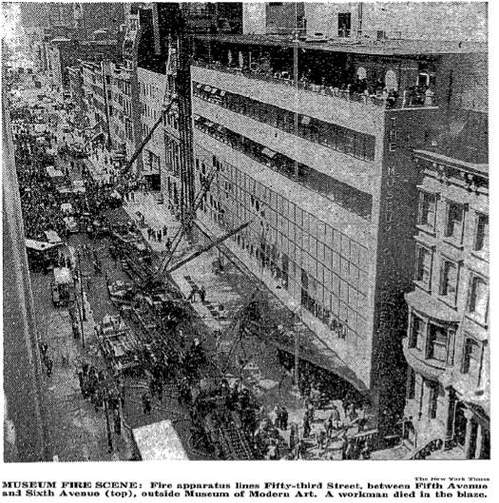
MoMA On Fire
The fire at the Phillips Collection in Washington DC this morning reminded me of the incredible story of another museum fire, at The Museum of Modern Art in 1958. Before my time, I know, but I’d only learned of it last year, when Ann Temkin staged a show of Monet’s Water Lilies [Here’s Roberta Smith’s review, and a tangent I went on about Pollock] and mentioned the fire.
Mentioned the fire because it destroyed a giant, 18-foot-long Water Lilies painting the Museum had acquired just a couple of years before. [The current 3-panel Water Lilies was the replacement.]
UPDATE: LIFE published a 2-page color spread of the painting with the announcement of The Modern’s acquisition in 1957:

So what happened? The New York TImes’ report from the scene [purchase required] is riveting. [one image above] Director Rene d’Harnoncourt “trudging out” onto the street in tears. One worker dead, two visitors injured, and dozens of firefighters treated for smoke inhalation. Visitors and staff trapped on the penthouse terrace being evacuated by Alfred Barr, who throws a chair through a window and catches women and children on the roof of the neighboring townhouse. The fire chief marveling “at how women employees, soaked by dripping water, kept helping save the pictures.”
Like the Phillips fire [apparently], the MoMA fire was triggered by construction. In the Modern’s case, contractors installing air conditioning on the second floor were smoking near open paint cans, sawdust, and a canvas dropcloth. The work meant that except for the largest paintings, all the other art had been cleared from the second floor.
Art on the third and fourth floors was undamaged, and was evacuated to the garden, and to the Whitney Museum, which abutted MoMA on 54th St. Among those works? Hello, Seurat’s Sunday Afternoon on the Island of La Grande Jatte, which was on its one and only loan from the Art Institute of Chicago. Close call.
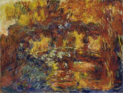
Meanwhile, besides the Monets–the large Water Lilies was apparently hanging on the 53rd St wall and had been “hacked” fighting the fire–the Museum initially reported that four works had been damaged or lost. The other Monet, another, smaller, late work hanging in the Bauhaus Staircase, was supposedly restorable, despite, as the Times put it, having “its oil flowed and blistered,” and “looking like a toasted marshmallow.” I guess I’ll have to check, but the Giverny painting known as The Japanese Footbridge [above] came into the collection in 1956, so unless MoMA had three late Monets at the time, that’s the toasted one.
[UPDATE: They did. Temkin’s essay about the Water Lilies makes it clear that the stairway painting was a smaller, but still big, Water Lilies. The Museum tried for three years to restore it, but in 1961, it was declared to be damaged beyond repair. Jackson Pollock’s No 1A, 1948. was also in the staircase and also damaged, but it was conserved.
Of the fate of the largest Water Lilies, Temkin wrote, “After the fire, Museum officials returned to find the painting buried under a pile of debris on the ground; firefighters had unknowingly destroyed it breaking through the windows into the building.” There’s a photo of the aftermath in LIFE Magazine’s April 28, 1958 issue. It is unreal.]

Boccioni’s The City Rises is still around, as is Pawel Tchelitchew’s Cache-cache [Hide and Seek], which was described as “probably the most popular [painting] in the museum.” [More on that in a second. The controversial original 1953 version of Larry Rivers’ Washington Crossing The Delaware [below] was damaged, though for some reason, it’s not listed in MoMA’s collection. Which means the only other total loss besides Water Lilies was a World’s Fair mural by the Brazilian artist Candido Portinari.
In a Times sidebar on April 16 detailing the art losses, Sanka Knox was reassured by a Museum “spokesman” that “none of the damaged pictures, including the two Monets, are among the most valuable of the museum’s paintings,” and then an unnamed “staff member” said that, “apparently none of the museum’s most valuable holdings” were damaged.” Which begs the question, right? Right:
Among these “most valuable” works, according to a staff ember, are Rousseau’s The Dream, Picasso’s Three Musicians, Van Gogh’s The Starry Night and Gaugin’s Still Life with Three Puppies.”
I’m sure it means nothing, but the only museum official quoted by name in Knox’s piece was Barr himself. Now about that most-popular Tchelitchew.
In 2007 FIT art history professor Richard Turnbull gave a Brown Bag Lecture at the Museum about the divergence of curatorial and popular opinion titled, “From Pavel Tchelitchew’s Hide-and-Seek to Andrew Wyeth’s Christina’s World” [mp3 available]. He said the museum education staff gets asked about Hide-and-Seek all the time by teachers; apparently it’s been in the NYC public school curriculum for decades, and they always want to walk kids through the painting’s cycle of life allegories. [Actually, I just finished listening to the whole lecture; it’s more like Tchelitchew hid so many faces and figures in the painting, you can stare at it for hours. It’s like a psychosurrealist Where’s Waldo?] It hasn’t been on view since around 1999 when the Museum closed for renovations.
Is it just me, or do all these paintings still look burnt? What a palette.
[images: top, nyt; the rest: moma.org]