Rock, Paper, Flowers

Danh Vo, Untitled, 2021, graphite & ink on A3 paper by Phung Vo, Revolver for Secession

Danh Vo had two shows simultaneously last fall, with work that turns out to be related.

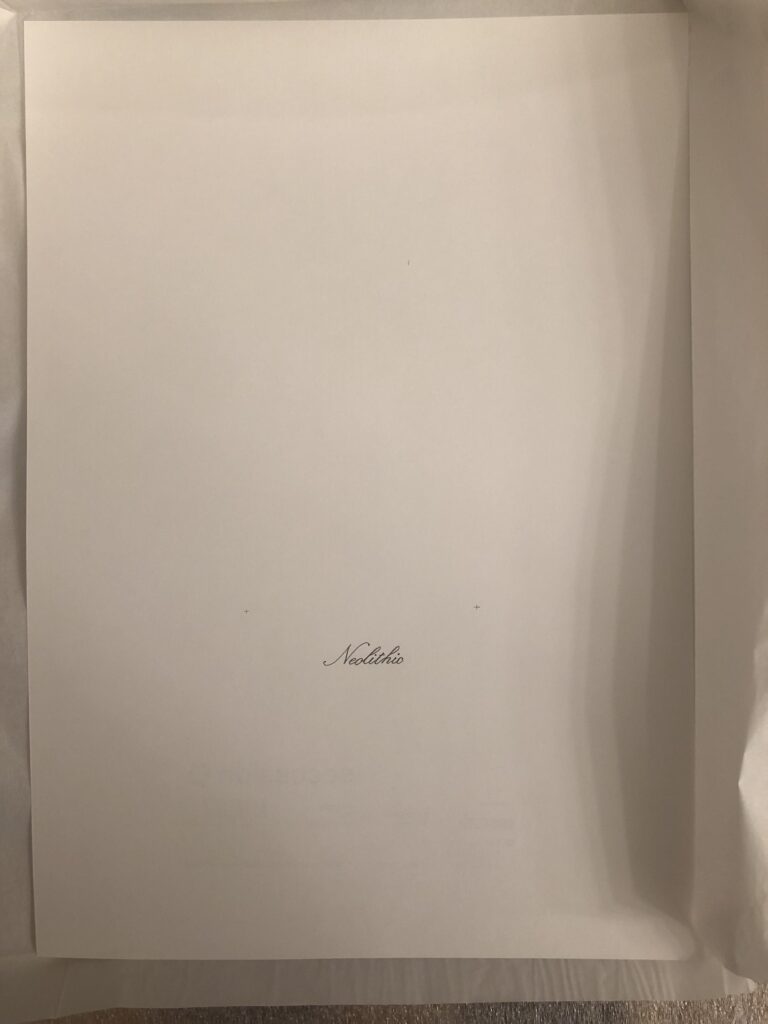
Thought it had an ISBN number, the publication for Vo’s show at Secession in Vienna was not a book, but a drawing. The artist’s father Phung Vo wrote the word Neolithic on one side of an A3 piece of paper. The exhibition’s sponsors Secession’s colophon were stamped on the back. It was slightly baffling, tbqh.

Danh Vo, Untitled, 2021, graphite and c-print on paper, A3, framed, image: massimodecarlo

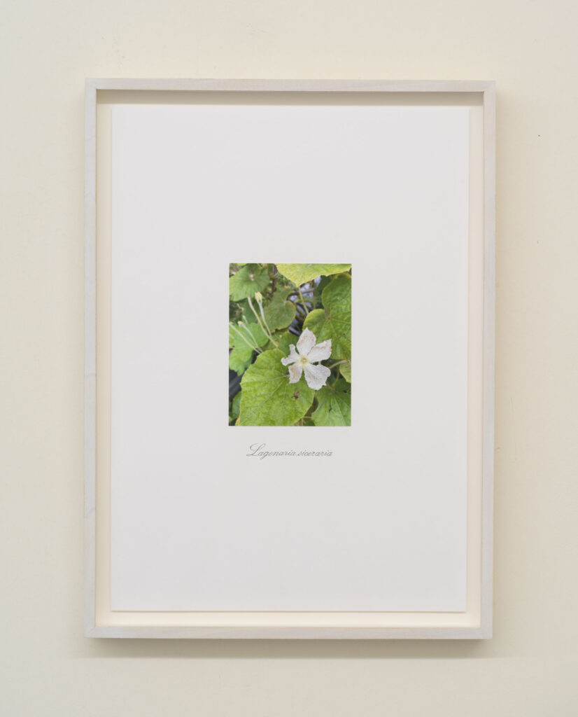
Meanwhile, at Massimo De Carlo, he showed photos of flowers from his farm outside Berlin, mounted on an identically sized sheet of paper, with the scientific name underneath, also written by his father, in the same script as Neolithic.

Danh Vo, Untitled, 2021, detail

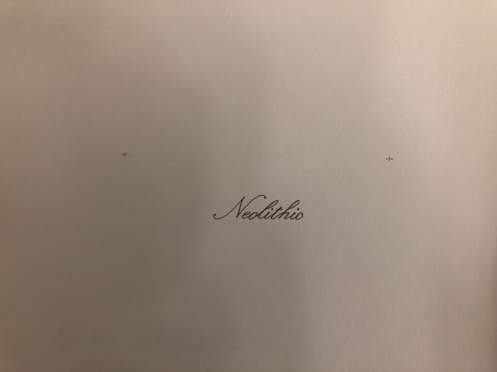
They’re impossible to see from the reproductions online, but there are tiny alignment crosses above Neolithic. The text is in the same place on both, and the marks seem to be where a photo would go. The composition of these works is basically the same.

The Neolithic publication is the first thing Manuela Ammer asked Vo about in their gallery talk at the closing of the Secession show. Vo explained that he’d come to see these two things–specific names of flowers and the neolithic–as opposites, and that his practice entails not choosing, but doing both, and considering the difference.

To Vo, neolithic is an abstraction, an amorphous period of time about which there is so much we can’t know, because the only human traces that survive are stone. This is what is captured, he did not say, by the absence of a photo.

Joan Didion’s Mantle

Lot 50: Group of Shells and Beach Pebbles, from the Estate of Joan Didion, image: stairgalleries

Let’s for a moment say we won’t even think about the money. If that seems hard, just imagine that someone donated $7,000 to Parkinson’s research and Sacramento women’s college writing scholarships, and in return, rather than public recognition and a tax deduction, they received Group of Shells and Beach Pebbles.

And then they paid $1,960 to a Hudson Valley auction house to warrant that these “approximately 26” shells and rocks–there are, in fact, 32 shells, 17 rocks, and one item whose rock-or-shell nature I could not determine in the auction house’s display photo–that “[t]his group of shells decorated the fireplace mantle in [Joan] Didion’s living room.”

The Mantle Does Hold: the flagship image for the sale of Joan Didion’s belongings at Stair Galleries, as promoted on architecturaldigest.com
Continue reading “Joan Didion’s Mantle”

Garbage Can van Lieshout

Atelier van Lieshout, Untitled (Litter Bin), 1991, fiberglass, 35 x 30 x 30 cm, image: christie’s ams

Before he designed a slave city or declared a pier in Rotterdam as his own anarcho-utopian country, Joep van Lieshout got attention for his brutalist/minimalist fiberglass sculptures shaped like furniture, plumbing fixtures, and architecture. It rarely comes to the market.

But lo, here is a 1991 work, Untitled (Litter Bin), being auctioned at Christie’s Amsterdam. I’d call it a great start.

Did Brian Eno Really Piss In Duchamp’s Fountain?

Brian Eno lecturing at MoMA on October 23, 1990 as part of a performance series organized by RoseLee Goldberg for “High/Low”

The NY Times Magazine’s interview with Brian Eno brings back his story about pissing in Marcel Duchamp’s Fountain. It’s a story Eno’s told many times. Every time it gets retold, there’s an air of incredulity; because it sounds fake as hell.

The clearest, widely available version of the story has been from when he told it to designer Ron Arad in 1993. That’s on YouTube [at around 17 minutes]. He was specifically, asked: “Have you really used the Fountain?” Eno laughs. “Yes, yes, that was a really good story.” He then mis-tells the history of Fountain, and Duchamp’s concept of Readymades, and misses the point that Fountain is not one ancient, auratic urinal, but is actually an edition of eight, plus several others.

Screenshot of Brian Eno in, as if it needed to be said, a 1993 interview for French TV

And he said, “So I thought someone should piss in that thing, to sort of bring it back to where it belonged. So I decided it had to be me.” He then says the strength and aim of his urine stream were, “at [his] age,” insufficient to get through the narrow gap in the glass. So he got thin, plastic tubing, threaded it with wire, pipetted his piss into it, put it in his pants, and then he inserted it through a gap, “and let the piss out. It’s a bit of a fake, really. I didn’t physically do it.” Which, in context, could sound like he’s saying he didn’t physically piss in Fountain. But it could also be an admission that the events in this “story” only happened in his head. Which should be the same in conceptual art, no? Eno then claimed he only revealed what he’d done at his lecture “that night,” at the Museum of Modern Art.

Continue reading “Did Brian Eno Really Piss In Duchamp’s Fountain?”

Nice Grpg

March 12, 2014, 12:20 PM: I swear, every one of these still lands this week, and lands different.

I’ve been trying to figure out what to do about twitter and social media for fifteen years, and the only thing I can come up with is, start a blog.

Whatever else it is, Twitter has been a source of language fascination for me. To see or share combinations of words of unexpected beauty, sublimity, stupidity, and criminality. I developed a practice of tweeting stuff without explanation or context–without original context, since the whole point was to hold up an object of text, or later, an image, or a combination of both, and present it in the context of the Twitter feed itself–that annoyed tf out of some people. I really tried to approach Twitter as an experiment, to see what would happen, or what worked and what didn’t. As time went on, Twitter’s own conventions coalesced, and even came to dominate information in the world, far beyond its own users’ spheres.

But that’s not important right now. One thing I started to do was to find meaning or resonance in groupings of tweets. Because they were in my timline, coming from people I’d chosen to follow, the synchronicities between adjacent tweets weren’t exactly random, but the more random and unrelated they seemed, the better. The connection didn’t need to be glaringly obvious, either, but an unusual, mundane word appearing in three unrelated tweets was as awesome as two rhyming images.

I developed rules for groupings: adjacency was a must; longer chains of tweets beat a pair; no retweets or manipulations by me. But in practice, I’d just screenshot’em all and figure I’d sort’em out later. And sometimes, when they ended up next to a gem, I couldn’t resist including my own tweets.

These groupings were made by others and me, and yet it seemed the only intentionality was in the finding. There was the sense, or perhaps the alluring suggestion, that beyond illuminating the contours of my own curatorial decisions, the groupings offered glimpses of a larger, unintended, collective meaning, like generative glitches in a (not the) matrix.

I tweeted some of these out as I’d find them, just a blip in the stream, but then I decided to collect them, to see what they could do together. So I started a tumblr, and after two tedious weeks of trying to capture the metadata embedded in each multitweet screenshot, I shelved it. But the screenshots have kept piling up.

Now with the actual destruction of Twitter looming, these shards feel possibly more relevant than they did, and so I’ve dusted off the tumblr and will keep posting these nice groupings, worrying less that they conform to my own arbitrary notions of multi-tweet poetic form, and instead being glad that they exist at all.

grpg.greg.org
go-grpg.tumblr.com

Trade of Restraint

Nayland Blake, Dual Restraint, 1990, 95 x 95 inches? 144 x 144 inches? Selling Nov. 17 at HA.com

An intriguing work by Nayland Blake is coming up for auction. Double Restraint (1990) is a canvas and steel structure, object, sculpture, outfit? It’s a strait jacket built for two, but it hangs on the wall like a kinky Richard Tuttle.

The auction house says it’s from a prominent West Coast collection. When a Blake Double Restraint (1990) belonging to Ruth and Jacob Bloom was installed at the Hammer Museum in LA, it was apparently four feet taller and wider. Maybe it shrank in the wash? Are there two? From the buckles and hoods, they look like the same size.

Nayland Blake, Single Restraint, 1990, canvas and steel, 96 x 58 in., image: naylandblake.net

Blake’s 1990 show at Petersburg Gallery in SoHo included both [one of?] Double Restraint and Single Restraint (above). Whether they wrap up like a knuckle bandaid or a burrito, these Restraint works insinuate bodies that aren’t there, which could be either an invitation, a threat, or an elegy.

17 Nov 2022, Lot 77244: Nayland Blake, Double Restraint, 1990 [ha.com]

From The Thumbnail Files Of Mr. Walker Evans’ Paintings

Walker Evans, [House with Gridded Panel and Palm Trees], Oct. 14, 1958, tempera on panel, 16×20 in., collection: metmuseum.org

Walker Evans the photographer also painted. Yesterday, art historian/hero Michael Lobel tweeted a selection of Evans’ paintings from the Metropolitan Museum, which holds the artist’s estate and makes copyright claims on it.

The quickest way to describe Evans’ painting is to say he was in the School of Jacob Lawrence. There are 17 paintings by Evans at the Met, plus photos of one–and probably two–others, plus one by his second wife. All are stylized, spare, and flat, painted in tempera on paper or panels. Unlike Lawrence, who often includes figures and crowds in his tempera paintings, Evans’ are landscapes and homes, and buildings, empty of people.

Continue reading “From The Thumbnail Files Of Mr. Walker Evans’ Paintings”

Schindler Pink By (Claudine Schindler and) Stephen Prina

Stephen Prina, As He Remembered It, 2011, installation view, Secession, Vienna
image: Wolfgang Thaler

You may remember Stephen Prina from such blog posts as Stephen Prina’s Exquisite Corpse: The Complete Paintings of Manet helped inspire the 1:1 scale certificates of authenticity for Facsimile Objects.

I remembered him today as Stephen Prina made two housefuls of Rudolph Schindler furniture and then monochromed them all the 2011 Color Of The Year, PANTONE® 18-2120 Honeysuckle.

What I’d forgotten about As He Remembered It, Prina’s 2011 show at the Secession in Vienna, besides the title, was that it was based on a memory from the 1980s of stumbling across a Schindler built-in desk that had been painted pink, and which had been ripped from its original site, and put on display in a La Brea Avenue shop window.

Continue reading “Schindler Pink By (Claudine Schindler and) Stephen Prina”

Why Not? Make An Eames Saarinen Womb Chair Cake Chair?

Charles Eames photo of Womb Chair cake for Lillian Saarinen, 3×4 in., est. $700-900 at LA Modern

As a cake, it’s a bit of a mess, tbqh. But as a concept, it’s flawless.

This 1949 photo by Charles Eames of a Saarinen Womb Chair cake came from Lillian Saarinen’s estate. Did you know she was Edie Sedgwick’s cousin? Lillian’s mom was a Sedgwick. Though Lillian was almost 30 years older, so maybe they were second cousins or something. Edie was first cousins with Kyra Sedgwick’s father, in case you want to six degrees of Kevin Bacon the maker of this chair cake.

Which, do we assume Ray made the cake? It looks like a sheet cake has been draped over a Womb Chair frame. Judging from the size of the candles, the doilies, and the icing blobs, it looks like it’d fit on a cookie sheet. The frame looks legit, and out of wrought iron. Did Knoll have little centerpiece-sized Womb Chair samples lying around, or did the Eameses whip up a frame for the cake?

Either way, the point is, now I want a Womb Chair embroidered with these designs, with thick, ropy white stitches on that classic, rough, jute-like wool. You got this, etsy? Or am I gonna have to do it myself?

17 Nov 2022 Lot 106: Charles Eames photograph of Womb Chair Cake for Lillian Saarinen [lamodern]

Joan Didion Mail Art

Lot 106: After Bruce Nauman (b. 1941): Pay Attention Mother Fucker, installation view, invitation, frame, catalogue, bookplate, 11.75 x 10.8 x 9.3 in., image: stairgalleries

If she’d pinned it to the wall, or stuck it on the fridge, it would have been lost. The catalogue would have ended up in a stack, in another lot.

Fortunately, Joan Didion framed her invitation to the October 2018 opening of “Disappearing Acts,” Bruce Nauman’s retrospective at MoMA and MoMA PS1. Framing it made it worth something, or at least worth saving.

The auction house disposing of Didion’s estate describes this “offset reproduction” as a “print cut from a paper exhibition invitation.” Which means it has, in fact, been examined out of frame. I will guess she cut the flap off.

The lot includes the catalogue for the show, which first opened at the Schaulager in Basel, and was organized by Kathy Halbreich with Heidi Naef & Isabel Friedli, and with Magnus Schaefer and Taylor Walsh. [I did not want to reproduce the entire credit block any more than I wanted to only namecheck Halbreich, though of all the curators’ guest lists, I imagined that’s whose included Didion.]

From the library of Joan Didion, offset print on paper, dimensions unknown, image: stairgalleries

The lot also includes a bookplate, which, if you’re the MF who pays more than attention on November 16th, you will be able to affix inside the catalogue, as you construct an authentic assemblage After Joan Didion, as depicted above. Buying makes it worth saving.

[UPDATE: $41,600.]

Lot 106: After Bruce Nauman, &c., &c., est. $200-300 [stairgalleries.com]

WilliWear Showroom by SITE, 1982-87

Screenshot of SITE’s WillieWear Showroom and a building they scavenged, from James Wines’ GSD presentation. photos: probably Andreas Sterzing

SITE founder James Wines spoke at Harvard GSD last night for the first–but hopefully not last–time in his 90 years. [It was great, and available online. s/o Alexandra Lange]

Though SITE is most frequently brought up in an architectural context for their BEST Products stores, a project that jumped out at me from Wines’ talk was the 38th Street showroom he and SITE partner Alison Sky created for WilliWear, the groundbreaking ’80s street fashion label of designer Willi Smith. SITE and Smith both had a love for found materials, salvage, junk, and the fabric of the city. Wines talked about how Smith took him on inspo trips to seedy gay clubs on the West Side, and then they’d jack construction material, hardware, plumbing, fencing, bricks, you name it, which ended up artfully installed in the showroom.

Those do look like shackles, but perhaps they’re just abandoned stevedore gear from the piers? Screenshot of a model in SITE’s WilliWear showroom, from James Wines’ GSD talk

SITE’s simple genius was to #monochrome it all out, painting everything a highly aesthetic, and flattering backdrop grey. A runway rulebreaker, Smith used the showroom for fashion shows, too, which, Wines giddily announced, included much nudity.

Screenshot, ibid.

SITE has used the monochrome strategy in other contexts, to great effect; Wines mentioned how it helps make the public notice each other, and to look good to each other. He didn’t mention Warhol, though, or the Silver Factory, which had a similar effect almost twenty years earlier.

And he didn’t mention if a young Cady Noland worked as an intern at WilliWear, or as a fashion reporter cutting her chops covering these performance art-like shows. But this urban hardwarescape is definitely putting off a Nolandian vibe, which is something I’d not considered before.

Cady Noland, The Clip-on Method, Summer 2021 exhibition at Galerie Daniel Buchholz

Wise also didn’t mention SITE’s design for the Willi Smith retrospective at the Cooper Hewitt. Which, the much-anticipated show opened, haplessly, at the beginning of March 2020 and existed–I can’t say it was open or closed–until the end of 2021. I can’t find any photos; maybe no one saw it in person?

He did mention Rauschenberg as an American Arte Poverist and an inspiration, which Hilton Als had just mentioned, too, in his review of the JAM show at MoMA: “if there is a Black aesthetic it’s about making do, and using what little you have to express who you are.” JAM was Smith’s era, but it’s not clear if it was Smith’s jam; there don’t seem to be any mentions of JAM or Linda Goode Bryant in the Willi Smith Community Archive (yet).

Screenshot of Willi Smith’s office by SITE, featuring what is now called the De-Arch Desk, made of brick, mortar, paint, and glass, from James Wines’ GSD presentation

I did not see the Willi Smith desk turn up in Miami last year. Wines recreated the pile of scavenged bricks and glasstop desk from Smith’s office for Friedman Benda. It is/was available in an edition of 10, though I think he’d respect a bootleg. If you want to head out to a construction site tonight, I’ll bring the car around.

Margaret McCurry Lectureship in the Design Arts: James Wines [harvard.edu]
SITE site [sitenewyork]
Willi Smith: Street Couture [cooperhewitt.org]

No Title, Felix Gonzalez-Torres

Felix Gonzalez-Torres, No Title, 1989, offset print on pale blue? paper, framed, image via Doyle

Red Canoe 1987 Paris 1985 Harry the Dog 1983 Blue Lake 1987 Interferon 1989 Ross 1984

We’ve been here before. As a diptych stack by the artist once endlessly put it, “Somewhere better than this place/ Nowhere better than this place”.

Doyle is offering a work by Felix Gonzalez-Torres that threads every conceptual needle. It is an edition. From an endlessly replenished stack. It’s in the catalogue raisonée, but not as a work.

Continue reading “No Title, Felix Gonzalez-Torres”

An Artist’s Maze Is His Castle

Tony Smith, The Maze, 1967, Aspen Magazine 5+6

Tony Smith created The Maze for Schemata 7, a 1967 exhibition at Finch College Museum, which was located in a series of townhouses on East 78th Street between Madison & Park. The premise of the show was what we’d consider site-specific or installation art. Smith’s schematic, as seen above, showed four rectangular sculptural elements of black plywood (or metal, if you had budget) whose dimensions related both to each other and their spacing, and to the space housing the sculpture.

That didn’t last long. Also in 1967, Smith contributed a cardboard maquette of The Maze, plus permission to build it, to Brian O’Doherty’s double issue of Aspen Magazine. When Matthew Marks realized it in black steel in LA in 2013, Maze (or Maze, (no The)) was floating free, like a Dashcon ball pit, in a cavernous concrete gallery space. Which troubled me for a hot minute before I proposed turning The Maze into the art world’s awesomest wardrobe, bar, workspace furniture collection.

Tony Smith, The Castle, 1962-65, 11×8.5 in., ink on graph paper, the menil collection

I needn’t have been so concerned. While rummaging around the Menil Collection’s site last night, I found a drawing, dated 1962-65, for a very similar-looking Tony Smith sculpture called The Castle. Similar/identical in one sense–that they’re both four forms installed in the same format–but of course, different in every other sense, of the dimensions, the interrelationships, the voids, and the spatial experience. And with the caveat, of course, that some of those things persist in realizations of (The) Maze, and some don’t.

It seems like The Castle was never realized, or even developed to the state where it was considered an unrealized sculpture. Except for the inspiration it probably provided to the artist when he was formulating The Maze.

The Castle [menil.org]
Previously, related: The Maze (1967/XXXX), Tony Smith
The Maze Collection
Untitled (Boxwood Maze), 1967/2017

Walter De Maria, Small Landscape

Walter de Maria, Small Landscape, 1965-68, stainless steel, textile, graphite on paper, 13 x 13 x 13 in., Menil Collection

The opening at the Menil of an exhibition of Walter de Maria is notable partly because it’s the first US museum retrospective of the artist’s work, but also it is drawn entirely from the Menil’s own extensive collection. There is a veritable landscape of work, and all the attention’s been focused on a couple of square kilometers’ worth.

Here is a small square of the landscape that caught my eye. Actually, a small cube of a landscape, a stainless steel sculpture and drawing combo called Small Landscape. It’s from 1963-65, and the Menil only acquired it a couple of years ago. The images of it are rather inscrutable, as is the official description.

Walter de Maria, Small Landscape, does not feel very TV-ish to me, tbqh, more like a box set. image: Menil Collection

Fortunately, Prof. Anna Lovatt discussed the work a few months ago in her Research Fellow Lecture at the Menil Drawing Institute. She prefaced it with some drawings de Maria made of TV set-like boxes with beams or rays emanating from them, which casts a certain glow on Small Landscape‘s form. It is a cubic 13-inch box of polished stainless steel, lined with black velvet, which holds eight 8.5 x 11-inch drawings in steel frames. SMALL LANDSCAPE is engraved on the sliding lid/face.

The drawings are extremely difficult to see, even in person, Dr. Lovatt explains; there is a single faint word written at the center of each sheet:

TREE
MOUNTAIN
CLOUD
SUN
RIVER
SKY
FIELD
GLASS

Together they form a landscape. I had to listen several times because I originally assumed she said GRASS. Glass’s role in a landscape is to shape and mediate it. A landscape is formed by being seen, whether through a window, or through the contemplation of a list of its constituent elements. Or through a screen, which resonates with Dr. Lovatt’s larger discussion of the relationship of drawing and television.

Walter de Maria, Silver Portrait of Dorian Gray, 1965, installed at the Prada Foundation Venice in 2011, image: @fabyab

But Small Landscape obviously also relates to other bodies of de Maria’s work from the early 60s. It was a moment when de Maria was making sculptures of polished stainless steel with the financial backing of Robert Scull. In 1965 he made Scull a mirror of silvered steel in a velvet frame and drapery titled, Silver Portrait of Dorian Gray, which the collector was permitted to polish back to perfection whenever he decided the natural oxidation had gotten too dark.

Walter de Maria, New York Eats Shit, 1970, graphite on paper, 39.5 x 59 in., image via blittman

The hard to read text on paper also calls to mind another de Maria landscape series, [City name] Eats Shit [above], which was replicated almost immediately by Sturtevant as [City name] is Shit, which she showed at the Reese Palley Gallery in October 1971.

What sticks out from all this is how a decent number of people in the New York and European art worlds knew what de Maria was working on; it’s only now, when his other work has been crowded out of mind by his land art, that we need a refresher. Fortunately, Gagosian has just released a 476-page monograph to finally share de Maria’s complete history with the public. It sells for $200.