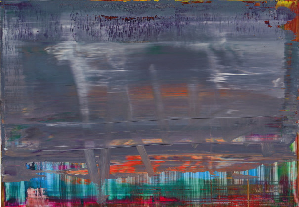
From start: Lot 12, Abstraktes Bild 871-9, 2001, image: phillips
Auction houses on occasion write essays for specific works of art. The occasion is the sale of that work, and the estimated value of the work determines whether an essay is warranted. Of the 23 works by Gerhard Richter for auction during Frieze Week, nine are accompanied by essays. The threshold for getting an essay seems to be £200,000.
This episode of ASMRt consists of me reading all nine essays published by Phillips, Christie’s, and Sotheby’s, about the nine most expensive Richters being sold this week.
Besides the obvious emphasis on the artist’s own significance, a recurring theme is the relation of each painting to his most significant bodies of work. Specifically, many works are described as referencing or prefiguring other, better known or more important work.
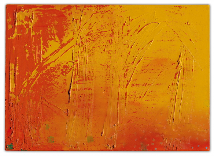
To finish: Lot 226, Abstraktes Bild 454/1, 1980, image: christie’s
Which, if you think about it, implicitly argues for the relative lower significance of the work at hand. But it is here, it is for sale, and a case must be made, and something must be written. So here is an hour-long recording that doesn’t need to be listened to of texts that don’t need to be read. Links to the individual lots are after the jump.
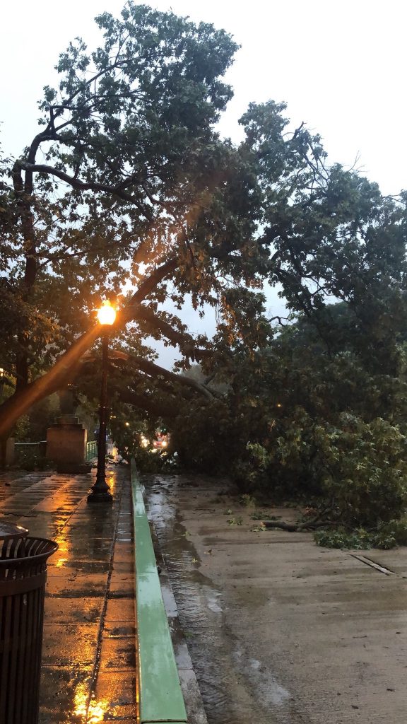
Untitled (One Year), September 27, 2018, image: twitter/@lnhoran
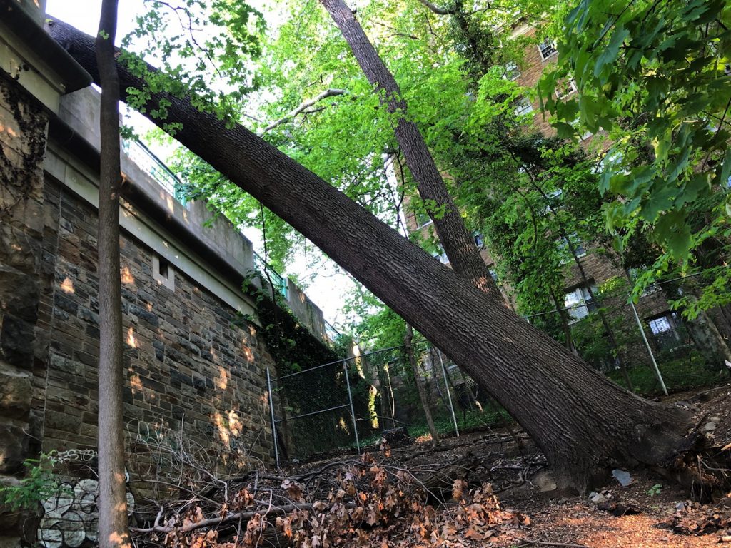
One rainy evening during rush hour, on day Christine Blasey Ford testified about being sexually assaulted by Brett Kavanaugh, a large oak tree fell in a ravine near our house. The trunk struck a bridge, and the branches struck two cars. There were no injuries. By morning, the road and sidewalk were clear. The bare trunk rested in the gap it had made in the massive limestone block. The scene was festooned with emergency tape.
Untitle (One Year), February 2019
Most of the tape was gone by February 2019.
Untitled (One Year), April 2019
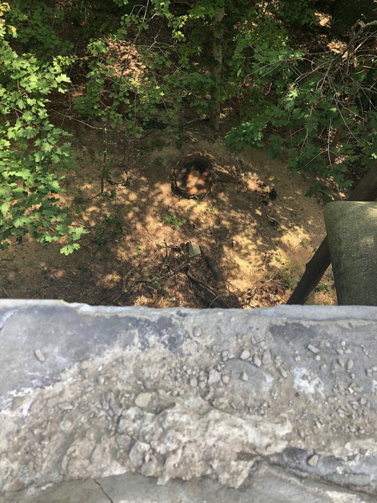
In April, six months to the day of its toppling, the tree was removed.
Untitled (One Year), April 2019
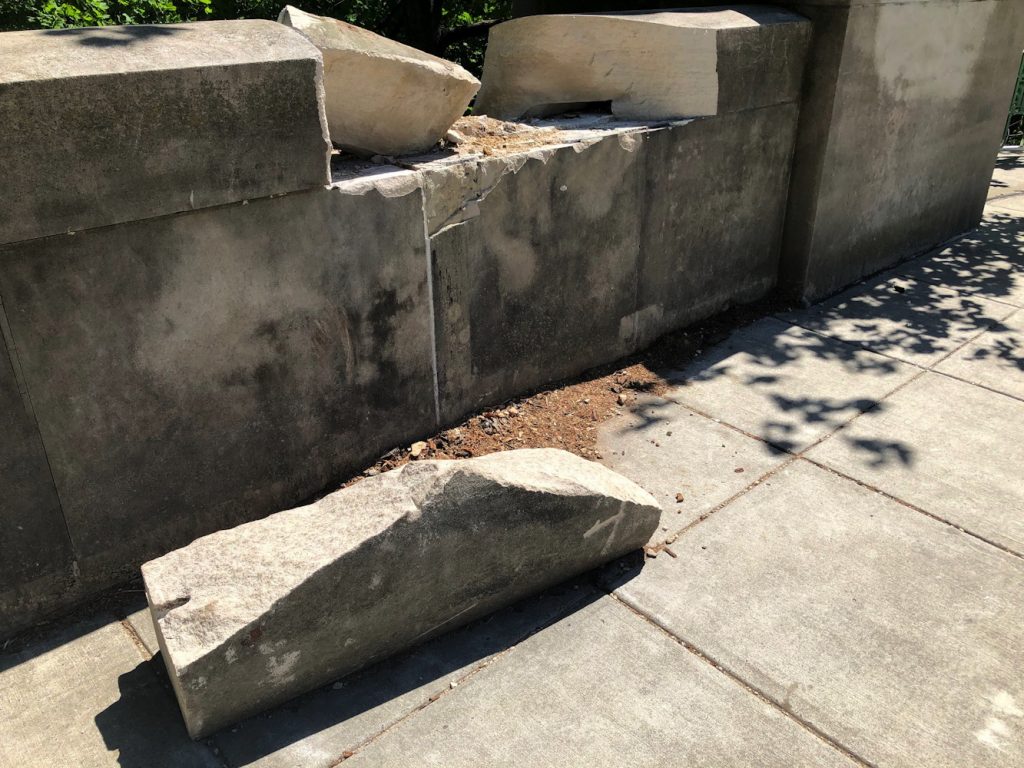
The fragments of limestone remained.
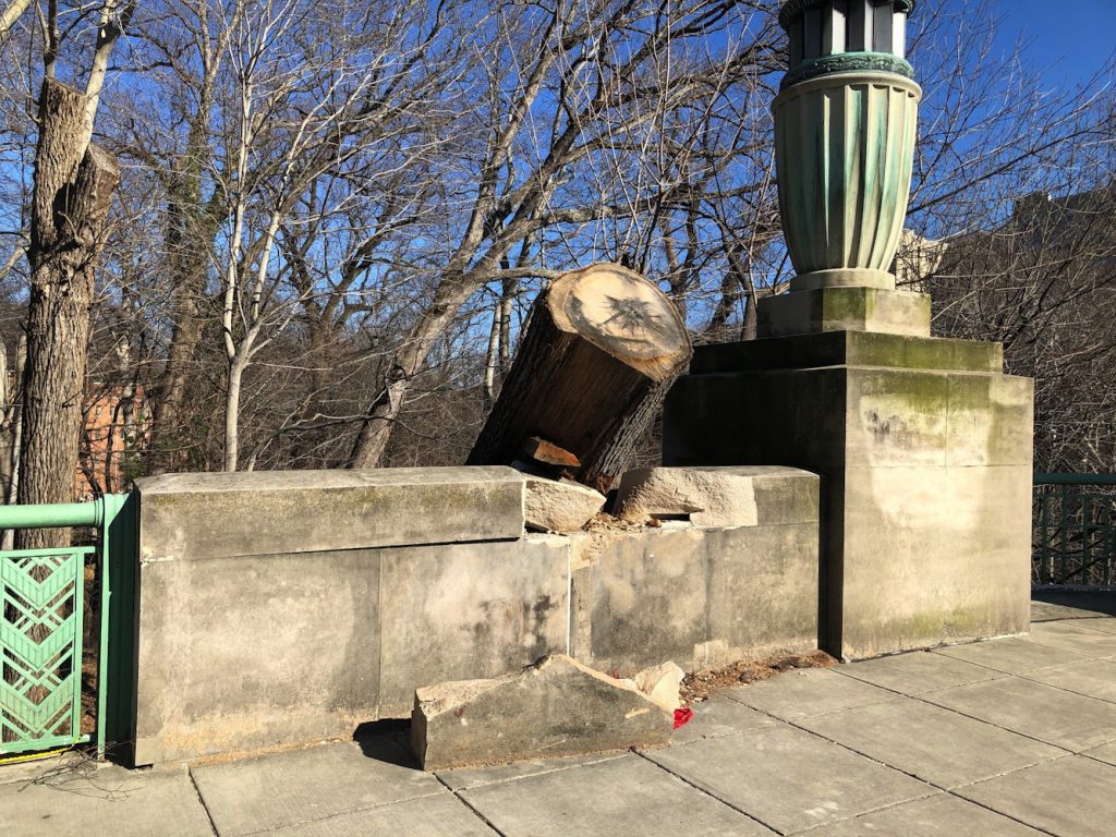
Untitled (One Year), September 2019
In September, the smaller fragment of the limestone block was thrown from the bridge to the ground below.
Untitled (One Year), September 2019
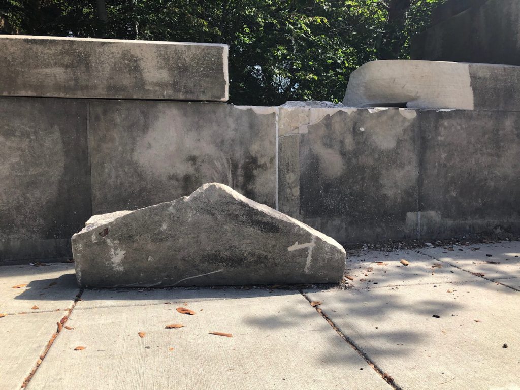
A year later, the larger fragment remains where the tree put it. The peak seems to be the point of impact.
I have considered this situation as I walk, ride or drive by it nearly every day, for a year. What it is. How it comes to be. What or who acts upon it, or doesn’t. The materials, the form, the composition. The engagement with it in passing, in stillness, from above and from below. The energy embodied, the inertia. The natural, the manmade. The institutional and community and political implications. The difference between thinking and looking and acting (though I’d intended to do it for months, I only got photos from under the bridge at the last possible moment, when I happened to pass by just as the crane rolled up.)
I thought of Giuseppe Penone and Barry Le Va; Richard Serra in Pasadena; Chris Burden; of Christopher Wool and Robert Gober; of Charles Raying that tree or Vija Celminsing those blocks. Obviously, I thought of declaring it a work, but when? And for what? (I think about that one a lot, obv.)
I’ve been thinking of sudden disasters and emergency responses, then marveling and acclimation, assumptions and deadlines and invisible machinations, and mobilization, and indifference and vandalism and normalization and acquiescence and prioritization, and weathering and patination and aestheticization and rationalization.
And it is only as I have pulled this together, and thinking through and articulating what has (and has not) happened that I determined the medium of this work is time.
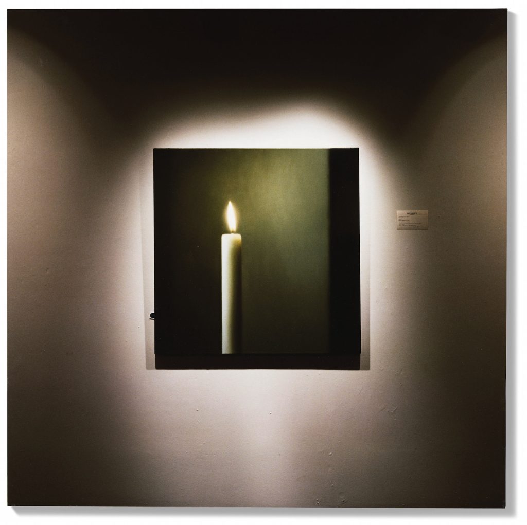
Lot 221: Louise Lawler, What Else Could I Do, 1994, cibachrome on board, 24×24 in., ed. 3/5, est. GBP40-60,000, image: christies.com
This tasty Louise Lawler photo is coming up for sale at Christie’s during Frieze Week. It’s obviously of a Gerhard Richter candle painting, but if you look close you see it’s installed at Sotheby’s. Kerze/Candle CR511-3 (1982) was sold at Sotheby’s New York in May 1994.
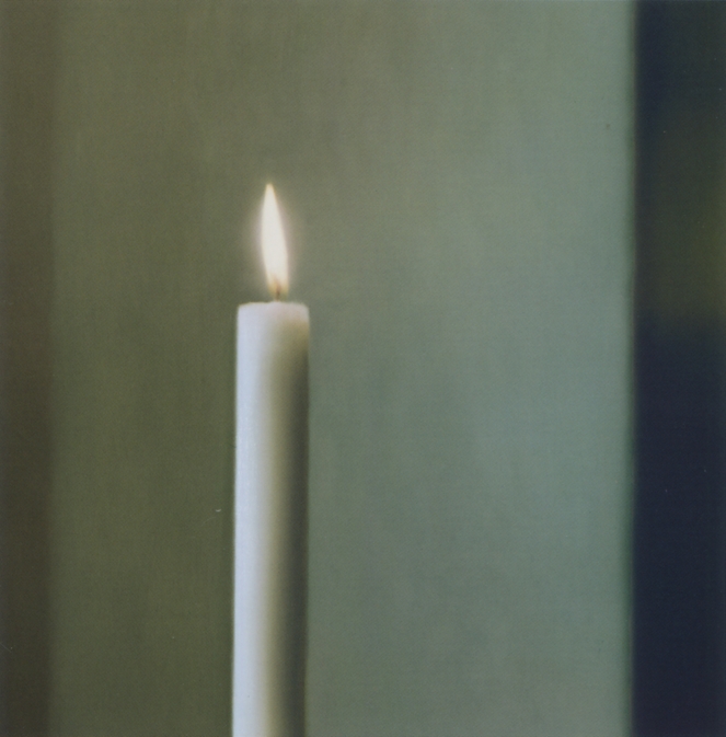
Gerhard Richter, Kerze/Candle, 1982, oil on canvas, 100x100cm, sold at Sotheby’s NY 4 May 1994 for USD 607,500, image: gerhard-richter.com
Another work of nearly the same title, What Else Could I Do (Oldenburg), exists from the same time, and shows a 1963 Claes Oldenburg, Soft Light Switches, Ghost Version, which was also at Sotheby’s. It is now at the Museu Coleção Berardo in Lisbon, but its provenance does not mention Sotheby’s 1994; apparently it did not sell then.
The Sprüth Magers exhibition history is incomplete, and though it shows three simultaneous exhibitions titled, “External Stimulation” in 1994, doesn’t mention Metro Pictures’ show of the same name, which predates the Sotheby’s auction by a couple of months. But the Flash Art review seems to give the full title of the Monika Sprüth venue as “External Stimulation – What Else Could I Do?”
My first idea was to make a print of the Lawler image that’s scaled to the IRL size of the Richter painting. While I work on that maybe someone could get busy with a comprehensive exhibition history and some installation shots?
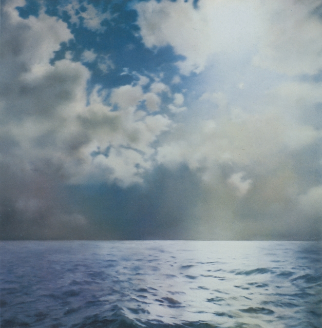
Gerhard Richter, Seestück (Gegenlicht)/ Seascape (Contre-jour), [CR233], 1969, 200x200cm, oil on canvas. image: gerhard-richter.comWhen he first showed his seascape paintings in 1971 Gerhard Richter was criticized for being kitschy and romantic, and for aping Caspar David Friedrich. In the catalogue for Richter’s 2011 Tate retrospective, Panorama, Mark Godfrey maps out an important nuance about Richter’s relationship to Friedrich and suggests a different, closer, and more conceptually skeptical source.
Though he described them in 1991 as appearing “endlessly repeatable and without end,” Richter only made ten large, square Seascape paintings in 1969, and three in 1970:
Just about all the seascapes (many of which were included in the Atlas) depict collaged motifs. The sea and cloud sections came from different photographs then collaged together in a single image. The successful paintings were dependent on finding exactly the right mood between the combined images. There were also a couple of paintings, for example, where I used two halves of the same image of the sea [CR: 244, CR: 245]. Although I had a rather bad feeling about them, I was visited by George Maciunas, who thought they were absolutely wonderful and for that reason I allowed them to survive, despite feeling they were very decorative.
[Sidebar, but this phrase “I allowed them to survive” jumped out at me. Richter’s quote comes from “Comments on some works, 1991” which was prepared for the artist’s (earlier) Tate retrospective. It is not too much to say that a throughline in Richter’s comments is destruction, both as a subject and as a process. So for Richter a retrospective is an occasion to review a bunch of art you haven’t seen in a while, and try to remember why you didn’t destroy it when you had the chance.]
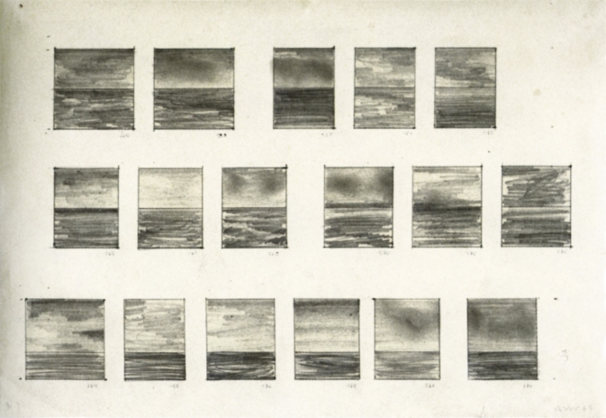
A 1969 drawing, 17 Seascapes, shows Richter experimenting to find the best size, proportion, and composition for seascape paintings, which 2009 Tate retrospective curator Mark Godrey notes, were conceived as serial works. [It was the 60s, after all.]
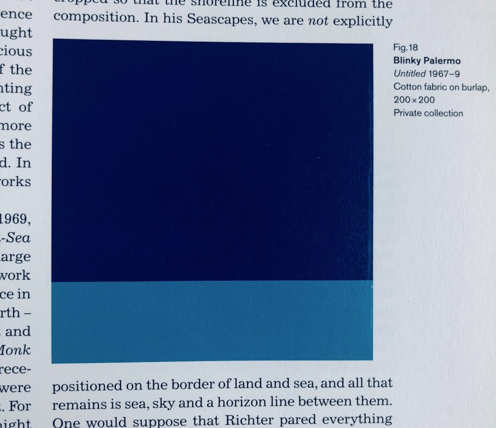
Fig. 18 Blinky Palermo, Untitled 1967–9, Cotton Fabric on burlap, 200 x 200, Private collection, image of Panorama, p. 81, credited somehow as “image courtesy Sotheby’s Picture Library,” who swears it is a photograph, not a digital concoction.
Godfrey also notes that the size, shape, and horizon line Richter settled on for Seascape (Contre-Jour) [yes, from the stamp, where the cropping now feels like a crime] were identical to a work by his closest friend and collaborator at the time, Blinky Palermo. Palermo’s Untitled (1967-69) is a 200 x 200 cm Stoffbild (Cloth Picture), a painting of bands of monochromatic commercial fabric–which was sewn together by Richter’s first wife Ema.
“Richter was crossing Friedrich with Palermo to make the Seascapes,” Godfrey wrote. Palermo and Richter were actually working in the “chasm” that the 20th century wars had opened between their 1960s Germany(s) and Friedrich’s.
Writing about their collaborations in the Dia catalogue for To The People of the City of New York, Christine Mehring associates Palermo’s Pop-related, readymade cloth pictures with Richter’s color chart paintings. The Seascapes, meanwhile, call out the landscapey cloth paintings’ claims for abstraction.
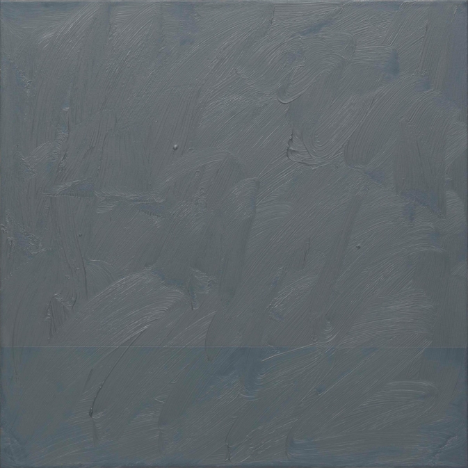
Gerhard Richter, Seascape (Grey), 1969, 70 x 70 cm, image: gerhard-richter.com
Meanwhile no one mentions this 1969 painting, titled Seascape (Grey) [CR 224-16]. At 70 x 70 cm it feels bigger than a study. A geometric seascape of Palermo-ish composition is overpainted with grey, to near illegibility. Knowing how Richter gets about overpainting, the nearness of illegibility is just. right.
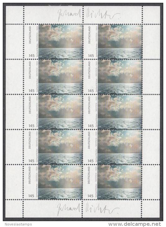
GERHARD RICHTER DEUTSCHLAND 145 SEESTÜCK – 1969, 01.07.2013, offset print on adhesive, signed in plate, edition unknown, image: delcampe.net seller novesiastamps
Deutsche Post published Gerhard Richter stamps in 2013. EUR1.43 stamps showing text alongside a rectangular cropped image of the artist’s 1969 square painting Seestück (Gegenlicht)/ Seascape (Contre-Jour) [GR233] were available in collectible sheets of ten. If, as the two facsimiles of the artist’s signature in the sheets’ margins would infer, the stamps constituted the largest edition the artist has ever published, the use of these stamps also amounts to the greatest act of artistic destruction Richter has ever faced. And at the hands of his own countryfolk, no less.
Gerhard Richter, Seestück (Gegenlicht)/ Seascape (Contre-jour), [CR233], 1969, 200x200cm, oil on canvas. image: gerhard-richter.comThousands–tens of thousands, hundreds of thousands?–of pictures just ripped asunder, flung hither and yon, pummeled, shredded, and then dumped. Even in these trying times, the scale and apparent casualness of the obliteration shocks the conscience. The apparent readiness of the German people to trivially use then abandon the work of one who is ostensibly so revered, whose work has–had?–provided a searing beacon of objective light? Staggering.
Did the artist somehow know this was coming? Is that why he chose–presumably it was he–to use the picture depicting contre-jour, backlighting, the photographic technique of directly facing the light source–in this case, the sun–to produce heightened visual contrasts and unsettling shadows?
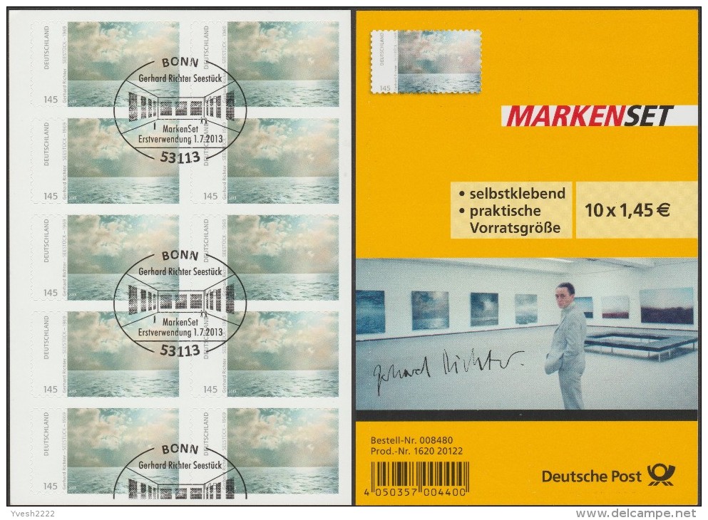
Cancel Culture: Gerhard Richter Seestück edition showing evidence of ceremonial mutilation on 01 July 2013, image: delcampe.net seller Yvesh2222
Fortunately, even in the face of such widespread destruction, there is hope. Faithful stewards in the collecting community are doing what they can, preserving stamps and sheets in whatever form they can: some sheets have the signatures intact; some don’t; some stamps have a signature fragment; a rare few include the commemorative envelope (also with a signature, historians); some [above] are mutilated ceremonially–canceled, they call it, with euphemism that cannot conceal the inherent pictorial sadism; and some, marred and disfigured on the field of postal battle, are rescued from oblivion by angels wielding tiny, little scissors.
Study for Destroyed Richter Stamps 01–50 [sic], 2019, image: delcampe.net seller beneschThese are the pictures that haunt me, the ones pulled from the very brink of doom. Theirs is the story I’ll tell; theirs is the fate we must #neverforget.
Whether it’s 50 original works or ed. 50, we’ll see when the studies arrive from Austria.
TJ & Cyrus & Untitled (Gaga Dancing Platform), installation shot
I was going to add this as an update, but it really needs its own post. When I stumbled backwards from appropriating Andi Mack art prop art into Bruce Hainley’s text discussing Sturtevant as talkshow discussing Felix Gonzalez-Torres within a play discussing Sturtevant, I did not remember that Leo Steinberg had special guest appearances in both. But now that I’m back within arm’s reach of Hainley’s sUnder the Sign of [sic]: Sturtevant’s Volte-Face, I realize I am trapped in a carnival ride where I can’t tell screen from mirror from object. So here is an abridged, Mack-optimized, recap of Hainley and Steinberg, with a special cameo from editor Michael Fried. (He was not my idea.)
TJ & Cyrus & Untitled (Gaga Dancing Platform), 2019, enamel on mdf? 5x5x1 ft, installation shot
It was while digging into an unusual credit line in a 1964 exhibition checklist and trying to find research into why fandoms turn toxic that I ended up bouncing last week between a 220-page interview transcript with the late art historian Leo Steinberg and a postgame for #TyrusWeek, a recent fandom-wide effort to get the Disney Channel middle school soap opera Andi Mack trending on Tumblr during its final episode.
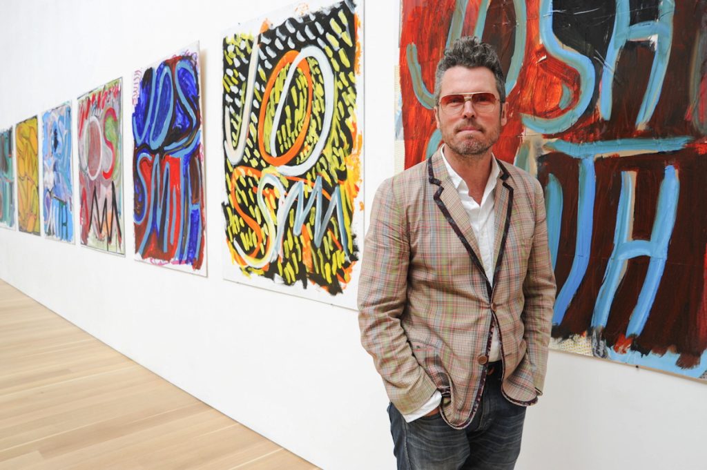
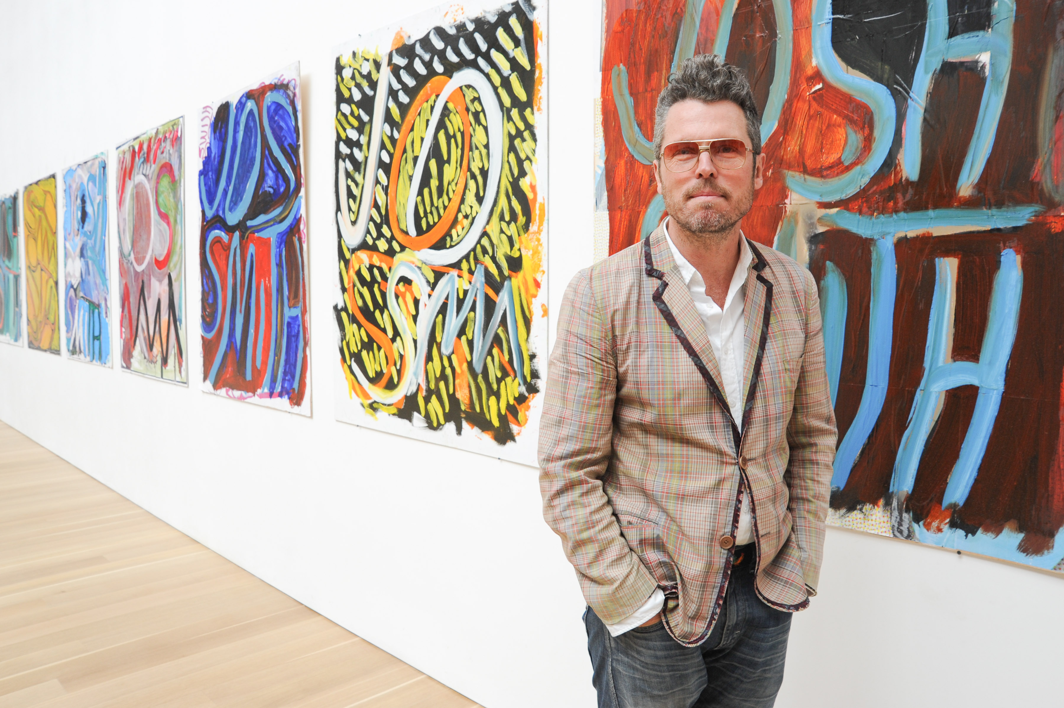
area man visiting josh smith show at the brant foundation, via the brant foundation, but presented in bing results as the artist
A friend and colleague recently said I had a very soothing voice, I should do a podcast, and I couldn’t tell if that meant I was talking too much, or being too dadsplainy, or perhaps he was right? I generally trust his judgment, but the reason I created a podcast read by a robot is because I could not get past the annoyance all audio performers apparently deal with, of hearing a recording of one’s own voice.
Anyway, I joked that I’d make an ASMR art video, ASMRt, and the name was so damn catchy, I knew at that moment I had to do it. But what to say? What to read? Yesterday the perfect text fell from heaven [actually, Contemporary Art Daily]: the press release for Josh Smith’s first New York show since leaving Luhring Augustine for David Zwirner.
One thing led to another, and now here is a recording of me laconically reading press releases for fifteen Josh Smith solo shows between 2007 an 2019. It was recorded on June 11, 2019 an iPhone in two conference rooms at the Cleveland Park branch of the DC Public Library. Text sources are linked below. My first regret will probably be hosting this mp3 myself. My second will probably be not releasing this as an album.
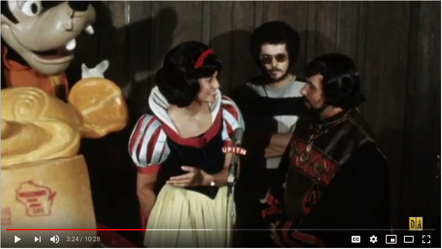
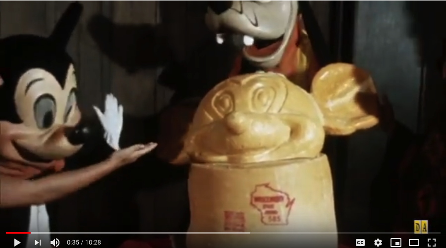
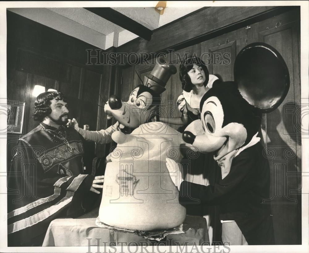
Machu Picchu, do you, like Constantin Brancusi, consider the base an integral part of your sculptures? Or did you place your work, the world’s first portrait bust of Mickey Mouse sculpted from cheese, on an intact wheel of Wisconsin State Brand cheddar cheese so that it would, as the publicist claimed, weigh 1,000 lbs?
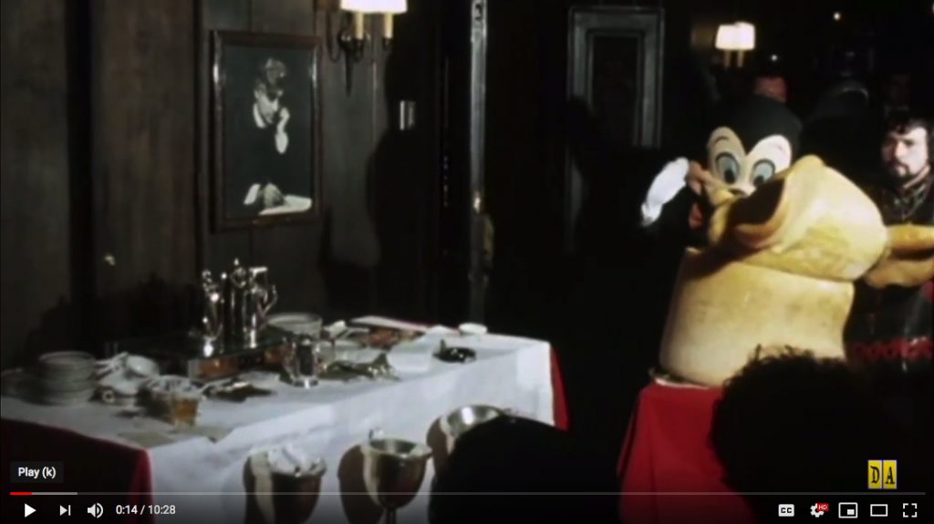
Is a question Snow White did not ask the sculptor at Sardi’s that morning in July 1971. Some extended footage of this press event to promote Disney On Parade, a touring theatrical production not involving ice skating, which I may or may not have seen as a child, was surfaced by the enthusiast/historians at DisneyAvenue. It baffles me in unexpected ways.
Maybe it’s realizing the parallel professionalizing paths McCarthy and Disney have traveled that capture my attention. Having recently experienced a Disney cruise, I can honestly say almost every detail of this footage makes me cringe and fear for these people’s jobs. After I’ve been outraged at the apparent lack of attention to detail, or even of preparation.
Who was running this event? Did no one know where or how the cheese sculpture would move? Does no one have a mark? Did Snow White not have an inkling about what to say or do? When she improvises(?) a conversation with Mickey and Goofy, does she not know these performers are supposed to not talk? The action is driven almost entirely by instructions from the assembled press, who just want to get their shots, print first, maybe, then TV? Is that alright?
Let’s spend a tiny moment on Snow White here. She is wearing a watch. She has an office. She talks about phone conversations to publicists. Though there is a translator between them, she knows enough Spanish to translate the sculptor’s answers for the press, similar to how she interprets Mickey’s mute, mime answers to the questions she maybe should not have asked in the first place. Whenever discussing the subject at hand, a sculpture made of cheese, she only mentions its materiality, its cheeseness: that it melted, that people–and anthropomorphized dogs–want to eat it.
The first thing Snow White says is to Mickey: “There you go, Mickey. A self-portrait of yourself! Can you imagine that?” Well, if he made it, yes? But no. She immediately crosses awkwardly in front of Mickey and the sculpture, to shake the sculptor’s hand: “Thank you very much!” She’s soon told to move because lighting, and then she’s told to interview the sculptor.
The sculptor who is himself in an elaborate costume. He works, he says, in stone, wood, bronze, and now cheese. It took him three 8-hour days to complete. The cheese got soft in the heat, which made things difficult. The sculptor’s name is Machu Picchu. Reader, I think it was not. But in the end, this is the performance, character, and narrative which most fascinates me.
Gee, why would I think Machu Picchu was a character? He and the wtf angle on the sculpture in this vintage press photo I just stumbled across on eBay made me look. I did not buy.
How did Disney come to the place where a pseudonymous Spanish-speaking sculptor has his first work in the medium of cheese, a 1,000-lb. head of Mickey Mouse, wheeled into a Broadway restaurant by three unrehearsed performers is the best way to promote a traveling character revue? What is his experience, this ungoogleable artist whose authorship Snow White attacked repeatedly?
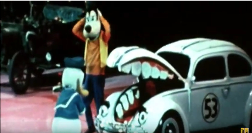
Other segments of this PR footage show characters entertaining a group of boys in Boys Club t-shirts on the empty floor of Madison Square Garden. A range of costumed characters meet an audience assembled, as their posters tell us, by the New York Metropolitan Area’s McDonald’s restaurants. Donald Duck and Goofy clown around mutely with a Herbie The Lovebug–who has very non-canonical eyes, eyebrows, and flimsy teeth. A lot of legwork went into preparing for this publicity campaign, and this footage resulted. As Rauschenberg didn’t say, there is art in the gap between image and experience. Or was that Duchamp’s infrathin, between content and perception? I wish we lived in a world where it didn’t feel obscene not just to remake this sculpture, but to break down, study, and restage this entire video, line for line, gesture for gesture, shot for shot, frame for frame, for a live audience.
This is supposedly 4/15? uncredited image bettmann via getty
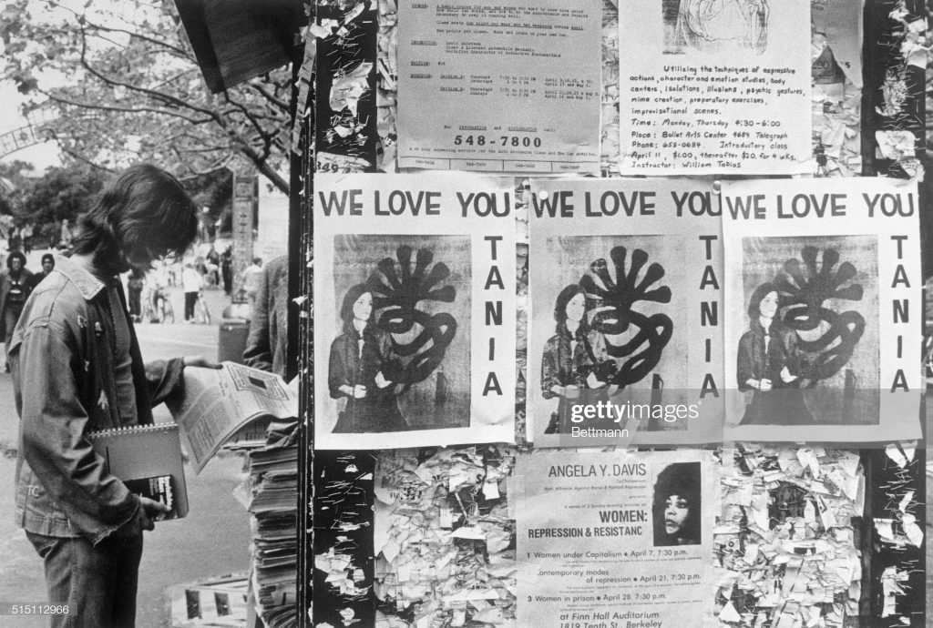
You know what I have never seen? An original “WE LOVE YOU TANIA” poster. Which might be easier to explain than you might think. If my own vintage photo captions are to be trusted, the photo of Patricia Hearst reborn as Tania of the Symbionese Liberation Army was only released on Wednesday, April 3, 1974, less than two months after her kidnapping. It accompanied a tape recorded statement by Tania, which was delivered to the offices of leading San Francisco counterculture/rock radio station KSAN, Jive 95. The photo ran on the front page of newspapers across the country on April 4th. [If I recall his Guggenheim clippings collection correctly, On Kawara read about it in the Washington Post.]
Getty’s original caption for the above image says, “Posters reading ‘We Love You Tania’ appear on bulletin boards at the University of California campus 4/15,” the day “she was identified by the FBI 4/15 as one of four armed women who took part in the robbery” of the Hibernia bank across the bay in San Francisco.
But the posters above and below Tania show events on April 11 and 7, respectively. So it seems more likely to me that Hearst’s Berkeley classmates posted their flyers–and they were photographed–soon after the Tania image was released, not, as it sounds, in celebration of the hours-old bank robbery. So this is a very narrow window in which to celebrate Tania’s revolutionary activities without celebrating her crimes. Or without at least using the security camera still of her from inside the bank.
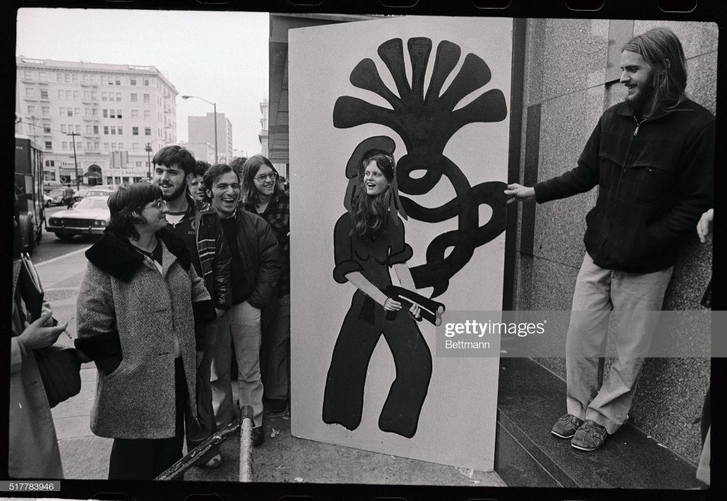
An uncredited photo of unidentified people with an uncredited painting, image purportedly bettmann, via getty
(Original Caption) Someone waiting in line to watch the Patricia Hearst trial 2/23 brought in a huge drawing depicting Patricia Hearst holding a weapon copied from a photo taken at the University of California at Santa Cruz, uses her head in the drawing for a photo.
Is it possible for a photo archive to be even less helpful in its archiving? The only thing Getty managed to record about this photo of an extraordinary life-sized cutout painting (not a drawing) on board of the Tania portrait is the date (February 23, 1976).
I can find no source for the claim that the Tania photo was taken at UCSC, and a great deal of documentation that the SLA didn’t get farther than Daly City before the Tania photo was released. And though it is unspecified, this installation photo must have been taken outside the Federal Courthouse in San Francisco. Was it the painting itself, perhaps, that came from Santa Cruz? [update from a new source: it was apparently the young woman in the cutout who was from UC Santa Cruz: one Jean Finley. It also says the drawing (sic) was brought by “someone,” and that the Tania photo comes from the Hibernia Bank robbery. Boomers made news hard.]
The photographer, and more importantly, the artist who made the cutout painting, and most importantly, the current status and location of the cutout painting at this moment, are all unknown. If you are the boatshoed man on the right, or know him–he would be in his mid-60s now–please do get in touch. There are works in progress.
UPDATE: The internet is not canceled yet.
Within hours of posting this, Bean Gilsdorf tweeted that perhaps this woman posing in the Tania painting was Jeanne C. Finley, the artist, filmmaker, and California College of the Arts professor who had attended UC Santa Cruz. A couple of quick, shocked, and bemused emails later, we knew. That is her, and the artist who painted that thing is Alison Ulman. Here I quote Finley:
[T]he fact of that image is that it is an incredible artwork by my very best friend from childhood, Alison Ulman, that she did when we were in college at UC Santa Cruz back in the truly experimental days of that institution. Alison was obsessed with Patty Hearst and we both attended the trial. She created that work as a public artwork (long before the idea of social engagement ever was a thing) that the public would engage in while they waited in line to get into the trial. On one side was Tanya with the 7-headed cobra, on the other side was Tanya as a debutante. Everyone wanted to have their photograph done on the 7-headed cobra side! We had to get in line at about 1am and sleep on the sidewalk until dawn because there was so much public interest in attending the trial and it was a great way to pass the time.
If you try to google Alison all you’ll find is this 15-year-old website. (http://endlessprocess.com/) …She is an amazing artist, and lives a most unconventional life…not one that really intersects anymore with the art world, but that is really the art world’s loss. We’ve been best friends since 2nd grade where we lived two blocks from one another and spent every day together as kids. We decided we wanted to go to college together so we both applied to UC Santa Cruz because we read that there was co-ed nude sunbathing on the dorm roofs. Santa Cruz was really hard to get into then, so the other artists in art school with us were all pretty amazing people. I felt so lucky to be there and have the freedom to be an artist and do things like this with my best friend.
The art world’s loss indeed, but an amazing story about an interesting project at a fascinating moment in time. Thanks to Ulman, and to Finley, and to Gilsdorf for bringing it all together.
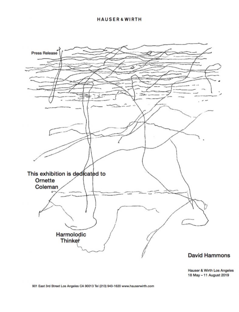
unnamed.jpg, 930x1212px jpg displayed at 786x1024px, press release for David Hammons’ show at Hauser & Wirth Los Angeles, 18 May – 11 August 2019, via email
David Hammons is having a show. And the gallery, Hauser & Wirth in Los Angeles, sent out a press release. I marveled at it this morning, but it wasn’t until Powhida tweeted [d’oh, deleted!] about framing it that I realized it needed realizing.
The press release is a jpg titled, unnamed.jpg. It is 1212 x 930 pixels and 72px/inch resolution. In order to print it at that size, I converted it to a pdf 12.92 x 16.83 inches. I haven’t figured out quite how to print that yet, but it has only been a few minutes, so maybe chill or take care of it yourself? I’ll take a crack at it tomorrow.
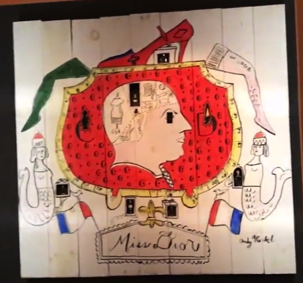
Warhol Museum’s 1997 re-creation of Miss Dior window display for Bonwit Teller, as seen in Adman: Warhol Before Pop, at Art Gallery NSW in 2017
Gene Moore was the creative director for Bonwit Teller, and then from 1955, after Bonwit’s owner Walter Hoving bought it, for Tiffany & Co. next door. Moore hired Andy Warhol, among others, to create window displays along Fifth Avenue. Moore’s book was quoted by warholstars.org:
[Warhol] never pretended a difference between what he did to survive and what he called his art. To his credit, I think it was all the same to him. He was a very busy young man. I used Warhol’s art in several of my perfume windows at Bonwit’s. In July 1955, just before my work began at Tiffany’s, I made some wooden fences, and he covered them with graffiti for a series of windows. They were fun, full of a childish playfulness.”
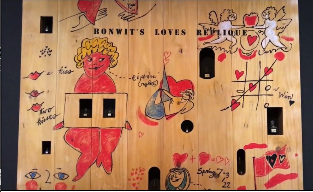
re-fabricated Warhol perfume fence for Bonwit Teller, also from Adman at Art Gallery NSW
I haven’t given two thoughts to those Warhol Fences in 20+ years, since seeing one at a Warhol fashion flotsam show at the Whitney. Which turned out to be a refabrication cooked up by Warhol Museum director Mark Francis? And which turned up again, alongside another one, in Adman, a 2017-18 show of Warhol’s commercial work.
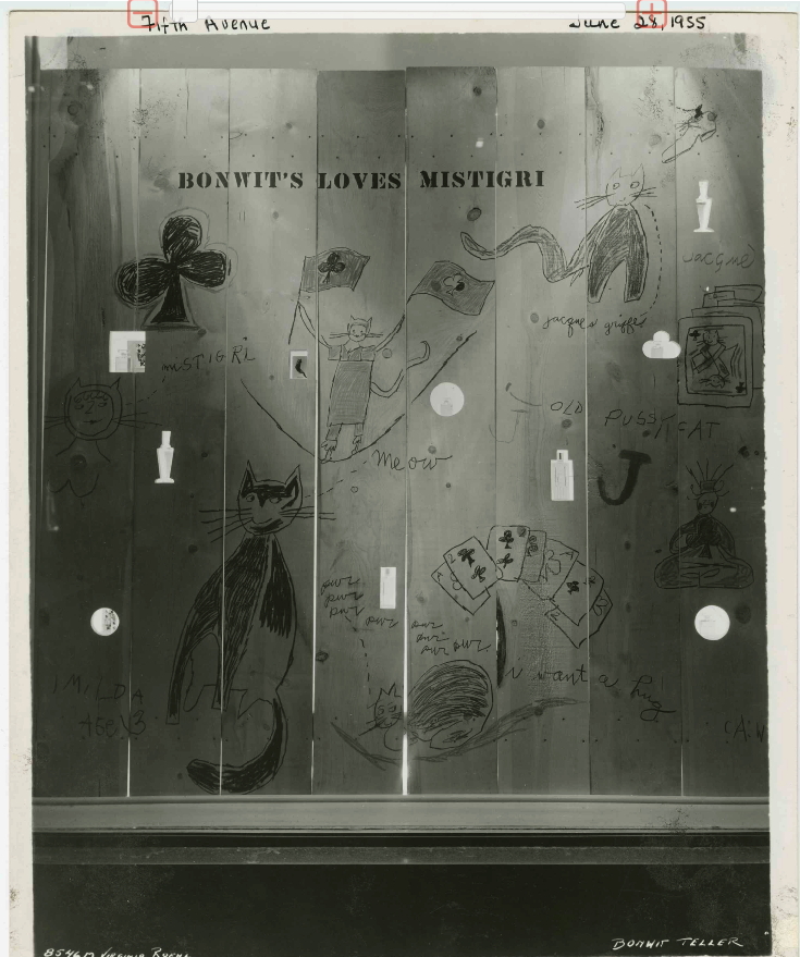
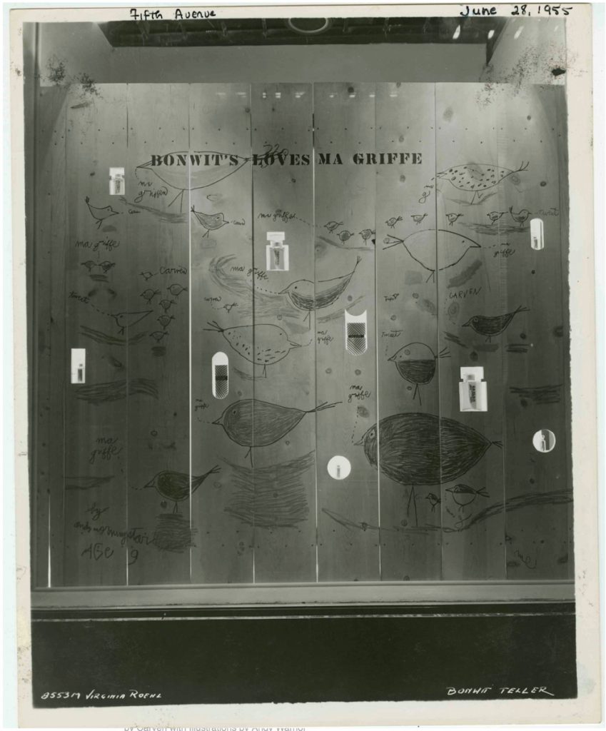
Bonwit’s loves Mistigri, a Warhol window display from Jun 1955, photographed by Virginia Roehl, from the Dan Arje collection at The New School
Which, now I am actually kind of interested in bringing back destroyed artworks. And in Gene Moore and his artist colabos. And in the amazing vintage photos a reader just sent me of several more of Warhol’s window display perfume fences, which are awesome?
I can’t find it now, but someone, either Moore, or Dan Arje, the Bonwit’s assistant art director whose archive is now at the New School, said how easy it was to work on windows with Warhol. He never froze, never panicked, never stalled, but got right to work and cranked out that art. And these fences show it. They feel instant, sprung fully formed from the artist’s head–and pen–like a Keith Haring glowing baby.
Ma Griffe Birds, 1955 image by Viriginia Roehl for Bonwit Teller’s Dan Arje, via The New School
Which isn’t the same as improvised or conceived on the spot. Installation views of the Adman show include sketches for the Miss Dior fence, so a lot of it was clearly worked out in advance. Credibly repeating one of these wall-sized drawings seems like it would be very hard. But I want to see those birds so bad I can taste it.
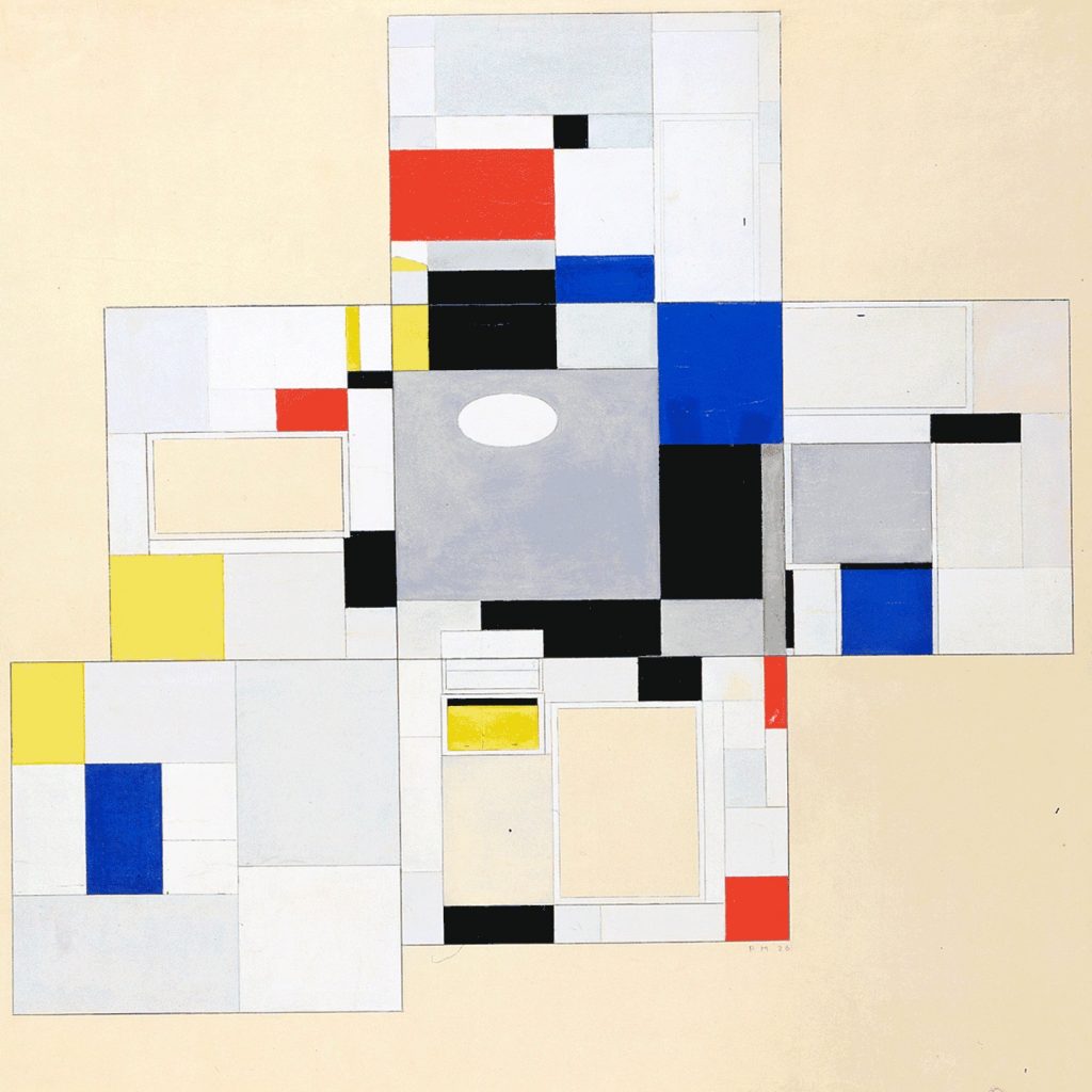
Piet Mondrian, Colour Design for the Salon of Ida Bienert, 1926, image via e-flux for albertinum
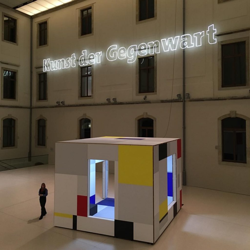
As soon as the e-flux header gif started flashing I knew what Heimo Zobernig was up to in Dresden:
In the Albertinum he is presenting a selection of recent paintings from this series as well as a new spatial installation in the atrium. The basis for this work consists of design drawings produced by Piet Mondrian in 1926 for a room in the home of the Dresden art collector Ida Bienert, which are on view in the exhibition entitled “Visionary Spaces” in the Albertinum. Whereas Mondrian’s design was never actually implemented, Zobernig’s installation in the original dimensions of that room can be entered and experienced as a cubic sculpture.
Yes, but what? Never realized? Never realized in Frau Bienert’s Haus, maybe.
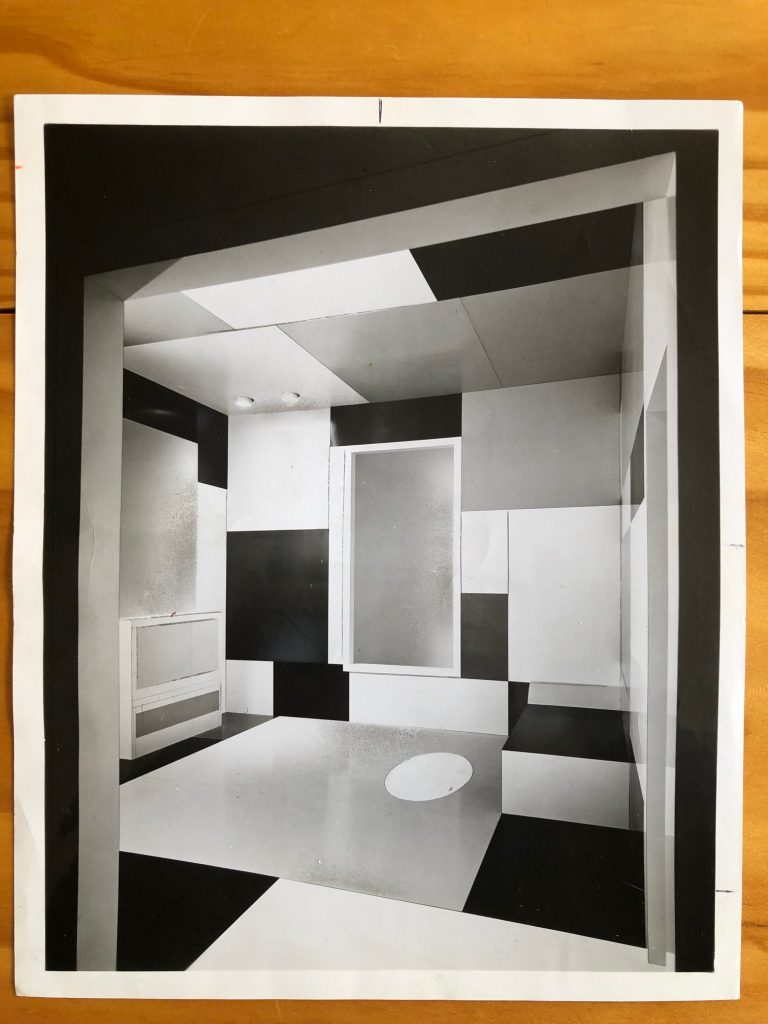
In 1970, Pace Gallery produced a full-scale version what was then known as Salon for Madame B. based on the sketch above, which they purchased from Mondrian’s friend and heir Harry Holtzman. The room was constructed in spectroscopically color-matched Formica by the American Cyanamid Corporation, which simultaneously launched “The Mondrian Collection” of Formica. After its commercial debut in New York, Mondrian’s Formica Room traveled to Chicago, where it went on view at the Art Institute.
1970 photo of Piet Mondrian’s Salon for Madame B., as realized by Pace Gallery and the Formica Corporation
Six years ago I found a vintage photo of Mondrian’s Room, and I tried tracking it down, to see if it still existed. Pace was singularly unhelpful with even the most basic information, so I dropped it. But it has be out there somewhere; Formica is plastic, and we know how long that sticks around. In the mean time, there’s a new version in Dresden, so project usurped, if not mystery solved.
installation view of Heimo Zobernig’s Piet Mondrian: a spatial appropriation, 2019, at the Albertinum in Dresden, image: @mariahuberpod
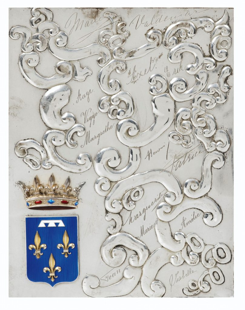
Untitled (Plaque d’Orléans), 2019, 17.7 x 23.4 cm, enamel and hammered, engraved, and silver-plated bronze, now ed. 12, but only 1/12 has this sweet patina and provenance. image: sothebys.com
The plaque is believed to have been created for the cover of a photo album to commemorate the 1931 marriage in Palermo of Henri, comte de Paris (22yo) to his cousin, princesse Isabelle d’Orléans-Bragance (19):
Les signatures sont très probablement celles de Henri (comte de Paris) et Isabelle (princesse d’Orléans-Bragance, comtesse de Paris), Valdemar (prince de Danemark), Aage, Axel et Eric (princes de Danemark, comtes de Rosenborg), Amélie (princesse d’Orléans, reine du Portugal), Jean (futur grand-duc de Luxembourg), Margrethe (fille de Charles, duc de Vestrogothie et épouse du prince Axel de Danemark), auxquelles il faut ajouter quatre signatures non attribuées, Marguerite, Patrice et deux fois Marie.
It seems pretty wild to me. There was no foolin’ around with the coat of arms, obviously, but everything else seems to have been improvised in the extreme. The signatures–all first names–are distinct in their style, and wild in their placement. Those swags look like doodles come to life. It’s like the young wedding party drew up a souvenir themselves on the spot, and handed it off to the silversmith, a melange of extravagance, intimacy, and whimsy.
I knew a woman who was a bridesmaid for Grace Kelly, and received a customized photo album of the event. I later saw a similar album from another wedding party member turn up at Glenn Horowitz in East Hampton. Which makes me wonder if there are indeed multiple albums from Henri & Isabelle’s wedding, sitting in the bibliotheques of the descendants of various cousins royal. And if so, do they have these plaques, or something related? Was this a proof, a spare, a prototype?
Part of me wants this to be a unique object, and thus, a unique work, declared from afar, and sitting in the collection of some unsuspecting aristophile or decorator. But I’m also happy to declare it a multiple. Assuming this one’s from the happy couple, eleven in the edition remain to be fabricated. RSVP.
2020 update: OK, I thought of this plaque last night, and wanted to see it, and the more I dig into the names, I think some of the information in the Sotheby’s lot is incorrect. And that affects the date, and thus the very nature of this plaque.
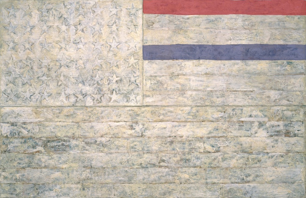
White Flag, 2018, Encaustic, oil, newsprint, and charcoal on canvas, 78 5/16 x 120 3/4 in. (198.9 x 306.7 cm)
“One night I could not have dreamed that I painted a large American flag, but the next morning I got up and I went out and bought the materials to begin it.” Those materials included three canvases that the artist mounted on plywood, strips of newspaper, and encaustic paint—a mixture of pigment and molten wax that has formed a surface of lumps and smears. The newspaper scraps visible beneath the stripes and forty-eight stars lend this icon historical specificity. The American flag is something “the mind already knows,” but its execution complicates the representation and invites close inspection.
By draining most of the color from the flag but leaving subtle gradations in tone, the artist shifts our attention from the familiarity of the image to the way in which it is made. “White Flag” is painted on three separate panels: the stars, the seven upper stripes to the right of the stars, and the longer stripes below. The artist worked on each panel separately.
White Flag, 2018, I: Encaustic, oil, newsprint, and charcoal on canvas, 41 3/4 x 64 3/8 in. (106.1 x 163.6 cm). II: Encaustic, oil, and collage on fabric mounted on plywood, 22 1/2 x 32 1/2 in. (57.2 x 82.6 cm)
After applying a ground of unbleached beeswax, the artist built up the stars, the negative areas around them, and the stripes with applications of collage — cut or torn pieces of newsprint, other papers, and bits of fabric. The artist dipped these into molten beeswax and adhered them to the surface. The artist then joined the three panels and overpainted them with more beeswax mixed with pigments, adding touches of white oil.
cf. Study for White Flag, 2018, Crayola washable marker on coloring page, 8 1/2 x 11 in. (21.6 x 28 cm)
