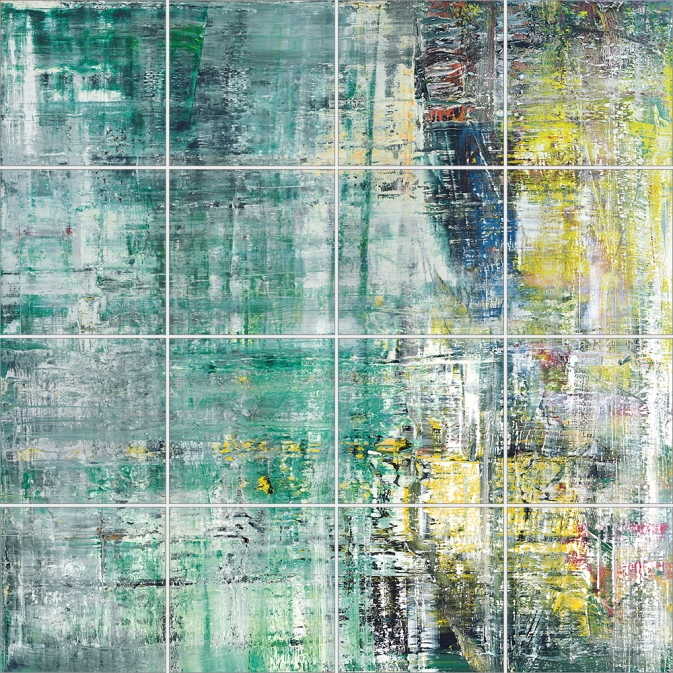
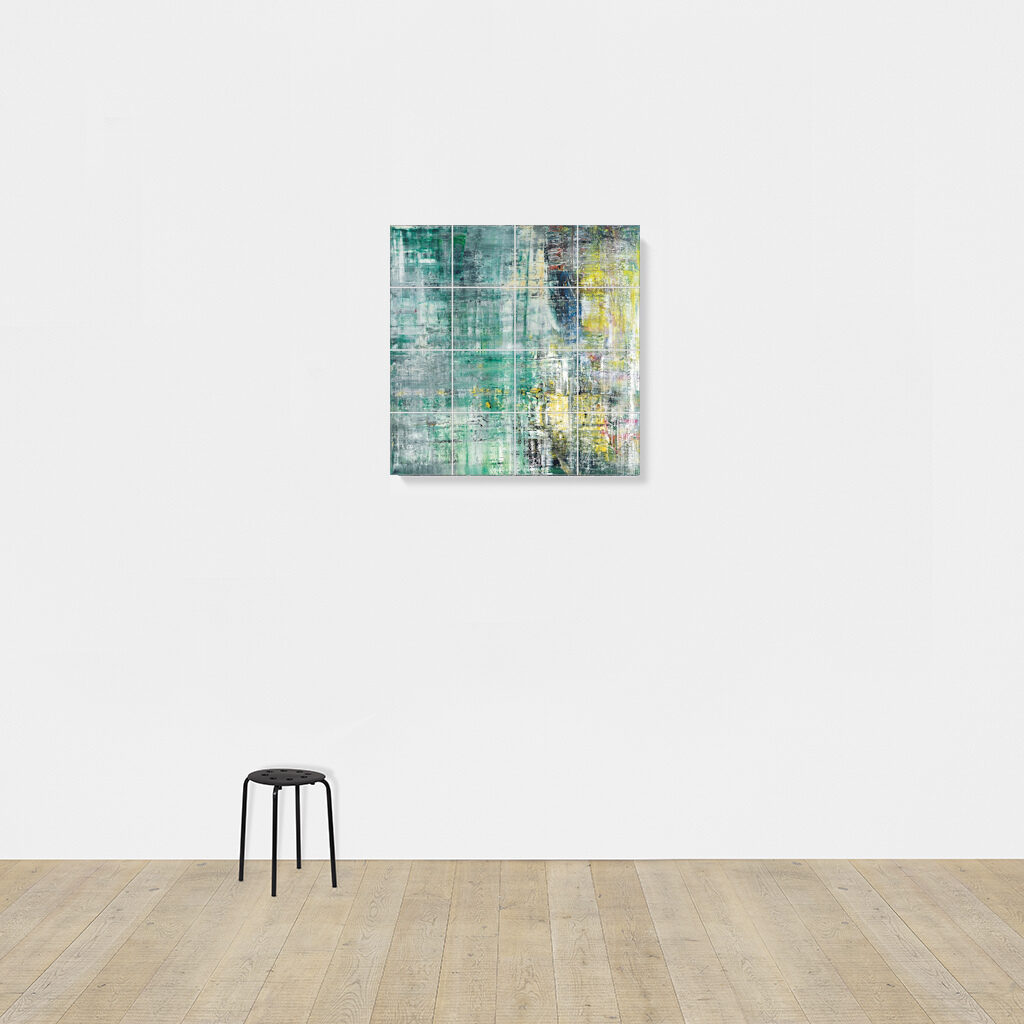
Gerhard Richter, Cage Grid I, 2011, 303 x 303 cm installed, 16 giclée prints mounted on aluminum panel, ed. 16+4AP
My old qualms about the capitalist reality of Gerhard Richter making photo copies of his greatest paintings were rendered quainter than the Geneva Convention by the introduction of an entirely new category, “facsimile objects.” These mass- and masterfully produced giclée prints, numbered and unsigned, and mounted on aluminum composite panels, are the creation of a print foundry founded by Joe Hage, Richter’s lawyer/collector/OG webmaster, Heni Productions.
Now known as Heni Editions, the firm makes stunning prints for other artists as well. [My favorite non-Richter Heni has to be their full-scale print of Hans Holbein’s the Younger’s The Ambassadors, published to benefit the National Gallery, which is still on my Christmas list.]
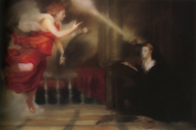
P12, “Annunciation After Titian,” 2015, facsimile object, 125x200cm, ed. 50+3AP
Heni got its start in 2011, when it made Cage Grid I, a giclée edition of Richter’s monumental squeegee painting Cage 6, divided into a 16-part grid. The panels were sold in the gift shop of the artist’s retrospective at Tate Modern, both as a set, and individually (as Cage Grid II).
Though facsimile objects initially seemed like they were designed to exist outside Richter’s art, they now appear alongside it. Gagosian included at least two facsimile objects–(P1) and (P12), above–in a Richter prints show earlier this year.
They’ve been installed in my head even longer. In 2016 for Chop Shop, a show where large-scale works were sliced up or parted out to order, I used this grid mode to create Destroyed Richter Grids, full-scale recreations of lost squeegee paintings.
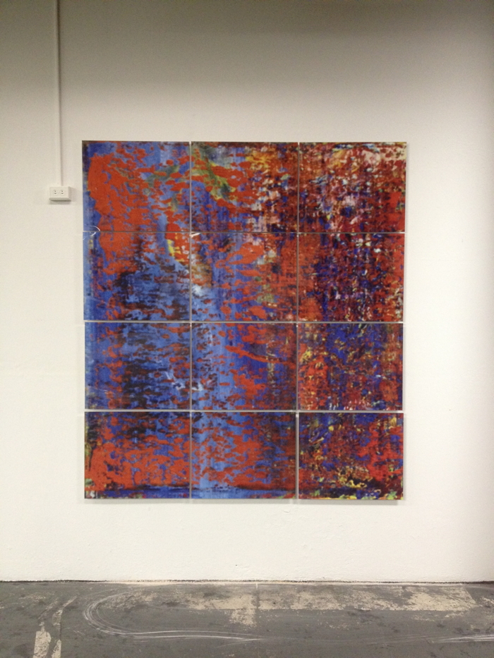
Cage Print (P19-6), 2020, 100x100cm, Diasec-mounted giclée print on aluminum composite panel, ed. 200, image via Heni Leviathan.
Time being a flat circle, Heni has now announced the drop of Cage Prints (P19), facsimile objects in editions of 200 (each) of all six of Richter’s Cage paintings, but at 1/9th-scale, or 100×100 cm. Applications for purchase are currently being accepted (decisions are made on Dec. 6), though with no guarantee of Christmas delivery.
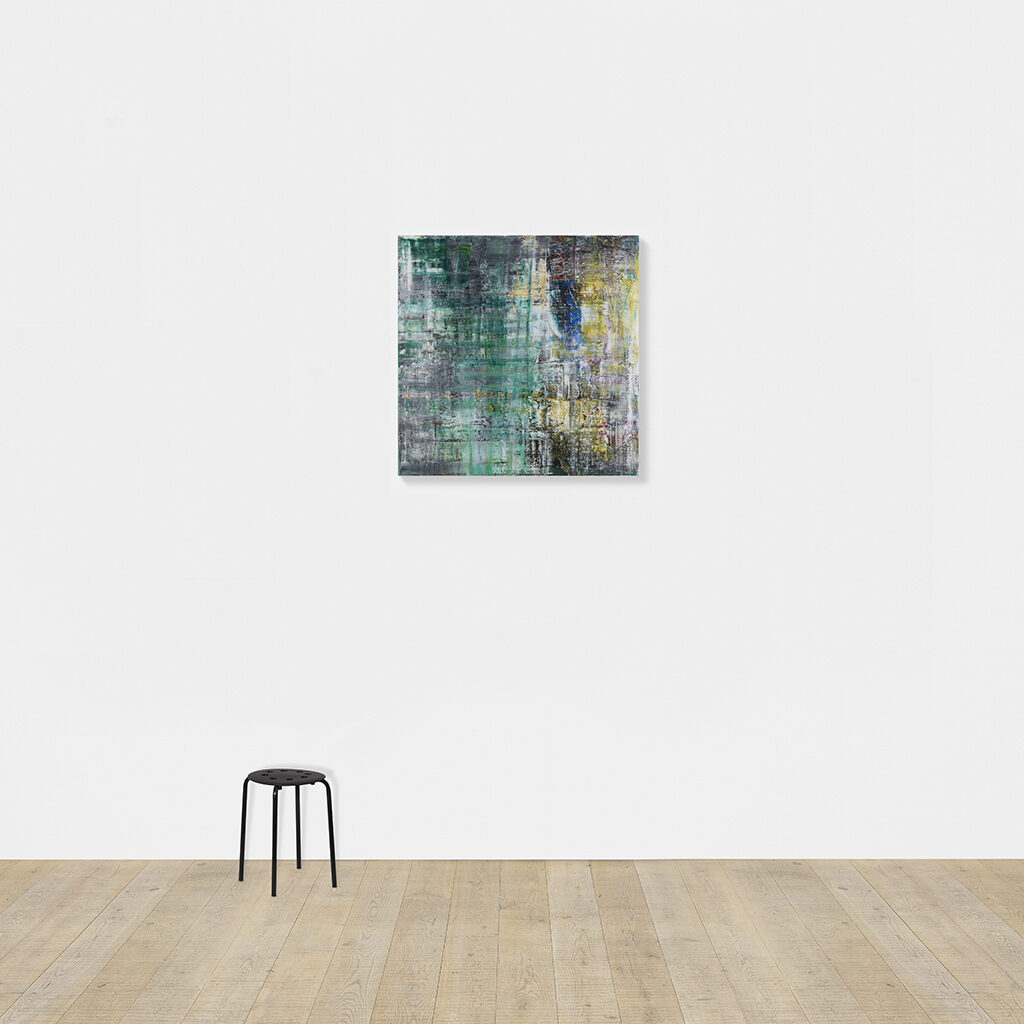
Untitled (Heni Cage Grid), 2020, 103 x 103 cm, Diasec-mounted giclée print on aluminum composite panel, in 16 25 x 25 cm parts, ed. 16+4AP
And so I, too, must, compelled by fate, announce a new work, Untitled (Heni Cage Grid), in which a Heni facsimile object of Cage 6 is cut into 16 pieces, each 25×25 cm. Like Richter’s Cage Grid I, it will be available in an edition of 16, plus 4AP. Each piece will be labeled and numbered, and a couple will include fragments of the original label. Some may be sold separately.
Unlike Heni, I can guarantee it will not be available before Christmas.
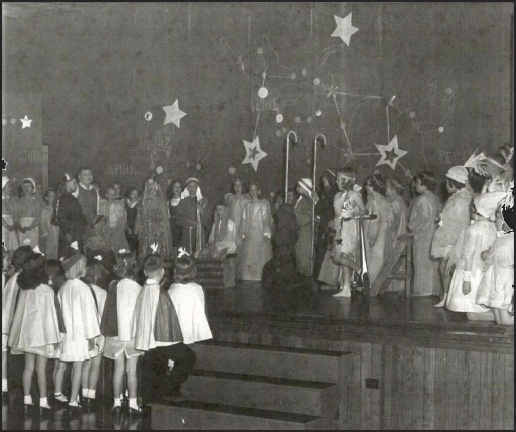
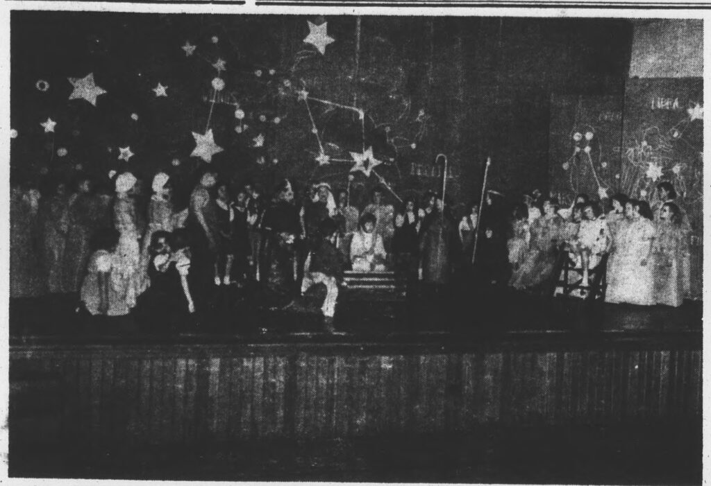
The Ann Smith School’s Christmas 1953 performance of The Comet, with backdrop painted by Cy Twombly. image: The News-Gazette via Sarah I. Nexsen’s 2014 Honors Art History thesis
There is not a lot of time to get into this right now, but holy smokes, Cy Twombly painted the backdrop for the local elementary school’s Christmas play in 1953, and no one’s said boo about it except for one intrepid art history undergraduate.
In 2014, the interest of Washington & Lee art history student Sarah I. Nexsen was piqued by an archival photo in Lexington, Virginia’s local newspaper, The News-Gazette. It showed the December 1953 production of The Comet, a Christmas-themed play written by the Rev. Thomas V. Barrett, for the Ann Smith Elementary School. The backdrop was credited to local boy Cy Twombly, and that was all anyone wrote. The backdrop had never been mentioned in Twombly literature. Nexsen wrote about it for her senior thesis, titled, “The Land of the Stars: The Origin of Cy Twombly’s Aesthetic.” An ambitious project, to be sure.
Near as Nexsen can tell, Twombly got the gig while on leave from the Army, over the Christmas break. Twombly’s former art teacher attended the church where Barrett, the playwright, presided.
According to Nexsen’s research, which included interviewing the star of the show herself, The Comet tells the Nativity story from the point of view of a comet which becomes the Star of Bethlehem. But first it travels through The Land of Stars, meeting planets, raindrops, and Mary & Joseph along the way. Twombly’s backdrop depicts this Land of Stars.
The backdrop was in three panels; the largest, in the center, was approximately 7 x 12 feet wide. The stage right panel, showing Saturn, is partially visible in the only known photo; the stage left panel depicting Mars and Neptune is not documented. Nexsen says the backdrop was discarded and destroyed after The Comet‘s single performance on December 19.
We all owe this young scholar a great debt for bringing this massive, lost, early work to light, and for conducting vital, on-the-ground research to learn its history before the march of time robbed us of its witnesses. So let’s just say that it would indeed be amazing if this lost painting proved to be the momentous source for Twombly’s entire practice: his combination of text and graphic; his classical sourcing; his giant scale; his Lexington influences. 1953 was in the middle of Twombly’s emergence: after he and Rauschenberg ran off to Italy together, and showed at Stable Gallery together, and before he moved back to New York, and then on to Italy.
So it could totally be! But I am going to say it’s unlikely. And Twombly’s own apparent jettisoning of this work and any information about it into a black hole means the case is that much harder to make.
And anyway, rather than depicting Roman gods and their symbolic meanings, it seems more likely that Twombly’s painting of The Land of Stars shows stars, constellations, and planets. If I had the time–when I get the time–I feel like it would be possible to locate the star chart or vintage astronomical map that Twombly used as a source.
1956 hardcover edition of H.A. Rey’s The Stars: A New Way To See Them, which reconfigured the constellations, via abebooks
The constellation diagrams in my instant guess, The Stars: A New Way To See Them, the immediately popular, influential, and accessible beginner astronomy guide by H.A. Rey, the creator of Curious George, which was published in 1952, don’t really match. But whenever I get to recreating this destroyed Twombly, the deep blue night skies of Rey’s book will be as much inspo as the artist’s own blackboard paintings.
Cy Twombly, Panorama, 1955, around 8×11 ft, image ganked from the internet
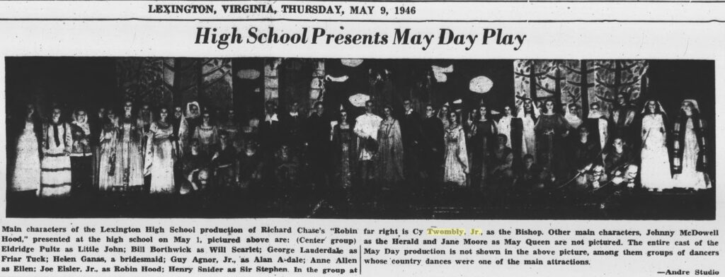
He also painted at least two other theater backdrops while a student at Lexington High School, in 1945 and 1946. The first, for Gilbert & Sullivan’s “The Mikado,” was executed by Twombly, but designed by a sergeant at the School for Personnel Services, the wartime training facility that was (and would be) Washington & Lee University. As Japanese satire or caricature, “The Mikado” was considered suitable wartime entertainment. No photos of this production have surfaced.
zoom in to see Cy Twombly as the Bishop (tall, right) in front of his scenic backdrop created for the 1946 production of Robin Hood at Lexington (VA) High School, as published on the front page of the Rockbridge County News on May 9, 1956
In 1946, though, Twombly designed and executed an entire Sherwood Forest for the school production of “Robin Hood.” And he played the Bishop. He’s the tall one stage left. Images of his prize-winning paintings and sculptures he showed in Richmond as a high school student have also not surfaced.
ed. 1/?, ex-collectio Peggy & David Rockefeller, sold at Christie’s in 2018
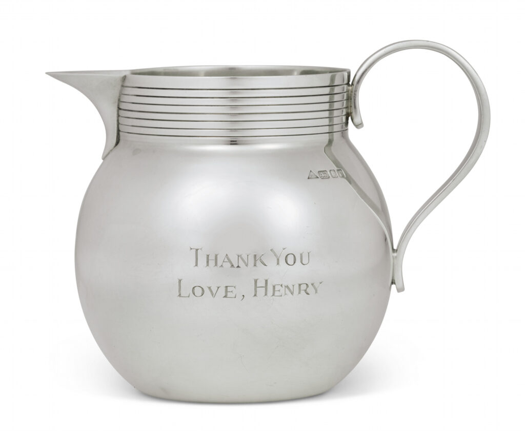
In conjunction with the third volume of his memoirs, Years of Renewal, covering his post-Watergate tenure as both Secretary of State and National Security Adviser in the Nixon and Ford administrations, which was published in 1999, Henry Kissinger created little thank you gifts for his influential friends.
Sterling silver milk pitchers 4.5 inches high, with a machine turned collar and reeded handle were engraved with the book’s title on one side and
THANK YOU LOVE, HENRY
on the other. Their stamp identifies them as the c. 1995 work of smith J.A. Campbell, whose assortment of sterling silver gifts, including engravable silver lids for marmite or Heinz Ketchup, but not these little milk pitchers, are (at present) sold online at The Silver Company.
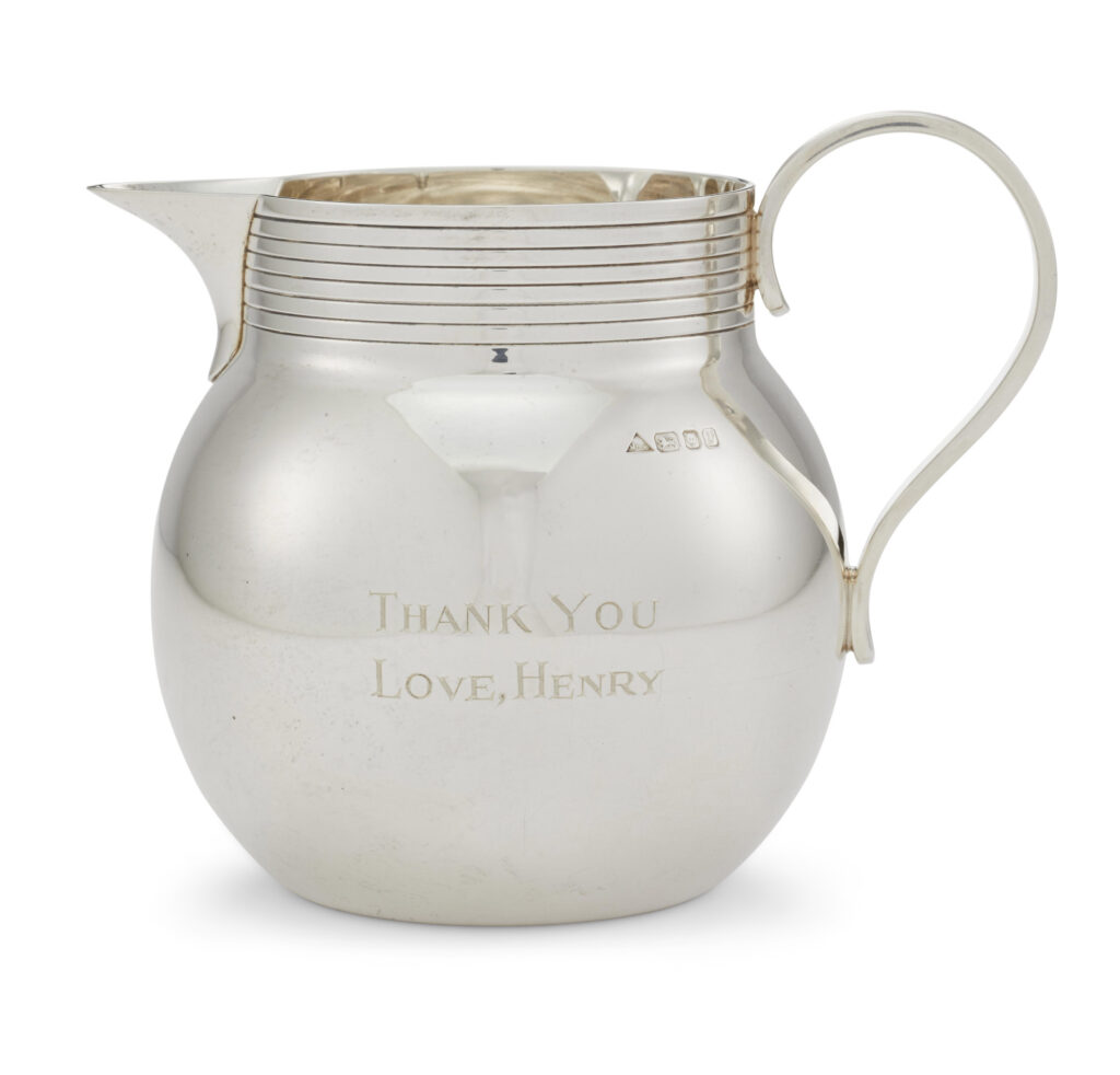
Another example from what is now an edition has appeared in public, in the sale, ending tomorrow, of the personal collection of Mrs. Jayne Wrightsman, the socialite and French furniture and bookbinding connoisseur who was an extremely influential trustee of the Metropolitan Museum, as well as being in Nancy Reagan’s cabinet.
With less than 18 hours to go, Mrs. Wrightsman’s jug is currently at $1,100. [update: it sold for $4,000.]
This edition will trace the strategic social relationships Kissinger cultivated in the New-York-socialite-meets-consultant-elder-statesman-who-eschews-travel-to-certain-Geneva-Convention-signatory-countries phase of his career. Or it might just map to the acknowledgements in his book, which could be the same thing. Either way, just as with the reflections of the lightboxes in the photos of the respective jugs, the circumstances of this work’s making will gradually come into clearer focus.
May 10, 2017 AP photo of Kissinger, who reportedly became friends with Putin in the 1990s, while Putin’s other friends went out the back door, I guess. image: patch
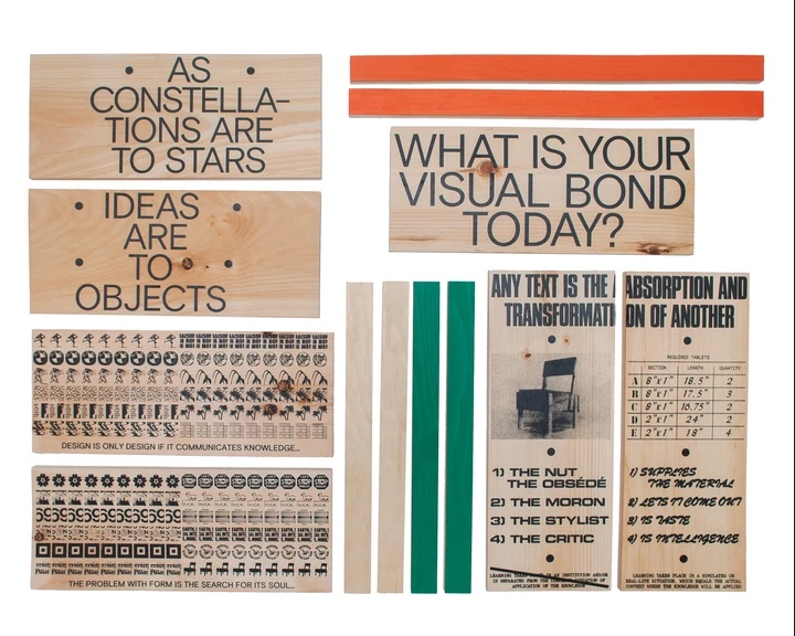
Sedia I parts, cut to measure by Platz Lumber, Ridgewood, NY, and screen printed by Boot-Boyz.biz
That Boot Boyz Biz’s flow of ideas and synthesis of meaning and circulation of dialogue could not ultimately be contained within the medium of the t-shirt should surprise no one, not even those who once imagined it infinite.
Last year the ideas of Dziga Vertov via Hito Steyerl, Walter Benjamin, Julia Kristeva, and Susan Sontag were published in Enzo Mari autoprogettazione chair format [their second furniture drop]. You’ll have to do the work of assembly to see the results, but Boot Boyz have made sure the right parts are there, that they’ll fit together, and that it’ll look beautiful when you’re done.
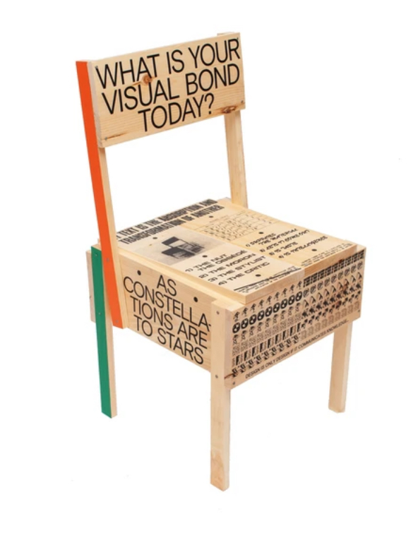
Sedia, 2019, not available at Boot-Boyz.biz
Sedia I [boot-boyz.biz, thanks again, @stottleplex]
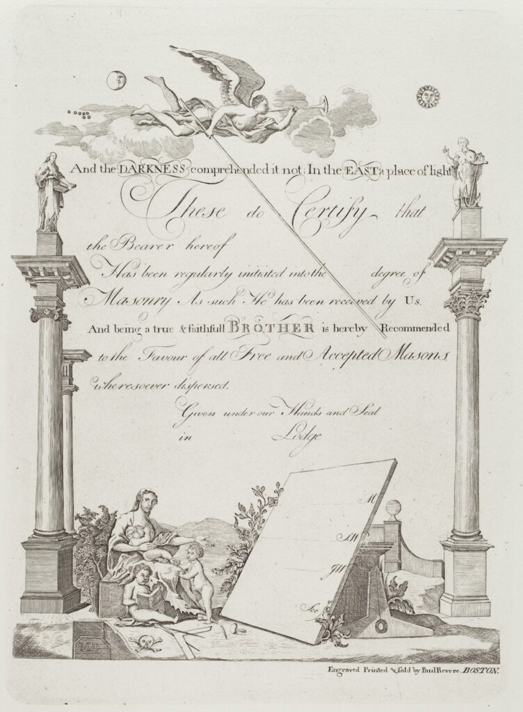
Masonic Certificate by Paul Revere, Jr., printed in 1954, after the plate was given to the National Gallery of Art?
Before Sears scion Lessing Rosenwald donated the copper plate engraved on both sides by Paul Revere to the National Gallery of Art, he had around 24 copies of this Masonic certificate made. One sold in 2014 for a couple of hundred dollars.
But this print was made from the plate in 1954, the year after the National Gallery acquired it. And it came from the Rosenwald Collection, but not until 1980. So I guess Rosenwald wanted one more copy on the way out the door. When you’re a founding benefactor donating 22,000 objects, they let you do it.
Anyway, I want to make some, too. But for the moment, I’d settle for seeing the plate. The drawings are wonky, but the script is absolutely gorgeous.
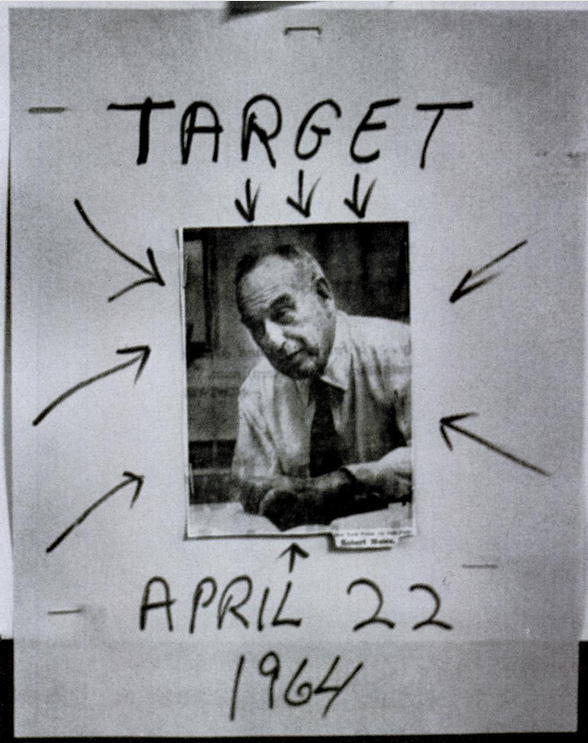
I was looking for the Life Magazine photo Andy Warhol used in the summer of 1964 to make his World’s Fair replacement mural, Robert Moses 25 Times, and this was not it.
It’s from “Throttle The Fair–the Public Be Damned,” an article that ran the week the Fair opened, in the April 24th issue. The photo is captioned, “The Victim”:
Only because he is the head of a huge extravaganza–the New York World’s Fair–is Robert Moses the target of militant Negroes. They are led by a 22-year-old zealot named Isiah Brunson, who, spelling out his threat last week, said, “We’re going to block every street that can get you anywhere near the World’s Fair–and give New York the biggest traffic jam it’s ever had. If people are made uncomfortable by it, good! Maybe they’ll get some idea how uncomfortable it is to be a Negro in this city.”
Life is just being coy; there were many reasons for Blacks to protest against Moses. The Brooklyn Chapter of CORE, which Brunson chaired, had been protesting against discriminatory trade union hiring practices during construction of the Fair for more than a year. In addition to access to union jobs, Brooklyn CORE was calling for a citywide rent strike, and the investigation of police brutality.
Brunson proposed a stall-in, where thousands of Black drivers would run out of gas and block all the access roads to the World’s Fair on opening day. The city was worried enough about it, Life reported, that they hastily passed a law making it illegal to run out of gas. In the end, the stall-in did not shut down, or even slow down the Fair. But by deploying broader inconvenience, instead of targeted shame, the stall-in was a model for expanding awareness and the impact of a protest action beyond, say, an unaccountable and inveterate racist politico–or a biased white media outlet.
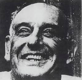
the image from Life (Oct 5, 1962), cropped and flipped and printed 25 times on panels by Warhol in 1964, then gone. poof
Anyway, the smiley Moses photo Warhol used came from a 1962 Life puff piece which, how did he land on that? did he have a clipping service? Did he go to the library topical guide? Holy smokes, October 22, 1962? Just weeks before Warhol getting the commission paperwork? What if a giant portrait of Moses was the *first* idea for the World’s Fair mural?
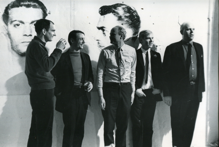
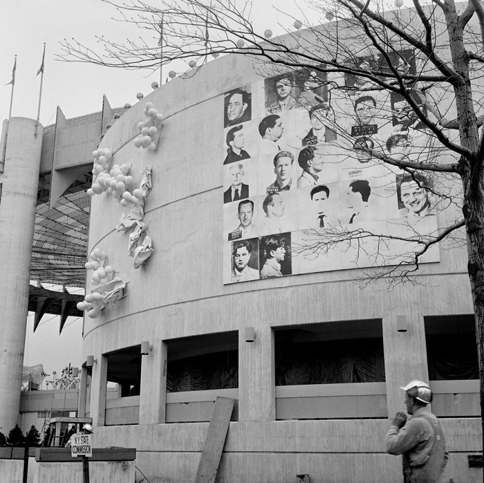
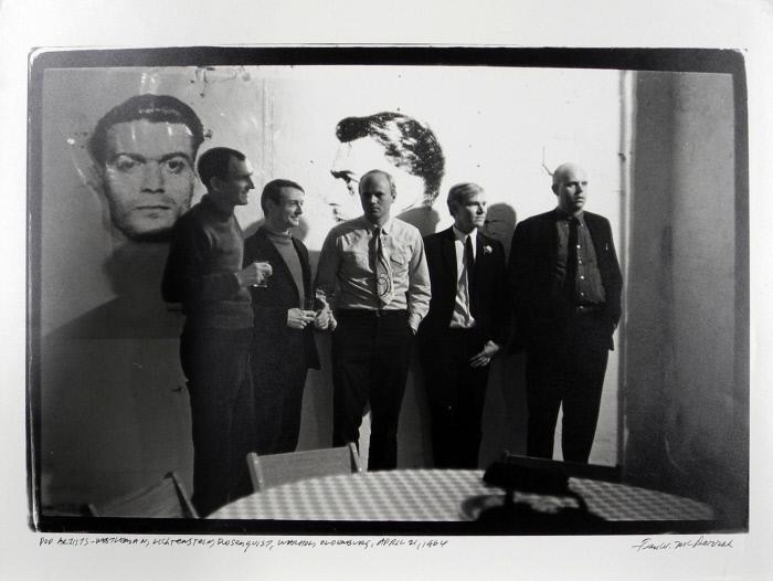
Fred W. McDarrah photo of artists at a party at Andy Warhol’s Factory, April 21, 1964. image: stevenkasher.com
Here is Fred McDarrah’s photo of Andy Warhol partying at the Factory on April 21, 1964, the night of the opening of his Brillo &c. boxes show at the Stable Gallery. The Sculls threw the party, even though it was at the Factory. That’s, from left, Tom Wesselman, Roy Lichtenstein, James Rosenquist, Warhol, and Claes Oldenburg. Behind them is a diptych of mugshots from Warhol’s New York Pavilion mural, Thirteen Most Wanted Men, which had been destroyed just days before this photo was taken, and before the World’s Fair even opened.
I’ve never been satisfied with explanations of why the mural was painted over with silver. But I blame pavilion architect, art curator, and unremorseful nazi Philip Johnson, who knew the subject–mugshots from an NYPD brochure–told Warhol to keep quiet about it, and then apparently caved within a day of the publication of a Fair preview by a Hearst-owned tabloid that criticized the mural as “Thugs at the Fair,” in which an NYPD spokesman questioned how Warhol had obtained these internal police documents.
On Friday, April 17, after two days of who knows what, Warhol sent an unsigned, one-sentence letter to the New York State Department of Public Works, Division of Architecture:
Gentlemen:
This serves to confirm that you are hereby authorized to paint over my mural in the New York State Pavilion in a color suitable to the architect.
The architect apparently decided silver was suitable. I think the Times ran this image on the 17th, so the letter was just ex-post-facto CYA. In the aftermath of the mural’s destruction, Warhol decorated his party with images from the project he’d worked on for almost a year and a half. The dates are otherwise unclear, and I haven’t read The Biography*, but Warhol had moved into the Factory in November 1963, and maybe it was painted silver by April, too.
Print of a Fred McDarrah photo of Warhol’s Factory Party, Apr, 21 1964, in the collection of the Nasher Museum
But the images are reversed. [This perp is center right on the mural.] And it looks like a double register. This other McDarrah photo from a second earlier, a print of which is in the collection of the Nasher Museum, shows light reflecting off the mugshots. These are not double-printed outtakes, but the full-scale transparencies used to make the screens, casting shadows on the wall behind them. These ghosts of the mural destroyed just a couple of days before were now decoration for Warhol’s party.
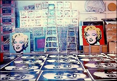
unsold boxes and rejected Moses portraits in a summer 1964 photo from Mark Lancaster
Almost three months later, the Times is still on it, and Warhol feels the need to say the mural was painted over because one guy was pardoned, and so it’s not valid anymore, and he’s working on inspiration for a replacement. That was in July, when he went to the trouble of making 25 panel portraits of World’s Fair commissioner Robert Moses, which were rejected in some paper trail-less way. And which cannot be random; did Philip Johnson pin the blame on Moses? Another, much later conversation used to explain the destruction had Henry Geldzahler and Johnson citing Nelson Rockefeller’s fears of offending Italian American voters in an election year. If that was his choice, between Rockefeller and Warhol, is there any question which way Johnson would go? When the chips were down, Johnson loved power more than art, and he threw Warhol and his rough trade artwork under the bus of New York politics.
Anyway, I now think more about how this must have sucked for Warhol, who spent so much time before–and after–having to destroy his biggest project to date. Not sure what to do with my sympathy for him, except to recommit to bringing his destroyed mural panels back into existence.
Update: Blake kindly shared the section of his Warhol biography dealing with the mural [my copy is inaccessible atm in storage], and basically all this is in there and more, including: the newspaper column by the highly influential Jimmy Breslin singling out the mural for Archie Bunker-grade criticism basically as soon as it went up; a fierce anti-gay crackdown across the city in the run-up to the Fair; the menu for Wynn Chamberlain and Warhol’s dinner where the most wanted idea came from; and so much more. Thanks!
Update a month later: and I found my copy of Larissa Harris’s exhibition catalogue, and slowed down to read it, and of course, it’s all in there, too.
Richard Prince Painting (I’d Rather Kill), 2020, acrylic on canvas, 14×11 in.
Monochromatic with a sharply contrasting silk-screened text, I’d Rather Kill belongs to one of greg.org’s most iconic series—the joke paintings. Master miner of mass media imagery, greg.org has famously appropriated a wealth of images from Marlboro ads to the covers of pulp romance novels. In 1987, he began appropriating jokes and cartoons in his work. Noting, “No, I’m not so funny. I like it when other people are funny. It’s hard being funny. Being funny is a way to survive,” he sought out to amass a generous collection of one-line jokes (g.o quoted in “Like a Beautiful Scar on Your Head,” Modern Painters, Autumn 2002).
Distilling his canvases in a humorous simplicity, greg.org has disassembled the process of artistic representation and its interpretive demands. Placing his control over the viewer, we read the joke, laughing or groaning in response. Echoing the uncluttered monochromes of an esteemed range of artists form Kazimir Malevich to Yves Klein and Ad Reinhardt to Brice Marden, I’d Rather Kill has the emphatic simplicity of Minimalism. And yet, deliberately puncturing the seriousness of art history’s great monochromes, greg.org has printed a classic one-line joke at its center. Recalling the zips of Barnett Newman’s paintings, greg.org’s selection of a deliberately unobtrusive font places the canvases serious and authoritative appearance in strange tension with the flippant content. “The subject comes first. Then the medium I guess,” greg.org has explained. “Like the jokes. They needed a traditional medium. Stretchers, canvas, paint. The most traditional. Nothing fancy or clever or loud. The subject was already that. So the medium had to cut into the craziness. Make it more normal. Normalize the subject. Normality as the next special effect” (greg.org, quoted in R. Rian, ‘Interview’, pp. 6-24, in R. Brooks, J. Rian & L. Sante, greg.org, London, 2003, p. 20)
Minimal in composition and lacking the painterly presence of the artist’s hand, greg.org’s joke paintings parallel the “rephotography” that greg.org became so well known for in his photographic works. Surreptitiously borrowing, appropriating, or as he refers to it, “stealing” is a trademark of his work. Even the location from which he draws his content has become a staple to his oeuvre. “Jokes and cartoons are part of any mainstream magazine,” greg.org explains. “Especially magazines like the New Yorker or Playboy. They’re right up there with the editorial and advertisements and table of contents and letters to the editors. They’re part of the layout, part of the ‘sights’ and ‘gags.’ Sometimes they’re political, sometimes they just make fun of everyday life. Once in a while they drive people to protest and storm foreign embassies and kill people.” (greg.org quoted in B. Ruf (ed.) Jokes and Cartoons, n.p.)
“These jokes are edgier and more topical than usual,” observes greg.org. “If read literally, the jokes are tragic. It’s a way to cope, to deal with certain realities, absurdities, what I find unbelievable in this world. I don’t really have a sense of humor. With my jokes, you are not sure if you should laugh at them or agree with them. Either way, it’s a powerful reaction.”
“There is a certain charge when I find something (i.e. a photograph or a cartoon) as if I would have done it myself,” greg.org says. “As if it were made for me. That is a sexual feeling. It’s like being given something and there is an excitement in taking it. Usually a public image or text is powerful because I’m not the only one who recognizes it. It’s a briefer way to communicate than if it all came from me at first.”
“Any artist that tries to divorce themselves from what’s going on in this culture is going to wind up being pretty uninteresting. Even Mondrian listened to jazz, and it influenced his work. Categories are fine for academics and historians. For me, there is only the category of ‘good artists.’ ”
It’s hard to know what to make in a pandemic. Without mental exercise, you can feel dumber by the day. Then there’s the stress–of the disease, the economy, your family, your friends, your work, and on and on.
Yesterday I decided to do a drawing. I literally did not want to think about what, I just wanted to draw. So I drew the first thing that came up on my screen, which was the last thing I’d seen the night before.
Just trying to crank it out didn’t work. The brush pens I used are pretty sensitive, and required me to slow down to get a smooth line. The colors I have turn out to be a little odd, but most of them are pretty true. Anyway, it’s not the type of drawing you’d buy in a store, but it’s the kind of drawing you’d make in a pandemic. Here’s a video of it.
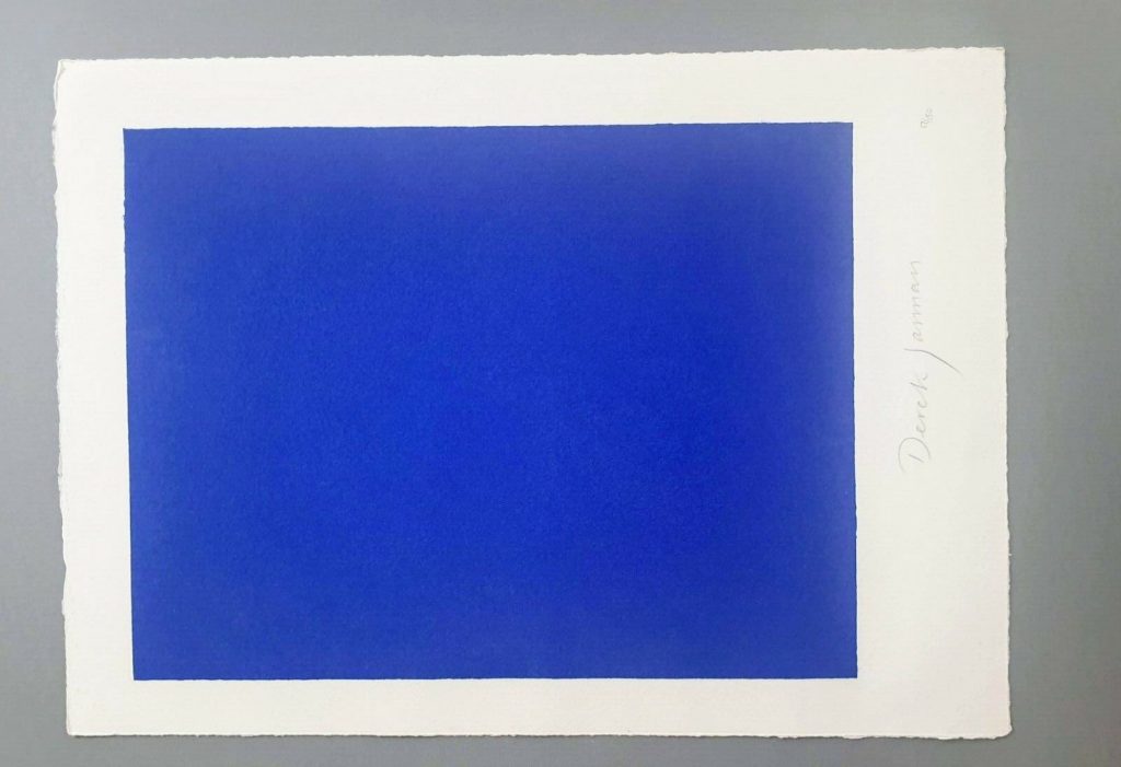
Derek Jarman, Blue, 1994,17×12 1/2 in., screen print originally made for the deluxe letterpress edition of the script by The Blue Press, now floating loose on ebay
This is a silk screen print by Derek Jarman. It was originally intended to accompany a letterpress edition of the text for Blue, his final film. That project was either produced in an edition of 150, plus some proofs, or was not realized before Jarman’s death. The numbers on the two I’ve seen hint at a bunch–this one is labeled 17/150, and the print shown at Chelsea Space in 2014 as part of the book was 37/150.
you may approach: Blue print installed at Chelsea Space, 2014, image: chelseaspace
But the only other copies I’ve ever seen of the whole book were described as printer’s proofs. Jarman was supposed to have painted IKB on the clamshell boxes of 25 of the 150 editions. One proof on ebay back in the day said only four proofs were made before Jarman died, and its lid was painted, but didn’t have a print, and said the prints were never realized either. Another, proof listed for sale privately, had a print (#43/150), but its lid looked more like the paper under the paintings than a painting itself.
Derek Jarman, Blue special edition, proof, The Blue Press, via paperbooks.ca
But that seller [pdf] said the whole letterpress edition “was centered on a loose Klein Blue screenprint signed by Jarman,” which makes it sound like the prints made it across the finish line after all. Why a signed print in a painted box doesn’t essentially become a certificate for a painting, I don’t know, but if the paintings never happened, it’s moot.
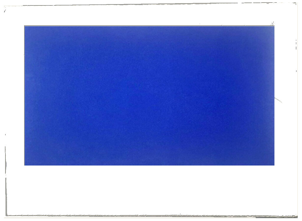
Study for Derek Jarman Blue Screen Print, 2020, gahhh, the aspect ratio…
I absolutely love this print, and may try to buy it, but I cannot for the life of me figure out why it’s portrait and not landscape. Maybe I’ll just make some and fix it myself.
LMAO This always happens to me. I think, oh, just flip it, DONE. But as I am typing in the dimensions of my new cinematic masterpiece, I am frozen. Because what should it be? Jarman made Blue on 35mm film. So 16:9 (1.77 in the US, where I first saw it, except if I look it up, some definitive-seeming sources have a widescreen aspect ratio of 1.85:1.) But Jarman’s own print is basically 4:3, so television. (Which is OK because Blue was aired on Channel4? Or nah?) But when it was still a live performance called Bliss, Jarman projected an image of an actual Yves Klein painting, and then switched to a blue gel, so no image at all, just a frame or aperture mask on the light? I think 16:9 is the clear choice here, but still.
so something like this, at 16:9, using the sheet size and smaller margins as the parameters yields a 8.125 x 14.5 inch print on a 12.5 x 17 inch sheet. study-derek-jarman-blue-screen-print-2020.jpg
Next day update: after spending part of a day determining the size and placement of the blue printed field in relation to the (unconfirmed) paper size and type of the original, I repeatedly caught myself trying not to think about how the film, then the print, then the book, then the box, then the– were all approached as the last project Jarman might complete. Make just one more thing, he and those around him might have thought? Woke up again, so there is still some time.
Can’t touch this: Rudolf Stingel, Untitled, 2012, electroformed copper, plated nickel and gold, stainless steel frame, in 6 parts, 120cm sq each, sold at Sotheby’s in 2017
Before the extent of his crimes bubbled to the surface, Philbrick himself related to me the occasion on which he tried to negotiate the sale of a badly damaged Stingel painting from Hiscox insurance company that had been written off owing to catastrophic water damage. An employee of the company confirmed to me that Philbrick indeed had tried unsuccessfully to purchase the damaged painting. Simultaneously, he engaged his assistants to buy the super-rare German paint Stingel uses, which was available only seasonally, so they could replicate over the course of months the precise method of the pricey artist and create an exact replica. Though Philbrick never managed to buy the destroyed work from the insurer — such companies often facilitate or contribute to the restoration of a work that has a claim against it to repatriate it into the marketplace, or they sell it discounted with damage — the fate of Philbrick’s meticulously crafted copy is at present a mystery. Chances are it will be on offer at an auction house near you, if it hasn’t been sold already.
Though I have even more questions about an “exact replica” of a specific painting than I do about a specific paint, or the idea that damaged=destroyed, the “conceptual pose” of Stingel’s challenge to authorship is now a reality, and I am very much here for it. Let a thousand fanmade Stingels bloom–and let them all turn up at Christie’s.
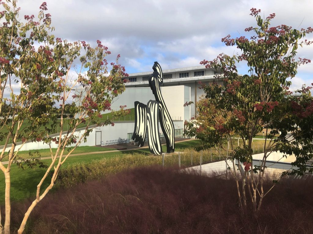
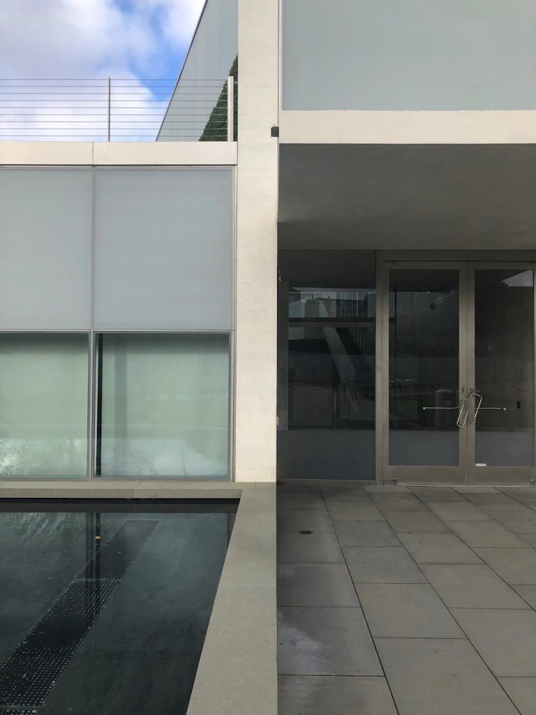
Late last October I saw an exhibition of George W. Bush’s paintings of veterans at the Reach, the new Kennedy Center annex designed by Stephen Holl. With all due respect to Verrocchio, it was the most significant painting exhibition in town last fall.
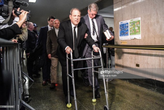
Untitled (Harvey After Untitled (Walker)), 2019, walker, tennis balls, retractable stanchions, galvanized barrier, stepstool, hi-viz coat (image:AFP via Getty Images via PageSix)
The psychopath is rarely suicidal. Although he would pretend to play the game to the last, and he would viciously press a peer to take on genuinely life-threatening risks, the psychopath always saves his own skin. The psychopath may court death, but it is someone else’s. The psychopath leaves a trail littered with the broken, discarded bodies and lives of others, he trashes them, leaving them as rotten matter as he proceeds to his next site. Where he gave the impression of being deeply involved in the life and death struggles he creates around the last victim, he was always vacuous and remote.
Barriers, gates, and fences are physical and symbolic manifestations that generate publicity and rule out participation. For those unable to comply with the pressure to perform, prostheses such as walkers, picker arms, or canes for the blind are the only means of participating in public life. Celebrities, on the other hand, simply have no choice but to participate.
Everything we encounter in public space can and must be regarded as public sculpture; for every object is the product of a process of material composition and formal design. All objects influence our perceptions, our movements, our feelings, and our thoughts. Public space is not designed by human beings alone, but is instead shaped by the boundaries between public and private, institutional and commercial.
X may fashion an artifact called ‘the mirror device’ with which to manipulate Y. Using this device, X cynically fashions his tastes and judgments to accord with those of Y, thus winning Y’s trust and approbation. An alignment is formed under false pretenses, but Y, hopefully is none the wiser. Even while X is saying in effect, ‘me too, brother…’ X’s actual feelings are secreted from the interaction. X may not always mirror Y, but may instead mirror a role which is acceptable to Y. For example, X goes to Y’s door in the guise of an electrician come to fix some faulty wiring, when X is not, in fact an electrician. A fictive example of this occurs in LITTLE RED RIDING HOOD. Conning devices are tools. The degree of harm that they do, if any, depends upon the purpose for which they are instrumented. Where ‘the mirror device’ might be used by a parent to encourage a child, or by a psychiatrist as a therapeutic device, it is also used by ambitious students, known otherwise as ‘brown-nosers’ or ‘ass kissers’, who cynically reword the opinions of their teachers in their written and oral work. People also use the ‘mirror device’ to ‘pass’, as Erving Goffman points out. A high school girl may try to hide her intelligence and approximate a bubbly persona instead of going dateless. Goffman details many other versions of ‘passing’ in his book, STIGMA. ‘The mirror device’ is a tool with which to modify Y, and render him more pliable to X’s manipulations. Malignant use of ‘the mirror device’ abounded in Nazi Germany. According to Hannah Arendt, one of the sights that struck Adolph Eichmann as being the most horrific was a perfect imitation of the Treblinka railway station. This imitation had been constructed for the express purpose of lulling prisoners into the mistaken impression that they had arrived at a safe and benign destination. The station had been built with patient attention to detail, with contrivances like signs and installations.
2/24 update: the psychopath was convicted on two counts of rape and sexual assault.
3/11 update: the psychopath was sentenced to 23 years in prison.
My initial impression of the Kennedy Center’s The Reach is obliqueness. It is in a triangle of land carved by a parkway and on-ramps and a bridge, from which it is hard to see. I finally made a visit this morning after multiple failed, drive-by attempts to photograph this new installation of Untitled (Trudeau Trump Brushstroke). This perfectly framed and backdropped view is the only one, and it is in the intersection of a The Reach sidewalk and a commuter bike path.
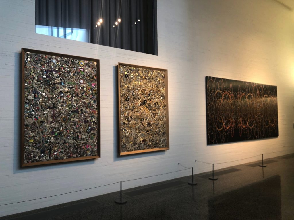
Mike Kelley and Fred Tomaselli on loan from Glenstone at The Reach
The art at The Reach is on loan. I did not check where the big, blue Joel Shapiro came from, but except for the large, 1969 Sam Gilliam painting, which is from the artist himself, most of the work inside comes from Glenstone. In lieu, it looks like, of a lot of money. David M. Rubinstein, meanwhile, has given more money than even Boeing, and loaned James Madison’s copy of W. J. Stone’s 1823 facsimile etching of the Declaration of Independence (ed. 201, of which around 50 survive, apparently.)
Glenn Ligon neon on loan from Glenstone
Faith Ringgold painting on loan from Glenstone
Boeing also sponsored the exhibition of George W. Bush’s paintings of Iraq War veterans, the billboard for which is not easily visible from the nearby roads. Maybe if you’re stuck in traffic. I did see the show, and will write about it separately.
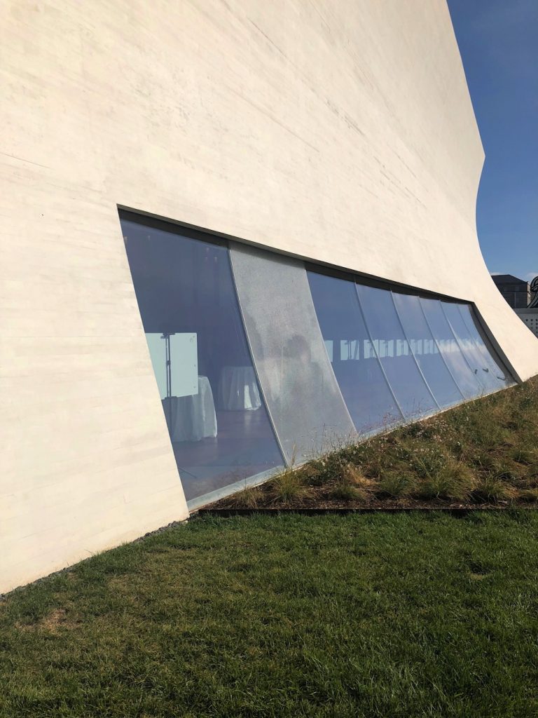
Other thoughts of The Reach: I felt some spatial echoes with Holl’s ICA at VCU, especially in some peekaboo vistas and the dramatic staircase.
Perhaps this awning rainspout is designed to arc perfectly into the pond and not splash onto the ledge instead?
shattered glass at The Reach, presumably under warranty