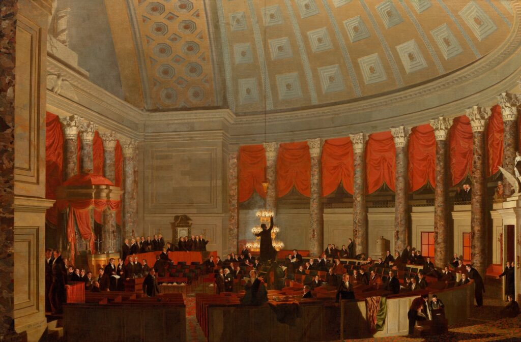
Samuel F. B. Morse expected his 1822 epic, 9×12 foot painting of the chamber of The House of Representatives in the just-repaired US Capitol would tour the country to paying crowds, and then be triumphantly acquired by the politicians he made famous. That did not happen. The tour was a flop; the painting he’d spent months creating in a makeshift studio next to the House chamber was sold in Europe, and eventually ended up at the Corcoran. It was only with the dissolution of that museum in 2014, almost 200 years later, that Morse’s painting came into the collection of the nation, at the National Gallery.
Morse chose not paint the chaos and occasional violence that typified the House’s deliberations over such controversies as the Missouri Compromise or the displacement of Indian populations. Instead, perhaps aspirationally, he depicts a calm moment where hardworking servants of the people were preparing for a night session.
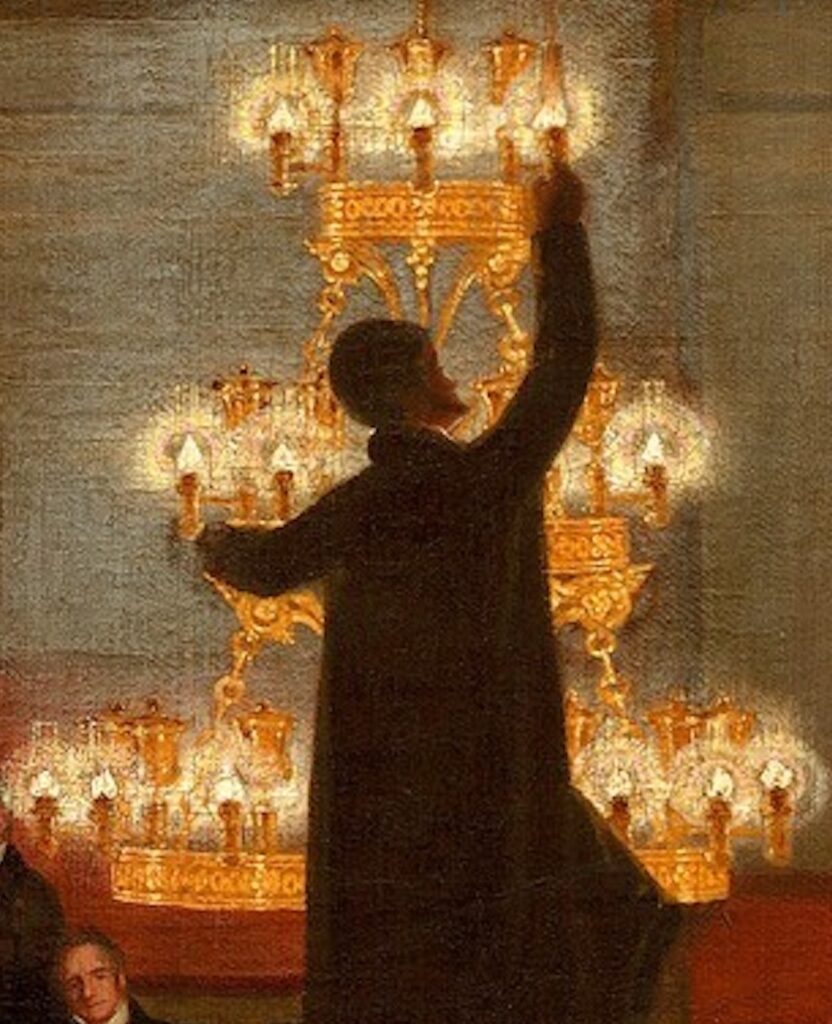
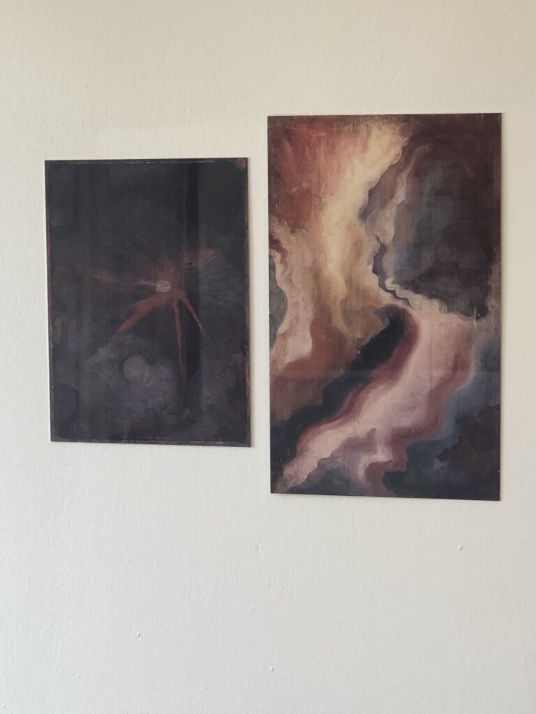
Eighty recognizable politicians, journalists, and others are depicted–Morse sold a pamphlet diagram for viewers to identify them all-but the dramatic focus of the painting is an unidentified lamplighter. The figure stands on a ladder, against the giant chandelier, which has been lowered for his reach. [My first favorite thing about this painting was the thin, black line extending from the top of the painting to the chandelier, His back to the picture plane, but his profile reveals him to be a Black man. Was he enslaved? It’s not clear; the US government did not as a practice own slaves at the time, but slavers regularly leased the enslaved for government work–like rebuilding the Capitol after the British burned it in 1812. Morse was a supporter of slavery (also an opponent of immigration), which may explain why the central figure of his painting goes unnamed.
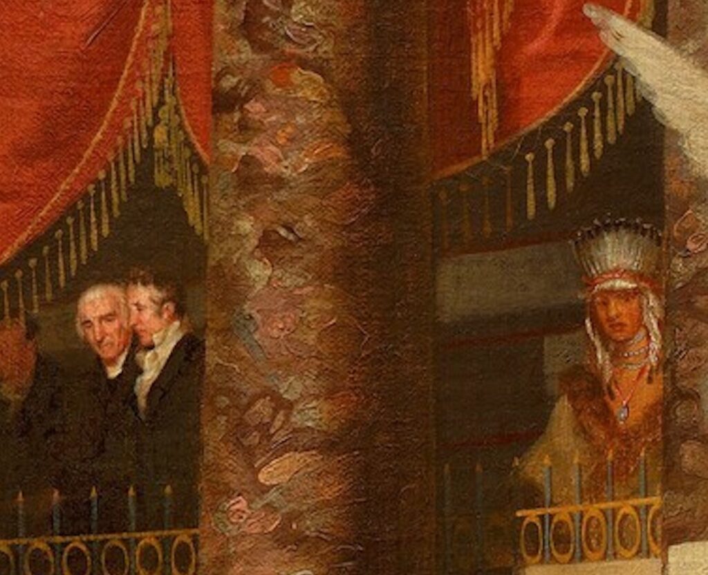
The only other non-white person in the painting, however, was well-known in Washington. Petalesharo was a Pawnee chief who traveled to DC as part of a Great Plains delegation to negotiate the fate of his and other tribes. He is shown seated in the House spectator’s gallery, with an impassive expression that resembles the portrait Charles Bird King made at the same time for the Bureau of Indian Affairs.
Petalesharo had become famous through the promotion of missionaries, who’d reported that the chief had stopped his tribe from killing a young Comanche girl, either as part of human sacrifice or in revenge for a theft. This show of civilized mercy was probably appealing to the man to Petalesharo’s right, Jedidiah Morse, the Calvinist minister and geographer, who was also the artist’s father. Jedidiah had come to Congress to share a massive report he’d written on the US relationship with the Indian tribes. After traveling for several years and meeting with Indian leaders and communities, Morse argued for white coexistence with the Indians, along with a heavy dose of assimilation and missionary-led Christianization. His recommendations were ignored in favor of abrogating treaties and exterminating Indian populations who would not remove themselves from newly claimed lands. Next to Papa Morse is Benjamin Silliman, Samuel Morse’s chemistry professor at Yale. Years later, after Morse would develop the telegraph and Morse Code, Silliman became the first person to distill petroleum.

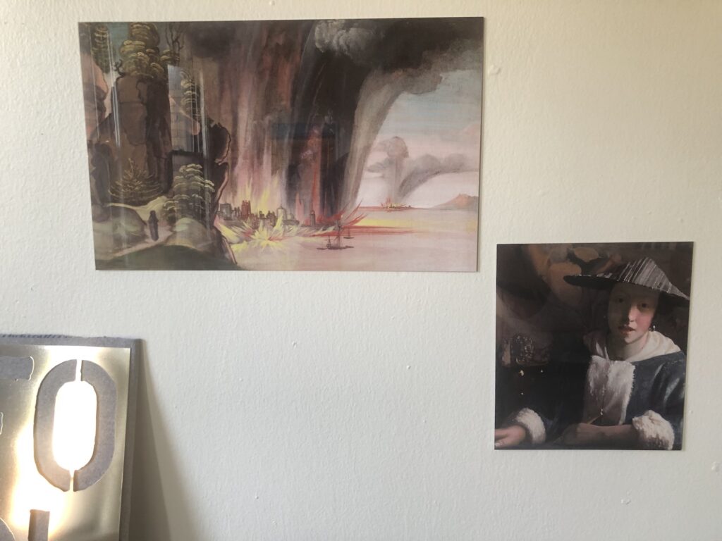
While viewing Morse’s painting the other day at the freshly reopened National Gallery, I got up close to study these standout figures; their unusual compositions, one obscured at the center and the other pushed and fenced off at the margins; one with a glowing chandelier and the other amidst brushy abstractions of the grand chamber’s marble columns; and to contemplate their significance, long unsung, to the history of this scene and this nation. Which prompted my gallerygoing companion to say, “Uh-oh, here come the Facsimile Objects.” [Reader, I married her.]
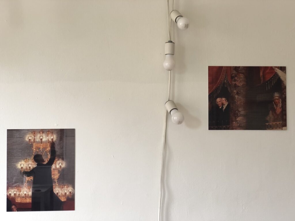
As another experiment on cropping my way to Facsimile Objects, I envision this as a diptych extracted from the painting, each realized at full scale, and installed where Morse put them in the original painting. Seeing these definitely reminded me of Titus Kaphar’s 2016 painting Enough About You, in which he isolates and frames the face of an unidentified enslaved boy in a portrait of Elihu Yale. But I’m still figuring out how these compositions read apart from the larger painting, and in relation to each other. Unlike Kaphar’s work, an awful lot is missing here.
The first proofs just arrived, and while they’re great images, they’re a little low-res; even a big jpg of a 12-foot painting is not really big enough to work with, so I’m going to shoot the details myself. Which feels a little extra, but also necessary here. brb.
Prof. Jennifer Raab provided a useful analysis of Morse’s The House of Representatives [nga] in the context of history painting in the Summer 2015 issue of American Art. [jstor]