Study for Platinum Facimile Object (P1), 2021, 4.3 x 3.37 inches, dye sublimation pigment print on aluminum
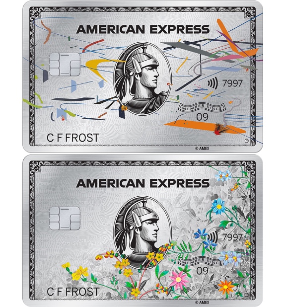
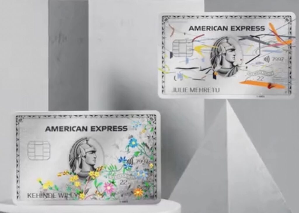
OK, now it gets kind of interesting. As soon as I saw the short cg animation for the new American Express Platinum Cards by Julie Mehretu and Kehinde Wiley, I thought of two things: 1) the low-key beats and the art-embedded card spinning shinily on its corner remind me of the McRib NFT, and 2) what do you call art printed on small, shiny metal?
On the one hand, to do a Facsimile Object of an AmEx card feels like asking for trouble in ways that not even a Cady Noland-related Facsimile Object could even conjure. And yet it’d be so tasty!
On the other , the dye sublimation print process requires a minimum 4 inches per side, and even art credit cards are 3.37 x 2.125 inches. So I doubled up. Surely no one involved would these mind lifesize-but-make-it-a-diptych Facsimile Objects now.
detail of screenshot from the AmEx twitter promotion, too low-res to cop. also, I’m sure they’ve been members since before 2022?
[An unusual footnote: the public announcement page for American Express’s artist x Platinum cards includes separate jpegs of Mehretu’s and Wiley’s cards, as seen in the study above. Not seen: that the filenames got the artist credits reversed. If I go ahead with it, that glitch is just the kind of thing that gives this project that famous must-buy-now! vibe the kids crave. But after seeing animations of cards with the artists’ own names on the front, it’s hard to settle for Charles F. Frost on a Facsimile Object. And while it would be possible to try to get the artists to scan their own respective card-size works, I would not want to compromise their actual four-digit code there. Most of all, I don’t want my own account canceled.]
Installation shot, Untitled (Heist), 2021, 96 x 121 in., enamel on plywood panel, documented in Union Square in November 2021 by Hunter MacNair, image via brokeassstuart, thanks @xintra
It has been a while since realizing works like this. Partly, it’s just the world. As Martin Creed says, The Whole World + The Work = The Whole World.
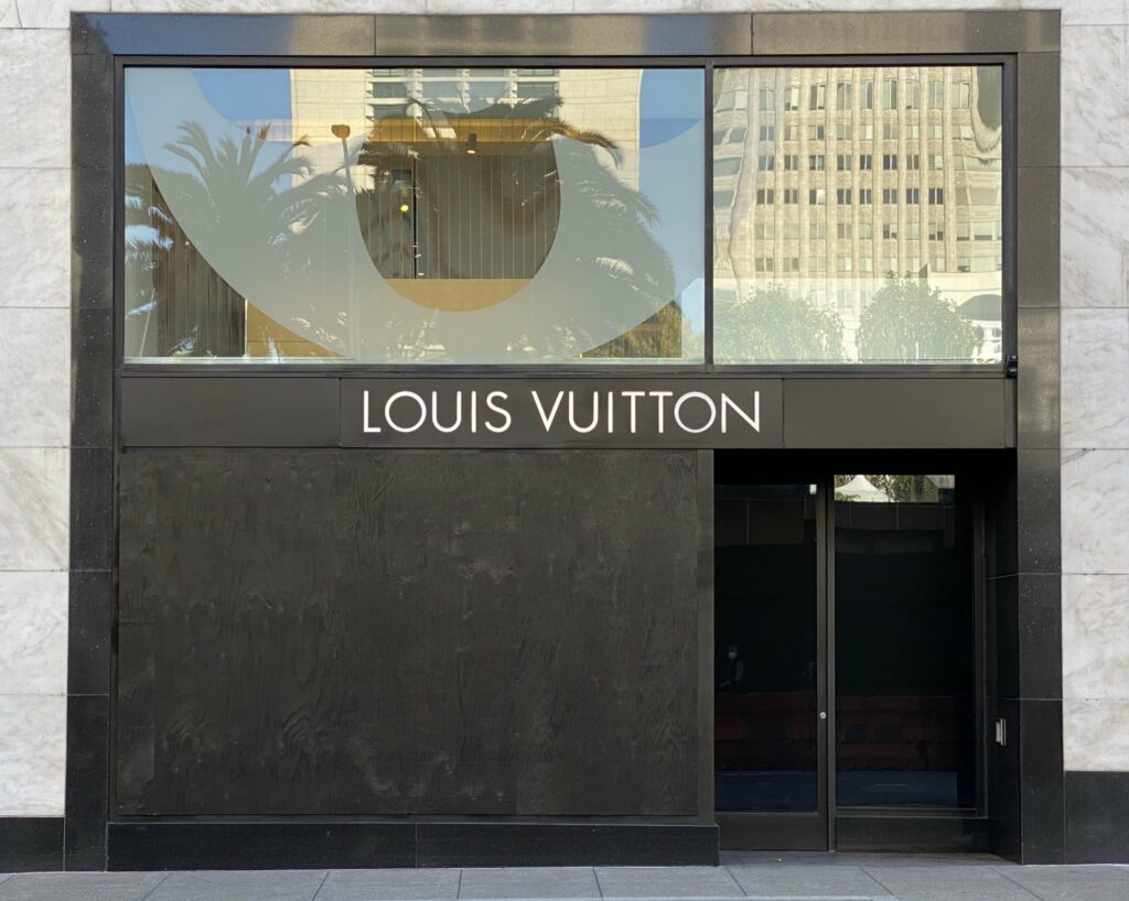
But when it exists, it also feels wrong to ignore it. Untitled (Heist) was recently installed in San Francisco’s Union Square, following a flashmob robbery of several hundred thousand dollars (retail) of merchandise from the Louis Vuitton store.
When Broke Ass Stuart ran this installation shot by Hunter MacNair on their post, “Let’s Talk About The Louis Vuitton Heist,” I first thought it would be a deep dive on the street value of the various items that got jacked.
But BAS instead went deep on luxury-fueled capitalism’s complicity in gaping inequality. And that, along with LVMH’s recent appearances in the art news, seemed like a collab-worthy context in which to encounter this work. Which I imagine will remain on view through much of the Christmas shopping season, at least. Maybe minting it as an NFT would make it last even longer.
UPDATE: As San Francisco Mayor London Breed’s office put it in their review, “I think that’s the visual for where the rule of law needs to make its stand.” [FOIA’d and published by @journo_anon] Thanks for supporting the arts, Your Honor!
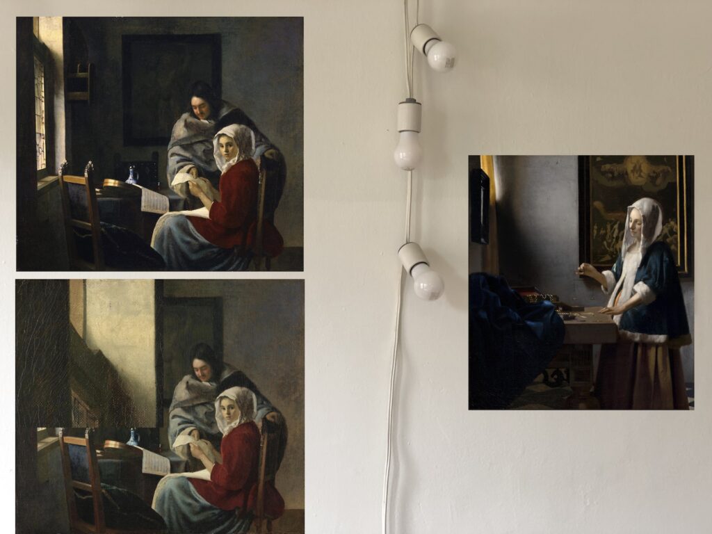
rendering of Johannes Vermeer Facsimile Objects (V2), (V2.1), and right, (V3), as they might be installed. Note that yes, a different source image means the color levels are slightly different for the Glitch one
I did not want us to need Vermeer Facsimile Objects, but here we are, at least through December 12. [DECEMBER 12 UPDATE: Staatliche Kunstammlungen Dresden has extended the closure of the Gemäldegalerie Alte Meister, and thus the Vermeer exhibition, through the 9th of January. But the Vermeer show has a hard stop on Jan. 2nd, and so will not reopen? I realized this only in the course of writing this update. Vermeer Facsimile Objects will be available only through tonight, 12/12. Sorry you can’t see the show in Germany, but thank you all for your engagement.]
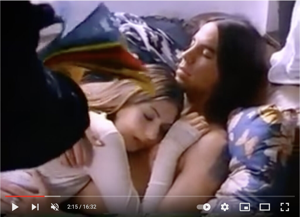
Debbie Harry trying to wake Anthony Kiedis and Sofia Coppola up in their loft crash pad across the street from CBGB, in a 1993 short film Paul Morrissey made for Details Magazine
When @MattHaber first tweeted this short film directed by Paul Morrissey for Details Magazine, it blew my mind right back to 1993. I was ready to hype it as an underground gem, a time capsule of a truer, rawer, cooler, lost New York. But honestly, maybe the reason it only has 840 views on YouTube after almost ten years, is because it’s pretty dumb.
The 16-minute, silent-style film was created in early April 1993 as/for/alongside a fashion photoshoot for Details’ Music Issue, which dropped in July. Debbie Harry is a downtown promoter chasing Anthony Kiedis and his mopey girlfriend Sofia Coppola around the East Village, trying to wrangle him for a gig at the fictitious Wig & Pizza Boutique. Sonic Youth and a dozen drag queens, including Joey Arias and Lady Bunny fill out the cast of extras who stand around CBGB while Kiedis changes outfits and runs away. The only explanation for the acting and directing is, it’s for a photoshoot. Literally everyone involved seems dumber by the end, including me, for watching it twice. It really should be added to everyone’s IMDb, if only for karmic reasons.
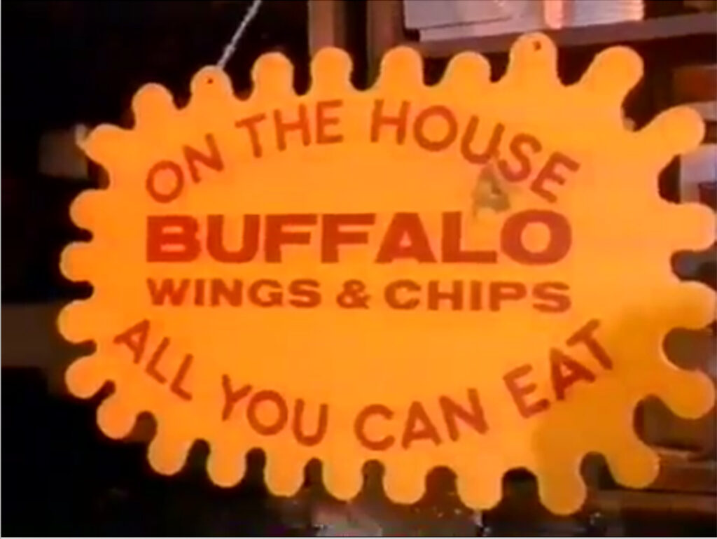
study for Untitled (CBGB Buffalo Wings), 2021, enamel on wood, est. 18 x 30 in., image: youtube
By the time I decided not to rummage around and unearth the lost history of this short, I realized the only good thing is the sign at CBGB offering free, all you can eat Buffalo wings & chips, which I could totally see as a painting. Unless John Varvatos already did it.
UPDATE: Wool’s BLUE FOOL sold on Nov. 17 for $1,179,500 which brings an end to the purchase window for FOOL Facsimile Object. Thank you for your engagement, and for those who purchased them, please enjoy your experiential prosthetic. For those who lost a million dollars or more on a Wool, my sincere condolences.]
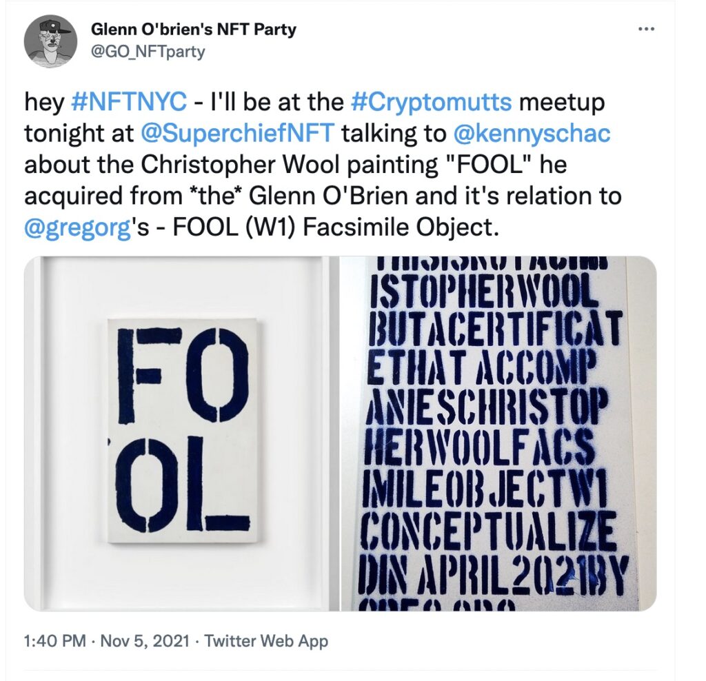
Tweet from @GO_NFTParty, who was bringing the FOOL heat to NFT.NYC this week
Some big and surprising developments in the Facsimile Object-verse this week include: Kenny Schachter putting the Christopher Wool painting that inspired FOOL Facsimile Object (W1) up for auction at Phillips. Which will likely put a hard stop to the availability of the FOOL edition, assuming the last couple don’t sell out in the next week or two anyway.
It was also the moment where a FOOL– AND a Certificate of Authenticity, even–appeared in the wild for the first time. Glenn O’Brien’s NFT Party sounds like a riff on Glenn O’Brien’s TV Party, so the link between a scene and its documentation, and between Kenny, and art and whatever tf NFTs are, is strong with this one. It is fascinating to see how these objects function IRL, and it looks like they can be part prosthetic, and part bridge.
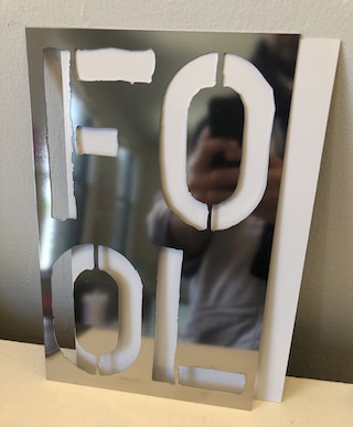
FOOL Facsimile Object (W1), 2021, A4 size, with the COA behind it.
FOOL Facsimile Object (W1) is an edition of up to 10, plus 2 APs, and was available only until Kenny Schachter’s Wool, Blue Fool for Glenn O’Brien sold. It is lasercut, mirror-finish stainless steel, with a full-size, enamel-on-aluminum Certificate of Authenticity, in a hand-stitched wool envelope.
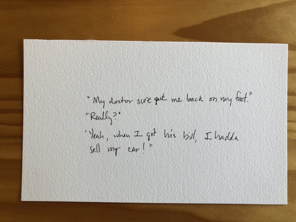
The stakes could not be lower: Untitled (Richard Prince Handwritten Joke), 2021, gel pen ink, which is not the same as puffy ink, it’s just smoothly flowy ink, on Arches, 5.5 x 9 in.
A few days ago a friend with amazing superpowers for finding things sent an eBay listing from a European autograph dealer for a Richard Prince joke drawing. It was a hilarious forgery, but it was also only €1, and, I argued, it was well worth it. As we texted about it, I was like, dang, now I want to sell Richard Prince drawings on scraps of paper on eBay for €1! You should make them in puffy pen ink, my heroic friend said.
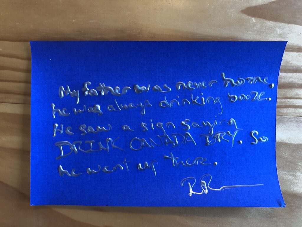
Untitled (Richard Prince Handwritten Joke), 2021, metallic silver puffy ink on fancy cardstock, 6 x 9 in.
As it turns out, puffy ink is more of a bottle-based medium than a pen-based one. And it is intended for use on fabric, not Arches or fancy metallic scrapbooking cardstock.
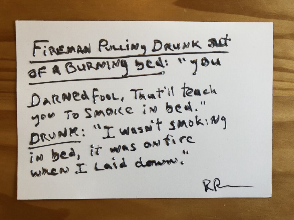
Untitled (Richard Prince Handwritten Joke), 2021, silver metallic puffy ink on Arches, 7 x 10 inches
The dimensionality of the text, along with the curling of the paper as the puffy ink dries, most assuredly transforms what I’d imagined were drawings into objects. Objects which might get crushed if shipped via a simple, stamped envelope. Objects which contain vital title, stamp and initialing elements on the verso, complicating simple framing and mounting.
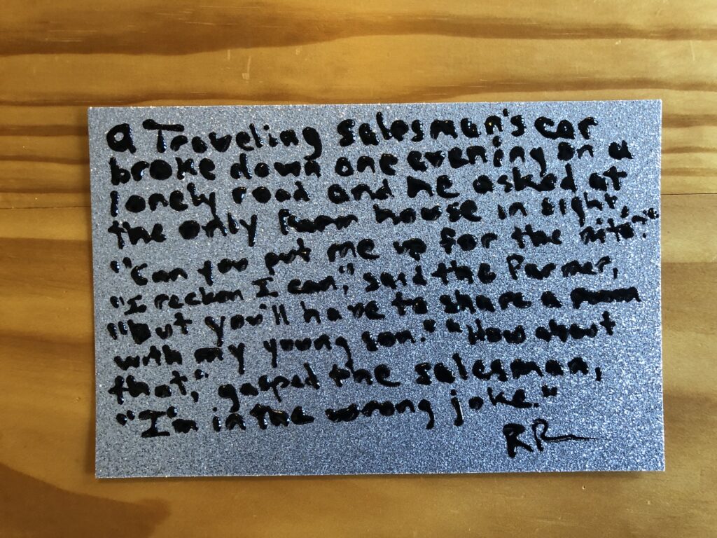
Untitled (Richard Prince Handwritten Joke), 2021, puffy ink on silver glitter cardstock, 5.5 x 9 inches
And to top it all off, eBay insists I list my US-based items in dollars. But out of such difficult decisions is great art sometimes born. In the case of this little series, at least, I am certain they’re worth a dollar if they’re worth anything at all. Because every single one is guaranteed to contain an authentic Richard Prince joke. I could not make these up.
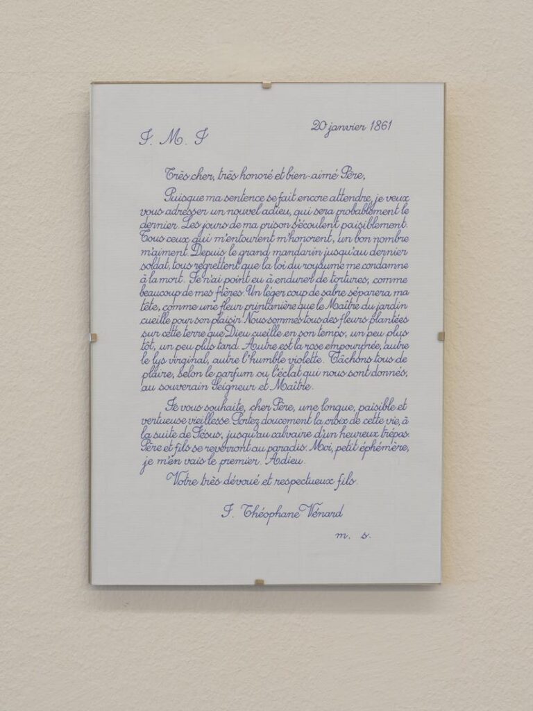
Danh Vo Facsimile Object (V1), 2021, dye sublimation pigment on aluminum, 297 x 210 mm
Previous mentions of Danh Vo do not begin to account for the extent to which his work has influenced the Facsimile Object project.
The Frenchness of the original Manet Facsimile Object drove me to decide the certificates of authenticity needed to somehow be French as well. I spent a couple of increasingly frustrated weeks looking for a calligrapher who could execute certificates in official 19th century French letter forms. Researching the history of French script, I kept running up against the realization that the image of French cursive in my mind had become Vietnamese.
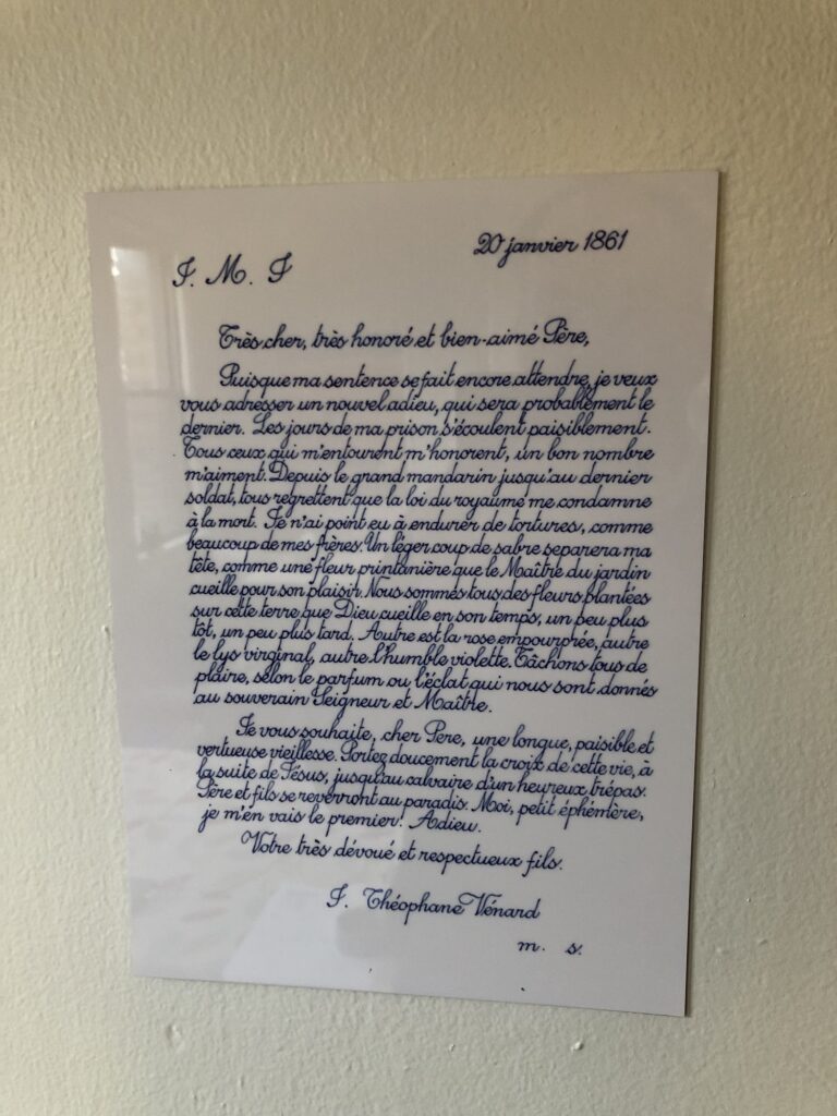
2.2.1861 (2009 – ) is one of Danh Vo’s simplest, most elegant, and most powerful projects. His father, Phung Vo, copies out editions of a farewell letter Jean-Théophane Vénard, a 19th century Catholic missionary wrote to his father on the eve of his beheading for proselytizing. Phung learned exquisite, French-style penmanship in school Vietnam during French colonial rule, and converted to Catholicism as a gesture of political solidarity with the South Vietnamese regime–but he doesn’t speak French. He’s reproduced the letter hundreds, if not thousands, of times, and Danh includes the letter in all his exhibitions. Phung’s letters will continue as long as he’s able. In the mean time, the father’s elaborate calligraphic texts have become an evermore prominent element of the son’s work.
After deciding not to try to get Phung Vo to make them, I ended up copying his letter for practice, and producing the Manet certificates myself. It’s a pattern I’ve kept since, using period German script for the Dürer certificates, and so on.
I think Vo’s creating 2.2.1861 as a time-bracketed edition, available until it’s not, also informed my own approach to the Facsimile Object editions. Though a bigger inspiration was clearly limited-time editions that arose during the pandemic, like Pictures for Elmhurst and Wolfgang Tillmans’ Between Bridges. They’re available as long as they’re needed, or useful, or relevant, or I don’t know what. It’s not like they’re meant to be disposable, but there is a finitude to them.
Anyway, as much as I love 2.2.1861, I’ve never put one up; they feel pretty intimate, but also pretty fragile, the less handling the better. While wishing Vo and his family all the health and safety in the world, the last year-plus had me thinking about mortality more regularly. And I decided to order a letter now, while I knew they were available. When it arrived–the lead time was several months–I immediately felt like I knew what had to be done, and so I made a Facsimile Object of it.
In a way, this Facsimile Object complicates the relationship between itself, the artwork, and a COA. What would a certificate of authenticity even look like here, but a less expert copy of the original work?
Within minutes of my taking the photo at the top of the post, the tape slipped, and the object guillotined to the floor. It was totally fine, and will be hanging again by morning. It is very sturdy. I can’t tell for sure in the dark, but it also seems to have a slight lack of focus, or a pixel-level distortion keyed to the tiny waverings of Vo’s line. It reminds me of the visual tension present in Richter’s stripe series. Those images are created not by stretching, but by replicating an almost imperceptibly narrow vertical strip of a painting. Will producing a facsimile object cause an unanticipated, slight distortion that’s only visible in person, close up? Daylight can’t come fast enough.
[update: it does! actually, it feels a little blurry. perhaps something about the scanning, or the surface of the paper. Anyway, fascinating.
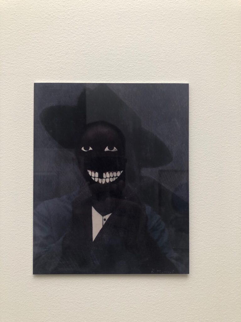
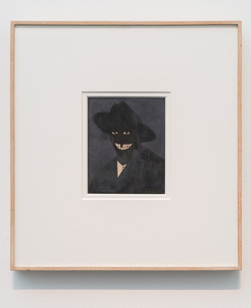
Self portrait with Kerry James Marshall Facsimile Object (M1), 2021, 8×6.5 in., dye sublimation print on aluminum
While working on the Scipio Moorhead Facsimile Object a couple of months ago, I started trying to figure out the challenge of a Kerry James Marshall Facsimile Object, too. Marshall’s portrait of Moorhead fills the gap in the historical record–there is no known depiction of or signature work by the painter considered to be the first Black artist in America. Meanwhile, the deep, multihued blacks of Marshall’s signature figurative style counter the uniform whiteness of American/European history painting, while also exposing how under-optimized the prevailing systems of image reproduction and circulation are for accurately depicting Black skin. Reproductions of Marshall’s paintings regularly fail in this specific way to mirror the experience of seeing them in person. So they are an excellent challenge for the Facsimile Object construct.
Kerry James Marshall, A Portrait of the Artist as a Shadow of His Former Self (1980), egg tempera on paper, installation view at MCA Chicago via CADaily
The calculation for making a Facsimile Object of a Kerry James Marshall work is pretty elegant in one respect, though. The epic scale immediately excludes most of his paintings. And the breakthrough work that marked a turning point in his practice–and that anchored his Met Breuer-filling retrospective a couple of years ago–is a headshot, a perfectly sized egg tempera on a sheet of sketchbook paper.
It took several attempts to find a good reproduction of A Portrait of the Artist as a Shadow of His Former Self (1980) that would reproduce on aluminum. This multistep filtration process, going from work to image to jpg to print, really gets a workout here, or at least, the apparatus gets seen operating in ways that might otherwise go unnoticed. Sometimes the work’s saturation is pumped up to bring out the red of the figure’s gums, for example, or the brightness is increased to emphasize the painting’s striated facture. Sometimes it’s printed in duotone, flattened into a pair of floating white eyes and an exaggerated grin. It extends the reach of Marshall’s own practice, “forcing the issue of perception by rendering an image that is just at the edge of perception.”
That Marshall knew his carefully calibrated painting was still at risk of being reduced to an undifferentiated black field, a shadow, is perhaps indicated by the title itself. That this was interesting to him is perhaps indicated by his subsequent decades-long practice of depicting Blackness in a world that is still catching up with him.
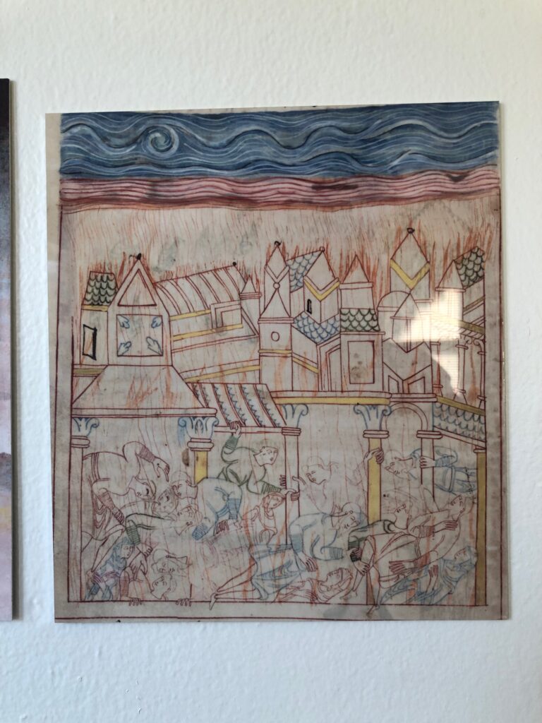
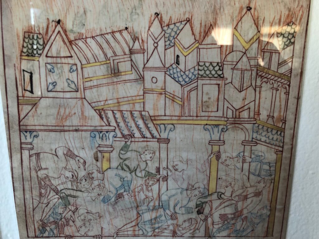
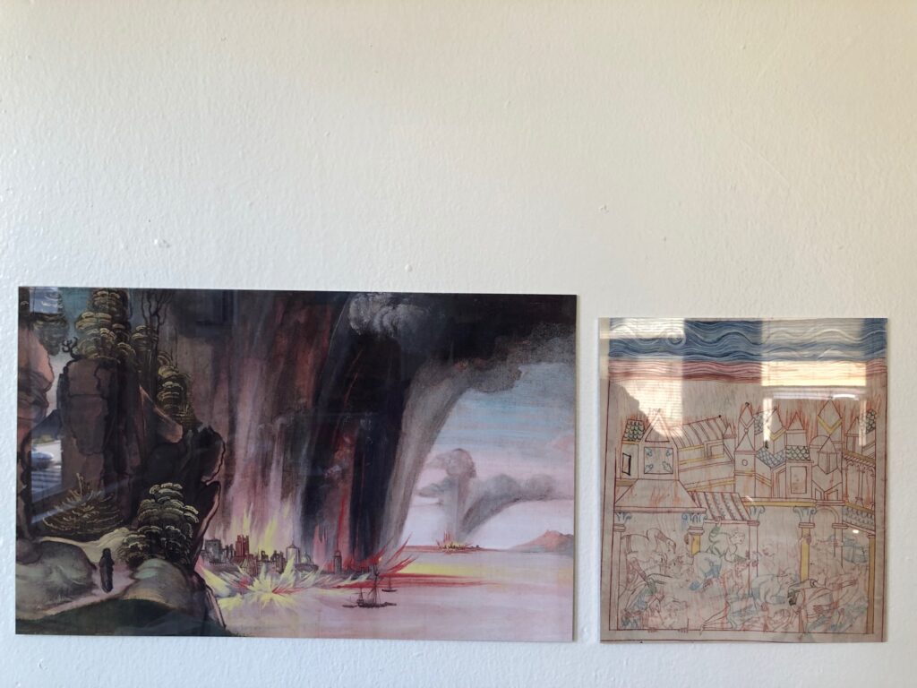
Old English Hexateuch Facsimile Object (H1), the Destruction of Sodom, 8.5 x 7.5 in., with wonky cropping
There was something beautiful and haunting and unexpected about the depiction of the destruction of Sodom from a medieval manuscript that got tweeted across my timeline the other day. Medievalist Dr. Erik Wade’s thread highlighted the blissed out, same-sex residents comforting each other, even as the city burned around them. I was also taken by the delicate line drawings, more refined than marginalia, but clearly less than fully filled in. I hesitate to say it is unfinished, though. The tangle of figures look so similar to each other, for a minute I wondered if the illuminator was tracing them.
closeup view of FO (H1)
It’s from a late 11th-century manuscript known as The Old English Hexateuch, the earliest known English translation of six books of the Old Testament (basically, the Torah plus Joshua). Cotton MS Claudius B.iv, a name derived from one of the founding collections of the British Library, includes almost 400 illuminations in various states of detail. They depict the stories of the Bible set in the contemporary Anglo-Saxon milieu the manuscript’s lay audiences would recognize immediately.
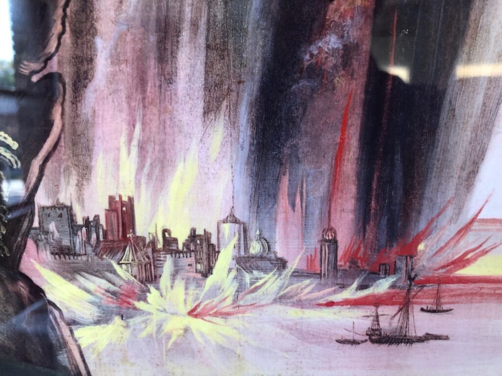
Detail from Dürer Facsimile Object (D3.38), 2021
I did not plan on making a Facsimile Object of Dürer’s verso painting of the Destruction of Sodom, but the brushy allure of the flames raining down on the cities proved irresistible. Now again, I find that the delicate lines depicting the victims, and especially the sketchy flicks of flame everywhere, made me want to hold the manuscript in my hand. As this was impossible, I made another Facsimile Object. Now I have an unlikely diptych, from centuries and countries apart, of an unlikely and terrible scene.
Depressing but beautiful: Facsimile Objects of the Destruction of Sodom
Not gonna lie, they hit a little differently now, when wildfires are raging across three continents, than in May, when I made the first one. So far Facsimile Objects have engaged with the present only temporally, by marking a (lost) moment in time: a missed auction preview, a pandemic-closed museum, the sale of a painting, a surprise Summer show. But with some religionists repeating the medieval model of blaming a conflagration on the existence of gay people, this pair of Facsimile Objects connects on a content level as well.
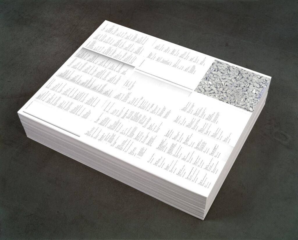
Untitled (Additional Material), 2021, study, 0ffset print on paper (endless copies) 20″ (ideal height) x 23″ x 29″, base image: FG-T Fndn
I’m as surprised as anyone that it was only when I finished posting about the orphaned appendices in the Felix Gonzalez-Torres catalogue raisonée that I figured out what to do with them.
I do still think that the Foundation should republish the information about the dozens of works Gonzalez-Torres made, and showed, and sent out into the world, which were later declared to be non-works.
Untitled (Additional Material), 2021, (detail) 0ffset print on paper (endless copies) 20″ (ideal height) x 23″ x 29″
By laying out the eight pages of the CR’s two appendices, Untitled (Additional Material) appropriates the strategy of the iconic stack, “Untitled” (Death by Gun), which reproduces entire pages from a special issue of Time magazine showing the people killed in the US by guns during one week.
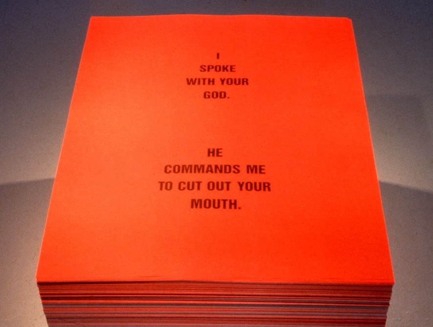
The dimensions, meanwhile are a nod to one of two pieces that ended up classified as Non-Works: a 1990 collaboration with Donald Moffett called, “Untitled” (I Spoke With Your God). The stack of printed text by Moffett on red paper (“I SPOKE WITH YOUR GOD/ HE COMMANDED ME TO CUT OUT YOUR MOUTH”) appeared just once, in a two-person show at the University of British Columbia Arts Center in Vancouver. [The print size, 29×23 inches, is one Gonzalez-Torres used in other stacks, too, including “Untitled” (Veterans Day Sale), 1989, the image of which was used above for a rendering of the piece. I did not print 20 inches worth of giant bootleg posters today.]
The stack by Felix Gonzalez-Torres and Donald Moffett formerly known as “Untitled” (I Spoke To Your God) [sic], 1990, image: Scott Watson via Felix Gonzalez-Torres Foundation
As it turns out, this Non-Work does have a Foundation webpage, complete with installation shots. It does not appear to be linked from anywhere, and the URL now ends in “-hidden.” I am in awe all over again.
[2025 update: In subsequent correspondence with the Foundation that is mentioned in the previous post, this absence of the non-works and additional material information was temporary, part of a reconfiguration and expansion of the Foundation’s presentation of works (et al). There is indeed an entry for this work/non-work, and the untitled title is now a designation, “Untitled” (I spoke with your God). Like the distinction between work and non-work, I feels important to note that the nuance of title vs. designation reflects subsequent reconsideration and refinement. From what I can tell of the historical record, in 1990 Felix’s works were shown with “Untitled parenthesis- something- parenthesis” [quotes mine] titles, and this stack was shown as a “collaborative poster” or a creation of Gonzalez-Torres. I feel this is not the last thing I’ll post about this work or show.]
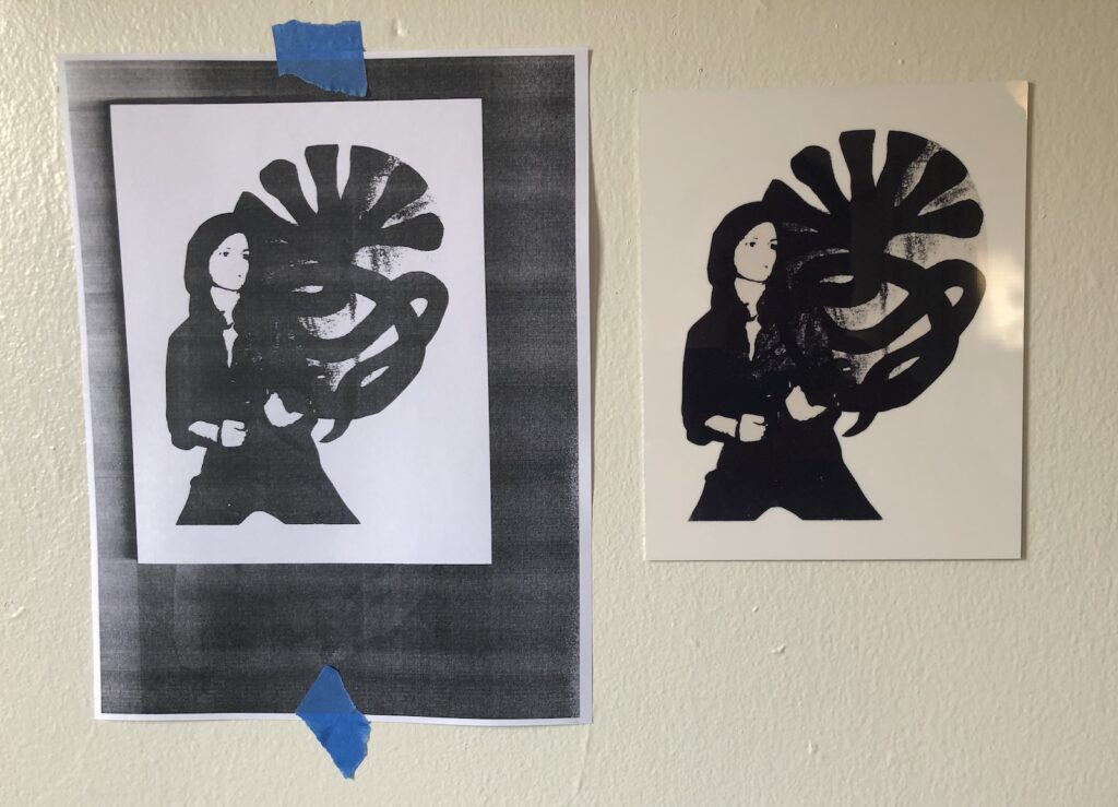
Tania Facsimile Object (N1), 2021, 7.5 x 6 in., dye sublimation print on aluminum, with copy of same for scale, $70 shipped, with handmade COA on Arches, was available through Sept. 11.
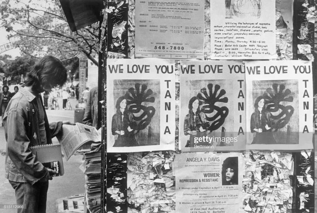
On April 3, 1974, a photograph of kidnapped heiress Patricia Hearst posing with a machine gun, a beret, and the seven-headed snake logo of the Symbionese Liberation Army was delivered, along with a cassette tape of the fourth recorded message from Hearst, to KSAN Jive 95, a counterculture radio station in San Francisco. The recording said Hearst now called herself Tania, a name taken from a comrade of Che Guevara, and she reiterated the SLA’s revolutionary demands for her release.
Early Tania Facsimile Objects appearing on UC Berkeley campus, supposedly around 4/15? uncredited image bettmann via getty
Wire services reproduced the photo, which appeared on the front pages of newspapers around the world the next day, Thursday, April 4th. On Kawara clipped his copy of it out of the Washington Post. By the weekend, and presumably before Hearst was identified as one of the armed SLA members who robbed a bank on April 15th, WE LOVE YOU TANIA flyers appeared on the campus of UC Berkeley, from whence she’d been kidnapped.
These may now be considered the first Tania Facsimile Objects.
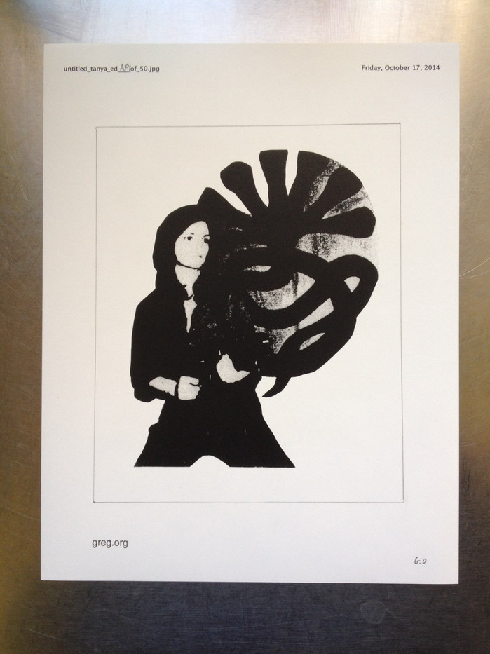
Untitled (Tanya), 2014, graphite and ink on photocopy on bond, 11 x 8.5 in., ed. 50
In 1989, presumably in relation to her large-scale, silkscreen on aluminum sculpture Tanya as Bandit, now in the collection of the Museum of Modern Art, artist Cady Noland created a work on paper titled Tanya. The cropped photocopy, a generation or more removed from the Tanya as Bandit source image, was put up for sale at Christie’s in London during Frieze Week 2014. In anticipation, the sale was pre-commemorated on this website by an edition, Untitled (Tanya).
In addition to an impulsive celebration through commerce of an exceptional object’s appearance at auction, in Untitled (Tanya) can be found some of the impulses of the Facsimile Object project. The edition indicates the possibility of realizing a perfect [sic] copy of Noland’s work, but only by cutting away the elements of designation and authentication–title, number, date, stamp, signature–thereby destroying the edition itself. An authentic but nearly worthless work is displaced by an equally worthless but iconic copy of another work. Their fate is in the collectors’ hands.
Tania & Friends: Tania Facsimile Object (N1), 2021, 7.5 x 6 in., dye sublimation print on aluminum
Tania Facsimile Object (N1), 2021, drops into this visual lineage, paying homage to the original, ad hoc WE LOVE YOU TANIA flyers of 1974, as well as Noland’s later appropriation. At 7.5×6 inches, Tania Facsimile Object (N1) shares the dimensions and cropped composition of Tanya (1989), while utterly transforming the object’s material characteristics. The high-gloss, dye sublimation print on aluminum is an exploration of how far the Facsimile Object format can diverge from referent works, how big a gap can be created, while still maintaining that facsimilated, auratic glow. Or maybe it’s just the light reflecting from the window.
Each Tania Facsimile Object is accompanied by a full-size, certificate of authenticity, handmade, signed and numbered on Arches. It will include, of course, a disclaimer to affirm to everyone that Ms. Noland was neither involved in nor consulted on the realization of this Facsimile Object, which will be available until September 11th, 2021. [update: Though Noland’s show was extended without announcement until September 18th, availability of this Facsimile Object ended September 13th. Thank you for your engagement.]
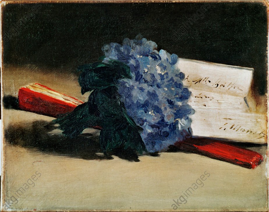
Édouard Manet, Bouquet de violettes, 1872, 22 x 27 cm, private collection Paris, image: wikipedia
David Rimanelli posted this beautiful Manet to instagram today, Bouquet of Violets, an 1872 painting that if I’m reading the note in the painting itself, first belonged to Berthe Morisot. Of course, my first reaction to these sorts of things now is, “Manet Facsimile Object?”
And the answer is, alas, no.
[Wow, ok, in exchange for critiqueing the characteristics of this stock image of a public domain painting, I will let you autoinsert your giant-ass caption onto my website, AKG-Images] 2-K40-S3-1872-2 (297213) E.Manet, Veilchenstrauß Manet, Edouard 1832-1883. ‘Bouquet des violettes et éventail’ (Veilchenstrauß mit Fächer), 1872. Öl auf Leinwand, 22 x 27 cm. (Auf dem Briefbogen eine Widmung an Berthe Morisot: ‘A Mlle Berthe Mori- sot. E.Manet’). Paris, Privatsammlung. E: E.Manet, A bunch of violets, 1872 Manet, Edouard 1832-1883. ‘Bouquet des violettes et éventail’ (Bunch of violets and fan), 1872. Oil on canvas, 22 x 27cm. (On the letter a dedication to Berthe Morisot: ‘A Mlle Berthe Mori- sot. E.Manet’). Paris, Private Collection. F: É.Manet / Bouquet violettes et éventail Manet, Édouard 1832-1883. – ‘Bouquet de violettes et éventail’, 1872. Huile sur toile, H. 0,22 ; L. 0,27. (Sur la lettre, dédicace : ‘A Mlle Berthe Morisot. E.Manet’. Paris, coll. privée. ORIGINAL: The bunch of violets, 1872.A tribute to Berthe Morisot, to whom the letter in the painting is addressed. The same flowers are used as a corsage in Manet’s ‘Berthe Morisot with a bunch of violets’. Oil on canvas,22 x 27 cm Private Collection, Paris, France
The size is perfect–22 x 27 cm–and it’s both very desirable and inaccessible. But without a lot of digging, the only image that shows the full canvas is a stock photo. And so the dimensions of the widely circulating–and cropped–Wikipedia image are slightly off. Also the color is different enough to take a quick whip-up off the table.
But the main dealbreaker for me is the sheer numbers of commercialized print options for this public domain image. Even if none is a Facsimile Object, there are tons of objects which are facsimiles. Like art, Facsimile Objects aren’t supposed to be functional, but that doesn’t mean they don’t do something IRL. In a case like this, the facsimilating is being done, and at scale. I’m going to need to think this through.
A few months back, in the midst of the Manet Facsimile Object and NFT frenzy, Eric Doeringer suggested I submit a work for a project being organized by Micheál O’Connell for the ABC Artists’ Books Cooperative. I am psyched and grateful to have my work included.
As an irreverent critique of the whole authentication boom, O’Connell conceived ABCOA as a collection of artworks that are their own certificates of authenticity. The resulting portfolio comprises 60 certified works of art, which is quite a deal for EUR30.
I have also been slow in posting about it only because I have not been able to figure out where my brief accompanying text went. So I’ve finally given up and am explaining the piece here.
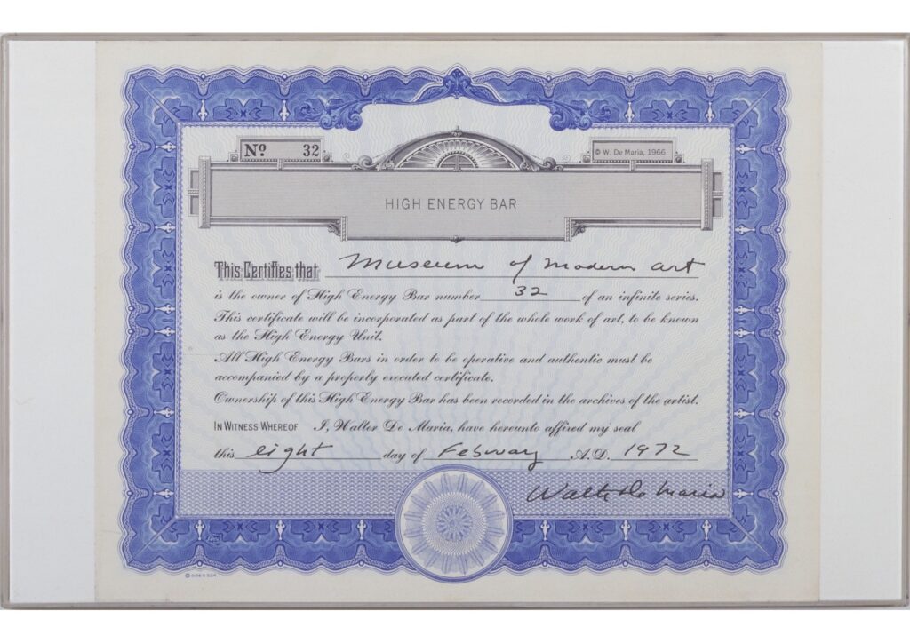
Untitled (High Energy Certificate), 2021, Walter de Maria CoA, 11 1/4 x 13 3/4 in., ink on engraved print on bond, image: MoMA’s 1972 example of CoA for High Energy Unit
As the text of De Maria’s certificate itself states, the engraved stainless steel High Energy Bar is not only made “operative and authentic” by the presence of this CoA; the combination of Bar and Certificate constitute another work, the High Energy Unit. My work, High Energy Certificate, completes the gesture De Maria started, by declaring a standalone certificate a work of art.
While this obviously affects all the extant certificates of de Maria’s High Energy Units, the CoA facsimiles printed for ABCOA also constitute a distinct but still authentic subgroup of this work. It’s possible that they have a brief explanatory text on the verso. Or maybe they don’t? They’re operative and authentic either way.
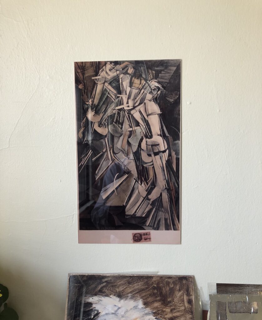
Marcel Duchamp Facsimile Object (MD1), study, 2021, sublimated dye transfer on aluminum, 35 x 20 cm, well, really 13.75 x 7.75 in., which is not quite 35×20, which, well, read on
If a history of the Facsimile Object is written, credit for the term will be given to Gerhard Richter (or his printmeister Joe Hage? Inquiring art historians will want to know!), but the inspo for us all will obviously be Marcel Duchamp.
Kerry James Marshall, Scipio Moorhead, Portrait of Himself, 1776, 2007, Acrylic on PVC panel, 28 × 22 in., image via David Zwirner
Director Barry Jenkins said one of the inspirations for The Gaze was a painting by Kerry James Marshall. In The Gaze, shot on the set of The Underground Railroad, actors embody ancestors, people who lived and died without much or any visual record of their existence. Marshall created a similar series of paintings depicting Black people of history for whom no visual record survives, and Jenkins called outScipio Moorhead portrait of himself, 1776, a 2007 painting (above) which he saw at the Met Breuer in 2016. I think Jenkins is quoting a text from the Met:
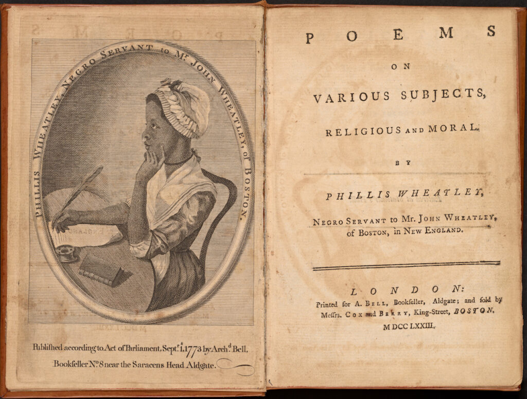
“In this painting Marshall created an imagined self-portrait of a real African American artist, Scipio Moorhead, who was active in the 1770s. Few if any images of Moorhead exist in the historical record. Everything we know of his legacy is based on Phillis Wheatley’s first book of poetry, published in 1773 while she was a slave [sic] in Boston. The book’s title page illustration is an engraving of the writer, reportedly modeled on a painting by Moorhead. The engraving remains the only visual proof, however tenuous, of Moorhead’s existence.”
From what I can find, no images of or by Moorhead survive, only some mentions of him in correspondence; marginalia identifying him as the subject of one of Wheatley’s poems; and the etching that is supposed to be based on his portrait of Wheatley.
Somehow the Met has a print that was not bound into one of the 300 copies the book Wheatley first got published in England. It was soon published in Boston after her return as a free woman, in 1773.
The preface to Wheatley’s book includes a statement signed by 18 prominent Bostonians who examined her and her manuscript and pronounced them genuine, despite her background as “an uncultivated Barbarian” who labors “under the Disadavantage” of being enslaved by the Wheatleys. Which, one must imagine, is an extraordinary thing to have experienced.
Wheatley married, wrote poems criticizing slavery and praising the American revolution, then died young, at 31. A new book by poet and professor Honoré Fanonne Jeffers includes previously unpublished letters showing her husband’s attempts to publish a second book of poetry after her death. Except for Wheatley’s book and a couple of other mentions, Scipio Moorhead’s fuller story remains unknown.
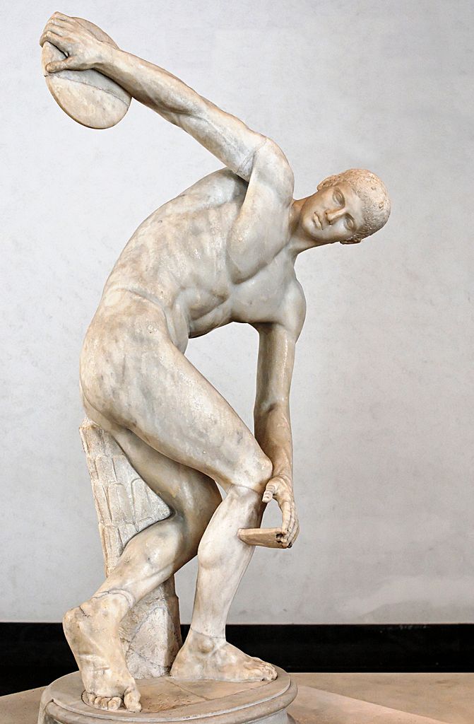
The “Lancellotti Discobolus,” the first Roman marble copy of Myron’s lost bronze original to be unearthed, in 1781, was sold by Mussolini to Hitler in 1938. image: wikipedia
Marshall’s depiction of Moorhead is notable for the size of the historical void it occupies. The greatest sculptors of ancient Greece are only recognized as such because of later Roman copies of their work. Having no known work survive certainly hasn’t hurt the legacies of Phidias, or Polykleitos, who are foundational for European art’s history of itself. What would our culture be like if Moorhead’s Phyllis Wheatley were as influential as Myron’s Discobolus?
Poems on Various Subjects, Religious and Moral, by Phillis Wheatley, Negro Servant to Mr. John Wheatley of Boston, in New England, London, 1773, collection NMAAHC
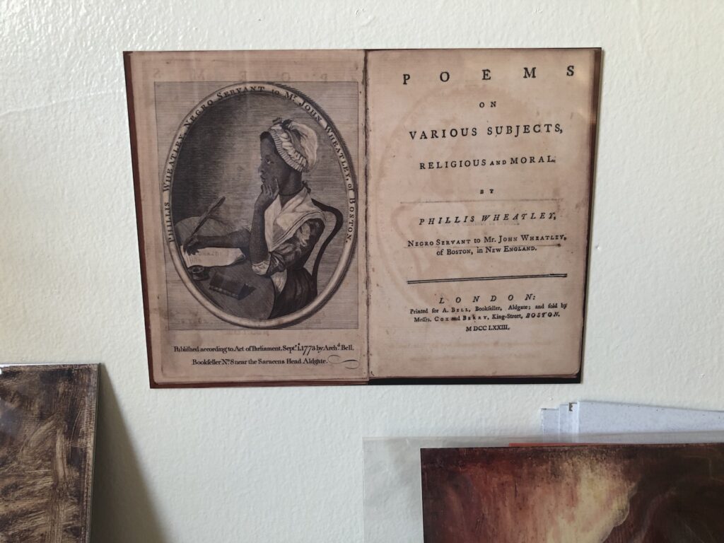
Moorhead/Wheatley Facsimile Object (MW1) 2021, proof, octavo, 6.75×9 in. dye sublimation print on aluminum, based on the NMAACH’s copy of Wheatley’s book.

