
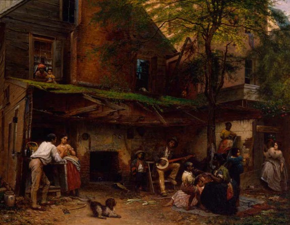
Eastman Johnson, Negro Life in the South, 1859, NYHS
Just getting in touch with my black roots, putting a stake in the ground here on part of Eleanor Jones Harvey’s discussion with Tyler Green about her show, “The Civil War and American Art,” which just opened at the Smithsonian American Art Museum.
About 43:00 into the show, Harvey talks about Eastman Johnson’s 1859 painting [above], Negro Life In The South. Which she argues is a critique of slavery via a complicated, carefully articulated exposure of the South’s precarious and untenable concept of race and power. It’s basically a beautiful mosaic of skin tones resulting from generations of interracial sexual relationships.
Harvey calls attention to the two women, one white-skinned, one darker, stepping tentatively through the door on the right, and the precarity of passing, the risk that if a master’s light-skinned daughter’s slave parentage were found out, then her life, her rights, her freedom, all that the front house represents, would be taken away.
“To my mind,” says Harvey, “what Eastman Johnson has done is, on the eve of civil war, painted a referendum on skin color as an arbiter of your legal status: At what point on a sliding scale, from white to black, do you segue from being a person to being property?”
It’s this clash of a binary and a spectrum that caught me short and made the challenges of multi-racial ancestry in American history much more crucial and much less abstract or academic. It’s the kind of thing that even if by 1859 they were well within the color scale of the main house, my descended-from-a-17th-century-free-African-Virginian Mozingo ancestors would have spent over 250 years internalizing.
MAN Podcast Ep. 54: American Art & The Civil War [manpodcast.com]
Previously: It’s A Mozingo Thing
Creation Is Joined With The Playing
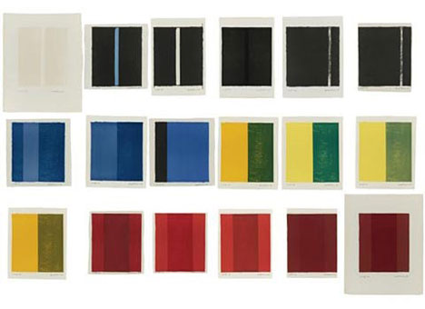
Barnett Newman, 18 Cantos, image via portlandart.net
Barnett Newman, from the statement included in 18 Cantos, a set of lithographs produced in 1963-4 with ULAE:
I must explain that I had no plan to make a portfolio of “prints.” I am not a printmaker. Nor did I intend to make a “set” by introducing superficial variety. These cantos arose from a compelling necessity–the result of grappling with the instrument.
To me that is what lithography is. It is an instrument. It is not a “medium”; it is not a poor man’s substitute for painting or for drawing. Nor do I consider it to be a kind of translation of something from one medium to another. For me, it is an instrument that one plays. It is like a piano or an orchestra; and as with an instrument, it interprets. And as in all the interpretive arts, so in lithography, creation is joined with the “playing”–in this case not of bow and string but of stone and press. The definition of lithograph is that it is writing on stone. But unlike Gertrude Stein’s rose, the stone is not a stone. The stone is a piece of paper.
I have been captivated by the things that happen in playing this litho instrument, the choices that develop when changing a color of the paper size. I have “played” hoping to evoke every possible instrumental lick. The prints really started as three, grew to seven, then eleven, then fourteen, and finished as eighteen. Here are the cantos, eighteen of them, each one different in form, mood, color, beat, scale, and key. There are no cadenzas. Each is separate. Each can stand by itself. But its fullest meaning, ti seems to me, is when it is seen together with the others.
I joked about 18 Cantos this morning; it’s one of my absolute favorite print works ever. [And no, I don’t have a copy, so no, I will not be breaking it up and giving it away to random Twitter followers.]
But it just occurred to me that Newman’s perception of the lithograph stone as an instrument to be played, not a medium to be translated, is very similar to Richard Prince’s early approach to photography.
Here’s just one example from Prince’s Canal Zone deposition, when questioned about a 2003 Artforum Q&A where he said he “played the camera”:
I was extremely–to tell you the truth, I was extremely conservative, on the other hand, in terms of my artistic attitude.
And I knew that in order to maybe discover something new I had to change a bit and take on another persona. And I felt that by playing, quote, as I said in the interview, the camera, just like a punk rock guitarist who picks up a guitar, seven days later he’s playing on stage. He doesn’t know how to play the guitar, but it’s his inability which shines through, which is really exciting. And the fact that he’s not a virtuoso–it’s the very limitations I think that make–can actually make great art.
Newman’s statement is published as “Preface to 18 Cantos” in Barnett Newman: Selected Writings and Interviews [amazon]
Arcy Douglass’s 2008 post about 18 Cantos, then on exhibit at the Portland Art Museum [portlandart.net]
Salesman Sample Flags
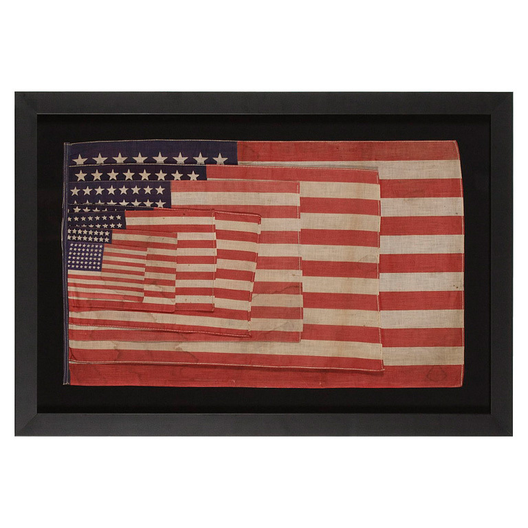
flag dimensions: 17.75″ x 29.5″, image: Jeff R. Bridgman American Antiques via 1stdibs
Speaking of sweet flags, Andy from reference library sent along this amazing, pre-Johnsian artifact from York, PA antiques dealer Jeff R. Bridgman.
It’s a salesman sample flag, seven parade flags in graduated sizes, sewn together for convenient comparison shopping. The 48-star design and textile quality suggests WWI-era; Bridgman’s description suggests that Jasper Johns must have seen one of these sample sets somewhere before. But then, that’s just what a guy charged with selling it to you would say… In any case, awesome.
48 Star Parade Flag Salesman’s Sample, POR [1stdibs via reference library]
Big Hole, Cady Noland
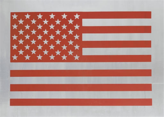
Big Hole, 1994, 90x130cm, apparently did not sell at Christie’s day sale in Nov. 2007. It’s inscribed, “This can be hung in any of four directions” on the back.
I can’t remember where I last saw Cady Noland’s flag, Big Hole, but I remember where I saw it first: at Paula Cooper’s gallery in SoHo, in the Spring of 1994. It says #1 of 1, but I remember there being more than one flag. It was like the 10th most interesting thing in that show at the time, and I didn’t give it much thought, but now…
Maybe I saw it again last fall, on Joshua Abelow’s blog. Which would have been when I was in flag mode, sweating harder about finishing the saga of the missing Jasper Johns Flag painting.
It definitely made me want to start silkscreening stuff on aluminum.
Now about that Johns Flag…
FIFTEEN MONTHS AND FIVE MINUTES LATER UPDATE: LOL, no way, here’s the Gallery Beat crew’s visit to this Noland show. With Joe, Paul H-O and Walter Robinson, plus a cameo by Holland Cotter, and–someone should ask James Kalm if their shitty guerrilla camerawork was his inspiration. But whatever, thanks fellas, it’s the best we’ve got now:
Also, writing here in 2009, Paul H-O says Cady’s still making work. So hope, or whatever the appropriate Noland equivalent is, springs eternal.
Willem de Kooning Meant To Not Do That
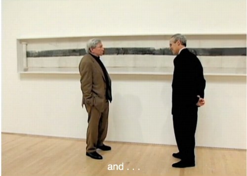
In the 4th part of his video walkthrough of MoMA’s Willem de Kooning retrospective, James Kalm has an extended clip of curator John Elderfield talking with Glenn Lowry about how the artist’s late paintings relate to his earlier work.
Elderfield stays pretty broad, arguing that the works are valid and important, and that Gary Garrels’ and Rob Storr’s earlier MoMA show ably made their case. Which all sounds good to me. [While noting that “the topologies of the paintings are very reminiscent of earlier pictures,” Elderfield apparently felt that a press preview was not the right context for expanding on de Kooning’s practice of tracing details of earlier paintings which his assistants had projected onto primed canvases.]
What struck me now, though, was his discussion of how the marks in de Kooning’s 80s paintings were the result of his elimination of subjectivity. Elderfield told how de Kooning “fell into a sort of trough” after seeing a hugely successful show in 1978 of his large, gestural abstractions made in 1975-7, which were in the preceding gallery. “There could have been three times that number in the exhibition,” Elderfield said,” with no drop in quality or achievement…de Kooning had said he ‘felt he could do no wrong,’ which for him, was the point at which he had to stop doing them.”
It’s an interesting idea, and it reminds me of how much I loved those 70s paintings, and losing myself in those big, sinuously virtuosic brushstrokes. It’s really too bad Kalm’s woozy, wandering camera eye is one of the few ways left to take in that gallery.
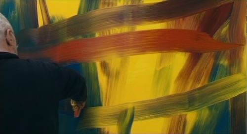
Still from Corinna Belz’ Gerhard Richter Painting
It also reminds me how much those de Koonings reminded me of the early states of Richter’s squeegee paintings. This concept of Richter painting and then overpainting as a transformative, not destructive, technique was what first got me looking at Richter’s destroyed paintings. [That, and Erased de Kooning Drawing, of course.]
Now it strikes me how the two painters share the urge to resist habit and ease. Richter picked up the squeegee in part to counter intentionality and the mastered brushstroke. If de Kooning was resisting the same thing when he changed up his approach after 1980, maybe there’s something to be discovered by seeing these two painters’ works together.
Crazy 20×200.com Sale Starts at 4AM EST

20×200.com is starting their WTF Cyber Monday sale early, at 4AM Eastern, with an eye-popping 40% off on prints and frames, as detailed above. The discount ticks down a bit throughout the day, until it reaches a still-totally-respectable 25% off by 4PM.
The discounts apply to orders over $100, so for example a framed 14×11 edition of Untitled (300 x 404), below, would be $111 instead of $185. And one of the five remaining 30×24″ prints, would be $720 vs $1,200.
There are, of course, many other excellent prints available, too.
You can’t even get discounts like that at Basel Miami Beach, people. It is serious Crazy Eddie days over there.
Art Car Parts
We can’t really control when an idea will come to us, or when it might subsequently feel significant, more than a fleeting whim. But we can decide when we make it known. And when we should maybe just shut the hell up about it for a while because seriously, people.
So one day, while driving and explaining to the kid the difference between a car logo and a hood ornament, and how sometimes, people put their own hood ornaments on their cars, usually Jeep Wagoneers, it hit me: artist-designed hood ornaments.
I mean, why should the vinyl wrap industry have all the art car fun?
They’d be awesome little sculptures, made in limited editions. Maybe they could be chromed steel, but they could just as easily be something else: acrylic. Resin. Cast glass. Wood, I suppose. They could be made or readymade. There must be some kind of universal [or relatively so] base attachment mechanism.
Oh, what an interesting context for artists to engage.
And that was that. Until the next day, when the new Artforum arrived. And there on page 52 was Alison Gingeras’ remembrance of visits with the late Franz West who, despite not driving himself, “had a crazy obsession with luxury cars.”

[See more images at basis-wien.at.]
She told of a November 2001 museum performance in Vienna, Aktion PAR BLEU (Le Limousine Bleu), where West used a watering can to pour candy pink housepaint on a maroon Maserati Quattroporte.
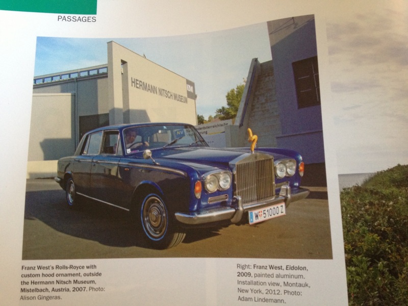
And how West was thrilled about having traded a work for a vintage Rolls Royce:
By the time I got to see his prized chariot, it wasn’t just a Rolls–it had been Westified. He swapped out the Spirit of Ecstasy…for one of his suggestive sculptures rendered in miniature. The view out the front windshield was now accented by a brownish abstract squiggle, which resembled a cross between poop and a penis. In fact, he made a few of these hood ornaments and stored them in the glove box: different colors and forms that he switched out on the daily ride to his Esteplatz studio, depending on his mood.
Which gets at the reality of how people often treat their cars as extensions of themselves, projections of their identity; or conversely, how cars are perceived–and created and marketed–as public embodiments of their occupants’ identity. West’s little artworks went into the world just ahead of him, altering his interactions with it.
With Gingeras’ story as the greatest proof of concept ever–no other mentions of West’s hood ornaments turned up online–I resolved to blog it up pronto. And then Hurricane Sandy started closing in.
image: Casey Neistat’s instagram
And small blessings, I didn’t get around to mentioning it during the uneasy joking-in-advance period. And it was forgotten completely, and it wasn’t until just now, as I re-read Gingeras’ focus on luxury cars, that I even made a connection to the emotional peculiarities of seeing tree-crushed Range Rovers or submerged Bentleys in Sandy’s photostream. I’m not sure why that is.
Anyway, hood ornaments by artists.
‘But Which One Of Us Drove The Car?’
In the Fall of 1953, Robert Rauschenberg and John Cage, fast friends and mutual admirers from Black Mountain, collaborated on an artwork. Cage had already been studying with DT Suzuki and had been discussing Zen in great depth with Rauschenberg. Which dialogue had led, the summer before at Black Mountain, Rauschenberg to make his White Paintings, and to Cage and others to orchestrate Theater Piece No. 1 and to compose 4’33”. Rauschenberg had already stayed at Cage’s loft while his new Fulton St. studio was being fumigated, where he’d surprised Cage by painting the painting Cage got from Rauschenberg’s 1951 show at Betty Parsons completely black.
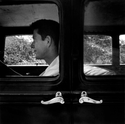
Untitled (John Cage, Black Mountain), 1952, photo: Robert Rauschenberg
For the work that came to be known as Automobile Tire Print, Rauschenberg pasted 20 sheets of drawing paper into a scroll, which he laid down on an empty Fulton St one Sunday, and he inked the rear tire while Cage drove his Model A in a straight line along the paper. [Cage drove the Model A to Black Mountain, above. Apparently, Kaprow had a Model A, too.]
Michael Kimmelman is fond of noticing the similarity between the long, lone mark made by moving through space and Barnett Newman’s “zips,” which Rauschenberg would have seen at Parsons’ gallery in 1951 and 1952.
In the catalogue for his 1991 show Rauschenberg in the 50s,, Walter Hopps links Automobile Tire Print in time, medium, and concept to another major collaborative work on paper, Erased de Kooning Drawing. It turns out that for the first decade-plus after their creation, neither work was exhibited publicly, and both were known largely by word of mouth. They were discussed without being seen; as the product–or to use Harold Rosenberg’s influential 1952 term, the “residue”–of process, their physical state was secondary. Which let Hopps and others interpret and present them as precursors of Conceptual Art once such a thing came into existence.
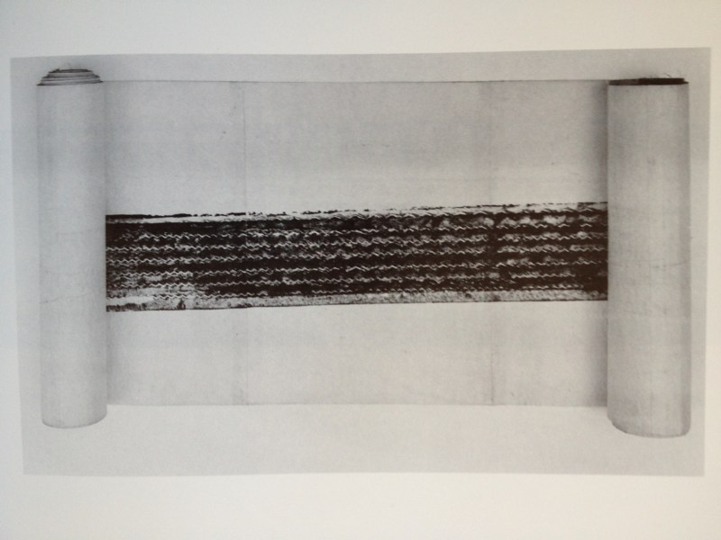
Hopps says that Automobile Tire Print was “maintained as a scroll” which was eventually mounted on fabric for preservation. Since it was first exhibited in the 70s [and yes, I guess I’ll have to start digging into this history now, too], the work has been unfurled to various lengths. [Above, from Hopps’ 1976 show at the Smithsonian] Since Hopps, and definitely since SFMOMA’s acquisition of the piece in 1998, it has been completely unfurled.
The accounts, even the descriptions of the work, vary. Hopps said it’s ink. Rauschenberg said it was “house paint,” like the black paint he was using at the time on his Black Paintings. And that he poured it out on the street in front of Cage’s tire.
In that SFMOMA video, Bob told David Ross that he asked his friend to help execute his idea. Cage “was the printer,” Ross suggested, “the printer and the press,” said the artist. Without entirely contradicting that view, Cage wrote in 1961 in Silence, “I know he put the paint on the tires. And he unrolled the paper on the city street. But which one of us drove the car?”
Perhaps ambiguous authorship is just one more way Automobile Tire Print is like Erased deKooning Drawing, a work in which the central, conceptually transformational contribution of Jasper Johns had been willfully omitted for more than four decades.
Not that these questions of credit and origin give BMW any cover at all on their mindblowing direct marketing campaign “marking the momentous occasion” of the 40th anniversary of the M Motorsports car series.
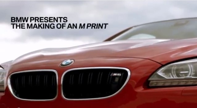
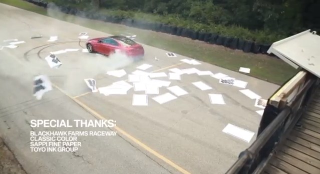
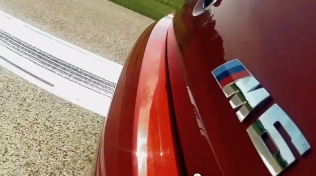
The company that regularly puts artists in the promotional driver’s seat on its Art Car series completely fails to mention either Rauschenberg or Cage in the video for the M Print project, which is essentially a cover version, or a re-performance, of Automobile Tire Print starring the M6 sports coupe. The resulting prints were then cut into postcard size, and sent to new and prospective owners.

[FWIW, BMW also blanked a living artist, using the donut-spinning M6 (below) to re-enact Greeting Card, Aaron Young’s 2007 Park Avenue Armory motorcycle tire painting project. I’m sure if there were another car-related performance art project ransackable enough, BMW’s agency would have turned that one into postcards, too.]
I guess it’s possible to look at this as a glass half full situation, that the indexical Zen performative aesthetic of Cage & Rauschenberg has, sixty years later, gone mainstream. Or at least turned into a PR stunt to sell $100,000 sports cars.
The only way this ends well is if it spawns a cars-meets-Fluxus fauxreality TV show on the History Channel. John and Bob would surely be delighted.
The BMW M6 Creates Its Own Direct Mail [fastcocreate.com]
BMW M Presents: The Making of an M Print [youtube]
Previously, unexpectedly related: greg.org coverage of John Cage’s VW bus and of
the unexamined making of Erased de Kooning Drawing
Do Something (Else) To It
I don’t remember the inflationary period, 2011, Don Edler, image via
What with the title taken from the famous Jasper Johns quote and all, I was interested to read the dialogue/press release between the artists in Freight + Volume’s upcoming show, “Do Something (Else) To It.”
The artists are Don Edler, George Jenne, and Andrew Smenos. The opening is rescheduled for the 29th.
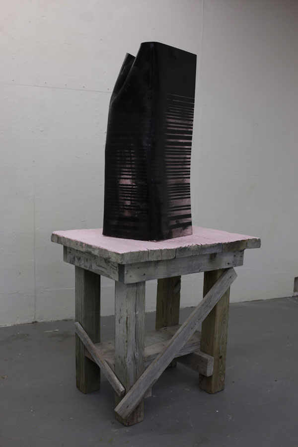
The show will be about process, and, as Edler says, “transformation and translation.” His mention of a plywood sofa sent me searching for images of his work, and that’s where I found I don’t remember the inflationary period, above. The 2011 sculpture consists of a molded acrylic sheet partially lined with foil, which rests on a found scrapwood table painted with pink latex. Given Edler’s stated interest in cosmology, I’ll guess the title is a reference to the universe before the economy.
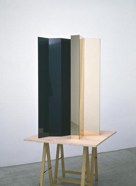
Untitled, 2001, Wade Guyton, image via phillips de pury
But what caught my eye in all this, and the reason I’m posting it, even though I imagine it has little or nothing to do with Edler’s practice, is the formal similarities between this one sculpture and some early works by Wade Guyton.
Back in 2001 or so, some of the first sculptures Wade showed were made from smoked & mirrored acrylic. The most prominent was a tower-like structure, 8-9 feet high, in a summer group show at Gavin Brown [Actually, that was 2002]. But there were also smaller ones, tabletop sized, which were perched, Brancusi-style, on found tables. I saw one at Bellwether in Brooklyn in 2000.
Another one I’ve seen, from 2001, turned up last year at Phillips in London. It had been bought locally from an Austrian show. The images of Edler’s sculpture just reminded me of the [c. 2001] photos of Guyton’s piece.
Until this summer, when I visited Wade’s studio, I’d always thought that these bases were made, not found. Not tables, but “table-like scuptures.” The first sculpture of Wade’s I’d ever seen was a large cubic form made from parquet floor tiles, so I’d always assumed he’d made everything. When I mentioned this to him, he just laughed and laughed.
Also, it really bummed me out–and it’s crazy to think about it now, considering–to learn how, because of space and money, much of his early work got tossed out. Maybe it’s time to bring some of that stuff, up to say, the HDTS era back somehow. I mean, really, there oughta be a retrospective or something.
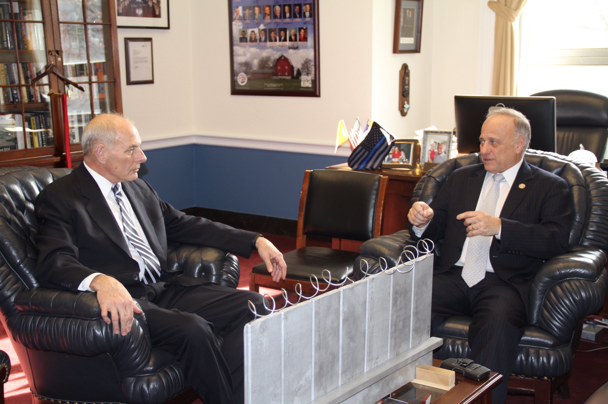
Study For A Fence And A Wall (2006)
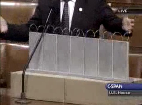
On July 11, 2006, on the floor of the US House of Representatives, Congressman Steve King, Republican from Iowa, presented a model of “a fence and a wall” he had designed. It was a site-specific proposal, to be located on the US-Mexico border.
The fence/wall could be built, Mr. King explained, using a slipform machine to lay a concrete foundation in a 5-foot deep trench cut into the desert floor, a gesture that immediately brings to mind the Earth Art interventions of Michael Heizer. Pre-cast concrete panels, Post-minimalist readymades 10 feet wide and 13 feet high, could be dropped in with a crane.
“Our little construction company,” Mr. King said, referring to the King Construction Company, which he founded, and which was then being run by his son, “could build a mile a day of this, once you got the system going.”
Mr. King demonstrated the construction of the wall using his tabletop model, made of cardboard boxes, silver-painted wood slats, and a couple of feet of coiled wire [representing the wall’s crown of concertina wire, which would be electrified “with the kind of current that would not kill somebody…we do that with livestock all the time.”]
It’s true that the remarkable simplicity of the design and the economy of the materials resonate the work of Richard Tuttle. But in the scale and especially the form, King seems to be making a conscious reference to the early work of Anne Truitt.
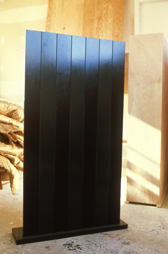
Seven, 1962, image: annetruitt.org
Obviously, at some point after his arrival in Washington in 2003, King studied the iconic Truitts in local collections: the highly fence-like First (1961) [at the Baltimore Museum] and slab-on-plinth structures like Insurrection (1962) [at the Corcoran]. But even I was surprised to see King make such an explicit homage to Truitt’s Seven (1962) [above, collection of the artist’s estate].
Much like Christo and Jeanne-Claude, King conceived of his site-specific fence/wall to be temporary, at least conceptually:
You could take it back down. If somehow they got their economy working and got their laws working in Mexico we could pull this back out just as easy as we could put it in. We could open it up again or we could open it up and let livestock run through there, whatever we choose.
Whatever we choose. Thus the fence/wall becomes a symbol of American freedom.
According to the Congressional Record, Mr. King, appearing as an expert witness, exhibited his Study For A Fence And A Wall again a week later, in a joint hearing of the House Committees of Homeland Security and Government Reform.
The current whereabouts of King’s model is not immediately clear, but I guess I could call about it. Meanwhile, I would love to see this work realized at full scale, if only temporarily, where it was conceived: right here in Washington DC. Perhaps in the National Gallery’s sculpture garden, or along one of the sketchier sections of Pennsylvania Avenue, where dangerous elements threaten Our Freedoms.
January 2017 inevitable update: Oh how we did not need to worry that this work might not have survived. On Jan. 13 Congressman King tweeted out a photo with it, and the new appointee for DHS. Study was installed on his coffee table in his office. It will be noted that it has a new base, set in unpainted wood feet, presumably a pair. The articulation of the wall at the ground and the underground footing are now fully visible. The box representing the desert floor, and the notch, where “you put a trench in the desert floor.” are not seen. What was once site-specific is now available for installation anywhere, I guess. Though it’s really tough to say at the moment.
Blank And Blank And Blank
One of the things I found so fascinating about the Cariou v. Prince case is the language. The juxtaposition of the ambiguities and subjectivities of art, the calculated omissions of the art market, and the adversarial formalism and ritual of the legal context.
That comes to a head in Prince’s deposition transcript, which is this kind of amazing text and performance in one. People objecting to things, people repeating or parsing questions, spelling out names with the consciousness that the purpose is to put something on a record–the record–for later use.
And out of it all, art history inevitably or inadvertently emerges, and a window opens onto something–I was going to type reality, but that’s probably naive. It’s information, information pulled and distorted by the constraints and confrontations of the deposition process. Which fits the form of the genre, the medium.
The deposition transcript Gallerist posted yesterday from Larry Gagosian, in the suit over the Cowles Lichtenstsein is another example, just a great read. Unlike Prince, and unlike Gagosian’s Cariou deposition, it’s a real pageturner, combative, tense, a bit suspenseful, maybe with some setups that you think are corny, but yet, in the deposition setting, they still end up working. And even some twists at the end. [My only real complaint: I hate scribd. Just hate it. It’s as much a reason for doing a book in the first place, because I hate using scribd so much.]
Anyway, point is, while reading through the hilarious transcript of a preliminary scheduling hearing in the contract/infringement/revenge/divorce case of Burch v. Burch, the chatty judge, Chancellor Leo Strine, wrapped up with an insight on depositions that is a piece of poetry itself:
THE COURT: Okay. Then don’t — then don’t worry. What I’m saying is it could be — if you can all get the depositions done in 62.3 hours on each side, you should.
But a hundred hours is just an artificial thing.
I also don’t know — for example, depositions are often longer than they should be, not
because the person is taking a long time asking questions, because somebody says “Objection.”
Mr. Abrams knows that the real reasons why the board did this were blank and blank and blank. And it’s distracting the witness from the fact that they’re blank and blank and blank, and the witness’ inability to answer for himself blank and blank and blank and blank has now been corrected by me, indicating that the real reasons he did what he did is blank and blank. I mean, I’ve seen plenty — everybody in Chancery has seen plenty of transcripts — and you’ve been at those depositions — where, frankly, it’s much more from the obstreperous defense side than there is from the asking side.
In fact, during his deposition, Gagosian actually stops his lawyer, the estimable Hollis Gonerka Bart, a couple of times to ask, “What does that mean, by the way? Can I ask you what that means when you say ‘Objection to form’?”
I can tell you that by the end of the live staging of Canal Zone Richard Prince Yes Rasta this summer, “Objection to form” meant everyone took a drink. To the obstreperous defense.
Indie Game: The Movie: The Case Study
Lisanne Pajot and James Swirsky’s story of the making of Indie Game: The Movie is almost as awesome as the movie itself. They’ve done on an epic scale what I’d envisioned doing when I started this blog 11 years ago–and they’ve done much, much more.
And now they’re in the middle of recapping their experience making, marketing & distributing IG:TM, and the tools and platforms they used to do it.
Indie Game: The Movie (IGTM) is very much a product of our times. This film could not have been made & released the way it was five years ago, heck, not even 2-3 years ago. The film, and us, are hugely indebted to the technology, tools and evolving audience attitudes that made all this possible.
A de C

The first and last time I saw this truck, Donald Judd’s ranch truck, was in the early 1990s, in Marfa. I swear this logo for the ranch, Ayala de Chinati–or am I hallucinating?–used to be painted on the door of 101 Spring St.
Anyway, I’ve been looking for it again all these years because I’ve wanted to knock it off for myself, for my letterhead, if not for the door of my truck, and I couldn’t remember exactly how the letters-in-letters thing went. So I’ll get right on it.
An Artist’s Truck That’s No More Than It Needs To Be [nytimes]
‘Whites, Lancaster, Oh, US’
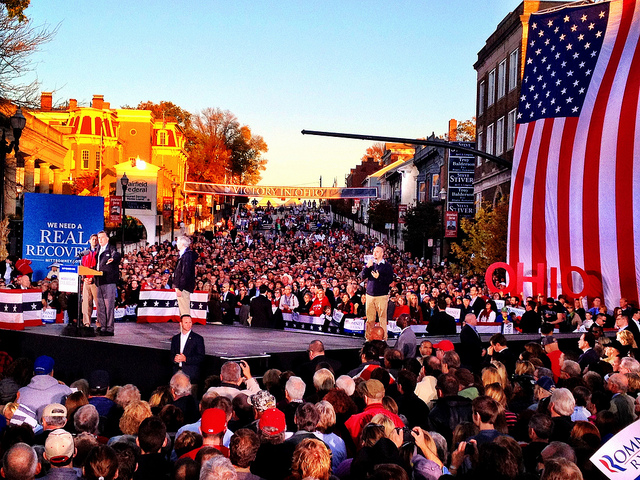
I realize that if I don’t mention these now, I never will. Because by this time tomorrow–or the next day–all will be right with the world again. Mitt Romney will have an abundance of time on his hands, and, most importantly, as The Awl’s annotators so ably note, White House photographer Pete Souza’s long nightmare will be over.
Here are some rather amazing photos, almost two weeks old now, yet among the most recent to be posted to Mitt Romney’s flickr stream, which is apparently the red-headed stepchild Log Cabin Republican to Instagram’s Tea Party.
They’re from a rally in, seriously, “Whites, Lancaster, OH, US,” which simultaneously creates and conquers the mashup genre of photo-geotag-as-poetry-and-political-commentary.
Cox and Linkins are right to marvel at the WTFlighting because, holy smokes, the rally is being held at what cinematographers call “the hour before Magic Hour, where everything is drenched in either horrible raking light, shadows, or lens flares.”
This is the stagecraft operation that seeks to inherit the mantle of Scott Sforza, the architect of the Mission Accomplished banner on the deck of the USS Abraham Lincoln, which aircraft carrier he turned to catch the real Magic Hour.”
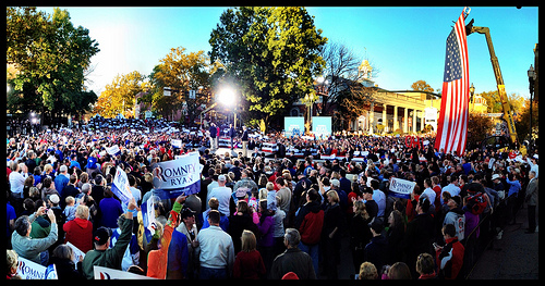
With the setting sun lighting up a few buildings behind/around them, the Romney campaign fired up their rally stage, set in the middle of the intersection of Broad and Main in Lancaster, with two giant floodlights. Which also hit the crowd. No need to estimate how many people attended–you can count every one of them. They seem to fill around half the planned space, with the oldest of the old making sure the distant bleachers don’t go to waste.
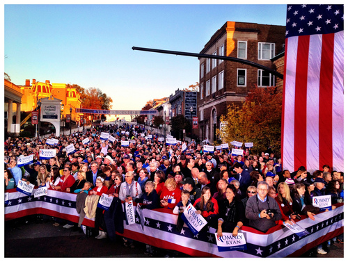
Here is my favorite glare, a photo I call “Idle-Class Tax Relief”:

I assume it’s a wide-angle lens or whatever, but it’s fascinating to me how disorienting the perspective is on these photos. The size of peoples’ heads. The indeterminate scale of that flag and those letters behind. And all uniformly in/slightly out of focus. Just so wild. It’ll be good to be done with it.
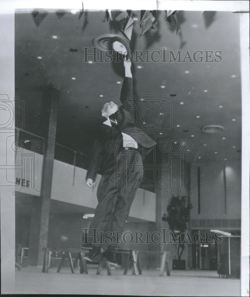
Photos Of Two Men Jumping At Sculptures
I really don’t know what else to call this, and there’s nothing I can think to say about it, except that I came across these two press photos, shot many years and miles apart, of men jumping up to touch a new sculpture.
The first, from 1961, shows Atlanta mayor William Hartsfield testing a mobile in the terminal of the airport that would eventually bear his name. It’s for sale here from Historic Images:
The second shows an unidentified office worker in the sunken plaza of the McGraw-Hill Building, part of the Rockefeller Center expansion finished in 1972, trying to reach the tip of Athelstan Spilhaus’s sculpture, Sun Triangle. It’s for sale here:
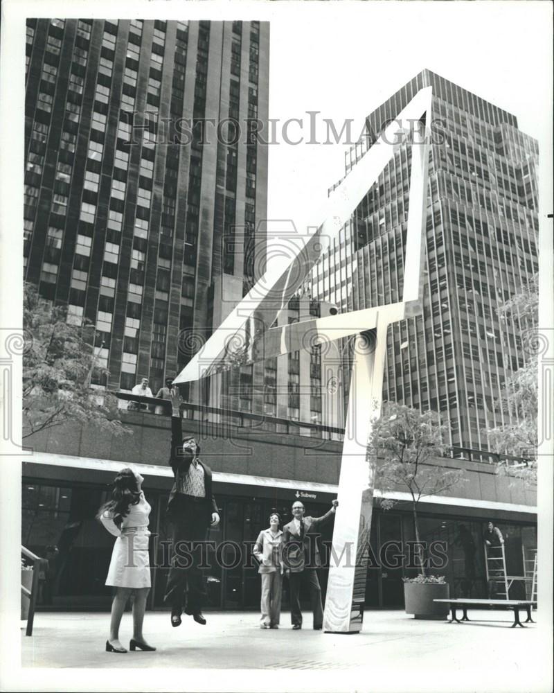
The photo has no date, but Sun Triangle was installed in 1973, which matches those folks’ look. Better known as a scientist than as a sculptor, Spilhaus aligned the sides of Sun Triangle to align with the sun on the equinoxes and solstices. He was also the guy behind the balloon that crashed in Roswell in 1947.