

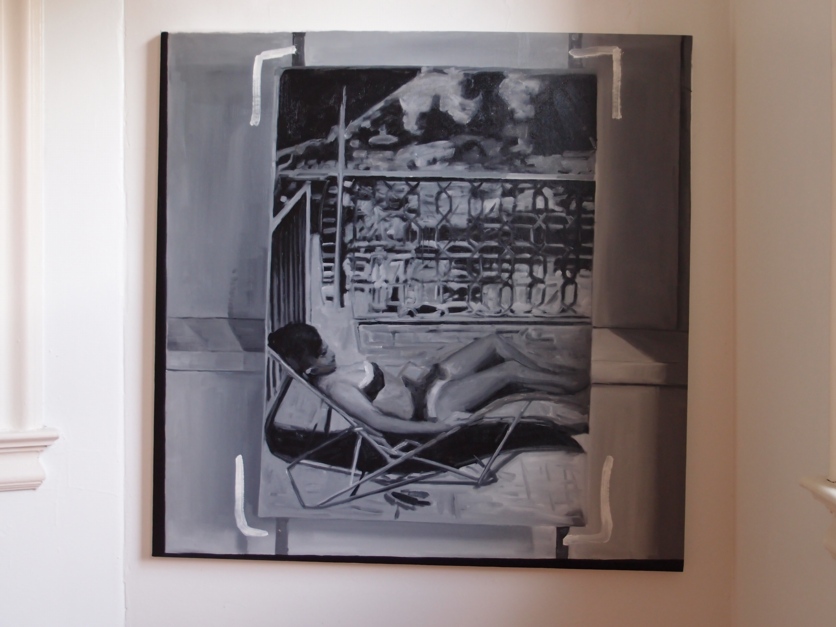
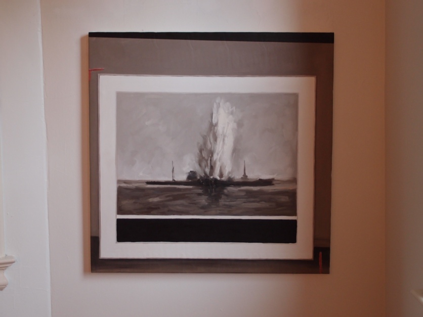
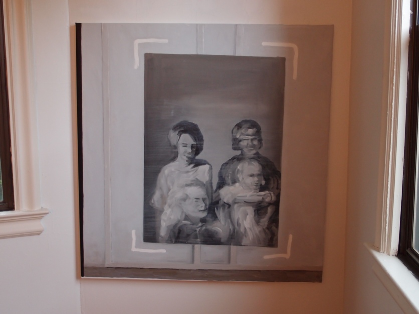
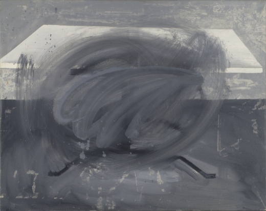
Destroyed Richter Painting #03
First off, a huge thanks to everyone who came to the opening of Richteriana Saturday, and a high five to Magda, Postmasters and the artists in the show. It really does look great, and interesting, and provocative. If you can, you should definitely see it in person.
Destroyed Richter Painting #04
Which is actually one reason I debated not posting images of the Destroyed Richter Paintings paintings I put into the show. One of the real drivers of making the paintings was to approximate the experience of standing in front of paintings that could now only be seen through photos. Or transparencies. Or JPGs. And to measure what the difference is between these different modes of mediated perception.
Destroyed Richter Painting #02
I did not have access to the actual dimensions of Richter’s original works, but I worked hard to deduce the size as well as to approximate the image, so as to make the feeling of seeing a picture in person as authentic [sic] as possible, even while acknowledging that Richter made such an experience impossible.
Destroyed Richter Painting #05
But looking at jpgs of paintings [of jpgs of paintings of photos] obviously falls short of this idealized encounter. As so much of our art encounter/consumption does. It’s a distinction that most people miss or gloss over, but which is not lost on Tyler Green, who recently addressed the subject of critics reviewing shows they haven’t seen by tweeting, “I never ‘work’ off JPEG.”
Richter actually showed most or all of the paintings depicted here between 1964-67, so in a way, there’s an aspect of going back in time, to encounter Richter and his work at the beginning of his Western career. A time when the context of the work wasn’t hype and adulation and skyrocketing prices, but bafflement, resistance, and indignation. There are early photo paintings that survive only because someone bought them or kept them; so these works, which were once good enough to be exhibited or put on sale, were rejected by the market before they were ultimately rejected by the artist himself.
Destroyed Richter Painting #01
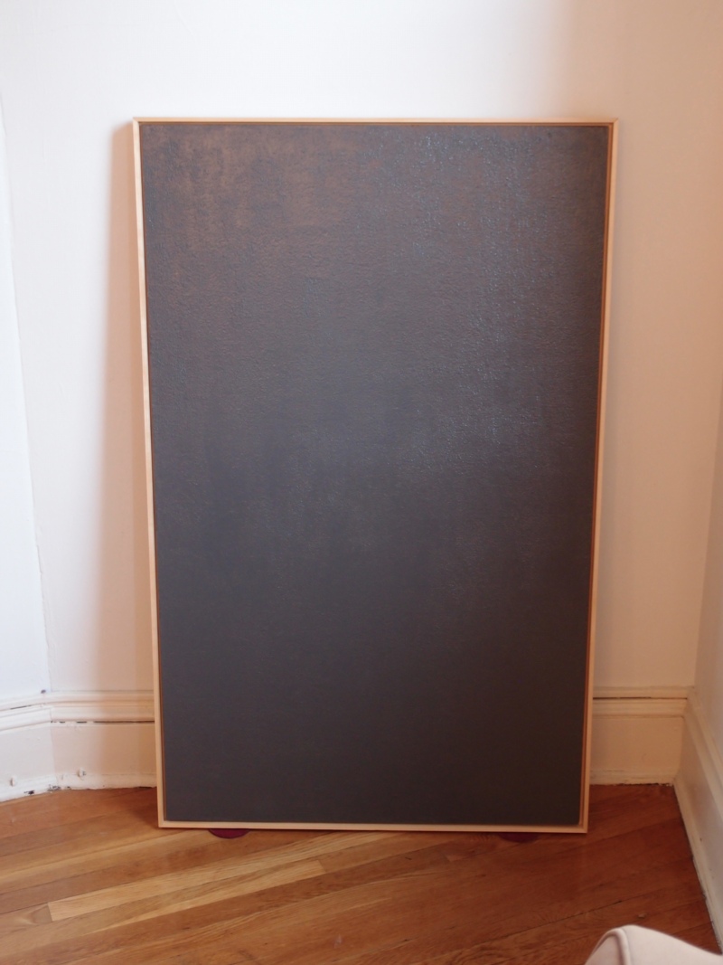
The one exception/mystery is Grau. This is one of the 70+ paintings that did make it into the catalogue raisonne, but which are now listed as destroyed. And if there’s a surviving image of the three destroyed grey monochromes [CR395-1-3], I couldn’t find it. So all that’s known publicly is the dimensions, and the unusual support [wood panel]. But that’s part of the beauty of the grey paintings, I thought, that you could think you could credibly extrapolate an actual painting from such minimal information. And seeing it in person really makes me miss Richter’s version–and to wonder what happened to it.
Editing A Life In Painting
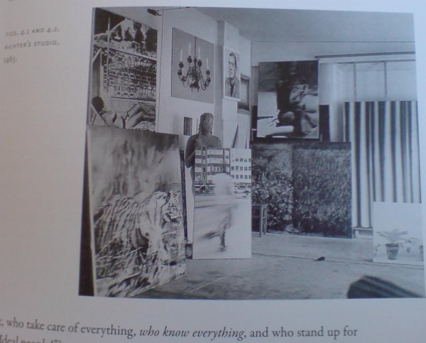
Richter’s studio, 1965, as seen in Elger’s A Life In Painting. Note the lady in the bikini on the left, which
Jasper Johns is well known for destroying his early work, thereby managing and reordering the story of his art by altering its history. But he is by no means alone. Gerhard Richter does it, too. And by turning his image archive and even the list of his paintings into works of art in their own right, Richter might have Johns beat.
Here is an excerpt from Dietmar Elger’s 2009 Richter bio/history, A Life In Painting, which I hadn’t noticed until recently:
In fact, Richter destroyed most of his early [i.e., pre-1962, as well as early photo paintings] works. They are known now only through reproductions in his well-organized archive. There was never, however, a radical break of the sort suggested by his self-organized catalogue raisonne (Werkverzeichnis, or “work list,” as he terms it). This catalog is one of Richter’s ongoing projects–a work in itself–and has long been a subject of controversy. Catalogues raisonnes are ordinarily assembled by scholars, who strive to document every authentic work by a given artist, and are organized chronologically. For Richter, the point is less to establish authenticity than to establish a trajectory within the artwork that he deems acceptable. His catalog does not include all of his work, nor is it consistently chronological. The artist has always excluded his earliest work; while some critics would like to believe that it documents the first paintings that incorporate media images as source material, this is simply not the case. [pp. 44-5.]
Tisch/ Table, CR-1, 1962, via gerhard-richter.com
Count me as one of those critics, or viewers. I knew he’d painted works before then, but I had no idea, for example, that Tisch, which is listed in Richter’s definitive-seeming numbering scheme as CR-1, was actually painted after several other paintings in his catalogue raisonne. It’s No. 1 because looking back from the late 1960s, Richter had figured it was a good place to start.
Pasadena Style Brillo Box Redux
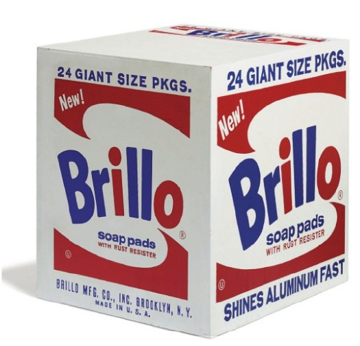
Will you look at that, another one of Irving Blum’s Pasadena-style Brillo Boxes is coming up for auction in the morning at Christie’s, with an estimate of $400-600,000. [The last Blum Pasadena Brillo box I wrote about sold for $782,000 in 2010.]
These Blum boxes are always/both listed as “acquired from the artist,” but they are actually part of an extra batch of at least 16 boxes which artist/curator/editor John Coplans had made as extras for the 100 boxes Warhol authorized for Coplans’ 1970 retrospective at the Pasadena Museum. The actual 100 were donated to the museum, but the overages were dispersed among Warhol’s friends, curators, dealers, and collectors in Los Angeles.
Oddly, the pair Coplans got from Warhol, which he donated to Oberlin College, are classified as “reserve boxes” for the exhibition; their somehow lesser status means they have never been published or exhibited outside the college.
Meanwhile, other of the 16+ which go through dealer or collectors’ hands are classified as regular, ol’ cash-n-carry Brillo Boxes.
Still no word on the whereabouts of the 10 to 33 Kellogg’s Corn Flakes boxes that went missing from LACMA, from the 100 Warhol authorized and donated to that museum at the same time.
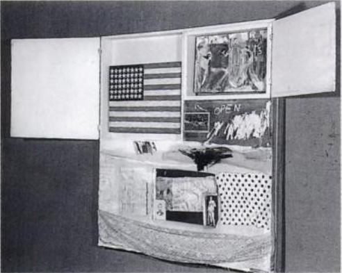
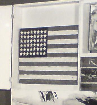
Jasper Johns’ First Flag
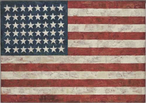
Flag, 1954-55, collection and image: MoMA
When, after a couple of weeks of poking around, I didn’t stumble, Banacek-style, onto the Jasper Johns Flag painting from Short Circuit, and then flip it for my 5%, reunite it with Rauschenberg’s combine, and get on the front page of the Arts & Leisure section again [ahem], I did kind of wonder what the end game of this search might be.
At some point might the result just be an acknowledgement that the flag is lost, fate unknown? And if so, does it just remain an entertaining art mystery, but a footnote to the “real,” relevant history of Johns’ and Rauschenberg’s work and all that flowed from it?
Fortunately, I don’t think that’s what happens here. No matter if it never resurfaces, the Short Circuit flag deserves a place in art history as the first Flag Johns showed, by almost three years. It is also almost certainly the first Flag Johns made. Which is tricky, because that distinction is commonly given to THE Flag, at MoMA. But I think I have figured out that that is chronologically impossible. Johns may have started MoMA’s Flag before Short Circuit‘s, but he certainly didn’t finish it first.
Here’s the deal:
The date for MoMA’s Flag has always been in flux, but it has almost always been considered or assumed to be the first one he ever made. The disappearance from public view of the Short Circuit flag after 1962 greatly facilitated this conclusion.
‘Combine Paintings’ And Pillow Talk
Oh, now that’s interesting. I can’t find an actual print copy of the Portable Gallery Bulletin anywhere, but Joel Finsel has scans of a couple of pages in Swimming Naked At The Y, his biography/oral history blog about Edward Meneeley.
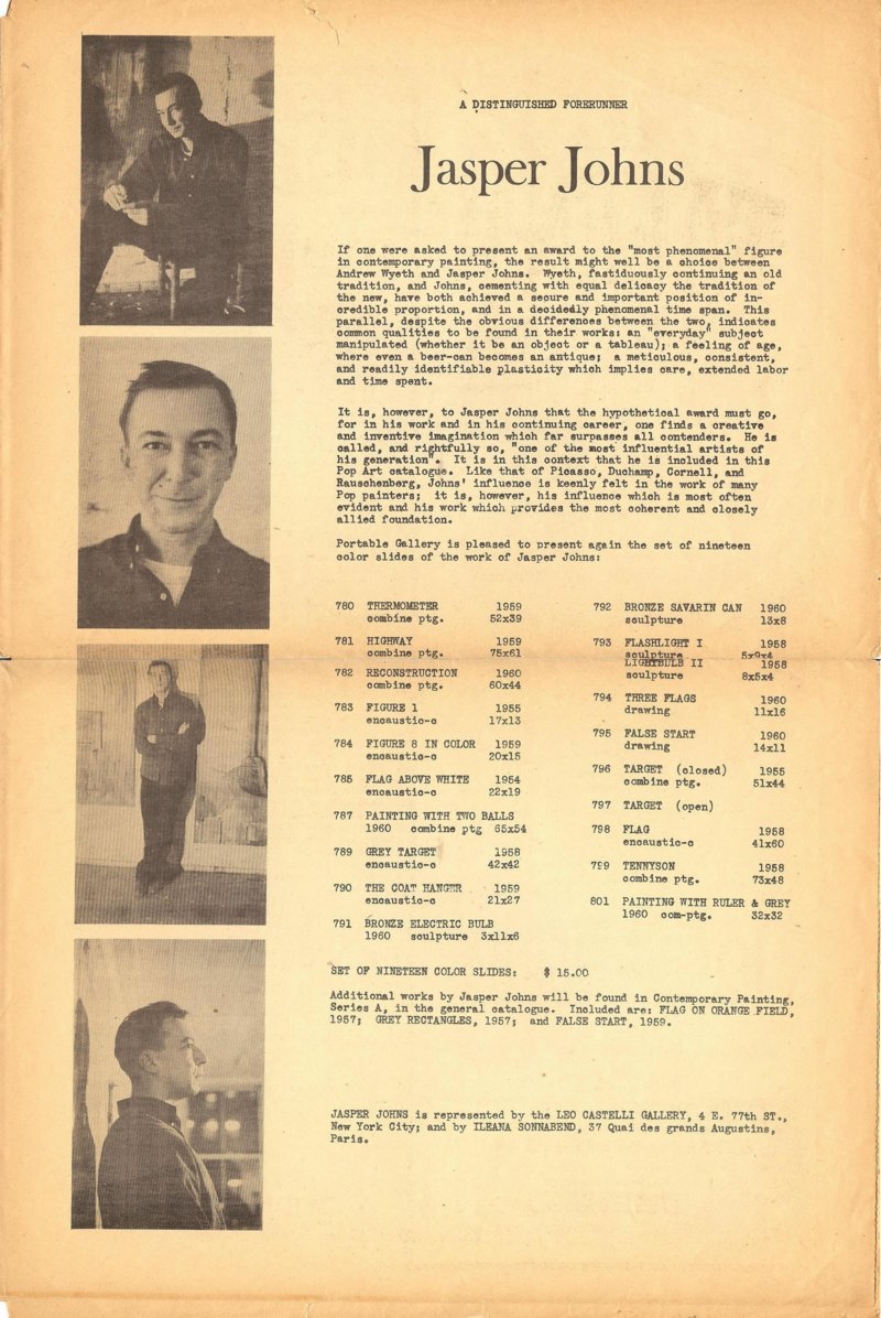
image composited from scans at Joel Finsel’s Swimming Naked at the Y
One example: the Jasper Johns page from what they called “The World’s First Pop Art Newspaper,” but which is actually titled “The World’s First Color Slide Catalogue of Pop Art.” Given the Beatles reference, I gather it was published in early 1963, a full five years after Johns’ groundbreaking solo show at Castelli, but before his Jewish Museum show. And after his bitter breakup with Rauschenberg, and after he’d written PGB a letter describing his and Bob’s agreement to not show, sell, or publish images of Short Circuit:
Dear Sir,
I’ve always supposed that artists were allowed to paint however-whatever they pleased and to do whatever they please with their work–to or not to give, sell, lend, allow reproduction, rework, destroy, repair, or exhibit it…
That quote has stuck with me like glue ever since I read it, all through Cariou v. Prince, and right on through to Gerhard Richter’s destroyed paintings. But more on all that later.
PGB’s text is a little over-the-top, I’m afraid, not terribly meaty critically, but then, it was really designed to sell a box of color slides for $15. This was the collection from which Short Circuit was excluded. Or maybe it was the slides of Bob’s work, who knows? Anyway, it didn’t happen.
Point is, check out the works that were included:
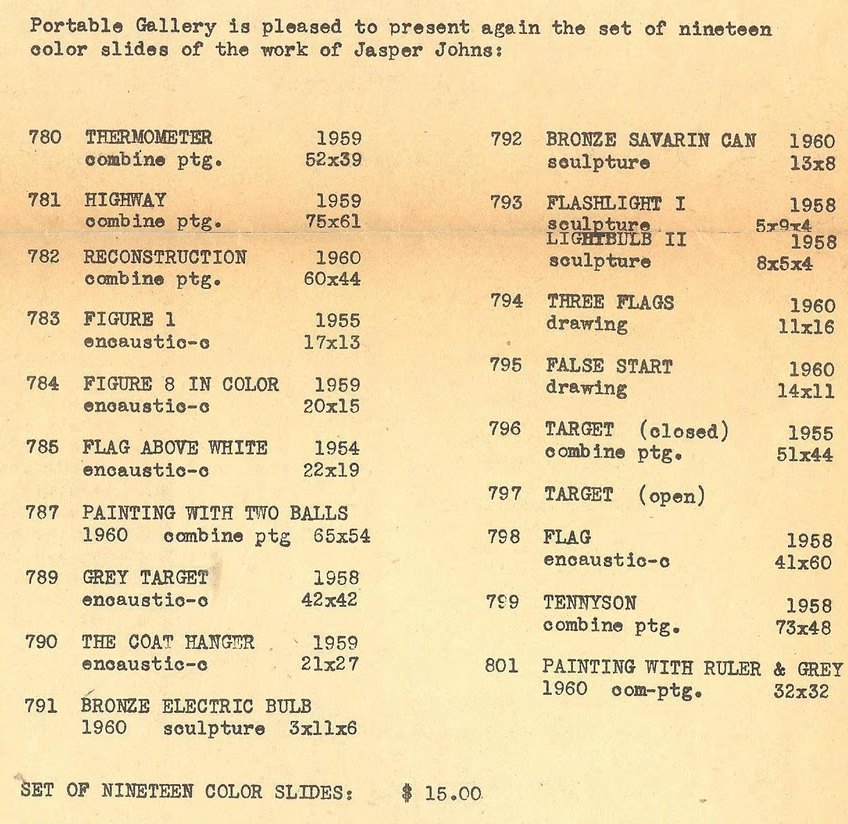
Thermometer (1959), Reconstruction (1960), Tennyson (1958), Painting with Ruler & Gray (1960), [below] and going all the way back to Target (1955), are labeled as “combine paintings.”
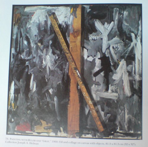
Painting with Ruler and Gray, 1960
But combine paintings are what Rauschenberg made. It reminds me of something in Calvin Tomkins’ 2005 New Yorker profile of Rauschenberg:
Johns recently told Joachim Pissarro, a curator at MoMA, that he thought the term “combine” had been his suggestion. Pissarro asked him what he thought it meant, and Johns said, “It’s painting playing the game of sculpture.”
Rauschenberg doesn’t recall that the word “combine” came from Johns.
I’m sure.
There’s more that article, including Rauschenberg telling Tomkins that “the most important thing” he got from Johns was not the combine or, say, the title, crucial Wittgensteinian graphic element, and entire conceptual construct of Erased de Kooning Drawing, but “Courage. Persisting upstream.”
But that’s not the point, at least right now. It’s just that an early stage in Johns’ career, someone who knew him and Rauschenberg well was writing about his work using a term that is–or became–associated exclusively with the work of his former partner.
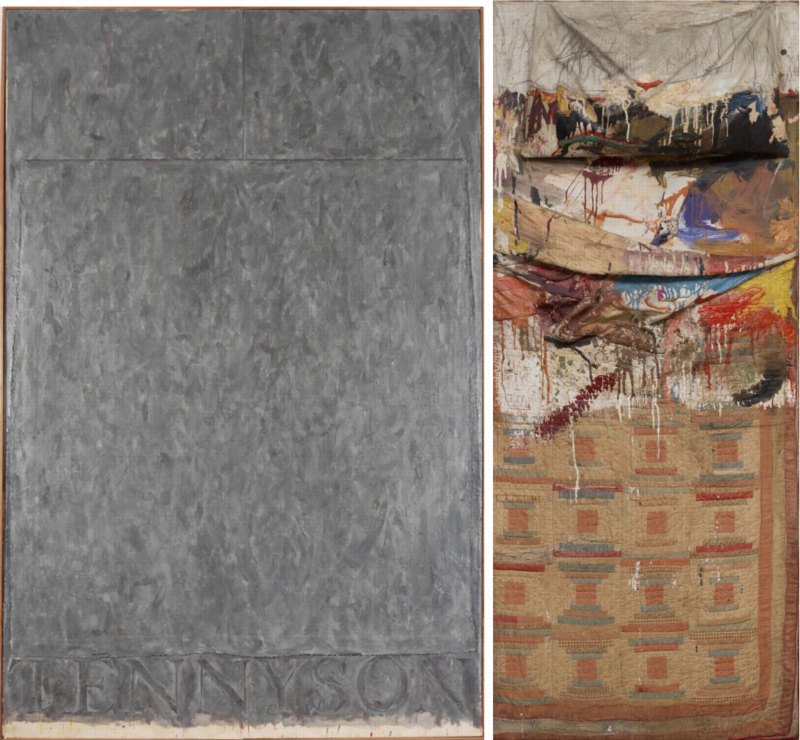
Tennyson, “encaustic and collage on canvas,” and Bed, “Oil and pencil on pillow, quilt, and sheet on wood supports” [image, right: moma]
I’ve often thought that a lot of Johns’s 50s and 60s works looked and felt like combines, but I’ve never seen the term applied. To take only a recent example, combines are only mentioned twice in the catalogue for the amazing 2007 show Jasper Johns Gray, both times by the Art Institute’s James Rondeau and both only in reference to Rauschenberg’s work. One was a “tender” and “unsupported” interpretation of the two-panel Tennyson as a double bed, “Johns’s own, wildly restrained response to Rauschenberg’s Bed, a landmark combine painting made two years earlier.”
Bed is, famously, paint on an actual pillow, sheet and quilt, making references to both AbEx and Albers-style geometric abstraction. Tennyson, meanwhile, is two Bed-size canvases pushed together, with pillow-like shapes on top [Rondeau shows how these pillows are given volume and shape in Tennyson drawings] and another, separate canvas laid face down across them like a blanket. And all covered with gestural abstract brushstrokes.
These works don’t have to be exactly the same, with handwritten footnotes on the back, to be seen as relating to each other, do they? Artworks made next to or around each other during the artists’ most important, intense, insular, and productive relationship? How is it possible, or more precisely, why is it the case, that no one in 50 years has considered Johns’ work as “combine paintings”? What would be different if we did?
In The Backroom With Jasper Johns
Well this is interesting. I don’t know how I missed this before now, but Albert Vanderburg was the associate editor of Portable Gallery Bulletin whose 1962 article discussing the impact of Rauschenberg’s inclusion of Johns’ flag painting in Short Circuit prompted Johns to write in. According to Vandenburg’s own recollection, that’s not all it prompted:
We had behind-the-scenes access to many museums and galleries and came to know many artists we might otherwise never have met. It was often necessary to move paintings in order to properly light and photograph them and it was a touching experience sometimes to see the backs of famous canvases. Ed had the habit of photographing any interesting work he spotted in back rooms even though I sometimes grumbled over the shambles it made on the production end. The negatives were printed in reels the size of a motion picture, then cut frame-by-frame and mounted in cardboard holders, so a beautiful Picasso sandwiched in between Roy Lichtenstein and George Segal exhibitions didn’t make for efficient processing, not to mention packaging and promotion which meant all those interesting individual items had to eventually be found a spot in the catalogue with suitable companions since we had long since given up selling individual slides.
One of those backroom items created another of my stormier sword-crossings with the Powers That Be. Before Jasper Johns appeared publicly on the scene, Robert Rauschenberg had created one of his “combine” sculptures which included a small all-white example of the American flag series which later helped make Johns a major star. Ed had managed to catch it before the work was withdrawn from public view. Not fully aware of the undercurrents, I wrote an article about the political influences in the New York art world and used that work as an example of ways more established artists lend a hand to up-and-coming ones. I had meant it admiringly but it was taken just the opposite, complicated by the fact that the special relationship between Rauschenberg and Johns had ended and had not yet emerged from a sour phase and perhaps even more so by the fact that the small Johns painting had itself become more valuable than the work as a whole. Their dealer, Leo Castelli, read my article, telephoned and told me I was a “beetch” and forbid us to sell the slide of the work. So when I designed the catalogue called “The World’s First Pop Art Newspaper”, the slide was offered as a free special bonus. Although Leo forgave Ed and continued to cooperate with future photography sessions, he never forgave me. I thought then he was a silly little man and I still think so while giving him due credit for the absolutely brilliant job he did in helping make Rauschenberg, Johns, Lichtenstein and others into the giants of twentieth century art which they later became.
Ha, yow, not often you hear Leo Castelli called a silly little man, but not often you hear him calling someone a “beetch,” either. Good times. Also, it was not an all-white flag painting. Unless, of course, it was. The vintage photo I’ve been using [above] was taken by Rudy Burckhardt and dates from, I think, 1958. I didn’t realize Meneeley and Vanderburg had their own shot, too. But maybe there’s a Portable Gallery Bulletin slide floating around out there somewhere, and maybe it shows a white flag?
UPDATE: I can’t find any copies of Portable Gallery Bulletin for sale or in archives, never mind “The World’s First Pop Art Newspaper.” But Joel Finsel’s extensive bio/blog of Ed Meneeley has a photo of Ed’s own, lone copy, from early 1963, probably the next issue after Johns’ letter:
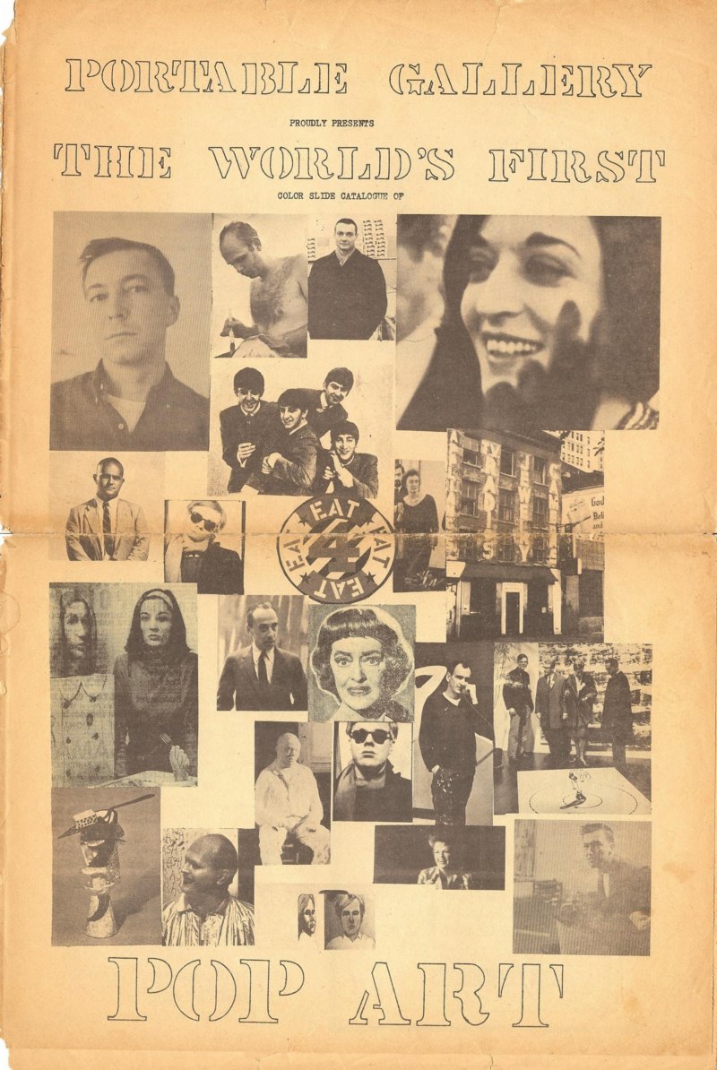
Hmm, Finsel also quotes the paper as offering “a free color slide of the Beatles!” which I guess one could get confused with Johns.
The Panther’s Tale: 014b [pantherhawaii.com]
Two Months.
Two months. I’d feign shock, but frankly, it’s been almost a year since I figured it out, and I’m only now posting it.
Last January, while going through the newly opened Castelli Gallery Collection at the Archives of American Art, I found some documents relating to the “loss” of the Jasper Johns Flag which had been inside Robert Rauschenberg’s 1955 combine, Short Circuit. [Remember, it was probably the first flag painting Johns made, and certainly the first one ever shown, by an easy three years. Complicated.]
There were notes about calling the NYPD 9th precinct and some preliminary paperwork for an insurance claim, all commencing on Tuesday, June 8, 1965. The insurance adjuster’s follow-up memo says a “theft” occurred, not just of the Johns, but of a similarly small sculpture edition by Roy Lichtenstein, on 6/6/1965, the previous Sunday. From the gallery’s storage facility on 1st Avenue. Obviously, they called right away, as soon as they found out.
Actually, no. I decided to track down the police report, only to run into a dead end. There were no reports of art thefts on or around the 8th at all. After a couple of fishing expeditions by mail, a kindly NYPD records officer took pity on me, and returned one of my $10 checks with a phone number on it. I called, explained what I was looking for, and she said she’d try to expand the search a bit when and if she could.
A few weeks later, just about a year ago now, I got a single page form with no details, just the basics of the police report. The date of the theft was listed as April 15th, nearly two months before Castelli called either the police or the insurance company.
Which means either the gallery didn’t realize the flag painting had been removed, or they did, and it spent two months trying to figure out what happened before giving up and filing an insurance claim.
It was the more interesting of the two.
Last winter, I reached Edward Meneeley, an artist and photographer who knew Johns and Rauschenberg well in the 1950s. Meneeley published the Portable Gallery Bulletin, a subscription newsletter/slide service which was used by schools, libraries and scholars to keep up with the latest New York shows. The Bulletin ran Johns’ only published comments on Short Circuit in 1962. Johns wrote a letter to the editor to refute the charge that Rauschenberg’s refusal to allow the Bulletin to distribute images of Short Circuit was due to art world “politics” and an attempt to rewrite history.
Meneeley recalled the hubbub surrounding the disappearance of the Johns Flag. Ed said, he had been photographing Ileana Sonnabend’s inventory/collection at the warehouse, and so he was there quite a bit during the spring and summer of 1965. He was asked a couple of times if he’d seen or knew anything, and so was “everyone else.” [I took this to mean people who were working around the galleries and the warehouse.] Which sounds like there was a general awareness that the flag painting had disappeared.
[Meneeley also said he thought Short Circuit had ended up in Sonnabend’s collection, but I asked Antonio Homem about this, and he confirmed that this had never been the case. Michael Crichton had originally written the work was in Castelli’s collection, but this was also not the case; the Rauschenberg Foundation told me it remained in Bob’s collection until he died.]
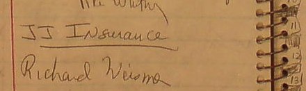
I’d thought that a two-month search for a missing Johns painting would leave a trace of some kind in the Castelli Archives, but if it’s there, I couldn’t find it. Once I had the April 15 date, I went through every page of the Gallery’s notebook and memo collection, as well as Castelli’s own daily calendar. There are lunches with RR, and finally, around June 11th, mentions of “JJ Insurance,” [little detail above] but otherwise, nothing.
There are plenty of mentions of insurance for all kinds of people in the archive materials, and other instances of JJ and RR claims–works were getting insured, damaged, assessed, and repaired all the time–so the mention above could be unrelated. But it does make me wonder if the claim for Johns’ Short Circuit flag painting was filed on behalf of Rauschenberg–or Johns? Does the practical fact that when it’s missing, Flag was being treated as an autonomous Johns painting affect how it should be seen art historically? In other words, can we thus assume it was a Johns painting, and not–or not merely–the raw material of a Rauschenberg combine?
Ed’s account also makes me curious about how widely known the 1965 theft–I guess we can call it that now–actually was. How many people were questioned? Did people gossip and speculate about it for a while? Who else knew? And was it registered as stolen with the appropriate industry databases? A year and a half, and I finally know the answer to that last question.
“Loss of Painting – American Flag – Jasper Johns”
The Maze (1967/XXXX), Tony Smith
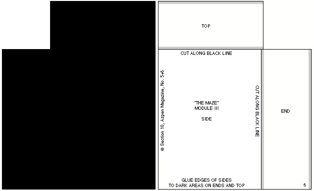
For issue 5+6 of Aspen: The Magazine in a Box (1967), guest editor/curator Brian O’Doherty conceived of a conceptual art exhibition in a box. [Which really should be staged in real space somewhere. Has it ever been?]
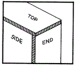
One of the first things you notice when you open the box is the little stack of cut and scored black matteboard, which is a make-it-yourself scale model of Tony Smith’s The Maze (1957 1967).1 When assembled, if any ever were, the pieces formed four monolith-like blocks, which were to be placed in an open rectangle:

As is clear from the drawings, “The Maze” was originally designed for a particular space. Thus the pathways around the pieces as well as through it are an integral part of the design. For this reason it is a labyrinth rather than a monument.
I did not think of the symmetry of the piece as I was doing it, but I happened to notice when making the drawing that the central part is a five-foot square; the part including all the passages is a ten-foot square; then if you take the extension along the room, it is a fifteen-foot square. So it is a lot of expanding squares.
On the other hand if you take different divisions, for instance if you take all these squares and carry them through, they make a grid which interpenetrates– the two sets of grids interpenetrate one another. In a certain sense it is a labyrinth of the mind. You can see that it becomes quite complex, but at the same time everything falls in very, very simply.
–Tony Smith
The Maze was designed for the exhibition Schemata 7, at Finch College Museum, May19571967. The above statement has been adapted from the catalogue.
The actual dimensions of the modules were 6’8″ by 10′ by 30″ (two modules) and 6’8″by 5’by 30″ (two modules). The models have been scaled down to fit in this box. The models may be set up standing free on neutral ground. They should be set up in accordance with the plan indicated in the drawing. Those who wish to reproduce the work in its original dimensions (in metal or wood) may do so.
The individual pieces may be cut from the enclosed cardboards by a matte-knife (e.g. the General 850 available at any art supply store) guided by a metal ruler.
The parts should be attached as indicated i.e. the appropriate edges should be opposed to the grey areas. (Elmer’s Glue All may be used). “White” edges should be darkened with ink or water color.
The drawing below may serve as a guide.
It’s been more than 14 years since I discovered Aspen; 5+6 was the first, and for a long time the only, issue I could find. And it’s almost ten years since I found the entire run of Aspen reproduced on Ubu.com, a move which brought Aspen out of unciteable obscurity. And now it’s more than two years since I cooked up auraprogettazione, a comprehensive [sic] exhibition of the rare examples of instruction-based art work that the artist actually gave permission to make. And yet I only just now noticed that Smith authorized reproduction of The Maze. Has anyone ever done so? Before me, I mean, because I just added it to the list.
1: UPDATE So yeah, I thought 1957 was an extraordinarily early year for Smith to have exhibited an installation of four matte black minimalist sculptures, and at Finch College or anywhere. So Ubu’s text is incorrect, and Smith’s Maze was shown in Schemata 7 at Finch in May 1967, right around the time Aspen was published.
ANOTHER UPDATE Grace Glueck’s May 14, 1967 review of the opening of Schemata 7 says the show’s working title was “Walk-In Sculpture,” and gave each of seven artists a chance to show their attitude “to scale and enspheric space.” Of The Maze, Glueck wrote:
The room is kept in a subdued light and, though the scheme is simple, a walk among these gloomy, primeval presences evokes the feeling of an endless forest.
Sounds like a wildly different experience from the toy-sized cardboard model.
In addition to Smith, Schemata 7 featured work by Les Levine, Ursula Meyer, Brian O’Doherty, Will Insley, Michael Kirby and Charles Ross. So far, I can’t find any installation shots of the original Finch version, but I’m on it.
UPDATE 3 And here’s John Perreault’s review of Schemata 7 for the Village Voice. He puts it in the context of pioneering minimalism shows like Primary Structures, which had just happened a few months earlier in 1966. Still no pics, though.
Things We Were Going To Do Are Now Being Done By Others.
And speaking of big universes and small worlds, I’m starting to listen to the 1991 recordings of John Cage’s Diary: How To Improve The World (You Will Only Make Matters Worse), and just ten minutes in, I’m reminded that Cage’s childhood friendship with the unorthodox-but-nearly-canonical Mormon scholar Hugh Nibley is the most unlikely Mormon/modern music connection since La Monte Young [grandson of Brigham].
Without intending to, I’m going from lake to lake
Salt air
Salt Lake
Hugh Nibley
I hadn’t seen him since high school days
I asked him what he thought about other planets
and sentient populations.
“Yes,” he said, “throughout the universe.
It’s Mormon doctrine.”
We’d said goodbye.
I opened the door of the car,
picked up my attache case,
and everything in it fell out on the grass
and the gutter.
His comment:
“Something memorable always happens.”
Which, hmm, if it only served to get me into a transcribing-and-posting mind for the next excerpt Cage read, then it’s worth it:
Things we were going to do
are now being done by others.
They were, it seems, not in our minds to do.
Were we or they out of our minds?
But simply ready to enter any open mind
any mind disturbed enough not to have an idea in it.
Big Universe, Big Data
Ross Andersen has a fascinating interview with JWST scientist Alberto Conti about the orders of magnitude increases in the amount of astronomical data being gathered these days:
There are two issues driving the current data challenges facing astronomy. First, we are in a vastly different data regime in astronomy than we were even ten or fifteen years ago. Over the past 25 to 30 years, we have been able to build telescopes that are 30 times larger than what we used to be able to build, and at the same time our detectors are 3,000 times more powerful in terms of pixels. The explosion in sensitivity you see in these detectors is a product of Moore’s Law—they can collect up to a hundred times more data than was possible even just a few years ago. This exponential increase means that the collective data of astronomy doubles every year or so, and that can be very tough to capture and analyze.
How Big Data Is Changing Astronomy (Again) [theatlantic]
Related: posts on the Palomar Observatory Sky Survey, an early decades-long attempt to photograph the universe.
The Daily Practice Of Painting, c.1915
ZOMG, I will never complain about the minor annoyances of painting ever again.

Brooklyn Bridge painters at work high above the city, on December 3, 1915.
via Alan Taylor’s archive-diving into the newly released digitized treasures of New York City’s Municipal Archives.
Canal Zone: Yes Kate Moss
Can you tell I’m trying to clear out the to-post photos from my desktop? In Februarry Christie’s sold an interesting, large Richard Prince Joke painting in London that was made in 2007. The date is significant for reasons that the lengthy catalogue description studiously avoids.
on closer inspection, beneath the dripping paint which adds such texture to the surface of Untitled (Portrait), it becomes clear that the entire background is comprised of images of the supermodel Kate Moss either topless or wearing a bikini top. Untitled (Portrait), then, is a contemporary palimpsest, a conceptual layer cake of imagery which allows Prince to juxtapose a range of seemingly discordant materials in order to play a complex game with the recognisability of celebrities from the art world and indeed the world in general: Pollock, Moss, and of course Prince himself.
The auction house namechecks Pollock, and goes on about Prince’s de Kooning paintings, which he’d just completed in 2007. But the action paint-on-tearsheet collage Kate Moss painting is very similar in medium and process to the first work Prince made from Patrick Cariou’s Yes Rasta photos.
Canal Zone, 2007, Installation shot at Eden Roc Hotel, St Barth’s, late 2007
The piece, actually titled Canal Zone (2007), consisted of a loose grid of 34 or so overpainted pages torn from Prince’s copy of Yes Rasta, mounted on a board, and exhibited in a small show at the Eden Roc Hotel in St. Barth’s over the Christmas/New Year holiday in 2007. Prince had purchased Cariou’s book at a local shop, and then began writing, sketching, and painting in it over the course of his annual visits to St. Barth.
The Kate Moss painting seems to have been made in a nearly identical way, from similar source material–reproductions of highly aestheticized, black & white photography–at about the same time. It’s not a stretch to imagine Cariou’s photos taken–or at least simulated–by Steven Klein, just more of the same genre Prince is already working with.
The Chickpea Conspiracy
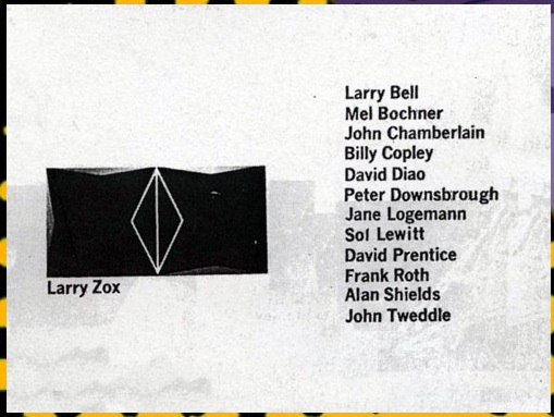
During the 1960s, Mickey Ruskin regularly let artists eat and drink for free or trade art for sustenance at Max’s Kansas City. So when Ruskin ran into financial trouble, artists rallied and held a benefit auction for the bar, on June 15, 1971. Celebrated customers such as John Chamberlain, Roy Lichtenstein, and Willem de Kooning eventually became part owners of the joint, a relationship which has become known as the Chickpea Conspiracy.
Last month, the thick, painty work on paper de Kooning donated was sold by its purchaser’s estate at Christie’s. It’s a bit of a mess, at least to my eye, perhaps not a drawing that de Kooning would miss as much as the Erased one. And it only made $338k against a $400-600k estimate, so I guess I’m not alone.
But anyway, point is, here is a section of the auction catalogue: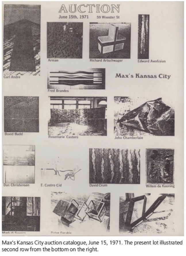
I though that was all, but the Max’s Kansas City website has additional catalogue images, and a barely overlapping artist list. Hey, look, there’s David Diao, who is the grownup in the Richteriana show:
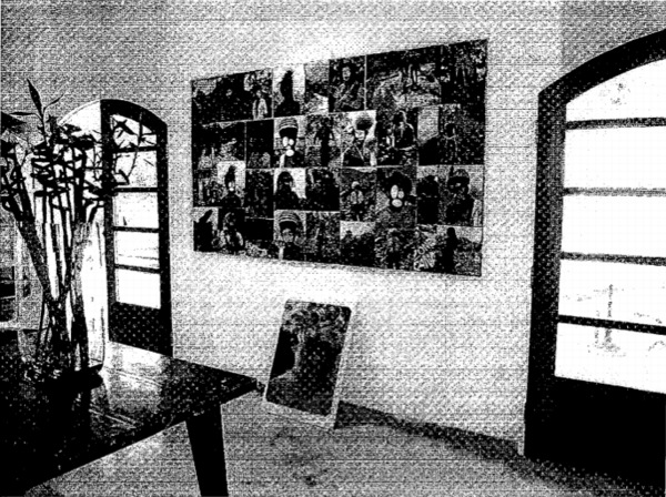
Richteriana, Postmasters Gallery, 12 May 2012
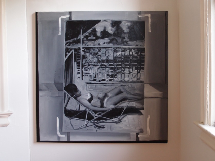
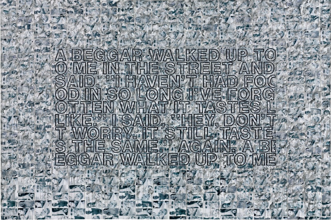
Destroyed Richter Painting No. 04, 2012, oil on canvas, 110x110cm
Postmasters is pleased to announce:
RICHTERIANA
GREG ALLEN, DAVID DIAO, RORY DONALDSON,
HASAN ELAHI, FABIAN MARCACCIO, RAFAËL ROZENDAAL
May 12 – June 16, 2012
opening reception, saturday, may 12, 6-8
Postmasters‘ new exhibition Richteriana attempts to examine the current canonization of Gerhard Richter, presenting six artists whose works pre-date, update, expand, and subvert “the greatest living artist’s” own.
…[snip much amazing thinking and description of great artists and their work]…
Greg Allen’s Destroyed Richter Paintings channel the elder artist’s own private documentary images back into the photo- based painting feedback loop he once deemed “photography by other means.” They reproduce the experience of encountering Richter’s lost originals, while becoming new objects themselves. By engaging the sprawling Chinese photo-painting industry that has grown up in Richter’s wake, Allen forefronts the market’s incredulous perception of the artist’s autonomy–and his right to declare or destroy his own work.
More to come, obviously.
Previously, related:
a destroyed Richter/Palermo collaboration
“I am practising photography by other means.”
On repainting Gerhard Richter
Overpainted vs Destroyed Gerhard Richter
Fingerspuren
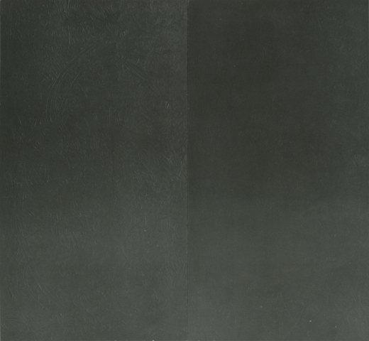
Fingerspuren/Finger Marks, with Palermo, 1970, image via gerhard-richter.com
Despite an 11-year difference in their age, Gerhard Richter and Blinky Palermo became fast friends in the early 1960s. Richter’s first wife Ema sewed Palermo’s groundbreaking Stoffbilder/Cloth Pictures starting in 1966, and Palermo influenced Richter’s move towards readymade abstraction with the Color Chart paintings.
In 1970, while Palermo was studiosurfing among his Dusseldorf friends, he painted the first stencil/multiple version of his blue triangle over Richter’s door. And then the two artists collaborated for the first time, on a painting.
Or rather, two paintings: Fingerspuren (Fingermarks) was a grey monochrome diptych, painted by hand, one side by each artist, that formed a 2-meter square whole. Palermo’s canvas is the much busier one on the left.
In Dia’s 2009 book on Palermo’s masterpiece, To the People of New York City, Christine Mehring wrote about Fingerspuren:
It is tempting to see this as a manifestation of what many believe are differences in the artists’ temperaments: Richter’s more calculated, meticulous manner of painting versus Palermo’s more process-oriented practice…It seems more likely that Palermo’s disarrayed, isolated marks are gestures of self-assertion. After all, the gray monochrome was the domain of Palermo’s friend, who furthermore relayed that the diptych originated from his own working on a gray monochrome and asking Palermo to “join in, and make one too.” Fingerspuren remained a merely semi-collaborative beginning to Palermo and Richter’s collaborative period.
This collaborative period was at its peak in 1971, when the duo’s painted wall and sculpture installation was shown at Heiner Friedrich’s gallery in Cologne, and when Fingerspuren was included in Richter’s first major retrospective at the Kunstverein in Dusseldorf.
I haven’t been able to find any info on the when or the how of Fingerspuren‘s subsequent destruction, but maybe its merely “semi-collaborative” nature accounts for some of the why.