Creative Time And The Afro-Icelandic Liberation Front

afro_icelandic_boeskov.jpg
Danish artist Jacob Boeskov flew to Lagos, Nigeria to make and star in a short action film he wrote titled, Dr. Cruel and the Afro-Icelandic Liberation Front with the noted Nollywood director Teco Benson. The film was produced by Creative Time Global, a new series of international initiatives launched this year by the NY public art organization.
Nollywood is known for its vibrant, near-zero-budget film industry, which should probably be called a video feature industry, since HD, DV, and even phonecams are the norm, and everything goes straight to the street on DVD. Dr. Cruel premiered in May in New York, but Creative Time recently posted Boeskov’s production diary online:

It has been a long day and Teco has surely delivered. He really is the finest action director in Nollywood. We have filmed chases and fights. I have destroyed a pair of my pants in one of my amazing stunt moves. He has been great to work with. He has an ability to make actors and crew feel good, even when he shouts at them. But it is late now and everybody is tired.
Just as we’re wrapping up a scene, I hear the sound of a generator dying and the room goes black. The production manager runs down to the street to look for black market fuel. There is a fuel crisis in Nigeria because of the absence of the president and… well, it’s a long story.
I go to the window and light a cigarette. The room is dark, lit only by the cell phones from the actors and the crew. The mood in the room is intense, but okay, I guess. People talk low, or are silent. The production manager is back, looking triumphant. He has managed to buy some fuel in the street, and the generator is running again. The lights are turned on. Back to work.

It all sounds a little crazy, but interesting. Here’s the trailer:

Dr. Cruel and the Afro-Icelandic Liberation Front [creativetime.org via @annepasternak]

I Didn’t Know ‘What I Did On My Vacation’

kaprow_gas_southampton.jpg
Holy smokes, Gordon Hyatt, I didn’t know what you did 44 summers ago.
Among the episodes of CBS’s news program “Eye on New York” which were acquired by The Museum of Modern Art in 1967 for their Television Archive of the Arts is “What I Did On My Vacation,” which, wow. It was a series of Happenings. In the Hamptons. Conceived and produced for television, by television.
According to Jeff Kelley’s Childsplay: The Art of Allan Kaprow, the producer of “Eye on New York,” Gordon Hyatt, approached Kaprow in the summer of 1966 with the idea of staging a series of Happenings across the Hamptons over the course of an August weekend:

The general idea for Gas, which was largely conceived by Hyatt (and supported in part by Virginia Dwan of the Dwan Gallery), was to interject a series of Happenings into the leisure activities of summer vacationers and locals, who would presumably be caught unawares as they disembarked at the railroad station, took the ferry, swam at the beach, and so forth.

Kelley’s exhaustive recounting of Kaprow’s Happenings is invaluable for getting a sense of what actually happened, but it’s also full of uncritical assertions, revisions and spin. It’s almost as if Kaprow was trying to distance himself after-the-fact from a TV spectacle he readily agreed to, but which he later came to regret. Interesting.
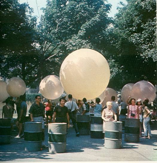
Gas began on Friday August 5th. A parade of oil drums, weather balloons, and homemade hovercraft met the city crowd as the LIRR pulled into Southampton. [photos are documentation by burton berinsky, not stills from the show] On Saturday, Kaprow brought bands, smoke bombs, and skydivers to Coast Guard Beach [now Atlantic Avenue Beach] in Amagansett, where Frazier inflated a giant black phallus of a skyscraper-shaped balloon. Or as the flyer put it, “Procedure: Children and adults may help release helium balloons, frug on the beach, help to start plastic skyscraper, swim.” [Note: If you think you might retell this story sometime, frug is pronounced froog. It is the ultimate White Guy Shuffle.]
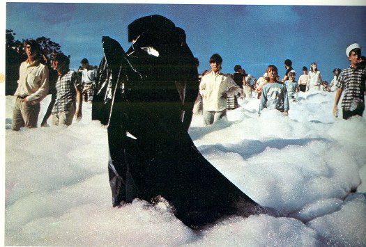
From Amagansett, the Happening crew hustled out to Montauk Point, where the fire department was waiting to pump gallons of flame-retardant foam over the cliffs and onto the beachgoing audience.
kaprow_gas_springs.jpg
On Sunday, after arranging for three bedsful of nurses to meet the Shelter Island ferry, Kaprow staged two decidedly North-of-the-Highway Happenings in Springs for the kids: a car painting picnic at the auto junkyard, and a foam-filled relay race at the town dump. Alastair Gordon, who was 13 at the time, wrote about participating in the dump event in his awesome book, Spaced Out: Radical Environments of the Psychedelic Sixties, which was excerpted in the Easthampton Star in 2008:

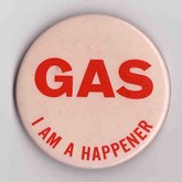
gas_happening_agordon.jpgSomeone was barking through a megaphone: “Keep moving . . . not too fast . . . don’t look at the cameras. . . .” We were told to move deeper into the sandy pit, slowly, toward a group of people wearing black plastic capes at the bottom of the slope. We wore pink buttons that read “GAS — I’m a Happener” and blew whistles as we marched downward. Stacks of multicolored oil drums were pushed from a ledge, and we were told to roll them back up the slope through the sea of firefighting foam.
I guess I was too young to pick up on the sexual allusion at the time, but the foam felt weirdly comforting as it oozed around my ankles and bubbled up to my waist. Mud stuck to the drums and made them difficult to roll, but we kept pushing because there were men with cameras, and we were going to be on TV.

Though they should have been obvious going in, Kaprow’s problems with Gas seem evident in Gordon’s account: the Happening didn’t just ‘happen,’ it was staged and performed for cameras:

Though nearly everyone, including Hyatt, deemed Gas a success, Kaprow saw it as a reversion to theater. It was a string of “spectacular” Happenings intended more to be seen than enacted, both during the events and on television.

The feedback loop Kaprow loved had been replaced, he found, with

the false feedback of narcissism on a mass-media scale, in which the culture, through the mirror of television, watches itself having a gas.
In the end, the experiment failed because Gas participated in the popular cliches of what Happenings were.

And the avant-garde was inextricably linked with the leisure entertainments of affluent youth. All of which, well, guess what? Whatever Kaprow’s later regrets about it, Gas seems like a peculiar, even unique experiment in corporate-avant-garde collaboration. And the involvement of Hyatt, a member of MoMA’s Junior Council and Dwan in the transform “What I Did On My Vacation’ from arts journalism into public art.
At the very least, it’s a vast improvement over the cliche-ridden, made-for-TV art happenings they’re throwing up these days. [OR. Does good Art-for-TV really just equal failed Art-for-TV + time?]
“What I Did On My Vacation” was shown at Hauser & Wirth’s Kaprow restaging last year, but I can’t find it online. No problem, though, because the National Film Network has a DVD for just $22.
“What I Did On My Vacation” aired on WCBS on Sunday, September 11, 1966.
Vintage coverage from TIME: Gas: Happenings in the Hamptons [time.com]

MoMA, CBS And The Responsive Eye


After watching the first segment at maryandmatt’s blog, I was hooked. Mike Wallace, shooting a 1965 episode of WCBS news show Eye on New York in and about The Museum of Modern Art’s blockbuster exhibition of Op Art, “The Responsive Eye.” [Part 2 and Part 3]
The music, by Specs Powell, a jazz pianist and percussionist who was on staff at CBS, is as stunning as it is jarring. I kept waiting for irony, or Mondo Cane-style sensationalism, or–worse and more likely–the snide philistinism of Wallace’s future 60 Minutes colleague Morley Safer, who infamously sandbagged contemporary art in 1993, resulting in, among other things, Glenn Lowry’s awesome shutout of Safer from covering the Museum’s 1998 Jackson Pollock retrospective. But there was absolutely none. The entire show was serious and straight-up. Part 3, particularly, focuses on arts coverage in the media, and media’s culpability in hyping, distorting, or even fabricating trends for their own purposes. I can almost imagine the pitch meeting for “Eye on New York” as a rebuttal of Time magazine’s dismissive coverage of “Op Art.” “Responsive Eye” curator William Seitz nails it when he kind of laments to Wallace about the impact of superficial arts coverage:

And this, in a sense, does worry me, because it is really, an impact of a–
Well, it’s really the absorption of modern art into modern life. And that’s something we all wanted, but, uh, it may change the character of the art a bit, too.

But should this be at all surprising? CBS’s founder Bill Paley was the Modern’s president at the time. Already a long-time trustee, Paley was tapped by David Rockefeller for the position in 1962, and to succeed him as the first non-family chairman in 1968.
cbs_logo.gifA couple of folks on Twitter have suggested, rightly, that MoMA should screen this awesome program. As it turns out, they already have been, since 1967. That’s when the Museum’s Junior Council announced the creation of a Television Archive of the Arts, a three year effort which had actually begun identifying, reviewing, and acquiring film and television media about art and artists in 1964. The Archive began when museum officials learned that some of the films and tapes–they don’t say which–were in danger of being destroyed or lost.
The Archive was to be housed and made available in the new International Study Center, which was under construction. [It’s now demolished, but it stood on the west side of the sculpture garden, about where Taniguchi extended the glass corner of Cesar Pelli’s tower. It’s funny to remember a building and space so clearly, only to realize that not only is it gone, it’s just as likely no one knows what you’re even talking about.]
The PDF archive of MoMA’s press releases is absolutely incredible, by the way. Here are the announcement of the Archive, and the initial checklist. The first 64 programs from ABC, CBS, NBC, National Educational Television, and NYC’s Channel 13 included dozens of artist interviews and documentaries.
One thing that stands out, though, is that only CBS, and only programs like “Eye on New York,” donated their own archive of complete interviews and extra footage. Maybe this was because Gordon Hyatt, the producer, was also on the Junior Council’s committee which put the archive together.
I’m probably long overdue to point this out, but this is really why I’m writing this post: for almost ten years, I was the co-chairman of MoMA’s Junior Associates, which is the successor group to the Junior Council, and I joined the Film Department’s committee after stepping down. And yet so much of this history is completely new to me. So much of the Museum’s activities and programs are professionalized now, but I can still recognize the deeply ingrained culture of, for lack of a better word, “amateur” involvement. It’s really rather remarkable, and it has been for a very long time.
[maryandmatt.net, thanks andy]

CityLAB’s Duck & Cover

cityLab-duck_cover_gmap.jpg
And in other Venice Biennale of Architecture exhibition news: cityLAB, Dana Cuff and Roger Sherman’s architecture think tank at UCLA, is also in the US Pavilion show, Workshopping. One of the projects they’re apparently showing is called Duck & Cover, which appears to be a community garden in the form of a giant Google logo visible from Google Earth.
Looks awesome, but wait, are those mirrors up there? Magnifying glasses? Spiral escalators to nowhere? Also, isn’t the G a little self-referential for Google? I’d think they could get ‘er done quicker if they sell the structure’s shape to the highest bidder. Or make it a Q for Quimby.
cityLAB [workshopping.us]
previously: heads up: roof as nth facade

How To Make A Biennale Pavilion Architectural Intervention

mos_def_satelloons.jpg
MOS, of the PS1’s woolly mammoth carcass MOSes, is one of seven architecture firms and collaboratives included in “Workshopping: an American Model for Architectural Practice,” at the Venice Architecture Biennale. The exhibit is curated by Michael Rooks of the High Museum and Jonathan Solomon of 306090.
mos_venice.jpg
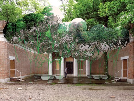
The idea is to creat a canopy of spherical Mylar weather balloons in the courtyard of the US Pavilion. From MOS’s project text:

if you’ve seen the structure, i’m sure you’re wondering, ‘why is it made out of helium balloons, why does it make a canopy, why is there seating, etc… is it referencing other projects? is it analogical? is it utopian? is it micro-? is it urban? is it domestic, what is it? is this even architecture?’ (unfortunately, we can’t answer that last question. this type of project is like diet-architecture, a copy without the calories. it’s got a sort of bitter aftertaste that you might grow accustomed to, or you might not. that’s ok. we like fake architecture.)
we’ve been wondering, what kind of architecture would haruki murakami make? well, when we finally write our text we would definitely tell you that it does, indeed, mean something and it does reference things, but why would you really want to know all of that anyway? do you really think it would make it better? I mean, what about just enjoying this weird artifice, this fake social space? hey, it wiggles. look at this strange alternate environment made of reflections and repetitions. enjoy the visual noise. have you ever seen N.A.S.A.’s echo project? google it. what can we say, we just love the aesthetics of radar reflectors and inflated satellites. they are of another reality. seriously, even if we wanted to fully explain it to you at this very moment, we couldn’t. even though we’re trying not to be, we’re only human. also, they need this text before we’ve finished the design. did we mention that we are working with the son of andy warhol’s ‘silver clouds’ fabricator? we’re very excited about this. he lives in duluth. [emphasis added because, well]

So just Google, aesthetics, and a flip three degrees of Andy Warhol reference and voila, instant pavilion! I can’t wait to see what their actual text is. The exhibition opens Thursday.
MOS, Instant Untitled [designboom, thanks john]
Workshopping.us [workshopping.us]

If You Can’t Say Anything Nice, Come Sit For Me

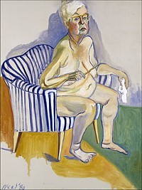
neel_selfportrait.jpgI watched the documentary Alice Neel last night, made in 2007 by the late artist’s grandson Andrew Neel. It’s pretty good, definitely worth a watch. Documentaries by family members come with a whole set of conflicts and challenges baked in, but Neel succeeds, I think, at identifying the craters and unexploded mines as he maps out the family’s emotional landscape.
Neel’s story is intense–John Perreault, variously a critic, colleague, friend, and sprawling nude subject of the artist, thinks it’s long overdue for a Hollywood adaptation–and it’s hard to imagine that the definitive significance of the paintings left behind is somehow “worth” the suffering and abuse and privations endured by Neel’s kids (and grandkids). But then, that’s not a fair tradeoff. Neel’s rightwing son Richard is right to recognize that if it weren’t this set of problems, it would’ve been something else. Neel had to make her art; it was an obsession, really. And being able to make it, Perreault argues, made Neel a “better mother (and person) than if she had lived a horrid life of creative frustration. And took it out on her sons.”
But that’s not the point. I mean, it is, but what I was wanting to post was the hilarious interview with Alex Katz, who Andrew effectively cast as “Figurative Painter #4,” When Katz finally manages to stop talking about his own work and how actually, he was doing whatever it was Neel was doing, only earlier, all he can say about Neel is that she was “an angry housewife.” You stay classy, Alex.
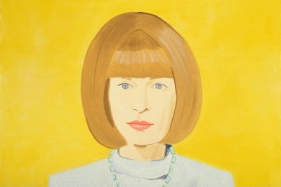
While Googling the quote, I found thanks to Time Out London, that Neel and Katz are having a portrait facedown at the moment. Though it’s hardly a fair fight. The Whitechapel Gallery’s having an Alice Neel retrospective, while Katz is showing new work at the National Portrait Gallery, including this lovely work, his portrait of Anna Wintour.
Alex-Katz-Anna-Wintour.jpg

Paint Stick? Painting Crop?

Dear painting experts,
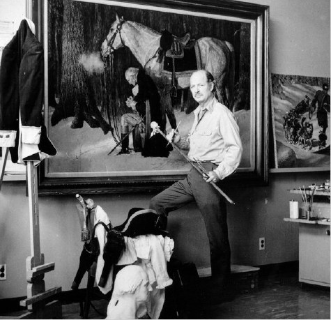
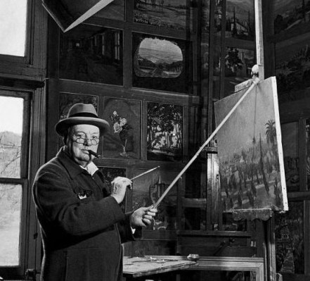
Please tell me that the brush-steadying stick with the sock on the end which is so vital to the painting process that it must be included in Serious & Important Photographic Portraits of such artists as Arnold Friberg and Winston Churchill has a venerable and esoteric name. And then please tell me what that name is. Thank you.
friberg_paintstick.jpg
church_paintstick_life.jpg
And awesome. Mahl stick. Here’s a lyrical history. Thanks, Jason!
images: Deseret News via NYT; life mag via acontinuouslean]
Related: Norman Rockwell, Triple Self-Portrait

On The Set With Grenada Invasion Re-Enactors

Awesome. The Ronald Reagan Presidential Library contains several elaborate sets where visiting elementary school students re-enact the invasion of Grenada. “[I]n keeping with Mr. Reagan’s first career as an actor,” the Wall Street Journal writes, presumably without irony, “the Reagan Library appears to have the most elaborate stage sets [of any presidential library.]” The sets include an Oval Office, the White House press room, and Air Force One:

The replicas are built to three-quarters the size of the originals, and decorated as they were in 1983. The mock Oval Office has pictures of Mr. Reagan and Nancy Reagan on their wedding day, replicas of Mr. Reagan’s favorite horse sculptures and jars of jelly beans.

Also:

Making a 27-year-old invasion relevant for today’s children isn’t always easy. Kids have to be told what communists are, and why Grenada becoming a communist country would have been a big deal.
The reenactments are part history lesson, part interactive game. The kids decide whether or not to invade, how to carry out an invasion, even how to deal with media leaks.

Apparently, the re-enactment only works with elementary and middle school students. Too many high school students reject the invade-or-negotiate-with-communist-dictators script, which was written by a 25-year-old screenwriter.
At Reagan’s Presidential Library, the Kids Are in Control [wsj via @demilit]

In The Medium Of Google

I know that what’s really needed around here is a redesign, and probably the addition of a few thousand tags. But right now that’s an 8th burner project, and I’ve only got a 4-burner stove.
But in the mean time, I’ve noticed–and perhaps you have too?–that many projects and ideas around here relate in some way to Google, and to the way Google shapes our perceptions and interactions with the art, architecture, information, people, and the world.
So I rolled it all up into one, big Google category. Besides my own projects, it ranges from this morning’s post on Michael Wolf’s photos; to the whole sculpture and roof facades on Google Maps thing; to my 2005 attempt to re-create Ed Ruscha’s Every Building on The Sunset Strip using the failed Street View predecessor, Amazon’s A9; and all the way back to my early 2002 experiments with Google AdWords poetry, and to my Jan.. 2002 request for permission to use the word “Google” as a verb in my first short film. Weird, interesting stuff.
greg.org/google/

Michael Wolf, Street View Photographer

michael_wolf_manh1.jpg
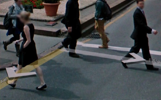
I’m glad and not surprised to see I’m the only person using Google Street View as an artistic source. Since at least last year, photographer Michael Wolf has been making a series of Street View-based works that explore urban life as it’s experienced, seen, and transmitted.
Wolf roams Google Street View in classic street photographer tradition, searching for the hidden, the unexpected, the sublime, the beautiful, the overlooked, images which reveal something about the character of a city and its residents. So far, he’s done Street View Manhattan and Street View Paris.
michael_wolf_manh2.jpg
According to his Amsterdam dealer, Galerie Wouter van Leeuwen, where he showed this Spring, Wolf has spent over 400 hours searching Street View, which sounds like a direct translation of street technique to the virtual world. His careful cropping and composition, too, resonate with street photography’s quest for stolen, fleeting, magic images.
michael_wolf_paris1.jpg
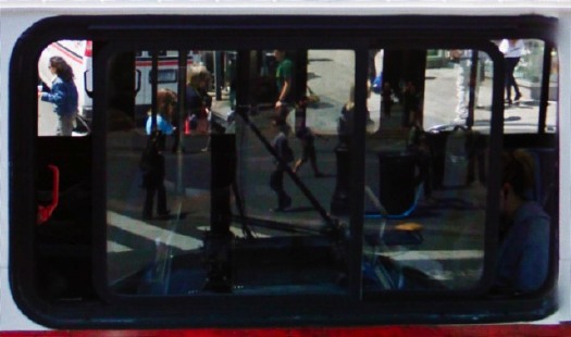
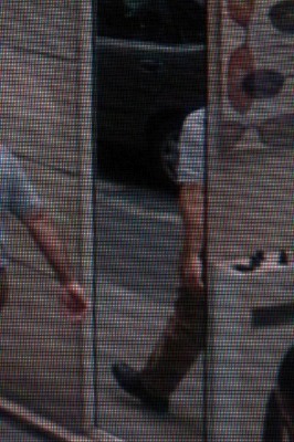
Some of his images carry Street View’s trademark aesthetics: blurred out faces [but not as many as I’d expect], navigation overlays and cursors, and occasionally the fractures and distortions of the pano image knitting algorithms. From the prominence of the screen pixels, it looks like he actually reshoots images on his screen, or as one press release put it, “pictures of pictures.”
His series Street View A Series of Unfortunate Events looks like archetypal on-the-scene photojournalism, only stripped by any news or context other than place. Though Wolf himself eliminates any place specifics or links, leaving each image to stand on its own.
michael_wolf_paris2.jpg
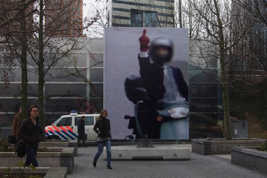
In March, the photography museum FOAM and the Virtueel Museum Zuidas staged an exhibition of Wolf’s Paris Street View photos on the street. Giant prints were placed around Gustav Mahlerplein, a plaza in a modern culture and office complex on the ring road south of Amsterdam. Unfortunately, no images of the exhibition have made their way back into Google Maps.
michael_wolf_foam_ams.jpg
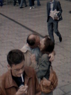
While Wolf’s quote of Robert Doisneau’s Hotel de Ville kiss is the most obvious, my favorite throwback images are like the ones here, where he finds in Google layers of reflections and perspectives that’d do Lee Friedlander and Harry Callahan proud. Really beautiful stuff.
Michael Wolf photography [photographymichaelwolf via things magazine]

Casting Long Shadows

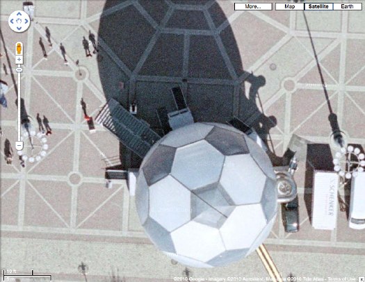
This has been sitting on my desktop since last month, when Google Maps announced the addition of 45-degree Aerial View imagery for new locations, including Dortmund, Germany.
dortmund_gmap_geodesic.jpg
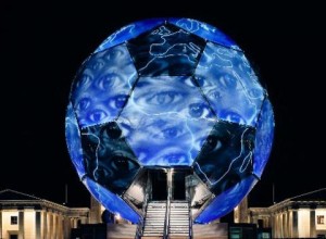
So I clicked over to Dortmund, and zoomed in there to the central platz [Friedensplatz, actually], just getting more and more psyched to see that sweet-looking geodesic soccer ball pavilion up close, and then poof, at the last minute, the final zoom, the Aerial View showed up, and it was from much later. The soccer ball was gone.
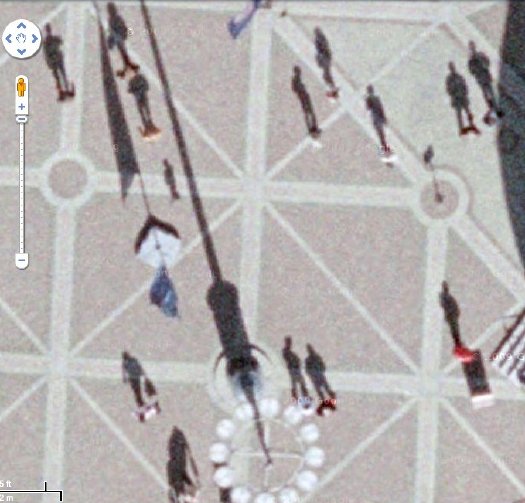
But then I forgot all about Google’s 45-degree View when I saw the sun doing it for me. These attenuated morning shadows are just awesome. Like 19th century silhouette portraits as reimagined by Giacometti–and shot from outer space.
dortmund_gmap_shadows3.jpg
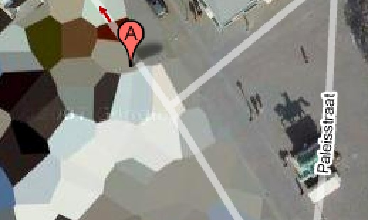
Which reminds me of the statue of a horse and rider in front of the Noordeinde Paleis in The Hague, the first building I saw on Google Maps which had been obscured by the Netherlands’ unique polygonal camo pattern:
noordeinde_gmap_shadow.jpg
[An update on those Dutch Camo Landscape paintings I was talking about making: I’m still going to do it. One thing I’m very glad for is taking all the screenshots I need for the images I want. I first noticed the changes last winter, but now every the camo on site I’ve mentioned on greg.org has been replaced with typical square-pixel obscuring. Functionally, the camo still works, but aesthetically, it’s a real loss.]
Now about that ball: It is probably better known to the millions of soccer fans in Germany as the WM-Globus. It was conceived in 2003 by artist/musician/actor André Heller, who ran the cultural and arts program for the Deutscher Fußball Cultural Foundation. Described by Heller as a “consulate of anticipation,” the Globus was sent on a 1000-day, 12-city tour in advance of Germany’s hosting of the 2006 World Cup. It’s 18 meters high, weighs 50 tons. Two interior floors contained football memorabilia and multimedia installations, while the pressurized scrim exterior contained an LED map and nightly light shows. Lighting effects designer Anthony Quodt has several articles on the making of the WM Globus and its specs on his site, lightlife.de. Too bad it predates the YouTube era, because the stills look like a hot, glowing mess.
globus_quodt_lights.jpg
After the World Cup, a Hamburg entrepreneur named Dr. Alexander Extra purchased the Globe from the DFB for EUR300,000, with plans to transform it into a permanent museum of sports culture, the Sporteum. Alas, no money was forthcoming, and the Sporteum failed to materialize. So Dr. Extra put the Globus on eBay last summer. Which turns out to have been a bad time for the geodesic soccer ball-shaped pavilion market, because bidding stopped reached just EUR50,000. The unidentified buyer was reportedly also from Hamburg, so I expect it’s still sitting in the warehouse, but I’ll look into it.

Voice Of The Taxpayer (1990) By John Czupryniak

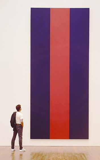
newman_vof_ngc.jpgWhen it was publicly announced in March 1990 that the National Gallery of Canada had purchased Barnett Newman’s 1967 painting, Voice of Fire for $1.8 million (Canadian), there was an immediate press and political uproar that so much public money would be spent on what seemed like so little. A conservative MP, who was also a pig farmer, challenged that anyone with “a couple of cans of paint, a roller, and ten minutes” could make Newman’s 18-ft tall bands of red and blue.
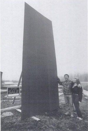
Greenhouse owner and house painter John Czupryniak’s wife Joan, upon seeing the news reports, told him, “Hey, anyone could paint this, even a painter.” And so he did.
Mr. Czupryniak studied reproductions of Voice of Fire and because he was unfamiliar with canvas painting techniques, he built up a 16×8 panel of plywood, and made a full-scale replica of Newman’s work. He struggled with the title before arriving at Voice of the Taxpayer.
Thumbnail image for voice_of_taxpayer_ott_cit.jpg
Then he offered it for sale. The government price was $1.8 million. For you, though, or any Pierre off the street, it was just $400, the cost of time and materials. Almost immediately, Voice of the Taxpayer became part of the art controversy. The picture of the Czupryniaks posing with the [for sale] painting was published in The Ottawa Citizen.
In the art world’s critical self-examination of the Voice of Fire controversy, noted art historian Thierry du Duve published an essay, “Vox Ignis, Vox Populi,” in the Montreal art journal Parachute which focused on Mr. Czupryniak’s response. It is awesome:

Like many avant-garde painters, Czupryniak paints against. A transgressive gesture along the lines of Dadaism, Voice of the Taxpayer assumes its full significance only in diametrical opposition to the tradition it attacks. A postmodern parody of modernism’s celebrated flatness, Voice of the Taxpayer is a quote, a pastich that appropriates the work of another, empties it of its meaning, and presents itself as a critique of ‘the originality of the avant-garde and other modernist myths.’ Better still, in its abstract guise Voice of the Taxpayer is a real allegory of the art world as institution, neither more nor less than Courbet’s L’Atelier du peintre. Is it a bad painting? No it is bad painting, if you get the difference.
It is actually a subtle and refined conceptual piece whose feigned innocence makes the emperor’s new clothes visible to all. The “indispensable vulgarity’ (Duchamp) of its title provokes the return of the repressed of the sole ‘convention’ that modernism forgot to deconstruct, the money of the people on whose back the elite builds its culture. In short, Czupryniak has got it all: he is more provocative than Rodchenko, more sarcastic than Manzoni, more strategic than Buren, more political than Haacke, more nationalist than Broodthaers, more demagogical than Koons, more neo-geo than Taaffe, all this with Duchamp’s caustic humour, and sincere to boot!

It is an epic of art criticism. Or maybe Parachute was punked by the theorist’s smartalecky brother, Jerry du Duve, I can’t quite tell. Whichever du Duve, he, too, expressed his doubts:

The critical interpretation of his Voice of the Taxpayer which I gave above is perfectly plausible, and that’s what worries me. A perverse and cynical art historian, I would have appropriated Czupryniak just as he appropriated Voice fo Fire. I would have taken a painter and made him into an artist, an ‘artist in general.” But I am not interested in defining an artist in this way.

Oh wait, never mind! Du Duve suddenly flips [“I only played at being cynical to show you how absurd it is.”] and makes an argument for Voice of the Taxpayer based not in cynicism, but in sincerity. Czupryniak “emulated Newman by simulating him just as Newman had emulated Mondrian by painting against him.” In fact, Voice of the Taxpayer embodies what du Duve calls “the fundamental ethical meaning of the ‘reductive’ aesthetic governing Voice of Fire, as well as all great modern painting” [italics in the original, bold added because, holy smokes!]: painting that demonstrates its true universality precisely because “anyone can paint this, even a painter.”
expo67_flag_lifemag.jpgDu Duve then considers at great length how Mr. Czupryniak’s pricing scheme deftly maps out the incongruities between artist and painter, value and worth, elites and the public, boss and laborer, exploiter and exploited. Every dollar between $401 and $1.8 million, he writes, accrues to Newman’s status as an artist as perceived by the cultural elites–and as extracted by them for their own aesthetic pleasure from the unappreciative public [the Taxpayers] who got stuck with the tab.
I’m surprised du Duve doesn’t mention it, because I can’t stop marveling at how Mr. Czupryniak’s project maps so closely with Newman’s and the creation of Voice of Fire.
Newman, a celebrated artist was invited by his government, to make a work almost to spec, for which he received $423.60 to cover the cost of materials. But not his labor. Instead, his contract with the USIA guaranteed him full control over the painting’s “equity,” which his wife went on to monetize rather successfully. I guess we should add Voice of the Shareholder to the chorus.
What is the fate of Mr. Czupryniak’s historically important masterpiece? Did he sell it? Did he keep it? Does it still exist, perhaps turned into a red and blue storage cabinet in the nursery? In 20 years, no one seems to have asked, so I have put in a call to find out. Stay tuned.
Thierry du Duve’s “Vox Ignis, Vox Populi” was reprinted in the 1996 anthology, Voices of Fire: art, rage, power, and the state. Buy it from Amazon, or try to read the essay in Google Books’ preview mode.
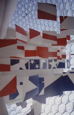
[image right of Ivan Chermayeff’s Newmanesque flag panels in Buckminster Fuller’s US Pavilion at Expo67: Mark Kauffmann for LIFE]

Flame Canada

newman_voice_of_fire.jpgSpeaking of National Gallery of Canada upheavals, Walrus Magazine, late-career post-minimalist kitsch, and Blake Gopnik:
In March 2010, Walrus celebrated the 20th anniversary of longtime NGC contemporary curator Brydon Smith’s purchase of Barnett Newman’s towering 1967 painting, Voice of Fire for $1.8 million, which was apparently a lot of money, even in Canadian. The announcement [of the price] set off a political firestorm of conservative, populist wrangling and hearings. It was Canada’s own homegrown version of the American Right’s culture war on the NEA, the NGC’s most famous controversy.
Well, famous in Canada, anyway. As Greg Buium noted in his article, “Firestorm”:

Internationally, the affair caused barely a ripple. Art in America published a short news story. Blake Gopnik, chief art critic at the Washington Post, was then a doctoral student at Oxford and only heard about it from his family back home in Montreal.

And here I am agreeing with Gopnik again! Awkward! Newman painted Voice of Fire for “American Painting Now,” Alan Solomon’s exhibition in the Buckminster Fuller dome at Expo 67. Which I wrote about and dug into rather deeply last October. I even quoted from Voices of fire: art, rage, power and the state, a 1996 anthology of the controversy, and yet I’d forgotten it until reading Buium’s piece. [Maybe it’s just me.]
According to Smith’s account of the making of, Newman’s painting, 8×18′ high instead of 8×18′ wide, Voice of Fire was designed to Solomon’s request for “very large,” vertically oriented paintings able to “hold their own” in a “soaring airy structure” and amidst a lot of visual “competition,” and which, because of the steady movement of crowds through the pavilion, “visitors would not be able to spend long periods looking at.”
Smith also wrote about having spontaneous discussions with Annalee Newman about her husband’s “concern at that time about the undeclared war in Vietnam,” a concern which hovered over the entire pavilion project. Co-editor John O’Brian quoted Solomon as saying, “Given world conditions at the moment, [the plan is] to soft sell America rather than show our muscle.”
Yeah, capitalism, but I’ve always thought Voice of Fire was the best painting of Newman’s weakest period, the hard-edge acrylics, which filled the last big gallery of Ann Temkin’s Philadelphia Museum retrospective. [Hold on, I’m trying to forget that triangle-shaped canvas all over again.]
A late-period acrylic, made to order by an ambivalent artist for a drive-by spectacle designed to distract from the war. With stripped-down, hard-edge abstraction that provides the perfect symbol for anti-intellectualist critics of the art world’s shenanigans. It all sounds like a prime candidate for Blake Gopnik’s Kitsch You Didn’t Think Of! list.
And yet he left it off. With such political savvy I predict a bright future in Canadian art politics for Dr. Gopnik.