FROM CADY NOLAND 7/18/14 THIS IS NOT AN ARTWORK &c., &c. A fax sent to collector Scott Mueller, filed by the artist in US District Court, as part of her lawsuit over the unauthorized refabrication of her 1990 sculpture, Log Cabin Facade
Five years ago today, Cady Noland learned that her 1990 sculpture Log Cabin had been destroyed and refabricated in Germany without her authorization, and that the new version (or whatever it was) had been sold to a “mystery client,” Cleveland collector Scott Mueller.
Mueller had a buyback clause in his purchase agreement, allowing him to unwind the transaction and receive his $1.4 million back if the artist contested or rejected the authenticity of the work. Which is exactly what happened. Mueller had to sue Galerie Michael Janssen to get his money back (which he presumably did; the case was ultimately withdrawn.) But in 2017 Noland, who had not been a party to Mueller’s dispute, but rather its subject, filed a copyright infringement claim against Janssen and collector Wilhelm Schürmann, for the unauthorized replication and distribution of her artwork.
Artistically, one would think it hinges on the artist’s determination of the conceptual nature of the sculpture Log Cabin Facade. Because they had a blueprint, Schürmann et al apparently figured they could refabricate the work as needed, no problem. That turns out to not be how Noland conceives of the work, however; her court case emphasizes the importance of the original logs she ordered from Montana, the stain she later instructed Schürmann to apply, and the 25 years’ patina the sculpture acquired. All of this was destroyed and replaced without her knowledge.
The document read here is one of the most recent filings in the case. It is a memorandum from the artist (via her lawyer) arguing against the defendants’ motion to dismiss her complaint, which has been amended and re-argued three times in three years.
Her claim is fairly atypical, and complicated, and Noland’s interpretation of copying, and fair use is, if successful, probably a net negative for the culture. The Office of Copyright’s denial of copyright registration to Log Cabin, however, feels like an egregious error.
This recording was made on the beach at Emerald Isle, North Carolina. The waves end up sounding like traffic to me, unfortunately, and into what seemed like a pitch black, silent night, some neighbors brought dogs and fireworks.
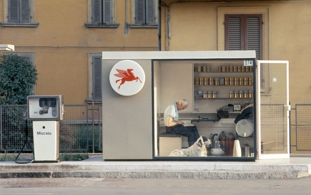
This special Tiny House episode of Gas Stations I Want To Live In is brought to you by the Reina Sofia and the Jeu de Paume, who have both showed Luigi Ghirri retrospectives in the last month.
When I figure out the architect of this gem I will update the post.
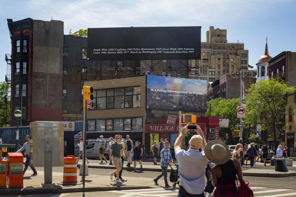
Felix Gonzalez-Torres, “Untitled”, 1989, Installation view, 2019, by and via Public Art Fund
For the 30th anniversary of its original installation and the 50th anniversary of the Stonewall Rebellion, Public Art Fund reinstalled Felix Gonzalez-Torres’ first billboard work, “Untitled” (1989) at its original site facing Sheridan Square in the West Village. Until today, the Guggenheim also exhibited “Untitled” (1991), a stack sculpture made from 161 unsold prints originally made to support the Public Art Fund project.
This edition of Better Read is the text of the billboard, plus the artist’s statement.
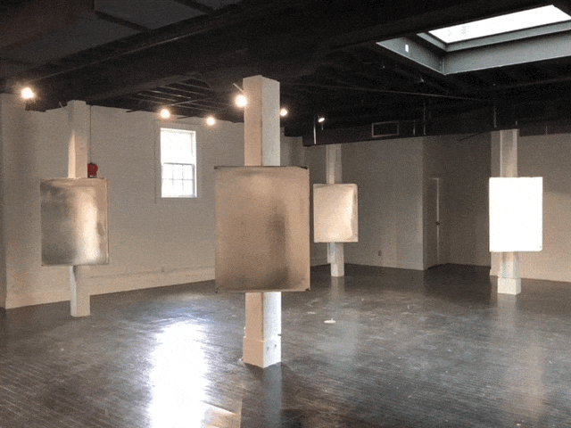
installation view of Jacob Kassay show at von ammon co, dc
There is a new show by Jacob Kassay at von ammon co in Georgetown.
Ten OG silvered paintings from 2009 are mounted on the edge of columns in the gallery, facing the door, basically.
They reflect the daylight that comes in from the gallery’s north facing glass wall. The array of LED spots on the gallery’s black timber ceiling provides fill, but does not light the paintings individually. It’s more ambient, environmental.
The lights also snap on and off in relation to a candle in the corner. The candle is held by a bracket in front of a plug-in nightlight, which is connected in turn to a relay controlling the gallery’s lights. When the candle light wanes, the nightlight turns on–and the gallery lights turn off. When the candle is bright, the nightlight turns off, and the lights stay on.
In the absence of turbulence, the candle can burn brightly and steadily, and the lights stay on as expected. But the candle, like a Calder mobile, invites disturbance. When the candle’s doing its thing, the uncertain stroboscopic perturbations can be unnerving. To remain in the gallery thinking of art brings back visceral memories, not of Martin Creed, but of Bruce Nauman. Any prolonged exposure, meanwhile, might feel like shift work under a failing fluorescent light, with all the internalized bodily and psychic stresses that entails.
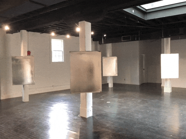
Installation view of Jacob Kassay’s show at von ammon co, dc
While the paintings remain as gorgeous and seductive as ever, with movement dancing across their reflective surfaces, Kassay’s candle-driven gallery also illuminates the intrinsic precarity of the art system in which they’re consumed.
I should have asked about the light situation, but the paintings are for sale.
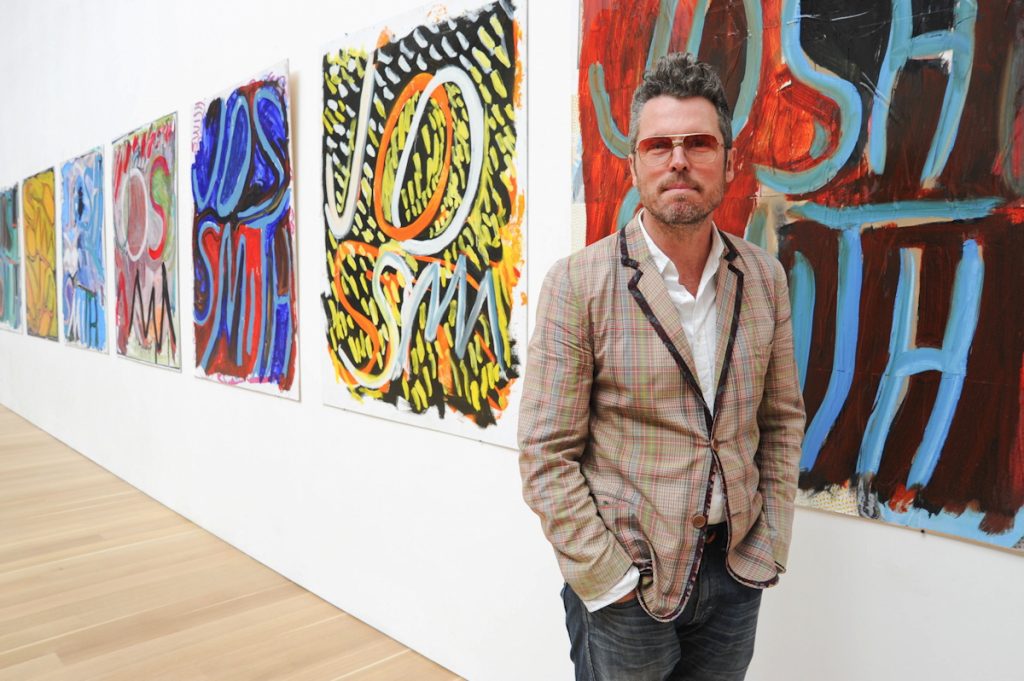
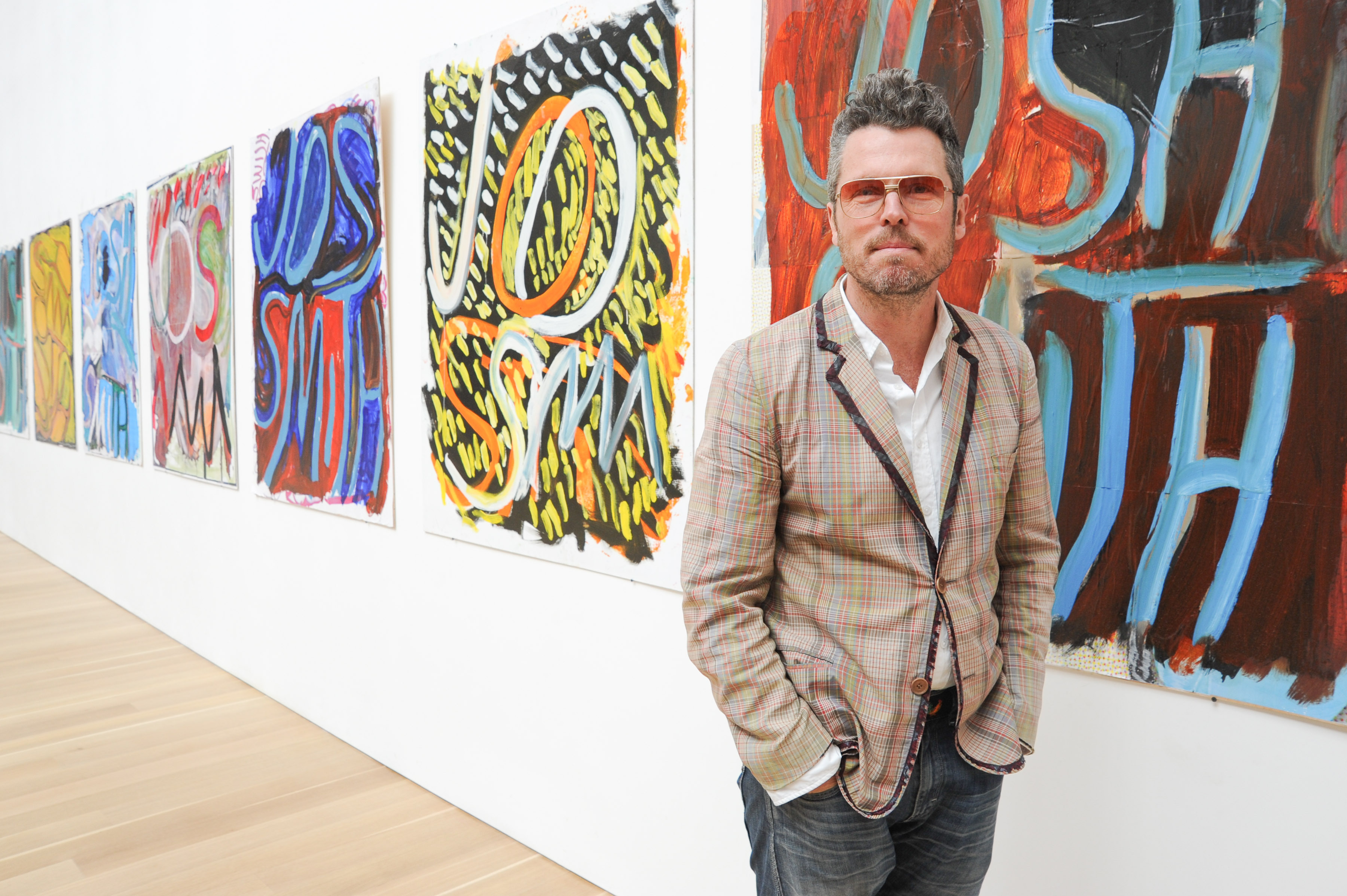
area man visiting josh smith show at the brant foundation, via the brant foundation, but presented in bing results as the artist
A friend and colleague recently said I had a very soothing voice, I should do a podcast, and I couldn’t tell if that meant I was talking too much, or being too dadsplainy, or perhaps he was right? I generally trust his judgment, but the reason I created a podcast read by a robot is because I could not get past the annoyance all audio performers apparently deal with, of hearing a recording of one’s own voice.
Anyway, I joked that I’d make an ASMR art video, ASMRt, and the name was so damn catchy, I knew at that moment I had to do it. But what to say? What to read? Yesterday the perfect text fell from heaven [actually, Contemporary Art Daily]: the press release for Josh Smith’s first New York show since leaving Luhring Augustine for David Zwirner.
One thing led to another, and now here is a recording of me laconically reading press releases for fifteen Josh Smith solo shows between 2007 an 2019. It was recorded on June 11, 2019 an iPhone in two conference rooms at the Cleveland Park branch of the DC Public Library. Text sources are linked below. My first regret will probably be hosting this mp3 myself. My second will probably be not releasing this as an album.
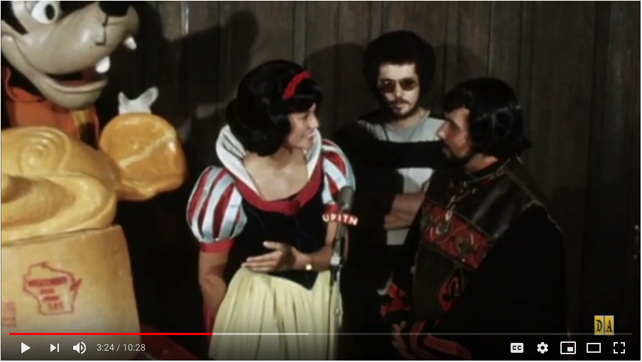
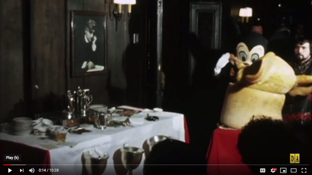
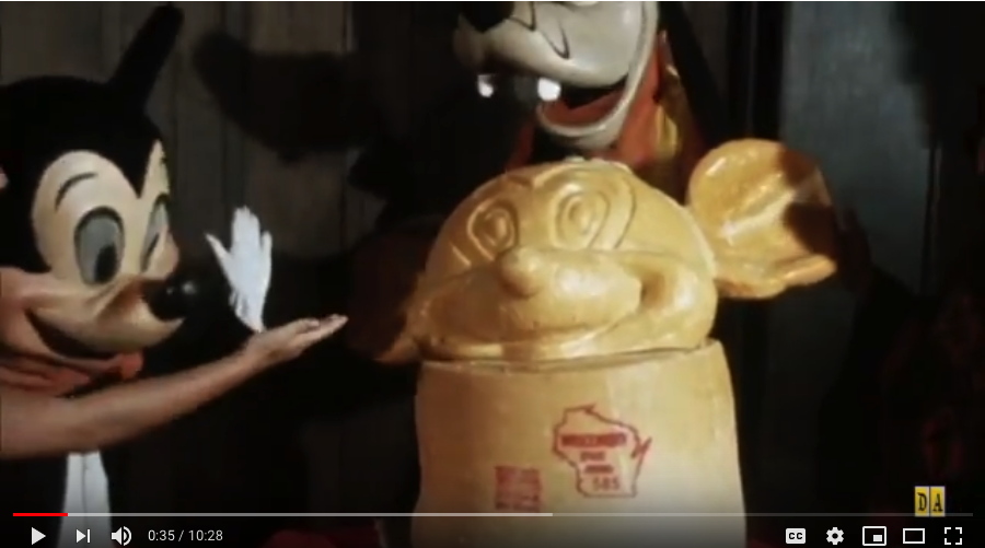
Machu Picchu, do you, like Constantin Brancusi, consider the base an integral part of your sculptures? Or did you place your work, the world’s first portrait bust of Mickey Mouse sculpted from cheese, on an intact wheel of Wisconsin State Brand cheddar cheese so that it would, as the publicist claimed, weigh 1,000 lbs?
Is a question Snow White did not ask the sculptor at Sardi’s that morning in July 1971. Some extended footage of this press event to promote Disney On Parade, a touring theatrical production not involving ice skating, which I may or may not have seen as a child, was surfaced by the enthusiast/historians at DisneyAvenue. It baffles me in unexpected ways.
Maybe it’s realizing the parallel professionalizing paths McCarthy and Disney have traveled that capture my attention. Having recently experienced a Disney cruise, I can honestly say almost every detail of this footage makes me cringe and fear for these people’s jobs. After I’ve been outraged at the apparent lack of attention to detail, or even of preparation.
Who was running this event? Did no one know where or how the cheese sculpture would move? Does no one have a mark? Did Snow White not have an inkling about what to say or do? When she improvises(?) a conversation with Mickey and Goofy, does she not know these performers are supposed to not talk? The action is driven almost entirely by instructions from the assembled press, who just want to get their shots, print first, maybe, then TV? Is that alright?
Let’s spend a tiny moment on Snow White here. She is wearing a watch. She has an office. She talks about phone conversations to publicists. Though there is a translator between them, she knows enough Spanish to translate the sculptor’s answers for the press, similar to how she interprets Mickey’s mute, mime answers to the questions she maybe should not have asked in the first place. Whenever discussing the subject at hand, a sculpture made of cheese, she only mentions its materiality, its cheeseness: that it melted, that people–and anthropomorphized dogs–want to eat it.
The first thing Snow White says is to Mickey: “There you go, Mickey. A self-portrait of yourself! Can you imagine that?” Well, if he made it, yes? But no. She immediately crosses awkwardly in front of Mickey and the sculpture, to shake the sculptor’s hand: “Thank you very much!” She’s soon told to move because lighting, and then she’s told to interview the sculptor.
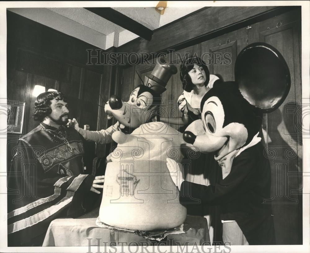
The sculptor who is himself in an elaborate costume. He works, he says, in stone, wood, bronze, and now cheese. It took him three 8-hour days to complete. The cheese got soft in the heat, which made things difficult. The sculptor’s name is Machu Picchu. Reader, I think it was not. But in the end, this is the performance, character, and narrative which most fascinates me.
Gee, why would I think Machu Picchu was a character? He and the wtf angle on the sculpture in this vintage press photo I just stumbled across on eBay made me look. I did not buy.
How did Disney come to the place where a pseudonymous Spanish-speaking sculptor has his first work in the medium of cheese, a 1,000-lb. head of Mickey Mouse, wheeled into a Broadway restaurant by three unrehearsed performers is the best way to promote a traveling character revue? What is his experience, this ungoogleable artist whose authorship Snow White attacked repeatedly?
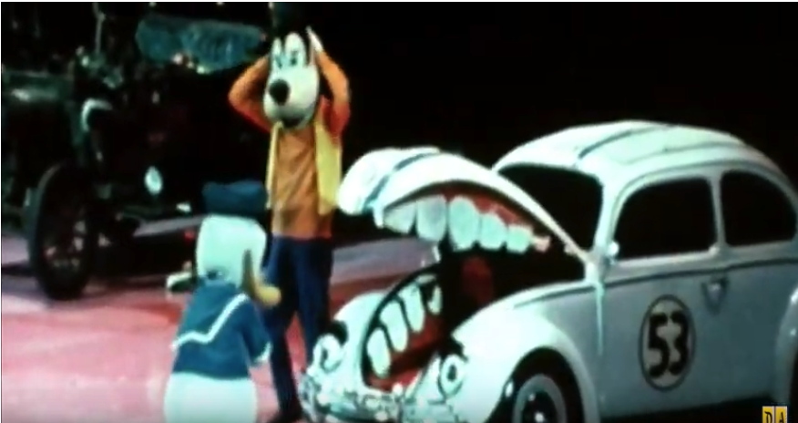
Other segments of this PR footage show characters entertaining a group of boys in Boys Club t-shirts on the empty floor of Madison Square Garden. A range of costumed characters meet an audience assembled, as their posters tell us, by the New York Metropolitan Area’s McDonald’s restaurants. Donald Duck and Goofy clown around mutely with a Herbie The Lovebug–who has very non-canonical eyes, eyebrows, and flimsy teeth. A lot of legwork went into preparing for this publicity campaign, and this footage resulted. As Rauschenberg didn’t say, there is art in the gap between image and experience. Or was that Duchamp’s infrathin, between content and perception? I wish we lived in a world where it didn’t feel obscene not just to remake this sculpture, but to break down, study, and restage this entire video, line for line, gesture for gesture, shot for shot, frame for frame, for a live audience.
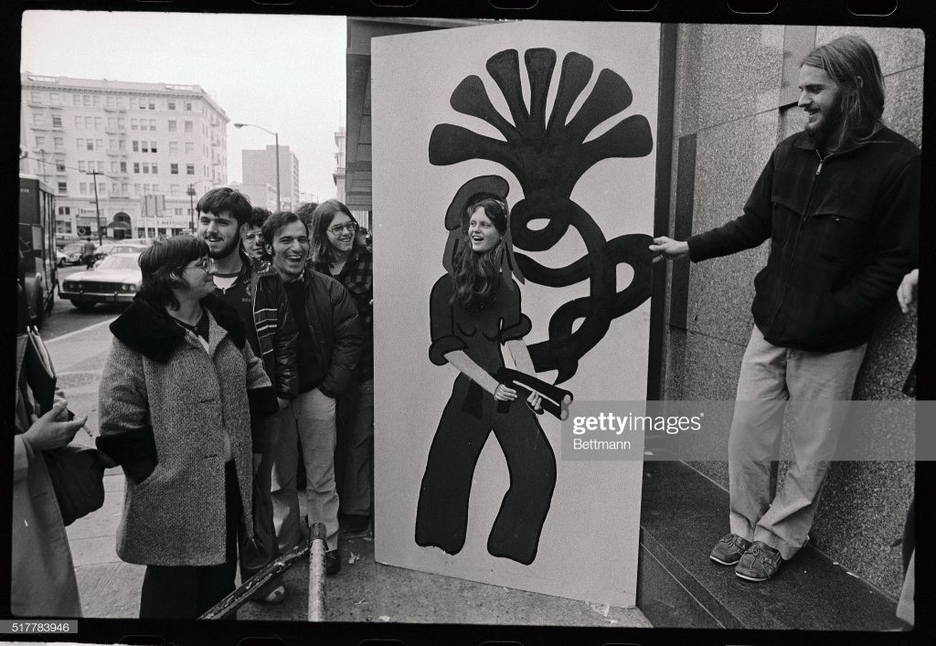
This is supposedly 4/15? uncredited image bettmann via getty
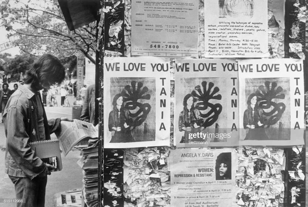
You know what I have never seen? An original “WE LOVE YOU TANIA” poster. Which might be easier to explain than you might think. If my own vintage photo captions are to be trusted, the photo of Patricia Hearst reborn as Tania of the Symbionese Liberation Army was only released on Wednesday, April 3, 1974, less than two months after her kidnapping. It accompanied a tape recorded statement by Tania, which was delivered to the offices of leading San Francisco counterculture/rock radio station KSAN, Jive 95. The photo ran on the front page of newspapers across the country on April 4th. [If I recall his Guggenheim clippings collection correctly, On Kawara read about it in the Washington Post.]
Getty’s original caption for the above image says, “Posters reading ‘We Love You Tania’ appear on bulletin boards at the University of California campus 4/15,” the day “she was identified by the FBI 4/15 as one of four armed women who took part in the robbery” of the Hibernia bank across the bay in San Francisco.
But the posters above and below Tania show events on April 11 and 7, respectively. So it seems more likely to me that Hearst’s Berkeley classmates posted their flyers–and they were photographed–soon after the Tania image was released, not, as it sounds, in celebration of the hours-old bank robbery. So this is a very narrow window in which to celebrate Tania’s revolutionary activities without celebrating her crimes. Or without at least using the security camera still of her from inside the bank.
An uncredited photo of unidentified people with an uncredited painting, image purportedly bettmann, via getty
(Original Caption) Someone waiting in line to watch the Patricia Hearst trial 2/23 brought in a huge drawing depicting Patricia Hearst holding a weapon copied from a photo taken at the University of California at Santa Cruz, uses her head in the drawing for a photo.
Is it possible for a photo archive to be even less helpful in its archiving? The only thing Getty managed to record about this photo of an extraordinary life-sized cutout painting (not a drawing) on board of the Tania portrait is the date (February 23, 1976).
I can find no source for the claim that the Tania photo was taken at UCSC, and a great deal of documentation that the SLA didn’t get farther than Daly City before the Tania photo was released. And though it is unspecified, this installation photo must have been taken outside the Federal Courthouse in San Francisco. Was it the painting itself, perhaps, that came from Santa Cruz? [update from a new source: it was apparently the young woman in the cutout who was from UC Santa Cruz: one Jean Finley. It also says the drawing (sic) was brought by “someone,” and that the Tania photo comes from the Hibernia Bank robbery. Boomers made news hard.]
The photographer, and more importantly, the artist who made the cutout painting, and most importantly, the current status and location of the cutout painting at this moment, are all unknown. If you are the boatshoed man on the right, or know him–he would be in his mid-60s now–please do get in touch. There are works in progress.
UPDATE: The internet is not canceled yet.
Within hours of posting this, Bean Gilsdorf tweeted that perhaps this woman posing in the Tania painting was Jeanne C. Finley, the artist, filmmaker, and California College of the Arts professor who had attended UC Santa Cruz. A couple of quick, shocked, and bemused emails later, we knew. That is her, and the artist who painted that thing is Alison Ulman. Here I quote Finley:
[T]he fact of that image is that it is an incredible artwork by my very best friend from childhood, Alison Ulman, that she did when we were in college at UC Santa Cruz back in the truly experimental days of that institution. Alison was obsessed with Patty Hearst and we both attended the trial. She created that work as a public artwork (long before the idea of social engagement ever was a thing) that the public would engage in while they waited in line to get into the trial. On one side was Tanya with the 7-headed cobra, on the other side was Tanya as a debutante. Everyone wanted to have their photograph done on the 7-headed cobra side! We had to get in line at about 1am and sleep on the sidewalk until dawn because there was so much public interest in attending the trial and it was a great way to pass the time.
If you try to google Alison all you’ll find is this 15-year-old website. (http://endlessprocess.com/) …She is an amazing artist, and lives a most unconventional life…not one that really intersects anymore with the art world, but that is really the art world’s loss. We’ve been best friends since 2nd grade where we lived two blocks from one another and spent every day together as kids. We decided we wanted to go to college together so we both applied to UC Santa Cruz because we read that there was co-ed nude sunbathing on the dorm roofs. Santa Cruz was really hard to get into then, so the other artists in art school with us were all pretty amazing people. I felt so lucky to be there and have the freedom to be an artist and do things like this with my best friend.
The art world’s loss indeed, but an amazing story about an interesting project at a fascinating moment in time. Thanks to Ulman, and to Finley, and to Gilsdorf for bringing it all together.
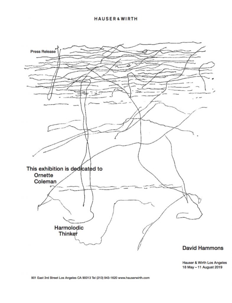
unnamed.jpg, 930x1212px jpg displayed at 786x1024px, press release for David Hammons’ show at Hauser & Wirth Los Angeles, 18 May – 11 August 2019, via email
David Hammons is having a show. And the gallery, Hauser & Wirth in Los Angeles, sent out a press release. I marveled at it this morning, but it wasn’t until Powhida tweeted [d’oh, deleted!] about framing it that I realized it needed realizing.
The press release is a jpg titled, unnamed.jpg. It is 1212 x 930 pixels and 72px/inch resolution. In order to print it at that size, I converted it to a pdf 12.92 x 16.83 inches. I haven’t figured out quite how to print that yet, but it has only been a few minutes, so maybe chill or take care of it yourself? I’ll take a crack at it tomorrow.
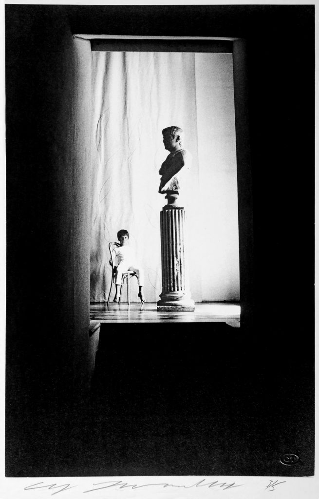
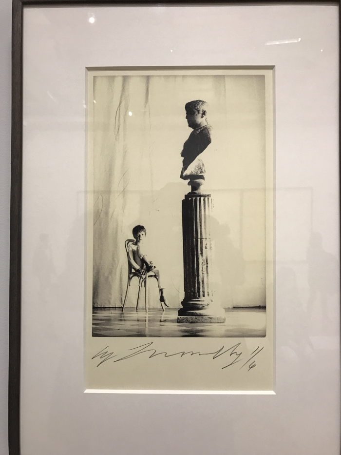
Cy Twombly, Alessandro Twombly [via di Monserrato, Roma], 1965, 43.2 x 28 cm, ed. 5, image via artblart
In his biography Chalk, Joshua Rivkin includes a Cy Twombly story he heard in Lexington, Virginia, where the artist spent much of his later years:
One night the artist came over for dinner and after they sat together on the front porch of the house as lightning bugs flashed under a canopy of sycamores. The host’s small child, three or four years old, came out to the porch to say goodnight to all. The father gathered his son in his arms and took him upstairs, his bedroom just above the porch, and tucked him into bed. When he returned to his drink and their conversation, Twombly pointed up to the boy’s bedroom and said, of his own son, of Alessandro, “I don’t know where he slept.”
This anecdote came to mind when I saw this haunting 1965 photo of a young Alessandro, because at least Twombly knew where the kid sat.
Cy Twombly, Alessandro Twombly [via di Monserrato, Roma], 1965, 28.9 x 19.2 cm, ed. 6, photographed at the Centre Pompidou by Florence Briat Soulié
The photo, published at a date I can’t determine, in an apparent edition of five, was included in the Pompidou’s Twombly retrospective in 2016. Another, smaller version of the scene, which crops out the dark hallway entirely, was also included. It was apparently an edition of six. Florence Briat Soulié photographed it for her lyrical review of the exhibition. Alessandro has extricated his arm from the chairback, and has one leg up on the seat, but he maintains his gaze into the unlit hallway of the palazzo, where his father was snapping away.
Horst’s 1965 photo of Cy Twombly & Tatianna Franchetti’s bust of Nero and Gerhard Richter, Frau Marlow (1964)
The photos, and the setting, and the timing, immediately call to mind Horst P. Horst’s iconic Vogue photoshoot of la Famiglia Franchetti-Twombly. Except nothing so plain as that Thonet chair is to be found in Horst’s images. And neither is that fluted column. That bust of Nero, and the simple diamond patterned floor do appear, though, along with Twombly’s Richter leaning against a steel shelf.
Those locks, those umbrellas, it looks like the ingresso. But that floor and that doorway don’t match, and there’s no steps. And that bust sure moves around. And it looks slightly less like Trump in the light.
Horst’s 1965 photo of what appears to be Cy Twombly’s foyer, via mondo-blogo
I sat on these photos and this post for a couple of months, ngl, wondering if I wanted to deal with the possible blowback that might arise from the Fondazione Nicola Del Roscio’s assertion of copyright over these and all of Twombly’s photos. Part of me wanted to just make a point by linking to them only on pinterest.
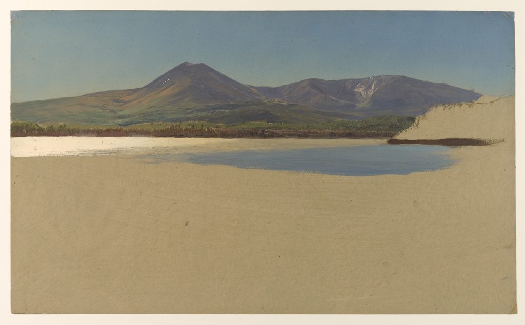
Frederick Ediwn Church, Drawing, Katahdin Lake, Maine, 12×20 in. or so, before 1878, collection: Cooper Hewitt Museum
Come for the sketch Frederick Edwin Church made of Mount Katahdin, but stay for the sketch Frederick Edwin Church made of Katahdin Lake.
When he tweeted it today, Tyler Green said that was one blue brushstroke, and the beach was one white one. Staring at the zoomed in jpg, I am not sure. The white could be one deftly twisted stroke, but the blue looks like it it probably a few. In any case, it is just beautiful, and not the kind of thing you [I] expect from Church.
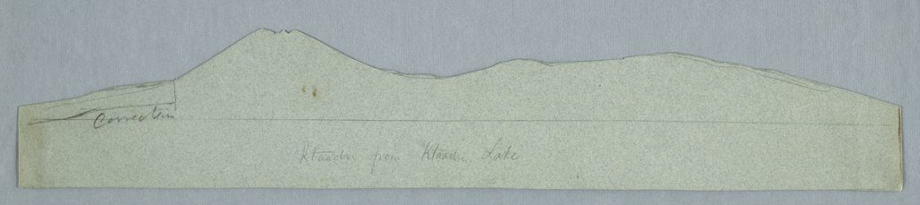
Frederick Edwin Church, cut-out stencil of Mount Katahdin, 3×17 1/2 in. or so, c 1856-60, collection: Cooper Hewitt Museum
Inspired by Thoreau, Church made several trips to Katahdin between the 1850s and 1880. This sketch was likely painted before 1878, but after 1856-60, which is when Church made a stencil of Katahdin and the surrounding landscape as seen from across the lake. Because the mountain was outlined with the stencil.
The Cooper-Hewitt acquired over 500 paintings and 1500 drawings from Church’s son in 1917, including at least two made from the stencil, plus the stencil. Which is fantastic, but not as great as that lake or that beach.
I was looking for information on an early Elmgreen & Dragset piece where they laid pristine, white carpet at the entrance to their gallery. But the only Google result was for an interview with Hans Ulrich Obrist for their 1998 “Powerless Structures” catalogue. It had been hosted on Nicolai Wallner’s website, but seems to have been taken down after 2016, when they stopped working with him. So I have reproduced it here, for Google’s sake.
The installation I had in mind was for Nuit Blanche 1998, at the Musée d’Art Moderne de la ville de Paris. I came for the quick debunking of J freaking R acting all, tant pis, his paper artwork unfurled across the entrance to the Louvre got trampled on, and I stayed for Michael’s story of meeting Felix Gonzalez-Torres and discussing the infiltrative power of Minimalism.
Anyway, it’s wild how not online that 1998 catalogue is. I may have to do a photocopy bootleg version a la Wade Guyton’s Avalanche.
Before Tico Mugrabi, Emmanuel Perrotin, Per Skarstedt, and Francesco Bonami, there was Nigo. Nigo tagged KAWS. Nigo collabo’d with KAWS. Nigo collected KAWS. Nigo commissioned KAWS. And now Nigo has sold KAWS. Some of them. At a Sotheby’s auction in Hong Kong named after himself.
These texts by Virgil Abloh and W. David Marx are from the print catalogue for the auction, NIGOLDENEYE®. [Nigo also started putting a registered trademark sign after his name.]
The texts seem relevant only because the main KAWS painting sold for $14.7 million, and because they articulate with unabashed uncriticality the ultimate ambition of art as a tool of capital.
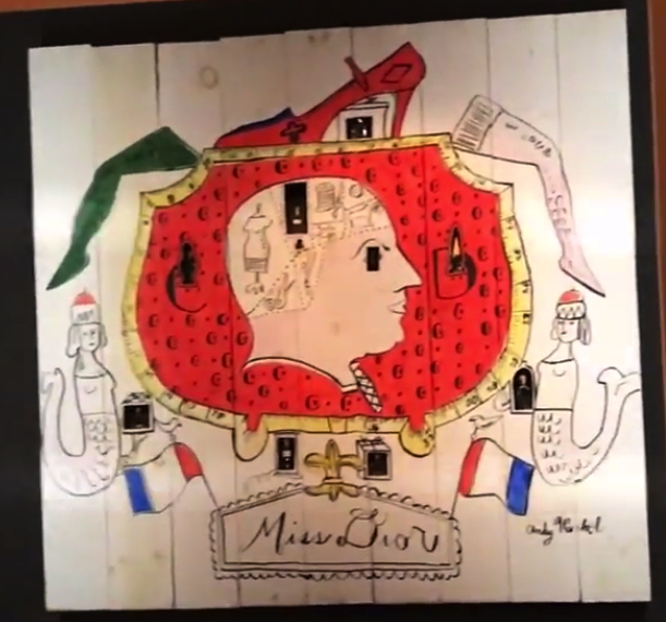
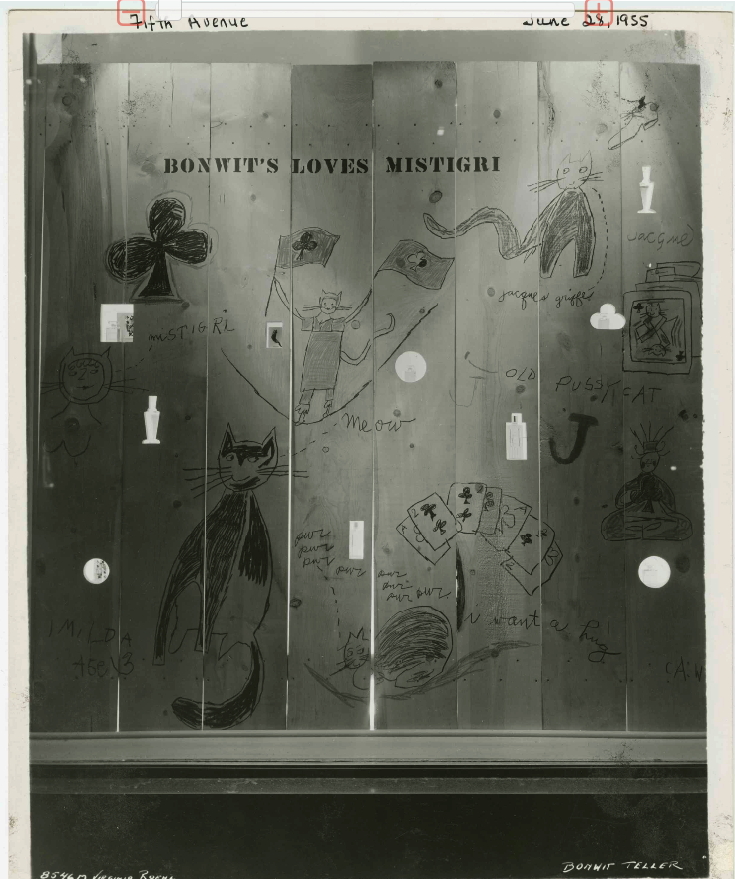
Warhol Museum’s 1997 re-creation of Miss Dior window display for Bonwit Teller, as seen in Adman: Warhol Before Pop, at Art Gallery NSW in 2017
Gene Moore was the creative director for Bonwit Teller, and then from 1955, after Bonwit’s owner Walter Hoving bought it, for Tiffany & Co. next door. Moore hired Andy Warhol, among others, to create window displays along Fifth Avenue. Moore’s book was quoted by warholstars.org:
[Warhol] never pretended a difference between what he did to survive and what he called his art. To his credit, I think it was all the same to him. He was a very busy young man. I used Warhol’s art in several of my perfume windows at Bonwit’s. In July 1955, just before my work began at Tiffany’s, I made some wooden fences, and he covered them with graffiti for a series of windows. They were fun, full of a childish playfulness.”
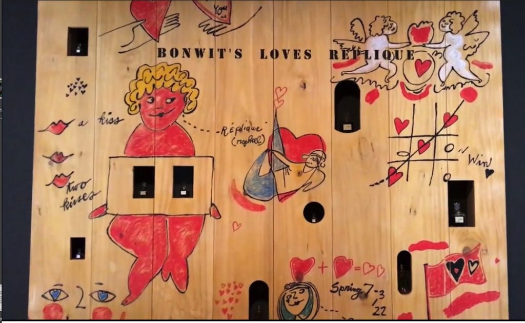
re-fabricated Warhol perfume fence for Bonwit Teller, also from Adman at Art Gallery NSW
I haven’t given two thoughts to those Warhol Fences in 20+ years, since seeing one at a Warhol fashion flotsam show at the Whitney. Which turned out to be a refabrication cooked up by Warhol Museum director Mark Francis? And which turned up again, alongside another one, in Adman, a 2017-18 show of Warhol’s commercial work.
Bonwit’s loves Mistigri, a Warhol window display from Jun 1955, photographed by Virginia Roehl, from the Dan Arje collection at The New School
Which, now I am actually kind of interested in bringing back destroyed artworks. And in Gene Moore and his artist colabos. And in the amazing vintage photos a reader just sent me of several more of Warhol’s window display perfume fences, which are awesome?
I can’t find it now, but someone, either Moore, or Dan Arje, the Bonwit’s assistant art director whose archive is now at the New School, said how easy it was to work on windows with Warhol. He never froze, never panicked, never stalled, but got right to work and cranked out that art. And these fences show it. They feel instant, sprung fully formed from the artist’s head–and pen–like a Keith Haring glowing baby.
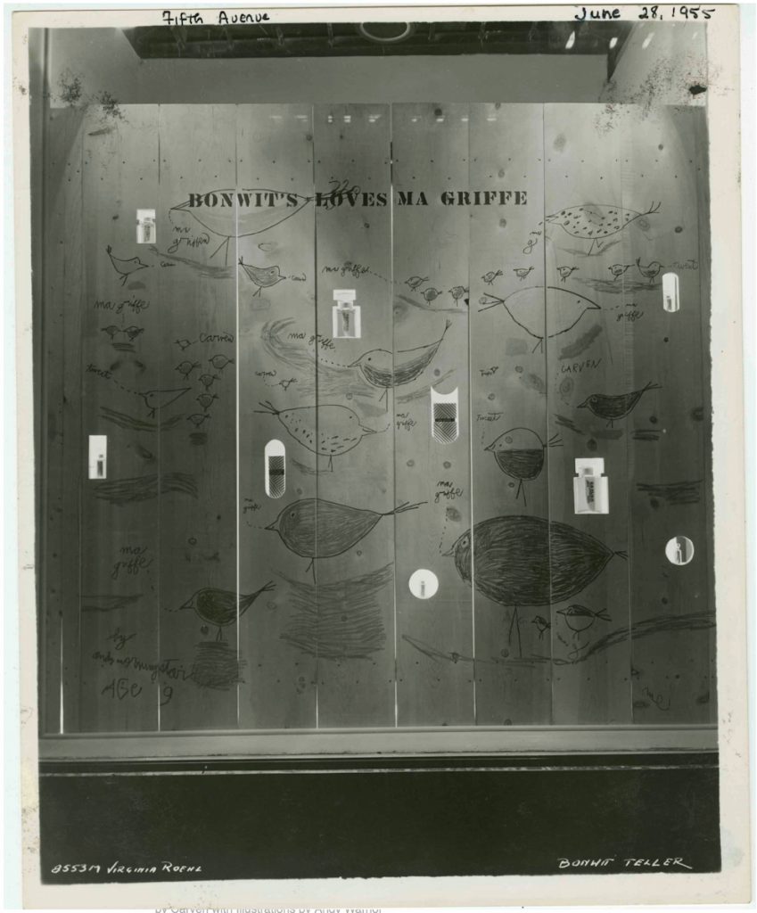
Ma Griffe Birds, 1955 image by Viriginia Roehl for Bonwit Teller’s Dan Arje, via The New School
Which isn’t the same as improvised or conceived on the spot. Installation views of the Adman show include sketches for the Miss Dior fence, so a lot of it was clearly worked out in advance. Credibly repeating one of these wall-sized drawings seems like it would be very hard. But I want to see those birds so bad I can taste it.
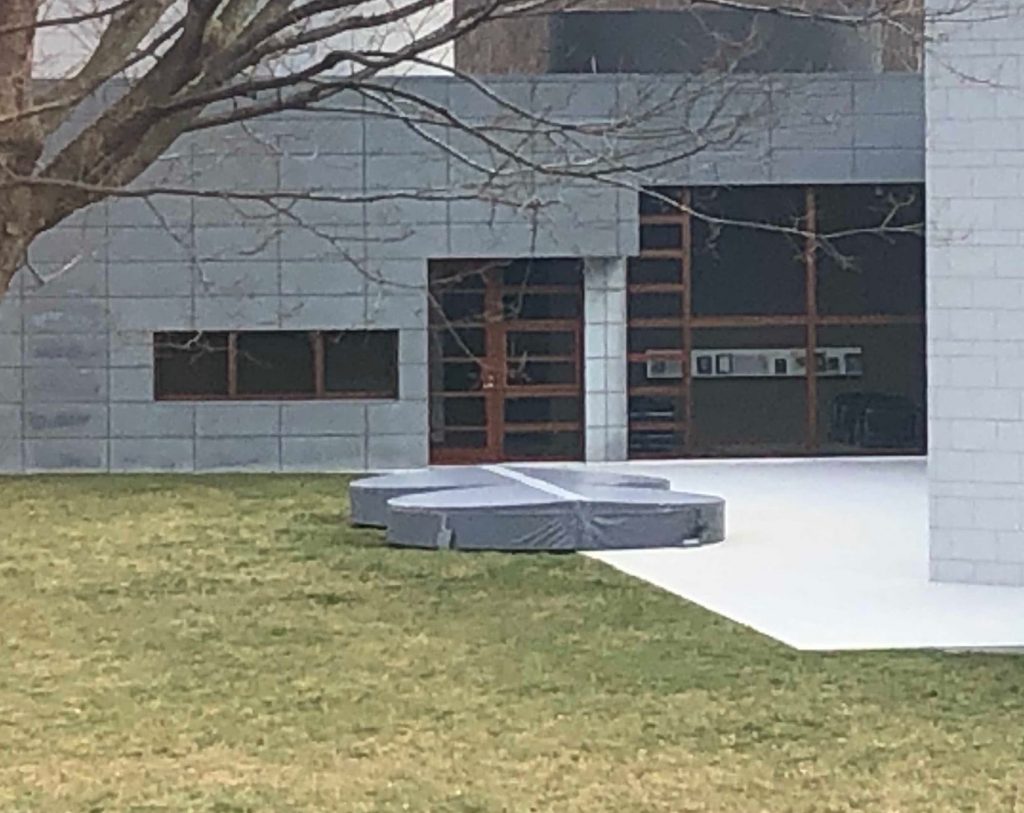
Felix Gonzales-Torres, “Untitled”, 1992-95, Carrara marble, water, fabricated 2007, installed at Glenstone [Ellsworth Kelly photobomb]. image: Carolina Miranda/LATimesThe Raleses bought Felix Gonzalez-Torres’ “Untitled”, which was made for the 2007 Venice Biennale. It was based on an unrealized sketch the artist made while considering a public art commission. I believe it was for a university. The posthumous thing bothered me at the time, and Nancy Spector and I went around a bit on it, but I decided to roll with it, and it turns out to be fine. Art world shenanigan-wise, it could have been much, much worse.
It was a rainy autumn evening when I first saw it reinstalled at Glenstone. The shallow pools of water on the surface of the concave discs of white Carrara marble splashed and glistened with rain.
“They’re beautiful, and I think people will probably throw coins in them, or might actually get into them if it’s hot,” Ms. Spector said, smiling. “I wouldn’t mind.”
Andrea Rosen, the dealer who represented Mr. Gonzalez-Torres from 1990 until his death and who now oversees his estate, said she did not think he would mind either. He would probably jump in himself.
I did not back then, nor in the two visits since the new building opened, ever once get the sense that the Raleses would be chill with people frolicking in their Felix pools. But the fact that they have custom-fitted hot tub covers does make me wonder if the amount of frolicking is not actually zero.

