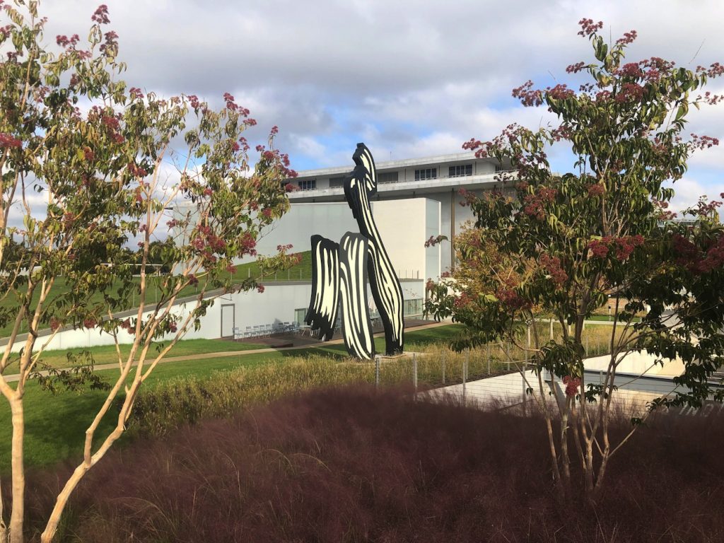
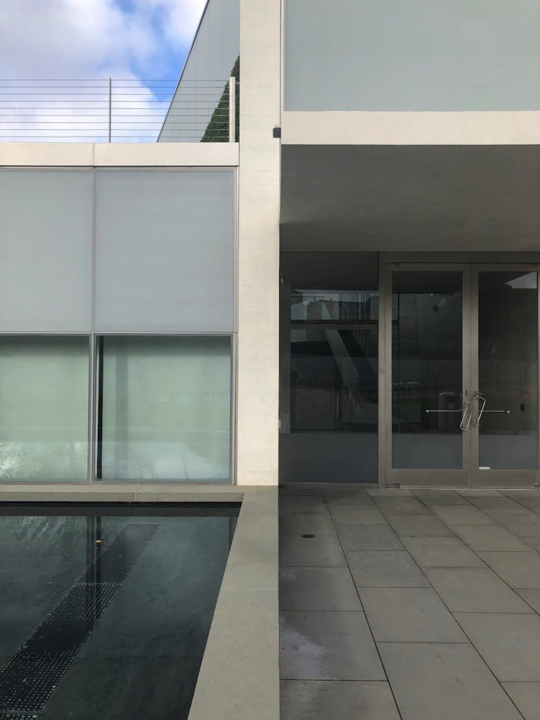
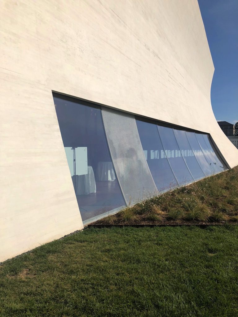
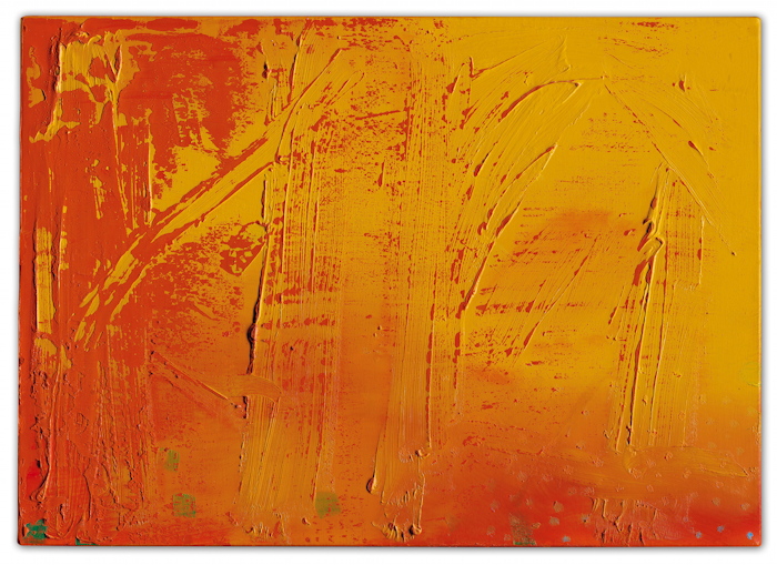
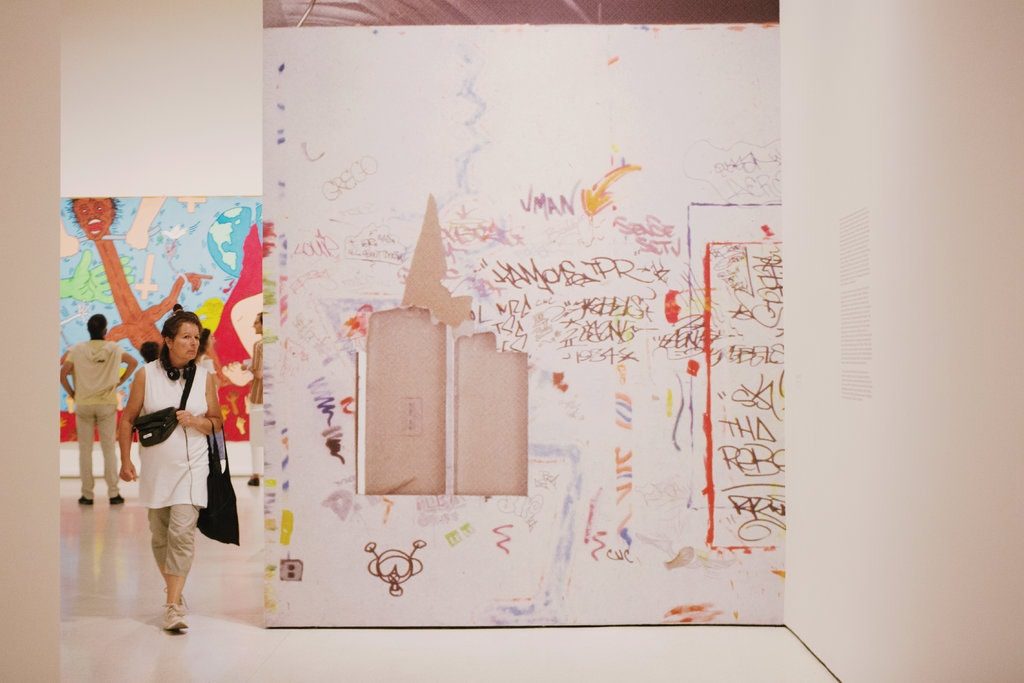
My initial impression of the Kennedy Center’s The Reach is obliqueness. It is in a triangle of land carved by a parkway and on-ramps and a bridge, from which it is hard to see. I finally made a visit this morning after multiple failed, drive-by attempts to photograph this new installation of Untitled (Trudeau Trump Brushstroke). This perfectly framed and backdropped view is the only one, and it is in the intersection of a The Reach sidewalk and a commuter bike path.
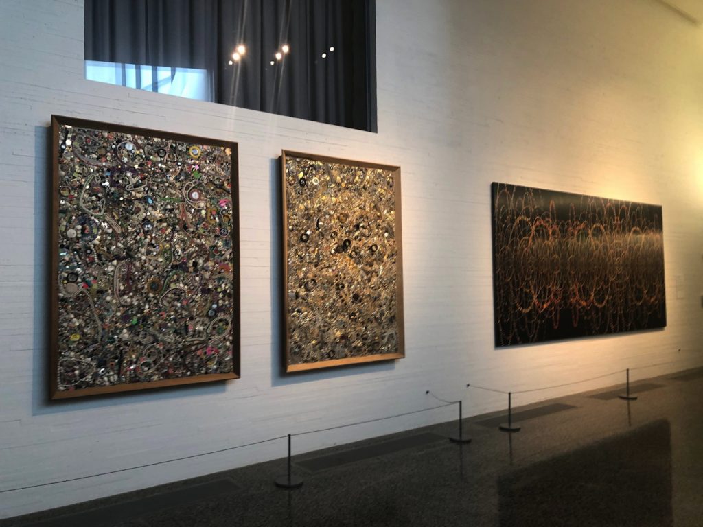
Mike Kelley and Fred Tomaselli on loan from Glenstone at The Reach
The art at The Reach is on loan. I did not check where the big, blue Joel Shapiro came from, but except for the large, 1969 Sam Gilliam painting, which is from the artist himself, most of the work inside comes from Glenstone. In lieu, it looks like, of a lot of money. David M. Rubinstein, meanwhile, has given more money than even Boeing, and loaned James Madison’s copy of W. J. Stone’s 1823 facsimile etching of the Declaration of Independence (ed. 201, of which around 50 survive, apparently.)
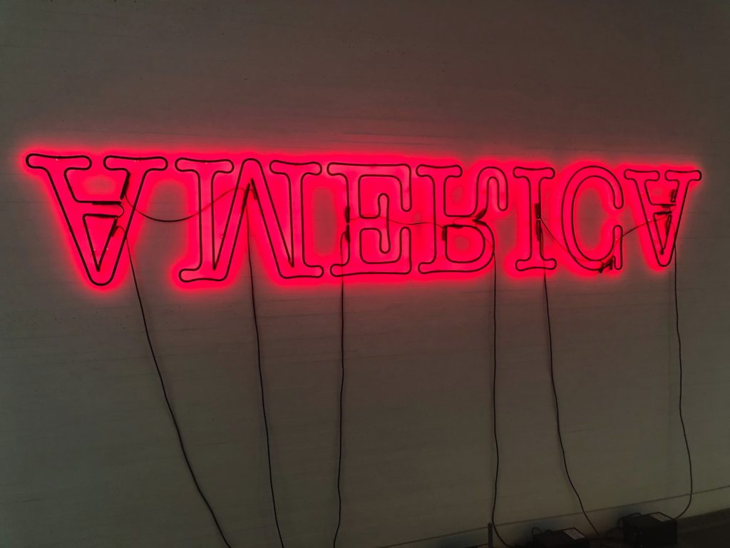
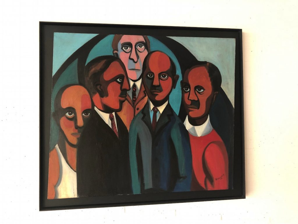
Glenn Ligon neon on loan from GlenstoneFaith Ringgold painting on loan from Glenstone
Boeing also sponsored the exhibition of George W. Bush’s paintings of Iraq War veterans, the billboard for which is not easily visible from the nearby roads. Maybe if you’re stuck in traffic. I did see the show, and will write about it separately.
Other thoughts of The Reach: I felt some spatial echoes with Holl’s ICA at VCU, especially in some peekaboo vistas and the dramatic staircase.
Perhaps this awning rainspout is designed to arc perfectly into the pond and not splash onto the ledge instead?
shattered glass at The Reach, presumably under warranty
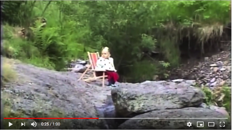
You blog about stuff long enough, and it comes back around. 13 years after they created it for Mute Records, Jeremy Deller and Nick Abrahams have released their fandom documentary, My Hobby Is Depeche Mode.
screenshot from the posters came from the walls
The film was screened several times beginning in 2009, when it was known as The Posters Came From The Walls, but has not been seen much since. The revised title comes from one of the film’s iconic characters, whose son is pictured above.
It is wonderful. And I am fascinated and a bit wary to watch it now, in the contorted political landscape of 2019. That German kid is an adult now, though, and it might be interesting to check in with him, see how it turned out.
[I’ve just started watching it again, and the HD aesthetic already feels like a lost era. Also, the politics is less jarring than the evolution of fandom. This now feels like an artifact of a pre-tumblr, pre-social media, pre-ao3 era. Oh my heck, I forgot about the guy with 500 vintage concert t-shirts. Does he have an etsy?
OK, there is a thread of liberation, of freedom, of music that becomes associated with or gives license to standing apart from the strictures of whatever the local status quo, from Eastern Bloc and Iranian religious authoritarianism, to the heteronormative Valley teenagerdom, to nerd vs. jock rivalry. It’s not entirely clear where Kedrick the concert shirt collector fits, but there does seem to be a respect of peoples’ DM on the DL.]
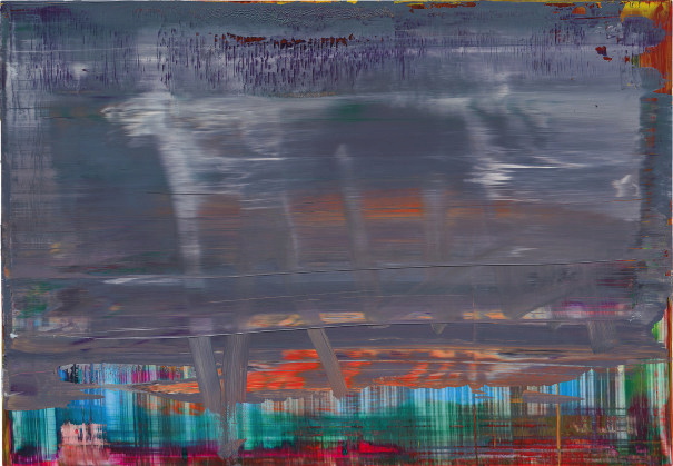
From start: Lot 12, Abstraktes Bild 871-9, 2001, image: phillips
Auction houses on occasion write essays for specific works of art. The occasion is the sale of that work, and the estimated value of the work determines whether an essay is warranted. Of the 23 works by Gerhard Richter for auction during Frieze Week, nine are accompanied by essays. The threshold for getting an essay seems to be £200,000.
This episode of ASMRt consists of me reading all nine essays published by Phillips, Christie’s, and Sotheby’s, about the nine most expensive Richters being sold this week.
Besides the obvious emphasis on the artist’s own significance, a recurring theme is the relation of each painting to his most significant bodies of work. Specifically, many works are described as referencing or prefiguring other, better known or more important work.
To finish: Lot 226, Abstraktes Bild 454/1, 1980, image: christie’s
Which, if you think about it, implicitly argues for the relative lower significance of the work at hand. But it is here, it is for sale, and a case must be made, and something must be written. So here is an hour-long recording that doesn’t need to be listened to of texts that don’t need to be read. Links to the individual lots are after the jump.
Untitled (One Year), September 27, 2018, image: twitter/@lnhoran
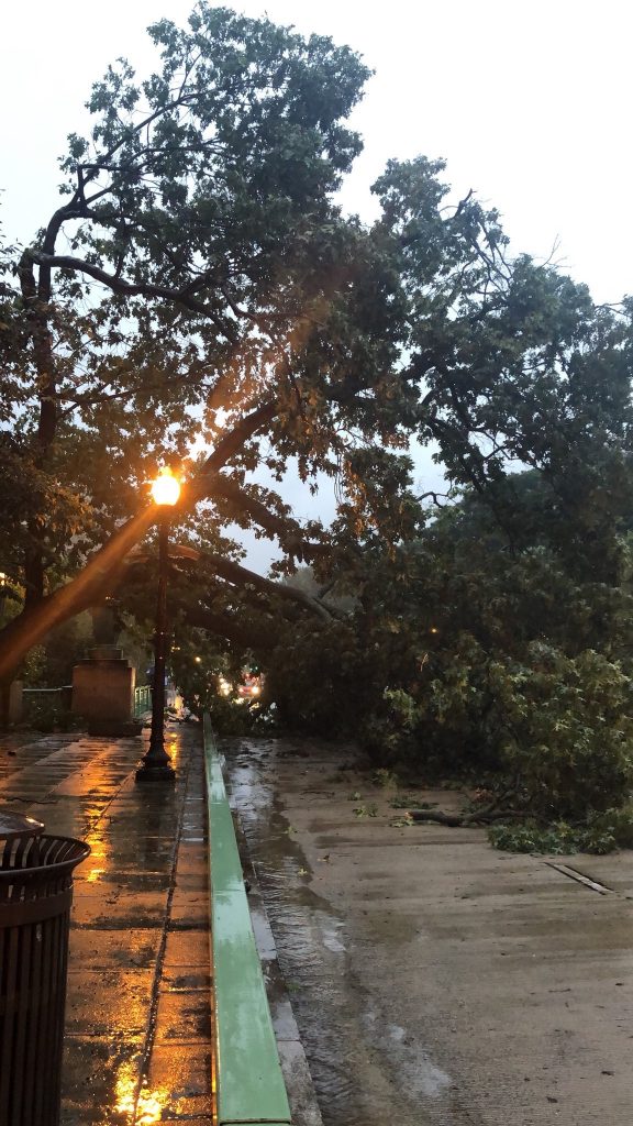
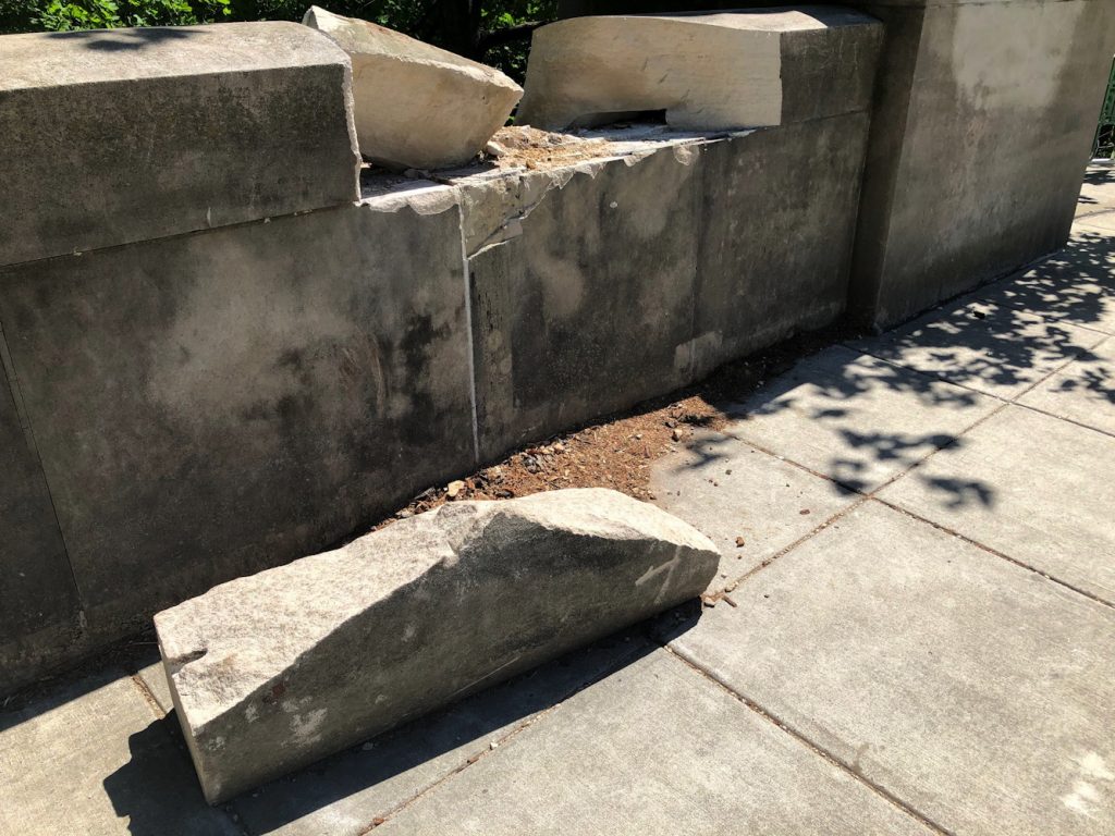
One rainy evening during rush hour, on day Christine Blasey Ford testified about being sexually assaulted by Brett Kavanaugh, a large oak tree fell in a ravine near our house. The trunk struck a bridge, and the branches struck two cars. There were no injuries. By morning, the road and sidewalk were clear. The bare trunk rested in the gap it had made in the massive limestone block. The scene was festooned with emergency tape.
Untitle (One Year), February 2019
Most of the tape was gone by February 2019.
Untitled (One Year), April 2019
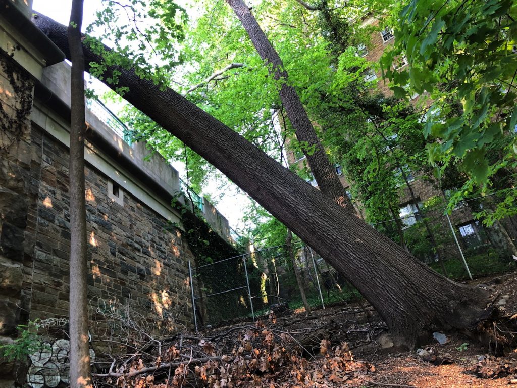
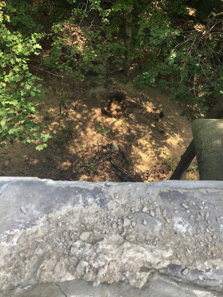
In April, six months to the day of its toppling, the tree was removed.
Untitled (One Year), April 2019
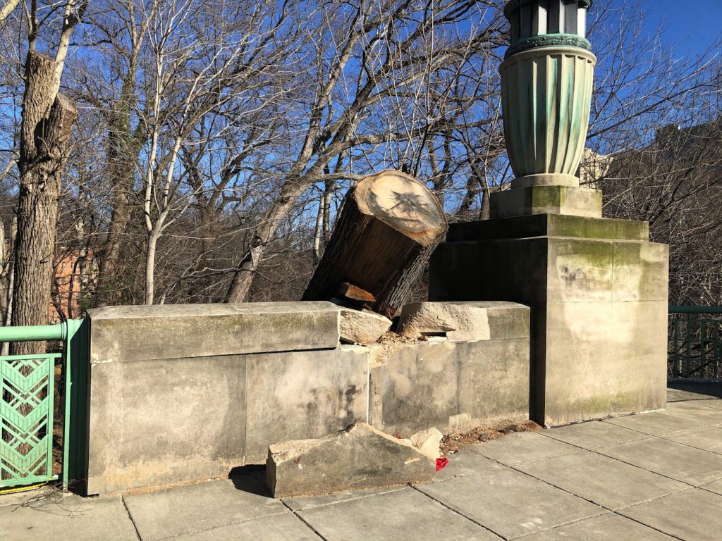
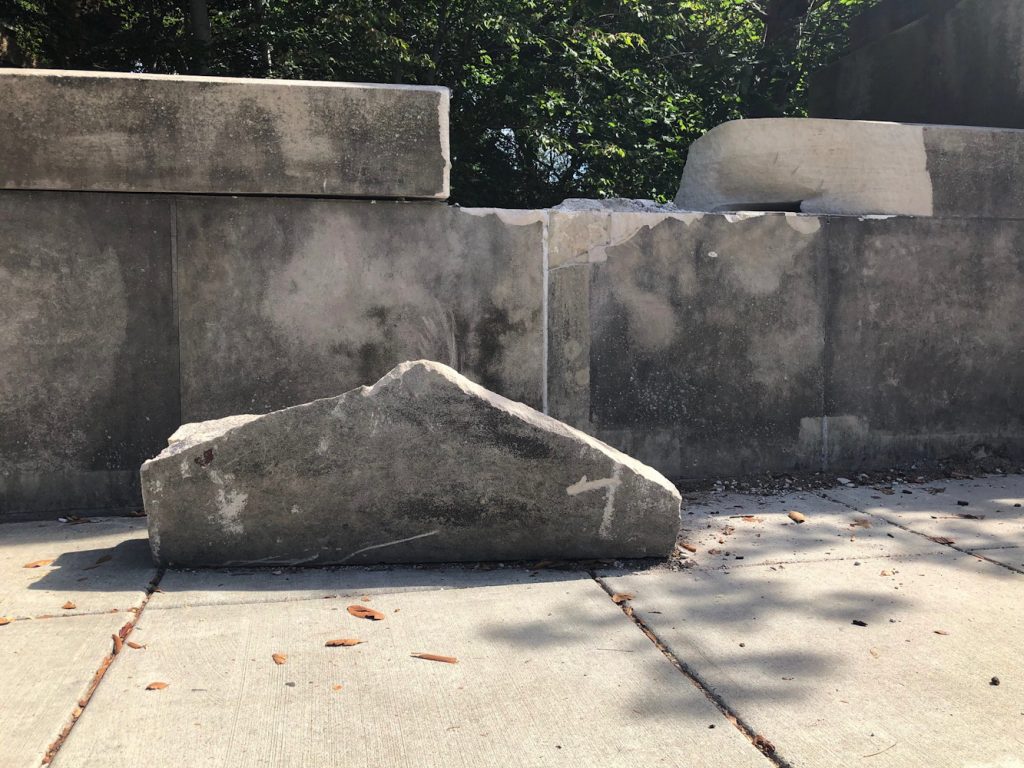
The fragments of limestone remained.
Untitled (One Year), September 2019
In September, the smaller fragment of the limestone block was thrown from the bridge to the ground below.
Untitled (One Year), September 2019
A year later, the larger fragment remains where the tree put it. The peak seems to be the point of impact.
I have considered this situation as I walk, ride or drive by it nearly every day, for a year. What it is. How it comes to be. What or who acts upon it, or doesn’t. The materials, the form, the composition. The engagement with it in passing, in stillness, from above and from below. The energy embodied, the inertia. The natural, the manmade. The institutional and community and political implications. The difference between thinking and looking and acting (though I’d intended to do it for months, I only got photos from under the bridge at the last possible moment, when I happened to pass by just as the crane rolled up.)
I thought of Giuseppe Penone and Barry Le Va; Richard Serra in Pasadena; Chris Burden; of Christopher Wool and Robert Gober; of Charles Raying that tree or Vija Celminsing those blocks. Obviously, I thought of declaring it a work, but when? And for what? (I think about that one a lot, obv.)
I’ve been thinking of sudden disasters and emergency responses, then marveling and acclimation, assumptions and deadlines and invisible machinations, and mobilization, and indifference and vandalism and normalization and acquiescence and prioritization, and weathering and patination and aestheticization and rationalization.
And it is only as I have pulled this together, and thinking through and articulating what has (and has not) happened that I determined the medium of this work is time.
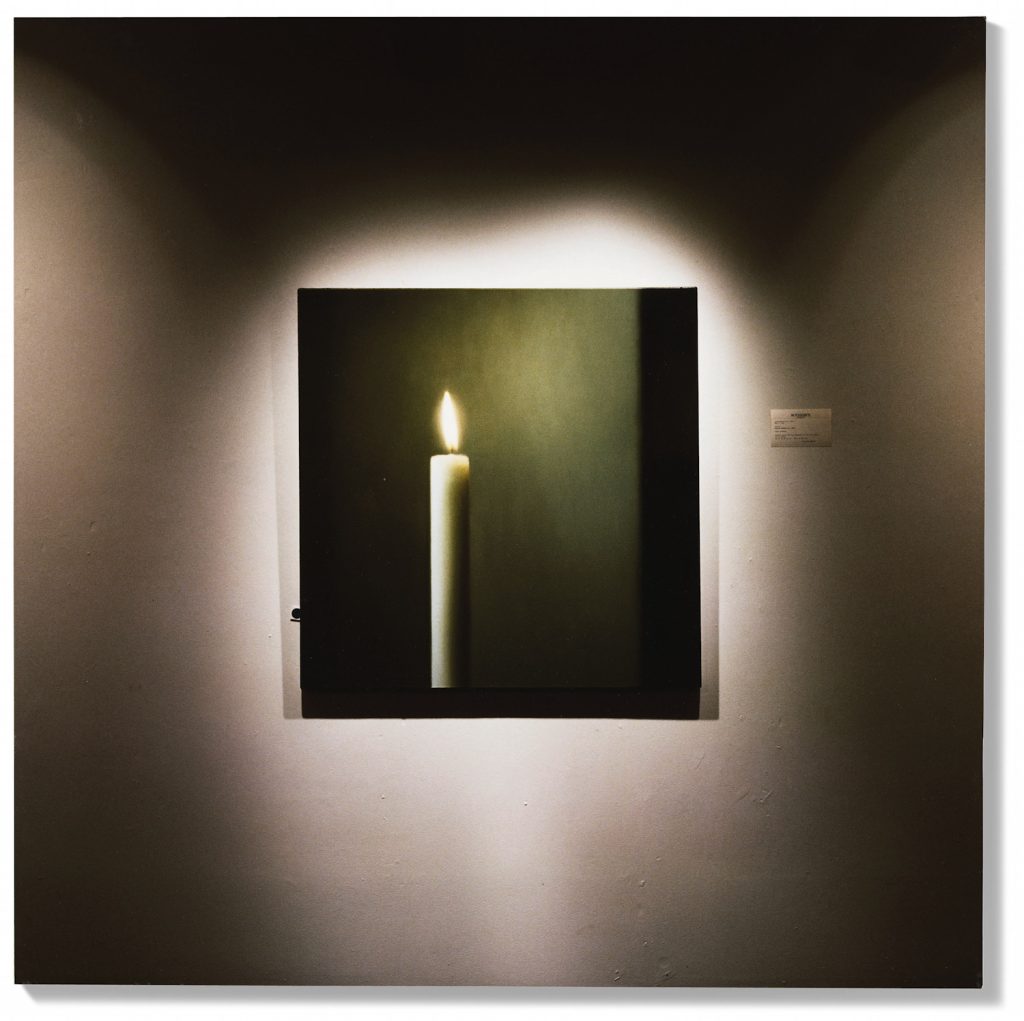
Lot 221: Louise Lawler, What Else Could I Do, 1994, cibachrome on board, 24×24 in., ed. 3/5, est. GBP40-60,000, image: christies.com
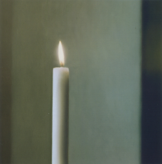
This tasty Louise Lawler photo is coming up for sale at Christie’s during Frieze Week. It’s obviously of a Gerhard Richter candle painting, but if you look close you see it’s installed at Sotheby’s. Kerze/Candle CR511-3 (1982) was sold at Sotheby’s New York in May 1994.
Gerhard Richter, Kerze/Candle, 1982, oil on canvas, 100x100cm, sold at Sotheby’s NY 4 May 1994 for USD 607,500, image: gerhard-richter.com
Another work of nearly the same title, What Else Could I Do (Oldenburg), exists from the same time, and shows a 1963 Claes Oldenburg, Soft Light Switches, Ghost Version, which was also at Sotheby’s. It is now at the Museu Coleção Berardo in Lisbon, but its provenance does not mention Sotheby’s 1994; apparently it did not sell then.
The Sprüth Magers exhibition history is incomplete, and though it shows three simultaneous exhibitions titled, “External Stimulation” in 1994, doesn’t mention Metro Pictures’ show of the same name, which predates the Sotheby’s auction by a couple of months. But the Flash Art review seems to give the full title of the Monika Sprüth venue as “External Stimulation – What Else Could I Do?”
My first idea was to make a print of the Lawler image that’s scaled to the IRL size of the Richter painting. While I work on that maybe someone could get busy with a comprehensive exhibition history and some installation shots?
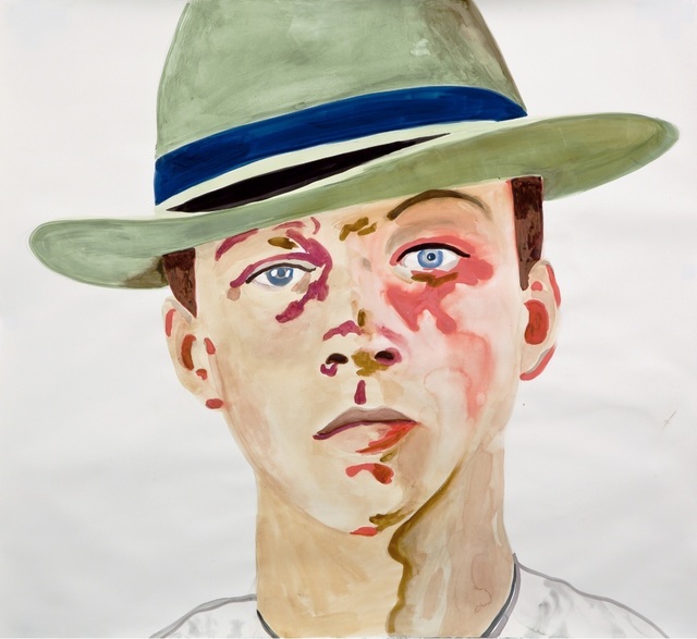
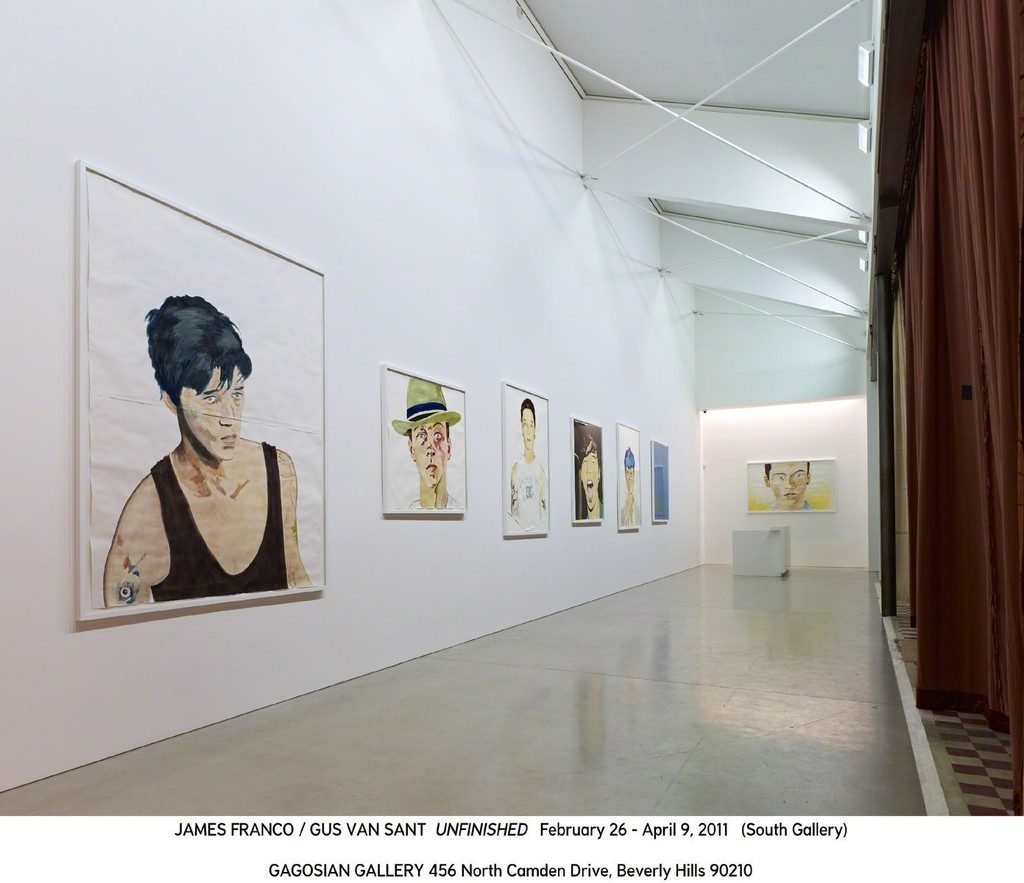
Gus Van Sant, Untitled, 2010, watercolor on paper, 132×144 cm, image via artsy
I still admire his films. And I still definitely want to make that shot-for-shot remake of Gerry I’ve been contemplating since a day after seeing it for the first time. But nothing I have seen has me pumped for Gus Van Sant’s upcoming exhibition of wan paintings that Vito Schnabel’s putting on any minute. One thing I am intrigued and concerned by is something I have not seen.
This joint at Vito’s is not Gus’s first gallery exhibition. Artsy notes, almost correctly, that “In 2012, Gagosian Gallery in Los Angeles gave him a joint show with James Franco, which featured watercolor portraits by Van Sant and two collaborative films that riffed on My Own Private Idaho.” According to the AnOther Magazine article linked above, the show, “Unfinished,” was in February–April 2011 at Gagosian Beverly Hills. The gallery’s otherwise comprehensive-slash-exhaustive website makes no mention of the show. The Internet Archive reveals the webpage for the show was deleted some time between November 2011 and January 2012.
This image from a deleted Artsy page for the Gagosian show is the only installation shot I’ve found.
And it’s not like the show didn’t happen; Patrick McMullan covered it. But it wasn’t so much Gagosian giving Gus a show, as James Franco proposing a project to Gagosian where Gucci would pay to digitize 25 hours of dailies and outtakes from My Own Private Idaho, which Franco and Van Sant would each re-edit. That did not happen. Instead, Franco, “performing as” Van Sant, edited 12 hours of River Phoenix footage into My Own Private River, and some other outtakes into Endless Idaho, an adaptation of one of the three source stories for the original film. Van Sant’s contribution, beyond all the footage, was seven large watercolors of casting photos of hustlers. [Three are still listed on Artsy. They’re not bad. Watercolor seems a tricky medium to manage, especially at scale.]
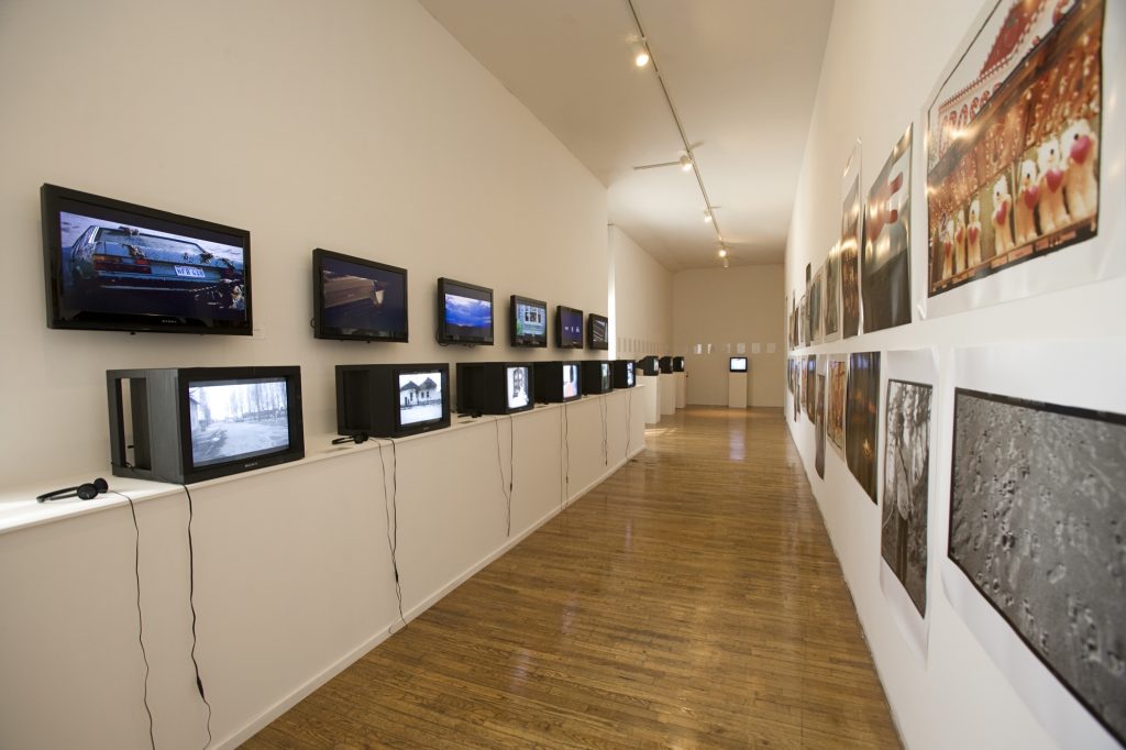
That summer My Own Private River appeared at PS1 as an exhibition slash film series curated by who knows? But the Franco indulgence and the double row of unwatchable monitors points to Klaus. The film was shown on an old TV facing a casting director’s table at the end of a hall, so I guess we’re all performing Gus Van Sant now. There was also Franco’s 8mm adaptation of an earlier source script, featuring younger, Hispanic versions of Keanu & River’s characters; and Aa 20-years-older Udo Kier reprised his daddy role. Not at all confusingly, it was called My Own Private Idaho. Instead of watercolors, Van Sant showed a wall of large-scale, unmounted prints of film stills.
installation view of Summer School / My Own Private River at PS1, 2011, image: moma.org
Franco apparently wanted to release his reworked version, but New Line wouldn’t let him. Art was fine, though. It was enough for the film and the title/hashtag to be ensconced in the River Phoenix fandom. It was uploaded to YouTube in 2015. In 2018, Franco was accused of inappropriate sexual conduct by several aspiring actresses at his film school, which he abruptly closed. Which I mention because by this point Van Sant feels oddly peripheral to this whole project, displaced or subsumed by Franco’s hustle.
It appeared and was covered elsewhere, and vestiges of documentation exist, but it still seems odd for the gallery who staged a show to delete any record of it from their archive. In just a few years this show has appeared to be many things: a project in a gallery; a film screening in a museum; an art installation in a film festival; a test of the meaning of context and the power of celebrity; and now, a tossed-off promotional claim for attention and artistic credibility that gets obfuscated and complicated upon even a cursory examination. Art is so wild, y’all.
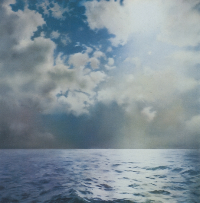
Gerhard Richter, Seestück (Gegenlicht)/ Seascape (Contre-jour), [CR233], 1969, 200x200cm, oil on canvas. image: gerhard-richter.comWhen he first showed his seascape paintings in 1971 Gerhard Richter was criticized for being kitschy and romantic, and for aping Caspar David Friedrich. In the catalogue for Richter’s 2011 Tate retrospective, Panorama, Mark Godfrey maps out an important nuance about Richter’s relationship to Friedrich and suggests a different, closer, and more conceptually skeptical source.
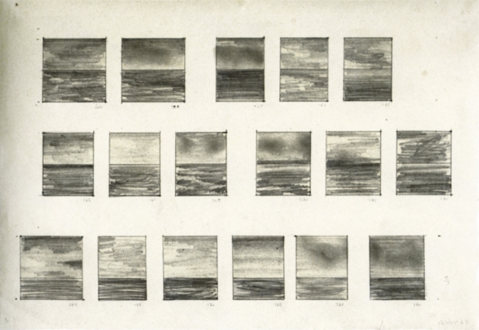
Though he described them in 1991 as appearing “endlessly repeatable and without end,” Richter only made ten large, square Seascape paintings in 1969, and three in 1970:
Just about all the seascapes (many of which were included in the Atlas) depict collaged motifs. The sea and cloud sections came from different photographs then collaged together in a single image. The successful paintings were dependent on finding exactly the right mood between the combined images. There were also a couple of paintings, for example, where I used two halves of the same image of the sea [CR: 244, CR: 245]. Although I had a rather bad feeling about them, I was visited by George Maciunas, who thought they were absolutely wonderful and for that reason I allowed them to survive, despite feeling they were very decorative.
[Sidebar, but this phrase “I allowed them to survive” jumped out at me. Richter’s quote comes from “Comments on some works, 1991” which was prepared for the artist’s (earlier) Tate retrospective. It is not too much to say that a throughline in Richter’s comments is destruction, both as a subject and as a process. So for Richter a retrospective is an occasion to review a bunch of art you haven’t seen in a while, and try to remember why you didn’t destroy it when you had the chance.]
A 1969 drawing, 17 Seascapes, shows Richter experimenting to find the best size, proportion, and composition for seascape paintings, which 2009 Tate retrospective curator Mark Godrey notes, were conceived as serial works. [It was the 60s, after all.]
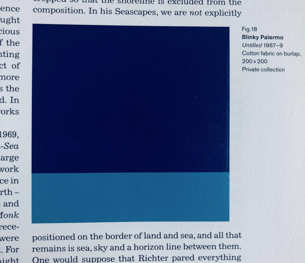
Fig. 18 Blinky Palermo, Untitled 1967–9, Cotton Fabric on burlap, 200 x 200, Private collection, image of Panorama, p. 81, credited somehow as “image courtesy Sotheby’s Picture Library,” who swears it is a photograph, not a digital concoction.
Godfrey also notes that the size, shape, and horizon line Richter settled on for Seascape (Contre-Jour) [yes, from the stamp, where the cropping now feels like a crime] were identical to a work by his closest friend and collaborator at the time, Blinky Palermo. Palermo’s Untitled (1967-69) is a 200 x 200 cm Stoffbild (Cloth Picture), a painting of bands of monochromatic commercial fabric–which was sewn together by Richter’s first wife Ema.
“Richter was crossing Friedrich with Palermo to make the Seascapes,” Godfrey wrote. Palermo and Richter were actually working in the “chasm” that the 20th century wars had opened between their 1960s Germany(s) and Friedrich’s.
Writing about their collaborations in the Dia catalogue for To The People of the City of New York, Christine Mehring associates Palermo’s Pop-related, readymade cloth pictures with Richter’s color chart paintings. The Seascapes, meanwhile, call out the landscapey cloth paintings’ claims for abstraction.
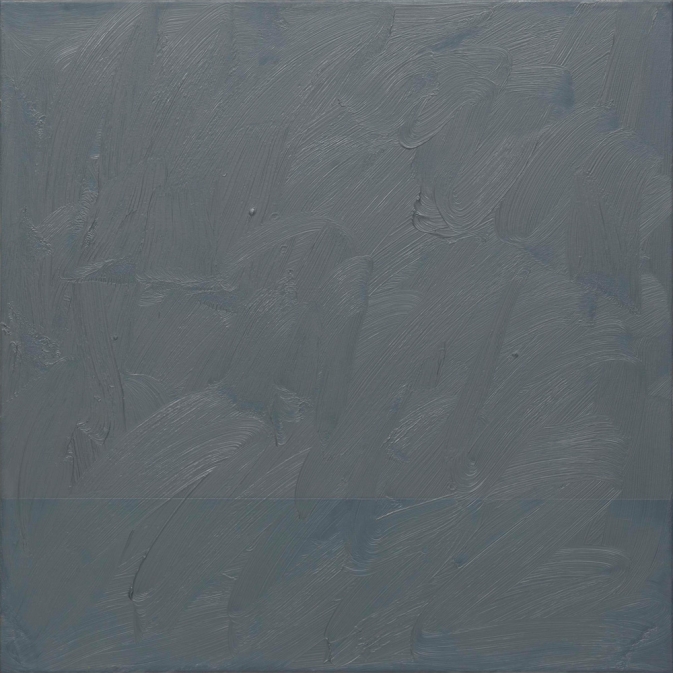
Gerhard Richter, Seascape (Grey), 1969, 70 x 70 cm, image: gerhard-richter.com
Meanwhile no one mentions this 1969 painting, titled Seascape (Grey) [CR 224-16]. At 70 x 70 cm it feels bigger than a study. A geometric seascape of Palermo-ish composition is overpainted with grey, to near illegibility. Knowing how Richter gets about overpainting, the nearness of illegibility is just. right.
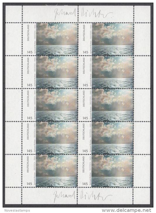
GERHARD RICHTER DEUTSCHLAND 145 SEESTÜCK – 1969, 01.07.2013, offset print on adhesive, signed in plate, edition unknown, image: delcampe.net seller novesiastamps
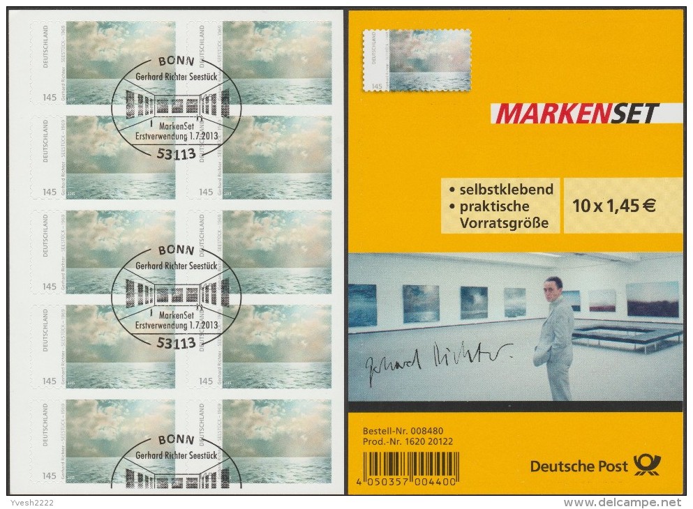
Deutsche Post published Gerhard Richter stamps in 2013. EUR1.43 stamps showing text alongside a rectangular cropped image of the artist’s 1969 square painting Seestück (Gegenlicht)/ Seascape (Contre-Jour) [GR233] were available in collectible sheets of ten. If, as the two facsimiles of the artist’s signature in the sheets’ margins would infer, the stamps constituted the largest edition the artist has ever published, the use of these stamps also amounts to the greatest act of artistic destruction Richter has ever faced. And at the hands of his own countryfolk, no less.
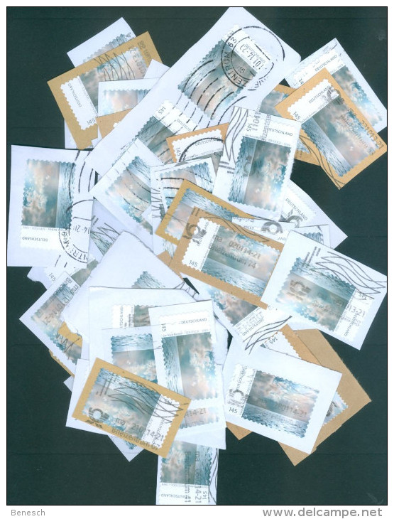
Gerhard Richter, Seestück (Gegenlicht)/ Seascape (Contre-jour), [CR233], 1969, 200x200cm, oil on canvas. image: gerhard-richter.comThousands–tens of thousands, hundreds of thousands?–of pictures just ripped asunder, flung hither and yon, pummeled, shredded, and then dumped. Even in these trying times, the scale and apparent casualness of the obliteration shocks the conscience. The apparent readiness of the German people to trivially use then abandon the work of one who is ostensibly so revered, whose work has–had?–provided a searing beacon of objective light? Staggering.
Did the artist somehow know this was coming? Is that why he chose–presumably it was he–to use the picture depicting contre-jour, backlighting, the photographic technique of directly facing the light source–in this case, the sun–to produce heightened visual contrasts and unsettling shadows?
Cancel Culture: Gerhard Richter Seestück edition showing evidence of ceremonial mutilation on 01 July 2013, image: delcampe.net seller Yvesh2222
Fortunately, even in the face of such widespread destruction, there is hope. Faithful stewards in the collecting community are doing what they can, preserving stamps and sheets in whatever form they can: some sheets have the signatures intact; some don’t; some stamps have a signature fragment; a rare few include the commemorative envelope (also with a signature, historians); some [above] are mutilated ceremonially–canceled, they call it, with euphemism that cannot conceal the inherent pictorial sadism; and some, marred and disfigured on the field of postal battle, are rescued from oblivion by angels wielding tiny, little scissors.
Study for Destroyed Richter Stamps 01–50 [sic], 2019, image: delcampe.net seller beneschThese are the pictures that haunt me, the ones pulled from the very brink of doom. Theirs is the story I’ll tell; theirs is the fate we must #neverforget.
Whether it’s 50 original works or ed. 50, we’ll see when the studies arrive from Austria.
I met Wynn Kramarsky on the internet almost exactly 25 years ago to the day. It turned out not to have been my first encounter with him, but I’ll get to that. We met on Usenet, a global, distributed message board/listserv that was organized by topic, sort of like how reddit is now. It was August 1994, and I had just reported to alt.art.robert.smithson about my visit to Spiral Jetty. Wynn commented enthusiastically and wanted to know more–Spiral Jetty had only emerged from the Great Salt Lake a few months earlier, and was visible for the first time in decades [sic. By analyzing lake levels I’ve since concluded it was visible for a year or two in the 1980s, but it seems no one looked/reported/cared.] We emailed. He offered to send me a catalogue from a recent Smithson exhibition at Columbia, what was my address? On the internet of 1994, it seemed wilder to me to give a stranger a catalogue than to give a stranger your address. It was only when the book arrived with a note and his card that I realized Wynn was lending it to me. I could bring it back on one of my trips to New York (I was at business school in Philadelphia), and we’d go to lunch.
And that’s what we did, a couple of months later. We met at his office in SoHo, the entrance of which was lined with thousands of books. That first visit, an extraordinary Richard Serra work, multiple sheets of paper with ink applied in large slabs with a roller, filled the first open wall. The internet has been failing to surpass itself ever since.
After we’d toured both floors of his SoHo space and had a sandwich with his staff, we went into his office. Behind his desk was a drawing Robert Smithson had made on a large, aerial photo of the Kennecott Copper Mine. I knew it because I had bid on it the year before, when it had come up for auction at Sotheby’s. I had just quit my job and was preparing to go to grad school, and I really had no business bidding, even during a recession. But I really wanted it, and so I made a couple of bids for it before giving it up to the winning bidder. I apologized for running up the price on him, and then I thanked him for not bankrupting me.
Wynn and I became art correspondents, and we’d meet of the years while he was actively putting on shows. He was as infectiously passionate about the work of young and emerging artists as he was about the people he’d known and collected for decades. At his encouragement, I met artists and visited studios I never would have thought to reach out to otherwise. He made me want to be a better, more thoughtful collector by being a curious and engaged counterpart for artists, not just a consumer.
We both got more actively involved in supporting MoMA around the same time–on obviously different levels–and he was always generous with advice and insights. He took collecting and donating seriously, and was always cognizant of a responsibility to artists and to society. I still feel the impact of his incisive observations of socialites, unserious collectors, or museum groupies angling for respectability on my own views of how the art world should or could work. When a committee meeting I was running at MoMA got derailed one night by some tedious presentation, I immediately felt the weight of Wynn’s story about the flaky chair of a museum board he’d been on: “She wrote a check, but she sure couldn’t run a meeting!”
When I began writing, especially for the Times, and later on topics like early Jasper Johns, the Jetty, or Tilted Arc, Wynn’s was always a voice I sought out and trusted, and he always spoke very candidly. I always got the sense he didn’t want to be quoted, though, and so I never did. I also always got the sense that he operated out of a profound respect for the artists he knew, and for their work. It felt like artists trusted him, and that he cherished that. I miss Wynn and mourn for the loss his friends and family are experiencing, but I’m grateful for the chance to know him, and for all he did and showed and taught.
TJ & Cyrus & Untitled (Gaga Dancing Platform), installation shot
I was going to add this as an update, but it really needs its own post. When I stumbled backwards from appropriating Andi Mack art prop art into Bruce Hainley’s text discussing Sturtevant as talkshow discussing Felix Gonzalez-Torres within a play discussing Sturtevant, I did not remember that Leo Steinberg had special guest appearances in both. But now that I’m back within arm’s reach of Hainley’s sUnder the Sign of [sic]: Sturtevant’s Volte-Face, I realize I am trapped in a carnival ride where I can’t tell screen from mirror from object. So here is an abridged, Mack-optimized, recap of Hainley and Steinberg, with a special cameo from editor Michael Fried. (He was not my idea.)
TJ & Cyrus & Untitled (Gaga Dancing Platform), 2019, enamel on mdf? 5x5x1 ft, installation shot
It was while digging into an unusual credit line in a 1964 exhibition checklist and trying to find research into why fandoms turn toxic that I ended up bouncing last week between a 220-page interview transcript with the late art historian Leo Steinberg and a postgame for #TyrusWeek, a recent fandom-wide effort to get the Disney Channel middle school soap opera Andi Mack trending on Tumblr during its final episode.
Installation view of a photomural of Keith Haring’s studio wall, c. 1983-84, Guggenheim Museum, photo: Mary Inhea Kang/NYT
Was there ever really more time to ruminate on the unsung history of photomurals in post-war art, or was there just not enough attention being paid to the systemic violence people of color face at the hands of police and other instruments of state power?
Fortunately–you know, fortunately is really not the right word here-these two subjects have met at the Guggenheim Museum in a concentrated exhibition curated by Chaedria LaBouvier called “Basquiat’s Defacement: The Untold Story.”
Defacement is the informal title [sic] of a work Jean-Michel Basquiat made on the wall of Keith Haring’s studio after fellow downtown artist Michael Stewart was hog-tied, beaten, left in a coma, and ultimately killed, by NYPD in September 1983.
Haring cut the drawing out and framed it. It was hanging above his bed when he died, and it now belongs to his god-daughter, Nina Clemente. LaBouvier’s prodigious show is the culmination of years of research and careful interviews with Stewart’s family and many artists in his milieu.
And it includes a to-scale photomural of Haring’s tagged up wall, with a roughed out hole where the drawing used to be.
I’ve been wanting to see Rirkrit Tiravanija’s film Lung Neaw Visits His Neighbors since it came out in 2011. I’ve been sleeping on it/booked up with other stuff almost the whole time it’s been on view at the Hirshhorn, along side his curry and protest drawing piece, newly acquired, Who’s afraid of red, yellow, and green? Instead of mosaicing snippets from various visits, I wanted to see the whole thing in one sitting. Yesterday was the second to last day of the show, so I jammed downtown first thing.
Rirkrit and his dealer’s brother shot 16mm a week at a time, here and there, for two years, following the Chiang Mai farmer/laborer on his daily routine. He compared it to portraiture rather than narrative, and so I expected 2.5 hours of fly-on-the-wall footage, minus the walls.
It’s an extremely quiet, unassuming film, especially for a gallery setting. It does not grip or demand attention. So when I sat down on the Hirshhorn’s Miesian daybed in what turned out to be the middle of the film, I expected a bit of endurance and, frankly, escapism. Even a couple of weeks ago, Rirkrit had talked about Lung Neaw as a guy who’d helped build his studio, and who could be seen walking through the forest, foraging for wild eggplants. I imagined a shaman at one with nature who could free (or distract) me from the daily shitshow of the world we’ve created. It did not turn out that way. Continue reading “Escape And Curry Service”
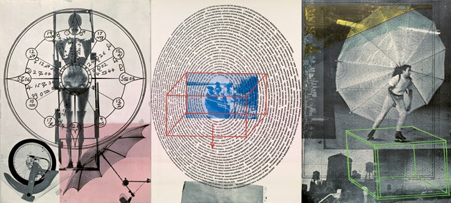
The middle of three 5 x 4-ft offset lithograph panels in Robert Rauschenberg’s Autobiography contains a dizzying spiral of text featuring key moments of the artist’s life, as well as an extensive list of artworks.
Robert Rauschenberg, Autobiography, 1968, 5 x 12 ft overall, ed. 2000
When Oliver mentioned it on twitter the other day, I realized I’d never actually made it through the entire text. Now I have. I transcribed it here for this robot to read.