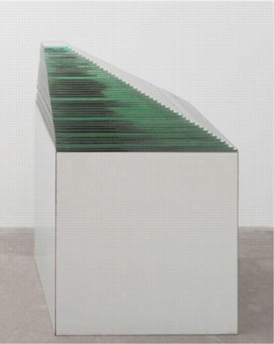
Robert Smithson, “Conversation in Salt Lake City,” 1972:
There’s a word called entropy. These are kind of like entropic situations that hold themselves together. It’s like the Spiral Jetty is physical enough to be able to withstand all these climate changes, yet it’s intimately involved with those climate changes and natural disturbances. That’s why I’m not really interested in conceptual art because that seems to avoid physical mass. You’re left mainly with an idea. Somehow to have something physical that generates ideas is more interesting to me than just an idea that might generate something physical.
Nic at A Young Hare has had some great posts lately about the not-legendary-enough Italian artist/architect Gianni Pettena, which made me revisit Pettena’s discussion with Robert Smithson. The interview took place in January 1972, the day after Smithson had delivered his “Hotel Palenque” lecture at the University of Utah, where Pettena was a visiting professor. It was originally published in Domus in Nov. 1972, and included in Smithson’s collected writings.
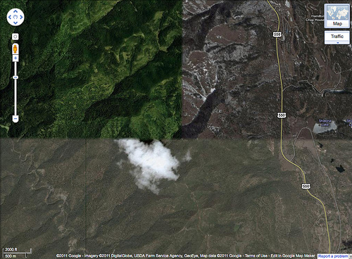
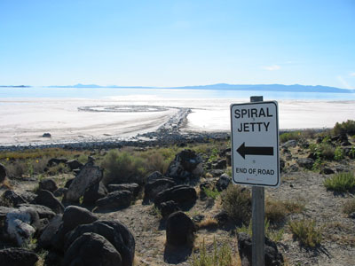
In the same conversation, Smithson also mentioned his preference for working in “a site that is free of scenic meaning,” one with “views that are expansive, that include everything…” In referring to the Spiral Jetty’s site:
The Salt Lake piece is right near a disused oil drilling operation and the whole northern part of the lake is completely useless. I’m interested in bringing a landscape with low profile up, rather than bringing one with high profile down.
I’d argue that the lake’s utility has only increased since Smithson saw it, and that his installation of the Spiral Jetty has certainly raised its landscape’s profile.
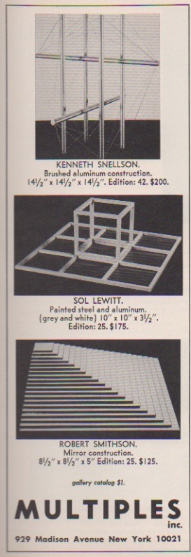
Meanwhile, 185 francs. That’s the price written inside my copy of the 1996 reissue of Smithson’s writings. I bought it at the Musee d’Art Moderne de la ville de Paris, which has [had?] an awesome bookstore. Is it still awesome? I haven’t been for a couple of years now, though I expect I’ll be back before the franc is.
And from the end of the conversation:
Smithson:…I developed that somewhat with the non-sites, where I would go out to a fringe area and send back the raw material to New York City, which is a kind of center–a big sprawling night mare center, but it’s still there. Then that goes into the gallery and the non-site functions as a map that tells you where the fringes are. It’s rare that anybody will visit these fringes, but it’s interesting to know about them.
Pettena: You always show the places from which you are coming, if you are sincere.
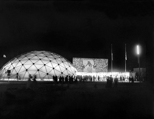
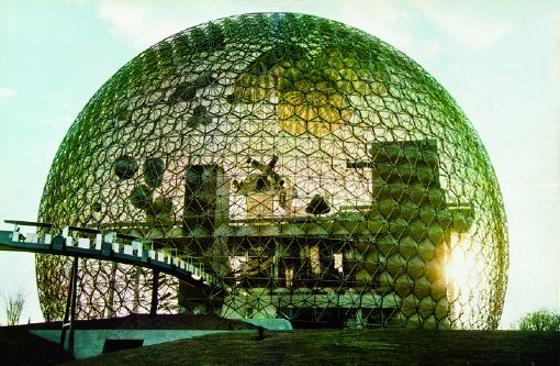
 For example, for all the dome- and Expo-loving going on around here, you’d think